The Social Life of the Student
-
A Design Project
Fredrik Jensen
FINAL THESIS PROJECT 2009
Civil Engineering
The Social Life of the Student
-
A Design Project
Studentens sociala liv
-
Ett designprojekt
Fredrik Jensen
Detta examensarbete är utfört vid University of Hartford i samarbete med Tekniska Högskolan i Jönköping inom ämnesområdet Byggnadsutformning. Arbetet är ett led i den treåriga högskoleingenjörsutbildningen Byggnadsteknik, Byggnadsutformning med inriktning arkitektur. Författaren svarar själv för framförda åsikter, slutsatser och resultat.
Handledare: James E. Fuller (University of Hartford) Bernth Jirvén (Jönköping University) Omfattning: 15 hp (G3-nivå)
Datum: 6/16/2009 Arkiveringsnummer:
Thanks to:
The S/L/A/M Collaborative Inc. that let me do the project with them. Geoffrey S. Gaunt & Casey L. Nixon, my mentors at S/L/A/M.
Professor James E. Fuller, my supervisor at The University of Hartford Professor Bernth Jirvén, my supervisor at Jönköping University
Abstract
This report describes from start to finish how a new design and extension of the Gengras student union center at the University of Hartford was done. The report will be using a project that was made by me and explains how the whole project was planned by contacting S/L/A/M Collaborative Inc. all the way until the final outcome was presented for a final jury. It explains the whole chain process one should use when designing a building such as different analysis, precedent studies, concept development and how to approach the design project. New technologies, the feature of access and flexibility are the main influence words in the design that is being used as an example. These words can be found and felt throughout the whole building both in the façade drawings and in the plan solutions. The result was a building that is more organic and flexible in its forms and spaces than current architecture is today. A sort of architecture that comes more and more in today’s architecture and which will shape the society in the future. My building also keeps a sense of the old façade to create a transition between the new and the old. The old and the new cooperation prove that the innovative design does not destroy the old building; it only enhances it and prepares it for the future.
Sammanfattning
Denna rapport beskriver från start till mål hur en ny design och utbyggnad av studentkårsbyggnaden Gengras vid University of Hartford, USA utfördes. Rapporten förklarar hur hela projektet utfördes från att kontakta företaget S/L/A/M Collaborative Inc. hela vägen till att slutprodukten presenterades inför en slutjury. Den förklarar hela kedjeprocessen man borde använda när man designar en byggnad såsom olika analyser, förstudier, konceptframtagning och tillvägagångssätt. Nytt tänkande, framtida tillgänglighet och flexibilitet är de mest inflytelserika orden i detta projekt. Dessa ord kan hittas och kännas genom hela byggnaden både i fasadritningarna och i själva planlösningen. Resultatet blev en byggnad som är mer organisk och flexibel i dess former och utrymmen än samhällets arkitektur idag. En sorts arkitektur som kommer mer och mer och som kommer att forma samhället i framtiden. Min byggnad
behåller även en känsla av den gamla fasaden för att skapa en övergång mellan nytt och gammalt. Den gamla och nya samverkan bevisar att den innovativa designen inte förstör den gamla byggnaden, den förbättrar den bara och förbereder den för framtiden.
Keywords
Socialize Flexible
Flow Organic
Interaction Technology
Table of Contents
1
Introduction ... 5
1.1 BACKGROUND ... 5 1.2 AIM &GOALS ... 6 1.3 DEMARCATIONS ... 6 1.4 METHOD ... 7 1.5 DISPOSITION ... 72
Studies ... 8
2.1 PREPARATION ... 8 2.2 THE EXISTING GENGRAS ... 10 2.2.1 The Flow ... 11 2.2.2 The Sun ... 122.2.3 A Campus for the Public ... 12
2.2.4 Precedent Study ... 13
2.3 EXTERNAL PROJECTS ... 17
2.3.1 The Julliard School ... 18
2.3.2 The University of New Mexico ... 19
3
The Projects Idea Development ... 20
3.1 PARTI &CONCEPT DEVELOPMENT ... 20
3.2 APPROACHING THE DESIGN ... 21
3.2.1 Design Ideas ... 21
3.2.2 Developing the Idea ... 22
3.2.3 The Feedback ... 26
4
The New Gengras ... 28
4.1 THE BUILDING AS A WHOLE ... 28 4.2 FIRST FLOOR ... 30 4.3 SECOND FLOOR ... 31 4.4 THIRD FLOOR ... 32 4.5 FINAL POSTERS ... 32 4.6 THE FINAL MODEL... 33
5
Conclusion and Discussion ... 34
6
List of References ... 36
7
Word Finder ... 37
8
Enclosures ... 38
8.1 ENCLOSURE 1–TIME TABLE ... 38
8.2 ENCLOSURE 2–PROGRAM ... 39
8.3 ENCLOSURE 3–SITE ANALYSIS ... 40
8.4 ENCLOSURE 4–PRECEDENT STUDY ... 41
8.5 ENCLOSURE 5–SITE PLAN ... 42
8.6 ENCLOSURE 6–EAST &NORTH ELEVATIONS ... 43
8.7 ENCLOSURE 7–WEST &SOUTH ELEVATIONS... 44
8.8 ENCLOSURE 8–SECTIONS ... 45
8.9 ENCLOSURE 9–FLOOR PLAN 1 ... 46
8.10 ENCLOSURE 10–FLOOR PLAN 2 ... 47
8.11 ENCLOSURE 11–FLOOR PLAN 3 ... 48
8.12 ENCLOSURE 12–3DPERSPECTIVE DRAWINGS ... 49
1 Introduction
My intention is to find out which way is the best for me to design a building, what is the best approach. To be able to show this approach an extension of the existing Student Center called Gengras on the University of Hartford’s campus will be made. The project will be used as an example of how to design a
building. This project is my final design thesis project for Jönköping
University in Sweden and the University of Hartford in Connecticut, USA. This report will explain how to start from being given a program for the building, making precedent studies, designing it and finally presenting the final building. The whole project was a close collaboration with S/L/A/M Collaborative Inc. in Glastonbury where they acted as the contractor. This architect firm
specializes in all different stages of buildings like architecture, interiors, landscape design, structural engineering and construction services. Because of the wide range they have this project was able to get feedback from all of these different departments.
1.1 Background
S/L/A/M Collaborative Inc. proposed the Gengras Student Union Center at the University of Hartford as my new project. I accepted the project and they made a program and goals that they wanted me to aim for and present at the final presentation. As a contractor S/L/A/M Collaborative Inc. gave me the
following statement as the main background/reason for making the renovation and extension:
“The University of Hartford has experienced a significant growth in the past decades with more students and newer technologies. Unfortunately the campus facilities haven’t fully caught up with the changing university dynamics.
Particular attention has been focused on the re-alignment of the core academic departments; however, the general university support spaces have not been very well defined in this progress.
The current and future students of the university community are looking for a more evolved student center – a place to meet and socialize during
nights/weekends, a place for student organizations to meet and a place for the neighboring community to interact with the campus community.” [1]
In abbreviation, they wanted me to design a place for students to interact and socialize outside the lecture halls, a place that everyone could go to whenever they want.
1.2 Aim & Goals
“The university wants a renovation and expansion of the Gengras Student Union Center which will end up in a social meeting place for the university students. The center will include dining facilities, a bookstore, social areas, a visitor’s center, a place for student organizations and a mailing center.” [1] The aim is to come up with a new design and an extension for the Gengras Student Center that will be suitable for today’s and future student’s demands. It will be a place for students to socialize and study both during and after school hours.
The central issue for this project is the final design of the Gengras student center that will be presented to The S/L/A/M Collaborative Inc. as well as to my supervisor professor James E. Fuller from the University of Hartford on April the 17th 2009. Because this project is more of a visual project it will be presented in the shape of posters.
1.3 Demarcations
Because of all the different building regulations the old measurements of the walls, slabs and spaces etc have been kept. To dig into all the regulations would be too much work considering the amount of different facilities the building consists of and the timetable the project has. It has taken in consideration for example new toilets and the new staircase to learn some parts of the American system.
Detail drawings for constructions as walls, slabs and foundations have not been taken in deliberation. The drawings would have taken too long time in relation to the tight schedule the project had.
The plan layout for the office spaces have been designed for the right amount of square footage. Walls in between different offices were designed mostly for presentation purpose to show that this kind of wall design does work. However, the inside walls have been designed to fit the old layout of office spaces that is used in the current building but with big modification of the shapes.
Most of the beams and columns that do exist in the current building have been preserved. The timetable was not enough to recalculate different forces in the structure. To do the buildings structure realistic the columns that was changed was replaced with extra reinforcement close by to be on the safe side structure wise.
1.4 Method
To be able to make this project, different reference objects will be studied. These studies will be made by going on study trips to different universities and their student centers. The University of Hartford will also be analyzed to connect the building to its surroundings.
A discussion group at S/L/A/M Collaborative Inc. will be giving feedback and discuss the whole project during the whole project.
1.5 Disposition
Below the report is divided into four chapters, ”Studies”, ”The Project Idea Development”, “The New Gengras” and “Conclusion and Discussion”.
“Studies” describes more of how the project was made beginning with different analysis and studies.”The Project Idea Development” describes the design process. “The New Gengras” chapter describes the final outcome of the project, the final design. In “Conclusion and discussion” the main comments from the jury is brought up and discusses the aims and goals. Both the ”Studies”, ”The Project Idea Development” and “The New Gengras” chapter can also be followed in the enclosures in the end of the report where the actual sketches and drawings are presented.
2 Studies
2.1 Preparation
In March 2008 the University of Jönköping in Sweden confirmed that a contract had been written to send me as an exchange student to the University of Hartford in Connecticut, USA. The school start was supposed to be in January 2009 and end in May the same year. My final thesis project was to be done during this semester. The final thesis project is supposed to be made together with a company of some kind. Because of my interest in architecture an architect company was an obvious choice. The architect firm S/L/A/M Collaborative Inc. showed an interesting design on their homepage and an e-mail asking if they were interested in this project was sent. In December 2008 Casey L. Nixon who is an architect at the firm agreed to help me by giving me different viewpoints of the design and act as the contractor together with her colleague Geoffrey S. Gaunt.
It has been a lot of e-mailing between me, S/L/A/M, Professor James E. Fuller at the University of Hartford and my professor at Jönköping University, Bernth Jirvén. Finally on January the 31st the first meeting was held with Casey L. Nixon and Geoffrey S. Gaunt at S/L/A/M Collaborative Inc.’s office in Glastonbury, Connecticut. They had several ideas of different buildings that could become my final thesis project but they had one main idea, Gengras Student Union Center. Both the program (table 1 & enclosure 2) and the building itself looked like an interesting challenge for me. I decided to accept Gengras as my final thesis project.
The customer presented a program that was supposed to be followed
throughout the whole project, the same kind of program that can be used in real life. Without a program like this it would have been hard for me to be able to make a good design. To be able to make a good design it is easier to first get a feeling of how big the main areas are and continue with the influence of those areas. Table 1 shows roughly the main areas that were given to me. A more detailed program is shown in enclosure 1.
EXISTING(sq ft)
PROPOSED(sq ft)
Dining Facilities 20,213 20,000 Bookstore - 10,000 Lounge/Social 3,135 5,000 Visitor’s Center 937 1,000 Student Organizations 22,963 25,000 Mail Center 1,792 2,000Total Net Square Feet 49,040 63,000
Total Gross Square Feet 75,000 90,000
Table 1. The main areas in the program and the square footage (sq ft). [1]. A more detailed program is shown in enclosure 2.
After approval from my professor in Hartford and my professor in Jönköping the project could be started.
The first thing to be done was to put up some questions together with the company that worked with me on the project. These questions are shown in table 2.
The customer S/L/A/M Collaborative Inc. wanted to redesign and make new renovation plans for the Gengras Student Center on University of Hartford’s campus. A new student center that will be designed for the students of today and for the future. It will include different technologies and designs concerning how students communicate in today’s life and mind.
A time table that shows when different deadlines were supposed to be presented for S/L/A/M Collaborative Inc can be seen in enclosure 1.
Research - What would the best approach and process be for me to get from a program to a finalized design?
- What are the trends in other universities for new spaces of interaction?
- How do students use spaces/interact today?
Exploration - Design ideas that explore campus identity, creation of/affect
on outdoor spaces, highly visible space of interaction.
- What kind of design can make students interact together and study more?
Resolution - Make plans that are functional, including egress, accessibility and clear circulation.
- Responds to need for a campus center
- Responds to question about new modes of communication
Reflection - How do initial impressions of an exchange student get played out in design?
Table 2. The goals and aims developed by me and S/L/A/M Coll. Inc. [1]
2.2 The Existing Gengras
To be able to design a building one has to know what is happening outside of the site that has been given. For this challenge you should put up some
questions for yourself to find out the answers. Where do all the people come from, what places are most used, how does the sun move etc. An existing map over the campus was used to graphically show different movements of
pedestrians, traffic, green surroundings and sun path. This map was out of date so the first thing that had to be done was to update it by putting in new
developments and re-arrange/add sidewalks.
By using a graphical diagram instead of numbers and charts it is easier for one to get the feeling of what is actually happening around the site, both for me as the architect and for the contractor. See enclosure 3 – site analysis.
2.2.1 The Flow
Because I am a student at the University of Hartford myself it was quite easy to figure out the pattern of how the students move around the campus. To analyze the pedestrians’ pattern you should study different sidewalks and observe the people´s different patterns during different times of the day. Most of the
students in this project came from the residential side of campus over the north bridge and walking in between the bookstore and the library. A big amount of students commutes and arrives by car. The biggest parking lots are placed south and especially on the east side of the campus and my site. The most used
entrances are a small door on the north side into a ½ level, a small door on the east side entering the lower level and the main entrance on the west side. Everywhere else on campus it is more or less an even spate of people.
Figure 1. A part of the University of Hartford’s Campus showing the Gengras student center in brown. The figure also shows the traffic flow, the sun path
and the students’ pattern. A bigger figure is shown in enclosure 3.
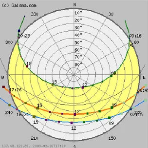
2.2.2 The Sun
Sun charts can be found on the internet [2] for a specific city area. The most important information about the sun is its path which is shown by using the sun path diagram in figure 2. This diagram shows how the sun travels throughout the year with different sunrises and sunsets. Darkest day of the year (December 21st) the sun rises at 7:15am and sets at 4:24pm which is shown as the lowest light blue line on the map. The equinox (March and September) is shown as the middle sun. On the lightest day of the year (June 21st) the sun rises at 5:16am and sets at 8:29pm and is drawn out as the highest green line. This chart was used on the site plan (enclosure 3). The sun is nice to have when socializing in some kind of lounge area. But if you are for example dining the sun can be an irritating object, something that should be considered while designing the different areas.
Figure 2. A diagram for West Hartford that explains in what orientation the sun is during different dates and times of the year around the building. [2]
2.2.3 A Campus for the Public
Starting to look at the green areas on campus there is an open field in the middle of campus which is being frequently used by students for sports and socializing. This field also makes a great mall into the campus looking from Bloomfield Avenue which is the big road running southwest of the campus. At the moment there is no “main building” showing where new students or
visiting people should go. The first building that is seen when entering the campus area is the building most south on the map (Barney School of Business). This is a building with no map or information about the campus which can make people feel lost until they find Gengras Student Center where a visitor center exists. By making a building stand out from the rest, this project is able to make a new landmark on campus that would drag new students into it. Making a building that makes people interested and wanting them to go to it and go to the right building at once.
The loading dock for the post office with the dining on top.
2.2.4 Precedent Study
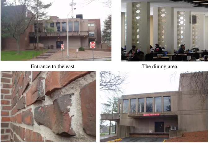
When you finally know how the surroundings work and looks like it is time to get to know the building you are designing and redesigning. One ought to study how other newer buildings in the same genre are designed and how they work. By documenting and photographing materials, lounge areas, corridors etc you are able to look back on the main building throughout the whole design process without actually being on site. Some pictures of the Gengras are shown in figure 1 below. Also by doing this you are able to focus on for example one material alone and not be disturbed by the surrounding activities and materials. The University of Hartford has one main material which is a red-brown brick used on almost every building. This red-brown brick is used at many different places in Hartford as the main material. Concrete is also frequently used at campus. The only exceptions are the new addition to the engineering-building and the newly renovated art-building which have been wrapped in a metal sheet and an orange wooden façade. By walking around all the buildings on campus and analyze them it was discovered that every building showed vertical lines. Columns, pillars, towers and even ventilation exhaust has been frequently used throughout the campus building design that shows these vertical lines.
Figure 3. Pictures of the existing Student Union center at the University of Hartford, the Gengras.
Entrance to the east. The dining area.
Figure 4. The main entrance on the west side of the Gengras building.
Enclosure 4 is the poster that was presented for S/L/A/M Collaborative Inc. as the precedent study. By using a poster you can easy present what influences the surrounding area and buildings gave you around your design. You should also present the newer buildings you have looked up and explain which part of these you like. Some of these parts on my poster were the glazed facades, an
indoor/outdoor feeling, stairs as seating and glazed garage doors that can be opened up. It was also discussed what parts that were disliked like landscaping that was all flat and that the glazed walls were all flat and boring, nothing happened in them.
Looking at the both sides of the poster and talking about my feelings about the pictures S/L/A/M Collaborative Inc. was given an idea of what direction the design was going. What ideas that would be used and what not.
S/L/A/M Collaborative Inc. did have the floor plans for the existing Gengras which was used as a base, see figure 6. What they did not have was sections and elevations which had to be made by me. The first sections are seen in figure 5. The placement and width of the windows was already known from the existing floor plans. Some of the existing windows heights was eyeballed by looking at pictures and compared to objects that had known measurements such as doors and the width of the windows.
A analyze how the present building is organized was made by using different color codes for different areas such as office, lounge, maintenance and toilets etc. See figure 5 and 6. This method was used both for the floor plans and for the sections.
Figure 5. Showing the current building in section and how it is divided by using color codes.
To get more inside information about the different uses of this building a conversation were held with some of the different student organizations. Most of them were pleased with the amount of office spaces and class/meeting rooms they had. They said they might want a slightly bigger amount of square footage in these spaces and a better connection to the students. In other words, they wanted to be more presentable and be in the middle of the students’ circulation. These main areas that the building were divided into were later also used for the new floor plans. It is a good way to show how the new organization works and how it looks like compared to the old floor plan.
Section looking east
Section looking north
Light blue=Office Purple=Student office/classroom
Red=Social are Green=Food area
Figure 6. The figure shows how the current building is organized usingcolor codes.
Light blue=Office Purple=Student office/classroom Red=Social are Green=Food area Brown=Maintenance Orange=Circulation.
2.3 External Projects
By searching for newer buildings like the one you are designing you are able to pick up ideas for how the facilities should work and what materials is mostly used today. To find Student Centers in the library on campus or online was not an easy task. The only source for similar facilities is the magazine Architectural record. These magazines had a few small pictures and small articles but none of these really described the spaces or plans in a good way. No floor plans were found in the library or online of other student centers. This forced me to only use the small amount of pictures of spaces that was found online when the precedent poster was made, see enclosure 4. My memory of earlier universities that have been visited was used in some extension to remember how their design and layout looked like and to use as an influence source in my design. These are Jönköping University and Karlstad University in Sweden, Miami University and University of New Mexico in USA. To get an even better and more updated feeling of what your genres buildings looks like you should also visit other buildings during the design process to get more ideas. In USA a visit was made to Berklee College of Music in Boston, The Julliard School in New York, University of Connecticut in Hartford and Yale University in New Haven. Seeing the buildings in real life makes you take in more details and ideas than looking them up on the internet, in books and magazines. It gives you a better sense of the buildings wholeness and what it stands for.
Figure 7. The library/lounge at Karlstad University in Sweden with an open connection between the different floors.
By visiting other universities and looking back at the ones I have gone to I realized that the technology is going towards an all wireless system. Most of today’s students have a personal laptop. Some universities even lend out laptops to the students who can’t afford one. This new idea of using laptops instead of a stationary computer makes the old computer labs superfluous. Today’s technology makes the students more flexible in their interaction with each other. They use mobile phones, text message and computer programs such as Windows Live Messenger and AOL Instant Messenger to interact with each other. By using their computers they can send files and work with other
students online and they do this even if they sit next to each other. The technology today is really flexible concerning of where your location is. My opinion is that this flexibility is going to increase even more in the future looking back at the progress the technology have been doing the last couple of years.
2.3.1 The Julliard School
By taking away computer labs more free open spaces can be formed and furniture can be rearranged to a more socializing furniture group. A demand that lots of students require in today’s school facilities. The Julliard School is a great example of these open spaces. The school displays a lot of different shows in music, dance and theatre. This forces them to make a school that is made for the public and can be used for public gatherings. During my visit to the school all the spaces was used, but not as my beliefs by the public.
Everywhere there was a student with a laptop or a cup of coffee talking with friends etc. These “public spaces” is frequently used by the students and shows that this kind of solution fits my plans for this project. Making a space that the students use during all hours of the day and that also can get the public into the campus.
Figure 8. The Julliard School, New York, USA. The left picture shows the theater building with a café, meeting rooms and an outside stage closest to the
2.3.2 The University of New Mexico
At University of New Mexico the food chains and dining facilities are all interacted together with the student center on the first floor below. The more administrative areas are placed in the basement/ground floor but have an open floor plan up to the second floor. This “hole” in the floor makes a great
connection and circulation of the students. They have couches, chairs and tables placed throughout the spaces alongside walls and corridors. All of these furniture’s and the dining tables are used by students all the time. It is a great way of making studying into a more social thing instead of being in a dark corner somewhere. This social approach makes the students help each other with homework, discuss issues and work more in a group. Because the space doesn’t feel like a study area it is easier to spend more hours and actually forget how boring school sometimes can be.
Figure 9. The student center at the University of New Mexico, Albuquerque, USA. A stair leads down to the student union’s offices and
administrating facilities. The glass entrance leads into the dining and socializing area that looks down towards the underground floor.
The overall feeling of all these universities gives open and airy spaces which connects dining, socializing and studying all in more or less one space.
3 The Projects Idea Development
3.1 Parti & Concept Development
A design always grows from an idea, a concept. It does not develop from thin air. This idea can be a shape, a verb or for example a feeling. The idea is used throughout the building during the whole design process. The concept is used to capture the contractor’s interest in your design. It is supposed to be used both in the beginning of the project and especially in the ending where you should be able to explain the whole design from the view of your concept.
In the beginning a lot of different concept ideas such as technology, speed, verticality etc. were on my concept list. Reconsideration was made of the
different concepts and circulation and flow was chosen to be my main concept. The concept of technology did not feel like it belonged in this project. Earlier in this report it has been written about “taking away” the technology such as computer labs and that more students use their own wireless laptops. While walking around at other universities it was discovered that speed is something that should be taken away from a school environment. The students are stressed out enough with all their different classes. They should have a more relaxed approach while not in class so they are able to study without being burned out.
The verticality concept came from all the vertical lines that was seen on campus and was one of my strongest concepts believed in. But to have
verticality as a concept felt like it would force my building into something that was not wanted. The word vertical was too precise and it would be hard to design something out of it. These vertical lines would have to be seen everywhere, it would be too much.
The students was supposed to use the building more and get away from sharp corners and have an easy circulation and flow inside as well as outside the building. The old buildings shape made me want to keep the main entrance on the west side, the most used entrance on the north side and make a new
entrance towards southeast where all the parking is placed. By connecting these three main arteries it made the shape of a triangle. Both these words were drawn down on a piece of paper in the shape of a circle for circulation and a triangle that showed how the flow of people was supposed to move. These two shapes where connected, the flow was warped around the circulation and this became my conceptual diagram as shown in figure 10 below.
Figure 10. The conceptual diagram that shows the circulation and the flow as one. The drawing furthest to the right is the final conceptual drawing.
3.2 Approaching the Design
3.2.1 Design Ideas
By making different design idea sketches and then showing them to S/L/A/M I could get a sense of which design approach they liked better. The sketches became a foundation for the overall design which was continued to be developed.
The sketch below is a design that was based on my verticality concept. This building was to reach up into the sky. To keep the square footage thinner “arms” in the plan was made so when walking around the building you would always see a vertical corner. While designing this idea the same thing as in the concept development was discovered, it was too much. The design did not give me any good feelings and neither did it to the architects [1] at S/L/A/M.
Figure 11. The verticality concept design sketch.
My speed concept was the foundation for the design below in figure 12. The big walls on the sides were supposed to bring people into a connection point such as an entrance. By walking along side these walls one was supposed to feel that the destination was the most important and drag you there. As said by S/L/A/M [1] this design made it looked like a big bunker/prison and I agreed. The design felt like it was too closed in. This was the opposite of what had been discovered in my precedent studies that openness and air is key features in today’s school facilities.
Figure 12. The speed concept design sketch.
The one that looked most like my final conceptual diagram was the design that was continued to be developed. This designed used all the words of openness, air and circulation. S/L/A/M told me not only to work with the building itself but also with the exterior of the building. Designing the exterior is something that is often put to the side and designed after the main building is done and just making the exterior as an extension of the building. By designing the
exterior simultaneously as the building itself a building and exterior that floated into each other was developing as a whole instead of two different pieces.
Figure 13.The conceptual sketch that was continued to be developed. It was based on the flow and circulation concept.
3.2.2 Developing the Idea
According to me the lower level should be more used than it was before. Therefore the decision to open up this level out towards the green field and make an easier entrance to this floor was made. The outside ground was
lowered and a sort of plaza was founded with stairs/seats going down from the higher grass field above.
Figure 14. The site plan as it was presented during the discussion group seminar. The Gengras is the big building that is shown in brown color. In the newer area in the north and northeast a food court and two smaller food/café companies have been placed to compensate for the old food places. The main food court was previously placed on the second floor hidden behind two small doors in one of the hallways. The old seating for the food court was placed in a big room on the second level and was only used for eating and it felt like you could not go there if you did not buy anything. I wanted to change some of the ideas Americans have considering eating. Every time me and my friends went out to eat somewhere in the USA we went to a restaurant and ordered the food, ate and then left. Though in Sweden most people are used to eat and socialize at the same time and not to stress as much as they do in the USA. I wanted to combine the words socialize, study and eat in the same word and place. Seating for the food court was therefore placed in direct connection to the outside plaza in the north making it a place to meet friends, eat and study at the same time. This is an approach that will be used mostly throughout the whole building.
Figure 15. The section is looking east while cutting through the northeast corner to show how the corner connects with the outside plaza and the green
area.
The big ventilation shaft that is placed in the northwest corner of the building is no longer in use and therefore it can be removed. By keeping its footprint it made a contrast towards the organic shapes and kept its lowered floor. The brick walls that surrounded the ventilation shaft were partly kept to hold up the floors above and also to make the lowered floor area into a cozy room. All the loading docks as well as the kitchen area in the southeast corner on this floor have been maintained. By keeping these areas it will be both cheaper for the contractor and a new area like it don’t need to be redesigned. Under the present plaza in the south a new office area will be placed so the square footage
requirements in the program are fulfilled.
Figure 16. A diagrammatic plan over the first floor showing the main areas. For the second floor the new bookstore was put where the old dining area was, partly because of the big and nice openness that already existed here. However the biggest reason to place it on this location was to use the bookstore as a transition between the public and the students. The public that usually parks out on the parking lot south/southeast of Gengras will now see the bookstore as the first place to go to. It will drag more people into the campus area as a place to shop for books and maybe other merchandises as well. The outdoor terrace on the south side was enlarged to bring in more people as a place to hang out on. It was also designed to be used as the main entrance for the public by bringing them in on a grand staircase up to the second floor. A lounge/study balcony was designed that visually connected with the dining area on the first floor and looking out over the green field and the plaza in the north.
Light blue=Office Purple=Student office/classroom Red=Social are Green=Food area Brown=Maintenance Orange=Circulation.
Figure 17. A diagrammatic plan over the second floor showing the main areas. The third floor was given a new design on the corridors to keep my idea of how a circulation and flow should look like. This floor was also given a
lounge/study balcony leaning out over the second floors balcony. From here you can see the first and second floor as well as the green field and the plaza on the outside.
Figure 18. A diagrammatic plan over the third floor showing the main areas.
Light blue=Office Purple=Student office/classroom Red=Social are Green=Food area Brown=Maintenance Orange=Circulation. Light blue=Office Purple=Student office/classroom Red=Social are Green=Food area Brown=Maintenance Orange=Circulation.
3.2.3 The Feedback
On March the 13th the project was presented at a discussion meeting in front of a discussion group at S/L/A/M Collaborative Inc. The group consisted of a landscape architect, an interior designer, a structural engineer and three architects. The group acted as opponents and gave me different kinds of feedback and discussed the whole project. The site plan is shown in figure 14. The plans are showed in figure 16, 17 and 18. Two different sections are showed in figure 20. Some of the groups comments was to put in more
landscaping, open up the south terrace more, change the grand staircase, make something happen with the glazed corner in the northwest etc. Having a discussion group really changes an architect’s way of thinking and designing, making the architects see the design from other architects points of view. The group did not only tell me what they thought should be changed, they gave me a great amount of ideas and what buildings that could be used as an inspiration. Among them the landscape architect told me to go down to New York and look at different parks and infill landscape projects. His proposal was followed and a trip to New York was made having a camera in one hand and my sketch book in the other. By the time of my return a bunch of different ideas for the
surrounding and landscaping around my building had been documented. A design on the sidewalk outside a high raised office building on 5th avenue as shown in figure 19 below was the biggest inspiration for the landscaping.
Figure 19. The picture shows the landscaping on 5th avenue that inspired my landscaping design. The sketch shows my landscape proposal outside Gengras
Figure 20. Two sections that were presented to the discussion group at S/L/A/M Collaborative Inc. on March the 13th. The top section shows the main areas with color codes. The bottom section shows more details with doors, interior
walls and furniture.
Light blue=Office Purple=Student office/classroom Red=Social are
4 The New Gengras
4.1 The Building as a Whole
The result of all my work during spring 2009 at the University of Hartford concluded in a renovation and extension of the campus student union building Gengras. The square footage was kept within the program boundaries. The circulation of the building became open and airy like the inspiration from the other universities. Throughout the whole building students are able to sit down to socialize and study at the same time. Big lounge areas were designed
especially for this and even the circulation zones have been fitted with small study spots throughout the whole building. The sharp corners was taken away and gave the whole building a more fluid organic feeling without taking away too much of its organized pattern. Even the mullions and columns for the glass wall in the northwest corner were designed to give a more organic shape. By shaping them it created an illusion and feeling that the wall was being pushed in and moves at the same time it has a smooth curbed shape. The surrounding sidewalks that run through the campus have also been redesigned to meet the new shapes and make the whole campus more fluid. The whole site plan is shown in figure 21 and enclosure 5. The elevations are shown in figure 22 and in enclosure 6 and 7. Two sections are also shown in figure 22 as well as in enclosure 8.
Figure 5. All the final elevations drawn by hand.
4.2 First Floor
On the first floor a big open space was made for socialization and dining. This space made a great connection between outdoor and indoor spaces. The big glass wall lets in light without letting in annoying sunlight because of its northern direction. The wall was also fitted with big garage doors made out of glass that can be pushed upwards with an engine during warm days. By
installing the garage doors the feeling between indoor and outdoor can be taken away even more out towards the plaza. The old ventilation room’s walls and the setting into the ground became a nice cozy room feeling outside the two smaller cafés/dining shops. The administration office area that was places in the south of the building was changed into a more organized strict pattern. This was made to make a contrast between the students more fluid form and an office strict pattern which worked out really well. The old kitchen facilities that existed in the southeast corner were kept and given an easy access to the food court by its own corridor. The staircase in the north was built in with glass and brick walls to keep its use as a fire proof staircase.
From the outside you can now enter the floor either by walking directly into the stair-well going up one floor or into the dining/circulation area. The outside plaza has a smooth ramp going from the first floor towards the second floors elevation. The inside of this ramp have been fitted with seating following the whole curb with integrated stairs so people easy can walk down to the plaza. On the plaza itself there are bushes, trees and moss planted on raised triangular and curbed flowerbeds that was designed on site to follow how people would walk. These flowerbeds have been wrapped in different stones and copper for different elevations. They have also been surrounded with floating benches made from wood so students have somewhere to sit down, a feature that the school has a lack of at the moment. See figure 23 below and enclosure 9.
4.3 Second Floor
The second floor was given a new main entrance on the west side and the lounge area in the south was enlarged. The balcony was shaped to match the rest of the buildings fluid forms. The bookstore was placed in the east in the old dining area and was given bigger windows than before. The open floor plan made it easier to make a more inviting feeling for the public inside the bookstore. A new grand staircase was located in the southeast to bring in the people from the parking lots up on the south plaza. A big flowerbed with a tree inside made the grand stair more interesting and was designed to look like it was splitting the stair in two pieces. The plaza was enlarged and given the same kind of flower beds that the north one had but also this one was designed on the site following the movement of the people. A new stairwell leading from the second to the third floor was installed in the southeast with glass walls and a staircase that was flying in the air inside the stairwell. Figure 24 below shows the second floor, it is also shown in a bigger scale in enclosure 10.
4.4 Third Floor
Every office zone has mostly kept its organized pattern to show the difference between work and study zones. As you can see on the floor plan in enclosure 10 a skylight roof was installed down to the southern lounge at the second floor, also this one has been given a fluid shape. The balcony in the north was pushed into the building so people are able to look down on both the second and the first floor. The floor plan is shown in figure 25 below and in enclosure 11.
Figure 25. The third floor plan and a diagrammatic illustration of the areas.
4.5 Final Posters
The final posters consist of a 36inch by 65inch poster with a floor plan for all three floors at 1/16”=1’-0” scale. These are shown in enclosure 9-11. In this poster color coded rooms were used instead of labeling every room by itself which would have interfered with the layout and my design.
A 30inch by 36inch poster contained elevations of the east, north, west and south side. This poster also had two sections, one looking east and the other one looking south. Both sections are cutting through the dining and balcony area. Also this poster is drawn with 1/16”=1’-0” scale, see enclosure 6-8 for bigger scale.
A site plan drawn at 1/30”=1’-0” scale with the dimensions of 36inch by 36inch was made where only the surroundings around it were colored to make the jury focus only at Gengras and not any other buildings. The new sidewalks that were designed were also colored to show how the students would move around the campus. The site plan is shown in enclosure 5.
Figure 26 is showing the design/layout of the final main posters. Floor plans, elevations/sections, perspectives and the site plan.
The perspective drawings are drawn by hand. To get the right proportions a CAD program called AutoCAD was used as guidelines for the scale but all colors and curbed lines etc. are made by hand. See enclosure 12 for bigger 3D perspective drawings.
4.6 The Final Model
The model that was made was one of the biggest time consuming parts before the presentation. The model is made out of foam board, chipboard, museum board, paper from paper-bags, steel pipes, plaited steel wire and frosted velum paper. The mullions for the glazed walls and roofs were the hardest part to make. By not using anything that would represent the glazing the jury was able to look inside and also it would have taken too much time to do all the complex shapes. Instead the mullions and columns were glued together so you could see the curves of the northwest corner when looking at it from the side. See
5 Conclusion and Discussion
On April the 17th the whole project was presented in front of a jury consisting of a landscape architect, a structural engineer, an interior architect and six other architects including my supervisor Professor James E. Fuller. After having presented the whole project and discussing it with the jury they came up with some opinions about the design. The most interesting and important opinions and my answer to those are shown below:
“You should have moved up the dining one floor” [3]
“- By moving up the dining area one floor the first floor will only be an empty space that no one wants to use. It will become a dead space which I wanted to take away by using the first floor and open it up to the outdoors.”
“Build the building upwards instead; it is sinking into the ground” [1] “- I wanted to use the first floor which is a basement in the current building because it’s already there. It would be an unnecessary feature to only build upwards and not use the basement space. I also wanted to stay inside the programs requirements of square footage which would have increased dramatically if I would have started building upwards.”
“Why did you keep a memory of the existing building?” [3]
“- The whole campus is somehow connected with Gengras and every student knows which building it is. I did not want to take away the old feeling where Gengras was. Instead I cut through it by moving from southeast up to the northwest. By doing so I kept two corners of the old building as it was which also saves a lot of money for the contractor. By changing it this way it shows that it still contains the same features as before but with newer thinking and spaces inside of it.”
Did I figure out how new technology can be used in a new design? Yes, and it can be answered by using one word, flexibility. The whole building is organic and flexible which is the way I think future societies should be designed as well to fit with the new modes of communication. Everything is becoming wireless so you can sit down and work, study and socialize wherever you are. I talked to my family and friends back home in Sweden by using these technologies all the way over in the USA. Everything you need is a comfortable chair. This can also be seen in my building with all the different study areas in the lounges and in the corridors. Here several people can sit down and study together or in private. Chairs can be placed almost anywhere in the building including in the corridors which makes this building interactive and flexible.
The openness of the floor plans as well as the openness between different floors is something that are seen everywhere in our days society. Private houses, libraries and most important in this project, universities are all using these kind of spaces. 20 years ago universities and even libraries were usually built with small rooms and dark hallways. My building is using the same kind of spaces but opens them up to let in more light, make them more accessible, functional, egress and to make the circulation easier.
Did I learn how a design process works? Every architect has different ideas of how you should make a project work and how you should approach the whole process. Every project is different and so is every student. A project should have the same basics as I have used during this report. With the basics I only mean the different headlines, not what is written under it. All the text that is written can be used as a guideline. But it should be adapted and changed for every project you make and for every student who makes it. No person is exactly the same; this goes for projects as well.
As an exchange student lots of my ideas have been different compared to the American students and how the American professors and architects think. Both the jury and my professors have said that my ideas have been interesting and also opened there eyes a bit more than what they had done before. They have said that I have come up with new solutions, shapes and way of thinking. My ideas together with what they have thought and showed me have really opened my eyes to new architecture. They have thought me a brand new way of
thinking, designing and approaching different projects. To go as an exchange student have only improved my skills.
If I would have continued with the project for a longer period of time I would like to look more into the American building standards and their building techniques. I would also like to figure out how my mullions would work in real life with all the different forces in the beams and the columns.
Overall I am very satisfied with the final design of my building and the layout of the floor plans.
6 List of References
[1] Nixon, Casey L.; Gaunt, Geoffrey S. Architects at S/L/A/M
Collaborative Inc. [Discussion meetings] Glastonbury, February 5th – April 17th, 2009
[2] Gaisma.com Tukiainen, Matti (2008)
http://www.gaisma.com/en/location/west-hartford-connecticut.html
(Acc. 2/16/2009)
[3] S/L/A/M Collaborative Inc. Discussion group at S/L/A/M
Collaborative Inc. [Discussion meetings] Glastonbury, March 13th &April 17th, 2009
7 Word Finder
B Bernth Jirvén... 8 building ... 5, 6, 8, 10, 12, 13, 14, 16, 17, 19, 20, 22, 23, 24, 26, 28, 30, 32, 34, 35 C Case L. Nixon ... 8 D design . 5, 6, 7, 8, 10, 13, 14, 17, 20, 21, 25, 26, 31, 32, 33, 34, 35 Design ... 10 drawings ...1, 6, 7 E extension ... 5, 6, 22, 28 F final posters ... 27, 32 first floor ... 24, 30, 32 future ... 1, 5, 6, 9, 18, 30, 34 G Gaisma ... 36 Gengras5, 6, 8, 9, 12, 13, 14, 17, 24, 26, 32, 34, 38 Geoffrey S. Gaunt ... 8 I interact ...5, 10, 18 J James E. Fuller ...6, 8, 34 Jönköping University ... 5, 17 jury ... 1, 32, 34 N New ... 1, 17, 26 P precedent ... 1, 5, 14 presentation ... 5, 6 process ... 7, 8, 13, 20 program ... 5, 8, 9, 24 R redesign ... 9 renovation ... 5, 6, 9, 28 result ... 1, 28 S S/L/A/M... 1, 5, 6, 8, 9, 14, 21, 36, 38 second floor ... 23, 24, 25, 31, 32 sketch ... 26 sketches ... 7, 21 socialize ... 5, 23, 28, 34 society ... 1 surrounding ... 13, 14, 26, 28 T Third floor ... 32 U University of Hartford ... 5, 6, 9, 11, 13, 288 Enclosures
8.1 Enclosure 1 – Time Table
Schedule
January 31st Project Kick-Off at S/L/A/M Collaborative Inc. February 13th Desk critic at University of Hartford, including:
- Review abstract and program - Site analysis
- Precedent research
February 27th Desk critic at University of Hartford, including:
- Parti and concept development - Sketch model
March 13th Discussion group seminar at S/L/A/M Coll. Inc April 3rd Desk critic at University of Hartford, including:
- Design development
April 17th Final review at S/L/A/M, including:
- Site plan
- Plans (all floors) - Sections (minimum 2) - Elevations (minimum 2) - Building model
- 3D drawings
Enclosure 1. Time table for the Gengras Student Union project and what was supposed to be presented.
8.2 Enclosure 2 – Program
8.3 Enclosure 3 – Site analysis
The site analysis that shows how students moves around the academic campus, green areas, different buildings, traffic
flow and the suns path. The poster is hand drawn.
8.4 Enclosure 4 – Precedent study
This is the poster that was presented to the S/L/A/M Coll. Inc. as the precedent
study.
The pictures show University of Hartford campus on the right side and newer
student union buildings from other universities on the left side.
8.5 Enclosure 5 – Site plan
8.6
The site plan, showing the landscaping, sidewalks and Gengras location compared to the other buildings oncampus
8.7 Enclosure 7 – West & South elevations
The west and south elevation. Drawn by hand.
8.8 Enclosure 8 – Sections
Two sections cutting through the northwest corner. One looking east and
one looking towards the south. Both are hand drawn
8.9 Enclosure 9 – Floor plan 1
First floor Drawn by hand.
8.10
Enclosure 10 – Floor plan 2
Second floor. Drawn by hand.
8.11
Enclosure 11 – Floor plan 3
Third floor. Drawn by hand.
8.12
Enclosure 12 – 3D Perspective drawings
3D perspective drawings.
Top right is showing the curbed mullions, columns and the plaza of the northwest
corner looking from the north. The drawing below is showing the south
façade with the grand staircase. The bottom right perspective is showing
the inside of the northwest corner with the curbed mullions, columns and the
inside balconies. Drawn by hand.
8.13
Enclosure 13 – The Model
The final model presented for the jury. The model was built in 1/30”=0’-1” The three pictures below is the model
![Table 1. The main areas in the program and the square footage (sq ft). [1]. A more detailed program is shown in enclosure 2.](https://thumb-eu.123doks.com/thumbv2/5dokorg/5401292.138284/12.892.154.806.130.486/table-areas-program-square-footage-detailed-program-enclosure.webp)
![Table 2. The goals and aims developed by me and S/L/A/M Coll. Inc. [1]](https://thumb-eu.123doks.com/thumbv2/5dokorg/5401292.138284/13.892.136.764.144.648/table-goals-aims-developed-s-l-m-coll.webp)