Automated Data Visualizations
– A Modular and Extensible Approach
Mälardalens University
Innovation, Design and Engineering Department George Hanna
Computer Science/Bachelor’s Degree 2015-10-28
Examiner: Rikard Lindell Supervisor IDT: Batu Akan
Abstract
Data analysis is an area that has evolved greatly in recent years where focus has been on the automation of many of its processes. Processes such as data extraction and data processing have been successfully automated using many different approaches but the process of automatically constructing informative data visualizations has not received the same attention. This thesis has been performed in cooperation with Scania AB. The purpose of the thesis is to examine how the data visualization process can be automated through the use of decision trees to convey integration test results. This was done by investigating Information Visualization principles, and developing a data analysis tool capable of performing both manual and automatic data visualization. The functionality of the tool was influenced by feedback received when conducting interviews with Scania employees experienced in data analysis, while information visualization principles were used as a basis when developing the expert system responsible for automatically generating charts. The thesis resulted in a working prototype, capable of automatically extracting, processing and visualizing data from Jira. The results of the thesis show that it is possible to automatically generate informative visualizations with the use of decision trees, and that the generated visualizations may be able to be effective at displaying integration test results.
Table of Contents
1 Introduction ... 5
1.1 Thesis Motivation ... 5
1.2 Problem Statement ... 6
2 Integration Test ... 6
2.1 Integration Test Results ... 6
3 Jira Data... 7
3.1 Jira Data Visualization ... 8
4 Background ... 9
4.1 InfoVis Principles ... 9
4.2 Automated Data Analysis ... 10
5 Method ... 12
6 Evaluation of InfoVis Principles ... 12
7 Expert System Design ... 15
8 Data Visualization Tool ... 18
8.1 Tools and Techniques ... 18
8.1.1 ASP.Net ... 18
8.1.2 Chart Class ... 19
8.2 Software Design and Implementation ... 20
8.2.1 StatTool System ... 21
8.2.2 Data Extraction ... 21
8.2.3 Data Visualization ... 22
8.2.4 Automatic Data Visualization ... 23
9 Results ... 24
10 Discussion and Conclusions ... 27
10.1 Future Work ... 28
List of Figures
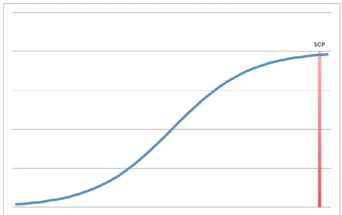
Figure 1. Chart representing the ideal case of test results. Issues are stagnating as SOP approaches meaning that the system is passing most tests and can proceed being tested
on trucks. ... 7
Figure 2. Image showing a Jira Issues’ different fields and values. ... 7
Figure 3. Jira chart displaying Created and Resolved Issues during a 30 day time period 8 Figure 4. Graphic created by Charles Minard representing the French invasion of Russia, which visualizes six different types of data by combining visualization techniques. ... 9
Figure 5. Example of Doumonts principles applied to recreate a chart to be more effective. Chart to the left is the original and the chart to the right is the recreated chart. ... 10
Figure 6. Flowchart of the StatTool system showing how its different systems are connected... 12
Figure 7. Chart created by Scania representing the integration test results of one ECU over several test periods ... 13
Figure 8. Recreated chart, created through use of InfoVis principles ... 14
Figure 9. Chart displaying found Issues for three components weighted against SOP date ... 15
Figure 10. An example of a decision that can be used to decide if it is optimal weather to play tennis outdoors. ... 16
Figure 11. Image representing 6 Jira Issues ... 16
Figure 12. Image of generalized Jira data. ... 17
Figure 13. Simplified version of decision tree that decides appropriate chart type. ... 18
Figure 14. Image displaying some components included in the ASP.Net framework. ... 19
Figure 15. Simplified UML diagram of the Chart, ChartArea, Series and Legend classes. 20 Figure 16. Flowchart displaying how the Data extraction system works. ... 22
Figure 17. Flowchart showing how the Data visualization system functions. ... 22
Figure 18. Flowchart showing how the automatic data visualization system modifies Charts. ... 24
Figure 19. Screenshot of a web browser running the StatTool website. The image is showing the first page presented to users of the StatTool website. ... 25
Figure 20. Image of the data extraction tool running on the StatTool website. ... 25
Figure 21. Image of the data visualization system running on the StatTool website. ... 26
Figure 22. Image of a chart preview created by an early version of the automatic data visualization system. ... 27
1 Introduction
Most organisations today produce large and varied amounts of data. These kinds of organisations rely on data analysis to streamline operations, improve production, make informed business decisions and more [1]. Data analysis is often performed by dedicated personnel called data analysts and the increasing demand for analysts can be seen as an indication of an increasing amount of organisations that have access to data that needs to be examined [2]. The ability to quickly perform data analysis with the aim of finding interesting patterns and making optimal decisions can benefit any organisation or individual that has access to quantitative data.
Data analysis is performed by applying a number of processes on a data set with the purpose of extracting knowledge from the data. The data analysis process is often finalized with data visualization. The purpose of data visualization is to model a set of data using images, charts and diagrams to help the viewer easily and intuitively examine the data. The intended use of the visualizations can range from confirming an idea to being pure exploratory. Exploratory Data Analysis (EDA) relies heavily on data visualization to help examine data where the objective is to gain new knowledge about it. With the growing number and variety of data that is available to analysts, the process of choosing appropriate visuals to use in exploratory data analysis that best represent the data and promote knowledge discovery has long been an issue [3].
This thesis has been performed in cooperation with Scania AB [4] at REST, the department responsible for performing integration tests of truck systems.
A data analysis tool, capable of automatic data extraction and processing, was developed. The software creates charts automatically by using Information Visualization (InfoVis) principles as basis.
The field of data visualization is big and the number of ways to visualize data is endless [5], thus the thesis has been limited to only focus on specific data sets and visualizations. All data has also been anonymized.
1.1 Thesis Motivation
An important step in the vehicle development process is the testing of Electrical Control Units (ECU) and systems. In Scania, systems are first tested individually during development. Systems that pass the first tests need to go through integration tests to ensure they work properly when interacting with all other systems in the vehicle. Integration tests are performed both manually and automatically, and the test results are gathered and evaluated to make a decision on how the system will continue through the development process.
The tests generate large datasets where test results are reported in Jira. By analyzing this data it is possible to examine how different systems are performing during tests and finally evaluate the outcome of the tests.
Since the data is large, it is analyzed through quantitative analysis. The final step of the quantitative analysis is to visualize the data. This is currently being performed manually which is both time consuming and makes the efficiency of the chart depend on how
proficient the creator is at using data visualization software when creating the charts and reports.
Automating this step will both save time and might also simplify the creation of efficient charts.
1.2 Problem Statement
The purpose of this project is to automate the data visualization process when analysing results from integration tests at Scania.
The goal is to identify how to best visualize test data, and develop software that uses InfoVis principles to automatically create effective data visualizations. The InfoVis principles will be applied by the software through the use of an Expert System built on Decision Trees (DTs).
The main question that the thesis will try to answer is:
Given test data with the aim of communicating system status, can decision trees be used to automatically create effective data visualizations?
The work done will contribute to the field of data visualization.
2 Integration Test
Integration tests are performed to evaluate how truck systems work together. The systems are tested individually during development, but these tests do not show how they function with other ones. This is the reason for the integration tests. The tests are performed at integration test labs. The labs are equipped with rigs, which contain all systems that are used in a truck. The systems that are tested are different hardware and software components, and the tests are performed either manually, automatically or a combination of both.
Manual tests are performed through use of test protocols. The test protocols outline actions that are to be performed, and expected outcomes. The tester documents the results during the test.
Automated tests are performed through use of test scripts written by test developers. The scripts first set the different systems to their initial. Afterwards, depending on the test, one or multiple actions are performed. Actions can consist of sending a signal or activating some system. All test results are finally automatically written to an Excel test protocol.
2.1 Integration Test Results
After the tests have been performed, the results are evaluated by test developers who create reports based on them. Jira Issues are created based on information in the reports and the information is later used to decide if the system may proceed to further testing in actual vehicles.
Figure 1. Chart representing the ideal case of test results. Issues are stagnating as SOP approaches meaning that the system is passing most tests and can proceed being tested on trucks.
There a number of test rounds performed before each Start of Production (SOP) date. It is expected that the number of issues found when beginning a new SOP will be low in the beginning, then slowly increase as testing proceeds, and finally decrease as SOP date approaches. This ideal scenario can be visually represented with an S-curve as seen in Figure 1.
3 Jira Data
Jira is a Project and Issue tracking system [6]. It is used by project groups to help manage changes made in projects. Jira users that are working on projects report the changes they’ve made by posting Issues [7]. Each Jira project contains a collection of Issues that are saved in a database, which can be accessed by users with the correct permissions.
Figure 2. Image showing a Jira Issues’ different fields and values.
An Issue is a representation of multiple data values. The data is represented using different fields such as “Type”, “Priority” and more. Figure 2 shows an example of some data an Issue can contain. The data is used to present information about a change or update that has been made in a project. The data can consist of text, hyperlinks, dates and images.
Jira Issues that represent integration test results need to contain data such as: date when the issue was discovered, cause, severity, affected components, and much more. Issues are then assigned to people responsible for fixing them. The Issues are then tracked and updated during development by each person responsible. When they have been fixed, the status needs be changed into “Resolved”, and the resolved date is saved in the Issue.
3.1 Jira Data Visualization
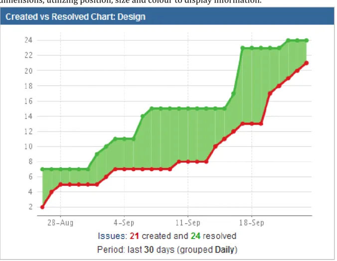
Charts visualizing Jira data usually consist of Line, Area and Column charts drawn in two dimensions, utilizing position, size and colour to display information.
Figure 3. Jira chart displaying Created and Resolved Issues during a 30 day time period
One example of a chart that may give some insight into how the integration tests are going is the “Created vs Resolved” chart shown in Figure 3. The chart displays the cumulated number of created Issues in one line, and the cumulated number of resolved Issues on another line. The chart makes it easy to compare if more Issues are being discovered in tests than are being fixed by developers. A scenario of when the chart would be helpful is when for example; the chart shows that the number of created Issues is growing at a much greater pace than the resolved. The analyst would then need to investigate how to solve this problem before SOP approaches.
Even though the chart may provide some usefulness, it is very prone to misrepresentation because of how limited it is at displaying the data. Simply displaying the number of created and resolved Issues does not tell us the size, urgency or impact of the Issues. This means that the creation of 100 insignificant Issues would give a greater reading on the chart than one very important and safety critical one.
Figure 4. Graphic created by Charles Minard representing the French invasion of Russia, which visualizes six different types of data by combining visualization techniques.
One way to address this is through the use of visualization techniques capable of visualizing data using several parameters, or by simply combining multiple visualization techniques. Information visualization specialists such as Tufte regard Figure 4 as one of the greatest statistical graphic drawn. The figure displays multiple types of data such as geographic position, temperature and size at different dates. It shows an example of how visualization techniques can be combined to create an effective graphic.
4 Background
To identify how to best visualize test data, State of the art practices in InfoVis have been examined. Since the goal of the project is to also develop a data analysis tool, that is capable of automatically generating data visualizations, what to consider when developing data analysis software has also been investigated.
4.1 InfoVis Principles
Information visualization is the process of making information easily understandable to humans through the use of graphics. The research and work that has been done in information visualization has been focused on finding ways to display information in an optimal way.
Edward Tufte writes in the book “The Visual Display of Quantitative Information” [8] about how graphics can be used to examine quantitative information. He does this by both presenting and discussing examples of graphics that are bad at conveying their message as well as graphics that are effective. Tufte states that graphics that are created by following certain principles will be more effective at displaying information. Tuftes principles include: maximizing data-ink ratio, removing chart junk, careful labeling of elements, and more.
Figure 5. Example of Doumonts principles applied to recreate a chart to be more effective. Chart to the left is the original and the chart to the right is the recreated chart.
Jean.Luc Doumont, similarly to Tufte proposes a set of rules that should be followed to optimize communication. These are presented in the book “Trees, Maps and Theorems: Effective Communication for Rational Minds” [9]. The book does not only focus on communication through the use of graphics but also on communication in scientific documents and presentations. Doumonts rules are equally applicable to all three ways of communication. The rules are: “Adapt to your audience”, “Maximize the signal-to-noise ratio” and “Use effective redundancy”. An example of Doumonts principles can be seen in Figure 5.
Information revealed in a study by Goldberg and Helfman [10], examines how information graphics are visually perceived by humans and compares different visuals ability to display information. The results from the study show that certain data visualization techniques are better at displaying specific data. Compared to the previous two works, by Tufte and Doumont, this paper gives few practical examples of when certain techniques should be used.
By developing an Expert system where the decisions made by the system is based on these principles and guidelines, it would be possible for it to produce graphics that effectively display the data to the viewer.
4.2 Automated Data Analysis
Many parts of data analysis can be automated by software [11]. This includes the data acquisition, data processing and application of statistical model methods.
A research paper by Jauw and Vassiliou [11], details the development of an automated data analysis tool that would help analyse product quality for a corporation. The developed system works by automating the data extraction, data processing and the data visualization processes. The automation of the data visualizations is accomplished by creating predefined visualization templates that are loaded with up-to-date information. Both Teoh et al. [12] and Gupta et al. [13] describe two independent systems that use this method of performing automated data visualization. A common factor between the works is that major effort of development has been spent on developing the different chart templates.
This method of using predefined visualization templates was found to be a common way to automate data visualization. The templates are created beforehand and are loaded with data that fits to them. The downside with this method is that one template is only compatible with type of data.
The overall benefits of automatically generated visualizations found through the papers [11], [12], [13] and [14] are that it:
Decreases the amount of time spent on the data visualization process.
Decreases overall time spent on data analysis.
Provides analysts with visuals that can be used to reveal unexpected patterns and information.
Makes it possible for analysts to focus on the examination of data by removing the necessity for the analyst to come up with ways to visually represent it.
Besides research projects dealing with automated data visualization, there also exist a multitude of data analysis tools that are capable of doing advanced data visualization. One of the industry leaders in data analysis software is SAS with their SAS/STAT software [15], which was developed in the 70s and has been updated during the years to keep up with the demands of today’s analysts. The latest update for the software includes the Auto charts system [16], which is SAS/STATs first attempt at automated data visualization. According to the SAS/STAT user guide [17] the Auto-charts system works by selecting the type of chart to display depending on the type of data that is provided in different containers. Although development of SAS/STAT began as a research project, it is today a commercial product and thus details about how it works on a technical level is not available to the public.
Another data analysis software that provides a type of automated data visualization is Tableau [18]. The Tableau software chooses one of four chart types in a similar way to SAS/STAT’s Auto charts [19]. Both of these tools rely on the user to know how best to visualize the data and thus do not contain any advanced automatic visualization functionality.
The work done in this thesis will try to expand on the functionality that is offered in tools similar to the ones described.
In the paper by Heer and Shneiderman [20], where the goal is to aid in the development of data analysis tools, several of the data analysis tools that exist today, and how they enable analysts to visualize data, are examined, and guidelines that should be followed when developing interactive data visualization tools are presented. The guidelines stated in the paper can be used by developers of data analysis tools when making decisions about the interactive parts of the tools.
Adrienko et al. [14] describes the IRIS system, which is a software tool that is capable of automatically creating visual representations of spatial data. The system automatically generates data visualizations while also putting a big emphasis on the analyst’s ability to interact with them. The visualizations are regenerated after each interaction. Actions the users of the system can perform include for example transforming and scaling of the visual components. This was found to increase the analyst’s ability to analyse the data. These two papers, [20] and [14], contain useful information that will be taken into consideration when developing the data analysis tool.
5 Method
The work done in this thesis has consisted of investigating how to visualize test data effectively through use of InfoVis principles. A chart used to track integration test results was recreated using the principles, and its effectiveness to visualize the data was judged through user tests. A data analysis tool was then developed capable of extracting data from Jira, and automatically creating charts with the help of an expert system. The expert system consists of decision trees, where the decisions made are influenced by InfoVis principles and guidelines.
Figure 6. Flowchart of the StatTool system showing how its different systems are connected.
The tool and expert system were developed in a way that made them easily extendable. The connection of the different parts of the tool can be seen in Figure 6. The software was developed using the C# programming language, HTML and controls included in the ASP.Net Framework. The ASP.Net framework was used to create the GUI and charts to visualize data. This made the tool interactive.
The data visualization library used for the tool was the Chart class library included in ASP.Net.
6 Evaluation of InfoVis Principles
To evaluate the benefit of using Tufte and Doumonts InfoVis principles when creating charts, demonstrations to three different audiences and four user tests were performed.
The evaluation was done by recreating an existing chart that represents Issues found in integration tests of an anonymous ECU. The users would compare the original chart (the base case) with the recreated chart to find if the recreated chart is effective at displaying the data set.
As well as recreating a chart and evaluating its effectiveness, a new chart was also created to display how beneficial data visualizations can be when analysing test data. Test results for three components was visualized and shown to users. This was then compared to analysing the data directly in Jira.
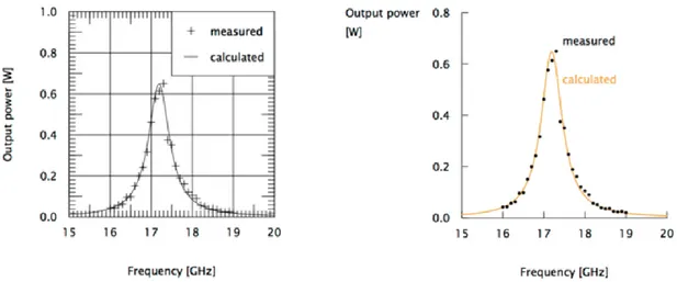
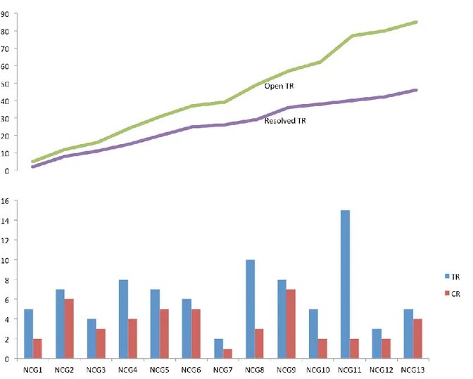
Figure 7. Chart created by Scania representing the integration test results of one ECU over several test periods
The base case, displayed in Figure 7, is a chart created by Scania, which uses a data set extracted from Jira to represent the integration test results of an anonymous ECU. The x-axis represents test periods, each test period being three weeks long. The chart displays discovered Trouble Reports (TR) versus Change Requests (CR), and the open versus resolved TRs.
Figure 8. Recreated chart, created through use of InfoVis principles
Figure 8 shows the chart created by applying the InfoVis principles on the same data set as the base case.
The user tests and demonstrations were evaluated using a qualitative analysis rather than a quantitative one. This is because of the small number of testers and the limited time available in the thesis.
The testers were asked to answer questions regarding the efficiency of the visualizations as well as give general comments and feedback. The total number of unique test users was nine and the questions were:
“Did one chart display more information than the other? If yes, which one, and in what way? ”
“Is one chart easier to read/analyse than the other? If yes, which one, and in what way?”
The feedback received during the tests show that all nine users felt that the recreated chart revealed equal amounts of information about the data set as the manually created one. Four users found the recreated chart to be easier to read, stating that the reason for this being:
“Chart was simple and clean, making it easier to read”.
“Separate charts made it easier to compare the data that was related”.
“It was possible to quickly identify and compare the data”.
One user found the base case to be easier to read saying “A lot of information is
contained in a single compact chart so I can compare all data with each other and I don’t have to move my eyes as far to see all the data.” while four users felt that neither was easier nor more difficult to analyse.
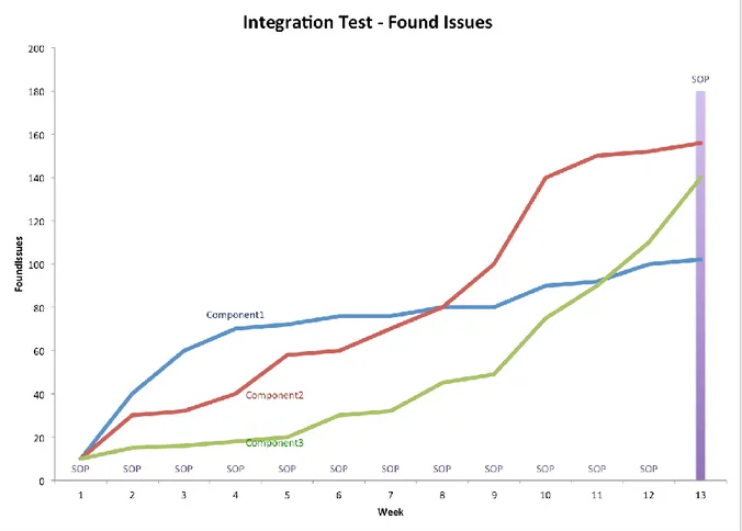
Figure 9. Chart displaying found Issues for three components weighted against SOP date
Figure 9 shows a chart representing Issues found during testing of three anonymous components. The SOP date is also displayed in the chart.
The chart clearly shows that Issues found stagnate as SOP approaches for two of the components, while many Issues are still being reported for the third component. The chart was shown to five test developers who all came to the same conclusion about the components. Components 1 and 2 were generally considered to be able to proceed to tests in truck. Component 3 on the other hand still required extensive fixes.
To analyze this data without visualizing it would require going through the Jira database and read tables of data. Each row in the database represents an Issue, and the columns contain all their fields and values. An effort was made to try and gather any insight using this method, but it was too time consuming and in the end, considered unfeasible when analyzing large numbers of Issues.
7 Expert System Design
Expert systems are used in many fields as a way to automate procedures. In medicine they are, for example, used to diagnose patients. The system is set up using the
decision trees are based on expert knowledge, information about the data is entered, and a visualization of the data is produced and received by the analyst.
The expert system developed in this project serves the purpose of creating a chart that displays Jira data in an effective way. This is done by using decision trees, and utilizing certain information visualization principles when designing the trees.
A decision tree is a data structure, consisting of nodes, that represents an algorithm [21]. The nodes in a decision tree can either be branches or leaves and they are navigated based on a set of conditions. Reaching a leaf node results in an action being performed or a decision being made. Branches represent conditions and leaves represent actions that will be executed or decisions that will be made when they are navigated to.
Figure 10. An example of a decision that can be used to decide if it is optimal weather to play tennis outdoors.
Decision trees work in a recursive manner, as shown in Figure 10. A tree node can have a number of tree nodes connected to it, called children. The traversal of the tree is then performed by starting out with one tree node, called the root node, and depending on the condition of the node, it chooses a child node to visit next. The child node then follows the same procedure until a node that does not have any child nodes is visited. When such a node is visited the traversal is over and a decision is made. The nodes containing child nodes are called branches while the nodes that do not have any children are called leaves.
ID Type Priority FixVersion Created Resolved
1 Trouble Report High NCG1 20/04/15 05/05/15 2 Change Request High NCG1 25/04/15 10/05/15 3 Change Request Low NCG2 02/05/15 10/05/15 4 Analysis Medium NCG3 02/05/15 20/05/15 5 Trouble Report Low NCG4 05/05/15 20/05/15 6 Trouble Report Medium NCG2 10/05/15 25/05/15
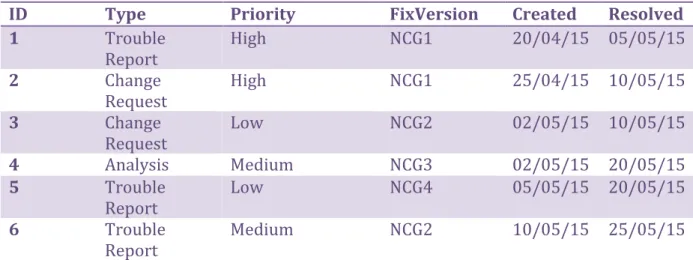
The data set in Figure 11 displays a small Jira data set. The data contains items, which in turn contain different fields with values. The items contain qualitative, as well as quantitative variables. Some field and value pairs in the items represent qualitative data while some represent quantitative data. By knowing the type of variables represented by fields in an item, it is possible to design the decision trees using general data descriptions. Generalizing and further dividing the data into categories makes it possible to design the decision trees using general descriptions rather than identifiers specific to Jira.
ID Type Priority FixVersion Created Resolved
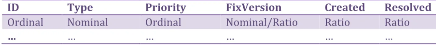
Ordinal Nominal Ordinal Nominal/Ratio Ratio Ratio
… … … … … …
Figure 12. Image of generalized Jira data.
The field and value pairs of an item in the data set in Figure 11 can for example be interpreted as shown in Figure 12, using statistics categories such as: ordinal, nominal, ratio and interval.
Due to lack of time, the expert system developed in this project does not implement all InfoVis principles examined in the SOTA, and the number of possible data visualization techniques the system can choose from has been limited to line and column charts. Focus has therefore been on implementing a way for the system to decide:
When to use the Line or Column visualization technique.
When and how to divide a chart into separate elements.
How to reduce Data-Ink.
The column charts are used when displaying and comparing categorical data while the line charts are used to visualize trends and evolutions [9], [10]. By examining the descriptions and categories of the data, the decision tree is able to make a decision of what visualization techniques to use.
To be able to decide the layout of the charts, the system uses not only the category of the data, but also the values that the different fields contain. This makes it possible to detect datasets that are comparable and group them together while separating sets that are not relevant to, or which might misrepresent, each other.
To make the charts easier and intuitive to read, the system also decides over the labeling of elements in a chart and tries to reduce data ink when possible while still showing the data.
Figure 13. Simplified version of decision tree that decides appropriate chart type.
The decision tree structure was chosen to be used for the expert system since it makes it possible to endlessly extend and adjust the algorithm represented by the trees without affecting other parts of the system. The algorithm is simply extended by creating and adding new nodes to the trees.
A visual representation of an example of the decision tree is displayed in Figure 13.
8 Data Visualization Tool
Development of the data analysis tool named StatTool was divided into four steps. The steps were structured and executed in the following order:
1 Design and implement the general StatTool system.
2 Design and implement an automatic data extraction and processing system. 3 Design and implement a basic data visualization system.
4 Design and implement an automatic data visualization system.
The different systems were designed and implemented using an object oriented approach, which increases the ability to easily extend them with additional features [22].
8.1 Tools and Techniques
Certain tools and techniques that were used when developing the data visualization tool are described in the following section.
8.1.1 ASP.Net
ASP.Net is a framework developed by Microsoft [23] that enables developers to write dynamic web sites.
Figure 14. Image displaying some components included in the ASP.Net framework.
The framework includes many of the components included in the .Net SDK, as shown in Figure 14. Developers can create ASP.Net websites using programming languages such as C#, Visual Basic, HTML and others.
C# is a programming language developed by Microsoft [24]. Different structures can be created in C# including structs, classes and interfaces. The language also offers inheritance between classes and interfaces. Classes can only inherit implementation from one class but are able to implement more than one interface [25].
ASP.Net Controls [26] are included in the ASP.Net framework. Example of controls are textboxes, buttons and data tables. Controls are event driven and implement different events depending on the functionality they offer. A button for example fires events when it is clicked while a textbox fires events when the text is changed. ASP.Net also includes a control called the User Control [27], which makes it possible for developers to create customized controls.
8.1.2 Chart Class
The Chart class [28] is a control that is included in the ASP.Net framework. It is capable of displaying different kinds of visualizations and it also offers advanced ways of manipulating different properties of the displayed visual.
Figure 15. Simplified UML diagram of the Chart, ChartArea, Series and Legend classes.
The Chart class requires a number of components to visualize the data, which is shown in Figure 15. It needs ChartAreas [29], Series [30] with data bound to them and Legends [31] that display information about the Series and ChartAreas.
A ChartArea represents an area on the chart. It contains properties that can be used to adjust different properties of the image it displays and needs to be bound to a Chart for it to be able to display its content.
A Series Class represents a container for data points and attributes of the data points. Attributes it contains are for example type of the data points’ x-value, maximum y-values in the data points collection and much more. Series need to be bound to a ChartArea in order to display their data points and bound to a Legend to display their name, colour and type. The values of the Series’ attributes affect how the series is displayed in the ChartArea. A Legend represents a legend that contains information about the Series contained in a ChartArea. The Legend is bound to a Chart and displays information about all the series in the Chart that are bound to the Legend. Information it displays is Series name, colour and type.
8.2 Software Design and Implementation
The data analysis tool StatTool was, in the beginning, designed to be a native .Net application. This decision was made because the .Net framework contains controls that make it possible for developers to quickly develop interactive GUIs and also because the .Net framework contains the Chart control which was deemed to be a competent data visualization control. The design of the native application focused on separating the GUI from the core program logic and relying mostly on composition over inheritance [32]. This would make it so that the system logic would not depend on a specific GUI and that components would work independently of each other which further decreases coupling and increases modularity.
Different employees at Scania, who will use the system, were interviewed during development of StatTool. A number of interviewees expressed a desire for the program to be accessible from any device connected to Scanias local network. After additional interviews, the decision was made to distribute the application using a website running on a server connected to the local network. It was therefore also decided that StatTool would run on a website instead of being a native application. ASP.Net was chosen as the framework to use when creating the website since it contained many of the controls provided by .Net. The use of ASP.Net also made it possible to reuse much of the previous design.
The biggest change that the switch from native to web application brought was the way events were handled. Events fired by any control in the web application will create a HTTP Post [33], which basically reloads the entire page with updated information. This made it so that controls needed to be reinitialized and reloaded each time any control fired an event. The decision of separating GUI from core logic did, because of this, create unnecessarily complex relationships between the two, resulting in difficult to understand system structures. This led to the decision of making the GUI and logic more interconnected by using User Controls and C# Interfaces.
The main component of StatTool would consist of four separate parts, the StatTool system, the data extraction system, the data visualization system and the automatic data visualization system. The reason for this was to promote modularity and extensibility of the different parts. Extending or changing one part would thus not affect any of the other parts.
8.2.1 StatTool System
The StatTool system was designed to handle user accounts, saving and loading data sets locally and handle switches between the data extraction and data visualization systems. Users need to log in with a user name and password that gives them access to the Jira database. The different systems are enabled if a connection is established with the database.
8.2.2 Data Extraction
The purpose of the data extraction system was to make it possible for users to extract and save data sets that exist in a Jira database. The system is used by selecting one or multiple data sets to extract. Data points are then created using the data extracted from the database. It was decided to construct the data points using collections of field and value pairs. An example of a field and value pair can be the field “Created” paired with the value of the date “2015-01-01”. This makes it trivial to save the data points using the CSV file format [34] where each field is comma separated by its value. Saving data points in the CSV format also enables user to use the data sets with other data analysis tools since CSV is a common format used by many data processing programs such as Excel [35]. The created CSV files are saved on a physical hard drive that is connected to Scanias local network and can be accessed by users without the use of StatTool. This makes it possible for user to reuse data sets without having to extract and process them each time.
Figure 16. Flowchart displaying how the Data extraction system works.
The processes performed by the system are shown in Figure 16. The time it takes to download the data from Jira depends on the amount of data the user wants to extract.
8.2.3 Data Visualization
The development of the data visualization system was one of the main focuses of this thesis and more work was therefore put into its software design.
Figure 17. Flowchart showing how the Data visualization system functions.
A flowchart of the data visualization system can be seen in Figure 17. The system begins with presenting users with controls that can be used to select data sets that have been downloaded and saved to the physical hard drive. By selecting a data set, users are then able to select the type of chart that will be used to visualize the data. A number of other controls are also available to give users the ability to transform the data and how it will be visualized. The system was designed to be used with the Chart control and the GUI is therefore laid out to represent a Chart, its Series and y and x-values. Each Series panel contains a data selection control, a number of Y panels and an X panel. These panels in turn contain controls that are used to construct Series objects.
The Y panel contains all filters that can be applied to the data points in the selected data set. These are used to narrow down the data points that are visualized. The Y panel is basically a collection of objects that implement a specific interface that defines a filter. This makes it possible to create new filters and add them to the Y panel by simply implementing the filter interface. Each Series panel can include multiple Y panels since, during interviews and demonstrations, this was found to be a desired functionality. This was due to the fact that using single Y panels meant users were required to create completely separate series if they wanted to plot different filtered data.
The X panel contains different controls that affect how the data is visualized but rather than filtering the data points, they instead have the purpose of letting users configure different properties of a Series. The controls in the X panel represent options that can be
made to a Series and they implement the interface that defines an option. The options in the X Panel are used to select a field, a date interval, the way data points should be counted and a date range.
The field selected by the user in the X panel will be used to set the values for the x-axis in the Series. The y value for each x-value is then calculated by iterating through all data points and counting the number of data points where the field contains the specific x-value. This is done for each unique x-value in the data set.
The date interval option is used to specify how to group x-values if they consist of dates. Available values that the date interval can consist of are: daily, monthly and yearly. By selecting an interval, the y-value for each x-value in the specified interval is added together. This gives users the ability to represent multiple data points with one point on the Chart. This can help users remove some of the clutter that can be caused when too many different points are drawn on a Chart but it might also produce Charts that lack detailed resolutions or patterns. By choosing too big date intervals the visualization may not represent the data correctly which can lead to misinterpretations.
The data points can be counted in two ways, either individually per point or cumulatively where the y-value of each point will be added with the y-value for the previous point. The different counting methods can display data in different ways, which makes it an important feature for users that want to examine data from different angles. The date range option is used to filter out points where the x-value is not included in the specified range. This gives users the ability to zoom in and out on a chart using specific date ranges. This feature can be used to get an overview over the complete data, detect visible points of interest and then zoom in and examine them more closely.
Users create the visualization by clicking a button on the page. The program then processes the data with respect to the user-selected options and when done, draws a Chart that visualizes the data. Due to time constraints, the current number of available types of charts, filters and options are limited.
8.2.4 Automatic Data Visualization
The automatic data visualization system was built as an extension to the developed data visualization system. It was constructed using fairly simple building blocks which, when put together are able to create visibly advanced data visualizations.
Figure 18. Flowchart showing how the automatic data visualization system modifies Charts.
The flowchart in Figure 18 displays how the system works. Users need to explicitly enable the system by using an option that is displayed in the data visualization GUI. This makes it so that the data visualization system builds the Chart as usual but sends it to the automatic data visualization system before it is draw on the page. The system consists of an Expert system, and is executed by passing it a Chart object. The expert system consists of a collection of decision trees. The decision trees are made up of a simple structure of tree nodes connected to each other. Tree nodes can be either branches or leaves. Branches contain a function that represents a condition and a list of references to its children. The condition function is executed on the Chart to decide which child node to visit. Leaves do not have any children or conditions. Leaves only consist of a function that represents an action. The action is applied to the Chart to modify it.
The trees in the collection are traversed in order. Each decision tree modifies the Chart before sending it to the next tree in the collection. This process is repeated until all decision trees have completed their traversal. The system then returns the final modified Chart.
9 Results
The result of this thesis is the StatTool system, which is an interactive software prototype consisting of a modular and extensible data visualization tool that can be used to extract and visualize data. StatTool is also capable of automatically generating data visualizations using information about the data. StatTool is an application contained in a website and can be run using ASP.Net compatible web browsers.
Figure 19. Screenshot of a web browser running the StatTool website. The image is showing the first page presented to users of the StatTool website.
When the website is first visited it presents the user with two fields where he can enter account name and password, displayed in Figure 19.
By entering correct account name and password, the user is able to interact with the buttons on the page to open the data extraction tool (“Download Data” button) or the data visualization tool (“Analyze Data” button).
Figure 20. Image of the data extraction tool running on the StatTool website.
If the user opens the data extraction tool, the page loads the system and presents its controls to the user, shown in Figure 20. The controls can be used to select the data to download from the Jira database and save it locally in the CSV file format. When the extraction is complete, the system displays the number of Issues downloaded to the user. The user is also able to see the actual query that is being constructed from the selections that are being made on the controls.
Figure 21. Image of the data visualization system running on the StatTool website.
By opening the visualization tool, the user is presented with controls that can be used to visualize the downloaded data sets, displayed in Figure 21. The Series has two options that can be changed by the user. One is used to choose the data set to visualize and the other is used to specify the type of chart to draw. The Y panel contains of a number of filters that can be used to select the data that should be drawn on the chart. The X panel contains four options. The options can be used to select what data will be used in the x-axis, the resolution of the time intervals and how the y-values are counted. The date range option is used to specify a range of time where any Issues created outside the range is ignored. The range includes all Issues if the ranges’ from and to values are less than one day apart.
Figure 22. Image of a chart preview created by an early version of the automatic data visualization system.
Marking a checkbox located on the top of the data visualization system (see Figure 21) page enables the automatic data visualization system. The automatic data visualization system selects the most appropriate chart type for the data and structures the charts to effectively display the data. A chart that has been created automatically by an early version of the system can be seen in Figure 22. The automatically generated charts use bar and line charts to visualize different kinds of data. After deciding the chart type and the layout of the charts, it then adjusts different chart elements such as the gridlines and the labels of elements and axes with the purpose of reducing some data ink and making the chart easy to read.
10 Discussion and Conclusions
Development of the StatTool system has shown an example of automating the visualization process. By providing an example of how automated data visualizations can be generated by an expert system built with decision trees, to communicate integration test results, this project has contributed to the main question stated by the thesis. By having used InfoVis principles as basis when developing the decision trees, the generated charts have also been found to be effective at displaying the data. This has resulted in a program that is able to create charts that effectively displays test result data.
The evaluation of the chart created, by using the InfoVis principles, has shown that it is more effective at displaying the data compared to the base case. Having visualized test results for three components, we have also shown that the charts make it much easier to
Due to lack of time, all InfoVis principles proposed have not been implemented in the expert system. The developed system is able to decide what data visualization to use, how to arrange the different data series and remove some non-important data-ink. The current functionality of the expert system is also fairly limited. For example: only two data visualization techniques can be used by the system, not all useless data-ink is removed, and labelling is not optimal in all cases.
By implementing other data visualization techniques it would be possible to display data with more than two parameters. One such technique is the bubble chart, which can display data using XY position as well as size. Charts using more dimensions are also able to display data using more parameters. A three-dimensional bubble chart can for example display data using four parameters: X, Y and Z position as well as size.
The ultimate goal would be to have the system create charts similar in nature to Figure 4, where the data and different chart components are perfectly combined, thus resulting in highly intuitive charts.
Having developed the software and decision trees to be easily extendable makes it possible to add visualization techniques and rules to the system, although this will require research in different visualization techniques and InfoVis in general.
During development of the tool it was discovered that the tool could be used to visualize any data that exists in Jira, be it test data or other. Problems found with this were that the system would sometimes use the wrong visualization technique, or would group data that was not related. This could be fixed by investigating the data and extending the expert system accordingly.
StatTool can currently be used by Scania employees to create charts of integration test results. By extending the tool, making it easier to use and better at creating efficient charts, it may be able to completely replace the manual creation of charts. This would both save time and also ensure that the charts that are used in Scania, concerning integration tests, are reliable and easy to analyse.
10.1 Future Work
Future work would include extending the expert system so that the charts generated can be more effective. It would also benefit other departments if the system was extended to be able to handle other kinds of data, although this would require investigating how to visualize the data, and how to adapt the system to account for the findings.
Furthermore, the data analysis tool could be improved by researching into, and implementing a more interactive and intuitive graphical user interface.
References
[1] S. Kandel, A. Paepcke, J. M. Hellestein & J. Heer, “Enterprise Data Analysis and Visualization: An Interview Study”, IEEE Transactions On Visualization and Computer Graphics, vol. 18, issue 12, p. 2917-2926, December 2012.
[2] e-skills UK, Big Data Analytics, An assessment of demand for labour and skills, 2012-2017, p. 11-12, January 2013
[3] X. Liu, “Intelligent data analysis: issues and challenges”, The Knowledge Engineering Review, vol. 11, issue 4, p. 365-371, 1996.
[4] Scania, [Online] Available: http://www.scania.se/. [Retrieved: 26th May, 2015].
[5] D. A. Keim, “Information Visualization and Visual Data Mining”, IEEE Transactions On Visualization and Computer Graphics, vol. 7, issue 1, p. 1-8, January 2002.
[6] Atlassian Jira, [Online] Available: https://www.atlassian.com/software/jira. [Retrieved: 26th May, 2015].
[7] Atlassian Jira What is an Issue, [Online] Available:
https://confluence.atlassian.com/display/JIRA/What+is+an+Issue. [Retrieved: 26th May, 2015].
[8] E. R. Tufte,“The Visual Display of Quantitative Information”, 2nd edition, Cheshire: Graphics Pr, 2001.
[9] J. Dumont,“Trees, Maps, and Theorems: Effective Communication for Rational Minds”, 1st edition, Principiae, 2009.
[10] J. H. Goldberg, J. I. Helfman, “Comparing Information Graphics: A Critical Look at Eye Tracking”, Proceedings of the 3rd BELIV'10 Workshop: Beyond time and errors: novel evaluation methods for Information Visualization, p. 71-78, 2010.
[11] J. Jauw, P. Vassiliou, “Field Data is Reliability Information: Implementing an Automated Data Acquisition and Analysis System”, Reliability and Maintainability Symposium, 2000 Proceedings. Annual, p 86-93, 2000.
[12] S. Teoh, K. Zhang, S. Tseng, K. Ma & S. Wu, “Combining Visual and Automated Data Mining for Near-Real-Time Anomaly Detection and Analysis in BGP”, Proceedings of the 2004 ACM workshop on Visualization and data mining for computer security, p. 35-44, 2004.
[13] G. Gupta, A. Liu & J. Ghosh, “Automated Hierarchical Density Shaving: A Robust Automated Clustering and Visualization Framework for Large Biological Data Sets”, IEEE/ACM Transactions on Computational Biology and Bioinformatics, vol. 7, issue 2, p. 223-237, April 2010.
[14] G. Adrienko, N. Adrienko, “Intelligent Visualization and Dynamic Manipulation: Two Complementary Instruments to Support Data Exploration with GIS”, AVI’ Proceedings of the working conference on Advanced visual interfaces, p. 66-75, May 1998.
[15] SAS, [Online] Available: http://www.sas.com/en_us/software/analytics/stat.html. [Retrieved: 26th May, 2015].
[16] SAS Data Visualization made easy, [Online] Available:
http://www.sas.com/resources/asset/106262_0313.pdf. [Retrieved: 26th May, 2015].
[17] SAS Institute Inc., “SAS Visual Analytics 5.2: Users Guide”, North Carolina: SAS Institute Inc., 2012.
[18] Tableau, [Online] Available: http://www.tableau.com/. [Retrieved: 26th May, 2015].
[19] Tableau Automatic Mark, [Online]
Available:
http://onlinehelp.tableau.com/current/pro/online/mac/en-us/viewparts_marks_marktypes_automatic.html. [Retrieved: 26th May, 2015].
[20] J. Heer, B. Shneiderman, “Interactive Dynamics for Visual Analysis”, ACM Queue-Microprocessors, vol. 10, issue 2, February 2012.
[21] S. J. Russell, P. Norvig, “Artificial Intelligence: A Modern Approach”, 3rd edition,
Harlow: Pearson Education, p. 697-703, 2014.
[22] J. Micallef, “Encapsulation, Reusability and Extensibility in Object-Oriented
Programming Languages”, Journal of Object-Oriented Programming, vol. 1, issue 1, p. 12-36, April 1988.
[23] MSDN ASP.NET Overview, [Online] Available: https://msdn.microsoft.com/en-us/library/4w3ex9c2%28v=vs.140%29.aspx. [Retrieved: 26th May, 2015].
[24] MSDN C# Programming Language, [Online] Available:
https://msdn.microsoft.com/en-us/library/z1zx9t92.aspx. [Retrieved: 26th May, 2015].
[25] MSDN C# class, [Online] Available: https://msdn.microsoft.com/en-us/library/0b0thckt.aspx. [Retrieved: 26th May, 2015].
[26] MSDN ASP.NET Controls, [Online] Available: https://msdn.microsoft.com/en-us/library/bb386451%28v=vs.140%29.aspx. [Retrieved: 26th May, 2015].
[27] MSDN ASP.NET User Controls, [Online] Available: https://msdn.microsoft.com/en-us/library/y6wb1a0e(v=vs.140).aspx. [Retrieved: 26th May, 2015].
[28] MSDN Chart Class, [Online] Available:
https://msdn.microsoft.com/en-us/library/system.web.ui.datavisualization.charting.chart%28v=vs.110%29.aspx. [Retrieved: 26th May, 2015].
[29] MSDN Chart Areas, [Online] Available: https://msdn.microsoft.com/en-us/library/dd456621%28v=vs.140%29.aspx. [Retrieved: 26th May, 2015].
[30] MSDN Series Class, [Online] Available:
https://msdn.microsoft.com/en-us/library/system.web.ui.datavisualization.charting.series%28v=vs.110%29.aspx. [Retrieved: 26th May, 2015].
[31] MSDN Legend Class, [Online] Available:
https://msdn.microsoft.com/en-us/library/system.web.ui.datavisualization.charting.legend(v=vs.110).aspx. [Retrieved: 26th May, 2015].
[32] O. Alam, J. Kienzle, “Designing with inheritance and composition”, VariComp '12 Proceedings of the 3rd international workshop on Variability & Composition, p. 19-24, 2012.
[33] HTTP POST, [Online] Available:
http://www.w3schools.com/tags/ref_httpmethods.asp. [Retrieved: 26th May, 2015].
[34] Edoceo Comma Separated Values, [Online] Available:
http://edoceo.com/utilitas/csv-file-format. [Retrieved: 26th May, 2015].
[35] Microsoft Excel, [Online] Available: https://products.office.com/en-us/excel. [Retrieved: 26th May, 2015].