Product registration in e-commerce for small and
medium companies (SMEs) : Usability aspects
Abdulbari Abdlbari
Subject: Human-Computer Interaction
Corresponds to: 30 hp
Presented: VT 2015
Supervisor: Else Nygren
Examiner: Annika Waern
Sammanfattning
Människor kan i dessa dagar köpa nästan vad som helt på nätet. E-handeln ökar stadigt och för att kunna konkurrera, känner sig små och medelstora företag som tillfället inte använder sig av e-handel pressade att börja med det. Speciellt för små-företag utan tidigare erfarenhet inom e-handel kan det kännas överväldigande att komma igång med en egen webbutik. Ett viktigt steg i processen är att registrera information om produkterna i systemet. Därför har jag studerat "Hur kan användar-centrerad design principer förbättra produktregistrering särskilt i små och medelstora företag?". Ett system som upprätthåller över 100 aktiva webbutiker användes som studie-objekt. En intervjustudie genomfördes för att få kännedom om kontexten och generella användbarhetsproblem. Därefter genomfördes ett första användartest för att få specifik kunskap om användbarhet och effektivitet. Utifrån denna kunskap föreslogs design-förändringar som sedan implementerades. En andra iteration av an-vändartesterna visade betydligt högre effektivitet och lägre antal fel. De viktigaste nya design elementen gällde navigering, arbetsflöde och anpassning av inmatnings-fält till datakällor. Sammantaget visar dessa undersökningar att det är möjligt att sänka tröskeln för SME butiker att gå online genom att systematiskt arbeta med användarcentrerad design av användargränssnittet.
Abstract
People these days are able to buy almost anything online. With a continuously increased E-commerce, small and medium sized companies (SMEs) feel obligated to enter the competitive E-commerce market. Moreover, small companies with little or no experience in e-commerce could become overwhelming to get a web-shop up and running. One important tasks to managing a web-shop is to register products into the system. This must be easy and efficient. Therefore, the focus of this thesis is to answer the question "How can user-centered design principles improve product registration, particularly in the SME context?". At the start of this study, surveys and interviews were conducted, which showed that product registration is very time consuming at the moment. User tests were conducted to measure the efficiency and the general usability of a system maintaining over 100 active web-shops. Based on the results of the first iteration of the user test conducted, design changes was proposed and implemented. A second iteration of the user test showed improved efficiency and substantial less occurrence of errors. The most important new design elements were related to navigation, workflow and adjustment of input fields to the data sources. Thus it has been shown that the threshold for SME web-shops to go online can be lowered by a systematic application of user-centered design of the user interface.
Index
Sammanfattning . . . 1 Abstract . . . 1 Index . . . 2 1 Introduction 4 1.1 Background . . . 4 1.1.1 E-commerce . . . 4 1.1.2 Data Entry . . . 51.1.3 Data entry in e-commerce . . . 6
1.2 Related work . . . 7
1.3 Aim . . . 8
2 Method 9 2.1 Methodological considerations . . . 9
2.2 Choice of method . . . 9
2.3 Application of the Method . . . 11
2.3.1 PACT-framework . . . 11
2.4 User testing . . . 12
2.4.1 The system being tested . . . 13
2.4.2 The test plan . . . 14
2.5 Redesign . . . 18
3 Results 20 3.1 PACT . . . 20
3.1.1 Interviews . . . 20
3.1.2 Survey response . . . 21
3.1.3 Agreements and disagreements . . . 22
3.1.4 PACT . . . 22
3.2 Result of the first user test and design proposals . . . 23
3.2.1 Quantitative results . . . 23
3.2.2 Qualitative results and Design proposals . . . 25
3.3 User testing after . . . 34
3.4 Comparison . . . 36
4 Discussion 39 4.1 Limitation of the study . . . 39
4.3 How the design did or did not solve the problems . . . 40
5 Conclusion 45
5.1 Further research . . . 47
APPENDICES 51
A Web form design guidelines 51
B Interview questions 52
C Web survey 53
1
Introduction
For decades, consumers have had to go to brick and mortar store to buy what they need. However, the last decade the Internet has changed the way consumers purchase their products and how one interacts with companies. There are several channels available for the consumer, where they can research the products before they choose to purchase anything. This has allowed the consumers to use simple price com-parison websites to find the best deals that also offer fast shipping. As a result, consumers who choose to purchase their products online are increasing. Further-more, e-commerce is expected to increase worldwide at least until 2018 [1] hence, the pressure on smaller and medium companies (SMEs) who currently does not use e-commerce. On behalf of the companies? request, which maintains a content man-agement system (CMS), where companies can create and manage their own online stores to make the product registration process more efficient, this study was con-ducted. It is a crucial step when a brick and mortar store transitions to an online store, therefore it essential for the user to have an intuitive and efficient system. In small companies, it is common that the owner (sometimes with low computer expe-rience) manages product registration. However, currently the product registration is time consuming, which makes it less appealing for the small and medium businesses.
1.1
Background
In this section, e-commerce and data entry is brought up followed by a description of the importance of data entry in e-commerce.
1.1.1 E-commerce
E-commerce is short for Electronic Commerce is defined as an online transaction for the purpose of buying and selling of products or services. It does not matter
if the customer buys a digital product such as an e-book or a physical item online that have to be delivered, all transactions involving money transfers online count as e-commerce. Most big retail stores if not all of them offer their customers an online store in order to stay competitive. The traditional processes of buying and selling require physical interaction between sellers and buyers. Thus, buyers have to physically go to the store in order to buy the product or the service. E-commerce improves the flexibility and efficiency for both retailers and consumers. Consumers online can easily search through a database among thousands of products or services. In fact, comparing prices is easily done with a click of the computer mouse. They also have the option to add products to their cart and decide later whether to buy or not. Also, retailers with e-commerce can be found more easily through search engines such as Google, which is less expensive than mass advertising. [2]
1.1.2 Data Entry
Data entry refers to transcribing information into another medium, which is done usually by entering information into a computer where one uses a keyboard for that matter. Data can be entered in many different ways. Pointing and clicking by using a computer mouse is one of the simplest kinds of data entry. Data input might be used to fill in forms, writing emails, or drawing a picture. The data entry process is taken care of by the computer by guiding the users if help is needed, detecting errors by checking data entries and other kind of aid. Both the computer processing logic and the data input is to be concerned when designing user interfaces. It is usually what determines how usable an interface is. In clerical jobs, data entry is highly emphasized, other jobs does also involve data entry at some point. Data entry is so common these days that the inefficiencies caused by badly designed data entry transactions are apparent but not concerned in all interfaces. Thus many have published recommendations for how a good user interface should look like but the major need is improving the logic of data entry. In other words, we know how to
visually design interfaces but need to improve the logic of how data is processed by the computer. [3]
1.1.3 Data entry in e-commerce
Data entry for e-commerce is as important as the other digital industries. If the information entered is incorrect, companies will be forced find and fix the errors, which cost will cost time and money. For e-commerce, entering the wrong data such as, prices, inventory quantity, and product description could result in significant losses.
When using web-based CMS, the user needs to have a relentless Internet con-nection, where the speed of the Internet makes a great difference in efficiency and is fundamental in the system interaction. Therefore, minimising the number of page requests are important to avoid unnecessary loading time.
For advanced users, it is not certain that the possibility of having shortcuts is available, while using a web-based system as it is when using an installed software, therefore, high frequency users will not have the privilege to use such much appre-ciated feature used to work efficiently with repeated daily tasks. Such features, if identified, could be implemented visually in the web based interface.
Especially in SMEs in e-commerce, where employees or owners usually do not have product registration as the only job assignment, there is (also) packaging, billing, customer service, etc. Therefore, the data entry has to be made intuitive and the user interface easy to learn. If the data entry is not efficient, it will affect other parts of the business.
1.2
Related work
Web forms is one of the core interaction elements between a user and websites. There have been many studies on how important it is to have useful web forms, not least in e-commerce. It is proven that if a web form is perceived as a hurdle or in other words, not usable, the customer is most likely to abort the transaction prematurely, leading to loss in profit. [4] To my knowledge, there have not been any studies regarding data entry in e-commerce where the customers are not the main focus as in this study. Studies that can contribute to this study will be described below.
Many aspects of online web forms have been explored in later years. In order to simplify the overview, [5] looked into the vast existing guidelines where form content, form layout, input types, error handling and form submission were the major topics. Guidelines are a set of recommendations with aim to improve the user experience. Based on their findings, 20 guidelines for usable web form design were derived. Keeping the form as short and simple as possible and not asking for unnecessary input is one of the guidelines. A complete list of the guidelines can be found in the appendix (Appendix A).
In another study, the same set of guidelines were applied to forms on real company websites. In order to empirically test it, an investigation was made where users were randomly assigned to either test the original form design or the improved forms were the guidelines were applied. The result showed shorter completion times, fewer eye fixations and fewer form submission trails. Consequently it is possible to rework data entry to improve the efficiency. [6]
In another study the authors highlights the importance of collecting and evalu-ating user feedback especially if the UI contains non-trivial and/or novel interface. If entities is to have widely different number of attributes and the types of their attributes can differ, then the traditional approach will fail in storing such data and representing it to the user. To restrain the user from semi-structured input or
constraining the structure that data can be stored in will both lead to important information loss. [7]
1.3
Aim
Main research question:
How can user-centered design principles improve product registration, particularly in the SME context?
Research sub-questions:
– What are the main usability issues in a typical existing system?
– Are there any possibilities to shorten the process of manual product registra-tion?
2
Method
This section starts with the methodological considerations followed by the choice of method and thereafter how the methods were applied.
2.1
Methodological considerations
To be able to understand the design problem, the context has to be understood. People, desires, values, goals, and norms cannot be designed to solve the problem. These elements are a part of the problem context and have to be investigated rather than changed. Artifacts may solve one problem in the context and create obstacles in another context. Therefore the interaction between artifacts and context is crucial. [8] Studies show that when conducting user tests only few participants are required to pinpoint major usability problems in a design. Five participants for each iteration are enough and will show at least 75 percent of the design flaws. It is more effective to conduct more iterations than having a high number of participants for less iterations. [9] [10]
2.2
Choice of method
As it was mentioned in the aim section, a user-centered approach was used for this study. User-Centered Design (UCD) is an approach to the design and development of interactive systems which is guided by knowledge of the end user, their needs, their context and at the same time it offers systems that are useful, easy to use and gives a positive user experience. It has a relation to the scientific knowledge related to human-computer interaction (HCI). The purpose is to counter the fact that "Constructing systems based on an inappropriate or incomplete understanding of user needs is one of the main sources of systems failure" [ISO 10]. The norm
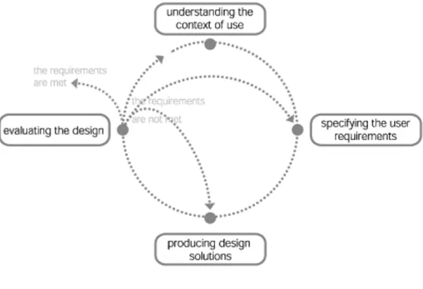
ISO 9241-210 describes the UCD approach where it clearly requires among other things that the design are based upon an explicit understanding of the user, tasks and environment. The process is iterative and driven by user-centered evaluation. This approach has four main stages, see Figure 1.
Figure 1: UCD Cycle
The first stage is to understand and specify the context of use of the future system. In this stage the collection of information about related characteristics of users in relation to the service, identifying users objectives and characteristics of tasks and finally a description of the environment (physical, technical, social and cultural) where the system will be used. A variety of methods can be used in this stage such as interviews, focus groups, etc. The next stage consists of specifying the user requirements, where "User requirements provide the basis for the design and evaluation of interactive systems to meet the user needs" [ISO 10]. In the third stage, design solutions are produced based on the previous stage. The fourth stage is essential in the context of UCD where evaluation of the design happen. Most important at this stage is to evaluate to what extent the design solutions meet the user requirements. The findings of the last stage in the iteration can serve as a basis for the next iteration. [11]
2.3
Application of the Method
A framework called PACT was applied to get a broad understanding of the problem. Both interviews and surveys were conducted to achieve the necessary understanding. The requirements that was drawn out of the PACT framework was the basis for creating a test plan for user tests. Two iterations of the user test were conducted. The first iteration of the user tests was carried out on the current system. A design proposal and its implementation were done between the iterations. In this section, the method application just brought up will be presented.
2.3.1 PACT-framework
Applying a framework called PACT started this study. The framework is used in or-der to get an overview over the design situation. PACT stands for People, Activities, Contexts and Technologies. People undertake activities in context while using tech-nologies. All those aspects can vary, which makes it both fascinating and challenging to design. By introducing or changing technology to an activity, new opportunities will appear and will change how that activity is carried out. Activities establishes new requirements for technologies, thus the cycle continues where one will change the other and so on. [12]
All these aspects highlighted by the framework have to be considered by the analyst/designer and how they fit together in a domain. The people or the users in this case may vary in their time usage of the system, job title, psychological differences, and computer experience. [12]
2.3.1.1 Interviews and Survey The interviews were carried out with those
who created/maintained the system that is being tested. For sampling, the snowball method was used where subjects recruited future relevant subjects for this study among their colleges. Before the interviews started, the participants were asked
permission to audio record the session. It were semi-structured interviews, where follow up questions could be asked depending on the answer. The interview questions can be found in appendix (Appendix B).
For further problem investigation an online web survey was conducted, which was created on Google Forms. The survey (Appendix C) was sent by email to 50 random selected online retailers listed in Prisjakt.nu, a website where visitors can compare product prices from different stores. Prisjakt.nu was used for two reasons. It is one of the leading websites for price comparison, which attract web-shops to listed in their service and also offers the list of all web shops connected to the service to the public. Ten out of 50 did participate in the survey.
2.4
User testing
The absence of the frustration in using a system or interface makes it usable, but a usable product or service should also be efficient, effective, satisfying, learnable, and accessible. Usefulness is the degree to which the product let the user achieve his or her goals and it is a very important element, if not the most important. If a product is to be efficient, effective, satisfying, but do not achieve the users goals, the user will not use it. The speed that the user’s goal can be accomplished in is related to efficiency and usually measured by performed task per unit time. However, effectiveness refers to the property that the product behaves in a way that is expected by the user and can be used as intended by the user. Part of the effectiveness is learnability. It is about the ability of the user to operate a system to some level in a predefined period of time and training which could be no time or training at all. Satisfaction refers to how the user feels toward the product or service and is usually assessed by questioning the user. By applying an iterative design process combined with usability testing it is possible to make usable and useful products and services. [10]
In order to fulfill the requirements of the PACT-framework, a controlled usability
general usability issues, in particular if interface is easy to understand and if there are important differences between different forms of source data. The test used the think-aloud method in order to capture possible issues of misunderstanding and find out if the interface is self-explanatory. The thinking aloud technique is intended to capture what the participants are thinking while performing the user tasks and have them express for example, their frustration or confusion [10].
I also looked for two kinds of errors when analyzing the user tests; error of
commission and error of omission. Where the error of commission is a mistake
consisting of doing something wrong, such as, entering a wrong value in an input field. The error of omission is a mistake consisting of not doing something that should have been done, such as, leaving an input field empty when not supposed to. All participants will have the exact same starting point and setup of the web shop, specially created for the test. After each test the web shop and its products will be exported and stored for further analysis if needed before resetting the web shop for the next user test.
2.4.1 The system being tested
The system that is being tested in this study is an e-commerce web based platform where users are able of creating their own online web stores. It is a so-called CMS (content management system). CMS is a computer application that allows users
to publish, edit, and modify content from a central interface. It aims to avoid
the need for hand coding which makes it more accessible for non-technical users. The system itself was created in 2007 and has since been updated at least once a year. The system is capable of handling most e-commerce fundamentals such as, product management, warehouse counting, different payment methods, newsletters, client database, currency changes, and different themes for the store. Currently, the system has over 100 active web stores. The owners of the stores pay a monthly fee.
Since the system is web based, the users are able to manage their stores from any browser.
2.4.2 The test plan
To have a test plan written down is good both for keeping all partners up to date on what is tested, what is measured and how the test will be conducted. Especially when the test is to be iterated, it has to be identical for the highest possible reliability.
Overall objectives for the study
– Map the work flow for registering products. – Identify misconceptions in the user interface. – Measure efficiency when registering products.
Research questions
– What are the main usability issues?
– Are there any possibilities to shorten the process of manual product registra-tion?
Qualitative data:
– The verbal protocol : The commentary the users make as they think aloud will help identify misunderstandings and confusing parts of the interface.
– Post-test interviews
Quantitative data:
– The time it takes to complete a product registration
– The number of errors of omission when registering products – The number of errors of commission when registering products
Participants
Before the real tests took place, a pilot test were conducted to fine-tune the user test when it was still possible. For each iteration, four participants participated and one person was a backup in case some of the other 8 participants did not show up. The only requirements for being allowed to participate was to have high computer experience, which was decided to be over 3 hours of computer usage per day. All the participants were university students, between the ages of 20-27. Each participant got one cinema ticket as a reward for their time participating in the user tests.
Summary: – Pilot user x 1 – Participant x 8 – Backup user x 1
– Total number or participants = 10 – Iteration x 2
– Participant per iteration x 4
Session outline and timing
Introduction to the session (3 minutes), discuss the following: – Participants experience with usability studies
– Importance of their involvement in the study – Moderators role
– Room configuration, recording systems. – Think aloud method
– Protocol for the rest of the session
Tasks
The test consists of three parts; which are introduction to the system, manage products, and efficiency. The test-persons will be seated in an office-like environment. A MacBook pro computer and a computer mouse will be used. The participants will
be given a short introduction to the test and provided with source documents con-taining data about the products to be registered. The source data will be provided in four different conditions: physical catalogue/paper, pdf-file, suppliers website (SW) or in an excel document. The interaction will be recorded. The order between the subjects will be balanced in order to avoid ordering effects. The three parts of the test will be presented below.
Part 1 - Introduction to the system (10 minutes):
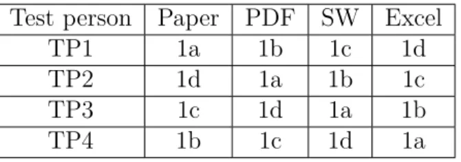
The think aloud method will be used here. In this part, participants will reg-ister products from four different product information sources. For the physical-catalog/paper source information, the user was given a printed-paper including data for one product, which needed to be registered in to the database. For the PDF information source, the user was pointed to a folder located on the desktop con-taining a PDF file. In that file there was also one product to be registered, since it is a digital source, the user was able to copy the product data and copy it in to the product registration. The copy and paste ability was of course not possible for the physical-catalog/paper as source of information. For the suppliers website as a source of information, the user was given limited information about the product and was asked to visit the suppliers website to get the further product information needed. For excel as source of information, the user was asked to import a prepared text file including a list of two products in to the database of the web store. The order of the sources for each participant is presented in Table 1.
Table 1: The order of the four information sources
Test person Paper PDF SW Excel
TP1 1a 1b 1c 1d
TP2 1d 1a 1b 1c
TP3 1c 1d 1a 1b
Different information sources used and the number of products: – 1a Physical-catalog/paper x 1
– 1b PDF x 1
– 1c Suppliers website x 2 – 1d Excel x 2
Part 2 - Manage products (10 minutes):
The think aloud method will also be used in this part. In order to test the general usability of the system and introduce some of the common functions to the users that could be used to make the product registration process faster, the user were asked to carry out a number of small tasks. In the first task, the users were asked to apply a discount of 20 % of the original price to any product in the database. In the second task, the user had to associate two products, which means if a customer buys one of the two products the associated product will be shown as a recommended product. In the third task, the user had to create a variation of a product, a T-shirt to be more specific. A variation could be for example different colors or sizes. Here the user was asked to create two sizes, large and small for the T-shirt registered in the previous part of the user test. The fourth task was about optimizing a product for search engines, such as Google.com or Bing.com. This is done by adding keywords to each product, hence allows search engines find a match. The user was asked to define three suitable keywords for any product in the store. The fifth task was about assigning an image to a product. In the last task users were asked to create a new brand, which is useful to assign to products.
Tasks carried out by the users: – Apply a discount for a product – Associate two products
– Create a variation of a product (two sizes) – Optimize a product for search engines – Add a picture to a product
Part 3 - Efficiency (40 min):
For the efficiency part, the participants were asked to register 15 products from pdf as a source and 15 products from the supplier’s website as a source. For each source the user had a 20 minutes time limit to register as many products as possible. The participants were also left alone in the room in order to let them focus on the task without being disturbed. The order between subject for this part is also presented below, see Table 2.
Table 2: Order for the efficiency part
Test person PDF SW
TP1 1b 1c
TP2 1c 1b
TP3 1b 1c
TP4 1c 1b
Product registration, 20 minutes time limit for each source: – 1b (PDF) x 15
– 1c (Suppliers website) x 15
Post-test interviews (2 minutes)
Ask broad questions to collect preference and other qualitative data. and follow up on any particular problems that came up during the test.
2.5
Redesign
Two iterations of the test described in the previous section were conducted. Between the iterations a redesign was made of the interface where the results from the first iteration was the basis. With my own expertise, the help of the Nielsen’s Usability Heuristics [13] and the 20 Guidelines described in [6], suggestions was created on
how the system can improve the user experience and make the work more efficient. Later on, the design changes were implemented. The usability heuristics just men-tioned is 10 general principles for interaction design with broader rules of thumb and not specified usability guidelines and that is why they are called heuristics. Both problems and design proposals that emerged from the first iteration of user tests are discussed in the next section.
3
Results
This section starts with presenting the results from the interviews and the surveys that answered the PACT framework followed by the quantitative results from the efficiency part of the first iteration of the user tests. After that, the qualitative results and design proposals are discussed. The section ends with presenting the results from the second iteration of the user tests.
3.1
PACT
In this section, the findings from the interviews and the survey will be presented followed by the applied PACT framework.
3.1.1 Interviews
The interviews showed that in small web shops, it is either the owner or a friend of the owner who is in charge of maintaining the shop. This includes the task of registering products. If it is the owner, he or she will have control of everything relating to the shop. If the owner’s computer experience is low he or she is most likely to ask a friend to do take care of it. The interviewees pointed out that small web shops with less than 3 million in revenue are more likely to be maintained by the owner. In bigger stores it could be the purchaser, market department, e-commerce department, product registration department that are responsible for product registration. For example in a store with around 60 000 items, around 6-7 full time employees will be needed in order to keep up with the product registration.
To register products, users use different sources to acquire the data needed about the products. They either visit the website of the supplier and copy the data from there or gets the data in an excel document where all the product data is included
except the textual product description that usually is a paragraph describing the product for the customers. The last option would be that the user enters data by recalling or inventing it.
The general computer experience is believed to be very low by the interviewees due to the kind of calls that come in to the user support department. What could be confusing in the system is that there are too many input fields and users do not understand fields like SEO (search engine optimizer), tags, and specification.
3.1.2 Survey response
Almost all companies that responded to the survey indicated that the ones taking care of the product registration is identified as the owner of the business. Webmaster or purchaser could also be the ones taking care of registration of products. The usage of categories, brands, collections, and variations in the web shops were used frequently regardless of industry.
The time spent on registering products manually varied between participants. Half of the users only spent 0-10 minutes each day on registering products. Others spent between 1-3 hours each day. In the survey, participants were asked to rate the computer experience of the people handling the product registration on a scale between one and five, where five is very high experience and one is very low. All participants chose the highest computer experience possible expect one who chose a four.
The results showed that participants use a variety of methods and sources to gather product data information. The sources used were Excel sheets, a list from supplier, browsing the suppliers website, pdf, or physical catalogs. More than half of the participants use manual product registration the whole time and the rest use it between 0-40 percent. All of the participants pointed out how time consuming the process of registering products was, specially when having to manually enter a high
amount of products. Their opinions on how to make the process easier/better were widespread. Some wanted fewer clicks and others wanted companies to use the same standardization for product lists.
3.1.3 Agreements and disagreements
Both interviews and survey response showed an agreement that the process of regis-tering at the moment feels tedious and time consuming at the moment. The irregular sources used to gather product data was also agreed upon. The only point where the interviews and the survey had a disagreement was about the computer experience of the users. The interviewees thought that users have a very low computer experience, while almost all users thought they have a very high level of computer experience themselves.
3.1.4 PACT
From the findings of the interviews and the survey, the following PACT was con-cluded.
People: In bigger companies, there are people assigned to take care of register-ing products. Smaller business owners are the main group. Accordregister-ing to them they have a very high computer experience and have been able to administrate a web shop.
Activities: The overall purpose of the activity is to register products into the database in order to be displayed in the web shop. There are different ways to do that. The manual registering process is the most used one, where many input fields have to be filled. Another way is to import a compatible product list provided by the supplier, which is more efficient but not always provided. When the import option is not available user tend to gather the data needed about the products by in-venting data, browsing the suppliers website, reading pdf- or physical catalogs. How
often the activity is carried out varies with a possibility to take from 30 minutes up to 3 hours a day, which is a lot for a small business owner. Bigger companies have multiple people assigned full-time to register products.
Context: The physical activity takes place in an office environment where the user uses a computer with a keyboard and a mouse or a laptop. The activity could be carried out by multiple people but not on the same computer. Organizationally, products must be listed with the correct information in the online shop. Sales are usually the only source of income.
Technologies: A lot of data need to be entered when registering products man-ually. The user should understand the many input fields presented and the value it will add to the product if entered. People who generally have a good computer experience should be able carry out the activity. The logic should also be similar to the one commonly used in personal computers.
3.2
Result of the first user test and design proposals
In this section, I will start by presenting the quantitative results reported from the first iteration of the user tests. The remaining part of this section will be about pointing out the findings of the user tests and propose improving the design could solve it.
3.2.1 Quantitative results
In the third and last part of the user tests, the efficiency of the product registration was measured. More specifically, the time it takes to register a product, number of error of commission, and number of error of omission. For each product the test persons were prompted to enter name, item number, price, VAT rate, category, and
amount. The product registrations count were divided between those products where all the prompted properties were entered and those where users did omit one or more of the promoted properties (marked as I). Also, some of the users chose to create categories, brands, and variations that were taken into consideration. Table 3 shows the quantitative results from the first iteration.
Table 3: First iteration user test results - Efficiency part
PDF PDF(I) SW SW(I) Categories Brands Variations Omission Commission
TP1 8 0 8 0 1 2 4 5 2
TP2 6 0 3 9 1 0 2 5 3
TP3 4 1 0 9 2 0 1 8 6
TP4 5 1 0 14 3 0 0 13 6
Sum 23 2 11 32 7 2 7 31 18
Also, 23 products were registered from PDF as a source from all four participants, of which only two registrations were incomplete. Thus 23 products during totalling 80 (20x4) minutes. On average, each registration took 3,47 minutes. From the supplier website the average product registration was only 1,9 minutes, see Table 4. The supplier website as source had faster average product registrations but had much lower incomplete registrations.
Table 4: Comparison between PDF and SW
Avg product registration Complete registration Avg number of registrations (20 min)
PDF 3,47 minutes 91% 5,75
SW 1,9 minutes 24% 8
Seven categories were created. Only one user created and assigned brands to products. Almost all participants but one used the variation function, which did not manage to use it. Numbers of error of omission varied between 5-13 for each participant, with average of 8 errors, which is a lot. Number of error of commission varied between 2-6 with average of 4,5 errors.
3.2.2 Qualitative results and Design proposals
Problems shown from the first iteration is discussed and proposal on how to solve them is brought up in this section.
Uneven workflow: The user tests revealed that on several occasions the users could not follow a natural flow from start to finish in the product registration process. One example was when the user came pretty far in the registration of a product and needed to set a property for which there was no category registered. This need, which arose late in registration forced the user to leave the page of registration, go back to the home page and look for a function in order to create a new category. Since the category property is mandatory, the system did not allow the product to be saved without defining it, which forced the user to start the process all over again. This led to interruptions in the flow and problems to come back again in the registration process.
Figure 2: Create category - Step 1 Figure 3: Create category - Step 2
In order to improve the flow I suggest to create a function for creating a new category is added where the need arises, i.e. the tab on which the user is already registered other information about the product; see the Figures 2 and 3. This would
make it possible to complete the registration without leaving the current page to define new categories and thus would be considerably smoother flow through the registration process.
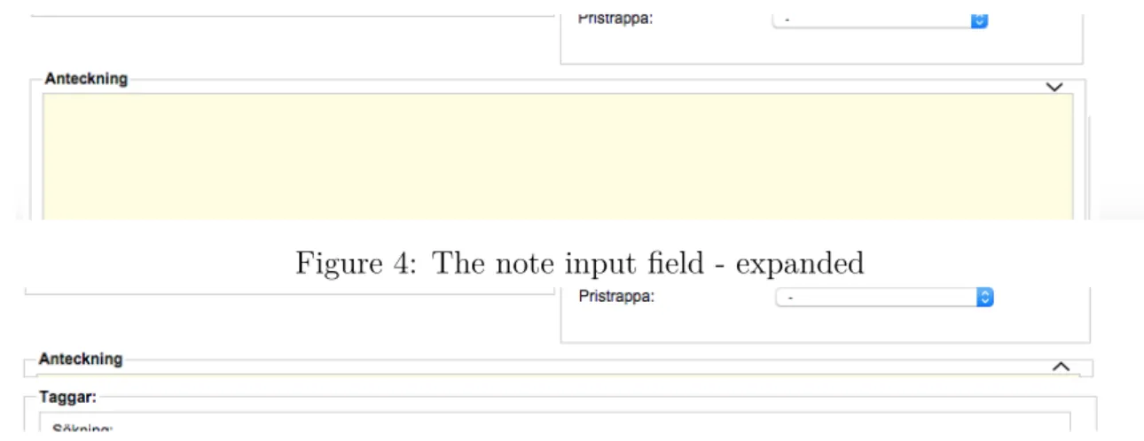
Jumping between windows: The observations of the recordings of the user tests clearly showed that users are switching back and forth between the browser and PDF / supplier page when registering products from digital sources. For each input field the users switched back and forth to the source, marked the needed information, copied it, switched back to the administration page, searched for the input field, and then pasted it. Some copied data for an input field while trying to memorize data for another input field to decrease the number of switching. One of the users solved it by copying all the data related to the product, went to the administration page, pasted all the data in the largest input field that is "Description?, and then distributed it to the various input fields. In this way the user did not have to go back to the source again for that product. The latest approach was the most efficient while the first approach was the slowest.
Figure 4: The note input field - expanded
Figure 5: The note input field - hidden
In order to make the data entry more efficient, which leads to faster product registration when using digital sources, I propose to introduce a feature that will serve as a notebook, see the Figures 4 and 5 . It will apparently indicate that the text contained in the function only appears there and not for the customers who
visit the web shop. This would indicate that users can use the function without affecting the product or the store, thus can be used to copy and paste data to then be distributed if necessary for example. It will give the user a space to be used as a temporary note holder within the system to be used for whatever purpose.
High occurrence of errors: Upon registration of products, it was easy for users to fail to enter one of the mandatory fields before storing the product. Even after the error message reminded the user to fill it in, it was possible that the user committed the same mistake with the next product, around 30 seconds later. This got the user frustrated and wondered how it could miss it again.
A simple marker (usually an asterisk) of the required input fields that are standard at registration for various websites could reduce the frustration, the number of error of omission and streamlining the process, see Figure 6. The user has a large number of products to register and want to get out quickly with a quick overview to see if they are marked (mandatory) fields are filled at the same time avoid getting error messages.
Figure 6: Marking mandatory fields with asterisks
Slow error recovery: It appeared some error messages during product reg-istration and management. Much time was spent finding the fields that the error message refers to. For example, the user missed to enter the category before saving
the product. The system showed an error message reminding to enter the category property. The user went through all the input fields and said, "There is no field for category". After some frustration, the user found the appropriate field. In some cases, there were those related input fields in a different tab than the user was on. It complicated things and a lot of users failed to resolve these errors, which led to frustration, incomplete products, and time waste.
Figure 7: Highlight fields related to errors
I suggest that the related fields of error messages is shown clearly in a way that make them stand out from the rest of the entry fields on the page, see Figure 7. It can be done by giving the related fields that are linked to the errors a color that attracts the eye. It will make it hard to miss the field user is looking for. If the user is in a different tab, the tab, which contains the related input fields, should be marked to indicate to the user that there is something of interest in another tab, see Figure 8. This way the user will not need to actively search for input fields and will find them right away.
Figure 8: Pointing out the tab where the error is located
Bad error communication: In case of error, an error message that tells about how the problem is to be solved was shown. Only one error message but sometimes there were more errors than one at the same time but the system still showed only one error message. This meant that users solved the problem, saved, and then the error would show up again. The first thought that struck them was that they had not fixed the problem properly but it was just multiple errors but only one was shown at a time.
For more efficient processing of errors, I suggest that all errors are displayed simultaneously to the user, see also Figure 9. This way, the user can fix all problems at once, and only need to save once.
Figure 9: Show all error messages simultaneously
Disoriented user: A web shop can have hundreds of products registered. Many users were unsure of which product they were about to change, specially when they found themselves in the other tabs than the "General" one where the input field "product name" is located. Those who were uncertain of what product they was on choose to click on the "General" tab, read what was written in the "Product Name" and then went on with the task they had in mind. The little concern about not
knowing were the user is, lowered the efficiency, increased number of clicks, and disrupted the flow of the registration process.
Figure 10: Show were the user is located
My suggestion is to have the product name subtitled "Change product" visible regardless of which tab the user is browsing in (see Figure 10). It excludes the concern and the user is sure of were they are located in all parts/tabs in the product section.
Unclear system status: At one point during the user test, users had to import products using a text file containing a list of two products. What the user had to do was find the import menu named "Product imports", press "Select File", select the file and press the "Upload to product database". First, the same menu led to the export section also, somehow it is a bit misleading that the same menu leads
to the export function. Many users clicked "Select the file type" related to the
export function which was adjacent to the import function. Second, for those who managed to successfully import the products to the database, a list of the products imported was shown and nothing else. None of the users perceived that the import is completed and no error occurred which left them wondering of what stage they are in the process. Is this task complete? Should I check the database? Did it work? To make it more clear to the user, the menu name requires to specify that it also contain an export function. As proposed, I suggest something by way of "Import / Export" since it is a sub-menu of "Product range". It is also a good idea to make a
Figure 11: Distinguish between the import function and the export function
clear separation from both functions, see Figure 11. In this way, the user is aware of were they are headed and what to expect. At the same time, the user will be vigilant first time it uses the function thereby reducing the probability of error of commission arising. Through better feedback, the user can keep track of what is happening. I suggest that it clearly shows that the import is completed without error followed by a small summary where, for example, number of products and number of categories are displayed, see Figure 12. This way, the user is notified of the status of the import process and can move on. This saves the user time and avoids getting frustrated.
Data loss: The greater part of the conducted usability tests was about register-ing products manually. Thus a lot of data was entered and in some cases modified later. On several occasions the users left made changes and left the page before saving the changes. Thus all the changes were lost without a warning. Some of the users later realized that the changes made had not been saved and had to do it all over again. In other cases the users never knew that the changes were not saved at all. This is a serious matter because it can lead to misleading information about the product for store visitors and cause problems for the owners of the store.
To ensure that users are aware that the changes have not been saved, I suggest that the system displays a warning in the form of a popup when the user is about to leave a page with unsaved changes, see Figure 13. The user should be able to choose between do not save, save or cancel. In this way, the user is aware that the changes have not been saved and will now have three choices for remedy. The user who on purpose does not want save the change can simply click "do not save". Either way, the user will be notified and would not have to wonder if he clicked the save button or not.
Complex function: Not a single participant was able to create a variation of a product without the help of the test session moderator. For example, to create three sizes of a shirt, the user had to find the variation tab, click "Add variation type", enter "Size" as a variation type in the text input field, which have a placeholder text saying "Variation type (Swedish)", then click the plus sign on the same row to create a row representing each variation such as Large, Medium and Small. These input text fields have a placeholder saying "Variation choice". After each variation choice (all the sizes) have been entered on a separate row the user should click on "Save" (which is written in text) to refresh the current page and bring the remaining options. For each size a product will be displayed in a list and the user would have to click "Create Variation" or "Create all variations" to finally create the products. Most confusing parts for the participants was what value to enter in the variation type field and the part where the user had to save the product in order to continue with the task. Many entered for example "Large" in the variation type, which should be "Size". There is a long sentence explaining that the user has to save the product in order to create the variations entered, but participants did not give attention to it. Most of the participants failed to create variations in the efficiency part of the user test where no help were given.
To make it easier for users to understand what kind of value is to be entered in the input fields, I suggest that the placeholders are changed. The easiest would be to give the user an example of what is expected to be entered. So the variation type placeholder should be changed from "Variation type (Swedish)" to "Variation type (e.g. Size)" and the placeholder for variation choice, from "Name for variation choice" to "Variation choice (e.g. Large), see Figure 14.
I also strongly recommend that at least two empty variation choices are to be created after the user has entered the variation type. It is natural to have at least two variation choices if the user is about to create a variation of a product. It will make it easier to understand and will decrease the amount of clicking. After entering the type and choices of the variation, many failed to understand that they need to
Figure 14: Help user understand what type of value is excepted
click on the save product, which is normally used to save changes/products. Since this button from previous experiences is used only to confirm saving a new product or to save changes on completed tasks. I suggest adding a new button to with the exact functionality as the "save product" button but labeled "Update" and closer to the variation function. This will clearly indicate that the button belongs to this function and is most likely to be clicked. If this function was easier to understand it will save a lot of time for the user. Instead of creating four products of the same type the user creates one and create variations for that.
3.3
User testing after
The design proposals suggested in the previous section were implemented in the system and laid as basis for the second iteration. User tests were conducted with the same test plan and structure as the first iteration. Participants for the second iteration had similar characteristics to those who carried out the tests in the first
iteration. All of them were also university students. Here below the results from the second iteration of the user tests are presented.
Table 5: Second iteration user test results - Efficiency part
PDF PDF(I) SW SW(I) Categories Brands Variations Omission Commission
TP5 4 0 6 0 3 0 2 3 2
TP6 15 0 10 0 4 0 0 1 2
TP7 10 0 14 1 5 0 0 1 2
TP8 11 0 9 2 4 0 0 2 1
Sum 40 0 39 3 16 0 2 7 7
During the second iteration, 40 products were registered from PDF as source from all four participants, of which, none of the registrations were incomplete. Thus 40 products totalling 80 (20x4) minutes. On average, each registration took 2 minutes and each participant registered on average 10 products in 20 minutes from the PDF source. The test person 6 (TP6) also managed to register all products in around 16 minutes.
When it comes to the supplier website as source, 42 products were registered in total, of which 3 registrations were incomplete. On average, each registration took 1,9 minutes with only 7 % incomplete registrations. The PDF as source had none incomplete registrations. Each participant registered on average 10,25 products in 20 min from the suppliers website as the source.
No user created and assigned brands to products. Variations was only used by one participant for creating two variations, almost all participants did not manage to use the variation function or preferred not to use it. Numbers of error of omission varied between 1-3 for each participant, with average of 1,75 errors. Number of error of commission varied between 1-2 with average of 1,7 errors for each participant.
3.4
Comparison
Here next, a comparison between the two iterations will be made. The number of products registered has increased substantially, specially when using PDF as a source, see Figure 15 on the next page. It has almost doubled in terms of average number of registrations and faster efficiency, see Table 6. The number of complete registrations is almost unaffected.
Figure 15: Comparison - Total number Table 6: PDF as source - Comparison
Avg product registration Complete registration Avg number of registrations (20 min)
Iteration 1 3,47 minutes 92% 5,75
Iteration 2 2 minutes 93% 10
When having the suppliers website as source, there was no major difference in number of products registered, but the number of completed registrations went up from 24 % to 93%, see Table 7. Both numbers indicate that the performed design changes improved the general data entry.
Table 7: SW as source - Comparison
Avg product registration Complete registration Avg number of registrations (20 min)
Iteration 1 1,9 minutes 24 % 10,75
Iteration 2 1,9 minutes 93 % 10
The number of errors of omission and commission decreased substantially (Fig-ure 16 and 17) due to the design changes that led to faster registration time and less time spent on solving errors. A complete table with both iterations from the efficiency part can be found in the appendix (Appendix D).
Figure 16: Error occurrence Figure 17: Average error
The usage of the variation function was still difficult for all of the participants and its usage decreased. Participants preferred to create variations manually due to the confusion it created. On the contrary, creating and assigning categories more than doubled due the design changes, see Figure 18. It is not a tedious process anymore and it resulted in a more sorted content.
4
Discussion
4.1
Limitation of the study
This study had number of limitations, which will be brought up and discussed in this section.
Certainly, having a more representative test group for the user tests would raise the validity of this study. It could for example be relevant staff of SMEs that only have physical stores or users who have recently begun to maintain their web shop. There was no possibility to find, contact, get an approval, and arrange testing sessions that fits multiple representatives within the time frame of this study. More iterations of the user tests had also raised the validity of this study and confirmed the effects of the latest design proposals and also earlier ones.
In addition, all the user tests in this study were conducted in the same room with the same setup. Since the system tested is web-based, it is possible to use the system from any computer as long as it is connected to the Internet. I believe that it would give a more ecological validity to do the user testing where users use their own computers ,where they are familiar with the operating system and the hardware, and also the stability of the Internet connection.
Finally, in this study, tests were conducted on a system (CMS) with over 100 active online stores where users can create and maintain their own web-shop. No investigation was done to determine the most used system in the industry. Therefore, there is a possibility that a system with a higher number of users exist, where the usability differs from the one tested in this study.
4.2
Alternative method
One possible way to investigate the usability of product registration tools is to em-ploy a heuristic evaluation, which is to systematically probe the software and note everywhere there is something that violates general guidelines. By using that method it would perhaps be possible to pinpoint some usability aspects, however these would be general and not particularly valid for the SME e-commerce user group. Because of this, a different methodological approach was chosen. First the PACT-framework was employed to guide interviews and surveys aiming at getting a deep understanding of the particular situation that is at hand for this user group. Second, it was decided to look at a dedicated software system aimed at providing services to hundreds of SME online shops. By investigating what kind of problems this user group had with the system, redesigning the user interface and then investigating if the issues could be handled by user interface redesign.
4.3
How the design did or did not solve the problems
In this section, the design changes will be discussed if they solved or did not solve the problems. The problems will be discussed in the same order as they were presented in previous chapter, Results.
Uneven workflow: For creating new categories in the system, the user had to visit the category page and from there create a category. It was the only place to create categories. Assigning a category to a product was necessary for adding a product to the database. It was really frustrating for user to have to leave, and lose an almost completed product registration. It would be possible if the users planned in advance and created the categories needed from the start. By offering the user to create categories where the need arises, the user can now create categories spontaneously, not having to leave the page, which led to saving time and lastly, motivate users to create more categories, which lead to a more sorted store content.
I believe the more content is sorted the easier it would be for visitors to find products of interest.
Jumping between windows: I suggested having a note function in the main page of the new product registration to hint the user that it can be used to paste all the product information needed there for distribution to relevant input fields. This would minimize the number of switching back and forth between the source and the system for example when having a PDF as source. It would also decrease the users memory load. No participant used it for the proposed usage, in fact, it was not used at all. I believe the participants were under pressure because the efficiency part of the user tests was time limited and could not really think "outside the box". However, if I should have pointed it out during the user tests, it would not have given accurate results since the design itself is not self-explanatory.
High occurrence of errors: The results showed that the efficiency of registering products from the PDF source almost doubled. It is really hard to point out what in the design was the main reason for that. I believe the design changes where the mandatory fields were clearly marked are one of the most important changes for the overall improvement. It was easy to miss mandatory input fields in the old design because of all the surrounding optional input fields. It happened over and over again. The results from the new design showed a big decrease in the numbers of errors. Especially the number of errors of omission where participants left input fields empty when not supposed to. By marking the mandatory input fields with red asterisks it is now possible with just a glance to see if they are all filled in before attempting to save the product.
Slow error recovery: Thanks to the marking of the mandatory input fields, there were fewer errors but however, two of the design changes were made to help users recognize, diagnose, and recover from errors if they appeared. By highlighting the input fields relevant to the error, users, did not even need to read the error message(s) to understand what was wrong and could directly attempt to solve the error. In the first iteration, users had trouble finding the relevant input field due the
vast number of input fields and tabs. At first they had to read the error message, then locate the field, and edit or add a value. It is sure that the new design change takes care of locating the relevant input field and it saves a lot of much appreciated time.
Bad error communication: The product registration page has multiple tabs with tens of input fields in each tab. The first iteration showed a problem where participants could not find the relevant input field related to error messages. It was almost impossible for the user, who are new to the system to find fields that is located in another tab than the one they currently are viewing. Highlighting the tab where the error occurred helped tremendously, especially combined with the help of highlighting the fields that were just discussed. This solution also saves time by helping users recognize, and diagnose errors.
Disoriented user: It is known that it is a good idea to let users know where they are located in systems or web sites. In this case, with the vast number of items in a web shop, the user could easily wonder, "What item am I editing now?" if they were for example to lower the prices of multiple items for a weekend sale. The name of the item was only displayed in the input field for "Product name:". This is not visible from all the tabs nor if the user have scrolled down. Users sometimes was unsure in which product they were editing specially when having a list of tasks. This was solved by having the value in the Product name input field in the header, visible from all tabs. It is hard to see if this design change did solve the problem by analyzing the recordings of the user tests. Anyhow, no participant did wonder what item they were editing in the part where the thinking aloud method was used nor did anyone edit an item they were not intended to in the efficiency part. Having the user recognizing is better than recalling.
Unclear system status: In one task, participants had to import some products using a prepared text file containing product data. The problem here, was that the import function was very close to the export function that had more choices. In the first iteration, almost all participants attention were drawn to the export function
due the bigger button and more choices. The design changes changed the name of the menu leading to these functions clearly telling the user what to expect. So both the name of the menu (Import) leading to the function and the grouping of the functions led to confusion. This was solved by renaming the menu (Import & Export) thus clearly separating the functions. No participant needed help in the second iteration regarding this task. Another problem shown in this task, was the poor visibility of the system status. After importing the products, all participants was wondering, "Is this it?", "What happened?". They had no idea what just happened, a list a product is shown and nothing else. No buttons, no text saying it is done, just nothing else. Few went to the database to check if the product was imported. With just a text label saying, "Your import is now completed, you can leave this page" which the design changes proposed, the status of the system is now clear. Participants moves to the next task after reading the text label, which showed they understood the system status.
Data loss: From the first iteration, by analyzing the recordings of the user tests, it was shown that users at some points did edit products and then went on with the next task without saving the previously edited product, which eventually led to data loss. Also focusing on the next task and forgetting to finalize the current one. Design changes were made to warn the user when leaving a page that was edited but not saved. This worked great. The participants were now aware of the changes and it was up to them to choose between saving the changes or discarding them. However, it does not matter if it was done on purpose or not to leave the page unsaved, they user is kept aware.
Complex function: The variation function is supposed to save the user time by creating variation of a product. For example making a variation of a shirt where it is available in five colors instead of having to create five products separately. The variations are endless and that is why this is a difficult function. Users are not sure what values to enter. Design changes proposed to have example values in the input fields to help user understand what values are to be expected. Even after having
explained how the function is supposed to work, participants did not manage to take advantage of it. They preferred to do it manually which felt a lot easier and some commented in the very short interviews after the user test that they did not want to spend time struggling with the function especially when there is a time limit. The design changes were not enough to make the function usable. It contains many steps and it is easy to make an error in one of the steps, which will ruin the whole process.
5
Conclusion
To improve the efficiency of the data entry regardless of the intended task the context and the users need to be investigated. In this study, the PACT framework was applied and proved to be a wise approach for pinpointing the problem and finding out the characteristics of the user, which is very important when having a user centered design as the method of approach. The interviews were not sufficient to inform the framework, but with the help of the survey the necessary information was captured. User tests were conducted on the current system before suggesting any design changes to make sure the predicted problems really are problems for the intended end user. Small business owners would be the ideal participants for this study, but their unavailability forced me to have students as participants. The main characteristics of the ideal user is, after all, a good computer experience. A good thing of having students as participants are that their prior knowledge did not affect the efficiency, since it is their first time registering products. It would also help to bring up problems that new users will stumble upon. By applying the very well known usability heuristics [9] and general usability guidelines for collecting data [7] combined with analysis of the users workflow, design changes were made. The number of products registered almost doubled and error occurrence drastically decreased. With a good understanding of the situation, minor changes can make a big difference.
The 20 usability guidelines discussed in [6] is mostly applied in forms that collect information about the user/visitor, for example, to become a member of a service. Too much struggle and the user/visitor is most likely to leave the service without registering and this puts pressure to have a high level of usability. I think that is why most of the usability guidelines are directed towards visitors/consumers due the vast alternatives they can choose from. However, applying usability guidelines on systems used daily by for example employees is another story. They will adapt even though the system have has very basic or no usability and I believe it is one of the main reasons why the usability is not prioritized in systems used on a daily
basis. The participants of the survey conducted in this study were not the current users of the tested system. Almost all of them complained about the slow product registration process. I believe the usability is generally low where the users are not the ones who are buying the products or service offered by the companies. Naturally, e-commerce companies focus on the relation and interaction between them and the consumers/buyers because they are the ones accounting for the revenue. Less thought is put into the usability of the system maintaining the web shop. Eventually, the employees or the owners will work it out, even if it is not efficient. The problem is that it is difficult to put a monetary value on usability, but in the long run, time is money and a lot of time goes to just registering products as the surveys showed. The results showed a decrease of almost 1,5 minutes for each product registration from the PDF as a source, which could pile up to hours if larger amount of products is to be registered.
As mentioned in the beginning of this study, almost anything is possible to buy through Internet these days. To facilitate SMEs to acquire e-commerce regardless of industry, the user interface need be to be more flexible. As discussed in [7], if the entities is to have a wide range of different attributes and different types and it is not supported by the system to create and store such data, it will become much more difficult. Let’s say the owner of a small physical store that sells radio-controlled helicopters want to start a web shop to expand the business. Entities
such as fly time, charge time, number of blades, blade diameter etc. is needed
product information in order to be appealing to customers. The owner with good computer experience got two choices, use a CMS which is probably the easiest to use or build their own web shop from scratch and create all the entities needed. The latter will probably cost more and would need high technical knowledge surrounding e-commerce. It is impossible for a CMS to have all possible entities predefined. Therefore, it is important to strive for a semi-structured input into e-commerce in in order to increase the usability and availability for specially SMEs. It would allow the user to create their own entities.
I recommend, for developing efficient user interfaces, that general usability need to be considered in the first place. Trying to achieve efficiency on a user interface that not even fulfills Nielsens 10 usability heuristics [9], would be difficult to achieve. Such heuristics ensures that the user interface speaks the users language and can be build upon. To maximize the efficiency of a system, the designer needs to have knowledge about the context of the activity and its users. That way, the design can be customized for these users and the tasks they perform and let the system do as much as possible of the work for maximum efficiency. Product registration is an important step in e-commerce and was found inefficient in SMEs due the irregular source of product information. It is hard to control the source since there is no existing standard format that would make the process automatic. So there is no other choice than focusing on making the data entry as efficient as possible. By using a user centered design approach it is possible to achieve a customized user interface for such specific task carried out daily. To confirm if the user interface is what is really needed, usability tests need to be conducted with participants that represent the end user.
5.1
Further research
Investigating the general usability of user interfaces used by companies/employees would be interesting. I suspect the usability only emphasized where its users are the ones buying the products or services. Awareness that usability can also save money for businesses must be enlightened. Tests should stretch in a longer period of time to measure the efficiency where the users have had the time to become accustomed to the system for a while.