Linköpings universitet | Institutionen för datavetenskap
Examensarbete, 15 hp | Innovativ Programmering - Computer and information science Vårterminen 2018 | LIU-IDA/LITH-EX-G--18/045—SESurvey data visualization
in a web environment
Hannes Albinsson
Emil Bengtsson
Handledare: Peter Dalenius Examinator: Rita Kovordanyi
Survey data visualization in a web environment
Hannes Albinsson
University of Linköping
Linköping, Sweden
albinzon@gmail.com
Emil Bengtsson
University of Linköping
Linköping, Sweden
emilbngtssn@gmail.com
ABSTRACTBriteback Explore is a service provided by the company
Briteback. The service provides a survey tool to its users that allows access to results through the downloading of a
comma-separated values (CSV) -file. What was built was a visualization model that provides the survey tool’s users with a graphical representation of the data directly through the service. Providing an overview of the survey results that lessens the amount of information overload perceived by the user while giving the data a structure. A survey based off of the System Usability Scale (SUS) evaluation method was then performed to display to what degree users found the new feature usable. Results showed a satisfactory high score on the SUS adjective rating scale.
Author Keywords
Visualization, javascript, web, survey data visualization, data visualization, perception of data, lazy load, chartjs INTRODUCTION
In today’s society there is information to gather everywhere and we rely on that information in our everyday life. A majority of today's systems collect large volume’s of data from its users. The main focus of this paper is going to be the information that exists within larger web based systems. More specifically, the focus will be on data collected through surveys over a longer period of time through the
Briteback Explore Survey tool1 and how the results collected can be visualized through charts.
Challenges
When working with visualizing this type of data, there are a two main problems that can be foreseen, information overload and how to convey differences in results gathered through longitudinal surveys.
Information overload is the concept of “Information presented at a rate too fast for a person to process” [1], which could both refer to the velocity and the amount of incoming information. The result of information overload is that most information that is actually important to us goes unnoticed [2]. Which is a problem since the typical way of displaying survey data is through comma-separated values
1https://www.briteback.com/en/solutions/research/
(CSV) -files. Using CSV-files gives the viewer a lot of information in a raw format. This format can be non intuitive and hard to comprehend since none of the data stands out from one another. This has a detrimental effect as the most common way to cope with information overload is to simply ignore parts of it [1]. Because of this an attempt to visualize answers to survey questions through charts will be made, providing the users with an overview of the results without overwhelming them with information.
A longitudinal survey is a survey that is recurrently sent out to participants collecting their answers through multiple iterations. An important aspect of the data collected through longitudinal surveys is how the answers change with time. Which leads to second problem of the paper, a method has to be made through which these changes can be displayed to the viewer without mixing the information such as to make it incomprehensible from which iteration it came from and what it is trying to convey.
Visualization models
Visualization models are methods of representing data. Examples of this can vary greatly and refer to i.e graphs, color arrangements or images. Different models are needed depending on what type of information you have and to whom you are displaying it.
Our focus will be on the on the use of charts and how they can represent results collected from a survey. Our method of representing data will henceforth be referred to as the
visualization model. Objective
Our objective with this paper is to implement a new visualization model for the Briteback Explore Survey tool, henceforth referred to as the survey tool. The visualisation model should give a user an overview of the results collected through a survey.
The research questions we will be asking are:
● Did the visualization model appear structured and uncluttered to the survey tool’s users?
For the visualisation model to improve the informations readability it needs to deliver in a less cluttered representation than a CSV-file would. The information should be presented in a structured and clean manner
allowing the user to smoothly move through and view the results, any form of information overload should not be perceived.
● Did each chart implementation within the visualization model convey its information? A survey is a collection of different question types used to gather information from a group of people, therefore the visualisation model has to be able and present each type correctly. A user should from the chart be able and tell what type of question it is and see the relevant information. In addition to our research questions, some focus will have to be placed on the performance of the visualization model so that it is up to par with the rest of the system surrounding the survey tool.
Delimitations
The visualisation model will first and foremost have the survey tools platform and users in mind during its creation. Results from this paper should therefore not be considered as the definite solution for survey data visualization but rather as the solution best suited for the survey tool’s user base.
The paper will not attempt to create a solution for other survey tools, although the visualisation model may be applicable through minor adjustments.
What we built
What we built was a visualization model for survey results collected by the survey tool. The implementation provides three main features to the survey tool. The first feature being the ability for a user to view a graphical representation of survey participation, with variants for different survey types. The second feature being the ability to view a graphical representation of the data represented as graphs. And finally, the last feature being the ability to select multiple iterations of a survey, if containing longitudinal data, for comparison.
BACKGROUND
In this chapter we will present the background to our work, what challenges we are faced with and work related to our own. We will begin with a short description of the system being built on top of. Following that is two sections about surveys, their purpose and how they function, and about the survey’s data that we will be working with and how it is structured. Concluding the chapter is a part where related work is discussed.
System
For this project, a completely new system will not be created. Rather, an existing system will be used as a platform to build the visualization model onto. The system that the implementation will be added to is an existing one from the company behind the survey tool, Briteback. The
system is a web app built on the React library. The survey tool is part of this system.
Surveys
Surveys are used to gather information from individuals . 2
The information gathered can be from a wide variety of areas but the structure of the gathered data is the same throughout the survey. All surveys consist of a set of questions with different possible options for answering e.g. yes/no or multiple selection. Answers for the survey questions are then gathered over a period of time before being finalized into a result. Depending on if the type of survey is one time or longitudinal, it could mean that the survey itself or an iteration of it has ended.
In this paper we will utilize the survey tool to evaluate our research questions. By sending out a survey to frequent users of the tool we can see how they feel that the new visualization option have affected the user experience. Survey data
When talking about a survey’s data structure, we are referring to how the structure of its content, meaning the question, the question type (such as yes/no or likert scale) and in what order they appear. The survey data itself is referring to the content by which we mean the set of answered questions as entries into the data structure. These definitions can be compared to that of CSV-files where the survey data structure would represent the name of each column while the survey data would be the content populating the following rows.
When a user is using a survey tool, they specify their own survey data structure. This means that it cannot be assumed that any two surveys has the same data structure.
Another aspect of survey data that needs to be considered is data that changes over time. In the example of longitudinal surveys this becomes clear since new data, as a set of answered questions, is entered into the data structure each time a subject is submitting their survey.
Related work
When working with information it is important to realize that more is not always better, Barlow states that “Knowledge is power, but information is not” [3]. With which she means that knowledge is the part of information that is useful to us, whilst the rest is only a detriment serving to obscure the clarity of a situation. In our research we will be looking into how we can reduce the obscurity of survey results by hopefully giving the readers only the knowledge and not the information. We want to achieve this by implementing a system that displays the information to the user in a clear, uncluttered and structured way thus displaying the knowledge. There exist many prior works
that deal with the problem of visualising continually updating data, proposing many different techniques for tackling the problem.
LifeLines [8] gives the user the option of manipulating large amounts of data regarding a person’s history to view summaries of different times in their life. This could be a good starting point for how to display the results gathered from the different iterations of the survey without progressing into the differences.
Two approaches to visualising changes are Themeriver [9] which focuses on visualizing changes in themes. Another is a work by Dubinko, Kumar et al where they develop a web browser application that allows a user to see how tag trends on social media applications, specifically flickr.com ,3
develop over time [10]. Both applications main purpose is to compute and display changing information and a common problem in both is the speed at which the information can be displayed. A cause is the amount of rendering happening on the screen and another is the amount of real time processing that is performed. Which is something our system also will have to consider.
In a related work by Kleinberg, it is also discussed what challenges a system is faced with when processing a continuous stream of data [7]. One of the problems in such a system is having to process the information as it arrives without the option of first storing it for later. Although the data set we will be processing is longitudinal, and therefore will change over time, we will not have to face this specific problem. This because the time between new data arrival and viewing will not be immediate. Therefore, it will be possible to treat the, at the time of retrieval, current data as static when creating visual representations of it as new data first has to be stored before being made available to the rest of the system, at which point that will be the new static. As prototyping will be a major part in our process of reaching a satisfactory system layout, it is important that the prototyping process proceeds in a structured manner. Maron et al divides this process into three tiers of increasing detail [12], a lo-fi tier, a middle-fi tier and a hi-fi tier. Their idea of the tiered model is that a base prototype could be developed without much resources being spent. The prototype can then be refined by people more experienced in the area, followed by a final refining by specialists should it be required. In our work we will follow a similar approach where we are the ones implementing each tier of the prototypes but will be discussing what to refine with people more experienced than ourselves in the area of data visualization.
3https://www.flickr.com/
THEORY
This chapter will contain a collection of explanations regarding methods and techniques used in the project and referred to later on in this paper. It starts off by defining the different types of charts that will be used. Following that will be a similar section about the different types of questions supported by the survey tool. Then a section explaining the concept behind the minimalist design pattern followed by a section about the System Usability Scale evaluation method. Lastly, a section about dialog windows followed by the concept of lazy loading and when it would be preferred to use.
Chart types
This section provides the theory about the charts used in this project as well as provides some examples of their preferred use cases.
Bar and Column charts
The two graphs that are the most like one another in that they both use bars to represent to compare the value of different data points [13]. The difference between these is the orientation, or direction, that the bars expand in. Bar charts orients its bars horizontally, lying down, while the Column chart instead orients its bars vertically, or standing, as columns. It is however not uncommon that both are referred to as Bar charts.
Both of the charts could in theory be used interchangeably but there are some situations where one is preferred over the other. E.g. a Column chart would be preferred in a situation where the data set contains fewer than about 10-12 entries and a Bar chart would be preferred when the amount of entries are higher than that . A Bar chart would also be the4 preferred type when the data point labels become too long to fit below the bars of a Column chart.
Stacked Bar charts
A variant of the previous mentioned charts where instead of placing data points next to each other they are stacked on top of each other. This type of Bar chart proves useful when the objective is to visualize the relation between sets of data within multiple categories, e.g. data sets for every time unit such as months or years [13].
Pie charts
Circular graph where each data point is represented as a slice of the circle. The size of each slice is the percentage that the data point makes up out of the sum of every data point. Pie charts are often preferred when the relation between data point values is more important than their actual values [13].
4
https://www.fusioncharts.com/blog/bar-charts-or-column-c harts/
Line charts
A Line chart is a chart type where data points are plotted over an axis of continuous values with a line drawn from each data point to the next. Line charts are the preferred chart type to use when the objective is to display a trend between data points [13].
Question types
This section provides the theory for the types of questions that could be encountered within the survey tool. It is assumed of these to be prefaced with a question or statement.
Yes/No
Question type were the user is given the choices “yes” or “no” as answers to the given question or statement.
As there always is a constant set of alternatives and as the interest for this of question lies in knowing the relation between answering either “yes” or “no”, a Pie chart will be used for visualization.
Multiple alternatives
Similar to the Yes/No question type with the main difference that there is no limit to the amount of alternatives presented to the user. In some variances of the multiple alternatives question type, the user is also allowed to select multiple of the alternatives instead of just one. That does however not affect the way a question of this type is visualized as the only difference it makes is to provide more data.
For this question type, the Column chart will be selected for visualization as the objective is to compare the relation between the provided alternatives as well as displaying the
amount of answers that each of them has received. Should the amount of data points exceed 10 entries, then a Bar chart would instead be used as described in the previous section.
Interval
Another variance of the multiple alternatives question type. An interval question type presents its alternatives to the user arranged as an interval of possible answers. E.g. a semantic
scale where the alternatives are numbered from low to high or a likert scale where each of the alternatives are assigned a text to represent their meaning instead of just a number. The answer to an interval question commonly represents the degree to which the user agrees with the prefaced question or statement.
As the interval question type is a variance of the multiple alternative question type the same method for visualization will be used.
Analog scale
Question type where the user is presented with an analog slider with values ranging between 0 to 100.
Given that the results from this type of questions will show the spread of answers, a Line chart will be used to visualize the trend between these.
Date/Time
Two related question types where the user is asked to enter either a date or time.
Similarly to the results of the analog scale question type, these results better shows the spread of answers rather than the specific amount of each date or time. For the same purpose, a Line chart will be used to display the trend between the given answers.
Minimalist design
Minimalist design, or less is more, is the main principle affecting the design of the product developed in this paper. The goal of minimalist design is to remove all distractions from what you are trying to convey presenting it in its most basic form [15]. A combination of leaving the element presented with no distracting decorations on or in its surroundings automatically catches and focuses an observer's attention on the element being presented. This makes the presented information appear more natural and not as forced upon the observer.
System Usability Scale
ASystem Usability Scale (SUS) uses 10 likert questions to produce a score used to determine the usability of a given system . Using this method removes any biases that might5
have occurred if the system authors would have written the evaluation questions themselves. The questions are asked after the user has had a chance to experience the system but before they have gotten any explanation as to how the it should work. Two advantages of using SUS is that it is constructed to work with most types of systems as well as being cost efficient [14].
Dialog window
A dialog window within a web environment is a view used to conduct an interactive communication with the user, generally through input fields or buttons. The dialog window is at first not visible until invoked by a user event on which it receives onscreen priority which means that it 6 is placed on top of other views within the website. Some common uses could be as a small view acting as an option menu to a local object on the website, or as a larger container that somewhat resembles a separate web page. Lazy loading
Systems built today often uses a dynamic set of components to represent the current relevant information. Loading all of
5
https://usabilitygeek.com/how-to-use-the-system-usability-s cale-sus-to-evaluate-the-usability-of-your-website/
those components at once could however be performance heavy for some devices and slow the system down. It could therefore be crucial for user experience that only the relevant components are loaded into the system. Lazy loading is the concept of only loading components as they become relevant , i.e. when the user navigates into an7
unloaded part of the system.
The opposite to lazy loading is the concept of eager loading that revolves around loading all the required components at once. This would be the preferred method of loading in the scenarios when the cost of queries are too large or when all content is known beforehand and could therefore be preloaded knowing that no additional loads would be required.
METHOD
In this chapter we will discuss the challenges associated with each part of the visualization model’s implementation process as well as the process of solving them. We will start of by describing the process of creating our prototype models. Following that will be two sections describing the implementation process of the visualization model’s frontend and backend. Finally a part detailing the evaluation process of the implemented visualization model.
Prototyping
The prototyping process was structured according to the model used by Maron et al [12], creating three tiers of prototypes showing the visualisation model’s design, with an increasing level of detail at each step. The following chapter describes the process of defining the target group that was used to base the prototypes off of.
Target group
When choosing how to build the prototypes we have to take into account who the main user group are. We based our definition of the user group on the users affiliated with the survey tool, a majority of which could be classified as academics within the athletics research area. Based off of this information, the choices were made that the model does not have to explicitly explain each and every step of what happens in the visualization model. This also led to the assumption that the visualization model’s initial view should contain a clear summary of the content with the option of going more in depth and viewing all available data.
Lo-Fi
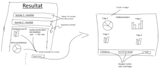
The first tier of the prototype was made as a digitally drawn sketch that gave a rough overview of the current system as well as how the visualisation model would be implemented into it. As can be seen in (Fig 1) the lo-fi contained the
7https://blog.stackpath.com/glossary/lazy-loading/
location of the metadata and a general outline for how the charts would be displayed.
Fig 1. Lo-fi made of the visualization model containing short component descriptions
Middle-Fi
The second tier was made using the online prototyping tool
proto.io . Images from the prototype can be found in8
Appendix 1. The design was worked out by discussing the lo-fi trying to decide what would be needed to provide an adequate representation of the results. It was decided that the metadata should be the front of the visualisation model, not hidden behind any click events so that you would easily be able to see the general status of your survey. It was decided that the metadata displayed should contain the survey participation and the question with the largest variety in answers.
When viewing the results the charts could not disturb the normal flow of the system, to accommodate this it was decided that they should be put into a dialog. When actually displaying the charts the following things were deemed critical. The user should easily be able and see from which iteration the current results are taken. All charts should connect to their related question in a clear way. They should be separated in such a way that there can be no misunderstanding as to which question they represent. When comparing results from different iterations the selected iterations should be displayed and changing them should be at most two clicks away.
After listing the needed features they were then worked into two different designs to assure that the final prototype would be the culmination of the different ways of designing the visualisation model.
Fig 2. First of the two middle-fi versions to be made.
Hi-Fi
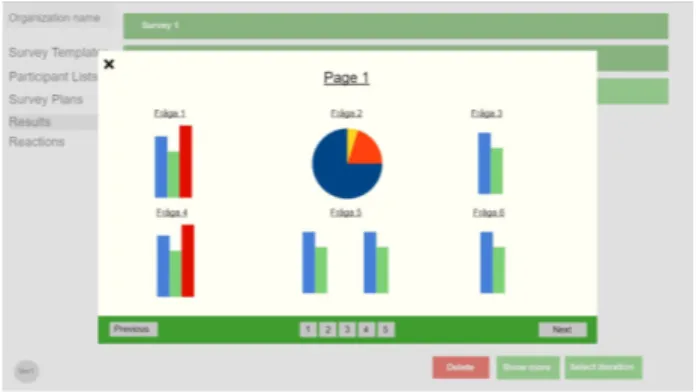
The final prototype made and also the design used when implementing the product into the system. Determined through combining the two middle-fi prototypes. Following the principle of less is more only features deemed crucial were transferred to the hi-fi. The design was kept simple leaving a lot of room around the element to emphasize the results displayed. The placement of the metadata and the participation information was kept from the two middle-fis. To keep the dialog clean and have it follow the principle of less is more all charts are displayed continually in a list, not hidden behind tabs or pages.
Fig 3. Final prototype and design of the product
Prototype evaluation
During each transition to a higher tier of prototyping, discussions were had with people of increasing in depth knowledge of the system according to the above mentioned prototyping model [12]. Discussions made before transitioning into the second tier (middle-fi) were had with an academic who is a regular user of the survey tool. Before transitioning into the third tier (high-fi), a discussion was had with a representative for the company with high in depth knowledge of the system.
After each of the discussions, suggestions were compiled into a document and were taken into consideration during the creation of the next tier of prototypes.
Implementing the frontend
Choosing a graph library
The graph library used in this project is Chart.js . When9
deciding on which library to use importance were put on the customizability and ease of implementation. An implementation of a few charts were made for each of the tested libraries with the end result being the decision to10 use Chart.js when implementing the charts.
Chart components
The four chart types described previously were implemented as three separate components. One component for both the Column and Bar charts and then one each for the Pie and Line charts. These then set the design for all charts of that type when rendering using a dataset received from a question component or metadata component. All chart designs follow the principle of less is more having all functionality that doesn’t improve the presentation of information turned off.
Question components
The question types were all implemented as separate components because each of the questions have a different structure and thus need to compute the dataset differently. All question components that utilize the same chart component produce identical datasets. The dataset is then sent to the chart component associated with the question.
Metadata
Two types of metadata were implemented one for open surveys visualized with a line chart and one for closed recurring surveys visualized with a stacked bar chart (Fig 4). The open metadata illustrate the activity of the survey from the first answer received until present time. The recurring metadata show how many participants there is for a iteration of the survey and how many of them have answered.
Rendering charts
The metadata is shown directly on the tab of the survey being inspected whilst to not disrupt the normal flow of the system a separate dialog window, covering a majority of the screen, is opened and used when rendering the survey results. The questions are loaded and rendered as charts in the same order they appeared in the survey, being displayed linearly in the dialog as the user continues to scroll. To keep up performance and reduce load times the charts are only rendered when they are about to be on screen using a lazy load algorithm. Any rendered chart that is scrolled passed is
9http://www.chartjs.org/
unloaded and cached so that no recomputation is required during the next rendering process.
Implementing the backend
When displaying the survey results there is two options for which answers to load. By default it will load all answers to the question through all iterations of the survey. But if the survey happens to be recurring there is also the option of choosing which iteration of the survey you would like to load the answers from.
Evaluation
To ensure that our research questions are correctly answered, we have to make sure that the method used to evaluate the visualization model is able to provide an unbiased result. For this purpose it was decided to use a SUS as a base for the evaluation.
To perform the evaluation, an example user was created and was given an example survey about an arbitrary subject. Questions were then selected to cover each of the question typesYes/No,Multiple alternatives,Interval,Analog scale, andDate/Time at least once with some additional questions added to expand the result dialog window, allowing the user to experience the implemented lazy load scroll as well. The survey was then answered several times by us using a pseudo random pattern when selecting our answers to provide some sample data simulating those of real surveys. Instructions were then made for how to access the example user, where the survey was located in the system and how to evaluate their experience after the reviewer had looked through the visualization model and felt satisfied. The evaluation was done through a survey 11 containing the standard ten SUS questions. Two questions about the charts with the options of leaving thoughts and opinions. Concluding with the opportunity to leave personal thoughts and suggestions about the product.
11 See appendix 2
The instructions were sent out to people with previous experience with the survey tool. This includes employees at the survey tool’s company as well as members of the target group. The given option to answer the survey was made available for five days time before it was closed.
After the survey had been closed, a SUS score had to be compiled. In order to do this each participant answer first had to be converted into a value between 1 to 5 were strong disagreeance to a questions were given the value of 1 and strong agreement the value of 5. The answers of each participant was then summed up according to SUS specifications to create individual SUS scores. The average of all the scores then became the final SUS score for visualization model.
RESULTS
In this chapter the results of the project will be presented. The visualization model
The final design of the visualisation model contains the three previously mentioned features, metadata, a dialog window for the charts and the option to compare results from longitudinal surveys. The metadata is displayed as soon as you view a survey and displays the survey’s participation. When viewing the results all charts are displayed in a list opened in a new dialog window. If the currently viewed survey is longitudinal a selector with the option to select iterations for comparison is available. Evaluation
Results based off of compiled answers from the evaluation where 10 system users participated. Resulted in a SUS score of 78.8. According to the SUS adjective rating scale presented by Bangor et al [17], this score achieves the grade of C which corresponds to the adjective rating of “Good”. Results displayed in (Fig 5).
Following questions about chart interpretation gave the following results. The initial metadata chart had a turnout of 60% positive (6), 20% negative (2) and 20% undecided (2).
Turnout for the question charts was 70% positive (7), 20% negative (2) and 10% undecided (1).
DISCUSSION
Discussing choices made during the course of the project as well as the results given from previous section.
Method
Prototyping
The choice to prototype was made in order to better understand how the product would look and what steps the implementation would involve. Having something to look at that showed the features that would have to be implemented removed many of the choices that otherwise would have had to been made during implementation. Though probably the most important thing gained from prototyping might have been that it was a good way of discussing thoughts and opinions regarding the different features of the product. Making sure that everyone were onboard with what had to be done and how the product would look.
The discussions held with an academic from the target group during the transfer from the middle-fi tier to the hi-fi tier could in other cases be seen as problematic as someone who will be evaluating the implementation also plays a part in its design. We do however consider it valid in this situation as the visualization model’s objective was to increase the usability for the target group. As such taking their opinions into account when designing the visualisation model would have a positive impact on the final result. When making the prototypes the mediums used were not given much importance since as shown in the work by Takayama and Landay [11], they have low impact on the actual result. The focus were instead put on the prototyping process and what structure to use for which the three tier structure used by Maron et al [12] was chosen.
This decision was made because it had a good balance between how much time would have to be spent on prototyping and how reworked the final design would be before implementation started. This proved useful since the
changes made to the design between the different tiers showed an increase in how clean and intuitive it became since they were things not noticed when designing the previous tier. If instead the decision would have been to use one or two tiers of prototyping the time spent reworking the prototype after discovering a flaw would have consumed more time than the current amount spent prototyping.
Implementing the frontend
While implementing the visualization model, we felt that some effort had to be made to ensure the visualization tool’s performance across platforms. In the events of a survey containing a larger set of questions, then it simply would not be a viable option to attempt an eager load in which all data would be loaded at the same time. Both because of the amount of network load required to retrieve the data and the amount of html canvas elements that would have to be created at once. This made us consider lazy loading as a design pattern for our component loading as it would allow users to have similar experiences across different platforms.
The decision to store rendered charts locally came because we saw that when scrolling through the visualization model, React would trigger a rerender for the various charts causing major performance drops. Caching the rendered charts allowed us to avoid the calculations associated with rendering the canvases.
Evaluation
Creating our own test data for the example survey may not have been optimal in terms of creating a life like data set. We however felt that this approach was validated as the main objective of the evaluation was to experience the visuals of the visualization model instead of the actual content.
SUS was in this project used as a determiner for how satisfied the survey tool’s users were with the implementation of the visualization model. Should we however in the future want to further develop the implementation, then the SUS could have been used recurrently, as proposed in the third option discussed by
Bangor et al [16], to find out if each implementation step improve, or worsen, the users satisfaction with the visualization model.
SUS is a widely adopted tool within the UX community for measuring usability as such it is a valid tool to use when12 determining the visualisation model’s usability.
Results
Evaluation
Using SUS as a base for evaluation proved to give us a good answer as to what system users thought about the product. What could be discussed however was if the amount of evaluation participants was sufficient to reach a definite conclusion. Although a higher participation amount would have provided a more exact result, we still believe that the current amount was sufficient. This because of the similarity between users within the target group. Given that a majority could be considered academics within similar areas allows us to assume that the answers we have got could be representative of the target group as a whole. While the results themselves are a great indicator that the visualisation model improved the data’s readability, the difference from the previous method of viewing data through CSV-files cannot really be measured. Had the project been redone, then an initial SUS evaluation would have been made on the original system. This initial evaluation could then have been used as a baseline for our final result displaying exactly how much of a difference data visualization had on the visualization model’s usability.
Evaluating the response given to the chart questions showed that while a close majority of users found the metadata chart (Fig 4) to be understandable, there were those that found it somewhat misleading. Comments made suggested that data labels were unclear and would have preferred them displaying a time interval instead the specific times of answers. This could be taken into account for any eventual future attempts at a similar system.
On the question of whether or not the charts for each question type where understandable, 70% of users gave a positive answer which indicates that the implementation was successful. A major concern amongst the other 30% however was the charts for both the Analog Scale question type as well as the Date/Time question type. Comments made stated that the Line chart approach for displaying spread between data points felt out of place and hard to understand and would much rather see that Bar charts were used even for these types, contrary to what previous data suggests.
12https://research-collective.com/blog/sus/
CONCLUSIONS
Dealing with a lot of data and getting a good grasp of the situation can be hard when only having texts and numbers to look at. Therefore an attempt at visualising survey results has been implemented and tested.
The visualization feature implemented into the survey tool allows users to view survey metadata displaying its participation rate over time. On top of that, the tool allows users to, through an openable dialog window, receive an overview of given results in a more clear and easily understandable fashion than the previous method of using CSV-files.
From the results of the evaluation survey it can be seen that the new visualisation method was positively received. The charts used to present result were understood and could be used to quickly gain an understanding for how the survey is progressing. We can from this conclude that given this result, the new visualization model provided a better overview of the survey’s result.
This implementation is supposed to give an overview of a survey’s results. Although, while viewing charts could provide humans with a quick understanding of the data, there are still situations when more in depth research will require the use of CSV-files, such as when the data is processed with a machine learning algorithm.
Future work
We believe that given our research questions we have reached a satisfactory result. We do however still consider there to be more research that could be done within the area.
Performance improvement
A recommendation would be to determine whether or not performance or usability would significantly improve should a chart library based on Scalable Vector Graphics (SVG) instead of html canvas elements.
Improving chart implementation
Another recommendation based off of the results from the evaluation would be to examine the perceived improvement in usability should the question types Analog scale and
Date/Time be reimplemented to instead of using a Line chart use a Bar chart configured as a histogram.
REFERENCES
1. Hiltz, S. R., & Turoff, M. (n.d.). STRUCTURING COMPUTER-MEDIATED COMMUNICATION SYSTEMS TO AVOID INFORMATION OVERLOAD. Retrieved from
https://dl.acm.org/citation.cfm?id=3895
2. Edmunds, A., & Morris, A. (2000). The problem of information overload in business organisations: a review of the literature. International Journal of
Information Management, 20(1), 17–28.
https://doi.org/10.1016/S0268-4012(99)00051-1
3. Barlow, J., & Usa, T. (n.d.). Coping with Information Overload. Retrieved from
http://www.tmiaust.com.au/downloads/Articles/20 03_Copingwithinformationoverload_2003.pdf 4. Savolainen, R. (2007). Filtering and withdrawing:
strategies for coping with information overload in everyday contexts. Journal of Information Science,
33(5), 611–621.
https://doi.org/10.1177/0165551506077418 5. Henricksen, K., Indulska, J., & Rakotonirainy, A.
(2002). Modeling Context Information in Pervasive Computing Systems (pp. 167–180). Springer, Berlin, Heidelberg.
https://doi.org/10.1007/3-540-45866-2_14 6. Cheverst, K., Davies, N., Mitchell, K., & Smith, P.
(2000). Providing Tailored (Context-Aware) Information to City Visitors (pp. 73–85). Springer, Berlin, Heidelberg.
https://doi.org/10.1007/3-540-44595-1_8
7. Kleinberg, J. (n.d.). Temporal Dynamics of Online Information Streams. Retrieved from
http://www.cs.cornell.edu/info/people/kleinber/stre am-survey04.pdf
8. Plaisant, C., Milash, B., Rose, A., Widoff, S., & Shneiderman, B. (1996). LifeLines: visualizing personal histories. In Proceedings of the SIGCHI
conference on Human factors in computing systems common ground - CHI ’96 (p. 221-). New York, New York, USA: ACM Press.
https://doi.org/10.1145/238386.238493 9. Havre, S., Hetzler, B., & Nowell, L. (n.d.).
ThemeRiver: visualizing theme changes over time. In IEEE Symposium on Information Visualization
2000. INFOVIS 2000. Proceedings (pp. 115–123). IEEE Comput. Soc.
https://doi.org/10.1109/INFVIS.2000.885098 10. Dubinko, M., Kumar, R., Magnani, J., Novak, J.,
Raghavan, P., & Tomkins, A. (2007). Visualizing
tags over time. ACM Transactions on the Web, 1(2), 7–es.
https://doi.org/10.1145/1255438.1255439 11. Walker, M., Takayama, L., & Landay, J. A.
(2002). High-Fidelity or Low-Fidelity, Paper or Computer? Choosing Attributes when Testing
Web Prototypes. Proceedings of the Human
Factors and Ergonomics Society Annual Meeting,
46(5), 661–665.
http://doi.org/10.1177/154193120204600513 12. Maron, D., Missen, C., & Greenberg, J. (2014).
Proceedings of the International Conference on Dublin Core and Metadata Applications.
International Conference on Dublin Core and Metadata Applications. Dublin Core Metadata Initiative. Retrieved from
http://dcpapers.dublincore.org/pubs/article/view/37 13/1936
13. DATA VISUALIZATION 101: HOW TO DESIGN CHARTS AND GRAPHS. (n.d.). http://content.visage.co/hs-fs/hub/424038/file-2094 950163-pdf
14. John Brooke, "SUS: a ‘quick and dirty’ usability scale," in Usability Evaluation In Industry, Patrick W. Jordan, B. Thomas, Ian Lyall McClelland, Bernard Weerdmeester. Great Britain: T.J. Press (Padstow) Ltd, 1996, pp. 189-194.
15. Motoda, H., & Liu, H. (Eds.). (2007).
Computational Methods of Feature Selection (Vol. 20071386). Chapman and Hall/CRC.
https://doi.org/10.1201/9781584888796 16. Bangor, A., Kortum, P. T., & Miller, J. T.
(2008). An Empirical Evaluation of the System
Usability Scale. International Journal of
Human-Computer Interaction, 24(6), 574–594. https://doi.org/10.1080/10447310802205776 17. Usability Professionals’ Association., A.,
Kortum, P., & Miller, J. (2005). Journal of
usability studies.Journal of Usability Studies (Vol. 4). Usability Professionals’ Association. Retrieved from
APPENDIXES
Appendix 2 - Evaluation survey
Below are the questions asked in the evaluation survey that was sent out. The questions were divided into a SUS part and a part about user experience with the system.
SUS - questions
1. I think that I would like to use this system frequently. 2. I found the system unnecessarily complex.
3. I thought the system was easy to use.
4. I think that I would need the support of a technical person to be able to use this system. 5. I found the various functions in this system were well integrated.
6. I thought there was too much inconsistency in this system.
7. I would imagine that most people would learn to use this system very quickly. 8. I found the system very cumbersome to use.
9. I felt very confident using the system.
10. I needed to learn a lot of things before I could get going with this system. User experience questions
11. I felt like I understood what the charts represented? 12. If not, what was unclear?
13. I felt like I understood what the initial participation chart represented? 14. If not, what was unclear?