Swedish National Road and Transport Research Institute www.vti.se
Analysis of daily variation in bus occupancy rates for city-buses
in Uppsala and optimal supply
VTI Working Paper 2020:8
Roger Pyddoke
Transport Economics, VTI, Swedish National Road and Transport Research Institute
Abstract
Recently several papers have analyzed optimal supply of public transport in the sense of optimal prices, frequencies, bus sizes, spacing of bus stops for a public transport authority facing a certain static demand for trips. This paper is motivated by the observation that demand for bus services varies between weekdays even for the same departure analyzes the magnitude of this variation and its implications for optimal supply. This analysis was enabled by the relatively recent adaption of technologies for counting passengers boarding and alighting and motivated by the relatively few published studies of such data. This paper therefore uses calculated rates between bus stops in the Swedish city Uppsala, and analyses the average variation in geography, between directions and between the same departure times and directions. The central results are that; there are parts of lines with systematically higher and lower occupancy rate than average without corresponding supply adaptions, there is substantial variance in the occupancy on buses leaving the same bus stop at the same time on week days, and welfare optimization indicates that providing capacity to cover maximum observed demand with seats in buses is not necessarily optimal.
Keywords
Public transport, bus, occupancy, load factor, variation in time and space
JEL Codes
1
Analysis of daily variation in bus occupancy rates for city-buses in
Uppsala and optimal supply
Roger Pyddoke
Abstract
Recently several papers have analyzed optimal supply of public transport in the sense of optimal prices, frequencies, bus sizes, spacing of bus stops for a public transport authority facing a certain static demand for trips. This paper is motivated by the observation that demand for bus services varies between weekdays even for the same departure analyzes the magnitude of this variation and its implications for optimal supply. This analysis was enabled by the relatively recent adaption of technologies for counting passengers boarding and alighting and motivated by the relatively few published studies of such data. This paper therefore uses calculated rates between bus stops in the Swedish city Uppsala, and analyses the average variation in geography, between directions and between the same departure times and directions. The central results are that; there are parts of lines with systematically higher and lower occupancy rate than average without corresponding supply adaptions, there is substantial variance in the occupancy on buses leaving the same bus stop at the same time on week days, and welfare optimization indicates that providing capacity to cover maximum observed demand with seats in buses is not necessarily optimal.
2
1 Introduction
Public transport demand for the same line, bus stop, departure time and direction vary from day to day. The distribution of this demand for public bus transport in Uppsala is examined as the
occupancy rate (or load factor)1 and its implications for frequency planning is analyzed. This daily variation in occupancy rate for the same departure does not appear to be subject to explicit consideration in Swedish public transport planning. One possible reason for this may be that until now few public transport authorities have had the equipment to count both boarding and alighting passengers. Another possible reason may be that until recently most public transport agencies have not administered their data in a fashion making it possible to easily use data on occupancy rates for the purposes of planning.
Official follow ups focus on aggregate boardings and sometimes the aggregate variation in demand over the day (e.g. the statistical yearbook of Region Uppsala 2018). The Swedish Association of Local Authorities and Regions (SALAR) (2018) publishes a comparison of average occupancy rates in buses. In 2017 the average occupancy rate in region Uppsala was about 11 passengers per bus. This level of abstraction disregards the differences between lines and even more the variation between
departures.
Technologies for collection of detailed data on boarding and alighting have been available for a long time. This has led to good knowledge about variations in occupancy rates in time and space (see e.g. Vuchic, 2017). This knowledge also appears to be used in planning of capacity (Vuchic 2017). The research question addressed in this paper is what capacity in terms of frequency is welfare optimal to provide when demand varies for a given departure. The starting point was the observation from Asplund and Pyddoke (2020) that Uppsala appeared to oversupply on bus departures
comparing supply to average occupancy rate. This triggered the idea to look closer at data on variation in occupancy rates with the hypothesis that a high variation in occupancy could justify a higher supply than the average occupancy rate would.
Background
The planning of supply of bus services in Uppsala proceeded from the fact that Uppsala adopted the goal to double its ridership from 2010 to 2020 (Region Uppsala 2011). This goal may have led to an emphasis on improved services to attract new ridership. When the proposal for a new Transport plan (Trafikförsörjningsprogram 2020-2030) was presented the goal to double ridership was adjusted (Region Uppsala 2019). Furthermore, public transport in Sweden has experienced substantial increases in bus boardings the last decade (Figure 1) and so has Region Uppsala (Figure 2).
3
Figure 1 Development of bus boardings in Sweden from 2009 to 2018. Source: Trafikanalys 2019 In Sweden bus boardings grew by 30 percent from 2009 to 2018. In Uppsala bus boardings grew by 50 percent from 2009 to 2018.
Figure 2 Development of bus boardings in city buses in Uppsala from 2009 to 2018. Source: Region Uppsala public transport.
Literature
In the last decade several papers have been published discussing the welfare optimal supply of public transport (e.g. Basso and Silva 2014, Tirachini et al. 2014, Börjesson et al. 2017, Asplund and Pyddoke 2020). The latter three optimize the supply with regard to average occupancy rates. None of these however attempt to model the actual occupancy rates on an actual bus line. Tirachini et al (2014) model a corridor serviced by bus with origin-destination data and appear to come close to modelling a bus line but do not analyze count data from buses.
In the textbook literature (e.g. Vuchic 2017) the theme of occupancy rate variation over a line is well developed. One of the capacity adjustments suggested for lines with uneven occupancy over the line in Vuchic (2017) is so called short turning. This can mean that a line running from the periphery to the center and back with more occupancy closer to the center the supply of capacity can be adjusted
80 90 100 110 120 130 140 2009 2010 2011 2012 2013 2014 2015 2016 2017 2018 In d ex 209= 100
Total boardings
0,0 5,0 10,0 15,0 20,0 25,0 30,0 2009 2010 2011 2012 2013 2014 2015 2016 2017 2018 Bora rd in gs m ill ion Year4
so that some departures turn at half way to the periphery thus giving I higher frequency in the inner city than in the outer parts.
An early contribution is Ceder (1984) who analyzes data collection approaches and four different methods to derived efficient bus frequency. Two uses maximum load observations and two uses load profile data. Mohaymany and Amiripour (2009) construct a method intended to be used with an origin-destination matrix between every two stations during the day as input data.
A survey of policies to reduce crowding in Svanberg and Pyddoke (2020) also summarizes some papers on occupancy rates. Bunker (2016) aims at devising a method that may assist benchmarking and decision making on line and scheduling design using two distinct measures of occupancy rates and passenger (load factors), defining the ratio between the factors as the load diversity coefficient. Bunker uses these numbers to demonstrate variation in quality of service over time and space. This paper does not explicitly analyze the variation between the same departures on different days. Wang et al. (2011) use a variety of automatic data collection sources to estimate OD matrices and
variations of weekday and weekend travel patterns to infer connected trips for planning purposes. None of these studies explicitly considers data where the variance of bus travel for the same departure time can be calculated in Sweden or the academic literature.
An important strand of literature models large scale public transport networks to represent crowding (e.g. de Palma et al. 2015 and Cats et al. 2016) where the latter uses dynamic stochastic models to capture benefits of increased capacity in terms of, among other benefits, reduced crowding effects. This study finds that failure to represent dynamic effects, e.g. bus bunching, may substantially underestimate the benefits from capacity increases.
The contribution of this study is to explicitly map the variance of occupancy between the same line, departure time and direction between workdays in a smaller network and to discuss its implications for welfare optimal supply of frequencies. The management of such measurements and calculations represents lower costs than managing a full scale modeling of the network.
The paper is organized as follows. Section 2 presents data and method. Section 3 maps average occupancy rates between bus stops for different lines and different times of the day for a sample of bus lines. Section 4 presents the variation in occupancy between bus stops for a sample of lines in terms of minimum, average and maximum occupancy rates between bus stops. This section also presents possible rules of thumb underlying Uppsala’s planning. Section 5 discusses the
consequences of choosing frequency to optimize expected welfare. Section 6 discusses results and concludes.
5
2 Data and method
Data were collected from different bus lines in Uppsala from January to May in 2018. The data represent counting boarding and alighting passengers at each stop and from these calculating the number of passengers between stops. This paper therefore uses calculated occupancy rates between bus stops.
There are examples of negative net numbers of passengers at end of lines. This indicates that counting technology is not perfect, i.e. it happens that when more than one passenger boards this is counted as one. This casts some doubt on the reliability of the measuring technology. The rates of negative passenger numbers are however small, so these observations have been deleted.
Only a share of all buses is equipped with counting devices. This share is about 14 percent of the city buses in Uppsala. These buses are rotated among lines and departures so that each departure gets covered at least sometimes during a year. In our sample the number of times a certain line, direction and departure time has been analyzed.
We have not sought to find data on occupancy rates from other PTAs. For some RPTAs we know that they do not have similar data as they do not count alighting passengers.
The paper will proceed to present average occupancy rates at different times of the day and along lines in section 3 from a large number of departures are presented. In section 4, minimum, average and maximum occupancy rates from about 17 observed departures in spring 2018 are presented. In section 5 an attempt to model the expected utility of a certain level of frequency given a stochastic demand. This very simple model is just to demonstrate that when demand varies in a stochastic fashion then expected utility optimal supply should be larger than optimal supply for certain average demand.
6
3 Average occupancy rates
In the following Figure 3 the average number of boardings per day for Uppsala city’s seven most used bus lines are presented.
Figure 3 The distribution of average aggregate boardings between the five bus lines with highest demand in Uppsala. Source: Region Uppsala public transport.
Note that the aggregate boardings on the most demanded line 3 is more than double that of the number for line 8. Figure 4 presents the aggregate distribution of boardings in Uppsala over the day in weekdays.
Figure 4 The distribution of demand over a weekday in Uppsala 2018. Source: Region Uppsala public transport.
Note that the two busiest hours are 7-8 and 15-16.
The standard bus size in Uppsala has 47 seats and takes 66 further standing passengers. This implies that theoretically and legally the buss is full when there are 113 passengers onboard or the bus. Calculated as the number of passengers on board buses over the number of seats, the occupancy rate for a full bus is 2.40. Long before this level of occupancy passengers will subjectively experience
0 2000 4000 6000 8000 10000 12000 14000 3 5 4 7 2 6 8 Av era ge n u m b er o f b o ar d in gs p er d ay Line number 0 2 000 4 000 6 000 8 000 00-01 01-02 02-03 03-04 04-05 05-06 06-07 07-08 08-09 09-10 10-11 11-12 12-13 13-14 14-15 15-16 16-17 17-18 18-19 19-20 20-21 21-22 22-23 23-00 Boa rd in g p er w ee kd ay Departure time
7
crowding that is a discomfort from too many people on board. This discomfort is estimated to increase at different pace in different studies the more seats are taken. In Asplund and Pyddoke (2020) the function is quadratic while in de Palma et al. (2015) it is exponential2. Figure 5 presents a discomfort cost function from Asplund and Pyddoke (2020).
Figure 5 The average crowding discomfort cost per passenger SEK/h as a function of occupancy rate.
In Uppsala the average value of travel time in public transport was assumed to be 37 SEK/hour (Asplund and Pyddoke 2020). At an occupancy rate of about 1,5 the average discomfort cost reaches about the same level as the average travel time cost.
In crowded conditions the benefits from increased frequency will therefore consist of shorter travel times due to less boarding and alighting, shorter waiting times at bus stops, less crowding costs and less risk of being denied boarding3 (implying even longer waiting times).
The uneven demand distribution among the seven most demanded bus lines is not fully reflected by an uneven supply. Instead the supply is quite large for these lines. This leads to quite low average occupancy rates for some lines. The following diagrams show average occupancy rates in city lines in Uppsala between 7 and 8 am. Note the following:
i) According to Figure 3 the average aggregate boardings quite uneven between the lines. ii) According to Figure 4 that 7-8 is the busiest hour. We therefore concentrate on that hour.
But also present some distributions of occupancy rates for other periods. iii) In the studied period line 3 had a higher frequency than the other lines.
In the following Figures the scales of the occupancy rates are different for the different directions.
2 See e.g. de Palma et al. (2015). For a review of policies for crowding see Svanberg and Pyddoke (2020). 3 A rough estimate of the risk of being denied boarding is provided by the following observations. The average
number of passengers boarding in the two peak-hours per month is about 332 000. The average number of passengers denied boarding is estimated to be about 150 passengers per month. Assuming that passengers are denied boarding only (mostly) in peak, this implies a risk of being denied boarding in peak of about 0.045 percent. This risk could easily increase if capacity was significantly reduced.
0 10 20 30 40 50 60 70 80 90 100 0,5 0,6 0,7 0,8 0,9 1 1,1 1,2 1,3 1,4 1,5 1,6 1,7 1,8 1,9 2 2,1 2,2 2,3 2,4 Crrow d in g d is comf o rt SE K/h Occupancy rate
8
Figure 6 Line 3 average occupancy rates (occupancy rates relative to total capacity) between 7 and 8 in the morning between each stop. Interval 6 minutes. Source: Region Uppsala public transport. For this line occupancy rates in the two directions are also quite asymmetric. For large parts of the line the average occupancy rate lies below 40 percent.
Figure 7 Line 5 average occupancy rates between 7 and 8 in the morning between each stop. Interval 10 minutes. Source: Region Uppsala public transport.
Here the average occupancy rate did not exceed 40 percent. For line 5 the average occupancy rateindicates a pyramid shape. This suggests short turning in the central part could be a good idea.
0% 20% 40% 60% 80% 100% 120%
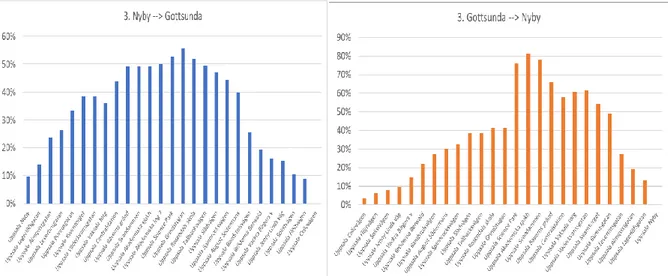
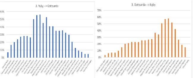
3. Nyby --> Gottsunda
0% 10% 20% 30% 40% 50% 60% 70% 80% 90%3. Gottsunda --> Nyby
0% 5% 10% 15% 20% 25% 30% 35% 40% Up p sala S te n h ag e n sko lan Up p sala Ki se lväge n U p p sal a S te n rö se t Up p sala G ats te n en Up p sala F lo gs ta Ce n tr u m Up p sala S tu d en ts tad e n Up p sala G ö tg atan Up p sala Kl o ste rg atan Up p sala Ce n tr als tati o n Up p sala S tr an d b o d gat an Up p sala V imp e lg atan Up p sala Ku gg e b ro Up p sala L ap p lan d sre san Up p sala Dan ep o rt Up p sala S målan d sväge n5. Stenhagen --> Sävja
0% 5% 10% 15% 20% 25% 30% 35% 40% 45% Up p sala S målan d sväge n Up p sala Dan ep o rt Up p sala L ap p lan d sre san Up p sala Ku gg e b ro Up p sala V imp e lg atan Up p sala S tr an d b o d gat an Up p sala Ce n tr als tati o n Up p sala S ko lg atan Up p sala E ko n o m iku m Up p sala Ric ko m b erg a Up p sala H ed en sb e rg sväge n Up p sala S te n h äll e n U p p sal a S te n h ag e n s Ce n tr Up p sala H er rh ag e n s B yväg5. Sävja --> Stenhagen
9
Figure 8 Line 2 average occupancy rates between 7 and 8 in the morning between each stop. Interval 10 minutes. Source: Region Uppsala public transport.
For this line the average occupancy rate in peak does not exceed 80 percent. For large parts of the line the average occupancy rate does not exceed 50 percent.
Figure 9 Line 8 average occupancy rates between 7 and 8 in the morning between each stop. Interval 10 minutes plus two extra runs between the central station and Ultuna.
For this line the average occupancy rate in peak does not exceed 100 percent. For large parts of the line the average occupancy rate does not exceed 60 percent.
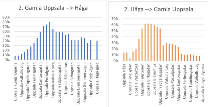
0% 10% 20% 30% 40% 50% 60% 70% 80% 90% Up p sala Ku n gs h ö garn a Up p sala V alh al ls väg Up p sala T o p el iu sg atan Up p sala F erl in sg atan Up p sala Kan to rs gatan Up p sala Po rt alg atan Up p sala V aks ala to rg Up p sala T räd gård sg atan Up p sala Blås en h u s Up p sala Bir ka gatan Up p sala L in d sb erg sg atan Up p sala G limmer väge n Up p sala G n ejs vä ge n Up p sala H åg a går d
2. Gamla Uppsala --> Håga
0% 10% 20% 30% 40% 50% 60% 70% Up p sala H åg a Up p sala G n ejs p lan Up p sala V äs te rt o rg Up p sala T äljs te n en Up p sala Bir ka gatan Up p sala Blås en h u s Up p sala T räd gård sg atan Up p sala V aks ala to rg Up p sala Po rt alg atan Up p sala Kan to rs gatan Up p sala F erl in sg atan Up p sala T o p el iu sg atan Up p sala V alh al ls väg Up p sala Ku n gs h ö garn a
2. Håga --> Gamla Uppsala
0% 10% 20% 30% 40% 50% 60% 70% 80% 90% 100% Up p sala G arn is o n en Up p sala F lo tt ö rg atan Up p sala S kö ld u n gag atan Up p sala Kl o ste rg atan Up p sala Bäv ern s g rä n d Up p sala A kad emi ska i n g 7 Up p sala Ul le råk e r n o rr a Up p sala Ul tu n aa llé n Up p sala E n ti tp ark e n Up p sala T ras th ag en Up p sala L ärk väge n
8. Ärna --> Sunnersta
0% 20% 40% 60% 80% 100% 120% Up p sala L ärk väge n Up p sala S u n n er stab ac ke n Up p sala S vank ärr svä ge n Up p sala E n ti tp ark e n U p p sal a Ho lmvä ge n Up p sala G en e ti kväg e n Up p sala Ul le råk e r n o rr a Up p sala S ci en ce P ark Up p sala S vand ammen Up p sala Ce n tr als tati o n Up p sala S ko lg atan U p p sal a S kö ld u n gag ata n Up p sala F järd h u n d rag atan Up p sala Bärb yp ark en Up p sala G arn is o n en8. Sunnersta --> Ärna
10
Figure 10 Line 1 average occupancy rates between 7 and 8 in the morning between each stop. Interval 10 minutes. Source: Region Uppsala public transport.
This is a new circle line. In this case the average occupancy rate does not exceed 45 percent in one direction but did not exceed 45 in the other direction. The patterns of occupancy rates also differ and are quite asymmetric.
Note the following:
• All the presented lines have low occupancies close to their terminuses
• The average occupancy rate is largest in the center (between the central station and the hospital) for most of the lines. If it was not for the central parts many of the lines average occupancy rates lie below 30 percent for large parts of the line.
• These observations suggest that
o a higher frequency for a shorter line (in the center) and a lower frequency for a longer line could be motivated in some cases.
o a generally lower frequency could be possible
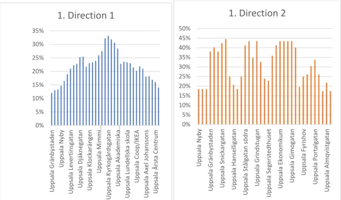
0% 5% 10% 15% 20% 25% 30% 35% Up p sala G rän b ys tad e n Up p sala N yb y Up p sala L eve rti n sg atan Up p sala Djäkn eg atan U p p sal a Kl o ckar än ge n Up p sala Mi mm i… Up p sala Kyrk o gård sg atan Up p sala A kad emi ska… Up p sala L u n d el ls ka s ko la Up p sala Co o p /IKE A Up p sala A xe l Jo h an ss o n s Up p sala Å rs ta Ce n tr u m
1. Direction 1
0% 5% 10% 15% 20% 25% 30% 35% 40% 45% 50% Up p sala N yb y Up p sala G rän b ys tad e n Up p sala S n ic kar ga tan Up p sala H an se lli gatan Up p sala S tål gatan s ö d ra Up p sala G ri n d stu gan Up p sala S eg e rs te d th u se t Up p sala E ko n o m iku m Up p sala G imo gatan Up p sala F yri sh o v Up p sala Po rt alg atan Up p sala A lmq vis tg atan1. Direction 2
11
Now study the following diagrams showing average occupancy rates in line 3 in Uppsala for different hours.
Figure 11 Line 3 average occupancy rates between 7 and 8 in the morning between each stop. Interval 6 minutes.
Figure 12 Line 3 average occupancy rates between 10 and 11 in the morning between each stop. Interval 10 minutes.
12
Figure 13 Line 3 average occupancy rates between 13 and 14 in the morning between each stop. Interval 10 minutes.
Figure 14 Line 3 average occupancy rates between 16 and 17 in the afternoon between each stop. Interval 6 minutes.
13
Figure 15 Line 3 average occupancy rates between 19 and 20 in the evening between each stop. Interval 15 minutes.
Note the following:
• The average occupancy rates are lower to and from Cellovägen than Nyby
• The average occupancy rates are largest in the center (between the central station and the hospital) off peak also.
• These observations therefore also suggest that a higher frequency for a shorter line and a lower frequency for a longer line could be motivated.
14
4 Variation in occupancy rates
In this section we compare the maximum occupancy rates between bus stops for the same bus line, direction, weekday, and departure time with the average occupancy rates. The occupancy rate is calculated as the ratio of the number of passengers on board over the number of seats. Therefore, disregarding the space for standing passengers.
These diagrams could be used to consider short turning. Just remember that if the RPTA or the operator uses the same vehicles for round trips then a lower frequency in one direction must
correspond to a lower frequency in the opposite direction. The diagrams are always with the starting point on the left side.
We start with Bus line 3.
Figure 16 The occupancy rate for Bus 3 direction from Nyby to Gottsunda 7.33 maximum, average and minimum with negative values deleted. Source: Region Uppsala public transport.
For Figure 16 the underlying number of observed departures was 17 observations. At this time, the frequency is departures each 6 minutes. Note that for this departure time and direction the average occupancy rate is just below 1.5 but the maximum occupancy rate in the central parts reaches towards 2.0, while the occupancy rate in minimum is barely reaches 0.6. This means that for the central parts of the line average occupancy rate regularly exceeds 1, i.e. there is regularly a need for some passengers to stand. No passenger should have been denied boarding. Only in small parts of the line does maximum occupancy rates pass below 0.5.
Uppsala RPTA collects data on the number of passengers left at bus stops. This data indicates that leaving passengers at bus stops is a rare occurrence. In most months the recorded number of passengers left does not exceed 150. Assuming that this primarily happens in peak
0,00 0,50 1,00 1,50 2,00 2,50 1 2 3 4 5 6 7 8 9 10 11 12 13 14 15 16 17 18 19 20 21 22 23 24 25 26 27 28 Max Average Min
15
Figure 17 The occupancy rate for Bus 3 direction from Gottsunda to Nyby 7.29 maximum, average and minimum with negative values deleted. Source: Region Uppsala public transport.
For Figure 17 the underlying number of observed departures was 8 observations. At this time the frequency is departures each 6 minutes. Note that for this departure time and direction the average occupancy rate almost reaches 1.2 but is mostly at 1 or below. The maximum occupancy rate, however, reaches 1.7 while the occupancy rate in minimum is never exceeds 0.7. In this direction, all passengers can sit almost always. In many links in peripheral parts maximum occupancy rate is below 0.7.
No passenger should have been denied boarding. In this direction a few more parts of the line do maximum occupancy rates pass below 0.5.
Turn now to line 4.
Figure 18 The occupancy rate for Bus 4 direction from Timjansgatan to Gottsunda 7.08 maximum, average and minimum with negative values set to naught. Source: Region Uppsala public
transport. 0,00 0,20 0,40 0,60 0,80 1,00 1,20 1,40 1,60 1,80 1 2 3 4 5 6 7 8 9 10 11 12 13 14 15 16 17 18 19 20 21 22 23 24 25 26 27 Max Average Min
0,00 0,20 0,40 0,60 0,80 1,00 1,20 1,40 1,60 1,80 2,00 1 2 3 4 5 6 7 8 9 10111213141516171819202122232425262728293031323334 Max Average Min
16
For Figure 18 the underlying number of observed departures was 17 observations. At this time the frequency is departures each 15 minutes. Note that for this departure time and direction the average occupancy rate is always below 1.1 but the maximum occupancy rate almost reaches 1.8, while the occupancy rate in minimum does not exceed 0.6.
This means that frequency is almost enough for most links to serve seats to all passengers. In the central parts some passengers regularly had to stand. In this direction about a third of the links have maximum occupancy rates pass below 0.5.
Figure 19 The occupancy rate for Bus 4 direction from Gottsunda to Timjansgatan 7.26 maximum, average and minimum with negative values set to naught. Source: Region Uppsala public
transport.
For Figure 19 the underlying number of observed departures was 21 observations. At this time the frequency was departures each 15 minutes. For this departure time and direction, the average occupancy rate was below 1.3 at all times but the maximum occupancy rate almost reaches 2.3, while the occupancy rate in minimum does not exceed 1.0.
For a large part of the maximum occupancy rate was below 0.6. Here there appears to be a potential for short turning.
Now turn to line 8.
0,00 0,20 0,40 0,60 0,80 1,00 1,20 1,40 1 2 3 4 5 6 7 8 9 101112131415161718192021222324252627282930313233 Max Average Min
17
Figure 20 The occupancy rate for Bus 8 direction from Ärna to Sunnersta 7.23 maximum, average and minimum occupancy rates with negative values set to naught.
For Figure 20 the underlying number of observed departures was 22 observations. At this time the frequency is departures each 10 minutes. For this departure time and direction, the average occupancy rate is below 1.2 at all times but the maximum occupancy rate almost reaches 2.3, while the occupancy rate in minimum does not exceed 1.0.
For a large part of the line maximum occupancy rate is below 0.6.
Figure 21 The occupancy rate for Bus 8 direction from Sunnersta to Ärna 7.32 maximum, average and minimum occupancy rates with negative values set to naught.
For Figure 21 the underlying number of observed departures was 29 observations. At this time the frequency is departures each 10 minutes. For this departure time and direction, the average occupancy rate is below 1.2 at all times but the maximum occupancy rate almost reaches 2.3, while the occupancy rate in minimum does not exceed 0.26. This means that in the central parts some
0,00 0,50 1,00 1,50 2,00 2,50 1 2 3 4 5 6 7 8 9 1011121314151617181920212223242526272829303132 Max Average Min
0 0,2 0,4 0,6 0,8 1 1,2 1,4 1,6 1,8 2 1 2 3 4 5 6 7 8 9 10 11 12 13 14 15 16 17 18 19 20 21 22 23 24 25 26 27 28 29 30 Max Average Min
18
passengers regularly have to stand. In the outer parts maximum occupancy rate is below 0.6 for a large part. There appears to be a potential for short turning.
Conclusions from this section
This section confirms the hypothesis that there is a large variation in occupancy rate with an average standard deviation in occupancy rate of 0.46. The most important conclusion from this observation is that higher demand at some departures may motivate higher frequencies. The high variation in demand pushes demand to such levels that significant crowding arises. These crowding costs may in turn motivate even higher frequencies.
We have not found any observations of occupancy rate above maximum occupancy rate of 2.4. Uppsala regions RPTA therefore appears to aim at covering demand in peak so no passengers are denied boarding. Considering that passengers are not likely to cram the bus to that extent, it appears likely that, although rarely, passengers are sometimes denied boarding.
In the central parts of Uppsala we frequently observe average occupancy rates above 1 and frequently maximum occupancy rates above 1.5. This indicates that Uppsala to a large degree accepts standing passengers and crowded conditions.
These observations of Uppsala’s planning could be interpreted as the following implicit rules of thumb.
• Ensure a frequency that almost never denies passengers boarding. • Occupancy rates of up to 2 are accepted.
• Short turning should be avoided
At the same time, we see frequent examples in peak with links that have maximum occupancy rates below 0.6. If management was aware of this fact, it preferred to let people stand in central Uppsala to reducing frequencies in the periphery and let passengers wait longer by applying short turning.
19
5 Optimal frequency in face of uncertain demand
A welfare optimizing supply of frequency would consider the effects on travel time (due to effects on time for boarding and alighting), on waiting time (due to changes in the interval), the effect on discomfort when the occupancy rate increases above 1, the risk of being denied boarding (due to a full vehicle) which will have to consider in terms of further irritation and waiting and of course the effects on costs from the change in frequency. With a high frequency a likely option would be to wait for the next departure. All these effects are likely to be different at different bus stops.
An important consideration is that frequency cost in peak is particularly costly. The cost for a bus round trip in peak traffic is estimated to be € 144 compared to € 79 in off-peak (Börjesson et al. 2017) indicating a significantly higher costs for peak-frequency costs.
A full optimization is not be pursued here. Instead, a highly simplified stochastic model will be outlined to suggest the welfare consequences from supplying higher frequencies.
Consider the following very simple example of stochastic demand for a single bus line, the same direction and departure time. Two possible demand states are considered for this line, place, direction and time, low and high demand. The stochasticity is interpreted as a random variation in demand not known in advance by the planner. The planner’s problem is thought to be what
frequency should be set for this line departure time, given that prices are set centrally. A base case is to calculate the optimal frequency needed for demand that arises for the low demand case. If price does not change the demand in the low state is constant.
Think of the low level of demand as the average demand level and the high level as the maximum observed level. The two levels of demand are represented by inverse demand functions or marginal willingness to pay functions:
MWTPL(q) and MWTPH(q)
In this case we disregard considerations of the consequences and valuations of being left at the bus stop in terms of irritation, waiting time and possibly crowding in the next departure.
𝐸(𝑈) = ∫ 𝑓(ℎ)𝑈(𝐶𝑆(ℎ)) 𝑗
𝑖
𝑑ℎ
Assume without loss of generality that the price is set equal to the marginal cost assumed to be 1. Let the probability for the low demand case for a given day be p and the high demand be 1-p. The
expected willingness to pay for extra frequency can then be written
𝑆𝑊𝐹 = 𝑝 ∫ 𝑀𝑊𝑇𝑃𝐻 𝑓𝐿𝑜𝑝𝑡 0 (𝑥)𝑑𝑥 + (1 − 𝑝) ∫ 𝑀𝑊𝑇𝑃𝐻 𝑓𝑐 0 (𝑥)𝑑𝑥 − 𝐶(𝑓 𝐶) (1)
where, 𝑓𝐿𝑜𝑝𝑡 represents the optimal frequency for the low demand case, 𝑓𝐶 the chosen frequency and C(f) the total cost function and c(f) be marginal cost in peak. This represents a case where all demand is covered in low demand and where the RPTA considers only offering frequency to the degree that maximal additional expected marginal willingness to pay covers costs for supply. As price is not changed, demand in the low demand case is constant and so the first term in the general expression is constant. Ideally this optimization should explicitly represent longer travel times, increasing crowding costs and risks of being denied boarding in the high demand state with low frequency.
First consider a case where the capacity in high demand is successfully allocated to the passengers with the highest willingness to pay. The losses from oversupply in the low demand must then balance
20
the gains from higher supply in high demand. Let the marginal willingness to pay for additional capacity be represented by the following linear function
𝑀𝑊𝑇𝑃 = 𝑎 + 𝑏 𝑓 (2)
Integrating and differentiating gives the following first order condition:
(1 − 𝑝)[𝑎 + 𝑏𝑓𝐶] − 𝑐 = 0 (3)
Giving the following expression for optimal frequency 𝑓𝐶:
𝑓𝐶 = 𝑐−(1−𝑝)𝑎(1−𝑝)𝑏 (4)
Now consider the following numerical example:
Let marginal cost be constant at 1, a=13 and b=-0.5. The constant in the low demand case is assumed to be 10. This gives the relationships in Figure 22 below.
In this case the optimal frequency for low or average demand is 18 units. The optimal frequency in high demand is 24. What then is the optimal frequency for the stochastic demand case? The optimum depends on p.
Figure 22 The marginal willingness to pay functions and marginal cost function.
In the case when p=0.6 the optimal supply for average demand is 20,4 (=0,6*18) + (0,4*24).
Figure 23 shows optimum frequency as a function of the probability of high demand (1-p). Note that first above a value for the probability of high demand of (1-p) = 0.25 (or below p = 0.75) the optimum frequency increases above the optimum for low demand. What happens below (1-p)=0.25? Then it is optimal, to stay at the optimal level for the state of low demand. For the case of p=0.6 the optimal supply is 21.
This illustrates the well known fact that concave risk preferences imply risk-aversion leading to some insurance in the sense of spending more on capacity for the sake of having better supply in the less likely high demand scenario.
0 2 4 6 8 10 12 14 1 2 3 4 5 6 7 8 9 10111213141516171819202122232425262728293031 Mo n eta ry u n its Demand MWTPlow MWTPhigh c
21
Figure 23 Optimal frequency as a function of the probability of high demand
The main conclusion is that the optimal frequency for parts of the probability distributions lies between the optimal frequency for the low and the high demand, and above the “optimal” supply for the average certain demand.
For higher probability of high loads (1-p) (or lower p) the optimal frequency grows towards the optimum frequency for high demand.
In this case, the following assumptions are crucial
i. No losses due to lack of frequency. In the high demand the passengers with highest
willingness to pay are admitted when demand exceeds capacity. This implies lowest possible losses due to lack of capacity.
ii. An alternative case could be to assume that the both the admitted and the excluded passengers have average valuations above price.
iii. A second alternative is that all passengers with willingness to pay exceeding price get on board but
If for some reason the “rationing” suggested above is not achievable then an alternative outcome could be assumed to satisfy a random rationing of the places in the vehicle implying that that all passengers receiving a place have a willingness to pay of at least the price equal to one 1. Then the average willingness to pay would be 0.71. Then it would not be socially optimal to provide more frequency.
Conclusions from this section
If planning proceeds from rules of thumb implying an aim to always be able to let passengers board but to accept crowding and not to use short turning, there are likely to be undervaluation of three types of costs. The first is longer driving times. The second is crowding costs in the parts of the lines were occupancy rates above 1 are frequent. The third is the risk of being denied boarding. The second cost can be substantial. Moving capacity from peripheral parts of lines to central parts will imply longer waiting times in the periphery but less crowning, shorter driving times, less risk of denied boarding. These costs must be compared for optimal reallocation of capacity.
0 5 10 15 20 25 30 0,1 0,15 0,2 0,25 0,3 0,35 0,4 0,45 0,5 0,55 0,6 0,65 0,7 0,75 0,8 0,85 0,9 0,95 1 Op timum cap acity
22
6 Discussion and conclusion
The aim of this study is to examine how demand varies for given departures in Uppsala bus services and if there may be a potential for welfare improvements by adjusting frequencies to demand. The main findings are that there are simultaneously conditions of over-capacity in the periphery and crowding in central parts and that variation in demand may motivate higher supply than average demand would indicate.
This analysis rests on the assumption that counting data are reasonably reliable. While this study has made no attempt to verify this reliability, there are no obvious reasons why the data should not be reliable.
From an economic perspective two possible strategies suggest themselves. The first, is to price capacity in peak higher than in off-peak. One of the objections to this strategy is that demand for trips in peak may be quite inelastic to price. Therefore, not giving adaption enough. To the extent that demand in peak would be reduced a more even capacity utilization could be reached.
The second, is to move capacity to the most used lines from less used lines. Sections 3 and 4 indicate that there may be such a potential although the variance in occupancy requires more capacity than the average occupancy would suggest.
The translation of crowding cost estimates to a crowding cost function is not obvious. Here the function chosen is the one applied by Asplund and Pyddoke (2020). This function was calibrated on Swedish official crowding cost has the desired property that discomfort costs are increasing in occupancy. The magnitude of crowding costs is therefore the same as for these recommendations. Other authors use other functional forms and other magnitudes.
The fourth section confirms the hypothesis that there is a large variation in occupancy rate with an average standard deviation in occupancy rate of 0.46.
We have not found any observations of occupancy rate above maximum occupancy rate of 2.4. Uppsala regions RPTA therefore appears to aim at covering demand in peak so no passenger is denied boarding. Considering that passengers are not likely to cram the bus to that extent, it appears likely that, although rarely, passengers are sometimes denied boarding.
In the central parts of Uppsala, we frequently observe average occupancy rates above 1 and frequently maximum occupancy rates above 1.5. This indicates that Uppsala to a large degree accepts standing passengers and crowded conditions.
The most important conclusions are the following. The pattern of uneven average occupancy rate along public transport lines is well known. In Uppsala with several lines crossing the city center from one side of the city to another this pattern is evident also.
In Uppsala there is a distinct pattern of more occupancy rate in the peak hour and increasing occupancy rate when a bus moves towards the centrally located workplaces and decreasing when the bus moves to the periphery. In addition, the analysis of variance shows that planning to barely cover average demand with seats in the most demanded links will frequently create substantial crowding effects.
The most important conclusion is that frequent events of high demand may motivate higher frequencies. With frequent high demand there will also frequently be crowding. The crowding costs also contribute to motivate higher frequencies. The study therefore indicates that management
23
prefers to let people stand in central Uppsala to reallocating capacity to central parts by reducing frequencies in the periphery by applying short turning.
If planning proceeds from rules of thumb implying an aim to always be able to let passengers board but to accept crowding and not to use short turning, there are likely to be undervaluation of three types of costs. The first is longer driving times. The second is crowding costs in the parts of the lines were occupancy rates above 1 are frequent. The third is the risk of being denied boarding. The second cost can be substantial. Moving capacity from peripheral parts of lines to central parts will imply longer waiting times in the periphery but less crowning, shorter driving times, less risk of denied boarding. These costs must be compared for optimal reallocation of capacity.
Acknowledgements
Funding from VINNOVA (contract number 2017-03292
)
is gratefully acknowledged. I thank Anders Engvall at UL får preparing occupancy data from Uppsala. I thank Stefan Adolfsson at UL, Disa Asplund VTI, participants at a meeting at UL and Isak Jarlebring Rubensson for valuable comments.References
Asplund, D. and Pyddoke, R. (2020) Optimal fares and frequencies for bus services in a small city, Research in Transportation Economics, Volume 80, May 2020, 100796.
Börjesson, M. (2017). Optimal prices and frequencies for buses in Stockholm, Economics of Transportation 9, pp. 20–36.
Bunker, J. (2016)Measuring route passenger load diversity for capacity and quality of service assessment. In Proceedings of the Transportation Research Board (TRB) 95th Annual
Meeting. Transportation Research Board (TRB), United States of America, pp. 1-18.
Cats, O., West, J. and Eliasson, J. (2016) A dynamic stochastic model for evaluating congestion and crowding effects in transit systems, Transportation Research Part B, 89, pp. 43–57.
Ceder, A., (1984) Bus frequency determination using passenger count data, Transportation Research Part A, 18, 439–453.
de Palma, A., Kilani, M. & Proost, S. (2015). Discomfort in Mass Transit and its Implications for Scheduling and Pricing, Transportation Research Part B, 71, 1-18.
Mohaymany A.S. Amiripour (2009) Creating Bus Timetables Under Stochastic Demand, International Journal of Industrial Engineering & Production Research pp. 83-91
Region Uppsala (2011) Trafikförsörjningsplan 2012.
Region Uppsala (2019) Trafikförsörjningsprogram 2020-2030, Samrådshandling,
https://www.regionuppsala.se/Global/UL/Dokument/TSN2019-0088-1%20Regionalt%20trafikf%c3%b6rs%c3%b6rjningsprogram%20f%c3%b6r%20Uppsala%20l%c3%a4n %202020-2030_samr%c3%a5dshandling%20462629_4_1.pdf
Svanberg, L. and Pyddoke, R. (2020). Policies for On-board Crowding in Public Transportation - A Literature Review, VTI Working paper 2020:6
The Swedish Association of Local Authorities and Regions (Sveriges kommuner och regioner), (2018).
24
Tirachini, A., Hensher, D.A. and Rose, J.M. (2013). Crowding in Public Transport Systems: Effects on Users, Operation and Implications for the Estimation of Demand, Transportation Research Part A, 53, 36-52.
Tirachini, A., Hensher, D.A. & Rose, J.M. (2014). Multimodal Pricing and Optimal Design of Urban Public Transport: The Interplay Between Traffic Congestion and Bus Crowding, Transportation Research Part B, 61, 33–54.
Trafikanalys (Transport Analysis) 2019 Regional kollektivtrafik 2018, Tabell 6 Antal påstigningar Vuchic, V.R. (2017). Urban Transit: Operations, Planning and Economics, John Wiley.
Wang, W. Attanucci, J. and Wilson, N. (2011). Bus Passenger Origin-Destination Estimation and Related Analyses Using Automated Data Collection Systems. Journal of Public Transportation 14, no. 4, 131–150.