The worst part of shopping?
A study on how emotional design can affect
customers in the checkout experiences of online
shopping.
Johanna Johnson
Interaktionsdesign Bachelor 22.5HP Spring 2018Supervisor: Jens Pedersen University username: af6156
2
Contact information
Author:
Johanna Johnson
E-mail address: johannaevasofia@gmail.com
Supervisor:
Jens Pedersen
E-mail address: jens.pedersen@mau.se
Malmö University, Faculty of Culture and Society (K3).
Examiner:
Anne-Marie Hansen
E-mail address: anne-marie.hansen@mau.se
3
Abstract
Emotions are taking part in our everyday lives even if we are aware of it or not. It helps us behave and to decide when we have to make decisions. A field one does not often associate with emotions is “serious” programmes. We like to think that serious programmes have to remain serious. Because of that, this is also a field where designers not often think about adding emotional design elements. This bachelor project became an explorative project where investigations on emotions in online checkouts, which I chose to define serious programme as, were conducted. The results showed that there are emotions present in the checkout, it could thus be difficult to point them out. Provocative experiments were also made to be able to discover the experienced emotions in the checkout which one does not often think about. It showed that adding emotional design elements in the checkout can influence customers and their behaviour to a certain extent and that there are emotions customers try to avoid.
4
Acknowledgements
I would like to thank all participants of my interviews, workshops and user-tests for participating, and for the contribution of important thoughts and opinions. Without whom it would not have been possible to explore this topic. I would also like to direct a thank you to my supervisor Jens Pedersen for giving me insights which made it possible to explore wider and for encouraging me to be curious. Also, a thank you to course responsible Clint Heyer for guidance through the whole course.
5
Table of content
1 Introduction ...8 Background ...8 Research Question ... 9 Contribution ... 9 Delimitations ... 9 Ethics... 9 Content... 10 2 Theory ... 10 Emotions ... 10 Emotional Design ...11 3 Methodology ... 12 Double Diamond ... 13Tailored Design Process Model ... 13
Semi Structured Interviews ... 14
Observations ... 15 Workshop... 15 Survey... 15 Prototypes ... 16 Provotypes ... 16 User Testing ... 17 4 Empirical Research ... 17
Observations and Interviews ... 17
4.1.1 Insights from Observations and Interviews ... 19
Workshops ... 20
4.2.1 Workshop 1 ... 20
4.2.2 Workshop 2 ...23
6
Survey as Quantitative Research ... 25
Prototypes for Creating Positive Emotions ... 27
4.4.1 Prototype 1 – “Plain” Design ... 27
4.4.2 Prototype 2 – “Basic” Feedback ... 28
4.4.3 Prototype 3 – “Nice” Feedback ... 29
4.4.4 Prototype 4 – “Fun” Feedback ... 30
4.4.5 Insights from Prototype 1, 2, 3 and 4... 31
Provotypes for Investigating Repressed Emotions ...32
4.5.1 Provotype 1 – Money Guilt ...33
4.5.2 Provotype 2 – Environmental Guilt...36
4.5.3 Provotype 3 – Out of Control ...39
5 Discussion ...43
Values ...43
Learning from Failure ... 44
Future Work ... 44
Self-critique ... 45
6 Conclusion ... 45
7
List of figures
Figure 1 Double diamond (Norman, 2013, p. 220). ... 13
Figure 2 Tailored design process model. ... 14
Figure 3 The four stages of online shopping. ... 17
Figure 4 Workshop timeline. ... 20
Figure 5 Stina placing activity cards on timeline. ... 21
Figure 6 Session A, timeline when Stina ordered from a well-known store. ... 22
Figure 7 Session B, timeline when Stina ordered from a lesser-known store. ... 22
Figure 8 Stina's behaviour when ordering online ... 25
Figure 9 “Plain” design. ... 27
Figure 10 “Basic” feedback. ... 28
Figure 11 “Nice” feedback. ... 29
Figure 12 “Fun” feedback. ... 30
Figure 13 Blue button leads to figure 16. ... 33
Figure 14 Red button leads to figure 17, green button leads back to figure 15. ... 34
Figure 15 Confirmation on purchase. ... 34
Figure 16 Blue button leads to figure 19. ... 36
Figure 17 Grey button leads to figure 20, green button leads to figure 18. ... 37
Figure 18 Grey button leads to figure 21, green button leads to figure 19. ... 37
Figure 19 Confirmation on purchase. ... 38
Figure 20 Blue button leads to figure 23. ... 40
Figure 21 Loading bar. ... 40
Figure 22 Error... 41
8
1 Introduction
The following chapter contains background to the subject, the research question - which I attempt to answer later in the thesis and what the aim is to contribute with to the society of interaction designers. It will also inform about how the delimitations has been made for the project and what ethical issues that can occur when researching the domain.
Background
Computers are today getting more personal and emotional in how they work, look and feel. However, there is one part of computer usage that often left out specifically regarding personalizing and emotionalizing – serious programmes, and more specific the checkout in online shopping. Think of it like this: you get e-mails from online stores with offers ‘just for you’ and you get suggestions on what to buy depending on what you have bought earlier and so on, but that is where the personalization and the fun parts ends in online shopping. Because, you decide to buy these things, which have been picked out ‘just for you’, and you go to the checkout and you place an order by filling in your boring contact information in a boring administrative side. Then your boring card information is requested, after that you also have to confirm this boring information and then the fun can start over again when the items are on their way with a confirmation saying: ‘Thank you for placing the order, the items are on their way to you!’. Why is it that the stage of checking out of an online store has been left behind regarding the personalization and emotionalization?
We rarely think about how positive or fun elements can contribute to experiences in the domain of serious programmes. We like to think that serious programmes should remain serious and that fun design elements should stay to programmes containing less seriousness. With a fear of making a programme look unprofessional, and a fear of making the user frustrated - emotional design is often avoided in the context of serious programmes. In the field of online shopping, the checkout is often seen as an administrative stage which a customer ‘just have to get through’ to make a purchase. With a background in customer service at an online store, I got interested in this topic. Is there a reason that checkouts are generally boring on most online shopping stores, and why does the designer of the checkouts not include work to create positive emotions for the customer’s experience?
Definitions:
Boring [adjective] – Not interesting; tedious (Oxford Dictionaries, 2018). Serious [adjective] – Demanding or characterized by careful consideration or application (Oxford Dictionaries, 2018).
9
Fun [adjective] – Amusing, entertaining, or enjoyable (Oxford Dictionaries, 2018).
Repressed [adjective] – Restrained or oppressed (Oxford Dictionaries, 2018).
Repressed, is in this text, used to describe emotions that one tries to avoid but are there anyway.
Research Question
How can we understand the emotions involved in online checkout, and how can the use of emotional design influence customers?
Contribution
This bachelor thesis was written with the aim to contribute to the interaction design community in how emotional design can be used in the field of online checkouts and where it rather should be avoided. The aim was to contribute with showing that emotional design in serious contexts does not have to be interpreted as unprofessional, and my hopes lies in that it will be used to a higher extent in the future to make a customer experience more enjoyable. Another thing I wanted to contribute with is to make a customer’s reactions during online checkouts more understandable. What are the reasons for our behaviour in online checkouts, and is it possible to change the reaction with different designs?
Delimitations
This thesis is limited to explore the checkout process in online shopping. The process of choosing what to order, and the behaviour when receiving an expected parcel is therefore excluded from investigation. However, participants explaining the emotions when in these stages will appear later in the text because of the information source of comparing. The process of how they thought when choosing and their emotional aspects when receiving parcels will thus not be investigated.
Work-related shopping will neither be explored in this bachelor project, all shopping mentioned is regarding shopping for oneself and for one own’s pleasure.
Ethics
This bachelor thesis about emotional design in online checkout was written without involvement from an external company. The companies mentioned in
10
this thesis are not, in any way, mentioned in a commercial way but used as examples to describe possible problem areas, findings and scenarios.
The participants of the interviews, workshops and user-tests were informed about their right to remain anonymous, and what the information they provided with was going to be used for. The persons knew in what context they spoke before participating and the inputs from interviews, observations, workshops and user-tests can come to be used as inspiration for an ideation process, and that I have the right to explore the ideas further. (Swedish Research Council, 2017)
Content
This bachelor thesis will begin with a section containing theory about emotional design and emotions. Subsequently, will a section about methods used in this project follow. The reader will then be guided through the process of investigating by doing empirical research, to be able to answer the research question mentioned in paragraph 1.2. Finally, is a conclusion and discussion presented based on insights and findings from the project.
2 Theory
The aim was to investigate how emotional design is applicable on the stages online shopping contains. To be able to do that, the following section contains theory about the domains of emotional design and emotions.
There are many researchers who have been exploring the topic of emotional design. A recurring name is D. Norman whose theories have influenced my work of investigation throughout the process.
Emotions
Before further reading, one has to understand what emotions are. Rosaldo (1984) describes emotions as social practices organized by the stories we tell and stories we experienced. Picard, on the other hand, (2003) refers to Kagan’s text The nature of a child (1984) in the text Affective computing: challenges where the term emotion is described:
The term emotion refers to relations among external incentives, thoughts, and changes in internal feelings […]
Emotions take part of our everyday lives and is essential for our survival. Together with logic it helps us to make decisions, to act in different situations and it affects how we feel. The emotional system also plays a significant role
11
for the human to survive, and it helps us to understand other humans. We read facial expressions and body languages of other people to see if they understand, agree or disagree with us. (Norman, 2004)
An example on how emotions could be experienced in online shopping is explained in the following example:
There are two pens which are similar in functionality and price, but one of them is in your favourite colour. You will probably choose the pen of your favourite colour, since it activates your emotions and makes it possible for you to emotionally connect to that pen. The excitement you felt because the pen was your favourite colour made you prefer and choose, that pen and not the other (Desmet, Porcelijn, & van Dijk, 2007).
Emotional Design
Emotional design and cognition has been investigated thoroughly during the last 30 years and has been given the hypothesis that it can affect human behaviour in how we decide, act and behave (Boehner, DePaula, Dourish, & Sengers, 2007). To define emotional design, one can describe it as if it allows a designer to design for a user’s opportunity to experience a range of emotions, without taking the user’s mood into consideration (Interaction Design Foundation, 2018). Using emotional design has never been primarily concerning the artefact to be more visually appealing, but to make programmes and computers more effective in the way it works (Picard, 2003). Boehner, DePaula, Dourish and Sengers (2007, p. 275) also writes that designing for emotions allows the designer to look:
“beyond the cognitive” and to understand new aspects of human experience.
Emotional design can also be used for making a product or artefact more understandable. Giving artefacts ways to express themselves can in turn lead to more appreciated, or more emotional, experiences (Norman, 2013). Norman (2004) argues that designing for emotion should be on three levels: the visceral, the behavioural and the reflective. All these three levels are equally important if the goal for a product is for it to have value for the user and to make an emotional impact.
The Visceral level is how the product looks and your first opinions, what is your first reaction when seeing the product? Here you get an opinion even before you start to interact with the product (Cooper, Reimann, Cronin, & Noessel, 2014; Norman, 2013). Designing on the visceral level does however not automatically mean that one should design beautiful products. If the design is good on the visceral level, it means that it is designed to put the online shopper in the wanted mood. The wanted mood is reached when the appropriate emotion for the situation is produced (Cooper, et al., 2014). For a
12
designer, designing on the visceral level mean that first appearance in shape or style matters, it could be first appearances such as the visual, smell or sound (Norman, 2013).
The Behavioural level is about how the product feels to you when you interact with it. Does the way the product feel interfere or harmonize with the way it looks? The behavioural level can bring emotions of annoyance or irritation if there is a lack of understanding the behaviour of the product (Norman, 2004). This level cannot come alone without passing through the visceral level first (Cooper, et al., 2014).
Norman (2013, p. 52) quotes:
For designers, the most critical aspect of the behavioural level is that every action is associated with expectation, expect a positive outcome and the result is a positive affective response […] Expect a negative outcome and the result is a negative affective response […]
The Reflective level refers to if you can relate to the product and about your emotional attachments to it. After you have interacted with the product, do you remember how you felt using it and how the product behaved (Cooper, et al., 2014; Norman, 2004)? This is where the highest levels of emotions are experienced, because the reflective level is where we think back to our experience with the product and get predictions of the future and possible future interactions (Norman, 2013).
Norman (2004) also argues for that humans perform better when in a better mood. One examples he describes is where psychologist Alice Isen gave problems to the participants of her test. The results showed that the participants were performing better when given candy before compared to when they not had been given candy. Which in emotional design translates to how designers can make users feel good even before they start interacting with the product, artefact or object.
3 Methodology
This thesis is written with the aim to investigate emotions involved in online checkouts and how the use of emotional design can influence or affect customers. It was therefore conducted with an empirical approach with focus on qualitative data. In the following sections are the used methods presented.
13
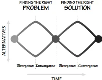
Double Diamond
The goal, at the beginning of the project, was to have a user-centered design research with a clear structure of the process, this lead me to follow the double diamond (figure 1). This was however problematic later in the process and the motivation towards which process to follow changed drastically, which will be explained later when an explanation of the tailored design process model is presented in paragraph 3.6.
Figure 1 Double diamond (Norman, 2013, p. 220).
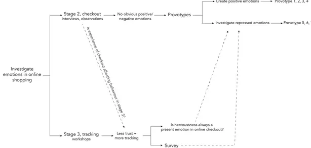
Tailored Design Process Model
As will be explained thoroughgoing later, I left the double diamond, after following it for a while, to instead develop and explore a tailored design process (figure 2). This design process model ‘shaped itself’ along the way, because the insights from one step took me to the next. To be aware of the tailored design process model can give an apprehension which can simplify the following of the process later in the thesis.
14
Figure 2 Tailored design process model.
Semi Structured Interviews
The qualitative research approach I strived for in this project argued for having semi structured interviews as a starting point. Conducting semi structured interviews can give a comprehension about people’s thoughts, interpretations and feelings in different situations (Muratovski, 2016). Using interviews in different phases of the project can also produce different kinds of information; interviews in an early stage of the research phase can give knowledge within the domain from the user’s point of view. Interviews later in a project can, on the other hand, give an opportunity to discover patterns and give confirmation about discovered findings or insights (Cooper, et al., 2014).
Having interviews as a research method can, however, also bring some obstacles, for example if an interviewee is not comfortable talking about the given subject. It also gives a responsibility to the interviewer, since s/he is the one who should lead the conversation forward but avoid asking leading questions. Interviewing skills are required to gently guide the interview towards a preferred direction but should not be prepared in the way that all questions are set beforehand. One should instead let the conversation shape questions along the way (Kvale, 1996). A research interview can be described like following:
The research interview is an interpersonal situation, a conversation between two partners about a theme of mutual interest. It is a specific form of human interaction in which knowledge evolves through a dialogue. (Kvale, 1996, p. 126)
15
Observations
I will collect information and data from visible reactions by doing observations on body language and facial expressions of the person being observed. Conducting observations can also inform about how the person being observed interacts with systems or objects and how they use it in their daily life. (Cooper, et al., 2014)
Muratovski (2016) presents observations as two domains that should be observed: structures and settings, and behaviour and interactions. This means that the place where you are conducting the observation can influence the person’s behaviour. The observation itself can also affect the behaviour of the person being observed. S/he can be affected by your presence and the fact that someone is watching the exact behaviour. This is called the Hawthorne effect (Adair, 1984).
The chosen way to use observation for this project was to combine the method with interviews. This could lead to highly informative sessions, which includes several ways of getting insights, since the observer can disambiguate if there is any vagueness in the observations (Cooper, et al, 2014). The reason for using semi structured interviews combined with observation as a starting point was because it is a good way to collect information from users. With a research phase inspired of the double diamond this was an obvious way to go; partly to get to know the domain, partly to meet the users and partly to hear about their opinions.
Workshop
Using workshops as a method to make ideas tangible can be a way to create creativity and to discover different perspectives and patterns towards a single aspect (Koskinen, Zimmerman, Binder, Redström, & Wensveen, 2011). The reason for using workshops in this bachelor project was to make the user expose his/hers experience without getting affected by how someone else described the topic. Conducting workshops is a way of letting the participants discover and define their own problems, and to let them investigate their own behaviour without impact from somebody else since the conducted workshops were done one by one.
Survey
The reason for using a survey was to gather many different opinions, which is argued for because of the investigation one could do to find relationships and patterns between opinions regardless of age, gender or knowledge in the domain of trust in online shopping. To gather quantitative data of people’s opinions, earlier experiences and possibly attitudes can give an apprehension of how the participants interprets the domain (Muratovski, 2016).
16
What could speak against using survey as a method to collect research data is that there is no information in whether the participants have been thinking their decisions through or not. It is often the first opinion that comes to mind in the answers. For the maker of the survey, it can be difficult to formulate the correct questions and answers (Muratovski, 2016). For this project, this was solved by not formulating answers for the participants - they had to write their own.
Prototypes
I chose to develop high fidelity (hi-fi) prototypes for the explorative stages in this project. The reason for using hi-fi prototypes, and not lo-fi (low fidelity) was because of the attempt to make it look close to a finished product because of the trustworthiness of the tests. The aim was to develop prototypes which created emotions close to emotions created in a real online store. Testing prototypes can inform about possible problem areas and give an apprehension of how different ideas are accepted (Muratovski, 2016).
Provotypes
A provotype is a prototype with provocative elements that is developed to provoke reactions. River and MacTavish (2017, p. 3998) writes that:
… the method is appropriate to unveil assumptions taken for granted at the beginning of the project.
The difference of using provotypes instead of prototypes is that they work as written above, and that they can be used earlier in a project as a research method. The provotypes can be used to state how things are now, but also give a direction towards how the future could be. Provotypes are preferably used early on when there is still time to redirect the process (River & MacTavish, 2017).
I used the provotype method to provoke emotions in online checkouts. Provotypes can be used as a tool to enhance experienced emotions, where in normal cases they are non. It can help the designer to discover the emotions of a user – but also help the user to experience more intense emotions than s/he normally would (Halse & Boffi, 2014). I wanted to provoke for emotions that were not easily discovered without provotypes and to begin a discussion around the subject, which was the motivation towards using it and letting it be a central method in the project. Furthermore, because provotypes also can help with identifying questions. Questions we do not ask ourselves in a normal day to day life, and by that start contemplating about things we otherwise take for granted (Mogensen, 1992).
17
User Testing
User tests was conducted in order to try the prototypes and provotypes, because it gives input to problems that the designer cannot identify him/her-self (Cooper, et al., 2014). Evaluation of the prototypes and provotypes was necessary to get feedback on whether the design is appropriate for its purpose (ibid.). User testing was central when exploring the domain since the prototypes and provotypes had to be tested in order to get reactions on them. To be able to user test in the most efficient way I asked the participants to think aloud when participating in any test. This could help to know what the person is thinking when testing a design and also give inputs one otherwise would perceive (Preece, Rogers, & Sharp, 2016).
4 Empirical Research
This bachelor thesis became an explorative analysis and the process has therefore not been a straight line from start to finish. As mentioned before, it began with a classic design approach inspired by the double diamond model (figure 1) and ended in a tailored design process model (figure 2). The following chapter will present the empirical research I conducted which took me from following the double diamond method to the tailored design process.
Observations and Interviews
Four sessions, which contained interviews and observations, were conducted together with participants who were about to buy items from online stores. I observed them when they made the purchase and added questions when it was needed. One of the interviews, which also was the first, were held over Skype with the participant screen sharing. The rest of the interviews were held face to face.
To explore the domain of online shopping I chose to divide the experience into four stages which a customer has to go through to make a purchase online; browsing, paying, waiting and receiving.
Figure 3 The four stages of online shopping.
The participants of these sessions wanted to remain anonymous, the used names are therefore fictional and not their real names.
18
Ida 24 years old, interview was held over Skype; Evelina 28 years old, interview held at her home; Frida 29 years old, interview held at a café of her choice and Emma 22 years old, interview held at Malmö University.
The following paragraphs includes the interviews and observations regarding stage 1 (browsing) and stage 2 (paying).
Stage 1, Browsing:
The participants easily described what they felt when browsing products. All of the participants appeared as if they were exited and talked a lot of what products to choose, how they would use the product and how much they could afford to buy.
All participants were able to have conversations simultaneously as they were browsing between products. Ida, Frida and Emma mentioned their anxiety against spending too much money. Ida also removed some of the items in her shopping cart and said that she should not spend too much money on clothes this month because she bought new last month as well. When Frida pressed the button, which would take her to the checkout on H&M’s online store, she then had to make the decision of creating a new account or log in. She said that she disliked online stores where she was forced to create an account. She was also annoyed with her log-in information not being saved, because she was not able to create an account since ‘her e-mail was already connected to another account’.
Stage 2, Paying:
In this stage, the participants had a more difficult time to describe what emotions they experienced. During the interview with Ida, she went quiet in the checkout and when I asked her to think aloud, she said:
Please wait just a second, it is a lot of numbers here… - Ida (Author’s translation)
Frida said in her interview, that the task of paying was so quick that she did not think about what emotions she experienced. I observed that her shipping information and payment information was saved and that the only thing she had to do was to tick in a box saying that she accepts the terms and conditions, and then press the pay-button before being forwarded to her banking page. Frida, however, also expressed a discomfort in seeing that the online store had saved the payment information, but it was nothing she put a lot of energy on.
Wow! I do not even have to fill in my payment information… How do they know my card number? Maybe I have made a purchase from here before… - Frida (Author’s translation)
19
All participants explained that they were more focused on this point in what they were doing, compared to stage 1 (browsing), since they did not want anything to ‘go wrong’. When they were asked what ‘go wrong’ meant, they said that they do not want to fill in wrong payment information or shipping information. This because that could mean that the parcel will be sent to wrong pick up point or that the amount can be drawn from wrong account or multiple times.
4.1.1 Insights from Observations and Interviews
The observations and interviews showed that the emotional aspects in the online checkouts are often more difficult to describe compared to describing experienced emotions concerning browsing (stage 1). The stage of paying (stage 2) could be seen as an interference to the exited emotions experienced when browsing and better described as where concentration and focus is prioritized, because of the reason that it is a stage where administrative information has to be filled in. Why concentration and focus are prioritized will later be investigated, when nervousness towards making an online purchase is explored. Could nervousness be the reason for the participants claiming that they had to be focused in the checkout and did that mean that no other emotions were excluded from our conversations? Or were there emotions that the participants wanted to repress? Could it otherwise be that they were expecting a certain feedback, in this case the conformation of the purchase, but are nervous for receiving the unexpecting feedback saying that something is wrong with their information? Receiving the unexpected can in turn make the customer experience disappointment or frustration, which in turn leads to a feeling of being out of control (Norman, 2013).
I perceived the interviews and observations as if the participants had a difficult time to explain what emotions they experienced in the checkout. This could mean that there were no emotions involved in the checkout, or otherwise mean that the emotions experienced were unpleasant and preferably repressed. This was further explored and will be presented later in the text.
Ida reflected back on previous shopping she had made, according to Norman (2004) on a reflective level. Ida was also relatively new to the online store and had only made purchases one or two times a long time ago, which could have influenced her behaviour. She was not used to the design of the online store which made her say that I had to wait before asking more questions because she needed to remain focused. Landin (2009) writes about being used to a design can bring trust, and not being used to a design can therefor bring uncertainty. She examines the reason for designs being similar to each other though in different contexts or made by different companies. This means Ida was having trust towards the online store, though having to stay focused because of that she was new to the online store.
Talking to the participants of the interviews and observations, there appeared to be less positive emotions in the administrational stage of paying (stage 2) compared to browsing between products (stage 1). The participants appeared
20
to be primarily focused on the task they were about to accomplish and not on which emotions they experienced. This guided me towards doing workshops to explore stage 3 (waiting).
Workshops
To investigate behaviour after placing an order, stage 3 (waiting), I conducted workshops together with two participants. The aim for this workshop was to find patterns in behaviour connected to emotions. How are we behaving when placing orders from different online stores and how is the relationship between behaviour and emotions appearing?
The participants of the workshops chose to stay anonymous and the names mentioned are fictional and not their real names.
Participant of workshop 1, Stina 23 years old; participant of workshop 2, Johan 28 years old.
4.2.1 Workshop 1
Stina was presented with a timeline (figure 4). She then had to place activity cards in the order they were performed after she had performed an online shopping session.
Figure 4 Workshop timeline.
She was asked to conduct the workshop twice; first the behaviour when she had placed an order from a well-known website and second her behaviour when she had placed an order from a lesser-known website.
21 4.2.1.1 Session A, Ordering from a Well-Known Online Store
Stina was asked to place activity cards in the order they were conducted after an online purchase (figure 5). Two activity cards were placed before the participant was asked to begin: the first and last one. The cards said: “makes purchase online” and “collects parcel from pick-up point”.
Figure 5 Stina placing activity cards on timeline.
Stina said that directly after placing the order, she checked for an e-mail confirmation. Seeing a confirmation in the web-browser was not enough as verification for her. She then waited for another e-mail confirming that the parcel had been sent. The second e-mail also contained a tracking number and a tracking link. Stina used the link for tracking immediately even if she knew that it often took at least one day for the tracking to be updated. She then said that she tracked the parcel at least twice a day until she got a text message claiming that the parcel was ready for pick-up. Figure 6 illustrates how Stina behaved after placing an order from a well-known online store.
I am tracking the parcel quite often because I want it to arrive as fast as possible. I know it doesn’t help to track it often, but it somehow feels like I’m stressing the shipping company. - Stina (Author’s translation)
22
Figure 6 Session A, timeline when Stina ordered from a well-known store.
4.2.1.2 Session B, Ordering from a Lesser-Known Online Store
Stina was now given another scenario where she had placed an order from an online store she did not order from often.
Stina said that her behaviour when ordering from a lesser-known online store was similar to when she orders from a well-known online store. She stated, however, that it was more important for her to get the order confirmation by e-mail directly. Because she might have less trust in the online store since she does not order from it often, and a confirmation makes her calmer about the order.
If Stina could see that there was a delay in the delivery from the tracking, she said that she would contact the company she ordered from to ask them if there was any more information about the parcel. She also added that if the order was placed from a lesser-known website, she would be more worried if the parcel was late compared to if a parcel from a well-known website was late. The timeline presented in figure 7 shows how Stina choose to place the activity cards when ordering from a lesser-known online store. She wanted to clarify that she would only contact the company if the tracking had not been updated for two days or more.
23
4.2.2 Workshop 2
The second workshop was conducted with Johan, who’s experience from ordering items online was big. He often ordered big items such as furniture and claimed that a normal delivery for him often took several weeks and that the parcel was often delivered to the door. Which meant that he had to be home to meet the delivery company for receiving the items.
Figure 8 Johan places the activity cards in the order he does them when ordering online
I am usually not as interested in where the parcel is, which is the information you can see from the tracking. I am more interested to see that the parcel has left the warehouse, and then I just wait until it arrives. – Johan (Author’s translation)
Johan explained that he puts more energy in if he receives an e-mail saying that the parcel has left the warehouse. However, he often waits more than two weeks before contacting the company if he does not receive the e-mail. Johan also adds that he often trusts the delivery company more than the company he orders from. This is because the delivery company is often well known, and he trusts that they will fix the problem if there is any. He also added that a shipping company have never done any mistakes with his ordered parcels, but that sometimes the actual online store forgets to put all items in the parcel. Figure 9 illustrates how Johan placed his activity cards when ordering from an online store.
24
Figure 9 Timeline when Johan from workshop 2 placed the activity cards.
4.2.3 Insights from Workshop 1 and 2
The workshops mentioned above in paragraphs 4.2.1 and 4.2.2 gave insights to how the participants behaved after they placed an order and waiting for it to arrive, which is explored in stage 3 (waiting).
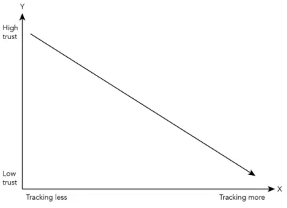
Whether one tracks a parcel or not can depend on who the person ordering is, and if the person has patience enough not to check the status every day. It can also depend on how stressed the person is to get the items. If the person must have the parcel to a specific day (for different reasons), then this person can be more able to track the parcel more often compared to someone who does not need the parcel to a specific day. Stina mentioned that she, even if she ordered from a well-known store, tracked the parcel at least twice a day until she got it. This could mean that a stress, or nervousness in not receiving the parcel on the anticipated day could be the reason for having such behaviour. This leads to a possible reason why a customer is tracking a parcel: the trust towards the online store. If the trust in the store is low – the probability for a customer to track the parcel is higher and vice versa. This is confirmed by workshop 1, where a comparison between ordering from a well-known website versus a lesser-known website was made. Comparing the two timelines shows that the Stina tracked a parcel more often if she ordered from a lesser-known website. How Stina behaved is explained in the diagram in figure 10:
25
Figure 8 Stina's behaviour when ordering online
With the reflective level being where the highest level of emotions is experienced, this is the level one can go into when waiting for the parcel to arrive. This is where you can start analysing and reflect over previous experiences. One can assume that a person ordering from a lesser-known store, as Stina did in session B, reflects more over however the parcel will be delivered on time or delivered at all. This is when customers to online stores can start blaming the company for not delivering items on time; when they assume the company to be the reason.
What was found from doing the workshops was that stage 3 (waiting), includes some nervousness, thus depending on who you are and where you are ordering from. It also shows that the more nervous you are or the less trust you have towards an online store, the bigger the chance is that you are going to track the parcel more often. This was found in, especially Stina’s, timelines when being compared. Also, if you have less trust in an online store already from the beginning when browsing the product – that could mean that you perform worse in the tracking stage (Norman, 2004). Worse in the sense that you track the parcel more often than you otherwise would because your patience is low. In the same way the other way around; if the online store makes you feel good you can perform better. Better in the way that you have more confidence in the store and by that more patience in how often you track the parcel.
And another question one must ask is however: does a lesser-known website automatically become less trusted? That question will be further explored in next paragraph which explores quantitative data from survey.
Survey as Quantitative Research
Insights from the workshops showed that there could be a connection between how much trust a customer has towards an online store and how often the customer tracks the parcel. This lead me to do a quantitative study, in the
26
shape of a survey to explore what factors that makes an online store trustworthy. The survey consisted of one question: “What makes an online shopping website trustworthy?” Over 40 answers to the survey came in within an age span of 21-56, where 69 % of the participants identified themselves as women, and 31 % of the participants identified themselves as men. There were no pre-set answers for this survey, which meant that the participants had to fill in themselves what they thought made a website trustworthy. Most of the answering participants interpreted the question as if the website was new to them. Some answered as following:
The website has to look professional, otherwise I will google some reviews to see what other said about it. (Author’s translation)
I will look at reviews from other buyers, and the website’s reputation in general is also important for me. (Author’s translation)
How the website is shaped, if it looks serious. And if it is easy to find information about how returns and such things works. (Author’s translation)
Other participants of the survey said that they trust the online store if they knew the brand or store from another context. For example, if they know H&M as a physical store, then they automatically trust H&M’s website because they know from earlier experiences that the physical store is trustworthy. Other participants mentioned that they trust the website if someone in acquaintance to them recommends it, and because they trust them, they trust the website.
Another interesting aspect of this survey was that several participants answered that they want to recognize the payment methods from other stores they have ordered from. For example, if the website offers Klarna Invoice as a payment method – then they trust the website because they recognize Klarna Invoice since before. Which is the phenomena mentioned earlier where Landin (2009) writes about trust towards known attributes and artefacts. Klarna was something these participants recognized since before and therefor it brought trust for them.
The answers from the conducted survey stated that there were different factors that played in if an online store appeared as trustworthy or not. Only one of the participants said that he did not contemplate if the online store was trustworthy or not and proceeded with saying that he had the mindset that all online stores were honest towards their customers.
27
Prototypes for Creating Positive Emotions
Prototype 1, 2, 3 and 4, which are presented later in this chapter, was created with the aim to create positive emotions with a possibility to enhance a customer experience in online checkouts. The reason for making four different prototypes was because of the comparison one could make between the participants reactions toward them when they had different amounts of emotional elements.
The prototypes were constructed in a prototyping tool which allowed for a hi-fi appearance. The reason for this was because of the aim to emulate real online store checkouts. Prototype 1, 2, 3 and 4 was, however, neutral in the appearance because of the wanting of the visceral level, which Norman suggest is the level where the first appearance plays a role (2013), not to be in focus. The aim was to not have the appearance affect the outcome of the tests. The first participant of the test was first presented with prototype 1. She filled in the contact information and then described the emotions she felt when doing this. The same procedure was then performed with the other 3 prototypes. The participants had to fill in their own contact information. The four prototypes were tested on four test-persons: two women and two men with different earlier experience of online shopping: Eva, 53 years old; Per, 53 years old; Ebba, 26 years old and Hans, 28 years old. The names are fictional and no the participants real names.
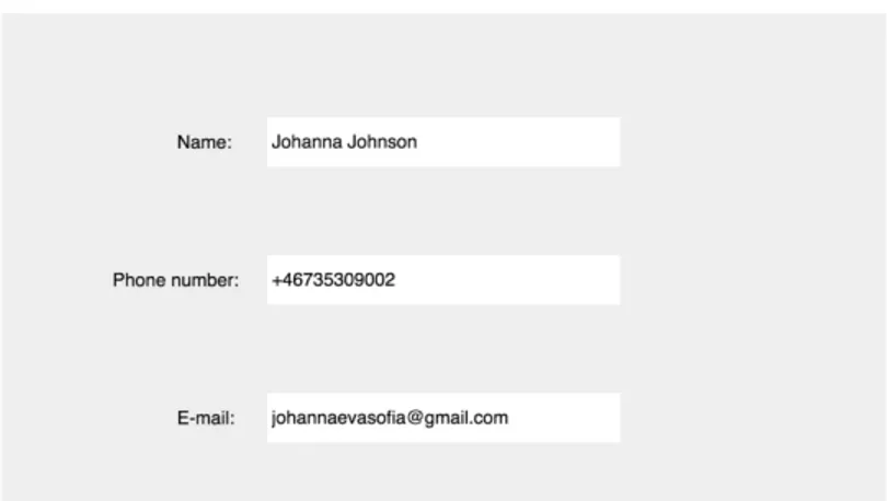
4.4.1 Prototype 1 – “Plain” Design
Figure 9 “Plain” design.
When contact information was filled in on prototype 1, there was no feedback confirming that the information was accepted. I wanted to investigate if the lack of feedback affected the participants behaviour and in what way.
Ebba claimed that she thought it felt undone and as if it felt like “her mother” could have done the design. Undone in the way that she did not know if the system wanted to know something else or if she filled in the correct information. On the other hand, she also said that could have felt very serious
28
because the system could find out what she meant even if she wrote something wrong. As if the system was smart enough to find out what she meant, for example if she had only written her surname and that the system automatically could then find her first name.
Eva said that filling in her contact information in prototype 1 felt normal:
This is exactly like I always do, not good not bad. Just my information that they need. – Eva (Author’s translation)
Per said that he liked the layout, he said that it felt serious and professional without pop-up messages and colours, which he appreciated because his opinion was that too much colour and pop-up messages feels cheap and pathetic. Whilst Hans experienced a feeling of something being unfinished, he could not determine however he thought that his information was approved by the system or if the online store crashed since he interpreted the site not giving feedback as if the online store froze.
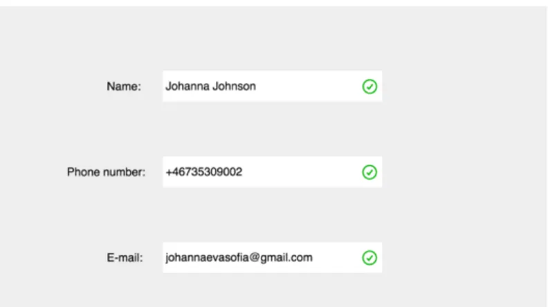
4.4.2 Prototype 2 – “Basic” Feedback
Figure 10 “Basic” feedback.
Prototype 2 had feedback in shape of green tick marks that appeared when the fields were completed. This was a ‘step-up’ compared to prototype 1 since this prototype gave more feedback. I observed how the participants reacted on the feedback and made an evaluation together with the participants afterwards.
Nice! Even if I know that my e-mail is correct – now I know that the system also knows that it is correct. - Ebba (Author’s translation)
This one (figure 12) feels more serious than the previous one (figure 11). It feels like I accomplished something by
29
getting these green tick marks (figure 12). – Hans (Author’s translation)
Eva said that prototype 2 felt serious and legitimate but could not point out the difference towards the previous one she tested. Whilst Per said that he felt interrupted in the process of filling in the information by having the tick-marks showing up. He compared it to having a conversation in real life where someone he tells a story to, confirms with an “okay” after all sentences he says, instead of listening to everything and then confirming the whole story with an “okay”. Per also mentioned that he rather would prefer one big tick mark after everything was filled in, which in the story could be translated to the “big okay” in the end.
4.4.3 Prototype 3 – “Nice” Feedback
Figure 11 “Nice” feedback.
Prototype 3, instead of only having the green tick marks appearing also had a sentence when the last field was completed that said: “Nice to meet you!”. This emotional design element was added because of the investigation in how the participants reacted to it. The question I wanted to answer by testing prototype 3 was if the participants reacted positively towards the sentence of if they disliked it, and why.
This prototype was provocative to some of the participants. All of the participants had more opinions regarding prototype 3 compared to prototype 1 and 2. Hans’ opinion was that the “Nice to meet you!”-text felt unnecessary because it did not mean anything. He meant that the information was already confirmed as correct by the green tick marks. Another thing Hans mentioned was that he described the text as if it was fake, as if the online store must compensate by being ‘too nice’ because something else in their service was lacking. He also mentioned that it has to be in the right context, and that it has to agree to the website’s brand. He said that if it was an ‘exclusive’ online
30
store – this sentence would not match the feeling of the online store. This because Hans did not think that exclusivity matched with fun.
Ebba had a spontaneous giggle when she saw the green sentence. She said that it felt like someone had been thinking of the small details to make her smile. She mentioned that the context however, had to be right, but that it is not very important because it is still a very clean and simple sentence. However, she added that if it would have said “Good job” or “Well done” it would have felt patronizing to her. Like if the computer did not think that she would be able to fill in her contact information.
Per said in this prototype that he did not expect the sentences to show up. He said that it felt cheap and that he personally did not like that kind of sale approach. A feeling of being anonymous was important to this participant and having the “Nice to meet you!”-text made him feel less anonymous even if he knew that this appeared to everyone who wrote their contact information there.
4.4.4 Prototype 4 – “Fun” Feedback
Figure 12 “Fun” feedback.
The last step was prototype 4 (figure 14). This prototype had emotional design elements in shape of sentences after every field that was completed. I wanted to investigate how these sentences were interpreted as a positive feedback or negative. There was nothing that obviously stated that the sentences were “approvals” but the fact that the text was in green. Moreover, I wanted to see however these sentences were positively accepted for the participants or if they appeared as annoying or irritating.
Prototype 4 resulted in different reactions from the participants of the test-sessions. Hans said that the small pop-ups of text was a “cute” feedback telling that his information was correctly completed. He did however add that if these sentences would appear every time he placed an order from an online store he ordered from often, it would feel repetitive and fake, he would then rather have these sentences showing if he signed up for newsletters or created an account which is only done once. The other participants did, however, say that it felt directly non-serious and cheap.
31
That could have been working on a site like LunarStorm -2003 but today, no. It has never occurred to me that someone should comment on this, there is no value in my boring information… and all of a sudden, these sentences give value to it? It feels awkward to me. – Ebba (Author’s translation)
Eva mentioned that it felt cheap, she said that she would not have bought from the online store who had this “fun” sentences even if she had trust in it since before. She said that the trust in the online store ‘disappeared’ with the appearing sentences.
Ebba also claimed that she would be worried if the sentences from prototype 4 (figure 14) showed when filling in her information on an online store like www.apple.com. Her opinion was that an online store like Apple’s does not have to compensate with that kind of humour for their products, since their products has high standards as it is and because their online store looks and feels professional. Whilst if the sentences showed up when ordering from a joke store with costumes and joke products, it would only have been expected.
If I wasn’t in the right mood I would not have understood that this was supposed to be fun, it would only have been frustrating and annoying. ‘Sure, that’s not fake?’ What… you tell me? – Per (Author’s translation)
Per described the feedback as gnathonic and asked why the sentences had to be there. He also added that if he would have been going through a checkout in a serious matter and if these sentences appeared, he would have been confused over if the website actually got his contact information.
4.4.5 Insights from Prototype 1, 2, 3 and 4
Stepping up the amount of emotional design elements as done from prototype 1 to 4 gave insights to how much one can add fun elements before they rather work as annoying. One could however not state that there is a certain line towards how much you can use, it depends on the customer and the company’s brand according to these user-tests. Doing the user tests with these prototypes show that emotional design elements has to fit the context to be well accepted. Some participants were happy about having emotional design elements whilst other would preferably skip them completely. There is a fine line in how emotional design could be implemented without being non-serious or making the online store look unprofessional. However, designing these prototypes in a simple and minimalistic design, to consciously not make the prototypes speak to the participant on the visceral level, showed that it is possible for the participant to still have an emotional response. Norman (2004) claimed, as
32
mentioned in the theory, that all levels (the visceral, the behavioural and the reflective) are equally important if the goal for the product to make an emotional impact. Which thereby is refuted when these prototypes was not designed well on the visceral level.
All these three levels are equally important if the goal for a product is for it to have value for the user and to make an emotional impact.
The prototype-tests showed that if one prefers emotional design elements or not, also depends on what you are buying. In other words, it has to match the company’s profile and what they sell in order to be well accepted by the customer.
There was a noticeable difference between the answers from the different test-persons and the different prototypes. However, all participants of this test mentioned that whether they would have liked it or not depended on which online store it would have appeared on and in what context they visited it. The insights from, especially provotype 3, contradicts Norman’s theory claiming that for a product to be appealing on a behavioural level – the outcome has to be expected to be well accepted by the user. Ebba’s reaction with a spontaneous giggle shows that she was not prepared for the sentence saying: “Nice to meet you!” but was positively surprised by it. Norman’s book: The design of everyday things, could however also be interpreted in the way that expecting positive outcome and positive outcome shows is working accordingly to the behavioural level. However, how positive the feedback preferably should be being not defined. (Norman, 2013)
Provotypes for Investigating Repressed Emotions
The word repressed is in this thesis used as a way to describe emotions that on tries to avoid but are still there.
For investigating if there are repressed emotions involved in stage 2 (paying), I chose to create provotypes for three different states of mind: the guilt of spending money, the guilt of environmental issues and the lack of trust or being nervous when ordering from an online store. The following provotypes are designed to have appearance close to real online stores. This because of the aim to provoke for emotions that were close to reactions one could get if the provotypes were real online store and not provotypes.
The names of the participants are fictional and not their real names.
Kristin, 26 years old; Bella, 23 years old; Christian, 28 years old; Sandra, 24 years old; Andreas, 26 years old and Jonas, 24 years old.
33
4.5.1 Provotype 1 – Money Guilt
What was found in earlier mentioned interviews and observations was that the guilt of spending money was often present when buying items in general. Three out of four participants mentioned their anxiety of spending too much money on unnecessary items. This gives the assumption that anxiety about spending money is a present emotion in online checkouts. There is however a possibility that this is an emotion that customers are trying to repress.
Definition:
Unnecessary [adjective] – More than is needed, excessive (Oxford Dictionaries, 2018)
Provotype 1 was presented to the participants of the test together with the scenario that they were about to buy items from an electronic store. They had to check their shopping cart and then proceed to payment. Figure 15-17 demonstrates how the flow looked like when the participant bought the items.
34
Figure 14 Red button leads to figure 17, green button leads back to figure 15.
Figure 15 Confirmation on purchase.
Four test-persons was instructed to think aloud when testing the provotype and had to tell what they were expecting before pressing buttons. All participants of the user test of provotype 1 mentioned when they were at figure 15 that they expected to be forwarded to ‘some kind of approval-page for payment’. What happened with all four participants when getting directed to figure 16 was that they got quiet. However, the reactions after the silence variated, one of the participant said that she got irritated:
35
It feels like I am 10 years old and that my mom tells me that I can’t get candy, but that I instead can have a fruit or broccoli or something else you don’t want when you’re 10. – Kristin (Author’s translation)
However, she also added that the website gives her emotions that she otherwise would not have experienced:
It feels like the website tells me what I am supposed to feel without listening to my actual feelings. It, like, puts emotions in my head and that annoys me, don’t tell me what to feel… - Kristin (Author’s translation)
Christian said that being presented with these sentences (figure 16) felt patronizing, as if he already had not been thinking through the decision of buying before pressing “pay”. However, he also added that they would not have affected him since he, had already been thinking though the decision of making the purchase. Bella mentioned that she felt annoyed because the sentences confirmed her anxiety about spending too much money, which she did not like.
4.5.1.1 Insights from Provotype 1 – Money Guilt
One could clearly state that there were several stages in this provotype that brought unexpected feedback for the customer. The participants claimed that they all were expecting to be re-directed to an approval page instead of a page informing about what else they could buy for the money. The participants getting quiet could be interpreted as a sign that they were not expecting what they saw. The feeling of being in control was lacking which brought emotions of irritation or annoyance, which was confirmed by Norman when he described the behavioural level as mentioned in the theory section (2013). Furthermore, one could also see a pattern in the participants being dissatisfied with being ‘told what to do and to feel’. The feeling of guilt was inflicted to the participants because they were not able to choose whether they wanted the feedback telling what they otherwise could buy or not. Which, on a reflective level, could lead that the participants not returning to the online store again since they know that ‘this online store gave me emotions I do not want to experience again’ (Norman, 2013). One confirmation to the existence of having repressed feelings was stated by Bella who did not like the fact that the online store confirmed her anxiety regarding spending too much money.
36
4.5.2 Provotype 2 – Environmental Guilt
The guilt of not taking care of the environment had not been mentioned by the participants in interviews and observations as an issue, and not in the workshops. However, with the environmental question being more central than ever which means that the guilt of not taking care of the environment could be a present emotion in life in general. This made me arrive at the assumption that this could be a repressed emotion present when purchasing online. Figure 18-21 shows how the provotype for provoking the emotions of guilt was shaped.
37
Figure 17 Grey button leads to figure 20, green button leads to figure 18.
38
Figure 19 Confirmation on purchase.
At figure 19, Sandra and Bella were able to keep distance from the provocation, and Bella said that she already knew that it was bad for the environment but that she wanted to continue the purchase anyway. Andreas did however say that he would quit already there and place the purchase from another online store. He described it as a parallel to if someone pointed a finger towards what he was eating and said: “are you really going to eat that?!”.
At figure 20, Sandra, Bella and Andreas described the provocation as ‘nagging’, and that they had already made the statement that they wanted the items from the online store. Bella was provoked to the point where she said that the online store behaved as if it knew her, and that it took for granted that she did not take care of the environment.
Techstore has no idea of who I am as a person, they don’t know that I am always taking the train instead of plane and that I am sorting all trash at home. – Bella (Author’s translation)
Figure 21 illustrates that the purchase had been approved and that the customer had an e-mail confirmation to expect. It did however also say that the earth will die within 20 years if everyone else was shopping as much as s/he did.
All participants reacted with a small laugh to the text saying that the earth will die within 20 years. Bella said that she did that because the text was “cocky”, whilst Sandra said that it was because it just was too much bad information to
39
handle at once. Andreas laughed because of the reason that this feedback to his shopping was unexpected and claimed that “Techstore will not survive much longer as on online store”. This confirms Norman’s (2013) theory about designing on the behavioural level means that the behaviour of the product harmonizes with the way it looks. Andreas did not expect feedback saying that he should not buy the items because it was an online store. The online store behaving that way contradicts the behaviour of a store in general.
After the provotype had been tested and evaluated by the test-person, I asked the question: “If you need or want to buy tech again, would you go back to this page?” All the participants answered that question with a no, because of the same reason: the participants knew that ordering online can be bad for the nature because of pollution of shipping and producing the products, but they did not want to be reminded of it since they already made the decision.
4.5.2.1 Insights from Provotype 2 – Environmental Guilt
It was noticeable that the participants of the provotype testing got frustrated when the provoking sentences showed, and that the frustration got bigger for every step they had to go through to ‘make the purchase’. Another thing one could see was that the feedback was to the participants perceived as ‘nagging’ because it was several stages that one had to go through and not only page claiming their decision was bad for the nature. The participants described it as it was never ending.
With Norman’s (2013) theory informing that the reflective level is where the highest (or deepest) levels of emotions are experienced, I believe that these sentences could be something that the participant will be reminded of for a future to come. Especially when stage 2 (paying) ends with the purchase being approved – however, the actual shopping experience is not over until the parcel is received and one decides to keep the items. One assumption could therefore be that these feelings of guilt this provotype brings would (if it was a real store) stay until the parcel was received by the customer and perhaps even longer. With the customer being reminded of the environmental issues these items bring every time s/he looks at them.
However, testing provotype 2 (and 1) confirms the existence of repressed emotions in the checkout to a certain extent. This because the participants were affected by the emotional design elements in the provotypes in the way that they said that they already knew it was bad but that they did not wanted to be reminded of it. Moreover, if the participants can experience the provoked emotions from this provotype - then one assumed conclusion could be that the emotional reaction would be even bigger if they actually were going to make a purchase from a real existing online store.
4.5.3 Provotype 3 – Out of Control
Trust in an online store, and nervousness because of the uncertainty of it being serious was mentioned by participants of the workshops. The aim for
40
investigating if nervousness appear already in the online checkouts was to find out why. I also wanted to investigate if it made the test-persons feel out of control, and/or with a feeling of being confused and if they seemed to have trust in this ‘invented’ online store.
Figure 20 Blue button leads to figure 23.
Figure 21 Loading bar.
After pressing the blue button, the figure above (figure 23) appeared with the loading bar moving forward very slowly.
41
Figure 22 Error.
After five seconds figure 24 appeared. Then again after five more seconds the screen changed into figure 25 with a confirmation to the purchase.
Figure 23 Confirmation on purchase.
As the three test-persons went through these steps in the provotype, I noticed that they became more confused for every step that passed. Figure 23 did, at