Mälardalen University
School of Innovation, Design and Engineering
Västerås, Sweden
DVA331 Thesis for Degree of Bachelor in Computer Science 15.0 credits
Responsive web design – an
explorative analysis from an
aesthetic, functional and
technical perspective
Aleksandra Ciesielska
aca15001@student.mdh.se
Examiner: Björn Lisper
Mälardalen University, Västerås, Sweden
Supervisor: Daniel Hedin
2
Aleksandra Ciesielska Responsive design – an explorative analysis from an aesthetic, functional and technical perspective
Abstract
Since the third-generation’s mobile telephony was introduced, the use of the Internet changed significantly. Websites can nowadays be viewed from a wide range of devices that differ in type and size. This puts a demand on the design of web pages because the page should be equally useful regardless of the type of device used to view the page. Responsive web design is a design method that strives towards solving this problem by allowing web pages to customize their visual representation based on the medium used to interact with them. Although it is a well-used tool in web development, it is relatively unexplored from a technical, aesthetic and functional perspective. The goal of this thesis is to improve the situation by exploring the possibilities and limitations of responsive web design in relation to the above perspectives. To achieve this, common definitions of this approach were collected, together with an implementation of a responsive product. To give structure to the analysis, the development process followed the Double Diamond approach together with two experiential qualities, fluidity and naturality. By using media queries together with scalable units in the implementation, a fully responsive portfolio website was created. The creation of the product gave room for understanding possibilities and limitations of responsive web design. The encountered problems in this thesis, such as detecting different types of devices, concludes that responsive web design is yet not a fully developed approach and contains problems that limit the implementation.
3
Aleksandra Ciesielska Responsive design – an explorative analysis from an aesthetic, functional and technical perspective
Table of Contents
1. Introduction ... 5
2. Background ... 8
2.1. Web technology ... 8
2.2. Fixed, fluid, adaptive and responsive design ... 9
2.1.1 Implementation of responsive web design in CSS ... 11
2.2 Double diamond approach ... 12
2.3 Experiential qualities ... 13 3. Design ... 14 3.1. Design considerations ... 14 3.2. Design proposals ... 14 3.2.1. Classic ... 15 3.2.2. Modern ... 18 3.2.3. Define ... 20 4. Implementation ... 21
4.1. Implementation of the desktop website ... 21
4.2. Implementation of the mobile website ... 25
4.3. Implementation problems ... 26
5. Discussion ... 28
6. Related Work ... 29
4
Aleksandra Ciesielska Responsive design – an explorative analysis from an aesthetic, functional and technical perspective
Abbreviations
CSS Cascading Style Sheets JS JavaScript
RWD Responsive web design WWW World Wide Web
5
Aleksandra Ciesielska Responsive design – an explorative analysis from an aesthetic, functional and technical perspective
1. Introduction
Since the third-generation’s mobile telephony was introduced in Sweden in 2003, the use of the Internet changed significantly [1]. It became possible to find information, read the news and listen to music on a smartphone, no matter the person’s location. Today, 78% [1] of Sweden’s population choose to use the internet on a mobile phone. Websites that were earlier only possible to view on a computer screen can now be viewed from a variety of devices. For devices with smaller screens, this means that information must be prioritized and displayed in such a way that the user can easily find what he or she is looking for. This puts a demand on the design of web pages; the page should be equally useful regardless of the type of device used to view the page.
Responsive web design (RWD) is a design method that strives towards solving this problem by allowing web pages to customize their visual representation based on the medium used to interact with them [2, p. 9]. The term was coined by Ethan Marcotte in 2010 [3]. The goal of a responsive website is to fit all screen sizes on different digital media, such as mobile phones, tablets, computers or television. The approach is based on creating a number of representations of the website tied to the resolution of the viewing device. Creating a separate size for each possible resolution quickly turns unmanageable. The number of devices will not stop growing, on the contrary – it will only become more complicated to handle the amount. Instead, versions for a selected number of resolutions are created and scaled to fit devices that lie in between.
RWD is a well-used tool in web development, yet relatively unexplored from a technical, aesthetic and functional perspective. A few process descriptions exist, such as mobile-first, that touch on those dimensions without making a clear separation.
The goal of this thesis is to improve the situation by further exploring the possibilities and limitations of RWD. To achieve this, common definitions of RWD were collected to form the basis for the creation of a responsive product – a portfolio. This product and the associated creation process were used for a reflection, based on responsive design from a technical, aesthetic and functional perspective. The implementation is a portfolio website with material consisting of images and text, written in pure CSS3 and HTML5. To contribute to an improvement in this field, this thesis focuses on the following question:
• How can responsive design’s possibilities and limitations be understood from a technical, aesthetic and functional perspective?
6
Aleksandra Ciesielska Responsive design – an explorative analysis from an aesthetic, functional and technical perspective
The method selected for this thesis is a combination of practice and reflective analysis and is primarily based on exploratory practical work. First, responsive web product was developed. Thereafter, the product was analysed in relation to the mentioned perspectives. To give structure to the analysis, the development process follows the Double-diamond [4] approach and is using a limited number of experiential qualities. The Double-diamond phases are Discover, Define, Develop and Deliver - presented below in the way they were applied in this work:
• Discover: during this phase, two different proposals were prepared for possible portfolios. The work took place within the framework of responsive design, but without taking into account technical constraints. Documentation of the design proposals took place in parallel.
• Define: during this phase, the two design proposals from the Discover phase were analysed based on two experiential qualities that the final product is desired to have. The result of this analysis was a complete design proposal that was taken to implementation. The analysis highlights the aesthetic and functional dimension of responsive design through the desired experiential qualities. Documentation and report writing took place in parallel.
• Develop: during this phase, the development of the portfolio took place. Different technical solutions to achieve the design that the Define phase determined, were explored. This led to one prototype with different technical and functional qualities. Documentation took place in parallel.
• Deliver: during this phase, the prototype from the Develop phase was analysed, based on the experiential qualities determined during the define phase. The analysis highlights the technical and functional dimension of responsive design through the desired experiential qualities and technical elegance. Documentation and report writing took place in parallel.
The Define and Deliver phase flows together and contains an analysis and allows us to understand aesthetic, functional and technical possibilities and limitations in responsive design. The reflection is bounded by two experiential qualities that provide structure and ability to link the initial design with the implementation. The result of the implementation is a responsive portfolio website. The creation of the product together with the exploration of the definition of responsive web design gave room for understanding possibilities and limitations of RWD. A number of problems were discovered relating to the definition of RWD as well as the implementation of RWD. For instance, responsive web design focuses heavily on the device resolution and fails to take other capabilities, such as touch or hover, into account.
The rest of this thesis is organized as follows: In order to introduce the reader to the field of responsive design, necessary terms are explained in Section 2. Section 3 gives an explanation of the design considerations that were taken into account,
7
Aleksandra Ciesielska Responsive design – an explorative analysis from an aesthetic, functional and technical perspective
together with the design proposals in 3.2.1. and 3.2.2., and an insight into the choice of the design in 3.2.3. Section 4 describes the implementation phase: the desktop website in 4.1 and the mobile website in 4.2. The implementation problems that occurred are presented and discussed in 4.3. This is followed by Section 5 which contains the discussion of the work. Finally, Section 6 presents the main conclusions of the thesis.
8
Aleksandra Ciesielska Responsive design – an explorative analysis from an aesthetic, functional and technical perspective
2. Background
Since creation of web pages relies on web technology, Section 2.1 introduces the fundamentals. Section 2.2 explains responsive web design framed in a historical setting, but also how it can be implemented. The structure of the analysis follows the Double-diamond design process model, which is introduced in 2.3. Finally, Section 2.4 explains the notion of experiential qualities.
2.1. Web technology
Hypertext Markup Language [5, p. 69], HTML, is the language for creating web pages and web applications. It was released in 1991 with SGML-derived syntax. The current version is HTML5. The elements of the language are described with so-called opening and closing tags that are written in angle brackets. Within every tag, the content of an element is placed. With the integrated tags, such as headings, paragraphs, links, images etcetera, the language provides structural semantics [5, p. 71]. The following is an example of a website with a heading, a paragraph, and the browser page title. The content within the body tags is visible on the web page.
1. <!DOCTYPE html>
2. <html>
3. <head>
4. <title>Example</title>
5. </head> 6. 7. <body> 8. <h1>Example</h1> 9. <p>Hello World</p> 10. </body> 11. </html>
A web page created only with HTML is a plain site with no styling. To alter the look of the layout CSS is used. Cascading Style Sheets [5, p. 87] was created by Håkon Wium Lie and released in 1996. This style sheet language describes the presentation of HTML, or any other markup language. The syntax of CSS can be written and placed in three different ways:
1. Inline CSS is attached to a specific HTML tag with a style parameter.
2. Inline global CSS is placed within style tags and applies to the whole document.
3. External CSS is placed in a separate file that is linked to the HTML file [5, p. 89].
To change the font type, size and color of the paragraph in the previous code snippet, the following can be used (external CSS):
9
Aleksandra Ciesielska Responsive design – an explorative analysis from an aesthetic, functional and technical perspective
1. p{
2. font-family: 'Roboto, sans-serif';
3. font-size: 1em;
4. color: blue;
5. }
The last core element of the World Wide Web is for changing the behavior of the web page’s content. By embedding the scripting language JavaScript (JS) [5, p. 96] in the HTML code web pages can become interactive. JavaScript can be written within the script tags or externally in another file.
2.2. Fixed, fluid, adaptive and responsive design
The traditional way of developing websites is with a fixed design [6]. A fixed design is made for only one resolution, like in the print medium. The content is not flexible – if the website has a width of 960 pixels, it will have this width on all devices, regardless of their screen size or type. The characteristics of this approach are the fixed units. In the example below, there is a selector wrapper, a pattern used to select an element to style [7], with a margin of 10px, a width of 960px and a font size of 16px. It means that these properties will not adapt to any screen size.
1. .wrapper{
2. margin: 10px;
3. width: 960px;
4. }
Fluid design [8] uses flexible units instead of the static ones, pixels. Due to this, the content is flexible and depends on the size of the viewport. In the example below, the selector wrapper has a flexible width of 70% and a margin of 2%. The font size is 1em. The relative unit em [9] is relative to the font-size of the element. For instance, 3em means three times the size of the current font. Percentages [10], on the other hand, are relative to the parent element.
1. .wrapper{
2. margin: 2%;
3. width: 70%;
4. font-size: 1em;
5. }
Adaptive design [11] can be seen as a hybrid of fixed and fluid design. It uses both scalable and non-scalable units. Media queries [12] are an important part of this approach. They are rules that enable choosing between different styles depending on the medium or screen size. As the name indicates, the design adapts to the
10
Aleksandra Ciesielska Responsive design – an explorative analysis from an aesthetic, functional and technical perspective
viewport, with the specific breakpoints [11] defined using media queries. When resizing, an adaptive website can give a jumping effect, which is caused by crossing over such breakpoints. In the code in the example below, the media query applies the minimum size 481px and maximum 768px. It means that the rules within the query will only apply when the min-width and max-width breakpoints are valid. If a viewport is smaller than 481px or bigger than 768px, another existing media query can be valid.
1. @media (min-width: 481px) and (max-width: 768px) {
2. #banner { width:740px; }
3. #banner img { max-width:740px; max-height:222px; }
4. #main { width:740px; }
5. #main-content { width:450px; float:left; }
6. #widget-container { width:200px; float:right; }
7. .widget-content { width:160px; }
8. }
Responsive design is similar to adaptive design but more flexible and fluid between the breakpoints. Where adaptive design uses media queries to select between a number of fixed designs, responsive design allows for the transition to be smoother by scaling the content between the different designs. This is made possible by the use of a flexible CSS grid system based on a set of horizontal columns and vertical rows containing different elements. The flexibility comes from the use of fractions in the definition of the grid system in combination with formatting the elements in percentages or ems and not in pixels. This causes the layout to resize itself as the viewport does, i.e., to respond to the device the user is using, regardless of which medium it is or which resolution it has [2], [13]. The typical way responsive design works is by removing elements on layouts for devices with smaller physical sizes. Working with the same HTML file and hiding some of the existing elements with CSS depending on the size of the viewport can therefore be seen as a natural part of responsive design. Using separate HTML representations is therefore often criticised [14], [15].
Fixed design has specific problems in relation to modern devices. A website with a width of 960 pixels on a 3840 x 2160 tv screen will probably be unreadable. Also, a website with a larger width but on a smaller screen will be problematic. The fixed approach is not universal and will always be best suited for only one device. Fluid design tries to alleviate these problems, but at the cost of introducing new ones; it is in general not possible to scale one site to every possible resolution. Images are elements that cannot be stretched or shrunk to any size because they can get pixelated [8]. The paragraph width can also not be stretched out; it should be between seven to ten centimeters [17, p. 294]. Paragraphs longer than that will be hard for an eye to follow. In smaller viewports, a fluid paragraph can on the contrary shrink and end up in only two or three words per line. Bigger screen sizes
11
Aleksandra Ciesielska Responsive design – an explorative analysis from an aesthetic, functional and technical perspective
can create problems with accessing icons or menus across large distances. Also keeping track of the cursor can be a difficulty when the screen size increases [18]. Responsive design attempts to solve the problems of fluid design by introducing constraints, where the scaling takes place.
2.1.1 Implementation of responsive web design in CSS
To achieve the flexibility, the components of a website have to be expressed in scalable units. The formula to attain this is as follows: target ÷ context = result [2, p. 20]. It can be used for instance to convert pixels to ems or percentages. In case a font size of 68 pixels has to be converted to ems, the target is the target font size expressed in pixels and the context is the default font size for the browser which usually is 16 pixels. The result is the font size expressed in ems: 68 ÷ 16 = 4.25em. Every part of the grid should be expressed in flexible units. An image that is 200 pixels wide on a website with a width of 960 pixels, will be 20.8333333%, since 200 ÷ 960 = 20.833333%.
The flexibility of images and media on a website can simply be achieved by the max-width property. The img element will resize itself to any size, as long as it is narrower than its containing element. If the image or the media element is wider than its container, the property will force the width of the element to match its container’s width [2, p. 45]. However, not all browsers support this solution, for instance, Internet Explorer 6 and below.
As mentioned in the earlier section, a media query is a module in CSS3. For instance, columns in a layout can be set to have a full width when the viewport gets smaller than 768 pixels. It is also required to set the media type, for example, screen, tv, print, projection or speech [19]. In the code section below, there are two selectors, the wrapper and the header. Below them, there are two media queries. The first one applies to a screen and max-width of 768 pixels. This means that if the screen gets smaller than 768 pixels, both the wrapper and the header will have the width of 768 pixels. If the media query does not apply, both selectors will keep the earlier set widths. Every property can be applied in a media query. The example below shows two different queries.
1. .wrapper{ 2. margin-right: auto; 3. margin-left: auto; 4. width: 960px; 5. } 6. 7. .header{ 8. width: 920px; 9. }
12
Aleksandra Ciesielska Responsive design – an explorative analysis from an aesthetic, functional and technical perspective
10.
11. @media screen and (max-width: 768px){
12. .wrapper, .header{
13. width: 768px;
14. }
15. }
16.
17. @media screen and (max-width: 550px){
18. background-color: black;
19. }
However, these solutions are not fully responsive. The formula target ÷ context = result has to be applied in order to express the elements in relative units and get rid of the pixels.
1. .header{
2. width: 95.833333%; /* 920 ÷ 960 */
3. }
By expressing all the elements (margins, padding, heights, widths, font sizes, etcetera) in relative units, a website becomes flexible. It is important not to round the numbers [20]. The browser has to get the most accurate result in order to display the layout in the most precise way.
2.2 Double diamond approach
To attain a clear structure in this work, the Double Diamond model [4], created by The British Design Council, has been used. The model is divided into four phases, which help to follow the design process in the right direction. It starts with a Discover phase where exploration of the area and its field is done. The Discover phase is followed by the Define phase where a specific part of the work is selected to focus on. In the Develop stage solutions or prototypes are made for the next and last stage which is Delivery. The Delivery phase deals with the final product. This approach is about understanding a certain problem and defining how it could be solved. Thereafter, based on these phases, the product is developed and delivered. [4], [21] The double diamond consists of iteratively diverging or converging [22], where diverging deals with opening up to possibilities without any boundaries, and converging deals with the reduction to specific parts of ideas.
13
Aleksandra Ciesielska Responsive design – an explorative analysis from an aesthetic, functional and technical perspective
Figure 1. The Double Diamond model [4].
2.3 Experiential qualities
Computer science is typically either theoretically founded or empirically founded, i.e., a thesis can be shown to be valid (or invalid) using a proof (in some formalism) or by experiments. Empiric founding requires some form of measurability. Many interesting properties, such as, e.g., various forms of performance definitions are relatively easily measurable. However, properties within interaction design, for instance, usability, are much more difficult to measure. Löwgren and Stolterman [23] discuss these difficulties and the desire for defining design properties of a product. Their solution is experiential qualities. The authors claim that a designer cannot circumvent a product’s quality, just because the properties are not measurable. Experiential qualities are a tool for developing reflection of quality in a product [23, p. 133]. They provide a structured process for achieving a desirable product, with its suitable properties.
There is no determined list of experiential qualities – they can be anything, depending on the product. For instance, the focus of a product with technical elegance [23, p. 178] as an experiential quality may be powerfulness and simplicity. That is, a powerful product, that may be complicated on the inside, but seems simple in the eyes of the user, and in the programming aspect, is written with few rows of code [23, p. 178]. This quality may be connected with another one - functional minimalism [23, p. 178], where the product should contain only the essentials for the functionality, not filled with things that disturb the quality or are unnecessary.
14
Aleksandra Ciesielska Responsive design – an explorative analysis from an aesthetic, functional and technical perspective
3. Design
Section 3.1 presents a discussion about the design space. Further, explanation of the design proposals is described in Section 3.2, 3.2.1 and 3.2.2. Section 3.2.3 describes the underlying reasons of the choice of the design proposal that was taken to implementation.
3.1. Design considerations
The desktop and mobile devices have very different design constraints. In mobile devices the size of the browser cannot be changed, and, thus, the content of a website must adapt to the viewport. This is not the case with desktop websites. The lack of flexibility makes responsive design more important for mobile devices, where the content of a website must adapt to the viewport. On the desktop, the user has the possibility of changing the size of the browser to suit the needs of the page. A desktop website does therefore not really need to be responsive at each point. If the viewport is large enough, the browser size is not limited by the size of the screen. In this case a small browser does not have to be a concern, because the user can enlarge it. For this reason, the need to make a desktop website responsive for every possible size can be questioned.
For mobile devices, the physical size of the device is one of the important properties to take into account when designing the layout. This is clearly reflected in the definition of RWD, which focuses on the size of a browser. However, designing for different devices entails more than just adapting the content to the physical size of the device. Of equal importance are the ways the device can be interacted with. One of the biggest differences between the capabilities of a computer and a mobile device is the touch functionality and the lack of the hover effect on mobile devices. Hover and touch provide space for fundamentally different designs.
For this reason, I chose to work with physical size, hover and touch. I chose not to proceed with separating desktop from a mobile device because this would have led me far beyond the common definition of responsive web design that I wanted to investigate. Thus, I work with a single HTML approach as a base for both desktop and mobile.
3.2. Design proposals
The object of the study is a portfolio website. The material of the portfolio consists of various projects and works. Each such has an image and a descriptive text in two languages. The experiential qualities chosen for the design are fluidity and naturality. In this setting fluidity means that a user should not need to click on any element of the website in order to see the content. The idea is based on letting the pointer float to reveal more content when the area of a project is hovered over.
15
Aleksandra Ciesielska Responsive design – an explorative analysis from an aesthetic, functional and technical perspective
The other quality, naturality, means that the design should feel natural given the device’s possibilities. That is, when using a computer, floating around with a pointer is an obvious and natural behavior. When using a mobile device, on the other hand, scrolling and touching the screen becomes natural.
During the Discover phase, two design proposals were made with focus on fluidity and naturality. One of the proposals resembles more a standard design and is called classic, while the second one, modern, differs more from the traditional layout of a website. Both of these are presented in the following sections. Each of the designs have a desktop version with hover, and a mobile version with touch.
3.2.1. Classic
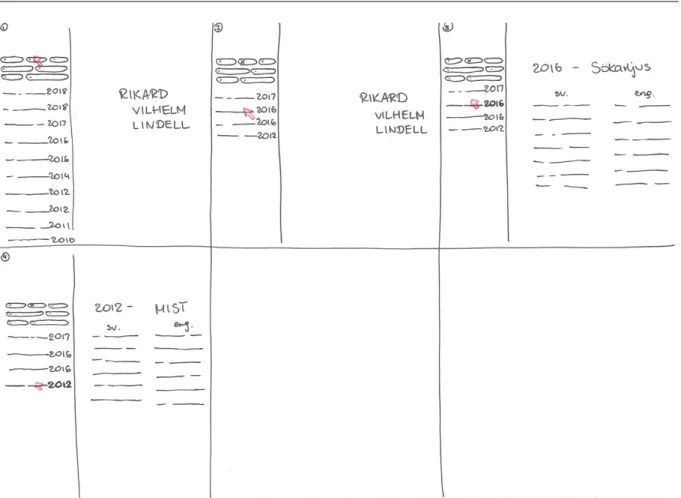
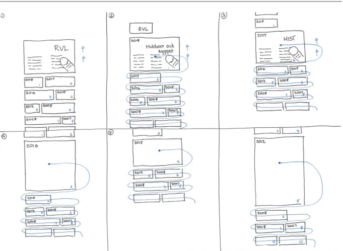
Figure 2 presents a storyboard for the desktop and hover version of the classic design. When the user opens the page (box 1), a menu is shown on the left side and an empty space with the portfolio owner’s name on the right side. The menu consists of titles of projects and their year. The idea is that as soon as the pointer is hovering over one of the titles, the content of the project appears on the right side (an image as a background and some descriptive text in two languages, box 3). As soon as another title is on hover, the content on the right side changes (box 4). In that way, it is not necessary to have to click on every project and go back and forth between the pages, which fulfils the quality of fluidity. Above the list of the titles, the user can find some filters to categorize the projects. The goal was to achieve an easy-to-use page, which would provide a clear overview of a variety of projects.
16
Aleksandra Ciesielska Responsive design – an explorative analysis from an aesthetic, functional and technical perspective
17
Aleksandra Ciesielska Responsive design – an explorative analysis from an aesthetic, functional and technical perspective
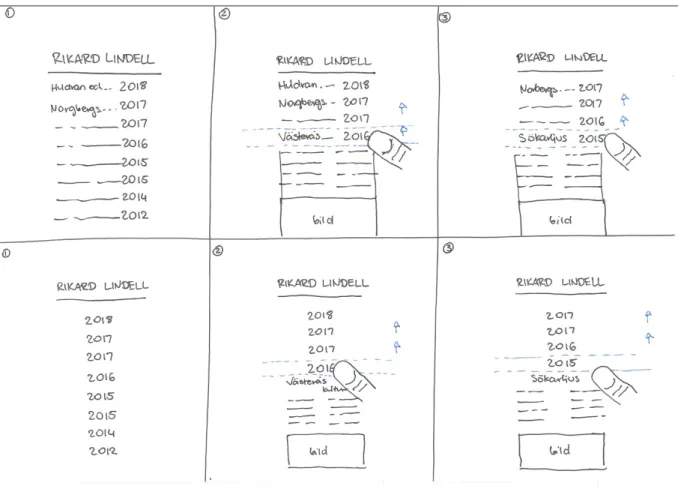
Figure 3 Classic design, mobile + touch.
Figure 3 represents the same design idea but for mobile devices. Even though the physical size is much smaller, the main goal is still the same. However, exactly the same design could not be achieved because the capabilities between the devices differ. The hover effect, which is a keystone in the desktop version, is not possible to have in mobile devices.
In both the desktop and the mobile designs, the projects are ranked according to the year. Due to smaller physical size on mobile devices, the user sees only the list with the titles of the projects. In figure 3, box 2 on the first row, it is shown what happens when the user is scrolling down. There is a predetermined area in the viewport that is supposed to activate when the user touches the screen and begins to scroll. When any of the titles fall into this area (box 3, first row), the box expands and more information with an image in the background is presented. When the user continues to scroll, another title ends up in the area and its content is shown. Boxes on the second row in figure 3 present the same idea. The only difference between the design on the first and the second row is that there are only years in the list and no titles of the projects. This design proposal was made in case the titles and the years would take up too much space and the design would feel messy and unclear.
18
Aleksandra Ciesielska Responsive design – an explorative analysis from an aesthetic, functional and technical perspective
3.2.2. Modern
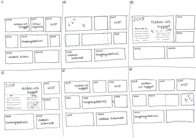
The desktop version of the second design proposal is shown in figure 4. This layout consists of a variety of boxes in various sizes. Every box has a year in the left upper corner and a title. Every box also has an image in the background. Some of the boxes have the same sizes, although there are no boxes with the same size on the same row. Also, there is no box with the same size below each other. In this way the design gives a feeling of a unique element for each project.
The experiential quality fluidity is captured in the hover behavior of the boxes. When the pointer is hovering above one of the boxes, it expands, and a descriptive text is revealed. As soon as the pointer is not hovering over any of the boxes, the user can see an overview of all the boxes. The expanded box covers other boxes but does not cut them in the middle. It is expanded till the edges of the other boxes. This makes the design more aesthetically appealing than if a box would stop its expanding in a middle of another box and pieces of it would have been visible.
19
Aleksandra Ciesielska Responsive design – an explorative analysis from an aesthetic, functional and technical perspective
Figure 5 Modern design, mobile + touch.
A mobile version of the modern design is presented in figure 5. The natural way of using a mobile device is to touch the screen, which differs a lot from the way a computer is used. In order to fulfil the quality of naturality the design had to be changed. The hover effect made the desktop design fluid and fulfilled the experiential quality. However, because hover does not exist on touch devices, the quality could not be achieved in the same way. A solution for this is a predetermined area in the viewport, where boxes ending up in this area, expands. The focus area is shown in figure 5 with a small blue circle. When the user continues to scroll, the box next to the expanded box ends up in the focus area and expands to a bigger size in order to show the descriptive text. This animation and the order of the boxes expanding are shown in figure 5, box 2-6 (follow the blue line). Figure 6 shows the same idea. The difference is that the box that is the focus area takes up the whole width, and not the half of it as in figure 5. In that way, the box can contain more information about a project.
20
Aleksandra Ciesielska Responsive design – an explorative analysis from an aesthetic, functional and technical perspective
Figure 6 Modern design, mobile + touch. The box in the focus takes up the whole width.
3.2.3. Define
The modern design proposal was chosen for the implementation phase. It was chosen primarily for two reasons. Firstly, because this design is more challenging from a technical perspective. Secondly, because it gives a more aesthetically appealing look.
Both designs fulfil the criteria of giving a clear overview of the portfolio’s material, and also the experiential qualities, fluidity and naturality. However, they are quite different from a technical perspective. The classic design consists of fewer elements – thus fewer elements that need to be responsive. It is a relatively simple layout, which resembles a more traditional layout, with a menu on the left and a project overview on the right side. This kind of layout suits well in several grid systems and can be implemented with various frameworks. The modern design, on the other hand, is more challenging to implement. It consists of more elements and animations that have to be responsive. This design does not follow a standard layout and differs from the traditional websites. Choosing the modern and more challenging design, RWD can be explored and analyzed in a more interesting way, than the classic design, which is a simpler variant.
21
Aleksandra Ciesielska Responsive design – an explorative analysis from an aesthetic, functional and technical perspective
4. Implementation
The implementation of this thesis was written with pure CSS3 and HTML5, using a single HTML file together with several CSS files and a number of media queries. The design was guided by the experiential qualities fluidity and naturality and the implementation by the experiential quality technical simplicity.
By using JavaScript, it is possible to take over the rendering entirely and accomplish anything. It is possible to use JS for implementing RWD, however at a high implementation cost which collides with technical simplicity. Responsive design does not, and should not in my opinion, rely on the use of JavaScript as it would give a false picture of the capabilities of RWD in modern browsers. In this work we have chosen not to work with any of the existing frameworks that are available such as Bootstrap [24] or PureCSS [25]. This way we avoid the inherent complexity of such frameworks and the additional work of exploring RWD not only in the context of one browser, but in the context of all supported browsers and the limitations imposed by the design decisions of the framework.
4.1. Implementation of the desktop website
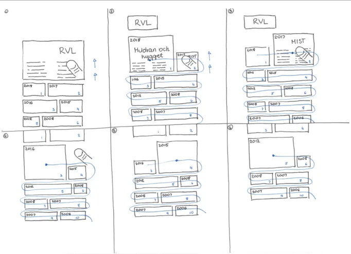
The result of the implementation of the desktop website is presented is figure 7. To achieve the layout of the modern design, the CSS3 grid system [26] was used. By specifying the desired number of columns, rows, their size and size of the row and column gaps a similar layout to the original design proposal was created. The grid system is flexible and scales the content when the size of the viewport is changed. A big advantage of the grid system is the fr unit. CSS does the dividing of the columns and rows automatically, therefore no specific measurements are necessary.
22
Aleksandra Ciesielska Responsive design – an explorative analysis from an aesthetic, functional and technical perspective
Following the design proposed in Section 3.2.2, every box placed in the same row has different size. Each box has a background image, background-image: url(…), with background-size: cover in order to fit the whole image in the box. The title, year and text of each box is placed with CSS positioning properties, for instance top, bottom, left or right. An example of one of the boxes is presented in figure 8. The desktop website is responsive and rescaled within the following ranges:
- Desktop 1. The minimum width of 1020 pixels.
- Desktop 2. Between the minimum width of 900 pixels a maximum width of 1020 pixels.
- Desktop 3. Between the minimum width of 640 pixels and maximum width of 900 pixels.
- Desktop 4. The maximum width of 640 pixels.
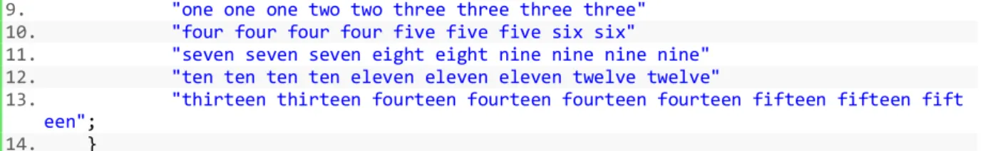
All sites were implemented with the help of the grid system; however, the grid was altered in every media query for each resolution range. A common factor for all resolutions is that the box elements expand on hover to show their content. An example of how the grid was implemented is shown in the code example below. Every box is given a name. The box in figure 8, e.g., has the name one. In the code example the grid-template-areas property specifies how many columns and rows each element should take up. The box one takes up three columns, box two takes up two columns and box three takes up four columns. The grid systems are implemented in the same way for all the resolution ranges, with the difference of the layout of the boxes and number of columns and rows. To fulfil the experiential quality of fluidity every box extends on hover. This is done with CSS transitions, transition: 1s ease-in-out, and changing the size of each box on hover.
1. #wrapper{ 2. display: grid; 3. grid-template-columns: repeat(9, 1fr); 4. grid-template-rows: repeat(5, 300px); 5. grid-gap: 10px; 6. max-width: 79.1139241%; /* 1000 / 1264 */ 7. margin: 0 auto; 8. grid-template-areas:
Figure 8 A box with background image, title, year and text
23
Aleksandra Ciesielska Responsive design – an explorative analysis from an aesthetic, functional and technical perspective
9. "one one one two two three three three three"
10. "four four four four five five five six six"
11. "seven seven seven eight eight nine nine nine nine"
12. "ten ten ten ten eleven eleven eleven twelve twelve"
13. "thirteen thirteen fourteen fourteen fourteen fourteen fifteen fifteen fift een";
14. }
Desktop 1 with the minimum width of 1020 pixels is presented in figure 7. Its grid system consists of five rows and three boxes on each row. Every row consists of a big, a medium and a small box. All of them have a year and a title, but only the big and the medium ones have a preview of the descriptive text.
Desktop 2 with the minimum width of 900 pixels a maximum width of 1020 pixels is presented in figure 9. The boxes are similar to the ones in desktop 1 but covers almost the whole width of the browser. The descriptive text is removed from all the boxes by using display: none.
Figure 9 Desktop 2, minimum width of 900 pixels and maximum width of 1020 pixels.
Desktop 3 with the minimum width of 640 pixels and maximum width of 900 pixels is presented in figure 10. The grid layout is altered and consists of only two boxes per row, which means that the number of rows is increased. The descriptive text is removed here as well.
24
Aleksandra Ciesielska Responsive design – an explorative analysis from an aesthetic, functional and technical perspective
Figure 10 Desktop 3, minimum width of 640 pixels and maximum width of 900 pixels.
Desktop 4 with the maximum width of 640 pixels is presented in figure 11. The grid layout is the same as in desktop 3, however the boxes are smaller. The titles are removed and only the years in a bigger font size are visible in the boxes.
25
Aleksandra Ciesielska Responsive design – an explorative analysis from an aesthetic, functional and technical perspective
4.2. Implementation of the mobile website
The design of the mobile website takes the physical size of the mobile device into account. Since the implementation is built on the previous presented desktop website one can argue that the desktop first approach was used [27]. This part of the work consists of a new media query. It inherits the layout from the smallest desktop design. The look and positioning of boxes are the same, only the sizes of the boxes differ compared to the desktop ones. Properties such as the descriptive text and title are removed with display: hidden. The year of each box is written in a bigger font compared with the previous designs. The result of the mobile site is presented in figure 10.
The desktop design is controlled by the resolution, which works well given approximately the same DPI of the screen. The same technique does not work on mobile devices, since they have too many different resolutions and DPI’s. What we want is the physical size, which is resolution divided by DPI. This is however not possible to calculate in CSS. The remaining solution is therefore to list media queries with ranges of resolutions that identify
different mobile devices. Making this list is not an easy task, but there are sources with lists of media queries for standard devices [28], which were used in this implementation. A code snippet from the media query for iPhone 6+, 7+ and 8+ is shown below. The number of columns and rows was changed, together with rearranging the positioning of the boxes in the grid-template-areas property.
Figure 12 The result of the implementation of a mobile website.
26
Aleksandra Ciesielska Responsive design – an explorative analysis from an aesthetic, functional and technical perspective
1. @media only screen and (min-device-width: 414px) and (max-device-width: 736px) and (-webkit-min-device-pixel-ratio: 3){ 2. #wrapper{ 3. display: grid; 4. grid-template-columns: repeat(5, 1fr); 5. grid-template-rows: repeat(8, 200px); 6. max-width: 90%; 7. margin: 0 auto; 8. grid-template-areas: 9. "one one two two two"
10. "three three three four four" 11. "five five six six six"
12. "seven seven seven eight eight" 13. "nine nine ten ten ten"
14. "eleven eleven eleven twelve twelve"
15. "thirteen thirteen fourteen fourteen fourteen" 16. "fifteen fifteen fifteen fifteen fifteen"; 17. }
18. }
4.3. Implementation problems
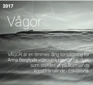
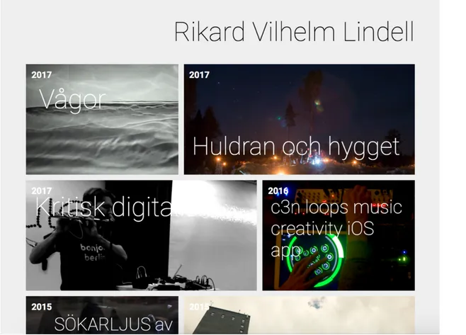
The design presented in the previous section uses hard-coded sizes of how large the elements are on hover. Manually setting the width of each box is a natural part of the design process, while the height of the box is decided by the amount of content (text) in the box. This requires a lot of work and is not a viable long-term solution. Every time content has to be added or removed, the hard-coded sizes have to be changed, which is not a good way to maintain a website. Figure 13 shows how the boxes look like when none of them is on hover. Figure 14 shows when the second box, Huldran och hygget, is on hover and extended. An extended box has to cover other boxes completely till their edges. In figure 14, the second box covers the third one, Kritisk digitalism, entirely. It would simplify the work if the height calculation could be done in CSS.
27
Aleksandra Ciesielska Responsive design – an explorative analysis from an aesthetic, functional and technical perspective
Figure 14 The second box is hovered and expands covering the third box completely.
In CSS the height and width properties can take the value fit-content to indicate that the corresponding dimension should be computed to fit the size of the content. Using fit-content for the height seems to be a possible solution, since given the desirable width, the height would be calculated. There are however a number of problems with this approach. Firstly, transition: 1s ease-in-out does not work with fit-content. It seems to remove the animation completely and expands the box to the new height in one step. Secondly, it calculates the new height based on the wrong width. Instead of calculating the new height based on the on-hover width the height is computed based on the original width. This results in an overly tall box. Finally, when the wider on-hover width is set, fit-content calculates yet a new lower height matching the new width. However, this time the new height is subject to animated transition.
Another problem is the lack of being able to detect touch in CSS. This can cause problems in cases where a design with hover effects on a computer also must adapt other devices, such as a Microsoft Surface (where both a pointer and touch exists), mobile devices with both pointers and touch available, or simply a usual mobile device with touch. The importance of detecting different capabilities may vary depending on the design, yet they can be crucial in many cases.
I have not found a way around these problems, but the conclusion is that different parts in CSS, such as the grid system, fit-content and the transition animations do not work together. Further investigation is required in order to find solutions.
28
Aleksandra Ciesielska Responsive design – an explorative analysis from an aesthetic, functional and technical perspective
5. Discussion
The way the mobile devices and desktops share responsive web design can be questioned. Currently, responsive dsign relies on removing elements from layouts for different resolutions. However, this study has identified other properties that are at least as important for a natural interaction between the user and the device, such as hover and touch that were used in this study. The result of very different interaction capabilities is that the HTML representation differs significantly between the implementations. While it is feasible to merge the implementations into the same HTML file it is not natural. I imagine that this could be a major issue for more complex implementations. Thus, the criticism of multiple HTML files may be questioned. Support may perhaps be needed in order to facilitate the work on fundamentally different implementations. In addition, the need for responsive design on the desktop is not as big as on mobile devices, which gives additional support for the question of whether they really should share HTML files.
The chosen design is based on fluidity and naturality with a shared implementation between desktop and mobile devices. For desktop, it was possible to separate relatively easily based on the resolution ofn of the viewport. For mobile, it was a more difficult task, since there is no easy way of identifying the physical size. This problem also applies to desktop, which will be even bigger as screens with high DPI become more common. However, the problem is not as big because the user can easily resize the browser. In order to be able to implement the chosen design, I needed to use the physical size and capabilities of the devices to choose the right mobile layout without hover for mobile devices, and the right desktop layout with hover for desktop. The hover effect can be detected, but it presupposes that it is either a mobile device or desktop. The method does not scale to hybrid devices that supports both hover and touch. In this case, a better information in media queries is needed in order to make a safe choice.
The layout for a mobile device and a desktop in the implementation of this thesis does not differ significantly. The structure between them is similar and have only some differences in the layout. Their functionality, on the other hand, differ more - the essential hover on desktops and touch on mobile devices. Because the differences between the capabilities of the devices are essential in this work, implementing with separate HTML files might have led to some simplification in the implementing. Further investigation by implementing this project in separate files might give a clearer solution to this issue. However, this seems to depend a lot on the design. Theoretically, on can assume that the more a design differs between the devices, the more useful separate HTML files can be. One’s taste of the structure in the implementation can also be an important factor. There are clearly both advantages and disadvantages of this that seems to vary from design to design.
29
Aleksandra Ciesielska Responsive design – an explorative analysis from an aesthetic, functional and technical perspective
6. Related Work
A few process descriptions exist in responsive web design. The existing ones, such as mobile-first and desktop-first are presented in published books. These approaches are at large reflecting the lack of definitions and mix the technical, aesthetic and functional dimensions.
The mobile-first [29] approach is about designing for the smallest possible screen size first, and later proceeding to larger sizes. This force prioritizing the content of a website and focusing on the most central parts. A mobile phone cannot fit all the data that a desktop can, in a clear and easy manner. Luke Wroblewski [29] claims that this process is useful even if your website is not meant to be used on mobile phones. It can result in innovative solutions. Big companies, such as Google or Facebook, are using this approach [30], [31]. The opposite of mobile-first is desktop-first. As the name itself says, this process is about the traditional and old-fashioned way of building websites. That is, starting from a big screen and then building for smaller sizes [27].
This thesis does not attempt to suggest a process. It rather aims to build and document the experience of responsive web design, but in a structured way by following the Double Diamond model and experiential qualities.
To best of my knowledge criticism of RWD is limited to experimental studies that identify various implementation issues. In general, those works differ from this thesis in that they are more product focused and contain less of a structured analysis. In particular, the study by Nikita Rogatnev [32] that summarizes responsive web design principles. The author breaks down the approach in all the necessary parts in order to achieve a responsive web application. The study explains the principles, such as media queries, typography, flexible media, but also special cases that can arise, for instance old browser’s compatibility or mobile navigation. The summary is followed by an implementation of a responsive website, which covers the necessary principles. The biggest difference between Rogatnev’s thesis and this is the structured approach. Rogatnev does not follow any specific method. The author’s work focuses on the differences between fixed, fluid and adaptive web design. He analyses them in order to accomplish the implementation of a fully responsive website. The thesis is very technical, while mine, in addition to these parts, also contains an analysis and reflection on the aesthetic and functional dimensions.
Another study by Daniel Eriksson and Karl Löfholm [33], gives theoretical and practical advices in designing for mobile websites. This work is also product focused, since the described design process is supposed to be reusable for the readers. Unlike my implementation, Eriksson and Löfholm chose to, in addition to HTML5 and CSS3, use the framework jQuery Mobile. Their focus lies more on exploring the mobile web design, and not the definition of the responsive web
30
Aleksandra Ciesielska Responsive design – an explorative analysis from an aesthetic, functional and technical perspective
design at large. Similarly, the study by Joni Korpi [34], which was written when responsive web design was a newly discovered technique, is exploring the possibilities and the limitations with adaptive and responsive web design, while redesigning a web application. In comparison with Rogatnev’s work, Korpi mentions the mobile-first and desktop-first methodologies and compares them.
31
Aleksandra Ciesielska Responsive design – an explorative analysis from an aesthetic, functional and technical perspective
7. Conclusions
The goal of this thesis was to improve the situation of responsive web design by exploring its possibilities and limitations in relation to a technical, aesthetic and functional perspective. To achieve this, exploration of RWD definitions and a responsive product was made. The creation of the portfolio followed a structured process by using the Double Diamond model together with two experiential qualities, fluidity and naturality. The analysis in the Define phase together with the analysis in the Deliver phase gave the opportunity to understand the above perspectives. The result of the implementation is a fully responsive portfolio website. The final product gives an aesthetically appealing overview of a number of projects, which are presented in boxes of different sizes. By using media queries together with scalable units, the website adapts to different resolutions with a fluid feeling.
The possibilities and limitations of responsive web design were explored in the Deliver phase, where the implementation took place. Media queries that give the possibility of altering styles for different resolutions and media types such as print, speech and screen, have some flaws. To interpret computer screens, tablets and smart-phones as the same media type screen is not a sufficient separation considering the devices that are available today. Identifying a device in a more specific way would simplify and make the implementation of RWD clearer. The capabilities between the devices differ too much and the resolution of a device is not a sufficient way to define it. If a clearer separation existed, the touch and hover function would not collide. It is a big difference of how desktops and mobile websites are used, therefore it should be natural to distinguish it in the implementation.
Another question that was raised in this thesis is representing a responsive website with one single URL and HTML file. This does not have to be a necessity, since the designs for devices may differ so much that separate HTML representations in many cases can come in handy and be a more elegant solution. The definition of RWD should not limit the implementation in this way.
The compilation of the design method responsive design gives the conclusion that RWD is a necessary tool in web development yet containing problems that makes it not fully developed. There is room for improvement of the common definitions of RWD, such as detecting touch devices. The definition of responsive design should be revised in order to eliminate the misunderstandings that in my opinion currently exist.
32
Aleksandra Ciesielska Responsive design – an explorative analysis from an aesthetic, functional and technical perspective
References
[1] Internetstiftelsen i Sverige, "Internetstiftelsen i Sverige," 2016. [Online]. Available: http://www.soi2016.se/internet-i-mobilen/vad-vi-gor-pa-dator-mobil-och- surfplatta/ . [Accessed 14 Feb. 2017].
[2] E. Marcotte, Responsive web design, New York: A Book Apart, 2011. [3] M. H. Baturay and M. Birtane, "Responsive Web Design: A New Type of
Design for Web-based Instructional Content," in Procedia - Social and Behavioral Sciences, 2013.
[4] Design Council, "Design Council," 2018. [Online]. Available:
https://www.designcouncil.org.uk/resources/report/11-lessons-managing-design-global- brands. [Accessed 12 Mars 2018].
[5] Zalewski, Michal;, The Tangled Web A Guide to Securing Modern Web Applications, San Francisco: No Starch Press, 2012.
[6] C. Castiglione, "One Month," 30 July 2017. [Online]. Available: https://learn.onemonth.com/responsive-vs-adaptive-vs-fluid-design/. [Accessed 31 Mars 2018].
[7] w3schools, "w3schools," [Online]. Available:
https://www.w3schools.com/cssref/css_selectors.asp. [Accessed 8 Apr. 2018]. [8] O. James, "Interneting Is Hard," 2017. [Online]. Available:
https://internetingishard.com/html-and-css/responsive-images/. [Accessed 31 Mars 2018].
[9] K. Schaeffer, "Kyle Schaeffer," 30 Sep. 2008. [Online]. Available:
https://kyleschaeffer.com/development/css-font-size-em-vs-px-vs-pt-vs/. [Accessed 5 Apr. 2018].
[10] w3schools, "w3schools," [Online]. Available:
https://www.w3schools.com/cssref/css_units.asp. [Accessed 18 May 2018]. [11] G. Graham, "CSS-Tricks," 11 Nov. 2015. [Online]. Available:
https://css-tricks.com/the-difference-between-responsive-and-adaptive-design/. [Accessed 5 Apr. 2018].
[12] w3schools, "w3schools," [Online]. Available:
https://www.w3schools.com/css/css_rwd_mediaqueries.asp. [Accessed 5 Apr. 2018].
[13] B. Hinderman, Building responsive data visualisation for the web, 2015. [14] "MDN web docs Mozilla," 13 Sep. 2013. [Online]. Available:
https://developer.mozilla.org/en-US/docs/Web/Guide/Mobile/Separate_sites. [Accessed 19 May 2018].
[15] M. Firtman, "Smashing," 14 July 2014. [Online]. Available:
https://www.smashingmagazine.com/2014/07/responsive-web-design-should-not-be-your-only-mobile-strategy/. [Accessed 19 May 2018].
33
Aleksandra Ciesielska Responsive design – an explorative analysis from an aesthetic, functional and technical perspective
[16] "Google Search," 27 Sep. 2017. [Online]. Available:
https://developers.google.com/search/mobile-sites/mobile-seo/responsive-design. [Accessed 19 May 2018].
[17] J. P. Lynch and S. Horton, Web Style Guide: Foundations of User Experience Design, 4 ed., Yale University Press, 2016.
[18] M. Czerwinski, G. Robertson, B. Meyers, G. Smit, D. Robbins and D. Tan, "Large display research overview," in Extended Abstracts on Human Factors in Computing Systems, New York, 2006.
[19] MDN web docs, "MDN web docs," 16 Feb 2018. [Online]. Available: https://developer.mozilla.org/en-US/docs/Web/CSS/@media. [Accessed 31 Mars 2018].
[20] B. Frain, Responsive Web Design with HTML5 and CSS3, Olton: Packt Publishing, 2012.
[21] J. Schneider, "Experience Design," 3 Feb 2015. [Online]. Available:
https://www.thoughtworks.com/insights/blog/double-diamond. [Accessed 31 Mars 2018].
[22] D. Nessler, "Digital Experience Design," 19 May 2016. [Online]. Available: https://medium.com/digital-experience-design/how-to-apply-a-design-thinking-hcd-ux-or-any-creative-process-from-scratch-b8786efbf812. [Accessed 31 Mars 2018].
[23] J. Löwgren and E. Stolterman, Design av informationsteknik - materialet utan egenskaper, Lund: Studentlitteratur, 2014.
[24] "Bootstrap," [Online]. Available: https://getbootstrap.com. [Accessed 21 May 2018].
[25] "PureCSS," [Online]. Available: https://purecss.io. [Accessed 21 May 2018]. [26] w3schools, "w3schools," [Online]. Available:
https://www.w3schools.com/css/css_grid.asp. [Accessed 20 May 2018]. [27] K. Zalatan, "BrainLeaf Inc.," 24 July 2017. [Online]. Available:
https://www.brainleaf.com/blog/brainleaf-news/mobile-first-vs-desktop-first-how-to-choose-a-responsive-strategy/. [Accessed 31 Mars 2018].
[28] C. Coyier, "CSS-tricks," 9 Oct. 2017. [Online]. Available:
https://css-tricks.com/snippets/css/media-queries-for-standard-devices/. [Accessed 20 May 2018].
[29] L. Wroblewski, Mobile First, New York: A Book Apart, 2011. [30] L. Wroblewski, "LukeW Ideation + Design," 21 Feb 2011. [Online].
Available: https://www.lukew.com/ff/entry.asp?1270. [Accessed 31 Mars 2018].
[31] L. Wroblewski, "LukeW Ideation + Design," 28 Oct 2010. [Online]. Available: https://www.lukew.com/ff/entry.asp?1226. [Accessed 31 Mars 2018].
34
Aleksandra Ciesielska Responsive design – an explorative analysis from an aesthetic, functional and technical perspective
[33] D. Eriksson and L. Karl, "Designing User Interfaces for Mobile Web," Gothenburg, 2011.
[34] J. Korpi, "Adaptive Web Design - as applied to the design process of a web application," 2012.
[35] w3schools, "w3schools," [Online]. Available: https://www.w3schools.com/css/. [Accessed 7 Apr. 2018].
[36] "CSS-tricks," [Online]. Available: https://css-tricks.com/snippets/css/media-queries-for-standard-devices/. [Accessed 13 May 2018].
![Figure 1. The Double Diamond model [4].](https://thumb-eu.123doks.com/thumbv2/5dokorg/4688075.122869/13.892.97.789.168.517/figure-the-double-diamond-model.webp)

