Artist Statement
Amanda Freymuth
If I could describe my work as a graphic design student in one word, it would be ‘experimental.’ When I first started my concentration, all I knew about graphic design was that it involved making art on the computer. That definition quickly expanded to include any art that was made for public use, with the intent of marketing to a broad audience. Coming from my entry level art courses, which mostly encouraged experimentation, I struggled at first to find a balance between my own personal style and the required elements for a successful design piece. My earliest logo designs were scrapped due to illegibility of both type and design, and my illustrations were either overly simplistic or complex. It was only when I accepted that graphic design was as much of a business as it was an art form that I feel my work started to blossom.
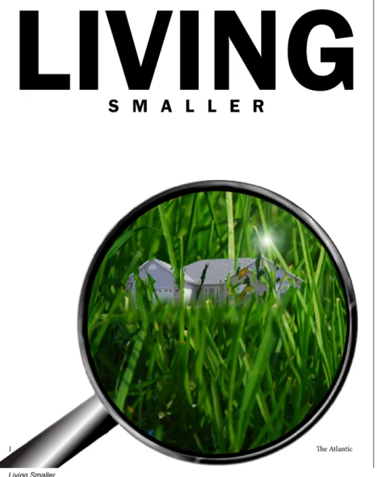
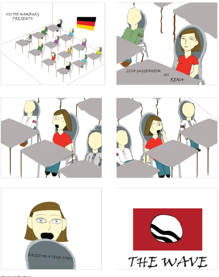
Even when the confines of my chosen career path became clear to me, I still wanted to experiment as much as possible. Every single piece I work on has gone through multiple levels of experimentation before I arrived at the final product. Some were simple color changes; the background of my redesign of the two page magazine spread for The Atlantic article ”Living Smaller” changed from multiple shades of green until I settled on a simple white background. Others were far more complicated. It took several layout sketches and mockups to arrive at the final six images of my animated storyboard for the German film The Wave, and several
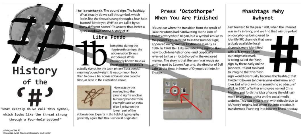
different layout and font choices were tried before I settled on the final design from my four page magazine spread entitled “History of the ‘#’”.
In my later concentration classes, I was tasked with either creating or
expanding on an existing brand. While at first glance these assignments may seem to have been incredibly limiting, I found them to be the most creatively interesting for me as a designer. Not only did I have to define the corporate fonts to be used for the duration of each series of projects, but I had to design nearly everything about them from the ground up, including logos, typefaces, website pages, advertisements, and so on. Each project provided me with a new challenge, as well as a new opportunity to experiment using my knowledge from previous assignments as a base.
The first of these two semester-long assignments was redesigning the corporate look for the Colorado International Invitational Poster Exhibition, or CIIPE for short, of which my instructor, Phil Risbeck, is co-director of. I, along with other students in his class, was tasked with single-handedly redesigning the logo and designing a corporate typeface, website, and advertisement. All of these projects stick out quite firmly in my mind due to both the difficulty and the amount of fun I had with each of them. My typeface, in particular, came from a happy accident while I was placing the previously designed logo on a t-shirt mockup. I liked how the resulting lights and shadows within the logo played with each other, and decided to apply the same style to my typeface as well as subsequent uses of my logo.
During my final semester I focused mainly on finding new ways to approach problems I had tackled in previous classes. In similar situation to the above project, I was tasked with creating my own political party, complete with logo, campaign
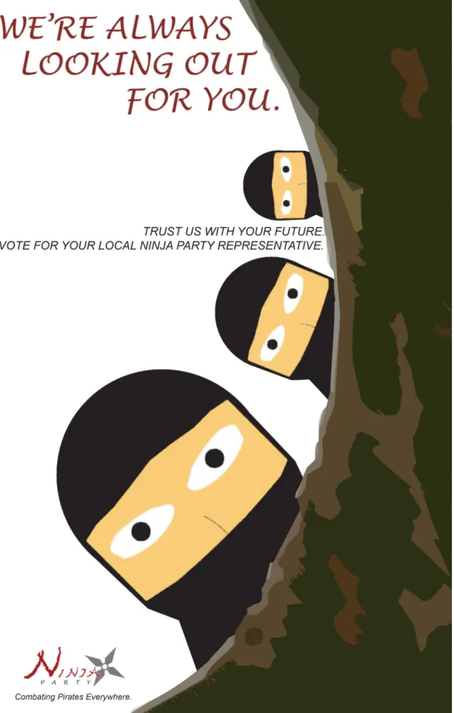
slogan, and platform. Additionally, I was to design posters, a stationary set, a website, and a board game, including game pieces. Since these projects were not based on any pre-established brand, it was the perfect opportunity for me to experiment, as well as demonstrate the skills I learned both inside the CSU Art Department and outside. As I tend to avoid current events when it comes to my design work, I decided to take a humorous approach to the assignment and created the Ninja Party, based off of the old ‘Pirates vs. Ninjas’ Internet phenomenon and my finding of a real life Pirate Party while doing research for ideas. I based the logo on the edgy, dark motifs typically associated with ninjas in popular culture, but gave it a sense of elegance by evoking cursive handwriting using my own handmade typeface and a shuriken, or throwing star, as a flourish. The logo became the basis on which I designed all of the following projects in the series.
As I finish my time at Colorado State University, I find that I have gained a unique skillset. I believe that this can be attributed both to my instructors, who helped me discover my place in the graphic design world, and my own willingness and eagerness to experiment whenever possible. I hope that my experiments in graphic design were, and will continue to be a success as I move further into the real world.
Title Media Original Format
Figure 1: Ninja Party: Looking Out Digital Illustration Illustrator, Photoshop, 2,105 KB
Figure 2: Ninja Party: How To Spot A Pirate Digital Illustration Stock images, Illustrator, Photoshop, 8, 655 KB
Figure 3: CIIPE Corporate Font Digital Illustration Illustrator, Photoshop, 929 KB
Figure 4: CIIPE Advertisement Digital Illustration Photoshop, 2,071 KB
Figure 5: CIIPE T-Shirt Front and Back Digital Illustration Illustrator, Photoshop, 1,390 KB
Figure 6: CIIPE Logos Digital Illustration Illustrator, 485 KB
Figure 7: Living Smaller Digital Illustration Photographs, Photoshop, InDesign, 3,202 KB
Figure 8: Wicked: The Musical- Phone App Digital Illustration Illustrator, Photoshop, 1,056 KB
Figure 9: History of the ‘#’ Digital Illustration Stock images, Photoshop, InDesign, 373 KB