User Interface Design for Quality Control
Development of a user interface for quality control of industrial manufactured
parts
Petter Abrahamsson
Industrial Design Engineering, master's level
2020
Luleå University of Technology
MSc in INDUSTRIAL DESIGN ENGINEERING
Department of Business Administration, Technology and Social Sciences Luleå University of Technology
User Interface
Design for
Quality Control
- Development of a user interface for quality
control of industrial manufactured parts
Petter Abrahamsson 2020
SUPERVISOR: Jörgen Normark (LTU)
SUPERVISOR: Michael Fergusson (Viospatia)
REVIEWER: Markus Ahlberg
EXAMINER: Åsa Wikberg Nilsson
User Interface
Design for
Quality Control
- Development of a user interface for quality
control of industrial manufactured parts
Petter Abrahamsson 2020
SUPERVISOR: JÖRGEN NORMARK (LTU) SUPERVISOR: Michael Fergusson (Viospatia) REVIEWER: Markus Ahlberg EXAMINER: Åsa Wikberg Nilsson
MSc in INDUSTRIAL DESIGN ENGINEERING
Department of Business Administration, Technology and Social Sciences Luleå University of Technology
CIVILINGENJÖR I TEKNISK DESIGN
Master of Science Thesis in Industrial Design Engineering Quality Control
Development of a user interface for quality control of industrial manufactured parts © Petter Abrahamsson
Published and distributed by Luleå University of Technology SE-971 87 Luleå, Sweden Telephone: + 46 (0) 920 49 00 00
Cover: Illustration by Petter Abrahamsson Printed in Luleå Sweden by
Luleå University of Technology Reproservice Luleå, 2020
CIVILINGENJÖR I TEKNISK DESIGN
Master of Science Thesis in Industrial Design Engineering User Interface Design for Quality Control
Development of a user interface for quality control of industrial manufactured parts
© Petter Abrahamsson
Published and distributed by Luleå University og Technology SE-971 87 Luleå, Sweden Telephone: +46 (0) 920 49 00 00
Cover: Illustration by Petter Abrahamsson Printed in Luleå Sweden by
Luleå University of Technology Reproservice Luleå, 2020
I would like to thank Viospatia for giving me the opportunity to be part of such an exciting and innovative project. A special thanks to Mikael Sjödahl, Michael Fergusson and Per Bergström for all your support during this process and all your help whenever guidance has been needed.
I would also like to extend my gratitude to the people involved at Gestamp Hardtech, Scania Ferruform and Volvo Cars, who have, regardless of current circumstances with restricted policies for visits and with their lim-ited working hours, still taken their time to advise me and contribute to my work.
Finally I would like to express my gratitude to my supervisor at Industrial design engineering at Luleå Univer-sity of Technology, Jörgen Normark, for your support throughout this challenging process. Your expertise in the field of interaction design has been priceless and a great support in an often diffuse process.
Thank you!
Petter Abrahamsson
Gothenburg 15th of June, 2020
The expected quality on manufactured components in the automotive industry is high, often with an accu-racy of tenths of a millimeter. The conventional methods used to ensure the manufactured components are very accurate, but they are both time consuming and insufficient and only a small part of the produced series are analyzed today. The measurement is performed manually in so-called measurement fixtures. Where each component is fixed and predetermined points of investigation are controlled with a dial indicator. These fix-tures are very expensive to manufacture and they are only compatible with one specific kind of component. Nowadays, great volumes of material are scrapped from these procedures in the automotive industry. Hence, there is a great need to increase the amount of controlled components without affecting the production rate negatively .
This project was carried out for the relatively new company Viospatia, which is a spin-off company based on research from Luleå University of Technology. They have developed a system that automatically measures each component directly at the production line with the use of photogrammetry technology. This makes it possi-ble to discover erroneous components almost immediately and the manufacturer gets a more distinct view of their production and its capability. The aim of this thesis has been to investigate how a user interface should be developed to be as user-friendly as possible without limiting the system’s functions. The objective has been to design a proposal of a user interface adapted for the intended user, creating value and is easy to use.
The progression has been structured around a human-centered approach expedient for interaction design, where the developing phase, containing analyze, design and validate, is performed through iterations with continuous feedback from users and the project’s employer. The context, where the intended solution is sup-posed to be used, was investigated through interviews and observations at the involved companies. In the proj-ect there were three factories involved, Gestamp Hardtech and Scania Ferruform in Luleå and Volvo Cars in Olofström. These factories are using similar production methods, sheet metal stamping, so their prerequisites and needs are similar for this type of quality control system.
Creative methods have been applied throughout the project to generate as much ideas as possible while trying to satisfy all the important aspects. Initially analog prototypes were created but they were soon developed to digital interactive prototypes. A larger usability-test was conducted with seven participants by using a weblink to the digital prototype. With support from the feedback these tests generated some adjustments were made and the final user interface was designed, separated in two levels - Supervisor and Operator.
Through extensive literature study and user-testing it became clear that the operator needs to get an unmis-takable message from the user interface. There should not be any doubts whatsoever and the operator should react immediately. This message is delivered with the use of colors that have an established meaning. By iden-tifying what needs the different actors have, the system’s functions can be separated and made accessible only for the intended user. The functions can then be more specifically developed for the intended user instead of modifying them trying to make a compromise that fits everybody. This separation of functions is not anything the user has to actively do but it is performed automatically by the user interface when the user is signing in.
ABSTRACT
KEYWORDS: industrial design engineering, human-centered design, graphical user interface, digital proto-types, quality control, automotive industry, sus-evaluation
Den förväntade kvalitén på tillverkade delar inom bilindustrin är väldigt hög, med toleranser på så lite som tiondels millimeter många gånger. De konventionella metoderna som används för att kontrollmäta de tillver-kade delarna idag är mycket noggranna, men de är både tidskrävande och otillräckliga och endast en väldigt liten del av en producerad serie blir kontrollmätt idag. Mätningen utförs manuellt i så kallade mätfixturer. Där varje komponent fixeras och förutbestämda undersökningspunkter kontrolleras med en så kallad mätklocka. Dessa fixturer är även väldigt dyra att tillverka och de är bara kompatibla med en specifik komponent. I dagens läge så kasseras otroligt stora mängder material från dessa komponenter inom bilindustrin. Här finns det alltså ett stort behov för att öka mängden komponenter som kontrolleras utan att påverka tillverkningstakten. Det här projektet utfördes åt det relativt nystartade företaget Viospatia, vilket är ett spin-off företag från forsk-ning utförd vid Luleå tekniska universitet. De har utvecklat ett system som med hjälp av fotogrammetri auto-matiskt mäter av varje komponent direkt i produktionslinan. Detta gör att eventuella fel upptäcks nästan ome-delbart samtidigt som tillverkaren får en tydligare bild av sin produktion och dess kapacitet. Syftet med denna masteruppsats har varit att undersöka hur ett gränssnitt bör utvecklas för att det ska bli så användarvänligt som möjligt utan att begränsa systemets viktiga funktioner. Målet har varit att ta fram ett förslag på ett gränssnitt som är anpassat för den tänkta användaren, som skapar ett mervärde och är enkelt att använda.
Processen har följt en användarcentrerad struktur fördelaktig för interaktionsdesign, där utvecklingsfasen be-stående av analys, design och validering sker i flera iterationer med kontinuerlig återkoppling med användare och uppdragsgivare. Kontexten, där den tänkta lösningen ska användas, undersöktes initialt hos de involverade företagen. I projektet var tre fabriker involverade, Gestamp Hardtech och Scania Ferruform i Luleå och Volvo Cars i Olofström. Dessa fabriker använder mestadels liknande tillverkningsmetoder, metallpressning, vilket gör att de rimligtvis har en del gemensamma förutsättningar och behov.
Under arbetets gång har diverse kreativa metoder använts för att generera så mycket idéer som möjligt utan att förbise viktiga aspekter. Till en början utvecklades prototyper analogt för att sedan utvecklas till digitala interaktiva prototyper. Ett större användbarhetstest genomfördes på distans med sju testpersoner via en länk till den digitala prototypen. Med hjälp av responsen från dessa tester gjordes en del ändringar och den slutliga designen på gränssnittet blev uppdelat i två nivåer, Supervisor och Operator.
Genom teoristudie och användartester framgick det att operatören behöver få en omisskännlig uppmaning från gränssnittet. Det bör inte uppstå några som helst tveksamheter och operatören skall kunna agera direkt. Denna uppmaning sker genom en tydlig färgkodning som utnyttjar vedertagna uppfattningar om färgers inne-börd. Genom att identifiera vilka behov de olika aktörerna har kan man på så sätt också hålla isär de olika funktionerna och göra de tillgängliga endast för den typen av aktör som behöver de. De kan på så sätt också utvecklas mer specifikt för den tänkta aktören istället för att modifieras för att passa alla. Denna separering av funktioner är inget som användaren behöver ställa in själv utan görs automatiskt då den loggar in med sitt användarkonto.
SAMMANFATTNING
NYCKELORD: teknisk design, användarcentrerad design, grafiskt användargränssnitt, digitala prototyper, kvalitetskontroll, fordonsindustri, sus-utvärdering
1 INTRODUCTION ...2
1.1 BACKGROUND ...2
1.2 STAKEHOLDERS ...2
1.3 OBJECTIVE AND AIMS ...2
1.4 PROJECT SCOPE ...3
1.5 THESIS OUTLINE ...3
2 CONTEXT ...5
2.1 THE SYSTEM VIOPRO ...5
2.1.1 PHOTOGRAMMETRY ...5
2.1.2 SOFTWARE ...5
2.2 CURRENT PRACTICE ...6
2.2.1 GESTAMP HARDTECH ...6
2.2.2 SCANIA FERRUFORM ...6
2.2.3 VOLVO CARS OLOFSTRÖM ...6
2.3 BENCHMARKING ...7
2.3.1 PARTINSPECT L ...7
2.3.2 AGISOFT METASHAPE ...7
3 THEORETICAL FRAMEWORK ...9
3.1 INDUSTRIAL DESIGN ENGINEERING ...9
3.2 HUMAN-CENTERED DESIGN ...9 3.2.1 ACTIVITY-CENTERED DESIGN ...9 3.3 USER INTERFACE ... 10 3.3.1 HUMAN BEHAVIOR ...10 3.4 USER EXPERIENCE ... 11 3.5 VISUAL DESIGN ... 11 3.5.1 LAYOUT ...11 3.5.2 TEXT ...12 3.5.3 COLOR...12 3.5.4 AFFORDANCE ...12
4 METHOD ... 14
4.1 PROCESS ... 14 4.2 PROJECT PLANNING ... 14 4.3 ANALYZE ... 15 4.3.1 REQUIREMENT ...15 4.3.2 INTERVIEWS ...15 4.3.3 OBSERVATIONS ...15 4.3.4 PERSONA ...16 4.3.5 SCENARIOS...16 4.3.6 TASK ANALYSIS ...16 4.3.7 LITERATURE REVIEW ...17 4.5 DESIGN ... 17 4.5.1 AFFINITY MAP ...17 4.5.2 LO-FI PROTOTYPING ...17 4.6 VALIDATE ... 18 4.6.1 DIGITAL PROTOTYPE ...184.6.2 USER TESTING AND EVALUATION .18 4.6.3 SUS ...19 4.7 METHOD DISCUSSION ... 19
5 RESULT ... 22
5.1 RESULTS OF ANALYZE ... 22 5.1.1 CONTEXT ...22 5.1.2 PERSONAS ...23 5.1.3 SCENARIOS...23 5.1.4 CLUSTERING SOFTWARE ...25 5.2 RESULT OF DESIGN ... 26 5.2.1 STRUCTURING THE ...26NEEDS AND REQUIREMENTS 5.2.2 LO-FI PROTOTYPES ...26
5.3 FIRST VALIDATION ... 31
5.4 REDESIGN ... 32
5.4.1 DIGITAL PROTOTYPES ...32
5.4.2 USER TEST AND EVALUATION ...35
5.4.3 RESULT OF SUS-SURVEY ...37
5.5 REFINEMENT AND FINAL CONCEPT ... 37
5.5.1 OPERATOR UI ...37
5.5.2 SUPERVISOR UI ...38
6 DISCUSSION ... 45
6.1 POSITIONING THE RESULT ... 45
6.2 RELEVANCE ... 46
6.3 REFLECTION ... 46
6.4 CONCLUSIONS ... 46
6.4.1 PROJECT OBJECTIVE AND AIMS ...46
6.4.2 RESEARCH QUESTIONS ...47
6.5 RECOMMENDATIONS ... 47
REFERENCES ... 48
CONTENT
APPENDIX A - PROJECT PLAN ...1 PAGE APPENDIX B - INTERVIEW QUESTIONS QUALITY CONTROL ...4 PAGES APPENDIX C - SIVPRO HTA...4 PAGES APPENDIX D - CANCAS HTA ...3 PAGES APPENDIX E - PERSONAS ...2 PAGES APPENDIX F - USABILITY TEST RESULT ...3 PAGES APPENDIX G - SUS USABILITY QUESTIONNAIRE ...1 PAGE APPENDIX H - SUS USABILITY SCORE ...1 PAGE APPENDIX I - IDEATION FOR OPERATORS UI ...1 PAGE APPENDIX J - ADVANCED SETTINGS FOR SUPERVISOR ...2 PAGES APPENDIX K - FINAL DESIGN OPERATOR UI ...5 PAGES APPENDIX L - FINAL DESIGN SUPERVISOR UI ...12 PAGES
Figure 1 - The SIVPRO v.2 prototype installed at a press hardening line at Gestamp, Luleå. Photo: Viospatia
Figure 2 - The inspection features shown in SIVPRO. Photo: Viospatia
Figure 3 - Gestamp’s newly developed UI for quality control. Photo: P. Abrahamsson
Figure 4 - The PartInspect L being prepared for an automated measurement. Photo: Hexagon AB Figure 5 - The software Agisoft Metashape used to create a 3d-model of an ancient pillar ornament. Photo: Jared Bendis
Figure 6 - A visualization of the human computer in-teraction with the interface bridging the gap between human and computer. Illustration: P. Abrahamsson Figure 7 - A representation of Norman’s “seven stages of action”. Illustration: P. Abrahamsson, inspired by Norman (2013).
Figure 8 - How a user scans a page with initial atten-tion to the focal point, then continuing to the termi-nation point. Illustration: P. Abrahamsson, inspired by McKay (2013) and Tidwell (2011).
Figure 9 - The interaction design process shown with opportunities for iteration. Illustration: P. Abrahamsson Figure 10 - Simplified version of project plan. For more detailed version see Appendix A. Illustration: P. Abrahamsson
Figure 11 - The informational display above the con-veyor belt at Gestamp. Photo: P. Abrahamsson Figure 12 - The measuring fixtures used for quality controls at Gestamp. Photo: P. Abrahamsson Figure 13 - Simplified HTA version of the required operations in SIVPRO. Photo: P. Abrahamsson Figure 14 - Categorizing needs with the help of Affini-ty mapping. Photo: P. Abrahamsson
Figure 15. Early Lo-Fi prototypes on one of the themes defined in the previous method Affinity map-ping. Photo: P. Abrahamsson
Figure 16 - The four tasks the testers had to perform in the usability test. Illustration: P. Abrahamsson Figure 17 - The score grading for SUS-evaluation. Illustration: P. Abrahamsson inspired by UIUX Trend (n.d.).
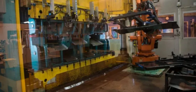
Figure 18 - A robot loading the press machine witht a metal sheet about to be pressed to a chassis part. Photo: Scania Ferruform.
Figure 19 -Simplified versions of the two personas Mattias and Lars representing the target user for the UI. Illustration: P. Abrahamsson.
Figure 20 - Scenario of a possible event when a prob-lem occurs at Gestamp and how it is handled today. Illustration: P. Abrahamsson.
Figure 21 - A future scenario showing how the new system and UI could improve the routines at Ge-stamp. Illustration: P. Abrahamsson.
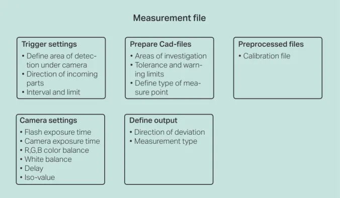
Figure 22 -Simplification of five important categories to go through when creating a measurement file. Illustration: P. Abrahamsson.
Figure 23 - Notes with important findings from the context phase clustered to five categories of require-ments. Photo: P. Abrahamsson.
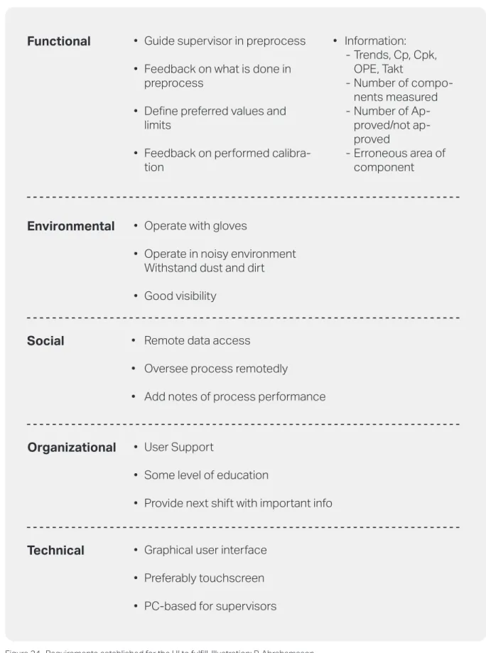
Figure 24 -Requirements established for the UI to fulfill..Illustration: P. Abrahamsson.
Figure 25 - Task analysis and Mind mapping of the first ideas of interaction in the UI. Illustration: P. Abra-hamsson.
Figure 26 - First lo-fi prototypes of the settings win-dows in the UI using lists for navigation. Illustration: P. Abrahamsson.
Figure 27 - First lo-fi prototypes of the settings win-dows in the UI using tabs for navigation. Illustration: P. Abrahamsson.
Figure 28 - Concept Light showing the status of last performd measurement. Illustration: P. Abrahamsson. Figure 29 - Concept Medium showing the status of last performed measurement. Illustration: P. Abraha-msson.
Figure 30 - Concept Heavy showing the status of last performed measurement. Illustration: P. Abrahams-son.
Figure 31 - Digital prototype of concept Light showing the fifth measurement in a batch of 700 components. Illustration: P. Abrahamsson.
Figure 32 - Analyzing the information regarding the measument point 04. Illustration: P. Abrahamsson. Figure 33 - The drop-down folder structure for navi-gating to the right files. Illustration: P. Abrahamsson. Figure 34 - The start menu shown when the supervi-sor has signed in to the UI. Illustration: P. Abrahams-son.
Figure 35 - Default window showing added mea-surement points with their defined limits and style. Illustration: P. Abrahamsson.
Figure 36 - The “Output data”-tab where the desired output of the measurement is selected. Illustration: P. Abrahamsson.
Figure 37 - Selecting the access level before signing in allows for a more target specific UI. Illustration: P. Abrahamsson. 5 5 6 7 7 10 11 12 14 14 15 16 16 17 18 19 19 22 23 24 25 26 27 28 29 30 30 31 31 31 32 33 33 34 34 35 35
LIST OF FIGURES
Figure 38 - A summary of the score from the control questions in the usability-test. Illustration: P. Abraha-msson.
Figure 39 - A summary of the SUS score from the Operator UI’s user-tests. Illustration: P. Abrahamsson. Figure 40 - The new file navigator operation with an text input box. Illustration: P. Abrahamsson. Figure 41 - A cropped version of the process UI with the ID’s history of not approved and warned measure-ments. Illustration: P. Abrahamsson.
Figure 42 - The analyzing window showing an ap-proved measurement. Illustration: P. Abrahamsson. Figure 43 - The analyzing window showing a mea-surement exceeding the UWL. Illustration: P. Abraha-msson.
Figure 44 - The analyzing window showing a measure-ment that is not approved. Illustration: P. Abrahams-son.
Figure 45 - The main menu presented immediately after signing in or terminating an operation. Illustra-tion: P. Abrahamsson.
Figure 46 - The initial Live view window showing sev-eral systems monitored at the same time. Illustration: P. Abrahamsson.
Figure 47 - A focused monitoring on Pressline 8 with a similar template as for the operator. Illustration: P. Abrahamsson.
Figure 48 - A more informative view of the process from Pressline 8 showing the way the users tend to scan a page in western culture. Illustration: P. Abraha-msson.
Figure 49 - The list with all the saved measurement files structured in accordance to department, project and other possible groups. Illustration: P. Abrahams-son.
Figure 50 - The history of ID number 2 on component Partname.X1 is investigated in the archive. Illustration: P. Abrahamsson.
Figure 51 - Selecting which system that is going to be calibrated. Illustration: P. Abrahamsson.
Figure 52 - A live monitor from the camera showing guides for the placement to be optimal. Illustration: P. Abrahamsson.
Solomon Hsu, Unsplash, Cover page Photo Greg Rosenke, Unsplash, Cover page Photo Patrick Tomasso, Unsplash, Cover page Photo John Thng, Unsplash, Cover page Photo Petter Abrahamsson, Cover page Photo Ümit Yıldırım, Unsplash, Cover page Photo
36 37 38 38 39 39 39 40 40 41 41 42 42 43 43
User interface User Experience Human-centered design Activity-centered design
That part of the UI designed to be used by the operators close to the system and in-line That part of the UI designed to be used by an Supervisor remotedly from the system. Process capability index
A set of data points generated in a three dimensional space to create 3D-shapes.
Upper Control Limit: The limit of the greatest positive deviation accepted for a certain mea-surement point
Lower Control Limit: The limit of the greatest negative deviation accepted for a certain mea-surement point
Upper Warning Limit: The limit of the greatest positive deviation accepted for a certain measurement point before a warning signal is shown
Lower Warning Limit: The limit of the greatest negative deviation accepted for a certain measurement point before a warning signal is shown
UI UX HCD ACD OUI SUI Cpk Point cloud UCL LCL UWL LWL
-LIST OF ABBREVIATIONS
Photo: Solomon Hsu, Unsplash
Introduction
In the automotive industry the expected quality of manufactured components is high and the allowed deviation from the nominal size is commonly a few tens of micrometer for some details. It is therefore of great importance to quickly identify the erroneous parts (Bergström et al., 2016). Today it is common that quality controls are performed for a batch of components, rather than for each component. These batches can sometimes be as large as 1000 compo-nents. If the measured part in the batch is inaccurate the previous 999 parts could also be inaccurate and can’t be approved without further measuring which could lead to great economic loss for the manufactur-er (Juran, 1995).
1.1 BACKGROUND
Viospatia was founded in the spring of 2018 by Mi-kael Sjödahl, Per Bergström and Michael Fergusson. The company develops three-dimensional inspection systems for quality control of manufactured parts, mainly for the automotive industry, and is a spin-off based on research from Luleå University of Technol-ogy.
Viopro is an optical system developed by Viospatia that inspects manufactured parts along the produc-tion line with the help of photogrammetry. A proto-type is installed at Gestamp Hardtech, Luleå, that is a manufacturer of stamped steel components mainly for the automotive industry.
1.2 STAKEHOLDERS
The main stakeholder is the company Viospatia, which is the initiators of this project and their CEO Michael Fergusson who also is one of the project’s supervisor. Other important stakeholders for this project are the different users of the system in the manufacturing industry, including the technicians working at the manufacturing line and the produc-tion engineers handling the calibraproduc-tions and set-tings for the measurement process. The companies involved in the project are Gestamp Hardtech, Sca-nia Ferruform and Volvo Cars AB. Where Gestamp
Hardtech, Luleå, and Volvo Cars, Olofström, are the most involved. Their involvement, for this project, has been about assisting with personnel for inter-views and observations regarding their current situ-ation. Throughout the project they have performed user tests and provided feedback on everything from early ideas to more refined prototypes.
1.3 OBJECTIVE AND AIMS
The need for a new UI to the Viopro system was for their product to be commercial competitive where the interaction between human and machine works as seamlessly as possible.
The objective of the project was to investigate how a UI for this type of innovative system should be de-signed to make it as user-friendly as possible without limiting the system’s functions. The UI should reflect the product’s high quality and professionalism and at the same time be user-friendly and pleasant to use. The aim of the project was to deliver a design pro-posal of a UI that is well suited for the intended user and at the same time it should create value to the user. The final concept proposal of a UI for the system Vi-opro was expected to be delivered with the possibility to adjust the interface based on which role the user interacting with it has. This kind of UI will contrib-ute to the manufacturers ability to ensure the quality of their components. It could also lead to financial gain for the manufacturers since the factors creating the errors in the manufacturing process are discov-ered and identified earlier and the errors could be cor-rected earlier than usual.
For this project two research questions were formu-lated on which the research for this project will focus on:
• How can a UI be designed so that the operating technician can, in the best way control, evaluate and make a decision whether the quality of a
com-ponent corresponds to the desired result?
1 INTRODUCTION
This project covers the process of developing a user interface, UI, for an automatic
quality control system in the manufacturing industry. It’s a master thesis project in
Industrial design engineering (D7014A) at Luleå University of Technology carried
out during the spring of 2020 and it is performed for Viospatia.
3
method discussion reflecting about the process. Chapter 5 Result
The fifth chapter presents the result from each phase during the project’s process.
Chapter 6 Discussion
The sixth and final discusses the result, it’s relevance with reflections on the findings. It ends with con-clusions regarding the objective and the established research questions and finally recommendations for further work.
• How can a UI be designed so that it can be handled by different actors with different need of
varying degree of complexity in the best way?
1.4 PROJECT SCOPE
Since this project was performed according to a Hu-man-centered design approach there were a lot of user-involvement throughout the process. Recurrent interviews, observations and user tests were initial-ly performed at Gestamp and Ferruform in Luleå. There was also some time disposed for traveling to Volvo Cars in Olofström to perform user studies. Due to the government’s travel recommendations and the companies’ temporary strict visiting poli-cies, following the Covid-19 outbreak, this meeting was conducted as an online video conference instead. So was the rest of the meetings with stakeholders throughout the project.
The main focus of this project was about developing the UI’s appearance and the interactions available in the system, not the implementation and program-ming of the UI with the system itself. However, the UI was developed in tandem with the development of the software controlling the system that the UI will be connected to.
1.5 THESIS OUTLINE
The structure of the thesis is organized in the follow-ing chapters.
Chapter 1 Introduction
The first chapter presents the background of the project and the stakeholders involved. It also presents the project’s objectives with two research questions and the scope of the project.
Chapter 2 Context
The second chapter explains the context of where the project is carried out and the stakeholder’s current practices, the existing system as well as a benchmark for similar solutions is presented.
Chapter 3 Theoretical framework
The third chapter presents the theoretical framework relevant for this project including theories about in-dustrial design engineering, human-centered design, user interface, user experience and usability.
Chapter 4 Method
The fourth chapter presents the process and the methods used during the project. Ending with a
Context
5
2.1 THE SYSTEM VIOPRO
The optical system developed by Viospatia is called Viopro and a prototype (SIVPRO v.2) is installed at one of Gestamp’s press hardening lines in Luleå, see figure 1. The system uses photogrammetry technol-ogy to inspect the components passing by on a con-veyor belt underneath the system. The rig consists of four cameras and a flash inside a photo box, where the cameras each takes a photograph of the object from different angles. With the software developed by Per Bergström a point cloud of the component is created that is in turn compared to the nominal shape, the CAD-model. The comparison, see figure 2, is entirely made on predetermined points, edges and holes from the Cad-model. Since the software just focuses on the predetermined areas the generation of the point cloud is performed much faster, which also is one of the strengths with the system and makes it unique. The system’s ability to inspect moving parts, max speed of 1 m/s, with high accuracy, 0.02 mm, is also one of its many strengths (Viospatia, 2020).
2.1.1 PHOTOGRAMMETRY
With the use of photographic images, that are pro-cessed and analyzed, reliable information about phys-ical objects and environments can be retrieved, which in turn can be used for instance to perform precise measuring and also to visualize the inspected object or area. The science and technology behind this is called photogrammetry (Wikipedia, 2020). The theory of photogrammetry is widely used to create three-dimensional models in many different areas such as inspection, object identification, visualiza-tion, navigation and animation (Remondino and El-Hakim, 2006).
The benefits of using the science of photogramme-try for shape inspection is that the component can be arbitrarily placed on the conveyor belt and the com-ponent can be in motion while measured. There has been a lot of previous attempts to develop a measur-ing system based on photogrammetry but the normal process of generating a point cloud is time consum-ing (Bergström, Fergusson and Sjödahl, 2018). 2.1.2 SOFTWARE
There are two separate software for the system today, one for calibration (CaNCAS) and another for pre-paring and performing measurements (SIVPRO).
2 CONTEXT
Following chapter presents the context the project is carried out within. How the
practices for quality is performed today by the stakeholders, how the system and
the prototype work today, what kind of similar existing solutions there are today
and how this phase was carried out.
Figure 2 - The inspection features shown in SIVPRO. Photo: Viospatia
Figure 1 - The SIVPRO v.2 prototype installed at a press hard-ening line at Gestamp, Luleå. Photo: Viospatia
process capability (Cp) and process capability index (Cpk). The process capability is a statistical measure of the process’ ability to produce a certain number of products (NIST/Sematech, 2013).
If the components are approved, they are brought back to the press station and the production can pro-ceed. If some of the components would not be ap-proved or the person performing the measurement is uncertain, a note could be made in the UI. The components are then blocked until someone from the quality department reviews it and decides what to do with it.
2.2.2 SCANIA FERRUFORM
Scania Ferruform is located in Luleå and manufac-tures rear axle housings, side beams and chassis parts for Scania trucks and buses. They are also a part of the SIVPRO development process and SIVPRO v.3 will be tested at their facilities during the spring of 2020.
Their quality controls vary depending on the com-ponents. For the rear axles they perform measure-ments on each component. For the other parts where the batches vary from around 400-500 a batch they perform quality controls in the start, in the middle and in the end. Their procedure differs slightly from the ones at Gestamp Hardtech. Instead of measuring in fixtures with a dial indicator they use measuring arms. Here the new system will be implemented a bit differently compared to the one at Gestamp. The measuring will be performed on fixtures lifting up the components rather than on a moving conveyor belt.
2.2.3 VOLVO CARS OLOFSTRÖM
Volvo Cars Olofström manufactures body compo-nents for their cars. Their production is similar to the ones at Gestamp and Ferruform since they also produce pressed metal components. They produce The calibration software is for calibrating the rig with
the cameras to the surface where the components will arrive to ensure the accuracy of the system, that is 0.02 mm (Viospatia, 2020). The other software, SIVPRO, computes the measuring through the six steps Image capturing, object identification, global matching, feature identification, feature matching and shape comparison (Bergström et al., 2018). The goal is to integrate both these software into one final UI.
2.2 CURRENT PRACTICE
The production sites of Gestamp and Ferruform, both in Luleå, were visited to create an understand-ing of how the current quality control procedures are performed.
2.2.1 GESTAMP HARDTECH
At Gestamp Hardtech they produce high strength and high tolerance press hardened components, mainly for the automotive industry. The process is rapid and the part that is relevant for this project re-gards when the parts leave the press and are stacked in boxes. This is where the SIVPRO v.2 prototype is placed today and the intention is to measure every component passing under the system directly after leaving the press.
At this location the components arrive on two paral-lel conveyor belts, two components on each belt. Two operators handle the components from one belt each and stacks the components in boxes of around 400 pieces per box. After this station, depending of what type of article that is pressed, some of the compo-nents are finished while some are sent to sand blasting for surface enhancements. At this station there is also a team leader responsible for that particular station and an additional similar station. These people are the ones who will be in direct contact with the system and UI on a daily basis.
The production process occurs in campaigns of about 1000 components, where half of them are identical to the other half, only that they are mir-rored. The first components leaving the press are car-ried, by an operator or the team leader, to a separate area where they are put into measuring fixtures. Pre-determined fixture points are controlled with a dial indicator in a given order and the measurement are sent to a software that register the values. The UI of this software indicates whether the values are within tolerances or not, see figure 3. The UI also presents a graph of all the components in the same campaign so that the trends can be detected. It also presents the
Figure 3 - Gestamp’s newly developed UI for quality control. Photo: P. Abrahamsson
7
much larger batches though, from 2000-8000 ponents per batch. Their frequency of finished com-ponents arriving at the line is also much higher, one every 2 seconds.
They perform measurements similar to the ones at Gestamp, one at the beginning, one in the middle and one in the end of every batch. For the measure-ments both dial indicators and measuring arms are used and the data is always stored and used for con-tinuous analysis and improvements.
2.3 BENCHMARKING
It is important to know about already established, if they exist, solutions relevant for the project. One can learn from those solutions and use the same key principles as others already have proved fruitful ac-cording to Sabisch and Tintelnot (as cited in Albers, Kraus, Revfi and Spadinger, 2019). To benchmark is according to Camp (1989, p. 12) “the search for the best industry practices which will lead to exceptional performance through the implementation of the best practises”.
2.3.1 PARTINSPECT L
Since this thesis is part of a great research project that regards an innovative system of which it is almost no other similar commercial solution, the focus of the benchmarking was instead on investigating UIs in general and why they useful. However, there is a similar system developed by Hexagon (Hexagon AB, 2020) called PartInspect L, see figure 4. The system is also automated and generates a three-dimensional model of the inspected part that is compared to the nominal shape to identify erroneous measurements like Viopro does. However, there is a difference be-tween the systems, which is that PartInspect is built for complex components produced in lower quanti-ties since one needs to place each component inside the kiosk-like measurement box. What they do have,
that is interesting for this project, is a well designed UI that seems user-friendly and intuitive.
2.3.2 AGISOFT METASHAPE
Agisoft Metashape is a software used to create 3D spatial models with photogrammetry technology. It is used for large scale models, such as terrain visualiza-tion in cartography. It is also used to generate smaller scale models in for instance areas like archeology or reversed engineering for product design, see figure 5. The result is commonly a refined point cloud that represents the inspected object (Agisoft LLC, 2020).
Agisoft Metashape was used in the beginning of the project to get familiar with a software using photo-grammetry technology. This was done since the tech-nology of this software is somewhat similar to the ones used in the SIVPRO and CaNCAS software. To get an understanding of what is needed to gener-ate a well-represented point cloud was investiggener-ated. What operations that needs to be performed and in what order they have to be executed was established through the study of user manuals (Agisoft LLC, 2020) and Youtube-tutorials (Bendis, 2019).
Figure 4 - The PartInspect L being prepared for an automated measurement. Photo: Hexagon AB
Figure 5 - The software Agisoft Metashape used to create a 3d-model of an ancient pillar ornament. Photo: Jared Bendis
Theoretical
framework
9
3.1 INDUSTRIAL DESIGN ENGINEERING
The research field of industrial design engineering can be described as a combination of the science about design engineering and industrial design. It re-gards great knowledge about math, technology and mechanics, which is common for design engineering. It also includes the ability to understand humans’ be-havior, how the aesthetics and the product’s appear-ance communicates its use to the user, which is im-portant knowledge for an industrial designer, Smets and Overbeeke (1994) explains. Industrial design en-gineering is about focusing on the user when creating solutions for his/her prerequisites and needs through a process where different methods, both creative and strict, are used continuously to develop the most suit-able product for the intended user Wikberg Nilsson et al. (2015) states.This project is about getting a large and complex sys-tem to become as user-friendly as possible for differ-ent types of users without affecting the system’s func-tions and possibilities. To achieve a good result there is a great need for understanding how the system works through knowledge about design engineering. At the same time knowledge about industrial design is important to comprehend the user needs, what they want to achieve with the system and how that can be performed in the best way with the help of a user interface.
3.2 HUMAN-CENTERED DESIGN
A common approach for product development is the one of Human-centered design, in this thesis referred to as HCD. It’s a process where the development, from the very start to the delivered final result, hap-pens in iterative cycles through observation, ideation and prototyping (Norman, 2013). The intended user has a varying impact on the process depending on which approach is used, but what is common for the HCD process is that the user is in some way always in-volved. Whether it’s through observation, interviews and feedback on ideas and solution or if they
active-ly take part in the development process, so called Co-creation (Norman, 2013). According to Gould and Lewis (1985) there is three important principles when performing a human-centered design process.
1. Early focus on the users: It is essential to focus on the users’ way of performing their tasks to un-derstand their cognition, behavior and attitudes. This could be done by observing them performing their tasks and/or involve them in the development
process.
2. Empirical measurement: Perform observations where the users tries simulations and prototypes. Remember to record and document their reactions
on design attributes and scenarios so they can be measured and analyzed.
3. Iterative design: Fix the problems discovered during the user tests and perform new tests to understand the effects of the corrections and see if
the problems really are solved.
3.2.1 ACTIVITY-CENTERED DESIGN
While the focus on the users is very important, some-times the outcome can be affected to the worse when the solution is too refined because it is supposed to match as many different users as possible Norman (2005) explains. The simpler a system is, the easier it is to comprehend and to know how to act in it Stolter-man (2008) states. But the lack of complexity could lead to low motivation, low stimuli and a less refined outcome. To engage into a thoroughly designed sys-tem with high complexity could instead bring a pos-itive sense of challenge and entertainment that could lead to a greater outcome Stolterman (2008) contin-ues.
For those systems the designer needs to have an un-derstanding of the whole situation and decide where the complexity is needed to some extent for the re-sult not to be affected. Here the user has to adapt to
3 THEORETICAL FRAMEWORK
In the following chapter a presentation of the relevant theories to conduct this
project are presented. Different sources have often been used to prove that the
the-ories are conventional. For some research fields there are contradictions whether
the assumptions are correct or not. If so, this has been addressed in text regarding
those theories and are discussed upon in a later chapter.
of action the user wanted the system to perform but often hourglasses, pop-up messages or simple repeti-tive animations are used to get our attention.
Users tend to blame themselves and their own short-comings if they do not understand a UI or fails to use it. Often it is not the users that are the problem, but it is rather the UI’s design that is insufficient, it is not intuitive. Because of this, the term ‘human error’ is often misused in the concept of HCI according to Norman (2013). He explains that these errors could be avoided if the UI provides simple and clear infor-mation to the user of what a certain action will lead to.
Every time some detail is confusing and the interac-tion with it makes the person uncertain there is an opportunity for improvement McKay (2013) says. He continues by saying that if there is a UI demand-ing to be experimented, assisted or trained before use there is always an alternative solution – a self-explana-tory solution that does not demand this type of train-ing (McKay, 2013). Before an action is performed, when the user evaluates the situation to make a deci-sion, all essential information for the decision should be accessible. An expert might have learned the cor-rect steps by heart and need lesser information than the UI provides but a less experienced person, who could be in need of performing the same task, will probably need more support. Thus, Norman (2013) concludes, the information should always be accessi-ble and guiding.
Immediately after the user’s action is performed a confirmation of some sort should appear that shows what is happening and the user can evaluate if right actions was performed. To minimize these ‘human errors’ it is also important to be able to reverse an action and undo to some extent without creating to costly problems (Norman, 2013).
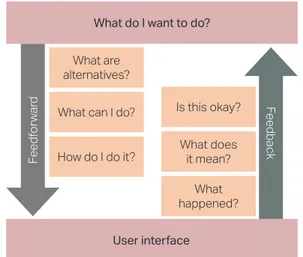
A tool to foresee and ease these important aspects of decision-making Norman (2013, p. 71) presents what he calls “seven stages of action”, see figure 7. He claims that a user asks him/herself seven questions during the process when an action will be performed until he/she is certain that it is performed correct-ly. These questions could also help supporting the designer since every question needs to be answered clearly by the UI for the user experience to be as pleas-ant and effortless as possible.
the product instead of the other way around which is normal in HCD. Some systems have to be com-plex, one needs to better understand the activity per-formed, otherwise the desired result is not possible to reach Norman explains (2005).
3.3 USER INTERFACE
Mckay (2013, p. 6) sums it up with “A user interface, or UI, is what connects users to a product’s underly-ing technology. It is what users see and feel directly when using a product.”. The UI of a product is what connects the user with the product and lets him/her influence the behavior of the product to a desired outcome. How well a product’s UI is designed de-pends on how well it communicates its use to the user Norman explains (2013).
Since the computer is gradually becoming a more important part of our lives there is also a growing need of making our interaction with the computers more efficient and user-friendly. The research on this field, whenever a human interacts with a computer of some sort, is called human-computer interac-tion (HCI) and it regards both to our everyday use of smartphone apps to more complex interactions with large systems demanding lots of practice and education to comprehend Karlsson, Osvalder, Rose, Eklund and Odenrick (2015) explains. One common kind of UI today is the graphical user interface (GUI) that you come across on websites, smartphone apps and computer software.
3.3.1 HUMAN BEHAVIOR
Today, many systems provide feedback within 0.1 seconds after an action is performed to assure the user that the desired action is registered and the system is working on it Norman explains (2013). This first sig-nal from the UI could vary depending on what kind Figure 6 - A visualization of the human computer interaction with the interface bridging the gap between human and com-puter. Illustration: P. Abrahamsson
11
At first, the question ‘What do I want to do?’ is for-mulated and that is about the goal the user has for a specific task. Then the user scans the UI to see which alternatives and possibilities there is that might in-dicate they can be a possible way to start solving the problem. After that, a quick investigation of which actions are feasible and how much is in the hands of the user are made. Also a plan of how the course of action might be is investigated. The information pro-vided by the UI to support these questions is called ‘feedforward’ by Norman (2013).
When all these questions are answered and the user, hopefully, feels certain he/she acts and the UI pro-vides some sort of feedback. This feedback is at least as important as the feedforward provided before the interaction. First the user will be aware if something ever happened. Then the information is interpreted to make an understanding of what state the system is in right now immediately after the acting. Finally, an estimation of whether the initial goal is reached or not is made says Norman (2013).
By using these seven questions as a tool in the design process of the UI and to see them from the user’s perspective some future errors could probably be avoided. For this project the goal is to make a UI that is as self-explanatory as possible but given the com-plexity it requires to perform some of the tasks with the system the questions should probably for some situations only be seen as motivations rather than a criteria.
3.4 USER EXPERIENCE
It’s important to separate the user experience (UX) from the user interface since a well working interface
does not have to imply that the user’s experience of it is good Norman and Nielsen explains (n.d.).
3.5 VISUAL DESIGN
The visual design of a UI is really important since it both affects how we grasp the UI from an affective perspective, if it is aesthetically appealing or not, but it is also important for reducing confusion and incorrect use (McKay, 2013). The aesthetic impres-sion is what immediately grasps our attention. Our perception of the UI is at first based on the visual ap-pearance, long before we have an opinion about how well the interaction is working (Wallach and Scholz, 2012).
There is a bias called ‘Aestethic-Usability Effect’ (Lid-well, Elam, Butler and Holden, 2010, p. 20) which means that users believes it is easier to use a UI they find more aesthetically appealing than a less appeal-ing UI. This bias also influence their judgement when they are asked to evaluate the UI based on its function and interaction Kurosu and Kashimura (1995) shows. McKay (2013) says that for a product to be appreciated it really needs to look like it fulfills its purpose and give a high quality impression since humans are emotionally controlled and reacts ac-cordingly to the product’s visual appearance. 3.5.1 LAYOUT
The layout of the UI helps guiding the user to the next task and it increases the chances for the infor-mation to be interpreted correctly. A good layout will give the UI the impression that it is structured, simple, easy to read and the aesthetical appearance makes it pleasant to watch and use (McKay, 2013). Tidwell (2011, p. 131) describes the meaning of the layout as “the art of manipulating the user’s attention on a page to convey meaning, sequence, and points of interaction.”.
When a page of the UI is presented for the user the whole page is first quickly scanned to make an idea of what is presented. By knowing how this scanning process works some useful insights can be used when setting up a layout, to direct focus. After the first quick scan the user searches for a focal point - the element that stands out from the rest that your eyes can’t resist going to (Tidwell, 2011) and (McKay, 2013). This element should be the thing that leads the user on the right path. In the same way we, in western culture, reads from left to right and top to bottom a page in a UI is scanned, see figure 8. If it What do I want to do?
User interface Feedf or war d What are alternatives? What can I do? How do I do it? Feedback Is this okay? What does it mean? What happened?
Figure 7 - A representation of Norman’s “seven stages of ac-tion”. Illustration: P. Abrahamsson, inspired by Norman (2013).
is important to get all the information on the page the interactive part should therefore be in the bottom right corner, the termination point (McKay, 2013.
3.5.2 TEXT
In the same way the graphical element’s size and placement can be used for calling to attention so can the text be used as well, through hierarchy. By using text with varying size, styles, weight, and color the at-tention can be directed to a certain desired order of how the information should be read. To gain better legibility the text should have a high contrast against its background and sans serif typefaces should be used as much as possible McKay (2013) and Lidwell et al. (2010) explains.
3.5.3 COLOR
Colors are primarily used to communicate a UI’s status and the meaning of the interaction. Howev-er, there is no explicit consensus about the meaning of colors because our perception of colors is largely based on our cultural affiliation McKay (2013) and Lidwell et al. (2010) explains. It is also important to not entirely rely on the color communicating its use or status since approximately 8 percent of adult males and 0.5 percent of adult females have some form of color confusion (Color blindness, 2020). To assure that people with color confusion does not miss any-thing important the information needs to be present-ed with rpresent-edundancy, e.g. by a complimentary text la-bel, icon or by hierarchy (McKay, 2013).
Nevertheless the cultural differences there is still some overall consensus about some colors and their meaning regarding their use in UIs. Red often in-dicates that something is wrong, something has
stopped, or something is critical and needs immedi-ate attention. Green indicimmedi-ates that everything is nor-mal and it works as it is supposed to do, the current state is approved and no further measure is needed. Yellow works as a warning color. It tells the user to be cautious and aware that the situation can get worse (red) which will need some form of measure. Yellow is often used as a transition between the two extreme positions (green and red) to prepare the user for the otherwise quite drastic change (McKay, 2013). Whenever it is important to attract attention and call for the user’s priority saturated colors should be used since they are more perceived as exciting and dynam-ic. According to Lidwell et al. (2010) desaturated col-ors should be used to enhance the perception but the call for attention is not that critical.
3.5.4 AFFORDANCE
The visual properties that communicates how the in-teraction works in a UI is called affordance. All inter-active controls have some sort of affordance whether it is good or not McKay (2013) explains. Lidwell et al. (2010) claims that a product is more intuitive when its interactive elements corresponds to the task they are supposed to perform. In abstract contexts, as for UIs, it is really important to try connecting the ac-tions to real comprehensible ones. Since the user only gets to see a fraction of what is really happening in the system he/she needs something to associate with and build an accessible perception of what is going on (Lidwell et al., 2010). A significant way to see how good affordance a UI has is to perform user-tests with the UI. If it is misused initially and takes some attempts before the user figures out how the inter-action works, its affordance is most likely poor and should be considered to change Norman explains (2013).
Focal Point
Weak fallow area Termination Point Strong fallow area
Figure 8 - How a user scans a page with initial attention to the focal point, then continuing to the termination point. Illustra-tion: P. Abrahamsson, inspired by McKay (2013) and Tidwell (2011).
Method
4
4.1 PROCESS
This project followed a traditional process for inter-action design (Wallach and Scholz, 2012), see figure 9. It is an iterative process consisting of five phases: Scope, Analyze, Design, Validate, Deliver. Through-out the whole process it is important to interpret the result objectively and identify the needs for each phase. For interaction design projects, focusing on user-friendly solutions, in general the extent of the situation is often quite large and complex. It is hard to comprehend everything from the beginning but by developing through many iterations one can start at one end, solving a problem. Through iterations of the phases analyze, design and validation new ideas and solutions occurs and can be added along the way until all the relevant areas has been considered ac-cording to Wallach and Scholz (2012).
It’s a conventional and general process for interaction design which Preece, Rogers and Sharp (2015) and Dubberly (2008) claims as useful for the design of UI. Since this project includes different types of us-ers with varying needs and requirements in terms of function and usage of the system, I consider the given process as a useful one to develop, in an efficient way, a UI that will favor the different users equally.
4.2 PROJECT PLANNING
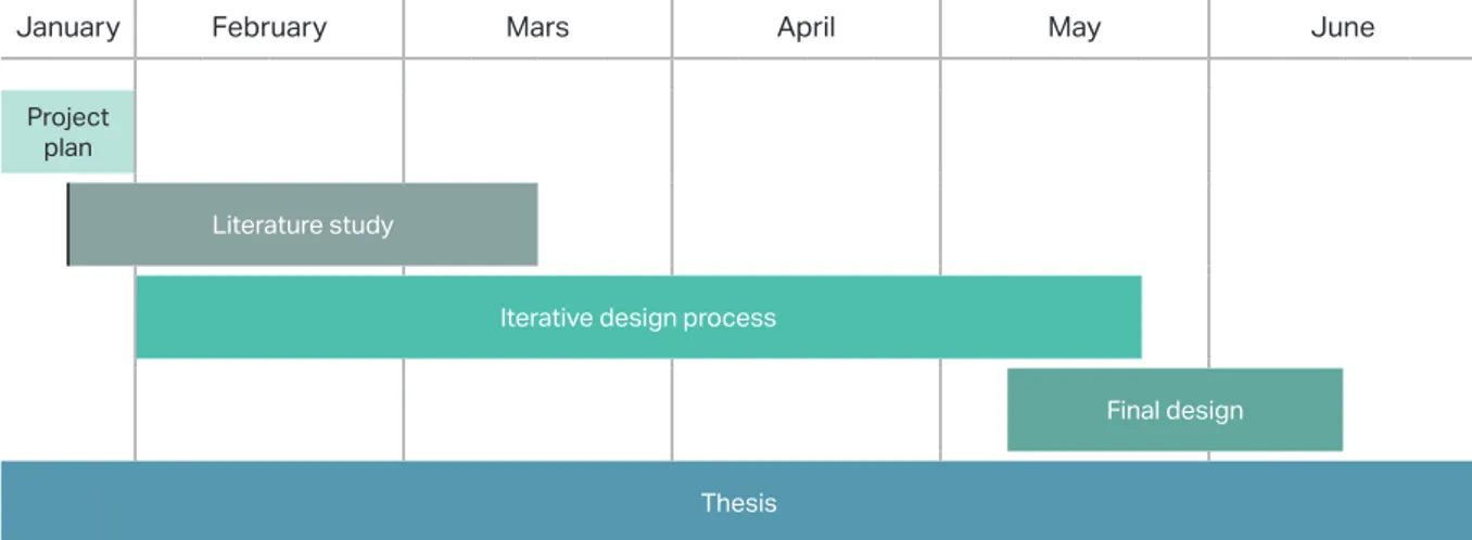
After the initial meetings with supervisors from Vi-ospatia and LTU an understanding of the project’s extent and how much could be expected of the proj-ect were set. Then began an estimation of the work-load and duration of each phase. An assumption that three iterations of analyzing, prototyping and evaluation were made. The first iterations should include initial context immersion, literature study and generation of early ideas. The second iteration should dig deeper into the users’ perception, based on feedback evaluations, and behavior. It should re-sult in more refined prototypes where the different actions are connected. The third and final iteration should be concerning the detail design of the UI as a whole. The project plan was established, see figure 10 and Appendix A, to follow the previous described design process. The work was structured so that the UI development could be performed parallel to the theory immersion and the thesis writing.
4 METHOD
Here follows a description of the process throughout this project. The methods,
how they work, why they are used and how they were implemented is presented in
this chapter.
Figure 9 - The interaction design process shown with opportu-nities for iteration. Illustration: P. Abrahamsson
January February Mars April May June
Project plan
Literature study
Iterative design process
Final design Thesis
15
A video conference with three employees from Vol-vo Cars was made later on in the project. Since this meeting was performed much later than the ones with Ferruform and Gestamp the arrangement was a bit different. The meeting worked as a check-up to see how much the already established needs were cor-relating with their needs.
4.3.3 OBSERVATIONS
During all phases in a HCD process observations can be very useful. If used in the beginning the method helps the designer to understand the context the user operates in, the activities that are carried out and the goals of these activities. It could also be used as a source of feedback for a new solution to see how well it helps achieving the goals. It can either be performed out on the field in an environment the user is com-fortable with or in a closed environment where the designer has more control of the procedure (Preece et al., 2015).
Observations has been carried out at Gestamp’s fa-cilities in Luleå at the press hardening line where the SIVPRO v.2 prototype is placed. A brief conversation with the operators working at the line was exchanged and they were studied whilst performing their task sorting the components arriving at their station. Also, the prototype was studied when in action, tak-ing photographs of the components passtak-ing by.
The measuring station with the measuring fixtures were studied and a demonstration of how the mea-suring procedure is performed was made. A sample from the production was fixed in the fixture and the six different fixture points, that were to be in-vestigated for this specific type of component, were measured, see figure 12. The result were presented in the UI at the station showing information about the measurement’s deviation.
4.3 ANALYZE
Since this project has a human-centered design ap-proach the context immersion has focused on meet-ing the stakeholders, to learn about them and to see how they operate in their own environment. It has been carried out through recurrent interviews, obser-vations, co-creation and feedback sessions through-out the whole process.
4.3.1 REQUIREMENT
A specification of requirements could help to de-fine the framework of the project and delimitate the work so that focus is laid on relevant topics (Karls-son, Osvalder, Rose, Eklund and Odenrick, 2015). It gives the designer an assumption of the direction and a reference to the relevancy of the development process. A good way to identify and categorize these requirements, Preece et al. (2015) explains, is to inves-tigate the stakeholders’ needs and problems in terms of function, data handling, environment, organiza-tional and technical. With these categories in mind the outline for the initial interviews and observations were made.
4.3.2 INTERVIEWS
As a big part in understanding the context for this project, interviews have been performed through-out the process with different types of stakeholders. A definition of an interview is “a conversation with a purpose” roughly meaning that a person wants to find out something another person might have knowledge about through the means of conversation according to Kahn and Cannel (as cited in Preece et al., 2015, p. 295). The different interview types can be categorized into four different categories, open and unstructured, structured, semi-structured and group interviews, Preece et al. (2015) explains. The method used for this project has mainly been semi-structured interviews with open questions and topics to talk about, see Appendix B. This method allows the conversation to take unexpected turns where the interviewer gets valuable information that could have been missed if the questionnaire consist-ed of only closconsist-ed questions and a strict procconsist-edure (Preece et al., 2015). In the beginning of the project interviews were performed to get an understanding of the current situation at Gestamp Hardtech and Scania Ferruform with different stakeholders. Since the interviews were semi-structured the interviewer could get answers on topics prepared beforehand but also allow the conversation to lead to new findings.
Figure 11 - The informational display above the conveyor belt at Gestamp. Photo: P. Abrahamsson
context without providing any specific solutions. The purpose with scenarios is to understand the sit-uation better and help you make right decisions in a quick and confident way by seeing the situation from the users’ point of view. The context of the scenario is very important to better understand the scene and what’s happening to get the big picture. It could in-volve the physical whereabouts - where is the scenario performed?, but also the mentally – how is he/she feeling? Is the person under stress? (McKay, 2013). Scenarios were used after the interviews and observa-tions at Gestamp to roughly concretize the physical context, the operations performed and in which or-der. It was also used to visualize how an implemented solution could be beneficial for these specific users and their context.
4.3.6 TASK ANALYSIS
To obtain an understanding of an existing system it could be helpful to use task analysis methods. They are used to comprehend the underlying logic in the system and the users’ purpose with the system. Task analysis is a hypernym where the methods are about exploring cognitive processes with a high degree of abstraction. The most commonly used method is Hierarchical task analysis, HTA, (Preece et al., 2015). HTA is about breaking down a large task or opera-tion to smaller classes and step by step trying to see the logical connection. It helps the designer to focus on the details and at the same time see how the details are connected at large Preece et al. (2015) says. The structure of the software SIVPRO and CaN-CAS were mapped out with the help of HTA, see Appendix C & D. After this in-depth investigation were made, a new simpler HTA was created to try to cluster the operations that were made in correlation to each other. The new categories were then used as a starting point to build new concept ideas and to start prototyping, see figure 13.
4.3.4 PERSONA
By doing research, through observations and inter-views, a fictive target user can be constructed. This fictive person represents a class of real target users and is called a Persona. It is important to not use yourself or anyone specific as the target user. You are not like the users and designing for everyone is like designing for no one. The design needs to be more specific with a certain target McKay (2013) explains. Personas is a powerful way of communicating a uniform view of the users’ characteristics and their prerequisites in a project, as long as they are based on the people in-volved in the data collection (Preece et al., 2015). Creating personas helps defining the attributes of the aimed target group since the personas are represent-ing the actors in the scenarios. If the persona is happy with the solution so is the class the persona represents and therefore the users’ needs are met to a certain ex-tent. The persona helps making better design deci-sions along the way McKay (2013) continues. Personas were created after observations and inter-views had been done at Gestamp and Scania Ferru-form. Based on these studies and the interpretation of the data collected an idea of the different users was obtained. Initially two personas representing those who will be in direct contact with the system, daily or weekly, were created.
4.3.5 SCENARIOS
As a way of concretize the procedures in a context, scenarios can be created because, as Preece et al. (2015, pp. 464) describes, “It describes human activ-ities or tasks in a story that allows exploration of con-texts, needs and requirement.”. A scenario describes a specific target user (persona) trying to achieve a spe-cific goal or perform a spespe-cific task. A good scenario focus on the users’ goals, their problems, and their Figure 12 - The measuring fixtures used for quality controls at Gestamp. Photo: P. Abrahamsson
Figure 13 - Simplified HTA version of the required operations in SIVPRO. Photo: P. Abrahamsson
17
4.3.7 LITERATURE REVIEW
There are five important steps to follow when con-ducting a literature review according to Milton and Rogers (2013). First a problem formulation must be done so that a given topic is specified. Then the data collection is performed, where it is important to cov-er as much as possible on the given topic. Followed by evaluation of the data, where deeper understand-ings are made and the review’s credibility is defined of how extensively this procedure is done. Then the data needs to be analyzed and interpreted, where the most relevant data for the given topic has to be presented. Finally, your own take on the topic has to be includ-ed to prove that you have understood it accordingly (Milton and Rogers, 2013).
A thorough literature review for many different ar-eas was made in this project. The research fields, and search words, were: Usability, Graphical user inter-face, Industrial design engineering, Human-centered design, Interaction design, Human-Computer Inter-action, Photogrammetry. It was performed by read-ing peer reviewed scientific articles, books and con-ference material regarding these topics from sources such as the university’s library and databases such as Scopus, Web of Science and Google Scholar.
4.5 DESIGN
After the context was explored and a lot of informa-tion was gathered the data needed to be structured in order to get a reasonable starting point for the ide-ation phase.
4.5.1 AFFINITY MAP
An effective way of connecting the dots with large amounts of data is to use Affinity mapping. It is about trying to cluster many different nodes into some few themes where the nodes in each theme could be seen as the same category (Gray, Brown and Macanufo, 2010). The method identifies reoccurring patterns and themes through a qualitative analytic procedure. As long as one is aware that the themes can relate to many different things such as behavior, user targets, physical places or situations it is an effective way of creating a bit of order out of disorder Preece et al. (2015) says.
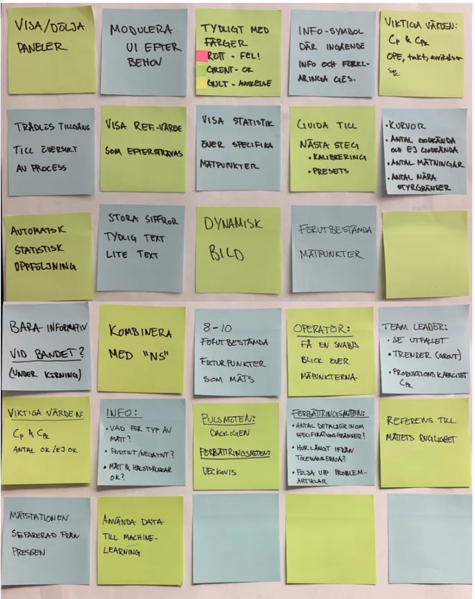
With the result from the interviews and observations an understanding of the current state of the stake-holders’ needs and desires could be mapped out. This was made with Affinity mapping and Scenarios. By first posting the findings and ideas from the field stud-ies on two separate boards, one for Gestamp and one
for Ferruform. Then a new board was made, where the requirement subjects functioned as themes. The nodes were then investigated and added to the new board under the relevant theme, see figure 14. This leads to a greater perception of the similarities in the different companies needs and demands.
Affinity mapping was also used to generate ideas for how the different needs could be reached for the op-erators’ UI. This was done after the first prototypes had been developed, since some questions were raised regarding how the data should be visualized. By studying existing UIs regarding how they present and visualize data some sketches were made for possi-ble ways of communicating the most relevant data in a comprehensive way. They were later applied to the prototypes to be tested and evaluated to see which ones of the solutions that seemed the most useful. 4.5.2 LO-FI PROTOTYPING
A very useful tool for developing an interactive UI is the lo-fi, low fidelity, prototypes. They are simple prototypes that merely represents the possible inter-actions and functions thought to be in the UI with-out focusing on the final design and the visual appear-ance. They are mostly made out of static sketches on paper, so called wireframes, to ease the development process since it is easy to generate and add new ideas and test different concepts (Preece et al., 2015). With the help from the HTA and the Affinity map-ping the prototymap-ping, see figure 15, could start since a better understanding of the needs and system had been established. Throughout the greatest part of the development process lo-fi prototypes were used con-sistently since whenever a new, perhaps, better idea appeared regarding some interaction it could easily be visualized and evaluated even though the proto-type was in the later refinement process.
Figure 14 - Categorizing needs with the help of Affinity map-ping. Photo: P. Abrahamsson