Lifetime prediction of sealing component using
machine learning algorithms
Olof Jansson
elt11oja@student.lu.se
Department of Production Management
Lund University, Faculty of Engineering, LTH
Advisors:
Fredrik Olsson
Assistant Professor, Industrial Management and Logistics, LTH
Daniel Sandberg
Science and Analytics Professional, Tetra Pak
Examiner:
Johan Marklund
Professor of Production Management, LTH
2016-09-16
Printed in Sweden E-huset, Lund, 2016
Abstract
Tetra Pak is a world leader in the food packaging industry and has been so for a very long time. In recent years however, they are experiencing increased competi-tion from low-cost suppliers selling their previously patented paper as a commodity. This has forced Tetra Pak to focus more on selling complete systems and services. One such potential service is condition monitoring coupled with predictive main-tenance of their packaging machines. In a packaging machine, there are electrical components called inductors that are used for sealing packages.
In this thesis, a model for predicting the remaining useful life of an inductor is built. Around 8 months of high resolution data is analysed and processed. The primary tool for data processing is Matlab, and the predictive model is built using Machine Learning algorithms in Microsoft’s analytics software Azure. In the data there are clear and visible trends of the inductor degenerating, but the precision of the predictive model is far too low to be useful in any real world-world scenario - more data is probably needed.
Keywords: Analytics, Machine Learning, Microsoft Azure, Condition Monitoring, Predictive Maintenance
Chapter
1
Acknowledgements
This master thesis project was carried out at the department Perfor-mance Management Centre (PMC) at Tetra Pak in Lund during the spring and summer of 2016. It was also the last part of Tetra Pak’s stu-dent trainee program ’Technical Talent Program’ in which I have par-ticipated since 2013. It has been very interesting to work in a project so close to reality and to be right in the middle of an ongoing business transformation!
First and foremost I would like to thank my Tetra Pak supervisor Daniel Sandberg for all the guidance and interesting discussions. I have learned a lot about analytics, data, inductors and many other things not related to work. I wish you all the best building Tetra Pak’s data science capabilities further!
I would also like to express my gratitude to the PMC team who has assisted me with data collection, scripts and many other things; Henrik Widestadh, Magnus Timmerby, Davide Borghi and Giulio Casini, thank you! Also, a big thank you to Tetra Pak statistician Klas Bogsjö who has taught me a lot about statistics, its beauty and its many pitfalls.
A very special thank you to Kristina Åstrand who has been my mentor throughout the Technical Talent program, and the one who directed me towards this thesis project in the first place. You have constantly kept me at the edge of my comfort zone and given me many valuable and sometimes even life-changing insights!
Last but not least I would also like to thank my supervisor and examiner from Production Management at LTH; Fredrik Olsson and Johan Marklund, who have guided me through the thesis process.
I hope you enjoy reading my report! Best regards, Olof jansson
Table of Contents
1 Acknowledgements iii
2 Introduction 1
2.1 Problem formulation, goals and scientific method . . . 1
2.2 Tetra Pak . . . 2
2.3 Analytics . . . 5
2.4 Condition Monitoring and Predictive Maintenance . . . 6
2.5 Introduction to Machine Learning . . . 7
2.6 Microsoft Azure . . . 9
2.7 Previous Condition Monitoring studies at Tetra Pak . . . 11
2.8 The Inductor . . . 12
3 Method 17 3.1 Data collection setup and procedure . . . 17
3.2 Raw inductor data . . . 18
3.3 Data wrangling and importing to MATLAB . . . 19
3.4 Data preparation and feature engineering . . . 23
3.5 Building prediction models in Microsoft Azure . . . 33
4 Results 39 5 Conclusions 43 5.1 Ecomonic aspects . . . 43
5.2 Data quality . . . 45
5.3 Algorithms and working with data . . . 46
5.4 Working in Azure . . . 47
5.5 Building the predictive model . . . 48
6 Further work and studies 51
References 53
List of Figures
2.1 Tetra Pak in numbers - a world leading company. . . 2
2.2 Tetra Pak’s installed base. . . 3
2.3 Typical Tetra Pak packages. . . 3
2.4 Example of factory layout. . . 4
2.5 Data Buzzwords 2016. . . 5
2.6 Machine Learning example - training a model. . . 8
2.7 Simple predictive model in Azure. . . 10
2.8 Anatomy of an inductor - individual parts. . . 13
2.9 Anatomy of an inductor - assembled and moulded. . . 13
2.10 Working principle of induction heating . . . 14
2.11 Cross section of a sealing setup. . . 15
2.12 Worn inductor. . . 16
3.1 Data collection setup. . . 17
3.2 Profile Viewer example. . . 21
3.3 Performance of data conversion scripts. . . 22
3.4 Execution times when converting csv to matlab format. . . 22
3.5 Characteristics of 9 different variables. . . 24
3.6 Characteristics of raw phase data. . . 25
3.7 Characteristics of raw impedance data. . . 26
3.8 Characteristics of raw frequency data. . . 26
3.9 Daily averages of phase time series. . . 28
3.10 Daily standard deviation of phase time series. . . 29
3.11 Pulse detection with threshold. . . 30
3.12 Pulse detection with derivative. . . 31
3.13 Impedance pulses before and after cleaning. . . 31
3.14 Phase pulse averages at different times in the pulse. . . 32
3.15 Trend of daily averages of phase pulses at different times into the pulse. 33 3.16 Phase trends pulse extraction. . . 34
3.17 Final version of Azure predictive model. . . 36
3.18 Hazardous way to split training/testing data. . . 37
4.1 Prediction model results - coefficient of determination. . . 40
4.2 Prediction model results - mean absolute error. . . 41
5.1 Customer value segmentation. . . 44 5.2 Prediction potential of parts. . . 45
List of Tables
3.1 Four example rows of raw data from a file. . . 19
3.2 Inductor measurements . . . 20
3.3 Finalized inductor feature data. . . 35
4.1 Coefficient of Determination . . . 39
4.2 Mean Absolute Error . . . 40
Chapter
2
Introduction
2.1
Problem formulation, goals and scientific method
Tetra Pak packages beverages and food in packages made of a type of carton. In the packaging process there is a step where the packages are sealed using a well known industry technique called induction heating. A physical electronic part called an inductor is used to heat up the packaging material so that it melts together. This is achieved by run-ning a current through the inductor which in turn will induce a current in the packaging material, heating it. The inductor is the part that this thesis will focus on.
A problem Tetra Pak faces is that it’s difficult to tell when an in-ductor is worn out. The inin-ductor is interesting because the part itself is quite expensive to replace, but more importantly is it very expensive to have machine downtime caused by malfunctioning equipment. Tetra Pak has recently started several initiatives regarding data analytics, condition monitoring and predictive maintenance. The general idea is that it should be possible to tell the state of a physical machine part by analysing data from different sensors and control equipment. Machines with inductors have been operating for a very long time, but to be able to perform analytics there has to be high resolution data which has not been collected historically. Equipment for gathering high resolu-tion data from inductors have been installed on 3 machines in a plant in Italy, and data has been collected for a around 8 months. The data collected is electrical measurements such as voltage, impedance, phase etc.
The project will try answer the following question: "Given 8 months of historical inductor data, can we predict the remaining lifetime of an inductor currently running?". To accomplish this, extensive data analy-sis will be conducted using mainly MATLAB and Microsoft’s analytics software Azure. Azure has a multitude of built-in tools for creating statistical predictive models. The goal is to create a predictive model that can predict the remaining useful life of an inductor to some extent. The project is not meant to produce a final version that goes live, but rather a proof-of-concept that indicates whether it is possible to build
predictive models of inductors.
The scientific method primarily used will be data analysis. The data collection is already completed by Tetra Pak, but a significant part of the thesis will be selecting relevant data from this pool of data. Before this selection process, interviews and discussions with people that have knowledge in the field of inductors will be carried out internally at Tetra Pak to limit the scope of the data analysis. One or more interviews will be carried out with professionals in the field of analytics and predictive modelling to gain insights in how best tackle model building with large amounts of data. The hypothesis is that it is possible to make mean-ingful predictions of inductor lifetime by building statistical predictive models using the data collected so far.
2.2
Tetra Pak
Tetra Pak is a global and multi national company in the food packaging and processing industry, with focus on liquid foods and beverages. The head office is situated in Lund, which also is the place that this thesis has been carried out. The company, founded in 1951, has a long history as one of the world leaders in their industry. See figure 2.1 for some key figures.
Figure 2.1: Tetra Pak in numbers - a world leading company.
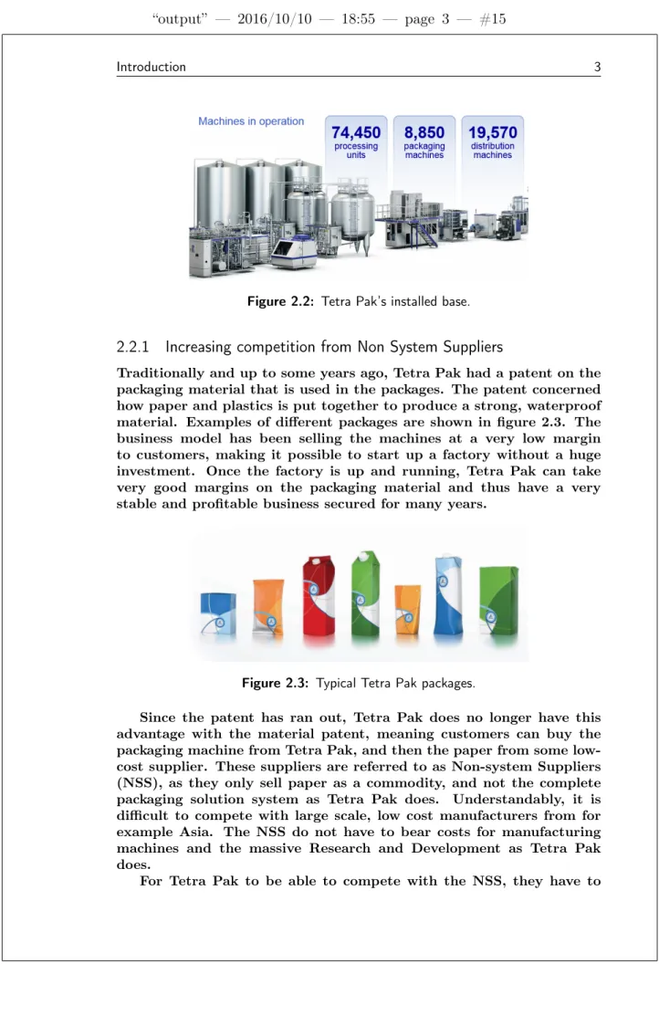
Tetra Pak is divided into two main parts; processing and packag-ing. Processing concerns all production steps leading up to the finished product, i.e. raw material, mixing, and pasteurizing. Once the product is finished, packaging takes over and puts it in a specific package, and also takes care of distributing the product after it is packaged. This the-sis is mostly about the packaging side, since the part being analyzed is on a packaging machine. Tetra Pak has been selling machines for a very long time, and therefore have an enormous installed base of machines worldwide. See figure 2.2.
Figure 2.2: Tetra Pak’s installed base.
2.2.1
Increasing competition from Non System Suppliers
Traditionally and up to some years ago, Tetra Pak had a patent on the packaging material that is used in the packages. The patent concerned how paper and plastics is put together to produce a strong, waterproof material. Examples of different packages are shown in figure 2.3. The business model has been selling the machines at a very low margin to customers, making it possible to start up a factory without a huge investment. Once the factory is up and running, Tetra Pak can take very good margins on the packaging material and thus have a very stable and profitable business secured for many years.
Figure 2.3: Typical Tetra Pak packages.
Since the patent has ran out, Tetra Pak does no longer have this advantage with the material patent, meaning customers can buy the packaging machine from Tetra Pak, and then the paper from some low-cost supplier. These suppliers are referred to as Non-system Suppliers (NSS), as they only sell paper as a commodity, and not the complete packaging solution system as Tetra Pak does. Understandably, it is difficult to compete with large scale, low cost manufacturers from for example Asia. The NSS do not have to bear costs for manufacturing machines and the massive Research and Development as Tetra Pak does.
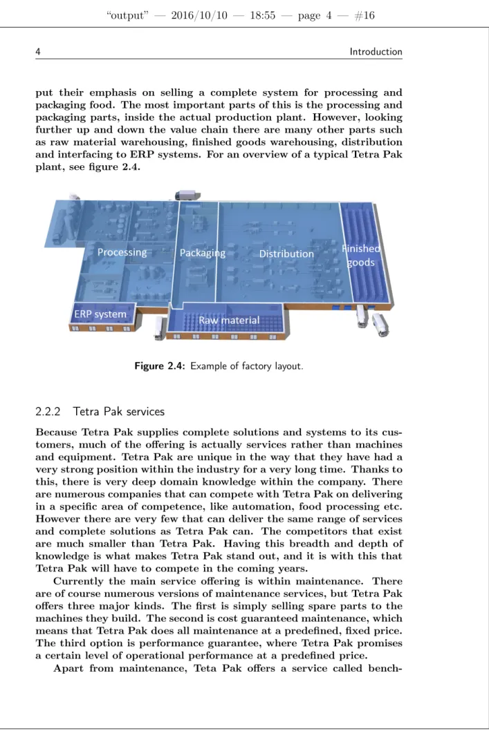
put their emphasis on selling a complete system for processing and packaging food. The most important parts of this is the processing and packaging parts, inside the actual production plant. However, looking further up and down the value chain there are many other parts such as raw material warehousing, finished goods warehousing, distribution and interfacing to ERP systems. For an overview of a typical Tetra Pak plant, see figure 2.4.
Figure 2.4: Example of factory layout.
2.2.2
Tetra Pak services
Because Tetra Pak supplies complete solutions and systems to its cus-tomers, much of the offering is actually services rather than machines and equipment. Tetra Pak are unique in the way that they have had a very strong position within the industry for a very long time. Thanks to this, there is very deep domain knowledge within the company. There are numerous companies that can compete with Tetra Pak on delivering in a specific area of competence, like automation, food processing etc. However there are very few that can deliver the same range of services and complete solutions as Tetra Pak can. The competitors that exist are much smaller than Tetra Pak. Having this breadth and depth of knowledge is what makes Tetra Pak stand out, and it is with this that Tetra Pak will have to compete in the coming years.
Currently the main service offering is within maintenance. There are of course numerous versions of maintenance services, but Tetra Pak offers three major kinds. The first is simply selling spare parts to the machines they build. The second is cost guaranteed maintenance, which means that Tetra Pak does all maintenance at a predefined, fixed price. The third option is performance guarantee, where Tetra Pak promises a certain level of operational performance at a predefined price.
bench-marking or "Expert Services" where experienced consultants from Tetra Pak measure the operational efficiency of a plant and compares the cus-tomer’s efficiency to that of its competitors. If it turns out that the competitors are much better, Tetra Pak can offer additional services and equipment to increase efficiency at the plant. In the case that the customer is already among the best among competitors, Tetra Pak can offer services and consulting to make sure they stay ahead.
2.3
Analytics
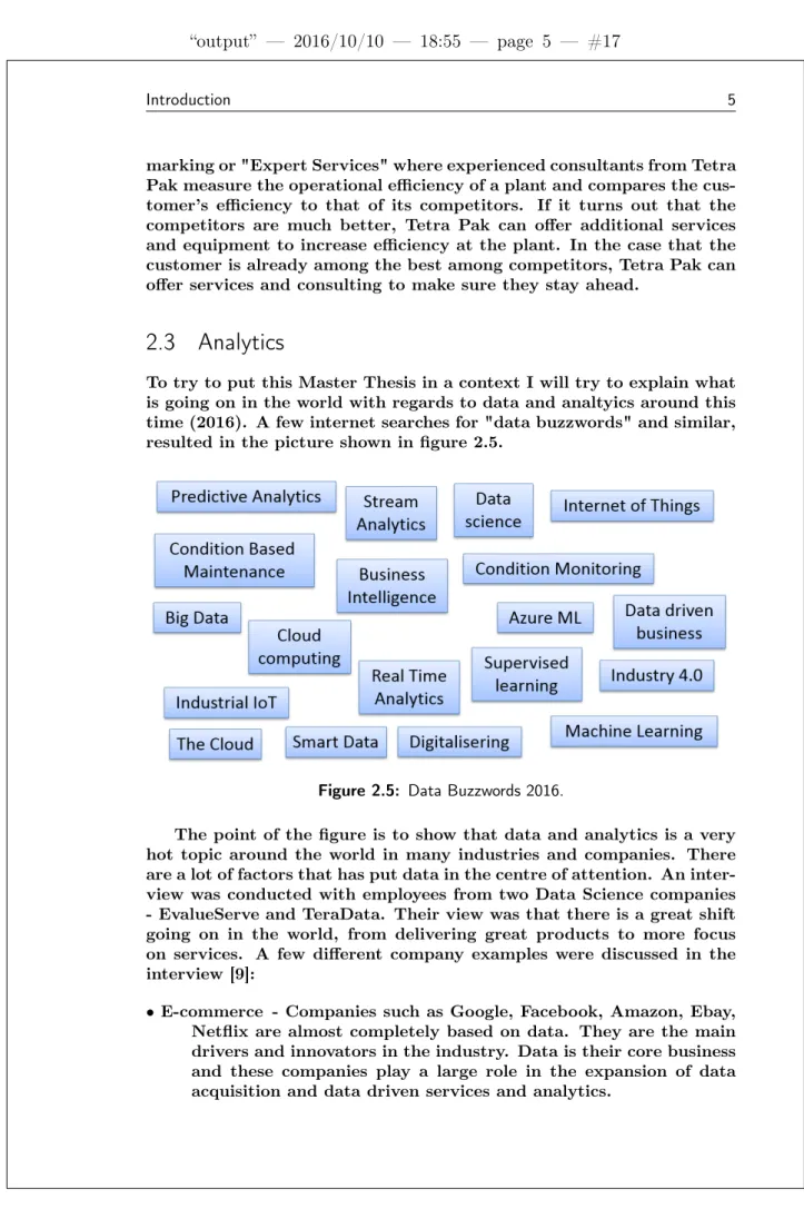
To try to put this Master Thesis in a context I will try to explain what is going on in the world with regards to data and analtyics around this time (2016). A few internet searches for "data buzzwords" and similar, resulted in the picture shown in figure 2.5.
Figure 2.5: Data Buzzwords 2016.
The point of the figure is to show that data and analytics is a very hot topic around the world in many industries and companies. There are a lot of factors that has put data in the centre of attention. An inter-view was conducted with employees from two Data Science companies - EvalueServe and TeraData. Their view was that there is a great shift going on in the world, from delivering great products to more focus on services. A few different company examples were discussed in the interview [9]:
• E-commerce - Companies such as Google, Facebook, Amazon, Ebay, Netflix are almost completely based on data. They are the main drivers and innovators in the industry. Data is their core business and these companies play a large role in the expansion of data acquisition and data driven services and analytics.
• Banks and finance - These companies have always collected a lot of data but not used it to its fullest potential. Recently many tools for analytics have emerged, making it easier to use the data for making decisions. A common example is automatically segment-ing customers in different risk classes ussegment-ing only transaction his-tory.
• Telecom - Telecom companies are experiencing a heavy shift away from traditional phone business to more focus on moving data. • Aerospace - Boeing and Airbus are manufacturers of airplanes that
have shifted their business models from simply selling airplanes to selling hours in the air. Airplanes motors is a common example within condition based maintenance, which implies heavy use of data.
There are many factors enabling the shift towards data. Usage of smartphones and people with an internet connection grows constantly, making it easier than ever to share data. Computational power has also become much cheaper. Combining these factors creates endless possibilities to transform traditional industries such as manufacturing. It seems a very good fit, since many of the traditional companies have worked with automation and such for a very long time, and already have a lot of the infrastructure for data collection in place. Large IT companies have released services that revolves around analytics. Google Analytics, Microsoft Azure and IBM Watson Analytics are examples of some of the major players on the market.
The website BusinessDictionary [6] defines analytics as follows: "An-alytics often involves studying past historical data to research potential trends, to analyze the effects of certain decisions or events, or to eval-uate the performance of a given tool or scenario. The goal of analytics is to improve the business by gaining knowledge which can be used to make improvements or changes." [6]. To summarize it is anything done with data that is helpful in making business decisions. Businesses has obviously always used data to help them make decisions, but with com-panies nowadays becoming almost complete digitized and large amounts if IT solutions becoming available at low costs, analytics can now be performed on a much large scale.
2.4
Condition Monitoring and Predictive Maintenance
Condition monitoring (CM) is the process by which a condition param-eter in a machine is closely monitored to be able to see changes in the machinery. By identifying changes in equipment before a serious fault occurs, maintenance can be planned and carried out in advance. This is known as Predictive Maintenance.
The concept itself is not new; in the most simple format it basically consists of inspecting the machine to see how it’s doing. In a report from
1975 [10] the authors go through both technical and economic details of condition monitoring. The interest of the field has risen considerably as industries get more and more automated, and implementations of new and advanced IT systems brings a lot of possibilities.
There are many different techniques and strategies that are used within condition monitoring. One of the most common is vibration di-agnostics of machinery, often motors. The vibrations of a machine are recorded and analyzed for a long period of time, enabling finding degen-eration patterns in the vibration data. This has a significant advantage over manual inspection performed by a maintenance technician, since nothing needs to be inspected visually, and there is no need to take the machine apart. Another example is electrical thermography [2] where infrared technology is used to monitor temperatures of components. Basically any variable or measurement that indicates the health of a machine or piece of equipment can be used as a condition parameter to perform Condition Monitoring and Predictive Maintenance.
2.5
Introduction to Machine Learning
Machine Learning is an extremely broad topic that contains many dif-ferent fields of study and applications. There is a well known definition from 1959 of what Machine Learning is, given by computer scientist Arthur Samuel: ’Machine Learning is the field of study that gives com-puters the ability to learn without being explicitly programmed.’ [11]. Machine Learning is often used to tackle complex problems that cannot be solved using traditional programming.
Algorithms using Machine Learning are often divided into two main sub-groups: supervised machine learning and unsupervised machine learning. In an unsupervised learning environment, an algorithm is given a large amount of unsorted data and tries to find useful relation-ships and pattern in it. Unsupervised learning is more advanced and not as commonly used as supervised learning.
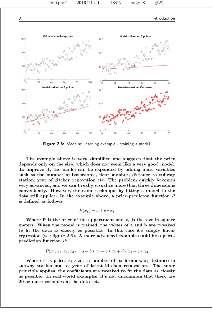
In a supervised learning process (which is what will be used in this thesis project), an algorithm is trained on existing data, where there is a "right answer" present. Once trained, the algorithm can be used on never before seen data and hopefully make meaningful predictions. A commonly used example is that of predicting house prices based on certain input parameters.[11] Starting off there is a data-set of apart-ments showing size in square meters, and price of the apartment. The example is illustrated in figure 2.6 where x-axis shows size and y-axis price. There are a total of 100 square meters-price pairs, and the trained model is illustrated by the the red line. By training the model using more and more data, it will successively become a closer representation of the data-set. Having trained the model using 100 examples, it can be used to predict the price of an appartment given only the size in square meters.
Figure 2.6: Machine Learning example - training a model.
The example above is very simplified and suggests that the price depends only on the size, which does not seem like a very good model. To improve it, the model can be expanded by adding more variables such as the number of bathrooms, floor number, distance to subway station, year of kitchen renovation etc. The problem quickly becomes very advanced, and we can’t really visualize more than three dimensions conveniently. However, the same technique by fitting a model to the data still applies. In the example above, a price-predicton function P is defined as follows:
P (x1) = a + b ∗ x1
Where P is the price of the appartment and x1 is the size in square
meters. When the model is trained, the values of a and b are tweaked to fit the data as closely as possible. In this case it’s simply linear regression (see figure 2.6). A more advanced example could be a price-prediction function P :
P (x1, x2, x3, x4) = a + b ∗ x1+ c ∗ x2+ d ∗ x3+ e ∗ x4
Where P is price, x1 size, x2 number of bathrooms, x3 distance to
subway station and x4 year of latest kitchen renovation. The same
principle applies, the coefficients are tweaked to fit the data as closely as possible. In real world examples, it’s not uncommon that there are 20 or more variables in the data set.
When fitting the data, there are numerous strategies that can be used and the strategies will often produce slightly different results, sometimes completely different. One example could be to define a func-tion that is the square of the distances from the data points to the fitted line. By minimizing this function (knows as least squares fitting), the optimal fitted line is found. A common algorithm to do this in Machine Learning settings is called Gradient Descent[4]. The algorithm starts out in one point of the function, and takes a step in the direction of the negative gradient (i.e. the opposite way of the direction with maximum change). By repeating this this step, the local minimum of the function will be found. If the minimum is found, this means that the optimal fitted line is also found.
2.6
Microsoft Azure
Azure, the data analytics tool used in this project, is a tool developed by Microsoft, and according to the company itself Azure is a "growing collection of integrated cloud services - analytics, computing, database, mobile, networking, storage, and web - for moving faster, achieving more, and saving money."[5]. The tool is used completely from a web browser where you can do all kinds of data analysis and build predictive models. The data is imported from any source: a local computer, an online database etc.
One advantage of Azure is that it is completely scalable. This means that a company can start a small project to see if it works out. Should it work, it takes very little effort to scale the solution up and bring it live for their customers to use. This should be compared to investing heavily in hardware and IT solutions that then have to be maintained.
2.6.1
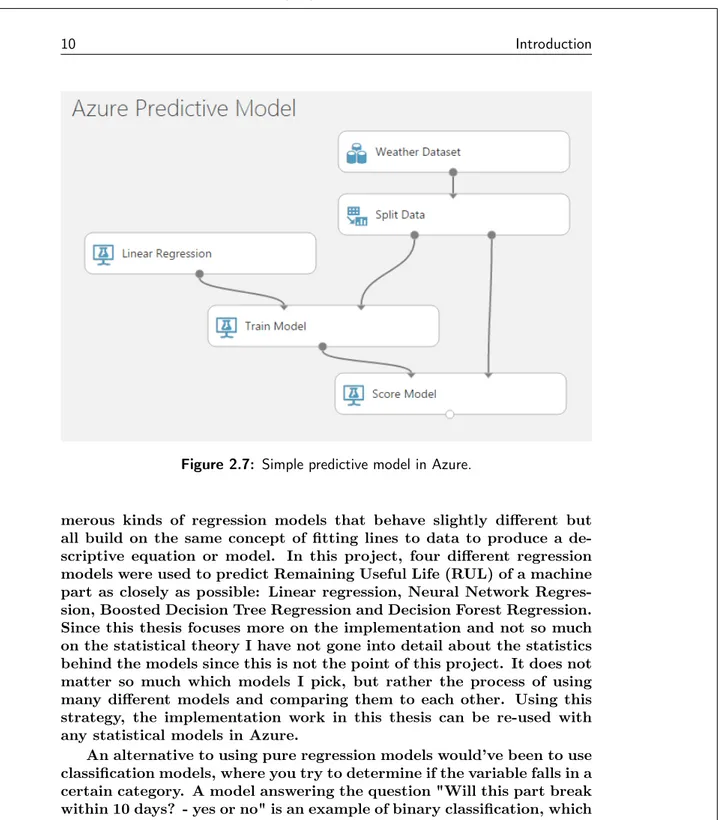
Training models and algorithms
Azure revolves around modules that contain pre-programmed actions. An example is displayed in figure 2.7. A dataset with weather data has already been imported into Azure and is available in any model you want to build. The data is split into training data and testing data. A common approach is to use 80% of the data for training the model, and save 20% to later see if the model works. A Train Model module is fed with the 80% training data, together with a Linear Regression algorithm, this produces a trained model. The model is scored by us-ing the 20% testus-ing data, and the output is various measures showus-ing how well the trained model performed when used on unseen data. For example mean absolute error of the predicted variable or coefficient of determination for the algorithm. This example illustrate a common, simple predictive model in Azure.
There are many techniques and algorithms used in predictive ap-plications, but the cornerstone of most algorithms is regression as de-scribed in the example with predicting houseing prices. There are
nu-Figure 2.7: Simple predictive model in Azure.
merous kinds of regression models that behave slightly different but all build on the same concept of fitting lines to data to produce a de-scriptive equation or model. In this project, four different regression models were used to predict Remaining Useful Life (RUL) of a machine part as closely as possible: Linear regression, Neural Network Regres-sion, Boosted Decision Tree Regression and Decision Forest Regression. Since this thesis focuses more on the implementation and not so much on the statistical theory I have not gone into detail about the statistics behind the models since this is not the point of this project. It does not matter so much which models I pick, but rather the process of using many different models and comparing them to each other. Using this strategy, the implementation work in this thesis can be re-used with any statistical models in Azure.
An alternative to using pure regression models would’ve been to use classification models, where you try to determine if the variable falls in a certain category. A model answering the question "Will this part break within 10 days? - yes or no" is an example of binary classification, which indicates that there are only two outcomes. Multiclass classification is similar, but has more than two options, for example: "How much RUL does this part have? 0 to 10 days, 10 to 20 days, or longer?
To determine how well a predictive model performs I have used a measurement called coefficient of determination (COD) which is con-sidered standard and widely used in predictive applications. The coeffi-cient of determination is the square of the correlation between predicted
y scores and actual y scores.[1]. COD of 0 means that the variable can-not be predicted at all, and a COD of 1 means that the variable can be predicted without error, i.e. perfectly. A COD of 0.3 means that 30% of the variance in the the variable can be predicted, etc. As a second measure of model performance, Mean Absolute Error has been used. The reason is that it is easier to get a grip of how large the predictive error is, counted in days.
2.7
Previous Condition Monitoring studies at Tetra Pak
There has already been a substantial amount of research in the field of condition monitoring at Tetra Pak. Since the food packaging indus-try is heavily automated and Tetra Pak is one of the most advanced solution providers, the realization that machine generated data holds valuable information is not new. Since approximately 2005 there have been different initiatives from Tetra Pak R&D. However, it is not until recent years that they have gotten closer to implementing and selling monitoring services on a large scale. Two examples of previous work will be covered briefly in this section. What is ideally accomplished is changing a part at the exact time it is worn out, thus minimizing amount of spare parts needed to be bought. At the same time, it is critical that the machine is not run with broken parts, as this could result in breakdowns and costly maintenance breaks.
2.7.1
Potential within Data driven services
As shown in figure 2.2 the number of Tetra Pak machines currently installed in the world is absolutely huge. Much of the data generated in the machines is already saved and stored, but much of it is not used for any specific purpose, or at least not used to its fullest potential. In many applications (as in this project) additional hardware has to be installed to be able to gather very detailed data. But since most of Tetra Paks customers are heavily automated, much of the infrastructure for collecting data is already in place. This means that there is a large potential to use analytics, even on the data that already exists. There are probably interesting information and patterns waiting to be found on Tetra Paks servers.
2.7.2
Knifes
In the packaging procedure, a paper tube is filled with liquid and then sealed and cut off from the tube - each cut produces one package. The cut is performed by a toothed knife that naturally will wear over time. When cutting, the machine applies a certain amount of pressure on the knife. Over time, as the knife gets more dull, more pressure is needed to push the knife through the material and and once a certain pres-sure threshold is passed, the knife is considered worn out and should
ideally be changed. This explanation is quite simplified, but captures the essence. In reality there is detailed analysis of how the shape of a plotted pressure pulse change certain characteristics over time. Knifes are replaced approximately every 1000th production hour, but the ac-tual wear will vary depending on what is produced. Knives are quite simple and have relatively short run-to-failure cycles, meaning that it’s easy to gather relevant data fairly quickly. However, questions can be raised about how valuable it is to know exactly when knives should be changed, since a worn out knife probably wont cause a long maintenance period.
2.7.3
Servo Motors
Another example is servo motors, which differs quite a lot from knifes. Servo motors are more expensive and takes more work to replace. While you can look at or touch a knife to determine if it is sharp, it’s more difficult to tell the health of a servo motor since it’s completely en-capsulated. Tetra Pak have done experiments where vibrations of the motor are measured, and then tried to find degradation patterns in the vibration data. It is more difficult to gather data since the lifetime of servo motors are longer, thus longer measurement periods are needed to get complete run-to-failure time series. However, an unexpected breakdown of a servo motor can result in very costly production stops and long maintenance times, so being able to avoid a breakdown or at least being able to have a planned maintenance could be a serious economic benefit.
2.8
The Inductor
The central physical machine part in this thesis is the inductor, which is the sealing component referred to in the title. There is much written about inductors, but this is not the place to go into detail about it. However, a short introduction to what we’re working with is in place. In this section a brief introduction will be given on the inductor and the induction heating method for sealing packages. There are many dif-ferent ways to manufacture an inductor, and Tetra Pak is world leading in inductors used for sealing.
2.8.1
Anatomy of the inductor
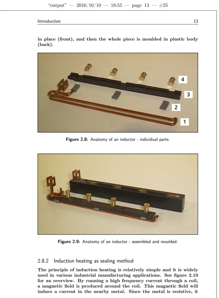
The inductor consists of a number of different parts, an overview of the inductor type analyzed in this thesis is shown in figure 2.8. Part are as follows: 1 - Copper coil with one winding, 2 - Magnetic Flux Concentrators, 3 - Plastic core that holds everything together during moulding of the body and 4 - Nipples for the screws that attaches the inductor to the machine. When assembled, the inductor looks like in figure 2.9; first assembled with the plastic core holding the pieces
in place (front), and then the whole piece is moulded in plastic body (back).
Figure 2.8: Anatomy of an inductor - individual parts.
Figure 2.9: Anatomy of an inductor - assembled and moulded.
2.8.2
Induction heating as sealing method
The principle of induction heating is relatively simple and it is widely used in various industrial manufacturing applications. See figure 2.10 for an overview. By running a high frequency current through a coil, a magnetic field is produced around the coil. This magnetic field will induce a current in the nearby metal. Since the metal is resistive, it
will be heated. A big advantage of the process is that it requires no physical contact between the coil and the metal to be heated.[3].
Figure 2.10: Working principle of induction heating
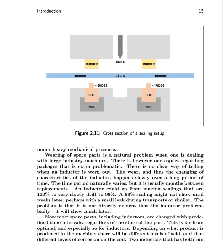
In Tetra Paks case the technique is used slightly different than what is shown in figure 2.10, however the same principle is used. That is, a current is run through a thick copper wire like the one in figure 2.8, which can be thought of as coil with only one winding. Instead of placing the material to be heated inside the coil, it is placed on top of it. A cross-section of the setup is shown in figure 2.11. The upper part and the lower part are moved together and the paper is tightly pressed between the rubber and the coil. The purpose of the ridge is to get a smaller pressing area and thereby a more distinct creasing of the paper, and the Magnetic Flux Concentrator (MFC) will concentrate the magnetic field upwards. A magnetic field is produced around the coil, just like with a regular inductor, and the package will be heated since there is a small amount of metal in it. The heating of the metal melts the plastic, and the package is sealed in a glue-like manner. Note that the inductor makes two sealings every time it moves down - the top sealing of one package and the bottom sealing of the next, with a cut in between. Two sealings and one cut equals one package. There are usually more than one inductor/knife-module in each machine. The data used in this thesis is from a machine equipped with two sealing modules that take turns sealing the package. However, there are cases where there are as many as fourteen sealing modules per machine.
2.8.3
Degeneration of the inductor
The inductors are used constantly in the machine, and is subjected to quite a metal-unfriendly environment. Many of beverages and foods that are packaged are acidic to some degree, for example fruit juices. The acid causes corrosion in the metal coil. In figure 2.12 an example is shown of what a worn inductor looks like. Apart from corrosion there is also the mechanical wear caused by contact with the packaging material
Figure 2.11: Cross section of a sealing setup.
under heavy mechanical pressure.
Wearing of spare parts is a natural problem when one is dealing with large industry machines. There is however one aspect regarding packages that is extra problematic. There is no clear way of telling when an inductor is worn out. The wear, and thus the changing of characteristics of the inductor, happens slowly over a long period of time. The time period naturally varies, but it is usually months between replacements. An inductor could go from making sealings that are 100% to very slowly drift to 99%. A 99% sealing might not show until weeks later, perhaps with a small leak during transports or similar. The problem is that it is not directly evident that the inductor performs badly - it will show much later.
Now most spare parts, including inductors, are changed with prede-fined time intervals, regardless of the state of the part. This is far from optimal, and especially so for inductors. Depending on what product is produced in the machine, there will be different levels of acid, and thus different levels of corrosion on the coil. Two inductors that has both run for 1000 hours can be in very different shape. Apart from the product produced, the weather and climate in and around the machine will also affect how parts are worn, further adding to the complexity. Because of this complexity, condition monitoring and condition based maintenance is potentially a very powerful method for determining when inductors should be replaced.
Chapter
3
Method
3.1
Data collection setup and procedure
In all Tetra Pak’s machines worldwide, there are lots of data generated and collected. The data is mostly from the control unit (PLC) and concerns input and output signals to the control unit. The data is not collected with high resolution and does not have the detail needed for deep analysis like what we’re trying to do in this project. To collect the right kind of data, a few machines have been selected and equipped with special sensors to collect high resolution data. An overview of the data collection setup is shown in figure 3.1. Note that this is only a schematic figure that shows the most important parts. In reality there are more components, but these are not necessary to get a general understanding of the process, which is the goal here.
Figure 3.1: Data collection setup.
Firstly, there is a control unit (PLC) that controls what happens in the machine and the inductor. The control unit will send square pulses to the power generator. Examples of signals are power level and on/off. The power generator sends a low-current, high-voltage signal through a coaxial cable into a transformer. The transformer (trafo) transforms the signal into a low-voltage, high-current signal. Since the transformer cannot be located very close to the inductor, a "busbar"
is needed to transport the current. The busbar is a thick copper part that can handle the high current. The EVO board, which is the extra data collection unit, samples data at a high frequency; around 1 kHz. This is equivalent to 1 measure per millisecond.
There is a predefined procedure for collecting data. First the ma-chine is run for 30 minutes to ensure that measurements are done in continuous production to not capture any effects of having recently started the machine. Once in continuous production, a burst of 20 seal-ings is taken every 20 minutes. This means that the data that captured is not everything that happens, but rather snapshots of it. This is how-ever considered to be more than enough since the wear and change of components from one hour to another is negligible. What’s interesting is what happens during days, weeks and months.
3.2
Raw inductor data
When the thesis project was started, the high resolution data collec-tion setup had been up and running for about 6 months on 3 ma-chines in a plant in Italy. The data was available on one of Tetra Pak’s online remote storage locations. There was one folder per machine, each with thousands of files - one file for each day and data source point. A typical file name would be something like "RightEvoVoltage-Out_20160123_000100000.csv". The variable name is then "RightEvo-VoltageOut" where "Right" means that is is the right of the two induc-tors in the machine. "Evo" refers to the data collection unit from figure 3.1, and "VoltageOut" is what the variable is measuring. "20160123" refers to date 2016-01-23 and is the date that the data was collected. The meaning of the last code "000100000" is unknown and was not used.
As evident in the file name, the files are of the type csv; comma-separated values. A sample of the contents of a typical file is displayed in the first part of table 3.1. Looking closely, one can see that the data is three columns separated by commas and splitting them gives the table in the lower part of figure 3.1. The first column is an event-code generated in the machine, referring to the current event taking place. This could be something like "Normal production" or "Stop due to x". However, the event code is not used in the analysis. The second column is a time-stamp string. Worth noting is that is is very exact, measuring seconds with 5 decimals. Also, the time-stamp is in text-string format, which we will come back to later. The third and last column is the actual measurement, in this case "Voltage Out", measured in Volts.
As previously mentioned, Evo refers to the computer unit used to collect data from the inductor. In one machine there are two induc-tors working simultaneously, taking turns sealing a package. The two inductors each have an Evo-board; "LeftEvo" and "RightEvo". Each Evo measures 13 different variables, of which an overview is displayed
Table 3.1: Four example rows of raw data from a file.
113931640,2016-01-05T05:41:23.47568 +01:00,255.4
113931640,2016-01-05T05:41:23.47568 +01:00,187.9
113931640,2016-01-05T05:41:23.47568 +01:00,114.7
113931640,2016-01-05T05:41:23.47569 +01:00,68.8
...
113931640
2016-01-05T05:41:23.47568 +01:00
255.4
113931640
2016-01-05T05:41:23.47568 +01:00
187.9
113931640
2016-01-05T05:41:23.47568 +01:00
114.7
113931640
2016-01-05T05:41:23.47569 +01:00
68.8
...
...
...
in table 3.2. Regarding the setup with left and right, they are ex-pected to behave very similarly since they always operate on the same material and as a rule of thumb they are always replaced in the same maintenance period. They are however regarded as two different data sets.
3.3
Data wrangling and importing to MATLAB
As mentioned, raw data was available as csv-files in folders in an online data storage location. 3 machines, 26 variables and around 150 days means that there were more than 10 000 files available, each with av-erage of around 400 000 rows. This is a huge amount of data, and far too much to be handled efficiently in this format, even with automated scripts. To make the data more quickly available I decided to convert it from csv to matlab format, which is much more effective storage-wise and much faster to run in matlab than reading csv-files one at a time. This seems like a very easy task, and I myself expected something like writing one line of code convertcsv2mat(’inputFile.csv’) - this was not the case. There had already been some work done in this area at Tetra Pak, so I could use some algorithms for data conversion that were al-ready written. Usually the performance of converting algorithms like this is not crucial, since the import only has to be done once. The measurements from the machines come once a day, so if it takes a few minutes per file to convert, it is not a problem. But in this case I started from zero and had more than 10 000 files.
In matlab, there are tools ready for importing csv files, but they are designed for numerical values, and the comma-separated line was stored as text, meaning that the text needed to be parsed to numerical val-ues before they could be used. The part with numerical measurement
Table 3.2: Inductor measurements
Measure
Variable name - left
Variable name - right
Current
LeftEvoCurrentOut
RightEvoCurrentOut
Delta power
LeftEvoDeltaPower
RightEvoDeltaPower
Frequency
LeftEvoFrequency
RightEvoFrequency
Impedance
LeftEvoImpedanceOut
RightEvoImpedanceOut
Phase
LeftEvoPhaseOut
RightEvoPhaseOut
Power output
LeftEvoPowerOutput
RightEvoPowerOutput
Power set
LeftEvoPowerSet
RightEvoPowerSet
Timer
LeftEvoTimer
RightEvoTimer
Tpih channel select
LeftEvoTpihChannelSelect
RightEvoTpihChannelSelect
Tpih digital 24
LeftEvoTpihDigital24
RightEvoTpihDigital24
Tpih error
LeftEvoTpihError
RightEvoTpihError
Tpih vmn
LeftEvoTpihVmn
RightEvoTpihVmn
Voltage
LeftEvoVoltageOut
RightEvoVoltageOut
values was solved relatively easily. The biggest problem was the times-tamp string (looking like ’2016-01-05T05:41:23.47569 +01:00’). Rather than working with a string, a time or a date can be represented as the number of days since January 0, year 0. As an example, the year 2016 is approximately 735 000 days after year 0. By using decimals, hours and minutes can be added. 0,5 would mean 12 hours etc. The numerical value 731204.5 corresponds to 2001-12-19 12:00. Converting the data with the scripts already available averaged around 3 minutes per file. As said, this is okay if run with one file a day, but with 10 000 files I was looking at 30 000 minutes or around 3 weeks in effective running time, which obviously was not feasible. Matlab in general is great at handling large amounts of data structured in vectors and matrices, but in the case of date conversion, the algorithms will be trickier because of all the special cases there is with time and date. This means that in the end, there has to be one function call for each date to be converted. I set out to write new matlab scripts with higher performance. Some immediate improvements were made with minor adjustments and con-solidation of unnecessary loops and such. Conversion times were re-duced, but still averaged over 2 minutes per file. To figure out what part of the script took the longest time to execute a tool Matlab tool called Profile Viewer or profiler was used. The profiler gives a detailed overview of how much time is spent in each function and subfunction. The tool is especially helpful when several calls and subcalls to different functions are made. An example of how the tool is used is displayed in figure 3.2. csv2mat is the main function which in turn make different
subcalls. The darker blue color indicates self time, meaning time that is spent in the own function. The lighter blue indicates time spent in other functions. This is then broken down in smaller and smaller parts. A large chunk of dark blue indicates a time-consuming activity in that specific function. With this knowledge it is easier to pinpoint what part of the code that needs to be improved.
Figure 3.2: Profile Viewer example.
With insight from the profiler it was concluded that most of the time, almost 90%, was used on overhead instead of the actual date conversion, which was the real problem at hand. Looking for further performance improvement the scripts were rewritten to make all calls and handle all data in batches. This means that instead of looping through 100 values and sending each as a function parameter, an array of 100 values is sent at once. The change made much sense, since Matlab is very good handling arrays and matrices. The change made a significant difference and time was cut drastically to averaging 25-30 seconds. While the time difference was massive, 10 000 calls averaging 30 seconds still equals around 3.5 days.
In a final attempt to reduce conversion time, the output results of the Profile Viewer were reviewed once again, and it was concluded that
95% of the time was now spent doing date conversion. After some research and reading in various programming forums I found an alter-native way to convert time and date that used a function written in the programming language C. The function was incredibly fast, but more difficult to work with. This meant that once again most of the code had to be rewritten, but the results were conversion times averaging 2-3 seconds per file. Comparing with the original script the time was cut with more than 98% and allowed running the script on all 10 000+ files in a matter of hours. An overview of the script progress is displayed in figure 3.3. Figure 3.4 shows time per file when running conversion of typical data files with the final version.
Figure 3.3: Performance of data conversion scripts.
0 10 20 30 40 50 60 70 80 File number 0 0.5 1 1.5 2 2.5 3
Converting time (s/file)
3.4
Data preparation and feature engineering
With all the data now imported into matlab, and readily available in a format that allowed manipulation of huge amounts of data very quickly, it was time to actually look at the data. Despite being able to handle the data efficiently it was still such large amounts that it was difficult to get a grip on it. With this amount of data there is almost no case where anything can be done manually. Every little thing has to be written in an automated script looping over hundreds of different cases.
3.4.1
Selecting relevant data
At this point I wanted to narrow down the amount of data and look at the most relevant points. Looking at the table in 3.2 there are 13 measurements for each side in the machine. I found this to be too many to experiment with simultaneously. When building prediction models one should strive to make them as simple as possible, so there is no need to include all the data you have if it doesn’t offer any significant advantage. The variables starting with Tpih stands for Tetra Pak In-duction Heating and has to do with inputs and other things that cannot be connected to the state of the inductor. They were considered not to hold any valuable information and not analyzed further. This leaves us 9 variables to work with and analyze. These 9 variables were plotted to get a feeling of what they looked like, the result is displayed in figure 3.5.
• CurrentOut - Current flowing through the inductor.
• DeltaPower - The difference between PowerOut and PowerSet. • Frequency - Frequency of the current/voltage through the inductor,
approximately 635 kHz.
• ImpedanceOut - Impedance of the system. • PhaseOut - Phase between current and voltage. • PowerOutput - Total power output in the inductor.
• PowerSet - Input parameter that is set by the operators of the ma-chine. Sets what the power should be.
• Timer - The clock by witch the PLC operates. • VoltageOut - Voltage measured in the inductor.
To select what data to work further with, the data characteristics were discussed with project supervisor Daniel Sandberg. Daniel has worked with inductors for many years and has extensive knowledge of how inductors behave. This type of domain knowledge is absolutely crucial when selecting data to work with in prediction models. Looking at the plots in figure 3.5 and discussing how inductors are worn we
0 500 1000 0 2 4 6 CurrentOut 0 500 1000 0 1000 2000 3000 DeltaPower 0 500 1000 0 200 400 600 Frequency 0 500 1000 30 40 50 60 70 ImpedanceOut 0 500 1000 0 20 40 60 80 PhaseOut 0 500 1000 0 500 1000 1500 PowerOutput 0 500 1000 1250 1260 1270 1280 PowerSet 0 500 1000 2.4 2.5 2.6 2.7 ×10 4 Timer 0 500 1000 0 100 200 300 VoltageOut
Figure 3.5: Characteristics of 9 different variables.
concluded that the most relevant and non-redundant data would be Phase, Frequency and Impedance.
The impedance is quite obvious since it depends on the physical formation of the inductor. If the part is damaged (perhaps with a dent in the copper) or some copper has corroded away, the impedance will be different. This change should be able to be discovered. Regarding frequency, the system is designed for having impedance of 50 ohms and a phase degree of 0 degrees. At each sealing done, the frequency sweeps over a certain interval to find a value where the phase is as close to 0 as possible. If the inductor is damaged in some way, the impedance might have changed and therefore the frequency sweep will be slightly different. This can hopefully be detected and analyzed. Phase is closely connected to impedance and frequency and therefore possibly holds interesting information.
3.4.2
Detailed data characteristics
Having narrowed it down to phase, impedance and frequency it was time to look more closely at the characteristics of the data. For impedance, one days data can be seen in figure 3.6 part 1. This is a typical day that contains around 400 000 measurements. Zooming in on the data in part 2 and part 3 of the same figure, we can see that the data behaves like repeated pulses. One pulse is interpreted as one sealing-cycle in
the inductor, which actually creates 2 sealings - bottom of one package and top of the next. Looking further we can see that one typical day like this contains around 800 pulses. Part 2 of figure 3.6 shows that there are pauses between pulses and in part 3 we see approximately one complete impedance pulse cycle. After discussing the characteristics with the project supervisor I concluded that only the actual pulse holds valid information, the time between pulses is just noise and not really measuring anything real.
As expected, the other variables also behave like pulses. This can be seen in figures 3.7 and 3.8. It should be noted that phase starts high and drops down during the sealing, while impedance and frequency start low and rises during the sealing. This has to be handled when writing scripts to extract pulses.
0 0.5 1 1.5 2 2.5 3 3.5 4 4.5 time (milliseconds) ×105 -80 -60 -40 -20 0 20 40 60 80 phase (degrees)
1) One production day of phase pulses
0 500 1000 1500 2000 2500 time (milliseconds) 0 10 20 30 40 50 60 70 phase (degrees)
2) Five phase pulses
0 50 100 150 200 250 time (milliseconds) 0 10 20 30 40 50 60 70 phase (degrees)
3) One phase pulse
Figure 3.6: Characteristics of raw phase data.
3.4.3
Feature engineering
A feature can be any kind data that is fed to a predictive model. The following list contains features commonly used when building predictive models:
• Raw data - data as it is received from the sensor.
• Moving average - the moving average of the data with different values on N.
0 0.5 1 1.5 2 2.5 3 3.5 4 4.5 time (milliseconds) ×105 25 30 35 40 45 50 55 impedance (ohms)
1) One production day of impedance pulses
0 500 1000 1500 2000 2500 time (milliseconds) 30 35 40 45 50 55 impedance (ohms)
2) Five impedance pulses
0 50 100 150 200 250 time (milliseconds) 30 35 40 45 50 55 impedance (ohms)
3) One impedance pulse
Figure 3.7: Characteristics of raw impedance data.
0 0.5 1 1.5 2 2.5 3 3.5 4 4.5 time (milliseconds) ×105 0 100 200 300 400 500 600 frequency (Hertz)
1) One production day of frequency pulses
0 500 1000 1500 2000 2500 time (milliseconds) 0 100 200 300 400 500 600 frequency (Hertz)
2) Five frequency pulses
0 50 100 150 200 250 time (milliseconds) 0 100 200 300 400 500 600 frequency (Hertz)
3) One frequency pulse
• daily mean - average value of one days measurements. • daily median - median value of one days measurements. • Max - maximum value during a certain period.
• Min - minimum value during a certain period. • Standard deviation - s.d. of one days measurements. • etc - ...
The point is that a feature really can be anything derived from raw data. Since the raw data is imported into matlab and in a convenient format to handle, there is nothing stopping us from starting to build models right away. One could very well feed a predictive model with all the available data that exists and see if it can make useful pre-dictions. There are certainly real-world applications where this could work. However, it does not seem likely that this would work in the case of inductors, since there is such a vast amount of data, and the data contains a lot of noise. In the feature engineering process it is useful to have someone with domain knowledge to try to understand how the data most probably will behave. Even narrowing down from 13 variables to 3 could be considered feature engineering.
Daily averages
The first feature that was tried out was daily average of all collected data for a certain variable. This means just taking the average value of around 400 000 values from one day. An example of what it looked like is displayed in 3.9. There seems to be some kind of trend going on, but it looks hard to look at the graph and point out where the inductor is new and fresh, and how it degenerates over time.
Similar plots were made with impedance and frequency. An attempt to improve the feature was made by excluding values above or below a certain interval. Looking at the pulses, one can see that even though they might trend up or down as the inductor wears, they will typically stay within the same intervals. For example, a phase pulse seems to stay within degrees 0 to 50. Anything outside that interval is probably noise or irrelevant data. In this way, a feature was produced by taking the daily averages of all values within the "reasonable interval". The results did not show any significant change though.
Daily standard deviation
Similarly to daily averages, a feature was made out of daily standard deviations. The idea behind this is that a new and fresh inductor should be very exact and consistent in its behaviour, and as it wears, it will behave more randomly. Looking at the graph in figure 3.10 there seems to be no significant trend to work with. This does not necessarily mean
0 20 40 60 80 100 120 140 Days 36 38 40 42 44 46 48 50 52 54 Phase / degrees
Daily Phase averages
that daily standard deviation is not interesting, but perhaps that there is too much noise in the data.
0 20 40 60 80 100 120 140 Days 29 30 31 32 33 34 35 36 37
Standard deviation / degrees
Phase daily standard deviation
Figure 3.10: Daily standard deviation of phase time series.
Extracting pulses
In an attempt to reduce the amount of noise present in the data I chose to try to extract only the pulses and leave out all the noise in between. I wrote several scripts in several versions to accomplish this pulse extraction, which was much trickier than expected. Each pulse was to be detected and then saved in some data structure to be able to easily compare pulses to each other.
In the first version I simply used a treshold for detecting a pulse. The idea is displayed in figure 3.11. If the value goes below the threshold value 40, this marks the beginning of a pulse. If it’s over 40 again, it marks the end. This approach is simple but since the pulses differ some in length, and there are quite some noise present, the resulting dataset will contain a lot of unwanted things.
Another approach that was tried was to look at the derivative. This method is displayed in figure 3.12. The idea was that a beginning of a pulse would produce a more distinct derivative compared to noise. This
3.37 3.38 3.39 3.4 3.41 3.42 3.43 3.44 3.45 3.46 Time ×104 0 10 20 30 40 50 60 70 Phase / degrees
Detecting pulse with treshold
Treshold
Figure 3.11: Pulse detection with threshold.
definitely worked better than the threshold version. However there was still too much unwanted things in the resulting dataset of pulses.
After some consultation with a few experienced engineers as well as my supervisor I wrote a script that used the signal from the PLC (control unit from figure 3.1). This way is more advanced to code since it uses different data sources rather than just looking at one time series of raw data. The signal from the PLC is a regular square wave that has either 0 or 1 as a value. 1 indicates that the left inductor is running, and 0 that the right is running. Using this I was able to extract pulses very efficiently and with good precision. An example is displayed in the left part of figure 3.13. The plot shows 5 days (approximately 1500 pulses) of impedance pulses plotted on top of each other. Most of them stay in the same interval but there are quite a few outliers. While it is expected that the pulses will drift up or down as the inductor wear, the change happens over a very long period of time, so within a certain day there should be very little difference that has to do with wear.
To address this some code was added to clean the data from pulses that were obviously way out. I had two strategies for this, both used simultaneously in the final version of the script. The first thing i checked was what happened in the middle part of the pulse. Excluding the first and last 20 milliseconds of the pulse, the values should stay in a set interval. If they are outside of this, the pulse is considered as noise and deleted.The second check I made was to take the vector of the 200 values that make up the pulse and sum them. If it’s a clean pulse, this
3.38 3.4 3.42 3.44 3.46 Time ×104 0 10 20 30 40 50 60 70 Phase / degrees
Two phase pulses
3.38 3.4 3.42 3.44 3.46 Time ×104 -30 -20 -10 0 10 20 30 40 Derivative of phase
Derivative of two phase pulses
Figure 3.12: Pulse detection with derivative.
sum should not differ much from previous sums. I compared the sum of the current pulse to the average sum of the last 5. If it differed to much, it was deleted. After implementing these two checks, I was able to remove almost all noise while managing to keep almost all of the actual clean pulses. The result is seen in the right part of figure 3.13.
At this point all pulses were cleaned and ready to be analyzed. I wrote scripts to calculate daily averages at different times into the pulse. An overview is shown in figure 3.14. Each day there were 5 averages calculated: at 20, 60, 100, 140 and 180 ms into the pulse. The reason I picked five different times is to catch trends that might appear more clearly in a specific part of the pulse (if that should be the case).
0 20 40 60 80 100 120 140 160 180 200 time (milliseconds) -5 0 5 10 15 20 25 30 phase (degrees) Phase pulses
Averages calculated at
20/60/100/140/180 ms
Figure 3.14: Phase pulse averages at different times in the pulse.
Next I plotted the 5 daily averages over a long period of time. The result is displayed in figure 3.15. Finally there are some trends visible! The red arrows indicates trends of the variables, exactly as predicted from the beginning. The span of the red arrow indicates one inductor going from new to worn out. This is referred to as one run-to-failure cycle or just cycle. It should be noted that each cycle is different in length and the amount of noise varies greatly. The figure shows data from one side of one machine, and there were 3 machines which totals 6 time series like this. All showed similar tendencies with downward trends but large variations in lengths and noise-intensity.
After great success in finding clear trends in the phase data, I re-peated the procedure with impedance and frequency. That is; extract-ing pulses, cleanextract-ing them from outliers, calculatextract-ing daily averages at different times into the pulse and plotting all the averages over a long
0 50 100 150 Days -6 -4 -2 0 2 4 6 8 10 12 14 Phase / degrees
Daily phase pulse averages at different time in pulse
20 ms 60 ms 100 ms 140 ms 180 ms
Figure 3.15: Trend of daily averages of phase pulses at different times into the pulse.
period of time. At this point I had 3 features - averages for phase, impedance and frequency. I also added calculation of standard devia-tion in the same way that I calculated averages. I had now derived the following 6 features from the raw data:
• Phase - average.
• Phase - standard deviation. • Impedance - average.
• Impedance - standard deviation. • Frequency - average.
• Frequency - standard deviation.
For all of the above there were 5 different time series (as seen in 3.15), but since the trends seemed to be behave similarly regardless of at what time in the pulse that was looked at I decided to only keep the value from 60 ms when going forward and building the predictive model.
3.5
Building prediction models in Microsoft Azure
Having engineered the features they were almost ready to be fed into a predictive model in Microsoft Azure, but first I had to select relevant
cycles. The goal is to teach an algorithm how run-to-failure cycles behave. This way it should be able to predict how much is left until failure, given data from any new cycle. To do this, the model must be fed with clean run-to-failure cycles. Our time-series contained multiple cycles at this point, so I had to select intervals from the data to clearly indicate where a cycle ends and another begins. Looking at the figure in 3.16 there are four different periods. The first part colored gray was considered too short to be used, although this might not be true since we actually only need run-to-failure, and not "new-to-failure". Cycle 1 and Cycle 2 are distinct cycles of fresh inductors running all the way to failure. The last gray part can not be used since it is not run to failure. Feeding this cycle to the predictive model would indicate that the inductor failed at the end of the cycle, which is not true.
Figure 3.16: Phase trends pulse extraction.
Repeating the process for all time series (3 machines each with 2 sides each) I was able to extract 6 cycles. This seems like a small amount considering 2 cycles were extracted from figure 3.16, but that time series was the cleanest of all. The others were very noisy and some even had data missing for long time periods for reasons unknown.
The final data-set that was imported into Azure is shown in table 3.3. RUL stands for Remaining Useful Life, measured in days. Note that RUL is the Day count backwards. The other headings should be self-explanatory. As mentioned there were 6 run-to-failure cycles, so the first column ID has values from 1-6.
Table 3.3: Finalized inductor feature data.
ID
Day
RUL
PMean
PStd
IMean
IStd
FMean
FStd
1
1
81
6.54
0.286
51.04
0.154
537.99
0.109
1
2
80
6.61
0.536
51.01
0.252
538.08
0.265
1
3
79
7.34
0.374
50.56
0.207
537.74
0.249
...
...
...
...
...
...
...
...
...
1
79
3
2.87
0.708
51.54
0.185
538.52
0.337
1
80
2
3.46
0.398
51.59
0.157
538.31
0.179
1
81
1
2.69
0.300
51.22
0.204
537.96
0.132
2
1
115
3.92
0.279
51.14
0.749
538.45
0.126
2
2
114
4.21
0.593
51.04
0.235
538.48
0.193
2
3
113
4.48
0.353
51.05
0.151
538.35
0.188
...
...
...
...
...
...
...
...
...
2
113
3
1.82
0.663
49.05
0.289
536.75
0.198
2
114
2
2.80
0.778
49.22
0.316
536.59
0.220
2
115
1
1.78
0.259
49.23
0.561
536.94
0.299
...
...
...
...
...
...
...
...
...
3.5.1
Building the Predictive Model
At this point it was time to start building the model inside Azure. Prior to this I had gone through a substantial amount of training by using online tutorials and reading articles about how to build models in Azure. Once features have been engineered and the data is cleaned and ready as in 3.3 building a model does not take very long if you are fairly familiar with Azure. The final look of the model is displayed in 3.17.
The dataset is imported in the first box, and some minor adjust-ments are made in the following two. The "Split Data" module splits the data into two sets; one for training and one for testing. It’s not uncommon that you start with two completely different sets where one is training and the other testing, but this was not the case here meaning I had to split the data myself in some way. I started by using "Random Split" and setting a coefficient of how much should end up in either leg. For example, using a coefficient of 0.8 would randomly select 80% of the rows to one output port and 20% to the other. This way, 80% of the data is used for training the model, and the remaining 20% is used for testing to see if the model could predict anything when shown data that it had not trained on. This sounds like good approach, but it’s hazardous. If 20% of the data is randomly selected rows that are removed from the training data, it means that you could have a
ingly linear trend (as we do in this case) and remove a few points in the middle of it. An attempt to demonstrate the problem with this made in figure 3.18. On the left side, 10 data points are available and a line is fitted to them. This illustrate fitting the model to the training data. On the right side, 20% of the data points are removed. However, since they were removed in the middle of a straight line it doesn’t matter at all. The model will still fit the exact same line to the data. Or in other words, the model will still get the same training. Unaware of this problem I randomly removed data from the training set and later tested the model on the removed data. This resulted in models that scored extremely high - almost 95% accuracy on predictions, which seemed like unreasonably high performance.
Figure 3.18: Hazardous way to split training/testing data.
Instead of using random split I removed 1 whole cycle from training data and used as testing data. There were 6 cycles, so I made 6 versions and changed which cycle was used for testing. This is much closer to the real scenario where the model would be used on data from a completely new cycle.
Moving on down past the split in the model in 3.17 the data is sent to four different segments, each with a different type of model. As described in the introduction there are different kinds of predictive models, and I chose to work with regression models over classification models.
• Decision Forest Regression
• Boosted Decision Tree Regression • Linear Regression
• Neural Network Regression
The output of the predictive model, the variable that we are trying to predict, is a so called "Response variable". In our case the response variable is Remaining Useful Life, RUL, measured in days. This is
specified in the "Train Model" box in Azure. The procedure does not differ much if there is one model or many. After the model is trained, it is scored using the testing data from the split. The last part in 3.17 are just some short scripts to tweak how results are presented.