Examensarbete
15 högskolepoäng, grundnivå
Exploring the weather impact on bike sharing usage
through a clustering analysis
Jessica Quach
Examen: Kandidatexamen 180 hp Handledare: Reza Malekian
Huvudområde: Datavetenskap Examinator: Radu-Casian Mihailescu Program: Systemutvecklare
Datum för slutseminarium: 2020-06-01
Teknik och samhälle
Abstract
Today bike sharing systems exists in many cities around the globe after a recent growth and popularity in the last decades. It is attractive for cities and users who wants to promote healthier lifestyles; to reduce air pollution and gas emission as well as improve traffic. One major challenge to docked bike sharing system is redistributing bikes and balancing dock stations. There are studies that propose models that can help forecasting bike usage; strategies for rebalancing bike distribution; establish patterns or how to identify patterns. Some of these studies proposes to extend the approach by including weather data. Some had limitations and did not include weather data. This study aims to extend upon these proposals and opportunities to explore on how and in what
magnitude weather impacts bike usage. Bike usage data and weather data are gathered for the city of Washington D.C. and are analyzed by using a clustering algorithm called k-means. K-means is suitable for discovering patterns within the data by grouping (clustering) similar instances, which literature review also advocated. In this project, the k-means algorithm managed to identify three clusters that corresponds to bike usage depending on weather. The results show that weather impact on bike usage was noticeable between clusters. It showed that temperature followed by precipitation weighted the most, out of five weather variables. Results also supported that the use of k-means was appropriate for this type of study.
Acknowledgement
I would like to thank my supervisor Reza Malekian for his guidance throughout this thesis and examiner Radu-Casian Mihailescu for his comments provided. I would also like to thank Visual Crossing Weather for their consultation regarding weather and Nils Lundahl for the time he spent on analysis support and suggesting improvements.
Table of Contents
1 Introduction... 1 1.1 Purpose ... 2 1.2 Research questions ... 2 1.3 Datasets ... 2 2 Theoretical background ... 3 2.1 Data mining ... 32.1.1 The data mining process ... 3
2.2 Machine learning ... 4
2.2.1 Clustering - an unsupervised approach ... 4
2.2.2 The k-means algorithm ... 5
3 Related Works ... 7
3.1 Clustering algorithms used in bike sharing ... 7
3.2 K-means algorithm ... 7 3.3 Spatiotemporal patterns... 8 3.4 Weather as factor ... 8 4 Method ... 9 4.1 Business understanding ... 9 4.2 Data understanding ... 9 4.3 Data preparation ... 10
4.3.1 The bike sharing dataset ... 10
4.3.2 The weather dataset ... 10
4.3.3 Aggregation of the bike and weather datasets ... 11
4.3.4 Dimensionality reduction ... 12
4.4 Modelling ... 12
4.4.1 Cluster validation ... 12
4.4.2 Computing k-means ... 13
5 Results ... 14
5.1 The result of cluster validation ... 14
5.2 The result of k-means ... 14
5.2.1 Cluster comparison: bike usage frequency ... 15
5.2.2 Temperature impact on bike usage ... 16
5.2.3 Precipitation impact on bike usage... 16
5.2.4 Cloud cover, humidity and wind speed... 16
6 Analysis ... 17
6.2 Analysis of working days and non-working days ... 18
6.3 Seasonality analysis ... 19
6.4 K-means as a suitable algorithm ... 20
6.4.1 Investigating possible granular results... 21
7 Discussion and future work ... 23
7.1 Understanding weather features impact and potentials ... 23
7.2 Possible bias and limitations ... 24
7.2.1 Season, mentality and events ... 24
7.2.2 Travel distance ... 24
7.3 The optimal number of clusters ... 25
7.4 Increase amount and variety of data ... 25
7.5 Future work ... 26
8 Conclusion ... 27
1
1 Introduction
Bike sharing systems (BSS) have been a popular traveling service for years and are used worldwide. The service allows individuals to rent a bike for a price or for free to travel from one place to another. There are two types of this service: “docked” bike sharing systems, in which the bike must be rented and returned to a docking station; and “dockless” bike sharing systems, in which the bike is not required to be parked in a docking station. Users can choose to subscribe to a membership or rent a bike on demand basis.
The concept of the BSS was invented in the 1960s by the industrial engineer Luud Schimmelpennink as a solution to the air pollution and traffic congestion in Amsterdam [1], [2]. The first generation of bike sharing system, Witte Fietsenplan, also known as the “White Bike Plan”, consisted of several bikes painted white and were placed around the city to be used as public transportation for free. This short-lived service attracted wanted attention as well as unwanted attention, causing some of the bikes to be vandalized or confiscated by the police. Two years later, Schimmelpennink attempted to formally introduce the idea when he became a city councilman, but the council rejected the plan, claiming that the bikes belong to the past and the cars the future. Schimmelpennink argued that the concept could be implemented for cars as well and launched the project Witkarren, a system for sharing small electric cars.
Although Schimmelpennink’s attempt to introduce the BSS was unsuccessful in
Amsterdam, the concept inspired many other people in other countries. The second BSS generation arose in Denmark in the 1990s when two Danes asked for
Schimmelpennink’s aid to develop a bike sharing system in Copenhagen. From there on, companies and people who saw a bright future for BSS reached out to Schimmelpennink, who never lost hope in his own idea of individual public transportation.
Bicycling has proven to be beneficial in many ways. By traveling with the bike instead of motor vehicles, local environmental issues like air pollution and car traffic are mitigated [3]. In the bigger picture, transportation alternatives such as walking and bicycling contributes to a reduction of greenhouse gas emissions [3] and fuel consumption [3], [4], [5]. Research also shows that bicycling encourages a healthy lifestyle because it involves physical exercise [3]. It is a convenient collective transportation for people who wish to contribute to a wholesome nature and live a healthier lifestyle.
Like any other big-scaled systems, issues arise with the implementation of a bike sharing system. Although shared bicycling promotes healthiness for the individual and reduces air pollution; as shown in a study by Maizlish et al. [3] there is an increase of traffic accidents with increased bike activities. The authors believe the reason is that bike cities lack adequate infrastructure such as separate bike lanes. Another issue is the redistribution of bikes in docked sharing systems. The bike usage in terms of bike pickup and drop-off differ in each station, which can lead to bike shortages or surpluses in a station. A third issue is the maintenance or condition of the bikes and rebalancing of stations.
The usage of bike sharing systems depends on many factors. All of the issues mentioned above have been pointed out and addressed by multiple studies [6], [7], [8], [9], [10], [11], but research suggests that there are other factors which need to be examined as well. Weather is a significant factor for bike sharing [9] which is suggested to be examined
2
[11], [6]. In theory, bad weather results in less bike usage [12], [13]. By studying what kind of weather and how much it affects bike usage, this paper could provide useful insight for decision making such as forecasting demand for rebalancing bikes; number of bikes a typical location with known seasonal weather would need.
1.1 Purpose
The purpose of this paper is to gain a better understanding on how weather impact bike sharing usage and to provide empirical data. This information can be useful in
determining number of bikes a location would need depending on seasonal weather. This is firstly (1) done by identifying and choosing a suitable clustering algorithm for exploring weather impact of a bikeshare system and secondly (2) by analyzing the results of the clustering algorithm.
1.2 Research questions
This paper’s purpose is broken down into the following two research questions: 1) How does the weather impact the usage of the Capital Bikeshare system? 2) What clustering algorithm is suitable for this type of study?
1.3 Datasets
For this study, two datasets with two years’ worth of data have been retrieved from different sources and will be analyzed in a machine learning algorithm to gain some insight of the weather impact on bike sharing system usage. Details about the datasets will be presented in section 4.2.
1) The bike sharing data is gathered by and retrieved from Capital Bikeshare [14] in Washington, District of Columbia. It shows historical records of trips taken
within a time interval.
2) The weather data is gathered by and retrieved from Visual Crossing Weather [15]. It shows historical records of weather information.
Capital Bikeshare is a docked bike sharing system with open access datasets. Their datasets are widely used within research on BSS. For ease and reliable dataset, this paper will use data exclusively from Capital Bikeshare. This means that dockless bike sharing systems will not be taken into consideration.
3
2 Theoretical background
This chapter will give an overview of the method which will be used in this thesis. The theory behind data mining and unsupervised clustering methods for exploring the weather impact on bike sharing will be presented here.
2.1 Data mining
We are surrounded by data which increases in amount rapidly, causing us to be
overwhelmed by it [16]. Technology has developed so quickly that we are able to easily record and store a lot of data and information in our computers.
There is a difference between data and information [17]. The former is referred to the raw facts that have not yet been processed to reveal its meaning or put into a context. The latter is the result of processed raw data to reveal its meaning. In order to extract some knowledge or gain an understanding of what lies within the data, one must process the data and transform it into useful information.
The process of discovering patterns and extracting knowledge from data is called data mining and it is done by analyzing existing data [16].
2.1.1 The data mining process
There are many variations of implementation of a data mining process. According to the reference model defined by Cross-industry standard process for data mining (CRISP-DM), the process of data mining consists of six phases [16], [18]. The process is shown in Figure 1 and each phase will be briefly explained.
Figure 1. The data mining process defined by CRISP-DM.
Phase 1 - Business Understanding
In this important phase, one must understand and decide what to accomplish with the data mining. The objectives and goal for the whole process is defined here. Important factors that have the possibility to influence the desired output from the data mining are
4
uncovered in this phase. Setting some criteria for the data mining goals is also done in this phase.
Phase 2 - Data Understanding
In the second phase, data is gathered or retrieved and studied in order to decide whether the quality of the data is suitable, and if the quantity is enough. The properties of the data are examined and visualized if necessary. If the data is considered poor or
inadequate, one should consider collecting new data which is more based and suitable for the criteria set in the previous phase.
Phase 3 - Data Preparation
In the third phase, also called data pre-processing, the goal is to transform the data into useful information that can be used in the next phase. It involves cleaning, reduction, transformation, and integration of data. Since most clustering algorithms are unable to handle and process outliers, non-numeric values and missing data values, those values must be handled in this phase.
Phase 4 - Modelling
In the modelling phase, a modelling technique is selected and built. The technique may be any machine learning algorithms suitable to accomplish the defined goal in the first phase. The success of the model is also assessed here.
Phase 5 - Evaluation
In the fifth phase, the chosen modelling technique is evaluated, taking into account all the other results that were produced in the whole process. The model’s success in
accordance with the process’ goal and objectives are summarized. If the evaluation of the model is deemed to be poor, the whole process may be reconsidered from the first phase. Phase 6 - Deployment
If the model passes the evaluation phase with high accuracy, the last phase is to deploy it in practice. This phase will not be implemented in this thesis.
2.2 Machine learning
Machine learning is the field of study that gives computers the capability to learn without being explicitly programmed [16], [19]. Machine learning algorithms are techniques that can be used for accomplishing data mining [16]. There are different forms of machine learning, among them are the categories supervised learning and unsupervised learning [19], [20]. In supervised learning the algorithm is given some label to classify along with input on which the algorithm can learn from in order to classify the label. Classification and regression algorithms fall into this category and are used to make some predictions about the future. In unsupervised learning the algorithm is not provided any label to classify or predict. Instead, the algorithm detects patterns which may not be obvious, or gains insight of processed data. The most common unsupervised learning is clustering.
2.2.1 Clustering - an unsupervised approach
Clustering is an unsupervised machine learning technique used for grouping objects together and is often used to gain a better understanding of the data and pattern detection [16], [20]. K-means and hierarchical clustering are two well-known clustering
5
algorithms which will be described later. The output from a clustering algorithm may be used as input for a supervised learning algorithm [16].
There are many clustering algorithms which have their own advantages and drawbacks. Most clustering algorithms cannot handle nominal and non-numeric data.
The result of a hierarchical clustering is represented as a binary tree called a
dendrogram [20], [16]. In short, the algorithm builds the dendrogram by forming an
initial pair of clusters. It recursively considers whether the clusters should be further divided. This is the divisive approach. The alternative approach is called agglomerative
approach, in which each data point in the data initially are considered as individual
clusters and are recursively merged until there are only one cluster left. The dendrogram is built from the records of the merges.
Fuzzy clustering, also referred to as soft clustering or fuzzy c-means, is a clustering algorithm in which each data point can belong to more than one cluster.
Density-based spatial clustering of applications with noise (DBSCAN) is a popular clustering algorithm that is density-based. Clusters are determined by how close neighboring points are and how many neighbors it has [21]. Outliers are identified by the far distance away from established clusters.
Another clustering algorithm is k-means algorithm, which will be discussed more detailed below.
2.2.2 The k-means algorithm
The k-means algorithm is the most popular and widely used clustering algorithm with many variations of implementation [16], [20]. Some of the most common k-means algorithms are given by Hartigan and Wong, MacQueen, Lloyd and Forgy [22]. The aim of the algorithm is to minimize the within-cluster sum of square by dividing M data points into k clusters [23].
The general idea of the algorithm can be seen in the following text and flowchart: Step 1. Decide the number of clusters k.
Step 2. Initialize k cluster points, called centroids, randomly within a dataset. Step 3. Assign all other data points to its nearest centroid.
Step 4. Recompute the centroid of each cluster.
Step 5. Repeat from Step 3 if new centroids are assigned; otherwise terminate.
6
Note that the measured distance between a data point in the dataset and the centroids depends on which distance metric is used. A distance metric is used to calculate or find similarities or dissimilarities between two data points. The Euclidean Distance is a commonly used distance metric [16], [20] for k-means. This is the distance metric used for Hartigan and Wong’s k-means algorithm.
In order to compute k-means, it is required to specify the number of clusters k
beforehand. Since the initial cluster points are randomized, the result is not repeatable. K-means is also sensitive to data points that vary significantly from other data points because a mean is easily influenced by extreme values [24]. These are known as outliers. Because the results are dependent on the initial centroids, it is common to run the algorithm several times with different initial centroids, gaining multiple results [16], [20]. The result with the smallest total within-cluster sum of squares will be the best result to choose.
Many methods and approaches have been proposed for choosing the optimal the number of clusters k [16], [20]. The methods can be divided into two groups: local methods, which consider individual pairs of clusters and test whether or not the clusters should be aggregated; and global methods, which evaluate some measure over the entire data set in order to optimize it as a function of k [25]. The three most common methods are the total within-cluster sum of square, the gap statistic, and the average silhouette width [26].
The average silhouette width, or silhouette method, includes a graphical display in addition to estimating an optimal number of clusters [27]. Clusters are represented by
silhouettes which are based on the comparison of its tightness and separation. The
method measures how well the objects lie within their own cluster. A high average silhouette width indicates a good clustering.
The gap statistic approach is a global procedure which compares the total within-cluster variation for different values of k with their expected values under null reference
distribution of the data [25].
The total within-cluster sum of square, commonly known as the elbow method, is another method for estimating the number of optimal clusters to use for a clustering algorithm [26]. This method measures the compactness of the clustering which should be as small as possible. The basic idea of this method is to compute the clustering algorithm for different values of k and plot the curve according to the values of k. The optimal value of
k can be given by finding the location in which the curve angles, hence the name “elbow
7
3 Related Works
In this chapter, connections between other relevant research and this paper will be presented and briefly described.
3.1 Clustering algorithms used in bike sharing
Previous studies have shown clustering algorithms to be useful for identifying and understanding patterns with bike sharing systems [11], [28], [6]. By using clustering analysis on bike station location and traffic information in New York City, Xue and Li [29] were able to show bike user’s social and economic activities at different times and locations. This result allows companies to predict behavior and demand of shared bikes, which can be useful for planning the placement of new stations [11]. In the bigger picture, it can also benefit governments in planning cities and bike lanes.As mentioned previously, clustering algorithms help reveal groupings in data that suggest there is a pattern between instances. By grouping instances based on their relevance to each other it is possible to uncover spatial, temporal or spatiotemporal patterns using clustering techniques.
3.2 K-means algorithm
K-means is one of the most popular clustering algorithms [30], [16], [31]. Multiple researches [11], [29], [10], [9], [7] use the k-means algorithm in their analysis to
investigate and explore some patterns with BSS. In their research, Zhao et al. [10] used different clustering algorithms to analyze five datasets with different kernel density gradients from China’s station-free bike-sharing system. The analysis presented the characteristics of the spatial distribution of shared traffic resources by investigating the relationship between the bike distribution density and geographical location. Among the four clustering algorithms, k-means algorithm and fuzzy c-means algorithm were
included. In addition to the analysis, the authors compared the performance of the algorithms in order to find the most optimal clustering algorithm and the optimal number of clusters k. The Davies-Bouldin Index, silhouette method and elbow method are used to estimate the value of k. Their conclusion is that while the fuzzy c-means algorithm is suitable when studying more intensive sharing bike data, the k-means algorithm is most suitable for studying the distribution of docked bike-sharing systems. Similarly, Ma et al. study [11] used k-means algorithm, hierarchical algorithm and expectation maximization algorithm to explore spatiotemporal activity patterns of a bike sharing system in Ningbo, China. Six cluster validation methods were used to find the optimal number of clusters for each algorithm. Their comparison of the performance of the algorithms and the result of their study shows that the most suitable clustering algorithm for their case is the k-means algorithm.
Looking at the clustering algorithms used for bike sharing system research, it is clear that the k-means algorithm is proven to be a suitable clustering algorithm for this type of study. This convinces and motivates the author of this thesis to consider using k-means to explore the weather impact on bike sharing systems.
8
3.3 Spatiotemporal patterns
In their study conducted in 2018, Xue and Li [29] uses two clustering methods, DBSCAN and k-means, to analyze the traffic patterns in different geographical areas based on a New York City bike sharing system data. The intention of the paper was to use the analysis of traffic patterns to reflect bike users’ social and economic activities in terms of time and space. The clustering resulted in eight different station regions or clusters. A recent study [11] from 2019 had a similar objective; to explore the spatiotemporal activities pattern of bike sharing systems. Using clustering analysis on bike sharing data from Ningbo in China, their results also show that clustered stations have a unique spatiotemporal activities pattern influenced by travel habits and land use characteristics around the stations.
One recurring phenomenon, identified in Xue and Li’s paper as well as other studies [29], [32], [11], [9], is the “double-peak” phenomenon for the frequency of bike renting and returning in docking stations. During weekdays, rentals and returns of bikes are drastically increased during traffic rush hours, specifically around eight in the morning and six in the evening. Xue and Li draw the conclusion that areas in which this
phenomenon applies are often large-scale business regions due to the short distances and time the bike users use the shared bike within the area. In some areas which also show the “double-peak” phenomenon, the peak for rentals in the morning are higher than the peak in the evening and the opposite for the returning peak. The authors believe that these are residential living areas. Some regions contain art galleries and other
entertainment activities, resulting in a much higher rental peak in the morning than the evening and a higher return peak in the evening than the morning during the weekdays. During non-working days, this phenomenon is replaced with a steady curve, increasing in the morning until the afternoon and then decreases as it becomes evening.
The study from 2019 used an electronic map data of land use, point of interest, to extract information about the land use characteristics around the bike stations [11]. Looking at the results from the clustering analysis, one cluster is greatly influenced by the Point of interest e.g. catering and shopping while another cluster is influenced by government institution and medical. Their study did not take in consideration the hourly bike sharing usage pattern. However, it was suggested to be researched in later their conclusion.
In conclusion, findings from previous study show that the usage of shared bikes are highly influenced by geographical and temporal factors such as hour of the day, day of the week and what type of activities take place nearby or in the area. This knowledge will be helpful for preparing data and analyzing the outcome from this study.
3.4 Weather as factor
Multiple studies [11], [6], [33] have mentioned or suggested weather as a potential factor to study in works related to bike sharing and clustering techniques.
As suggested by Ma et al. [11], adding weather as a factor in clustering could uncover new patterns and insights to bike users' behavior when analyzed together with weather data. Liu and George [34] theorized that data mining and examining weather data using fuzzy c-means clustering could give insight and practical benefits. In their research they
9
managed to use aforementioned techniques to identify spatiotemporal patterns in their data.
In their paper, Chardon et al. [6] mentions that bike sharing usage can vary by season, weather and day of the week. Since inclement weather and weekends means less demand for rebalancing bikes it can be assumed that bike usage was less. When it is a good season and weather, valet services are required in order to prevent stations from overcrowding. Valet services are personnel whose task is to park bikes. Although the paper shows that weather is a significant factor, the authors did not take weather into consideration in their final conclusion.
A study focusing on bike sharing demand in Toronto Canada [13] showed correlation between temperature, land usage and bike usage. In another study it was revealed that certain high temperature would reduce bike usage [12]. Precipitation also affected bike usage according to Gebhart and Noland [35].This shows that different variables that define weather could be further explored and its weight can be investigated.
4 Method
In this chapter, the implementation of the data mining process described in section 2.1.1 will be presented.
For this method, the framework RStudio is used, along with its base library and some other libraries and functions.
4.1 Business understanding
Following the CRISP-DM model described in section 2.1.1, the objective of the data mining is tied to the purpose of this paper. Thus, the first phase of the process has already been covered and can be found in section 1.1.
4.2 Data understanding
The bike sharing data retrieved from Capital Bikeshare [14], a popular bike sharing system in Washington, D.C., contains historical records of trips in the time period between the 1st of January in 2018 to 31st December 2019. It consists of a total of 6941101 observations and 9 features. The data has been processed by Capital Bikeshare to exclude trips that are taken by staff for maintenance and inspection purposes, as well as any trips that are taken for Capital Bikeshare’s testing stations at their warehouses. Trips lasting less than 60 seconds are regarded as false starts, or users who are trying to ensure that the bike is securely docked by re-docking it and is therefore excluded as well. The weather data, retrieved from Visual Crossing Weather [15], contains historical weather information of Washington D.C. from the time period between the 1st of
January in 2018 to 31st December 2019. The data consists of a total of 730 observations and 16 features. Some information included in this data are timestamps, average temperature, wind speed, wind gust, precipitation and many more.
10
4.3 Data preparation
The main focus in this section is to describe how the data are cleaned, reduced or
transformed, and to present the resulting dataset. As seen in section 3.3, the bike usage is highly influenced by the hour of the day. In order to avoid bias from the hourly bike usage such as the “double peak” phenomenon, this study will focus on the daily basis relations rather than hourly basis.
4.3.1 The bike sharing dataset
All data of the bike sharing dataset in the project are treated according to the EU law: General Data Protection Regulation (GDPR) 2016/679. For this research, the only interesting features of the bike data are the number of trips that were taken each day. Thus, data such as station number, bike number and membership are ignored and removed from the dataset. The number of trips taken each day are summarized into a new feature “Count”.
4.3.2 The weather dataset
The secondary dataset contains features such as “Address” which is removed because the weather information covers the area of Washington, D.C. The features “Wind Chill”,
“Heat Index” and “Snow Depth” contain more than 50% of missing data or no data at all
and are removed from the dataset, as the existing data is insufficient to calculate any valid approximations to replace the missing values [36].
“Wind Gust”, containing 29.7% missing values, is removed from the dataset after a consultation with Visual Crossing Technical Support [37]. As it is written in the documentation [15], wind gust is only recorded by weather stations if the measured short-term wind speed to be significantly more than mean wind speed. If the wind gust does not meet the criteria, a null or empty value is returned. However, as said in the documentation, these values do not indicate that there were no wind gusts at all. The feature “Conditions”, or weather types, can hold any of the values: “clear”, “overcast”, “partially cloudy”, “rain, clear”, “rain, overcast” or “rain, partially cloudy”. The values of this feature are nominal data and cannot be measured in any way. As mentioned in section 2.2.1, clustering algorithms cannot handle nominal data and would have to be converted to numeric values. For example, let the value “clear” have the numeric value 0, “overcast” the value 1, “rain” the value 2 and so on. However, this leads to the issue that k-means will treat the value represented by 0 to be closer to the value represented by 1 than 2. This does not make sense in the real-world, as there is no way to measure the closeness between said weather conditions. Furthermore, the values of this feature can be accounted for by the features “Cloud Cover”, “Precipitation” and
11
4.3.3 Aggregation of the bike and weather datasets
Once both datasets have been processed and cleaned individually, they are combined into one dataset.
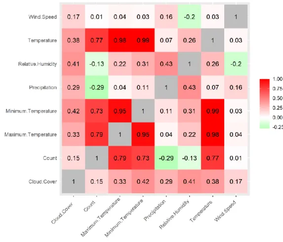
Since we are interested in which of the features have the most impact on the bike usage frequency, we look at the correlation coefficients between the features in the dataset. Features which are strongly correlated with each other with the exception of correlation with bike usage may be removed in order to increase performance of the k-means
algorithm. This can be visualized and seen below in Figure 3, where 1.0 indicates a strong positive correlation between two features, 0 indicates no correlation between two features and -1.0 indicates a strong negative correlation between two features.
Figure 3. A correlation matrix for visualizing the correlation between features in the dataset.
As the figure shows, “Temperature”, “Maximum Temperature” and “Minimum Temperature” are strongly correlated. They also have a strong correlation with the number of trips “Count”. We remove the features for maximum and minimum temperature and keep the average temperature “Temperature”. The feature
“Temperature” seems have the highest correlation with “Count”, followed by the feature “Precipitation”. The strong positive correlation between temperature and trips indicate that the number of trips increases when the temperature increases. The negative
correlation between precipitation and trips indicate that number of trips decrease as the precipitation increase.
12
The result of the data preparation is a dataset which includes 668 observations and 6 features, where each observation hold record for a day. The features are presented and briefly explained in the following list:
• “Count”: integer number, number of trips
• “Temperature”: decimal number, average temperature measured in Fahrenheit • “Precipitation”: decimal number, average rainfall measured in inches
• “Wind Speed”: decimal number, average wind speed measured in miles per hour • “Cloud Cover”: decimal number, average cloud cover measured in percent
• “Relative Humidity”: decimal number, average humidity measured in percent Features with the necessity to be standardized to have standard deviation one is scaled. This removes possible dissimilarity caused by the features’ unit measurement [20]. The dataset has been cleaned and processed into one dataset and is now ready to be used for the fourth phase of the process.
4.3.4 Dimensionality reduction
Dimensionality reduction is the process of reducing the number of features and can be done manually as well as automatically through algorithms. This process solves the curse of dimensionality [19]; which means higher number of features increases
complexity, computation costs and the number of dimensions. For the task of reducing the data, the dimensionality reduction was performed manually. Automating this process is valuable for large datasets and highly dimensional data. Such algorithms usually generate new features from the existing ones; the new ones are often less descriptive and difficult to understand. The datasets used in this thesis was not considered large enough to compute dimensionality reduction algorithms. In the
datasets, the number of features were considerably low and manageable. Moreover, the relevance and usability of the features for this study was clear. For instance, the removal of the name of the station location or address does not interfere with the investigation on weather impact, which is the main interest of this study. Therefore, the stations’
geographical locations and similar features could be removed without the use of any algorithms. Similarly, features with many missing values are unusable and thus there is no necessity for using an algorithm to remove such features.
4.4 Modelling
In this section, the chosen cluster validation methods and k-means clustering algorithm will be presented in detail.
4.4.1 Cluster validation
According to the k-means algorithm steps indicated in section 2.2.2, the number of clusters k must be determined first. Before presenting the chosen methods for estimating the value of k, one must note that the cluster validation methods, as well as the k-means algorithm, must use a distance metric to compute the distance between two data points. For this task, the Euclidean distance has been chosen and the formula is given below:
13
𝐷 = √∑(𝑥𝑖− 𝑦𝑖)2 𝑛
𝑖=1
(1)
Where D is the calculated distance between two vectors x and y of length n.
Moving on to the task of deciding the value of k, the three cluster validation methods mentioned in section 2.2.2 are used to estimate the optimal number of clusters. The formula of these three methods are given below.
Method 1: the gap statistic. The formula for performing gap statistic is given below: 𝐺𝑎𝑝𝑛(𝑘) = 𝐸𝑛∗log(𝑊𝑘) − log(𝑊𝑘) (2) Where 𝐺𝑎𝑝𝑛(𝑘) is the estimated gap statistic, 𝐸𝑛∗ denotes the expectation under a sample size n from the reference distribution, and 𝑊𝑘 is the within sum of squares. The
estimation of k will be the value which maximizes the gap statistic 𝐺𝑎𝑝𝑛(𝑘) after the sampling distribution has been considered.
Method 2: the average silhouette width. The formula for performing silhouette is given below:
𝑠(𝑖) = 𝑏(𝑖) − 𝑎(𝑖)
𝑚𝑎𝑥{𝑎(𝑖), 𝑏(𝑖)} (3)
Where 𝑎(𝑖) is the average dissimilarity of an object 𝑖 to all other objects in its cluster and 𝑏(𝑖) is the average dissimilarity of 𝑖 to all other objects in the nearest cluster that is not its own nearest cluster defined by the cluster minimizing the average dissimilarity. The estimation of k will be the value which maximizes the average silhouette 𝑠(𝑖) over a range of possible values for k. It is notable that this method assumes that the number of clusters k is more than one.
Method 3: the total within-cluster sum of square (elbow). The formula for performing the elbow method is given below:
𝑊𝑘= ∑ 1 𝑛𝑟 𝑘 𝑟=1 𝐷𝑟 (4)
Where 𝑊𝑘 is the within-cluster sum of squares, k is the number of clusters, 𝑛𝑟 is the number of points in cluster r and 𝐷𝑟 is the sum of distances between all points in a cluster. The estimation of k will be the value which minimizes the within-cluster sum of square 𝑊𝑘.
The analysis of estimating the number of clusters k is presented in section 5.1.
4.4.2 Computing k-means
The Hartigan-Wong approach is used to compute k-means. The aim of this approach is to search for a k-partition with locally optimal within-cluster sum of squares by moving data points from one cluster to another [23]. Unlike the general approach described in section 2.2.2, the Hartigan-Wong algorithm recomputes the centroids any time a data point is moved. It also computes differently in order to increase time and accuracy. The
14
maximum number of iterations are set to 10 due to computation limitations and the number of configurations of centroids are set to 25.
5 Results
In this chapter, the result from the cluster validation and the k-means algorithm is presented and briefly explained.
5.1 The result of cluster validation
The results for the cluster validation are presented in the Table 1 below:
Table 1. The results from the three methods for estimating the number of clusters k.
Method: Elbow method Silhouette method Gap statistic Optimal number of
clusters (k)
3 3 4
The elbow and silhouette methods yield the optimal value of clusters k to be 3 whereas gap statistic yield 4 clusters. Therefore, we decide to choose 3 as the value of the number of clusters k.
5.2 The result of k-means
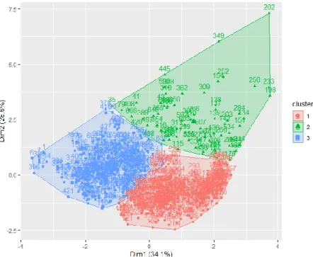
The result of clustering the dataset using k-means with the 3 clusters is visualized and shown in the figure below.
Figure 4. The visualized result of computing the k-means algorithm described in 4.4.2 with the number of clusters k = 3.
15
The 668 observations are clustered into 3 clusters. A total of 305 observations have been grouped into Cluster 1 which is marked red, 78 observations in Cluster 2 which is
marked green, and 285 observations in Cluster 3 which is marked blue.
The first dimension on the x-axis explains 34.1% of the variance in the data, and the second dimension explains 28.6%. This means that this visualization is able to capture 62.7 % of the variance in the data. The two dimensions are called principal components which captures as much of the information in the data as possible. Details about each cluster’s minimum, maximum, median and mean value for each feature is presented in Table 2-Table 4 below. The values have been rounded up to have 2 decimals. The tables will be discussed and further explained in sections 5.2.1-5.2.4.
Table 2. Detailed information about Cluster 1, marked red in Figure 4.
Count Temperature Precipitation Wind Speed Cloud Cover Relative Humidity Min. 6183 48.40 0.00 4.90 0.30 32.32 Median 12 581 73.80 0.00 12.70 30.00 65.24 Mean 12 647 71.83 0.03 12.86 43.93 64.82 Max. 19 113 88.00 0.60 28.10 100.0 88.53
Table 3. Detailed information about Cluster 2, marked green in Figure 4.
Count Temperature Precipitation Wind Speed Cloud Cover Relative Humidity Min. 1208 34.20 0.10 5.70 17.10 70.54 Median 6530 61.55 0.85 14.10 91.20 83.84 Mean 6363 60.21 0.98 14.43 72.98 83.53 Max. 13 709 82.70 4.00 25.40 100.00 99.10
Table 4. Detailed information about Cluster 3, marked blue in Figure 4.
Count Temperature Precipitation Wind Speed Cloud Cover Relative Humidity Min. 628 14.70 0.00 3.40 0.30 20.36 Median 6829 42.20 0.00 11.70 18.40 57.40 Mean 6564 41.46 0.05 12.88 23.75 58.93 Max. 11 740 58.50 0.70 33.00 100.00 97.34
5.2.1 Cluster comparison: bike usage frequency
The tables for each cluster show dissimilarities between the clusters. In Table 2, we can see that bike usage frequency varies between 6183 to 19113 trips a day for Cluster 1. This is significantly higher than in Cluster 2 and in Cluster 3; the variance is between 1208 to 13709; and 628 to 11740 respectively. Another significant gap between Cluster 1 and the two other clusters can be seen in the average bike usage frequency for all
observations in each cluster. Cluster 2 and Cluster 3 show a mean value of 6363 trips per day and 6564 respectively. This is only half of the average bike usage of Cluster 1, which has the mean value of 12647 trips per day. To get a better understanding of the
16
clustering, we look at the weather conditions for each cluster and compare it with the other clusters.
5.2.2 Temperature impact on bike usage
We begin with temperature, as this feature was most correlated with bike usage frequency according to the correlation matrix presented in Figure 3. As seen in the tables, both the mean temperature and the median temperature is highest in Cluster 1, followed by Cluster 2 and lastly Cluster 3. The range between the minimum temperature and maximum temperature is also highest in Cluster 1; with the minimum of 48.40 degrees Fahrenheit and the maximum 88.00 degrees Fahrenheit. In Cluster 2, the range is slightly lower and varies between 34.20 degrees Fahrenheit to 82.70 degrees
Fahrenheit. The minimum value for temperature in Cluster 3 is as low as 14.70 degrees Fahrenheit and the maximum value is 58.50 degrees Fahrenheit. This shows that trips within Cluster 1 was done during warmer temperatures; trips within Cluster 2 was done during temperatures slightly lower than within Cluster 1; and trips within Cluster 3 was done during low temperatures. This also shows that the temperature certainly impacts the bike usage frequency; the higher the temperature, the higher the bike usage. The opposite is also true; the lower the temperature, the lower the bike usage.
5.2.3 Precipitation impact on bike usage
Precipitation is measured in inches and is the second feature that correlated highly with bike usage frequency. We can see that the mean precipitation for Cluster 1 is as low as 0.03 inches and that it rained 0.60 inches at most. The range between minimum and maximum precipitation for Cluster 2 is 0.10 inches to 4.00 inches. The median and average precipitation is 0.85 inches and 0.98 inches respectively. As for Cluster 3, the mean is 0.05 inches and the highest is 0.70 inches. This shows that trips within Cluster 1 took place when there was very little or no precipitation at all. The same is true for
Cluster 3 which differentiates faintly from Cluster 1. We can see a somewhat significant
gap between Cluster 2 and the other two clusters; trips within Cluster 2 was done during precipitation compared to the others. To summarize the interpretation of precipitation impact on bike usage; the higher the precipitation, the lower the bike usage. Conversely, the lower the precipitation, the higher the bike usage.
5.2.4 Cloud cover, humidity and wind speed
As we can see in the correlation matrix, Figure 3, cloud cover has a small correlation with bike usage frequency. This is revealed in the results. In Cluster 2, the mean and median cloud cover is above 70% while it is lower than 50% for Cluster 1, and lower than 25% for Cluster 3. This shows that trips within Cluster 1 and Cluster 3 was done when the weather was sunny, or partially cloudy. In Cluster 2, most trips were done when it was cloudier. However, this cannot indicate that higher cloud cover percentage equals higher bike usage frequency. Looking at Cluster 1, which has many more trips taken, the overall cloud cover is higher than in Cluster 3. This is because of the strong correlation and impact temperature has on the bike usage.
The average and mean humidity for each cluster seems to differ by a small margin. However, it is observable that the humidity percentage is lower in Cluster 1 and Cluster
17
3 compared to Cluster 2. Like cloud cover, humidity has a weak impact on bike usage
frequency.
Wind speed has an insignificant correlation with bike usage frequency. This is reflected in the tables for each cluster; we can see that there is no certain pattern.
We can see from the results that the bike usage frequency is highest in Cluster 1. In this cluster, the temperature is high and there is little or no precipitation. In Cluster 2, the bike usage is half as frequent than in Cluster 1. Moreover, the temperature is somewhat lower and there is more precipitation than in Cluster 1. In Cluster 3, the bike usage frequency is lower than Cluster 1 and possibly also lower than in Cluster 2. What is notable in Cluster 3 is that, although there is little or no precipitation, the bike usage is still lower than in Cluster 1. This is because of the low temperature in Cluster 3.
6 Analysis
In this chapter, an analysis on the results will be presented and interpretation of the results will be discussed.
6.1 Anomaly analysis
While the dataset was processed to eliminate possible outliers such as data-entry errors or measurement errors, the results seen in Figure 4 show that are a few observations which may seem to be anomalies. It may be worthwhile to take into consideration and investigate unusual events or phenomenon that may cause abnormal results in the data. Global warming and climate change [38] are examples of such events which cause
weather anomalies. The weather and climate changes cause extreme weather events such as wildfires and heavy rain to occur more often. In this section, an analysis is done on unusual observations within the dataset.
The observation to the upper-right of the figure is labeled as 202 and is clustered into
Cluster 2. This observation will be referred to as Observation 202. The observation that
is somewhat close to Observation 202, labeled as 349, also seem to diverge from the rest of the observations and is also clustered into Cluster 2. This observation will be referred to as Observation 349.
Observation 202 was the 21st of July in 2018. It was a Saturday with the average
temperature at 71.7 degrees Fahrenheit, precipitation at 4.0 inches and wind speed at 21.4 miles per hour. The number of trips made that day was 2794 and this day contained the heaviest rainfall in the whole dataset. According to The Washington Post [39], there was a storm this day that ranked as the fifth wettest July day of Washington D.C. The heavy rain brought by the storm lead to flooding and strong winds which is most likely the cause of the low bike usage frequency.
Observation 349 was Saturday 15th of December in 2018. The average temperature was
51.5 degrees Fahrenheit, precipitation was 2.5 inches and wind speed at 18.4 miles per hour and a total of 1208 trips were recorded this day. Although there were no unusual events or occurrences, the high precipitation alone may be the reason to why the bike usage was low.
18
6.2 Analysis of working days and non-working days
In this section, we analyze bike usage difference between working days and non-working days. The calendar from QuantLib [40] is used for distinguishing working days from non-working days. Days included in the non-non-working days group are Saturdays, Sundays and public holidays such as New Year’s Eve and Christmas. All other days are included in the working days group. It is presented in Figure 5 below.Figure 5. Bike usage in working days and non-working days for each cluster.
The figure is a boxplot which shows the spread of bike usage (Count) in working days and non-working days for each cluster. The boxes are interquartile range boxes which represent the middle 50% of the data. The line inside each box show the median number of trips. For instance, looking at the box for Cluster 1 in the non-working day column to the left, the median number of trips is around 12 200 trips. The whiskers which extend from either side of the boxes represent the ranges for the first quartile of the data and the fourth quartile of the data. The dots, or outliers, represent observations that diverges from the majority of the observations.
From Figure 5, there are generally higher bike usage in each cluster during working days than the corresponding cluster during non-working days; this show that there may still be some bias involving day of week. However, it can be seen in the figure that the bike usage frequency for Cluster 1 does not differentiate much for day of week.
Public transportation services are a common travelling method for going to and from work or school. It is also useful for running errands such as grocery shopping or meeting up with friends. The double-peak phenomenon observed from other studies presented in section 3.3 shows that there is usually higher bike usage frequency in the morning and
19
evening in working days. As a result, there may be more bicycle trips made in working days. The studies also show that the weekends and holidays have a steadier curve for use of bike services, mostly for running errands or other activities between noon and evening. However, there are majority of observations in Cluster 1 for working days and non-working days seem to have about the same amount of bike usage. Cluster 1
contained observations with highest temperature and lowest precipitation. This cluster may indicate that while day of week may matter, the weather conditions have a deciding impact on whether people decide to bike or not. As for the case for trips in Cluster 1, the warm temperature and absence of precipitation may have resulted in the high amount of bike usage.
6.3 Seasonality analysis
By analyzing the bike usage frequency based on seasonality, it may be possible to uncover additional patterns. This analysis will show bike usage for each season in each cluster. It will also show bike usage for each season without the clusters.
Figure 6. Bike usage for each season in each cluster.
The figure shows bike usage frequency (Count) for each season in the clusters. One observation that can be made from the figure is that Cluster 3, which contained trips made in colder temperatures, do not contain any trips made during summer. Another observation is that bike usage frequency for each cluster is lowest during winter comparing to the corresponding clusters in the other seasons. Generally, it is common that the temperature is lower during winter, and higher during summer. This may have
20
resulted to clusters that depend on temperature which in turn depend on seasonality. Therefore, an analysis without the clusters is made.
Looking at the dataset: there are 182 observations made in autumn with a total of 1,792,486 trips; 184 observations with a total of 1,881,527 trips made in spring; 122 observations with a total of 1,551,109 trips made in summer; and 180 observations with a total of 999,290 trips made in winter. Since there are uneven amount of observations for each season, we calculate the average number of trips made per day in each season to see which season contained the most or least trips. This is done by dividing the total number of trips for a season with the number of observations for the season. The equation can be seen below:
𝐴𝑣𝑒𝑟𝑎𝑔𝑒 =𝑡𝑜𝑡𝑎𝑙 𝑛𝑢𝑚𝑏𝑒𝑟 𝑜𝑓 𝑡𝑟𝑖𝑝𝑠𝑠 𝑜𝑏𝑠𝑒𝑟𝑣𝑎𝑡𝑖𝑜𝑛𝑠𝑠
𝑤ℎ𝑒𝑟𝑒 𝑠 = 𝑠𝑒𝑎𝑠𝑜𝑛 (5)
The average bike trips per day for autumn, spring, summer and winter are; 9849, 10226, 12714 and 5552 respectively. This shows that bike trips are highest during summer followed by spring and autumn. The number of bike trips during winter is considerably lower. This analysis will be further discussed in section 7.2.1.
6.4 K-means as a suitable algorithm
To investigate on the second research question for finding a suitable clustering algorithm for this type of study, a literature review was conducted in section 3.2 and suggested k-means to be appropriate. The results of computing k-means presented section 5.2 show that the algorithm successfully clustered the dataset into 3
distinguishable clusters with significant similarities within the clusters. Each cluster creates an internal pattern which diverges from the other clusters.
One issue with the k-means clustering algorithm is to choose the optimal number of clusters k. In this study as well as some other studies, this issue is solved by using multiple cluster validation methods to estimate an optimal value of k. Zhao et al. [10] used 3 cluster validation methods in order to find k. In all cases except for one, their validation methods yielded a corresponding value of k for each clustering algorithm. Ma et al. [11] used 6 cluster validation methods and found that 4 out of 6 cluster validation methods yielded the same value of k.
However, it may be worth investigating other values of k to find more granular
differences in weather regimes. The gap statistic in Table 1 estimated 4 clusters. For this reason, an analysis of results for k=4 will be presented in section 6.4.1.
This shows that the k-means algorithm, specifically the Hartigan-Wong approach, is a suitable clustering algorithm for exploring weather impact on bike usage for the Capital Bikeshare system. It could possibly be a suitable approach for other similar bikeshare systems as well, but this will be further discussed in section 7.3.
21
6.4.1 Investigating possible granular results
Although both the elbow method and silhouette method estimated the number of
clusters to be 3, gap statistic estimated the optimal number of clusters to be 4. Therefore, we choose k to be that value and recompute k-means with the same configurations as before and briefly analyze the outcome. The results can be seen in the figure below.
Figure 7. The visualized result of computing the k-means algorithm described in 4.4.2 with the number of clusters k = 4.
The Cluster 1 contains 279 observations, Cluster 2 contains 65 observations, Cluster 3 contains 164 observations and Cluster 4 contains 160 observations.
As we can see, the clusters 1, 2 and 3 from the original results in Figure 4, which represents the number of clusters as k is set to 3, remain. The difference is that a new cluster, marked purple in the figure above, is created and includes observations mostly from the green and blue cluster, but also the red. The clusters seem to overlap each other, making observations belong to more than one cluster. This is not efficient for the analysis and evaluation because in k-means, an observation can only belong to one cluster. This shows that 4 clusters may not be the optimal value and may not contribute efficiently in analysis of bike sharing data. In order to get better insights, we can look at some details of each cluster. The details about each cluster’s minimum, maximum, median and mean value for each feature is presented in the tables below.
Table 5. Detailed information about Cluster 1, marked red in Figure 7.
Count Temperature Precipitation Wind
Speed Cloud Cover Relative Humidity
Min. 8372 52.30 0.00 4.90 0.30 37.02
Median 12 663 74.80 0.00 12.40 35.40 65.77
Mean 12 797 73.01 0.03 12.59 45.17 65.35
22
Table 6. Detailed information about Cluster 2, marked green in Figure 7.
Count Temperature Precipitation Wind Speed Cloud Cover Relative Humidity Min. 1208 34.20 0.20 9.50 17.10 70.54 Median 6864 65.40 1.00 15.10 92.50 82.92 Mean 6735 62.98 1.07 15.75 78.27 82.52 Max. 13 709 82.70 4.00 28.10 100.00 99.10
Table 7. Detailed information about Cluster 3, marked blue in Figure 7.
Count Temperature Precipitation Wind Speed Cloud Cover Relative Humidity Min. 1213 14.70 0.00 6.10 0.30 20.36 Median 7540 43.40 0.00 16.10 16.30 48.67 Mean 7570 42.69 0.02 16.51 24.30 48.83 Max. 15 874 63.40 0.60 33.00 100.00 81.94
Table 8. Detailed information about Cluster 4, marked purple in Figure 7.
Count Temperature Precipitation Wind
Speed Cloud Cover Relative Humidity
Min. 628 21.10 0.00 3.40 1.20 43.88
Median 6434 42.60 0.00 9.10 20.70 71.02
Mean 6093 43.49 0.13 9.22 26.15 71.74
Max. 10 670 69.80 1.00 17.30 99.60 97.34
In average, Cluster 1 contain observations with high bike usage, high temperature, very little or no precipitation; wind speed around 13 miles per hour; cloud cover around 45%; and humidity around 65%. It is notable that this cluster remain the same as it is in the original results shown in Figure 4, but with fewer observations.
Cluster 2 contain observations with an average of about half the bike usage than in Cluster 1, somewhat lower temperature than in Cluster 1, little or more precipitation
than in Cluster 1; wind speed around 16 miles per hour; cloud cover around 78%; and humidity around 83%. In this cluster, every bike trip was made during precipitation.
Cluster 3 contains observation with an average of bike usage lower than in Cluster 1, but
higher than Cluster 2; about half the average temperature of that in Cluster 1: very little or no precipitation; wind speed around 16 miles per hour; cloud cover around 24%; and humidity around 49%.
The new cluster in this scenario i.e., Cluster 4, contains observations with an average of a little less than half the bike usage than in Cluster 1; temperature about the same as in
Cluster 3; little or no precipitation; wind speed around 9 miles per hour; cloud cover
23
There are few differences between Cluster 1 when k equals 4 and Cluster 1 when k equals 3. As we can see, the range of minimum and maximum for each feature are narrower than it was with only 3 clusters. Although the clusters do not show a
significant difference in bike usage, temperature or precipitation; we can see a notable division of clusters depending on the wind speed, cloud cover and humidity. This is most visible in the clusters 3 and 4.
In both Cluster 3 and Cluster 4, the average temperature is around 43 degrees Fahrenheit. In Cluster 3, the range of temperature is somewhat lower than it is in
Cluster 4. The amount of precipitation is slightly lower in Cluster 3 than it is in Cluster 4. This leads to the lower percentage of cloud cover and humidity in Cluster 3 than in Cluster 4. Trips made in Cluster 3 were generally made during higher wind speed;
whereas the wind speed was somewhat lower for the trips made in Cluster 4. The bike usage frequency is higher in Cluster 3 than it is in Cluster 4. This analysis will be further discussed in section 7.3.
7 Discussion and future work
In this chapter, findings from the results and analysis will be connected to the purpose of the thesis. Practical applications on how to use this study and its results will also be proposed. Suggestions for improvements of the approach will also be presented and discussed.
7.1 Understanding weather features impact and
potentials
With enough empirical data and models explaining how and how much certain weather features impact bike usage behavior, one can use the information in decision making concerning BSS. Certain cities and climate might require less bike stations and fewer bikes because there might be a correlation to regional weather on bike usage. From the results presented, higher temperatures results in more bike usage in Washington, D.C. whereas Kyoungok [12], whose study was conducted in Daejeon, shows that there is a certain high temperature threshold that will lead to decline in bike usage instead. With events such as global warming, understanding this certain threshold could help in forecasting the demand of bike rides.
With knowledge on the seasonal weather patterns one could use this data to predict and prepare for bike usage demands. This could aid in rebalancing strategies if there is enough empirical data on how certain weather features impact the number of bike usage. In Xie et al [41] a strategic air traffic management uses weather forecast to predict and plan for possible scenarios and response. Since weather is not precise from 2-15 hours, the proper plan is very dependent on the weather intensity and its known impact. While the weather impacts bikes users differently, it can still be used in a similar manner, or at least the concept of using weather forecast for planning and making decisions based on known weather impact.
For cities or travel agencies, knowing how seasons and weather impact bike riders might offer opportunities for running advertisement in the right time. Tourism can benefit by offering tourists bike as a means of transport if weather and season permits.
24
One could theoretically investigate from a user’s perspective why and how a certain weather impact bike usage. It is then possible to find solutions to mitigate problems associated with certain weather. By knowing seasonal weather for a city or climate, understanding how a certain precipitation or temperature affect the user; it is possible to adjust bike features that encourage use or offer better rates. In Sweden a related
electronic scooter service Voi [42] uses a dynamic price rating depending on time of the day, scooter demand and possibly weather [43]. During rainy or cold seasons equipping bikes with saddle covers might help mitigate problems associated with mentioned weather.
7.2 Possible bias and limitations
This section will discuss limitations and bias that might exist in the data. By
acknowledging and understanding the possibility that there may be other underlying influencing factors on bike usage, one may find valuable knowledge that can be useful for further investigation of the topic.
7.2.1 Season, mentality and events
When taking the clusters into consideration, we can see that the clusters produced by k-means show relationship between temperature and season. Looking at Figure 6, we can see that Cluster 3 do not contain any records of trips made during summer. In each cluster, the season with the highest bike usage is summer followed by spring, autumn and finally winter. What can be seen in the figure is that the bike usage in winter is considerably lower for Cluster 2 and Cluster 3. For Cluster 1, bike usage also drops in winter, but not nearly as much as for the other two clusters.
It was noted that when disregarding the clusters, bike usage in average is still highest during summer followed by spring, autumn and lastly winter. While weather conditions seem to have a great impact on bike usage, public events and people’s mindset may also have an influence. The weather conditions during summer are generally sunny and warm which may cause people to travel by foot or bike rather than by car or bus. Many people decide to go on vacation or travel during summer and public transport services such as BSS are convenient ways of travelling around a foreign city. This may be the cause of high bike usage frequency seen in the analysis by seasonality.
While outdoor public events are made in any season, most of the events and festivals are often made during summer due to more reliable weather conditions. Organizers may assume that people are less likely to attend to outdoor events during poor weather and thus arrange events to take place during better weather conditions. At the same time, BSS may take advantage of such events or other events and advertise or offer discounts on days that bigger events are taking place. For instance, Capital Bikeshare offered free rides for 24 hours during their 9th birthday [44] and Earth Day [45]. Events such as
these may attract more bike users than usual and thus impact the bike usage.
7.2.2 Travel distance
Despite the evidence of strong weather impact on bike sharing usage, there may be some bias in the data that is not visible or obvious in this thesis. This may be seen in Cluster 3, as the cluster contain extraordinary feature combinations.
25
In Cluster 3, bike usage frequency and temperature are significantly lower than in
Cluster 1. This seems logical because in practice, people’s decision on whether to bicycle
often depend on the weather conditions. During high temperatures and sunny weather, people are encouraged to go out and bike. During low temperatures and rainy weather, people are more reluctant to go outside, let alone to bicycle. However, the bike usage in
Cluster 3 is about as frequent as it is in Cluster 2. The main weather differences between
these clusters is that the temperature and precipitation is higher in Cluster 2, while both features are lower in Cluster 3. This suggest that there might be other factors that can also impact the bike usage in addition to temperature and weather such as distance. Bikeshare systems serve as public transportation from one location to another. In some cases, a person’s decision to bike will be the same regardless of the weather. Their decision may instead depend on the distance between their location and the destination. For instance, a worker may use a bikeshare service on daily basis; the distance between work and home may not be too far or close for the worker to find it convenient.
Additionally, a person may not own a vehicle for personal reasons and are forced to use public transport when travelling over long distances.
This may explain the reason for the results in Cluster 3.
7.3 The optimal number of clusters
The analysis of the optimal value for k in section 6.4.1 indicate that more details may be revealed when dividing the observations into smaller clusters. The smaller clusters show shorter intervals in the features’ minimum and maximum value, more focused and possibly accurate similarities between each observation within a cluster. More clusters may also show the impact made from the less significant features wind speed, cloud cover, and humidity. From what can be seen in the Table 5-Table 8, computing k-means with 4 clusters rather than 3 clusters gave a slightly more detailed distinguish.
However, as mentioned in the previous sections, one must be cautious and be observant to anomalies and bias in the data. While the optimal number of clusters can be
estimated through cluster validation methods, it will still be but an estimation of the best possible value. Therefore, it may be interesting to investigate other values of k in order to find granular differences. By doing so, one may find more precise or distinct patterns. When increasing the number of clusters, it may also lead to increasing computation cost.
7.4 Increase amount and variety of data
In order to find interesting climate differences and patterns, one may consider increasing the amount of data used for detecting a more accurate pattern. In this thesis, two years’ worth of data for Washington D.C. was gathered and used. Capital Bikeshare shares data publicly for open access on bike usage as early as 2010 and weather data from those years are likely accessible as well. There are many more cities that use BSS that track their bike usage and those cities will most likely have decades of weather data available to the public.
By investigating BSS and weather data from other cities with different climate, more insight and patterns can be discovered. By analysis of data on different climate and weather, a pattern for the bike usage for that specific condition can be identified. In
26
Kyoungok’s study [12] results showed that bike rentals decreased when the highest temperature of the day (86 degrees Fahrenheit) exceeded. Data such as this would help expand the empirical data and identify impactful weather features. If data between multiple climates and weather can be compared it could help build a more accurate model on how weather impact bike usage.
With increased data and variety, increasing of notable outliers are to be expected. As seen in Cluster 2 Observation 202, investigation revealed that this day had ideal temperature but due to storms the number of bike usage was very low. These investigation aims to confirm weather impact or rule out non-weather factors that impacted bike usage heavily.
Some unusual events may also lead to abnormal data but over a longer period. An example of such an event is the pandemic outbreak COVID-19, which started in the beginning of year 2020 and is currently still ongoing. Multiple vehicle sharing services including many bikeshare services have decided to pause their services due to COVID-19. This impacts bikeshare usage frequency substantially. While Capital Bikeshare have decided to keep the operation going, it is possible that their regular members decide to avoid using public transportation despite the extra precautions made by Capital Bikeshare. It is also possible that people decide to switch from their regular travelling services such as subway trains or buses; and instead use services such as BSS for the sake of social distancing.
This poses a challenge to data preparation and to analysis of results that certainly requires more investigations to single observations as well as observations over a period. Nonetheless, any derived results would provide valuable insight and data.
7.5 Future work
The focus of the project is the usage of the clustering approach, specifically k-means, for achieving the purpose of the thesis. Even though the results of the k-means clustering algorithm have revealed an interesting pattern about weather impact on bike usage, there are improvements that can be made for producing more accurate results as well as for advancing this study.
One suggestion is to apply clustering analysis for other cities such as Malmo and Lund given that there is access to bike sharing datasets and weather datasets for that city. Some other suggestions are to increase the amount of data used and to include more variety by investigating multiple BSS. One could also apply a dimensionality reduction algorithm for data reduction. In addition, it might be interesting to examine the impact of trip distance or working days and non-working days.