Master
's thesis • 30 credits
Environmental Economics and Management - Master's Programme
Accounting for Geographic Basis Risk in
Agricultural Weather Index Insurance
- how kriging prediction may improve
protection against climate risk
Accounting for geographic basis risk in agricultural weather
index insurance - how kriging prediction may improve
protection against climate risk
Daniel LeppertSupervisor: Carl-Johan Lagerkvist, Swedish University of Agricultural Sciences, Department of Economics
Examiner: Jens Rommel, Swedish University of Agricultural Sciences, Department of Economics Credits: Level: Course title: Course code: Programme/Education: 30 credits
Second cycle, A2E Master thesis in Economics EX0905
Environmental Economics and Management - Master's Programme 120,0 hec
Course coordinating department: Department of Economics
Place of publication: Uppsala Year of publication: 2019
Name of Series: Degree project/SLU, Department of Economics Part number: 1235
ISSN: 1401-4084
Online publication: http://stud.epsilon.slu.se
Key words: agricultural economics, geographic basis risk, weather index insurance, kriging, climate change
Swedish University of Agricultural Sciences Faculty of Natural Resources and Agricultural Sciences Department of Economics
Acknowledgements
To my supervisor Carl-Johan Lagerkvist at the Department of Economics, for his encouragement and valuable input. To Tobias Dalhaus at ETH Zurich for sharing instructive reference code and other data, and to faculty and staff at ETH Environmental Systems Science for hosting me during the autumn semester 2018.
To my parents, Anna and Anders, for their unconditional love and support.
Finally, to my friends David, Björn, Nisse, Erik, Aidin, Hans and Otto, for being the family I got to choose, and without whom these past years would not have been half as rewarding. Thank you.
June 2019 Daniel Leppert
Abstract
Weather index insurance is a potential solution to a widely acknowledged problem of information asymmetries in agricultural crop insurance. Insurance where payouts depend on a weather index relies on accurate estimates of local weather, such as temperature and rainfall. Using a geostatistical kriging method and empirical weather and crop yield data from Illinois, I explore whether accounting for geographic approximation errors produces more desirable index insurance contracts. I find that switching to this so-called geographic basis risk-adjusted contract improves farmers’ utility for one of our two indices, but not for the other. Further, purchasing any index insurance contract only improves farmers’ utility during a particularly hot year. During a cooler year, purchasing WI insurance results in lower utility for risk neutral farmer, and constant utility for risk averse farmers.
Sammanfattning
Jordbruksförsäkring baserat på ett underliggande väderindex, t.ex. temperatur eller nederbörd är en potentiel lösning på ett uppmärksammat problem med informationsassymetrier i försäkringsbranschen. Dessa så kallade väderindexkontrakt bygger på att förluster i jordbruket med viss säkerhet kan kopplas till extrema väderförhållanden. I denna uppsats använder jag kriging, en geostatistisk metod för prediktion av spatial data, för att beräkna variansen som beror på avstånd mellan punkt där temperaturen skall estimeras och väderstationer från vilka temperaturdata hämtas. Jag undersöker hur temperaturindexförsäkring kan förbättras genom att ta hänsyn till denna varians och finner att dessa s.k. basriskjusterade kontrakt presterar bättre när ett vanligt temperaturindex används. Indexförsäkring gynnar dock enligt mina beräkningar bara lantbrukare under ovanligt varma år. Under svalare år missgynnas riskneutrala bönder av att köpa indexförsäkring, medan riskaversa bönder är mer ambivalenta.
Table of Contents
ACKNOWLEDGEMENTS ... III ABSTRACT ... IV SAMMANFATTNING ... V ABBREVIATIONS ... VIII 1 INTRODUCTION ... 1 1.1 Problem background ... 1 1.2 Problem statement ... 21.3 Aim and delimitations ... 2
1.4 Structure of the report... 3
2 THEORY AND LITERATURE REVIEW ... 4
2.1 Risk and risk aversion ... 4
2.2 Indemnity crop insurance ... 5
2.3 Weather index insurance ... 7
2.4 Geographic basis risk ... 8
2.5 The theory of kriging ... 9
3 DATA ... 12
3.1 Temperature data ... 12
3.2 Corn yield data ... 14
3.3 Geographic boundary data ... 16
3.1.1 Projection and coordinate system ... 16
4 METHOD ... 18
5 ANALYSIS AND DISCUSSION ... 26
5.1 Sample size sensitivity ... 29
6. CONCLUSIONS ... 31
REFERENCES ... 32
APPENDIX 1: MORE ON RISK AVERSION ... 35
APPENDIX 2: PLOTS ... 36
Temperature distributions ... 36
Sample variograms ... 37
Detrended kriging variance ... 39
Utility distribution 2012: No insurance ... 40
Utility distribution 2012: Contract 1 ... 41
Utility distribution 2012: Contract 2 (geographic basis risk adjusted) ... 42
Geographic trends ... 43
List of figures
Figure 2-1 Sample variogram ... 9
Figure 3-1 Station sample ... 13
Figure 3-2 Histograms of corn yields ... 15
Figure 3-3 Map projection, Campbell and Shin (2012) ... 16
Figure 4-1 : Scatterplot of latitude versus temperature (above) and residuals (below) ... 19
Figure 4-2 Interpolated maximum temperatures (degrees F) over the growing season using ordinary kriging. Spherical model with original temperature values. ... 21
Figure 4-3 Kriging variances; Spherical model with regular temperature field ... 22
Figure 4-4 Quantile Regression output: yield~temperature, yield deciles on x-axis ... 24
Figure 5-1 Wealth difference Insurance vs. No insurance 2012 ... 27
Figure 5-2 Wealth difference Insurance vs. No insurance 2017 ... 27
Figure 0-1 CARA utility curve (black) versus risk neutral utility curve (red). ... 35
List of tables
Table 4-1 Leave-one-out cross-validation for model selection ... 20Table 5-1 Terminal wealth for farmers at the end of the 2017 season, Temperature Index. ... 26
Table 5-2 Terminal wealth for farmers at the end of the 2012 season, Temperature Index. ... 26
Table 5-3 Terminal wealth for farmers at the end of the 2017 season, Degree Day Index. ... 26
Table 5-4 Terminal wealth for farmers at the end of the 2012 season, Degree Day Index. ... 27
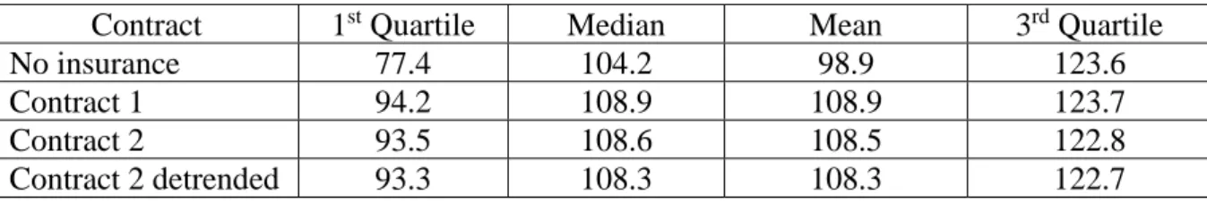
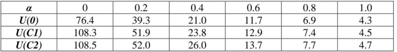
Table 5-5 Utilities for no insurance, contract 1 and contract 2 for various levels of risk aversion 2017; 0 risk neutral, 1 very risk averse. ... 28
Table 5-6 Utilities for no insurance, contract 1 and contract 2 for various levels of risk 2012 aversion; 0 risk neutral, 1 very risk averse. ... 28
Table 5-7 LOOCV for model selection; half sample size ... 29
Table 5-8 Terminal wealth 2017; half sample size ... 29
Abbreviations
CDD: Cooling degree day
CRRA: Constant relative risk aversion DARA: Decreasing absolute risk aversion LOOCV: Leave-One-Out Cross-validation v.N-M: von Neumann-Morgenstern
1 Introduction
“There cannot be more people on this earth than can be fed”
- Attenborough, D
This thesis aims to extend and build on recent work on weather index insurance in agriculture and sets out to answer the research question: Does accounting for geographic basis risk improve the market for weather index insurance contracts in Illinois corn production? Here I add to the existing literature by showing how contracts can be designed by using kriging interpolation to construct both weather indices and estimates of geographic basis risk.
1.1 Problem background
Climate change brings considerable uncertainty surrounding the future productivity of agricultural land. As ever-increasing amounts of greenhouse gases accumulate in the Earth’s atmosphere, an on average warming planet poses challenges for a number of species and ecosystems, notably those of crops on which we depend for sustenance. As the Earth is already committed to further decades of warming even with abatement in greenhouse gas emissions (Meehl et al. 2005; Solomon et al. 2009), maintaining future crop yields under a changing climate is therefore important to ensure food security for coming generations. A growing body of research has narrowed in on the economic impact of climate change for the agricultural industry, and the conclusions vary. An early, controversial paper (Mendelsohn et al. 1994) finds that higher temperatures in all seasons excluding autumn reduce average farm values in the United States, while rain outside of autumn increases farm values. Cline (1996) argues that these estimates understate the costs of climate change by failing to acknowledge the possibility of higher irrigation costs, reductions in global food security and more severe warming. More recent work by Schlenker et al. (2005) conclude that for dryland areas the impact of a 3.8°C mean increase in temperatures across the US would be unambiguously negative. The estimated annual loss is $5 to $5.3 billion, which represented 3.7% of total US crop values in 2018 (USDA 2019).
These projections emphasize farmers’ need for efficient protection against weather-related damages and climate risk. Traditional crop insurance schemes are widespread but suffer from a number of problems: Insurance specifically against weather damage have historically been rare and commonly bundled up with protection against a host of other damages in multiple peril contracts (Knight et al. 1997). Second, traditional crop insurance suffers from moral hazard as insured farmers may invest less in risk-reducing production inputs (Nelson and Loehman 1987). Recent work on soybean and corn yields in the United States suggests that crop insurance is associated with a 43% and a 67% increase in heat sensitivity, respectively (Annan and Schlenker 2015). Finally, traditional crop insurance requires monitoring by the insurer which can be costly, particularly in developing countries.
Index insurance is an alternative to traditional indemnity insurance (Barnett et al. 2008) where payoffs to policy-holders are not based on a physical loss assessment on the farm, but on an index that is related to crop production, such as temperature or rainfall. Farmers are indemnified whenever the weather index falls outside a given strike level, say above a given CDD.
Index insurance deals effectively with moral hazard because the index is taken to be exogenous. As index insurance offers important advantages such as i) symmetrical information, ii) lower transaction costs and iii) a solution to the moral hazard problem, designing competitive contracts that adequately account for basis risk would be valuable (Vroege et al. 2019).
1.2 Problem statement
The most cited obstacle to greater uptake of index insurance is so-called basis risk, i.e. that yields are not perfectly correlated with the index so that an insured farmer may suffer yield losses and receive no compensation (Conradt et al. 2015). There are three major kinds of basis risk: Local, product, and geographic basis risk. Local basis risk refers to the degree to which a particular weather derivative is an imperfect hedge against shortfalls for a given exposure, where the underlying index on the weather derivative and the exposure being hedged correspond to the same geographic location. In other words, the index reflects local weather conditions, but does not accurately hedge against weather risk because there is an imperfect link between the index and crop yields. Second, product risk is the difference in hedging effectiveness between alternative hedging instruments, for example a precipitation and temperature index. Finally, geographic basis risk refers to the error associated with employing a non-local weather derivative. For example, a weather index may be constructed from ground level climate station data measured some distance from the farm. While geographic basis risk is defined in terms of a particular site, it is possible for location indices to also be specified as a weighted set of locations, such as interpolations of a sample of station data points onto a continuous grid representing agricultural area (Woodard and Garcia 2008). This thesis will focus specifically on geographic basis risk, which I will estimate using a geostatistical kriging model.
1.3 Aim and delimitations
The purpose of this thesis is to a) construct two index insurance contracts against extreme heat
using so-called kriging interpolation, and b) explore the welfare effects of switching from a regular index contract to one which account for geographic basis risk. Specifically, I test the
hypothesis that variance due to geographic basis risk obscures the effect size of extreme temperatures on crop yields, leading to less efficient insurance contracts.
The scope of the thesis is limited geographically to the state of Illinois in the United States. While index insurance contracts can theoretically be created for any crop, I choose to focus only on corn production. These choices are motivated on the grounds that Illinois is one of the most important states for agriculture in the US, and corn farming is not only significant but also evenly and continuously distributed across the state. This ensures that the entire sample of weather stations is useful. Further, Annan and Schlenker (2015) have already shown that traditional crop insurance provides disincentives to adapt to extreme heat among Illinois corn and soybean farmers. Their results therefore motivate particular study of weather index insurance in this context. Due to time limitations, no other crops or states were studied. As such, the thesis cannot confirm whether the results remain robust across different climate zones and crops.
1.4 Structure of the report
The main part of the thesis begins with chapter 2 on theoretical perspectives and the relevant literature. Chapter 2 itself is split into two parts: First are subchapters 2.1 and 2.2 on the theory of insurance. The theoretical framework of weather index insurance is built upon older research on traditional indemnity crop insurance. This begins with the basics of risk and risk aversion, and the theory of indemnity insurance contract design. It presents the key results of risk attitudes beginning with von Neumann and Morgenstern (1947) and Arrow (1971) and covers key papers on crop insurance including Ahsan et al. (1982), Nelson and Loehman (1987) and Chambers (1989). These are followed in 2.3 by the theory of weather index insurance. Key papers include Conradt et al. (2015) and Dalhaus (2018). I explain how a weather index insurance contract is designed and how the payout mechanism works. Third is a subchapter (2.4) on geographic basis risk, and finally 2.5 on the theory of kriging interpolation. Kriging is the geostatistical method we use to interpolate temperature data from a sample of weather stations onto a grid of the state of Illinois. The kriging model is fitted using what is known as the variogram method, which I also explain further.
Chapter 3 describes the data such as the sample of weather stations and the corn yield data. I also explain how our data is mapped geographically. I cover the basics of mapping and specifically how the grid of Illinois is projected. In chapter 4 I show how CDD indices are constructed and how the contracts are designed. I motivate our choices of model selection and cross-validation and explain how the main hypothesis is tested. In chapter 5 I present the analysis and discuss the results. These include the construction of two different index insurance contracts, where the first is a ‘regular’ contract and the second is a geographic basis risk-adjusted contract. The analysis is built upon theory described in chapter 2. I present the payoffs to farmers and the insurer for each insurance option and test the geographic basis risk hypothesis. The following discussion also comments on weaknesses and possible improvements in the study design. Finally, chapter 6 concludes the thesis and summarizes the key lessons.
𝐸(𝑤) =1 2(𝑤0 − 10) + 1 2(𝑤0+ 10) 𝑈(𝑤) =1 2𝑈(𝑤0− ℎ) + 1 2𝑈(𝑤0+ ℎ) lim
𝑤→0𝑈(𝑤) and lim𝑤→+∞𝑈(𝑤) exist and are finite.
2 Theory and literature review
“If people don’t believe math is simple, it’s only because they don’t realize how complicated the world is”
- von Neumann, J
2.1 Risk and risk aversion
Quite simply, the purpose of an insurance contract is to offer the buyer protection against risk. I begin this section by briefly presenting the formal theory of modelling risk. Imagine that you have some initial wealth 𝑤0 and you are being offered to bet $10 on a fair coin toss. If the coin comes up heads, you will win $10. If it comes up tails, you lose $10. Would you take the bet? (2.1)
In playing this simple coin toss game, your expected terminal wealth is zero, equivalent to not playing at all. Recall that a rational agent maximizes utility as a function of wealth, where the marginal utility of wealth is strictly positive. Let us move now from a simple coin toss with two possible outcomes to a lottery with N possible uncertain outcomes, each associated with a given probability ρ. In a classic result, von Neumann and Morgenstern (1953) show that traditional utility theory can be simply extended to uncertain outcomes.
The expected utility theorem: Formally, the utility function U: ℒ → ℝ has an expected utility form if there is an assignment of utilities {𝑢1, 𝑢2, … , 𝑢𝑁} to N outcomes such that for every lottery 𝐿 = {𝜌1, 𝜌2, … , 𝜌𝑁} ∈ ℒ we have 𝑈(𝐿) = 𝜌1𝑢1+ 𝜌2𝑢2 + ⋯ + 𝜌𝑁𝑢𝑁. When choosing between two different lotteries L and L´, a rational individual has the preferences 𝐿 ≿ 𝐿´ if and only if ∑𝑁𝑛=1𝑢𝑛𝜌𝑛 ≥ ∑𝑁𝑛=1𝑢𝑛𝜌´𝑛. (von Neumann and Morgenstern 1947)1
A utility function U: ℒ → ℝ with the expected utility form is known as a von Neumann-Morgenstern (v.N-M) expected utility function. The v.N-M expected utility function can be interpreted as the weighted sum of all possible outcomes in a lottery by their respective probabilities. (Mas-Colell et al. 1995) The shape of an individual’s v.N-M utility function depends on their risk preferences. Consider again betting on tossing a fair coin with an expected terminal wealth of zero. An individual who is indifferent between taking the bet and not is considered risk neutral. By the expected utility hypothesis, we formally represent their preferences as follows:
(2.2)
where again 𝑤0 is initial wealth and ℎ is size of the bet. Similarly, an individual is considered risk averse if in equation 2.2 L.H.S. > R.H.S. and risk seeking if L.H.S. < R.H.S. When making assumptions about risk attitudes, we consider a) that wealth is always desirable so that the marginal utility of wealth is strictly positive 𝑈′(𝑤) > 0 and b) that if 𝑈(𝑤) is strictly increasing in 𝑤 the statement that it is bounded can be written,
𝛼𝐴(𝑤) = −𝑈′′(𝑤) 𝑈′(𝑤)⁄ 𝑈(𝑤) =𝑤 1−𝛼− 1 1 − 𝛼 𝐸(𝑤) = 𝑃 ∑ 𝜌𝑖𝑌(𝑋, 𝜃𝑖) − 𝐶(𝑋, 𝜔) 𝑁 𝑖=1 𝐸(𝑤) = 𝑌 − 𝜌𝐷
The boundedness condition implies that for some positive number ε, no matter how small, we must have 𝑈′(𝑤) < 𝜀 for all but a set of intervals on 𝑤 whose total length is finite. This means that 𝑈(𝑤) is concave so that 𝑈′(𝑤) is strictly decreasing as 𝑤 increases. Hence, with relatively rare exceptions 𝑈′′(𝑤) < 0. This shows that individuals are generally risk averse (See Appendix 1 for further reasoning). Indeed, prevalence of risk aversion can be inferred from economic observation. In a world of only risk neutral or risk seeking individuals, there would be no demand for fair insurance where expected utility is unchanging. (Arrow 1971)
(2.3) Equation 2.3 shows the measure of absolute risk aversion, which represents the compensation required for taking risks, i.e. how much higher the potential upside in the coin bet must be for a risk averse individual to want to play. By multiplying equation 2.3 with terminal wealth 𝑤 we derive the measure of relative risk aversion 𝛼𝑅(𝑤) which is the elasticity of the marginal utility of wealth. For the purposes of this thesis I will use an isoelastic utility function displaying constant relative risk aversion (CRRA) and decreasing absolute risk aversion (DARA) which has empirical support in the relevant literature (Di Falco and Chavas 2009; Dalhaus et al. 2019):
(2.4) where a condition for DARA is that 𝑈′′′(𝑤) > 0.2 Specifically, for equation 2.4 𝑈′′′(𝑤) = (𝛼2 + 𝛼)𝑤−𝛼−2 > 0 for α ∈ ℝ | α > 0 (Adams and Essex 2014).
2.2 Indemnity crop insurance
We turn now to the theory of crop insurance. The risk averse farmer aspires to maximize their expected utility given by equation 2.4 as a function of terminal wealth 𝑤 and a given level of risk aversion α. Terminal wealth is a function of crop yield which varies from year to year depending on some state of nature θ each associated with a probability ρ. The farmer’s expected terminal wealth can be represented as:
(2.5)
The price P is exogenously given (for simplicity we set it equal to 1) and ∑𝜌𝑖 = 1. The cost C is a function of inputs and input prices, but since it only factors into insurance decisions when we consider a choice between risky and risk-reducing inputs (Nelson and Loehman 1987) it is beyond the scope of this thesis. To simplify further we can separate the yield distribution into a constant optimal yield minus damages occurring with probability ρ. When we consider terminal wealth purely in terms of yield we get:
(2.6)
max
𝛼≥0 (1 − 𝜌)𝑈(𝑌 − 𝛼𝜑) + 𝜌𝑈(𝑌 − 𝛼𝜑 − 𝐷 + 𝛼)
𝑈′(𝑌 − 𝐷 + 𝛼∗(1 − 𝜌)) − 𝑈′(𝑌 − 𝛼∗𝜌) ≤ 0
𝛼∗ = 𝐷 𝑌 − 𝐷 + 𝛼∗(1 − 𝜌) = 𝑌 − 𝛼∗𝜌
Now imagine that the farmer can purchase insurance at a price φ per unit which pays one yield unit if damages occur. If the farmer buys α units of insurance, his expected terminal wealth will now be 𝑌 − 𝜌𝐷 + 𝛼(𝜌 − 𝜑). Following equation 2.2 the farmer’s utility maximization problem in choosing α is therefore:
(2.7) We differentiate equation 2.7 with respect to α. If 𝛼∗ is an optimum, it must satisfy the first-order condition:
(2.8) Suppose that the premium φ of one unit of insurance is actuarially fair, which means that it is equal to the expected payout of the insurance, ρ. Such a premium implies a non-profit insurance provider, which is realistic given a public crop insurance model, and absence of moral hazard, adverse selection, and transaction costs, which is less realistic. (Mas-Colell et al. 1995) For 𝜑 = 𝜌 the first-order condition requires that
(2.9) In chapter 2.1 we showed that 𝑈′′(𝑤) < 0 and so it follows that 𝑈′(𝑌 − 𝐷) > 𝑈′(𝑌). From there it also follows from equation 2.9 that 𝛼∗ > 0. We rearrange equation 2.9 and because 𝑈′(𝑤) is strictly decreasing, we can reduce it to
(2.10)
(2.11) Deriving equation 2.11 reveals an important result. With a fair premium, the risk averse farmer will insure completely and buy insurance to cover all damages. This extends similar results in the standard insurance literature (Arrow 1971; Rothschild and Stiglitz 1976; Raviv 1979) to agricultural crop insurance. However, Ahsan et al. (1982) shows that when insurers cannot distinguish between high-risk and low-risk farmers, market failure will occur, and this result does not hold.
Absence of competitive insurance markets can largely be explained through information asymmetries, the authors argue. Further, Chambers (1989) shows that since damages across farms are highly covariate, the insurer stands to suffer large losses simultaneously. Finally, Annan and Schlenker (2015) show empirically how insured farmers have less incentive to adapt to damage from extreme heat. All of this indicate that insurers may need to set higher premiums than what is actuarially fair. In the upcoming section I will explore how weather index contracts deals with these problems in insuring against weather damages.
𝑌𝑖𝑡 = 𝑔𝑖(𝑊𝐼𝑖𝑡) + 𝜀
𝑌𝑖𝑡 = ℎ𝑖(𝑊𝐼𝑖𝑡) + 𝜗 + 𝜀
𝑆 = 𝑔𝑖−1(𝑌̅)
2.3 Weather index insurance
Weather index insurance is an alternative to traditional indemnity insurance (Barnett et al. 2008) where payoffs to policy-holders are not based on a physical loss assessment on the farm, but on an index that is related to crop production, such as air temperature or rainfall. Weather is exogenously given and cannot be influenced by farmers. Further, historical weather data is public information. Because of this, with weather index (WI) insurance there are no information asymmetries and opportunities for moral hazard. These qualities have attracted further research into WI insurance in recent years (Nadolnyak and Vedenov 2013; Conradt 2015; Dalhaus 2018). In this section I will show in some detail how WI insurance contracts are designed and discuss their weaknesses.
WI insurance theory rests on the empirical fact that crop yields are correlated with the weather. A common index in WI research is rainfall, where e.g. Conradt et al. (2015) and Dalhaus (2018) use average rainfall over the growing season. Rainfall has been shown to be negatively correlated with crop yield for very low and very high values, and positively correlated in between (Lobell et al. 2007). Here I will focus on WI insurance against extreme heat, as the results of Annan and Schlenker (2015) indicate a need for protection without moral hazard. A farmer who buys a heat index contract receives payout not as a function of damages as in indemnity insurance. Instead, payouts occur whenever the heat index goes above a certain temperature limit, known as the strike level S. The strike level depends on the sensitivity of crop yields to extreme heat, and it is determined as follows:
Following from Conradt et al. (2015) and Dalhaus (2018) assume crop yield 𝑌𝑖𝑡 of farmer 𝑖 in year 𝑡 to be a function 𝑔𝑖(𝑊𝐼𝑖𝑡) of the weather index. Crop yield can be estimated using the linear model
(2.12) where ε is a bundle of all contributors to yield variations that are uncorrelated with weather. These include production inputs, soil characteristics and pests. In a perfect world ε would not include any weather-related losses as they would all be captured by 𝑔𝑖(𝑊𝐼𝑖𝑡). In reality, 𝑔𝑖(𝑊𝐼𝑖𝑡) can only be approximated by an estimate ℎ𝑖(𝑊𝐼𝑖𝑡) which comes with its own error term ϑ which captures basis risk. The final regression model is therefore
(2.13) By basis risk ϑ we mean error in ℎ𝑖(𝑊𝐼𝑖𝑡) due to how we approximate local weather from non-local weather station data. WI insurance depends on the idea that weather indices correlate with crop yields, and the strike level S is set such that unless the weather index falls outside this level, the farmer can expect average yield that year. The strike level is given by
(2.14) where the average yield over previous years are plugged into the inverse of the regression model. In other words, S is maximum value the index can reach while maintaining average yields. (Dalhaus 2018) When the index exceeds the strike level, payout to the insured farmer is determined based on the difference between the index and the strike level, as well as the effect size of the index on yield. This ensures that the size of the payout will be proportional to the damages associated with a given level of heat.
𝛿𝑖𝑡 = Τ𝑖𝑡∗ max{0, 𝑆𝑖𝑡− 𝑊𝐼𝑖𝑡} (2.15) where Τ𝑖𝑡is the regression coefficient, known as the tick size, which describes how yield varies with one unit change in temperature. Just like with traditional indemnity insurance, assume a non-profit, risk neutral insurance provider that set the premium φ equal to expected payout. The farmer’s decision problem therefore ultimately the same as with indemnity insurance. He chooses insurance so as to maximize expected utility as a function of terminal wealth
(2.16) The biggest obstacle to attractive WI insurance is basis risk. When the weather index fails to accurately predict crop yields, insured farmers may not be compensated. If damages occur but the index does not exceed the strike level, payouts will be zero. Similarly, a WI contract will pay out whenever the index exceeds the strike level even in the absence of damages. (Vroege et al. 2019; Dalhaus 2018) In the next sections I will cover geographic basis risk and how kriging interpolation can be used to measure it.
2.4 Geographic basis risk
As I have discussed in the previous section, weather index insurance payouts depend on the realization of a weather index, such as precipitation or temperature. Naturally, crop yields at a given farm are assumed to be realized weather at the farm location, which is at best similar to weather elsewhere. The potential for differences between weather at the farm itself and nearby weather stations is known as geographic basis risk. Put simply, geographic basis risk is the additional risk that arises by using a non-local contract. Geographic basis risk is defined in Woodard and Garcia (2008) in terms of a particular site, but it is possible for weather indices to be specified in terms of a weighted set of different locations.
When geographic basis risk was measured as the difference in hedging effectiveness between local and non-local derivatives, Woodard and Garcia (2008) find that the hedging effectiveness was about 8% better when hedging with a non-local average index derivative relative to the implied hedging effectiveness of a derivative written on an average index of the local indexes. They sampled temperature data from one ‘central’ weather station in each of nine crop reporting districts in Illinois, as well as six cities. The authors suspect that the reason for this result is that aggregating the hedging instruments across such a large geographic area results in a portfolio that has a very high systemic component, which can be associated with production shortfalls, relative to idiosyncratic component. Since the non-local cities are spread out over a larger geographic area than the local weather stations, the idiosyncratic components are more diversified in the case of the cities. At the state level, the estimated basis risk was 5,97% of the Root Mean Square Loss. (Woodard and Garcia 2008)
When designing a WI insurance contract, the underlying index is supposed to reflect local weather conditions at the farm, but in practice we only have a sample of weather stations. This means that we will need to estimate local weather from my sampled locations, as well as magnify the size of geographic basis risk. It turns out that kriging interpolation, which is covered in the next section, comes to our aid in both respects.
𝛾(ℎ) = 1
2|𝑁(ℎ)|∑ (𝑧𝑖 − 𝑧𝑗) 2 𝑁(ℎ)
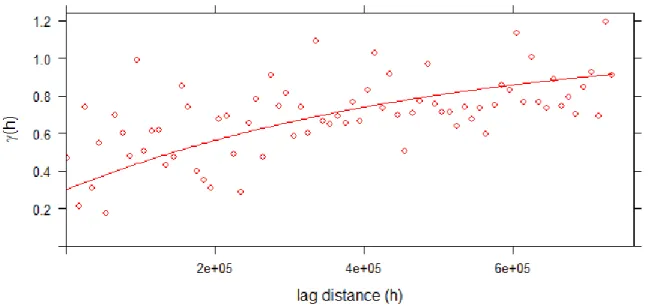
Figure 2-1 Sample variogram
2.5 The theory of kriging
Ordinary kriging, also known as Weiner-Kolmogorov prediction, is a commonly used method for interpolation of spatial data. Interpolation is a process where a range of values is approximated from a sample of data points. A spatial interpolation method exploits spatial patterns in the sample to “fill in the gaps” in some field, or geographic region in the 2D case. In geostatistical models, sampled data is interpreted as the result of a random process 𝑍(𝒔). The fact that these models incorporate uncertainty in their framework does not mean that the phenomenon – the forest, the farmland or mine etc. – has resulted from a random process, but rather it allows the researcher to build a methodological basis for the spatial inference of quantities in unobserved locations, and to quantify the uncertainty associated with the estimator. (Chiles and Delfiner 1999)
The unknown value 𝑍(𝒔0) which to estimate is interpreted as a random variable located at 𝒔0 and the weighted average of values in neighboring locations 𝑍(𝒔𝑖), 𝑖 = 1, … , 𝑁. Intuitively, we posit that observations closer to the interpolated point should have higher weights than more remote observations. Unlike a simpler method like inverse-distance weighting which calculates weights only based on distances, ordinary kriging also accounts for variances between points. In practice, the sample variogram method is used, described below:
The variogram is defined as the variance of the difference between field values at two locations 𝑖 and 𝑗. Given a sample of observations 𝑍(𝑠𝑖) = 𝑧𝑖 for 𝑖 = 1, … , 𝑘 at locations 𝑠 = (𝑥, 𝑦) in 2D space with coordinates 𝑥 and 𝑦, the sample variogram is given by:
(2.17)
where 𝑁(ℎ) is the set of all pairwise Euclidian distances 𝑖 − 𝑗 = ℎ and |𝑁(ℎ)| is the number of distinct pairs in 𝑁(ℎ).
𝛾(ℎ) = { 0, 𝑖𝑓|ℎ| = 0 𝑎 + (𝜎2− 𝑎) (1 − 𝑒𝑥𝑝 (−3|ℎ| 𝑟 )) , 𝑖𝑓|ℎ| > 0 𝐶(ℎ) = { 𝑎 + (𝜎2− 𝑎), 𝑖𝑓|ℎ| = 0 (𝜎2− 𝑎)𝑒𝑥𝑝 (−3|ℎ| 𝑟 ) , 𝑖𝑓|ℎ| > 0
Figure 2.1 shows the plot of a sample variogram. It is characterized by some key features:
Continuity: Most environmental variables are continuous and therefore we should expect γ(h)
to pass through the origin at h = 0. In practice, however, the variogram often appears to approach the y-axis at some positive value as h approaches zero which suggests that the process is discontinuous. This discrepancy is known as the nugget variance (see the intercept 0,3 in Figure 2.1). For properties that vary continuously the nugget variance usually includes some measurement error, but mostly comprises variation that occurs over distances less than the shortest sampling interval.
Monotonic increase. Figure 2.1 shows that the variance increases with increasing lag distance.
This indicates that at short distances the values of the 𝑍(𝒔) are similar, but as the lag distance increases they become increasingly dissimilar on average. The monotonic increasing slope indicates that the process is spatially dependent. (Chiles and Delfiner 1999)
Once we calculate an experimental variogram, we can fit it using some of the authorized variogram models, such as linear, spherical, exponential or gaussian (Isaaks and Srivastava 1989; Goovaerts 1997). The variograms are commonly fitted by iterative reweighted least squares estimation, where the weights are determined based on the number of point pairs or based on the distance.
Bins. When plotting a sample variogram, the researcher needs to decide on the size of
increments in the distance h. In figure 2.1 the maximum distance is 800 kilometers, reflecting the largest distance between two data points (e.g. stations) in the sample. This distance can be split into a number n of incremental chunks, or bins, of length 800 𝑛⁄ kilometers. A larger number of relatively small bins means a larger number of points on the variogram because there is a larger number of distances between pairs for which variances can be estimated. This makes it easier to fit a model such as the exponential to the sample variogram because its shape is more visible. However, such a variogram with many bins is less statistically robust because with more bins of smaller distance increments their will be fewer location pairs for each distance. The researcher should select the number of bins so as to achieve an approximate variogram model, while maintaining a minimum number of pairs in each bin. A rule of thumb is at least 30 pairs per bin. (Chiles and Delfiner 1999)
To compute kriging estimates, we will need the covariances among all points and between each of the observed points and the point to be predicted. The usual way to obtain these is through a covariance function, such as the commonly used exponential covariance function. The exponential variogram has the form:
(2.18)
where: a = nugget effect, r = range, and 𝜎2 = sill or variance where there is no correlation present, i.e. the maximum of γ(h) in Figure 2.1. The corresponding exponential covariance function has the form:
(2.19)
𝑍̂0 = ∑ 𝑤𝑖𝑍𝑖 𝑁 𝑖=1 𝑫 = [ 𝐶10 ⋮ 𝐶𝑁0 ] 𝜎𝐸2 = 𝐸 {(𝑍0(𝒔) − 𝑍̂(𝒔))0 2 } = 𝐶00+ 𝒘𝑇𝑪𝒘 − 2𝒘𝑇𝑫 ℒ = 𝐶00+ 𝒘𝑇𝑪𝒘 − 2𝒘𝑇𝑫 + 2𝜆(𝒘𝑇𝟏 − 1) (2.20) where ∑𝑁𝑖=1𝑤𝑖 = 1. Using the covariance function, let
(2.21)
Using this, the mean squared error expression can be written
(2.22) Equation 2.22 is minimized under the constraint that 𝒘𝑇𝟏 = 1 using the Lagrange optimization method. Introducing the Lagrange multiplier −2𝜆 and minimizing
(2.23) we eventually get the solution for the kriging weights 𝒘 = 𝑪−1[𝑫 − 𝜆𝟏]. Similarly, the minimized Ordinary kriging variance is 𝜎𝑖2 = 𝐶00− 𝒘𝐶0𝑖+ 𝜆. It shows that the kriging variance increases with lower weighted covariances 𝒘𝐶0𝑖 between sampled points and the point to interpolate 𝒔0. (Chiles and Delfiner 1999) The kriging variance shows the uncertainty associated with the interpolated temperature estimates, but also indicates in relative terms whether an interpolated location is near or far away from sampled locations. This is a useful property for my purposes because theory shows that geographic basis risk in WI insurance is higher when distances between weather stations are larger (Dalhaus 2018). This means that I can use the kriging variance as a proxy for geographic basis risk. My approach introduces a few improvements to Woodard and Garcia (2008): First it has potential for much higher resolution. Woodard and Garcia extrapolate temperature measurements at one location in each of nine crop reporting districts in Illinois. Meanwhile, kriging can be performed on a high-resolution grid where limits are only set by computing power. Even with very modest computing resources, I can estimate temperatures at 62,833 five square kilometer areas. Second, my method offers a straight-forward way to create geographic basis risk-adjusted WI contracts using the kriging variance. Finally, my method is easy to automate and the same approach can quite simply be applied to other states or even countries using the same framework.
3 Data
“There are three kinds of lies: Lies, damn lies, and statistics”
- (popularized by) Twain, M.
For the empirical part of this thesis I use exclusively publicly available data from three sources. Temperature data from Illinois weather stations is obtained from the ‘Daily Summaries’ dataset provided by the National Oceanic and Atmospheric Administration (NOAA) of the United States. Data on annual corn yields were obtained from annual surveys provided by National Agricultural Statistics Service (NASS) in the US Department of Agriculture. Finally, the geographic boundary shapefile of Illinois, the coordinate reference system, and projection datum were downloaded from the US Census Bureau. All data manipulation, statistical estimation, simulations and plots were made using the R language within RStudio. Code and data are available upon request to promote replication.
3.1 Temperature data
Daily temperature data where obtained from the NOAA ‘Daily Summaries’ dataset which includes daily measurements of minimum, maximum and average temperatures over 24-hour cycles measured at ground level at weather stations. The temperature is supplied in degrees Fahrenheit and was not converted to Celsius. Daily summaries were downloaded from May 1st through September 31st based on estimates for the growing season of corn in Illinois (USDA 2010). Since I am interested in estimating the impact of extreme heat, I am not interested in nighttime temperatures and only maximum temperature over the 24-hour cycle was chosen. Following Annan and Schlenker (2015) I consider extreme heat to be degree days over 29 degrees Celsius or 84 degrees Fahrenheit. However, to more easily reference previous work on temperature interpolation (Holdaway 1996; Nguyen et al. 2015; Cronqvist 2018) I do not transform degrees Fahrenheit to degree days until after kriging interpolation has been performed.
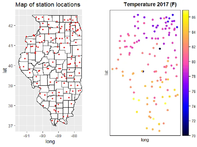
Temperatures over the growing season for all stations where then averaged by station to get mean temperatures over the growing season for each station. This was done for four years; 2017, 2016, 2012, and 2011. Two sets of sequential years (2016, 2017) and (2011, 2012) were chosen to perform two insurance simulations. The first is based on 2017 data where expected payout is calculated from previous year’s payout (2016) and similarly again with 2012 and 2011. The 2017 data included measurements from 135 weather stations, 2016; 136, 2012; 152, and 158 for 2011. Each station has a unique name and so the merge-function in R was used to perform an inner join by station name such that the data for all the different years consist of the same stations.
This resulted in 126 common stations. Each station 𝑖 for 𝑖 ∈ 1, … ,126 is associated with a mean degree day value per year 𝑡, a latitude and a longitude. The coordinates were used to transform the data table into a data frame of spatial points. In Figure 3.1 all stations are displayed on a map of Illinois. The stations were relatively evenly distributed geographically. Effective kriging interpolation requires that pairs of stations can be found for a wide range of different distances between the pair. A relatively dense sample of observations ensures that a reasonably realistic sample variogram can be fitted.
The temperature data largely followed a normal distribution (see Appendix 2) and ranged between about 70 degrees and 90 degrees Fahrenheit. The hottest season was in 2012 with an average temperature of 84 degrees F across the five months. The coolest was 2017 with an average temperature of 80,7 degrees F. 2012 was the third hottest summer on record in Illinois (NOAA 2019) since records began in 1873 (the first were 1955 and 1995) which made it an interesting robustness check to see how our insurance contract performs under relatively extreme heat conditions.
Exploratory analysis of the temperature data reveals some apparent outliers. Consider the plot 3.1 (b) of observed temperatures at the 126 stations for the growing season 2017. Two stations (USC00118186 at latitude 39,84, longitude -89,63 and USC00116910 at latitude 40,88, longitude -88,63) have much lower temperature values than neighbouring stations, both at 70 degrees while the immediate surrounding area uniformly shows temperatures above 80 degrees. Similar observations were made for only one station in the 2016 data set. 2017 outliers are shown in red circles on figure 3.1. No outliers were spotted in the 2011 and 2012 data. Recall from chapter 2.4 that variogram modelling relies on the assumption that covariances are higher between neighbouring sites than between distant sites. Outlier values at a particular site therefore skew the estimates for all neighbouring sites by fitting an incorrect variogram model to the pairwise variances. I solved this issue by replacing the three outliers with averages of observed values at the two nearest stations. Another option would have been to simply remove the outliers, but a priority was set to preserve sample size when possible.
I also referenced historical local weather reports to ensure that outliers were not the result of some extreme localized event (Illinois State Water survey 2017; 2016). In any case it is unrealistic to expect average temperatures across a five-month period to differ more than 10 degrees within a 10 km radius. I therefore feel justified in my approach. A digital elevation model (DEV) was not used for temperature prediction. The average elevation of Illinois is 180 meters above sea level and is very flat, with first and third quartiles only differing by 40 meters. (NOAA 2017) Previous research suggests that elevation does not strongly correlate with temperature at those altitudes (Cronqvist 2018).
3.2 Corn yield data
Data on corn yields were downloaded from the USDA NASS ad-hoc Quick Stats online search tool, providing users with free access to .csv-files of annual surveys conducted by NASS. The Agricultural Yield survey provides farmer reported survey data of expected crop yields used to forecast and estimate crop production levels throughout the growing season. Farm operators provide data for small grain crops, row crops (including corn), tobacco, and hay being produced on the operation. Hay stocks data are also collected. Acreage planted, acreage for harvest, and expected yield per acre are collected from each operator for the crop of interest the first month. In following months, the same sample of operators are contacted to update expected yield per acre data. Updating reported information from the same sample of operators each month provides a measure of change resulting from growing conditions. Sample sizes range from 5,500 in June to 27,000 in August. (USDA 2018) A more comprehensive survey called the agricultural census with larger sample sizes are conducted every five years.
However, exploratory analysis of the census, comparing census with survey data, reveals that the annual version is acceptable. NASS survey data has been used in multiple previous studies, including Goodwin and Hungerford (2014), Annan and Schlenker (2015) and others. It is however important to note that survey data is always subject to errors. Most importantly, samples of survey respondents may not be representative of the population of farmers.
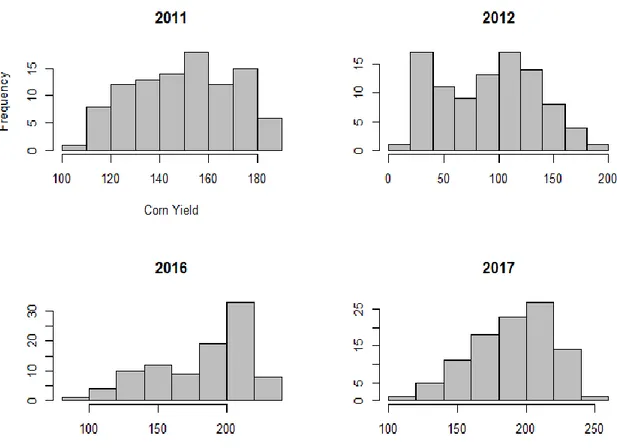
Figure 3-2 Histograms of corn yields
Yield data are supplied on a per county level, and includes 99 out of 102 counties in 2011, 95/102 in 2012, 96/102 in 2016 and 100 out of 102 in 2017. Data sets were merged by county name to ensure the same sample for all years. Exploratory analysis of the yield data reveals that their distributions differ between years. For example, in 2017 yields ranged between 120 and 250 bushels per acre (bu/ac) or 4,000 square meters, with a mean of 190,6 bu/ac. One bushel of corn grains is approximately 25,4 kilograms. In 2012, yields ranged between 14 bu/ac and 180 bu/ha, with a mean of 91,4. Corn is the most intensely farmed crop in Illinois, followed by soybeans, and is grown across the entire state. Because of the importance of corn as a staple in US agriculture, its dependency on weather and other variables has been studied before. In a comprehensive study of 2,000 US counties for 54 years between 1950 and 2004, Schlenker and Roberts (2006) show that corn yield follows a nonlinear trend with regards to temperatures. Between 10 and 25 degrees Celsius, corn yield and temperature are positively correlated. However, beyond 25 degrees, the relationship reverts to a negative contribution from temperatures on yield. Beyond 30 degrees, the effect is very significant and just one day of 38 degrees (100 degrees F) will lower annual yields by 5% on average. Such temperatures and beyond were measured in 1200 instances across 152 weather stations in Illinois in 2012, the warmest year in our data set. Figure 3.2 also shows that yields were on average considerably lower that year.
3.3 Geographic boundary data
The geographic boundary shapefile of Illinois was downloaded from the US Census Bureau, which could be read into RStudio using the readOGR-function which is used to load spatial objects. The state of Illinois boundaries was then used as a template to create a grid of 5 square kilometer (5000m x 5000m) pixels that cover the entire area of Illinois. This resulted in 62,833 pixels to interpolate over. When choosing a pixel size, one has to make a trade-off between high resolution and reasonable computing speed. Because the kriging algorithm works sequentially across the whole grid, more pixels lead to lower computing speed and kriging may become prohibitively expensive when the size or resolution of the grid are too high (Park et al. 2018).
Knowledge of the data to interpolate can help guide decisions about the resolution. We know that surface temperature is generally not subject to very local variation but in Illinois mainly a latitude trend with increasing temperatures in the north-south direction. (Wallace and Hobbs 2006, p. 391) Large urban areas may be warmer on average than less populated areas due to human activity such as modification of land surfaces and radiative forcing due to air pollution. This so-called urban heat island effect is generally more noticeable for nighttime temperatures than daytime temperatures. (ibid. p. 411) The main urban center of Illinois (Chicago) is much larger than 5 square kilometers. I therefore conclude the choice of 5km x 5km pixels for the purposes of kriging interpolation is appropriate.
3.1.1 Projection and coordinate system
When mapping sufficiently small areas, it is acceptable to approximate the Earth as flat. For small-scale maps, those that encompass a large area, we must consider the Earth’s shape. The assumption that the Earth is round or spherical does not accurately represent it. The Earth’s constant spinning causes it to bulge slightly along the equator, ruining its perfect spherical shape. Creating a 2D map from a 3D shape is impossible without introducing some error. Figure 3.3 shows three types of projections (planar, conic, and cylindrical) and how they pan out on a 2D map. Planar projection is appropriate only for mapping of the poles. Conic projections are very accurate along a given latitude, or circumference around the globe, where the cone ‘touches’ the Earth. This is good for mapping the mid latitudes. Cylindrical projections wrap a cylinder around the globe and are particularly accurate around the equator.For my purposes mapping a relatively small area (Illinois extends 338 km in the East-West direction and 628 km in the North-South direction) I am not overly concerned about choice of projection so long as the same one is used uniformly across our spatial datasets. Because Illinois extends further in latitude than in longitude, I chose the transverse Mercator projection, which caters well to that attribute.
The North American Datum of 1983 (NAD83) was applied as the coordinate reference system (CRS) for the Illinois grid. A geodedic datum is a coordinate system and a set of reference points, used to locate places on the Earth. Because the Earth deviates significantly from a perfect ellipsoid, the ellipsoid that best approximates its shape varies region by region across the world. Therefore, most regions of the world used ellipsoids measured locally to best suit the vagaries of Earth's shape in their respective locations. While ensuring the most accuracy locally, this practice makes integrating and disseminating information across regions difficult. However, for the purposes of mapping Illinois, using NAD83 is straight-forward and obvious. Latitude and longitude were converted from degrees to meters using the SPTransform-function in R’s sp-package. Using meters instead of degrees makes the variograms much easier to interpret because I can see how covariances between points vary by distance in terms of meters and kilometers.
Tit = α + β1Lati+ β2Loni+ β3lake
4 Method
“See first, think later, then test. But always see first. Otherwise you will only see what you were expecting. Most scientists forget that.”
- Adams, D.
Because the purpose of this thesis is to explore whether Illinois corn farmers benefit from an insurance contract which accounts for geographic basis risk, I need a reliable estimate of such risk. As described in better detail in chapter 2.4 geographic basis risk is defined here as the error in estimates of correlation between temperatures and crop yields that arises because temperature data is estimated at a weather station some distance away from the farm. The weather index constructed from data measured at that station is therefore only an approximation of local temperatures at the farm. Theory posits that this error becomes larger as distances between farms and stations grow larger, because the correlation between temperatures at two locations becomes weaker the greater the distance between the locations. As described in chapter 2.5, kriging interpolation estimates unknown temperatures across the whole study area from measured temperatures at a sample of locations. How heavily temperatures at a particular sampled location is weighted in estimating an unknown location depends on the distance between the two. Before kriging can be performed, a variogram model must be selected to fit the sample variogram. I will fit three different models; exponential, spherical, and gaussian. A model will be selected based on leave-one-out cross-validation, where the lowest mean error will be selected for kriging.
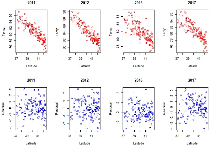
The variogram function in R plots an omnidirectional variogram, which means that distances in all directions in 2D space are treated the same. To perform kriging, the intrinsic hypothesis must be satisfied (Journel and Huigbregts 1978). The intrinsic hypothesis requires that the mean and the variance depend strictly on the separation distance between samples and not on the coordinate position of the data. When the intrinsic hypothesis is not satisfied it is because the data has some trend which must be removed before the data can be adequately interpolated with kriging (Vieira et al. 2010). I suspect that there may be directional trends in latitude or longitude. For example, there may be a trend towards lower temperatures as one moves latitudinally from south to north. In such a case the mean and variance are not independent of the coordinate position because the northernmost pixels will be overestimated, i.e. predicted to be warmer than the real temperature. We have learned from Cronqvist (2018) that altitude trends are not discernable in areas as flat as Illinois. Holdaway (1996) also shows a so-called lake trend, where summer temperatures are cooler in the immediate vicinity of a large lake or ocean. The north-eastern corner of Illinois borders Lake Michigan, which may impact three shoreline stations in our sample. Lake Michigan is the only large body of water in Illinois. Tests for trends can be performed via a simple linear regression. I run the following regression model: (4.1) where the Tit is the temperature at station i at year t and the explanatory variables are latitude, longitude, and a lake dummy. The lake dummy takes the value 1 for the three weather stations bordering Lake Michigan, and zero otherwise. Regression coefficients for latitude range from 1,17 to 1,57 for the four years in our sample, while coefficients for longitude range from -0,15 to -0,39. Moving 10 kilometers west in the east-west direction was associated with on average 0,01 degrees cooling. The dummy coefficient ranges between -0,9 and -2,2 which means that summer max temperatures are on average ca 1,5 degrees F cooler immediately by Lake Michigan.
𝑇𝑟𝑒𝑠(𝑥, 𝑦) = 𝑇(𝑥, 𝑦) − 𝑇̂(𝑥, 𝑦)
With latitude and longitude expressed in meters, moving 10 kilometers in a north direction was associated with 0,04 degrees cooling on average. However, only the latitude trend is statistically significant for all four years. The R2-statistic is 0,73 which means that the model explains geographic temperature variation rather well.
In my temperature data sample, I generate a new variable containing the residuals, or error terms, from the regressions following Vieira et al. (2010). Because the effect sizes of the trends are captured in the regression coefficients β, the residuals are independent of the explanatory variables. As described in detail in this literature on linear detrending of spatial data, the detrended variables are constructed as follows (Vieira 2000; Vieira et al. 2010):
(4.2) where 𝑇(𝑥, 𝑦) is the actual observed temperature at stations located at coordinates x and y, while 𝑇̂(𝑥, 𝑦) is the estimated temperatures in from the regression model. I choose to only account for the latitude (north-south) trend as it was the only one showing significance for all years. As seen in figure 4.1 there is a clear correlation between temperature and latitude. However, in our detrended variable the correlation is successfully removed. Therefore, I will fit a version of the variograms to the residual variables where the trend is removed.
As figure 4.1 shows, the residuals are decoupled from the latitude, and have a mean centred around zero. I create sample variograms both for the original temperature variables and the detrended variables. I then fit three different types of models to our sample variograms. Following Cronqvist (2018) and Vieira (2010) I fit an exponential model, a spherical model and a gaussian model. The exponential model increases more sharply close to zero distance, and then continues to strictly increase but flattens out until it reaches its sill at a distance where there is no longer any covariance between locations. The spherical model is similar in shape but reaches its sill earlier than the exponential function. This model also actually reaches the sill, while the exponential model merely approaches it. Hence, the exponential model is appropriate in cases where two locations of data are never completely decoupled, even when the distance between them is very large. The spherical model is more appropriate when you assume the covariance between the two to eventually reach zero. The gaussian model, in contrast, initially has a negligible slope at low distances which later increases, and then tapers off again approaching the sill. (Christakos 1992; Cronqvist 2018)
I fit the variogram models using the fit.variogram- and vgm-functions from the gstat-package in R. These functions automatically select nugget variance, range and sill to fit the model as close as possible with the data. It also selects the bin size to ensure that each bin contains at least 30 station pairs. I do this for all three model types, and both observed temperatures and detrended temperature residuals. Variogram plots are presented in Appendix 2. To decide on model selection we will perform leave-one-out cross-validation on how kriging would perform with the different models. Leave-one-out cross-validation works by separating the sample into a single observation as the validation set and the remaining observations as the training set. Since kriging predicts unknown temperatures at a set of locations based on observed temperatures at sampled locations, the accuracy of the kriging model can be measured by removing one observed location and compare the estimated value at that location with the observed value. This can be done for every observation in the sample. Put simply, this is what leave-one-out cross-validation is doing. (James et al. 2015, p. 192) I want to select the model for which the mean square error between estimated and observed values is the lowest, a measure of model accuracy.
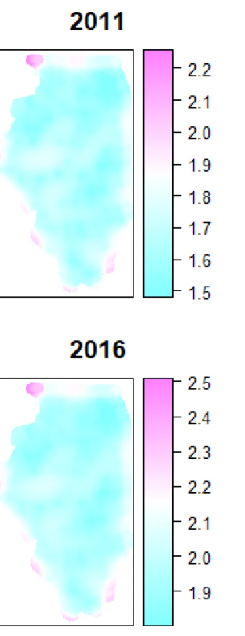
Table 4-1 Leave-one-out cross-validation for model selection
Model Year MSE Detrended MSE
Exponential 2011 1.265 1.285 Exponential 2012 1.097 1.853 Exponential 2016 2.078 2.827 Exponential 2017 1.975 3.356 Spherical 2011 1.261 6.547 Spherical 2012 1.099 1.831 Spherical 2016 2.077 2.764 Spherical 2017 1.974 3.889 Gaussian 2011 1.241 1.250 Gaussian 2012 1.164 5.522 Gaussian 2016 2.219 4.161 Gaussian 2017 2.169 3.925
As shown in figure 4.2, the best performing model for the original temperature variable is a spherical model. The same conclusion is reached in Cronqvist (2018) for temperature kriging in Sweden. That I replicate their results in another country with a different data sample suggests that I have successfully captured a physical relationship. For the detrended variable, the exponential model is a better fit. To explore whether the results of our economic analysis remain robust for both the original and detrended data, I will estimate a set of WI insurance contracts for both.
Using the two selected models from cross-validation, I perform kriging as described in chapter 2.4. The result is interpolated temperature fields at 62,833 locations with size five square kilometers for each of the four growing seasons. Each temperature field is associated with its respective kriging variance.
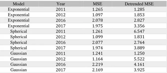
Figure 4-2 Interpolated maximum temperatures (degrees F) over the growing season using ordinary kriging. Spherical model with original temperature values.
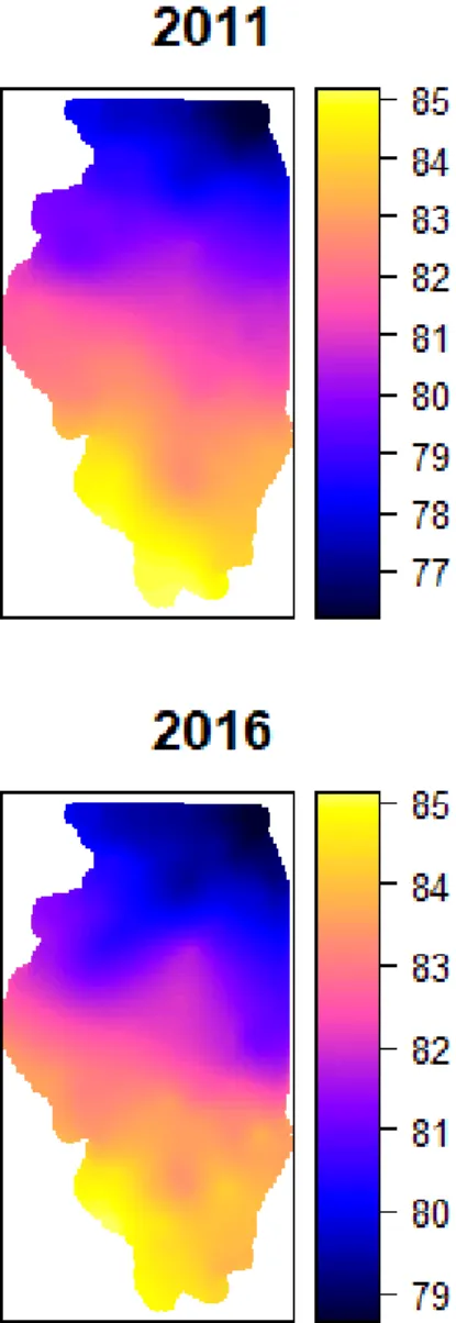
Figure 4.2 shows that northern Illinois is cooler than the southern part of the state, and it also shows once again that the growing season of 2012 is the hottest out of the four. The kriging variance heat maps in figure 4.3 are somewhat difficult to interpret, but a comparison with the map of station locations in figure 3.1 reveals that variances are higher in areas where the density of stations is lower. Consider for example the whiter area in the mid-latitudes, towards the western part of the state: Kriging variance is somewhat higher here compared to the surrounding areas in blue. This corresponds to an area in figure 3.1 approximately at (-90.5, 40) where there is a lack of stations. As discussed in chapter 2.5, kriging variance is higher when distances to stations are higher.
Next, I convert our interpolated temperature values into degree days over 84 degrees F (or 29 degrees Celsius). Here, we follow Annan and Schlenker (2015) and Schlenker and Roberts (2006) where 84 degrees is the temperature where negative impacts on corn are noticeable.
𝛽̂(𝜏) = argmin 𝛽∈ℝ (𝜏 ∗ ∑ |𝑦𝑖 − 𝑥𝑖𝑇𝛽| + (1 − 𝜏) ∗ ∑ |𝑦𝑖 − 𝑥𝑖𝑇𝛽| 𝑦𝑖<𝑥𝑖𝑇𝛽 𝑦𝑖≥𝑥𝑖𝑇𝛽 )
The degree day index will take the value 0 whenever temperature at a particular location and year is below 84 degrees. Temperature fields were converted into degree days using the following function:
DD_converter <- function(TMAX){ DD <- pmax((TMAX - 84), 0)
return(DD) }
where the function pmax simply returns the larger of two values; temperature in Fahrenheit minus 84, or 0. Next, I want to estimate the effect of heat on crop yields to determine the WI insurance strike level. Following Conradt et al. (2015) and Dalhaus (2018) a quantile linear regression (QR) model is used. QR, which can be regarded as an extension of the basic OLS (Koenker and Bassett 1978). It defers the focus away from the conditional mean to the conditional median or any other quantile of interest. The conditional QR model leads to the following minimization problem:
(4.3)
QR minimizes the sum of absolute residuals, which are asymmetrically weighted. The weighting factor depends on the sign of the residuals: positive residuals receive a weighting factor of τ, negative residuals are weighted by (1- τ). There are two important differences between the OLS and QR estimator. First, the OLS estimator relies on squared deviations whereas the QR estimator uses absolute value of deviations. Second, QR specifies a weighting factor τ, while OLS gives equal weights. With respect to the second property, for QR it is possible to characterize the entire conditional yield distribution and to specify any predetermined position, since in the QR framework β is a function of τ, β(τ) with τ ∈ (0,1). This is an advantage with regard to insurance solutions since the differential impact of x (here the weather index WI) on y may be analyzed and τ may be set in such a way to be consistent with the research interest.
For insurance solutions, the interest lies in the tails and QR is more efficient in representing the tail dependency than a mean-based estimator such as OLS. (Conradt et al. 2015) QR is also less sensitive to non-normal distributions and outliers which makes it easier to use than OLS. Following Condradt et al. (2015) and Dalhaus (2018) I select τ = 0.3 for the insurance contracts which means that I look at the effect size of degree days on yields at the third decile of the yield distribution. Figure 4.4 shows QR plots for the four years, with the log of corn yield as the dependent variable and degree days as the explanatory variable. τ is plotted along the x-axis and so 4.4 shows how the effect size of heat on corn yields vary along the yield distribution. With the exception of 2011, the damage from heat is worse towards the left tail of the yield distribution, implying that areas where corn yields are low hurt more from an increase in temperature. Coefficients at τ = 0.3 range from -0.1 to -0.35 which means that one additional degree over 84° F in average temperature over the growing season is associate with a 10-30% decrease in end-of-year corn yields. The effect size of heat on corn yields are largest in 2012 which is also the hottest year in the data set.
𝑤𝑖𝑡 = 𝑦𝑖𝑡+ 𝛿𝑖𝑡− 𝜑𝑖𝑡
I then proceed to calculate the outcomes of the WI insurance contracts following the theoretical framework developed in chapter 2.3. I begin by running quantile regressions for the third decile following Conradt et al. and Dalhaus. I will calculate insurance outcomes both for contracts based on a regular temperature index and a degree day (over 84 degrees) index. The strike level is then calculated by plugging in the Illinois-wide average yield into the inverse linear regression function 𝑆 = 𝑔−1(𝑦̅) so that the strike level S equal the degree days for which the expected yield is the average yield. The WI insurance payout is determined by the following function:
(4.4) where T is the ticksize, or regression coefficient. The intuition is that the marginal impact on yield per degree hotter temperature times the number of degrees above the strike level equals the expected yield loss. If the index is lower than the strike level, payout is zero.
Recall from chapter 2.2 and 2.3 that the risk neutral insurer sets the premium equal to expected payouts. For simplicity expected payout is assumed to be equal to last year’s payout. Therefore, the premium in 2017 is set as equal to the calculated payout based on the 2016 data, and the premium in 2012 is equal to the 2011 payout. Following Dalhaus (2018) I calculate terminal wealth as follows:
(4.5) where y is the realized corn yield, δ is the WI insurance payout and φ is the insurance premium. Figure 4-4 Quantile Regression output: yield~temperature, yield deciles on x-axis
𝑦𝑖𝑒𝑙𝑑 = 𝛽0+ 𝛽1𝑊𝐼 + 𝛽2𝜎𝑂𝐾2
The geographic basis risk adjusted contract is contract is constructed in a very similar way to the regular contract. However, the inverse function 𝑔−1 from which to solve the strike level now has two variables; the average yield and the kriging variance. The regression now has the following form:
(4.6)
Including the kriging variance means that the strike level will better contain the information on how much the weather index itself contributes to corn yields.
For the utility calculations, I choose an isoelastic utility function which exhibits CRRA and DARA. Such a utility function, introduced formally in chapter 2.1, has empirical justification in the literature (Dalhaus 2018). I calculate utilities for each of 62,833 hypothetical farms, each of a size of five square kilometers. Utilities were calculated for different degrees of risk aversion, where the Arrow-Pratt measurement of risk aversion (α in chapter 2.1) increases from 0 to 1.0 in increments of 0.2. I do this to see how the expected utility of our WI insurance contracts changes with changes in risk aversion. I test the hypothesis that the terminal wealth of a farmers purchasing the basis risk adjusted contract are on average better off than those purchasing the regular contract.