Navigation User Interface design
in e-commerce and its impact
on customers' satisfaction
A mixed-methods study analysing the impact of different menu styles
and user interface elements
Main Subject area: Informatics
Author: Christia Spiratos & Michaela Kořistová Supervisor: Ida Serneberg
This final thesis has been carried out at the School of Engineering at Jönköping University within Informatics. The authors are responsible for the presented opinions, conclusions and results.
Examiner: Bruce Ferwerda Supervisor: Ida Serneberg Scope: 15 hp (first-cycle education) Date: 2021-05-25
Abstract
This research paper investigates the impact of user interface design, particularly the navigation, on customers’ satisfaction when interacting with e-commerce websites. The main focus of our study was examining different navigation menu styles such as a mega menu, a horizontal menu and a hamburger menu. Navigational user interface elements such as a local navigation menu, breadcrumb trails, pagination, tags, linked logo and icons, were also analysed with relation to their ability to help users find desired products on a website.
The data was gathered by using a mixed-method research, where we carried out a survey, together with observations and semi-structured interviews. During the observations, participants were interacting with three different high fidelity prototypes of a beauty e-commerce website. They were given a task to navigate the website from the landing page, search for a specific make-up product (an eyeliner from L'Oréal) and add it to a shopping card. The semi-structured interview followed each part of the observation and participants were able to reflect on their experience. Our target group consisted of young adults, between the age of 18 and 25 years old. Our key findings showed that different navigation menu styles could affect websites' trust, quality, understandability, usability, hierarchy, efficiency and approachability. The data analysis uncovered a strong correlation between the mega menu and an improvement of users’
satisfaction with the e-commerce website. The inclusion of the hamburger menu had a negative effect on users’ satisfaction, while the horizontal menu ranked in the middle, suggesting no significant impact on enhancing the navigation experience of users. Out of all six navigational user interface elements, the local navigation was considered to be the most helpful element when searching for products on the beauty e-commerce website. It was followed by icons and
pagination, which were both rated to be beneficial elements of navigation in e-commerce websites.
We conclude that the utilisation of different navigation menu styles can have various effects on customers’ satisfaction when interacting with e-commerce websites. Moreover, the importance of different navigational user interface elements with relation to their ability to help users find desired products can vary. The novel conclusions can be drawn when conducting the research on a larger sample size and different age group. Our suggestion for future research includes
investigating other user interface elements, such as input controls and information components. A comparison study of different types of the horizontal menu could bring a deeper understanding of our results and conclusions.
Keywords
Navigation User interface design, e-commerce, e-satisfaction, mega menu, horizontal menu, hamburger menu
Table of contents
1. Introduction 1
1.1 Problem Statement 1
1.2 Purpose and Research Questions 3
1.3 Scope and Limitations 3
1.4 Disposition 4
2. Method and implementation 5
2.1 Suitable research method 5
2.2 Research approach 6
2.3.1 Implementation of observations and interviews 6
2.3.2 Implementation of surveys 8
2.4 Prototypes 11
2.5 Data collection 13
2.6.1 Qualitative data analysis 13
2.6.2 Quantitative data analysis 14
2.6.3 Methodological triangulation 15 2.7.1 Generalisability 15 2.7.2 Research validity 16 2.7.3 Research reliability 17 2.8 Considerations 18 3. Theoretical framework 19 3.1 E-commerce 19 3.2 Navigation efficiency 19
3.3 Information Systems (IS) Success Model 20
3.4 Determinants of e-Satisfaction 21
3.5 Online store attributes 22
3.6 Navigation design 23
3.7.4 Tag clouds 25
3.7.5 Linked logo 26
3.7.6 Icon 26
4. Results 27
4.1 Survey 27
4.1.2 Navigation menu styles 28
4.1.3 Analysis and comparison of navigation menu styles 29
4.1.4 Navigational user interface elements 30
4.1.5 Analysis and comparison of navigational user interface elements 32
4.2 Observations and semi-structured interviews 33
4.2.1 Transcription of extracted data into codes 34
4.2.2 Categorisation of codes 38
4.2.3 Methodological triangulation 41
5. Discussion 43
5.1 Result discussion 43
5.2 Method discussion 45
6. Conclusions and further research 46
6.1 Conclusions 46
6.1.1 Practical implications 46
6.1.2 Scientific implications 46
6.2 Further research 47
1. Introduction
In this chapter we offer a clear description regarding the background of our study and the problem area that our study is addressing. The purpose of our thesis and the research questions are presented here as well, along with the delimitations of our study and the disposition of our thesis.
1.1 Problem Statement
Due to the massive growth of the e-commerce market during the past decade (Shahriari & Mohammadreza, 2015), e-commerce websites have become the most important tool for businesses that want to sell their products online. User interface design (UI), along with user experience design (UX), are some of the most important factors which determine the success of e-commerce websites. In order for e-commerce websites to succeed in this highly competitive market, they need to provide the customers with a positive user experience (Bonastre & Granollers, 2014).
However, Bonastre & Granollers (2014) explain that UX is not implemented properly in e-commerce websites – 18 different studies made by Baymard Institute have pointed out that the average shopping cart abandonment rate reaches 67%. Therefore, enhancing the user experience design is necessary in B2C (business-to-consumer) websites in order to maximise the chance of customers staying on the website and purchasing products. As Egger (2001) says, customers must feel that they have significantly more to gain than to lose when doing online transactions. Loses can lead to frustration, dissemination of personal information, deception and wasted time and money.
It has been proven that in the context of e-commerce, different navigation designs can have an influence on the customer’s behavioural intentions and attitudes (Broeder & Gkogka, 2020). Broeder’s and Gkogka’s (2020) study was made on two sample groups that differed from a cultural standpoint; the first group was composed of Dutch people and the second group was composed of Greek people. The participants had to judge the online search page of a hotel booking website. The conclusion that the study reached is that dynamic navigation design is more preferred by users than static navigation design, especially in the case of Dutch people.
group. The categorisation of menu styles can be also made in a different manner apart from the one presented by Broeder & Gkogka (2020), who split navigation menu styles into dynamic and static. Menu types such as the hamburger menu, the mega menu or the standard horizontal menu can be further investigated in the context of e-commerce websites in order to discover which one contributes the most to customers' satisfaction when navigating through a website.
Navigation is one of the four most important factors that affect website effectiveness, along with time, graphic usage and interactivity (Udo and Marquis, 2002). Web navigation shows the location within a website, provides access to information and ultimately affects the website’s credibility (Kalbach, 2007). Pilgrim (2012) provided a solid base for researching specific website navigation tools. His research shows that there has been an increase in implementing a search field in commercial websites. Since the search field represents a significant part of navigation user interface design, we find it relevant for our study to investigate the importance of other navigational elements such as a local navigation menu, breadcrumb trails, pagination, tags, linked logo and icons. Considering all of these arguments which imply the importance that navigation has within a website, we have chosen to focus our study on investigating navigational elements in a greater depth, in order to find out how they affect users’ satisfaction.
There have been efforts to explain e-satisfaction by several researchers but the existing literature still contains gaps when it comes to providing a clear definition of e-satisfaction. Anderson and Srinvasan (2003) define e-satisfaction as “the contentment of the customer with respect to his or her prior purchasing experience with a given electronic commerce firm”. According to
McKinney et al. (2002), “Satisfaction is the consequence of the customer’s experiences during various purchasing stages: (a) need arousal, (b) information search, (c) alternatives evaluation, (d) purchase decision, and (e) post-purchase behavior.” Our study aims to further examine the second stage such as the information search. Customers can deal with either passive or active information search. The active information search is portrayed by visiting more than one e-commerce in order to make a comparison (of prices or products). Customers are actively seeking information and the purpose of their visit has been clearly defined. The passive information search does not include a specific intention for visiting e-commerce (Rossanty et al., 2018). The study by Gao et al. (2007) examined different navigation menu designs in relation to the overall ability of users to complete tasks. Participants between the ages of 44 and 75 years old were given different tasks to perform on an e-commerce website with different navigation menu designs such as an index menu, a tab menu (horizontal menu), a vertical cascading menu and a horizontal cascading menu. After conducting an experiment, they concluded that the tab menu and the vertical cascading menu help older users diminish disorientations when navigating through a website. The study proves that different navigation menus styles can have various impacts on users and play a crucial role in user interface design. Different menu designs can be examined further in relation to customers' satisfaction when interacting with them, and novel
conclusions can be drawn when conducting the research on a different age group. Furthermore, they suggest that more specific design features should be tested in future studies.
1.2 Purpose and Research Questions
The purpose of this study is to investigate how user interface design, specifically the navigation, of beauty e-commerce websites can affect the satisfaction of customers with e-commerce. We focus on observing and investigating how users interact with different navigation menu styles while navigating e-commerce websites, as well as how the specific navigation menu styles influence their overall satisfaction with the e-commerce website. Moreover, we aim to identify navigational elements of user interface design which customers find to be the most crucial and helpful when looking for desired products online. The main focus is to analyse the human-computer interaction and the relationship between the user interface and customers’ satisfaction when navigating through a website.
The research questions are: RQ1:
What can be the impact of different navigation menu styles used in beauty e-commerce on customers' satisfaction?
RQ2:
What are the main navigational user interface elements that help users find desired products on beauty e-commerce websites?
1.3 Scope and Limitations
In order to achieve the most accurate results within our resources, we limit our research to desktop user interface only. This way we can cover a wider range of menu styles, as well as functions like hover that are not available for mobile screens. Bigger size of the screen allows more possibilities and structure for navigational elements, since the relatively small screen size of a smartphone limits the amount of information that can be displayed on the screen (Lugtig & Toepoel, 2016). During the research we used highly fidelity interactive prototypes in order to
satisfaction when they interact with different navigation menu styles of e-commerce and make impulse decisions like adding products to a shopping cart and abandoning the website.
The target group of this research is clearly defined as young adults between the ages of 18 and 25 years old who have experience with making online purchases. This specific age group engages with the Internet on a daily basis and does most of their shopping online. They expect
e-commerce websites to deliver high quality, functionality and trustworthiness in order for them to obtain e-satisfaction and e-loyalty (Ayuni, 2019). We will not consider any other target groups for this research.
The thesis strictly focuses on human-computer interaction and does not take account of other possible factors such as educational background, cultural differences and social status.
1.4 Disposition
The “Introduction” presents a reader with the background information and the problem statement of this study, along with the research questions that this study aims to answer. The following chapter “Method and implementation” focuses on the explanation of the methods used in our research and provides a detailed description of how the data was collected and analysed.
“Theoretical framework” states important theories that we based our study on. The next chapter “Results” illustrates our key empirical findings. “Discussion” informs the reader about how the results relate to the previous studies and connects the results with our research questions. The final chapter “Conclusions and further research” provides conclusions, it also covers the relevance of our study and makes suggestions for further research.
2. Method and implementation
In this chapter we describe the methods that were used for our study, together with the research approach. Screenshots of different prototypes that were used in our mixed-method research are also included. We discuss the data collection and the data analysis. Lastly, we focus on defining the generalisability, the research validity and reliability and the considerations of this study.
2.1 Suitable research method
In order to achieve the most accurate results we decided to conduct a mixed-methods research. Therefore we used both qualitative and quantitative methods for our study, in the form of observations, semi-structured interviews and surveys. Observation is an ethnographic research method which allows researchers to study people in their natural environment with intent to understand their point of view (Baker, 2006). We had to take into account that this qualitative data collection method has been criticised for not being objective enough. As claimed by Caldwell and Atwal (2005), observers tend to be constrained by their own cultural and social backgrounds. Our aim was to target these issues straight from the beginning and define the right type of observation method for our study.
Our objective was to observe young adults, between the age of 18 and 25, while they navigate through a beauty e-commerce website. The participants were given clear instructions prior to the start of the observation. We emphasised their free choice to leave the website whenever they wanted. The established task was to navigate the e-commerce website (starting from the home page) in order to find a specific make-up product (an eyeliner from L'Oréal) and add it to cart. For our study we developed three highly interactive prototypes with different navigation menu styles, following the list of recommendations of a successful navigation design, which are specified in the Navigation efficiency theory by Gehrke and Turban (1999). The main focus was on the navigation user interface design. We chose not to use already existing websites, because we did not want the participants to be affected by brand attachment. Any kind of brand-self linkage could involve complex feelings about the brand, such as sadness and anxiety or
happiness and comfort. This sort of emotional brand connection could have a negative effect on the credibility of our research (Park et al., 2010).
Each observation consisted of three parts. The first part included observing the participants while they interacted with a prototype of a beauty e-commerce website containing the mega menu. It
participants navigated through a website containing a hamburger menu and were interviewed afterwards. The subjects were also asked to list the advantages and disadvantages of each of the three menu styles, as well as compare the different menu styles and explain which one they preferred the most. The reason why we chose to specifically conduct semi-structured interviews was because this method allowed us to also ask the participants questions that were not included in our standard set of questions. Since the experience of every participant was unique, our questions also had to adapt to each specific situation.
Along with observations and semi-structured interviews, we have also conducted surveys (created and distributed through the use of Google Forms). Surveys represented a very efficient method of collecting more structured data from our respondents, since the surveys exclusively contained close-ended questions. We used the survey in order to obtain data that can be
generalised to a larger population, this is why we decided to use a bigger number of respondents for the survey (66 respondents) in comparison to the observations (10 participants).
2.2 Research approach
We used an inductive approach in order to investigate the two research questions addressed in our thesis. The inductive analysis consists in studying documents and interpreting raw data with the purpose of developing theories, deriving concepts and identifying themes (Thomas, 2006). Strauss and Corbin (1998) describe inductive analysis in the following way: “The researcher begins with an area of study and allows the theory to emerge from the data”. This approach allowed us to generate meaning and identify patterns after gathering data from the observations and the surveys.
2.3.1 Implementation of observations and interviews
The role of the researcher is an important factor when performing an observation (Mulhall, 2003). Our intention was to undertake an intermittent observation. Therefore, we adopted the position of the observer as a participant in an informal observation. During the observation we did not want to interfere, neither interact with the participants. However, when each part of the observation was over, we followed up with interviewing and reflecting on participants' behaviour and decisions that were made. A semi-structured interview provided us with a better clarification of findings from observations.
The order in which we conducted the observations and semi-structured interviews was the following: we began by presenting to the participant the prototype which employed the mega menu, we gave the participant the task and then allowed them time to complete it at their own pace. After the task was finished, we continued by asking them questions related to their task and
their experience with using the mega menu. This process was repeated for the remaining two menu styles: the horizontal menu and the mega menu. The order of the questions asked during the semi-structured interviews remained the same for all participants and all menu styles, with the specification that during some parts we followed up with additional questions if further clarification was needed.
The questions that we used as a starting point for the interviews can be seen in Figure 1.1. Since we decided to conduct semi-structured interviews, we have also asked additional questions in addition to the pre-established set of questions, adapting to the experience and answers of each participant.
Regarding the place where the observations and interviews were conducted, we opted for a university and a café with a rather low amount of traffic. The environment should feel natural with a relaxed atmosphere, otherwise the results could be jeopardised. It is essential to recognise any noticeable changes of behaviour in the participants.
According to Mulhall (2003), “It is important to record field notes as closely as possible in time to when events were observed”. To get the most accurate notes, we decided to record the desktop screen of the participants while they navigated through different prototypes of beauty
e-commerce websites. We confronted any ethical issues by informing the participants about the screen recording taking place. We find this method to be the most effective one, because the actual filming of participants would interfere with our aim to attain a natural environment. Moreover, written notes were taken while observing the participants' behaviour and the human-computer interaction. To record participants' answers during the semi-structured interviews, we used a sound recorder app on our mobile phones.
We had to take into consideration that qualitative research often produces large amounts of textual data (Pope et al., 2000). These can be time-consuming to analyse and interpret, however, when done correctly, they can provide researchers with deeply analytical results. We settled on conducting 10 observations of people from our target group.
2.3.2 Implementation of surveys
Together with observations and interviews, we used surveys in the form of questionnaires with close-ended questions. Since respondents were given a lot of freedom and spontaneity with their choices and actions during the qualitative research, we wanted to use this part of our study in order to perform quantitative research and see how they respond to a more structured approach. Our aim was to find out a group of people with particular characteristics or similar behavioural patterns and to enquire generalised data. Conducting a quantitative survey is an ideal research method for reaching larger samples of audience with less resources. Furthermore, it is less labor intensive to collect and analyse data. On the other hand, close-ended questions can provide us with less accurate data (Nardi, 2018). We also had to consider the possible risk of a low return rate.
Our approach consisted in presenting to the users questions with limited answer alternatives, revolving around the topic of customers' satisfaction in relation to beauty e-commerce websites. In order to avoid the bias that may come from suggesting response alternatives to the users (Reja, Manfreda, Hlebec & Vehovar, 2003), we have structured our survey questions and answers by also keeping in mind the information that we have already gathered about the users’ behaviour and choices during the observation stage.
Our survey consisted of well-structured questions which were split into two main sub-topics: the influence that the different menu styles have on the satisfaction of customers with e-commerce and the specific user interface elements that help customers find the desired products on the website. The survey questions were also accompanied by various images of navigational user interface elements used in e-commerce, as well as screenshots of the high fidelity prototypes we used during the observation. Each menu style and navigational element was thoroughly
investigated with a set of questions using a Likert scale, where respondents could show their agreement or disagreement with the statement (Figure 2.1). At the end of the survey, we included two questions where our respondents could choose which navigational user interface elements they find to be the most important and which ones to be the least important. The findings from these questions are included in Figure 5.2 and Figure 5.3.
Figure 2.1 An example survey section investigating the single navigational UI element. The collected data was from the same target group, however for the survey we aimed to reach a higher number of respondents. Fogelman and Comber (2002) suggest that the minimum
acceptable sample size of any survey conducted on a small scale is 30. To get more accurate findings, we decided to draw a larger number of samples such as 50-70. When deciding on the size of our sample, we had to take into account the confidence interval and the level of
confidence. The confidence interval can be described as a range of values, obtained from sample observations, in which the estimate can contain a degree of uncertainty. The level of confidence of 95% is commonly used in research and it can be explained as a 5% chance that the actual percentage will not lie between the confidence interval that we selected (Hazra, 2017). After using an online calculator (Creative Research Systems, 2012), we established the confidence interval to be 10%.
2.4 Prototypes
During our observation we used three high fidelity interactive prototypes of beauty e-commerce websites. Gehrke's and Turban's (1999) Navigation efficiency theory, where they suggested a list of things that should be considered when designing a website's navigation, helped us create the user-friendly designs. These prototypes were created in Adobe XD and the width of the page was set to 1920 px. The main difference between the prototypes was the incorporated navigation user interface design. Prototype 1 (Figure 2.2) used a mega menu, Prototype 2 (Figure 2.3) a
horizontal menu and Prototype 3 (Figure 2.4) a hamburger menu. The specific product (an eyeliner from L'Oréal) that our participants were asked to find during the observations is shown in Figure 2.4. For the creation of these prototypes we drew inspiration from existing beauty e-commerce websites. We also included the screenshots of our developed navigation menu styles in the survey, together with other navigational user interface elements that were investigated in our study.
Figure 2.3 Prototype 2 - Horizontal menu.
2.5 Data collection
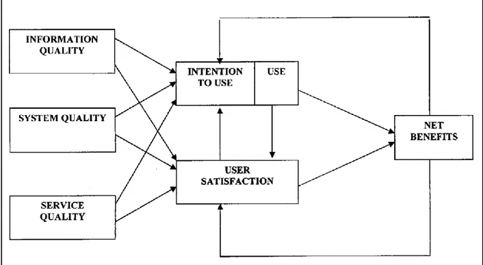
To collect data from participants, we produced interview and survey questions which were carefully constructed with the guidance of the IS Success Model developed by DeLone and McLean (2014). This model can be used as a guideline for measuring success of e-commerce by describing major elements of quality in information systems such as information quality, systems quality, service quality, usage, user satisfaction and net benefits. Moreover, we adapted a theory by Alawneh et al. (2013), which defines five determinants of e-Satisfaction. These determinants were specified as security and privacy, trust, accessibility, quality of public services and
awareness of public services. Since security and privacy were not relevant determinants when it comes to navigation, we decided not to consider them in our research. Instead, we used the remaining four determinants. Both of these models served us as measurements of participants’ satisfaction when interacting with different navigation menu styles and navigational user interface elements.
2.6.1 Qualitative data analysis
In order to analyse the qualitative data that we collected from observations and semi-structured interviews we used conventional content analysis, since this method is usually used with a study design whose purpose is to describe a phenomenon, and the existing theory or research literature about the specific phenomenon is limited (Hsieh & Shannon, 2005). In our case, the
phenomenon is represented by the satisfaction of users in relation to three different menu styles used in e-commerce websites. Since information about this topic is limited, we followed the advice of Kondracki & Wellman (2002) and avoided using preconceived categories – instead we allowed the categories to naturally flow from the data.
An advantage of the conventional approach to content analysis is the fact that direct information from the participants is gained without imposing preconceived theoretical perspectives or categories. We began the data analysis by transcribing the audio recordings from the interviews, in order to have easier access to the data. We then read the data multiple times, so that we could achieve a better sense of the whole (Tesch, 1990). In order to derive codes from the text, we focused on identifying the key words, thoughts and concepts and then highlighted them (Miles & Huberman, 1994; Morgan, 1993; Morse & Field, 1995).
Codes were then sorted into categories depending on how they related and linked. Categories are themes or patterns which are derived from analysis or directly expressed in the text, and they are used in order to organise and group the codes into meaningful clusters/subcategories (Coffey & Atkinson, 1996; Patton, 2002). Identified categories served us as a tool to measure the impact of different navigation menu styles on users' satisfaction with e-commerce websites.
2.6.2 Quantitative data analysis
We used descriptive statistics to summarise our data with the purpose of describing what occurred in the sample. Our goal was to detect any type of patterns, relationships and
connections. Descriptive statistics are often used to discover sample characteristics that may influence researchers’ conclusions (Thompson, 2009). It involves collecting and summarising vast amounts of data in an organised manner (Kaushik and Mathur, 2014). The data can be easily translated into simple quantitative measures such as percentages or visual summaries presented by histograms and box plots (Kaliyadan and Kulkarni, 2019). Descriptive analysis can serve as a good base for more complex statistical analysis.
To analyse our data obtained from the survey, we first carried out a frequency distribution. In the beginning of our survey we asked respondents to specify their demographics. It helped us
categorise the results according to distribution of categorical variables such as gender, age and nationality. The frequency of occurring groups of respondents was analysed and our findings were presented by using a frequency table.
The majority of our survey questions were using a Likert scale, a common ratings format where respondents rank quality from high to low or least to most, by using a five-level scale. Ordinal variables are appropriately analysed with nonparametric procedures based on the rank, median or range. We therefore settled for using distribution free methods which can include tabulations, frequencies, contingency tables and chi-squared statistics (Allen and Seaman, 2007).
Our survey also contained two questions aiming to collect data in a form of quantitative
variables, also called numeric, scaled or metric variables. When describing quantitative data it is crucial to mention two statistics such as measure of location and measure of spread. The most commonly used measure of location is called mean. It presents the arithmetic average. Mean is often used for comparisons, however it can be sensitive to extreme values. Median refers to the middle-most value in a set of ranked data. It is preferably used when there are extreme values taking place in the data. Range is considered to be the simplest measure of spread. It describes the difference between the minimum and the maximum (Nick, 2007). To present the distribution
of quantitative variables, we displayed the obtained data by using a histogram, which shows the frequency of certain values of a variable.
2.6.3 Methodological triangulation
Methodological triangulation uses more than one type of a method to study a phenomenon. In our study we used both a qualitative and a quantitative method. We refer to this technique as an across-method (Bekhet and Zauszniewski, 2012). According to Thurmond (2001), “Both
qualitative and quantitative studies are designed to understand and explain behaviour and events, their components, antecedents, corollaries, and consequences.” Methodological triangulation has many benefits. It can help us to come up with more comprehensive and authentic data.
Furthermore, it allows us to bring more validity to our conclusions and to provide a thorough explanation of the research problem (Casey and Murphy, 2009). We had to take into
consideration that methodological triangulation can cause difficulties in combining the numerical and narrative data in order to understand the studied phenomenon (Thurmond, 2001). The final step of our data analysis was to compare the findings acquired from both methods used in our study. We distinguished three main types of triangulation such as convergence, complementarity and divergence (Nightingale, 2020) and drew similarities and differences from our data.
2.7.1 Generalisability
Generalisability measures how efficiently the results of a study can be applied to a broader group of people or situations (Onwuegbuzie, 2010). Gibson (2017) came to the conclusion that the combination of qualitative and quantitative research within a study can lead to an increase in generalisability across contexts and cases. Since we used both qualitative and quantitative research methods in our study, in the form of observations, semi-structured interviews and a survey, we believe that the final results of our research can be generalised to a higher number of people who belong to our target group (young people aged between 18 and 25 years old). The generalisability of our study can also be confirmed by the fact that we respected the minimum number of participants suggested for small-scale surveys and interviews. In total, we had a number of 76 participants: 10 participants for the observations and semi-structured interviews and 66 respondents for the survey. On the other hand, a factor which might affect the
generalisability of our study in a negative way is the gender imbalance of our participants. The majority of the study’s participants were women: 66.7% of our survey participants were women,
2.7.2 Research validity
Blumberg et al. (2005) define validity as the extent to which an instrument measures what it is intended to measure. Validity represents the degree to which the results of a study are truthful and it establishes whether the results meet all the requirements of the research method (Pallant 2011). In the case of qualitative research, validity is a matter of dependability, trustworthiness and utility, as well as an extent at which the requirements of the chosen scientific method have been followed during the research process (Zohrabi, 2013). On the other hand, in quantitative research, validity represents the extent to which a measuring instrument measures what it is intended to measure (Thatcher, 2010).
According to Baker (2006), personal reactivity in the context of observations occurs when subjects behave differently because of the observer’s personal characteristics or behaviour. Procedural reactivity happens when the subjects are aware of the fact that they are being studied or observed and as a consequence begin behaving in a more unnatural way. In order to prevent personal and procedural reactivity, we have decided to screen record the process of the
participants completing their tasks and take notes while maintaining a distance, instead of actively taking notes next to the participants and studying their actions and choices in a way that might feel intrusive for them.
In order to assure the validity of the semi-structured interviews, we have pre-tested our standard set of questions with potential interviewees, by asking them if the formulation of the questions is clear enough, if they find the questions to be relevant and if they have any suggestions. The list of questions contained only open-ended questions, so that we could allow the participants to have as much freedom as possible in elaborating their answers. In addition to the standard set of questions that we used for every participant, we followed-up our interviews with pertinent personalised questions by taking into account each subject’s journey and experience when navigating the prototypes. This allowed us to gain a deeper knowledge of the thought process and judgement making of each participant.
The tone and demeanour that was used when interacting with the subjects was objective and non-judgemental. The duration of the observations and semi-structured interviews was approximately 6 minutes for each participant, therefore the chances of the participant becoming tired or losing their focus while performing the tasks or answering the questions was very low. We also do not consider that the order in which participants were asked the questions during the semi-structured interviews affected the results of the study in any way, since we used stand-alone questions which did not depend on one another.
In order to make sure that the questions that we included in our survey were relevant for our study, we used a theory made by Alawneh et al. (2013), which defines five e-satisfaction
determinants: security and privacy, trust, accessibility, quality of public services and awareness of public services. We used four of these determinants (trust, accessibility, quality of public services and awareness of public services) in order to measure the satisfaction level of e-beauty commerce users as efficiently as possible. We also used a theory written by DeLone & McLean (2014), which acts as a guideline for measuring success in information systems, including e-commerce. The major elements of quality that DeLone & McLean describe are: information quality, systems quality, service quality, usage, user satisfaction and net benefits.
2.7.3 Research reliability
As mentioned by Chakrabartty (2013), reliability is a concept used to measure the precision, consistency and trustworthiness of a research, indicating the extent to which the research is error free (without bias), therefore ensuring stable and consistent results. In qualitative research, reliability is determined by the consistency of the researcher’s approach (Twycross and Shields, 2004), as well as the researcher’s capacity to prevent their subjectivity from affecting the results of the study (Wilson, 2010).
During the observations that we conducted, we made sure not to interfere or interact with the participants in order to not compromise or affect the integrity of the results. For consistency reasons, all the observations and semi-structured interviews were conducted in the exact same manner. The observations were held in places with low amounts of traffic and with a relaxed atmosphere, so that the participants could concentrate exclusively on their tasks. All the participants of the study received the same task and then they were given space to perform the specific tasks without being interrupted or disturbed in any way by the observer. The questions for the semi-structured interviews were asked by the same interviewer every time and the conversations with the participants were audio recorded in order to have access to the participants’ responses at any time.
Twycross and Shields (2004) affirm that in quantitative research, the results of a research are considered reliable if consistent results have been obtained in identical situations but different circumstances. In order to assure the stability and consistency of our survey results, we have created a well-structured survey by using clearly formulated close-ended questions and
accessible words. This way, we prevented the risk of each question being interpreted differently by the participants. The images that accompany some of the survey questions were chosen to be easily understandable and to leave no place for confusion or misinterpretation to the participants
2.8 Considerations
We selected the participants for our study according to our specific target group, which is comprised of young people between the ages of 18 and 25 who are familiar with e-commerce shopping. Our participants consisted of people from our circle of friends, as well as people whom we have never met before. We used the convenience sampling method since it allowed us to get participants in an easy, quick and cost effective way. The convenience method consists in taking samples from a group of people who are easy to reach or to contact (Etikan, Musa & Alkassim, 2016). We chose to contact our friends, since they perfectly fit the targeted age group of our study. Another advantage of choosing our friends as participants was the fact that they had a more relaxed attitude during the observations and interviews, and that they felt comfortable answering our questions in an honest way. Most of the people in our friends circle are university students and therefore the collected results may not represent the whole population.
The manner in which we managed to get in touch with people from outside our group of friends was by sharing announcements about our study on Facebook group chats. This way, we found university students from different countries around the world (17 countries in total) which were willing to help us with our research. In terms of gender distribution, the majority of our
participants were women: 66.7% of our survey participants were women, respectively 80% in the case of observations and semi-structured interviews. The imbalance between the female to male ratio is a factor that might affect the generalisation of our results in the long term.
In what concerns the ethical implications of our study, we made sure to take the confidentiality of our participants very seriously and we assured them from the beginning that their personal information will be kept private. All the participants gave their consent for taking part in our research and they were informed that they are free to withdraw if they felt uncomfortable anytime during the research. It is also important to mention that none of the answers from our participants were judged in a subjective way; their answers served purely for research purposes and they haven’t been disclosed to anyone except us, the researchers.
3. Theoretical framework
This chapter presents the theories that were implemented in our research. The following paragraphs provide a definition of the IS Success Model, together with Determinants of e-satisfaction, which were both relevant and crucial to our study. Additionally, we describe different navigation menu styles along with different navigational user interface elements.
3.1 E-commerce
According to Niranjanamurthy et al. (2013),” Electronic commerce, or e-commerce refers to economic activity that occurs online. E-commerce includes all types of business activity, such as retail shopping, banking, investing and rentals.”
Different types of e-commerce has been defined by Nemat (2011) as follows: ● Business-to-business (B2B) ● Business-to-consumer (B2C) ● Business-to-employee (B2E) ● Business-to-government (B2G) ● Business-to-manager (B2M) ● Consumer-to-business (C2B) ● Consumer-to-consumer (C2C) ● Government-to-business (G2B) ● government-to-citizen (G2C) ● Government-to-employee (G2E) ● Government-to-government (G2G) ● Peer-to-peer (P2P)
In our thesis we focus entirely on business-to-consumer (B2C) e-commerce, which describes activities between the business and consumer, more specifically a purchase of goods or services.
3.2 Navigation efficiency
Gehrke and Turban (1999) describes navigation efficiency as an important part of an effective website. Their study specifies recommendations for improving the navigation experience of users. The following are their suggestions:
● Use distinctive hot buttons
● Use long pages with links rather than subsequent pages ● Use site maps/guides if the site has many underlying pages ● Avoid links that open up new browsers or pop-up ads
If the website’s navigation is not user-friendly, users can easily get confused and frustrated, which can eventually lead to users leaving the website. Therefore, when creating the navigation design, designers and web developers should follow the list of Gehrke’s and Turban’s (1999) suggestions.
3.3 Information Systems (IS) Success Model
Developed by The Delone and McLean in 2004 and updated in 2014, IS Success Model (DeLone and McLean, 2014) serves as a guideline for measuring success in information systems. In their research Delone and McLean described three major elements of quality as:
● information quality - referring to completeness, ease of understanding, personalisation, relevance, security
● systems quality - referring to adaptability, availability, reliability, response time, usability
● service quality - referring to assurance, empathy, responsiveness
The adaptation of IS Success Model to e-commerce meant enhancing the major three elements with other relevant elements such as:
● usage - referring to nature of use, navigation patterns, number of site visits, number of transactions executed
● user satisfaction - referring to repeat purchases, repeat visits, user surveys
● net benefits - referring to cost savings, expanded markets, incremental additional sales, reduced search costs, time savings
This led to creating the ultimate list of e-commerce success metrics (Figure 3.1). The above elements that are relevant to our study can be implemented and serve as an indicator of measuring customers' satisfaction.
Figure 3.1 Information Systems (IS) Success Model (DeLone and McLean, 2014).
3.4 Determinants of e-Satisfaction
Satisfaction relates to the quality of service and it consists of both behavioural and mental dimensions. Users are influenced by their experience and by attitudes they have developed prior to interacting with the service. Dissatisfaction might arise when there is a technological issue, a design problem or a service problem (Alawneh et al., 2013).
In order to measure the e-satisfaction, Alawneh et al. (2013) defined five e-Satisfaction determinants:
● Security and privacy ● Trust
● Accessibility
● Quality of public services ● Awareness of public services
reliable security and privacy should include resilience to attacks, data authentication, access control, client privacy (Weber, 2010).
Successful e-commerce websites should affirm customers’ trust and lower their risk perception through technology and marketing. The appearance, the functionality and the service quality are all a result of the technical design which is crucial in relation to trust (Corbitt et al., 2003). According to Gefen (2000), “Trust encourages long-term orientation, increases the acceptance of independence and creates commitment.”
Accessibility and approachability can be enhanced by a good page layout that is user friendly, and an accessible website that can accommodate business transactions (Cox and Dale, 2001). Accessibility is the ability of customers to use, perceive, understand, navigate and interact with the e-commerce website (Alawneh et al., 2013).
Quality of public services is the customer’s perception of the difference between the expected service quality and the perceived service. Quality that takes place in e-commerce is defined as users’ overall evaluation of e-service offerings in the virtual marketplace. Positive factors in an online environment such as reliability, responsiveness, access, ease of use, attentiveness, credibility, flexibility, convenience, efficiency and enjoyment can increase the quality of public services. On the other hand, security concerns, risk of obsolescence, impersonalisation and lack of control can contribute to users developing a negative perception of e-services (Santos, 2003). Awareness of public services helps users adopt and use e-services. Awareness is the ability to perceive, feel or be conscious of events, objects or sensory patterns. Consumer awareness relates to a consumer’s knowledge of a product or a company. It can be enhanced by providing product or e-service information to users, informing them about safety issues and their rights (Najafi, 2012).
3.5 Online store attributes
Studies who have analysed the online shopping service attributes (Jarvenpaa and Todd, 1997; Lohse and Spiller, 1998; Szmanski and Hise, 2000; Liu and Arnett, 2000) have classified these attributes into into four categories :
● Merchandise
● Customer service and promotions ● Navigation and convenience ● Security
Merchandising refers to product-related characteristics such as variety, assortment and product information (Jarvenpaa and Todd, 1997). The probability of the consumer’s needs to be fulfilled can be increased by a rich product assortment. Bakos (1997) argues that the primary role of an online store is to offer product information and price-related information in order to help the consumer reduce their search costs. Big online stores are not as effective as small stores at obtaining sales out of site traffic, because users have more difficulty finding the products that they are searching for (Lohse & Spiller, 1998). Extensive product information such as product testimonials, price comparisons or product demonstrations can be offered by online shopping stores in order to facilitate the decision making process of customers (Park & Kim, 2003). Customer service and promotion represents the second attribute category of online stores. According to Lohse & Spiller (1998), customers want continuous, careful and useful
communication. Customer service includes answers to frequently asked questions, information about payment policies, help with product selection, contact information for sales representatives and gift services. Promotions include practices or strategies that attract customers, some
examples being lottery games, frequent buyer schemes or product-related tips (Park & Kim, 2003).
The third attribute is represented by navigation and convenience, which, for an online store, is related to the user interface (Szymanski & Hise, 2000). Since the experiences of customers interacting with a product or service are influenced by the user interface of an online store (Griffith, 2001), a user interface system that is properly designed can reduce the users’ cost of searching and the time consumed. Consumers find online shopping a pleasurable and satisfying experience when the retailer sites are fast, easy to navigate and uncluttered. These types of websites allow users to economise shopping time by not performing extra steps in order to understand how to effectively shop online (Szymanski & Hise, 2000).
Finally, the security of online transactions is another important attribute of electronic commerce. Customers feel reserved when it comes to disclosing their private information to online shopping sites, even when websites offer private protection policies regarding the personal information of clients or guarantee transaction security. In most cases, websites omit to also offer detailed information on how they secure transaction and personal data (Elliot & Fowell, 2000).
navigation systems to make it easy for users to navigate the website in any conditions (Garrett, 2011).
3.6.1 Global navigation
Global navigation provides access to the most important sections of the website. It is quite common that global navigation appears on every page of the site and users are then able to get from one end of the site to the other in a short period of time (Garrett, 2011).
Hamburger menu
The hamburger menu is a type of navigation which is “hidden”, meaning that the user must click the hamburger icon in order for the content of the menu to be revealed on the page. The main characteristics of the hamburger menu are the fact that it occupies a limited amount of space and that it can scale a big number of items (Pernice & Budiu, 2016). We chose to study the
hamburger menu because it differs from the other menu styles by using an icon. This icon consists of three horizontal lines that are usually placed in the top corner of a website. We refer to it as a hamburger button (also known as the collapsed menu icon). During our research we aimed to study the different impact this menu style can have on users when navigating through a website.
Mega menu
The mega menu is a drop-down menu with multi-level expansions which has the ability to contain the website’s entire navigation into a single menu. A mega menu allows users to reach the deepest sections of a website by using exclusively the main menu (Kalbach, 2007). In our thesis we wanted to investigate whether this combination of global and local navigation accommodated in a single navigation menu style could have a positive or a negative impact on customers' satisfaction.
Horizontal menu
The horizontal navigation consists of a list of links at the top of each page. The horizontal
navigation menu can be situated above, below, to the right or to the left of the header or the logo, but it is always placed before the main content of the page. This type of menu can support up to two levels of navigation: primary and secondary. The primary level navigation is always
exposed, while the secondary level navigation can be either visible or hidden within dropdown menus (Kalbach, 2007). The reason why we chose to investigate this specific type of menu is because of its simple yet effective design, which allows users to quickly navigate throughout a website and find the desired piece of content.
3.7 Navigational user interface elements
In this chapter we describe the different navigational user interface elements that we found relevant to our study, and therefore we decided to investigate their ability to help users find desired products on beauty e-commerce websites.
3.7.1 Local navigation
Local navigation gives users access to those sections of the website that are nearby. If we considered a strictly hierarchical structure, local navigation would accommodate linking to a page’s parent, siblings, and children (Garrett, 2011).
3.7.2 Paging navigation
Paging navigation (pagination) is often found on search results pages which show details about the page numbers in the results set. Results sets often have limits on the amount of items that can be displayed at once, therefore, after this limit is reached, a second section of results is displayed on a new page (Kalbach, 2007).
3.7.3 Breadcrumb trail
The breadcrumb trail is a navigational mechanism that shows a person’s path while navigating a site. Breadcrumbs consist of elements, also called nodes, that are chained together. The nodes are connected to previously visited pages and they are separated with a symbol, usually a greater-than sign (>), colon (:), or pipe (|) (Kalbach, 2007).
3.7.4 Tag clouds
Tag clouds are logical arrangements of keywords within a textual context, which visually describe the subject of a website, blog or any other text. Tags represent the most popular topics and they are highlighted using bold, larger fonts or easily visible colours. Tag clouds help users
3.7.5 Linked logo
The logos of websites are usually found at the top of each page. It is a common practice to link the logo to the home page. This practice is used because linking the logo provides a predictable way of returning to a familiar starting point. It can be seen as an “undo” option within the navigation process (Kalbach, 2007).
3.7.6 Icon
Icon is a word originating from Greek “eikon”, which can be translated as an “image”. Icon design is a crucial part of user interface design. We refer to icons as simplified images that are used as graphical symbols indicating concepts. The icon’s goal is to help users navigate and get information more quickly and effectively. Icons are often hyperlinked and clicking on them can reach different behavioural results such as opening a file or an option (Yan, 2011).
4. Results
In this chapter we present, analyse and structure the empirical findings that were obtained from the survey, observations and semi-structured interviews. We provide a comparison between the qualitative and the quantitative method by using the methodological triangulation, which concludes this chapter.
4.1 Survey
The collected empirical findings were divided into two main sections, such as navigation menu styles and user interface navigational elements, following the structure of our survey. Each of the sections was followed by analysis of collected results and data comparison. Figures 4.1 and 4.1 were used to display the demographics of our respondents by using a frequency table.
Gender Frequency Percentage
Male 44 66.7%
Female 22 33.3%
Total 66 100%
Figure 4.1 Frequency distribution according to the gender of the respondents.
Age Frequency Percentage
18 4 6.1% 19 13 19.7% 20 6 9.1% 21 7 10.6% 22 8 12.1% 23 11 16.7% 24 7 10.6%
4.1.2 Navigation menu styles
In our survey we asked respondents to rank their agreement (on a scale from 1 - strongly disagree to 5 - strongly agree) with statements focusing on the different determinants affecting the quality of navigation and respondents overall satisfaction with the particular menu style. We formulated the statements in order to obtain detailed data about the ability of each menu style to provide a clear navigational experience, the ease of finding a specific product, the ease of understanding how the menu functions, the ability of the menu to improve the website's quality, as well as the impact of the menu on the website's trustworthiness. Through these questions, we investigated the impact of each menu style on customer's satisfaction with the e-commerce website. All navigation menu styles were presented by using a screenshot from the wireframes used during the observations.
Mega menu
The mega menu showed positive results in providing a clear navigational experience. More than 55% of the respondents rated the mega menu with the highest point of 5, and over 30%
respectively ranked with a 4, when asked about the navigational experience and the easiness of finding the desired product. According to collected data, all respondents were strongly confident or confident that it is easy to understand how the mega menu functions. The distribution of answers was more equal when asked about the impact of the mega menu on the quality of a website. 40.9% of respondents agreed with this statement, 36.4% agreed strongly, and 19.7% provided a neutral answer with no regard to a direct connection between the mega menu and the website's quality. Almost half of the respondents (45.5%) agreed that the mega menu positively affects their trust in the website. However, a third of the respondents ranked the mega menu with a 3 - nor agree or disagree with the statement. The most commonly used answer was 5, which indicates a positive effect of the mega menu on users' satisfaction.
Hamburger menu
According to our respondents, the hamburger menu provides a relatively clear navigational experience and it is easy to understand how it functions. 40.9% of the respondents rated the overall navigational experience of the hamburger menu a 5, while 33.3% of them rated it a 4. A significant percentage of the respondents (34.8%) agreed that it is easy to understand how the menu functions, while an even bigger percentage of subjects strongly agreed with this statement (43.9%). On the other hand, the downside of the hamburger menu is the fact that difficulties might arise when it comes to using this specific menu style in order to find a desired products page or category. Although 42.4% of the respondents were satisfied with the menu’s ability to help them navigate through the website, 34.8% of the respondents were either neutral or not satisfied in this regard. When it comes to deciding whether the hamburger menu improves the quality of a website or increases the customers’ trust, the majority of the answers indicated a slightly above the average satisfaction level. The respondents' most occurring answer was 4,
which shows the hamburger menu has the ability to improve user's satisfaction with navigating through the website, however not to that degree as the mega menu.
Horizontal menu
The respondents ranked the horizontal menu high on the satisfaction scale when it came to analysing its simplicity, its functionality and its overall efficient navigational experience. The majority of the respondents (51.5%) strongly agreed that it is very easy to understand how to use the horizontal menu, while 36.4% of the respondents simply agreed with this statement. The subjects also stated that this menu allowed them to efficiently find a specific page or category within a website, 37.9% of the respondents ranked this ability a 5, while 36.4% ranked it a 4. Even though the respondents were mostly pleased with the simplicity of the horizontal menu, they did not consider that it has the potential to significantly improve the quality of a website or increase their trust in a website. The mode or the most commonly used answer was number 5. Although the results did not show a notable difference between the numbers 4 and 5, which puts the horizontal menu slightly above the hamburger menu when analysing the users' satisfaction.
4.1.3 Analysis and comparison of navigation menu styles
percentage of respondents' answers (1 to 5) when asked about the three different navigation menu styles. We were able to use the 1 to 5 answers as a tool of comparison, because the values always carried the same meaning for each of the statements. Moreover, all statements about the menus that we included in the survey were constructed to have a positive meaning or a positive quality. Respondents used number 1 on the Likert scale to express a strong disagreement and number 5 to express a strong agreement with the statement. Therefore, we can perceive number 1 as a strongly negative response and number 5 as a strongly positive response to the particular menu. The questions were carefully constructed to detect the respondents’ satisfaction with each of the menus.
The mega menu was the most preferred menu style by our respondents. Almost 85% of them showed a strong agreement or an agreement with the statements, proving that the mega menu has the biggest impact on improving the users' satisfaction with an e-commerce website. With a lower percentage of respondents’ agreement with the survey statements, the horizontal menu ranked the second. The results show that the number of people who strongly agreed with the statements (38,48%) moved closer to the number of those who only agreed (33,64%). We also had to take into account a growing percentage of those who neither agreed, nor disagreed with the statements, since this number is larger than a fifth of the respondents. The hamburger menu received a smaller percentage of respondents who strongly agreed (27,88%) than those who agreed (38,48%) with the statements. There was also the highest percentage of disagreement and people who did not see any particular effects of the hamburger menu on users’ satisfaction. We can conclude that all menu styles proved to have a positive impact on the satisfaction of users, however the mega menu clearly differed with outstanding results.
4.1.4 Navigational user interface elements
The survey also accommodated sections about six different navigational user interface elements. The respondents were asked to rank their agreement (on a scale from 1- strongly disagree to 5 - strongly agree) with statements (see Figure 2.1). Each statement was focusing on different factors such as the ability of the element to contribute to a clearer navigational experience, to improve the quality of the website, to affect the trustworthiness of users, as well as the relevance of including the specific element in the ecommerce website. Through these questions, we
examined each navigational user interface element with relation to its ability to help users find specific products. All navigational user interface elements were presented by using screenshots from the wireframes used during the observations, together with a short written definition. Additionally, we included two different questions, where respondents chose the most important and the least important navigational user interface elements when it comes to their ability to help users find a desired product on a beauty e-commerce website.
Local navigation
The respondents found the local navigation to be very essential for the overall navigation on the website. Over 75% of the respondents strongly agreed or agreed that local navigation should be included in the website and more than a half of the respondents agreed that the absence of the local navigation could result in users abandoning e-commerce websites. The survey showed that over 75% of the respondents agreed or strongly agreed that the quality of the website is improved when local navigation is incorporated. The mode or the most repeated answer was number 5, which proves the importance of this element.
Breadcrumb trails
When investigating this particular navigational user interface element, we received almost equally divided answers among the five-point scale. Even though 39.4% of the respondents strongly agreed that breadcrumb trails contribute to a clear navigation experience, almost 20% neither agreed nor disagreed with this statement. The results showed that 37.9% of the
respondents did not find it relevant to incorporate the breadcrumb trails in order to improve the website's trustworthiness. The split opinions of the respondents were present when asked whether they find it important to include this element in the website at all. Most of the respondents (28.8%) did not consider the absence of the breadcrumb trails to be directly connected to users leaving the e-commerce website.
Pagination
42.4% of the respondents gave the pagination a ranking number 5 and 30.3% a ranking number 4, when asked about the effect of this navigational user interface element on a clear navigational experience. Over a half of the respondents strongly agreed or agreed that the pagination makes it easier to find the desired product. They also stated that the pagination improved the website's quality and is important to be included in the website. The respondents did not find a direct relation between the pagination and its possible effect on users' trust in the website. 27.3% of the total number of respondents agreed that the absence of the pagination could result in an
abundance of the e-commerce website, however, 24.2% disagreed with this statement, resulting in a clash of opinions between the respondents. The most commonly used answer was number 4 (agree), suggesting that the pagination betters users' satisfaction with the e-commerce website.
Tags
The answers were almost equally divided when respondents were asked to rate the influence of tags on the navigational experience. 31.8% of the respondents rated the contribution of tags on
voted 2 when asked whether the absence of tags would affect their decision of staying on a website. 27.3% of the subjects voted 1 for the same question, while 25.8% of them voted 3.
Linked logo
Linked logos had a strong positive impact on the majority of our respondents, 54.5% of them ranked the contribution that linked logos bring to a clear navigational experience a 5. A high percentage of the respondents (60.6%) also considered that linked logos play a significant role in improving the quality of a website, while 53% of respondents considered that it is very relevant to include this navigational element inside a website.
Icons
Icons were another highly appreciated navigational element, which 65.2% of respondents viewed as very necessary for an efficient navigational experience, rating it a 5. When asked if icons help the user find a desired products page or category within a website, 54.5% of the respondents strongly agreed with this statement and ranked icons a 5. 54.5% of the respondents considered that it is highly relevant to include icons inside an e-commerce website, while 59.1% of the respondents voted for the ability of icons to improve the quality of a website a 5.
4.1.5 Analysis and comparison of navigational user interface elements
Figure 5.3 A histogram showing the least important navigational elements.
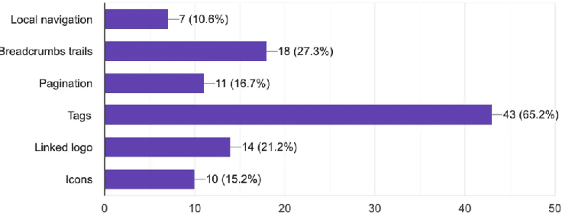
In order to determine which navigational user interface elements are the most important when it comes to users' satisfaction, we added two additional questions to our survey. Inside these questions we listed the six navigational elements that we were investigating and we asked the respondents to choose which elements they found to be the most important, respectively which ones they found to be the least important. The respondents’ answers were displayed inside two graphs which were automatically created by Google Forms. After analysing the two graphs, we noticed that the participants’ answers were overall consistent in what concerns the placements of the navigational elements within a hierarchy. Both graphs show that the “Local navigation” is considered by far the most important navigational element, followed by “Icons” as the second most important element. The following elements in the hierarchy are “Linked logo”,
“Breadcrumbs” and “Pagination”, but their order varies between the two graphs. On the other hand, both graphs clearly confirm that “Tags” were voted as the least relevant navigational element by the respondents.