Investigating Hand Gestures
as
Additional Input
in a Multimodal
I
nput Interface
“DON’T TOUCH THE TOUCHSCREEN!”
Bachelor Thesis in Interaction Design K3, Malmö University
Supervisor: Andreas Göransson Examiner: Tony Olsson Partners: Crunchfish AB Report version: 1.1 Date: 2013-05-22 Malin Olofsson malin.olofsson@live.se Hampus Söderberg hampus.soderberg@gmx.com
i
Abstract
At the time of writing, touch is revolutionizing the market with devices that have touch as the primary input modality. In this thesis we have been able to explore how another input modality, touchless, can complement touch in everyday applications. Touchless refers to an input method that is able to recognize hand gestures and act upon them.
To investigate how these two input modalities can be combined, an Android prototype application featuring both touch and touchless was created. We chose to create a recipe reader because we found that a lot of people can relate to having soggy hands in the kitchen.
The outcome of this thesis is assembled to form design principles that we find worthy to consider when designing multimodal input interfaces that includes both touch and touchless.
Tags
ii
Acknowledgement
iii
Illustration Index
Illustration 1: The Chosen One ... 4
Illustration 2: to left: Facebook to right: Spotify ... 7
Illustration 3: Touch swipe gesture ... 8
Illustration 4: Camera-based touchless interaction ... 10
Illustration 5: Sensor-based Gesture Interaction ... 11
Illustration 6: Features in Application ... 19
Illustration 7: User Interface flow chart ... 20
Illustration 8: Touchless Semantic Zoom Gesture in Calendar ... 21
Illustration 9: Green Touchless Feedback Frame ... 21
Illustration 10: Touchless Swipe Gesture Test ... 22
Illustration 11: Wireframes showing steps of the application ... 23
Illustration 12: Application Overview Screen, Lo-Fi prototype ... 24
Illustration 13: Application Detail Screen, Lo-Fi prototype... 24
Illustration 14: Application Overview Screen, Hi-Fi prototype ... 25
Illustration 15: Application Detail Screen, Hi-Fi prototype ... 25
Illustration 16: Application Guide Screen, Hi-Fi prototype ... 26
Illustration 17: Application Guide Screen with Feedback Frame, Hi-Fi prototype ... 26
Illustration 18: User Test session 1 ... 27
Illustration 19: Touch input modality with feedback ... 28
Illustration 20: Overview left: Tablet, right: Phone ... 28
Illustration 21: Icons: application icon, touch icon and touchless icon ... 28
Illustration 22: Categorical icons ... 28
Illustration 23: Recipe left: Tablet, right: Phone ... 29
Illustration 24: Visual Feedback left: Tablet, right: Phone ... 29
Illustration 25: Overlay tutorial left: Tablet, right: Phone ... 30
Illustration 26: Gesture input modality top: feedback bottom: no feedback ... 30
iv
Table of Contents
Abstract ... i
Tags ... i
Acknowledgement ... ii
Illustration Index ... iii
Table of Contents ... iv
1 Introduction ... 1
2 Problem Statement ... 1
Problem Area ... 2
Goals and Purpose ... 4
Questions ... 5
Delimitations for this thesis ... 5
Document Layout ... 5
3 Related Work ... 6
Touch ... 6
Touch User Interface ... 7
Touchless ... 9
Touchless Recognition Methods ... 10
Multimodal User Interface ... 11
4 Methods ... 12 Literature Review ... 12 Brainstorming ... 13 Interviews ... 13 Observations ... 14 Scenario ... 14 Prototyping ... 15 User Testing ... 16 Personas ... 17 5 Design Process ... 17 Conceptualization ... 18 Lo-Fi Prototype ... 20 Hi-Fi Prototype ... 25
Hi-Fi Prototype Iteration ... 27
6 Summary and Analysis ... 33
v
The Feedback Frame ... 33
Interaction Mode Indicator ... 34
Instruction Overlay ... 34
Gestures ... 34
Multimodality ... 35
Technical Implementation Analysis ... 35
Context and Persona Analysis ... 36
7 Conclusions and Discussion ... 37
Conclusions ... 37
Discussions ... 37
Further Research Areas ... 38
8 References ... 39
Appendix A: Persona ... 1
Appendix B: Scenario: An evening with the boys ... 1
Appendix C: Test Plan for First User Test ... 1
1
1 Introduction
“Everything is best for something and worst for something else.” (Buxton 2007)
At the time of writing, the market is exploding with devices that have touch as the primary input modality. Many laptops are equipped with touchscreens and computer tablets can be docked with keyboards. This provides a second and third input modality. These two components creates the common vision of a laptop and the way to interact with the system. Touch has already become a de facto standard for interaction with current phones and tablets. The ability to directly manipulate screen objects makes a tangible experience that is very satisfactory for people. As touch interaction has developed, several interaction design patterns have emerged.
An upcoming trend in Natural User Interface (NUI) research is touchless hand gesture recognition, which provides a three dimensional input modality. This area has been explored to some extent for entertainment purposes, whereas productivity uses remain largely uncovered. Touchless hand gestures are inherently contactless which makes interaction possible from a short distance. These interactions are also more hygienic.
In the near future touchless could complement other input modalities to provide people with novel ways of interacting with the technology around them.
2 Problem Statement
Hand gestures as an input modality are interesting for interaction designers since this sort of human computer interaction has begun to find its way into different digital artefacts. Gestural interfaces have historically been, and still is, an interesting input modality for Human Computer Interaction (HCI) to feature in science fiction movies. There is a popular scene in Minority Report (2002) where the actor Tom Cruise demonstrates this kind of interaction, from the scene:
“A man wearing special gloves stands in front of a large, translucent screen. He waves his hand in front of it, and objects on the screen move. It’s as though he’s conducting an orchestra or is some sort of high-tech sorcerer’s apprentice, making objects fly about with just a sweep of his arm. He makes another gesture, and a video begins to play. With both hands, he stretches the video to larger size, filling more of the screen. It’s like magic” (Saffer 2009, p. 1).
That was eleven years ago, yet today we have not reached that level of maturity to be able to make use of the technology in everyday situations. Major companies are investigating the possibility to integrate gestural hand input technology in digital artefacts. Samsung has recently released a smartphone, the Galaxy S4, which features hand gestural input. The product description reads: “Simply motion your hand at the Samsung GALAXY S4 to accept calls, change music, or browse the web and your photos with Air Gesture” (Samsung 2013).
“It is important to remember that a gesture interface is to be seen as complimenting or an alternative to existing interface techniques, such as the old desktop paradigm” (Nielsen et al. 2004, p.1).
Microsoft and Sony are two of the biggest actors in the video game industry. Each have their own ecosystem of dedicated videogame consoles, online services and games. Both companies have
2
explored how free form hand-gestures can be used to interact with games. To enable gesture recognition both companies make use of cameras, Xbox Kinect and Playstation Eyetoy. By adding a Kinect to an Xbox, users are able to control the console, play video games and access other multimedia features using touchless gestures.
Gesture recognition is currently an experimental way to interact with technology. The lack of tangibility and haptic feedback makes the design of touchless interaction a challenge. Where “…achieving accurate and meaningful gesture recognition and identifying natural, intuitive and meaningful gesture vocabularies appropriate for the tasks in question” (Sukeshini 2011, p. 821). Although the technology for touchless gesture input has been explored, a lot of work is to be done in finding and investigating meaningful, practical and intuitive implementations for touchless gestures. Throughout this report “touchless” and “touchless gestures” refer to an interaction method that recognizes hand gestures and responds to them.
Considering our mobile context and intended use-cases, we delimit our definition of touchless to not include full body interaction such as Microsoft Kinect (see Chapter 3).
Since touchless is a relatively new interaction method it still hasn’t got its use cases and gestures well defined. This makes touchless interesting for interaction designers.
Problem Area
Windows, icons, menus, pointer (WIMP), is a style of computer interaction that makes use of graphical elements to drive interaction. Many of the interfaces that are built on the WIMP style of interaction are based on the “desktop” metaphor that first saw light at Xerox PARC in the 1970’s (Moggridge 2007). This design pattern is based on analogies between real world office items and virtual ones. The computer screen as a whole, resembles a desktop on which files depicted as documents (commonly referred to as icons) can be placed by the use of a pointer which can be moved across the screen along the X and Y axis. Apart from being moved around, documents can be selected and opened inside windows, which just like icons can be rearranged using the pointer. A menu is a selection of contextual or categorical options and actions that can be selected or performed, again, with the pointer.
As described above, one of the four pillars of a WIMP interface is the pointer. The pointer is the main input method in a WIMP interface which means it has a wide influence on the design and layout of interactive interface elements. The most commonly used input device for controlling a pointer is the mouse which gives the user the ability to control the pointer with very high precision; a gaming mouse may have a precision as high as 8200DPI (Razer 2013). What this means is that an interface can rely on the pointer’s accuracy to be precise enough for enabling a user to access every pixel on a screen. WIMP interfaces are developed for use with high precision pointers which enables having a lot of buttons in a physically small area. The feedback that is provided in WIMP interfaces is often objects changing color as they are hovered over or clicked on by the pointer.
With the introduction of touchscreen input devices, interfaces have gradually started to challenge the established WIMP interaction style. Apple’s iPhone can be considered to have set a design paradigm for touch interfaces. A main difference between a traditional WIMP interface and a touch interface is that a touch interface’s pointer is replaced with the user’s finger. This allows for a very direct
interaction where a user’s finger directly manipulates virtual screen objects. However, a human finger is considerably larger than a mouse pointer and combined with the comparably low precision of a
3
finger touch input lacks the same level of control that a traditional pointer offers. To accommodate the loss of precision, touch interfaces commonly have bigger touch targets. However since touch offers a much more direct manipulation of screen objects combined multi-touch gestures such as zoom, some functionality can be offloaded from dedicated buttons and instead be utilized almost subconsciously anywhere.
Feedback from touch interfaces often make screen objects bounce, squeeze or be distorted in other ways to simulate being physically touched.
Touchless input provides even less precision than touch. In addition to this, touchless, like a mouse pointer, manipulates screen content indirectly. Because of this, touchless requires a different interface - an interface that doesn’t need the same level of accuracy and precision as touch-based interfaces. Touch interfaces made screen objects larger and more tangible than in previous WIMP interfaces.
WIMP Very high precision, Indirect manipulation
Touch Low precision, Direct manipulation
Touchless Very low precision, Indirect manipulation
Future implementations of touchless might evolve from being a low precision input method, as described and experienced in this thesis, into a direct input method with very high precision. Display technology will also evolve and might evolve into 3D displays which would make touchless interaction every bit as direct as touch currently is on 2D displays.
As was previously mentioned, the market is currently experiencing a large increase of smartphones and computer tablets. Because of their portability, people tend to bring these devices along with them almost anywhere they go.
A lot of people prefer to use a tablet form-factor device instead of a laptop form-factor device for reading lengthy texts. A survey made by Gartner Inc. shows that “… more than 50 percent of media tablet owners prefer to read news, magazines and books on screen, rather than on paper” (Gartner Inc. 2012). A reason to this may be a tablet’s “book size form-factor” and lesser weight compared to an ordinary laptop.
Usage of these devices is growing as they are used by people of all ages in a wide variety of places and situations. From casual media consumption at home to professional uses at work. Because mobile devices are used by a large variety of users in a possibly even larger variety of places, there are a lot of important things to consider. It is challenging to design for a broad spectra of users because they all have specific goals and needs. Alan Cooper says in his book The Inmates are running the asylum:
“Whenever I hear the phrase “the user,” it sounds to me like “the elastic user.” The elastic user must bend and stretch and adapt to the needs of the moment. However, our goal is to design software that will bend and stretch and adapt to the user’s needs” (Cooper 2004, p. 127).
A persona can be used to specify the purpose of the prototype application and may thereby make the design process more focused.
4
in technology and likes to explore new features and artefacts before they are available on the market, might be suitable to design for.
Goals and Purpose
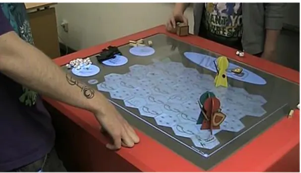
The authors of this bachelor thesis are Malin Olofsson and Hampus Söderberg, two interaction design students at Malmö University. We have worked together on a slightly related project in the past, a project called “The Chosen One”. That project consisted of a digital table top adventure game that featured physical play pieces (see Illustration 1: The Chosen One). We built the game using a borrowed touch-table, also known as “Rosie” (Barrajon & Göransson 2009). Touch input was recognized by a camera that was able track two dimensional movements and objects on a diffuse glass surface. The project allowed us to explore how digital and physical elements can be used together and augment each other. Specifically we took the tangibility of physical play pieces and combined this with the dynamic possibilities of a digital playfield.
Illustration 1: The Chosen One
A shared interest in cutting edge technology and experimental interaction design have led us to work together again with this thesis.
We were inspired to explore the touchless interaction field by a Swedish company called Crunchfish. With their Touchless A3D software, Crunchfish aim to provide a more intuitive human-computer interaction: “Crunchfish mission is to simplify interaction with mobile devices by providing a more intuitive touchless interface” (Crunchfish AB 2013).
At a presentation event, Crunchfish demonstrated a couple of prototypes to illustrate what possibilities their Touchless A3D™ platform could provide.
The first prototype they showed was based on ID Software’s classic videogame, Doom. By tracking head movement, users were able to control the onscreen point-of-view by tilting their head. To fire a gun, the user tapped the screen.
The second prototype demonstrated how users were able to rotate a colorful 3D cube by gently waving their hands in front of the screen.
Crunchfish envision touchless interaction to be integrated and used with any device as long as it has a camera.
5
The main goals of this thesis is to explore touchless hand gestures and how these can be
implemented alongside other input modalities, such as touch. We have decided to use a scenario that puts the fictive persona in a kitchen context with the task of cooking dinner.
Questions
What visual feedback will users require when interacting with software in a touchless setting and how can this be implemented?
How can touchless hand gestures be combined with touch gestures in one user interface on everyday devices?
Delimitations for this thesis
We have chosen to delimit our focus to mobile devices. The mobile operating system (mobile OS) Android has been chosen as a prototyping platform, as it is the platform of preference for our partner Crunchfish, and also because we are familiar with developing applications for Android devices. It is important to know that within this thesis there is no room for altering hardware designs. The key is to provide intuitive touchless interaction without having to change existing hardware designs. The focus will be on human-computer interaction. Therefore, the application’s actual content will not be thoroughly researched in terms of how to efficiently display a recipe or how the cooking guide should present its recipes. Similarly, concepts in the project will mainly be targeted at single user activities.
Hypotheses
To guide and keep our effort focused, these hypotheses were formed:
An icon that indicates the currently available interaction mode can be helpful in making users understand how to interact when several interaction modes are present.
A visual feedback in the shape of a frame that activates when a touchless interaction is detected can make users’ touchless experience more satisfying.
A semi-transparent overlay that appears on first-use only to instruct users how to use touchless interaction is a fast and efficient way to introduce new users to touchless interaction.
A touchless gesture may advantageously derive from an existing touch swipe gesture.
Technical boundaries
Technical difficulties that are experienced in this project are due to inconsistent hardware, such as cameras and sensors that are positioned differently from device to device. Because of this, it is challenging to design an accurate touchless input modality as hand tracking can easily become offset. This affects the users’ intuitive understanding of how to interact touchless as users need to first locate a device’s camera before they can start their interaction.
Document Layout
Chapter 3: Related Work will show related work within the field of our investigation and introduce three research themes: multimodality, touch and touchless.
The next chapter, Chapter 4: Methods, will present and describe the methods that were employed in our design process.
6
Design Process. This chapter will take you through our entire design process, starting with the conceptualization stage leading all the way to final user tests of the prototype application. In Chapter 6: Summary and Analysis, we will summarize the work that has been done, as well as describe individual research outcomes.
The final chapter, Chapter 7: Conclusions and discussion, will concretize the outcome of the thesis and provide answers to our research questions. This chapter will also discuss how we reached our results and what these results mean. Lastly we will point out some further research topics for other researchers and interaction designers to investigate.
3 Related Work
In this thesis, we present a study of multimodal interaction that focuses on the novel input modality, touchless, and how it can be implemented alongside traditional input modalities. Within this field of multimodal interaction, previous work have predominantly been focused on sensor-based gesture interaction. Specifically on mobile devices with built-in sensors like accelerometers and what forms of interaction these sensors can enable.
To get a thorough understanding of the research area, we studied how touch-based interaction has evolved and what others have previously done in the area of touchless interaction.
Touch
Touchscreens have existed since the 1960’s and one of the earliest incarnations was created by E.A Johnson. In 1965, Johnson wrote an article where he described how a frame of conductive wires could be attached to the front of an, at the time, ordinary cathode-ray tube computer display and form a novel input/output device (Capacitive touch). Johnson presented his input/output device as a new kind of keyboard whose keys are changed according to what keys are needed (Johnson 1965). In the following years, Johnson set up his touch display for use with an air-traffic control. Johnson believed this to be a given use context for his touch display as air-traffic operators traditionally had to enter large amounts of text to amend air traffic. He reorganized the workflow and created a
sequential user interface with dynamic buttons that changed labels and functions based on the current situation. By combining the sequential workflow with the touch display he managed to greatly simplify the complexity of amending flights (Johnson 1967).
During the 1970’s, Sam Hurst from the University of Kentucky was a key player in the advancement of touchscreen technologies. During 1971 he formed Elographics Inc. who, in 1977, developed a
touchscreen based on a different technique where the screen itself consists of two layers making contact if touched (Resistive touch). They continued working on the technology and showcased 33 touchscreens to the general public at the 1982 World’s Fair in Knoxville, Tennessee (Elo Touch Solutions 2013).
In 1983 HP released their “HP-150 Touchscreen” PC which is considered to be one of the world’s first computers that came bundled with a touchscreen. The computer ran MS-DOS 2 with touch
compatible versions of that time’s popular productivity applications: MultiPlan, Graphics, WordStar, Lotus 1-2-3, dBase II, VisiCalc and others (HP).
Apple announced the iPhone in 2007 which was a time when touchscreen equipped phones were relatively rare and touchscreen interaction most often required the use of a stylus. Tapping with a
7
finger was either impractical due to small GUI’s or wasn’t technically supported by the touchscreen. The iPhone reimagined the way a touch interface can look and behave by designing a GUI that considered the finger to be a user’s primary input method. “We are all born with the ultimate pointing device—our fingers—and iPhone uses them to create the most revolutionary user interface since the mouse” (Apple Inc. 2007). The iPhone was created with this in mind and thereby featured an interface that leveraged many of the possibilities that touchscreens provided. With the iPhone Apple has propelled the development of touchscreen based interfaces and set general expectations of how touch interfaces should look and behave.
Touch User Interface
Designing for mobile devices is challenging because of the wide range of various platforms and device form factors that exists; from the smallest phones to the largest tablets. Different software and hardware designs are created and combined to adapt to various usage patterns (Nudelman 2013). There are three common operating systems for mobile devices (mobile OS) which all have touch optimized user interfaces: Android, iOS and Windows (Windows 8, Windows RT and Windows Phone). The user interfaces in these OS’s varies but some design patterns can be recognized and the design principles for those patterns are often similar.
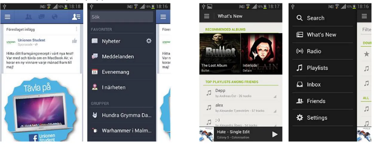
Different navigation features that have similar patterns have emerged as the touch interface has become more common. Examples of those are menus that appears from the side of the screen, in some software in all four sides (Canonical 2013). These can be reached with different gestures, to mention two common gestures, swipe in to the middle of the screen from the sides or tap a button that will activate a menu. This feature is integrated and well used in both the Facebook application and also in the Spotify application.
Illustration 2: to left: Facebook to right: Spotify
The menu in these applications is there to hide unnecessary information that the user doesn’t need at the moment. This way of hiding information makes more room in the GUI for content that is more relevant in this particular place in an application.
“People feel great when they figure things out for themselves. Make your app easier to learn by leveraging visual patterns and muscle memory from other Android apps. For example, the swipe gesture may be a good navigational shortcut” (Android Developers 2013a).
8
Swipe gesture is a well-integrated pattern within the touchscreen interface on various mobile devices. Most of the applications on a device doesn’t take advantage of the space when the screens gets larger than average size. When navigational components are hard to reach by holding the device with one hand, a swiping gesture can reduce these difficulties (Nudelman 2013). “This is similar to Drag to Move Object, but this pattern, sliding a finger on the screen in one direction scrolls the screen or a list of items in that direction” (Saffer 2009, p. 52). Slide to scroll is commonly used when the screen can't hold the content. The pattern of slide to scroll is similar to another pattern, Tap-and-hold on the screen, to select an object to move. This activity is usually
confirmed with some sort of feedback, haptic or audio to indicate for the user that they have started the pattern to move an object. “Utilizing some kind of feedback, such as a visual bounce, haptic buzz, or sound when the user reaches the end of a scroll, is a good practice” (Saffer 2009, p. 52).
Feedback
According to Dan Saffer (2010, p. 39) feedback is “…a message about whether or not a goal was achieved or maintained – whether or not an error was detected.” When a tap action is confirmed the user is shown a hint or confirmation that an interaction has been recognized. It is equally important that when the user wants to perform an interaction such as tap, flick or drag, that the affordance is presented according to “…common visual design techniques to indicate controls” (Neil 2012, p. 259). The visual appearance alters to show that something is interactive. A common design pattern for this involves beveling and shadowing screen content to make the element seem clickable. The user flow must not be disrupted by either one of these visual cues; it is important not to exaggerate the usage of these effects (Neil 2012).
Today touchscreens don’t have tactile feedback. On several mobile devices physical buttons are replaced with touch buttons. The feedback given is an indication in the form of light or a vibration (Saffer 2010). On mobile devices that don’t have physical buttons it becomes more important to use other channels to inform the user that the device has responded to their action or input.
“Use color and illumination to respond to touches, reinforce the resulting behaviors of gestures, and indicate what actions are enabled and disabled” (Android Developers 2013c).
It is important to show the user that the application is listening and recognized the object that was touched. Google have published guidelines that they would like to have implemented in the applications that people around the world are making (Android Developers 2013b). As mentioned before, when physical buttons are removed from the touch interface it becomes more important to give the user feedback when tapping on a touch button, which they cannot feel, if there isn’t a haptic feedback in a form of vibration. Otherwise commonly used feedback in this situation to let the user know that the application is listening are audio or visual feedback.
The application that is built by us will have an overlay tutorial that is the same color as the feedback frame. Even though a tutorial are annoying and can interrupt the user flow in the application it can be necessary to show an introduction on how to use the application or how to interact with it. Trying not to annoy our users, the tutorial is an overlay that is added on top of the screen content. The strength of the overlay tutorial is that the user is free to ignore it if they want (Nudelman 2013).
Illustration 3: Touch swipe gesture
9
Even though haptic and audio feedback can increase the user’s performance on a mobile device, for the chosen context where it can become very noisy during preparation of a dinner, we fall back and rely only on visual feedback for this project (Hoggan 2009). When looking at the touch design patterns for visual feedback, a frame appears when there is a boundary, buttons become blue if they are tapped. The chosen theme was the default Android Holo Theme, which provides the feedback in the color blue (Android Developers 2013b).
Touchless
Although touchless is yet to be introduced in personal computing contexts such as those involving mobile phones, tablets or computers; touchless interaction has been explored in the context of entertainment systems and hygiene sensitive environments.
Sony EyeToy
In 2003 Sony released the “EyeToy” which essentially was a webcam that was connected to a PlayStation 2 console and placed on top of a television. The EyeToy was developed by astronautical and aeronautical engineer Richard Marks who wanted to take advantage of the PlayStation 2’s hardware capabilities and create a supplemental input method to complement the traditional Dual Shock controller (Robischon 2003). Since the EyeToy didn’t replace the traditional controller, games had to be developed specifically for the EyeToy in order to take advantage of the added possibilities. At launch, Sony released the game “EyeToy Play” which was a collection of minigames designed specifically for the touchless EyeToy interface. Not only the mini games but also the menus of this game was controlled by hand gestures, enabling the user to exclusively use the EyeToy for interaction. Users interact with the menus by gently waving their hand at a button, making sure a button-“press” was intentional.
The minigames were relatively simple and were designed to mimic common physical activities such as sports and household chores. One of these minigames was “Wishi Washi” which was a game where the users were supposed to clear the screen of fog. Users could use their arms or grab a real sponge to more efficiently remove the fog. Another game was called “Boxing Chump” and was a boxing game where users got to deliver, as well as dodge, incoming punches from an opponent visible on the screen.
Nintendo Wii
Sony and Microsoft both focused on delivering consoles with cutting edge hardware performance that supported the next generation of graphics. With the Wii, Nintendo chose an alternate approach to differentiate themselves on the gaming console market. Instead of packing high performing components, like Sony and Microsoft, they built the Wii with relatively low performance parts and put their focus on how the user was supposed to interact with the console. Therefore the Wii’s game controller is different than Nintendo’s earlier controllers, and different than most others that had previously been seen on the market. The Wiimote is a candy bar form-factor controller that features a speaker, an IR camera and most prominently an accelerometer for enabling gesture recognition. The Wii was released in 2006 (Nintendo n.d.). One of the first games released to Wii is “Wii Sports”, a collection of mini games based on different sports. With the use of the Wiimote users get to play baseball, golf, tennis, bowling and more. Physical accessories for transforming the Wiimote into rackets, golf clubs and steering wheels have become available to further improve user immersion (Nintendo 2013).
10
Microsoft Kinect
Microsoft released the Kinect in 2010 as a peripheral device for the Xbox 360 and has later been made available to Windows as well. The Kinect itself is a USB connected device featuring
microphones and three cameras, two 3D depth sensing cameras and one RGB camera. The interactions supported by the Kinect are: full body gesture recognition, face recognition and voice recognition. The Kinect was developed to renew the whole Xbox 360 experience by enabling touchless gestural input throughout the console (Wikipedia 2013a).
At launch, 17 games were made available. All of these took advantage of the new interaction
possibilities enabled by the Kinect (Microsoft Corporation 2010). One of those games is “Kinectimals”, a game where the player adopts a pet animal that he or she can nurse and play with. It is possible to gesturally pat the animals and you can also teach them to do tricks by using your voice (Kinectimals 2010; Microsoft Corporation 2010).
Touchless Recognition Methods
Gesture based interaction between humans has evolved for centuries, thus it cannot be assumed that these gestures can be directly transferred into human-computer interaction. Touchless interaction with mobile devices needs to be considered and chosen carefully (Löcken et al. 2012, p. 15).
“However, gestural interfaces must fulfil the same requirements as any other interaction technique. In particular, it is important to define usable gestures for the functionalities that the particular
application offers” (Löcken et al. 2012, p. 16).
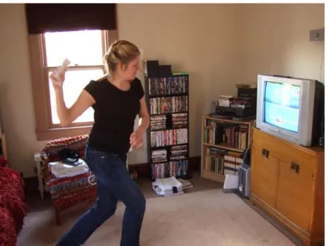
There are two distinct technical approaches for recognizing touchless gestures: sensor-based and camera-based (Kela et al. 2006). An example of camera-based gesture recognition can be seen in illustration 4 where a girl is playing tennis using Microsoft Kinect which responds to her body movements.
11
Camera-based gesture recognition makes use of ordinary camera technology. Gestures are recognized by tracking movements and objects that appear in a video stream.
Entertainment products such as Microsoft Kinect make use of camera-based gesture recognition. Researchers have long been interested in camera based gesture tracking.
Companies are exploring the possibilities to implement camera-based gesture interaction into personal mobile devices, one being Crunchfish with Touchless A3D™.
Illustration 5: Sensor-based Gesture Interaction
Sensor-based gesture recognition can be seen in illustration 5 where another girl is playing tennis. Only this time, with Nintendo Wii. This method relies on dedicated hardware for detecting
movements from which gestures can be recognized. Nintendo Wii made a big commercial impact by making extensive use of sensor-based gestures. These sensors have then gradually made their way into mobile devices such as smartphones and tablets. Sensor-based gesture interaction has been widely adopted by researchers because it is relatively easy to implement in experiments (Löcken et al. 2012).
Multimodal User Interface
When looking at human to human interaction (HHI) it is clearly visible that while speech is the primary communication method, gestures are used extensively to amplify and illustrate the spoken words (Allwood 2012).
Similarly, multimodal human-computer interaction (MMHCI) can incorporate different input methods to accommodate for varying use of scenarios and different uses. Mice and keyboards are often used together. The mouse provides the ability to select objects on the screen while the keyboard provides an efficient way to enter text.
Like the HCI discipline, MMHCI strives to “…determine how we can make computer technology more usable by people” (Sebe 2007, p. 116). In order to reach this goal, there are some things to consider. The first thing is to understand the importance of having enough knowledge of an intended user group to be able to make sound decisions on what functionality and features a product should include. The next thing is to design interfaces that support users in completing their tasks. To do this, it is important to understand which features users need at certain times (Sebe 2007; Allwood 2012).
12
“…the development of multimodal interfaces involves both software and hardware components” (König 2010, p. 1).
Microsoft developed Windows 8 to take advantage of all the possibilities that are present with touch based interaction. Since Windows is intended to be used on a wide range of devices, including ones that does not feature a touch-enabled display, multimodality was a major concern when developing Windows 8 (Wikipedia 2013b). The user interface in Windows 8 was designed to offer a new
experience that was optimized for touch while maintaining compatibility with traditional mouse and keyboard inputs (Microsoft Corporation 2013).
Nudelman (2013) points out that you need to forget all knowledge you have about human-computer interaction when it comes to mobile design and testing. “The uniform mode of interacting with a computer via only mouse and keyboard does not apply to mobile devices. Much of what the mobile age is all about is taking advantage of the body’s natural motions” (Nudelman 2013, p.57).
Mobile devices typically support a wide range of sensors: microphones, cameras, touchscreens, accelerometers, gyroscopes, proximity and light sensors and more. Many of these were developed for specific uses. For instance, a front-facing camera is included to enable video conferencing.
Beyond their originally intended uses, these sensors can also be used to measure the human body and can thereby enable natural and intuitive interaction methods.
To design an efficient user experience and intuitive interface, these different interaction methods need to be considered and evaluated. Due to the portability of these devices, it is important to realize that users attention may be easily distracted by their surroundings (Nudelman 2013).
4 Methods
“It’s our experience that in comparison, qualitative methods tend to be faster, less expensive, and more likely to provide useful answers to important questions that lead to superior design” (Cooper 2007, p. 51)
As Interaction designers from K3, Malmö University, our research makes use of qualitative methods such as user tests with observations and interviews. The design process makes use of brainstorming and prototyping to generate and evaluate design ideas. The fields of touchless gesture interaction and multimodal human-computer interaction are researched in a literature review.
Literature Review
To get a better understanding of how touchless can be used as an input modality, we have searched literature for articles and papers that investigate this field. We will research user interface design, specifically visual feedback to get a better understanding of the kind of feedback that is needed for various interactions.
To help us understand how users perceive touchless gestures as an input method, we will study other interaction designers’ previous work within touchless interaction.
The field of multimodality will be researched in terms of how touchless gestures as an input modality can be combined with other input modalities to navigate a digital artefact.
Further research is done to discover and potentially incorporate other interaction designers’ design methods in our design process.
13
Brainstorming
It was natural to us to make use of brainstorming during the project’s preface. We found
brainstorming to be a quick and efficient method for letting the mind play with the topics and themes of the project. By doing this we also got a common understanding of the research area and form a mutual project vision.
Saffer (2009) points out that the brainstorming process continues after and in between session and that it therefore is a good idea to spread the brainstorming sessions across several days. During the conceptualization stage we were alternating between doing research and having brainstorming sessions. This to be able to gather insight into the topics and ideas that might have been under discussion.
We have used brainstorming as a tool to concretize our ideasand to get them analyzable.
Brainstorming allowed us to discuss possible directions and to eventually determine the themes to investigate and the ideas to explore in this thesis.
Multiple techniques were used to support our brainstorming. We used digital tools, Microsoft OneNote, as well as analog tools, whiteboard along with pen and paper.
Interviews
The touchless input on a tablet is not an established modality and users haven’t experienced this kind of interaction in this context before, and therefore it is important to interview potential users. The interviewed people could be seen as candidates that would use the application in the future and that their needs could be easier to meet with the data from interviews (Cooper 2007).
There are different methods to conduct an interview: structured, semi-structured and group interviews. The decision of what method to use depends on the purpose of the interview. The questions to ask alters in order to what kind of goals the interviewer has.
The unstructured interview method can give a deeper understanding of the topic, alternative paths and new ideas that haven’t been considered by the interviewer. A negative aspect of this kind of interview is that it can generate a lot of data. Interaction designers collect the data by taking notes or by doing audio/video recordings.
If the project has a clear goal the questions can be more precise. When using structured interviews it is common that the interviewed person gets to answer questions with alternatives that are
predetermined. This method requires more preparation by the interviewer when deciding the right questions, than with an open structured interview.
These two methods can be combined to one, semi-structured interviews, which can have both open and closed questions. When conducting a semi-structured interview it is very important not to interrupt the interviewed persons, to let them take the time to consider their answers and talk until they have finished. This way the interviewer show interest in the person talking (Sharp et al. 2007). When doing user tests with a prototype that have an experimental interaction it is important that the persons testing this new interaction doesn’t feel stupid. This can be avoided by testing the prototype with a focus group, this might create an atmosphere where testers can discuss their experience and thoughts about features with other testers. Even though the agenda is predetermined it is room for the participants to raise issues that they think are relevant for the session (Sharp et al. 2007).
14
In this thesis the interviews will be conducted as a discussion with open questions in a focus group, this because we feel the importance of rising this new touchless interaction, and to focus on the user’s perceived experience.
Observations
During product development it is a good thing to do observations of the intended user group to gather data of how the user perform activities, what goals they might have and in what context the user need these goals to be fulfilled. Early in the design process this method helps the designers to get an understanding of the users’ context, tasks and goals. This can be collected meanwhile the designer follow the user as they go about their day-to-day task, and make notes of what they observe. Later in the design process observations can help to measure whether the prototypes that are developed can met the intended user’s tasks and goals (Sharp et al. 2007).
Sharp et al. (2007) mention that it is important to prepare and structure an interview, they believe that this also should be implemented when planning of doing observations.
It is important
To have a clearly stated goal, especially when an observation session takes place, to get relevant feedback from the user.
To be prepared with a script on how the observation session should take place.
That the participants will be greeted and informed of how many they are that participates in this workshop and what they can expect in the coming hour.
The strength of having observations in a controlled environment is that the participant can focus in completing the tasks without interruption. Also for the designers to get to learn about how a user understands the tasks, to raise questions they might have about the interaction. In this project it is valuable to make this kind of observation while conducting user tests because touchless as an input modality is rather new to use a mobile device (Sharp et al 2007).
Scenario
Scenarios are often used when developing for imagined situations to help expressing conceptual designs, and as a tool in the communication between team members but also for communication with the users. A scenario declares the direction of a project, to set the prototype in a context and to describe how one user can use the product. By using the scenario to sketch out screens and an early user guide, it’s hard not to start discuss features and information that needs to be on the screen, also what features to implement in the prototype. This sketching can be transferred to a storyboard that show how the prototype can be used in a defined context (Sharp et al. 2007).
When a scenario, the story about how a product may be used by one user to achieve a task is decided, it’s time to identify every moment and step the user takes to complete the task. By focusing on the interaction and create a storyboard, that can be scenes where each step is illustrated, or as a diagram, this can help to set the frames for the user while testing the prototype. Storyboards are also relevant for the design team, this helps in the discussions about what features and activities that are needed in the scenario (Sharp et al. 2007).
Saffer (2009) points out that a storyboard is the best way to document a complicated gesture that is difficult to understand outside the context. In this project the gesture that we investigates isn’t so
15
complex, but we believe that this can be a good way for us to illustrate how the interaction with the mobile device is experienced within the thought scenario.
The context we have chosen for this investigation is the kitchen. In this scenario, the persona, Nicklas, have a goal to prepare a dinner for his friends. To reach this goal he wants to use a tablet to see the instructions on, also to be able to navigate through the recipe steps. The key here is that in a kitchen, the hands are often wet or soggy, by hacking and washing vegetables, stirring in the pot and so on.
Prototyping
Prototyping is a good tool to express a concept idea, to highlight the interaction and to show stakeholders the project vision. Interaction designers make prototypes to experiment with different interactions, features and to test these with real people. “It’s often said that users can’t tell you what they want, but when they see something and get to use it, they soon know what they don’t want” (Sharp et al. 2007, p. 530). Especially when showing them a prototype. A prototype can be anything from a piece of paper with drawn storyboard to more advanced prototypes that have complex software. The main point of making prototypes is to show people involved in a project how the product, interaction or design can turn out. Even though the main goal of prototyping is to get the involved project people to evaluate the prototype, it is still important to get the prototype evaluated by real users. Testing the prototype in real environments, or by using fictive scenarios, can make it clearer what parts of a prototype that works well and what does not (Sharp et al. 2007).
Low-Fidelity prototyping is often analog and made by paper or cardboard to simulate the concept. Using these kind of prototypes require the Wizard of Oz manipulation, the designer has to make the product seem like it is interactive for the user that test the prototype. Paper prototypes are a way of testing and evaluating the flow and the concept in the context. The designer sketch the steps in the prototype and put it down on paper, each paper contains a step of the task in the design. The strength of making paper prototypes is that the material is cheap and quick to modify so they show the thought design and interaction even though the tester need to see through lack of flow (Sharp et al. 2007).
As interaction designer sketching wireframes is a sufficient tool to get information of user flow and interaction within a software.
Storyboarding is one example of how Lo-Fi prototyping can turn out, especially when GUI-based software is being designed. This method of prototyping is often used together with scenarios, which enables the designers to show their thought concept. The stakeholders in the project can interact with the prototype in a fictive scenario, following the steps in the storyboard gives the user an idea of how the system could work (Sharp et al. 2007).
While Lo-Fi prototyping was made by materials that isn’t expected in a final product, Hi-Fi
prototyping use materials that can be seen in the final product. Especially when prototyping software systems, to be able to develop this kind of prototype requires knowledge and the right tools. Even though Hi-Fi prototyping have drawbacks (take long time to build, testers comment on the aesthetics rather than the content and from a developer’s perspective it gets harder to “kill your darlings”), it is a powerful tool to show for the stakeholders or other participants included in a project. The strengths of Hi-Fi prototyping is that the software can include complete functionality, that clearly shows how the navigation works, and that this kind of prototype has the look and feel of a final product (Sharp et al. 2007).
16
In this project where we will explore an experimental modality that depends on the integrated camera, therefore using Hi-Fi prototyping as a method is needed. This will make it easier for us to illustrate and show stakeholders how we think the interaction can be integrated in a mobile device. As our prototype will be a software application for the Android OS, the scenario within the
application can be seen in an interface flow chart that have been made to illustrate the different steps that the user needs to take before their goal can be fulfilled.
User Testing
During user testing of a Lo-Fi prototype one can gather a lot of information on how certain features are perceived. Observations and interviews can be an effective way to get to an understanding of what features users want or not want in a prototype. The features that worked well or other features that needs to be changed can in the next iteration to be implemented and tested in a High-Fidelity prototype.
The basic approach of usability testing, according to Rubin (2008, p. 25) includes different elements, and here are chosen elements that have been conducted during user tests in this project:
Usage of representative sample of end users which may or may not be randomly chosen. Representation of the actual work environment.
Observation of end users who either use or review a representation of the product.
Controlled and sometimes extensive interviewing and probing of the participants by the test moderator.
Testing is an artificial situation and it's important to take this in consideration when the collected data is evaluated. Continuously testing a product in the real context is not a guarantee for the data to be useful in the long run. In an early stage of the development of a product it is not necessary to conduct usability testing, this because the team already know the obvious problems (Rubin 2008).
Once the hi-fi prototype has been developed, it is time to test this with real people. Saffer (2009) points out that when the prototype have an experimental way of interact with a device, it is
important that participants in the user tests are as close as possible to the intended real environment for the prototype.
Soren Lauesen (2005) describes that three users can be enough when testing usability, at the first test, that serious problems can be found by one user and this is more time efficient. After an iteration and problem correction the next round of tests that may include three users can get out detailed information. The motivation for using three people is that during the design process the usability is measured several times inside the team. However since some of the components we are investigating are perceived partly subconsciously these will need to be tested by unintroduced people.
For this project it’s been decided that one of our user tests will be conducted in the thought context, preferably in the participant’s kitchen. We want to open a discussion with our testers where they get to describe their current experience and future expectations for the technology. It is interesting for us to understand the user’s experience and thoughts, while testing the prototype. In the test sessions there will be questions that the test person will be asked during the end of the test.
To get feedback from our research a decision was made to distribute the prototype application with brief instructions and a formula with questions for the tester to answer. In this way the collected data
17
can indicate in which way and how users interact with the software in their own homes, preferably when they make use of the application in the thought out context and scenario.
Personas
According to Cooper (2004) the most efficient tool that an interaction designer have in the design process is personas, a persona is a fictive user which is defined by his or hers goals to accomplish tasks with the product. Designing for a single user makes it easier for the interaction designer to hit the bull’s-eye in the goal of satisfying the user. When using personas it is important to be very specific in the description, the persona should come alive and become a person for the design team. This makes it easier to follow the same direction in deciding the specifications of the prototype, what features that the persona needs to accomplish the goal. The personas “…goal is an expectation of an end condition, whereas both activities and tasks are intermediate steps (at different levels of
organization) that help someone to reach a goal or set of goals.” (Cooper 2007, p. 15)
The easiest way to create a genuine persona is to build it upon stereotypes, although it is important that the persona is like a real person. Cooper (2007) points out that it is important to identify the user that can represent the user group in mind, and a way to do this is to determine the user’s goals and what motivates the usage of this product. To make the persona more personal for the design team, give the persona a picture so the team can easier relate to their persona, and it can easier be integrated throughout the design process. Nudelman (2013) recommends that disagreement about the persona should also be written down, the persona doesn’t have to be detailed with a lot of information. And to remember that “The most important function of the persona is the sense of team cohesion and empathy toward the struggles and challenges faced by the target customer” (Nudelman 2013, p. 60). The persona is what keeps the design process on the right track, that the right features and that the right interactions are focused at by the whole team, cohesion as Nudelman says.
5 Design Process
In the planning for this project there were four things that needed to be sorted out. The knowledge of where the user might be during usage of the thought product, what equipment they might use and if they are doing anything else at the same time. The context can help to drive the team to choose a final design approach and a list of features that the product should contain. To know who the
application is created for, the targeted person, a persona, can keep the focus within the group. When this is done, the fieldwork can start, by observe and interview people, followed by brainstorming sessions (Nudelman 2013).
“Interaction designers take the raw stuff produced by engineers and programmers and mold it into products that people enjoy using” (Saffer 2011).
The core of this project is to investigate how a new technology for tracking hand movements can be used when interacting with a digital device. From that starting point, and throughout the whole project we have followed a “technology centered view”. According to Saffer (2011) there are three major schools of interaction design, one of them being the aforementioned technology centered view. This view is all about working with the latest cutting-edge technology in an exploratory manner looking for design gaps.
18
Conceptualization
Conceptualization has been our primary design method and central in the search for a utilitarian use for touchless hand gestural interaction. Several conceptualization methods have been exploited to explore various aspects of our research area. Brainstorming has been used extensively for finding and defining our area of research. A Persona was created to provide a target user for the application. Storyboarding was used to select and organize ideas and concepts that were developed during brainstorming sessions. The storyboard roughly describes the intended scenario.
Brainstorming
The topic touchless is a new field for exploration where little research has been done within our selected context, mobile devices. We decided to use brainstorming as our primary tool for generating ideas and exploring potential concepts. Saffer (2010) inspired us to spread the brainstorming over several sessions to be able to research identified themes, and to discuss these in coming
brainstorming sessions.
The discussions have gone from extracting qualities from mechanical buttons to creating a 3D browser and finally landed in prototyping a kitchen recipe reader.
After several brainstorming sessions recognizable patterns have emerged that reflected our interests in the touchless topic. Three themes were established that resonated well with our interests. One of the themes was multimodality; how can different input modalities work together.
The next theme was visual feedback; how can the device assure the user that the device sees them and that the device is ready to respond to the user’s command.
The third theme was about gestures; how can a touch swipe gesture input be transferred to a touchless swipe gesture input.
A rough sketch was created to get an overview of the features that could be implemented in the application. This list of features can be seen in Illustration 6 where backend features are to the left
19 and frontend features on the right.
Illustration 6: Features in Application
The illustration above provides an overview of design problems we have found:
Would users want or need visual feedback for indicating a recognized touchless gesture?
How can generic actions such as confirm, cancel, go forward, go backwards and scroll affordances be communicated to users?
Will users ever need to tap a device or could anything be accessible through touchless input? When and how will touchless interaction be activated, by tilting the device or by tapping a button? Should the application force users to have their devices in a specific orientation to be able to use touchless input?
Persona
This investigation follows a technology centered approach where the purpose is to find a design gap that touchless could potentially fill. In essence, we are designing a new need rather than refining an existing one. To balance this thesis’s technical starting point, a persona was created. See Appendix: A. The persona was useful in determining what values certain features would add if they were to be implemented in the concept. This way we were able to maintain a user-oriented design process where we could make thoughtful design decisions based on actual user needs instead of adding the features that we wanted.
Scenario and Storyboarding
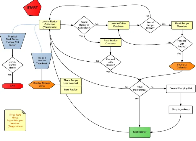
Storyboarding has been used and resulted in an interface flow chart (Illustration: 7). Creation of the flow chart helped identifying key activities that are associated with the considered scenario. Throughout brainstorming sessions it has been inevitable to avoid talking about the application’s structure. The user interface flow chart shows application features and how they would be implemented in the prototype application.
20 Illustration 7: User Interface flow chart
The user’s goal in this application is to find a recipe and to receive instructions to be able to cook dinner. When the user starts the application, the first screen is a recipe collection showing thumbnails of recent and favorite recipes. If the user can’t find a recipe in the local collection, there will be a feature to search for recipes online. When the user has found a recipe, a confirmation is required to proceed with that recipe. Then the required ingredients are shown and the user can compare this to their own inventory and add missing ingredients to a shopping list. This list can then be brought along while shopping for the missing groceries. With all ingredients collected, the user can return to the application and resume with the touchless instructions for the selected recipe.
Peripheral services that have been thought upon are: social and private sharing, recipe rating and ability to mark as favorite. Another service that was considered was to make the application suggest recipes that can be done from the remains of ingredients bought for a recipe.
The user interface flow-chart (Illustration: 7) lays out a holistic view of the concept and proved to be an efficient tool for designing every detail in the concept. The persona was used extensively during the design of this flowchart. However since the goal for the prototype is to explore touchless interaction only the green “Cook dinner” step will be fully implemented.
Lo-Fi Prototype
In the prototype process we will present our Lo-Fi paper prototypes and then describe how the process have proceeded to the creation of a Hi-Fi prototype that we will test on actual users. This design process is a standard way in interaction design to show stakeholders a concept idea, but also
21
to be able to try this out with real users. For the Lo-Fi prototype, a choice not to test the Lo-Fi prototype with actual users is due to the lack of tangible interaction and therefore we test the Lo-Fi prototype within the project group to get an idea of the modalities we will design for.
Microsoft PowerPoint was used to create dynamic mockups of different touchless gestures. These mockups deliberately have a very low-fi appearance, partly to save time but mainly to focus completely on investigating gestures. Interactions were simulated by utilizing PowerPoint’s built-in animation and trigger functions. An animation is triggered by the test moderator once the test user attempts an interaction.
Semantic zoom gesture
Illustration 8: Touchless Semantic Zoom Gesture in Calendar
Semantic zoom was explored by portraying a calendar that switches between month- and week-view depending on whether the user’s hand is moved towards the screen or away from it (see Illustration: 8). When moving the hand towards the screen, month-view is replaced with week-view and vice-versa.
5.2.1.1 Results
Generally, users didn’t appear to understand what was happening when they performed the zoom gestures. We concluded that this could be due to this gesture not being as commonly used as others.
Feedback Frame
22
Feedback was explored by having a green frame appear as the user enters the touchless interaction area (see Illustration: 9).
5.2.2.1 Results
Users induced the frame by waving their hand in front of the screen and it was seen as a direct feedback of this action.
Swipe Gesture
Illustration 10: Touchless Swipe Gesture Test
Swipe was investigated by creating screens that contained a simple text and an arrow icon that prompts the user to swipe in a specific direction. At first the screens directly emulated the touch swipe gesture, the content is swiped away in the same direction as the finger moves (see Illustration: 10). As it was discovered that users got confused when the content didn’t swipe in the direction they subconsciously were expecting it to, another mockup, where the swipe direction was reversed, was created.
5.2.3.1 Results
It was discovered that subtle feedback from the directly manipulated content is very important to achieve an enjoyable and predictable experience. The swipe gesture itself was well received, meaning that users quickly understood the gesture and performed it as intended. This may possibly be
because they recognized the gesture from touch.
Wireframes
The initial steps in the creation of the prototype application involved taking the rough ideas developed during the conceptualization phase. Wireframes was the method that was chosen for generating tangible representations of the concept. This approach enabled us to quickly illustrate and
23
communicate our ideas of the application’s layout with each other. As well as let us test the application flow and to understand what features that does and doesn’t work.
The features and interactions that was decided in the user interface flow-chart diagram (see
illustration: 7) was put into context in wireframes (see illustration 11). This way it was possible to get a visualization of what the application might look like and the intended interactions. The wireframes was evaluated and the generated content were iterated to eventually form a template to follow during the creation of the Hi-Fi prototype.
Illustration 11: Wireframes showing steps of the application
Illustration 11, are a graphical design extension of the user flow-chart, and how we visualized the layout. These papers illustrate the screens of an application, the thought content and interactions between the screens.
All ideas that emerged during brainstorming and meetings have been considered and included in the design process. Recipe overview, recipe thumbnails, categories and sorting, online search, local search, ingredient stock check, shopping list and recipe instructions are all features that have been considered during the creation and evaluation of the wireframes.
In accordance to our delimitations (see Chapter 2) many of these features were discarded in favor of creating as good of a touchless experience as possible for the user. We have chosen to exclude features such as instant messaging services, multimedia services, scan barcodes on ingredients to generate recipe suggestions, photo-sharing service and social networking as we found these features to distract the user from the actual investigation content. Those described and discarded features would risk to take over the application, and might provide us with irrelevant data from our user tests. To investigate how this way of interacting with a mobile device should be implemented, there is a need to put the touchless interaction into a natural context. Therefore it came natural to us as
24
interaction designers to make use of a persona (see Appendix: A), the process of generating these wireframes raised discussions of different use-cases and their possible features and interactions. Our persona, Nicklas, have been helpful in finding key events that are crucial in making concepts work in the previously decided context.
Wireframes Iteration
For the first prototype the wireframes was iterated to digital images to illustrate what the finished prototype would look like. Illustration 12 shows the starting screen and how the collection is thought to be designed. Illustrations 12 and 13 demonstrates the design of touch-only parts of the
application, a recipe collection and a recipe overview.
Illustration 12: Application Overview Screen, Lo-Fi prototype
The menu to the left provides navigation through food categories and users’ favorite and recent recipes. The grey squares serve as placeholders for recipe thumbnails which are meant to give users’ an overview of the different recipes they can choose among. Here the interaction mode is touch, where users can swipe and scroll through recipe thumbnails. Tap on a recipe thumbnail to display the corresponding recipe.
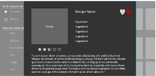
Illustration 13: Application Detail Screen, Lo-Fi prototype
Illustration 13, depicts the recipe overview screen where a recipe is detailed. The overview screen presents a recipe similar to how books and websites do by offering a single-page layout with an ingredients list, recipe summary and a picture. A rating affordance as well as an “add to favorites” button is also present.
25
Hi-Fi Prototype
The Hi-Fi prototype’s purpose was to implement the previously created wireframes and provide a platform for testing and evaluating the touchless interaction mode. Therefore, the elements outside of the touchless instructions screens were implemented as static images. These non-interactive screens did however present a near-final visual design.
Illustration 14: Recipe Collection Screen, Hi-Fi prototype
A lot of changes can be seen in the illustration above. While the earlier wireframes provided only placeholder texts and images this prototype iteration contains final texts and graphics.
In detail, the menu to the left now include small icons to illustrate separate food categories.
Illustration 15: Recipe Overview Screen, Hi-Fi prototype
The illustration above shows an iterated recipe overview screen where it is now possible to add ingredients to a shopping list. Some elements have been moved to better integrate with android design principles.
26
application screens. An action bar was implemented in the recipe collection for holding shortcuts to search, share and shopping list functionalities.
When the user have chosen a recipe, the next step is to get guidance for how the preparation of the recipe is. In the action bar in the top right corner (see Illustration: 16) there is an icon in the shape of a hand. This icon indicates that the interaction mode has changed and now it recognize touchless as the main input modality.
Illustration 16: Application Guide Screen, Hi-Fi prototype
The guidance screens (see Illustration: 16; 17) has a very simple visual design, but none the less, the main focus for this test is the interaction made by the user. In the bottom of the screen the progress bar indicates how many steps that are left before the guidance is completed. This is a way of giving the user feedback on their progress that are easy to understand.
When the user navigates through this application by using touchless swipe gesture, it is important that the user can understand that the software have seen the user’s hand. A frame is used to clearly indicate to the user when their hand is seen by the software, and when the user can make a
touchless swipe gesture to navigate to the next instruction (Illustration 17).