School of Technology
Malmö
University
Master Thesis Project 30p, Spring 2011
August 2011
Master Thesis
Visualization of data from transportation
simulation systems
By Banafsheh HajinasabRazlighiSupervisors:
Paul Davidsson
Annabella LoconsoleExaminer:
Jan Persson
2
Contact information
Author:
Banafsheh HajinasabRazlighi E-mail: Banafsheh.Hajinasab@mah.seSupervisors:
Paul Davidsson E-mail: Paul.Davidsson@mah.seMalmö University, Department of Computer Science.
Annabella Loconsole
E-mail: Annabella.Loconsole@mah.se
Malmö University, Department of Computer Science.
Examiner:
Jan PerssonE-mail: Jan.A.Persson@mah.se
3
Abstract
Nowadays by increasing importance of information in all sectors, illustrating data in a communicative format helps decision makers to understand and analyze effectively large amount of information in a short time. Information visualization, as a way of presenting different data types in a more understandable form, is growing increasingly in various areas. This thesis aims to investigate how information visualization could be used to increase readability and usability of transportation simulation data. Most of the previous studies in this area have focused on visualization of transportation infrastructures such as roads, bridges, etc.; while the main focus of this thesis is visualizing the outputs of transportation simulation systems. In order to study the role of information visualization in the transportation systems, we have investigated the visualization applications in a real implemented agent-based transportation simulator called TAPAS as case. In our case study, the visualization related requirements of users were analyzed, and the visualization tool was designed and developed based on the identified requirements.
4
Acknowledgement
This thesis would not have been possible without the valuable contribution and guidance of certain people. First and foremost I offer my sincerest gratitude to my supervisor, Professor Paul Davidsson, who has supported me throughout my thesis with his patience and knowledge. Secondly, I would like to express my gratitude to Annabella Loconsole, for her guidance and precise comments. I am indebted to my examiner Jan Persson, whose guidance from the initial to the final level of this thesis enabled me to develop an understanding of the subject.
I would like to thank Dr. Johan Holmgren and Dr. Linda Ramstedt for their input especially in the interviews of this study. They have shared valuable insights in this study. To Blekinge Institute of Technology, thank for giving me the opportunity to work with TAPAS.
I am also grateful to my parents who have made available their support throughout all my studies.
Last but not least, I would like to show my deepest gratitude to my husband Shahram and my daughter Sheida for their unconditional love and encouragement in all my pursuits.
5
Table of contents
1 Introduction and background ... 8
1.1 Introduction ... 8
1.2 Purpose and motivation ... 9
1.3 Quality attributes ... 10 1.4 Goal ... 11 1.5 Research question ... 11 1.6 Research delimitation ... 12 1.7 Results ... 12 2 Research Method ... 13 2.1 Literature review ... 14
2.2 Design and creation ... 14
2.3 Qualitative case study ... 14
2.4 Data Collection methods and techniques ... 15
2.5 Evaluation methods ... 17
3 Literature review ... 20
3.1 Information visualization ... 20
3.2 Principles and basic theories of graph drawing ... 21
3.2.1 Graph drawing concepts ... 21
3.2.2 Graph drawing layout algorithms ... 24
3.3 Transportation system visualization ... 25
4 Empirical case ... 32
4.1 TAPAS... 34
6
4.2 Requirements analysis ... 36
4.2.1 Classification of TAPAS users ... 37
4.2.2 Data gathering method ... 38
4.3 Visualization Techniques versus Requirements ... 43
4.4 Features and Functionalities of TAPAS Visualization tool ... 45
4.5 Visualization tool Construction ... 50
4.5.1 Development Technologies ... 50
4.5.2 Investigate Current System ... 52
4.5.3 Developing the Visualization tool ... 55
4.6 Evaluation ... 60
5 Conclusion ... 61
5.1 Future Work ... 62
Appendix I: Interview with expert users... 64
1. Interview questions ... 64
2. Interview transcripts ... 65
Appendix II: Interview with end users ... 70
Appendix III: Sample development codes... 75
7
List of Figures
FIGURE 1:THE RESEARCH PROCESS OF THIS THESIS (BASED ON [15,17]). ... 13
FIGURE 2:THE IMPACT OF DIFFERENT CRITERIA ON SELECTION OF RESEARCH METHOD,TAKEN FROM [17] ... 15
FIGURE 3,TAKEN FROM [7]... 22
FIGURE 4:A SAMPLE MAP-BASED VISUALIZATION OF FREIGHT DATA (TAKEN FROM []) ... 29
FIGURE 5:A SAMPLE SCORE-CARD VISUALIZATION OF FREIGHT DATA BY USING BAR CHART (TAKEN FROM [44]) ... 29
FIGURE 6:A SAMPLE DIAGRAM OF SIMULATION RESULTS WHICH DEPICTS THE DEPENDENCE OF WAITING TIMES ON THE NUMBER OF VEHICLES USED.(TAKEN FROM[46]) ... 30
FIGURE 7:SIMPLE SPIRAL MODEL FOR SOFTWARE DEVELOPMENT (TAKEN FROM HTTP://WWW.ARCTERN.COM/DEVELOPMENT_METHODOLOGIES.ASPX) ... 33
FIGURE 8:ORIGINAL SPIRAL MODEL FOR SOFTWARE DEVELOPMENT (TAKEN FROM [51]) ... 34
FIGURE 9:A SAMPLE SCREENSHOT FROM GRACE WHICH SHOWS THE PROCESS OF SIMULATION ... 39
FIGURE 10:A SAMPLE SCREENSHOT FROM GRACE WHICH SHOWS DIFFERENT BAR CHARTS DURING SIMULATION... 40
FIGURE 11:FIRST SKETCH OF PROPOSED TAB VIEW FOR VISUALIZATION TOOL OF TAPAS ... 45
FIGURE 12:FIRST SKETCH OF PROPOSED TAB VIEW FOR VISUALIZATION TOOL OF TAPAS ... 46
FIGURE 13:THE FINAL SKETCH WHICH SHOWS THE COST INFORMATION FOR EACH LINK AND INPUT OF SIMULATION. ... 48
FIGURE 14:THE FINAL SKETCH WHICH SHOWS THE COST INFORMATION FOR EACH ROUTE AND INPUT OF SIMULATION. ... 49
FIGURE 15:THE PROPOSED TEMPORARY DATABASE SCHEMA AND ITS RELATION WITH TAPAS SIMULATION SYSTEM. ... 53
FIGURE 16:THE SPECIFICATION AND FIELDS OF THE NEW PROPOSED TABLE (VISUALIZATION_INFORMATION) ... 54
FIGURE 17:FIRST FORM OF VISUALIZATION TOOL; SELECTING SCENARIO NAME ... 56
FIGURE 18:LINK BASED VIEW FORM OF VISUALIZATION TOOL; PUSHING THE COST BUTTON ... 57
FIGURE 19:ROUTE BASED VIEW FORM OF VISUALIZATION TOOL; PUSHING THE COST BUTTON, VIEWING THE RELATED CHART . 58 FIGURE 20:UPLOADING A MAP AS BACKGROUND IMAGE ... 59
List of Tables TABLE 1: MAPPING RESEARCH QUESTIONS TO THE RESOURCE OF EVIDENCES ... 17
8
1 Introduction and background
1.1 Introduction
Nowadays, there is a growing use of simulation in transportation [1]. The idea is to attempt to simulate the real system characteristics in a computer system and observe how applying different scenarios will affect the behavior of the transportation system. This can help in planning process where the decision makers wish to be aware of the consequences of a specific decision on the whole system. The main application of simulation in the transportation context can be cost reduction and increasing quality of service. However, not all the transportation simulation systems are necessarily successful regarding reducing costs and increasing quality. There are some factors which determine the degree of success in simulation models. One important factor is the “Ease of use” of the simulation system by different types of potential users [1]. Typically, a simulation system generates a large amount of data as output. This data must be processed and analyzed in order to be useful for different type of users and decision makers. Hence, the way of analyzing and presenting the output data to users, can be a challenge. As we acquire more information through vision than through all of the other senses [2], visualizing the output data of transportation simulation systems can be an ideal solution.
Information Visualization provides visual representations of large amount of data in order to be more usable and understandable for users. Information Visualization could be used in different contexts and for different purposes, such as Network Analysis, Semantic networks and knowledge representation, Cartography, VLSI Circuits design, Genetic maps, etc.
In this thesis, visualization techniques will be applied on output data of transportation simulation systems to increase the understanding of results by different stakeholders. This can facilitate the decision making process for policy makers by visualizing the complex data of simulation results on screen. In particular, the visualization techniques will be applied in an agent-based simulation model for transportation and production called TAPAS [3] (Transportation And Production Agent-based Simulator. TAPAS is a micro-level simulation tool which aims to predict the effects of applying different measures
9
including governmental policies like taxes, and infrastructure investments and business strategies [4].
TAPAS can act as a decision support system for public authorities and policy makers. They can monitor what could be the effects of applying a specific set of production and transportation measures and whether it contribute to the government goals such as sustainable economic development or not. Furthermore, TAPAS can also help enterprises to make both operational and strategic decisions, for example decisions regarding consignment size and storage locations, etc. [3].
1.2 Purpose and motivation
Information Visualization has an important role in different contexts. In fact, it has been used in different fields and it is an expanding area of knowledge [5].
Obviously, the nature of the data to be visualized is different in various application areas. The choice of selecting a set of visualization techniques and applying them to a data set is highly dependent to the context of data set. As an example, in case of being some inheritance relations between the data elements, we can make use of graphs as a way of representing and visualizing information [6]. In visualization of large and complex graph data, some problems and issues will emerge. Visualizing the whole data in one graph might not be useful for the users and also it causes performance problems and increases the complexity and therefore decreases the readability of the result. Also, it would be more meaningful to display some elements in a different color and shape to increase readability of visualized graph.
Also, some layout algorithms have emerged to solve the problems of visualizing complex and large data. Some of these algorithms have focused on aesthetics criteria in the context of Graph Drawing [7], [8]. But still there is a need to mix these approaches and techniques to reach usability requirements of potential users of this specific context. Thus, it is necessary to investigate how visualization techniques can be applied to transportation systems.
There are other kinds of visualization techniques, such as displaying data through diagrams [9]. Based on the nature of data, some data should be visualized by diagrams.
10
The focus of this thesis is visualization of data in the context of transportation systems. Indeed, the graph visualization techniques are applied and tailored to visualize data related to transportation systems and link connections between different nodes, in a graph-based shape. Also, we applied other data visualization techniques, such as diagrams. TAPAS, which is a multi-agent based production and transportation simulator is used as a case study [4]. The purpose of this simulator is to show how organizations in supply chain might act after applying different governmental control policies and whether the outcomes are desirable and near to their goals or not [10]. Currently this simulator does not show the results of simulation graphically, which would make it easier to understand the results.
1.3 Quality attributes
The quality attributes which this thesis has focused on are readability and usability. The readability of a visualization model can be defined as how easy and fast the user can find the information he/she is looking for [11].
Usability is a term which contains several factors. Davis [12] has proposed a model for Information Technology acceptance. He has categorized two main factors which cause users to accept or reject a system. The first factor is the usefulness, which is defined as “The degree to which a person believes that using a particular system would enhance his or her job performance” [12]. This factor can be described by these characteristics [13]:
1. Allows working faster. 2. Improves job performances. 3. Immediate insight.
4. Adaptability to task.
The second factor which called the ease of use is defined as “The degree to which a person believes that using a particular system would be free of effort”. The characteristics of this factor are listed below:
1. Easy to understand. 2. Easy to learn.
11
4. Aesthetic value.
In this thesis we will use the term “usability” which refers to both usefulness and the ease of use of the system.
1.4 Goal
This Master thesis project aims to increase usability of transportation simulation system by visualizing the output data from different simulation scenarios. The goal of this project is to support the analysis of how actors in a transport chain act given various measures through visualization of information.
This goal can be achieved by investigation of the methods for increasing readability and usability of visualized output in this specific context.
1.5 Research question
The central research question is formulated as follow:
• How can visualization techniques be applied to transportation systems?
Questions that stem from this question are:
• RQ1: What are the requirements of users who want to view the results from a transportation system simulator in a visual representation?
• RQ2: What are the important features for increasing readability and usability of a visualization in the context of transportation systems?
• RQ3: How can visualization techniques be implemented to meet the requirements of the users?
12
1.6 Research delimitation
This research is limited to the visualization of transportation systems and will only consider the techniques which could enhance usability in this context. Therefore, the other parts of supply chains are out of the scope of this thesis.
1.7 Results
This Master thesis provides guidelines on how output data of a transportation simulation system could be visualized. Moreover, a tool for visualizing extensive amount of data in the context of transportation systems has been developed.
In addition, the final report contains a survey about existing Graph drawing techniques and algorithms. A customized algorithm that suit to the requirements of a complex graph with complex relations and different type of nodes in the context of transportation systems is proposed. This new algorithm covers both aesthetics and readability concerns as well as the usability requirements of users.
13
2 Research Method
This section is aimed to describe the research approach undertaken for this thesis. This section is divided into four sub-sections. In the first sub-section section, the chosen research methodology is described. In the next part, the possible data collection methods are introduced. In the last section, the evaluation methods which are used for the evaluation of this research are described. The figure below (Figure 1) shows the whole research process of this research. This research process is designed based on the findings from [15, 17]. Literature Review Develop Theory (Literature Review) Review techniques of visualization Review transportation systems context
Planning Case Study
Select Case Study
Design Data Collection Protocol
Conduct Case Study
Review documents of Software
Qualitative interview with expert and end users to
identify requirements
Evaluate results
Evaluate improvements by a questionnaire
Design and develop new features for the software using the previous developed
framework
Define questions
Select sample users
Send questionnaire to selected users
Analyze results of questionnaire
Case Study
Design sketches of the desired system and get the
user approval Develop a framework for
applications of Visualization techniques in
transportation simulation systems
Design test cases and run the visualization module
for real data
Timeline
2.1 Literature review
Because of the fact that there are a tremendous amount of literature in the fields of Information Visualization and graph drawing algorithms [14], there is a critical need for doing a deep literature review. For this reason, some researchers working on information visualization and graph drawings are identified to use their knowledge published in articles in this field.
2.2 Design and creation
In this thesis, a new IT artifact will be developed, so the main research strategy of this thesis is “Design and creation” [15]. As the result of this research we will have a tool for visualizing the simulation results of TAPAS [3], which currently does not have any visualized output. According to March et al [16], there are four types of IT artifacts: Constructs, Models, Methods, and Instantiations. In this research an instantiation, a working computer-based system, was implemented.
Before implementing the visualization options, some sketches from the proposed system were prepared. These sketches were shown to the users to get the approval and their feedback about design alternatives and options. This could be an iterative process that is continued until receiving positive feedback from the users.
2.3 Qualitative case study
Yin.R, has proposed an idea for selecting the proper research method according to three criteria: (1) the type of research question, (2) whether the researcher has control over behavioral events or not, and (3) focus on contemporary events. His idea is demonstrated in the table below (Figure 2) [17]:
15
Figure 2: The impact of different criteria on selection of research method, Taken from [17]
Regarding the main research question of this thesis which is “How can visualization techniques be applied to transportation systems?” and two other factors of the above framework, the best research approach for this research could be Case Study.
According to Yin.R [17], there are three types of case studies: exploratory study, descriptive study, and explanatory study. In this research, an exploratory case study will be performed as the first step. The TAPAS simulator [3] will be used as a case to investigate what are the current lacks and possible problems of using visualization techniques in transportation simulation context. In fact, the TAPAS software as existing software for this context will be improved by applying the visualization techniques.
2.4 Data Collection methods and techniques
As Yin [17] stated, there are six different resources for evidences which researchers could use in data collection phase: documentation, archival records, interviews, direct observations, participant observation, and physical artifacts. Moreover, Yin [17] has recommended using different resources of evidences related to a fact to increase the quality of research. Therefore, the author will use documents, and qualitative interviews to investigate how visualization can improve transportation simulators. In the table below (Table 1), the reasons of selecting these sources of evidences are described.
16
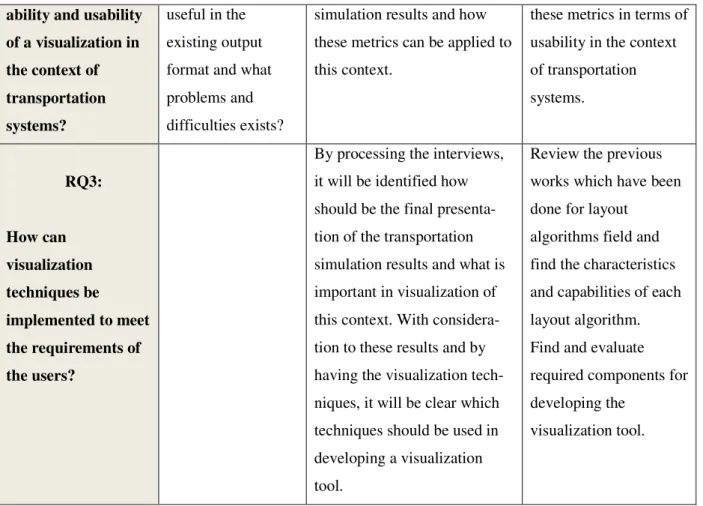
Moreover, it provides a chain of evidences from research questions to data collection and conclusion. The author will use Table 1 to map research questions to the sources such as interview and documentation. Cells of the Table 1 show how different sources should be used to collect data associated with each research question. Furthermore, the literature review which has been done regarding each research question is described.
Resources
Research questions
Documentation of TAPAS
Interview Literature review
RQ1:
What are the requirements of users who want to view the results from a transportation system simulator in a visual
representation?
Review the tech-nical documents of transportation simulation systems or in general, supply chain simulators and extract potential candidates for visu-alization.
Asking transportation experts and users of system; What are major problems in the process of monitoring the results of simulator which cause difficulties and interrupts in their work? How much time and cost they spend as an outcome to above problems? What do they think about having simulation results visualized? Which information are they interested in?
Review the Information Visualization literature in order to gain knowledge about visualization and also to conduct an effective interview.
Review the transporta-tion visualizatransporta-tion sources, and extract important challenges of simulation results monitoring.
RQ2:
What are the important features for increasing
read-Review the docu-ments of a sample output result to find out if there is any type of visualization or not. What is
The results of interviews will be investigated to find which of the graph drawing metrics extracted from literature review, should be used in visualization of transportation
Review the literature of graph drawing
techniques to find all possible metrics which could be used in visualization. Evaluate
17
ability and usability of a visualization in the context of transportation systems? useful in the existing output format and what problems and difficulties exists?
simulation results and how these metrics can be applied to this context.
these metrics in terms of usability in the context of transportation systems. RQ3: How can visualization techniques be implemented to meet the requirements of the users?
By processing the interviews, it will be identified how should be the final presenta-tion of the transportapresenta-tion simulation results and what is important in visualization of this context. With considera-tion to these results and by having the visualization tech-niques, it will be clear which techniques should be used in developing a visualization tool.
Review the previous works which have been done for layout
algorithms field and find the characteristics and capabilities of each layout algorithm. Find and evaluate required components for developing the
visualization tool.
2.5 Evaluation methods
For the evaluation of the product regarding technical aspects, there are some methods like black box testing and white box testing [15]. Black box testing is usually used to ensure that the specific inputs could generate the desired output, while white box testing is usually used when the researcher wants to evaluate the correctness of all possible paths of the code. As this research is about applying visualization to a transportation simulation system and develops a visualization tool, it is possible to test it by both black box and white box testing.
For black box testing, the simulation results of TAPAS can be considered as input for visualization tool. So, it is possible to test the visualization tool regarding the
18
correctness of the created output. It means that we can design test cases to check if a special set of input creates the correct output or not.
Furthermore because the nature of this research is based on user satisfaction and improving the process of monitoring simulation results, we can also evaluate this research from a different point of view. Oates [15] has introduced three type of evaluation of a product from a different point of view:
• Proof of concept: is based on creating a simple prototype to show the feasibility of the researcher’s solution in terms of having the specific properties under specific circumstances.
• Proof by demonstration: it deals with evaluation of the product in practice, but not in the real-world. In this approach, the researcher will restrict the context and apply the solution or use the product on a restricted context.
• Real-world evaluation: In this approach, the researcher is examining the product in a real context not in an artificial one.
In this research, the second approach for evaluation of artifact was used. Therefore, we have evaluated the results in a restricted domain with non-real users. We have planned to do real-world evaluation in the future, where a real case and real users will be used for evaluation. For this purpose, an existing transportation simulation system, “TAPAS” [3], has improved by enabling users to observe simulation results visually. For evaluating whether these improvements are useful or not, we need another strategy.
Plaisant has categorized common evaluation methods in the field of Information Visualization into four groups [18].
• Controlled experiments comparing design elements. • Usability evaluation of a tool
• Controlled experiments comparing two or more tools. • Case studies of tools in realistic settings
So, for the evaluation of improvements of the case, the second approach was used. Indeed, after improving “TAPAS” as a case study, these improvements were evaluated through performing usability evaluation of TAPAS. This could also be done through
19
sending a questionnaire to TAPAS users to find out if the improvements could increase readability of TAPAS output or not. This work is considered as a future work for the thesis.
20
3 Literature review
It is crucial to understand the concept of visualization to develop a tool for data visualization. Thus, first part of this chapter reviews the related concepts of information visualization. The second part previews literature about principles and theories of graph drawing. Also, previous studies on information visualization in the transportation context will help to use best practices in the design and development phases. Therefore, in the third section, previous works on application of information visualization in transportation systems are presented.
3.1 Information visualization
Information Visualization is a relatively new area of study which is acquiring more and more attention in both academic and industrial environments. This concise introduction to the subject explores the use of computer-supported interactive graphical representations to explain data and amplify cognition [19]. In fact, visualization plays an important role in human perception of the environment. “Visualizations have a small but crucial and expanding role in cognitive systems. Visual displays provide the highest bandwidth channel from the computer to the human” [2]. Owing to the importance of visualization in real world problem domains, it has been growing tremendously in recent years. Several books have been published in Information visualization. Also the number of conferences in this field has been steadily increasing [20].
Information visualization is a multi-disciplinary area of science and includes elements of human-computer interaction, computer science, graphics, visual design, psychology, and business processes. Nowadays, Information visualization has a large area of applications including: scientific research, digital libraries, data mining, financial data analysis, market studies, manufacturing production control, and crime mapping [21].
In this research, we have focused on visualization of data in the context of transportation. For visualizing a transportation network, we need special techniques of
21
graph drawing. An important characteristic of this context is positioning the elements on the screen. So, we will investigate the techniques for visualizing a set of nodes and their relations in the next section.
3.2 Principles and basic theories of graph drawing
Graph Drawing is a way of visualizing datasets. The positioning of nodes (or vertices) and edges can influence usability, readability and aesthetics. The algorithms which are used for positioning are called “Graph Layout Algorithms”. There are different layout algorithms with different positioning perspectives. In fact there is no best graph layout algorithm and it depends on the purpose of visualization [22].
This is highly relevant to the approach of visualizing transportation systems in this thesis, because of the fact that the positioning of nodes and links and their attributes are key factors in the context of transportation systems.
In this section, the general metrics and criteria for drawing graphs in an aesthetic way will be introduced. Furthermore, some of the most common graph layout algorithms will be described.
3.2.1 Graph drawing concepts
There are some theoretical guidelines for graph drawing. Battista et al. have categorized most important parameters of graph drawing methods into three graph drawing concepts, to achieve better description of requirements of a good drawing [7]. These principals are as followed:
• Drawing conventions • Aesthetics
• Constraints
3.2.1.1 Drawing conventions
“A drawing convention is a basic rule that the drawing must satisfy to be admissible.” [7]. In fact, drawing conventions are the basic rules which must be considered in graph
22
drawing. These conventions are tightly coupled with the context and area of application. One example of a drawing convention could be Orthogonal Drawing in which each graph graph is drawn as a polygonal chain of alternating horizontal and vertical segments (Figure 3).
Kaufmann et al. [8], have described the connectivity of drawing conventions to the traditional drawing style in a specific context. Based on this research, it is important to consider the traditional way of visualizing data of a specific context. For example, it would be more meaningful to draw a graph in the context of electrical circuits, in an orthogonal shape [8].
Because of the fact that this thesis is about graph visualization of data in a specific context; transportation systems; the above concept is very relevant and useful for this thesis. We can adopt some special conventions for a specific application based on the user requirements. For example, in visualization of transportation systems we can make a rule for representing all the nodes of graph with an icon relevant to their type.
Figure 3, Taken from [7]
3.2.1.2 Aesthetics
Graph aesthetics concern parameters which could increase graph drawing readability through focusing on aesthetic issues. “Aesthetics specify graphic properties of the drawing that we would like to apply, as much as possible, to achieve readability.” [7].
23
Manning [23] has formulated some possible criteria of drawing a “good” graph, for example, these criteria lead to increase uniformity of edge lengths: Minimizing the maximum edge length, maximizing the minimum edge length, minimizing the sum of edge lengths, minimizing the number of distinct edge lengths. In this research, the researcher has tried to create an ideal graph drawing by selecting and combining a set of criteria. In case of having a small set of data, a set of criteria could generate a unique drawing, but if the data set is complex and big, the probability of occurring conflicts in the given criteria increase. In this case, no graph drawing will be generated. Since there are many criteria for drawing a graph [23] and each one could highlight different specifications of a graph, we must identify which graph drawing criteria is the most important for the specific context and application of the visualization. In this case we can select only some of the criteria which have the most importance in a specific context.
Kaufmann et al. have proposed an idea about the level of importance of different graph drawing metrics [8]. They pointed out the fact that selection of graph drawing criteria is dependent to the context of application. For example, in case of drawing VLSI circuits, some criteria like minimizing the edge length are more important than others.
There are some commonly accepted aesthetics [24, 25, 26]. Applying these general criteria to a graph drawing, will increase the graph readability. Some of these criteria are as below:
• Minimizing the number of edge crossings [27] • Minimizing bends [28, 29]
• Maximizing symmetry [30, 31]
• Adjacency of nodes which have a connection [24] • Drawing edges as straight as possible [24]
In case of occurring conflicts between aesthetic criteria in drawing a graph, we need a procedure to select a set of criteria which make a drawing more readable. There are some researched which attempt to grade these criteria base on the effectiveness on human understanding [32, 33]. Purchase [33], has placed a priority order for the
24
importance of the aesthetics. She has done online experiments and measured the ease of understanding drawings. The result of this research indicates that minimizing the number number of edge crossings, is the most important aesthetic criteria, while minimizing bends and maximizing symmetry have less effect on human understandability [33]. Despite the fact that this type of grading could be helpful for building effective drawings, there is still a need for adding the concept of context or application domain for prioritizing aesthetic criteria. In this thesis, specific criteria for drawing graph of data in the context of transportation systems will be proposed.
3.2.1.3 Constraints
“Semantic features can be expressed by means of constraints on the drawing.” [34]. Based on this fact, for features that require knowledge about the meaning of the drawing, we can define constraints for graph drawing. As an example, if a set of nodes has more importance than others in a specific application domain, it would be more readable and meaningful to use constraints that place this set of nodes in the center of drawing. Tamassia et al, have classified different type of constraints [34]:
• CENTER: place a set of specified nodes in the center of the graph • DIMENS: assign the dimension of the symbols representing given nodes • EXTERN: place given nodes on the outer boundary of the graph
• NEIGH: place a group of nodes as close together as possible • SHAPE: draw a sub graph with a pre-defined shape
• STREAM: place a sequence of nodes on a straight line
This thesis contributes to this concept by defining the most important constraints in transportation system application domain and uses these constraints to achieve a more readable graph.
3.2.2 Graph drawing layout algorithms
There are some general approaches for positioning nodes and edges. The most important and commonly used approaches are listed below [35, 36]:
25
• Force-base drawing algorithms: In this layout algorithm, the network of nodes and edges are simulated as an electrical system. There are attraction and repulsion forces between nodes and edges. These forces will apply to nodes and the position of nodes will change accordingly. The goal of this algorithm is to reduce the energy associated to graph layout. This algorithm has an iterative nature and it will be repeated until the energy system reaches to a balanced state [30].
• Geographical approach: In this strategy, position of nodes is based on geographical attribute of nodes on a map [37].
• Circular topology: This layout algorithm tries to put nodes on a circle, so the edge crossings will be at the center of the circle [38].
The selection of which approach should be taken is highly dependent on the domain of data to be visualized. For example, in a particular context such as social network, the circular topology is more meaningful than others. In this thesis, the Geographical approach has been used, because of the fact that this approach responds to the requirements of users in the transportation simulation context.
3.3 Transportation system visualization
In order to investigate previous works in the area of visualization of transportation systems, different web sites and journals such as IEEE, ScienceDirect, Elsevier , ACM, and Google Scholar have been reviewed. The keywords used in literature review were “transportation systems visualization”, “transportation chains visualization”, “visualization of transportation simulation” and “visualization of transportation simulation systems”.
There are several research groups working on transportation, such as “Transportation@MIT”1 and research groups in different universities like Monash2,
1http://transportation.mit.edu
26
Southampton3 and Cambridge4. Each research group has different approach to transportation, but none of them has focused on applying visualization methods to transportation simulation in order to monitor the effects of input on final results of the simulation.
However, the “Visualization in Transportation Committee”, a sub-committee of the “Transportation Research Board” (TRB5), is focused on visualization techniques for transportation issues. Most of the studies on transportation visualization are referred to this committee. After reviewing the related publications, it became clear that the research goals of the relevant work are different from those of this thesis. Most of previous studies have focused on visualization of the physical products (e.g. a new road or bridge) and the impact of these products on transportation system, whereas this thesis emphasizes on visualization of output data from transportation simulation systems. To put it simply, the focus of the mentioned research group is visualizing and envisioning the transportation related products such as bridges and roads to facilitate decision making by stakeholders. In fact, they try to show the picture of improved situation to stakeholders and visualize the outcome of their decision. But this thesis tries to improve readability of information related to transportation simulation results.
Hixson has classified different applications of visualization in transportation [39]. Some of them are listed as below:
- Design
- Identification and evaluation of human factors - Analysis of outcomes
- Getting approval from stakeholders and relevant agencies - Security issues
According to Hixson [39], the main uses of visualization are in the design process and it aims to facilitate the work of designers and getting public approval to reduce the rework costs. Although the approach of using visualization in transportation for design purposes
3http://www.trg.soton.ac.uk/index.htm 4http://www-trg.eng.cam.ac.uk/ 5http://www.trb.org
27
is also a goal of TAPAS, this approach is relatively different. In the above research, the use of visualization in design process is limited to showing the anticipated final product (e.g. a road, a bridge) with respect to architectural factors as input, while in this the aim of visualization is to show the impact of applying different measures in transportation process, such as taxes in a visual model.
Although visualization has been used in transportation field for many years and several studies have been done for improving and customizing visualization techniques for transportation goals, there is still a lack of research for application of visualization in planning process [40]. Use of visualization in planning process, can cover human and environmental aspects of transportation projects as well as economic impacts. Hughes [40] believes that the research which have been done in this field so far, mainly concerns how to involve stakeholders in design process and investigate what are effective ways of demonstrating design alternatives to different stakeholders. He argues that there is a need to apply visualization techniques in transportation by considering environmental perspectives in planning process [40]. This thesis is focusing on the impact of transportation decisions on environmental aspects and visualizing the results.
There is other research which describes the benefits of applying visualization in the transportation field [41]. In this research, one benefit of visualization is introduces as a complementary way for ensuring alignment of achievements with planned improvements.
Hannon [42] has introduced another concept in visualization, named “Virtual Reality”. He has made a comparison between simulation and VR. Simulation is defined as a process in which a model of a real system is created in order to discover the effects of changing system’s variables on the whole system and on the future system’s behavior. In this research, virtual reality is defined as a technology which output has these characteristics [43]:
• Computer generated • 3D model.
• The ability to interact with user and the user must be able to navigate the system and feel the effects of variables in a real simulated system.
28
This thesis will investigate the visualization of the results of a simulation and it will not cover the visualization of how a system works. Thus it will be a 2D visualization of simulation output and it will show how input data could change the behavior of the system by visual models and diagrams.
Hughes has reviewed current trends and approaches in visualization of transportation data [44]. Based on this research, two techniques of visualization are mainly used in the context of transportation:
• Map-based visualization: Because of that the nature of data in the context of transportation often is based on geographical information, using map as a background and visualizing transportation data on a map can be considered as a wise solution. Typically, the transportation-related information consists of source, destination and routes between them. Thus, it can be more meaningful to make the use of maps for visualization of freight data. An example of map-based visualization is illustrated in Figure 4.
29
Figure 4: A sample map-based visualization of freight data (Taken from [44])
• Using “Score Cards” and “Dash boards”: These techniques can be used with the aim of tracking Key Performance Indicators (KPIs) of a system and also system level variables for users. A sample visual model of “Score Card” by using bar chart for visualizing the KPIs, is shown in Figure 5.
Figure 5: A sample score-card visualization of freight data by using bar chart (Taken from [44])
In the Kutz handbook of Transportation Engineering [45], two points of visualization which are important in transportation field are:
1. Use of visual models to show status of transportation network to managers and the public.
30
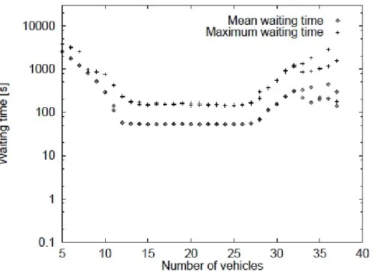
Hoff, et al have done a research about simulation of Automated Guided Vehicle Systems (AGVS) and visualization of simulation results [46]. They visualized the simulation results in the form of diagrams. One sample diagram in showed in the Figure 6.
Figure 6: A sample diagram of simulation results which depicts the Dependence of waiting times on the number of vehicles used. (Taken from[46])
There is research in which the authors have worked on developing a software system for visualizing their multi-agent model of logistics management [47]. Their proposed features for the software, consists of visualizing the simulation process, routes, the appearing of loads and truck movements. This software is the visualization of how the simulation system works. It has the ability to work in two modes, static and dynamic. In the static mode, the user can navigate through the time and in dynamic mode, the movements and actions in simulation are controlled by a timer. The researchers did not provide any picture of this system in the article.
31
As the scope of this thesis is investigating in visualization techniques for a multi-agent based transportation simulator, where monitoring the effects of applying measures is the goal of simulator, it is very different form the research which have been done in this field so far.
32
4 Empirical case
In this section, we will study the TAPAS case as a real implemented transportation simulation system. First of all, the TAPAS system as the unit of analysis is introduced. Secondly, with regard to RQ1, the visualization requirements of TAPAS users will be identified and analyzed. Next, the potentials of visualization techniques to cover identified user requirements will be discussed. At the next step, the functionalities and features of a TAPAS visualization tool will be elaborated (RQ2). Finally, results of the construction phase will be represented (RQ3).
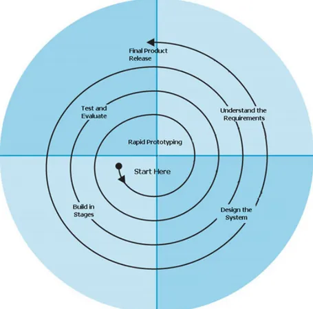
The process for designing the visualization tool is based on the “Systems Engineering” process [48, 49]. We have followed “System Development Life Cycle (SDLC)” as a life cycle of system development; in which we have Analysis, Design, Implementation, Testing and Evaluation [50]. Furthermore, we have used the “Spiral Model” for the migration from requirements to design solution [51]. This selection made due to the fact that we have created prototypes of the system to get user feedback during development process. This method has an iterative nature and we repeat each iteration until the final product is made. We have used a simple summarized model of spiral method for this project, which is showed in Figure 7. We have selected this method because this project is a small project and it is not possible and meaningful to follow all the detailed steps of the complete spiral model. As an example, it is not necessary to do risk analysis for a small project. The original model of spiral method which is illustrated in Figure 8, displays the iterations of the “Spiral Model” [51].
33
Figure 7: Simple spiral model for software development (Taken from http://www.arctern.com/Development_Methodologies.aspx)
34
Figure 8: Original spiral model for software development (Taken from [51])
4.1 TAPAS
TAPAS is a Multi-Agent-Based Simulation (MABS) model which aims to analyze the effects of applying production and transportation measures on supply chain activities. There are different types of measures which can be considered as input to TAPAS. TAPAS can be used to predict the consequences of various measures for decision and
35
policy makers, before making any decision. Some of these measures are listed below [52, 4, 10, 54, 55]:
• Governmental control policies, such as taxes and fees,
• Infrastructure investments, such as investments in a new road or railway, • Strategic business related strategies, such as changing the location of a factory
The output of TAPAS shows how supply chain actors are assumed to react to above measures. So, the users of TAPAS can interpret the results and make more informed decisions and avoid undesired effects. The main outputs of TAPAS simulation are described below:
• Economic effects, such as costs for fuel and taxes • Logistic effects, such as such as route and mode choices • Environmental effects, such as different type of emissions
It is important for users to compare the output results of applying different measures (scenarios).
A TAPAS simulation scenario consists of a set of transportation and production actions, and a set of measures which are applied to the simulation. Thus, each scenario studies the effects of a certain set of measures on the supply chain.
TAPAS can have two types of users. The first group is public policy makers, who are interested in predicting the impact of their decisions in approaching their governmental goals, e.g. emission targets. The second group can be private companies and enterprises and other stakeholders of transportation and production, who want to enhance their competitive advantage among other companies. Different type of users may intend to apply different measures. For example, public authorities are more interested in the first group of measures, i.e. governmental control policies, while enterprises might be more eager to predict the effects of their business related decisions, such as changing the location of a factory, on their profit. However, enterprises might be also interested in monitoring the effects of a new transport policy [53, 54].
36
We have selected TAPAS as our case because
1- TAPAS is an implemented transportation simulation system without visualization tool. Thus, it is not easy for users, especially for non-expert users, to interpret the results of simulation, compare output of different simulation scenarios, and make a decision based on their interpretation. A visualization tool can be a complementary tool for TAPAS, and help users to compare results. One of the motivations for selecting TAPAS, is that it is fully implemented and it is currently applied to real cases.
2- TAPAS is an outcome of research conducted at Blekinge Institute of Technology6 and information of the project is accessible for this researcher at Malmö University. Some of the researchers of this project are currently working at Malmö University, so I have access to the resources of TAPAS.
3- Users of system are available for interviews and questionnaires.
4.1.1 Definition of TAPAS terms
There are some terms which are used often in the TAPAS documentation, and therefore in this research.
• Node: A node can be different kinds of actors in the transportation chain, for example: customer, producer (a factory), or a connection point (terminal) [53] • Transportation mode: A transportation mode represents the type of
transportation (e.g. road, rail, or sea)
• Link: A link is a directed connection between two nodes. A link can have exactly one mode of transportation. However, we can have several links between two nodes which differ in their transport mode.
4.2
Requirements analysis
In this section, the efforts which have been done to address the first research question of this thesis; which is: “What are the requirements of users who want to view the results
37
from a transportation system simulator in a visual representation”; are presented. In order to answer RQ1, it is necessary to understand the problems of users regarding readability and usability of TAPAS output, and how a visualization tool could help them. In addition, we need to know the type of target groups who potentially can use TAPAS, because their needs should be considered in the design process of the visualization tool of TAPAS. This can be achieved through a requirement analysis. In order to gather requirements of each target group we conducted interviews with TAPAS users, who are mostly expert in the field of transportation. The first part of this chapter classifies and describes different type of user groups. In the second part, we describe the method of data gathering for each target group. Conclusion of the user requirements will make the last part of this chapter.
4.2.1 Classification of TAPAS users
Based on previous publications of TAPAS, we can categorize potential users of TAPAS into two main sections: Public authorities and large companies [54]. These are users of TAPAS simulation system in general. But for this research’s purpose, which is developing a visualization tool for TAPAS, we can consider that we have another type of users who are developers of TAPAS. They can be also considered as TAPAS users, because of the fact that they are entering various scenarios to the system and run simulation several times to generate simulation results.
Hence, we can categorize TAPAS users from another perspective: • Expert users
• End users
Expert users are analysts and researchers who work with the simulation system and manipulate the simulation results.
End users are decision makers who can use simulation results to improve their work. Both decision makers in public authorities and large companies are considered as end users in this case. Some part of the end users can be the users who do not work with the visualization tool, but they use the output of visualization tool. This group can be called
38
off-line users, who just see the output of visualization tool as screen dumps or statistical charts. We consider that this type of users have the same requirements as end users.
4.2.2 Data gathering method
For answering RQ1, it is necessary to analyze the user requirements. Each type of users has their own concerns and expectations from the system. In order to identify user needs, two interviews with expert users of TAPAS have been done. The interviews aim to find the user requirements and discover probable problems which TAPAS users face without visualizing the results. The interview questionnaire and the answers are enclosed to this report as Appendix I.
Furthermore, we have designed a web-based questionnaire for potential end users to understand their special needs and interests of a transportation simulation visualizer. The screenshots of this questionnaire are attached to this report as Appendix II.
4.2.2.1 Interview with expert users
Due to the fact that the expert users were not accessible for a face-to-face interview, interviews conducted via Internet. Therefore, a structured interview with pre-defined questions performed.
From the interviews with expert users, the author found out that currently, there is no Graphical User Interface for presenting the results of simulation. Although they mentioned that there were some attempts to visualize the TAPAS, the purpose of visualizing was relatively different. The aim of that work, which was done at Blekinge Institute of Technology7, was to demonstrate the TAPAS simulation process. To put it simply, the visualization tool, called GRACE, is about visualizing the process of simulation and it does not cover the visualization of simulation results. Furthermore, one of the characteristics of GRACE is that it covers only a specific pre-defined scenario and it cannot be used to visualize different simulation scenarios. The interviewees also mentioned that the people who was involved in this project and had knowledge about this
39
visualization tool are not accessible now. Therefore, it is not possible to extend or reuse this tool easily. Some screenshots of GRACE visualization tool are presented in Figure 9 and Figure 10.
Figure 9: A sample screenshot from GRACE which shows the process of simulation (Taken from http://www.bth.se/tapas)
40
Figure 10: A sample screenshot from GRACE which shows different bar charts during simulation (Taken from http://www.bth.se/tapas)
Another point that extracted from the interviews is that the input data and output of TAPAS simulation system are stored in SQL database. Thus, to generate a meaningful output result from TAPAS, they have to design some queries. Also, the users have to analyze these data manually to create some graphs, tables and diagrams to show the output in a more understandable way. Since the process of formulating SQL queries and analyzing the collected output data is error-prone, sometimes they need to go back and start from scratch because of small errors. To summarize, one major problem for TAPAS users without a visualization tool is that the whole process of designing visible outputs from TAPAS is quite time-consuming.
Both of the interviewees agreed that visualization can help TAPAS users to have a better and clearer understanding of the results. They had also some suggestions for visualizing. One valuable suggestion is visualizing also the “input data” for different scenarios of simulation. It can help users to realize which input has resulted to this output. It is also a good suggestion to show and compare different scenarios. So that the users can gain a better understanding of how applying different input measures can change the results (e.g. route choice).
41
TAPAS has different output that can be visualized [3,55]. One of the questions of the interview is focused on identifying the interests of users regarding visualization of output. The interviewees suggested some of the output which is important to display in a visual form. Both of interviewees have the same idea about visualization of output, but they expressed them in different languages. The important output to be visualized can be categorized as below:
1. Route choices (percentage between different routes) 2. Mode choices (percentage between different modes) 3. Transportation per link (e.g. number of vehicles per link) 4. Share of amount of emissions per route (e.g. CO2) 5. Transport cost (per route)
6. Different types of other costs (per route)
As a conclusion of the interviews, the author found that there is an inevitable need for visualization in TAPAS to facilitate the process of analyzing simulation results. Furthermore, it is now clear what requirements of the users are with respect to visualization of output.
4.2.2.2 Interview with end users
End users can be defined as decision makers who are working in the transportation field. We designed 7 questions and published them through an online survey. This decision was made because the selected users were in different countries and they were not accessible for a face-to-face interview. Also, we should minimize the number of questions to encourage the respondents to answer the questionnaire. Due to the fact that there were just few end users available, we have sent our questionnaire to three users. Although this questionnaire was easy to answer and it provides visual models to make it more tangible, we received only one response. A possible reason for this is that it was summer vacation and perhaps some of the selected users were on vacation.
The purpose of this questionnaire was to find out which type of simulation data the end users are interested in. We used the knowledge extracted from literature review and the previous interview with expert users to suggest possible data which they may be
42
interested in. Furthermore, we have put some screenshots from our design solutions to get their opinion regarding their preferences to see information of simulation and how the final visualization tool should looks like.
From this questionnaire, we extracted their interests for visualization of different kind of the TAPAS output. The user is interested in to see route choices, modal choices, and amount of emissions in a visualized model. Also, this user believes that comparing different scenarios of simulation could be an important feature of the system. The user also feels that visualization of simulation results could contribute to his work.
For the next three questions, we provided mock-ups of our proposed visualization tool which we had made using Microsoft PowerPoint. The aim of these questions is to gain the user’s opinion regarding the importance of showing information related to each route or each link in the transportation network. From these questions we realized that the respondent is interested to have information related to each route.
4.2.2.3 Conclusion of user requirements
Req1. Showing input and output of simulation: We can conclude from the interviews
that both expert and end users are interested in a visualization tool and that they think it could facilitate their work. Also, they need to see which input has resulted in a specific output; just visualization of simulation output will not be meaningful for them. Thus, we conclude that we should visualize the input related to each output as well.
Req2. Showing different scenarios concurrently: Both types of interviewees would
like to be able to see several different scenarios at the same time. They found it useful to compare various scenarios and their related output. Also, they think this feature can help them in evaluating the output results and facilitate the decision making process.
Req3. Showing simulation information based on links and routes: Furthermore,
interviewees had some suggestions for which output is more meaningful to be visualized and which not. We can also conclude that they need to see information related to both links and routes.
43
In the next section, in order to understand how visualization techniques could help representing simulation results effectively, we correlated visualization techniques with important information for users in the next section.
4.3 Visualization Techniques versus Requirements
The strategy of answering the second research question (RQ2); which is “What are the important features for increasing readability and usability of a visualization in the context of transportation systems?”; is correlating the user informational requirements from interviews with visualization techniques from literature review. Thus, after studying the current state of the art in visualization algorithms and by considering the points extracted from interview, we have decided on which visualization techniques can be helpful for representing TAPAS outputs. Based on the results, we have proposed a mapping for visualization of different outputs.
This mapping relates the interview results to possible visualization techniques. To put it simply, after analyzing interview transcripts, the different types of TAPAS users and their special requirements regarding visualization of output are determined. Based on the knowledge obtained in the literature review about visualization techniques, the mapping can be completed by relating each user need to a suitable visualization technique. The proposed mapping contributes in the design of the visualization tool. This mapping is presented in the table below (Table 2). This table shows how we can use visualization techniques for addressing the visualization requirements of users.
As stated before, the spiral model is used in this thesis to migrate from requirements to design solution. As a part of this migration, several mock-ups of the tool have been prepared and shown to the users. Based on the user feedbacks, this mapping is revised several times to get the most appropriate visualization solution. Therefore, we have started with an initial simple mapping and we have revised the mapping after getting the user opinions.
In this mapping, each “*” describes how the user requirements (each column) could be satisfied by the visualization techniques (each row). So, the existence of a “*” in a cell
44
means that this visualization technique is selected and approved by the user to cover the specific user requirement.
This mapping is a brief illustration of design decisions in response to the user requirements, which is used in the development phase. In fact, this mapping provides a guideline for understanding which visualization technique should be implemented for satisfying user requirements. Furthermore, we have used this mapping for design of the mock-ups.
Furthermore, we have concluded from literature review and user requirements to display all the informational requirements of users on a graph. Also from literature review we found out that a good solution for visualizing a transport network, could be displaying a map as background.
User Groups
Visualization Technique
Expert and end users informational requirements (Req3)
Route Choice Mode Choice Transportation per link Emissions Transportation Costs Using colors *
Using pie chart * * *
Thickness of edges * * * * * Highlighting edges * Using different edge styles * Displaying data on edges * * *
45
Furthermore, by analyzing the interview results, we can conclude that there are two ways for presenting information which users are interested in; information on link and information on route. So, we can categorize user requirements with regard to visualization in two parts.
• Link based view • Route based view
The information is mainly connected to each route, while displaying some information for each link can be also meaningful.
4.4
Features and Functionalities of TAPAS Visualization tool
Because of the fact that the design decisions could not be discussed with users just by explaining theories, we have designed several mock-ups of the visualization tool. A mock-up could help users to imagine the real system and facilitate the process of designing functions and features of the visualization tool.
Thereby, we designed mock-ups by Microsoft PowerPoint in several steps and discussed with expert users and end users to get their feedback.
Based on the above mapping, the proposed User Interface of the TAPAS visualization tool can have two Tab Views; Link based view and Route based view. This simple sketch, Figure 11, was produced as the first step. The relevant information of each category can be displayed in their related tab.
46
The second sketch shows the different techniques of visualization, which can be used to show different transportation modes between two nodes. This sketch is illustrated in Figure 12. This sketch is presented to the expert users and they suggested taking the second approach for demonstrating different transportation modes. For the reason that TAPAS users have employed different edge styles as a notation for different transportation modes in the previous articles and documents of TAPAS, they suggested to follow the same notation. In this case, this visualization tool can be more tangible for users.
![Figure 1: The research process of this thesis (Based on [15, 17]).](https://thumb-eu.123doks.com/thumbv2/5dokorg/4069507.84700/13.892.137.843.503.998/figure-research-process-thesis-based.webp)
![Figure 2: The impact of different criteria on selection of research method, Taken from [17]](https://thumb-eu.123doks.com/thumbv2/5dokorg/4069507.84700/15.892.163.760.163.424/figure-impact-different-criteria-selection-research-method-taken.webp)
![Figure 4: A sample map-based visualization of freight data (Taken from [44])](https://thumb-eu.123doks.com/thumbv2/5dokorg/4069507.84700/29.892.140.769.374.851/figure-sample-map-based-visualization-freight-data-taken.webp)
![Figure 8: Original spiral model for software development (Taken from [51])](https://thumb-eu.123doks.com/thumbv2/5dokorg/4069507.84700/34.892.137.758.166.748/figure-original-spiral-model-software-development-taken.webp)


