Evolution of Technical Debt:
An Exploratory Study
Md Abdullah Al Mamun1, Antonio Martini2, Miroslaw Staron1, Christian Berger1, and J¨orgen Hansson3
1 Department of Computer Science and Engineering, Chalmers | University of
Gothenburg, Gothenburg, Sweden. abdullah.mamun@chalmers.se, miroslaw.staron@cse.gu.se, christian.berger@cse.gu.se
2
Department of Informatics, University of Oslo, Norway, antonima@ifi.uio.no
3 School of Informatics, University of Sk¨ovde, Sweden, jorgen.hansson@his.se
Abstract. Context: Technical debt is known to impact maintainabil-ity of software. As source code files grow in size, maintainabilmaintainabil-ity becomes more challenging. Therefore, it is expected that the density of technical debt in larger files would be reduced for the sake of maintainability. Ob-jective: This exploratory study investigates whether a newly introduced metric ‘technical debt density trend’ helps to better understand and ex-plain the evolution of technical debt. The ‘technical debt density trend’ metric is the slope of the line of two successive ‘technical debt density’ measures corresponding to the ‘lines of code’ values of two consecutive revisions of a source code file. Method: This study has used 11,822 com-mits or revisions of 4,013 Java source files from 21 open source projects. For the technical debt measure, SonarQube tool is used with 138 code smells. Results: This study finds that ‘technical debt density trend’ met-ric has interesting characteristics that make it particularly attractive to understand the pattern of accrual and repayment of technical debt by breaking down a technical debt measure into multiple components, e.g., ‘technical debt density’ can be broken down into two components show-ing mean density correspondshow-ing to revisions that accrue technical debt and mean density corresponding to revisions that repay technical debt. The use of ‘technical debt density trend’ metric helps us understand the evolution of technical debt with greater insights.
Keywords: Code Debt · Technical Debt · Technical Debt Density · Slope of Technical Debt Density · Technical Debt Density Trend · Soft-ware Metrics · Code Smells
1
Introduction
In recent years, the technical debt metaphor has received a lot of focus both from the academia and the industry due to its advantages of communicating and quantifying the impact of sub-optimal software artifacts. Researchers are continually working to find new metrics and techniques to calculate the accrual and repayment of technical debt, to find new ways to visualize it, etc.
Code smells are related to internal software qualities that accrue technical debt. Kruchten, Nord, and Ozkaya have considered code smells as legitimate artifacts in their landscape of technical debt [7]. Code smells impact various software qualities, e.g., reliability and maintainability [13, 15, 5]. Likewise, rela-tions of code smells with software faults have also been investigated [14, 8].
The principal of technical debt related to a code smell is the expected time to fix it. SonarQube [1] is a tool that reveals a plethora of code smells and other violations and uses measures to calculate the principal of technical debt based on heuristics developed together with expert developers. Understanding how these measures evolve over time (e.g., how much principal has been accumulated and refactored) and how these measures evolve with respect to the change in size of different files, would tell us more about how developers accumulate and refactor technical debt. In addition, we do not just want to understand if the absolute technical debt has grown from last commit, but we are interested in understanding whether the density of technical debt has changed. For example, adding many functionalities (corresponding to a large amount of code) to a file but accumulating only a little amount of technical debt, should be considered different from adding the same amount of technical debt but adding just a few lines of code. Within the context of this research, technical debt density indicates the amount of technical debt per 100 lines of code. To our knowledge, in depth investigation of the evolution of technical debt density has not been studied. To understand and explain the evolution of technical debt, we have introduced a new metric ‘technical debt density trend’ . A detail description of this new metric is given in the next section.
The goal of this study is to investigate the evolution of technical debt concern-ing the newly introduced metric ‘technical debt density trend’ . We particularly want to investigate whether the trend metric helps to understand the evolution of technical debt better. Therefore, this exploratory study has the following re-search question. RQ: How do the ‘technical debt density trend’ metric contribute to explain the evolution of technical debt?
To answer the research question, we conducted an exploratory empirical study based on 21 open source projects collected from the GitHub. We have extracted 13,120 data points from 4,013 files and 11,822 commits. Each of these revisions are automatically checked by SonarQube tool against 138 code smells. We have observed that a file has the highest level of ‘technical debt density’ at the earlier stage of its revisions and ‘technical debt density’ keeps reducing as the file size grows. We have devised a sophisticated way to calculate ‘technical debt density trend’ . According to our observations, the ‘technical debt density trend’ metric is interesting in different ways. One of the most interesting aspect is ‘technical debt density trend’ metric can be used to tag other metrics so they the other metrics can be explained with two components (in terms of positive and negative ‘technical debt density trend’ ) revealing the underlying dynamics of how overall ‘technical debt density’ evolves resulting from the mean of ‘technical debt density’ corresponding to positive ‘technical debt density trend’ and mean of ‘technical debt density’ corresponding to negative ‘technical debt density trend’ .
Description of the metrics are given in Section 2 and the detail derivation of the ‘technical debt density trend’ is given in Section 2.1. Related work is presented in Section 3 so that we have a clear picture of the metrics described in Section 2. Project selection, data collection, data processing and validity threats are discussed in Section 4 (methodology). Results with inline discussions are presented in Section 5 followed by conclusions and future work in Section 6.
2
Description of the Selected Metrics
In this section, we describe the metrics along with a discussion about their advantages for the purpose of technical debt evolution. The metrics are listed in Table 1.
Table 1: Metrics used in this study.
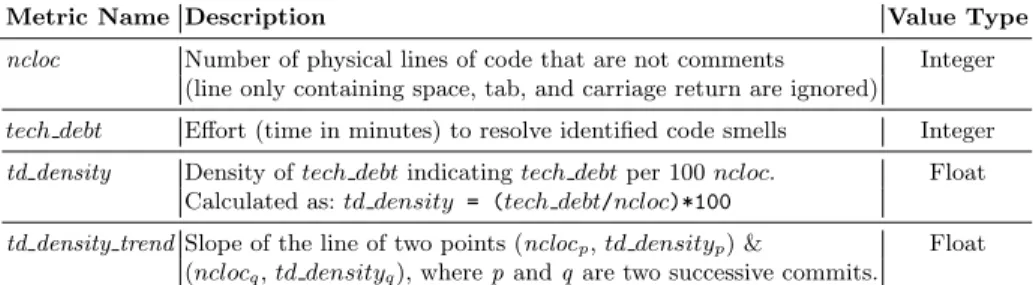
Metric Name Description Value Type ncloc Number of physical lines of code that are not comments Integer
(line only containing space, tab, and carriage return are ignored)
tech debt Effort (time in minutes) to resolve identified code smells Integer td density Density of tech debt indicating tech debt per 100 ncloc. Float
Calculated as: td density = (tech debt/ncloc)*100
td density trend Slope of the line of two points (nclocp, td densityp) & Float
(nclocq, td densityq), where p and q are two successive commits.
SonarQube’s ‘technical debt’ (tech debt ) metric indicates the total amount of time require to fix all the identified issues resulting from the source code analysis based on a set of rules (code smells, in our case). If we want to compare technical debt in two files or projects, we cannot directly use corresponding technical debt measures as the metric tech debt is not normalized, meaning, it does not make sense to compare files or projects of different size because a larger code base is likely to contain more technical debt. The same problem remains even if we consider two successive commits of a project or revisions of a file due to the reason that they are not of equal size.
The density measure of technical debt is a normalized measure, which indi-cates the amount of technical debt per n ‘lines of code’ (ncloc), say n = 100. When the normalized measure is used, we can compare technical debt irrespec-tive of the code size. Since, ‘technical debt density’ (td density) is a normalized measure of technical debt, we assume, td density does not suffer from the afore-mentioned problems. Therefore, we want to use td density as a measure for the evolution of technical debt.
Since, we have collected data at the file-level, our ncloc values indicate file size. A discussion regarding the sampling strategy of ncloc is available in Sec-tion. 2.1 and a description of the ncloc samples is available in SecSec-tion. 4.3.
2.1 ‘Technical Debt Density Trend’ (td density trend ) Metric Motivation As researchers, we not only want to know whether a latest commit of a project or revision of a file is better than the state of the technical debt before that commit/revision but also the extent to which technical debt has accrued or repaid. The practitioners might not always be interested about the detail numer-ical scale of the density but can be interested to know whether the latest com-mitted code was better or worse in terms of tech debt . Let us imagine a scenario where the latest commit of a project has increased total size (‘lines of code’ ) and total amount of tech debt of a project. From two successive td density val-ues alone, we have no way to conclude whether the quality of the code written in the latest commit was better or worse compared to the code base before it. There-fore, we need a metric that can answer these questions. To serve this purpose, we have introduced a new metric ‘technical debt density trend’ (td density trend ), which is not a delta measure between two successive td density. The metric td density trend resembles the same mathematical concept, a slope or gradient does for a straight line. A slope or gradient of a line measures the steepness of the line, which can be defined as ‘change in y’ over the ‘change in x’ of a line. So, constructing a slope requires at least two variables. Considering the slope of td density (that requires two dimensions or two variables) is better compared to taking the difference between two successive td density (or the delta measure which need only a single variable). Because, slope as td density trend has the ad-vantage that it incorporates both the td density and the ncloc measures. Since td density is a normalized measure, using delta of td density for td density trend is correct only if all the values within the set of ncloc are equidistant. In reality, this is not the case, meaning, size of file revisions are different. However, slope as td density trend can be used in both cases, i.e., values within the set of ncloc are equidistant or non-equidistant.
Measurement Approach To measure the trend, we can take the slope of a line between two td density corresponding to two successive revisions. This approach still has an issue as the size (ncloc) of the commit varies which does not allow to properly sample the data points in terms of ncloc so that there is a good spread of data points. Another approach to tackle this issue can be by considering ranges of ncloc, e.g., [1, 10], [11, 20], [21, 30], etc., and grouping all available data points according to these ranges. It does not make sense to group files that has their entire revision within such ranges. However, we can map the beginning data points related to files and assign within such ranges. For example, in Fig. 2(a), if we consider ranges [1, n1] and [(n1+ 1), n2] and so on, we have two data points for the two files, with one data point for each of the first two ranges. Still we have the issue that these two files might vary in size (ncloc) and number of revisions which cannot be considered in this approach, as this approach is based on only the starting of a file. A better approach would be to sample the data exactly at some specific ncloc points say n1, n2, n3, etc. as shown in Fig. 2(b).
Fig. 1: Calculation of td density at the intercepting point of nk and the line between points (ni, dp) and (nj, dq). n1 n2 n3 n4 n5 n6 ncloc (n) td density (d ) n1 n2 n3 n4 n5 n6 ncloc (n) td density (d ) (n1, d6) (n2, d5) (n2, d1) (n3, d2) (n4, d3) (n5, d4) n1 n2 n3 n4 n5 n6 ncloc (n) td density (d ) (n1, d6, s1) (n2, d1, s2) (n3, d2, s2)(n4, d3, s2) s1 s2 slope of line (a) (b) (c) density slope (s)
Fig. 2: Data processing for two revisions of two files. (a) original data (b) sam-pling data at specific points (c) getting a new dimension (td density trend ) in the data.
Let us consider, for two successive revisions of a file, we have a corresponding pair of data points (ni, dp) and (nj, dq), where n indicates ncloc and d indicates td density as per Fig. 1. We can find any value of dr (where dp <= dr <= dq) corresponding to nk(where ni <= nk<= nj) using the following equation which is derived by plugging in s, b (as mentioned in the inset of Fig. 1), and x in the line equation y = m ∗ x + b .
dr= dp+ ( dq− dp nj− ni
)(nk− ni) (1)
We have calculated td density values corresponding to ncloc at specific points n1, n2, n3, etc. by using Equ. 1 as illustrated in Fig. 2(b). Since at this point all successive data points for a file have an equal ncloc difference and we can calculate the slope of line or td density trend from each successive data points, we add td density trend measure with each data point if there exists a next data point and ignored the last data point. This transforms our two-dimensional data points as in Fig. 2(b) to three-dimensional data points in Fig. 2(c). This approach simplifies the problem as for any of our specified ncloc points (n1, n2, n3, etc.), a corresponding td density trend value says whether the td density has increased or decreased starting from that point. Since td density trend mathematically resembles the slope of a line, the magnitude of the td density trend express the rate of change of td density, which can also be an indicator of accrual/repayment of technical debt.
3
Related Work
Some work on the evolution of Technical Debt has been carried out. Most of the existing studies are focused on the evolution of code smells, with only a few recent studies focusing specifically on Technical Debt.
In [4], the authors look at at the evolution of both non-normalized and nor-malized technical debt over time. In the previous section, we have explained why evolution based on non-normalized ‘technical debt’ metric is not meaningful, so we have avoided it. Since there is a positive correlation of ncloc and ‘techni-cal debt’, which is also graphi‘techni-cally demonstrated in this study, their result of increasing growth of ‘technical debt’ for non-normalized case is not useful. Al-though their ‘technical debt’ measurement from SonarQube is the same as ours, the approach is different. The authors analyze one commit from every week, however, we analyzed every commit in the master branch. They gathered their measures at the project level, we have collected them at the file-level, there-fore, we have data at a much refined-level. However, most importantly, we have explained technical debt evolution based on a newly introduced metric.
In [2], the authors study the evolution of Technical Debt, measured by Sonar-Qube, to understand how the experience of developers affects the accumulation and refactoring of violations. However, the authors do not observe the rela-tionship among td density and size over different commits, they only count the absolute increment of TD over a single commit and study such increment with respect to different variables than the ones considered in our study.
Many studies concern the evolution of code smells, but most of them focus either on a few code smells, or they do not consider the principal amount of technical debt, or they do not study the evolution of td density with regard to td density trend . For example, in [3], the authors analyze the evolution of four code smells over time in two large Open Source projects. Our scope is however to look at the evolution of Technical Debt over multiple projects and a large selection of 138 code smells.
In contrast to the existing literature, the key contribution of our study is that we have used a new metric td density trend and combined this metric with the traditionally used td density metric to discuss the evolution of tech debt . We have identified and discussed some interesting attributes of the td density trend metric. In summary, this study has introduced a new way of looking at the evo-lution of technical debt with new insights and elaborate explanations in various scenarios using the proposed td density trend metric.
4
Methodology
The reason for using SonarQube is its industrial acceptance and popularity in the recent years. SonarQube is considered as the de-facto source code analysis tool to measure technical debt [6].
4.1 Case and Subject Selection
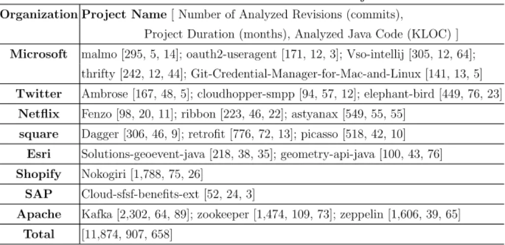
Open source software projects on GitHub serve as the data source for this study. We have used 21 open source Java projects from GitHub. These projects are se-lected based on several criteria such as the minimum LOC is 4,000, the minimum number of commits is 150, the minimum cumulative number of developers is five, and developed by well-known organization. We partially used GitHub’s search functionality which has limitations to fulfill our search criteria. The project se-lection was started from the GitHub’s showcase4 for open source organizations then continued with snowball sampling method. An overview of the selected projects is given in Table 2. More detail information regarding these projects are available in previous work [9, 10].
Table 2: Overview of the Selected Projects
Organization Project Name [ Number of Analyzed Revisions (commits),
Project Duration (months), Analyzed Java Code (KLOC) ] Microsoft malmo [295, 5, 14]; oauth2-useragent [171, 12, 3]; Vso-intellij [305, 12, 64];
thrifty [242, 12, 44]; Git-Credential-Manager-for-Mac-and-Linux [141, 13, 5] Twitter Ambrose [167, 48, 5]; cloudhopper-smpp [94, 57, 12]; elephant-bird [449, 76, 23]
Netflix Fenzo [98, 20, 11]; ribbon [223, 46, 22]; astyanax [549, 55, 55] square Dagger [306, 46, 9]; retrofit [776, 72, 13]; picasso [518, 42, 10]
Esri Solutions-geoevent-java [218, 38, 35]; geometry-api-java [100, 43, 76] Shopify Nokogiri [1,788, 75, 26]
SAP Cloud-sfsf-benefits-ext [52, 24, 3]
Apache Kafka [2,302, 64, 89]; zookeeper [1,474, 109, 73]; zeppelin [1,606, 39, 65] Total [11,874, 907, 658]
4.2 Data Collection
For data collection, we have used the SonarQube [1] to analyze all revisions in the master branch available on GitHub for each selected projects and generate various measures of our interest. Table 1 shows metrics used for this study. De-scriptions of the metrics collected using the tool are taken from the SonarQube’s database and metric definition page5.
SonarQube’s Java plugin has more than 300 code smells classified into dif-ferent categories. We have skipped all code smells that are categorized as minor because such code smells have less impact and the probability of the worst thing happening due to such code smells are low. We reviewed the rest of the code
4
https://github.com/showcases/open-source-organizations
5
smells and ignored code smells within the “convention” category that are specific to organizations. However, we kept the code smells related to naming conven-tions that are specific to Java and not specific to an organization. The list of 138 code smells used in this study is not included in this report due to space limitation, instead, are made publicly accessible online [11].
Table 3: Chronological steps for data processing.
St-ep Operation Number of files Number of file segments Number of data points
1 Raw data collected from database 11,358 2,527,990
2 Data points with NONE value removed 11,358 2,527,990
3 Remove successive duplicated data points 11,358 24,976
4 Files with single data points removed 4,013 18,371
5 Split every two successive data points into pairs 14,358 14,358*2 = 28,716 6 Transform every pair of data points so that we have data at
specific ncloc points, i.e., n1, n2, n3, etc. like in Fig. 2(b)
14,358 28,716 7 Delete any file segment that has a single data points 3,665 17,584 8 Create new pairs/segments by taking every two successive
data points of the existing file segments. A pair is of the form (n1, d6), (n2, d5) as shown in Fig. 2(b)
13,919 13,919*2 = 27,838 9 Calculate slope s1 from (n1, d6), (n2, d5) using Equ. 1 as
shown in Fig. 2(b) and transform the pair into a single data point with three elements (n1, d6, s1) as seen in Fig. 2(c)
13,919
10 Remove 782 data points associated to any ncloc >1200 be-cause of lower number of samples for higher ncloc values
13,137
11 Remove 17 outliers related to td density 13,120
4.3 Data Processing
We went through an elaborate processing of the collected data. We present the data processing steps chronologically in Table 3. At the end of the data process-ing, we have every data point in the form (ncloci, td densityi, td density trendi). Here, ncloci means the ncloc value at a certain point i. Here, i is a set of values {10, 20, 30,...,1200}. The metric td densityi denotes td density at ncloci and td density trendi indicates to the slope of the line connecting points (ncloci, td densityi) and (ncloci+1, td densityi+1). It can be noted that our final data points are independent of each other. Descriptive statistics regarding the pro-cessed data is reported in the appendix [11].
4.4 Threats to Validity
A general weakness of case study research is generalizability due to the reason that samples are not randomly selected from the population. There are two primary reasons why the selection of projects is not randomized for this study. First, the quality of the projects. According to GitHub’s statistics for 20176, 6.7 million new users joined the platform, of them 48% are students and 45% are totally new to programming also 4.1 million people created their first repository. Therefore, it is important that projects are carefully selected that hold quality up to a certain-level. We have selected projects from the well-known organizations with criteria like LOC, number of revisions, number of developers etc. so that our results are generalizable within such a context.
Programming languages have different constructs, therefore, measures of code metrics may vary due to programming languages. To minimize the effects of programming languages, we have selected projects that are mainly labeled as Java projects.
In section 2.1 we have discussed various threats related to different ap-proaches to sample and process the raw data for this study and concluded that sampling data at specific ncloc points with equidistance among the ncloc data points is a better approach which is considered for this study.
We discussed the chronological steps for data processing in Table 3. In step-5, we split data points of every file into sets of two successive data points. If the transformation in step-6 could be performed without the split in step-5, we could possibly have more data points in step-7. However, the exact amount of data loss cannot be measured here without actually doing it because step-6 also results in a loss of some data points specifically at the boundaries, meaning at the minimum and maximum ncloc positions of a file. Since our finally processed data points are independent of each other, loss of some data points either at the boundary or in the middle do not significantly impact the validity of this study.
5
Results and Discussions
For each result presented in this section, we provide an inline discussion. In the legends of Fig. 3, 4, and 6 dense slope indicates to td density trend .
5.1 Understanding overall accrual and repayment of technical debt throughout the development of source files
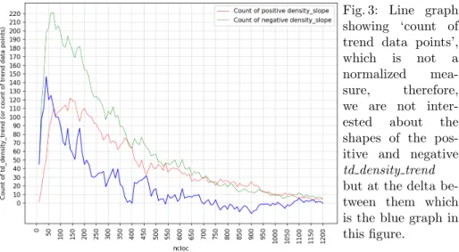
Since the td density trend metric is constructed from the slopes of lines between two successive pairs of (ncloc, td density) values, the graphs in Fig. 3 can also be read as a representation of our data points at different ncloc values.
Since the ‘count of td density’ measure is not normalized, we are not inter-ested about shapes of the positive and negative td density trend graphs in Fig. 3 but in the difference between them. The difference gives us a general idea at
6
Fig. 3: Line graph showing ‘count of trend data points’, which is not a normalized mea-sure, therefore, we are not inter-ested about the shapes of the pos-itive and negative td density trend but at the delta be-tween them which is the blue graph in this figure.
which phases (from starting to the end) source files accrues and repays technical debt. Such a view of technical debt is not possible without the td density trend metric. We get the positive and negative td density trend graphs by tagging files’ revision points or in our case trend data points with a positive or negative td density trend and this has an interesting and easy to understand intuition. We can simply tell, whether a given revision (corresponding to the ncloc value of a trend data point) a file is contributing toward the increase or decrease of the den-sity of technical debt or td denden-sity, which can also be interpreted as accrual or repayment of technical debt without the actual magnitude of debt. This gives us interesting insights how developers deal with technical debt density throughout the life-cycle of a file or project. From this understanding, we can say from Fig. 3, there are more revisions/commit at the beginning (at about 70-200 ncloc range) of life-cycles of files that contribute toward reduction of td density than accrual of td density. The difference between the positive and negative graphs gradually decreases up until 700 ncloc and after this we see that the two td density trend graphs are kind of inter-twined.
5.2 Effect of the cumulative nature of the tech debt metric
The overall mean and mean of positive and negative td density trend are re-ported in Fig. 4 where the slopes of the td density is much departed from zero at the beginning of the file and they gradually comes close to zero over time as the file size grows. One reason of this is that when the code size is small, a code change of an average size can highly influence the overall td density there-fore the slope of the td density i.e., td density trend . In the opposite manner, when the size of a file grows, a regular size change in the file would result in a much smaller change in the density of that file. According to our experiences of investigations [10, 12] of cumulative vs non-cumulative metrics, we opine that
Fig. 4: Line graphs show-ing mean td density trend . A close-up view is given in the inset.
the high steepness of the td density trend graphs at the beginning is due to the cumulative nature of td density metric. Such an effect can be avoided if non-cumulative (or organic as we described them in [10]) measure of tech debt is used to measure organic td density. An organic tech debt measure can be a delta or a code churn measure that would consider the tech debt exclusively written in a specific commit or revision without consolidating any previously written code, thus an organic td density metric would be free from the effects we observe here from the cumulative td density metric. It would be interesting to investigate how Fig. 4 would look like if it is constructed from the non-cumulative (or organic) td density measure. However, such an investigation is out of the scope of this study and can be considered as a future work.
5.3 Evolution of technical debt when td density is explained with td density trend
We would like to look at the scatter plot in Fig. 5 and the line-graphs in Fig. 6 showing relations between ncloc and td density metrics. While Fig. 5 shows all of our processed data points for these two metrics, Fig. 6 shows the overall td density mean values. It is quite interesting that on average a file has the maximum density of technical debt (td density) at ncloc 20. From thereon, the td density keeps reducing. It drops dramatically within the range 20-50 ncloc and then a moderate reduction within 50-175 ncloc followed by a slight reduction until about 350 ncloc. For even higher ncloc we see a slight growth of td density up to 900 ncloc and then a moderate decrease in td density until the end i.e., ncloc 1200. The beginning dramatic drop in Fig. 6 followed by a gradual drop is also influenced by the cumulative measure of td density, which we described earlier in this section for Fig. 4. Since several factors are involved for the slope
Fig. 5: Scatter plot for the metrics ncloc and td density. Here, red data points indi-cate positive td density trend and green data points indi-cate negative td density trend . Fig. 6: Line graphs showing mean density of technical debt (td density). This figure is an accumulated representation of the data points in Fig. 5.
dynamics of Fig. 6, it is necessary to investigate the relations between ncloc and td density without the effect of cumulation.
In Fig. 5 some data points somewhat outside of the rest of the data points. For example, the series of red points between 400-500 td density in Fig. 5. Since we have high amount of samples within the ncloc range 100-300, the effect of these points would not be significant and we do not observe any irregular pattern within this range in Fig. 6. There are few other data points, e.g., the green dots between 300-400 td density and 450-600 ncloc and some other green dots about below these points. These points quite stand out and can possibly be considered as outlier. We have not excluded them from our data set. As we have fewer samples within this range i.e., 450-600 and above as shown in Fig. 6, they might
potentially be the reason why we see the slight rise of td density within the same range of ncloc.
The observation of higher td density at the beginning of the files revisions is quite interesting. One possible reasons for this can be developers are reckless about accruing debt when the code is small because small code is easy to read and maintain therefore bearing more debt is not considered as a problem. Another probable reason could be reduced understanding of the problem due to lack of understanding of requirements or even lack of clear requirements which could influence the developers to make invalid assumptions and write poor code. More research is required to investigate the actual reasons for such an observation.
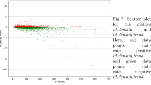
Fig. 7: Scatter plot for the metrics td density and td density trend . Here, red data
points
indi-cate positive td density trend and green data
points
indi-cate negative td density trend .
Now, we look into Fig. 7. This is a more straight-forward figure that tells us, the higher the td density, the greater is the td density trend . Since we have al-ready discussed the relations between ncloc-td density trend and ncloc-td density, we know that the higher td density comes at the beginning of a file. This figure shows an expected practice, i.e., if the td density is higher, quickly repaying the debt would reduce the td density and increase the maintainability. In our data, we see that the td density is decreased as the code size increases, which is some-thing we want. More importantly, we have divided the measures according to positive and negative td density trend which give us insights about the rate at which we are accruing and repaying debt.
Finally, we are reporting an interesting difference between td density trend and td density plotted against ncloc in Fig. 4 and 6 correspondingly. When we look at the graphs (all three graphs in red, green and blue), we see that Fig. 4 has much smooth and simpler pattern than the graphs in Fig. 6. Even in the close-up view in the inset of Fig. 4, the smoothness of the curve is observed. This makes the relationship between ncloc and td density trend interesting for
the purpose of predicting td density or even technical debt. The three graphs in Fig. 4 have a more uniform shape than the three graphs in Fig. 6. If for a project, we find the mean td density trend as any of the three graphs in Fig. 4 and we know the latest td density for the project, we can predict the td density trend for the future and predict td density. From Fig. 4, we see that the mean graph for td density trend (in blue) converges to zero much earlier and then it keeps moving around zero. This happens because, this is the mean of the positive and negative td density trend graphs. For both positive and negative td density trend graphs, we see that they exhibit a trend of convergence to zero but do not merge with zero as earlier as the blue mean graph does. Of course, here the two graphs for positive and negative td density trend acts as two components of the blue mean graph. Our supposition is, can we better predict technical debt when we divide and analyse the dynamics of technical debt into its two primary components that are accrual and repayment of technical debt. However, a detail analysis of the properties and usefulness of td density trend for predicting td density is beyond the scope of this paper.
5.4 Componentization of Technical Debt
Componentization of a vector is a proven problem solving approach in many scientific discipline, e.g., physics, vehicle dynamics. A vector has both magni-tude and quantity. Any vector in a two-dimensional plane can be expressed of two components. Since a vector is an outcome of the interactions of its compo-nents, controlling a vector is performed by controlling its individual components. Similarly, technical debt is a vector like concept which has both the magnitude (tech debt , td density values) and direction (td density trend ). Throughout the development of software, we continuously keep working with accrual and re-payment of technical debt in an intertwined-manner. Therefore, discussing and analyzing technical debt in terms of these two components should give us more accurate and precise estimation and possibly better prediction of technical debt. The metric td density trend is useful in different ways. First, it is intuitive, e.g., any value greater than zero means increase and any value less than zero means decrease, and a value zero means no change in technical debt density. Second, the above three value state of td density trend can be expressed with three colors, which can be a good tool for effective communication among stake-holders. Third, td density trend can be used to breakdown (componentize) other metrics like we have done for ‘count of positive and negative td density trend in Fig. 3, for td density in Fig. 5 and ‘mean of td density’ in Fig. 6. The ability to breakdown metrics into two (practically) groups or components is the most in-teresting advantage of td density trend in our opinion. Moreover, the magnitude of td density trend is also interesting as it tells us how quickly are we accruing or repaying technical debt.
6
Conclusions and Outlook
To study the evolution of technical debt this research paper has investigated the use of ‘technical debt density trend’ metric and found interesting observations how technical debt is accrued and repayment is made within the context of 4013 source files from 21 open source Java projects. In the context of this research, technical debt is calculated with the SonarQube tool instrumented with 138 code smells. It is observed that on average a file has maximum density of technical debt when the file is only about 20 lines of code. Within the 20-50 ncloc, the ‘technical debt density’ is dramatically reduced followed by a moderate decrease until 175 ncloc followed by a slight decrease until 350 ncloc. Within the 350-1000 range, the trend does not look much consistent but after 1000 ncloc a moderate decline in ‘technical debt density’ is observed. The high density of technical debt at the beginning of the file could possibly be a result of several factors such as ‘when writing a new code file, developers quickly start working without thinking much about the quality’, ‘when the code size is very small, it is easy to read, therefore, easy to maintain even though the ‘technical debt density’ is very high, so, developers might not consider writing high quality code at the beginning’.
We discussed some characteristics of the ‘technical debt density trend’ met-ric, i.e., its intuitive interpretation of the rise and fall of the density of technical debt. We also discussed the possibility of the graph from ncloc and ‘technical debt density trend’ to predict the density of technical debt. More importantly ‘technical debt density trend’ can be used to breakdown other metrics, meaning, it would be possible to breakdown a metric into two components (one corre-sponding to positive ‘technical debt density’ and the other to negative ‘technical debt density’ ). Analysis of such components can be very useful to understand the dynamics of increase and decrease of ‘technical debt density’ within the context of a project, behavior of the developers or practices of an organization, which we think is a novel contribution of this research.
Finally, we observed that the graphs between metrics ncloc and ‘technical debt density trend’ and the graphs between metrics ncloc and ‘technical debt density’ have very strong steep at the beginning which reduces as ncloc increases. According to our past research experience, such observation is an effect of cu-mulative measurement of ‘technical debt’ and ‘technical debt density’ metrics. Since both of these two metrics are integral part of ‘technical debt’ evolution, non-cumulative equivalents of these metrics should be used to investigate the evolution of ‘technical debt’ in scenarios where cumulative metrics are problem-atic. We consider this as an essential future direction for a better understanding of ‘technical debt’ .
References
1. SonarQube, https://www.sonarqube.org/, [retrieved: June, 2019]
2. Alfayez, R., Behnamghader, P., Srisopha, K., Boehm, B.: An exploratory study on the influence of developers in technical debt. In: Proceedings of the 2018
Interna-tional Conference on Technical Debt. pp. 1–10. TechDebt ’18, ACM, New York, NY, USA (2018), http://doi.acm.org/10.1145/3194164.3194165
3. Chatzigeorgiou, A., Manakos, A.: Investigating the evolution of code smells in object-oriented systems. Innovations in Systems and Software Engineering 10(1), 3–18 (Mar 2014), https://doi.org/10.1007/s11334-013-0205-z
4. Digkas, G., Lungu, M., Chatzigeorgiou, A., Avgeriou, P.: The evolution of tech-nical debt in the apache ecosystem. In: Lopes, A., de Lemos, R. (eds.) Software Architecture. pp. 51–66. Springer International Publishing, Cham (2017)
5. Kapser, C.J., Godfrey, M.W.: “cloning considered harmful” considered harmful: patterns of cloning in software. Empirical Software Engineering 13(6), 645 (Jul 2008). https://doi.org/10.1007/s10664-008-9076-6
6. Kazman, R., Cai, Y., Mo, R., Feng, Q., Xiao, L., Haziyev, S., Fedak, V., Shapoc-hka, A.: A Case Study in Locating the Architectural Roots of Technical Debt. In: Proceedings of the 37th International Conference on Software Engineering - Volume 2. pp. 179–188. ICSE ’15, IEEE Press, Piscataway, NJ, USA (2015), http://dl.acm.org/citation.cfm?id=2819009.2819037
7. Kruchten, P., Nord, R., Ozkaya, I.: Technical debt: From metaphor
to theory and practice. IEEE Software 29(6), 18–21 (Nov 2012).
https://doi.org/10.1109/MS.2012.167
8. Li, W., Shatnawi, R.: An empirical study of the bad smells and class error proba-bility in the post-release object-oriented system evolution. Journal of Systems and Software 80(7), 1120–1128 (Jul 2007). https://doi.org/10.1016/j.jss.2006.10.018 9. Mamun, M.A.A., Berger, C., Hansson, J.: Correlations of software code
met-rics: An empirical study. In: Proceedings of the 27th International Work-shop on Software Measurement and 12th International Conference on Software Process and Product Measurement. pp. 255–266. IWSM Mensura ’17 (2017), http://doi.acm.org/10.1145/3143434.3143445
10. Mamun, M.A.A., Berger, C., Hansson, J.: Effects of measurements on corre-lations of software code metrics. Empirical Software Engineering (May 2019). https://doi.org/10.1007/s10664-019-09714-9
11. Mamun, M.A.A., Martini, A., Berger, C., Staron, M., Hansson,
J.: Appendix: Evolution of technical debt: An exploratory study,
https://archive.org/details/code smells p11, [retrieved: June, 2019]
12. Mamun, M.A.A., Staron, M., Berger, C., Hebig, R., Hansson, J.:
Im-proving code smell predictions in continuous integration by
differentiat-ing organic from cumulative measures. In: The Fifth International
Con-ference on Advances and Trends in Software Engineering. pp. 62–71.
www.thinkmind.org/download.php?articleid=softeng 2019 4 20 90071 (2019) 13. Monden, A., Nakae, D., Kamiya, T., Sato, S., Matsumoto, K.: Software
quality analysis by code clones in industrial legacy software. In:
Pro-ceedings Eighth IEEE Symposium on Software Metrics. pp. 87–94 (2002). https://doi.org/10.1109/METRIC.2002.1011328
14. Shatnawi, R., Li, W.: An Investigation of Bad Smells in Object-Oriented Design. In: Third International Conference on Information Technology: New Generations (ITNG’06). pp. 161–165 (Apr 2006). https://doi.org/10.1109/ITNG.2006.31 15. Yamashita, A., Moonen, L.: Do code smells reflect important maintainability
as-pects? In: 2012 28th IEEE International Conference on Software Maintenance (ICSM). pp. 306–315 (Sep 2012). https://doi.org/10.1109/ICSM.2012.6405287