IN
DEGREE PROJECT
MEDIA TECHNOLOGY,
SECOND CYCLE, 30 CREDITS
,
STOCKHOLM SWEDEN 2019
Visualizing Error in Real-Time
Video Streaming Data for a
Monitoring System
I WAYAN KURNIAWAN ADITYA WARDANA
English title
Visualizing Error in Real-Time Video Streaming Data
for a Monitoring System
Swedish title
Visualisera Fel i Realtids-Videoströmningdata för ett
Övervakningssystem
I Wayan Kurniawan Aditya Wardana
wardana@kth.se
DA232X Degree Project in Computer Science and Communication, Second Cycle, 30 credits Master’s Programme in Interactive Media Technology, 120 credits
KTH Royal Institute of Technology year 2018
School of Electrical Engineering and Computer Science (EECS) Supervisor at EECS was Mario Romero Vega
Supervisor at Red Bee Media was Ida Renström Examiner at EECS was Tino Weinkauf
Principal was Red Bee Media 2019-06-13
KTH EECS
Stockholm, Sweden URL: www.kth.se/eecs
[English]
Title
Visualizing Error in Real-Time Video Streaming Data for a Monitoring System
Abstract
The aim of this master thesis is to investigate the affordances and limitations of using
information visualization methods to visualize errors in real-time video streaming data. The
study was carried in Red Bee Media company by following several steps including user
research, prototyping, and user evaluation. The user research produced design requirements
and basic tasks for the prototype. The prototype had to follow the design requirements and use
information visualization techniques to visualize the error data. Next, the prototype was
evaluated by 5 expert users, all Red Bee Media employees with 1,5 to 3 years experience of
working with the existing Red Bee Media system. The results show the prototype obtained a
higher SUS score compared to the Red Bee Media monitoring system. Based on a comparison
questionnaire, the prototype also had a better visualization for each basic task compared to Red
Bee Media monitoring system. The comments from the user evaluation have been categorized
into 4 different labels. Those labels listed several usabilities need to be focused on when
developing a video monitoring system.
[Swedish]
Title
Visualisera Fel i Realtids-Videoströmning Data för ett Övervakningssystem
Abstract
Syftet med denna masteruppsats är att undersöka möjligheterna och begränsningarna av att
använda
informationsvisualiseringsmetoder
för
att
visualisera
fel
i
realtids-videoströmningsdata. Studien genomfördes hos företaget Red Bee Media genom att följa flera
steg inklusive användarstudier, framtagning av prototyper och användarutvärdering.
Användarstudien gav designkrav och grundläggande uppgifter för prototypen. Prototypen
måste följa designkraven och använda informationsvisualiseringstekniker för att visualisera
feldata. Därefter utvärderades prototypen av 5 expertanvändare, som är medarbetare inom Red
Bee Media med 1,5 till 3 års erfarenhet av att arbeta med det befintliga Red Bee
Media-systemet. Resultaten visar att prototypen erhållit ett högre SUS-poäng jämfört med Red Bee
Medias nuvarande övervakningssystem. Genom ett jämförelseformulär erhöll även prototypen
en bättre visualisering för varje grundläggande uppgift jämfört med Red Bee Medias
övervakningssystem. Kommentarer från användarutvärderingen har kategoriserats i 4 olika
kategorier. Dessa anger flertalet användningsområden som måste fokuseras på när ett
övervakningssystem utvecklas
Visualizing Error in Real-Time Video Streaming Data for a
Monitoring System
I Wayan Kurniawan Aditya Wardana
KTH Royal Institute of Technology Stockholm, Sweden
wardana@kth.se
ABSTRACT
The aim of this master thesis is to investigate the affordances and limitations of using information visualization methods to visualize errors in real-time video streaming data. The study was carried in Red Bee Media company by following several steps including user research, prototyping, and user evaluation. The user research produced design requirements and basic tasks for the prototype. The prototype had to follow the design requirements and use information visualization techniques to visualize the error data. Next, the prototype was evaluated by 5 expert users, all Red Bee Media employees with 1,5 to 3 years experience of working with the existing Red Bee Media system. The results show the prototype obtained a higher SUS score compared to the Red
Bee Media monitoring system. Based on a
comparison questionnaire, the prototype also had a better visualization for each basic task compared to Red Bee Media monitoring system. The comments from the user evaluation have been categorized into 4 different labels. Those labels listed several usabilities need to be focused on when developing a video monitoring system.
Author Keywords:
Information visualization, data visualization, video streaming data, monitoring system.
1. INTRODUCTION
Nowadays, real-time video streaming has become one option to deliver content to users. To improve the user experience, video streaming providers need to offer high-quality video to consumers. However, there still exist a number of problems when providers deliver this kind of service to consumers such as jittering, macroblocking, and frame freezing. As a
result, it will deteriorate the experience for the consumer while using video streaming services. To tackle this problem, Red Bee Media uses real-time analytics and monitoring tools for immediate first-line mitigation in case of technical issues.
The current monitoring tools consist of two different applications, which are used together to monitor and analyze problems in real-time video streaming. The usage of the two applications simultaneously might reduce efficiency while monitoring and increase the complexity of the tools. In addition, there is a need to improve the tools to be able to visualize the real-time quality of video streams in a pedagogical way. An example is to show the characteristics of MPEG Transport Stream or OTT-stream to describe or give a better understanding of errors and normal state of streams to operators.
This degree project will focus on investigating an information visualization tool that can be used for the monitoring system to visualize error in real-time video streaming data. The d3.js framework is chosen to develop an information visualization application. The main objective is to improve the current monitoring system to have better visualization and interaction and reduce the complexity of the current monitoring system. Furthermore, this thesis will give insight to the company about new possibilities to visualize the monitoring system. The main research question examined is:
What are the affordances and limitations of using information visualization techniques for a monitoring system used by broadcast engineers to visualize error in real-time video streaming data with the four tasks of: 1) observing the quality of streaming data; 2) monitoring alarms in broadcast channels; 3)
classifying error types; and 4) identifying the network location of these errors as measured by subjective expert interviews and survey questionnaires measuring perceived usability?
2. THEORY AND RELATED WORK 2.1 Information Visualization
Information visualization is a discipline that helps humans understand abstract data by providing visual representations from the data [1]. The visual representation will help to stimulate the perceptual capabilities of the human visual system. If we add interactivity to the visual representation, it will exploit the interactive capabilities of the cognitive problem-solving loop [2]. Furthermore, the visual representation will give insight for humans to recognize the patterns in data and rapid parallel processing by the human brain. This can be done because human vision contains millions of photoreceptors to work with those capabilities. As a result, appropriate design choices become necessary for the visual representations to show user insight from the data.
Information visualization also emphasizes the importance of interactivity. Information visualization gives an opportunity for the user to explore and interact with data. Ben Shneiderman also emphasizes this with visual information seeking mantra: “Overview first, zoom and filter, then details-on-demand” [3]. Zoom and filter are some examples of interactivity. By giving users the capability to interact with the visualization and change it dynamically based on the purpose of exploration, it will open the possibility to
combine and relate multiple independent
visualizations [4].
The monitoring system consists of multiple visualizations because each visualization usually has minimal data to be monitored. In this case, the visualization depends on the type of data and the tasks needed to be performed to analyze the visualization. The process to visualize multiple visualizations is done with the visualization pipeline. The visualization pipeline is the computational
process to convert raw data to the visual format that the user can interpret [3]. This process helps to determine in which phase the operation that shall be executed to change the visual format.
Furthermore, understanding the type of data is also important to determine the design for the monitoring system. In this thesis, temporal data will be used to create the monitoring system. Temporal data is one type of data structure that changes in time [1]. For this type of data, the time gives information when an event occurs, and all events have their own timestamps. There are several examples of temporal data visualization. DecisionFlow is one example that aims to visualize high-dimensional temporal event sequence data using interactive multi-view visualization and combines scalable and dynamic temporal event data structure [5]. Another example is Sequence Synopsis that visualizes event sequences using the minimum description length (MDL) principle. This principle will identify a set of sequential patterns for an overview of the data while balancing the information loss in it [18].
2.2 Real-Time Video Streaming
Rapid Internet development gives users a new opportunity for a video streaming service such as Over-the-top (OTT) services and Internet Protocol Television (IPTV) services. OTT and IPTV offer flexible schedules and a wide variety of content that broadcast via the internet [6]. The difference between IPTV and OTT is that IPTV is delivered over a privately controlled network while OTT is delivered over the uncontrolled network [7].
Several processes are required to distribute video streaming to the user. The original video will go through a process called encoding, transcoding, and packaging before entering the content delivery network (CDN) and delivered to the user. The
encoding process will compress video into a smaller size typically with MPEG-2 or MPEG-4 standards [8]. The next process is transcoding where the compressed MPEG file will be split into several files with different bit rates. This process will help to give
suitable content based on the quality of the network using the adaptive bit rate (ABR) approach [7]. After that, the compressed video file will be divided into segments. Each segment contains a few seconds of video. This process is called packaging. Those segments will be sent to the user’s video player which will download the segments based on the manifest file [9].
The quality of audio and video stream delivered to the end user needs to be monitored to ensure a high-quality experience. As a result, the encoding, transcoding and packaging processes need to be monitored to find eventual errors as soon as possible. There are some errors where users can be impacted like macroblocking, jerky playback, frozen or black pictures. The location of the error needs to be detected by looking in every part of the distribution network hardware [10].
There is a method used in the video streaming industry to standardize the type of error and which error needs to be monitored. The standard for MPEG-2 transport stream is called ETSI TR 101 290. This standard is divided into two priorities of error. The first priority is necessary for basic monitoring and de-codability. The second priority is for periodic or continuous monitoring [11].
2.3 Information Visualization Evaluation
Ultimately, it will be a user performing tasks that determines the effectiveness of the design of the information visualization system. To understand the information visualization tool usability from the user perspective as well as its potential and limitations evaluation practices need to be performed [13]. The purpose of the evaluation is to get qualitative and quantitative data. Qualitative data helps to understand patterns of behavior from the user when using the tool while quantitative data gives numerically description of human behavior and performance [16].
The evaluation can be done with several methods, for example, user interviews or user testing. Based on seven guiding scenarios for information visualization evaluation [14], to evaluate user experiences, it can be done using informal evaluation, usability test, field
observation, and laboratory questionnaire. Those methods can be wrapped up into a user interview session. The user experience evaluation scenario produces subjective results from user responses. From the evaluation, it is possible to measure the usability from a design. One tool to measure usability is the system usability scale (SUS). It consists of 10 Likert scale questions. The questions have been standardized. The SUS shows if the visualization tool has a strong usability score by comparing it with other designs [15].
Furthermore, the evaluation shall be done by focusing on low-level tasks the user will perform. By understanding the low-level tasks, the evaluation in a user testing session can be designed based on those tasks. There are typically ten tasks to be performed by the user during the analysis of an information visualization tool. Those tasks are: 1) retrieve value; 2) filter; 3) compute derived value; 4) find extrema; 5) sort; 6) determine the range; 7) characterize distributions; 8) find anomalies; 9) cluster; and 10) and correlate [12]. Designing the tests to perform with users based on common tasks will give a grounded evaluation for the visualization tool to work effectively on those tasks.
3. METHOD 3.1 User Research
The first phase of this thesis is to identify and understand the current monitoring system from Red Bee Media. The methods during this phase are user interviews, literature reviews, and direct observation of the current monitoring system in practical use. The purpose of the user interview is to understand the users’ working environment and workflow with the current system from the perspective of the user. Participants from this interview are broadcast engineers working at Red Bee Media that have experience with the current monitoring system. Questions for the user Interview were developed focusing on user experiences of the current monitoring system and low-level tasks users perform while using the monitoring system [12][14]. Furthermore, the purpose of the literature review in
this phase is to understand the workflow of real-time video streaming data in the monitoring system and some examples of visualization techniques that can be used in this case. Finally, the observation method towards the current monitoring system is performed to give the researcher an understanding on how the current application works, what tasks are included in the current application, and what tasks are not performing well in the current application.
The results of this early research include a deep knowledge of the current tasks and understanding of users’ current performance in the existing system. These results will further translate to design implications for potential improvements of the system.
Those basic tasks help to develop design
requirements for the prototype by looking to interaction and design principles of information visualization and usability problems in the current monitoring system. This thesis travels through this process.
3.2 Prototyping
After developing the design requirements, the next phase is prototyping. The prototype developed is based on the design requirements in the user research method. During this phase, there were two prototypes developed, a low-fidelity (lo-fi) and a high-fidelity (hi-fi) prototype. In the beginning, the design requirements were translated into a low-fidelity prototype by creating a preliminary sketch on paper to get informal feedback from users in Red Bee Media. After that, the sketch and the feedback were developed into a second lo-fi prototype using a graphic design tool. The second lo-fi prototype was used as the design basis for the hi-fi prototype. The next step was to develop a high-fidelity prototype. The hi-fi prototype is a working prototype that is used in the final usability testing and uses real measurement data from Red Bee Media live video streams. The hi-fi prototype is the final development in this thesis and it is used to generate qualitative and quantitative data from the user to analyze the results of this research and evaluation thesis. The hi-fi
prototype was developed using the d3.js library in a website environment using HTML and Javascript. This library provides information visualization techniques that can be used in web applications. Furthermore, the interaction for information visualization is an important part of this prototype and can be provided with the help of this library. The hi-fi prototype was evaluated regularly every two weeks by the supervisors.
3.3 User Evaluation
The next phase is user evaluation. The hi-fi prototype design was evaluated by conducting expert user tests and interviews. In this case, the expert users are broadcast engineers at Red Bee Media who currently use the existing monitoring system and who were not involved in the previous design and evaluation cycles. Expert user tests and interviews are used to measure subjective qualitative and quantitative metrics. The subjective qualitative metrics can be measured by conducting user interviews. Quantitative subjective metrics can be measured using Likert scale questionnaires.
The evaluation performed with 5 people from the stream delivery playout team. The evaluation was conducted in the Red Bed Media offices. In the beginning, all participants filled a Likert scale questionnaire to evaluate the current monitoring system in Red Bee Media. The questionnaire follows the system usability scale (SUS) that consists of 10 questions to measure usability [15]. This method has been used to measure the usability of a product at the industrial level. After that, the participants were given an explanation regarding the functionality of this hi-fi prototype. Then, they performed 8 tasks and used the think-aloud protocol to get qualitative data on potential usability problems. Think-aloud protocol asks participants to think aloud as they are performing a set of specified tasks. The tasks represented basic chores which emerged as a result of the first user study. During this part of the evaluation, audio and screen recordings were used to document the feedback from the user.
After performing the tasks, users filled a second SUS questionnaire to measure the usability of the hi-fi prototype and a tailored Likert scale questionnaire directly comparing the current system in Red Bee Media and the hi-fi prototype when working with the 8 basic tasks. At the end of the session, users were interviewed with 10 questions. The interview followed scenario’s guidelines from “Seven guiding scenarios for Information Visualization Evaluation” focusing on evaluating user experiences [14]. It provides qualitative data from the users related to usability.
4. RESULTS
4.1 User Research Results
The result from the user interview, the literature review, and the direct observation of the employment of the current system in the user research phase provided several important tasks that the user needed to perform in this application. The tasks are: 1) observing the quality of streaming data; 2) monitoring alarms in broadcast channels; 3) classifying error types; and 4) identifying the network location of these errors. Those tasks can be called the basic tasks in this research paper.
During user interviews, the users stated that in the current system, data filtering is really important because the amount of monitored data is large, and the filtering feature helps the user to focus in a small amount of data. There are some filtering features the users usually use such as sorting based on time, recent error, or type of error.
In the current system, those tasks can be performed by combining two different applications. The first application can be used to observe the quality of streaming data, monitor alarms in broadcast channels and classify error types. The second application can provide the network location of those errors. Even though the current system can cover those tasks, however, the two applications are separated and do not work together. The operator needs to translate and deliver the information between both applications. Furthermore, using two systems increases the requirements to use more screens.
Moreover, The display of Red Bee Media monitoring system consists of 6 screens that are used simultaneously to monitor real-time streaming data. From the observation, the need to use 6 screens occurs because all information from these applications is located in the different interface, and not compiled in one interface. When users want to see other information, they need to click other menus to go to a different interface that provides different information. As a result, the system overloads short-term memory and the perceptual and cognitive capabilities of users. According to Weinschenk’s book “100 things every designer needs to know about people” [17], human short-term memory consumes significant mental resources. Our observation is that the current system requires significant mental resources. Thus, the design of the prototype needs to tackle this problem.
The design of the prototype must be based on the basic tasks that emerged from the first round of user research. It must focus all information on one view preferably on one screen and provide clear and integrated interaction dynamics. Furthermore, based on the principle from Shneiderman visual information seeking mantra, a good visualization needs to provide an “overview first, then afford zooming and filtering, and finally facilitate the discovery of details in the data through simple interaction devices, that is provide details-on-demand”[3]. Filtering and detail-on-demand become major features that need to exist in the visualization and are suitable for user feedback.
4.2 Prototype Result
The prototype was developed based on design requirements from user research. The final prototype is shown in figure 1. From the design requirements, there are two areas that need to be addressed. Those areas are visualization techniques and interaction techniques. Those areas need to be developed in one screen display with a focus on the four basic tasks.
4.2.1 Visualization Techniques
The visualization techniques used in the prototype should focus on the basic tasks and be suitable for the current data.
Figure 1: Final Prototype: a dashboard interface with three main visual structures providing interactive and integrated filtering, zooming, and details-on-demand
The current data consists of the error name, the time when an error happens and the location of the error. These types of data are temporal data and can be represented in one-dimensional data visualizations [4]. Each task uses one type of visualization techniques to describe the task. The tasks and visualization techniques are explained in Table 1.
Tasks Visualization Techniques
1. Observing the quality of streaming data
Pie Chart
2. Monitoring alarms in broadcast channels
Timeline Chart
3. Classifying error types Stacked Bar Chart 4. Identifying the network
location of these errors
Tree Graph
Table 1: Tasks and visualization techniques
For Task 1 to understand the quality of streaming data, the design uses a pie chart visualization to convey the percentage between the duration of error and the duration of the normal operation of each channel. For Task 2, a timeline chart was chosen to explain the error types in each channel related to time. The timeline chart can help the user to show the time when the errors start and end. With this approach, the timeline chart can monitor alarms of errors in each channel. For Task 3, the stacked bar chart describes what kind of error happens in a time range and classifies the error based on its type. For Task 4, the tree graph describes the location of the error and the workflow of real-time streaming data network system.
Furthermore, color becomes an important part in this prototype and currently is not used in the monitoring system by Red Bee Media. This prototype uses color to distinguish each alarm type. The colors will always be used consistently in all visualization techniques to help the user recognize the information rather than recall the information of alarm types [17].
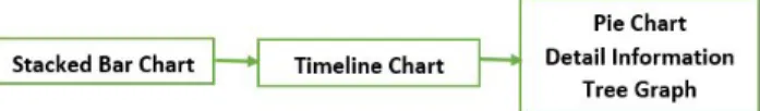
Figure 2: Visualization techniques workflow of the prototype
The flow of this prototype is designed based on the principle of visual information seeking mantra. The flow of this prototype is described in Figure 2. The stacked bar chart classifies error types located at the top of the screen. This will cause this visualization to be the overview of all the data. When the users want to zoom and filter the data, they can interact with this stacked bar chart, and the result will be shown in the timeline chart. The timeline chart is located below the stacked bar to monitor alarms in broadcast channels. This chart shows more details of the errors across time. The timeline chart works as a filtering and zooming interface for the stacked bar chart. If the user wants more detailed explanations of each error, the user can click on the error. The pie chart, the detail information of the error, and the tree graph will appear on the right side of the dashboard interface.
4.2.2 Interaction Techniques
Interaction techniques are the capability to directly change the visualization of data according to the exploration objective of the data [4]. By using interaction techniques, the user will be able to explore the data deeply and find more correlations from the data from different visualizations.
The methods used in this prototype are interactive linking and brushing and interactive filtering. Based on Keim, interactive linking and brushing give the ability to combine different visualization methods [4]. In this prototype, the stacked bar chart becomes the overview visualization. Then, to make the stacked bar chart capable to do zoom and filter, the interactive linking and brushing are implemented in this chart. The brushing function occurs in the stacked bar chart and is linking to the timeline chart to show the timeline data from the brushed area.
Furthermore, the interactive filtering uses to explore the huge data sets provided from this prototype.
There are some filtering and sorting features used in this prototype. The features are filter based on the alarm type and time, and sort based on the recent errors and name. Also, the data can be represented to shows all channels or channels with errors. Those filters ideas come from the feedback during the development process of this prototype.
Moreover, during several testing to the user, the importance of the history features is identified. During the observation, the user tends to lose what they have been searching before and to tackle that, this prototype provides the history search feature. All the filtering parameters the user has used can be saved so the user can use it again.
The other features use to add interactivity in this prototype is the tooltips. The tooltips give instant information to the visualization element when the user is pointing the cursor to the visualization element. This approach helps the user to have a quick method to find information from the data.
4.3 User Evaluation Result
The user test was conducted with 5 Red Bee Media employees at Red Bee Media Office. The participants have experience with the Red Bee Media monitoring system between 1.5 - 3.5 years. The findings from the user testing provide qualitative and quantitative results regarding the expert user subjective opinion about the prototype. From the SUS and comparison questionnaire, the prototype has better usability compared to the current monitoring system in Red Bee Media. Also, the qualitative result gives the perspective for a better approach for a monitoring system.
4.3.1 Quantitative Result
The score for each of the SUS questions is presented in Figure 3 for both the prototype and the current system. The score for comparison between the prototype and the current system related to the basic tasks is presented in Figure 4.
Figure 3: SUS result from red bee media monitoring system and the prototype
For the SUS questions, the even number shows a negative statement and the odd number shows a positive statement. The green cell shows that participants agree with the statement and the red cell shows that participants disagree with the statement. The total score for the prototype from the SUS questionnaire is 80 and the Red Bee Media monitoring system is 51.5.
For the comparison questionnaire towards the basic task, the green cell shows that the prototype visualizes the task better than the Red Bee Media Monitoring system and the red cell shows that the Red Bee Media Monitoring system visualizes the task better compare to the prototype. Figure 4 also shows that the average value from each task and as a result shown, the prototype provides better visualization for all basic tasks.
Figure 4: Comparison of questionnaire results
4.3.2 Qualitative Result
Figure 5: Four labels from participants feedback
From the think-aloud notes and the interview transcripts, there are a lot of comments from user experts that can be used to find a suitable method to visualize the monitoring system for this case. Participants found that the prototype is easy to learn, user-friendly, and gives direct visual to the user. Using the grounded theory method [19], all the comments categorized into 4 labels: efficiency, functionality, design and real-time. Those 4 labels are presented in Figure 5. The comments categorized to 4 labels are:
1. Efficiency label
● Minimize clicking and number of displays. ● Search history and next/previous button. ● Efficient date search.
2. Functionality label ● Filter alarm type.
● Brush interaction to avoid conduct a new search and get more details.
● Option to only show channel that has a certain kind of error.
3. Design label
● Approach with a quick overview and direct visual.
● Overview of the number of errors and recognize alarm.
● Color coding to differentiate alarm types. 4. Real-time label
● Alerting the user regarding the new error. ● Structure of the system in real-time.
5. DISCUSSION
5.1 Discussion of the Methods
In this thesis, the methods helped to gather only subjective data from expert users. The objective data can be gathered by conducting a comparative study. However, the comparative study between the Red Bee Media monitoring system and the prototype cannot be implemented because the current monitoring system is always used continuously for 24-hours monitoring and expert users cannot participate in this study because they have knowledge with the current system that can cause the result to be invalid. Without the comparative study, it is hard to measure information retrieval from the prototype. Information retrieval consists of precision and recall [20]. Those two variables need to be measured to get a conclusion if the prototype has a better design than the current monitoring system.
However, because the prototype developed only focusing on broadcast engineers, the subjective data from broadcast engineers can be used to evaluate the design. During the user study, the number of participants is more than half of total broadcast engineers in Red Bee Media. This amount of participants can be a strong representative of the subjective data.
Furthermore, the order of the method during user evaluation needs to be considered, especially the SUS questionnaire for the existing monitoring system. During the user evaluation, the SUS questionnaire for existing monitoring system was given to the participant at the beginning of evaluation without
knowing when the last time participants used the existing monitoring system. As a result, this approach might reduce the credibility of the data. Even though the participants are expert users with the existing monitoring system, they might lose experience of the existing monitoring system. It is better to give the participants the SUS questionnaire for existing monitoring system directly after they used the existing monitoring system.
Moreover, the explanation or introduction for the prototype should never be conducted before participants answer the SUS questionnaire for the existing monitoring system. By following this approach, it might reduce bias for the SUS questionnaire for the existing monitoring system and make the user answers based on the existing monitoring system without affected from other design.
5.2 Discussion of the Results
From the evaluation, it is clear that the prototype has better usability compared to the Red Bee Media monitoring system. Based on Figure 3, the prototype scored 80 from the SUS questionnaire while the current system scored 51.5. Based on Kortum, the prototype can be categorized between excellent and good. The Red Bee Media Monitoring system can be categorized as fair [15]. The Red Bee Media monitoring system got a low score in the SUS questionnaire in question number 5 and 6. For question number 5, the current monitoring system got 2.6 on average. For question number 6, it got 3.6. Those questions are related to the integration of the system and the inconsistency of the system. The participants feel slightly disagree if the Red Bee Media Monitoring system were well-integrated and participants slightly agree if the Red Bee Media monitoring system has too much inconsistency. The visualization techniques used in the prototype are able to tackle the problem from the current monitoring system. By visualizing all errors using the timeline visualization and differentiating all error types using color, it gives the prototype a high value in the SUS questionnaire. Especially for question number 5 and 6. For question number 5, the prototype got an average score of 4.4. For question number 6, it got
1.6. It means that participants agree if the prototype is well-integrated and participants disagree if the prototype has too much inconsistency. To give consistency and well-integrated visualization, the prototype puts all information on one screen, and each visualization needs to be relatable with each other.
Moreover, the comparison questionnaire also supports that the prototype has a better approach in terms of visualization. Based on Figure 4, the participants also thought that the prototype makes the classifying error types become easier. It got a score of 4.4 from 5 on average. The score for this task can be achieved because the prototype uses color coding to differentiate alarm types and helps participants got a quick overview of the error.
From the expert user interview, the prototype gets several feedbacks from participants. Those feedbacks can be classified into 4 different labels. The results presented in Figure 5. Those labels have similarities with Ben Shneiderman visual information seeking mantra [3]. The design label consists of participant comments related to the prototype capability to give a quick overview to the user regarding the error. Because the design of the prototype using several different colors to categorize error types, it makes users get a quick overview regarding the number of errors, types of errors and duration of the error. As a result, the design label shows the correlation with the overview part in visual information seeking mantra. The design for a monitoring system needs to be able to give an overview of the entire data in the first glimpse.
The functionality label consists of the feedback from participants regarding features from the prototype. Participants gave positive feedback to the brush and sort feature. Users thought this approach can help them to avoid a new search and get more details for the timeline feature. The brush feature makes the prototype more user-friendly. Furthermore, Participants also like the idea to give the option to only show channel that has a certain error, it helps the user to only focus on a channel that has an error
rather than show all channels in a single view. The functionality label has a correlation with zoom and filter part in Shneiderman seeking mantra, the prototype able to filter uninteresting data and zoom to interesting data with brush and sort features. The efficiency label consists of several feedbacks from participants regarding how the prototype makes an efficient approach. Participants agreed that minimizing the number of screens used in the monitoring system and reducing the number of clicking when searching data are better approaches. It is better to put all the information on one display. Moreover, participants agreed that the search history and next/previous buttons are strong features that help the user to avoid using multiple screens for data comparison because the user can go back or forward to their search to look at the data.
However, the prototype lacks an efficient search date. The prototype does not provide a quick option to go back in the last 1 hour or last 6 hours, and the user needs to type the date manually. This type of function is needed because the monitoring system requires a lot of search for the time. The efficiency label has a correlation with the history part in Shneiderman seeking mantra. The prototype is able to keep a history of searches and user can undo the search. The last label is the real-time label. Participants thought that a real-time approach needs to exist. However, the prototype does not provide this kind of feature because this thesis is only focusing on the affordances and limitations of using information visualization to monitor error in the video streaming data. As a result, there is no implementation for real-time data. However, if the real-time feature will be implemented in the future, there are some comments related to this label. The monitoring system needs to send an alert to the user if any errors occur and provide the structure of the system in real-time. Because the prototype did not provide this feature, participants thought that the prototype is more suitable as a search tool for the error. However, in
overall, the prototype is a good additional extension for the current monitoring system in Red Bee Media.
5.3 Future Work and Research
In section 5.2, most participants gave feedback regarding the need to have real-time data in the prototype. For the future work, the prototype feature can be extended to visualize real-time data and observe if real-time data can work with design in this thesis prototype. There are several aspects that need to be considered when using real-time data, such as the method for alerting alarm and retrieving the data for the user. There should be more analysis regarding those aspects.
6. CONCLUSION
This study has investigated a new approach to develop a monitoring system in Red Bee Media company to monitor error in broadcast channels using information visualization. By defining the basic task first, the prototype is built based on the basic task and evaluated the usability of the prototype. The evaluation provides quantitative and qualitative data. Participants gave a positive response to the prototype, claiming it is easy to learn, more user-friendly and has better usability. The prototype scored 80 from SUS test to measure usability. It can be categorized between good and excellent according to Kortum [15]. Furthermore, based on the comparison questionnaire, the prototype also has better visualization for each basic task compared to the monitoring system in Red Bee Media. The evaluation also produces 4 labels of usability needed to be focused on when developing a monitoring system to visualize error in the broadcast channel. Those labels consist of comments from the expert user regarding a suitable approach from the prototype and also missing features from the prototype.
7. ACKNOWLEDGMENTS
The authors would like to thank all participants in this study especially Stream Delivery Playout team in Red Bee Media company for the help and opportunity to work on this project. I would also like to thank my supervisors Ida Renström and Mario Romero for all
the valuable feedback and help during the process of this thesis. I gratefully acknowledge the Swedish Institute Study Scholarships from the Swedish Institute that give me the opportunity to pursue my Master Degree in Sweden. Lastly, thank you so much for the support of my family in Indonesia.
8. REFERENCES
[1] Mazza, R. (2009). Introduction to Information Visualization.
Springer
[2] North, C. (2012). Information Visualization. Handbook of
Human Factors and Ergonomics Chapter 43.
[3] Shneiderman, B. (2003). The Eyes Have It: A Task by Data
Type Taxonomy for Information Visualizations. The Craft of
Information Visualization, pp.364-371.
[4] Keim, D.A. (2002). Information Visualization and Visual Data
Mining. IEEE Transactions on Visualization and Computer Graphics, Jan.-March 2002, Vol.8(1), pp.1-8.
[5] Gotz, D., Stavropoulos, H. (2014). DecisionFlow: Visual
Analytics for High-Dimensional Temporal Event Sequence Data. IEEE Transactions on Visualization and Computer Graphics, Dec. 2014, Vol.20(12), pp.1783-1792.
[6] Li, S.S. (2017). Television media old and new: A niche
analysis of OTT, IPTV, and digital cable in Taiwan. Elsevier
Telematics and Informatics, November 2017, Vol.34(7), pp.1024-1037.
[7] Popescu, A., Yao, Y., Ilie, D. (2018). Video Distribution
Networks: Architectures and System Requirements.
SpringerLink.
[8] Popescu, A., Uitto, M. (2018). Energy-Aware Software Video
Encoding in Head-End. SpringerLink.
[9] Swaminathan, V. (2013). Are we in the middle of a video
streaming revolution?. ACM Transactions on Multimedia Computing, Communications, and Applications (TOMCCAP), 01 October 2013, Vol.9(1s), pp.1-6.
[10] Jelacic, Z., Balasko, H., Grgic, M. (2008). End-to-End
Real-Time IPTV Quality Monitoring. 50th International
Symposium ELMAR, Sept. 2008, Vol.1, pp.73-77.
[11] ETSI TR 101 290 V1.2.1 (2001-05). Digital Video
Broadcasting (DVB); Measurement Guidelines for DVB Systems.
[12] Amar, R., Eagan, J., Stasko, J. (2005). Low-Level
Components of Analytic Activity in Information Visualization.
IEEE Symposium on Information Visualization, 2005,
pp.111-117.
[13] Plaisant, C. (2004). The Challenge of Information Visualization
Evaluation. Proceedings of the working conference on advanced visual interfaces, 25 May 2004, pp.109-116.
[14] Lam, H., Bertini, E., Petra Isenberg, Catherine Plaisant, and
Sheelagh Carpendale. 2011. Seven guiding scenarios for information visualization evaluation.
[15] Kortum, P.T. & Bangor, A (2013). Usability Ratings for
Everyday Product Measured With the System Usability Scale.
[16] Cooper, A., Reimann, R., Cronin, D., Noessel, C. (2014).
About Face: The Essentials of Interaction Design, Fourth Edition. John Wiley & Sons, Inc.
[17] Weinschenk, S.M., (2011). 100 Things Every Designer Needs
to Know About People. New Riders.
[18] Chen, Y., Xu, P., Ren, L. (2018). Sequence Synopsis: Optimize Visual Summary of Temporal Event Data. IEEE
Transactions on Visualization and Computer Graphics. Vol.24(1).
[19] Flick, U. (2014). The SAGE handbook of qualitative data analysis. SAGE.
[20] Catarci, T. , Kimani, S. (2012). Human-computer interaction