More Beautiful than Usable
A Study on the Web Navigation Experience
on Swedish Art Museum Websites.
This final thesis has been carried out at the School of Engineering at Jönköping University within Informatics. The author is responsible for the presented opinions, conclusions and results.
Examiner: Vladimir Tarasov Supervisor: Ida Serneberg Scope: 15 credits
Abstract
Purpose – The purpose of this study was to investigate the web navigation experience on two Swedish art museum websites.
Method – The research was carried out as a case study with six participants between 20-30 years old being part of a questionnaire, usability tests and semi-structured interviews. The questionnaire contained qualifying and context-providing questions. The usability tests consisted of seven tasks and were conducted on Gothenburg Museum of Art’s websites and Museum of Modern Art’s website. A four-point scoring method was used on the data gathered in the usability tests to measure the success rate of the tasks performed. The participants were asked in the interviews to rate the websites on a scale of 0—5 on five criteria based on the MUSEF framework (a framework developed for evaluating museum websites), in order to measure the users’ subjective satisfaction.
Findings– The results are pointing towards that users with an 89,5% probability can navigate a Swedish art museum website with success. This indicates that the websites do not have an adequate navigation, since a website should try to reach a 95% success rate. The users’ subjective satisfaction suggests that the navigation is right in between mediocre and good, which can be discussed if it is an adequate navigation or not. What can nevertheless be concluded is that there is room for improvements when it comes to navigation on art museum websites.
Implications – The findings from this report can be utilized to get a more profound understanding of how the navigability of Swedish art museum websites works today and to gain insights into what adjustments that can be made to improve the navigation on similar websites. The results can also serve as a motivation for museum
managements to improve art museum websites, which can lead to an increased number of visitors.
Limitations – The timeframe limited the number of websites evaluated and the number of usability metrics used. It also limited the number of participants, which led to that they could not be fully representative of the target group and could not yield accurate results of the success score or the users’ subjective satisfaction of the two websites.
Keywords – Navigation, Art Museum Website, Usability Test, User Experience Design
Table of contents
Abstract ... ii
Table of contents ... iii
1. Introduction ... 1
1.1 BACKGROUND ... 1
1.2 PROBLEM STATEMENT ... 1
1.3 PURPOSE AND RESEARCH QUESTIONS ... 2
1.4 SCOPE AND DELIMITATIONS ... 2
1.5 DISPOSITION ... 2
2. Method and Implementation ... 3
2.1 LINK BETWEEN RESEARCH QUESTIONS AND METHODS... 3
2.2 WORK PROCESS ... 3
2.3 APPROACH ... 4
2.4 DESIGN ... 4
2.5 DATA COLLECTION ... 7
2.6 DATA ANALYSIS ... 7
2.7 VALIDITY AND RELIABILITY ... 8
3. Theoretical Framework ... 9
3.1 WEBSITE NAVIGATION... 9
3.2 DEFINING GOOD WEBSITE NAVIGATION ... 9
3.3 THE MUSEUMS IN THE STUDY ... 11
4. Empirical Research ... 13
4.1 MUSEUM VISITOR NEEDS ... 13
4.2 WEBSITE NAVIGATION ON MUSEUM WEBSITES ... 13
4.3 USABILITY ON ART MUSEUM WEBSITES ... 13
5. Analysis ... 15
5.1 QUESTIONNAIRE ... 15
5.2 USABILITY TESTS ... 17
6. Discussions and Conclusion ... 22
6.1 FINDINGS ... 22 6.2 DISCUSSION OF METHOD ... 22 6.3 DISCUSSION OF FINDINGS ... 23 6.4 SOCIAL ASPECTS ... 24 6.5 IMPLICATIONS ... 25 6.6 LIMITATIONS ... 256.7 CONCLUSIONS AND RECOMMENDATIONS ... 25
6.8 FURTHER RESEARCH... 25
References ... 27
Appendices ... 30
Appendix 1: Questionnaire ... 31
Appendix 2: Tasks for usability test ... 32
Appendix 3: Screen- and voice recording ... 33
Appendix 4: Interview questions ... 48
1. Introduction
1.1 Background
Museums play an important role in society by saving and preserving cultural heritage and displaying aged and modern arts while inspiring and educating visitors. In
Sweden, visiting a museum is one of the most common cultural activities (Swedish Agency for Cultural Policy, 2019) and in 2018, approximately 26,2 million museum visits were made (Swedish Agency for Cultural Policy, 2018). However, the data shows that the number of visitors has gradually decreased since 2016.
It is of great importance for museums to retain and attract visitors — not only for the community and its’ residents, but for tourism, too. Most museum experts claim that websites offer unique opportunities to attract people to a museum (Marty & Twidale, 2004). There are several reasons why people visit a museum website in the first place: for example, to search for information on a popular exhibit, look up opening hours, take a glance at the digital collections, etcetera. In 2018, Swedish museums had almost 16 million unique visits to their websites (Swedish Agency for Cultural Policy, 2018). Given the importance of museum websites, the objective of any museum’s website should be to present information in a way that engages visitors while being easy to use, understand and navigate.
An evaluation of 36 museum websites in 2004 revealed that many of the museum websites that were tested had navigation controls that were more beautiful than usable (Marty & Twidale, 2004). Furthermore, a study on behavioural intentions in relation to a museum’s website design confirmed that a visitor’s impression of a museum’s website predicts whether the visitor is willing to visit the museum personally and to return to it (Loncaric, Perisic and Ribaric, 2016). The positive correlation between the design of a museum’s website and visitors' intentions to visit the museum in person has been confirmed by many researchers (Madariarga et al., 2017; Garcia-Madariarga et al., 2019; Loncaric, 2016; Lopatovska, 2015; Marty, 2007). Thus, it can be concluded that the user experience on a museum’s website is of great importance in attracting and maintaining visitors.
1.2 Problem statement
If users enter a website and cannot find the information they are looking for, it may lead to frustration and dissatisfaction. When it comes to museum websites, this affects not only the user — who might cancel their visit and lose out on the experience — but the museum itself. Since museums play an important role in society, it is necessary that the museums have a website that works well, and that the user can navigate with ease. After all, the user experience on a museum’s website is of great importance in attracting and maintaining visitors.
At present, there are several studies made regarding the overall usability of museum websites (Lepkowska-White & Imboden, 2013; Pallud & Straub, 2014; Garcia-Madariarga et al., 2019; Pallas & Economides, 2008; Lopatovska, I., 2015; Fotakis & Economides, 2008; Loncaric, 2016; Marty & Twidale, 2004). Yet, most studies only touch briefly on the navigability aspect and many studies evaluated websites that are now outdated. Hence, there is a research gap in sole focus on web navigation on
experience nor navigability on Swedish art museum websites. I assume that art museums’ websites differ from general museum websites, as the websites aim to not only provide information, but to attract visitors with aesthetics.
1.3 Purpose and research questions
The purpose of this study is to investigate the web navigation experience on two Swedish art museum websites. The focus will be on users’ ability to complete tasks and the users’ subjective satisfaction of the websites.
This research will attempt to answer the following question:
Research question: How easily and successfully can users navigate on an art museum website?
1.4 Scope and delimitations
This study will examine two art museums’ websites in desktop version, focusing on the web navigation. Only Swedish museums’ websites will be tested. Usability tests will be conducted on a small number of participants in the ages 20–30. All
participants will be of Swedish nationality and recruited using convenience sampling. The usability test will contain seven tasks, all of which have to do with planning a visit to the museum. The study will not include testing updated versions or mock-ups. These limitations are applied to fit the time frame.
1.5 Disposition
I. The chapter Introduction describes the background of the study, why it is a relevant area and what purpose the research has. The research question is presented as well as the delimitations.
II. In Method and Implementation, the chosen research methods are presented as well as how the data will be analysed. Also, the validity and reliability are discussed. III. In the chapter Theoretical Framework, relevant theories are presented to provide a
foundation for answering the research question.
IV. The chapter Empirical Research consists of an overview of the empirical domain which forms the basis of the study.
V. In the chapter Analysis, the collected empirical data is presented and analysed. VI. The chapter Discussions and Conclusions consists of discussions about the method
and findings of the study as well as a conclusion. This is followed by suggestions for further studies.
2. Method and Implementation
Given the purpose of investigating the web navigation experience on art museum websites, two Swedish art museums were chosen for the study — Gothenburg Museum of Art and Museum of Modern Art. A case study was determined to be the appropriate course of action, since it is a suitable research method to discover new dimensions and answer a research question that begins with ‘how’ or ‘why’ (Blomkvist & Hallin, 2015).
2.1 Link between research questions and methods
To lay ground for answering the research question, a literature review was carried out on the topics to be investigated – user experience, web navigation, museum website user needs and user experience on museum websites.
To answer the research question, the users’ subjective satisfaction and the users’ ability to complete tasks on the websites were used to determine how easy and successfully the participants were able to navigate the websites. The quantitative data consisted of task success metrics and the users’ rating of the websites. Task success metrics provided indications about the user’s experience on the websites, while the rating on the dimensions of usability provided a further and more clear understanding of the relative usability and navigation experience. The qualitative data provided supplementary understanding to the quantitative data — explanations, comments and contextual information. The context-providing questions in the questionnaire were used in order to look for background information that could affect the participants’ performance and with that affect the results.
2.2 Work Process
The case study was carried out using method triangulation; approaching a subject of study by using multiple measures. Method triangulation involves using different data collection methods to be able to determine the consistency and validity of the
findings, while attempting to minimise systemic bias (Patton, 1999). I combined literature review with quantitative data collection and qualitative data collection. Though quantitative data is objective, numeric and comparable, solely using
quantitative approaches provides data from which the users’ viewpoint is difficult to understand. The use of qualitative data allows for users’ thoughts, opinions and perspectives and can also provide explanations to the users’ behaviour (Kaplan & Maxwell, 2005).
Initially, data was collected through a literature search on the topics of user experience, web navigation and museum websites. This data laid ground for the following user tests. The literature review was performed on two article databases, Primo and Google Scholar. Searches were made on specific terms and keywords that were continuously refined to discover appropriate literature for the research. Initially, theory was gathered on the topics of user experience and web navigation by using search terms such as ‘website navigation’ and ‘user experience design websites’. Furthermore, I searched for articles regarding museums, museum websites’ users and their needs, museum visitors and museum websites. To gather this information, searches were made using search terms like ‘museum website’, ‘museum visitor needs’, ‘museum website user experience’ and ‘museum website usability’. The initial
if the topic of study was relevant — whether navigation experience on museum websites was a topic worth exploring. Thereafter, the article search was made in depth in a cyclical manner: searching on specific keywords, reviewing results, refining search terms, examining results. In many cases, further articles were found through the references in relevant studies. This process was iterated throughout the research process, from having determined the topic until the end of the work. This way, the literature survey was as exhaustive as possible and new theories and articles were found at the same time as learning more about the topic and research design. Thereafter, data was collected from end users during sessions of testing. Data
collection began three weeks after the start of the research. The testing was delayed in order to ensure that enough empirical research had been made to develop reliable procedures and test contents. Testing consisted of a questionnaire, usability tests and semi-structured interviews. The usability test and the interviews were the primary focus of the investigation.The questionnaire was given to the user prior to the test, providing contextual data that will be used when analysing and interpreting the results. To collect qualitative data, the user was asked to ‘think aloud’ as they were carrying out the tasks in the usability tests. In the interviews, the participants were asked to rate the websites on five dimensions of usability — providing quantitative data. They were also asked to explain the rating, which provided more qualitative data. In the data analysis, the quantitative and qualitative data were used to analyse the user success rate from the usability tests.
2.3 Approach
This study was approached as an exploratory research. Two Swedish art museum websites was observed in order to see how the easy and successfully users were able to navigate on the websites.
2.4 Design
Every participant underwent both usability tests in one session. Each session took between 10 minutes and 15 minutes, based on the speed at which the participant completed the tasks. Before any testing was performed, all participants were presented with their ethical rights, based on ethical research principles (Vetenskapsrådet, 1990). These were rights such as their right to withdrawal, guaranteed anonymity and so on. The session began with giving the participants the consent and then they were given a questionnaire. When the questionnaire was completed, usability tests and interviews were conducted on each website.
I. Participants
For usability testing, using five participants has been shown to be enough to
determine most usability problems (Nielsen, 2000). But this study required an even number of participants so that half of the participants could test one website first and then the other and vice versa — hence, six participants were recruited. However, it is preferable to have around 20 users when collecting usability metrics (Nielsen, 2001). But this was not possible in this study, due to the limited timeframe.
was used since young adults attend art museums less frequently than the elderly in Sweden (Swedish Agency of Cultural Policy, 2019) and therefore they should be an important target group for museums in order to attract new visitors. To be suitable for the test, participants would not have any previous experience in web design or user experience design. Had they visited any of the websites to be tested within the last year, they were not eligible to take part in the test.
II. Questionnaire
The questionnaire started with qualifying questions to determine the participant’s suitability for the study — age, previous experience in web design/user experience design and whether they had visited one or both websites in question within the last year. Had the participant responded in a way that did not suit the study (age outside our determined age range; having had previous experience in web design; having had visited one or both websites within the last year), the experiment would not continue. Next, the participant answered context-providing questions about their internet usage and if they visit museum websites regularly. The data was used in order to look for background information that could affect the participant’s performance and which in turn affect the results. To gather background information for this purpose is
recommended when doing usability tests (Rubin & Chisnell, 2008).
The questionnaire consisted of five questions. Only one answer was allowed per question, and the questions were as follows. First, they were asked about their age, followed by two yes or no questions — ‘Do you have previous experience with web and/or user experience design?’ and ‘Have you visited the website of Gothenburg Museum of Art and/or The Museum of Modern Art within the last year?’. Participants were then asked context-providing questions about how often they visit museum websites and were presented with four options: ‘One or more times per month’, ‘One or more times per year’, ‘More seldom’ and ‘I have never visited a museum website’. Finally, participants were asked about how much time they spend on the internet each day on average: ‘Less than one hour a day’, ‘1–2 hours per day’, ‘2–3 hours per day’, ‘3–4 hours per day’, ‘4 or more hours per day’, or ‘I don’t use the internet every day’. Once the questionnaire was completed, and the participant was deemed appropriate for the test, they moved on to the usability test.
III. Usability test
The usability test was conducted twice, once per website. In order to minimise the risk that the participants’ experience on the first site affected the results on the second site, the websites were presented in a different order for the different participants — half of the participants (participants 1,2 and 3) tested Gothenburg Museum of Art first, and the rest (participants 4,5 and 6) began with Museum of Modern Art. In the tests, the participant was given specific tasks to perform — the same tasks on each website. The tasks presented to the participants were determined based on previous research
regarding museum visitor information needs. When studying the needs of potential visitors to a museum, research has shown that their primary information requirement was to get help for planning a visit to the museum. This information mainly involved opening hours, price of admission, location of the museum and how to get there, and current exhibits (Booth, 1998; Kravchyna & Hastings, 2002; Kravchyna, 2004).
— the framework used to analyse the data collected. Consequently, seven tasks were created to include the dimensions of usability as well as the information needs. As the participant performed the tasks, they were asked to ‘think aloud’ — recite their thoughts throughout their process. This method has several advantages and the most important one is that it discovers what users really think about a design (Nielsen, 2012).
The tasks in the usability test were as follows: 1. When does the museum open on Saturdays?
2. Change the language on the website from Swedish to English. And back to Swedish.
3. How much does a ticket to the museum cost? 4. How many exhibitions are currently ongoing?
5. Which is the closest bus stop if you want to visit the museum?
6. Use the search function to find out if you can buy a cup of coffee at the museum. 7. What is the address to the museum?
These tasks cover the afore mentioned visitor needs (tasks 1, 3, 4, 5 and 7) and all tasks cover the dimensions of MUSEF by testing the interface, structure and
organisation, navigation and orientation. Task number six was included to ensure that the users experienced the search function.
IV. Interview
After performing each usability test, participants partook in a short, semi-structured interview to evaluate their experience on the website. They were asked to rate the website on the five criteria of usability — user interface, site structure and
organisation, navigation, orientation and search. The reason for not asking about the navigation only is because the other parts of usability is so closely related to the navigation. Participants rated these dimensions on a scale of 0–5:
0 = Non-existent 1 = Very Poor 2 = Poor 3 = Mediocre 4 = Good 5 = Very Good
Following, they were asked to explain their rating. This provided further data to use when interpreting the results. The dimensions on which the participants rated the website represent the ‘Usability’ dimension of the MUSEF framework (Pallas & Economides, 2008). The criteria were translated to Swedish and were accompanied by a short explanation of the terms – minimising the risk of the participant not
understanding what they were asked. By conducting semi-structured interviews, participants were given a chance to explain their rating. Additionally, the scale at
V. Equipment
The tests were carried out using a computer and a screen- and voice-recording software.
2.5 Data collection
Data collection consisted of gathering questionnaire responses and recording usability tests and interviews. By recording the screen during the usability tests, the number of detours taken to perform tasks could be measured afterwards. The participant’s voice was recorded during the usability tests as well as during the interviews. The choice to record all verbal data from participants rather than take notes were made to avoid distracting the participant and to ensure that no important information was missed. Data processing began with watching the usability test recording and determining which paths and the number of detours the participant made. The ratings from the interview were compiled. Next, the voice recordings from the usability tests and interviews were transcribed.
2.6 Data analysis
The results from the questionnaire was compiled using bar graphs. These were analysed by looking at the user’s background information that could affect the performance, in order to better understand the results from the usability tests as well as the interviews.
When it comes to the usability tests, the paths and detours taken to solve the tasks along with the voice recording were analysed using a four-point scoring method. The levels of success were determined by Tullis & Albert (2013) and are presented below:
1 = No problem. The user completed the task successfully without any difficulty or inefficiency.
2 = Minor problem. The user completed the task successfully but took a slight detour. He or she made one or two small mistakes but recovered quickly and was successful.
3 = Major problem. The user completed the task successfully but had major problems. He or she struggled and took a major detour in her eventual successful completion of the task.
4 = Failure/gave up. The user provided the wrong answer or gave up before completing the task.
The emphasis should be on the 3’s and 4’s, since the 1’s and 2’s are usually nothing to worry about (Tullis & Albert, 2013). The scores were then compiled and presented as frequencies for each level of completion. This is recommended for ordinal data rather than reporting an average score, since the intervals between measurements are not meaningful (Tullis & Albert, 2013). A website should aim to have a 95% success rate (Rubin & Chisnell, 2008).
Participants’ ratings from the interviews were analysed using Museum's Sites
Evaluation Framework (MUSEF) — a framework developed for evaluating museum websites. In the study which laid ground for the framework, 210 museum websites around the world were analysed and assigned a score of 0–5 to each criterion by one of the authors (Pallas & Economides, 2008). This large sample lays a reliable ground
for comparison between the Swedish museums studied and other art museums around the world. MUSEF contains six evaluation dimensions: content, presentation,
usability, interactivity & feedback, e-Services and technical. Though, this study focused solely on the third dimension: usability.
2.7 Validity and reliability
Validity and reliability are important when assessing the quality of scientific work. Simply put, validity involves studying what is relevant while reliability entails studying in the right way (Blomkvist & Hallin, 2015).
The choice to use several methods allowed a triangulation to be carried out. This allowed findings to be supported and any weaknesses in the data could be
compensated for by the strength of other data, thus increasing the study’s validity and reliability.
Individual variation within the group of participants can make it harder to ensure that the data collected is reliable, since it can skew study results considerably. Therefore, a target group of 20-30 years olds were used in the study. Also, the participants
answered a questionnaire, which was used to look for background information that could have affected the user’s performance and take that into consideration when analysing the results. Also, in the questionnaire, it was a conscious decision not to ask the participants about their gender, since it was considered irrelevant in this study. When conducting usability tests and interviews, much depends on the reliability of the person performing these. To ensure that the data collected were accurate, both screen- and voice recording was made. The interviews were semi-structured, since it was important not to ask any leading questions in order to get as accurate information as possible. The environment in which the participants were tested was consistent — they had the same amount of time to take the test and were all in a similar
environment. All participants used their own computers, in order to be able to show their true competence. However, usability testing is always an artificial situation and the very act of conducting a study can itself affect the results (Rubin & Chisnell, 2008). There is for example a chance that participants behaved differently than normally, because they were being observed.
A four-point scoring method for measuring the success rate is relevant for answering the research question, because it gives straightforward numbers that signal whether users can accomplish their goals on the websites or not. Using criteria for successful completion of the tasks adds precision to what is measured. The data from the MUSEF framework also provides straightforward numbers that can be used to compare with data from previous research. Hence, it gives a reliable comparison between websites. Both the success data and the user’s subjective satisfaction were measured, to give a broader understanding to answer the research question.
3. Theoretical Framework
3.1 Website navigation
With the expansion of the World Wide Web, people saw an advantage of collecting webpages together and giving them a brought-together structure and as a result, website navigation would come to play a critical role in many websites.
The term ‘navigation’ was originally used in regards of moving a vessel across a body of water. It later extended to include the process of deciding the path for other means of transportation, such as a ship or an airplane. Today, ‘navigation’ is used to explain a path travelled through any environment (Darken & Sibert, 1993). Online, navigation is a metaphor: no one physically moves anywhere on the web. The language of web use — visiting a website, getting lost on a website, and so on — is the language of navigation and travel. Various reasons can explain why people perceive web use as navigation, one of which is the natural correspondence between gradually displaying new content and moving to a new virtual location. Another is that we instinctively apply our knowledge and skills from the physical world to the digital world (Farkas & Farkas, 2000).
3.2 Defining good website navigation
Online, a user lacks a sense of scale, direction and location. Therefore, navigation plays a crucial role in creating an enjoyable user experience. Adequate navigation tells the user where they are, what they can expect to find and where they can go next (Krug, 2014). The goals accomplished by minimizing the frustrations of using a website by remedying flaws in the design are making the way for a positive relationship between the organization and the users. It shows that the organization considers the goals of its customers to be important (Rubin & Chisnell, 2008). Designing a solid navigation system is a challenge, given the large number of factors to be considered. One of the most important aspects incorporated in the humanistic side of user experience is the belief that people are the centre of the experience (Rosenzweig et al., 2015). However, every person is different and thus it can be concluded that not everyone interacts with a system in the same way (Rosenzweig et al., 2015). For instance, some people will look for a search box as soon as they enter a website. Others will begin with browsing the website, and only use the search
function if they cannot find what they are looking for. For some, the decision whether to start by browsing or searching depends on factors such as how much of a hurry they are in, or whether the navigation seems intuitive (Krug, 2014).
Another important aspect when it comes to navigation is that a website should be organized to make the difference between the actual structure, and users’ expectation of the structure, minimised (Chen & Ryu, 2013). Repeated exposure to different situations builds perceptual pattern in our minds, which some researchers call
‘frames’. Mental frames for situations bias our perception of objects that we expect in any situation. Therefore, a common user-interface guideline is to have a consistent placement of controls on websites, to make sure that reality matches the user’s frame for the situation (Johnson, 2014). Additionally, consistency is important in terms of labelling and language; it is wise to stick to web conventions in order to make the website easy to interpret and use.
Studies has revealed that different hierarchal navigational structures affect a user’s ability to perform tasks on a website (Fang & Holsapple, 2007). Usage-oriented hierarchy — i.e. content organised according to usage — has been shown to be
superior to subject-oriented hierarchy — organising content according to subject. This is because usage-oriented navigation is independent of the content of a website and can be understood through experience from other websites (Fang & Holsapple, 2007). It has also been shown in a study by Cooper that for most users, web navigation hierarchies that are broad and shallow (having many items in the menu with few sublevels) are easier to use than narrow, deep hierarchies (having few items with many sublevels) (cited in Johnson, 2014).
On larger websites, breadcrumbs can be useful to provide information as to where the user is and how they got there. It also makes it easier for the user to move to any previous page in the trail (Krug, 2014). Other advantages of breadcrumbs are that they never cause problems in user testing and that they take up very little space on a page (Nielsen, 2007). Breadcrumbs might not be a matter of website survival, yet it improves the usability.
Another factor that must be taken into consideration when designing web navigation is the perceived complexity of the website. A website with large amounts of content and information can easily overwhelm and mislead users (Tuch et al., 2009). A user’s impression of a website’s complexity begins at the first page the user visits, often the ‘start page’ or home page. The same study has shown that a ‘start page’ with low visual complexity — low amounts of visual stimuli — are seen as more enjoyable and less agitating. Additionally, it was also concluded that websites with less complex ‘start pages’ are more pleasant to users whilst being better remembered than more complicated ones. Therefore, it is important to consider the amount of information presented on a website.
What cannot be prevented, but should nevertheless be considered, is that users may have limitations affected by cognitive load limitations, visual and audio impairment, and the potential for making more mistakes while under stress (Rosenzweig et al., 2015). One example is when a user is intensely occupied with a task, such as finding something specific on a website, it may then happen that the user fails to notice items that they otherwise would have noticed. This phenomenon is, according to Simons & Chabris, called inattentional blindness (cited in Johnson, 2014).
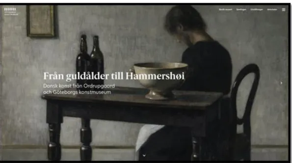
3.3 The museums in the study
Figure 1. Print screen of the start page of Gothenburg Museum of Art Gothenburg Museum of Art is Sweden’s third largest art museum in terms of the size of its collection (Gothenburg Museum of Art, n.d.). According to their website, the collection includes primarily Western art from the 15th century and onward, with
emphasis on Nordic art. They also write that the museum building is designed by Arvid Bjerke and Sigfrid Ericson and it was erected for the Jubilee Exhibition of 1923.
Figure 2. Print screen of the first page of The Museum of Modern Art (Stockholm)
The Museum of Modern Art is a museum located in Stockholm, Sweden (The Museum of Modern Art, n.d.). It is a museum for modern and contemporary art from the 20th century until today, according to their website. They also write that it opened
in 1958 in an old military building and in 1998, the museum moved into a new building right next to the old one, designed by the architect Rafael Moneo.
4. Empirical Research
4.1 Museum visitor needs
Prior to researching user experience on any digital product, one must know the user and their needs. In 2004, a doctoral dissertation investigating the information needs of virtual visitors (i.e. visitors of websites) for art museum websites was published. This study used a web-based survey to investigate 550 potential visitors’ primary purpose of visiting the websites, what information they find to be most important on the website, etcetera. Virtual visitors were grouped into five categories: museum staff, scholars, teachers, students and general visitors. It was concluded that the primary purpose of all user categories was to learn more about museum collections and decide what they want to see in the museum. Regarding preferences for information about current exhibitions at the museum, all types of users expressed wanting information about duration, location, ticket price and highlights of the exhibits (Kravchyna, 2004). Similarly, a series of surveys on information needs of visitors to the Science Museum in London found that most remote queries (i.e. queries submitted from people who were not at the physical location) to the museum’s facilities were to help plan visits to the museum. These included questions about admission prices, opening hours, events, and how to get to the museum (Booth, 1998).
4.2 Website navigation on museum websites
There is a lack of research made solely regarding the topic of web navigation on art museum websites. However, amongst several studies made on the topic of usability on museum websites — where navigation is a subsection — one study was made analysing 80 art museum websites in the United States (Lepkowska-White and Imboden, 2013). It was found that more than two thirds of the websites use a menu structure with main categories and subcategories, where the viewer must “select the main category first in order to view the subcategories”. All websites analysed used appropriate labelling in the navigation, but about half of the websites’ buttons were hard to find. These websites lacked embedded links to encourage the user to explore the site further. The research concluded that — though most of the websites used proper labelling, coherent headings and subheadings that allows for easy navigation — several art museums’ websites needed to change their structure in order to retain and attract visitors. Examples of improvements included the use of hyperlinks, visibility of buttons and the inclusion of an in-site search function.
4.3 Usability on art museum websites
In the study made on 210 art museums in 2008, which laid ground for the MUSEF framework, it was shown that the American art museum websites received the highest score, from the user’s viewpoint, when it came to usability, with an average of 3,63 out of 5 (Pallas & Economides, 2008). It was also shown that European art museum websites had 3,02 points in average and the “rest world" got 2,75 points.
5. Analysis
5.1 Questionnaire
The data below were collected from the participants in the questionnaire. None of the participants had any previous knowledge in web design or user experience design. Neither had they visited any of the two websites within the last year. Moreover, all the participants were between the ages of 20–30 years old.
Figure 4. A diagram showing the age of the participants
The participants’ internet usage varied greatly. One participant spent less than one hour per day on the internet, another 1-2 hours per day, three participants spent 3-4 hours per day and one participant spent over 4 hours per day.
Figure 5. A diagram showing the participants’ internet usage All participants had visited a museum website in their life. However, none of the participants visited a museum website as often as once or several times per month. Two participants visited museum websites once or several times per year and four participants visits them more seldom.
5.2 Usability tests
I. Gothenburg Museum of Art
Tasks 1, 2, 3, 4 and 7 on the Gothenburg Museum of Art’s website were solved by the participants with zero or minor problems (1’s and 2’s). These tasks were about finding out when the museum opens on Saturdays, changing the language of the website and change back again, finding out the ticket price to the museum, see how many
exhibitions that were currently ongoing and finding the address to the museum. The tasks that caused problems for one or several participants (3’s and 4’s) were task 5 and task 6, which covered finding the closest bus stop and using the search function to find out if you could buy a cup of coffee at the museum. One participant had to give up on task 5, since he or she did not find the information that was asked for. Task 6 was especially hard for the participants; one participant had major problems and four participants gave up. Only one participant solved the task with minor problems. None of the participants gave the wrong answer on any of the tasks.
Task 1 Task 2 Task 3 Task 4 Task 5 Task 6 Task 7 Total
P1 1 2 1 1 1 4 2 12 P2 1 2 1 1 1 3 1 10 P3 1 1 1 1 4 4 1 13 P4 1 2 1 1 1 4 1 11 P5 1 1 1 2 1 4 1 11 P6 1 1 1 1 1 2 1 8
Figure 7: Success data — Gothenburg Museum of Art’s website II. Museum of Modern Art
On the Museum of Modern Art’s website, the tasks 1, 2, 6 and 7 caused zero or minor problems to the participants (1’s and 2’s). These tasks were about finding when the museum opens on Saturdays, changing the language of the website and changing back again, using the search function to find out if you can buy a cup of coffee at the museum and finding the address to the museum. The tasks 3, 4 and 5 caused major problems for one participant each (3’s). These tasks included finding the ticket price to the museum, finding how many exhibitions that are currently ongoing and finding the closest bus stop. None of the participants gave up or failed by giving the wrong answer on any of the tasks.
Task 1 Task 2 Task 3 Task 4 Task 5 Task 6 Task 7 Total
P1 1 1 1 1 1 1 2 8 P2 1 1 1 3 3 1 2 12 P3 1 1 1 1 2 1 1 8 P4 1 2 3 1 2 1 2 12 P5 2 1 1 1 2 2 2 11 P6 1 2 1 1 1 1 2 9
5.3 Interviews
In the interviews, participants were asked to rate the websites on a scale of 0-5 on the five criteria of usability — user interface, site structure and organisation, navigation, orientation and search. The results are presented below.
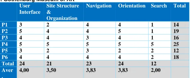
I. Gothenburg Museum of Art User
Interface
Site Structure &
Organization
Navigation Orientation Search Total
P1 3 2 4 4 1 14 P2 5 4 4 5 1 19 P3 4 4 3 4 1 16 P4 5 5 5 5 5 25 P5 3 2 3 2 2 12 P6 4 4 4 4 2 18 Total 24 21 23 24 12 Aver . 4,00 3,50 3,83 3,83 2,00
Figure 9. A table showing the participants’ rating of Gothenburg Museum of Art’s website
Gothenburg Museum of Art got 24 points in total for the website’s user interface, of 30 possible. The average score from the participants is 4 points out of 5. Two of the participants expressed their dissatisfaction regarding the big image on the front page — the image occupied a great deal of space that they thought could have been utilized in a better way. The remaining four participants said that they liked the interface of the website.
When it comes to the site structure and organisation, the website got 21 points of 30 possible. The average score is 3,5 out of 5. Four of the participants said that the information that they were looking for was easy or quite easy to find. Two participants felt the exact opposite — that it was hard finding the information. The navigation of the website got 23 of 30 points in total, which is 3,83 points out of 5 in average. Four participants thought that the navigation was decent. The remaining two participants thought it had room for improvements.
Regarding orientation, the website got 24 out of 30 points in total, which is 4 points in average of 5 possible. One of the participants were highly impressed of how well the website gave a sense of orientation, thanks to that the words in the menus were underlined when active. Another participant also felt that the experience of the orientation was good. Three participants thought that it was easy knowing where they were on the website, but hard knowing where to start looking for information. One participant felt lost at times.
on Museum of Modern Art’s website and that it was positive that the search results was divided with lines — it made it easier to scan them.
II. Museum of Modern Art User
Interface
Site Structure &
Organization
Navigation Orientation Search Total
P1 4 4 3 3 4 18 P2 3 2 3 3 5 16 P3 3 5 4 4 4 20 P4 4 3 3 3 4 17 P5 4 3 3 2 4 16 P6 4 4 3 3 5 19 Total 22 21 19 18 26 Aver. 3,67 3,50 3,17 3,00 4,33
Figure 10. A table showing the participants’ rating of Museum of Modern Art’s website
Museum of Modern Art got 22 points in total for the website’s user interface of 30 possible, which gives the average score of 3,67 of 5 possible. One of the participants said that the menu icon (hamburger menu) did not have three lines as usual and that made it difficult to know if it was a menu or not. Another participant also mentioned that some buttons were looking strange and not like they use to look. Two participants said that they preferred the other website. Two participants thought that the website looked good overall and that it felt modern. However, one of the two did not like the big image on the front page, since it takes up a lot of space.
Regarding the site structure and organisation, the website got 21 out of 30 points possible, which is 3,5 of 5 in average. One participant thought that the menu hardly consisted of any links, since he or she did not think that the three menu items in the top were clickable (even if they were). One participant thought that the site structure and organisation was unlogic. Two participants thought there were room for
improvements. The two remaining participants thought it worked well.
When it comes to the navigation, the website got 19 points out of 30 possible, which is 3,17 out of 5 in average. Three participants said that it was confusing that the menu covered the whole screen. One of the participants thought the navigation felt messy. One participant had the impression that the website changed appearance when
navigating around and thus thought the navigation felt confusing. Another participant thought that the navigation was good.
The website got 18 out of 30 points for the orientation, which is 3 out of 5 in average. Two of the participants said that they at times felt lost on the website. One of them thought that it was strange that the design of the website changed so much navigating through it. One participant said that he or she did not always know where to start looking. One participant thought it was hard getting a sense of location since the menu covered the whole screen. One of the participants said that he or she always had a sense of location and a good idea of where to go next.
When it comes to the search function, the website got 26 out of 30 points, which is 4,33 points of 5 in average. All of the participants thought that the search function worked well. One of them said that if it were not for that the search field was so big, he or she would have given the highest score.
III. Compilation of data
Counting the success rate of Gothenburg Museum of Art’s website showed that 86% of the tasks were 1’s and 2’s, which means that the participants had zero or minor problems solving the tasks. 14% of the tasks were 3’s and 4’s, which means that they had major problems solving them or that the user gave up. When it comes to the Museum of Modern Art’s website, it was shown that 93% of the tasks were 1’s and 2’s and 7% of the tasks were 3’s and 4’s.
Both websites combined, that equals around 89,5% of the tasks caused zero or minor problems and 10,5% of the tasks caused major problems or were so hard to solve that the users gave up. No user failed by giving the wrong answer on either of the
websites.
Task 1, 2 and 7 were performed on both websites without creating major problems or causing the users to give up. The same goes for task 3 on the Gothenburg Museum of Art’s website. The remaining tasks caused however major problems to some
participants or even caused some to give up. One task that was especially hard for the users and that stood out among the results were task 6 on the Gothenburg Museum of Art’s website. That task was about using the search function to find out if it was possible to buy a cup of coffee at the museum and only one participant was able to solve the task without major problems or having to give up. Task 5 on Museum of Modern Art’s website caused some confusion among four participants, since one hyperlink took them to SL’s website (Stockholm Public Transport) instead of taking them to a new page on the museum website, as they expected. However, almost all participants were still able to solve the task without having major problems or having to give up.
Based on the grading 0—5 made by the participants in the semi-structured interviews, Gothenburg Museum of Art ‘s website got 4 out of 5 points in average for the user interface, 3,50 points when it comes to site structure & organisation, 3,83 points for the navigation, 3,83 points for the orientation and 2 points for the search. When it comes to the Museum of Modern Art, the website got 3,67 out of 5 points in average for the user interface, 3,50 points when it comes to site structure & organisation, 3,17 points for the navigation, 3 points for the orientation and 4,33 points for the search. The two websites got 42 out of 60 points for the navigation, which is 3,5 points in average. Many of the participants felt that both museum websites could be improved when it comes to navigation. There was only one participant who gave the highest grade when rating the navigation and that was given to Gothenburg Museum of Art’s
The results from the questionnaires revealed that the participant who spent the least amount of time on the Internet each day (less than an hour), did not have the most problems performing the tasks in the usability tests. However, that participant gave both the websites the overall lowest grade of all the participants. The participant who spent the most amount of time on the Internet each day (more than four hours), had the best success scores on the Gothenburg Museum of Art’s website, but apart from that there were no data standing out. When it comes to the different ages of the participants as well as the frequency of museum visits, there were no significant difference in results.
6. Discussions and Conclusion
6.1 Findings
The results are pointing towards that users with an 89,5% probability can navigate a Swedish art museum website with success. When it comes to the user’s subjective satisfaction of the navigation, the websites combined got an average score of 3,5 out of 5. This is right in between mediocre and good on the scale. The overall usability (where navigation is a sub section) also got an average score of 3,5 points of 5 possible.
As mentioned earlier, adequate navigation on a website should tell the users where they are, what they can expect to discover and where they can go next (Krug, 2014). According to both the quantitative and qualitative data, all participants did not experience this all the time. Emotions that arouse during the usability tests were according to some participants confusion and the feeling of being lost.
Since every person is different, we interact with systems in different ways
(Rosenzweig et al., 2015) and that was also evident in this study. Some tasks in the usability test caused participants to take several detours before finding what they searched for. This was because the structure of the websites did not always meet the participants’ expectations of the structure, which is an important aspect for a good website navigation (Chen & Ryu, 2013). One example is that some participants looked for the address to the museum in the footer, since that was where they
expected it to be. When they did not find the answer there, they continued looking for it on other places.
Cooper’s study shows that web navigation hierarchies that haves many items in the menu with few sublevels are easier to use than having few items with many sublevels (cited in Johnson, 2014). Even though Museum of Modern Art had the highest success rate and the highest score of perceived satisfaction, Gothenburg Museum of Art has a menu with more items (with the hamburger menu included) and fewer sublevels, than the Museum of Modern Art.
Breadcrumbs can be useful on larger websites to provide information to the user of where they are and how they got there (Krug, 2014). It improves the ease of use of the website, as well as fosters user comfort (Nielsen, 2007). Even though only the
Museum of Modern Art’s website uses breadcrumbs, Gothenburg Museum of Art’s website still got a higher grade on the orientation. The low grade of Museum of Modern Art’s orientation has probably to do with that a few participants mentioned that they disliked that the menu covered the whole screen when active.
Some participants were not pleased about the fact that both the museum websites had big images on the frontpage, instead of using that space for providing valuable information. However, start pages with low visual complexity had been shown to be
there would have been a bigger risk of outliers in the data. A disadvantage of that is that the results cannot be generalized to audiences outside the chosen age range, but it opens up possibilities for further studies.
For collecting usability metrics, it is preferable to have around 20 participants (Nielsen, 2001). Since this study only had six participants, it does not produce accuracy of results. More usability tests need to be made in order to state what the exact success rate of the websites are, as well as more interviews to find out more accurate scores of the users’ subjective satisfaction. However, using five participants is enough to determine most of the usability results (Nielsen, 2000).
The number of usability metrics used was limited, due to the timeframe. Also measuring for example time on task would have provided a more accurate answer to the research question. Neither observations nor eye tracking was used as data
gathering techniques, although it could have yield valuable data.
The two art museums websites in the study was chosen since they had approximately the same size (when it comes to the number of pages and the amount of information) and both websites were in Swedish. However, since only two websites were
compared, it is not valid to generalize the results for all Swedish art museum websites. Despite the limitations, the choice of methods worked well to address the purpose of the study and it answered the research question to a certain extend.
6.3 Discussion of findings
The Swedish art museum websites in this study are pointing towards having an 89,5% success rate. That means that they are not reaching the recommended 95% criterion that is recommended. The websites should go through more small tests and iterate the design in between, in order to reach the success criterion.
The average score of the navigation as well as the overall usability of both the
websites was 3,5 out of 5. The score would probably been higher if, according to both the results and previous research, both websites had utilized the space on the
frontpage more effectively, used many items in the menu with only a few sublevels, structured the website more according to the participants’ expectations and used breadcrumbs.
Comparing the average score of usability with research made using the same
framework, it was shown that American art museum websites are perceived easier to use than the Swedish art museum websites in this study. However, the Swedish art museum websites are better than the average European art museum website as well as art museum websites in the rest of the world (see figure 3).
In the study of 80 art museums in the United States, it was found that several of the websites tested used neither hyperlinks nor had an in-site search function
(Lepkowska-White and Imboden, 2013). This was not the case with the museum websites in this study. Though, only one user was able to use the search function on Gothenburg Museum of Art’s website without having major problems or having to give up. One hyperlink on the Museum of Modern Art’s website caused confusion
among several users, since it did not take them to where they expected. Hence, there is definitely room for improvements on these areas.
The usability tests indicate that the navigation could be improved by sometimes providing multiple paths to the same content. This is because it happened that some users had different expectations of where to find certain information. Sometimes there were several paths to the same content and sometimes an additional path would have been helpful.
Considering that some users thought that the start pages where not utilized enough, it might be valuable to have, for example both the opening hours and the current exhibitions on the front page. The opening hours are one of the most important information a museum has and therefore should probably be displayed as soon as you enter the website. To display the current exhibitions might catch the visitor's interest and he or she might feel more engaged to make a visit to the museum. However, more elements should probably be avoided, since low visual complexity is perceived more enjoyable on start pages (Tuch et al., 2009).
One participant said it was confusing that Museum of Art’s website had a hamburger menu that did not look like it usually does and therefore it was hard knowing if it was a menu or not. The participant was used to that the menu icon has three parallel lines, but this only has two. Even though it may be innovative and original to change the appearance of an icon, it may cause confusion for the users. Also, the hamburger menu covers the whole screen when activated, which also may feel innovative. However, some users complained that it made it harder to navigate as well as get a feeling of orientation. These findings indicate that you should not sacrifice the advantages of convention solely for the sake of innovation.
What caused the most problems for the participants in the usability tests was the search function on the Gothenburg Museum of Art’s website. The search function seemed to work well, since the correct page became visible for the participants. However, neither the titles nor the descriptive texts of the search results did match what the user searched for. There are probably users who uses the search function when they are stuck in the navigation and if the search function causes further
complications, there is a risk that the user gives up and leaves the website. Therefore, it is important that the search function can be used with ease. If the search function would be improved on the Gothenburg Museum of Art’s website, it would enhance the user experience as well as the success rate considerably.
6.4 Social Aspects
Museums have an important role in today’s society, for the community, its’ residents and tourists. They can foster a deeper understanding of our cultural heritage and encourage discussion and self-reflection. However, maintaining a building, paying workers and launching new exhibits is not free and the need to generate the necessary visitation statistics to remain financially viable or justify government funding can be a
important in Sweden nowadays, since the number of visitors to museums are decreasing (Swedish Agency for Cultural Policy, 2018). Even if evaluating and updating a website regularly is costly, it can be an impactful strategy for the survival of museums. In other words, it could be an investment.
6.5 Implications
The findings can help acquire a greater understanding of how the web navigation of Swedish art museum websites works today and to gain insights into what alterations that can be made to improve the navigation on similar websites. The results can work as motivation for museum administrators to improve art museum websites, which in turn can result in an increased number of visitors.
6.6 Limitations
The limited timeframe influenced the scope and results of the study. It limited the number of websites evaluated and the number of usability metrics used to evaluate the results. If the study had been conducted during a longer period, the study could have been more extensive which would have strengthened the results.
Even though five participants are enough to find most of the usability problems in a design, it is preferable to have around 20 users when collecting usability metrics (Nielsen, 2001). To set a stronger conclusion, the success rate and the users’ subjective satisfaction should have been tested on a larger number of participants. It is not valid to generalize the results of this study for all Swedish art museum websites, since only two were compared. Additionally, the participants in the study cannot be fully representative of the target group, because of the small sample size.
6.7 Conclusions and recommendations
The research aimed to answer the research question “How easily and successfully can a user navigate on an art museum website?”. The results are based on data from a questionnaire, usability tests and semi-structured interviews with six participants between 20-30 years old. The findings from the study are pointing towards that users with an 89,5% likelihood can navigate an art museum website with success. This result indicates that art museum websites do not have an adequate navigation, since the aim of any website should be to have an 95% success score.
The results of the users’ subjective satisfaction are suggesting that the navigation is right in between mediocre and good, which can be debated if it is an adequate navigation or not. However, what can be concluded is that there is room for
improvements when it comes to the navigation of Swedish art museum websites and improving these websites could be beneficial for attracting new visitors. That is especially important in Sweden, where the number of visitors to museums are decreasing. An iterative design process is recommended to achieve a higher success rate and increase the users’ subjective satisfaction.
6.8 Further research
For further studies, it would be of interest to test the websites on participants in different age groups, to target the whole demography. It would also be interesting to test them in mobile version, since it differs from the desktop version. Further research could examine the user experience on the selected art museum websites outside of
navigability — the overall impression and functionality of the websites or dig deeper into one of the five left-over criteria from the MUSEF framework.
Evaluation of the websites should be an ongoing project, with continuously
adjustments and refinements. Therefore, this study should be repeated after a while in order to identify the progress of the websites.
Further studies could also examine more art museum websites, to get a better
overview and a more accurate result of how easily and successfully users can navigate on them.
References
A museum for the future. (2015, May 22). Retrieved February 3, 2020, from https://www.modernamuseet.se/stockholm/en/about/
About the Museum. (n.d.). Retrieved February 3, 2020, from https://goteborgskonstmuseum.se/en/about-the-museum/
Blomkvist, P., & Hallin, A. (2015). Method for engineering students : degree projects using the 4-phase model (1. ed.). Lund: Studentlitteratur.
Booth, B. (1998). Understanding the Information Needs of Visitors to Museums. Museum Management and Curatorship, 17(2), 139–157. doi: 10.1080/09647779800301702
Chen, M., & Ryu, Y. U. (2013). Facilitating Effective User Navigation through Website Structure Improvement. IEEE Transactions on Knowledge and Data Engineering, 25(3), 571–588. doi: 10.1109/tkde.2011.238
Darken, R. P., & Sibert, J. L. (1993). A toolset for navigation in virtual environments.
Proceedings of the 6th Annual ACM Symposium on User Interface Software and Technology - UIST 93. doi: 10.1145/168642.168658
Elliot, M., Fairweather, I., Olsen, W., & Pampaka, M 2016, ’convenience sampling’, A Dictionary of Social Research Methods, Oxford University Press, Oxford
Fang, X., & Holsapple, C. W. (2007). An empirical study of web site navigation structures impacts on web site usability. Decision Support Systems, 43(2), 476–491. doi:
10.1016/j.dss.2006.11.004
Farkas, D., & Farkas, J. (2000). Guidelines for Designing Web Navigation. Technical Communication, 47, 341–358.
Fotakis, T., & Economides, A. A. (2008). Art, science/technology and history museums on the web. Int. J. Digital Culture and Electronic Tourism, 1, 37–63. doi:
10.1504/IJDCET.2008.020134
García-Madariaga, J., Virto, N. R., & López, F. B. (2017). The influence of museums’ websites on users’ intentions. ESIC MARKET Economic and Business Journal, 48(2), 369–392. doi: 10.7200/esicm.157.0482.4
Garcia-Madariaga, J., Virto, N. R., López, M. F. B., & Manzano, J. A. (2019). Optimizing website quality: the case of two superstar museum websites. International Journal of Culture, Tourism and Hospitality Research, 13(1), 16–36. doi: 10.1108/ijcthr-06-2018-0074
Johnson, J. (2014). Designing with the mind in mind: simple guide to understanding user interface design guidelines(2nd ed.). Amsterdam: Elsevier.
Kaplan, B., & Maxwell, J. A. (2005). Qualitative Research Methods for Evaluating Computer Information Systems. Health Informatics Evaluating the Organizational Impact of Healthcare Information Systems, 30–55. doi: 10.1007/0-387-30329-4_2
Kravchyna, V. (2004). Information Needs of Art Museum Visitors: Real and Virtual. Kravchyna, V., & Hastings, S. (2002). Informational Value of Museum Web Sites. First Monday, 7(2). doi: 10.5210/fm.v7i2.929
Krug, S. (2014). Don’t make me think, revisited : a common sense approach to web usability (3. ed.). Förenta staterna [Berkeley, CA: New Riders.
Kulturvanor i Sverige 1928-2018. (2019). [pdf] The Swedish Agency for Cultural Policy. Available at: https://kulturanalys.se/wp-content/uploads/2019/07/kulturvanor-i-sverige-1989-2018-2.pdf [Accessed 6 Feb. 2020].
Lepkowska-White, E., & Imboden, K. (2013). Effective Design for Usability and Interaction: The Case of Art Museum Websites. Journal of Internet Commerce, 12(3), 284–305. doi: 10.1080/15332861.2013.859040
Loncaric, D., Prodan, M., & Ribaric, I. (2016). THE INFLUENCE OF A VISITOR’S PERCEPTIONS OF A MUSEUM’S WEBSITE DESIGN ON BEHAVIOURAL INTENTIONS. Ekonomski Vjesnik, 29(1), 65–79. Retrieved from
http://search.proquest.com/docview/1802590390/
Lopatovska, I. (2015). Museum website features, aesthetics, and visitors’ impressions: a case study of four museums. Museum Management and Curatorship, 30(3), 191– 207. doi: 10.1080/09647775.2015.1042511
Marty, P., & Twidale, M. (2004). Lost in gallery space: A conceptual framework for analyzing the usability flaws of museum Web sites. First Monday, 9(9). doi:
10.5210/fm.v9i9.1171
Marty, P. F. (2007). Museum Websites and Museum Visitors: Before and After the Museum Visit. Museum Management and Curatorship, 22(4), 337–360. doi: 10.1080/09647770701757708
Museer 2018. (2018). [pdf] The Swedish Agency for Cultural Policy. Available at: https://kulturanalys.se/wp-content/uploads/2019/06/museer-2018-1.pdf [Accessed 6 Feb. 2020].
Nielsen, J. (2000, March 18). Why You Only Need to Test with 5 Users. Retrieved February 10, 2020, from https://www.nngroup.com/articles/why-you-only-need-to-test-with-5-users/
Nielsen, J. (2001, January 20). Usability Metrics. Retrieved February 18, 2020, from https://www.nngroup.com/articles/usability-metrics/
Nielsen, J. (2007, April 9). Breadcrumb Navigation Increasingly Useful. Retrieved February 10, 2020, from https://www.nngroup.com/articles/breadcrumb-navigation-useful/
Nielsen, J. (2012, January 15). Thinking Aloud: The #1 Usability Tool. Retrieved February 10, 2020, from
https://www.nngroup.com/articles/thinking-aloud-the-1-Pallud, J., & Straub, D. W. (2014). Effective website design for experience-influenced environments: The case of high culture museums. Information & Management, 51(3), 359–373. doi: 10.1016/j.im.2014.02.010
Patton, M. (1999). Enhancing the Quality and Credibility of Qualitative Analysis. Health Services Research, 34(5 pt 2), 1189–1189208.
Rosenzweig, E. (2015). Successful User Experience Strategy and Roadmaps. San Francisco: Elsevier Science & Technology.
Rubin, J., & Chisnell, D. (2008). Handbook of usability testing : how to plan, design, and conduct effective tests (2. ed.). Indianapolis, IN: Wiley Pub.
Tuch, A., Bargas-Avila, J., Opwis, K., & Wilhelm, F. (2009). Visual complexity of websites: Effects on users’ experience, physiology, performance, and memory. International Journal of Human - Computer Studies, 67(9), 703–715.
https://doi.org/10.1016/j.ijhcs.2009.04.002
Tullis, T., & Albert, B. (2013). Measuring the user experience collecting, analyzing, and presenting usability metrics (2nd ed.). Amsterdam, Netherlands: Elsevier. Vetenskapsrådet. (1990). Forskningsetiska principer inom humanistisk-samhällsvetenskaplig forskning. Vetenskapsrådet.
Appendices
Appendix 1: Questionnaire
Appendix 2: Tasks for usability test Appendix 3: Screen- and voice recording Appendix 4: Interviews questions
Appendix 1: Questionnaire
How old are you?
_____
Do you have any previous experience with web design and/or user experience design? ❑ Yes
❑ No
Have you visited the website for Gothenburg Museum of Art and/or The Museum of Modern art within the last year?
❑ Yes
❑ No
How often do you visit a museum website? ❑ Once or several times per month ❑ Once or several times per year
❑ More seldom
❑ I have never visited a museum website
On average, how many hours per day do you spend on the Internet? ❑ Less than 1 hour per day
❑ 1-2 hours per day ❑ 2-3 hours per day
❑ 3-4 or more hours per day
Appendix 2: Tasks for usability test
1. When does the museum open on Saturdays?2. Change the language on the website from Swedish to English. And back to Swedish.
3. How much does a ticket to the museum cost? 4. How many exhibitions are currently ongoing?
5. Which is the closest bus stop if you want to visit the museum?
6. Use the search function to find out if you can buy a cup of coffee at the museum.