Degree project
Visualization of
Gene Ontology and
Cluster Analysis Results
Author: Vladyslav Aleksakhin Date: 2012-08-20
Subject: Computer Science Level: Master
Abstract
The purpose of the thesis is to develop a new visualization method for Gene On-tologies and hierarchical clustering. These are both important tools in biology and medicine to study high-throughput data such as transcriptomics and metabolomics data. Enrichment of ontology terms in the data is used to identify statistically over-represented ontology terms, that give insight into relevant biological processes or functional modules. Hierarchical clustering is a standard method to analyze and visualize data to find relatively homogeneous clusters of experimental data points. Both methods support the analysis of the same data set, but are usually considered independently. However, often a combined view such as: visualizing a large data set in the context of an ontology under consideration of a clustering of the data.
The result of the current work is a user-friendly program that combines two different views for analysing Gene Ontology and Cluster simultaneously. To make explorations of such a big data possible we developed new visualization approach.
Keywords
Graph Visualization, Gene Ontology, Hierarchical Clustering, Mappings, Interaction Technique, GML, JUNG.
Acknowledgments
I would like to express my gratitude to my supervisor Dr. Andreas Kerren and to my co-supervisor Ilir Jusufi. They encouraged and stimulated me in each step of this work. Moreover, my greatest gratitude goes to my father Oleksandr and my family that made my study possible, for their constant moral support even though thousands of kilometers separated us. Finally, I would like to thank to my best friend Olga for support and patience.
Contents
1 Introduction 2 1.1 Motivation . . . 2 1.2 Thesis Collaboration . . . 2 1.3 Thesis Outline . . . 3 2 Background 4 2.1 Information Visualization . . . 4 2.2 Bioinformatics . . . 5 2.3 Gene Ontology . . . 6 2.4 Clustering . . . 7 3 Data Extraction 9 3.1 Algorithm Overview . . . 9 3.2 Dataset Description . . . 9 3.3 Mapping Algorithm . . . 10 4 Visualization Approach 13 4.1 Clustering Visualization — First Attempt . . . 134.2 Cluster Analysis Results Visualization . . . 15
4.3 Gene Ontology Visualization . . . 17
4.4 Complete Solution Overview . . . 22
5 Implementation 25 5.1 Programming Language and Tools . . . 25
5.2 Java Graph Libraries Overview . . . 27
5.3 GML Graph File Format . . . 31
5.4 Other Graph File Formats . . . 34
5.4.1 GraphML . . . 34
5.4.2 DOT Graph File Format . . . 35
5.4.3 DGML . . . 36
5.4.4 GXL . . . 37
5.4.5 SVG . . . 37
5.5 OpenGL Visualization Standard . . . 38
5.6 Program Architecture . . . 39 6 Conclusion and Future Work 43
References 44
Appendix A: Listing of a Complex GML File 50 Appendix B: Subgraph Extraction Algorithm 53 Appendix C: Complete UML Class Diagram 54 Appendix D: Program Execution Screenshots 55
1
Introduction
The current chapter covers the root of the problem and goals we are trying to accomplish.
1.1 Motivation
Computer information analysis is the only known approach to work with huge amount of data produced every day. In any field of human work there is data and there are tasks of analyzing it. The topic of this thesis combines two areas of data computing: information visualization and biological data processing.
There are many datasets for analysis in biology. This thesis is intended to make a visualization tool for genes and gene relations in order to help biologists with their work. Data for processing was provided by the Plant Bioinformatics Group of Leibniz Institute of Plant Genetics and Crop Plant Research (IPK), Germany. Data consists of Gene Ontologies and hierarchical clustering which are are both important tools in biology and medicine for high-throughput data study.
To help analyzing this data the following approaches are desired: visualizing the data set in the context of a ontology (such as the Gene Ontology) and in the context of data clustering. There is no solutions that deals with combined visualization of ontology (DAG) and an hierarchical clustering (tree) of one data set. The aim of this work is creation of a new visualization approach and is implementation in order to provide a useful tool for biologists in their everyday research work.
The result of this work is a base of the research paper [1].
1.2 Thesis Collaboration
This project is the result of collaboration between ISOVIS research group (Head: Prof. Dr. Andreas Kerren [16]) of Linnaeus University at V¨axj¨o, Sweden, and Plant Bioinformatics Group (Head: Prof. Dr. Falk Schreiber [17]) of Leibniz Institute of Plant Genetics and Crop Plant Research (IPK), Germany.
ISOVIS research group is focused on the exploration analysis and visualization of large information data in Software Engineering, Geography, or Biology. There are several different techniques for information visualization, one of them is widely used in the research is Human-Centered Visualization. This kind of visualization com-bines different research areas: Information Visualization, Scientific Visualization, Human-Computer Interaction, Data Mining, Information Design, Graph Drawing, and Computer Graphics.
As said on official page of Plant Bioinformatic Group:
“The research group focuses on modeling, analysis, simulation and visualization of biological networks in the context of plant biological problems. Our aim is the development of methods and software tools for the analysis of complex biological networks. Therefore we integrate, process and analyze data from different areas of genome, proteome and metabolome research and present the results in a user-friendly way. The emphasis is on the linkage of experimental data about expression profiles and metabolite patterns with metabolic and regulatory networks. The data and complex connections are modeled using graphs. We are de-veloping graph (network) analysis and interactive visualization methods
to discover network properties and to make the data easily accessible to the user. A subsequent step is to use the data for the simulation of metabolic and regulatory networks.” [19]
Current work fulfills goals of the ISOVIS research group stated above and provides the useful tool for the researchers of the Plant Bioinformat-ics Group in their everyday work.
1.3 Thesis Outline
Following Section 2 presents the results of the related work, where relevant research efforts in the fields of Bioinformatic, Information Visualization and Bio-Visualization were explored in connection to the thesis work. Section 3.1 covers the following top-ics: visualization complexity and describes the goals, description of the input data and mapping between graphs. Section 4 describes attempt to the visualization solu-tion, the solution for Cluster Ananlysis tree and the visualization solution for Gene Ontology visualization technique. One of the biggest section in the report is Sec-tion 5 that determines the requirements, use cases, and proposes the architecture for thesis application. Additionally in Section 4 describes the input data format overview, overview of the different graph file formats, implementation details, archi-tecture of the system, used libraries, project management tools. Technical details of the visualization algorithms are explained in Sections 4.2 and 4.3. Last part of the report is Section 6 that describes problems and future work.
2
Background
Following chapter covers the data domain we are developing for.
2.1 Information Visualization
“The field of computer-based information visualization draws on ideas from several intellectual traditions: computer science, psychology, semi-otics, graphic design, cartography, and art. The two main threads of computer science relevant for visualization are computer graphics and human-computer interaction. The areas of cognitive and perceptual psy-chology offer important scientific guidance on how humans perceive vi-sual information. A related conceptual framework from the humanities is semiotics, the study of symbols and how they convey meaning. Design, as the name suggests, is about the process of creating artifacts well-suited for their intended purpose. Cartographers have a long history of creating visual representations that are carefully chosen abstractions of the real world. Finally, artists have refined methods for conveying visual meaning in sub-disciplines ranging from painting to cinematography.” [2] Information visualization tries to present abstract concepts and relationships that do not necessarily have a counterpart in the physical world using the graphical models.
Application of information visualization transform and represent source data of any format (binary, textual, etc.) in such a visual form that allows human inter-action. Using the interactive visualization program the data can be analyzed by exploration rather than using pure mathematical algorithms. Users the visualiza-tion program can understand the structure and connecvisualiza-tions in the data by observing the immediate effects of their interaction.
“Graph drawing is an area of mathematics and computer science combining methods from geometric graph theory and information vi-sualization to derive two-dimensional depictions of graphs arising from applications such as social network analysis, cartography, and bioinfor-matics.” [4]
Graph drawing algorithms varies by the type of graphs they try to represent. There are large amount of available algorithms, some of the are general purpose visualization algorithms – to visualize any type of the graph, and the other are focused for the specific kind of graph.
In the current work we introduced two new visualization approaches based on the specific properties of the provided data. Visualization approaches will be covered in the corresponded sections. But it is worth to mention that Gene Ontology graph visualization idea is based on the Layer Graph Drawing method.
“Layered graph drawing methods are best suited for directed acyclic graphs or graphs that are nearly acyclic, such as the graphs of depen-dencies between modules or functions in a software system. In these methods, the nodes of the graph are arranged into horizontal layers us-ing methods such as the CoffmanGraham algorithm, in such a way that most edges go downwards from one layer to the next; after this step, the nodes within each layer are arranged in order to minimize crossings.” [5] Cluster Tree are usually represented using the dendrogram plot. The dendrogram plot is one of the visualization algorithm for hierarchical structures. It illustrating the outcome of decision tree-type clustering in statistics, in computational biology to illustrate the clustering of genes or samples [8]
There are many methods and approaches to graph visualization. They are all based on various perception qualities of human. The Radial Dendrograms [6] algo-rithm is circular layout.
“Circular layout methods place the vertices of the graph on a circle, choosing carefully the ordering of the vertices around the circle to reduce crossings and place adjacent vertices close to each other. Edges may be drawn either as chords of the circle or as arcs inside or outside of the circle. In some cases, multiple circles may be used.” [7]
2.2 Bioinformatics
Last years advances in molecular biology and the equipment available for research in this field have allowed the increasingly rapid sequencing of large portions of the genomes of several species. In fact, to date, several bacterial genomes, as well as those of some simple eukaryotes (e.g., Saccharomyces cerevisiae, or baker’s yeast) have been sequenced in full. The Human Genome Project, designed to understand all twenty four genomes of the human chromosomes, is also in progress. Popular sequence databases, for example Gene Ontology project, have been growing tremen-dously. This huge amount of information requires the careful storage, organization and indexing of sequence information. Information science has been applied to bi-ology to produce the field called – Bioinformatics.
The primary goal of bioinformatics is to increase our understanding of biological processes.
Major research efforts in the field include sequence alignment, gene finding, genome assembly, protein structure alignment, protein structure prediction, predic-tion of gene expression and protein-protein interacpredic-tions, genome-wide associapredic-tion studies and the modeling of evolution.
The simplest tasks used in bioinformatics concern the creation and maintenance of databases of biological information. Nucleic acid sequences (and the protein sequences derived from them) comprise the majority of such databases. While the storage and or organization of millions of nucleotides is far from trivial, designing a database and developing an interface whereby researchers can both access existing information and submit new entries is only the beginning. The most pressing tasks in bioinformatics involve the analysis of sequence information. [9]
Here we can find short introduction and history of Bioinformatics:
“Bioinformatics is the application of information technology to the field of molecular biology. The term bioinformatics was coined by Paulien Hogeweg in 1978 for the study of informatic processes in biotic systems. Bioinformatics now entails the creation and advancement of databases, algorithms, computational and statistical techniques, and theory to solve formal and practical problems arising from the management and analysis of biological data. Over the past few decades rapid developments in ge-nomic and other molecular research technologies and developments in in-formation technologies have combined to produce a tremendous amount of information related to molecular biology. It is the name given to these mathematical and computing approaches used to glean understanding of biological processes. Common activities in bioinformatics include map-ping and analyzing DNA and protein sequences, aligning different DNA and protein sequences to compare them and creating and viewing 3D models of protein structures.” [10]
The developed tool helps to reach the goals of the Bioinformatics stated above through analyzing the Gene Ontology data and corresponded mappings.
More resources about Bioinformatic are available in [11].
2.3 Gene Ontology
As stated above, there are different knowledge databases for biologic information storage. Gene Ontology [12] project is one of the first-rate international projects. The Gene Ontology, or GO, is a major bioinformatics initiative to unify the rep-resentation of gene and gene product attributes across all species. The aims of the Gene Ontology project are threefold. Firstly, to maintain and further develop its controlled vocabulary of gene and gene product attributes, secondly, to anno-tate genes and gene products, and assimilate and disseminate annotation data, and thirdly, to provide tools to facilitate access to all aspects of the data provided by the Gene Ontology project. The GO is part of a larger classification effort, the Open Biomedical Ontologies (OBO) [13].
In the current work one of the input data is Gene Ontology graph. The Gene Ontology is used by researchers of the Plant Bioinformatics Group to run clustering algorithm. Different goals use different algorithms as the result provides different
clustering trees. GO helps to gather and share information withing researchers. Here is description from the project web-site:
“The Gene Ontology project provides an ontology of defined terms representing gene product properties. The ontology covers three do-mains.
First is cellular component and the parts of a cell or its extracellular environment.
Second is molecular function and the elemental activities of a gene product at the molecular level, such as binding or catalysis and biological process.
Finally the third are operations or sets of molecular events with a defined beginning and end, pertinent to the functioning of integrated living units: cells, tissues, organs, and organisms. Each GO term within the ontology has a term name, which may be a word or string of words; a unique alphanumeric identifier; a definition with cited sources; and a name space indicating the domain to which it belongs. Terms may also have synonyms, which are classed as being exactly equivalent to the term name, broader, narrower, or related; references to equivalent concepts in other databases; and comments on term meaning or usage. The GO ontology is structured as a directed acyclic graph, where each term has defined relationships to one or more other terms in the same domain, and sometimes to other domains. The GO vocabulary is designed to be species-neutral, and includes terms applicable to prokaryotes and eu-karyotes, single and multicellular organisms. The GO ontology is not static, therefore additions, corrections and alterations are suggested by and solicited from members of the research and annotation communities, as well as by those directly involved in the GO project. For example, an annotator may request a specific term to represent a metabolic pathway, or a section of the ontology may be revised with the help of commu-nity experts. Suggested edits are reviewed by the ontology editors and implemented where appropriate.”[14]
2.4 Clustering
As was mentioned in the previous section different clustering algo-rithm could be applied to the GO.
“Data clustering (or just clustering), also called cluster analysis, seg-mentation analysis, taxonomy analysis, or unsupervised classification, is a method of creating groups of objects, or clusters, in such a way that objects in one cluster are very similar and objects in different clusters are quite distinct.
Data clustering is often confused with classification, in which objects are assigned to predefined classes. In data clustering, the classes are also to be defined.” [15]
Clustering algorithms help to classify genes and analyze mappings between genes in the Gene Ontology graph.
Other than in Bioinformatics and biology clustering algorithms can be applied in many other fields. For instance:
• Marketing: finding groups of customers with similar behavior given a large database of customer data that contains their properties and past buying records;
• Libraries: book ordering;
• Insurance: identifying groups of motor insurance policy holders with a high average claim cost, identifying frauds;
• City-planning: identifying groups of houses according to their house type, value and geographical location;
• Earthquake studies: clustering observed earthquake epicenters in order to iden-tify dangerous zones;
• Internet: document classification clustering web log data to discover groups of similar access patterns.
3
Data Extraction
One of the main goals in the topic is data mapping algorithm of the graphs. Current section covers the nature and structure of the input data. Additionally the work of the sub-graph extraction algorithm is described.
3.1 Algorithm Overview
First step that program supposed to do is to load data and to compute connected components. Data is stored in GML file format. More detail information about this format and other common graph file formats is given in Section 3.1.
3.2 Dataset Description
Gene Ontology data and cluster analysis results presented as directed graphs. They are stored in separate files in special format — GML files.
GO graph is directed acyclic graph that has 10,042 vertices and 24,155 edges. Also it has 1 root, 2,729 nodes and 7,312 leafs (terminal nodes). Figure 3.1 shows visualization of the Gene Ontology graph using Hierarchical layout by yEd [23] graph editing tool. It obviously shows imperfectness of classic visualization of graphs.
Figure 3.1: Gene Ontology yEd visualization
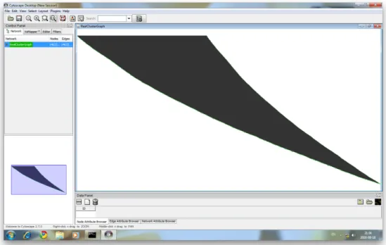
Cluster tree is a directed binary graph that has 14,623 nodes and 14,622 edges. The Cluster graph as a tree has a single root, 7,310 nodes and 7,312 leafs. To get an impression of the graph, Figure 3.2 shows the cluster tree that uses the Cytoscape [25] visualization tool.
Both graphs are independent from each other based on developer point of view: they have different node ids and edge ids. More over, they are connected by vertex labels — both graphs have same labels for terminal (leaf) vertices. This property is used in the sub-graph extracting algorithm.
Performance is one of the main requirements since the application should work with large quantity of data that has over tens of thousands vertices. It is very important to give a consideration on optimization.
Figure 3.2: Cluster analysis result tree Cytoscape visualization tool
Figure 3.3: Zoomed cluster analysis result tree
3.3 Mapping Algorithm
Here is the explanation of that program algorithm uses sample graphs:
1. The program visualizes Gene Ontology and cluster analysis result tree. This visualization technique is discussed in Section 4.
2. Interactively select node in the Gene Ontology graph (Figure 3.4a). 3. When node is selected the program computes all successors (Figure 3.4b). 4. Extract leafs from successors (Figure 3.5).
(a) Selected node in the Gene Ontology (b) Extract sub-graph for selected node
Figure 3.4: Sub-graph extraction from the Gene Ontology
Figure 3.5: Extract leafs from the Gene Ontology sub-graph
5. On this step program finds sub tree and caches. This sub tree is highlighted in Gene Ontology graph.
as showed in Figure 3.6a.
7. For any item the program finds root connected to all leafs and extracts corre-sponding sub trees (Figure 3.6b).
(a) Find corresponded leafs (b) Build sub-graph
Figure 3.6: Analyze Cluster graph
As was mentioned before, the aim of the work is to provide flexible tool specially made for biology scientists to deal with huge data sets. To trace relations in the two separated datasets (Gene Ontology graph and cluster analysis result tree): both graphs are stored separately in the different files. Also during program design we had to consider that cluster analysis results graph was produced from Gene Ontology graph using separate tool and clustering algorithm specific to the purpose. This means that there are various cluster graphs for the same Gene Ontology.
The tools provides effective space filling visualization method and allows interac-tive relations highlighting. The tool also provides ability to track graphs discovering: focused or selected vertex and label are showed for both graphs separately.
Considering end-user requirements there is a use case specification for biology scientist — interest in the concrete gene in the Gene Ontology. Also scientists are interested in the search mechanism to find specific gene by name and view it immediately on the graph.
4
Visualization Approach
Current section covers the visualization approach we have developed to achieve our goals. The subsections give an overview of the research work made, and introduce two separate visualization methods for each of the input data graphs, Gene Ontology and Cluster.
4.1 Clustering Visualization — First Attempt
As was discussed before in Section 3.2 cluster analysis result graph is a binary tree. “A binary tree is a connected acyclic graph such that the degree of each vertex is no more than 3. A rooted binary tree is such a graph that has one of its vertices of degree no more than 2 singled out as the root. With the root thus chosen, each vertex will have a uniquely defined parent, and up to two children; however, so far there is insufficient infor-mation to distinguish a left or right child. If we drop the connectedness requirement, allowing multiple connected component in the graph, we call such a structure a forest” [39]
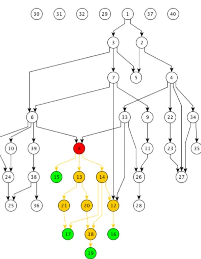
A simple binary tree is shown in Figure 4.1
Figure 4.1: A simple binary tree graph
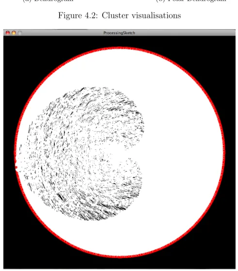
There exist several visualization methods for binary trees and more specific meth-ods for cluster results. The main method for visualizing clusters is a dendrogram. A sample dendrogram visualization produced by MATLAB 7.2 represented in Fig-ure 4.2a .
Figure 4.2b shows a polar dendrogram visualization algorithm of the same cluster tree produced by MATLAB.
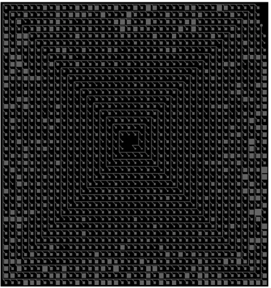
One of the main ideas in the beginning was to use a polar dendrogram algorithm for cluster visualization. Figure 4.3 shows visualization of the Cluster using native JUNG radial layout algorithm. Nodes are represented by colors. Red are nodes and white are edges on the black background. As picture shows, algorithm doesn’t count nature of the cluster. That means it is very deep binary tree, not wide as it is common for cluster analysis results, visualization algorithm produces to many edge overlapping.
Additionally to visualization issue it has performance issue — without any mea-surement it was seen for an eye that program does not allow smooth interaction.
(a) Dendrogram (b) Polar Dendrogram
Figure 4.2: Cluster visualisations
Figure 4.3: Cluster visualization using JUNG radial layout
Low performance issue was in the nature of the JUNG visualization library. It uses very complex hierarchical structure with many utility classes for each visualized ob-ject. Flexible architecture has a cost and the cost is high memory consumption. Also JUNG uses Java 2D [40] which by itself is ‘heavyweight’ because it is a part of the Java AWT — Abstract Windows Toolkit.
“The Abstract Window Toolkit (AWT) is Java’s original platform-independent windowing, graphics, and user-interface widget toolkit. The AWT is now part of the Java Foundation Classes (JFC) the standard API for providing a graphical user interface (GUI) for a Java program. When
Sun Microsystems first released Java in 1995, AWT widgets provided a thin level of abstraction over the underlying native user interface. For example, creating an AWT check box would cause AWT directly to call the underlying native subroutine that created a check box.” [41]
This technology is outdated and replaced by Swing. In the developed tool all GUI elements are implemented using the Swing API. Here is the brief description and goal of the Swing project:
“Swing is the primary Java GUI widget toolkit. It is part of Sun Microsystems’ Java Foundation Classes (JFC) an API for providing a graphical user interface (GUI) for Java programs. Swing was developed to provide a more sophisticated set of GUI components than the earlier Abstract Window Toolkit. Swing provides a native look and feel that emulates the look and feel of several platforms, and also supports a pluggable look and feel that allows applications to have a look and feel unrelated to the underlying platform.” [42]
“Since early versions of Java, a portion of the Abstract Window Toolkit (AWT) has provided platform-independent APIs for user inter-face components. In AWT, each component is rendered and controlled by a native peer component specific to the underlying windowing sys-tem. By contrast, Swing components are often described as lightweight because they do not require allocation of native resources in the operat-ing system’s windowoperat-ing toolkit. The AWT components are referred to as heavyweight components.” [42]
Reasons to use Swing and more detail information on comparison can be found in. [43]
Figure 4.4 shows improved JUNG radial algorithm and our own visualization implementation using JOGL will be discussed in Section 5.5..
The root of the cluster graph has fixed position in the center of the ring. The layout places all leafs evenly on the outer ring based on the distance from root. Each node is placed on the concentric ring corresponding to its distance to the root node — level. Each node is radially centered over children. The number of concentric rings is exactly equal to the number of levels of the graph.
Figure 4.5a and Figure 4.5b show cluster visualization and highlighted subgraph (subgraph extraction algorithm was discussed in Section 3.1). These pictures show the nature of the dataset. Improved version has good performance and better vi-sualization but still has issues. There are too many elements in the scene and it is impossible to identify separate gene or trace highlighted graph genes.
4.2 Cluster Analysis Results Visualization
Figure 3.3 from Section 3.2 shows cluster graph specific structure: it is very high, unbalanced and has not so deep sub-parts. It is possible to use this disadvantage as advantage and abstract sub-parts to reduce drawing area. For this we need to extract those nodes and edges that form the longest path of the cluster graph -“backbone”. Figure 4.8 shows the algorithm step by step. Backbone vertices are
Figure 4.4: Cluster visualization using JOGL and improved JUNG radial layout
(a) Cluster graph and highlighted sub-graph
(b) Cluster graph and highlighted sub-graph
Figure 4.5: Cluster graph visualization using improved JUNG polar dendrogram layout
filled with yellow and are shown in Figure 4.6a. Next step is to abstract branches into groups. Group size is scaled according to amount of elements inside.
(a) Backbone and branches(b) Abstract branches into groups
(c) Scale group size
Figure 4.6: Cluster Visualization algorithm
giving a possibility to show the complete tree in one view. Figure 4.7 shows how it works.
Figure 4.7: “Rectangular Spiral Layout”
Then backbone formed as rectangular spiral with a root in the center and moving in clockwise direction. Figure 4.8 shows complete visualization result for the real cluster tree. This approach reuses space as much as possible and still gives overview of location of the highlighted vertices in cluster hierarchy — how far it is from the root.
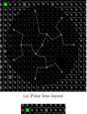
It is possible to explore sub-parts (rectangles) of the Cluster graph using “lens”. User can interactively choose any sub-part and the lens with inner content will appear. There are two different lens layouts: polar (Figure 4.9a) and HV-tree (Fig-ure 4.9b). Polar lens layout is based on the algorithm used for initial visualization of the Cluster graph, the algorithm was explained earlier in Section 4.1. Both im-plementations are made by our own and are not based on any third party source code.
4.3 Gene Ontology Visualization
Gene Ontology graph is a directed acyclic graph and highly connected: 24,153 edges and 10,041 vertices, where 3,918 are unconnected components. Figure 4.10 shows
Figure 4.8: Rectangular spiral Cluster graph visualization
how extremely connected the graph is, the picture was produced by yEd graph editing tool.
The high connectivity between elements in the source graph makes it very com-plicated to explore. Provided visualization approach has several goals. The first goal is to reduce amount of connections between vertices by showing edges only for “current” sub-graph. It allows to see where the sub-graph is aligned in the whole graph and, in the same time, helps to track its inner structure. Second goal is an ability to switch from working with genes of the GO graph to discovering relations between GO and Cluster graphs. For this purpose there are two view modes for GO graph:
• levels overview — show graph levels from top to bottom with corresponding content as “preview”;
• zoomed view — visualizes only on three levels at the same time in order to focus on genes inside;
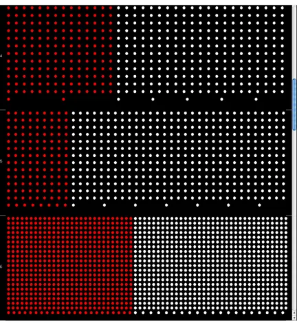
The last but not least goal is to explicitly show nodes and leafs. Each level is divided into two sections where leafs are red colored on the left and node genes are on the right and having white color. Color schema can be changes through the settings menu but not leafs-nodes location. This feature gives further insight into
(a) Polar lens layout
(b) HV-tree lens layout
Figure 4.9: Different lens layouts
the topology of a specific layer by gaining information about the distribution of leafs and nodes on a particular layer.
There are two layout implementations based on the goals discussed before. First GO layout is “Levels Layout” and is shown in Figure 4.11. Genes are ordered by layers depending on their graph-theoretic distance from the root.
Figure 4.12 displays the situation when the user zooms in the view. Although the resulting visualization looks like bar charts, the number of leafs cannot be precisely compared between different layers since the area the red node pixels (leafs) cover is not proportional to the total number of leafs in each layer. However, it is pro-portional to the sum of nodes in that particular layer. In other words, the covered area depends on the specific layer density. There are unconnected components in the Gene Ontology graph. Unconnected nodes are placed in the top layer number — zero. There is an option to show-hide unconnected components from the main menu. The spatial arrangement of the node pixels within a layer, except the placing of leafs and nodes are in specific regions, is random.
Figure 4.10: Gene Ontology graph visualization using yEd
Figure 4.11: Gene Ontology Levels Layout visualisation
the first one in terms of placing the nodes into corresponding layers based on the distance from the source node and random distribution of the node pixels within each layer. However, all leafs are placed into one single layer together with unconnected nodes at the bottom of the GO view, i. e., in the layer with the highest number. Unconnected nodes can be filtered out if necessary. This approach gives insight into the distribution of nodes among different layers without the distraction of the leafs, thus enriching the perception of the graph topology.
Figure 4.12: Zoomed view
Figure 4.13: Leaves bottom layout
in the scene. But even with hided edges visualized sub-tree could be complicated. The result of sub-graph highlighting is shown in Figure 4.14a.
(a) Straight edges (b) Edge bungling
Figure 4.14: Gene Ontology sub-graph edge highlighting
Improved edge visualization for the same selected vertex “multicellular organis-mal process” is shown in Figure 4.14b. A newer solution is simple edge bundling. Edge bundling technique and usage example well described in the [36] and [37].
For all edges which go into same level computed “dummy node” located on the top of the target level and in the middle of outlined vertices, drawing single line from source to “dummy node” as first part. Second part is to draw “Bezier line” from “dummy node” to target vertex. This solution helps to follow the connection and to use space in the right way.
4.4 Complete Solution Overview
Biologists usually browse the data set randomly or they have a specific GO term in mind to analyze.
For that purpose the tool provides the list of Gene Ontology genes in the alphabet ordered. It is called – Gene dialog, available from the menu.It is possible to search for specific gene over the list, search provides auto-complete functionality similar to Spotlight [?] in Mac OS series of Operation System. Or it is possible to directly click on a particular node in the GO view. Gene dialog also tracks corresponded manual selected node and vice versa – selected term in the Gene list is highlighted in the Gene Ontology view.
A mouse-over action of the user on a node will display the name of that node with the help of a tool-tip technique. This helps the user to browse the GO and to select a node for further exploration. Extended information is shown in the status bar: it provides the name of the currently selected term of the each view, GO and Cluster Tree, and the name of the currently highlighted.
The GO view displays the nodes as single pixels as already explained earlier. It is pretty hard to perceive a single selected pixel by using color coding only. To make this task easier there is a green circle around the selected node in the GO view, as
seen in the third layer of the GO view in Figure 4.15. This feature also makes it easier to identify the layer the currently selected node belongs to.
After the node has been selected by left-mouse clicking, the sub-graph consisting of all reachable nodes will be calculated. These related nodes, as explained in Subsection 4.3, will be highlighted in yellow in the both views.
There is an optional menu to show the edges of the sub-graph for the Gene On-tology view. At the same time, the corresponding cluster sub-tree will be highlighted with the same color in the Cluster Tree view reflecting the selection made in the GO view. In this way, the user can easily identify the mapping between both views by comparing the highlighted elements.
Note that the closer the selected node is to the GO root, the larger the number of nodes can be accessed from that particular node. For example, the root node of the GO DAG has access to all nodes of the DAG, this means that if the root node is clicked, the complete DAG will be selected.
In such cases, edge overlapping can not be avoided. Therefore, user of the tool can choose the option to disable the visualization of edges of the Gene Ontology graph if needed to reduce information overflow.
More screen shots of the complete solution in the different states can be found in the Appendix D.
Figure 4.15: The result of the complete visualization solution with interaction tech-nique
5
Implementation
Current section covers technical details of the implementations of the tool. It covers module abstractions of the system, overview of the tools that were used during the development and short discussions about the reasons as well.
5.1 Programming Language and Tools
Main language and platform for developing thesis is Java. Java is a programming language and computing platform first released by Sun Microsystems in 1995. It is the underlying technology that powers state-of-the-art programs including utilities, games, and business applications. Java runs on more than 850 million personal computers worldwide, and on billions of devices worldwide, including mobile and TV devices. [38] Also, there are a lot of different libraries in Java. Every common part of the system could be replaceable. In the future sections would be detailed overview libraries for graphs, graph visualizations and graphic libraries.
Java is flexible platform which has big amount of different libraries. It helps not to write twice things already made but flexibility cause project structure complexity and library management. On the early stage there are no problems to control project throw sophisticated IDE (integrated development environment) but as project com-plexity grows more powerful building tool need appears. Maven is used during thesis work.
Maven [44] is free, open-source and de-facto project management standard on the Java platform, is part of Apache software project developed and supported by ASF (Apache Software Foundation) [45].
“Maven provides a comprehensive approach to managing software projects. From compilation, to distribution, to documentation, to team collaboration, Maven provides the necessary abstractions that encourage reuse and take much of the work out of project builds.” [46]
Maven is a set of standards, a repository format, and a piece of software used to manage and describe projects. It defines a standard life cycle for building, testing, and deploying project artifacts. It provides a framework that enables easy reuse of common build logic for all projects following Maven’s standards. The Maven project at the Apache Software Foundation is an open source community which produces software tools that understand a common declarative Project Object Model (POM). [47]
Maven’s primary goal is to allow a developer to comprehend the complete state of a development effort in the shortest period of time. In order to attain this goal there are several areas of concern that Maven attempts to deal with:
• making the build process easy • providing a uniform build system • providing quality project information
• providing guidelines for best practices development • allowing transparent migration to new features
In Figure 5.1 is the structure of the project folder. Thesis project uses standard Maven project folder format. Here is overview of key parts: java source code stored in the “src/main/java” folder, tests source code stored in the “src/test/java”. Neces-sary resources such as log4j configuration file stored in the “src/main/resources”, in the same folder thesis properties file is stored. During “package” phase all resources are copied by Maven.
“Native” directory stores JOGL native libraries to different platform such as Linux, Windows and Mac OS X. In the “lib.zip” stored jars for JUNG library which should be manually placed in the local Maven repository because they do not exist in central Maven repository. All other dependencies are exist in Maven repositories and handled by default dependency process.
Complete builds are stored in the “build” folder. Latest build stored in the “build/latest” folder, other builds stored in the folder that has such name pattern:
GoClusterViz-%version%-%build date%-%build time%
Each build folder contains corresponded native build for each of three platforms Linux, Windows and Mac OS X. Cluster graph and Gene Ontology graphs are stored in the “data” folder.
Figure 5.1: Thesis folder structure
Second necessary part of the normal development process is revision control. “Revision control, also known as version control or source control (and an aspect of software configuration management or SCM), is the management of changes to documents, programs, and other information stored as computer files. It is most commonly used in software devel-opment, where a team of people may change the same files. Changes are usually identified by a number or letter code, termed the ‘revision number’, ‘revision level’, or simply ‘revision’. For example, an initial set of files is ‘revision 1’. When the first change is made, the resulting set
is ‘revision 2’, and so on. Each revision is associated with a time stamp and the person making the change. Revisions can be compared, restored, and with some types of files, merged.” [48]
During thesis development Git version control system was used.
“Git is a distributed revision control system with an emphasis on speed. Git was initially designed and developed by Linus Torvalds for Linux kernel development. Every Git working directory is a full-fledged repository with complete history and full revision tracking capabilities, not dependent on network access or a central server. Git is free software distributed under the terms of the GNU General Public License Version 2.” [49]
Git allows to store and work locally on the machine but for safety reasons all source code stored on GitHub. GitHub is a web-based hosting service for software development projects that use the Git revision control system. GitHub provides free hosting for open-source project. Thesis project home page on GitHub [50] and Git repository URL [51].
5.2 Java Graph Libraries Overview
There are overview of a few libraries for working with graphs in Java 1. Java Graph Editing Framework (GEF) [52]
The aim of project consists in generation of library for graph editing, which can be used for construction of high-end (high-quality) custom applications for working with graphs. GEF facilities (opportunities):
• simple and clear design, which allows a developer to expand library’s functionality
• Node-Port-Edge model of graph’s presentation, which permits to per-form overwhelming majority of tasks occurring in working with graphs applications
• future XML-based format support (SVG) 2. ILOG JViews [53]
ILOG JViews gives (grants) components, aimed for using in custom applica-tions, and also in common with Ajax and Eclipse platform.
3. JGraphT [54]
JGraphT is open source library, which provides with mathematical tool of graphs theory. JGraphT supports different kinds of graphs, including: ori-ented and unoriori-ented graphs, graphs with weighted/non weighted/nominate (named) or anything else arc format, appointed by user, non upgradeable graphs - supported access to internal graphs in “Read Only” mode. Listenable graphs: allows outer listener to trace events appearance; sub-graphs: graphs which are a view about other graphs. Being a powerful feature, JGraphT has been developed as easy and type-safe (with Java code generators use) feature
Figure 5.2: Commit graph of the local repository made by gitk tool
for working with graphs. For example, any object can be node of a graph. You can build graphics on basis of: line, URL, XML documents and so forth, you can even build graphs of graphs.
4. Java Universal Network / Graph Framework (JUNG) [55]
JUNG (Java Universal Network/Graph Framework) — is a software library that provides a common utilities for the modeling, analysis, and visualization of data that can be represented as a graph or network. It is written in Java, which allows JUNG-based applications to make use of the extensive built-in capabilities of the Java API, as well as those of other existing third-party Java libraries.
“The JUNG architecture is designed to support a variety of rep-resentations of entities and their relations, such as directed and undi-rected graphs, multi-modal graphs, graphs with parallel edges, and
hyper-graphs. It provides a mechanism for annotating graphs, en-tities, and relations with meta data. The current distribution of JUNG includes implementations of a number of algorithms from graph theory, data mining, and social network analysis, such as routines for clustering, decomposition, optimization, random graph generation, statistical analysis, and calculation of network distances, flows, and importance measures (centrality, PageRank, HITS, etc.).” [56] JUNG library is widely used in differ amount of projects. Here is a list of projects using JUNG:
• ExtC: an Eclipse plug-in that is useful for locating large, non-cohesive classes and for recommending how to split them into smaller, more cohe-sive classes. (Keith Cassell) [57]
• Djinn: a tool for visualizing java artifacts dependencies in a project: jars, directories, packages, classes. (Fabien Benoit) [58]
• Angur: An XML visualization/WYSWYG Editor (Amir Mohammad shahi) [59]
• RDF Gravity: a tool for visualizing RDF/OWL graphs/ontologies. (Sunil Goyal, Rupert Westenthaler) [60]
• GUESS from HP Labs is a database-driven network analysis tool that pro-vides flexible visualizations, scripting capabilities with Python/Jython, and interfaces with JUNG to let users take advantage of its algorithm library. (Eytan Adar, David Feinberg) [61]
• ADAPTNet is an applet that visualises the families of short oligo mi-croarray probesets associated through common gene transcripts. (Michal Okoniewski, Tim Yates) [62]
• Augur [63] is a visualization tool designed to support the distributed software development process. (Jon Froehlich) [64]
• Ariadne is an Eclipse plug-in (under development) that links technical and social dependencies [65].
• Netsight is a proof-of-concept tool for the visual exploratory data analysis of large-scale network and relational data sets. (Yan-Biao Boey, Joshua O’Madadhain, Scott White, Padhraic Smyth) [66]
• InfoVis CyberInfrastructure provides an unified architecture in which di-verse data analysis, modeling and visualization algorithms can be plugged in and run. [67]
• PWComp is a graph comparative metabolic pathway tool. (Joshua Adel-man, Josh England, Alex Chen) [68]
• Google Cartography, featured in Google Hacks, uses the Google Search API to build a visual representation of the interconnectivity of streets in an area. (Richard Jones) [69]
• GINY is a project with similar aims to that of JUNG, which contains some code derived from JUNG. (Rowan Christmas) [70]
• GraphExplore is a JAVA application that renders networks of objects in a graphical form, which uses modified forms of the JUNG layout algorithm implementations. (Quanli Wang) [71]
• TOTEM (TOolbox for Traffic Engineering Methods) provides a frame-work where researchers can integrate their traffic engineering algorithms. These algorithms can therefore be applied on models of real networks. The TOTEM toolbox also gives network operators the opportunity to ex-periment the currently developed traffic engineering algorithms on their own network. Today, the TOTEM toolbox already federates a large set of traffic engineering algorithms published in the scientific literature. This project uses JUNG for the graphical representation of the network topol-ogy. (S. Balon, O. Delcourt, J. Lepropre and F. Skivee) [72]
• D2K (”Data to Knowledge”) is a visual programming environment for building complicated data mining applications; T2K is a library of D2K modules that implements sophisticated algorithms for text analysis. Each of these uses JUNG for network visualization. [73]
• graphBuilder is an application that allows users to build network repre-sentations of relational databases and data files. It has been designed as a tool for exploring online scientific data repositories. (Ben Raymond) [74] • Semiophore is an application for exploring large graphs where there are many variables on both nodes and links (including time-based/event vari-ables). It works with a relationnal database. It provides several visual-ization approaches. One of them is based on JUNG. It provides several analysis routines, featuring SNA measures among them. User can interact with the network : dynamic multi-variables filtering, dynamic aggrega-tion, network editing and production of quicktime videos from longitudi-nal alongitudi-nalysis are possible. Semiophore can handle text/XML documents with NLP information extraction and text summarization routines [En-glish and French support only] in order to automatically build network maps of actors/information. [75]
• Xholon uses JUNG to represent and visualize networks such as biochem-ical pathways and models (screenshots). (Ken Webb) [76]
• Flink is a website presenting the social networks and research activity of Semantic Web researchers based on a number of sources (web pages, publication databases, email archives, FOAF data). Flink uses JUNG for network representation and visualization as well as for computing network measures. Flink has won 1st prize at the Semantic Web Challenge [78] of 2004. (Peter Mika) [77]
• T-Prox(approve sites) is a proxy, designed to be used for usability ana-lyzes of websites. It uses JUNG to visualize the users path through the site. (Sven Lilienthal) [79]
• Simple C-K Editor is a visualisation tool built on the C-K Design Theory. Its main purpose is to provide an easy tool to create, manipulate, edit and print C-K diagrams. [80]
• PCOPGene is web-based application to analyze microarray data with large sample-series. The user can identify several kinds of non-linear expression relationships inside the gene network, study the expression
dependence fluctuations in detail, and crossing the results with external biomedical data-servers. [81]
There are a lot more graph visualization frameworks for Java: Piccolo [85], The Visualization Toolkit (VTK) [86], The InfoVis Toolkit [87], Improvise [88]. All of them can be used as for storing and visualizing graphs and networks.
During initial topic research I have analyzed libraries mentioned above and in the scope of current thesis JUNG graph library was used to store graph structures. The list of applications used JUNG is impressive.
JUNG library showed high advantages over other libraries after analyzing its source code, internal structure and design. One of the main benefits of the JUNG graph library is its simplicity — the library provides sophisticated interface to ma-nipulate graph data and is flexible for future extensions.
In the current work I have extended the graph storage entity with name attribute for vertices and provided additional functionality. Also I have introduced new IO layer to load data from file into internal JUNG graph data storage. Corresponded graph file format will be covered in the following sections.
5.3 GML Graph File Format
GML, the Graph Modeling Language, is our proposal for a portable file format for graphs. GML’s key features are portability, simple syntax, extensibility and flexibility. A GML file consists of a hierarchical key-value lists. Graphs can be annotated with arbitrary data structures. The idea for a common file format was born at the GD’95; this proposal is the outcome of many discussions. GML is the standard file format in the Graphlet citeGraphlet graph editor system. It has been overtaken and adapted by several other systems for drawing graphs. [21]
GML format is platform independent, and easy to implement. Furthermore, it has the capability to represent arbitrary data structures, since advanced programs have the need to attach their specific data to nodes and edges. GML is flexible enough that a specific order of declarations is not needed, and that any non-essential data may be omitted. Simple graph is shown in the Listing 5.1
graph [ d i r e c t e d 1 node [ i d 1 ] node [ i d 2 ] node [ i d 3 ] e d g e [ s o u r c e 1 t a r g e t 2 ] e d g e [
s o u r c e 2 t a r g e t 3 ] e d g e [ s o u r c e 3 t a r g e t 1 ] ]
Listing 5.1: GML description of sample graph
Figure 5.3 shows manual visualization of the sample graph using yEd [23] graph visualization tool.
Figure 5.3: Manual visualization of the sample graph
Listing of the more complex graph with additional properties and is in the Ap-pendix A and the visualization of this graph shown in Figure 5.4
Applications supporting GML [22]
• Clairlib [24], a suite of open-source Perl modules intended to simplify a number of generic tasks in natural language processing (NLP), information retrieval (IR), and network analysis (NA).
Figure 5.4: Manual visualization of the sample graph
• Cytoscape [25], an open source bioinformatics software platform for visual-izing molecular interaction networks, loads and save previously-constructed interaction networks in GML.
• NetworkX [26], an open source Python library for studying complex graphs. • ocamlgraph[27], a graph library for OCaml.
• OGDF[28], the Open Graph Drawing Framework, an open source C++ library containing implementations of various graph drawing algorithms. The library is self contained; optionally, additional packages like LP-solvers are required for some implementations.
• Tulip [29] (software) is a free software in the domain of information visualiza-tion capable of manipulating huge graphs (with more than 1.000.000 elements). • yEd [23], a free Java-based graph editor, supports import from and export to
5.4 Other Graph File Formats
We choose to use GML because it is powerful enough for our needs and easy to implement. The next section covers several different graph file format we tried during the research. They are explained in descending order of interest.
5.4.1 GraphML
GraphML is a comprehensive and easy-to-use file format for graphs. It consists of a language core to describe the structural properties of a graph and a flexible extension mechanism to add application-specific data. [30] Its main features include support of:
• directed, undirected, and mixed graphs; • hyper graphs;
• hierarchical graphs; • graphical representations; • references to external data;
• application-specific attribute data; • light-weight parsers;
The GraphML document consists of a graphml element and a variety of sub elements: graph, node, edge. Figure 5.5 below is a simple graph. It contains 11 nodes and 12 undirected edges.
Figure 5.5: A simple graph
<graphml> <graph i d=” SampleGraph ” e d g e d e f a u l t=” u n d i r e c t e d ”> <node i d=” node0 ” /> <node i d=” node1 ” /> <node i d=” node2 ” /> <node i d=” node3 ” /> <node i d=” node4 ” /> <node i d=” node5 ” /> <node i d=” node6 ” /> <node i d=” node7 ” /> <node i d=” node8 ” /> <node i d=” node9 ” /> <node i d=” node10 ” />
<e d g e s o u r c e=” node0 ” t a r g e t=” node2 ” /> <e d g e s o u r c e=” node1 ” t a r g e t=” node2 ” /> <e d g e s o u r c e=” node2 ” t a r g e t=” node3 ” /> <e d g e s o u r c e=” node3 ” t a r g e t=” node5 ” /> <e d g e s o u r c e=” node3 ” t a r g e t=” node4 ” /> <e d g e s o u r c e=” node4 ” t a r g e t=” node6 ” /> <e d g e s o u r c e=” node6 ” t a r g e t=” node5 ” /> <e d g e s o u r c e=” node5 ” t a r g e t=” node7 ” /> <e d g e s o u r c e=” node6 ” t a r g e t=” node8 ” /> <e d g e s o u r c e=” node8 ” t a r g e t=” node7 ” /> <e d g e s o u r c e=” node8 ” t a r g e t=” node9 ” /> <e d g e s o u r c e=” node8 ” t a r g e t=” node10 ” /> </ graph>
</ graphml>
Listing 5.2: Simple graphml file
GraphML support is implemented in the tool – there is corresponded parsers to load graph from the GraphML file.
5.4.2 DOT Graph File Format
DOT is a plain text graph description language. It is a simple way of describing graphs in human readable form.
“DOT graphs are typically files that end with the .gv (or .dot) exten-sion. At its simplest, DOT can be used to describe an undirected graph. An undirected graph shows simple relations between objects, such as friendship between people. The graph keyword is used to begin a new graph, and nodes are described within curly braces. A double-hyphen (--) is used to show relations between the nodes.” [31]
graph graphname { a − − b − − c ; b − − d ;
}
Similar to undirected graphs, DOT can describe directed graphs, such as flowcharts and dependency trees. The syntax is the same as for undirected graphs, except the digraph keyword is used to begin the graph, and an arrow (− >) is used to show relationships between nodes. [31]
graph graphname { a −> b −> c ; b −> d ;
}
Listing 5.4: DOT file format: directed graph
Visual representation of both graphs shown Figure 5.6 below.
Figure 5.6: Directed and undirected graphs
5.4.3 DGML
DGML is an XML-based file format for directed graphs. Here is what a simple directed graph with three nodes and two links between them looks like
<?xml version=” 1 . 0 ” e n c o d i n g=” u t f −8” ?> <d i r e c t e d G r a p h> <n o d e s> <node i d=” 1 ” l a b e l=” a ” s i z e=” 10 ” /> <node i d=” 2 ” l a b e l=”b” background=”#FF008080 ” /> <node i d=” 3 ” l a b e l=” c ” s t a r t=”2010−06−10” /> </ n o d e s> < l i n k s> < l i n k s o u r c e=” 1 ” t a r g e t=” 2 ” /> < l i n k s o u r c e=” 2 ” t a r g e t=” 3 ” />
</ l i n k s> < p r o p e r t i e s>
<p r o p e r t y i d=” background ” d a t a t y p e=” Brush ” /> <p r o p e r t y i d=” l a b e l ” d a t a t y p e=” S t r i n g ” /> <p r o p e r t y i d=” s i z e ” d a t a t y p e=” S t r i n g ” /> <p r o p e r t y i d=” s t a r t ” d a t a t y p e=” DateTime ” /> </ p r o p e r t i e s>
</ d i r e c t e d G r a p h>
Listing 5.5: DGML file format
The complete XSD schema for DGML is available at Microsoft Schema web page [32]. DGML not only allows describing nodes and links in a graph, but also annotating those nodes and links with any user defined property and/or category.
5.4.4 GXL
GXL (Graph eXchange Language) is an XML based exchange format for several kinds of graph information. GXL provides a standardized notation for exchanging instance data (graph) including their structure (graph schema).
“GXL was created to fulfill the need to exchange data between re-engineering tools. Previously, interoperability between tools relied on converters between local formats. This approach requires case-by-case negotiation of exchange semantics. As the research area matured, it be-came apparent that a standard exchange format was needed and that this format should provide a mechanism to help articulate semantics.” [33]. GXL is considered as possible solution to transport graph data from different graph file formats
5.4.5 SVG
SVG is open graphical data storage format. Has been in development since 1999 by a group of companies within the W3C. SVG drew on experience from the designs of two older formats: Precision Graphics Markup Language (PGML) developed from Adobe’s PostScript and Vector Markup Language (VML) developed from Microsoft’s RTF. Which were submitted to W3C in 1998.
SVG allows three types of graphic objects: • Vector graphics
• Raster graphics • Text
“Graphical objects, including PNG and JPEG raster images, can be grouped, styled, transformed, and composited into previously rendered objects. SVG does not directly support z-indices that separate drawing order from document order for overlapping objects, unlike some other vector mark up languages like VML. Text can be in any XML name
space suitable to the application, which enhances search ability and ac-cessibility of the SVG graphics. The feature set includes nested trans-formations, clipping paths, alpha masks, filter effects, template objects and extensibility..” [34]
As described above current information storage format is not meant to store graphs but is considered as possible data exchange storage format for the export functionality – export graph visualization in the file to view it in any modern browser.
5.5 OpenGL Visualization Standard
During first attempts to visualize data using available libraries the performance be-came a bottleneck. Without any measurement methods it was obvious that Java3D API used in the most of the libraries does not allow smooth intersections and real-time computations.
As possible solutions we introduces our own abstraction for visualization using OpenGL and underlying hardware acceleration.
OpenGL is a software interface to graphics hardware. This interface consists of about 120 distinct commands, which you use to specify the objects and operations needed to produce interactive three-dimensional applications. OpenGL is designed to work efficiently even if the computer that displays the graphics you create is not the computer that runs your graphics program.
“OpenGL is designed as a streamlined, hardware-independent in-terface to be implemented on many different hardware platforms. To achieve these qualities, no commands for performing windowing tasks or obtaining user input are included in OpenGL; instead, you must work through whatever windowing system controls the particular hardware you’re using. Similarly, OpenGL doesn’t provide high-level commands for describing models of three-dimensional objects. Such commands might allow you to specify relatively complicated shapes such as au-tomobiles, parts of the body, airplanes, or molecules. With OpenGL, you must build up your desired model from a small set of geometric primitive — points, lines, and polygons.” [82]
Since OpenGL is not bound to actual hardware but it is implemented as native C library and coupled to the Operation System it is run on. To avoid direct calls from the Java program to native API (Java Native Interface) we used wrapper.
There are many wrappers over OpenGL for developing on different programming languages. One of the favorite in the Java community are JOGL and LWJGL.
“The Lightweight Java Game Library (LWJGL) is a solution aimed directly at professional and amateur Java programmers alike to enable commercial quality games to be written in Java. LWJGL provides devel-opers access to high performance cross platform libraries such as OpenGL and OpenAL (Open Audio Library) allowing for state of the art 3D games and 3D sound. Additionally LWJGL provides access to controllers such as Gamepads, Steering wheel and Joysticks. All in a simple and straight forward API. LWJGL is available under a BSD license, which means it is open source and freely available at no charge.” [83]
In the thesis used JOGL wrapper library over OpenGL. Java OpenGL (JOGL) is a wrapper library that allows OpenGL to be used in more Java way. Here is the overview of the JOGL project:
“The base OpenGL C API and associated operation system API, are accessed in JOGL via Java Native Interface (JNI) calls. As such, the un-derlying system must support OpenGL for JOGL to work. JOGL differs from some other Java OpenGL wrapper libraries in that it merely ex-poses the procedural OpenGL API via methods on a few classes, rather than trying to map OpenGL functionality onto the object-oriented pro-gramming paradigm. Indeed, most of the JOGL code is auto generated from the OpenGL C header files via a conversion tool named GlueGen, which was programmed specifically to facilitate the creation of JOGL.
This design decision has both its advantages and disadvantages. The procedural and state machine nature of OpenGL is inconsistent with the typical method of programming under Java, which is bothersome to many programmers. However, the straightforward mapping of the OpenGL C API to Java methods makes conversion of existing C appli-cations and example code much simpler. The thin layer of abstraction provided by JOGL makes runtime execution quite efficient, but accord-ingly is more difficult to code compared to higher-level abstraction li-braries like Java3D. Because most of the code is auto generated.” [84]
5.6 Program Architecture
An overview on the tool’s architecture is given in Figure 5.7. The implementation is divided into several modules specialized for various tasks. The IO module imple-ments data loading from gml files. The data is stored in extended gml file format, which contains additional properties for nodes, such as the node label. The Graph Core module extends the JUNG graph model [55] in order to fit it to our require-ments. The implementation of Swing GUI and OpenGL user interactions is realized by the User Interaction module. The Graph Visualization module and its submodules contain all code for the whole visualization process, including our own layout im-plementation, primitive drawing abstraction, and program state machine. One of the most important modules of is of course Subgraph Extraction that contains the implementation of the subtree calculation algorithm.
One of the main module in the program is Subgraph Extraction module. Extrac-tion algorithm was explained in SecExtrac-tion 3.1 and in the Appendix A is pseudo-code, implementation is in the class se.lnu.thesis.algorithm.Extractor.
Complete UML class diagram of the GoClusterViz can be found in the Ap-pendix C. Here is a brief overview of the package content.
Main class and program entry point is class — GoClusterViz.
Package se.lnu.thesis.gui contains all interface abstractions and Swing implemen-tations for main window, menus and event handling.
se.lnu.thesis.element is hierarchy for graph visualization. It is implementation of the Composite pattern:
“In software engineering, the composite pattern is a partitioning de-sign pattern. The composite pattern describes that a group of objects are to be treated in the same way as a single instance of an object. The
Figure 5.7: Module architecture of GoClusterViz tool
intent of a composite is to ‘compose’ objects into tree structures to rep-resent part-whole hierarchies. Implementing the composite pattern lets clients treat individual objects and compositions uniformly.” [89]
Figure 5.8: Graph elements visualisation hierarchy abstraction
Package se.lnu.thesis.paint contains all drawing implementations. Graph elements do not implement visualization shape, for that purpose there is ElementVisualizer abstraction. Diagram in Figure 5.9 shows complete UML diagram of the package
se.lnu.thesis.paint.visualizer, there are several different shape visualizer. To reduce memory usage all visualizers are stored in the ElementVisualizerFactory — Flyweight design pattern.
“Flyweight is a software design pattern. A flyweight is an object that minimizes memory use by sharing as much data as possible with other similar objects; it is a way to use objects in large numbers when a simple repeated representation would use an unacceptable amount of memory. The term is named after the boxing weight class. Often some parts of the object state can be shared and it is common to put them in external data structures and pass them to the flyweight objects temporarily when they are used.” [90]
Flyweight pattern is used to store different kind of visualizers for graph elements. It means for each element of the graph there is a reference to visualizer object containing its shape, metrics, and other formatting data, which reduce amount of data to hundreds or thousands of bytes for each character. For every element of the graph there is a reference to a flyweight visualizer object shared by every instance of the same graph element in the graph; only the position of each element and current state (selected, highlighted, focused) is stored internally.
Figure 5.9: Flyweight element visualizers
User interaction state machine is implementation of the State software develop-ment pattern located in the package se.lnu.thesis.paint.state.
“A monolithic objects behavior is a function of its state, and it must change its behavior at run-time depending on that state. Or, an applica-tion is characterized by large and numerous case statements that vector flow of control based on the state of the application. The State pattern does not specify where the state transitions will be defined. The choices are two: the context object, or each individual State derived class. The advantage of the latter option is ease of adding new State derived classes. The disadvantage is each State derived class has knowledge of (coupling to) its siblings, which introduces dependencies between subclasses. A table-driven approach to designing finite state machines does a good job
of specifying state transitions, but it is difficult to add actions to ac-company the state transitions. The pattern-based approach uses code (instead of data structures) to specify state transitions, but it does a good job of accommodating state transition actions.” [91]
It means that graph has several states: normal view, zoomed view, lens is on the scene, etc. It releases the code from the long “switch” statements and determines logic into different classes.
Figure 5.10: Layouts class diagram
During this work several layouts were implemented, as it was discussed earlier. Layout implementations are in the se.lnu.thesis.layout package. UML class diagram is shown on Figure 5.10.