Stacked User Inputs
Combining digital and physical layers of interaction for “same-space- multiplexed” input
Master of Interaction Design Thesis – Malmö University, 2010
Author: Rob Nero me@robnero.com
ABSTRACT
Multi-touch tables, iPhones, and iPads are just a few of the many devices to have embraced the mystical power of touch sensitivity. Somehow, without any physical push of a button, these devices can magically “feel” when my finger is touching them! Touch-sensitive technology is perceived to be such a recent addition in devices, that it still holds people in amazement and makes them believe they are living in a science-fiction fantasy. Is this the future for all devices though? The iPhone has proven to be such a success that it seems as though all mobile phone manufacturers are abandoning physical buttons in favor of touch-sensitive panels. This thesis aims to point out that the physicality of interfaces should not be abandoned, but combined with touch-sensitivity. The haptic1 feedback that I receive while pushing the keys down on my keyboard is an advantage that is quickly lost with the touch-sensitive screen of an iPhone. However, the touch-touch-sensitive screen of an iPhone offers the ability of using natural gestures to provide input to the device, which a physical keyboard is unable to do at all. I propose that a physical interface can be combined with a touch-sensitive interface to create “Stacked User Inputs” that would combine the advantages of both interfaces, into one seamless interaction.
1 Haptic: of or relating to the sense of touch; tactile.
TABLE OF CONTENTS
Introduction ____________________________________ 7 Background ____________________________________ 9 Related Examples ________________________________ 11 TRKBRD 11 Aftertouch 12 Apple Trackpad 13Apple iPod Classic 15
Related Research ________________________________ 18 Focus _________________________________________ 22 Research Approach _______________________________ 23 Prototype 23 Technology Probe 24 Programming 28 Testers 34 Interviews 36 Test Results ____________________________________ 37 Interaction 37 Concept 48 Ideas 52 Conclusions_____________________________________ 54 Thank You ______________________________________ 57 References _____________________________________ 58 Appendices _____________________________________ 61 A. SUI Cube electronics schematic 63 B. SUI Cube probe instructions sheet 65
C. SUI Cube code version #1 67
D. SUI Cube code version #2 75
INTRODUCTION
A paradox has taken shape in human-computer interfaces: computing devices are getting smaller and packing more
capabilities into smaller form factors, while the invention of multi-touch surface interactions has made us attempt to incorporate these rich interactions into our portable computers. People want a computer to match their increased mobility and are unwilling to compromise on how they interact with it.
Many attempts have been made to solve this paradox. Netbooks have offered one solution for portable computing by shrinking the overall shape, but the decreased size can make interacting with it (for example, typing) more difficult. “The problem is, netbooks aren’t better at anything.” said Steve Jobs, when trying to explain what advantages netbooks hold over smartphones or laptops [6]. The post-smartphone era of iPhone clones with their digital touchscreens have been adding rich, multi-touch interactions to their pocket-sized computers, but their size still makes common computing operations (such as web surfing or writing emails) time-consuming and unnatural. Tangible computing also joins this paradox by attempting to add physical control over virtual elements, and introducing the natural motion of using our two hands as the primary method of providing input to a device. This only adds frustration to the mix by increasing our expectations of interacting with a device, only to be disappointed when it fails to respond to our natural hand gestures.
“Stacked user inputs” is a concept that attempts to offer relief, and a possible solution, to this paradox. Where current devices provide a physical or a digital input interface, stacked user inputs combine them to provide a cohesive physical and digital input interface. This combination of previously separate interfaces, could offer richer interaction while not requiring additional physical space on a device.
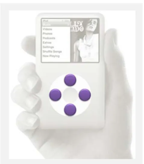
The iPod Classic design (Figure 1) is a perfect example of stacked user inputs, and an easy way to understand the physical and digital interfaces. If you are not familiar with using this specific iPod model, please watch the video in Figure 2 before continuing. The entire interface to controlling the iPod is contained inside a “jog wheel” and center button. Every operation of the device is controlled within this single interface. Additional study of this interface, though, reveals the stacking of two independent interface layers.
The top interface layer is what I would label the “digital layer of interaction” and responds to the touch of your finger. I consider this layer digital since it is transparent, offers no immediate affordance to its use or function, and is digitally interpreted. To interact with this layer, all that is necessary is to glide your finger in a circular motion in either direction, on top of the white “wheel”. The iPod responds by scrolling through vertical lists of data (e.g., artist or song list), or horizontal attributes (e.g., volume or star rating).
Figure 1: iPod Classic
Figure 2: Using the iPod Classic
http://www.vimeo.com/ 11838765
The bottom interface layer is what I refer to as the “physical layer of interaction”. The physical layer consists of a 2-state (down and up) button underneath the jog wheel for the top, right, bottom, and left positions. I consider this a physical layer since you are physical pushing down on the wheel to “click” each button, as you would normally expect to interact with a physical button. The four buttons under the wheel perform functions commonly used when listening to music: play, pause, next song, previous song. The center button, which is not a part of the stacked interface, performs the function of committing to an action in the graphical interface (e.g., choosing a song to play or advancing the menus). This thesis will explore this concept of combining physical and digital layers of interaction to understand its potential uses and parameters to consider when it is used. I will first provide a
background on a prototype I developed before starting work on the thesis, which sparked the stacking concept. This is the starting point, and the beginning of this entire story. Next, I will analyze and explain other devices, like the iPod Classic, that embody characteristics of stacking and will aid in understanding and defining “stacked user inputs”. I have created a small prototype abstracting the concept, and used it as a technology probe to gain feedback on the concept. I will conclude by sharing the results of testing the probe, and how the results impact defining the concept.
BACKGROUND
The concept of stacking user inputs was born out of a previous project of mine, at the end of the first year of the Interaction Design Masters program at Malmö University, in 2009. The framing for this last project was to use “research through design” as the method for creating a knowledge contribution. We were
encouraged to create a design that could be tested, to gain insights and feedback on the design, which could then be
formulated into research findings. As it is mentioned in a research paper outlining the method, “…it stressed design artifacts as outcomes that can transform the world from its current state to a preferred state [1].”
I was provoked early in the project, while sitting at a small café table with my laptop. I enjoy the portability of my laptop, but am continuously frustrated with my options for providing input to the laptop. There is a trackpad built into the laptop, but I find its size and overall usability to be frustrating. I carry a small wireless external mouse with my laptop, but the small table at the café was only big enough to hold my laptop with no extra room to navigate a mouse. It was all of these frustrations that provoked me to think of a better input device.
A quick survey of portable computers and input devices uncovered design trends and common design decisions. Small laptops and “netbooks” [footnote: definition] are becoming more common, even though their reduced processing power limits the types of applications that are usable. In this case, form has followed function, and the overall size of the netbooks has been reduced too.
I discovered three design decisions that were consistent amongst the netbook designs:
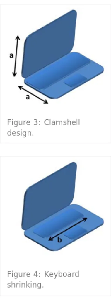
1. The common clamshell design will have both sides of the netbook be equal in size. (Figure 3)
2. The keyboard is shrinking to reduce the overall size, but shrinking to a limit since our fingers are not shrinking as well. The keys on the netbook keyboards are smaller than a full-size keyboard, but not getting so small so that they become unusable. (Figure 4)
Figure 3: Clamshell design.
Figure 4: Keyboard shrinking.
3. The keyboard is occupying most of the space on its side of the clamshell design, stealing space away from the trackpad input device. (Figure 5)
Input devices for portable computing offered little relief past just making the device smaller to match the portable computer. An abundance of external mouse options are available but appear to be first designed for a desktop computer. To be used for portable computing the mouse was just made smaller, or made wireless, or both. Evolution has made the trackpad the default input device for portable computers, making the trackball and “eraser head” trackpoint input devices ancient history.
“Why can’t these input devices be combined?” is what I thought while sitting at the café that day. The keyboard is a large flat surface that is only used when I am typing. My input to a computer is typically modal: I am providing keyboard input, or I am providing mouse input, but usually not both at the same time. The flat surface on top of the keyboard is a large unused space when I am not typing.
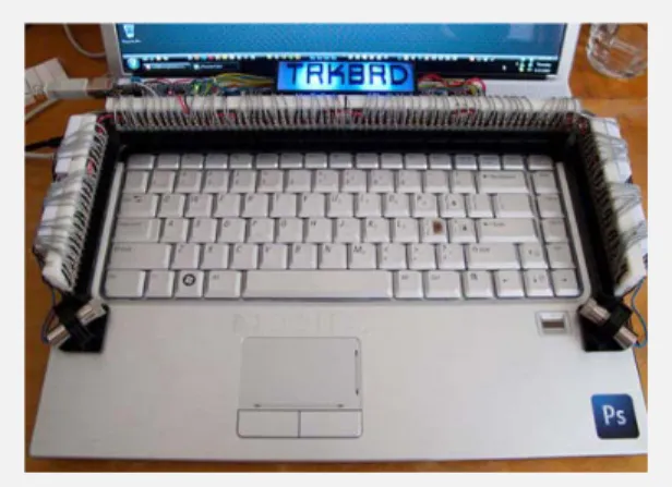
“What if the trackpad was placed on top of the keyboard?” My idea was to combine the trackpad and the keyboard, to create a trackboard. The keyboard would function as a typical button keyboard that has an “up” state and “down” state for each physical key. A sensor grid would be placed on top of the keyboard to provide the cursor (mouse) input. To move the cursor on the screen, I could simply glide my finger over the keys, being careful not to press the keys down. If I tapped on the key to “click” the mouse, or if I quickly typed a key on the keyboard, the trackboard would be smart enough to know each interaction and provide the correct reaction. Combining the trackpad and keyboard was my theoretical idea, and building the TRKBRD (trackboard) was the actual physical prototype that I built to test the idea. The prototype can be seen in Figure 6, and a video showing the prototype working can be seen in Figure 7.
It was at this point, when working out the theoretical and
mechanical details of the TRKBRD, that I discovered the concept of “stacking inputs”. In the case of the TRKBRD, I was physically stacking one input layer on top of another input layer to provide a better input experience for spatially-limited portable computers. My initial design decisions for “stacked user inputs” followed the form and function of the TRKBRD design, and became the starting point for this thesis:
1) Multiple input interfaces
2) Input interfaces occupy the same physical space (or within touch proximity of each other)
3) Independent control of each interface
Figure 6: Final TRKBRD Prototype
Figure 7: TRKBRD Working Flash Prototype!
http://www.vimeo.com/ 9105600
1:16 minute video
Figure 5: Trackpad shrinking.
RELATED EXAMPLES
The TRKBRD prototype provoked me to see the “stacking” concept, but it is not the only device that embodies some of the principles of the concept. Additional exploration into devices and interfaces uncovered other designs that show the potential to be labeled “stacked”.
TRKBRD
As stated earlier, the TRKBRD design is what provoked me to pursue this thesis. This design example perfectly illustrates the concept of stacking, since it is the design that created the concept.
The laptop keyboard provides the physical layer of interaction, shown in purple in Figure 9. It is a typical computer keyboard that requires a person to push down a key in order for it to register as a keystroke.
Figures 9 through 11 show a side-angle view of the TRKBRD installed on the laptop.
The small cylinder on the left side of Figure 10 is one of the lasers providing infrared light. The multiple, small, black components are the infrared light sensors. This combination of components produces an invisible field on top of the keyboard to create the digital layer of interaction. When a finger is moving in this invisible field, it is translated to cursor
movements on the screen. It is also possible to “tap” and “double-tap” in the field, the same way as if you were using a trackpad or touch-sensitive screen.
Figure 8: TRKBRD installed on top of laptop keyboard, turned ON, and functioning normally.
Figure 9: Physical layer.
Together, a digital layer is stacked on top of a physical layer, as seen in Figure 11. A person is able to type as you would normally type on a keyboard. The device is intelligent enough to know when a key is pressed, and then cancel a “tap” command. Each layer of interaction can be independently controlled, and each layer controls a separate device. What was previously two different devices, a mouse and a keyboard, are combined as a single device for the TRKBRD.
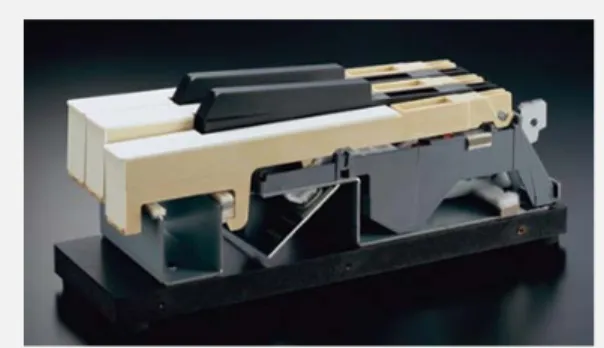
Aftertouch
"Aftertouch" is pressure sensitivity on an electronic synthesizer, allowing the musician to change the tone or sound of a note after it is struck [10]. For example, it could allow a musician to slightly bend the tone of a note or slowly add vibrato to a tone, by simply pressing a little harder while holding down the key to sustain the note.
I cannot confirm that the photo used for this example is from an aftertouch-enabled keyboard. I am using this photo for demonstration purposes only.
The top layer of a keyboard is the obvious and most visible layer: the tone-producing key "button" (Figure 13). When a key is pressed, a tone is produced. Depending how advanced the keyboard is, would determine how much control the musician can have on producing the tone. For example, on more technologically advanced keyboards (and usually much more expensive), a musician could produce a tone of varied
loudnesses, or varied percussive attacks of the tone. Versus, a cheaper keyboard that produces the same loudness and attack no matter how differently you press the key.
All of these elements pertain to the tone-producing layer of interaction on a keyboard.
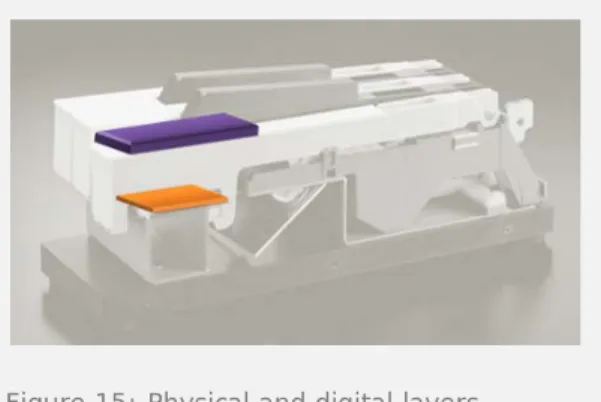
Figure 11: Physical and digital layers.
Figure 12: Synthesizer key side-cut view.
The "aftertouch" layer of interaction occurs only after a tone is produced in the upper layer. Presumably there are sensors underneath the key that determine when it is pressed to produce a tone, and also sense when slightly more pressure is given to the press to activate aftertouch (Figure 14). Aftertouch can only be activated once a tone is generated. This fact breaks one of the rules of determining a SUI: interface independence. The upper layer of interaction must be used in order to get to the lower layer of interaction (Figure 15).
Aftertouch is not a SUI for multiple reasons: There are not multiple interfaces. The
upper layer produces a tone, while the lower layer augments the tone. Both are related and interfacing with the tone generating interface of the keyboard. Both interfaces described here occupy the
same physical space, but it is unclear whether the interfaces described here are separate and plural.
There is no interface independence. Aftertouch cannot be activated without first interacting with the upper physical layer of interaction.
Apple Trackpad
The most recent design of the Apple Trackpad seems to be an obvious real-world example of stacking interfaces into a single device. It is clear why people think of this device right away when asked about stacked inputs, because it is Apple's daring design decision that has provoked people to think "Do I really need a separate button?" It is a large button that is touch-sensitive on the top. The lower layer of interaction in the trackpad is the button level (Figure 17). When you press down, it is the same result as if you clicked a mouse or tapped the trackpad: a mouse-click event is triggered. Since a press of the trackpad and a tap on the trackpad are both registered as the same event, it could be argued that this button level could be removed from the trackpad with no degradation of interaction. It is my guess that the button level was kept in the design to assist in those few occasions when only using a tap can make an interaction more difficult than using a button.
Figure 14: Digital layer.
Figure 15: Physical and digital layers.
Figure 16: Apple buttonless Trackpad.
Some interactions are more efficient and manually possible through the addition of physicality, instead of attempting to combine a string of touch motions that virtually create the same result.
The lower button level of the trackpad provides access to a single mouse event, click.
The upper level of the Trackpad provides a plethora of interaction that goes beyond the assumed abilities of a typical trackpad (Figure 18). For full disclosure, I must admit that I do not have an Apple Trackpad and am only stating functionality from what I have witnessed or seen online [11].
All typical interactions are possible: tap, double-tap, drag. Apple expands on these interactions, though, through the use of a multi-touch trackpad: "right-click" when tap with second finger when first finger is already touching, two-finger scroll for a webpage, four-two-finger up to hide all open applications, four-finger down to show a small icon of each open application, pinch two fingers to zoom, rotate two fingers to rotate an image, hold your thumb down while moving your finger to perform a click-drag, press with two fingers for a "right-click", three fingers swiped to the left or right to move back or forward while surfing the web, four fingers swiped left or right to open the Application Switcher... and on top of all that... you can customize all of these gestures through a preferences pane in the control panel. It is not certain if the Apple Trackpad is a SUI. It does not contain multiple interfaces in accordance to how the TRKBRD contains multiple interfaces. If the definition of "multiple interfaces" were adjusted, though, the answer could be "Yes" to the multiple interfaces question.
The top layer provides cursor movement control, cursor event commands, and access to a limited set of gesture commands.
The bottom layer provides cursor event commands, too.
Where the definition of "multiple interfaces" could be stretched, and I think where most people are convinced that it is a SUI, is how gestures are incorporated into the overall functionality of the trackpad. Without the gestures, the Apple Trackpad would without a doubt not be a SUI because of the absence of opposed interfaces. The
Figure 18: Digital layer.
button and touch-sensitivity are both controlling the same interface. With the inclusion of gestures in the top layer of interaction, the line that separates the interfaces becomes blurred, and the definition of "interface" becomes uncertain. From my inexperienced understanding of the Apple Trackpad gestures, they are simply shortcuts or "quick-keys" to functionality that is attainable by other means. The gesture is providing the user with a quicker way of performing the function by allowing the user to maintain their hand position and not move their arm to press a button, or by eliminating multiple cursor movements and click commands. Because of this, I do not consider the gestures to be an interface.
Apple iPod Classic
The Introduction introduces the iPod Classic (Figure 20) as a good example of stacked user inputs. Below is a more in-depth study of its interfaces.
Using your finger, you can touch the jog wheel and move your finger in a circular motion (Figure 21). This interaction modifies a number of controls on the screen.
It scrolls whichever list is visible on the screen. A clockwise motion scrolls down, while a counter-clockwise motion scrolls up. If a horizontal status bar is visible, it can
adjust the current position in the status bar to the left or right (clockwise for right, counter-clockwise for left). This is used for adjusting the volume and adjusting the time position of the song.
If the star rating is visible, scrolling to the left or right with the jog wheel selects more or less stars.
To use the Genius playlist control, scrolling the jog wheel to the right moves a selection arrow control, which initializes the Genius feature.
The jog wheel is typically used as the selection control for the iPod. The device does not have any type of pointing device to make selections, as
Figure 20: Apple iPod Classic.
someone is typically used to using on a desktop computer for example. Using the jog wheel as a selection interface is more apparent when trying to play Solitaire on the small device.
Moving your finger to the left or right on the jog wheel moves a "selection hand" on the screen. The hand moves in a linear pattern allowing you to select a card to move in the game. This selection interaction on a desktop computer is strictly given to the mouse or trackpad to provide input.
Underneath the jog wheel are 4 buttons that provide more input to the iPod interaction (Figure 22).
The top button (MENU) is typically used as a "back button".
The right button is used to advance to the next song, or when held down, used to advance the current song by a few seconds.
The left button is used to go to the beginning of the current song, go back one song, or go back in time in the current song.
The bottom button is used play or pause the song.
The middle button that is not underneath the jog wheel, and thus not included in the SUI interface, is used to advance through the menus or commit to an action.
The iPod Classic represents a SUI interface: Multiple interfaces
o Jog Wheel controls menu
selection (scrolling through lists), and parameter adjustments (changing volume, place in song, star rating).
o 3 of 4 buttons control music playing.
o MENU button function is related to menu selection and not music playing.
Interfaces occupy the same physical space.
Figure 22: Physical layer.
Figure 23: Physical and digital layers.
Each interface can be independently controlled without interfering with the other interface.
The iPod's adherence to the SUI framework is weak for rule #1, though: there is not a strict separation of interface functions.
One button in the lower layer is used in conjunction with the jog wheel in the upper layer.
The jog wheel can be used to adjust a music playing parameter.
RELATED RESEARCH
“Tangible interaction” was the starting point to begin researching “stacked user inputs” even though the related examples just mentioned do not directly fall into this domain. This was decided because of the potential larger application of a stacked input device.
Tangible interaction “…allows users to ‘grasp & manipulate’ bits in the center of users’ attention by coupling the bits with everyday physical objects and architectural surfaces [12].” In other words, it aims to provide the ability to control data or virtual objects on a computer screen or some other type of digital device, with the use of real-world objects that a person could physically hold or
manipulate. A good example of tangible interaction would be the MIT research project called “Siftables”, which has now been commercialized under the name Sifteo [13]. The Sifteo blocks can be assigned various values, from numbers, to letters, or even colors. When the blocks are placed near each other, or
manipulated in numerous other ways. The blocks react to each other as if they have awareness of all the other block values surrounding it.
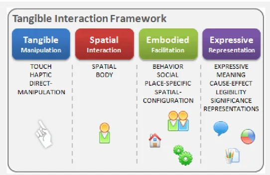
The video links in Figures 24 and 25 show two of these possible interactions. Figure 24 shows how the last block can display the sum of the other two blocks, just by placing them in the correct order and including the necessary mathematic signs. Figure 25 demonstrates each block’s awareness of the surrounding blocks. When lettered blocks are lined up to spell a word, the blocks outline in blue when a correctly spelled word is formed. Both of these examples demonstrate how the physical moving and orienting of the blocks are manipulating digital pieces of data. While I initially had uncertainty in where to begin researching stacked inputs, I used the tangible interaction domain as the starting point and branched out from there. The tangible interaction framework proposed by Hornecker and Buur [14] organized these early explorations and brainstorming sessions. Their framework focuses on the “interweaving of the
material/physical and… the social aspects of tangible interaction” [14] through the use of four themes: Tangible Manipulation, Spatial Interaction, Embodied Facilitation, and Expressive Representation. To better understand these themes, I visualized my interpretation of their research, as seen in Figure 26. I interpreted their framework as outlining a series of perimeters around a person when they are interacting with tangible interfaces. The first theme of “Tangible Manipulation” was the closest perimeter around a person and defined the individual’s direct interaction with objects with his or her hands. The next perimeter of “Spatial Interaction” moved further away from a person and defined how his or her body interacted in “space”. The third perimeter of “Embodied Facilitation” grew larger and
encompassed multiple bodies socially interacting in a “place”. I do not view the last theme of “Expressive Representation” as a perimeter, but as something that can be achieved in any of the perimeters. Figure 24: Siftables Equation Editor http://www.vimeo.com/ 3164229 0:14 minute video
Figure 25: Siftables word game
http://www.vimeo.com/ 3164983
The result of using this framework while brainstorming ideas for this thesis is shown in Figure 27. The details of the image are not important, as much as the fact that the framework proved to be invaluable in obtaining the focus for my research. Each theme provided a focus while brainstorming, an organization for ideas, and a way to relate ideas to each other. It was during this session that I came to an important realization, shown on the left side, that I explain in the Research Approach section later.
Figure 27: Brainstorming session while using the Tangible Interaction Framework. Figure 26: Visual interpretation of Tangible Interaction Framework [14].
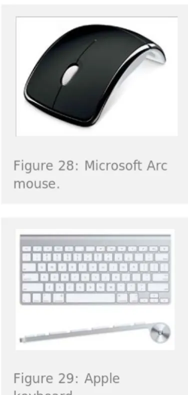
To more adequately classify related examples and position my concept in relation to other research, I included the concepts of “time-multiplexed” and “space-multiplexed” input devices [9]. These classifications define how functions are controlled by an input device. “With space-multiplexed input, each function to be controlled has a dedicated transducer, each occupying its own space. In contrast, time-multiplexing input uses one device to control different functions at different points in time. [9]” Examples of each classification include the simple mouse and keyboard used on almost every computer. A computer mouse is an example of a time-multiplexed input device (Figure 28). A mouse controls different functions on a computer’s graphical user interface at different points in time. At any moment in time, a mouse is used for clicking a button, scrolling a document, highlighting a word, or clicking a link on a web page. An example of a space-multiplexed device would be a standard keyboard for a computer (Figure 29). Each key on the keyboard is available through its own key.
How is each related example classified? TRKBRD = space-multiplexed
The keyboard input and TRKBRD input both occupy their own physical space. However, if different technology were used that would embed the TRKBRD into the keyboard, they would occupy the “same space”.
Aftertouch = space-multiplexed
The key that generates the tone and the sensor that activates the Aftertouch effect occupy their own space. The Aftertouch effect occupies the small space that resides between pressing a key normally, and pressing it just a little bit harder.
Apple Trackpad = time-multiplexed
Although different parts of this interface occupy their own space, time is a factor in determining what function is provided when a person interacts with each interface.
Apple iPod Classic = space-multiplexed/time-multiplexed Some of the controls on the iPod occupy their own space, such as the Play/Pause and MENU buttons. Other controls are time-multiplexed such as the scrollwheel and center button. Depending on when you use both of these, they control different parts of the graphical user interface. It is important to note that the iPod also places all of these controls in the “same space”.
A potential expansion to the concept of “space-multiplexed” could be “same-space-multiplexing”. This expansion would adjust the definition to “each function to be controlled has a dedicated transducer, with each transducer occupying the same space”. Both examples of stacked user inputs, the TRKBRD and iPod Classic, can be classified under this adjusted definition.
Combining layers of interaction is not a foreign idea to interfaces, and can be illustrated with two research projects. For the “Layered Touch Panel” project, an invisible field similar to the TRKBRD was placed on top of a typical touchscreen [15]. This layering was used
Figure 28: Microsoft Arc mouse.
Figure 29: Apple keyboard.
to detect a finger hovering over the touchscreen and to provide a “mouseover” type event that is currently not available with touchscreens. The other project involved a complicated collection of technology that would allow someone to physically hold up something they wanted to virtually “pin” to a wall [16], for
example, a piece of paper. The technology would quickly capture a photo of what was to be pinned, and then project it onto the wall. Their use of layering input was found in how they created virtual planes in front of the wall (only centimeters apart) so they could detect when a person was holding up something they wanted to “pin”. When both planes were broken by the paper and person’s hand, they would interpret this as a command to capture a photo of the paper.
Making buttons touch-sensitive is also not a foreign idea. An overlay of sensors was placed on a “clamshell” style mobile phone for the “SmartPad” project, allowing a person to glide their fingers over the keypad and also press the key buttons [17]. They proposed “previewable physical interaction”, allowing a person to preview information before committing to an action on the information. In another project with the same researchers, they used a similar technology in a larger number keypad to test similar interactions for desktop computer applications. The “PreSense” keypad could be used for navigating a map or photo library, for example [18].
The TRKBRD design too, has been almost replicated in a research project only a few years before. The “Touch&Type” input device is a normal looking desktop computer keyboard with embedded technology that makes the keys touch-sensitive [19]. Key differences in the two projects include the technology used, what interactions were included, and testing methods. The technology in the TRKBRD is immediately apparent when using it, while the Touch&Type was able to make the technology completely invisible to the user. The TRKBRD included the ability to “tap” and “double-tap” in the touch plane to provide cursor commands, while the Touch&Type used physical buttons on the side of the keyboard that were accessed through a mode switch. The user would have to select the “typing” mode or “touch” mode explicitly, while the TRKBRD included intelligence to predict these modes. The Touch&Type research aimed for quantitative results through rigid usability lab tests. I aimed for qualitative results by testing the experience with people that I literally stopped on the street and showed them the prototype on a bench.
FOCUS
The idea of “stacking layers of interaction” to add awareness and new interactions is not a new concept, proven by the research and devices previously mentioned. Layers of “finger-detecting” planes have been added to walls and touchscreens to interpret a person’s intent while interacting with the device. Touch-sensitive buttons have been added to a mobile phone and number keypad to interpret a person’s interaction as ways to augment the user experience in software. The critical word to point out here is interpret. All of these projects have used multiple layers to interpret a person’s behavior, in order to augment or assist the system or device.
“Stacked User Inputs” aims to expand on the previous research of layering interaction, but concentrate on the ability to maintain independent control of each layer for the intent of controlling separate interfaces. It is not that one layer is merely offering a way to adjust another layer. It is to create two separate interfaces, controlling separate devices, and occupying the same physical space.
RESEARCH APPROACH
The research approach for this thesis continues with the “Research through Design” theme that was the starting point for the TRKBRD project. It was the intent for this thesis to create a prototype that embodied the “stacked user input” concept, and then use the prototype to further explore the concept and test with users. This was also the intent for the TRKBRD project, to build a prototype and test it with users. However, this thesis aimed to focus on the concept of stacking and not on any specific contextualization of stacking. This may seem to be an insignificant and nuanced difference between the projects, but the following explanation of the thesis research approach will explain key differences that separate the projects.
My first major decision was to create and test an abstract
prototype instead of a fully-contextualized prototype. This was not an easy decision to realize. I had many frustrating brainstorming sessions prior to making this decision, attempting to discover a new prototype to build for this thesis. I needed an additional prototype to further exemplify the stacking concept, but could not expand my ideas past the obvious ones such as an advanced light switch or another computer input device.
It wasn’t until I realized my own personal position in the brainstorming process that I realized my biggest limitation: my body of knowledge is limited to what I know and what I currently know best is computer input devices. I know input devices best because of the research I collected during the TRKBRD project, from building and presenting the TRKBRD project to many groups, and from the fact that I use computers on a regular basis. It was during a decisive brainstorming session that I realized that I was trying to contextualize my concept within another domain I had no prior experience or knowledge. The abstract prototype would demonstrate the stacking concept, without providing input to any specific device or context.
Prototype
To demonstrate the concept, the prototype would need to distill the functionality down to only what is necessary. I decided on using a single button to represent the physical layer of interaction, and making the button touch-sensitive to represent the digital layer of interaction. A touch-sensitive button is what personified the most basic stacked user inputs during my brainstorm sessions. Even if the button was multiplied or aesthetically modified during my idea generating, the core concept would still simplify down to a simple touch-sensitive button.
An Arduino micro-controller would provide the ability to add programming logic to the prototype, and dictate how its
functionality would respond to various interactions. The Arduino can capture when the button is pressed and when the top of the button is being touched by a finger. It then takes this data and follows a long progression of software logic statements to
Two RGB (red/green/blue) light-emitting diodes (LEDs) provide the interaction responses by shining different colors and different brightnesses. Light is the only type of response to the user’s interactions, to purposely keep the responses simple and easily understandable. The advantage of using RGB LEDs is that their color is determined through the software. This means, that once the prototype is built, I can easily change the software to perceive new interactions and provide different colored reactions without changing any of the electronic hardware. Figure 30 shows the complete electronics schematic: Arduino Pro, 3-AA batteries, RGB LEDs, QT110 touch sensor chip, and a single silicon rubber button with conductive thread stitched on the top surface. The conductive thread and touch sensor chip are used together to accurately detect the touch of a finger. This specific button was chosen for its aesthetic and functional properties. The color of the button is a simple white (and similar to the cube color described below), and proportionate to the final size of the probe. Its functional
advantages include that it is easy to include in a switch circuit, and the button is hollow which allowed easy sticking of the conductive thread.
To house the button and all the necessary electronics, I decided on a small cube (henceforth referred to as “the cube”). I wasn’t focusing on aesthetic qualities for the prototype or the tests, but still wanted to achieve a simple design that was unassuming. Hopefully the prototype would not instill any preconceptions to possible interactions or reactions based on the form or materials used for construction. I built a seven centimeter square cube from laser-cut, milky-white plastic. Milky-white plastic was used to diffuse the LEDs inside and create a glow around almost the entire cube.
The size of the cube was just big enough for the Arduino board, LEDs, various other components, and a 3-AA-size battery
compartment. I decided to use batteries so that no external wires would be necessary to connect while testing the prototype. It was important to me that the prototype was as simple as possible to use and did not require any external connections in order to operate. Once the cube was switched on, all that was necessary for a tester to think about was how they wanted to interact with the button. The tester could concentrate on their interactions and the cube responses and not have to worry about whether or not they connected it properly.
Technology Probe
Once I built multiple cubes, I used the Technology Probe method to “release the cubes into the wild” to gather research data [20]. I used this method in order to allow an individual a longer period of time to test the prototype. Instead of a standard usability test where a person is tested on specific actions and functions during a short timeframe, my intent for the technology probe was to allow more time for the person to explore the prototype and track their discoveries over time. I wanted each person testing the cube to be relaxed in familiar environments and not feel as though they were
Figure 30: SUI Cube Electronics schematic. Larger image available in Appendix A.
Figure 31: Inside of cube, assembling electronic components.
being tested to find the correct answer. “Time” was just as much of a factor in the probe, as the physical technology that the person interacted with.
Multiple attributes inspired the design of the probe, in accordance to the framework described by Hutchinson et al [2]. They describe how a prototype is different than a probe, and thus the
corresponding testing method should also be adjusted. I consider my TRKBRD design to be a prototype that I used to conduct “usability-lab-style” tests for qualitative results. I desired a different kind of result with the “cube” tests, however, that would incorporate time as a factor and spark more creative problem solving from the testers. The cube needed to test the ability of interacting with stacked inputs, but also provoke the tester to think past their preconceptions of physical and digital interfaces.
Distinguishing Features
The following five features that distinguish a probe from a
prototype grounded my design decisions for the cube, and assisted me in differentiating the cube from my previous TRKBRD prototype [2].
Functionality
“Technology probes should be as simple as possible…” [2]
While sketching early versions of the cube prototype, I had considered other forms and functions for the prototype. I considered a larger configuration of multiple interconnected buttons, a button with multiple touch-sensitive points along the sides, and a button with multiple touch-sensitive points on just the top surface. I simplified the sketch each time and came down to a single button with a single touch-sensitive zone on the top surface. This was the bare minimum in functionality that would be needed in order to test the core concept.
Flexibility
“…they should be designed to be open-ended with respect to use, and users should be encouraged to reinterpret them…” [2]
This was my exact intent for my cube prototype, and was explicitly stated in the directions included with each cube (Figure 32). The purpose of the cube was to abstract the core concept of stacking inputs, gain feedback on the interaction of using the cube, and spark ideas of contextualizing the concept with the tester. The cube was designed to be plain and absent of preconceptions to assist the tester in reinterpreting its use and application.
Usability
“They are not changed during the use period based on user
Figure 32: Instructions included with each probe. Larger image available in Appendix B.
feedback. In fact, a deliberate lack of certain functionality might be chosen in an effort to provoke the users.” [2]
Three different versions of code were written, with each version detecting different types of interactions and providing slightly different responses. A cube would be delivered to a tester with one of the code versions, and stay unchanged throughout testing. Code versions #1 and #2 were written before testing started and then randomly assigned to each tester. Code version #3 was written as a backup version, after the initial tester interviews uncovered some frustration with the interactions.
The sensors in the cube were limited to a button that can be pressed down, and a touch-sensitive area on the top surface of the button. No other sensors were included in the cube.
Logging
“Technology probes collect data about users and help them generate ideas for new technology. Prototypes can collect data as well, but this is not a primary goal.” [2]
I was most interested in how each person used the cube probe, and how comfortable they were with the interactions. Time and resources prevented me from embedding logging functionality inside the cube, to retrieve and analyze after each test. This type of quantitative data was not the focus of the probe, though. I wanted to focus on the qualitative results of each tester spending time with the probe, and record video of their reactions to further analyze their nuanced use of the probe.
Design phase
“Technology probes should be introduced early in the design process as a tool for challenging preexisting ideas and influencing future design.” [2]
For the context of this thesis, there was no specific future design to influence. Instead, the probe was targeting hypothetical and yet-to-be-seen future designs imagined by the testers or anyone that reads this thesis. This feature further illustrates how the Technology Probe method is better suited for this thesis. The cube probe is not a finished
prototype that needs analysis of use to determine its positive and negative attributes; it is the starting point of generating ideas based on the concept. The intention of the probe is to provoke the tester.
Light-weight
The Technology Probe method was only the starting point for my chosen research method. Limitations and obstacles forced me to
modify the method and tailor it to fit my thesis. The intention of the Technology Probe method is to embed a technology in a real-world context for an extended period of time, to gather data on how people use the technology in their daily lives [2]. However, resources and time constraints in my thesis prevented me from following this method exactly. My cube probe was only an
abstraction and lacked any contextualization to the real-world. It is only a self-contained probe that cannot be connected to anything. I also did not have an extended period of time to embed the cube with each tester. I was limited by the timeframe of the thesis governed by my university and thus needed to compress the method to accommodate my short timeline.
To accommodate the limitations, I adjusted the initial method according to the “Light-weight Technology Probe” framework created by Langdale et al [3]. Their “intergenerational communications system” suffered from similar limitations and restrictions that forced them to adjust the initial method. The adjustments include compressing the timeframe to a few days, and relying on the tester’s imagination to envision future scenarios [3]. Their adjusted light-weight method is outlined in five steps, that I used as inspiration for modifying the method to fit my thesis. The steps outlined in the Light-weight Technology Probe method and my interpretation of the steps for this thesis:
Step 1
“The users are presented with a description of the existing system.” [3]
Each tester received a small box that included a cube probe and short instruction sheet inside a white box. The instruction sheet explains what the cube is, what is requested of the tester, and what to think about while they are testing (Figure 32). I purposely kept the instructions short and not too descriptive. I do not explicitly state how to use the cube, or how it is possible to interact with the cube. That was
intentional to motivate the tester to explore possible ways of interacting with the button on the cube.
Step 2
“The users are then asked to design some scenarios that are in keeping with their goals that they think that the system could help with.” [3]
The last point on the instruction sheet makes this request (Figure 32). The cube was purposely built as an abstraction of the concept to aid in contextualizing. It was my goal that the testers would imagine contexts where a similar stacked inputs interface could be used.
An additional modification related to time engagement inspired an adjustment to my method. The light-weight method encourages users to think about this step “…off and on for several days…” [3]. Instead of requesting dedicated time for each tester to be engaged in exploring the cube, I
requested casual use when they found themselves provoked or needed a break from their daily work schedule. I hoped each tester would initially explore the interactions of the cube but then go on with their daily work schedule, letting the concept linger in their subconscious for a few days. I knew it would be difficult to expect a busy tester to dedicate a lot of time to testing the probe, so I framed it to the tester in this fashion to ease their “test anxiety”. My real goal for this adjustment, though, was to give enough time for the tester’s body of knowledge stored deep in their brain to process the concept and envision future scenarios.
Step 3
“The researchers receive the scenarios.” [3]
I modified this step, and combined it with Step 4.
Step 4
“The users arrive on-site and attempt to successfully carry out their scenarios.” [3]
This step illustrates a major difference between a typical technology probe and this light-weight method. A typical probe would embed the technology in the environment of the testers to get their real-world reactions. This light-weight method brings the testers to the technology in a more stable, though foreign, environment. When a technology is not stable enough for the real-world, this adjustment to the method makes testing still possible.
My adjustment to this step and the previous step was to combine them while interviewing the tester. After a testing period of a few days, I planned on returning to the tester’s office to video interview them. I would start the interviews by asking them to demonstrate for me how they explored the cube, and what interactions they discovered.
Step 5
“The users are debriefed…” [3]
The remainder of the interviews would include debriefing the testers. I planned a rough outline of questions to uncover the tester’s perceptions of the cube and touch-sensitive button interface, determine their meaning of the visual light feedback, and discuss any contexts they imagined with the interface.
Programming
The software in the cube is what would give life to the multiple interfaces of the cube. Decisions related to selecting hardware
components were made carefully, in order to keep the hardware compatible with multiple versions of software. For example, RGB LEDs were selected because a specific color response could be chosen by changing one line of code, and not determined by the single color of a physical LED. A small opening was cut on one side of the cube to allow the programming board to slide in and
interface with the Arduino board to load new versions of code. A minimal amount of code was necessary for detecting when a finger touched the button or pressed the button down. The majority of code is for translating sensor data into interactions and delivering a corresponding response. “Time” added another layer of
complexity since many of the possible interactions unravel over time or use specific timing.
“Touch” and “press” were the obvious initial interactions included in the software. It was a design decision to correspond each of these interactions to its own color: blue for touch, and red for press. I decided this to attempt to make a strong disconnect between the two interactions, and create color associations for the tester. I would use this later during the tester interviews to determine if the tester associated meaning to the colors or saw correlations between color and interface. To phrase it another way, blue would correspond to the digital layer of interaction, and red to the physical layer of interaction.
When “time” was added to each interaction, the colored response would also be affected. Quick interactions would result with quick color responses, while longer interactions would result in longer color responses. The initial interactions were expanded to include time as a modifier. If a person touched the button longer, a new response was displayed. If the button was pressed longer, an additional response was displayed. When time was factored into the initial interactions, a new set of possibilities and layer of complexity emerged.
To expand the total sum of possible interactions even further, I used Johan Redström’s concept of Tangled Interaction as inspiration. Up to this point, each response is the result of an interaction with only one layer in the stacked inputs. Tangled interaction proposes “…to set layers up in ways that makes something potentially interesting happen also in-between…” [4]. Applying this concept would result in new interactions that combine actions involving both layers in the stacked inputs. This level of complexity is not present in my TRKBRD prototype and is an unexpected exploration for this thesis. The very notion of simultaneously combining interactions with both layers contradicts the third design decision of the initial Stacked User Inputs
framework that created the base for this thesis. However, in the context of the abstract cube probe, combining interactions introduces a level of complexity that could assist in determining a tester’s understanding of the layers in the stack. These new tangled interactions would be represented by a “rainbow color” response by the cube; displaying red, blue, and all the other colors in between.
It was my original thought that the list of interactions listed above was only the beginning. I planned on expanding the interactions and making them more complex after conducting the first 2-3
tester interviews. I felt these initial interactions were obvious and did not offer a big enough challenge for the testers, or lay the foundation for valuable test data.
Code Version #1
The first version of code2The slightly more complex interactions include holding your finger on the top surface for longer than one second, and pressing the button down without touching the top surface. I felt these interactions to be more complex since they are not typical
interactions with a button. The button I chose to use for the probe allows someone to press the button down while holding the sides; however, not many button designs in the real world offer this affordance.
for the cube was intended to be the simplest of all the versions. This version creates the baseline that the other code versions expand on. The base interactions include tapping the top of the button similar to a tap on a trackpad, and pressing the button down. The only “tangled interaction” occurs when the button is held down for longer than one second while also touching the top of the button. The “tangled-ness” is subtle, since it is common to touch a button on its top surface, and it is a known interaction to hold a button down.
The list below describes the interactions and the cube’s
corresponding response. It is necessary to watch the short video in Figure 33, demonstrating the interactions and responses, to understand the cube interactions.
Tap
A quick tap on the touch sensor without pressing the button down. Short blink of blue light, matching the number of taps. For example, if you tap three times at a medium-paced rhythm, it will blink three times after you stop tapping the button.
TapHold
Hold finger on touch sensor for longer than one second, without pressing the button down.
Blue light will slowly fade to full brightness and then fade to black. This pattern repeats as long as finger is still touching the button.
Press
Push down on the button, pressing for shorter than one second
2 Code available in Appendix C.
Figure 33: SUI Cube Code #1
http://www.vimeo.com/ 11683417
Red light when you press down, until you release the button.
PressHoldTouch
Push down on the button, while touching the touch sensor, for longer than one second.
Red light displays initially. After one second red slowly cross-fades to green, then cross-fades to blue, and then cross-fades back to red. This pattern repeats until finger is no longer touching the button, or the button is released.
PressHold No Touch
Press down on the button, without touching the touch sensor, for longer than one second.
Red light displays initially. After one second red slowly fades to black and then back to red again. This pattern repeats until the button is released or the touch sensor is touched.
Code Version #2
The second version of code3It was my intention that this version’s tangled interaction be less transparent and more difficult to discover. I wanted this interaction to unravel after the tester spent a longer period of time exploring the cube. I didn’t feel this interaction would be too complex and unattainable, though. Each tester would have years of personal computer experience and be familiar with a “double-click” interaction with a button interface. The test would be whether or not they apply a mouse-focused interaction to an interface not resembling a mouse.
includes the base and slightly complex interactions from version #1, but modifies the “tangled”
interaction. Two quick presses of the button (double-press)
changes the cube into a “Press Lock Mode”. Once it is in this mode, a Tap and a TapHold interaction changes which rainbow color is displayed. This version of the tangle interaction is not as transparent as the previous one. The cube would not appear to have any “tangled-ness” unless this mode was discovered. I consider this mode to provide a virtual tangled-ness, since the physical layer is virtually locked and no longer requires to be pressed down when performing the tangled interactions.
The list below describes the interactions and the cube’s
corresponding response. It is necessary to watch the short video in
3 Code available in Appendix D.
Figure 34: SUI Cube Code #2
http://www.vimeo.com/ 11683492
Figure 34, demonstrating the interactions and responses, to understand the cube interactions.
Tap
A quick tap on the touch sensor without pressing the button down. Short blink of blue light, matching the number of taps. For example, if you tap three times at a medium-paced rhythm, it will blink three times after you stop tapping the button.
TapHold
Hold finger on touch sensor for longer than one second, without pressing the button down.
Blue light will slowly fade to full brightness and then fade to black. This pattern repeats as long as finger is still touching the button.
Press
Push down on the button, pressing for shorter than one second. Red light when you press down, until you release the button.
PressHoldTouch
Push down on the button, while touching the touch sensor, for longer than one second.
Same response as Press.
PressHold No Touch
Press down on the button, without touching the touch sensor, for longer than one second.
Red light displays initially. After one second red slowly fades to black and then back to red again. This pattern repeats until the button is released or the touch sensor is touched.
Double-Press (Press Lock Mode)
Press down on the button, twice in succession, at a medium-paced rhythm. “Double-click” the button.
Responds the same as a Press, initially, for each press. Immediately after second press, displays red light continuously to represent the “Press Lock Mode”.
If cube was in Press Lock Mode when double-pressed, there is no response while pressing each time. Immediately after second press cube exits Press Lock Mode, and all lights turn off.
Double-Press + Tap
While in Press Lock Mode, tap the top of the button.
Switches to the next color in the progression: red, green, blue. Next color stays on continuously.
Double-Press + TapHold
While in Press Lock Mode, hold finger on top of the button for longer than one second.
Slowly cross-fades to next color in the progression: red, green, blue. This pattern repeats as long as finger is still touching the button. When finger is removed, the cross-fade stops at that color and continuously displays that color.
Code Version #3
The third version of code4The list below describes the interactions and the cube’s
corresponding response. It is necessary to watch the short video in Figure 35, demonstrating the interactions and responses, to understand the cube interactions.
uses version #1 as the starting point, but is then simplified for quicker interpretations. This version was written after the first few tester interviews revealed the other code versions to be more complex than I had anticipated. The same interactions are possible with this version, but the responses do not maintain a correlation between interaction layer and color, and the time-related responses have a shorter delay.
Tap
A quick tap on the touch sensor without pressing the button down. Short blink of blue light, matching the number of taps. For example, if you tap three times at a medium-paced rhythm, it will blink three times after you stop tapping the button.
4 Code available in Appendix E.
Figure 35: SUI Cube Code #3
http://www.vimeo.com/ 11683522
TapHold
Hold finger on touch sensor for longer than one second, without pressing the button down.
Green light displays after 0.5 seconds, as long as finger remains touching the button.
Press
Push down on the button, pressing for shorter than one second. Red light when you press down, until you release the button.
PressHoldTouch
Push down on the button, while touching the touch sensor, for longer than one second.
Red light displays initially to represent the Press. After 0.5 seconds color changes to purple.
PressHold No Touch
Press down on the button, without touching the touch sensor, for longer than one second.
Red light displays initially. After 0.5 seconds red light begins to flash on-off quickly. This pattern repeats until the button is released.
Testers
The next step after building the cube probe was to find people to test it. I was faced with two challenges: who would be available to test the cube within my short timeframe, and who would give me the most valuable test data? Fortunately, I felt both questions could be answered with the same response: experienced designers.
The “Genius Design” method inspired me to use experienced designers as test participants. “Genius design relies almost solely on the wisdom and experience of the designer to make design decisions [5].” I wasn’t going to rely on the test participants to create or make design decisions related to the cube probe or this thesis, but I did want to leverage their design experience. The list of testers was carefully crafted to include local designers that I have met while pursuing my Masters degree. I chose each one because I feel I have learned something from them in the last two years. The designers work at a diverse set of companies with a focus that includes interaction design, software development, industrial design, mission critical interaction design, and mobile
phone interfaces. It was the designer’s experience in their respective focus that would be the lens through which they gave feedback on the cube.
Choosing designers as testers also followed the progression of changes I already made to the technology probe method, adapting it to my decision to create an abstract probe. If existing technology was available, that could more closely follow the technology probe method, it would be best to use actual users for the testing since they could use it natively in the wild. My challenge was that I was testing an abstract concept that lacked any context to make it feasible in the wild. A natural progress for track #2 in Figure 36, was to use designers for the tests, and use their domain
knowledge as the sounding board for feedback.
Scheduling time with each tester would be a challenge, but was a necessary element for the probe. I wanted to embed the probe with each tester for 3-7 days to allow them enough time to explore the probe, and allow them to explore it at their own pace. With only two cubes constructed, I needed to carefully schedule the tests and follow-up interviews while remaining flexible to each tester’s work schedule.
Valuable test data was the most important element in choosing test participants, and motivated my decision to test experienced designers. With an experienced designer in a related field, I would be able to communicate with them on the same level by using a language of design we both understand. With this common link between us during the interviews, I would be able to use metaphors and phrases that we both understand, to frame questions and draw conclusions from their responses. I decided to avoid “on-the-street” testing because of this lack of common language between me and the random person on the street. It would be difficult enough to stop someone on the street and explain an abstract concept to them, aside from also trying to communicate with someone that does not natively speak my language. I focused on test participants that would provide qualitative results, rather than quantitative.
Interviews
To collect the data from each test, the designers would be interviewed and video recorded after the period of exploration time. If more than one designer that is being tested works at the same company, they will be all interviewed together in a single session. The session will be video recorded to allow additional analysis after the test, of how each designer interacted with the cube and the interactions they discovered.
The format of the interview will separate the questioning into two parts: reactions to the cube, and reactions to the concept. The first half will concentrate on interactions they discovered in the cube, how they performed those interactions, and their reactions to the cube probe. The second half will attempt to get their feedback on the “stacked” concept, their understanding of the digital and physical layers, and the use of other examples to provoke their reaction to the concept. I will use the TRKBRD prototype since it was the inspiration for this research and embodies the SUI principles. I will also use the Apple iPod Classic as an example because it represents a real-world product that uses stacked user inputs.
TEST RESULTS
The intent to use a diverse set of designers was to gain a diverse set of test results, and that is exactly what I received during the final interviews. Below is a summary of the designers that tested the cube, how long they explored the cube before the test, and which cube version they tested (Figure 37). The number of designers is also included, since I did not anticipate one company broadcasting the prototype to their entire staff and encouraging everyone to take part in the test. I had only recruited three designers at Ergonomidesign, but the test included a fourth designer and her summarized results from another 10-15 people in the company also testing the cube.
The test results are split into three sections: interaction, concept, and ideas. Each section will include the major themes of research findings across all of the designers that tested the cube.
Figure 37: Summary of Testers
Company Do-Fi ALT Unsworn Ergonomidesign TAT Systematic
Number of Designers 1 2 2 4+ 2 1 Tester Background Interaction Design, Programming Industrial Design Interaction Design, Programming Interaction Design, Industrial Design Mobile concepts & prototyping Interaction Design in mission critical domain Time with Cube
3 days 6 days 7 days 7 days Cube #1:
3 days Cube #3: 6 days 1 hour Cube Version #1 #2 #1 #1 #1, #3 #2
Interaction
Each cube had a range of possible interactions, depending on which version. At the minimum there were five, at the most there were eight. The designers were aware that many interactions existed in the cube, since that was the focus of this thesis and the included instructions clearly stated to explore the “multiple layers and multiple interactions”. Many of the intended interactions were found during the tests, but many were not. During the tests I watched the designers to find out which interactions they discovered, and whether or not they could find the hidden interactions. I asked them series of questions to investigate their understanding of the color responses and perceived independence of the interactions. Other results that emerged unexpectedly were
the importance of time with each interaction, and the various positive and negative affordances of the button interface.
Found/Not Found
Figure 38 below illustrates the compiled findings of all the possible interactions in the three versions of the cube, and which
interactions were found or not found with each testing company.
Figure 38: Summary Interactions Found
Company Do-Fi ALT Unsworn Ergonomidesign TAT Systematic
“Tap” Yes No No No No No
“TapHold” Yes Yes Yes Yes Yes Yes
“Press” Yes Yes Yes Yes Yes Yes
“PressHoldTouch” Yes Yes Yes Yes Yes Yes
“PressHold No Touch”
No Yes No Yes No Yes Yes
“Double-Press” n/a No n/a n/a n/a No
The “Tap” interaction was the only interaction that did not have a one-sided or split result. Only one designer out of six found this interaction. Some of the remaining designers found the interaction during the interview, but only as a result of collaborating with their coworkers or purely by chance. In some of the interviews, it was necessary for me to introduce this interaction to the designer, and explain the proper tap speed and the fact that it counts the taps back to them. Each of these designers had an initial perplexed and surprised reaction to the novelty, but soon relaxed after they realized the familiarity of the interaction. Once the speed threshold was mastered, each designer was quite comfortable with the tapping interaction and found delight in the fact that the cube was capable of counting.
“Whoa! That’s never happened before! Has that happened to you?” (Ergonomidesign)
“I’m a bit proud. [after discovering the Tap interaction after many attempts, and without any instruction]” (TAT)
Tapping on a touch interface as become so common through the widespread adoption of touchscreens for mobile phones and devices, that it was not a foreign interaction for the designers once they knew that the interaction was possible.
Contrary to the “Tap”, the “TapHold” interaction was quickly discovered. These two interactions were not as connected and paired as closely as I anticipated they would be. The affordance of