Postadress: Besöksadress: Telefon:
Box 1026 Gjuterigatan 5 036-10 10 00 (vx) 551 11 Jönköping
Screen for the modern workplace
Joakim Karlström
MASTERTHESIS 2016
Master in Product Development with a specialization
INDUSTRIAL DESIGN
Postadress: Besöksadress: Telefon:
Box 1026 Gjuterigatan 5 036-10 10 00 (vx) 551 11 Jönköping
Avskärma den moderna arbetsplatsen
Joakim Karlström
This degree project is performed at the School of Engineering in Jönköping in the subject field Industrial Design. The project is a result of the master program Industrial Design. The writers are responsible of the result, conclusions and reflections.
Tutor:Lars Eriksson
Extent: 30 points (D-level) Date: 15/06/2016
Abstract
iii
Abstract
The goal of this project is to solve the need for screening at modern workplaces. The problem occurs in offices where many employees work at the same table. The employees sit and work close to each other which creates a bad work atmosphere according to sound level.
The solution is a screen placed on the table between the employees. To improve the atmosphere both acoustic absorption and visual screening is required. Other requirements are that the screen have to fit the company´s style, have to be possible to produce, stand stable, have a high level of design. To have a high level of design means that it should look good, all details and parts should be well thought thru and the functions should work very well.
The idea comes from the furniture company Ragnars, which is a company producing premium office furniture, located in Forserum. They need a product like this thou they sell tables to offices which have the described problem. To be able to offer a solution for their costumers would gain the business.
The report explains the way how the screen has been developed from idea to final prototype. The development process goes thru many steps and methods. The methods used are applying design thinking, ergonomic studies, acoustic science and different types of testing. The process is iterative. An iterative process is when the work path goes in a spiral instead of a straight line. When iterating, new ideas generates and gets refined over and over again, better result will then be achieved.
The result is a screen made of felt that stands on the table. The screen has the possibility to quickly be moved and stored at a hanger or a shelf at the wall. The dimensions of the screen are optimized according to the standard size of workplaces and human
anthropometry. The shapes and colors of the screen are chose to fit the company´s assortment and at the same time modern architecture and modern trends. The screen provides sound absorption due the thickness and internal material.
Quick and easy usage of the screen were a main part of the design. This have been developed and tested thru prototypes and the result fulfills the need. Another main focus was to make the design as simple and clean as possible. During the whole process the components and shapes have ben simplified as much as possible.
The report explains all features of the product and how all decisions have been made. The process can be followed in a chronologic and easy way.
Summary
iv
Sammanfattning
Målet med projektet var att lösa problemet med avskärmning på moderna arbetsplatser. Problemet uppstår på kontor där flera anställda arbetar vid samma bord. De anställda sitter nära varandra vilket skapar en dålig arbetsmiljö med avseende på ljudnivå och koncentrationsförmåga.
Lösningen på problemet är en avskärmare placerad på bordet mellan de anställda. För att förbättra miljön krävs både ljudabsorption samt insynsskydd. Andra krav på produkten är att den måste passa in i företagets sortiment, var möjlig att tillverka, stå stabilt och ha en designhöjd. Att ha en designhöjd betyder att den ska se bra ut, alla detaljer ska vara väl genomtänkta och alla funktioner ska fungera optimalt.
Idén över skärmen kommer från möbelföretaget Ragnars. Ragnars är ett företag i
Forserum som tillverkar och säljer premiumkontorsmöbler. De behöver en produkt som den här eftersom de säljer bord till kunder som har det beskrivna problemet. Att kunna erbjuda en helhetslösning för kunderna hade gynnat företaget.
Rapporten tar upp och förklarar vägen över hur avskärmaren har utvecklats från ide till färdig produkt. Processen sträcker sig över flera steg och metoder. De använda
metoderna erbjuder design tänkande, ergonomi studier, akustikvetenskap och olika typer av testning. Processen har följt en iterativ process där arbetet går i loopar istället för i ett rakt spår. Vid iterationerna utvecklas och förfinas idéer vilket leder till att ett bättre och mer genomarbetat resultat nås.
Resultatet är en avskärmare tillverkad av filt som står på bordet. Skärmen kan snabbt och enkelt flyttas och förvaras hängande eller stående på en vägg. Dimensionerna på skärmen är avpassade efter standardmått på arbetsplatser och antropometriska mått på människor. Formerna och färgerna är valda för att matcha företagets sortiment och värderingar samt att passa in i de moderna trenderna inom möbelbranschen och modern arkitektur.
Skärmen kan absorbera ljud tack vare tjockleken och det absorberande materialet. Snabb och enkel användning har varit ledord under hela utvecklingsarbetet vilket har verifierats med prototyper och tester, detta har gjort att resultatet lever upp till
förväntningarna. Ett annat ledord har varit att förenkla designen. Detta har gjorts genom att alla former och delar har skalats av och förenklats så långt det gått.
Rapporten förklarar alla delar och designelement av produkten och hur alla beslut har tagits. Processen kan genom rapporten följas på ett kronologiskt och enkelt vis.
Table Of Contents v
Table of Contents
Abstract ... iii Sammanfattning ... iv Table of Contents ... v 1 Introduction ... 6 1.1 The company ... 6 1.2 Background ... 6 1.3 Statement ... 7 1.4 Objectives ... 8 1.5 Delimitations ... 8 1.6 Disposition ... 8 2 Theoretical Background ... 10 2.1 Requirements ... 10 2.2 Design ... 10 2.2.1 Design science ... 10 2.2.2 Design thinking ... 112.2.3 Research through design ... 11
2.2.4 Semantic ... 12 2.2.5 Appearance ... 12 2.2.6 Shapes ... 12 2.3 Bootcamp Bootleg ... 13 2.3.1 Empathize ... 13 2.3.2 Define ... 14 2.3.3 Ideate ... 14 2.3.4 Prototype ... 14 2.3.5 Test ... 15 2.4 Acoustics ... 15
2.4.1 Noise control in rooms ... 16
2.4.2 Material properties for absorbing sound ... 16
2.4.3 Diffraction ... 17
2.5 Anthropometry ... 19
3 Method ... 20
Table Of Contents
vi
3.2 Activity analysis ... 20
3.3 Competitor analysis ... 20
3.4 Trend analysis ... 21
3.5 Visual design brief ... 21
3.6 Brainstorming ... 21
3.7 Sketching ... 21
3.8 Prototype ... 22
3.9 Testing ... 22
3.10 Design for manufacture and assembly ... 22
3.11 Presentations ... 23
4 Approach and Implementation ... 24
4.1 Empathize ... 25 4.2 Define ... 27 4.3 Ideation ... 31 4.4 First presentation ... 36 4.5 Refinement ... 37 4.6 Second meeting ... 40 4.7 Prototyping ... 41 4.8 Storage ... 44 4.9 Third presentation ... 46 4.10 Finalizing ... 47 5 Result ... 49 5.1 Functions ... 49 5.2 Colors ... 51 5.3 Materials ... 51
5.4 Size and shape ... 52
5.5 Hanger and shelf ... 54
5.6 Economics ... 55
6 Conclusion and discussion ... 56
6.1 Discussion of result ... 56
6.1.1 Compared to requirements ... 56
6.1.2 Materials, colors and shapes ... 57
Table Of Contents
vii
6.2 Discussion of method ... 59
6.2.1 Prototypes ... 59
6.2.2 Method and result ... 60
6.3 Discussion of project ... 63
6.4 Further work ... 63
6.5 Conclusion ... 64
7 References ... 65
8 Attachments ... 67
8.1 Attachment 1, competitor analysis ... 67
8.2 Attachment 2, photos from the furniture fair ... 68
8.3 Attachment 3, modern architecture ... 69
8.4 Attachment 4, function analysis ... 70
Introduction
6
1 Introduction
1.1 The company
The project is made in corporation with the furniture company, Ragnars. Ragnars design, produce and sell office furniture. The company was founded in the 1950s, today they have 40 employees and is located in Forserum, just outside Jönköping, Sweden, with a turnover of 9 million euros. [1]
Ragnars produce workstations, work towers, cabinets, seating etc. The products are organized in a system with numbers from 1-5. The product gets a number which indicates which class it is in, 1 is the lowest and 5 the highest. A product with a 1 is cheap and it does what you expect and no more. If the product has a 5 the price is higher, the material is exclusive selected and there are integrated functions that gives the product a higher value. There is also some product with a 6 which means that everything on the product is absolutely of the highest class. Ragnars don’t have nothing under a 3. This system is an internal system which were described by the contact person.
Function and quality in the products is important for Ragnars. They are always trying to find the real need in a product to make the solution to last long. For the solutions to last long it’s important that the design is timeless and the material is durable. The material is also chosen with minimal environmental impact and has to be recyclable. [1]
1.2 Background
The project has its root in the changes of modern workplaces. The modern workspace is tending to move away from traditional big desks in a private office. The modern way of working is to use big tables in open rooms were the employees have to share the space. [2] The tables get crowded and noisy which cause the problem the project is aiming to solve. See Figure 1. To make people to work and feel better while working, there is a need for screening between the workers. The table screen should absorb sound to make the sound environment better. The screen works also as a small wall where the worker won’t be disturbed by glances or moving people. The problem is important because everyone want to feel focused and not to be disturbed when working. The modern way of working in groups does also requires whole groups to be screened of.
There are already products on the market that solves this problem, which means that the focus of the project will be to apply the company’s form language and to make the product to work better. The company doesn’t have the product in their assortment yet but they have a need for it thou they sell workplaces like the one described above. With this product they have the possibility to sell total solutions which will increase the competitiveness of the company.
Introduction
7
Figure 1. The problem, bad work atmosphere.
1.3 Statement
There has been a great change in the offices during the last ten years. More colors and innovative furniture are used and the work area is more open. The raised used of
technology and computer makes it possible to have flexible and shared workplaces. This is the modern way of working. But this change has not always created the benefit wanted. Often productivity, communication and user satisfaction have been reduced. [2]
The scenario of near-constant distraction at work have become the normal though and expectation for most people today. We also drown in information which we should process faster and come to conclusions. All of us want to feel effective and to be focused at work. This is something we try to tell ourselves all the time. No matter how much we try we will not be more focused. Controlled attention is hard work and our brain get tired, like the rest of our body when working. When the brain is tired a physiological
mechanism sets in. This mechanism makes us easily distracted to save the remaining energy for “emergency” tasks. [3]
There are two types of attention, controlled and stimulus-driven. The controlled is what we choose to focus on and the stimulus is something that attracts our attention. A part of the brain called prefrontal cortex steer the attention. Even if we are focused on a task we can be disturbed by something happen around us (stimulus). This is an embedded
function in our evolution to stay alive. But today the stimulus may be a phone ringing or a colleague passing by. To screen of the view and sound around the worker would reduce the stimulus and gain more focus on the task. This would increase the productivity and wellbeing for the employees. [3]
Every employee gets disturbed every three minutes in average and it takes 23 minutes to return to a task after being interrupted. [3]
Introduction
8
1.4 Objectives
The goal of the project is to design a table screen which have a good functionality and fit the company’s existing products. The product should mainly consist of felt material and have a high finish to be able to be sold with the company’s most exclusive tables. For the user the screen has to be very easy to use and to be good looking so they want to use it. It has also to have functions or solutions that make this screen better than other screens. The research question is:
- How to solve the need for screening at a modern workplace according to Ragnars design language?
To reach the goal the research question is divided into smaller questions, the associated question is:
- Which function will be included? - How will it look?
- How will it work?
- What is Ragnars design language? - How can it absorb sound?
- How will it be produced?
- What are the future trends and needs?
- How can it provide a greater value for the company and the users? To solve the questions and reach the goal in an appropriate way the task will be approached in a scientific way with methods that are developed and proven before.
1.5 Delimitations
The project includes knowledge of sound and acoustics, where only basic knowledge in the specific field of absorption will be covered. There will be no work made on a big dividing screen wall even thou it is a similar product which could have been designed in the same manner. It’s not possible to produce a prototype in the exact same material and colors as the final product will have. Therefore, the most similar materials are used for testing and prototypes.
1.6 Disposition
The report starts with theoretical background where existing knowledge and other important facts are explained. For example, design knowledge and anthropometrics are described. Then takes the method parts over where all used methods are presented. The methods are written in logical order but when they are used they will be used many times and in different stages. The meaning of this section is to describe and explain all methods used. In the part, approach and implementation the whole process is presented. All thoughts and decisions will be taken up. When reading the section an understanding of how the product have grown will be clear. The section is written in a way that reflects to myself. This is because to ease the reading and to understand that the thoughts are mine as the designer. All features and functions of the product will be presented in the result
Introduction
9
part. This part is only talking about the final result, no thoughts and decisions are explained here. The report ends with a chapter of conclusions and discussion where different approaches and methods are compared. Different result might have been achieved by using different methods. The last part of the report consists of attachments where pictures and chars that didn’t fit in the report are placed.
Theoretical Background
10
2 Theoretical Background
The work preceded in the report are built upon facts and the existing facts are described here. The most important part for the work is to understand how sound and noise works. The acoustics have a great part of the theoretical background. The used method and anthropometrics measurements will also be described. The anthropometrics are going to be used to set the dimensions at the product.
2.1 Requirements
The requirements given by the company are the following: - Design a table screen with acoustic properties. - Use felt as the main material.
- Fit to the company’s 5 series.
- Fit the company’s existing products. Requirements set by the university:
- Deadline of the project 31 May 2016.
- Exhibit the product at the exam fair 3 June 2016 - Research approach to the project.
2.2 Design
Everything we have around us has been designed. Someone have chosen the shape, color and material. The quality and function of the design has a great impact on our life.
Therefor is design and the designers’ ability to create effective, attractive, useful and ergonomic products important to all of us. [4]
2.2.1 Design science
Design science is the meeting between research and design. It is a new field of studies, thou it is both art and science it has before been seen as a non-scientific field. A research field should contain creating knowledge through research and spread the knowledge by education. Design does both of this. [5]
Design science is focusing on how products are created and how they fit on to our lives. The product has to fit physical, psychological, economical and virtual in our environment. To achieve this, the design science combines data and findings from many different scientific disciplines. [5]
Good design improves our lives and bad design ruins our life. To make good design the critical and most important part is to bring all the different field of studies together. This is the aim of design science. To gather all design research and make it accessible for everyone interested. To read how other designer have approached a problem will speed up the own process and gain knowledge. [5]
Theoretical Background
11
To answer question like: does the design fit users of all ages, sizes, gender and with varying capabilities? How does the ethnicity, education and believes of different people affect the design? Does it fit the human body, is it comfortable and easy to use? What materials should be used and how to produce it? Is the design understandable for the users to interact? [5]
This is questions that designers have to answer in every project. To find the answers different methods and different research areas will be used. When answers have been found they can be shared. When sharing the findings other designer can use them and gain time also they can keep develop the answers or the methods. This is how other research areas work and it will raise the level of design science. The science in design need a unified approach in objectives and aim, not in method and tools. [5]
2.2.2 Design thinking
“Our job is to give the client, on time and on cost, not what he wants, but what he never dreamed he wanted; and when he gets it, he recognizes it as something he wanted all the time.” – Denys Lasdun, architect.
Design thinking is about to see beyond the obvious solution and find something exiting and stimulating. The design brief should not be seen as a specification but as a starting point from where the exploratory design process can start. The exploration aims to discover something new. [4]
A design thinking mindset is solution oriented and focusing on a preferred future, instead of focus on the problem. Thru intuition and imagination possible solutions will be
explored. The solution aims to benefit the user, design thinking can be seen as a way where the designer match people´s need to a product. [6]
The risk of engaging customer to the process minimizes when using design thinking. Customer will not see the future possibilities but reflects only to the existing. Design thinkers will implement the costumer insights thru real-world experiment. [6]
The Bootcamp Bootleg method is a method used by using design thinking. [7] 2.2.3 Research through design
Design and research is similar in many ways, its iterative, evaluating, grow knowledges and leads to products or applications. The difference between the two activities is the
techniques and what counts as evidence. For many years’ research have been seen as an important part in design. But design has the same importance in research. For example, is research containing of generative and evaluating thinking which requires creative thinking, where design methods will be used. Also that design creates knew thoughts and new knowledge which moves the science and research forward. [8]
Theoretical Background
12
2.2.4 Semantic
Semantic is the study of signs and the meaning of them. A sign is not an object, it is a relation between the shape, what it says and how it gets interpreted. For a product to be used the most important part is for the product to be understood. This means that a product can’t be designed to be used, it has to be designed to be understandable. How a product gets understood depends on how the users interpret the symbolic meanings of shapes, dimensions, material, surface, color, graphics and texture. The stronger symbolic meaning a product have the stronger character it has. With a higher characteristic the product gets a deeper meaning and becomes more useful. [9]
2.2.5 Appearance
Appearance and aesthetics is a matter of how we perceive things with our senses. When talking about products it’s about what we see and feel. In this counts shape, dimension, structure and composition. [9]
To make a product attractive it need to stand out from the surrounding. This doesn’t mean they should have bright colors or weird shapes. When a product is not in use it should remain background, it should distinguish itself through good design. There are some rules to achieve attractive and good design. [10]
Newness: New things are more attractive than old.
Right place: A product should be where it is supposed to be used.
Simplicity: Simplicity is appealing and understandable but it must fascinate. Unity: All parts, transitions and shapes should seem to fit together.
Regularity: Arrange parts, volumes and products in logical orders. Symmetry: Symmetry is easier to understand than asymmetry.
Balance: Composition of objects should be in balance, then they are easy to look at. 2.2.6 Shapes
Different parts shape the product and all parts are volumes. The aim is to try to vary the shapes and the orientation of these. One way is to use three volumes and establish them as, dominant, subdominant and subordinate forms. The dominant volume is the biggest and most interesting. The subdominant is applied to complement and lift the dominant. These two volumes can create great shapes but when adding the subordinate, the shape became more three dimensional and even more interesting. The subordinate form should have the smallest volume. To make the total shape harmonic and in balance the axis of the three volumes should not be parallel. The axis should point in all three dimensions. The axis is the imaginary line through the center of the dominant direction of the shape. [11]
Theoretical Background
13
Figure 2. Placement of volumes, [11].
2.3 Bootcamp Bootleg
Bootcamp Bootleg [7] is a methodology based on design thinking 2.2.2. It is organized like a toolbox with different methods to help the designer in the design process. It consists of a document with a number of design methods to use to achieve different targets during the development of a product. The methods will guide the designer during all stages in the development process. The stages according to Bootcamp Bootleg are
empathize, define, ideate, prototype and test. [7] See Figure 3. All stages and the meaning
of them, will be described below.
Figure 3. The stages in Bootcamp Bootleg.
2.3.1 Empathize
The goal of this stage is to study the users, to build empathy for them and to understand their needs and demands. The design is made to solve clients’ problem, not the designers, that’s why one has to understand other peoples’ problem. To help the designer to find out the problems, demands and needs of the user, this stage is divided in to three parts:
Theoretical Background
14
Step one is to observe the users in their real life, this is to see how they perform the specific task and to see where and how the problems occur. It’s central to try to detect intangible meanings for the user in the interaction with a product or the environment. It’s from these observations the best and most thoughtful solution grows from. [7]
Engage with the users is step two and gives information to the designer which the user may not think of when doing a task. The user might say a task is done in a certain way but when doing it, it’s done totally different. The designers’ role is to find out how the task really is performed or how the product really is used. In this stage it is easy for the designer to see if the users spent time and/or energy because of bad product design, which can be improved. Interviews is another important part in this stage. The interviews are made to find emotions and feelings of the user while using a product or performing a task.
At last it’s of great importance to have personal experience in the area where you are designing. The designer has to try the specific tasks and products oneself to immerse in the design area and to gain a greater understanding of the context. [7]
2.3.2 Define
All findings and results from the empathizing phase will be gathered in the define stage and formulate a problem statement. [7] This is to set the frame for the project. Guidelines for the project will be set up and the focus of the work will be correct. The statement and guidelines have to be built upon facts and deep understanding of the user and design area. When the project is defined it’s easy to start work because all is set and decided. When a decision has to be made later in the project, the answers might be found in the
statements, created in this phase. 2.3.3 Ideate
The aim is to go wild and try to find as many solutions as possible to the problem. Here is quantity is better than quality. From the large amount of concepts and ideas there is always some that will work, or can be combine with another to make it work. The idea is to drop of the obvious solution and think deeper to design a more innovative and better product. The only rule in this phase is to never evaluate the ideas. Evaluation of ideas can be made later on. Generating and evaluating ideas, always have to be separated. They can only be mixed when you know exactly what you are doing. [7]
2.3.4 Prototype
To prototype means that an idea takes a physical shape. The prototypes can be made of whatever and be very rough in the early stages, the important thing is that the designers and users can test the idea and functions to evaluate it. [7] The prototype will, as the project goes on, have a greater and greater finish, quality and function. In the end the prototype will appear and work exactly as the product is designed.
Theoretical Background
15
The idea of prototyping is among others:
• Exploration: to think while you work and develop more solutions. [7]
• Testing: to test the function of ideas and concepts or evaluate with users. [7] • Solve disagreements: a prototype is a good way of communicate in the design
team. [7]
“If a picture is worth a thousand words, a prototype is worth a thousand pictures.” [7] 2.3.5 Test
The prototypes will be tested in this phase according to function, usability, design etc. Here is the chance to refine the solution to make sure that the problem is solved in an as good way as possible. Sometimes, if the prototypes fail the testing the project step back to sketching table and the early stages in the Bootcamp Bootleg method. [7] The testing is the final step in the method and works as a divider in the iterative process. Either, the product pass and more and better prototypes can be build and further tested. Or it fails the testing and goes back for one more loop in the process.
2.4 Acoustics
This part will explain the basics of acoustics and the theory of how to stop unwanted sound. There are two types of acoustics, sound and noise. Sound is wanted and often needed, it can be music, talking etc. Noise is unwanted and is for example produced from machines, ventilations, traffic, combined talking from many people etc. This is of course an individual definition, one kind of music can be sound to someone and noise to
someone else. [12] The two different words sound and noise will be used in the report to describe wanted or unwanted acoustics.
Noise is almost everywhere and it is produced from something, e.g. a machine. The machine vibrates and sets the surrounding air in oscillation. The oscillation is soundwaves whish are propagated in all directions like ripples on water. How fast the waves propagate depends on the medium that it is passing thru, in the report the medium is always air. [13] Low frequency sound (bass) is very hard to block while high frequency sound (treble) is easy. The treble has often one specific direction and can easily be stopped, even with thin materials. On the other hand, bass has no direction and can penetrate very thick materials. [14]
There is two ways for sound to spread, thru the air or as vibration thru pipes, floors etc. the vibration transmitted sound is not relevant for the report and will not be further discussed. The air born sound can take two ways to the receiver, direct or reflected. [12] See Figure 4. The direct sound goes direct from the transmitter to the receiver while the reflected sound bounces at walls, floors or ceiling before reaching the receiver. [12]
Theoretical Background
16
Figure 4. Reflected and direct sound.
2.4.1 Noise control in rooms
The reflected sound can be reduced by absorption. Absorption pads will then be mounted in the ceiling and on the walls. The sound absorbs by a porous material by friction loss, the momentum of the wave transforms to heat energy in the material. [12] The amount of loss is a function of how tight the fibers are packed and thickness of the material. [13] The direct sound will be reduced by blocking the way for the sound with a wall or screen. The sound reflects on the wall or screen to be absorbed by the absorbers at the ceiling or walls in the room. [12]
2.4.2 Material properties for absorbing sound
A good sound absorber has to have some specific properties. The most common material for absorbers is a porous material, like mineral materials, foams, fabrics, and so on. [13] It has to be porous due the sound wave must be able to cause the air to vibrate down in the material to transform the sound energy to heat energy. Therefor it must be possible to force air thru the material to have an efficient absorption. [13] If the porosity is too low the sound can´t enter the material and will reflect, if the porosity is too high the sound can pass thru the material without any friction loss. The term when combining porosity and the possibility for air to pass is called flow resistance. [12]
The density of the absorber just affects the result slightly and the choice of which density to choose is a question of cost and installation. A softer material is easier to cut and to press fit to the installation. [13] The density is connected with the flow resistance but not the most important factor.
The flow resistance increases with the thickness of the material, therefor is the absorption greatly connected to the thickness. Low frequency sound is much more efficient absorbed by a thicker material. The absorption is also depended on the frequency of the sound, a high frequency sound absorbs more and vice versa. [12] See Figure 5.
Theoretical Background 17 Frequency (Hz) Material 125 250 500 1000 2000 4000 Rock wool 25 mm 9 23 53 72 75 77 Rock wool 50 mm 20 53 74 78 75 77 Rock wool 100 mm 68 84 82 78 75 77
Figure 5. Table over sound absorption in percent (%) [12].
When an absorber is mounted on a reflective wall, as they usually are. The sound will pass the absorber and reflect back. Standing waves will appear in the room, the speed of the air will be greatest at ¼ wavelength from the wall wish means that the maximum absorption can be made at that distance. The wavelength depends on the frequency of the sound. This means that if the absorber is placed with a certain distance from the wall, a certain frequency will be maximized absorbed. [12]
2.4.3 Diffraction
When installing a screen there will be a sound shadow behind. This occurs when the size of the screen is relatively bigger than the wavelength of the sound. When the size reduces or the wavelength increases the sound will bend around the edges of the screen. The screening function reduces and eventually the sound shadows disappear. The sound bending phenomena is called diffraction and is possible to calculate. [12] The calculation is simplified to be easier to calculate but will give a reasonable approximation. [13] However studies show that the screens in real life doesn’t give the expected value, as it does in laboratory studies. The reason for this is that in a real room does the sound reflect on the surrounding walls and ceiling. To really get the most out of a screen the reflective surfaces in the surroundings have to be reduced. A method to this is to find out which surface that are going to be hit by the sound. This can be done with a simple sketch and then place sound absorbing pads on the surfaces. [12] See Figure 6.
Theoretical Background
18
To calculate the insertion loss from a screen the following figure and formulas are used. The formulas work best for large distance [12] but give a hint of the effect even on smaller distances. The calculations give the insertion loss (IL) in dB. See Figure 7.
Figure 7. Figure for calculating.
At first the Fresnel number have to be calculated. [13] 𝑁𝑁𝐹𝐹 = 𝐿𝐿−𝑅𝑅𝜆𝜆
2
[13]
Where 𝐿𝐿 = 𝑟𝑟𝑠𝑠+ 𝑟𝑟 [13]
And 𝜆𝜆 is the wavelength of the specific frequency. [13] 𝜆𝜆 = 𝐶𝐶𝑓𝑓 [12]
Where 𝐶𝐶 is the speed in m/s of the sound in the specific medium, (343.4 m/s in air, 20˚C) [15]
And 𝑓𝑓 is the frequency in Hz. [12]
When the Fresnel number is calculated the approximate IL can be calculated. [13] 𝐼𝐼𝐿𝐿 ≈ 10 log(4𝜋𝜋2𝑁𝑁
𝐹𝐹) [13]
As seen only the active screen size and the distance from sender to receiver that depends to the result. Clearly the screen must have an absorption to stop the sound from passing thru the screen. It cannot either be made of reflective material thou then the sound level will be larger at the sender side. [12]
Theoretical Background
19
2.5 Anthropometry
Thou the screen will be easy to move there need to be a handle. To dimension the handle, the size of hands need to be studied. To find the largest and smallest measurements the 1st and 99th percentile have been used, see Figure 8.
Smallest grip: 31 mm (British female 18-64)
Largest hand thickness: 35 mm (British male 18-64)
Widest middle finger, first joint: 21 mm (British male 18-64)
Widest index finger, first joint: 21 mm (British male 18-64)
Longest distance from wrist to top of middle finger: 214 mm
(British male 18-64)
Widest hand: 99 mm (British male 18-64)
Figure 8. Table over anthropometry of human hand.
All pictures and measurements in Figure 8, are gathered from an anthropometry computer program called PeopleSize.
Method
20
3 Method
All methods used in the project are explained in this chapter. The methods are described in a logical order to ease the reading. When the methods were used in the project they were used in an iterative way, meaning that they were used many times over and over again.
3.1 Function analysis
The function analysis is a tool to help the designer to find out why a specific product exists or why it should exist. [16] The function analysis is used early in the process to find the functions that the product requires. It can be both technical and visual functions. The functions are explained with two words, one verb and one noun. For example: fit hand, express quality, absorb sound etc. [16] [17] The reasons why it’s only two words is because the important thing is to come up with the functions, not to write them. Two words goes quick to write and more time will be spent on thinking. [17] The functions will then be ranked in, main function (M), necessary function (N), desirable function (D) and unnecessary function. [17] All products have only on main function, the main
function is why the product exist, for a pen is for example, make mark. [16] The necessary functions is functions required to enable the main function, for a pen it’s for example, enable grip or contain color etc. Desirable functions are those that are not needed for the function but might be good to have for other reasons. [16] On the pen it can for example be, show logo, feel soft or contain fastener etc. Unnecessary functions might be crazy ideas that are written down not to forget them or perhaps it is functions that have been changed in the analysis and no longer is necessary. If we for example started out to design a casual pen and wrote both contain ink and contain lead, one of them will be
unnecessary while deciding which type of pen we are designing.
3.2 Activity analysis
All tasks consist of a lot of steps which forms the activity. The activity analyses divide the task in to all the small steps. The steps can be both physical and cognitive. A physical step means something the user does which require a physical movement, for example open a door. A cognitive step is what happens inside the head, for example to know which way to open the door at. This gives a good overview of how the product is used and how the user is interacting with it. [18]
3.3 Competitor analysis
Competitor analysis is a tool to find out what products that already exist and what their functions are. The analysis gathers all similar product that can be found, and compare them according to features, e.g. height and price. It’s important to try to find an own unique feature or function. If it looks and work just like all others the costumer will chose product just after price, availability or image etc. But with a special positive function the costumer might find a greater value in just your product and will buy that one. [16] In the competitor analysis pros and cons of the existing product can be applied and it’s easy to see what is good and bad with existing solutions.
Method
21
3.4 Trend analysis
Trend analysis is to figure out how the future might look. It’s about to find out what materials, shapes and colors etc. that are assumed to be popular. It’s important to know what’s coming to be able to design a product that fits in the future. Taida is a method for trend analysis. The name, Taida, stands for the words, Tracking, Analyzing, Imaging, Deciding and Acting. The words describe the method well but briefly it’s about to track what you see, to be observant on changes around you and try to see a direction of where the trends are going. To analyze what you see and connect the inputs to other design areas or other time periods to see connections and reasons why things and taste are changing. When you have an idea of the trends you imagine the future and try to fit your product to that environment and opinions. The two last steps are to decide what to do and to evaluate the idea and then make a plan of how to implement it on the market. It is important to be aware of the changes even during the analysis not to miss anything. [19]
3.5 Visual design brief
The visual design brief is to show thoughts about the products in an easy way. The design brief consists of pictures which describes the product. It can be divided into different parts to show different aspects of the product, for example, textures or shape. The design brief is a very good way to gather all the ideas and elements expected to be include to the product. It is also very good to use when talking about the product in the early design stage thou the thoughts are visual and it’s easier to understand. The pictures reinforce the words and creates a total image of what is wanted to be expressed.
When looking at a good and well done visual design brief, a hint of the final product will be visual.
3.6 Brainstorming
Brainstorming is a method to generate a lot of new ideas. The brainstorming can be done in different ways, but always in a group because it is working on each other’s ideas. One idea leads to another. All ideas coming up have to be noted and most important, is to never judge or evaluate the ideas during this period. [7]
Some rules or guidelines to follow are: Never criticize or judge, this is to create a positive and inspiring atmosphere. A high number of ideas is wanted and the ideas can gladly be wild and crazy. [16]
3.7 Sketching
Sketching is a way of show and explore ideas and concepts. The benefits with sketching instead of building a digital 3D model is that it goes much faster to visualize the idea, it’s easier to do changes and quicker to come up with a large number of concepts. To sketch the ideas, force the designer to concretize the lose thoughts. The sketch gives a picture which can be shown to the team. To start the discussions from a sketch is always easier than trying to explain the ideas. Sometimes a sketch is easier to understand than a technical drawing, which means that the functions and features easier can be analyzed. The sketches will later serve as an underlay for the digital model. [16]
Method
22
The designer has here a responsibility against the client. Beautiful sketches which are nice to look at might easier be choose even if the product or function is not the best. For the designer to be professional all sketches need to have the same quality and manner. [16]
3.8 Prototype
To build prototypes is an important step in the design process. In the early stage the resolution of the prototypes can be very low, it’s better to spent time on generate more prototypes. Early prototypes can be a piece of cardboard, it just has to hold the desired function. Simple blocks or tape on the wall can sometimes work as prototypes, it depends on the product in the project. A final prototype can be exactly as the final product with all the same functions, colors and materials. [7]
When you can hold a prototype in your hands you feel the shape and functions and will discover solutions which would have been impossible to see on sketches. [16]
3.9 Testing
A lot of feedback on the design is received when testing the prototypes with users, if it’s done in the right way. The designer has to know what to test, and to test it in the right environment with users that later are going to use the final product. [7] How the designer interact is also to take in consideration, the designer can’t lead the tester into some special thoughts. The designer must stay neutral and just explain what the tester should do. Sometimes maybe there should be no explanation for the tester of what to do. That will test the products semantics. [7] The last and most important part when testing with users is to observe, the designer can learn very much just from observing how the users interact with the prototype. For example, how they hold it in the hand, how they think about the buttons etc.
3.10 Design for manufacture and assembly
Design for manufacture (DFM) is defined as: establishing the shape of components to allow for efficient, high-quality manufacture. [20] The key is to find the best
manufacturing process for every component and to follow the specific methods guidelines. It’s possible to design the component in such way that there will be no sink marks or surface imperfections etc. The right method will also reduce the waste of material. Often the component need after processing and moved between processes, holds for fixturing and lifting can be implemented in the design to ease these steps. [20] Design for assembly (DFA) is to design the components and product to be as easy to assemble as possible. Almost all products are more than one component, which are assembled. Assembly takes time, which is money and that’s the reason to minimize the time and effort to put the components together. [20]
To assembly a product, a person or a machine have to first collect all components then handle the components to have them in the right orientation and last to mate them. Every step creates an operation which is proportional to the number of components. So to make the assembly more effective is to reduce the operations, the best way to do this is to minimize the components. Below follows a list of examples to design for assembly. [20]
Method
23
- Minimize components - Minimize fasteners.
- Design the product with a base plate.
- Make it possible to mount everything on the base plate without moving it. - Avoid components to tangle while stored together.
- Make the components symmetrical.
- If the component can’t be symmetric, make it clearly asymmetrical. - Make assembly from one direction possible.
- Use chamfers to simplify insertion. - Maximize accessibility to the components.
3.11 Presentations
It doesn’t matter how good the design work is if the message doesn’t reach the
stakeholders. The stakeholders can be the clients, the leaderboard or the users etc. The presentation is equal important as the contents and how the presentation is made have a big effect on the total impression. The presentation needs to be targeted to the listeners and suitable material will be used. Material to use can be posters, drawings, slideshows or an exhibition. [16]
The design work is not just grabbed from the air, it’s built upon facts, ergonomics, semantics etc. be sure to show this to get a professional expression. Presentations during the design process can for example be to keep the client informed and involved in
concept decisions. The process presentations aim to present the status of the project and to make decisions. These decisions make the project to move forward. [16]
In the end of the project there usually is a big presentation where the final prototype is showed and explained. This is the time to make a fancy presentation and to be proud of the work. [16]
Approach and Implementation
24
4 Approach and Implementation
The project started with a meeting at the company where the problem area and goal were presented for me. I got a tour around at the company and were showed how they work and what kind of material they use. They are really keen of having high quality and nice materials. It felt like a company that fits my personal opinions about products and furniture.
The meeting was with my contact person at the company. We agreed on that I was supposed to create a product for them that solved the problem presented. To next
meeting I said I would have come up with a planning and a project description to present at that time.
I did a planning over the project where I used a Gantt chart to visualize it. The plan was to follow the Bootcamp Bootleg methodology and to be finished in good time before the presentation.
At the second meeting I presented the planning which looked fine for the company. I also presented my thoughts about the project. My thoughts were about what kind of material they usually use, if they have a design guide to follow and what the product should express. I got an explanation over a system that the company uses while naming their products. The company have a system in their products were they name them with a number from 1 to 5. The number tells which quality it is. A table in the 1 series is just a table that works, it is cheap and not special in any way. The 3 series is more expensive, better looking and a better table according to functions and components. The highest series, number 5, is an exclusive table, the functions are the best, the materials are
carefully selected and the design and esthetics are high, also the price is higher. The screen should fit the 5 series, which means that the functions, materials, design and esthetics has to be super well thought thru.
Considering material, the company are comfortable with both wood and aluminum. If using solid wood, the volumes shouldn’t be too large due to that becomes expensive. Aluminum is very much used at the company today especially anodized aluminum. So to design something that would fit the company’s existing products, aluminum is a smart way. For the main body of the screen molded felt should be used. This is a method and material they already use and are familiar with.
When discussing functions of the product there have to be some special function or extra good features which creates a greater value. To create a greater value means to provide more than just solving the main problem. For example, enable an easy storage, a smart way of producing the product or a new material.
So after the second meeting a list of demands were gathered. The list was short in the beginning but were developed during the project duration. Here is the first list of demands presented.
Approach and Implementation
25
- Fit 5 series (Ragnars ranking system) - Molded felt
- Absorb sound - Included functions - Feel dynamic
- Build together with each other
To feel dynamic means that it will have the expression of quick and easy moving. It should not feel like a screen which are supposed to stand at the same place for a long time. And to build together is to be able to place screens next to each other to create a greater screen or a pattern to work better in different situations. The screens might be able to be connected to each other in some way.
These are the core demands and which have got the most consideration during the work.
4.1 Empathize
Now did the design work start with empathizing which is the first step in Bootcamp Bootleg methodology. The phase aims to gather information about the design area, learn and understand about the users and get in depth with the problem.
The first thing I did to understand the users was to do an activity analysis. The analysis cover all involved steps while using a screen. The steps written in italic is cognitive steps and the others are physical. It’s a lot of steps just to fetch and remove a screen. It shows clearly in the analysis that it’s important that the product shows where to grab it, which side that is down and to be clear and easy to put on the hanger. The product must communicate to the users in a semantic and understandable way.
The physical steps as carry the screen can be simplified by study the anthropometry of the users. This generates a comfortable grip area and a proper size. To make the placement easier the weight and stability of the screen have to be, and to feel correct.
1. Want a screen
2. Find a screen
3. Understand where to grab the screen
4. Grab the screen 5. Carry the screen
6. Understand how to place the screen
7. Place the screen 8. Use the screen
9. Want to remove the screen
10. Understand where to grab the screen
11. Grab the screen 12. Carry the screen
13. Understand which direction to place the screen on
14. Put the screen on the holder
Approach and Implementation
26
After the activity analysis I were wondering how the existing products are solving the problems and how they are designed. I created a competitor analysis where a lot of different screens were compared. The screens were gathered and collected in a chart. In the chart were also all information about the screens noted. Personal pros and cons were also added to all products.
14 screens from 12 different companies were collected and evaluated, see Attachments 1, competitor analysis.
Findings from the analysis is that the majority of the screens have a height between 400 and 500 mm. The width differs a lot thru the screens but many have a value between 600 and 800 mm. Discoveries from the comments is that many have a very static feeling, they are placed on a surface and then they are supposed to stand there for a while. In
combination to the static feeling they are also hard to store in a smart way when it’s not needed. On the other hand, are those that feels static very stable and will not fall if someone hit the table. There are a few that are flexible and these feels dynamic and easy to move. But they often have ugly edges where the bending occur. An idea might be to apply the feeling from a flexible screen to a static. The impression from the screen can be that it’s possible to bend. One of the screens in the survey have a hole in the top. This hole invites to grab the screen there and to move it quick and easy. The hole is also a smart way of hanging the screen to store it when not in use. Those which are not bended have a foot to stand on, this foot is required for the stability but it takes a lot of valuable space. The foot will also create sound when the screen is moved and scratched along the table. According to the shape, some of the screens have shapes of squares with sharp edges and other are organic with soft shapes. There can maybe be something in between. After analyzing the competitors, I wanted to explore what the trends in furniture and design are today and what it might be in the future. It is important for the product to be modern as well as being possible to last over a longer period of time concerning trends. I did a trend analysis following the Taida method described above.
To track trends, it is good to be at a place where new designs and trends are showed, like the furniture fair. The trend analysis was mainly made at the Light and Furniture fair at Stockholm 2016. A lot of common trends were discovered, the trends were mainly shape, colors and material. The same trends were shown in all kinds of product, not only on screens. The shape trends that were discovered were big radiuses, simple shapes with basic forms, surfaces with many angles. According to color it was pastel colors. And there was very much wood, metal strings and acoustic materials. Many products are very
thought thru with smart and innovative solutions. To offer really good products in terms of functionality in combination to nice design is also an observation which is worth to keep in mind.
When it comes to the desktop screens at the fair most of them looked the same. The majority were squares with sharp edges. There were just a couple that differ from this. But on big screen walls were there a lot of different shapes. There were many very organic and also sharp but bended in some way. Those big screens gave a lot of inspiration,
Approach and Implementation
27
especially to use the structure and shape of the screen to make it stand. See attachment 2, photos from the furniture fair.
To know what the trends in architecture are I were looking at different online magazines over modern architecture. Very much of the modern buildings are very edgy and with flat surfaces. Many houses have a lot of angles and are not looking like the traditional houses. Even the inside of the houses are applying to this edgy style. Stairs and windows often are tilted in some way to create an expression which is not the traditional. See attachment 3, modern architecture.
This modern architecture style is a style which also fits very well to Ragnars style of existing products. But when compared to the rounded products with big radiuses at the fair, the trends go in different directions. But I think that a combination of the styles creates an interesting product that can fit in many different environments.
4.2 Define
The steps so far have been to learn about the problem and to see what is existing. This information will be further converted into statements that will frame the rest of the work. The statements can be seen as a compass with six words, who, what, when, where, why. All words are now set and if somethings change later in the process the whole first part of the project have to be redone and the result will no longer be the same.
The next step in the process is to define the work, which means to set the frame and the goal for the work. To set frames the frames differ from who you are designing for. If considering the designer as an author. All people who are interested in reading the book are stakeholders. But the book can have different meanings too the readers. The people interested in the screen are the users, the buyer, manufacture & assembly and Ragnars. To find all functions for the product I did a function analysis following the method described above. The functions were divided in the four different stake holders. This division reach all the different aspects of the product. The main function was set to provide screening whish feels correct. Other important findings from the analysis is that the product have to visualize the logo of the company and express quality. Also it has to be easy to produce and to have suitable properties for screening. The analysis worked as the guidelines during the rest of the project. See attachment 4, function analysis.
To be able to somewhere at the product show the logo is a very important function for Ragnars. I know from previous projects that the logo is essential but it is a function that is easy to forget. The logo will also send a message to the user that the company are proud of the product and can stand behind it. If the user knows the company from before they will associate the product with functionality and quality, as the company stands for. Visual briefs were the next thing to do to try to visualize the feelings and ideas of the final product. All briefs will be shown and described below.
Approach and Implementation
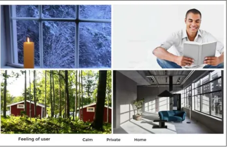
28 Feeling of user
The brief is describing how the user should feel when using the product. The desired feelings are calm, private and home, see Figure 9. When feeling this way, the user should have a good mood for working. The feeling the user should have is to have a private and calm place, like home, when it can be stormy and stressful outside of this area. It should feel like entering a peaceful place.
Figure 9. Feeling of user
The shape
The shapes of the product should express the feeling of; simplicity, dynamic and strong, see Figure 10. With simplicity means that the product consists of basic geometric shapes with no complicated areas. The simplicity will also increase the dynamic feeling wish refers to be mobile and easy to move and change as the user wants. The product should feel strong to give an expression of a shelter and to protect the user from noise and stress.
Approach and Implementation
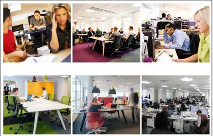
29 The problem
This brief shows the problem very well, Figure 11. People sit very close to each other and have a hard time to concentrate. Even the environment around the table is a stressful and busy atmosphere due to people walking and other work tables. It is obvious that the environment can be largely improved. The peoples in the pictures are working alone but sometimes groups have to work together. To be able to work as a group the group have to be divided from the others not to disturb or be disturbed.
Figure 11. The problem
The environment
The environment where the screen is going to be used is mainly offices, Figure 12. The screen is going to be used at big tables where people work together and between people working side by side. The screen will also work to screen between computer screens. Generally, is the office spaces big and open with a lot of employees. To notice is when to store the product not all offices have walls to store it at. Some offices have a lot of
windows and other have shelves on the walls.
Approach and Implementation
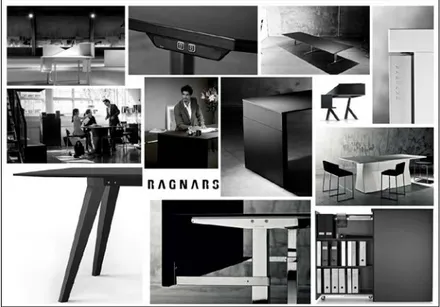
30 Ragnars
The brief over the company were made, to be able, to fit the products that the company already have, Figure 13. The products are very straight and square with dark colors and small details. The products have high quality and are built to last and to be functional. To be functional the products are well thought thru with smart solutions, good material and timeless design.
Figure 13. Ragnars
Existing screens
The brief over existing products is in addition to the competitor analysis and shows how different the product can be, see Figure 14. It also shows different solutions, for example how to make it stand and how to store it. The screens are all very different to each other the thing connecting them is the material and the soft feeling. The material comes from that it has the same main function, to absorb sound. To take further from this brief is the smart ways of store some of the screens when it’s not in use.
Approach and Implementation
31
The briefs are a great way of explaining thoughts and ideas. They were also used as reminders and inspiration around the workplace when I was working. To be reminded all the time was very good for me thou I then know what I was doing. I did also put up my latest ideas around me as well to see them all time and to be forced to judge and to think of them.
I had now a great understanding of the product and the problem. It will be a screen that absorbs sound as well as it contains extra functions in some way. It’s important that it express quality and premium product. After the theoretical background I also know that the screen need to have a thickness and to be filled with a material that can absorb sound.
4.3 Ideation
From now on I worked a lot with sketches, CAD (computer aided design), renderings and prototypes. This process is iterative and goes back and forth many times, it will be
described in the same way as it were proceeded. To ease the reading many pictures will be used.
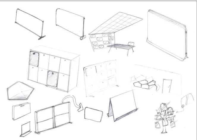
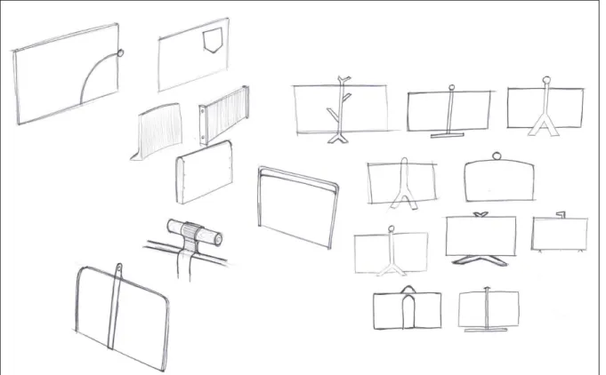
I started the ideation with sketching a lot. I sketched all ideas I got to be able to see it, to evaluate or to develop it further. During the sketching I was talking to friends and looking at online furniture shops to gain inspiration and more ideas. The first sketches are shown in Figure 15 and Figure 16.
Approach and Implementation
32
Figure 16. First sketches 2.
The first sketches, Figure 15, were investigation different ways of placing the screens. I had ideas of a modular wall screen where the smaller screen could be removed and used on the table. A similar idea was to store the smaller screens on a big screen when they were not in use. To use a big screen as a storage place would remove the need for a wall or another system to be able to store the screens. Another way of smart storage would be to use the locker doors to hang the screens on. In that way, if every employee has one locker each, they would get one personal screen each.
In Figure 16 I focused on the ease of moving and lift the screen. I tried different handles at the top and the handle should also work as a hanger when store the screen.
To further develop the sketches, I created them in CAD and rendered pictures of them, Figure 17. The screen on the picture to the top left has the idea of to be able to place the screen at any way. I think it’s a fun idea, but it creates many problem according to stability and the ability to store it. The other ideas in Figure 17 shows the storage concept with a big wall screen and hanger on the table screen. In Figure 18 is the idea of placing the screens at the locker doors showed. This is an idea I like and think might work good. To continue with this idea, I need to find out measurements of standard lockers.
Approach and Implementation
33
Figure 17. First renderings of early ideas.
Figure 18. Screen placed on locker.
From all sketches and renderings above I realized that the design is too complicated, too much things. The trends and also the company advocate smart solutions and simple design. I continued with more sketching and tried to keep it simple and smart. To use the material and shape of the screen to make it stand were now the idea I had. In Figure 19 there is many ideas where the screen is curved or bend to create a base for the screen. To create a pattern of the screens when they are stored became important from this sketches the idea of that is make the screen more useful and esthetic.
Approach and Implementation
34
Figure 19. Second sketches of ideas.
Again I created CAD models of the ideas and rendered pictures of them, Figure 20. All these concepts are produced of pressed felt and are able to stand on its own due to the shape and material. The concepts in the bottom left and the middle right are a zigzag pattern with flexible corners to be able to fold and unfold the screen. The folding is good for the ability to change size of the screen depending on the situation. When simplifying those ideas, the bottom right concept was created. Simply it is a folded sheet which can stand on its own and can be hung at the wall. The top pictures are again a simplifying of the bottom right concept. They are a sheet but with only one fold on the middle. While having this symmetric bending there are many options to work with the shape at the top. I tried many different shapes and also different ways of handles.
Approach and Implementation
35
Figure 20. Renderings of different ideas.
Thou the symmetric concepts were the furthest simplified I continued working with that to make it better according to sound absorption. To have better absorption properties there have to be a thickness of a porous material. The solution was to use two thick felt sheets and only press them on the outsides to create a stiff frame and a softer inside. The frame makes the screen stable while the inside absorbs sound see Figure 21.
Approach and Implementation
36
From this stage I wanted to improve the visual effect while the screen is stored. I came up with the idea of a honeycomb pattern. The honeycomb is very popular on furniture, which I saw at the fair in Stockholm. A pattern would give the product a greater design feeling and a more interesting product. The honeycomb pattern was created by changing the shape of the screen and to create a shelf. The pattern occurs when the screens are stored at the wall, see Figure 22.
Figure 22. When stored at the wall a honeycomb pattern is created.
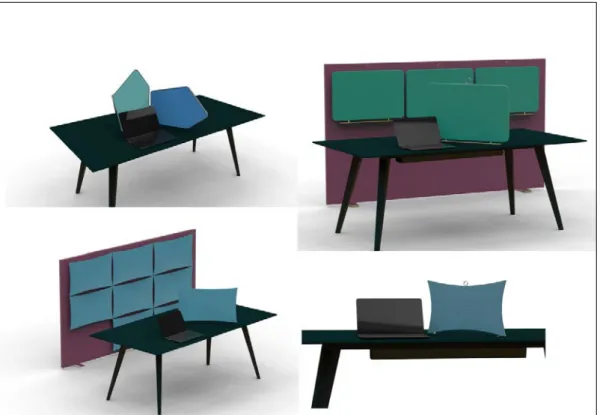
Finally, I ended up with three concepts which I presented for the company.
Figure 23. Three different concepts.
4.4 First presentation
Everything created so far were presented for the company. When presenting for the company I were talking to my contact person. I had prepared a presentation printed on papers to be able to easily bring it and show it. The presentation started with the
competitor analysis, function analysis and the different briefs. I showed the different analysis and pictures and at the same time explained everything and told what my thoughts was. The presentation continued where I showed all sketches and renderings
Approach and Implementation
37
which is the same as those presented here in the report. We discussed a lot over the concepts and the findings were that I should continue with concept 3, Figure 23.
The discussion with my contact person over the concepts started with the idea were the screens are placed on the lockers, concept 2, Figure 23. He liked the idea and thought it is a smart way of storing the screens but the problem is that there are no standard
dimensions on lockers. This creates problem with finding the size of the screen and how to make it work in reality.
The self-standing screen, concept 1 did he really like thou it had a lot of Ragnars feeling. It stands in a smart way and it looked very simple. At the same reasons he also liked the symmetrical concept 3. Concept 3 is better due to the screen have a natural direction. It’s obvious which side is up and down. At the other screen both sides can be placed down which is a problem if the screen needs extra weight to stand stable. Then the screen can be placed wrong and the ease and impression will decrease.
About the honeycomb pattern at Figure 22 he liked the idea of the pattern but it will be too much for the costumer to mount and install on the wall. The shelves are big and requires a lot of space and material which is bad both for the buyer and the producer. Also the screens get to sharp top according to me when they have to have this hexagonal pattern.
So we decided to continue with concept 3 from Figure 23. To help the decision a quick table over the discussed properties were created, Figure 24. In the table it’s easy to see that concept 3 were the best to continue with. I would investigate which side the soft material should be on. Questions to answer are. Should it be on the inside or outside? Or maybe both? How does the placement affect the acoustics properties? I also need to find out the dimensions and the size of the hole. To solve the task, the plan was to build prototypes and to ask people who are experts in sound and acoustic.
Concept Direction Stability Storage Easy to use Handle Idea
1 x x
2 x x x
3 x x x x x
Figure 24. Table over concept evaluation.
4.5 Refinement
After the meeting I quickly created a prototype of cardboard just to get a feeling of the product and to see if the screen could stand. The prototype worked well and it seemed that it can be both stable and good looking. To build a simple prototype helped me a lot when figuring out which dimensions the screen should have, with the screen I could measure and imagine how it would appear while changing something.
Then I started to sketch a lot over how the proportions should be. I tried to implement the golden ratio but it didn’t turn out good. So to find the dimensions I conducted a more engineering way. The normal work area is 70 cm wide so I said the screen should be 70 cm, then one screen can be placed in from of the work area. Also many tables are 60 to
![Figure 2. Placement of volumes, [11].](https://thumb-eu.123doks.com/thumbv2/5dokorg/5425531.139778/15.892.113.783.107.350/figure-placement-of-volumes.webp)

![Figure 5. Table over sound absorption in percent (%) [12].](https://thumb-eu.123doks.com/thumbv2/5dokorg/5425531.139778/19.892.106.655.105.291/figure-table-sound-absorption-percent.webp)