Postadress: Besöksadress: Telefon: Box 1026 Gjuterigatan 5 036-10 10 00 (vx) 551 11 Jönköping
A FRIENDLY PRODUCT
Martin HansenMASTERTHESIS
2019
Master in Product Development with a specialization
INDUSTRIAL DESIGN
Postadress: Besöksadress: Telefon:
Box 1026 Gjuterigatan 5 036-10 10 00 (vx)
551 11 Jönköping
A FRIENDLY PRODUCT
A Kansei engineering study
Martin Hansen
This degree project is performed at the School of Engineering in Jönköping in the subject field Industrial Design. The project is a result of the master program Industrial Design. The writers are responsible of the result, conclusions and reflections.
Tutor:Jonny Tran
Extent: 30 points (D-level) Date: 23/09/2019
iii
Abstract
This master thesis is about exploring the possibility to concisely and deliberately apply a feeling on a product medium. The report features the process and results of using the kansei engineering methodology to develop and evaluate a friendly vibrator (pleasure product). The thesis is
iv
Table of Contents
Abstract ... iii Table of Contents ... iv 1 Introduction ... 6 1.1 A friendly product ... 6 1.2 Research questions ... 6 1.3 Delimitations ... 6 2 Theoretical Background ... 7 2.1 Perception ... 7 2.1.1 Viewing attraction ... 72.1.2 Understanding the aesthetic mind ... 8
2.1.3 Form casting shadows ... 10
2.2 The feeling of colour ... 15
2.2.1 What is colour? ... 15
2.2.2 The feeling´s physical ... 17
2.3 Natural Colour System [NCS] ... 20
3 Method ... 21
3.1 Introduction to kansei engineering ... 21
3.1.1 Kansei? ... 21
3.1.2 Applying kansei engineering ... 22
4 Approach and Implementation ... 24
4.1 Road to a friendly kansei ... 24
4.1.1 Product domain ... 24
4.1.2 Spanning the spaces, semantic space ... 25
4.1.3 Space of properties ... 25
4.1.4 Spaces summarized ... 29
4.2 Construction of kansei engineering study ... 30
4.2.1 Imagine images ... 30 4.2.2 Context ... 30 4.2.3 Questionnaire ... 31 4.2.4 Interview ... 31 5 Result ... 33 5.1 Questionnaire ... 33
v 5.2 Interview ... 33 5.2.1 Friendly ... 34 5.2.2 Modern ... 35 5.2.3 Intimate ... 36 5.2.4 Soft ... 37 5.2.5 Familiar ... 38
6 Conclusion and discussion ... 39
6.1 Friendliest option? ... 39
6.1.1 Form ... 39
6.1.2 Colour ... 39
6.1.3 Material ... 39
6.1.4 The final design ... 39
6.2 Working with kansei engineering ... 40
6.3 What is friendly? ... 40 6.4 Reflections ... 41 7 References ... 42 8 Attachments ... 44
Table of figures
Figure 1. Asmongold. ... 26 Figure 2. Balls. ... 26 Figure 3. Curve. ... 27 Figure 4. Dumpling... 27Figure 5. Matte plastic material……….. 29
Figure 6. Glossy plastic material………..29
Figure 7. Soft translucent plastic material………29
6
1 Introduction
1.1 A friendly product
This master thesis is about exploring the possibility to concisely and deliberately apply a feeling, the feeling friendly on a product medium and, if you can make concise premeditated design choices, based on information and knowledge of the subject matter, without having to rely on intuition. Intuition is a necessary skill, but relying on intuition alone is absurd. Because, intuition in its essence, is knowledge. A designer might know what the “correct” design choices are from intuition alone, but without true understanding, the results can be inconsistent. Proactively working with information as a foundation is the key to great product design. But can you predict what is perceived as friendly 2.1.1? what is friendly? To help facilitate the thesis, the methodology of kansei engineering is used to construct and evaluate what can be considered friendly. Kansei engineering is first and foremost a product development methodology in the category of emotional engineering. Kansei engineering´s main goal is to translate impressions on products, then fix the impressions to design parameters. With this methodology you can guide products intent towards the planned goal, you can specify and push certain impressions on products and evaluate existing products towards their assumed ideal.
1.2 Research questions
What is friendly? : Can you deduct what stakeholders consider friendly? Or is the notion too
abstract?
Is kansei engineering a viable methodology?: Does kansei engineering have potential in projecting
specific feelings on products, how hard is it to use and get invested in?
To be help interpret and evaluate the possible outcomes of the kansei engineering study, the first chapters are dedicated to theories regarding colour, perception and aesthetics. following this, the report continues with a kansei engineering perspective.
1.3 Delimitations
Because of the limited timeframe, the thesis must confine some aspects of the kansei engineering study:
The synthesis data evaluation will be limited to survey results.
The evaluation of the study results will be based on a simple score system combined with verbal analysis. The focus group of the surveys will be chosen after the maximum number of possible respondents. The specific affect of the properties combined with the kansei words will not be futher delved into. The final design will be visual only.
7
2 Theoretical Background
2.1 Perception
2.1.1 Viewing attraction
What is good design if not beauty? Products solve functions, that is what they are designed to do. The problem does not care if the solution is ugly or not, the solution is the same, the function of the product is the same. So why, is the aesthetic element so important in design (Norman, 2004, pp. 18,19) Emotions. Our emotions guide our lives, our decisions, our frame of mind. Interacting with beautiful objects are important to us, we are drawn to them, and they affect us accordingly. It is not false to say that aesthetically pleasing things work better. Doesn’t the car seem to run smoother when newly washed? (Tonino & Sarah, 2014, p. 81) It is known that emotions affect our cognitive system. Feeling happy widens the thought processes and facilitates creative thinking. However, being affected by negative emotions, concentration and thinking narrows to directly focus us on the relevant problem. Applying this phenomenon to product design is easy. Attractive things make people feel good. This is the true nature of good design, to excite the sensuous to the utmost degree. The aesthetic aura in products is the consumers primary acquisition. We don’t buy artifacts, we buy meaning. The item is no longer the main issue, the aesthetics is. (Wolfgang, 1997, p. 10) Now, when we know that attractive things = good, what is considered attractive?
Attraction exists in the eye of the beholder. The theories of aesthetics say that for something to be perceived as beautiful something ugly needs to exist. Where everything is perceived as beautiful, nothing is considered beautiful, nothing stands out. This is the plurality of aesthetics. All perceiving is specific. To see something is to overlook something else. Thus, the preference for a certain aesthesis is not just an aesthetic decision, but also an anaesthetic one at the same time.
Now, what is aesthetic? Aesthetic, translated to Swedish is called “läran om det sköna”, the appreciation of beauty. The aesthetic subject is divided into elevatory elements, the most important, aithesis, refers to the sensuous nature of aesthetics. Aithesis is sensation and perception which is the most important aspects when identifying affective design choices. Sensation is emotional in value, it evaluates the sensible on a scale of pleasure and displeasure, while perception directly addresses genuine sensuous qualities such as colours, sounds, tastes and smells (Klaus, 2006, p. 102). In general terms, aesthetics refers to the sensuous element, the aithesis. All the same, we do not call everything sensuous, aesthetic. In the element of aithesis sensation, we isolate the rough sensuous, the lower, vital sensation of pleasure, from the elevatory sensuous, the higher appreciation of the beauty of irrelevant aspects of pleasurable objects. Whilst the vital pleasure could be compared with the ground floor of a building, the aesthetic elevatory pleasure corresponds to a piano nobile (Wolfgang, 1997). Where, once elementary needs have been satisfied, a reflective pleasure is enjoyed, one which judges its objects not as necessary or useful, but as beautiful or superior. Likewise, on the other side of the boundary of aisthesis, the side of perception, the elevatory element is equally germane. When we label a perception as aesthetic, then we do not have the traditional sort of perceiving in mind, but rather higher-level perception.
8
Not, to that which the visual system interprets as red, but rather to the fact that this red,
complements the surrounding green or that it is empathized particularly well by the surrounding hues.
The aesthetic perception generally refers to the relationship between the elements, not to the elements themselves. To transitions, harmonies, and contrasts. (Wolfgang, 1997, pp. 10,11,12) However, since the lower vital sensational element of aisthesis is evaluated based on human needs, it will affect the aesthetics perception. So how do we assume a purely objective point of view? How to triumph the subjective element? It is frequently said that aesthetic sensation is subjective. One person is pleased by this, another by that. This is understandable insofar as pleasure is a subjective determination in general where pleasurable character is attached not to objects, but is acquired by them only in relation to experiences. Regarding objective perception however, one can investigate one differential phenomenon (Wolfgang, 1997, pp. 62,63,64). The differences between the short-range and the long-range senses. Unlike the short-range senses, the long-range senses are independent from actual contact with the object. This is where we can start to separate perception from sensation. Reactions registered by sensation, always result from direct contact. Thus, short range senses, are fixated to aithesis of sensation rather than aithesis of perception. Disassociation of perception from sensation is made as soon as the aithesis perspective directs itself to an object’s appearance, independently of its sensational characteristics. In doing so, it embraces an objective outlook instead of a subjective orientation. A new type of aithesis is formed, the act of actual objective perception. It targets the genuine sensuous qualities of an object, that is, colours, tones, tastes, smells, tactile qualities and form, and this in their objective characteristics separated from their sensational forms. This new objective aesthetic angle evaluates its objects no longer according to basic emotional criteria, such as, alluring, pleasant tasting etc. but rather to a more reflective precedent, beautiful, delightful, repulsive, disturbed (Wolfgang, 1997, pp. 71,72). But still lurking is the subjective element. Constructing a purely objective viewpoint is challenging, not for the common layman. thus, a good designer must understand and wield the subjective element to his advantage.
2.1.2 Understanding the aesthetic mind
The first impression of an object is always atmospheric. The first impression is crassly put, experiences that serve as an instant response regarding emotion, motivation or value. The atmospheric property of the initial response is also why a person might perceive irritation from a homecoming spouse without being able to analytically explain the link between the physical reactions and the impressions the persons draws from them. It is a tacit primal reaction drawn from the semantic element. What does the object mean to us, what reaction does it draw from us? Why do we prefer a wooden object to a plastic or metal one? If not for its ability to evoke, for example life, peace, strength, sensuality etc. perhaps, in general, for being a material whose stiffness is not at the expense of its warmth and its rustic authenticity.
Emotions. Emotions drive, and emotions are themselves driven. True emotional attachment take time to develop, however. They come from sustained interaction. Appearance and utility play relatively minor roles. Instead, what matters, is the history of interaction, the associations that people have with the objects, and the memories they evoke. Memories are our life experiences. They also serve to underline how we view ourselves. Our self-image plays a more important role than we like to admit. The way we dress and behave, the material objects we possess are all public expressions of ourselves. Objects are us; we are objects. What we are, or what we want to be is
9
displayed to the world through our objects. The same object can have different association as well, what it means to me might not be the same that what you perceive.
I might view the old painting as a historical treasure, an antique artifact of no value but for its history and I cherish it in that regard. You might view the same object for its artistic aesthetic properties, the vivid colour palette and the beautiful brush technique. The object is never the same in your mind.
To correctly govern and administer the correct emotions when designing you must look at the brain as three separate entities. (Norman, 2004, p. 21)The prewired layer, called the visceral layer,
the behavioral layer and the reflective level. Each layer requires a specific style of design. The visceral
level is fast, it makes rapid judgements of what is good and what is bad, safe or dangerous. This is a purely primitive level, reptilian, built on basic emotions and knee jerk reactions. The visceral brain level is incapable of reasoning. The visceral level reacts according to our survival instincts and evolutionary emotional behavior. Yielding positive responses from warm, comfortable and lit atmospheric places, tempered climate, bright hues, sweet tastes and smells, smiling faces,
symmetrical objects, rounded smooth objects, etc. Similarly, there are some inputs that produce negative
effects, such as heights, sudden loud sounds or bright lights, crowds of people, sharp objects, looming objects, rotting smells, decaying food etc.
The behavior level is the site of human behavior, the part which controls and process everyday
behavior. Monotonous routine and non-reflective action. The behavior level in humans is especially useful for well-learned, routine operations because the behavior level is not conscious. Only the reflective level is used to process direct thinking. That is why you can lose yourself in an autonomous process and think of something else. For example, at your boring warehouse job, you operate on routine, non-thinking action and you don’t actively know what you are doing, you just do.
The highest level is that of reflective thought. It does not have any direct access to either sensory input or
behavior control. However, it watches over, reflects upon, and tries to influence the lower levels. The reflective level is our active consciousness. The three levels interact with one another, each modulating the others. When an activity is initiated from the lowest, visceral levels, it is called a bottom up behavioral reaction. When an activity comes from the highest reflective levels, it is called top down behavior (Norman, 2004, pp. 22,25,29,30). Bottom up behavior is driven by perception, top down behavior is driven by thought. The result is that everything you do has both a
cognitive and an affective component. So how can we apply this?
Real products provide a continual set of conflicts. A person interprets an experience at many levels, but what appeals at one may not at another. Therefore, a successful design must excel at all cognitive levels. The visceral level is pre-conscious, pre-though. At a visceral level, physical features dominate, such as feel, smell, looks. Shape and form matter. The physical feel and texture of materials matter. Heft matters. Visceral design is all about immediate emotional impact! It must feel good, look good. Sensuality and sexuality play immense roles. Visceral design is what nature does. We are explicitly tuned to receive powerful emotional signals from the environment. Our inclination towards size, colour and appearance are derived from these evolutionary emotional reactions. You can find visceral design in advertising, folk arts, crafts and children’s items. More prevalent in children´s toys because children tend to be more viscerally influenced than adult humans. Adults tend to explore experiences from the reflective level ignoring or diverting the visceral reactions.
10
The principles underlying visceral reactions are hardwired and is consistent across people and cultures. If you design something according to the visceral rules, the design will always be attractive. However, if you design for the sophisticated reflective level, your design can easily be outdated because this reflective level is highly sensitive to cultural differences and trends. The behavioral level is all about use. Appearance does not really matter, performance does. In behavioral design, functions come first and foremost. What does a product do, what functions does it perform? Even if the function is only to look good, it must succeed. If the function is inadequate or of no interest, the product is of little value (Norman, 2004, pp. 36-39).
It is only at the reflective level that consciousness and the highest levels of feeling, emotion and cognition reside. At the lower visceral and behavioral levels, there is only affect, without
interpretation. Interpretation and reasoning come from the reflective level. Considering this, the reflective level has the power to affect and override the lower levels. Reflective design is all about message, culture and meaning. The meaning of things and the personal remembrances something evokes. Reflective design is about our self-image. The essence of reflective design, it is all in the eye of the beholder. Attractiveness comes from a visceral level reaction. Beauty comes from the reflective level. Beauty looks below the surface. Beauty comes from reflection and experience. The piano nobile. Reflective level operations often determine a person’s overall impression. Here, you think about the product, reflecting upon its total appeal and the experience using it. Here is where many factors come into play and where deficiencies of one aspect might be trumped by the strength of another. Because of this, the reflective level is the most vulnerable to variability through culture, experience, education, and individual preferences (Norman, 2004, pp. 65-69, 83,87,88).
The three levels can be summed up as: Visceral design – Appearance. Behavioral design – effectiveness of
use. Reflective design – personal satisfaction. However, even when simplified there is no straight path of
application. Now how can we apply our knowledge of our minds processing levels to generate great designs?
2.1.3 Form casting shadows
How does one design an attractive object? a product that stands out of the crowd, that everyone wants to own, display and remember? One that does not grow stale in the eye of the beholder (Norman, 2004, p. 56)? Designing products that are easily recognizable, attractive and lasting depends on the expected users past experience, common sense and perceptions. You can try to create something unique but going too far from the ideal can make the new product lose attraction. People recognize products and objects by their typicality, their ideal form. Near the ideal type, center, the objects are recognizable. The further you strain from the objective center, the less recognizable the object will become. Using simplicity is often appealing. But only in contrast to complexity. (think Braun design, complex products, simple aesthetics). Much of attractiveness is bound to things being where they are expected to be. People also tend to pay less attention to familiar things. Whether it is a possession or a spouse. Because it is usually the novel, unexpected things in life that require the most attention. The brain naturally adapts to repeated experiences (Klaus, 2006, pp. 91,102).
11
All of this demonstrates the fragility of design. What is liked today might not be liked tomorrow. It is ever fluctuating and changing. There are of course guidelines that help create some
semblance of order in this. You can use gestalt laws to create an aesthetic good form. You can use the semiotic aspects of objects to draw attention to functions in good ways. You can manipulate materials and colours to evoke the correct feeling and atmosphere. One tool that is easily overlooked in this however, is language.
The fate of all products is decided in language, the semantic aspect of design. Objects come to life in the narratives of their stakeholders. Giving them meaning. The idea that objects have properties is neither natural nor universal. They are the result of linguistic attributions.
Attributions reveal what people sense and feel, and what they believe other people sense and feel. Language attributes clarifies experiences with objects. Without descriptions, it would be
impossible to distinguish among the properties of things. It matters whether people talk about an object as being beautiful or ugly, simple or complex, affordable or costly. So how do characters differ from physical properties?Consider the experience of something heavy. Heaviness makes sense only in relation to something that is not heavy. The weight of an object ignores the humanistic reference to the experience, it is based on something measurable. On the other hand, the word soft, describes the quality of touch. On might try to measure “softness” by measuring the depth of the impression or surface microstructure. This, however, does not explain how humans experience softness. These characters are rarely measurable by physical instruments. However, these are the characters that are important. A designer must take into consideration what the stakeholders of their design see, touch and feel. Since perceptions, feelings, and
opinions are inaccessible to observation and measurement, designing the character of a product, means designing sensory experiences that elicit desirable attributes from those who matter. However, character attributions often balance the border of measurable qualities. For example, when a product is considered cheap or inexpensive, the monetary value does not explain why people give these attributions. Cheap entails disapproval whereas inexpensive can be considered an opportunity. Hitting the right spots are what differs from the former reflection to the latter. (Klaus, 2006, pp. 147,148,155,156).
The important of language in product design is clear. But what about the product itself? What is recognizable as a well thought out product from something half baked? How can you design
intuition? This is where semiotics and gestalt come into play.
2.1.3.1 Semiotics and semantics
Semiotics is the study of signs, their structure, properties and behavior. Products semiotics states that we place meaning in what our senses perceive. What we see, hear and feel should make it easier for us to orient ourselves. Visual perception is primary, however, hearing our surroundings plays a decisive role in several ways. What we hear is not just meaningless sounds. We interpret sounds, we give them meaning. (Klaus, 2006, p. 102)In other words, they are signs in the semiotic sense. when the alarm goes off in the morning, we hear it as a sign that we need to push the snooze button and long for the sweet release of death. Therefore, audio signs must correlate to visual signs. By passing our hand over an object we investigate the nature of the surface and the three-dimensional form of it. in other words, surface and space are signs that we can interpret not only with our ears and eyes, but also with our tactile and haptic senses. In fact, haptic senses are affected to a large degree by our visual sense. Like the visual system people can perform haptic object recognition very well however, it is not the same.
12
Consider the difference between material properties. Those that do not depend on the structure of an object, like its surface roughness and geometric properties. In haptic perception, the observer is in contact with the object, so material properties of the object such as soft, cold are easy to perceive and play a crucial role in the recognition process. In vision, there is no physical contact, so thermal and textural properties of objects are much more difficult to recognize. Therefore, it is the geometric properties of the object that are most important for visual recognition (Jeremy M, 2006, p. 303).
All our senses are influenced by signals. Signals call attention, first to themselves, then to other things. For a signal to succeed, it must compete for sensory attention with other features of a product. Signals accomplish this with psychophysical contrasts, such as flashing lights, vibrations or sounds. However, signals can be expressed in many ways to achieve different functions. Mainly, because signals are information. You can use signals to indicate the state of a product: State indicators shows users what the object is presently doing. There are three kinds of status indications.
Direct state indicators are identical with the states that the user needs to know. In using simple tools.
States of interest can be whether the scissors are open or closed. Mediated state indicators become important when the complexity of the object prevent users from having direct access to its operation. A fuel gauge of a car, the buzzer of a remote door opener for example. Calculated
indicators abstract multiple states of an object and present them in terms that users can
understand. For example, the speedometer of a car.
It is important for state indication to be instant, for delays in the indication of states can make navigation difficult which will influence the experience of the product. (Rune, 1997, pp. 58,62) Directing perception can be used as a signal such in the case of affordance: Affordance deals with the phenomenon that one does not perceive objects, but usability. It includes direct perceptions but also what users can derive by logical reasoning from clues, icons, shapes and patterns. Ordinary objects are perceived and conceptualized in the terms of affordances, cups of their ability to hold and drink from them, knobs for their ability to push, pull and turn etc.
Correlations and discontinuities which is related to gestalt can also be used to indicate
information. Users are inclined to perceive discontinuities in the appearance of parts or features of products as meaningful, especially in the absence of compelling technological reasons. Besides discontinuities in material, forms and colours there are unequal spacing etc. Designers need to be aware of the human inclination to make sense of discontinuity and build appropriate
interpretations to avoid misleading users. Correlation handles the physical or conceptual
correlations between the movement, arrangement or location of the controls of product and their affect. Take an elevator for example, the most logical way would to have the buttons going from the lower floors to higher floors from down to up. Copy the layout of the building on the
corresponding button layout, do it the other way around and you can confuse users (Klaus, 2006, pp. 111, 118-123).
13
2.1.3.2 Gestalt
Gestalt is the arrangement of parts which appears and functions as something that is more than the sum of its parts. The quality of a product being more than the sum of its part means that form, colour and material structure are not perceived as isolated factors. Instead, we experience the value of the whole as the way the factors influence one another. Properties of the whole take
precedence over the properties of parts. Gestalt is born from perception and vision. If we start with an
object placed on a simple background, the best way to start recognizing the object would be to find the edges of the object. it is established that we will identify an enclosed line as an object. (Rune, 1997, p. 33) However, what will happen if the lines are interfered with other lines, or that the lines are blurred?
An illusory contour is perceived at an area where nothing changes from one side of the contour to the other. No separation, no difference, but the contour is still there. It seems that our visual system compensates for the missing information to estimate the non-existing separation of the object. This phenomenon which appear almost everywhere, is the foundation for the gestalt grouping rules, which is the set of rules that describe which elements in an image will appear to group together. The brain´s ability to compensate and calculate the probability of visual
outcomes is remarkable and essential for our interpretation of reality, because objects are rarely kind enough to present themselves to us on blanket backgrounds. In the real world, objects are often partially hidden by other objects. Even three-dimensional objects hide parts of themselves. To deal with this, the visual system estimates the solution. The visual system strives for the highest
probable option. One example is how the visual system treat continuations of curves, as such in the
case of the gestalt law, the good curve. Take a simple c-curve. Put it behind an object that obstructs the middle section and only the ends are visible, still, the visual system will presume that the curve is one single entity. Take an s-curve and do the same however, the brain will interpret the curve to be two objects. The visual system is unwilling to guess such an elaborate relation, and therefore, concludes that the lines are not connected. It is good to realize that the visual system is not infallible, it is willing to accept misinterpretations. the visual systems strive for the simplest answer and that is what the gestalt rules are made from. Taking advantage of this knowledge and applying it. From this we get the following gestalt laws (Jeremy M, 2006, pp. 76-80):
proximity; proximity works with creating gestalts out of grouped things. The tendency of two
features to group together will increase as the distance between them increases or decreases. Take a control panel for example. it is more intuitive to use when the controls are grouped according to function. Common movement or common fate; common movement/fate is connected to the
similarities of movement in a scene. If the objects move at the same speed and direction, they are viewed as one figure. Symmetry; symmetry creates gestalt the same way as patterns do. Symmetry is also considered highly aesthetic. Inclusion; lines that enclose an area is easier to be viewed as a whole, thus generating a gestalt figure. Similarity; also called the principle of common properties. Enables us to gestalt figures with similar properties such as form, colour, texture etc. The good curve
and good continuation; The good curve allows us to see the arrangement that makes the minimum
change or break in straight lines. The law of good continuation says that the tendency of lines of similar orientation to be viewed as the same contour. Experience; the experience factor is the most personal factor. It derives from our own experiences and learnt behavior. The experience factor is immensely important in product design, but it is also one of the most subjective gestalt laws.
14
Common region or area; two features will tend to group together if they appear to be part of the
same larger region. Surroundings or size; if one region is entirely surrounded by another, it is likely that the surrounded region is the figure. Connectedness; two items will tend to group together if they are interconnected either in form or colour (Rune, 1997, pp. 34-38) (Jeremy M, 2006, pp. 84-88).
Now when we know the importance of understanding how man views objects and products etc. We can use this to try and consciously draw informative correct decisions when designing products. There is one subject however that require some more detailed explanation. Colour.
15
2.2 The feeling of colour
2.2.1 What is colour?
There is no such thing as colour, yet, colour is essential.
Colour is light, therefore, colour is an effect of our visual system. The perception of colour is caused by the physical characteristics of light. Specific wavelengths of light for the fact. The visible light wavelength-spectrum for a human being is in the range of 400 to 700 nm and the colour perceived is depending on the combination of wavelengths that reach the eye. The eye facilitates wavelengths with the help of two kinds of photoreceptors, rods and cones. Rods are sensitive to scotopic (low) light levels and all rods contain the same photopigment molecule, which means that all rods are sensitive to the same wavelengths of light (Jeremy M, 2006, pp. 99-101). Consequently, this causes the phenomena of univariance. “Univariance is the fact that an infinite
set of different wavelength intensity combinations can elicit exactly the same response from a single photoreceptor”
(Jeremy M, 2006, p. 99). Simply put, univariance is the lack of colour vision under scotopic light scenes. Because the rods all contain the same photopigment molecule and therefore react to the same wavelengths, there is not enough data for the eye to rely the correct colour information, the scene will be perceived as monochrome. It is in the cones that the true colour vision comes to light. Cone photoreceptors come in three variances, each containing a different photopigment. These different pigments give each type of cone a distinctive absorption spectrum, which peaks in different. These three cones are the essence of colour vision, also known as trichromacy (Dale & R. Beau, 2003, pp. 91,93).
2.2.1.1 Trichromacy, not necromancy
The three varied cone types are named after their specific peak position on their relative
absorption spectrum. Cones that peak on lower wavelengths, specifically 440nm are called short-wavelength cones, S-cones for short. M (medium)-cones peak at 535nm and long-wave (L) cones peak at around 565nm. (Dale & R. Beau, 2003, p. 96)
Take in consideration that the specific peak centrals may differ from individual to individual. This will not affect overall colour vision, but it might constitute slight individual chromatic perception differences. Historically, S-, M- and L-cones are named blue-, green- and red-cones (referring to the specific colour of the wavelengths). However, all the cones need to be activated to see colour correctly, if not, we return to the phenomena of univariance. They work in symbiosis with each other. Unfortunately, trichromacy cannot truly explain colour vision. There are some phenomena that need more than trichromacy theory to be fully explainable, specifically regarding hue
16
2.2.1.2 Hue transitioning and opponency
The colour opponency theory derivates from the phenomena that humans see colours in opponent pairs. It says that some combinations of colours are illicit. The human mind is unable to perceive opposite hue transitions without pathing through grey. You can’t have a greenish red. Contrary to the trichromacy theory, opponency theory is built upon 4 base colours, image, red, green, blue and yellow which all respond to a specific chromatic wavelength. For example, blue in the opponency colour wheel responds to the wavelength 470nm in which there are no red or green light present (Dale & R. Beau, 2003, pp. 97,98) (Jeremy M, 2006, pp. 109,110).
2.2.1.3 Context phenomena, contrast and constancy
What is colour without context? Context has a remarkable influence on our perception of colour, the effects of context are discussed in terms of colour contrast and colour constancy. Two
contradictory phenomena (see below). Colour contrast is closely knit with brightness contrast
phenomenon so the same theories can theoretically be used to explain both subjects. Take the phenomena of simultaneous brightness contrast for example. In theory, two objects in a scene that return the same amount of light to the eye should appear equally light or bright. However, the perception of brightness and lightness will fail to meet the expectations. Why is that? If two objects of equal photometric intensity are placed on backgrounds with different luminance the objects will seem brighter or lighter. Ergo, surrounding context matter. This can also be applied to the subject of colour contrast. in the context of a surrounding colours influence on a target, the target will be biased towards the opposite colour of the surrounding colour hue. Basically, if the target is a grey circle on a green background, the circle will appear “reddish” (Jeremy M, 2006, p. 112) (Dale & R. Beau, 2003, pp. 99,100).
Contradictory to colour contrast, colour constancy is the phenomena when regardless of context, the visual input will be the same. When observing colour contrast, two separate targets return the same wavelengths to the eye (same colour and surface texture) but they are surrounded by regions that return different spectra, the two targets are no longer perceived as similar. In colour constancy however, two different spectral returns create the same visual input. Objects under different light conditions will still be perceived as having the same colour. The answer to this phenomenon lies about assumptions regarding surfaces and their reflectance. Generally, it is very unlikely for a surface to reflect 100 percent of one wavelength of light. Even surfaces that come close to being metameric are reflecting a wide arrange of wavelengths. Take this example from the book sensation and perception “Imagine a room full of objects lit up by a light source composed of mostly
short and middle wavelength rays. None of the objects in the room will reflect much long wavelength light. However, the red objects in the room will still look red because they will reflect more long-wavelength light”. The visual
systems understanding of light is why the brain can make these assumptions (Dale & R. Beau, 2003, p. 133) (Jeremy M, 2006, pp. 116-119).
Now when we have a basic understanding on how colour and some of its effects visually work, we can dive into some more interesting subjects. To really understand mankind’s relation to colour we must perceive it through two separate lenses, physiological and psychological. In the terms of physical interactions with colour, purely physiological effects are evaluated. In the context of psychological effects there is a bit more to consider. Psychological reactions to colour are based on several perspectives, physiological, historical, personal and most important,
17
2.2.2 The feeling´s physical
Studies has been conducted that show when under red light reactions times were 12 percent quicker while green light retarded the response time. Another study strengthens the results. It was observed that most living things tend to orient towards brightness. The stimulation of brightness increase energy in the organism and the response tendency with it. Therefore, the effect on activity in bright environments is heightened but, sedentary tasks will suffer. The conclusion taken from this are that activities of muscular nature are better performed in bright surroundings and mental activities are better performed around softer and deeper colours like nature green (Faber, 2006, p. 150). One clear market example is sports attire. In the 80s we started to see an increase in biologically correct colour choices in design. In sports and motion, athleticism is what matters, and researchers in sports medicine discovered that runners performed better when wearing brightly coloured clothes. Bright and extreme colours stimulate the body into increased physiological activity. This is generally why boxing gloves are red (Karl, 1999, p. 41).
The most intense physiological effects can be observed when stimulated by red-, blue- and green- (short-, medium, and long wave-) light. Red increases the bodies blood sugar levels, blood
pressure and sexual hormonal production. Red also stimulate the adrenal medulla for increased adrenaline production which increases physical reactions. Blue is considered opposing in character to red. Blue stimulates the expulsion of cortisone which lowers blood pressure and adrenaline production which gives a sedative and relaxing effect. Blue light also lowers hormone production. Some psychological phenomena can be explained by these kinds of reactions. Surrounding colour seem to affect our perception of space and time. Under the influence of warm hues such as red, object appear larger and heavier, while time appear to soar by. True to the physiological effect of opposing reaction by blue, the same result occurs in this phenomenon. Under cool hues such as blue, time is likely to be underestimated and objects seem to be lighter and smaller. This is all related to the physiological effects of the representative colours. Red increases physical reactions which simulates more muscle activity, ergo more muscle power is used when handling objects, objects appear heavier. It seems that our perception of reality is not as neutral as we imagine. Our senses are clearly affected by colour stimulation. In general, the physiological effects of colour stimulation can be summed up to “red is inciting to activity and
favorable for emotionally determined actions; Green create the condition of meditation and exact fulfillment of thinking; blue generates a calming surround of relaxation” (Faber, 2006, pp. 142-145) (Karl, 1999, pp.
18
2.2.2.1 More than visual?
Colour as purely physiological vibrational energy readies the body in different preparation states. This is known as dermo optic perception, or for short, skin-vision. Though not scientifically proven, colours can be perceived as warm, cool, wet, rough, shiny, slick or sticky though feel. However, there are some issues when categorizing the colour of hues in the context of tactile sense, in regard to hot and cool. (Karl, 1999, pp. 67,68,71). Studies showed that the warmest hues are in the red to orange region, but cool hues can be associated throughout the spectrum from green to violet to yellow. This is a narrower range for warm hues than when perceived visually (Faber, 2006, p. 168)
2.2.2.2 The mind body problem
In general, the colours of the spectrum are associated with two moods, the warm, active and exciting qualities of red and its related hues, and the cool passive and calming qualities of blue, violet and green. Likewise, light colours are perceived as active while deep colours are likely to be passive. This is of course affected by the subjective inclination of individual likings. Personal preference is an important aspect to consider when discussing the topic of psychological effects of colour. Indeed, physiological feedback is the basis for physical reactions, but psychological reactions can also affect the physical, such as preferences (Faber, 2006, pp. 150,153,154).
2.2.2.3 General harmony
Sure, personal preference is important when observing colour phenomena, but some
generalization due occur when it comes to what “looks good”. As is the case when combining different hues or, colour harmony. People tend to harmonize colour combinations in hues that are closely related or antithetical (opposite). For example, yellow will appear more harmoniously combined with yellow-orange than with yellow-red. Making the correct choices when combining tints is also important. The light hue variation should be derived from a pure colour that is normally light and the dark hue variation derived from a pure colour that is normally dark. For example, pale green is more aesthetically pleasing combined with dark blue than pale blue is with dark green. Related to this, for the best visual attraction, specific colour tints should refer to some guidelines. Pure hues should be rich and intense, pastel tints (pure hue with white added) should be light and delicate, while shaded tints (pure hue with black added) preferably should be dark and mature. It is when hues place themselves in the borderline of these guidelines that they can be perceived as unpleasant or ugly. Continuing with harmonizing colours, pure hues combine wonderfully with tinted colours and white, while grey (being neutral, containing white and black) combine well with all other types of colours (Faber, 2006, pp. 171-178). Combining specific colours can also be an important way of displaying information. Take the classic black text on yellow background for example. Yellow is considered the “largest” colour (drawing most visual attention) followed by, red, green and blue. Combined with black, yellow created the most legible of all colour combination, which is why it is used in warning signs etc. (Faber, 2006, p. 243).
19
2.2.2.4 Frame of reference
Entering one of the most important aspects of colour relation, context. But why is context so important? What makes colours and emotion so hard to determine, is that colours may have contradictory qualities. Take green as an example, as seen objectively green is a pleasing and clear colour, but in the context of green illumination, viewed on human flesh makes the colour utterly repulsive (Faber, 2006, p. 172).
Man find in the hues of the spectrum emotional analogies with sounds, shapes and forms, odors and tastes. Reaction to it, appreciation of it, requires little effort of intellect or imagination. The reason is probably that the sensation of colour is of a primitive order. This is fortified by
mankind’s frequent use and importance of colour throughout history. Colour has been built up upon many centuries of history, religion, tradition and superstition. In the roman catholic rite, the colour of vestments has definite significance; white is the symbol for innocence and purity. Red for blood, charity and sacrifice. purple (murrey) for royalty etc. The fact that man has given colour such important a role in is life is displaying that man occupy a primal psychological interest towards colour (Karl, 1999, p. 41).
2.2.2.5 Colour, history and sustenance
Colours historical and almost evolutionary aspect to man can clearly be observed regarding sustenance, which holds the most powerful association to colour. Everyone is sensitive to the colour of foods. Appetite will quicken or dismay in direct relation to the observer’s reaction to colour. Since the dawn of time mankind has been genetically imprinted to decide which foods are edible and which that can be harmful. Primitive man discovered that most of edible food was coloured in the yellow-orange-red scale. Other edible substance could also be green, like salad and cabbage. These primal associations still linger. Among the spectrum, red seems to be the most appealing, imagine a juicy red apple. Towards orange the appeal is still high but at yellow it starts to diminish and at yellow-green it finds a low point. At green however, there is a pickup related to the freshness of nature’s green. Blue, violet and purple are all considered unpleasant colours because man never learned to associate the hues with edible food. It will be noted however, that the largest drop-offs are in-between the small intervals of the spectrum, such as yellow-orange, yellow-green and red to red-violet. Tints are neither as upsetting or savory are pure hues, the reaction is more neutral. Pink is not perceived as succulent as pure red for
example. Considering shades, orange stand in domination, as well does brown, related to cooked meat and bread (Karl, 1999, pp. 51-53). Colours association to odors are also related, although less obvious. Some of the most preferred odors are rose, pine, violet, coffee, cedar, chocolate, orange and vanilla. The least liked are lard, rubber, fish, turpentine, vinegar, onion and human perspiration. Relating this to colour, pink, lavender, pale yellow and green are the considered “best” smelling colours while hues in grey, brown black and deep shades are perceived as less pleasant. This specific concept of association is heavily used in marketing. Take Mc Donald´s logotype as an example, bright delicious red and clear yellow. However, this also means that the grocery sector is heavily influenced by colour. Therefore, making the wrong colour choice can have dire consequences. The reason for this is the strong association towards the previously explained learnt behavior. Where an association is well established, liberties cannot be taken. You would not eat green meat. (Faber, 2006, pp. 162,166-168).
20
2.2.2.6 The proper surrounding milieu
In interior- and architectural design the correct colour choice is vital. The long-term effects of choosing the wrong hues can cause emotional disturbance to people who are sensitive, and in bad cases cause direct negative health symptoms. The symptoms can vary from irritation, eye strain, loss of energy, lack of concentration to severe headaches. Therefore, it is crucial to comprehend colours psychological and physiological ramifications. Using awareness of colour effects, functional environments can be constructed. In a home environment it simply can be derived to; Food related colours in the kitchen and calming hues in the bedroom. In the study, colours that inspire concentration while in more active areas bright colours that stimulate activity. The same principles can of course be applied to all interior environments. In industrial
contexture, soft grayish hues are preferred. They are less distracting, and they effectively conceal dust and contamination. In casual spaces such as cafés, restrooms etc. lighter colours are
recommended like blue. In areas with no natural light sources such as stairways and storage areas, bright white and yellow are preferred to compensate the lack of illumination. In spaces that require concentration and no distractions soft variations of green, grey and blue is the best option. There is a reason why you never see a bright yellow library or cozy bar in turquoise (Faber, 2006, pp. 248,249,258) (Karl, 1999, pp. 54,71).
2.3 Natural Colour System [NCS]
The natural colour system is a colour system that is based on human colour perception, removing unnecessary information such as pigment structure and instead focusing on specific colour appearance, the NCS system can be used to get a general description of colour regardless of surface material. The system is based on 6 different pure colours, the four elementary colours, red, yellow, blue, green and black and white (NCS, 2019).
21
3 Method
3.1 Introduction to kansei engineering
Kansei engineering is first and foremost a product development methodology in the category of emotional engineering. Kansei engineering´s main goal is to translate costumers’ impressions on existing products and product concepts, then fix the impressions to concrete design parameters. Simply put, psychological impression (kansei) – Kansei engineering – design solution. However, it is not completely correct to say that “impressions” is the only emotional factor at work. The term of kansei is much more than simply “impressions” (Simon, 2005, pp. 49,50) (Mitsuo, 2018, pp. 177,178).
3.1.1 Kansei?
The word kansei originates from the Japanese kanji-signs “Kan” and “Sei”. Which means sensitivity and sensibility. Describing what kansei means however, is not that easy. Kansei is one of those words that cannot be directly translated. Kansei is not a simple impression, or a feeling it is something more, it is atmospheric and personal. An emotion received from all the senses to create a whole. One can try to explain kansei in simpler terms, in fact, there are several different definitions of what kansei is. what they all have in common however, is that kansei deals with emotional stimuli, received from all 5 senses, derived from individual subjective impressions when interacting with an artefact, situation or environment. Though subjective in nature, the personal kansei of one individual, may not be entirely unique. It can be grouped, evaluated and turned into data, which is where kansei engineering steps in. But, how can subjective emotions be evaluated (Simon, 2005, pp. 36-39)?
To give an example: A specific kansei arise when person is subjected to an artefact in a certain context. A walk through the forest, beneath the first spring sun can evoke kanseis such as beautiful, fulfilling, happy etc. Consider however, that these kanseis are just a small part of the overall experience. One might feel glad that the winter is over or just content that the spring sun is out once again. The situational complexity must be contained somehow and what seems to be the correct option is to apply a hierarchic thinking 2.1.2. A first degree kansei Is a collection of many transitory, lower kanseis, which appear spontaneously and build a higher degree kansei. The higher level kansei can be summarized in one general kansei. In contrast to the higher degree kansei, the lower degree kansei arises instantly whereas a higher degree kansei take some time to build up. Lower degree kanseis are often are more individual than higher degree kanseis. This means that many may feel happy, which is a higher, general kansei, when walking through the forest on a warm spring day, but all does not view it as beautiful, which is a kansei of a lower degree (L, et al., 2018, pp. 473,474) (Simon, 2005, p. 44).
The question arising is now how the individual kansei can be and converted into useful information for product development. Kansei is an internal sensation, but it can only be
measured using methods based on external reactions. Because of the delicate structure of kansei, which often includes small nuances of emotional impressions, mapping methods must be sensitive enough to include these nuances. Methods that meets these demands are grounded on semantic descriptions. Methods measuring physiological responses, however, are often regarded as too inexact and unnuanced. Measurements of semantic exploration and description of the kansei are foremost interview techniques. (Simon, 2005, pp. 45,46).
22
3.1.2 Applying kansei engineering
Kansei engineering utilizes certain stimuli, product samples and describing words, which are fed into the model system. The output from the engineering system is recorded usually in interview or questionnaire form. The data represents the correspondents perceived kansei of the affected product. However, using kansei engineering models does not necessarily mean that the outcome of the study reflects the correspondents true kansei. It is just an image taken at a certain point of time under certain circumstances. it is impossible to accurately predict an individual’s kansei which all users of this methodology must take into consideration. Kansei engineering is a
successful method, but it is not infallible. There are limits to the methodology. Now how do you use kansei engineering? There are three main steps in the basic kansei engineering model.
Choosing the affected domain, spanning the affective spaces and synthetization (Simon, 2005, pp. 40-43) (L, et al., 2018, p. 466) (Kerstin, et al., 2013, pp. 145,146).
Choosing the domain includes the selection of a target group, market-niche and specification of the affected product. Based on this information, product samples are collected, representing the total domain. The kansei domain can be understood as the ideal concept behind a certain product. The domain includes both existing products, concepts and unknown design solution. with utmost importance, it is vital to cover as much space as possible in the domain for the best results (Simon, 2005, pp. 52,56).
3.1.2.1 The semantic space
The idea behind the product can be described from two different perspectives: the semantic perspective and the description of product properties with each spanning an individual vector space. Subsequently these spaces are analyzed in relation to each other indicating which of the product properties evokes which semantic impact (L, et al., 2018, p. 466).
The kansei is hierarchic. This means that one higher level kansei is combined of several lower kansei and facilitates the representation of correspondent’s affective values. For example, the low level kansei of slow, fast, agile, and quick can be summed up to a single higher level kansei, like “kinetic”. In kansei engineering only higher level kanseis are connected to product properties in order to achieve a better generalization of the results. The purpose of spanning the semantic space is to identify these higher level kanseis from a greater number of lower kanseis (Simon, 2005, pp. 57-59).
Spanning the semantical space is done in three steps. first, collection of low level kansei words. A kansei word is a word describing the product domain. Often these words are adjectives, but other grammatical forms are possible. In order to get a complete selection of words all possible sources can be used, even if the words emerging seem to be similar of the same. Suitable sources can be magazines, literature, manuals, experts, experiences users, studies etc. Depending on the domain, the number of existing kansei words can range up into the hundreds. It is important to select more words than seemed necessary to avoid missing important kansei possibilities which can affect the result of the kansei engineering study.
In the second phase, the kansei structure identification phase, higher level kanseis are identified and compiled from the collected set of kansei words. In the third step the words are sorted and combined for easier evaluation and synthetization (Markus & Tan, 2011) (Simon & Lluis, 2018, pp. 22,23) (L, et al., 2018, pp. 473,474).
23
3.1.2.2 The space of properties
When the identification of the core product values and Kansei words is complete, the next step is to identify the design elements that affect the product towards those specific values. When defining the affective product properties, it is important to find the physical properties that affect the user and strengthens the products perceived kansei. However, it is not easy to decide what property of the product evokes a certain kansei and how the kansei is influenced when this property is changed (Simon & Lluis, 2018, pp. 23,24)1.3.
When performing a kansei engineering study, the goal must be that all participants experience the kansei of the product in question. Otherwise, the impact of the affective values cannot be
measured. Sensory organs are vital in kansei formation. Kansei however, is subjective in nature. What is clear however, the first interaction of an object is almost always visual. Depending on the individual’s preferences, they can choose to further explore the object using the other senses, adding more input. There are differences in the importance of the sensorial input. Sight is considered as the most important sense. the other senses of hearing, smell taste and touch are usually used in a complementary manner. However, in kansei engineering, this ranking is not very relevant. Because, the significance of sensory input can vary dependent on the product examined 2.1. This is an important aspect to consider when spanning the space of properties. What kind of product is the study focused on? When determining the quality of a cup of coffee, the taste and smell clearly are the most important senses. While evaluating the quality of a fabric, vision and touch is the most affective senses. The degree or importance depends on the product in question. To provide the correspondent the possibility to constitute a full kansei, you have to define what degree of interaction is necessary and choose the affective properties after the affected senses (Simon, 2005, pp. 47,57-61,64-71). Finally, all selected properties are brought together to one set of product properties to be used in the synthesis step.
3.1.2.3 Synthesis
In the synthesis step, the semantic space and the space of properties are linked. For every kansei word, several product properties are found, affecting the kansei word (Simon & Lluis, 2018, p. 23).
The identification of relationships conducted in the synthesis phaser is the core of kansei
engineering. Several tools have been developed and are used for this part. Both mathematical and non-mathematical methods, for example: Fuzzy logics or Linear Regression Analysis or even focus-group based surveys. They all have in common that they establish a connection between the two Spaces. Which provides information of how certain intended affective aspects can be represented product. Also, it becomes possible to choose product properties in a way that an intended feeling is imposed on the product, as is the case in this thesis. One of the most common methods is the use of evaluating surveys. The main components of these surveys are
questionnaires or interviews. They enable fast information from large numbers of participants to be generated with minimal resources. Questionnaires and interview survey possess some
limitations however, the affective window is often limited to the visual senses only which will decrease the grade of the perceived kansei. Which can lead to mislead conclusions (Simon, 2005, pp. 62-64,72) (L, et al., 2018, p. 473).
24
4 Approach and Implementation
4.1 Road to a friendly kansei
4.1.1 Product domain
The product domain was chosen beforehand based on personal interest. The domain of pleasure products. The pleasure product market is of course a very lucrative market, but it can be
perceived as quite polarizing. There is a lot of social stigma tied into the products that maybe should not be there. However, during the recent years, the pleasure product market is starting to revamp. The new modern pleasure products strive for something new, the “normalization” of the market, with designs that are colourful, fun and artsy, withdrawing from the black latex, phallic design language. The classic fetishized products are of course still very popular but the influx of new modern design angles are attracting customers to the market that might have been too hesitant because of social stigma or taboo, thus enabling a new larger market. This is why applying the kansei friendly, to this kind of product can be beneficial, if you reduce the emotional
barrier between the costumer and the product. This might for some be an odd or maybe “taboo”
choice of product, especially in a theoretical based master thesis, but this product choice provides great potential, especially for this Kansei engineering study:
The limited amount of time to perform and conclude the following interview- and questionnaire-based study, limits the survey to only include image-based choices for the participants to evaluate. A brief first impression evaluation through visual input only. This will of course reduce the quality and therefore the validity of the data while limiting the possible affective property spaces. However, a vibrator provides the freedom to work with applicable extremes. The vibrator is in essence a shell containing a battery and a weighted motor. The shape of the shell is more or less free for interpretation. The mechanical limitations are very low regarding the overall product form, which enables more creative, exaggerated forms. The same is applied to colour choice and in part to the material options.
25
4.1.2 Spanning the spaces, semantic space
The space of properties in this study are derived from the chosen product domain, the external vibrator. The study is limited to visual stimulation and the visual affective properties of the chosen product are, its shape, its colour and its surface material. Therefore, the categories of the space of properties are shape or form, colour and material 3.1.2.2.
Exploring the semantic space of “friendly” 3.1.2.1. The main kansei of focus in this thesis is friendly. However, In the sense of evaluating only “friendly” is bit shallow. To increase the amount of supporting data the study used additional supporting kansei words. Kansei:s that relate to friendly, something that can support the main objective but that is evaluating, in its own right. The supportive kansei words were generated by magazines, television and internet sources related with words chosen that can be related to friendly:
Peaceful, Familiar, Good, Welcoming, Loving, Fond, Loyal, Kind, Soothing, Sentimental, Warm, Dear, Amiable, Earnest, Erotic, Generous, Faithful, Compassionate, Forgiving, Tender, Pleasing, Cheerful, Honored, Comfortable, Soft, Comforting, Affectionate, Sympathetic, Easy, Calming, Intimate, Harmonious, Modern, Cheap, Fashionable, Expensive, Lucrative, Cold, Old, New, Symbolic, Historic, Sexy, Fashionable.
After evaluating, combining and weighing the chosen kansei words, the following kansei engineering words were chosen (Take in consideration that theses supportive words are chosen by personal
preference based on previous research and study context, they are not infallible and there may be better options.): Familiar. Something familiar is something that you can recognize, in the context of the kansei
friendly, the unknown is not positive, people shun what they do not know. Intimate. Intimacy is a wanted aspect in the context of the product (something sexy) but it is also very personal.
Something close to heart. It is hard to view something unfriendly as intimate. Soft. Round and soft forms are more often than not viewed in a friendly manner. You probably would not look at a sports car, a needle, or even a brick with the same emotional reaction. Modern. The modern aspect of the chosen words is not related to the main friendly kansei. However, it was included to see if there are any trends that can affect the market value of the finished concept.
4.1.3 Space of properties
As mentioned previously in this chapter, the properties of interest are form, colour and material. But before delving deeper in the space of properties 3.1.2.2, it must be decided what is of interest to evaluate?
To try and predict what can be perceived as friendly, you must try and define what friendly is. Friendly is a primal emotion. Friendly is the opposite of fear, aggression and stress. This is where we can start looking at what properties that trigger the correct emotion. Working with the opposites. What is considered friendly is a subjective element however, it derives from personal experience and preferences. But are there some generalizations? The easiest subject to predict friendliness in is the subject of colour. Colour theory is quite extensive and some general
predictions can be derived from existing research, not to say that colour theory is an easy subject. When it comes to the rest of the available properties it gets a bit complicated. Looking at shapes and forms we can work with gestalt theories and aesthetics. Considering materials however, we must look at product limitations, historical- and cultural-elements to try and derive friendly alternatives.
26
4.1.3.1 Form
What can be derived from the initial research, friendly forms can almost be anything. However, there is possibilities to exclude some features that are perceived as unlikeable, confusing or uncomfortable. Working with friendly as a primal emotion, we can choose design options that affect the visceral level of the mind 2.1.2. Sharp shapes and corners are potentially dangerous, so round shapes are preferred. Too complicated forms and transitions can be confusing and should be avoided. Extreme simplicity, using basic shapes could be interesting because it could be, depending on composition, perceived as anything, with caution however 2.1.3. On the other hand, natural shapes, if they are not overdone, could strike the friendly factor as well, as nature has a symbolical value. Symmetry could be considered, as it is a valued trait, especially in facial preferences, however, something too perfect could also be off putting and unrealistic.
With no clear way of making true predictions, the only way is to try different alternatives. The study will evaluate 4 different form options, with 4 different angles. Two forms are made up of basic shapes and two are naturally curved. Two forms are asymmetrical and two are symmetrical, one symmetric for basic shapes and one for natural curves and vice versa. all forms are simplistic, rounded with no complicated transitions or sharp features.
Figure 1. Asmongold.
Form alternative Asmongold (A), is asymmetrical and naturally curved. It is inspired from the natural fold of a horse ear or clamshell with an ergonomic touch for comfortable handling.
27
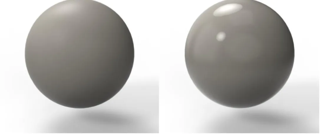
Form option Ball:s (B), is symmetrical and made out of simple spheres. The form is playful and basic with a core of childish exploration.
Figure 3. Curve.
Form option Curve (C), is asymmetrical and made from simple shapes. The form is phallic in inspiration, to try and trigger recognition and maybe intimacy. However, the reaction might be negative which will cause opposite results.
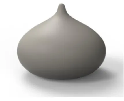
Figure 4. Dumpling.
Form option Dumpling (D), is symmetrical and naturally curved. Inspired by dumplings and onions this form is a soft friendly blob of simplicity with its recognizable organic form.