Outdoor-navigation in public spaces
for the elderly visually impaired
Elias Widqvist
elias.widqvist@gmail.com Interaction Design Bachelor 22.5HP Spring 2019Contact information
Author:
Elias Widqvist
Email: elias.widqvist@gmail.com
Supervisor:
Henrik Svarrer Larsen Senior Lecturer - Design
Email: Henrik.svarrer.larsen@mau.se
Examiner:
Susan Kozel
Professor - Arts and Communication Email: susan.kozel@mau.se
Abstract
The elderly visually impaired is not only a neglected user group within interaction design but also a large one in our society. Within this user group, I discovered that they do not get enough exercise because of their inability to move in public spaces without feeling unsafe. To feel safe, they would have to use both their rollator and their white cane at the same time; an impossibility. This paradoxical issue brings forth design opportunities of both physical artifacts with combined effectiveness of a white cane and a rollator. Also, it includes an exploration with a user-centered design approach on how haptic feedback could help them navigate. Haptics being the suitable alternative for a non-visual interaction. An add-on attached to the existing rollator with sensors and haptic feedback would enhance the feeling safety of an elderly visually impaired and would enable them to move in public spaces to get their exercise.
Keywords: universal design, inclusive design, haptics, visually impaired,
Acknowledgments
I like to thank all the support and encouragement given to me by my supervision Henrik Svarrer Larsen. Feedback during the process of writing and conducting the process has been much appreciated and valuable. I would also like to acknowledge the participants of my workshop, consisting of peers from the Interaction Design program at Malmö University. Mentioning Malmö University, I would also like to thank the locale provided for us during the course to be able to have space in which we have helped each other. This open environment helped us to ask peers smaller questions or opinions on issues we had. Very valuable.
The interviews and observation participants at Synskadades Riksförening Malmö has provided me with the most valuable user research possible and they enabled me to start off this project. Thanks to them.
A last special thanks to Charlotte Magnusson at Certec who not only participated in an interview over lunch at Certec in Lund, but also provided me with relevant text and referred me to earlier projects.
Table of Contents Contact information ... 2 Abstract ... 3 Acknowledgments ... 4 1 Introduction ... 7 1.1 Context ... 7 1.2 Research question ... 7
1.3 Relation to interaction design ... 8
1.4 Limitations ... 8 1.5 Ethical considerations ... 8 1.6 Structure ... 9 2 Background ... 9 2.1 Elderly ... 9 2.1.1 Gerontology ... 9 2.2 Fall prevention ... 11 2.3 Visually Impaired ... 12 2.4 Safety ... 15
2.4.1 Safety and the Rollator ... 15
2.5 Public spaces and exercise ... 16
2.6 Conclusion on background ... 16
3 Theory ... 16
3.1 Usability ... 16
3.2 Universal- and inclusive design ... 17
3.3 Disabilities ... 19
3.4 Critical design ... 20
3.5 Haptics ... 20
3.5.1 Different haptics ... 21
3.6 Navigation ... 22
3.6.1 Navigation in interaction design ... 22
4 Related work ... 23
4.1 HaptiMap ... 23
4.1.1 “PocketNavigator” ... 23
4.1.2 “Joined” and “JuicyBeats” ... 24
4.2 Daniel Innala Ahlmark’s doctoral thesis ... 26
5.1 Double Diamond ... 27
5.2 User-centered design ... 28
5.3 Observations and interviews ... 29
5.4 Workshops ... 30
5.5 Mapping and How-might-we-questions ... 30
5.6 Brainstorming ... 31
5.7 Prototyping ... 31
5.7.1 Buxton and prototyping ... 32
5.7.2 Fidelity, Wizard-of-Oz and Houde & Hill. ... 33
6 Design process and exploration ... 34
6.1 Demographics – who is the user? ... 34
6.1.1 Observation 1 ... 34
6.1.2 Interview 1 ... 35
6.1.3 Observation 2 ... 36
6.1.4 Interview 2 ... 36
6.1.5 Who are they? ... 36
6.2 What do they want? ... 37
6.3 How can it be made? ... 37
6.3.1 Workshop ... 37
6.3.2 Connecting the dots with mapping ... 39
6.4 What could work and why? ... 40
6.4.1 Brainstorming ... 40
6.4.2 Prototyping and its limitations ... 41
6.4.3 Potential look and feel ... 41
6.4.4 Prototyping choices ... 44
7 Discussion ... 45
7.1 Discussion ... 45
7.2 Contribution ... 46
7.3 Critique and future work ... 47
8 Conclusion ... 47 9 References ... 49 Appendix ... 55 1. Consent form ... 55
1 Introduction
This thesis is based on a design project and exploration concerning the visually impaired elderly and their need to feel and be safe when navigating outdoors in public spaces. The design project explores what it means to feel and be safe, how the elderly moves and what non-display technology such as haptics they can use to avoid obstacles as part of fall prevention.
1.1 Context
As our society grows larger and more diverse, we must begin with ourselves to include others with an open mind. There are minorities everywhere that need to be seen and heard, and we as designers need to create including designs for everybody (Danielsson, 2019). This thesis focuses on a larger minority, the elderly, and those elderly with visual impairment. It also focuses on what they need to feel safe as they navigate outdoors in public spaces.
There are currently over 217 million who suffer from severe visual
impairment and 36 million people who are completely blind, which makes it a clear minority but also a large one (Bourne et al., 2017).
There is also the elderly, a group of minorities that grow larger by the decade. In fact, in 2050, the elderly population, 65 and above, will almost have doubled up to 22% of the world population from today’s 12%
(Olshansky & Carnes, 2010). Furthermore, as many as 30% of the elderly community, fall and get injured to such a degree that they need to visit a hospital every year (Campbell et al., 1990; Peel, Kassulke, & McClure, 2002; Tinetti, Speechley, & Ginter, 2010). How can fall prevention for the elderly be a part of an artefact whilst navigating outdoors?
Combine visually impairment and elderly and add the geographical setting of Sweden. Here, 7% of men and 9% of women who are above 65 cannot read a newspaper with or without glasses because of their visual
impairment. Thus, almost one-tenth of our elderly suffer from severe visual impairment and is therefore affected (Socialstyrelsen, 2009).
How can this group of people, the elderlies, who according to The World Health Organization is getting larger every year (Campbell et al., 1990), be included in interaction design and navigation services? How might an interactive artifact support the elderly visually impaired to make them feel safe?
1.2 Research question
“How can the use of non-display feedback help the elderly visually impaired to avoid obstacles and to feel safe when they are physically
1.3 Relation to interaction design
When discussing a topics relation to interaction design, it is safe to say that the smoother the user experience is and the less thought a user has to put into interacting with it, the better. A perfect interaction runs smoothly and without hesitation. The behavior of the user should not be in need of change for the device or product response, it should run smoothly as an everyday task (Norman & Draper, 1986). This thesis focusses on trying to make a solution for a tool for the elderly visually impaired to be able to use smoothly and without a large change in behavior to be able to feel safe in a public space. In this sense, how can a designed solution based on the user experience when interacting with it, be of help and seamlessly incorporated in their everyday life? “By interaction design, we mean designing interactive products to support people in their every-day and working lives.” (Preece, Rogers, & Sharp, 2002, p. 6).
1.4 Limitations
There are two major limitations here, the first being somewhat connected to the ethics. There is no way for me as a designer or non-visually impaired to truly understand how it feels to be as visually impaired to such a degree that it affects my everyday life. I must, therefore, rely very much on the voice of the users when designing, which might or might not affect the solution. Another limitation is the security of the elderly. Since many projects in interaction design and other disciplines depend on prototyping, not being able to do so in a degree that is needed because of safety aspects might limit the solution into the lesser.
1.5 Ethical considerations
The ethical considerations and limitations for this thesis are undoubtedly important since it focuses on the visually impaired. One must be careful not to listen to our own assumptions or hunches on who the user is and what they want, but rather to attentively listen to their voice and what they have to say. Observations and interviews are therefore crucial for the thesis and its connected project. The voice of the user will be held in high regard when it comes to how the situation looks today and might look in the future. However, the conductor of the design process has a designer’s viewpoint not to be overlooked nor diminished when finding solutions.
Participants of the interviews and the observations did so willingly, and all the interviewees signed and read a consent form to make sure that their personal data was kept intact (see appendix 1). Even after signing the consent, the only one mentioned by her actual name is Charlotte Magnusson, the Associate Professor at Lund Tekniska Högskola. Therefore, according to the General Data Protection Regulation, the personal information is kept by Malmö University records of personal data processing. The thesis also follows
the ethical guidelines set by the Swedish Reseach Council (2017). This includes the right to be anonymous for the participants and for the results to be truthful. ( Furthermore, the group of participants in the observations and
raise-your-hands-survey were all asked for permission by the organizer,
Syndskadades Riksförening, before participating.
1.6 Structure
The introduction covers a straightforward summary of the project and why it has been conducted. Following this, is a background explaining the different parts of the project and what background research has been made and why. It works as a base for the design project to stand on and tells the story of what, creating a context. After that, the theory on existing projects and interaction design relation will be presented. Following that, the methodology will be presented and the story of how and why it has been conducted in a certain way. How the double diamond model, user-centered design and field studies worked specifically in this project and what other methods way used to reach the solution. Chapter five goes into detail on how the design process looked and its opportunities, problems, and solutions.
2 Background
To further explain what base this project stands on, the background incorporates all the research that is needed for the project to be understood and be backed. The terms that will be used in the design process and why they are important for the design process are explained below.
2.1 Elderly
The term “elderly” will be used frequently in the thesis and is a term that involves all people above the age of 65, regardless of background or sex. In fact, as many as 12% of the world’s population are elderly people in that regard (Olshansky & Carnes, 2010). When you get to a certain age, your health starts to decrease in not just physically way, but mental too. The difficult part seems to be, to find a consistent linear way to see this decrease in health. Some elderly, showing as good health as any given 40 year-old, and some having trouble to walk or even built sentences as they used to (Olshansky & Carnes, 2010).
2.1.1 Gerontology
A field within science is gerontology and those who practice it hope to understand the process of ageing and what struggles or challenges it might add to their everyday life. They focus to explore all parts about ageing,
including what to expect, how to prepare, and how to handle it. A gerontologist searches for all the answers concerning age, aging and being aged. Its therefore also a field with many disciplines, including biological, social and economic (Little, 2013). Little (2013) writes about social gerontology as “Researchers focus on developing a broad understanding of the experiences of people at specific ages, such as mental and physical well-being, plus age-specific concerns such as the process of dying.”. This is truly a large part of live in general as all with age-anxiety can vouch for and therefor it makes
But the fact that the health of an elderly decreases the older they get is something we all know, even if it differs from person to person. There are however different degrees of elderly-symptoms and even if there is a determined age that includes a person into the elderly category, the motor skills and health, both mental and physical, can differ quite a lot between a person who just turned 65 and one that just turned 85, just as it can for a person being 18 or 38 (Olshansky & Carnes, 2010). When defining sub-groups within elderlies these are often mentioned simply as “young old”, “middle old”, and “very old”. The name for the latter sub-group might also be more commonly known as “oldest-old” or “old-old” (Pirkl, 2013). Claudia Voelcker-Rehage, a gerontologist in the institute of Human Movement Science and Health in Chemnitz University of Technology, made an extensive study on motor skills within these sub-groups of elderlies in 2008 for the European Review of Ageing and Physical Activity (EGREPA) and her study proved some differences to expect between these sub-groups. Especially when it comes to motor skills. In her studies, she also confirmed the largely accepted idea that young adults, 18-31 years, completed tasks faster in all tests across the board of motor skills (Voelcker-Rehage, 2008).
2.1.1.1 The “Young Old”: 65-74
When these groups were termed in 2008, the “young old” was the sub-group within elderlies that were the first wave of the baby boomers. Baby boomers being a sub-group within itself but referring to children being born the first twenty-so years after the second world war when a lot of children was born due to “happier times” and a world-wide feeling of being safe. The “young old” group now is simply people being between the ages of 64 and 74 (Pirkl, 2013; Voelcker-Rehage, 2008). Voelcker-Rehage states in her study that “...such as walking and grasping, or specific skills, such as hammering a nail, pitching a baseball, or driving a car” is in most cases no issue for this sub-group of elderlies. The motor skill is there and most “young old” does not have any issues performing these fundamental tasks that they have been doing all their lives. What begins to happen though, is that many of the “young old” accepts that performing these tasks might not in many cases be as easy as it once was and there for not performing it as fast nor efficient as they ones did. She especially confirms the assumption that “...(60–69 years) required a longer duration to achieve the same sub movement accuracy as
younger adults (18–26 years)”. Meaning that doing two tasks as once that require motor skill is more difficult (Voelcker-Rehage, 2008).
2.1.1.2 The “Middle old”: 74-84
The middle old sub-group, as all the sub-groups of elderlies, in Europe and North America is larger than ever. Mostly because of how societies have learned to take care of both ourselves but also the elderly as a whole. What a middle old person felt and functioned 25 or more years ago is therefore outdated. What we do know, is that the oxygen uptake lowers in between 5-10% each 10-year period from the age of 30, meaning 1% decrease per year if you’re unlucky. According to the study made by Voelcker-Rehage and Physical Activity in Sicknessprevention and Rehab (FYSS in Swedish), the middle old sub-group of people are the most common time to feel this decrease for the first time. Wanting to sit down as often as possible, being tired a lot and really feeling their age has come to stop them from doing the fundamental daily task that they would want to do. This does not seldom create a feeling of non-sufficiency and depression (Frändin & Helbostad, 2016; Voelcker-Rehage, 2008).
2.1.1.3 The “old old”: 84 and above
The lucky few that make it to this sub-group of elderlies are unfortunately most likely to suffer from not only all of the above with lowered oxygen uptake but also a very much lowered muscle capacity, balance and joint mobility. Oftentimes, these elderlies suffer from such low mobility that they are in almost constant need of a wheelchair to move around and not to mention the high risk for dementia and a decrease in their mental state (Frändin & Helbostad, 2016).
Categorizing the elderlies in these three sub-groups are to generalize in some parts even if the odds are often in the generalizations favors. The elderly is a large and very heterogenic group and could differ quite a lot.
2.2 Fall prevention
Fall prevention is a term that is used to categorize the different actions that the society and its elderlies take to make sure fewer and fewer fall and get hurt. As of now, 30% of all elderly fall at least once a year and do so most often because of gait deviations which contributes to falls. That means that they in a sense trip themselves because of neurological signals that move too slow (Snijders, van de Warrenburg, Giladi, & Bloem, 2007).
Falls are more often in the “middle old” sub-group, mostly because of sudden changes in mobility but also, unfortunately, a self-believe that “I have always been able to do this” and non-acceptive about their new limitations. Elederlies part of the “old old” has often learned and accepted their limitations as well as the oxygen uptake is lowered which limites the amount
of movement anyway which lowers the risk of falling (Little, 2013; Snijders et al., 2007; Voelcker-Rehage, 2008).
Most fall preventions rely on planning and understanding how what is dangerous in frequently visited environments. Therefore, most fall preventions are made in the home environment. This could be a simple thing as a non-slippery rug, walker or rollator, handles in the staircase or more complicated things such as a motor driven elevator connect to the staircase or a hanger with a harness in the shower (Lockwood, Taylor, & Harding, 2015).
There is an apparent need for fall prevention since when accident occurs there is no way to say what level of injury it will bring before it happens. Some elderly have weaker bones and, in the cases, where a fall injures the pelvis, the recovery rate is as low as 25%. Which leaves the person immobilized and in need of a wheelchair or in the worst cases even dead (Moylan & Binder, 2007).
2.3 Visually Impaired
A common misconception is that visually impaired is the same thing as being blind (Lenochko, 2012; University of Washington, 2017). Rather the opposite, visually impaired includes everyone that has some kind of impairment of their vision, at any degree. In the United States, they categorize visual impairments into different levels or degrees of it any name those categorizes. These are “Partially sighted”, “low vision”, “legally blind” and “totally blind” and are used by hospitals, schools and other instances in the society to categorize people into different folders (Koestler, 2004). In Sweden, the categories are different and are based on the disease it’s a symptom of.
The most common ones are listed below.
• Diabetes-related (see figure 1). Visual impairment as a symptom of diabetes. This occurs when retinopathy, retinal vascular damage, connected to diabetes. Small areas on the retina are blurred or completely dark for the person who has it (Synskadades Riksförbund, 2016).
Figure 1: An example of visual impairment connected to diabetes. Reprinted from Synskadades Riksförbund, n.d. Retrieved March 29th, 2019, from
http://www.srf.nu/leva-med-synnedsattning/om-synskador/de-vanligaste-ogonsjukdomarna/
• Cataract (see figure 2). The eye lenses get grey and the sight gets worse over time. This is the most common reason for visual impairment for the elderly and can most often be seen by others since the eye looks grey and turbid.
Figure 2: An example of cataract and what the symptoms might look like. Reprinted from Synskadades Riksförbund, n.d. Retrieved March 29th, 2019, from
http://www.srf.nu/leva-med-synnedsattning/om-synskador/de-vanligaste-ogonsjukdomarna/
• Glaucoma (see figure 3). This is a disease that has its symptoms on the optic nerve and develops slowly over time. It’s not visible for others and does not hurt. The vision forms as a kind of tunnel for the person who has it (Synskadades Riksförbund, 2016).
Figure 3: An example of glaucoma and what the symptoms might look like. Reprinted from Synskadades Riksförbund, n.d. Retrieved March 29th, 2019, from
http://www.srf.nu/leva-med-synnedsattning/om-synskador/de-vanligaste-ogonsjukdomarna/
• Macular degeneration (see figure 4). This does not result in complete blindness but can however make the person suffer from visual hallucinations without having a mental illness and typically occurs in older people (Synskadades Riksförbund, 2016).
Figure 4: An example of macular degeneration and what the symptoms might look like. Reprinted from Synskadades Riksförbund, n.d. Retrieved March 29th, 2019, from
http://www.srf.nu/leva-med-synnedsattning/om-synskador/de-vanligaste-ogonsjukdomarna/
• Retinal detachment (see figure 5). Hence the name, this disorder occurs when the retina separates from its original place and moves. The symptoms can be that only have the visual field can be used (Synskadades Riksförbund, 2016).
Figure 5: An example of retinal detachment and what the symptoms might look like. Reprinted from Synskadades Riksförbund, n.d. Retrieved March 29th, 2019, from
http://www.srf.nu/leva-med-synnedsattning/om-synskador/de-vanligaste-ogonsjukdomarna/
The design project does not narrow down on any of these visual impairments specifically. However, with that being said, the symptoms of cataract will be the ones to be worked most against since it occurs most often to the elderly and is the most common visual impairment (Synskadades Riksförbund, 2016; University of Washington, 2017).
2.4 Safety
Feeling safe or being safe? Can it be dangerous to feel safe? The only aspect
of the word safe that can be completely true is the feeling of being safe. There is no way to actually be safe in any environment at any time. There can be sickness, there can be an accident around the corner, or some might do you harm. The state of feeling safe however can be true and is a cornerstone in our well-being. It enables us, as humans, to be able to sleep, eat and any many aspects simply relax. Even if we know that our house might explode while we’re asleep, since the laws of physics allow it, we feel safe because of the probability that it won’t. We need to feel safe in the environments and spaces we navigate and move through for the sake of our well-being (Campbell et al., 1990).
2.4.1 Safety and the Rollator
As previously mentioned, the importance of feeling safe is one of the crucial fundamental things of functioning as well-beings (Campbell et al., 1990; Olshansky & Carnes, 2010; Tinetti et al., 2010). It allows us to function with eating, sleeping and moving about. For an elderly in Sweden, to be able to feel safe, many use a rollator as fall prevention. It almost works as an extension of themselves and they trust it with their lives. It gives support when walking, sitting, carrying and since its wide use in Sweden, the elderlies hold it in high regard. Some to that extent that it never leaves their sight and feel that their rollator is special and cannot use anyone else’s (Socialstyrelsen, 2009).
2.5 Public spaces and exercise
Public spaces are generally all spaces that can be accessed by the public. In one aspect, these include streets, squares, and parks, but on the other hand, one can argue that malls, shops and buses also could be counted as such. They vital for any town, city or village to work as a society and for the people living in them to feel free (TED, 2014). Public spaces do not only work as paths of transportations or as help for navigation, but they also work as a way of exercise; parks especially. However, for the elderly and the visually impaired, a walk in the park might in fact not be a walk in the park, because of safety aspects. Furthermore, concerning exercise, it proved that the majority of both the elderly and the visually impaired get less exercise than needed. The main reason for this is, in both instances, because of the fear of getting hurt in public spaces (Campbell et al., 2005; Capella-McDonnall, 2019; C.Magnusson, personal communication, March 6th, 2019). Not to overlook, many elderlies are visually impaired and are therefore included in both these groups.
2.6 Conclusion on background
What should be taken into account concerning the sub-groups of elderlies in relation to visual impairment are because of their visually impairment, the ways of everyday life of a “young old” might more reflect the “middle old”. Concerning how difficult it might already be for a “young old” to navigate and move around in public spaces, adding visual impairment to this does not make it easier. Even if the “middle old” is the sub-group of elderlies where people most often start using a Rollator, an assumption can be made that many of the “young old” visually impaired use one too because the need to feel and be safe.
3 Theory
3.1 Usability
Determining if a design is good or bad is largely to do with how its usability is experienced. It is widely used as a way of validating that the interactive product is easy to learn, effective to use, and enjoyable from the user’s perspective (Preece et al., 2002). Because of this, it can be broken down to
effectiveness, efficiency, learnability and memorability with the latter
meaning that the user seamlessly remembers how to interact with it the next time of use. The effectiveness of a design is making sure it is simply doing what it should; what it is supposed to be doing. Efficiency refers to if the design is doing what it should (effectiveness) in a reasonable amount of time, interactions or steps. Within efficiency is also the importance of safety and
utility, as a combination of effectiveness and efficiency. Learnability
meaning simply if it is easy to learn and if the learning phase makes sense. People tend not to want to spend time on learning an app or a system. It has to be easy to use to have high usability (Norman & Draper, 1986; Preece et al., 2002).
Concerning this thesis, the usability has high value, especially since the user group, in this case, are the elderly whom possibly not are as comfortable in the digital and technological spaces as young users (Anna, personal communication, March 5th, 2019; Charlotte Magnusson, personal communication, March 6th).
While these are the criteria for a design to have high usability, mentioned above, there is also a way of validating that it follows the criteria. To validate and test the usability of a design, Abras, C., Maloney-Krichmar, D., & Preece who wrote a section about User-centered design in Encyclopedia of Human-Computer Interaction (2004) refers to a table of purpose made by Dumas & Redish (1999). Usability testing aims to achieve the following:
“• improve the product’s usability • involve real users in the testing • give the users real tasks to accomplish
• enable testers to observe and record the actions of the participants
• enable testers analyze the data obtained and make changes accordingly” (Abras, C., Maloney-Krichmar, D., & Preece, 2004).
Therefore, the goal of a usability test and the goal of prototyping are often not different, sometimes even exactly the same, usability testing could very likely be prototyping.
3.2 Universal- and inclusive design
The “Seven Principals of Universal design” where initiated by a team of designers across the field of principles and lead by Roland Mace. Together their ideas of “design for all” sparked this initiative to make sure that as many users as possible where to be able to use the end product. A grand gesture that not only was to make sure that a design could be used by many, but also that it could be flexible and used differently to fit the need of different people. It connects to usability, in its ways of simple and intuitive designs but also because of them both striving towards a design that the user can use for longer periods of time with the least possible amount of physical effort (Stephanidis, Akoumianakis, & Savidis, 2001). Universal design can also be seen as a political stance on design. Below (see figure 6 and 7) are two examples of political posters highlighting the need for more universal design in public spaces made by the Hong Kong Physically Handicapped and Able-bodied (PHAB) Association.
Figure 6. Two examples of pollical posters addressing universal design. Reprinted from Hong Kong PHAB Associsation, n.d. Retrieved October 18th, from
http://www.hkphab.org.hk/en/about-phab/whats-new
Images like these does not only tell an everyday life story for many disabled and impaired, but also takes a stance on their inclusion. Universal design can be seen as a new, politically correct, term that is more talk than action to start a conversation on how to include everyone when designing or it can be held in high regard as a meaningful topic for every designer to discuss when designing for the large public. The principals of universal design is most noble, and it opens up discussions towards how one product can be used by many and not limit it to the non-disabled majority for example (Interaction Design Foundation, n.d.; Stephanidis et al., 2001).
It can be argued that inclusive design is a design principle-cousin, if you will, to universal design. They include the same main principles and strive for the same goal of giving “all people equal opportunities to participate in modern society” (Moriera da Silva & Almedara, p.606, 2007). Inclusive design also has set key-points to consider while designing to ensure a broader spectrum of users. It is about designing for the needs of people with disabilities. These disabilities may vary, as the often do, but the main objective while conducting inclusive design is to be just that, include (Moriera da Silva & Almedara, 2007). To draw a difference between Universal Design and its similar cousin, Inclusive Design, the latter one has two central concerns to take note of. Their goal is not simply to design for all but also to look at the current state of designs in a critical way. Practitioners of inclusive design wants to shine a light on first the demographic changes, meaning the fact that the population is getting older (also mentioned in section 2.1.1). Secondly, inclusive design wants to design for all but do so with sustainability in mind and trying to find
a better management of the natural resources without a loss of quality in human living (Moriera da Silva & Almedara, 2007). With that being said, connections between inclusive design and usability are frequently draw since a design with high usability covers many of the areas that inclusive design does, and the result is often that products of inclusive design are looked on as tools to complete task and has nothing pleasurable about them. To avoid this, Moriera da Silva and Almedara states that:
“When designing inclusively, designers need to look beyond usability at other factors that can affect the relationship between person and product. This one can obtain by designing satisfactory products, which are socially accepted products and pleasurable products.” (Moriera da Silva & Almedara,
2007, p.607).
This meaning that usability is to be held in high regard but seeing emotional responses that can be linked to products as very important. Thus, to understand users and their needs look for the link between qualities of a product and emotions to truly see which combinations work (Moriera da Silva & Almedara, 2007).
3.3 Disabilities
Describing disabilities is often done by two different measures; the social and the medical model (University of Leicester, 2015). In the medical approach, people tend to see a disability as something that is up to the concerned individual. Making them responsible to “catch on”, with the non-disabled. It is seen as a harder approach against the disabled but also sets an individual approach to it, making sure that the disabled individual is treated as someone who can take care of themselves, rather than needing a “babysitter” to help them all the time. This approach can be, on one hand seem like it is not inclusive nor helpful to the disabled individual, but on the other hand it is a way to not treat a disabled like a child. Since the disabilities and the impairments differ in such a large degree it is difficult to say that the medical model is the wrong way of view it as the social model is more humanizing, it can also undermine the person in question (University of Leicester, 2015). The social model is the including point of view, which rather aims to give the disabled the same chance and opportunities and non-disabled would. This point of view sees the obstructions or challenges of the disabled person might face and helps to include them.
The University of Leicester posted two fitting examples of both to make the difference clearer.
“An example of a medical model is a course leader who refuses to produce a hand-out in a larger font for a visually impaired student. The student cannot therefore participate in the class discussion.” (University of Leicester, 2015).
“An example a course leader who meets with a visually impaired member of the group before the beginning of a course to find out how hand-outs can be adapted so that the student can read them.” (University of Leicester, 2015). Even if I have some understanding of the argument of the medial model and their take of the social model as inequal to other students in this case and undermining to the disabled to not to be able to do it themselves, I find it difficult to agree of the model at large. The latter seeming more humane and including also makes it clear for this thesis to stand on a social model of disability, asking the disabled how it can help rather than not to. Making the design inclusive and according to the social model.
3.4 Critical design
Designers and philosophers Anthony Dunne and Fiona Raby coined the term
Critical Design in the 1990s to use as a way of redesigning and criticizing
current designs. Standing on that ground, they believed that critical design could be used as a way of distancing themselves from commercial design. They believed that commercial design, which might benefit users, most often is design that we as people accepted and had zero criticism towards (Koskinen, Zimmerman, Binder, Redstrom, & Wensveen, 2013). The aim of critical design “was to help people discover their true interests rather than accept things in shops as such” (Koskinen et al., 2013, p. 90).
Critical design is also seen as political aspect of design and it is not far from ideas of design that that Moriera da Silva and Almedara (2007) draws to Inclusive design, where they argue that a critical take on the commercially and widely accepted might help to include users and streamline products.
3.5 Haptics
Haptic technology is something many of us use every day; mostly on our smartphones. Every vibration is a kind of haptic feedback made by a small motor inside the smartphone. Haptic is often, therefore, called a way to communicate feedback through the sense of touch (Ahlmark, 2016; Jerald, 2015; Sjöström, 2002). The haptic technology can also recreate and mimic the feeling of touch by vibrating and forcing a certain way. Haptic communication, on the other hand, is communication we have with others that is not verbal. Since it is possible to mimic touch, many technologies choose to use haptics as a way for us to feel touch. Haptic feedback can be used as a supplement for communicating information, when sound or vision is not needed or available (Magnusson et al., 2009; Yu, Ramloll, & Brewster, 2001). Haptic technology has a long history in technology and design. It was made largely available in many people’s every-day lives when Apple, in 2015, introduced something they called a “taptic engine” in their MacBook. It was later introduced in iPhones and is not used it the majority of their products. This engine is not only a motor that communicates vibrations, it is also mimicking a button. Pressing the trackpad of a MacBook feels as if it is one
large button, mimicking a clicking sound and a small vibration mimicking a button click. However, it is simply a flat surface, retracting a small amount when pressing to mimic the sensation of a button, which can be proved when the computer is turned off (Apple Inc, 2019; Wuerthele, 2016). Largely because of users have either a “taptic engine” or any haptic technology in their devices, users expect to get feedback through touch; even when interacting with a display (Karlberg, 2016; Purwar & Kampara, 2019).
3.5.1 Different haptics
Jason Jerald wrote a book in 2015 which revolves around Virtual Reality and the need for further understanding the need of great haptic interaction while navigating within a virtual environment (Jerald, 2015). He explains that the six different way of communicating through haptic feedback to be “passive (static physical objects) or active (physical feedback controlled by the computer), tactile (through skin) or proprioceptive force (through joints/muscles), and self-grounded (worn) or world-grounded (attached to real world)” (Jerald, 2015, p.36-37). This thesis will focus mostly around the active haptics for its way of signaling or communicating rather than the passive way of mimicking touch. Active feedback through haptic is controlled by a computer and is also, therefore, the most common and used way of haptic feedback (Jerald, 2015). Since active feedback is controlled through a computer, it can have a dynamic range of forces. The benefit of this is that the feedback could be controlled in how powerful, how long or in what pattern the feedback would be sent to the user (Jerald, 2015). When Calle Sjöstörm conducted his doctoral thesis on non-visual haptic interfaces in 2002, he created guidelines on how to think and act when designing haptics in interaction design (Sjöström, 2002).
“The guidelines should be particularly useful for three purposes:
1. To come up with an initial design that is as good (usable, efficient, learnable, user acceptable, etc.) as possible
2. For the heuristic evaluation of an existing design
3. To facilitate users investigating haptic interfaces and to empower them in providing feedback from their experiences.” (Sjöström, 2002, p. 77) This guideline, although seventeen years old, is being used by many interaction designers including those working at Certec in Lund. Certec being a part of the intuition of design science at Lund Tekniska Högskola where all projects focus on methods and technology to design for and with users with disabilities, it is easy to connect them to design projects for the visually impaired (Lund Tekniska Högskola, 2017).
Even if the part about navigation in Sjöström’s (2002) guidelines and Jerald’s (2015) mostly focuses mostly on navigating in digital environments, some of the pointers can be connected to physically navigation in public spaces. Sjöström (2002) stresses that the need for an easily understood reference
system that does not change but it recognizable at all times and clear reference points matters mostly for a user to fully being able to use a navigation system based of haptics seamlessly and smoothly. If the user knows what a specific haptic feedback means and does so without hesitation, the interaction with it will run better. Better in the aspect of if being usable, learnable and efficient (Sjöström, 2002).
3.6 Navigation
The word navigation has different meanings depending on the context and space it is spoken about. To be specific, the word means to be able to control and monitor the movement of a vehicle from one place to another. But the broader, and more common use of the word means to be able to determine one’s location and to know which direction certain things are (Hofmann-Wellenhof, Legat, & Wieser, 2007). On one hand, navigation can mean using a map to get to places on the other side of the world such as a circumnavigation, but on the other hand, it can also mean to navigate within an app when using it. There are a lot of spaces in between the size of the world and the digital spaces. The navigation we use most commonly outdoors is our sense of direction. We know our way to our homes, jobs, school and friends. We know that space and navigate it seamlessly. In those cases, the navigation is most often just A-to-B navigation that we manage to complete without the help of any tools, digital or analoge. What most people us use to find our way in our most common spaces, and does so while feeling safe, are memory, sight, and our mobility. All three of which the functionality decreases yearly in the elderly (Bourne et al., 2017; Olshansky & Carnes, 2010).
3.6.1 Navigation in interaction design
Outdoor navigation in combination with interaction design is a large part of our everyday lives. Services such as inbuilt Maps on our iPhones or Google Maps are easier and more efficient than ever to use. They are easy to learn and work with great accuracy. Fewer people struggle to use it, and since the coverage of GPS signal to determine one’s location is getting more accurate, it is safe to say that there will be a continuous need for navigation (Ahlmark, 2016; eeDesignIt, 2016). With the general usability of interactive maps on smartphones becoming better and better in the sense that people use them seamlessly, there is a need for designers to create the same usability for visually impaired as well.
Using Sjöström’s guidelines (see section 3.1.1) and with the purpose to make geospatial information more accessible for everyone and not simply for the screen users, a new project was started initiated called “HaptiMap” (Magnusson et al., 2009).
4 Related work
4.1 HaptiMap
Looking at previous projects and products concerning navigation for the visually impaired, we find this extensive project called “HaptiMap” involving several smaller projects. This project was initiated by Certec at Lund’s Tekniska Högskola and was a project active between 2008 and 2012. It was a project aimed at making maps and location-based services more accessible by using several senses like touch, hearing and vision (User, 2008; C. Magnusson, personal communication, March 6th, 2019). It received financial support by the European Commission in the Seventh Framework Programme which involved 392 users and 27 developers. To summarize the project, it developed a software toolkit that other developers could use to design navigation services in which haptics and non-display, such as sound and touch, feedback was in focus. To give and overview, the researches behind “HaptiMap” Charlotte Magnusson, has uploaded a video on YouTube showing some of the projects that came out of the larger HaptiMap projects (Centre for Occupational & Health Psychology, 2012).
The projects that received best the feedback, in terms of usability, were according to Charlotte Magnusson (personal communication, March 6th, 2019) the ones that focused on distinct haptic feedback. The difference would be that those projects that had combinations of vibrations of haptic feedback to tell the user where to move were more difficult to understand and more difficult for the user to remember.
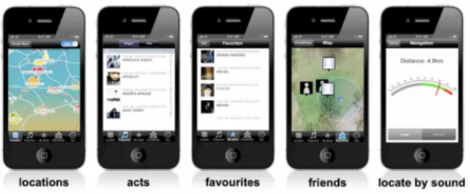
4.1.1 “PocketNavigator”
“PocketNavigator”, is a navigation system specified for pedestrians, that focuses on the strengths of using non audio-visual interactions as feedback. Using the PocketNavigator, working similar to a compass, users would
Figure 7. How the patterns of the PocketNavigator are structured (Pielot et al., 2010).
receive feedback from their smartphone, whilst having it in their pocket. On their devices, they would have previously added their destination to have the smartphone use built-in maps to navigate through the public spaces. Whilst walking, running or biking, the smartphone sends out patterns of haptics. Two haptic vibrations followed each other in a pattern, a longer vibration followed by a short if they were to turn left and another similar pattern if the user were to turn right (see figure 7).
A tactile compass the creators Martin Pielot, Benjamin Poppinga and Susanne Boll calls it. Connecting PocketNavigator to usability, it is safe to say that in terms of learnability the PocketNavigator had some issues and struggles. These patterns, users said, where too complex and similar for the user to have a seamless experience. The different patterns meaning hard or soft right are almost identical, making it difficult to notice a difference (see figure 7) of patterns of haptic being sent out and focusing on remembering what the pattern meant. The creators points our in the conclusion of their project that when users truly remembers and understands the patterns being sent out, it quite effectively can be used to navigate from A to B giving it a high effectiveness even if the efficency and learnabillity in usabillity is notably low (see section 3.1) (Pielot, Poppinga, & Boll, 2010).
4.1.2 “Joined” and “JuicyBeats”
The projects “Joined” and “JuicyBeats”, also part of the HaptiMap initiative, where apps which were more focused on the ease of using them, granting them high learnability when it comes to usability. The interactions of these systems were simply to point the device or smartphone towards a set destination or person and then receiving haptic feedback if the devices (and user) was on the correct route. It is because of their many similarities that they have been connected under the same sub-title.
4.1.2.1 Joined
Joined, with a now seemingly dated graphical user interface (see figure 8 and 10), was an early adapter on sharing your location with friends and worked in the same way as one of the largest social media apps, Snapchat, does now in 2019 (see figure 9). The user allows for their location to be sent to a database and the friends of this user can see their position in the app.
Figure 8. Joined friend map. Accessed on October 18th, 2019. Reprinted from http://joined.geomobile.de/features.htm#2
Figure 9. An example of how todays Snapchat Maps looks where friends can see each other’s positions. Accessed on October 18th, 2019. Reprinted from
https://www.telegraph.co.uk/technology/0/snapchat-map-do-use-safe-children/
Except for this feature which in an effective and efficient way enabled users to access their friends’ locations, it was highly easy to learn. Simply adding a friend or a location in the app would help navigating to the destination with in-built haptics that would only give feedback if the device was pointed in the correct direction (see figure 10) . Making it very easy to use and high
learnability, effectiveness and efficiency (C. Magnusson, personal
communication, March 6th, 2019) .
Figure 10. Joined navigation interface. Accessed on October 18th, 2019. Reprinted from
4.1.2.2 JuicyBeats
JuicyBeats was made especially for a German music festival with the same name and was used there for three consecutive years. It draws many similarities to Joined and has the same kind of maps with friends’ locations. JuicyBeats also has a navigation system, based on haptic feedback as directions but doesn’t use the GPS-system a a way of location. Interstingly, they used sound and the in-built microphone to establish position before sending this out to the database and onward to the added friends. As seen on figure 11, many features and functions work similar on the two except for the way the locate and position the devices.
Figure 11. Example of JuicyBeats’ interface. Accessed on October 18th, 2019. Reprinted from
https://www.facebook.com/GeoMobileGmbH/videos/410731112314224/
In terms of usability, the three different HaptiMap projects all proved valuable information for this this and its project. The importance of
learnability for users to have a true understanding on how to use the product
in the most efficient way. Easy-to-read haptic feedback proved to be the main focus for a non-display haptic navigation to work. Since walking, running or biking is the main task, receiving and reading the haptic feedback is the secondary making it important to not over-complicating it and to use distinctive haptic feedback (C. Magnusson, personal communication, March 6th, 2019).
4.2 Daniel Innala Ahlmark’s doctoral thesis
In just over three years ago, in 2016, Daniel Innala Ahlmark wrote his doctoral thesis for the University of Luleå on a highly related subject. The title for the thesis was “Haptic Navigation for the Visually Impaired” and shares many touchpoints with this thesis. In his thesis he further proved the assumptions on exercise, visually impairment and mobility. He touches on the dangers of not being able to move in public spaces independently and that this in many times leads to isolation. One of the more important factors of feeling safe is to be aware of one’s surroundings, something a non-visually impaired person is much because of our sight. His evaluation includes tests and prototypes of smart canes, similar to a white cane, but with the use of feedback. Having a younger user group, without the need of a rollator as fall prevention, he, just as HaptiMap, proved that a higher usability is achieved
if the haptics are simpler and easier to understand since the task of reading the haptic feedback is done as a secondary task while navigating (Ahlmark, 2016). As seen in figure 12, the LaserNavigator is an innovative product designed on inclusive design principles. Also, many of the findings can be drawn to this thesis, which are mentioned above, even if the actual device cannot be used by the users in this thesis because of limitations of movability connected of their age.
Figure 12. A picture of the latest version of the LaserNavigator, a smart cane tested by Innala Ahlmark. Reprinted from Innala Ahlmark’s thesis “Haptic Navigation for the Visually Impaired” from 2016.
5 Methodology
This chapter of the thesis will go through different design methods connected to interaction design and used by interaction designers. This part of the thesis will further explain how the design process was carried out and what methods were used to reach the result.
5.1 Double Diamond
The double diamond is an approach to a design process and is not seldom used when designing for or with the user. It was presented by the British Design Council in 2007 and was introduced when they saw that “Designers across disciplines share strikingly similar approaches to the creative process” (The British Design Council, 2007). It is many times used by interaction designers and works as a map to get an overview of what’s left to come and where the designer is currently situated in the design process. Many designers, interaction designers included, divide their work into four parts that work as parts of the double diamond. These are, by the British Design Council labeled as discover, define, develop and deliver (The British Design
Council, 2007). Discover is the first part and when the designer gets an understanding of the topic and gathers insights from users and background research. The next part, define, is when the same designer takes those insights further to define what possibilities or problems they encountered. After that, having the design challenge, one moves into the develop phase where the designer conceptualizes to prototype and iterate. Having done this, one moves into the delivery. When all is created, tested and backed up by user research, a solution is finalized or presented to show how it could be made and why.
The following project will be based on this structure as it follows its main points and turns and might go in circles at some points. However, the project is in need of a bit of distancing itself from the double diamond. Much because it was chosen not to be a slave towards the diamond because of its possible restrains. It will, however, use it as a map to sometimes lean on to make sure nothing is missed nor overdone.
5.2 User-centered design
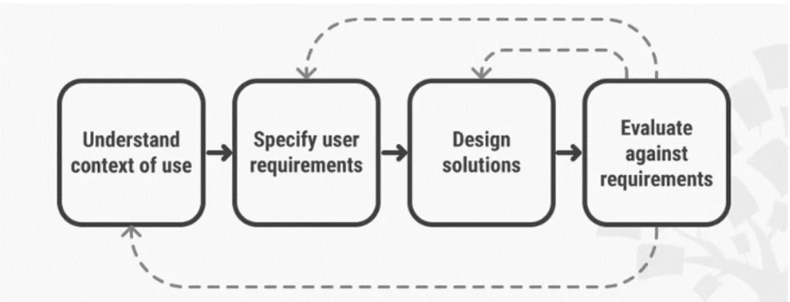
In user-centered design, the designer chooses to include the user in the design process and acknowledges that the voice of the user weighs heavy for a project or design to work and be liked by the user. In this sense, user-centered design is often based on the problems or design opportunities that the user expresses rather than the fact that a company is in need of revenue. It is also important that the designer listens to and actively uses the voice of the user in all stages in a design process. A user-centered design process (see figure 6) can be connected to a double diamond process as the different stages look and work almost the same way. However, the stages in user-centered design make sure that the user is included in all of the steps, but when comparing the two, they have many similarities (Abras, C., Maloney-Krichmar, D., & Preece, 2004).
User-centered design was first introduced by Norman in the 1980s and is something widely used and accepted by many designers (Abras, C., Maloney-Krichmar, D., & Preece, 2004). It was introduced in the book User-Centered System Design: New Perspectives on Human-Computer Interaction (Norman & Draper, 1986) and the term was used to describe a certain way of designing. When doing user-centered design and because of its early use of user input, the user is able to use the product as its indented use but it also makes sure that the user learns how to use it with minimal effort (Abras, C., Maloney-Krichmar, D., & Preece, 2004).
With this workflow, the voice of the user is maintained to be held in high regard, and the work is situated around and for the user. This is a big part of the interaction design-DNA since the user experience and the user need is what create great interactions. However, pointing this out, the designer is still the designer and the user is still the user, meaning that even if the voice of the user is held in very high regard, the designer has the final say. The designer will therefore also, of course, give pointers and share I sights to the users to open them up for potential innovative solutions rather than getting stuck in an old pattern. The design process is user-centered, not user-conducted.
5.3 Observations and interviews
When conducting user-centered interaction design, it is crucial to establish a need and a voice of the user. To do so, the designer must have a way of doing so. How does an interaction designer hear a voice in the correct way? How is the actual problem or design opportunity established? The user might not even know they are facing difficulties within the area and therefore a way of actually picking those up, the designer can conduct observations in the environment that the user is most often occupied. Doing observations helps the designer to realize the problem and to see how the user interacts and acts in certain situations. This is not seldom called field visits and are basically what they sound like; to observe a user in their natural habitat the designer makes a field visit and to observe the user whilst they are completing everyday tasks to find out if they have a problem doing so and if there might be a design opportunity (Goodman, Kuniavsky, & Moed, 2012). The designer finds a how, a what and a why. Most often, observations are being used in the beginning of a design process to establish these points, but when doing user-centered design, the user might be included in all stages and so does observations. Except for giving the designer concrete details of actual use, observations during field visits also gives the designer knowledge about hidden understandings amongst the users and it challenges the assumptions of the designer. All of these things simply make the designer understand the actual
Figure 13: An example of a work-flow of a user-centered design process. Reprinted from The Interaction Design Foundation, n.d. Retrieved April 22nd, 2019, from
situation of use and include users to show their story (Abras, C., Maloney-Krichmar, D., & Preece, 2004; Goodman et al., 2012)
Interviews are sometimes part of the observations, to have the user reflect and to further understand their needs and who they are. But since interviews are used to ask the user what their situation look like, they fit in different stages of a design process. Interviews are being used in different ways and in the beginning of a design process when the designer trying to get a broad sense of the topic and the user, interviews are based on broad questions of use, daily activities and to try out assumptions. The interviewer must assure that the questions are broad to receive qualitative data rather than to ask yes or no quantitative data (Goodman et al., 2012).
5.4 Workshops
It could be argued that workshops are a kind of sibling to the observations and interviews. Mostly because observations are a big part of workshops and because they can have the same goal of outcome. Workshops are often used at a bit later stage than observations and includes users to get their ideas and their reflections of what could be a possible solution to the problem established earlier in the project. Workshops are built with several users, often from the same user group and with one or several conductors observing and pushing the users to think outside the box and to create a clear path ahead (Goodman et al., 2012). The helpful part about this could be argued to be that the users voice is being heard in full, and their potential solutions will be pushed forward. But in reality, the designer must take caution not to rely on the user’s design ideas to much and also weigh in their own view as designers into the process.
5.5 Mapping and How-might-we-questions
Mapping could be used to visually create a map of which relationships exist between different things. These things can be objects, users, spaces or say design opportunities. What is mapped matters less than why it is used; to create a map between the relationships to acknowledge the similarities and differences between them (Goodman et al., 2012). In design, mapping is often used to combine insights found by user research in the form of opportunities or problems with current or previous solutions of the matter. When doing this, one often finds out where to explore new grounds. When insights from users and its opportunities and openings does not get mapped together with a current solution, there is a new opening for design (Goodman et al., 2012). This is not seldom done with a whiteboard and post-it’s to get a clear view of what goes with what. Ending the mapping, there should be at least a couple of How-might-we-questions that pop up. How might we do X for this user group (Dam & Siang, 2017; Project Fellows, 2017).
5.6 Brainstorming
For the designer to get into ideation and actual potential solutions to the specified topic, brainstorming sessions are conducted based on the
How-might-we-questions. To make sure that it does not end up being a chit
chat-session where participants simply add ideas onto a clean slate, it often benefits from having some rules applied (Dam & Siang, 2018). Brainstorming sessions often, and also in this project, make sure to develop an open-minded forum for the participants without critique and censuring (Goodman et al., 2012). Participants get their say and participants ideas all get “thrown” in the pot of ideas. The use of pens, post-it’s, whiteboards or large papers often get the mind flowing when ideating together. Using these tools are the widely known way of brainstorming. However, if brainstorming with users when conducting workshops in user-centered design, these tools might need to be switched out to suit the audience. In the case of brainstorming with visually impaired users, post it’s should not be considered the best methods as much of the point of the post it’s being to be able to filter and map all the ideas on the board in a quick manner. Visually impaired participants of this brainstorming session might not benefit nor be able to participate in the degree needed to push the ideas forward. In those cases, the best way to involve and include the participants needs adaption for those specific cases. During a brainstorming session, after everyone has gotten their ideas out, most often based on previous experiences, knowledge of previous solutions or simply their creativity the sessions end up with many ideas of different value. Because of the open forum and the non-criticizing environment, a positive cycle is created. “The cycle is often interrupted by a great idea, triggered by another element in the process.”(Moggridge, 2007, p. 733). Ideally, a good idea will show itself and create a pause in the brainstorming. The participants start to ideate only on that idea to move it further. If this happens too early in the session, the risk is that other great ideas are missed. In these cases, a restart of the brainstorming is a good idea. An idea, good enough to pause the brainstorming, that emerges later in the session is only positive since that’s the goal of the process itself (Moggridge, 2007). If no consensus can be reached by the participants on which ideas are good, they have to decide together. Voting or simply deciding on which could work in reality considering technological limitations, economical limitations and ethical limitations, the participants end up with at least one idea to move forward with (Dam & Siang, 2018; Goodman et al., 2012).
5.7 Prototyping
Prototyping is a widely known, used and accepted way of getting input from users in quite a few design disciplines, interaction design included (Houde & Hill, 1997). The designer produces a limited version of a thought-out solution to give to the user or testers to gather information about usage. It could involve anything from what way does the user hold the artifact to actual
verbal response on what the like or dislike about it. Its arguably useful to prototype in all kinds of stages of a design process, to gather input from users, but most commonly it’s used in the later stages.
5.7.1 Buxton and prototyping
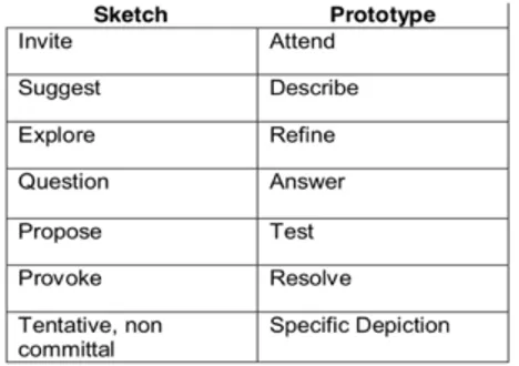
Widely acknowledged designer William Buxton often refers to prototyping and sketching in his book Sketching the User Experience (2007) and, in his view, they differ quite a lot. Sketching is not only sketching on paper with pen, but sketching is showing, proposing or exploring (Buxton, 2007). In his book (Buxton, 2oo7), he has made a famous table to show the difference between them (see figure 7). In his view, the main difference is the intended purpose of doing them. Why does the designer do this? Is it to create something? To provoke? Or to question something? Then it is sketching. If it is created to test or refine, it is prototyping.
However, I find it difficult to draw such conclusions. With that being said, I am aware of what regard Buxton’s voice is being held in interaction design and do not intend to diminish it. However, what I am pointing out is that most often, the intent as Buxton calls it, is not always known nor written in stone before showing of a sketch or prototype for a user. One might simply want to both explore and describe at the same time. One might come to the user with the intent to propose but leaves with answers and refined iterations. I realize however that at those times when the purpose for prototyping is clear, the result is more likely to be valuable rather than the opposite. As Houde & Hill (2010) puts it: “With a clear purpose for each prototype, we can better use prototypes to think and communicate about design.” (Houde & Hill, 2010, p.15).
Buxton also promotes “sketching” throughout the whole design process, which makes Lim, Stolterman and Teneberg’s (2007) way of seeing it a bit less complicated. They call for a new way of seeing prototyping and want designers to see “prototypes as tools for traversing a design space where all possible design alternatives and their rationales can be explored” (Lim et al., 2007, p. 2). Designers could use prototyping as a tool of exploration, regardless of what they want to find out, be it a solution or user need.
Figure 14: Buxton’s table of what differs sketching from prototyping based on intent of the creation. Reprinted from: