Full Terms & Conditions of access and use can be found at
https://www.tandfonline.com/action/journalInformation?journalCode=skon20
ISSN: (Print) (Online) Journal homepage: https://www.tandfonline.com/loi/skon20
Reframing the Concept of Illustration: Image, Text,
and the Double Difference of Reproductive Media
Sonya Petersson
To cite this article: Sonya Petersson (2020) Reframing the Concept of Illustration: Image, Text,
and the Double Difference of Reproductive Media, Konsthistorisk tidskrift/Journal of Art History, 89:4, 273-292, DOI: 10.1080/00233609.2020.1823470
To link to this article: https://doi.org/10.1080/00233609.2020.1823470
© 2020 The Author(s). Published by Informa UK Limited, trading as Taylor & Francis Group
Published online: 21 Sep 2020.
Submit your article to this journal
Article views: 356
View related articles
and the Double Difference of Reproductive Media
Sonya Petersson *
Introduction
When the French nineteenth-century steel print, Aimé de Lemud’s Beethoven (), was used as an illustration in Stephen Bann’s art-historical study on nineteenth-century pic-torial prints, Distinguished Images (), it was both inserted in an argument scrutinising the status of graphic art in nineteenth-century art criticism and transmitted as a digital photograph just below a chapter heading high-lighting the nineteenth-century question‘[i]s lithography art?’Lemud’s steel print was like-wise reproduced in xylography (wood engrav-ing) in the Swedish nineteenth-century literary review Vår tid (–, Our Time), as a cap-tioned vignette to one of the editor’s poems. In other words, the image appeared not only in close physical interrelation to different textual elements such as headings, captions, and art-historical and poetic contents, but also in different media of reproduction, be it nineteenth-century xylography or twenty-first-century digital photography.
Digital photography and xylography are both technical prerequisites for the image’s insertion into new texts and cause changes in
its material appearance. The steel print, the digital photograph, and the xylographic print expose different sizes, diverging pictorial details, and dissimilar surfaces. For these reasons, the basic premise of the present article is to investigate the medium of repro-duction as the very opposite of a transparent transmitter of content. Rather, the medium of reproduction is examined for its particular medial and semiotic implications for the type of pictures commonly called illustrations.
More precisely, this study aims to pursue the question of what an illustration is in medial and semiotic terms by intertwining the following three objectives. The first is to nuance the broadly accepted view of illus-tration as a picture juxtaposed to an adjoining text and therefore constituting a bimedial, textual and pictorial, object of study. Instead, this study investigates image and text from the point of view of the medium of reproduc-tion. The second objective is to employ actual illustrations to bear on– i.e. challenge, devel-ope, complicate, and discard as well as accom-modate – the historiographically established concepts that name and describe them as
© The Author(s). Published by Informa UK Limited, trading as Taylor & Francis Group
This is an Open Access article distributed under the terms of the Creative Commons Attribution-NonCommercial-NoDerivatives License (http://creativecommons.org/licenses/by-nc-nd/./), which permits non-commercial re-use, distribution, and reproduction in any medium, provided the original work is properly cited, and is not altered, transformed, or built upon in any way.
ISSN 0023-3609 K O N S T H I S T O R I S K T I D S K R I F T / J O U R N A L O F A R T H I S T O R Y 2 0 2 0 V o l . 8 9 , N o . 4 , 2 7 3– 2 9 2 , h t t p s : / / d o i . o r g / 1 0 . 1 0 8 0 / 0 0 2 3 3 6 0 9 . 2 0 2 0 . 1 8 2 3 4 7 0
media objects in the first place, most impor-tantly ‘illustration’.These concepts are com-parable to the headings, captions, and textual contents mentioned above, in the sense of being juxtaposed ‘texts’ that take part in the medial and semiotic processes all illustrations are involved in. There is a simple reason to why the language about the illustrations’ mediality is on a par with the texts in contain-ing objects such as illustrated journals and books. As soon as one names or describes the illustrations as such, a set of media con-cepts comes into play by being imposed upon the objects and circumscribing their scope and functionality. Consequently, such concepts need to be accounted for as inevitable – but changeable – parts of how illustrations illustrate. The third objective is to make use of examples of nineteenth-century illus-trations, partly because they are still paradig-matic examples of the type of pictures commonly recognised as illustrations. In the historiography of illustration studies, the nine-teenth century has continuously been described as the heyday of illustrated litera-ture, due to its explosive development of new technologies for pictorial reproduction. For this reason, nineteenth-century illustrations are particularly useful in a study that fore-grounds the medium of reproduction and its relation to image and text. Nineteenth-century illustrations are the products of what are today obsolete technologies of reproduc-tion. As ‘old media’, xylography, steel print, and so on, stand out as more visible than when they were proliferating the nineteenth-century print media landscape, and likewise as radically different from the ever-present medium of digital photography.
From a broader, semiotically based, inter-medial perspective, this investigation is thus designed to transgress the image and text
binary of both illustration studies and word and image studies. These fields of research are predicated upon concepts targeting image and text relations, such as ‘image-text’, ‘ekphrasis’, ‘iconotext’, and, of course, ‘illustration’.
A straightforward account of the‘bimedial’ concept of illustration appeared in the debut issue of The Journal of Illustration Studies. In defining the field’s object of study, the editorial section explains that an illustration is a ‘bime-dial work of art’ and ‘consists of text and image in privileged relationship with each other’. Even though the term ‘bimediality’ is not always explicitly used as a frame of analysis, it conceptually underpins other defi-nitions of illustration operating within the field. One of the most seminal is J. Hillis Miller’s theory of illustration as bringing something of itself to light or adding to, rather than merely following, the text it juxta-poses. Miller’s theory is based on the recog-nition of the ‘irreducible residue of non-meaning or of materiality in any sign or collec-tion of signs in any medium’ with the corollary that ‘[e]ach sign, whether graphic or verbal, brings something of its own into the light rather than copying, commenting on, or eluci-dating some other sign’.
For Miller, the point is that the illustration, in not being reducible to any other constella-tion of signs, illustrates by being profoundly different from that which it ‘elucidates’. As much as this study confesses to pictorial irre-ducibility, my point is nonetheless that Miller’s theory is conceived of in the frame-work of‘graphic or verbal’ media, image and text. Miller, just like Mieke Bal, W. J. T. Mitch-ell, and Johan A. Bateman, has profoundly problematised the ways in which these two medialities intersect each other, ranging from inscriptions on pictorial surfaces, to words in
pictures, to narratives of pictures, and to the theoretical concepts employed to conceive of image and text relations.This line of analy-sis, which foregrounds: () bimediality; () the picture’s radical alterity; and () its capacity of complicating, upsetting, and inter-rupting as well as accommodating its textual other, also runs through the important works of Lorraine Janzen Kooistra, Nicholas Frankel, and Keri Yousif.
Yet, there is more at stake in illustration than only the question of either passivity or activity on the part of either the picture or the text. It is not only that both picture and text may equally well be momentarily and interchangeably taking the active, leading, part of a continuous process of analysis, but also that the image and text binary is in itself reductive. In the present study, the medium of reproduction is therefore from the start assigned a dual role. On the one hand, it is accounted for as a force of dispersion. On the other, its traces are examined as sign vehicles in their own right: analytically separ-ated from pictorial and textual elements, but granted the same ability to signify.
Illustration in image, text, and media of reproduction
Illustrations like the Beethoven print in Vår tid (Figs. –) not only relate to different medialities, such as image and text, but also to different containing material units such as the page, the spread, the April issue of, or the bound collection of the entire year. Such units are by convention delimited as autonomous. They are separated from their environment by elements such as the margins of a page or the covers that enclose both the single issue and the annual collection. It is especially noteworthy that the tendency in
recent illustration studies has been to accentu-ate the autonomy of the page by the practice of reproducing entire pages (e.g. the spread in
Fig. ), as distinct from cutting out only the picture (e.g. the cropped page inFig.). As all these particular containing units, page, spread, issue, and so on, expose image, text, and medium of reproduction, they exem-plify the concept of media combination. According to Irina O. Rajewsky, media combi-nation includes ‘at least two conventionally distinct media or medial forms of articulation’, which are‘present in their own materiality and contribute to the constitution and signification of the entire product in their own specific way’. Media combination thus requires the presence of different types of sign vehicles, such as the letters of the poem’s three stanzas and the figures and forms of the picture above it. The bimedial concept of illus-tration would have stopped at this point, by designating the image’s pictorial forms and the text’s letters as their materially present and media specific means of articulation.
Exceeding the bimedial concept of illus-tration, the Beethoven print includes a third type of sign vehicle: the traces caused by the xylographic tools, which have left a relief pattern on the wood block to be subsequently inked and – unlike intaglio or photogravure technologies – printed in the same press as the letter types. The traces left by the xylo-graphic tools fill up the whole surface of the Beethoven print: the parallel horizontal lines that cover the upper background, the parallel vertical strokes that render the short sides of the cello and the clavier, and the cross-hatch-ings of the darker areas that surround the instruments and make them pronounced. One way of grasping the relation between the picture and the xylographic traces is to account for their often recognised indexicality.
Fig. 1. Carolina Weidenhayn after a steel print by Aimé de Lemud. Illustrated spread from Vår tid, April 1877. Xylo-graphy, 4.8 × 6.2 cm. Location: Kungliga biblioteket/National Library, Stockholm. Copyright: CC-BY-NC-ND. Photo: National Library, Stockholm. For conservation reasons, the spread is a Photoshop fusion of separate photographs of the pages.
Fig. 2. Carolina Weidenhayn after a steel print by Aimé de Lemud. Enlarged and cropped illustration from Vår tid, April 1877. Xylography, 4.8 × 6.2 cm. Location: Kungliga biblioteket/National Library, Stockholm. Copyright: CC-BY-NC-ND. Photo: National Library, Stockholm.
Christopher S. Wood, for instance, comments that the manually printed image is ‘strictly speaking indexical only to its wooden block or copperplate’, which is true but imprecise. The xylographic picture relates indexically to the relief pattern left on the block by burins and other tools, which, in their turn, trace earlier lines drawn on or photographed onto the block. More than to mark words, my point here is that the ‘wooden block or copper plate’ supported a foregoing transfer of another medium, be it drawing or pho-tography, before it was engraved. Already in the indexical bond between block and print, mediation has been involved. This type of mediation, involving transfer, exceeds the concept of media combination and will be further discussed below. For now, it suffices to emphasise that image, text, and medium of reproduction are interrelated by being com-bined on the same page (spread, issue, etc.) and realised in the ink on paper materiality of print.
It should be equally stressed that the Beethoven print actualises different types of combinations. The xylographic lines, strokes, and cross-hatchings are integrated in the picture in modelling out the surface of every pictorial form, either by their actual marks (black lines, etc.) or by the un-inked spaces between the marks. The xylographic marks can be described as build-ing blocks for larger pictorial elements such as depicted things and figures, light and shadow, and areas in between other things (such as the dark cross-hatched area between the clavier’s leg and the composer’s). Still, it is important to note that the integrat-ing relation between the picture and the xylographic traces does not imply that the latter disappears once the image appears, as when Sybille Krämer characterises media as
becoming invisible the moment it brings something else (a message) to the fore. To speak about xylographic traces as inte-grated within the picture both singles out the first on its own and characterises its relation to the picture as synthesised, and therefore a media combination that differs from the juxtaposition of the picture to the textual elements outside the picture frame (e.g. the caption, the title of the poem, and its three stanzas).
Some of the print’s textual and pictorial elements have a similar function of singling out its xylographic surface by framing it with references to the print’s reproduced state. The caption not only names the depicted com-poser (thefirst line) but also points to a source medium (the second line, with my emphasis): ‘Ludvig van Beethoven. After a picture by de Lemud’. The word‘after’ obviously under-scores the print as a reproduction. Further-more, the caption claims the reproduction to be made after a ‘picture’ or, in Swedish, ‘tafla’. The latter is often inaccurately trans-lated as ‘painting’, but does not designate any specific medium (such as oil on canvas). Rather, it is closer to Mitchell’s ‘picture’ as ‘image plus the support’ and frame.In nine-teenth-century parlance, more than today, ‘tafla’ included prints (lithographs, xylographs, etchings, various types of photographs) as well as paintings. The caption denotes ‘tafla’ as ‘picture’, as that which precedes the print and, notably, that which already is in media of reproduction (i.e. the materialised image). Moreover, the signature in the right-hand corner below the picture frame functions as a reminder of the print’s status as a reproduc-tion. In relation to Lemud’s name in the caption, the signature ‘C[arolina] Weiden-hayn’ marks the print as being by a hand other than Lemud’s, or the hand that signed
the xylograph rather than the previous ‘picture’. Further, the fact that the Beethoven print is repeated from the cover of the April issue prompts its status as a reproduction. Its appearance inside the issue signifies a second repetition of a ‘first’ appearance in so far as any conventional handling of the magazine would involve first holding the closed booklet, looking at its cover, turning the pages, and then proceeding to the ‘second’ Beethoven print together with the poem. As the caption highlights a reproduction after a preceding ‘picture’, the memory of the cover highlights the print as a repetition of itself as an anterior reproduction. The caption, the sig-nature, and the memory of the cover are elements juxtaposed with, or recalled by, the print. Together, they draw attention to the print’s status as a reproduction and its specific xylographic means of reproducing the anterior ‘picture’. In other words, they take part in making the xylographic traces, the surface pattern of lines, strokes, and cross-hatchings, evident.
The reference to the picture’s anterior appearance on the cover implies sequential action evolving in time and hence introduces a diachronic dimension to the media inter-relations surrounding the print. Thereby, the print comes to represent (stand for) and present (instantiate) a distinction that is crucial for the concept of illustration: the dis-tinction between the synchronicity of com-bined media and the diachronicity of transmediation. In principle, the concept of media combination is synchronic in its emphasis on the material presence of media elements. But even as pages or spreads are present in one instant view, it is still a media presence that includes sequential relations between the elements. Because the Beethoven print serves as a vignette to the poem, it is,
in the order of reading, anterior to grasping the poem’s content line by line. By its position on the page, it stands as an introduction to the poem. The illustration is thus involved in the sequential manner of handling print media formats such as magazines and books by turning pages and beginning at the top of each page. Regardless of the order of pro-duction (i.e. whether the picture was produced before or after the text), the order of the page imposes a sequential model of perception and apprehension where the illustration is anterior and the poem posterior. The poem is thus placed as responding to that which the illus-tration evokes. As for the concepts, media combination accentuates the synchronic aspect of presence (i.e. pages and spreads as seen at once) while transmediation accentu-ates the diachronic aspect of sequence. All the same, the combined media object of the Beethoven print on the page includes what the concept of media combination excludes: namely diachronic movement.
In Lars Elleström’s sense, the diachronicity of transmedial processes involves transfer and transformation of any media trait from a ‘source medium’ to a ‘target medium’. This includes the way present media elements in the object construed as a target medium both represent again – and transform – larger or smaller, implicit or explicit, media elements (e.g. themes, motifs) from an already known, previous, object construed as a source medium.Although the concept of transme-diation methodologically hinges on construing something as a target and something as a source, the emphasis is on ‘construing’. It is in no way given what should be understood as the target or the source, and the transfer between them could oscillate, reversing the positions of source and target. For example, transmedial processes occurred when the
image from Lemud’s steel print was trans-ferred to the xylographic picture in Vår tid or when the content of the caption was trans-ferred to the picture as part of a framework that made it instantiate itself as a xylographic print and recall its status as in media of repro-duction. After the transfer, picture and caption are thus made to share the same object (the idea of reproduction) but‘speak’ about it by different means and in different media. Notably, the transmedial process from caption to xylographic print involves elements on the same page and is consequently a sequential aspect of a combined media object. By attending to how the print: () both instantiates and stands for its status as a repro-duction, and () both actualises and trans-gresses the distinction between synchronic and diachronic media interrelations, it has been studied from the different ways it points to the issues of mediation, represen-tation, and reproduction. These interlinked issues are further supported by the elements of depiction that evolve around the represen-tation of music in general (rather than a par-ticular piece by Beethoven) and offer a point from which to read the poem, suggested by the print’s position on the page.
Music appears as an object referred to by the depiction of instruments (a cello and a clavier), sheet music, and an unearthly, ghostly or dreamlike, orchestra. The latter is recognised as an orchestra by the way the centrefigure holds a conductor’s baton in an expansive gesture. Its unearthly status is suggested by the cloudy background and the blurred areas that separate the representation of the earthly instruments, furniture, compo-ser, and so on, from the second-order rep-resentation of the sleeping composer’s dream of music. When the picture’s references to sources of musical sounds (instruments and
orchestra) determine the reading of the poem, it singles out three sets of words that relate to sounds: first, words that name sound: the ‘roaring’ of cataclysmic weather, the wind’s ‘whistle’, and ‘sigh’; second, words that suggest sound by association:‘nightingale’ and‘preaching’; third, words that allude to or name musical sounds: ‘choir of spirits’, ‘wedding song’, ‘anthem’, and ‘the swan song’.In addition, the poem’s title mentions both the sense of hearing and a type of musical composition: ‘When hearing a symphony by Beethoven’.
Music, as the idea of a medium, is referred to by depiction and by words. It is not present by its media-specific modality of sound. It would therefore be easy to agree with Bann’s discussion of Lemud’s steel print, that it is key to the ‘wider issue of the inability of the visual work of art to convey sound’. In the case of Lemud’s image as a picture related to a poem in Vår tid, however, the text of the poem nonetheless exposes a modal attribute of music, namely rhythm. If the poem were to be read aloud, then rhythm would be heard. Otherwise, it is indicated by the pattern of verse lines grouped in three stanzas between spaces left blank. Rhythm is made apparent by the visual features of the text that iconically relates to rhythm in the modality of sound. Music is thus both represented as a theme by depiction and presented by the typographic pattern of reading and pause. Another way of putting this is that music is a theme trans-mediated from the picture to the contents of the poem, which supports the recognition of rhythm as a modality shared by music and the visual pattern of the text.
To sum up thus far, this section has demon-strated how the Beethoven print is simul-taneously involved in two types of media
interrelations: () the three-part combination of image, text, and medium of reproduction, and () the transmedial processes between the combined elements that have an anchoring point in the sequential order supported by the magazine format. Method-wise, these two types of media interrelations have been studied as evoking relations between (constel-lations of) media elements and the objects they signify. The point to be noted is not exactly what the Beethoven print has been made to illustrate, but rather that the process of making it illustrate is itself sequential, diachro-nic, and involves repeated transfers between media elements and the objects they refer to. These transfers go in various directions. The caption brought something to the picture and the picture brought something to the poem.
It has also been noted that the Beethoven print is involved in media interrelations that suggest a model for thinking about the repro-duced image as preceded by another one of its kind: by an anterior reproduction. Lemud’s steel print is in concrete, technological, terms the result of a two-stage process of production where an impression is taken– reproduced – from a plate. The caption in Vår tid refers to Lemud’s preceding print as such by the more general denomination ‘picture’. Additionally, the relation pointed out by the caption was mimicked by the print’s ‘second’ appearance above the poem, after its ‘first’ appearance on the cover. Lastly, and in metaphorical terms, a similar relation is actualised when the theme from the picture was brought to the poem and ‘reproduced’ by it. The print was the source to the poem’s target and the source was, now in technological terms, already a reproduction.
This media phenomenon of anterior repro-ductions is not uncommon. For example, in
Patricia Mainardi’s study of nineteenth-century European print culture, one can follow the way nineteenth-century (often monochrome) prints are reproduced in black-and-white as well as in colour, how they are shrunk to thumbnails as well as blown up in detail, and how they are neatly inserted in line with the text as well as fanci-fully transgressing the text’s margins. As a whole, this pictorial layout effectively illus-trates the rich possibilities of digital photogra-phy. Even so, the prints’ surfaces and their traces of anterior reproductive technologies (lines, strokes, cross-hatchings) are perceptible precisely in their difference from the present means of reproduction. More specifically, as digitally reproduced, the prints’ traces of their anterior technologies of reproduction become represented as such in the new con-tainer partly by the layout described above, partly by being underscored as anterior repro-ductions by captions naming techniques (‘wood engraving’, ‘lithograph’, etc.), and partly by the subject of the study (pictorial print media). In Mainardi’s book, the new medium of digital photography is not at all thematised, but it still manifests itself as differ-ent from the media it reproduces. The prints hence come to stand for (i.e. represent) anterior reproductions, in addition to what-ever else they might illustrate.
The double difference of reproductive media
The phenomenon of the anterior reproduction will now serve as a touchstone for discussing the medium of reproduction in relation to something that it seems to presuppose – the idea of an original. As a critical interlocutor, I will use Nelson Goodman’s
analytical-philosophical theory of allographic and auto-graphic arts in Languages of Art ().
The concept of‘original work’ in Goodman refers to that which is kept intact through its various reproductions if there is a notational system that guarantees its preservation (the paradigmatic case of a notational system is a musical score). To begin with, I distance my study from Goodman’s objective of preserving a‘work’ from instance to instance under the name of ‘original’, as it is at odds with the idea of the anterior reproduction derived from the Beethoven print. Instead, what is worth considering is Goodman’s distinction between what he terms allographic and auto-graphic arts, since, in the end, it provides a better understanding of both the anterior reproduction and the illustration in its medium of reproduction.
Broadly speaking, the distinction between autographic and allographic arts covers a con-tinuum where visual, literary, and performa-tive art forms are conceived according to their different relations to notational schemes and systems or sets of syntactically and semantically correlated rules based on convention. At the autographic end of the continuum, including painting and printmak-ing, no reproduction is possible without vio-lating the syntactic and semantic properties of the‘work’. At the allographic end, repro-ductions count as legitimate instances of the same ‘work’. The latter would have been the case if the poem accompanying the Beethoven print had been reissued separately and pre-served its ‘sameness of spelling’ mark by mark and letter by letter.Lastly, the distinc-tion between autographic and allographic arts does not coincide with the distinction between singular and multiple arts, such as painting and xylography, since Goodman convention-ally accepts all prints from the artist’s plate
as instances of the ‘original’, even if changes in inking and impression occur.Goodman’s reasons for stressing this point is that, in such cases,‘originality’ can only be assured through knowledge of the print’s history of production. Its inclusion in the class of prints counting as, e.g.‘Lemud originals’ does not rely on proper-ties in the print but on contextual knowl-edge. For reasons of conventional classification, Goodman in these cases sup-presses the ‘density’ of the autographic arts or the point to be retrieved from his theory.
To understand density, one must– for the moment– presuppose a notational system as a counter-category, or a system that adheres to Goodman’s requirements on syntactic and semantic disjointness, differentiation, and unambiguity. Allographic arts can be pre-served from instance to instance not because they never change but because their notational schemes are preserved. The signature‘C. Wei-denhayn’ could have been printed in black letters or twice its size but it would still have been possible to distinguish the inscription‘C’ from other inscriptions and identify it as an inscription of the general class of C characters. It is syntactically disjointed in that it is possible to differentiate from similar inscriptions such as O or D. Goodman cannot allow typographical traits, size or anything else that risks merging different inscriptions into one another to matter, because it would then be impossible to determine which character each inscription belongs to, and, further, to whichfield of refer-ence (or ‘compliance class’) each character belongs to. From the point of view of the nota-tional system, it does not matter that the inscription’s mimicking of hand-writing evokes different associations than if it had been typed. If there is a notational scheme, between any two inscriptions, there cannot be a third. Otherwise, the scheme is dense.
On the contrary, between any two graphic strokes, there can always be a third. The lines, strokes, dots, lozenges, and cross-hatch-ings that comprise the xylographic surface of the Beethoven print cannot be disjointed from each other, because a stroke may be part of a lozenge that is overlaid by a second stroke that is part of a cross-hatched area, and so on. Neither can any particular stroke be purified as an inscription of a given and unambiguous ‘stroke character’ since it always exposes variations in length, thickness, curvature, and so on, and since its syntactic variations are always constitutive. Unlike the typographical shape of letters, no pictorial fea-tures, however minute, ‘can be dismissed as contingent, and no deviation as insigni fi-cant’.Consequently, autographic art has no notational scheme to preserve throughout a series of reproductions because every syntacti-cal variation in reproduction– even variations on the limit of perceptibility– counts as a sig-nificant deviation from the reproduced ‘work’, whether or not the latter is construed as an ‘original’ or an anterior reproduction. Every autographic reproduction is its own unique instance.
What the comparison between the idea of a notational scheme and the materiality of xylo-graphic traces makes evident is the difference between each and every instance of reproduc-tion, even between the prints emanating from the same plate. It is well known that during a single print run, differences in force of impression, amount of ink, thickness of lines, and so on, regularly occur. In other words, through reasons of density and historical prac-tice– past and present –, ‘behind’ every repro-duction there are syntactic and semantic differences. This further implies that every print (whether or not from the same plate) is always syntactically different from the
preceding instance it repeats. It also implies that the preceding instance (whether or not conventionally recognised as the ‘original’) shares one characteristic with the present one: the possibility of repeating differently. And, by extension, if two or several reproduc-tions in a sequence share the ability of repeat-ing differently, it implies that the precedrepeat-ing one is already characterised by the ability taken as pertaining to the present one. This is the logic of the anterior reproduction.
Here, it is important to note that the differ-ence pertaining to the density of xylographic and pictorial sign vehicles targets the picture or the (conventionally delimited) unit that on the page of Vår tid is clearly demarcated as an inked square (Fig.shows an illustrated page where the picture is less clearly demar-cated). The difference of density needs to be tied to the picture frame in order to clarify that when the reproduced picture is function-ing as an illustration, it not only differs from its former instance, but is also accompanied by yet another type of difference enabled by its media of reproduction. This is the differ-ence of the picture’s changing media environ-ment in its containing object, including its likewise changing relations to textual elements in that environment. Walter Benjamin’s emphasis on the‘reproducibility’ of reproduc-tive media acknowledges such contextual changes, whereas Geoffrey Batchen’s essay on the‘repetition and difference’ of photogra-phy demonstrates how both picture and environment are permeated by the differences between, on the one hand, all positive prints from the same negative and, on the other, their various contexts and uses. Similarly, the picture functioning as an illustration is bound up with a double difference: the differ-ence between several reproductions of the ‘same’ image and the difference between
their changing environments of combined textual elements.
Illustrating the anterior reproduction In this section, I turn to the vignette illustrat-ing literary critic Gérard de Nerval’s foreword to the edition of Jacques Cazotte’s Le Diable amoureax (). Cazotte’s story is well-known for being one of the chief examples in Tzvetan Todorov’s definition of the ‘fantastic’ as a literary genre. The less
well-known vignette, however, is better intro-duced as part of the story’s nineteenth-century reception. Here, I will use it as an object answering to, or bearing on, the phenomenon of the anterior reproduction. The latter will thus be related to the vignette as a content to be further developed by exam-ining the vignette’s and the page’s various elements in image, text, and medium of reproduction.
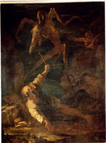
The vignette (Fig.) that precedes the fore-word, but is placed under the heading
Fig. 3. Unknown xylographer after a drawing by Édouard de Beaumont. Illustrated page from the preface of Le Diable amoureux, 1845. Xylography, 21 × 12.7 cm (page). Location: Kungliga biblioteket/National Library, Stock-holm. Copyright: CC-BY-NC-ND. Photo: National Library, StockStock-holm.
‘Cazotte’, is a xylographic reproduction after one of Édouard de Beaumont’s drawings that quotes Goya’s etching The Sleep of Reason Pro-duces Monsters (Fig. ). The sleeping man’s
posture, dress, and the way his upper body leans on the desk, as well as the bats in the background, make up an indirect visual quota-tion. It should be called‘indirect’ not because thefigure is reversed, but because of the quo-tation’s lack of external declaration, as when the caption of the Beethoven print declares
the print’s source in Lemud’s ‘picture’. In other words, the quotation is dependent upon recognising the iconic relation between elements in the vignette as target and Sleep of Reason as source.
But as a qualification of the iconic relation between target and source, the quotation might very well be called direct. If the source is known, the quotation is identifiable at once. The close resemblance between the quo-tation’s target and source therefore differs by
Fig. 4. Francisco Goya. The Sleep of Reason Produces Monsters, print no. 43 from Los Caprichos, 1799. Etching and aquatint, 21.5 × 15 cm. Accessible at https://en.wikipedia.org/wiki/Los_caprichos#/media/File:Museo_del_ Prado_-_Goya_-_Caprichos_-_No._43_-_El_sue%C3%B1o_de_la_razon_produce_monstruos.jpg. Copyright: CC-PD.
degrees rather than in kind from the more general traits shared by the vignette, the Beethoven print, and Sleep of Reason. They all expose the difference between first- and second-order representation or the relation between human bodies and such worldly things as desks and claviers versus the back-grounds of the cloudy and dream-like orches-tra in the Beethoven print; the nightmarish bats, owls, and a lynx in Sleep of Reason; and the skeletons, bats, and a demon in the vign-ette. Further, the identities of the human bodies are suggested as belonging to‘artists’ of different kinds by the depiction of artists’ tools: the composer’s musical instruments and sheet music; the etcher’s/draughtsman’s pencils and sheets of drawing paper; and the author’s quill pen and inkpot. In the vignette, the identity of the man as the author is further suggested by the way the visual quotation is captured spatially on the page between the heading‘Cazotte’, naming both the subject of the foreword and the author of the novel, and the first word ‘L’auteur’ (‘The author’), which stands out since it occupies the writing desk, or, post Sleep of Reason, the place of inscription, and differs typographi-cally from its typed counterparts by its spaced capitals as well as by the form of the ‘L’. The heading and the beginning of the first sentence read well together: ‘Cazotte[,] [l]’auteur du Diable amoureux’ (‘Cazotte[,] [t]he author of Diable amoureux’).
All these elements further share a theme that has been reverberating throughout Sleep of Reason’s reception and historiography since it started its public trajectory at the end of the eighteenth century: the principally romantic idea that it represents the sleeping artist in a moment of creative and even tor-mented imagination. Analyses following this direction has not only characterised Goya’s
nineteenth-century reception, represented, e.g. by Baudelaire’s ekphrastic poem Les Phares (),but also, as Laura Sager Eidt has shown, by the numerous twentieth-century transmediations of Sleep of Reason into poetry, drama, and film. In a study that reframes the Caprichos series in relation to eighteenth-century ideas about perception and the body, Andrew Schulz has made the argument that Sleep of Reason ‘links artistic creativity with the fantastic and the visionary’ and takes part in the duality between the the-matic pairs of observation and imagination, and satire and the fantastic, that runs through the entire series.Here, the rich tra-dition of Sleep of Reason interpretations is noted not so much for its heterogeneity and complexity, but for its evolving around artistic imagination in the implicit or explicit sense of origin. In Nerval’s foreword, the idea of origin is closely linked to a critical programme centred on thefigure of the author and the cir-cumstances of his life. In the sentence quoted below, Nerval, in passing and with no meta voice, captures the demonstrated method of interpreting Le Diable amoureux and other ‘works’ by Cazotte in relation to the experi-ences, interests, and readings of the author as key to his‘invention’:
The end of his life gave above all the secret of the mysterious ideas which presided over the invention of almost all his works, and which add to them a singular value which we will try to appreciate.
In the light of the texts on Sleep of Reason’s reception and historiography, it would be easy to trace the theme of artistic vision between Goya’s print, the vignette, Cazotte’s novel, and the two first lines of the last stanza of the poem in Vår tid that celebrates artistic creative imagination. This would,
however, be a reduction of what the vignette, in its relation to Sleep of Reason, has to‘say’. It would miss: () the way the reversal of the quotation functions as a sign of its own repro-duced state; () how it, as such, provides an entry point to other elements in the vignette; and () how it directs attention not to one but several anterior reproductions.
Reversals also occur in some of the later illustrations, where the signature‘Édouard de Beaumont’ is printed in the wrong direction and where the reversal is likely to be the direct result of reproduction practices. As the lines from the preceding drawing (includ-ing the signature) were not reversed on the wood block, its print was reproduced in the opposite direction, with the signature reversed. If the lines from the drawing had been transferred to the wood block in the reverse, they would have printed in the same direction. In the case of the vignette, it is much more likely that it was reversed already in its drawing stage to fit the right-hand,first-page, composition. But it does not matter much whether the quotation is causally related to the efficient, time and labour saving, neglect of reversing the reproduced element on the plate to get it right on the print.
Rather, the important point is that the quo-tation signifies its own state in the medium of reproduction in two other ways. Firstly, in the more metaphorical sense of instantiating itself as a reproduction, both in being a quotation and thus implying repetition, and in being a reversal and thus implying difference from the original source. Secondly, in the more con-crete way of being tied to specific historical print media practices. Unlike the first aspect, this second one presupposes nineteenth-century frames of reference. The claim here is that the quotation, in being a reversal, was associatively rather than causally tied to the
well-established practice of the print media industry before photography to take the short cut of reproducing entire motifs, parts of motifs, or inscriptions in the reverse. This associative relation also harks back to some-thing necessarily anterior, since the recog-nition of the reversal depends on havingfirst recognised its source.
The reversed quotation further functions as a prop to expose other elements as instantiat-ing the xylographic medium of reproduction. The greyish area of the background is actually not so much‘greyish’ as striped or covered by the thin, vertical and parallel lines that are the inversed result of the incisions on the block. More precisely, the striped area exemplifies xylography in the black lines and the bound syntax of metal engraving favoured by the printing industry.As such, it contrasts with both the white-line style of Thomas Bewick– since the nineteenth-century widely (but inac-curately) claimed as the inventor of xylogra-phy– and the etching-like or sketchy figures of the sleeping man and the bats. By first being framed by the reversed quotation, along with its references to reproduction in general and historical print media practices in particular, the greyish background becomes exposed as the traces after the tech-nology that made reproduction possible. Fur-thermore, the lines of the background are also highlighted by being echoed in the pattern of the foreword’s first letter ‘L’, suggesting that the latter’s decorative and lin-guistic functions are downplayed the moment its stripes are identified as ‘echoed’, or stand-ing as a quotation of the background’s lines as traces.
Besides functioning as a sign of the vign-ette’s medium of reproduction, another impli-cation of the Sleep of Reason quotation is that it functions as a reminder of the vignette’s
multiple sources. First, it is a quotation that makes the conventionally ‘original’ status of Beaumont’s preceding drawing – an anterior reproduction in the sense of‘picture’ – seem somewhat ambivalent, because it nonetheless contains the reversed Goya quotation as a reference to something anterior to the drawing: Sleep of Reason as an anterior repro-duction in the concrete sense of a print from an etched plate.
Additionally, the Sleep of Reason quotation is accompanied by another quotation that further elaborates the theme of multiple sources. The monstrous figure that bends
over the sleeper is derived from Salvatore Rosa’s seventeenth-century painting Tempta-tions of St Antony (Fig. ). The quotation from the Rosa painting is, unlike the other figures in the vignette, explicitly referenced in the story of Cazotte’s novel or the textual entity that is conventionally regarded as the illustration’s source. When the Rosa quotation is introduced in the story as‘a terrible camel’s head’ or one of the devil’s guises, the story is still prefigured by the pictorial quotation. The model derived from the Beethoven print is hence repeated. The textual introduction of the ‘camel’s head’ functions as a
Fig. 5. Salvator Rosa (1615–73). Temptations of St Antony, undated. Oil on canvas, 125 × 93 cm. Location: Galleria Palatina, Florence. Copyright: Photo Scala, Florence. Courtesy of the Ministero Beni e Att. Culturali e del Turismo, CC-BY-NC-ND. Photo: Photo Scala, Florence.
metaphorical reproduction of the pictorial element in xylographic reproduction, which by quotation reproduces a painting or an anterior reproduction in the sense of a picture. Later – or what is ‘later’ in relation to the conventional and sequential handling of the book format – the Rosa quotation appears again, in a bedroom scene rendered both tex-tually and pictorially.The repetition of the Rosa quotation in the bedroom scene implies that in the latter instance – whatever else it might signify (such as the devil’s appearance as seen by the protagonist Alvare) – it will, post-vignette, be exposing itself as a self-quo-tation of a quoself-quo-tation. Media-historically, such self-quotations can be extended into longer chains. The Rosa quotation appeared in another version of the bedroom scene in the lithographic poster advertising the edition of Cazotte’s novel, just as the Beetho-ven print appeared in the advertisement section of Vår tid’s sister magazine Ny illu-strerad tidning (–, New Illustrated Magazine; an equivalent to the British The Graphic,–).
Finally, from the historiographic point of view, the Rosa quotation also ties into a set of conventionally accepted distinctions between painting and pictorial prints. The present elements of the quotation, its black-and-white spaced strokes, lines and cross-hatchings, and book size, are by contrast underscoring painting’s conventional proper-ties of colours, infinite brushstrokes, and greater size. These conventionally recognised attributes of painting and prints are in their turn accompanied by a parallel set of distinc-tions that targets Benjamin’s unique and auth-entic – ‘auratic’ – status of the ‘original’ painting and the derivative and secondary status of the multiple and multipliable reproduction.
Given the existence of concepts such as ‘original’ and ‘aura’, associated with painting and framing the reproduction as an object related to its ‘original’ by repetition and loss of‘aura’, the point worth emphasising here is that the vignette complicates the picture by exposing no singular ‘original’ but a web of interrelations to multiple sources (Goya’s etching, Rosa’s painting, Nerval’s foreword, Cazotte’s novel). As the painting is left in a crowd of ‘originals’ it is denied its unique status. What is more, the close association between the medium of painting and the idea of its‘originality’ and authenticity is his-torically easily contested. The Rosa quotation actually emanates from‘a painting’ known in at least three copies. It also makes out a motif that has by Rosa scholars been traced to previous print media sources such as illus-trated scientific treatises.
Bruno Latour and Adam Lowe have meta-phorised the copy into a ‘proof of fecundity’ of its ‘original’ by comparing it to the ‘antique emblem of the cornucopia, a twisted goat horn with a sharp end – the origin – and a wide mouth disgorging an endlessflow of riches’.The vignette, by contrast, evokes the reversed image. From an‘end’, its material presence in print, it points to a plethora of already reproduced predecessors.
Conclusion: the ever-changing function of illustration
The concept of illustration is better conceived of as denoting an ever-changing medial and semiotic function than a bimedial object. Instead of analysing illustrations in a two-part framework of image and text, the starting point of this study was tripartite: image, text, and medium of reproduction. The present study study also tied the medium of
reproduction to what I have termed the double difference of reproductive media: the differ-ence between former and forthcoming pictor-ial sign vehicles as in media of reproduction (nineteenth-century xylography as well as digital photography) and the difference of the image’s former and forthcoming textual containers.
In this tripartite framework, the function of illustration, the object’s ‘illustrability’ to para-phrase Benjamin, includes the fact that Lemud’s Beethoven print was never originally produced as an illustration but has nonethe-less been used as such by Bann and Vår tid respectively. Moreover, it includes the fact that the vignette has by now come to illustrate historiographically important themes in the reception of Goya’s Sleep of Reason, the con-tents of Nerval’s foreword and Cazotte’s novel, just as well as the idea of the anterior reproduction. Consequently, the function of illustration is, on the one hand, a matter of use on the part of the producer that works in tandem with technologies of reproduction (in the sense of denoting the possibilities of dispersion or the images’ travels between different containers). On the other hand, it is a matter of recognition, apprehension, and analysis on the part of the receiver. In both cases, however, the picture relies on, even if deviating from, the existence of a conventional framework of previous examples. My chief examples, the Beethoven print in Vår tid and the vignette to the foreword in Le Diable amoureux, are paradigmatic cases in the per-spective of the field of illustration studies. They are not likely to raise questions about what conventionally counts as an illustration, as does, e.g. the black page in Laurence Sterne’s Tristram Shandy.
Regardless of the object’s conventionality, the important point that has implications for
the bimedial (i.e. conventional) concept of illustration is the recognition of the image’s trajectory through new media of reproduction and new containing objects where it encoun-ters likewise new textual elements. The basic idea is that the image’s exposure in new media of reproduction changes its appearance as well as its combinatory, textual, elements. The latter has been accounted for on different levels: () partly by studying how the image in its medium of reproduction bears on those textual elements that are literally in the com-bined object, such as the poem juxtaposed to the Beethoven print or the foreword juxta-posed to the vignette; and () partly by study-ing how the image bears on the concepts that are imposed upon the combined object from without, in order to make sense of it, such as ‘illustration’ or ‘combined media’. Further-more, these textual entities have been juxta-posed to ‘textual’ elements derived from the illustration itself, such as the idea of the anterior reproduction that was suggested by the Beethoven print, providing a starting point for the reading of Goodman and then exemplified in a new direction by the vignette. These processes are renewed differently each time a picture functions as an illustration.
Here, it is once again called upon to emphasise the distinction between the two types of functions that I have tied to the concept of double difference – in order to examine them as intertwined. Firstly, how the traces after the technologies of reproduc-tion are manifested in the picture and how they take on semiotic functions. Secondly, how the image in its travels between different containers enters into relationships with textual elements of various types. In the first case, the medium of reproduction has been studied as the syntactic element that might cause semantic changes. In the
second case, the medium of reproduction has been studied as one of the forces behind the image’s travels between containers. All in all, I propose to think of illustration as a function where these two media of reproduction aspects enter between the pair of image and text.
ORCID
Sonya Petersson
http://orcid.org/---
Funding
This work was supported by grants from The Rid-derstad Foundation for Historic Graphic Research (Ridderstads stiftelse för historisk grafisk forskning) and The Åke Wiberg Foundation (Åke Wibergs stiftelse).
Endnotes
. Stephen Bann, Distinguished Images: Prints in the Visual Economy of Nineteenth-Century France, New Haven, , pp. –, –.
. Poem: Lotten von Kraemer, “Vid åhörandet af en symfoni af Beethoven”, Vår tid, April , pp. –. Illustration: Carolina Weidenhayn,“Beethoven”, Vår tid, April, p. .
. Cf. Walter Benjamin’s ‘reproducibility’ as the ability of reproductive media to disseminate the object it reproduces across time and in other media. Walter Benjamin,“The Work of Art in the Age of Its Technological Reproducibility []”, in Michael W. Jennings, et al. (eds.), Edmund Jephcott, et al. (trans.), The Work of Art in the Age of Its Technological Reproducibility and Other Writings on Media, Cambridge, MA,, pp. –.
. In this regard, my study is aligned to the turn towards the image’s materiality, its ‘facture’ and ‘interface’, in visual culture studies and image studies. Cf. Keith Moxey, Visual Time: The Image in History, Durham,, esp. p. ; Anna Dahlgren, Travelling Images: Looking across the Borderlands of Art, Media and Visual Culture, Manchester,, esp. pp. –.
. The semiotic functions of the traces after the medium of reproduction include but exceed indexicality. Cf. both Groupe µ’s ‘plastic signs’ and James Elkin’s ‘marks’. Groupe µ,“Toward a General Rhetoric of Visual
Statements: Interaction between Plastic and Iconic Signs”, in Thomas A. Sebeok and Jean Umiker-Sebeok (eds.), Advances in Visual Semiotics: The Semiotic Web–, Berlin,, pp. –; James Elkins, On Pictures and the Words that Fail Them, Cambridge, MA,, pp. – , –.
. Cf. Mieke Bal’s discussion of ‘travel between concept and object’ in Travelling Concepts in the Humanities: A Rough Guide, Toronto,, pp. –, –.
. As in Joseph Pennell, Modern Illustration: Its Methods and Present Condition, London,, pp. –; John Buchanan-Brown, Early Victorian Illustrated Books: Britain, France and Germany,–, London, ; and in the literature referred to in notes, , , and . . ‘Old media’ in the sense of Lisa Gitelman and Geoffrey
B. Pingree (eds.),“Introduction: What’s New About New Media?”, in New Media, –, Cambridge, MA, , pp. xi–xxii.
. For ‘image-text’, see W. J. T. Mitchell, Picture Theory: Essays on Verbal and Visual Representation, Chicago, , pp. –; for ‘ekphrasis’, see Stephen Cheeke, Writing for Art: The Aesthetics of Ekphrasis, Manchester, ; for ‘iconotext’, see Liliane Louvel, Poetics of the Iconotext, ed. Karen Jacobs, trans. Laurence Petit, Burlington, VT,.
. [No name], ‘Editorial’, Journal of Illustration Studies, March, unpaginated,http://jois.uia.no/articles.php? article=(accessed October ).
. First quotation: J. Hillis Miller, Illustration, London, , p.; second quotation: Miller, , p. .
. Mieke Bal, Reading ‘Rembrandt’: Beyond the Word-Image Opposition, Cambridge,, pp. –; Mitchell, , esp. p.; John A. Bateman, Text and Image: A Critical Introduction to the Visual/Verbal Divide, London,, pp.–.
. Lorraine Janzen Kooistra, The Artist as Critic: Bitextuality in Fin-de-Siècle Illustrated Books, Aldershot,; Lorraine Janzen Kooistra, Poetry, Pictures, and Popular Publishing: The Illustrated Gift Book and Victorian Visual Culture,–, Athens, OH, ; Nicholas Frankel, Masking the Text: Essays on Literature & Mediation in the s, High Wycombe, ; Keri Yousif, Balzac, Grandville, and the Rise of Book Illustration, Burlington, VT,.
. ‘Sign vehicle’ and ‘elements’ are equivalent to C. S. Peirce’s ‘representamen’, although analysed from the medial rather than logical point of view. Charles Sanders Peirce, The Collected Papers of Charles Sanders Peirce, Vol., eds. Charles Hartshorne and Paul Weiss, Cambridge, MA, , paragraph ..
. Cf. Gerard Curtis, Visual Words: Art and the Material Book in Victorian England, Aldershot,; Frankel, ; Janzen Kooistra, ; Yousif, .
. Cf. Catherine J. Golden, ed., Book Illustrated: Text, Image, and Culture–, New Castle, DE, .
. Irina O. Rajewsky, “Intermediality, Intertextuality, and Remediation: A Literary Perspective on Intermediality”, Intermediality: History and Theory of the Arts, Literature and Technologies, No., , pp. –, quotation p. . . Christopher S. Wood, Forgery, Replica, Fiction:
Temporalities of German Renaissance Art, Chicago,, p..
. Sybille Krämer, Medium, Messenger, Transmission: An Approach to Media Philosophy, trans. Anthony Enns, Amsterdam,, p. .
. ‘Ludvig van Beethoven. Efter en tafla af de Lemud’. My translation.
. W. J. T. Mitchell, What do Pictures Want? The Lives and Loves of Images, Chicago,, p. .
. It was also frequently used as a metaphor for verbal and natural scenes. Cf. the use of the term in the short stories of Alfhild Agrell, Från land och stad, Stockholm,, p.; and Josefine Wettergrund, Valda berättelser af Lea, Vols.–, Stockholm, –, p. .
. Lars Elleström, Media Transformation: The Transfer of Media Characteristics Among Media, Basingstoke,, pp.–.
. ‘brusar’, ‘susar’, ‘suck’; ‘näktergal[ens]’, ‘förkunnar’; ‘andekör’, ‘bröllopssång’, ‘hymn’, ‘svanesången’. My translation. von Kraemer,, pp. –. . ‘Vid åhörandet af en symfoni af Beethoven’. My
translation. von Kraemer,, p. . . Bann, , p. .
. Patricia Mainardi, Another World: Nineteenth-Century Illustrated Print Culture, New Haven,.
. Nelson Goodman, Languages of Art: An Approach to a Theory of Symbols, Indianapolis,.
. Goodman, , pp. –. . Goodman, , pp. –. . Goodman, , pp. –.
. For a full account of the theory of notational schemes and systems, see Goodman,, pp. –.
. Goodman, , p. .
. For studies that demonstrate such possibilities of repeating differently, see, e.g.: James Mussel, The Nineteenth-Century Press in the Digital Age, Basingstoke, ; Hans Dam Christensen, “The Art of Copying: Five Strategies for Transforming Originals in the Art Museum”, Culture Unbound, Vol. , No. , , pp. – ; Julie Codell and Linda K. Hughes (eds.),
“Introduction”, in Replication in the Long Nineteenth-Centuy: Remakings and Reproductions, Edinburgh,, pp.–; Dahlgren, .
. Geoffrey Batchen, Repetition och skillnad: Fotografins re/ produktion, trans. Cecilia Grönberg and Jonas Magnusson, Hägersten,, pp. –. This text is unfortunately not published in English.
. Gérard de Nerval, “Cazotte”, in Le Diable amoureux, roman fantastique par J. Cazotte, précédé de sa vie, de son procès, et de ses prophéties et révélations par Gérard de Nerval, Paris,, pp. I–LXXXIV.
. Tzvetan Todorov, The Fantastic: A Structural Approach to a Literary Genre, trans. Richard Howard, Cleveland, OH, [].
. First published in Les Fleurs du Mal. Quoted in Nigel Glendinning, Goya and His Critics, New Haven,, pp.–.
. Laura M. Sager Eidt, Writing and Filming the Painting: Ekphrasis in Literature and Film, Amsterdam,, pp.–.
. Andrew Schulz, Goya’s Caprichos: Aesthetics, Perception, and the Body, New York,, p. .
. ‘La fin de sa vie a donné surtout le secret des idées mystérieuses qui présidèrent á l’invention de presque tous ses ouvrages, et qui leur ajoutent une valeur singulière que nous essayerons d’apprécier.’ My translation. Nerval, , p. IV.
. ‘Oh, from where did you get, artist with no equal, / This power that knows not limits?’ (‘O, hvar fick du, konstnär utan like, / Denna kraft som ej af gränser vet?’). My translation. von Kraemer,, p. .
. Jacques Cazotte, Le Diable amoureux, roman fantastique par J. Cazotte, précédé de sa vie, de son procès, et de ses prophéties et révélations par Gérard de Nerval, Paris, [], pp. III, XXIV, , , .
. About reversals in the printing process, see Antony Griffiths, The Print before Photography: An Introduction to European Printmaking,–, London, , pp.–.
. The classical text on the ‘syntax’ of graphic art is William M. Ivins Jr., Prints and Visual Communication, Cambridge, MA, [], cf. chaps. IV–VI. . ‘une tête de chameau horrible’. My translation. Cazotte,
, p. . . Cazotte, , p. .
. The poster is accessible through Gallica, the digital archives of Bibliothèque nationale de France,https://gallica.bnf.fr/ ark://btvbd(accessed November ); Ny illustrerad tidning, No., , p. .
. These differences are key to Benjamin’s concept of ‘aura’: ‘In even the most perfect reproduction, one thing is lacking: the here and now of the work of art– its unique existence in a particular place. […] The here and now of the original underlies the concept of its authenticity, and on the latter in turn is founded the idea of a tradition which has passed the object down as the same, identical thing to the present day.’ The object’s ‘physical duration’ and presence in one place thus transmit its sameness and authenticity through history. When the object is reproduced, the‘aura’ pertaining to its place and history of experience is detached. Benjamin,, first quotation
p. [original emphasis]; second quotation p. . For Benjamin, the lack of‘aura’ on the one hand makes the object inauthentic and reproductive, and, on the other, permits the reproduction to enter ever new contexts of multifarious reception.
. See the record in the Digital Archives of Galleria Palatina, catalogue number, atwww.uffizi.firenze.it/ catalogo/scheda.asp(accessed November ). . Jonathan Scott, Salvator Rosa: His Life and Times, New
Haven,, pp. , .
. Bruno Latour and Adam Lowe, “The Migration of the Aura, or How to Explore the Original through Its Facsimiles”, in Thomas Bartscherer and Roderick Coover (eds.), Switching Codes: Thinking Through Digital Technology in the Humanities and the Arts, Chicago,, pp.–, quotation p. .
. The difference here is, of course, that Bann uses a digital photograph of Lemud’s print, while Vår tid commissioned Weidenhayn to produce a reproduction in xylography. Both Bann and Vår tid, however, share the demonstrated intention of using the digital/xylographic reproduction as an illustration.
. Laurence Sterne, The Life and Opinions of Tristram Shandy, Gentleman: In Two Volumes, Dublin, [–], p. , chap. XII.
Summary
In order to reframe the conventional bimedial (textual and pictorial) concept of illustration, this study examines illustrations and their textual and pictorial elements from the point of view of the medium of reproduction– which includes present-day digital photography as well as nineteenth-century xylography. The study investigates two nineteenth-century illustrated texts, the Swedish literary review Vår tid and the edition of Jacques Cazotte’s
novel Le Diable amoureux. Both provide examples of how nineteenth-century
xylography transmits the images it reproduces into new textual containers, be it illustrated journals or books. The argument made is that the concept of illustration, rather than denoting a bimedial object, is better understood as an ever-changing medial and semiotic function where the medium of reproduction enters between the image and text pairing in two particular ways. Firstly, by the way the traces after varying technologies of reproduction are manifested in the picture and take on semiotic functions in relation to textual and pictorial elements. Secondly, by the way the image, due to its medium of reproduction, is enabled to travel between different containers and thus to enter into new relationships with new textual elements. These two aspects constitute what I term the double difference of reproductive media. In developing this argument, the present study discusses multidirectional transfers of content between image and text, pictorial quotation as a type of metaphorical rather than a technological reproduction, and how the place assigned an‘original’ is occupied by an anterior reproduction.
Sonya Petersson
Department of Culture and Aesthetics Stockholm University, Stockholm, Sweden E-mail: sonya.petersson@arthistory.su.se