Touch screens in cars
Investigating touch gestures and audio feedback in the
context of in-vehicle infotainment
Erik Hassel
Interaction design Bachelor Degree 30 HP
Spring 2016
Contact information
Author:
Erik Hassel E-mail: erikhassel94@gmail.comSupervisor:
Clint Heyer E-mail: clint.heyer@mah.seMalmö University, Konst, kultur och kommunikation (K3).
Examinator:
Anuradha Reddy
E-mail: anuradha.reddy@mah.se
Abstract
This paper explores how touch gestures with the help of audio feedback can be used to make touch screens easy to use and possible to interact with eyes-free in an in-vehic le context. Prototypes will be created and usability tested in order to investigate how the gestures and feedback performs in the context. These results will be discussed and analyzed and transformed into a few design principles that should be considered when designing gestures for use in an in-vehicle context.
Acknowledgements
I would like to thank my supervisor Clint Heyer for his support and guidance during the work with this thesis. I would also like to give a big thank you to all the participants of the questionnaire and the usability tests.
Table of Contents
1 Introduction ... 8
1.1 Background ... 8
1.2 Purpose and Problem Definition ... 9
1.3 Intended Target Group ... 9
2 Theory ... 10
2.1 In-Vehicle Infotainment ... 10
2.1.1 History of in- vehicle infotainment ... 10
2.1.2 Designing for in- vehicle infotainment ... 10
2.1.3 Interaction ... 12
2.2 Eyes- free touch screen interaction ... 12
2.3 Gestures... 14
3 Related work... 15
3.1 BMW iDrive ... 15
3.2 Tesla Infotainment System... 17
4 Methods ... 19 4.1 Questionnaire ... 19 4.2 Brainstorming... 19 4.3 Bodystorming... 19 4.4 Prototyping... 20 4.5 Usability testing ... 20 5 Design Process ... 22
5.1 Result from Q uestionnaire ... 22
5.3 Bodystorming Session ... 25
5.4 First prototype ... 27
5.4.1 Interactions... 28
5.4.2 Feedback ... 29
5.5 Testing the first prototype ... 29
5.5.1 Results from the first usability test ... 30
5.6 Second prototype... 32
5.7 Testing the second prototype ... 34
5.7.1 Results from the second usability test... 35
6 Discussion... 37 6.1 Self-critique... 38 7 Conclusion ... 39 8 Future Work ... 41 9 References ... 42 9.1 Literature ... 42 9.2 Books ... 44 9.3 Online Sources ... 44 9.4 Figures... 45 10 Appendix ... 46 10.1 Questionnaire questions ... 46
10.2 Test plan for the first usability test ... 47
Table of Figures
FIGURE 1:BMW IDRIVE CONTROLLER (DAMBRANS 2014)...15
FIGURE 2:BMWAIR GESTURES (AUTOMOBILE ITALIA 2015) ...16
FIGURE 3:TESLA INTERIOR (VAN DER MARK 2014)...17
FIGURE 4:WALL WITH INSPIRATION AND NOTES ...23
FIGURE 5:SKETCH OF MULTI-SWIPE ...24
FIGURE 6:SKETCH OF EDGE-SWIPE ...25
FIGURE 7:PICTURE FROM THE BODYSTORMING SESSION ...26
FIGURE 8:RIGHT EDGE SWIPE REVEALS SOURCES MENU ...28
FIGURE 9:BOTTOM EDGE SWIPE REVEALS LIBRARY ...29
FIGURE 10:TEST PARTICIPANT INTERACTING WITH THE PROTOTYPE ...31
FIGURE 11:ICONS IMPLEMENTED FOR THE EDGE GESTURES...33
FIGURE 12:TEST SETUP DURING THE SECOND USABILITY TEST...35
1 Introduction
1.1 Background
The use of touch screens in cars is increasing as more and more car manufacturers choose to use this technology to control many of the car´s functions, such as music playback and setting of the climate control system. At the same time, research shows that touch screens require more attention since the driver receives no tactile feedback, which means that the user must rely on visual feedback. This leads to the driver looking at the screen instead of the road, which means that the ability to detect hazards on the road decreases, which in turn means that the crash risk increases (Burnett et al. 2013).
Bach et al. (2008) have conducted a study in which they compare three different types of interaction in cars; tactile, touch and gesture interaction. They found that the tactile interaction made it possible for the test subjects to feel their way to the correct button, however, it didn’t result in the test subjects looking down fewer times compared to the touch interaction. The touch interaction was also the interaction that was the quickest and easiest to perform. Gesture interaction was not as fast as touch interaction, however, it had other advantages such as the test subjects said that they had more control over the vehicle since they didn’t have to look down as much on the screen compared to the other interactio n methods. The conclusion they made is that a combination of gestures and touch could lead to a powerful platform where gestures can be used for the basic functions while the more advanced features of the infotainment system can rely on a regular touch screen interface (Bach et al. 2008).
The area I have chosen to study is how touch gestures can be used to control the music player in an in-vehicle infotainment system, for example, to change track or adjust the volume.
1.2 Purpose and Problem Definition
The purpose of this thesis is to research the use of touch gestures in in-vehicle infotainme nt systems and how these gestures should be designed to function satisfactorily during driving. My goal is to find out which touch gestures that work in my chosen context and through the design of a prototype answer the problem definition:
“What principles should be considered when designing touch screen gestures for a music player in an in-vehicle infotainment system?”
1.3 Intended Target Group
The intended target group for my study were initially car drivers. Since this is a very broad target group, a choice was made to narrow it down to car drivers with experience of using smartphones or tablets.
2 Theory
2.1 In-Vehicle Infotainment
2.1.1 History of in-vehicle infotainment
To get a better understanding of the problems in today’s infotainment systems we need to understand how these systems have changed over the years. Gitlin (2014) and Teehan (2014) writes that in the 1930s automakers started fitting radios in their cars, for a long time this was the only entertainment available in the car. After a few decades’ tape-decks were introduced and later cd-players were added. These systems relied on physical buttons and were relatively easy to control thanks to the small amount of features (Gitlin 2014; Teehan 2014).
Nowadays, in-vehicle infotainment systems have a lot more functions; streaming music, navigation, telephone connection, internet capabilities, to name a few. When the infotainment systems get more functionality, the driver’s interaction with the system increases. This makes it important to provide good user experiences in the car in order to keep driver distraction at a minimum (Kern & Schmidt 2009).
2.1.2 Designing for in-vehicle infotainment
When designing interactions and user interfaces for in-vehicle use it is important to understand that the interaction with the infotainment system is a secondary task. The primary task the user performs is driving, which is a safety critical task that requires high visual load (Wheatley 2000). This makes it important to design interfaces that are glanceable and doesn’t cause distraction for the driver (Marcus 2004).
The ESoP Development Group of the European Commission (2005) have produced a set of principles that should be considered when designing user interfaces in vehicles:
“The system supports the driver and does not give rise to potentially
focus on an overall requirement for in-vehicle systems, the system should not reduce road safety (European Commision 2005).
“The allocation of driver attention to the system displays or controls
remains compatible with the attentional demands of the driving situation.”
The driver should be able to modify the attentional demand of the system by choosing when and how to interact with it (European Commisio n 2005).
“The system does not distract or visually entertain the driver." The driver’s ability to be in control of the vehicle shouldn’t be compromised by visual entertainment, such as displaying visually attractive pictures (European Commision 2005).
“Visually displayed information presented at any one time by the system
should be designed such that the driver is able to assimilate the relevant information with a few glances which are brief enough not to adversely affect driving.” The graphics should be well structured and easy to read so
the driver doesn’t get preoccupied with non-primary driving-related tasks (European Commision 2005).
“The driver should always be able to keep at least one hand on the steering
wheel while interacting with the system.” One hand should always be on
the steering wheel in order for the driver to have control of the vehicle (European Commision 2005).
“The system should not require long and uninterruptible sequences of
manual- visual interactions. If the sequence is short, it may be uninterruptible.” The driver should be able to interrupt the interaction in
interaction when the traffic situation allows it (European Commisio n 2005).
2.1.3 Interaction
There are several technologies available for interaction with infotainment systems; touch screens, rotary controllers, buttons and more (Burnett et al. 2004). All these interactio n methods perform very differently in terms of task times, glances and driving performance, this became clear when Burnett et al. (2011) compared the performance of touchpads, rotary controllers and touch screens in a car simulator study. The rotary controller performed poorly across all tasks during the test, the task times were longer and the participants wavered in their lane more compared to the touch screen and touchpad. The touch screen and touchpad however, performed more equal, though there were some differences between them, the touch screen required more glances but the touchpad was slower to operate. The touch screen required more glances because the users didn’t get auditory feedback which they got from the touchpad, this resulted in that the touchpad were possible to interact with blindly. The touchpad was slower to operate since the user first needed to move their hand to the touchpad and then start navigating the screen, with the touch screen however, these two steps were completed in one combined operation, the users moved their hand to the screen while simultaneously scanning the screen (Burnett et al. 2011).
2.2 Eyes-free touch screen interaction
The touch screen interface offers several benefits compared to interfaces with physical controls, such as buttons and knobs. Touch screen interfaces are flexible since they can display different interfaces on the same surface, which makes it possible to display controls that fit the task at hand. Another advantage touch screens have over physical buttons is discoverability, meaning, the users can manipulate items on the screen with gestures such as rotating and pinching, instead of being required to remember input commands. On the other hand, physical controls have one significant advantage over touch screens, the user gets audible and tactile feedback when using these input methods. This means that touch
screens are difficult to use or even inaccessible for eyes-free interaction (Vidal & Lefebvre 2010; Kane et al. 2008).
One way of making touch screens usable for eyes-free interaction is by using audio and/or haptic feedback. Audio feedback can be used in many different ways. One way of using audio feedback is by letting the system speak the name of the object the user’s finger is over. Kane et al. (2008) researched this in their prototype Slide Rule. When the user’s slide their finger over the screen the system announces the first letter in the object and then the full name. According to the authors this allows the user to faster scan through a list of objects since they don’t have to listen to the full name in order to find what they are looking for (Kane et al. 2008).
Other researchers suggest that audio feedback should be combined with haptic feedback since eyes-free interaction methods that only give audio feedback can be difficult to hear if there are noise around you, for example, in the street (Azenkot et al. 2013). The prototype DigiTaps that Azenkot et al. (2013) constructed uses gestures and haptic feedback. When a gesture is entered, DigiTaps vibrates one or two times depending on what gesture the user performed. The result they got from their study is that DigiTaps is promising interactio n method in environments where it can be hard to hear the device’s audio feedback (Azenkot et al. 2013). Vidal & Lefebvre (2010) however, found out that touch screens with haptic feedback, even with the help of speech feedback, still has very low acceptance among their test subjects due to the lack of real physical marks and tangible buttons, which makes it hard to learn to use the device (Vidal & Lefebvre 2010).
The importance of physical marks became clear when Kane et al. (2011) conducted user tests where they let blind and sighted participants invent gestures for different commands. During this study they found out that blind participants favored gestures that were located near the edges and corners since this provided them with physical marks. The authors suggest that critical functions should be placed along the edges and corners of the display to improve accessibility during eyes-free use (Kane et al. 2011).
2.3 Gestures
Gestures are used in most mobile touch screen devices, for example, “pinch-to-zoom” on iOS and Android devices. They have the advantage of offering reduced attentional load, better performance and being possible to perform almost eyes-free in environments where distractions occur (Bragdon et al. 2011). Since gestures are possible to perform nearly eyes-free they are a good choice for interaction in vehicles because it helps the driver to keep his attention on the road (Bach et al. 2008; Alpern & Minardo 2003).
Experienced drivers have said that touch gestures fit the driving context since gestures are easy to perform and doesn’t require precise finger pointing when interacting with the system (Heikkinen et al. 2013). Research have also showed that gestures are easier to learn than keyboard shortcuts on a pc, however, to make the gestures easy to perform they should only be used for a limited set of functions (Appert & Zhai 2009; Rümelin & Butz 2013).
Burnett et al. (2013) suggests that swipe gestures fit the car context since these gestures are familiar to the users and are easy to use. In their study they investigated how the direction of swipe gestures vary depending on the command that needs to be executed. They gave the test person a command and then the test person would do a swipe gesture that he or she thinks fit that command. What they found out is that, overall there is a high agreement of swipe direction for the various commands and that the highest agreement in swipe direction occurred for tasks that the users are familiar with from smartphones, for example, play previous song (Burnett et al. 2013).
A similar study was conducted by Colley et al. (2015), in their study they compared a traditional touch screen interface with finger-specific swipe gestures and multi-touch swipe gestures. The test subjects in their study preferred the two gesture interaction techniques over the traditional touch screen interface since it improved the eyes-free usage. The conclusion is that interaction techniques that do not require precise finger pointing are considered easier to use eyes-free (Colley et al. 2015).
3 Related work
In this section I will take a look at existing interaction methods for in-vehicle infotainme nt systems in order to gain more knowledge of what problems existing infotainment systems have and what designers are doing in order to try and solve them.
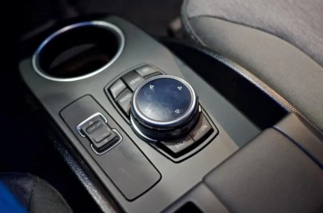
3.1 BMW iDrive
BMW iDrive is the name of the infotainment system BMW uses in most of their newer cars. The system consists of the screen and a rotary knob controller placed on the center console near the gear lever. You can rotate the controller to scroll through lists and then press it down to select an option. The user can also press the controller to the right to go forward and to the left to go back. BMW claims that iDrive is “the easiest and most
intuitive way to control entertainment, information, communication and navigation functions” (Controller n.d.; iDrive n.d.).
The iDrive infotainment system is however not as perfect as BMW says it is, it has been heavily criticized by owners for being hard to use and slow to respond on the users input (Yang 2007). Car reviewer Farago (2002) even goes as far and calls it: “The iDrive is not,
as BMW claims, 'A New Way to Drive'. It is, in fact, a new way to die.” (Farago 2002).
Researchers have also compared iDrive with a touch screen based infotainment system where they found out that a visual touch screen is easier to control than the iDrive system since no new interaction technology has to be learned (Rydström et al. 2005).
A similar study was conducted by Harvey et al. (2011) in which they compared an iDrive style rotary controller with a touch screen. In their study the rotary controller performed inferior compared to the touch screen in regard of driving performance and task times (Harvey et al. 2011).
Figure 2: BMW Air Gestures (Automobile Italia 2015)
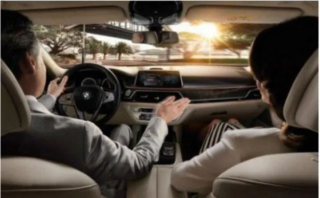
In the new 7 series BMW have added air gestures as a complement to the iDrive controller. They have chosen to have a limited set of gestures for the most basic functions. You can increase or decrease the volume by rotating your finger in front of the screen and you can
also swipe your hand in front of the screen to dismiss a call or just point towards the screen the answer a call. The users can also program their own gestures according to certain predefined functions, such as muting the sound or turning of the display (Digital Trends 2015).
3.2 Tesla Infotainment System
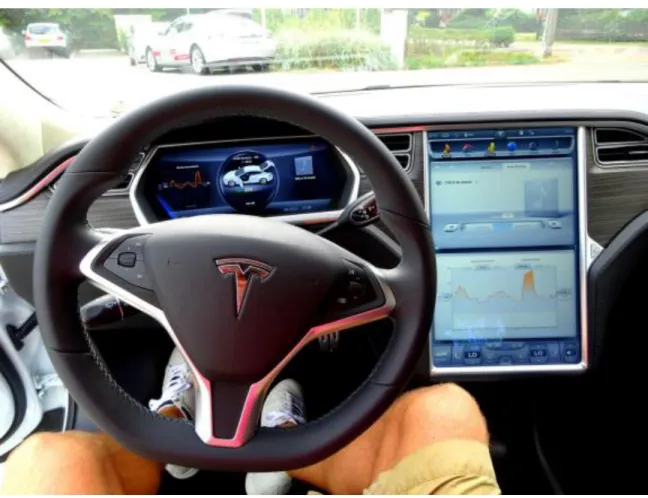
When Tesla released the Model S they received a lot of attention for their infotainme nt system. It uses a 17-inch tablet like touch screen that controls most of the cars functio ns. The infotainment system is controlled via a traditional touch screen user interface and it has no physical buttons or knobs.
Figure 3: Tesla Interior (Van Der Mark 2014)
The Tesla infotainment system has been criticized by bloggers for being distracting and dangerous to use while driving (Robinson n.d.; Sinclair 2011). If the driver wants to do any
adjustment to the system, he needs to look at the screen in order to find where to touch (Sinclair 2011). Robinson (n.d.) writes that most controls have been hidden in sub-menus which makes it near impossible to operate the system without looking at the screen for worrying periods of time (Robinson n.d.).
Much research in the field of in-vehicle infotainment systems talks about the problems with having a traditional touch screen user interface in a car. One of the most serious shortcomings touch screens have compared to systems with physical buttons is glance time, the touch screen requires longer glances than the button interface (Duarte & Oliveira 2014).
4 Methods
4.1 Questionnaire
At the beginning of my design process I decided to send out an online questionnaire on social media about people’s experiences with touch gestures. The purpose with the questionnaire was to reach a wide audience and to get more research data. I choose to use mostly questions with open text field answers in order to let the respondents answer more freely and not limit them to predefined response options. The meaning of the questionna ire is to gain a better knowledge of what touch gestures people are familiar with from smartphones and tablets and which gestures they use the most. I chose to include only the most necessary questions in my questionnaire to keep the questionnaire short, as suggested by Denscombe (Denscombe 2009, P. 216). I think a questionnaire will perform better in my design process than, for example, interviews and focus groups since it is easier to make people contribute to a questionnaire because they can answer the questionnaire when they have some spare time.
4.2 Brainstorming
Brainstorming is an idea generation method where the designer should focus on to generate as much ideas as possibly, not to generate one perfect idea. At this point the designer want concepts that approach the project from all angles. What matters the most during a brainstorm session is quantity, not quality (Saffer 2010, P. 114). The idea with a brainstorm session is to put all your ideas down on paper so you have them saved for later. During the brainstorm session the designer should have models and research close at hand for inspiration (Saffer 2010, P. 114-115). Since in-vehicle touch gestures is a relatively new research area it’s important to think out different ideas that can help me answer my research question, this is why I decided to conduct a brainstorm session, to flesh out all possible ideas before starting to build a prototype.
4.3 Bodystorming
Bodystorming is a design method where the designer act out the role of the user in a prototyped version of the space the product is supposed to be used in. The purpose with
bodystorming is to simulate the experience of using the product in the real context. This method helps the designer identify design opportunities (Schleicher et al. 2010). Bodystorming will be an important part of my design process since it will let me try out different concepts and gestures without having to build a working prototype. This means that I can test many different gestures quickly.
4.4 Prototyping
Prototypes are used by designers to express their visions of how the product they design could look like. There are two variants of prototypes, low-fidelity and high-fidelity. Low-fidelity prototypes are usually made of paper, which means they have limited features and no interaction. This means that they need people to fake and control the interaction of the prototype. These prototypes are meant to be constructed quickly and then be thrown away. High-fidelity prototypes, on the other hand, often works just as well as a finis hed product. These prototypes should be perceived by the users as a real product instead of a prototype in order to get as good feedback as possible (Saffer 2010, P. 175-180.).
In this study, a decision was made to only develop high-fidelity prototypes. The decision is based on, that in order to get qualitative results from the test persons in the usability tests, the gestures and feedback from the prototype need to work satisfactorily. During the usability tests, I also have to take notes and observe what the test subjects do which would be difficult if I needed to control the prototype simultaneously, which is something that would be needed in a low-fidelity prototype.
4.5 Usability testing
Usability tests are conducted in order to evaluate the prototypes the designer make. The test should preferably be carried out in the test subject’s own environment, for example, in
the user’s home or on their computer (Saffer 2010, P. 181). In my study it would be diffic ult
to conduct the usability tests in the test subject’s own environment since that would narrow down potential participants to those who own a car and it would take a lot of time setting up each individual test, instead, the tests will be conducted in school and at home.
By usability testing the prototypes I create, I will get research data that will help me iterate the design of my prototype and also help me answering my research question. Before the usability tests are conducted, a test plan will be produced, as suggested by Saffer (2010), that contains questions for the participants to answer and tasks the participants will be asked to performed (Saffer 2010, P. 183).
5 Design Process
5.1 Result from Questionnaire
The questionnaire was made with Google Forms and was shared via social media. The purpose with the questionnaire was to get more information to base my design process on. I wanted to hear what gestures people know and use on their smartphones and tablets since this could help me in my design process to make gestures that are easy to use for people with smartphone experience. The questionnaire was online for four days and a total of 16 people responded, ten men and six women. All of the respondents were 18-25 years old except four who was 26-30 year sold. A total of 13 respondents said they use touch gestures. The questionnaire can be found in appendix 9.1.
The first question in the questionnaire was “What touch gestures are you familiar with?”. The answers on this question seemed, at first, very mixed but after analyzing the data more the conclusion was made that the respondent had used different terms to describe the same gestures. One example of this is “pinching” and “zoom”, which is the same gesture on mobile devices since a pinching gesture let the user zoom in on the content.
The gestures most of the respondents said they were familiar with was; Swipe, tap, pinch to zoom and rotate.
The second question were “Which gestures do you use the most?”. The gesture most respondents said they used the most were swipe, followed by tap and pinch to zoom. The last question of the questionnaire was “What functions is the most important in a
car?”. 12 respondent answered that “music” is the most important functions in a car and
four respondents answered “navigation”. The answers to this question was used as a guide to determine the overall focus of my study to a subject people are interested in.
After analyzing the data extracted from the questionnaire, it can be seen that the gestures people are familiar with are gestures that are commonly used in smartphones and tablets, such as, swipe and pinch to zoom.
5.2 Brainstorming Session
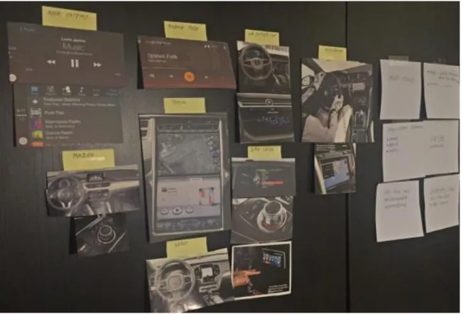
Based on the data and knowledge extracted from the literature studies and questionnaire, I conducted a brainstorm session in order to get my ideas flowing and to come up with concepts that could help me answer my research question. During the brainstorm I had pictures of current infotainment systems and notes I’ve written during my literature studies posted on a wall to get inspiration (Saffer 2010, P. 114).
Figure 4: Wall with inspiration and notes
Based on my literature studies I’ve found it interesting to study how swipe gestures that uses the edges of the display as physical marks would work in an in-vehicle context, so naturally, many of my ideas during the brainstorm revolved around using the edges of the display in some way. The questionnaire also showed that most respondents use, or is familiar with swipe gestures, which makes these kind of gestures a smart choice for my study since the learning curve will be kept low.
At the end of the brainstorm session I felt that two of the concepts were promising for further investigation. Both concepts use swipe-gestures, with the key difference being that the concept Edge-Swipe uses swipe gestures around the edges of the display and that the concept Multi-Swipe uses multi-touch swipe gestures.
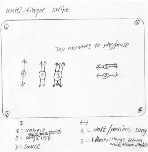
Figure 5: Sketch of multi-swipe
The concept Multi-Swipe uses multi-touch swipe gestures. The gestures can be made in the directions up/down and left/right with up to three fingers. Figure 5 shows which gestures that can be used. For example, to select source the user swipes three fingers up or down on the display.
Figure 6: Sketch of Edge-swipe
The concept Edge-Swipe uses swipe gestures around the edges of the display. The gestures can be made in the directions up/down and left/right. Figure 6 shows which gestures that can be used. For example, to select source the user swipes one finger on the right-side edge of the display.
5.3 Bodystorming Session
Since the screen in a car is positioned standing upright, I wanted to test how the concepts from my brainstorm session and commonly used gestures from smartphones would
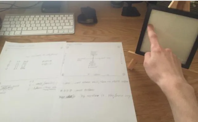
perform in a realistic use case where the screen is positioned upright. One concern I had after the brainstorming session was that the gestures can’t take a long time to perform since this can be a safety problem in a vehicle context, but also, since the screen is upright it could be tiring to perform gestures for a long period of time. In order for the results to be as accurate as possible, I placed a photo frame in about one arm’s length to the right of me since this is where the screen is placed in most left-hand drive cars. I chose to use a photo frame since the glass surface is similar to the feel of a touch screen and the edges of the frame allow me to test out how gestures around the edge would feel.
Figure 7: Picture from the bodystormi ng session
The results from the bodystorming session is that simple gestures, such as swiping is more comfortably to perform than more complex gestures, such as pinching and rotating. One reason for this could be that in order to perform a pinching gesture on an upright positioned screen you need to turn the wrist, which is something you don’t need to do while performing swipe gestures.
After performing some commonly used gestures, I went on to try out the concepts that was created during the brainstorm. Right away I felt that the multi-touch swipe concept suffered from the same problems that pinching and rotating did. The cause of this is that the differe nt fingers on a human hand aren’t the same length, which means that in order to touch the screen with more than one finger you need to turn your wrist in an angle that isn’t comfortable on a screen that is positioned upright.
The concept edge-swipe performed well during the bodystorming. Since this concept only require that one finger touches the display, the wrist could be held straight when performing the gestures, which is far more comfortable than turning the wrist. Swipe gestures that was performed around the edges of the photo frame were performed straighter than swipe gestures anywhere else. This could be taken into advantage later on in the design process when deciding where to place different functions. Functions that the user wants more control over could be placed around the edges for better control, for example, volume which some people like to fine tune to the exact right level.
Another thing that was noticed during the bodystorming is the need of feedback that rely on something else than visual information in order to make the interaction eyes-free. Since some of the functions in a music player already have direct audio feedback, for example, adjusting the volume and when changing tracks, I have decided to go with audio feedback to make the feedback experience uniform.
5.4 First prototype
Based on the knowledge and data extracted from the bodystorm session, I decided to go with the concept that utilize swipe gestures around the edges since this concept felt as the most promising. The prototype was built using the design software Sketch (Sketch 2016) and the prototyping software Pixate (Pixate 2016). These softwares were chosen since they are easy to use and let you run the prototype on a tablet. A simple frame was constructed out of cardboard and fitted around the screen of the tablet since the edge gestures need a frame to perform satisfactorily and being possible to perform eyes-free.
5.4.1 Interactions
The interaction with the prototype is mostly done via swipe gestures, however, three different tap interactions were implemented for the functions shuffle, repeat and play/pause. Shuffle and repeat are activated by tapping in the lower left corner and lower right corner. To play/pause the user taps anywhere on the screen.
Edge-swipes can be done on all edges except the top edge. The functions that where placed along the edges were; volume, sources and library. The last two gestures are left/right swipe which changes song and up/down swipe which lets the user swipe between either artist, albums or playlists, depending on what was chosen in the library section.
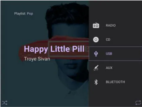
Figure 8: Right edge swipe reveals sources menu
As an example, if the user wants to play a playlist from a usb-stick, then he first swipes along the right edge to select usb in the source menu, then he swipes along the bottom edge to select playlists in the library menu, and at last he swipes up or down anywhere on the screen until he finds the right playlist.
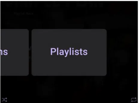
Figure 9: Bottom edge swipe reveals library
5.4.2 Feedback
During the bodystorm session, I decided that audio feedback will be the best feedback method for the prototype since it lets the user perform the gestures without having to look at the screen. Two different types of audio feedback were implemented in the prototype. For the functions shuffle and repeat I implemented 2 different sound effects which lets the user hear if he activated or deactivated the function. For the sources and library section, speech feedback was implemented since these functions have multiple choices, meaning, sound effects wouldn’t be adequate since the user wouldn’t know which alternative he had chosen. The functions play/pause, volume and previous/next track already have direct audio feedback since they directly control the music, so no feedback were implemented for these functions. Worth noting is that no music was implemented in the prototype due to technical problems.
5.5 Testing the first prototype
The usability test of the first prototype were conducted with four people. The age of the participants ranged from 21 to 25 years old. Three of them were males and one was female. All of them used smartphones on a daily basis and were familiar with swipe gestures. All of the participants had a driver’s license and prior experience with infotainment systems
All tests were conducted with one user at a time. The participant sat down in front of a table with the prototype placed to the right of them in order to try and replicate how a screen is placed in a car.
Each test session started with a quick introduction of the concept and an explanation of the purpose with the test. The participants were also told to think aloud during the test and to try and look at the screen as little as possible. After this the participant got a chance to play around with the prototype for around 5 minutes to get a chance to become familiar with it before the test started. When the participant felt he were somewhat familiar with the prototype the test started.
During the test I gave the participant tasks to complete, such as; play song x from playlist y. After each task the participant was asked to describe what he thought about the tasks he just completed. When all tasks were completed, a short discussion were held to discuss the overall feeling of the concept, what was good about it and what could be improved. The test plan can be found in appendix 9.2.
5.5.1 Results from the first usability test
Something I noticed right away during the warm up phase, when the participant first got to play around with the prototype, was that all the participants understood how the interactio n with the prototype works. The reason for this was that all the participants used smartphones on a regular basis, where swipe gestures are a common interaction method. During the dialogue with the participants it was concluded that all of them used the warm up phase to learn the interface and to try and memorize where the different functions were placed, not to learn the interaction.
During the actual test the participants said they liked the overall concept since the combination of swipe gestures, audio feedback and the feedback of the edge let them control the system without having to look at that screen for long periods of time. Two of the participants compared the prototype to other touch screen based infotainment systems they have used and said the prototype was easier to use since there is no need to target a
small section of the screen like there is in current touch screen infotainment systems. The participants especially liked that they could change playlist by simply swiping up or down on the screen instead of being forced to go through menus to do this. However, one of the participants commented that it may be tedious to do this if the music library is large.
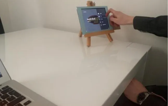
Figure 10: Test participant interacting with the prototype
Through observations during the test I can confirm that the participants didn’t look at the screen for long periods of time. Most of the glances occurred right before or right after the participant interacted with the device. During the discussion after test, two of the participants said they made a quick glance at the screen before interacting with the prototype in order to remember where the function is placed.
The audio feedback got overall very positive feedback. The participants said it was easy to understand the two different sound effects implemented for the tap interactions. The participants said that these two sound effects are similar to those used in some compute r programs and smartphone applications, which helped them understand the meaning of
participants said the feedback was intuitive and helped them navigate the prototype without looking directly at the screen.
Even though the prototype got, overall, very positive response there were some things the participants felt needed to be improved. Three of the participants didn’t like that the volume control was more sensitive and reacted faster than the other gestures since this made it hard to adjust the volume to the right level. During the test I also observed this, the participants often had to turn the volume down since the volume changed to much on the first swipe. Another thing that was noticed through observation was that the glances some of the participants made before starting the interaction sometimes was followed by a short pause before the actual interaction began. This occurred mainly during the interaction with the edge gestures. The cause of this was that they tried to remember where the function was placed since no icon or text label was used for the gestures in the prototype. The reason why this occurred mainly when interacting with the edge gestures was because these gestures, and the functions they control, were relatively new to the participants compared to swiping on the screen to change song which is rather common in music applications for smartphones.
The results of the usability test led to a checklist of things that need to be addressed: Make the volume less sensitive.
Implement icons or text labels for the edge gestures. Implement a bigger music library.
5.6 Second prototype
Based on the feedback from the first usability test I iterated the design of the prototype. The first thing that was changed was the volume control. During the test some of the participants said volume was to sensitive which made it hard to set the right level. In the first prototype the volume moved twice as fast as your finger. The purpose with this was that the user shouldn’t need to move their finger very much in order to change the volume. However, this wasn’t appreciated by the participants in the test so this needed to be changed. In this prototype I changed the sensitivity of the volume control so it moves the
same speed as your finger, instead of twice the speed like it did before. The lower sensitivity of the volume control will make it easier for the user to set the right volume level since the volume doesn’t change as fast as it did in the first prototype, meaning, the user doesn’t need to be so gentle with their finger movement.
Another thing that was discovered during the usability tests were that some of the participants glanced at the screen and then paused for a short moment right before they were going to perform an edge gesture. They did this since they were unfamiliar with using edge gestures. To minimize the need for the user to take a short pause before starting the interaction I implemented icons for the edge gestures. The icons were added to help the user find the right edge to interact with since there will be no need for a pause after the glance if they can see where the function is placed.
Figure 11: Icons implemented for the edge gestures
The last thing that was noticed during the first test was that one of the participants thought it may be tedious to scroll through one artist at a time if the music library is large. To test
this out a larger library were implemented in the prototype in order to find out if the participants thoughts about this were true. In the first test there were five artists, five albums and five playlists available in the prototype. In this prototype I added fifteen more artists to a total of 20. I choose to only make the artist section larger since it’s enough to allow me to test how a larger library performs.
When all changes and improvements had been implemented in the prototype it was time to test the prototype in order to find out if the changes improved the experience.
A video of the prototype can be seen on Vimeo: https://vimeo.com/166036185
5.7 Testing the second prototype
The usability test of the second prototype was conducted in a slightly different way compared to the test of the first prototype. During this test session I wanted to conduct the test in a more realistic environment compared to the first test. To do this, a car simula tor was set up which consisted of a steering wheel, pedals and the game Scania truck driving simulator. The purpose with this setup was to see how the prototype would work in the context it’s supposed to be used in. Apart from this, the test was similar to the first test; a quick introduction followed by a session where the participants got a chance to play around with the prototype in order to learn how the prototype works. After this, the test started. The test was conducted with four participants, two of them had tested the prototype before. The test plan can be found in appendix 9.3.
Figure 12: Test setup during the second usability test
5.7.1 Results from the second usability test
The results from the second usability test were overall very positive. The participants said that the combination of swipe gestures and audio feedback were intuitive and easy to use during driving in the car simulator. During the test I observed that the participants mostly interacted with the prototype eyes-free. Some of the participants made glances at the start of the interaction. This was something that also was noticed during the test of the first prototype. During this test these glances occurred for the same reason as in the first test, the participants glanced at the screen in order to remember where the gestures should be made. Through observation I could see that none of the pauses some of the participants made in the first test were present in this test. This was also confirmed by the two participants who had tested the previous prototype, they said that the icons implemented for the edge gestures helped them see where the gesture should be made. It was also observed that the participants glanced at the screen right after they had changed song or
feedback of the music and since no music was implemented in the prototype they had to glance at the screen to get feedback.
None of the participants in this test gave negative feedback on the volume control. The participants who had tested the previous prototype said it was easier to control the volume in this prototype. The conclusion drawn from this is that a volume control that reacts slower is easier to control than one that reacts faster since the user doesn’t have to be so careful with their finger movement if it reacts a bit slower.
The larger music library that was implemented in this prototype performed well during the driving in the simulator, however, three of the participants said it was quite slow to swipe through the artists compared to other music applications they have used. Two of the participants said it would be nice to have the option to choose between this swipe interface and a more traditional scroll list interface depending on the situation, for example, the scroll list interface could be active when the car is stopped and during driving it changes to the swipe interface.
Even though the participants said it was slow, they also said it fit the context since it’s easy to interact with it while driving. I could see through observation that the participants didn’t look much at the screen during this task. I also observed the game and saw that there was no significant effect on the driving performance during interaction with the prototype.
6 Discussion
Choosing the right gestures for in-vehicle use is crucial since some gestures can be uncomfortable or even hard to perform in an in-vehicle context. This can be seen when looking at the results from the bodystorming session. Multi-finger gestures like pinching and swiping with multiple fingers proved to be harder to perform than single-fi nger gestures like tap and swipe. The cause of this is that in order to perform multi-fi nger gestures, one has to turn the wrist in an uncomfortable way.
Swipe gestures proved to be easy to use during both the bodystorming session and the usability tests. The results from the two usability tests shows that all the participants understood right away how the interaction with the prototype work and that they found the swipe gestures to be easy to use eyes-free. This is in line with what Colley et al. (2015) found out in their study where they compared a traditional touch screen interface with swipe gestures. In their study the participants preferred swipe gestures over the traditio na l touch screen interface since it was easier to use eyes-free (Colley et al. 2015).
The positive reaction to the swipe gestures in the prototype could also be explained by the participants familiarity with swipe gestures. This is supported by the results from the questionnaire which showed that most of the respondents use swipe gestures. Burnett et al. (2013) writes in their study that swipe gestures are familiar to the users and that they are easy to use (Burnett et al. 2013), this is in line with the results in this thesis. However, during the second usability test the participants said it was quite slow to swipe through the artist section. This result is supported by Bach et al. (2008), they found out that gestures should be used to control basic functions, while advanced functions can rely on a traditio na l touch screen interface (Bach et al. 2008).
Kane et al. (2011) found out that blind users favored gestures that were located near the edges and corners of the display since this improved accessibility thanks to the physical feedback from the edge (Kane et al. 2011). The usability tests in this thesis shows similar
results, meaning, the use of gestures near the edges of the display is also a good choice in the context of in-vehicle usage since they are possible to perform eyes-free.
The audio feedback that was used in the prototypes performed well during the usabilit y tests. The users said they liked it and that it helped them control the prototype without having to look at the screen. The audio feedback worked in a similar way of that used in the prototype Slide Rule created by Kane at al. (2008), the system reads out the name of the selected object (Kane et al. 2008). However, worth noting is that Azenkot et al. (2013) points out that audio feedback can be hard to hear in places where background noise is present (Azenkot et al. 2013). Since the usability test in this thesis were held in a controlled environment where background noise was low, further testing of the audio feedback is required before a definitive conclusion is made. However, the results in this thesis indicate that audio feedback is a good choice of feedback since it gives the user eyes-free feedback.
6.1 Self-critique
The questions in the questionnaire was a bit to general to give an in depth understanding of what the respondents think of different kind of gestures. However, it gave me enough information to help choose what gestures to use in the prototypes. The questionnaire got a relatively low amount of respondents, only 16 people responded. This low amount of respondents makes it hard to create a fair picture of what gestures the general public is familiar with. However, I believe that the questionnaire can provide indications of what gestures the general public is familiar with since the answers from the respondents were overall relatively similar.
A weakness in the two prototypes created for this thesis was that no music could be implemented due to technical difficulties. During the usability tests, the lack of music may have affected the results since the participants needed to look at screen to get feedback for the tasks; play/pause and next/previous song. However, I think that if music had been implemented in the prototype, the participants glances to the screen had become fewer since the music would have acted as audio feedback.
7 Conclusion
The research question this thesis set out to answer was “What principles should be
considered when designing touch screen gestures for a music player in an in-vehicle infotainment system?”. From my research I can conclude that there are some princip les
that should be considered when designing touch screen gestures for an in-vehic le infotainment system.
Use gestures the users are familiar with
When designing gestures for an in-vehicle context it’s important to know your user-base. This is especially important in the context of in-vehicle infotainment systems since it’s important to provide good user experiences in the car to keep driver distraction at a minimum (Kern & Schmidt 2009). By choosing gestures the users are familiar with, the designer has a greater opportunity of making the system easy to use for the users since no new interaction method need to be learned and understood. This can be seen in the usabilit y tests in this thesis, the participants familiarity with swipe gestures made the prototype easy to use since all of the participant understood how the gestures worked.
Use the edges and corners of the display
The corners and edges of the display act as physical marks for the user, meaning, the user gets tactile feedback. By placing gestures at the edges and corners of the display, the user can feel with their finger where the gestures can be made thanks to the tactile feedback. This helps keep the visual load low which is important in this context since driving is a task that requires high visual load (Wheatley 2000). The results from the usability tests shows that the feedback from the edge helped the participants control the prototype eyes-free.
Make available gestures visible to the user
By using icons for the gestures, the user can easily understand and locate which gestures are available and where on the screen they can be used. This is especially important with gestures that are new for the users, like the edge gestures in my prototype. By adding icons
to the second prototype created in this thesis, the users didn’t have to pause and try to remember where he or she should swipe since the gestures was visible via a quick glance at the screen.
Usability test the gestures
Usability tests plays an important role when designing interactions for most products. This is also true when designing gestures for in-vehicle infotainment systems. By usabilit y testing the gestures, the designer can understand how the gestures performs and what the users think of them. This results in that the designer can take the necessary steps to improve the gestures based on the feedback the users give and provide a good user experience which is important in order to keep driver distraction low (Kern & Schmidt 2009).
Use feedback that don’t rely on eyesight
Driving a car is a task that requires high visual load (Wheatley 2000), this means that the feedback the infotainment system provides the user with should rely on something else than visual feedback. The usability tests in this thesis shows that audio feedback is a good choice of feedback in this context since the user can keep their eyes on the road while interacting with the system.
8 Future Work
This thesis shows that gestures is a good interaction method in the context of in-vehic le infotainment. However, the results from the second usability test indicate that gestures should be combined with a more traditional touch screen interface. Research is needed to give insight to how a system with two interfaces should work and behave. One direction to research more could be to implement context awareness where the system chooses what interface to show based on the traffic and road condition.
The prototypes in this thesis was possible to interact with eyes-free, indicating that it could be used as a music player for people with visual impairments. This is something that would need to be researched and tested in order to give definitive conclusion.
9 References
9.1 Literature
Alpern, M. & Minardo, K., 2003. Developing a car gesture interface for use as a secondary task. CHI’03 extended abstracts on Human factors in …, p.932.
Appert, C. & Zhai, S., 2009. Using Strokes as Command Shortcuts : Cognitive Benefits and Toolkit Support. Proceedings of the 27th international conference on Human
factors in computing systems (CHI’09), 2009, pp.2289–2298.
Azenkot, S., Bennett, C.L. & Ladner, R.E., 2013. DigiTaps: Eyes-Free Number Entry on Touchscreens with Minimal Audio Feedback. Proceedings of the 26th annual ACM
symposium on User interface software and technology - UIST ’13, pp.85–90.
Bach, K.M. et al., 2008. You can touch, but you can’t look. Proceeding of the twenty-sixth
annual CHI conference on Human factors in computing systems - CHI ’08, 7(3),
p.1139.
Bragdon, A. et al., 2011. Experimental analysis of touch-screen gesture designs in mobile environments. Proceedings of the 2011 annual conference on Human factors in
computing systems CHI 11, 17, pp.403–412.
Burnett, G. et al., 2013. A study of unidirectional swipe gestures on in-vehicle touch screens. Proceedings of the 5th International Conference on Automotive User
Interfaces and Interactive Vehicular Applications - AutomotiveUI ’13, pp.22–29.
Burnett, G. et al., 2011. Designing touchpad user-interfaces for vehicles: which tasks are most suitable? Behaviour & Information Technology, 30(3), pp.403–414.
Burnett, G., Summerskill, S. & Porter, J., 2004. On-The-Move Destination Entry for Vehicle Navigation Systems: Unsafe by Any Means? Behaviour & Information
Technology, 23(4), pp.265–272.
Colley, A., Väyrynen, J. & Häkkilä, J., 2015. In-Car Touch Screen Interaction: Comparing Standard, Finger-Specific and Multi-Finger Interaction. In Proceedings of the 4th
international Symposiun on Pervasive Displays. pp. 131–137.
Duarte, R.S. & Oliveira, B.F. de, 2014. Comparing the Glance Time Required To Operate
European Commision, 2005. European Statement of Principles on the Design of Human
Machine Interaction, ESoP 2005.
Harvey, C. et al., 2011. To twist or poke? A method for identifying usability issues with the rotary controller and touch screen for control of in-vehicle information systems.
Ergonomics, 54(7), pp.609–25.
Heikkinen, J. et al., 2013. Mobile Devices as Infotainment User Interfaces in the Car: Contextual Study and Design Implications. Proceedings of the international
conference on Human-computer interaction with mobile devices and services (MobileHCI ’13), pp.137–144.
Kane, S., Wobbrock, J. & Ladner, R., 2011. Usable gestures for blind people: understanding preference and performance. Proceedings of the 2011 annual
conference on Human factors in computing systems - CHI ’11, pp.413–422.
Kane, S.K., Bigham, J.P. & Wobbrock, J.O., 2008. Slide rule: making mobile touch screens accessible to blind people using multi-touch interaction techniques. Proceedings of
the 10th international ACM SIGACCESS conference on Computers and accessibilit y - Assets ’08, pp.73–80.
Kern, D. & Schmidt, A., 2009. Design space for driver-based automotive user interfaces.
Proceedings of the 1st International Conference on Automotive User Interfaces and Interactive Vehicular Applications - AutomotiveUI ’09, (AutomotiveUI), p.3.
Marcus, A., 2004. The next revolution. Interactions, 11(1), p.40.
Rydström, A. et al., 2005. Multifunctional systems in vehicles: a usability evaluatio n.
Proceedings of the Fourth International Cyberspace Conference on Ergonomics CybErg 2005, pp.768–775 (8).
Rümelin, S. & Butz, A., 2013. How to make large touch screens usable while driving.
Proceedings of the 5th International Conference on Automotive User Interfaces and Interactive Vehicular Applications - AutomotiveUI ’13, pp.48–55.
Schleicher, D., Jones, P. & Kachur, O., 2010. Bodystorming as embodied designing.
Interactions, 17(6), p.47.
Vidal, S. & Lefebvre, G., 2010. Gesture Based Interaction for Visually-Impaired People.
October, pp.809–812.
Abstracts on Human Factors in Computing Systems, (April), pp.43–44.
9.2 Books
Denscombe, M., 2009. Forsknings-handboken: för småskaliga forskningsprojekt inom
samhällsvetenskaperna, Studentlitteratur, Lund.
Saffer, D., 2010. Designing for interaction: creating innovative applications and devices, New Riders, Berkeley.
9.3 Online Sources
Controller, n.d. Available from:<http://www.bmw.com/com/en/insights/technology/technology_guide/articles/contr oller.html>. [29 February 2016].
Farago, R., 2002. BMW I Drive. Available from:
< http://www.thetruthaboutcars.com/2002/02/bmw- i-drive/>. [29 February 2016]. Gitlin, J., 2014. The past, present, and future of in-car infotainment. Available from:
<http://arstechnica.com/cars/2014/06/the-past-present-and- future-of- in-car-infotainment/>. [ 2 March 2016].
iDrive, n.d. Available from:
<http://www.bmw.com/com/en/insights/technology/technology_guide/articles/idrive .html>. [29 February 2016].
Pixate, computer software 2016. Available from: <http://www.pixate.com>. [3 April 2016].
Robinson, M., n.d. Hiding basic car controls in a touchscreen is stupid and distracting. Available from: <https://www.carthrottle.com/post/hiding-basic-car-controls-in- a-touchscreen-is-stupid-and-distracting/>. [2 April 2016].
Sinclair, J., 2011. Tesla designing a dangerous distracted driving machine. Available from:
<http://stopandmove.blogspot.se/2011/10/tesla-designing-dangerous-distracted.html>. [2 April 2016].
2016].
Teehan, G., 2014. The State of In-Car UX. Available from:
<https://medium.com/habit-of-introspection/the-state-of- in-car-ux-9de33c96403d#.7prhmyqis>. [2 March 2016].
Yang, A., 2007. BMW iDrive Really Sucks. Available from:
<http://themobileexperience.blogspot.se/2007/01/bmw- idrive-really-sucks.html>. [29 February 2016].
9.4 Figures
Figure 1 Dambrans, K., 2014. BMW i3 electric car. Available from:
<https://www.flickr.com/photos/janitors/13103953853/in/photolist-kXWndr- kXXV2U-kXWktz-kXYp95-kXX2sv-kXX5We-kXX3pv-kXWZHP-kXWTp8-kXWZzV-kXWwV2-kXXoZi-kXXK AE-kXXRed-kXYc6C-kXWzgV-kXXhaB- kXYohL-kXWRpr-kXX9Lt-kXWGwB-kXWWnH-kXWpPD-kXXbWR-kXWjCr- kXY3JN-jAtB9b-qREp8D-kXY9WC-kXXeZe-kXWp3i-kXY73w-kXYh1Y-kXXv3a-kXYhXN-kXY8Vu-kXXPs7-kXWN wn-kXX8Ui-kXYjVA-kXWDgD-kXYcSs-kXX7Dc-jLvWPN-vFrSEU- vGoPkr-vpyBRe- vG1x5t-vG1xrR-vG1xoz>. [20 April 2016].
Figure 2 Automobile Italia., 2015. La BMW presentera al CES 2016. Available from: <https://www.flickr.com/photos/automobileitalia/23439956733/in/photolist-opMhxR-CJHHNg-CPp2Zf-BHiUv4- uJYoYA>. [20 April 2016].
Figure 3 Van Der Mark, D., 2014. Proefrit testdrive Tesla Model S. Available from: < https://www.flickr.com/photos/d_vdm/14748104361/>. [20 April 2016].
10 Appendix
10.2 Test plan for the first usability test
Introduction
Explain the project and the purpose of the test.
Before the test questions
How often do you use a smartphone? Are you familiar with swipe gestures?
Have you used in-vehicle infotainment systems before?
5 minute warm up session
The participant get a chance try out the prototype before the test.
Test session tasks
Task 1: Turn on the radio and play bandit rock. Change the volume to around 50% Task 2: Change source to usb and play the playlist rock. Play next song. Pause the song. Task 3: Play the artist Troye Sivan and set the volume to around 75%. Turn on repeat. Task 4: Play the album taking one for the team and turn off repeat.
Questions after each task
How was the interaction?
What do you think about the feedback? Was something hard?
Any other comments?
Round up questions
What do you think about the overall concept? Did something stand out? In what way? Hard/easy? What did you think about the gestures?
What did you think about the feedback?
Was it possible to interact without looking at the screen? Anything else?
10.3 Test plan for the second usability test
Introduction
Explain the project and the purpose of the test.
Before the test questions
Are you familiar with swipe gestures?
Have you used in-vehicle infotainment systems before?
5 minute warm up session + 5 minute game warm up
The participant get a chance try out the prototype before the test and to get used to the game and the controls.
Test session tasks
Task 1: Turn on the radio and play bandit rock. Change the volume to around 50% Task 2: Change source to usb and play the playlist rock. Play next song. Pause the song. Task 3: Play the artist Troye Sivan and set the volume to around 75%. Turn on repeat. Task 4: Play the album taking one for the team and turn off repeat.
Questions after each task
How was the interaction?
What do you think about the feedback? Was something hard?
Any other comments?
What is your feeling about navigating to the last artist? (Task 3)
Round up questions
What do you think about the overall concept? Did something stand out? In what way? Hard/easy? What did you think about the gestures?
What did you think about the feedback?
Was it possible to interact without looking at the screen? Anything else?