Web analytics.
Website analysis with Google Analytics
and Yandex Metrics
Author: Alisa Dibrova
Graduation thesis 30p,
Interaction design Bachelor, 2013,
Malmö Högskola K3
Abstract
The scope of my research is web analytics. This paper describes the process of usability analysis of the website belonging to a company Sharden Hus situated in Stockholm. From the many existing tools of web analysis I chose two the most popular ones, Google Analytics and Yandex Metrics. In similar projects that I have read, the website redesign was based on both quantitative, statistical, and qualitative (user interviews, user tests) data. In contrast to the previously carried out projects on websites improvement with the help of similar tools, I decided to base the changes on the website only on quantitative data obtained with Google and Yandex counters. This was done in order to determine whether and how Google and Yandex tools can improve the website performance. And to see if web analytics counters may provide with sufficient statistical data enough for it's correct interpretation by a web analytics designer which would lead to the improvement of the web site performance.
The results of my study showed that Google and Yandex counters isolated from qualitative methods can improve the website performance. In particular, the number of visits from the territory of Sweden was increased to almost double; the overall bounce rate reduced; the number of visits to the page containing order forms significantly increased.
Table of Contents
1. Abstract...2 2. Table of contents...3 3. Introduction...4 4. Background...4 5. Problem...56. What do I lean upon?...5
6.1. The notion of web analytics...5
6.2. Earlier research...6
6.3. Web analytics tools used for current research...7
6.4. Literature sources...8
7. Methods and materials...9
8. Design process...10
8.1. Heuristic evaluation...11
8.2. First round...13
8.2.2.User interviews, first round...13
8.2.3. Statistical data, first round...15
8.2.4. Comparison of user interviews and statistical data, first round...20
8.2.5. Summary...20
8.3. Implementing changes on the website...21
8.3.1. Order page...21
8.3.2. “Bokning” button...23
8.4. Second round...23
8.4.1.User interviews, second round...23
8.4.2. Statistical data, second round...25
8.4.3. Comparison of user interviews and statistical data, second round...29
8.4.4. Contingencies...30
9. Conclusions...31
Introduction
The field of the current work is web analytics. Web analytics is the measurement, collection, analysis, presentation and interpretation of information about visitors of web sites for the purpose of their improvement and optimization. The main task of web analytics is to monitor traffic of the website, on the basis of which the web audience is determined and the behavior of web visitors is studied in order to make decisions on the development and increasing of the functionality of a web resource. The current work represents an analysis of a website in usability and interactivity. My interest is in inspecting the principles on which creation of a functional web site is based, such as, for example, web site's composition: the construction system (website map), as well as the location of information on the web page, objects on the page, the color gamut of the whole site or of the separate objects and the way this all affects the level of effectiveness of interaction between user and a website, which is a company's main representative.
Background
With the means of web analytics I plan to investigate interactive system used by the company Sharden Hus AB in its business strategy, and to explore the means of achievement of a maximal interactivity of their website, studying the existing methods used by the company, finding out the potential positive changes and implementing them in practice. Web analytics can help in carrying out this task by letting us to look at website functionality from inside and see such things which are impossible to see through an ordinary observation or user interviews. With the means of web analytics I may see, for example, how many visits there are on this or another page of the website, how actively visitors use this or another link, what they click and what they don't, how they travel within the website and how all these aspects change after the rearrangement of the website content or implementing any other changes to it. As Jacob Nielsen states in his article Quantitative
Studies: How Many Users to Test? (2006)“The point is that you collect usability metrics to compare them with other usability metrics, such as comparing your site with your competitors' sites or your new design with your old.”
The company I was collaborating with while carrying out an analysis on interactivity of it's website is situated in Stockholm. The company provides cleaning and renovational services throughout Stockholm. I got a positive response and an agreement to carry out the planned work.
First of all, this project was an experiment where I isolated the quantitative data from the qualitative in order to see if this data would still be sufficient to serve as a basis for the changes on the website which are aimed on it's improvement. In this context my designer role is researcher. Web analytics counters provide with plenty of different data expressed in numbers and diagrams. For example, we have data in numbers about the bounce rate or about the number of drop offs on the various pages on the web site. We see only the numbers, but do not see the situational circumstances surrounding a particular user action. Or data about page visits - here task of web analyst as a designer is to interpret the available statistical data in a correct way. For example, to determine the real reason of why users stay to little on this or the other page: the page content is of little interest or the information is placed inconvenient for perception, reading and understanding. What exactly and how it needs to be changed on a website based on the statistical data obtained with counters was my main task as designer and web analyst in the current project.
Problem
Often the website is the face of the company. This is especially true if the website is the primary means through which the client learns about the company and interacts with it. How well and correctly a website is built, and how well the principles of interactivity are followed, determines how much the client will like the company and how much he or she would be ready to use its services. I aim to learn the principles of a good web design, to examine which aspects affect user interactivity of a website in a positive way, and which reduce the effectiveness of the interaction. I plan to examine the way Google Analytics and Yandex Metrics tools work and the ways they can be applied to improve the interactivity of websites. I want to check whether it is possible to identify practical ways of improvement of the website www.shardenhus.se by means of Google Analytics and Yandex Metrics tools. Against this background I set myself a question: Can the web analytics
counters provide with sufficient statistical data for it's correct interpretation by a web analytics designer with the purpose to improve the web site performance? And how will the received
quantitative statistics look in comparison to the qualitative data derived from user interviews as well as compared to my own reflections based on previously studied literature?
The aim of this work is to investigate by which means Google and Yandex tools help in improving websites. The goal will be considered to be achieved when after the changes are applied on www.shardenhus.se the next following data gathering from the website would confirm the increase of it's functionality.
What do I lean upon?
The notion of web analytics
Nowadays, the concept of web analytics is well known. By web analytics we may understand a set of measures for the collection, interpretation and analysis of information about visitors of a website aimed at effective promotion of a website, increase of its visits, and common optimization. The official WAA (Web Analytics Association) definition for web analytics is: “Web Analytics is the measurement, collection, analysis and reporting of Internet data for the purposes of understanding and optimizing Web usage.” (WAA 2008, p. 3)
Web analytics can give answers on such questions important to a website, and company development in general, as: Which countries / regions course the most interest of web visitors? How much time visitors spend on the website? From which webaddress they come to the website from? Do visitors perfom any actions (filling in forms, participate in a survey, etc.) and do they become customers of the company later on? Were the costs for advertizing and for the promotion of the website reazonable? And many others.
The field of web analytics is relatively young, though at the present time there exist a lot of tools for the analysis of websites' functionality. For example, such tools as Site Catalyst, or CoreMetrics Analytics, and WebTrends Analyst, Yahoo Web Analytics, and many others. Each of the tools differs by its own specific features and capabilities. There are both commercial and free tools for web analytics. Many companies specializing in website analysis and promotion use tools such as Google Analytics and Yandex Metrics. An important aspect which reveals the popularity of a web site is the number of its visitors. The most affordable way to define the website traffic is an attendance counter. At the moment, the most popular among free counters are Google Analytics and Yandex Metrics. All existing counters determine the quantity of site traffic, and at the same time, analyze
the behavior of users. For carrying out this project I chose two of the most popular tools of web analytics, Google Analytics and Yandex Metrics.
Earlier research
There were conducted plenty of analyses of multiple websites using different tools available. They all have differences, because there are different websites which are analyzed and different tools are used for that. There are selected different analysis strategies. In some cases quantitative, statistical data, is combined with user interviews aimed at finding out how users evaluate the website, in others — with user tests of the upcoming website modifications. And even when using one and the same web analytics tool analysts lean upon different metrics reports. But all these projects have a common goal - to improve the usability of a website. It would be interesting to take a look at a few of the already existing projects.
In all the projects listed both quantitative and qualitative methods of research are used for the analysis and promotion of the websites.
In my research, similar to the first and second researches listed, I tracked website quantitative data with the page-tagging method by means of Google Analytics and Yandex Metrics tools. Though, in contrast to all the projects mentioned I based all the changes made in a website on only Google Analytics and Yandex Metrics data in order to find out if it would still lead to website's promotion. One of such projects is «Using Google Analytics for Improving Library Website Content and Design:
A Case Study» by Wei Fang. The author describes the process of analysis and improvement of the
website of the Rutgers-Newark Law Library (RNLL). To fulfill his tasks Wei Fang chooses to use Google Analytics as a tool of quantitative data collection. And, as a quantitative method, he involves library personnel in a "decision-making process" of the further website redesign.
The redesign changes which took place were to add: the “Most viewed items” section, which in author’s mind would attract more visitors to these pages; “Other links of interest” in order to further promote popular pages. There was redesigned the right- and left-hand menu, some of the the changes were based on the wishes of the library personnel.
The project results: increased number of website visitors, number of visits of popular pages, increased the average number of page viewed, all of which are positive changes which indicate the improvement of website's functionality.
The conclusions of the project state that the website functionality was increased by use of Google Analytics combined with user tests.
One of the related projects is Using Google Analytics to Evaluate the Usability of E-commerce Sites.
"This research investigated whether advanced web metrics, calculated using Google Analytics software, could be used to evaluate the overall usability of e-commerce sites, and also to identify potential usability problem areas.” One of the aims of the project is "To compare issues raised by GA software to problems identified by the web experts who evaluated the sites using heuristics approaches." (Hasan, Morris and ProbetsIn n.d.). In my project there was made a similar
comparison: issues raised by GA software to problems identified by the users who evaluated the site during user interviews.
The research consists of comparing the six metrics categories of three e-commerce web sites. These categories are: navigation, internal search, architecture, content and design, customer service, and purchasing process.
Results of the research describe different rates and measurements of the three websites. Data is gathered by means of the page-tagging method (tracking code is installed on each page of the website) with the help of Google Analytics tool.
Conclusions state that with the means of GA combined with experts' evaluation there is possible to obtain quick, easy, and cheap, indications of general potential usability problem areas on e-commerce web sites.
One more interesting paper on this matter is called Developing a Web Analytics Strategy for the
National Science Digital Library. As it may be understood from the title, the paper describes a
workshop process of developing a web analytics strategy for the National Science Digital Library (NSDL). The workshop results were so that the web analytics study should comprise few web sites, comprised of NSDL.org. And the websites' evaluation would be based on both quantitative and qualitative data, such as, for example, online surveys.
Web analytics tools used in current research
So, what are Google Analytics and Yandex Metrics and what do they do?
One of the main aims of installing the counters is to obtain information about where your visitors lose interest in a website and close it. With this data we can modify pages of exit and improve the website statistics.
Google Analytics will provide with information about attendance - for this purpose it has a section "Exit Pages." In this system you can analyze the common statistics, see from which pages users most often leave the website.
Google Analytics provides the necessary information that describes the behavior of a website: • The number of website visitors and number of page views;
• The number of unique visitors;
• The average number of pages viewed per visit and average time spent on a website;
• Bounce rate (the percentage of visits of a website, during which not more than one page was viewed, or during which the visitor has left from the same page he/she entered a website);
• The percentage rate of new and returning visitors.
In addition, it gives an opportunity to see the web statistics for each separate page. Metrics allow to compare the audience coming from different sources of traffic, such as search engines,
advertising, external website or direct transfer.By the source of traffic there is possible to gather some additional data (for example, for traffic of external websites we can view pages from which the transition was made).
With Google Analytics it is also possible to find out a lot of information about visitors: - The operating system;
- The types of browsers;
- Extensions and screen color settings; - Language used by visitors;
- The types of mobile devices that visitors use to access the Internet.
Yandex Metrics is a Russian analogue of Google Analytics, giving a possibility to record and analyze the actions of the website users and to see the website's attendance. A great advantage of Yandex Metrics counter is the technology "Webvisor" - it records the actions of website visitors, so that it is possible to view them in the "live video". The data is stored on all visits in the last 14 days. By means of using "Webvisor" we can identify not only the most popular pages of exit, but also see the exact behavior of users on the website who came there via a specific request from a specific search engine.
This data will help considerably in finding and fixing errors in usability, structure and design
Among the tools of Yandex Metrics which allow visually track the behavior of a website visitors there is map of the website ways. It shows the transitions between pages, as well as entry and exit points on a specific page.
Literature sources
Major literary sources that I have chosen to rely on in writing this work are primary a number of books on Google Analytics describing the peculiarities of work and use of this tool: Google
Analytics Third edition (Mari E. Tyler & Jerry Ledford 2010); Advanced Web Metrics with Google Analytics (Brian Clifton 2008). These two sources are the guide to Google Analytics, which give
detailed explanation of the process of installation and adjustment of Google Analytics, describe each section of the data collection, the meaning of that or the other data obtained by the counter Google Analytics. These books helped me in interpretation of the meanings of the satatstics results. A guide in statistics interpretation was also a Professional Analytics, video course (2012), which describes the features of both counters and focuses on the interpretation and use of reports obtained with Google Analytics and Yandex Metrics tools.
When redesignign pages of the Sharden Hus' website I used a number of books as my guides concerning the limits on what should be avoided while redesigning a webpage. One of these books is called Användbara hemsidor: analys av 50 webbplatser (Nielsen 2001). The book is written by a leading web usability consultant and consists of two parts. The first part describes the general principles of usability of homepages which are taken from the author's experience. The second part describes 50 specific examples of homepages with analysis of their errors. One more book used in a similar way was Användbar Webdesign (Nielsen 2001). This book suggests the principles of a good content and page design, website's structure, among this the ease of navigation. I received useful information about the concepts and tools needed to develope web sites that maximaze the user experience from the book Web Usability. A User-Centered Design Approach (Lazar 2006). As the main basis for the heuristic evaluation of Sharden Hus' website I used
Användbarhetsboken (Sundström 2005). The book highlights the basic points that should be noted
when creating a good website. Among the points discussed is language, interactivity, graphic profile and it's meaning for a usable website, etc. The main content of the book is the creation of a website with a focus on usability. This book, as well as the previous ones, has helped me to make
my own evaluation of the website based upon the guidelines stated in the book. I compared my own evaluation of the website with the data obtained from the Google and Yandex counters to see if they have much in common or the opposite – contradict each other.
When choosing the number of interviewees I leaned upon the article Why you only need to test
with 5 users (Nielsen 2000) and a book Don't make me think (Krug 2006). Based upon the
information and recommendations from those two sources I made my choice on the number of interviewees needed for carrying out my project.
Methods and materials
Web analytics is my primary quantitative method used when carrying out the project, in particular - tracking user actions with the help of Google and Yandex tools. The qualitative methods used are user interviews and heuristic evaluation.
The web analytics survey and user interviews survey together with the heuristic evaluation provide project with different kinds of data. Web metrics survey provides with only quantitative data, though,
«What the numbers represent, it is not always an easy task to decide. Numbers are
totaly isolated from the context in which they occurred. They say nothing about why a particular function has been used, or whether the user managed to resolve his task. The statistics does not show the user's facial expressions when he left the page or the web site. Usage statistics must therefore be complemented by a more qualitative
techniques, such as think-aloud tests or interviews.” (Rolf Molich 2002, p. 192)
Qualitative and quantitative data complement each other. In order to get the most clear picture of how good the functionality of the website is, it is desirable to rely on both types of data, both qualitative and quantitative. That is how it is usually done. In this project I have made an experiment where I isolate the quantitative data and base the changes implemented on the website on only the quantitative statistical data I received. This is done in order to investigate if and how the use of only Google and Yandex counters with no help of qualitative data can improve the website perfomance. At the same time I used qualitative interviews and quantitative statistics to evaluate the changes implemented on the website, both before and after implementing those changes.
When tracking user actions with Google and Yandex counters, no users are aware that their actions on a web page will be observed, might be recorded and used for the following research. The observation was conducted as before the implementing of any changes on the web page, as after it, in order to track the possible changes in the website's work. The fact that users are unaware they are observed will in my mind give the most accurate results because users are not being influenced by the observer while the observation takes place. Users are not be trying to perform any certain actions in any different way from what they would do being alone in order to effect the viewer's reaction, just because of that they are unaware of any observer. During the observation the users are in their natural environment and are only busy with the interaction with the website. Under such kind of observation, users interact with the site in the same way as they would have done without being observed.
By means of the Google and Yandex tools I can get such quantitative data as, for example, which of the links on the webpage were clicked the most. This will allow me to draw conclusions about the quality of the links: if they are located in a suitable way, if there is a way to jump to the webpage directly or the rarity of it's visits is caursed by too complicated route to it.
«Usage statistics can also reveal "holes", ie. parts of the site that are rarely or never used. Perhaps it is too difficult to navigate to those sections of the website, or the corresponding user tasks are unrealistic (Användningsstatistik kan också avslöja ”hål” dvs. delar av webbplatsen som sällan eller aldrig används. Kanske är det alltför svårt att navigera till dessa delar av webbplatsen, eller de motsvarande
användaruppgifterna är orealistiska)” (Molich 2002, p. 192).
Data on the length of staying on a given page can provide with information about the usefulness of page's content. For example, if the website has a page that most people leave already after a few seconds, it will point to the poor quality of the content: information of a poor importance is published, text has poor readability, there are irritating colors in the layout or other factors which reduce the level of interactivity. In this case, based on quantitative data, it's possible to make conclusions on the qualitative characteristics of various objects.
Besides the statistical quantitative data, I decided to lean upon on the qualitative data, user interviews and a heuristic evaluation. The observations were combined with the interviews and my own evaluation of the website, which provides project with qualitative data. Different testees were questioned on how they evaluate the website's functionality in two rounds: before the changes on the website were implemented, and after.
The heuristic evaluation is made on the following aspects: target group, aim, layout, function, color and shape. In my mind, evaluation of such parameters of the website would give a quite complete picture of the website and it's functionality.
The interviews survey was conducted on four users. Jacon Nielsen (2000) states in his article ”Why You Oly Need to Test with 5 Users” that for successful user tests it's enough to only test a group of five persons. According to Steve Krug's (2006, p. 138) statements in his book ”Don't make me think”, the number of test users should be from three to a maximum of four people. I made my choice on four users. Statistical data on the user's visit, gathered with the Google and Yandex tools shows that among women the main category of visitors are women between 24 and 34 years and among, men from 34 to 44. From such statistics, it could seem to be reasonable to focus on certain age and gender groups for conducting user test. Though, according to Steve Krug «it doesn't much
matter who you test”, whatever the target audience could be. ”For most sites, all you really need are people who have used the Web enought to know the basics.” (Krug 2006, p. 139)
Design process
For examining the company's website I used Google Analytics and Yandex Metrics. Google Analytics performs monitoring on user activity and provides reports that lets to measure and analyze user interaction with the webpages. Based on them, the important parameters can be
identified for further work. In such way I can also find out what is popular on the site. Determine how often people visit each page, how much time they spend on it.
The work is carried out in the following steps:
• Tracking functionality of the website using Google Analytics and Yandex Metrics simultaneously. This was done during all the time the project was carried out.
• First round of user interviews • Studying and processing the results
• Stating recommendations on improvement the website • Implementation of possible improvements
• Second round of user interviews
• Gathering statistical data from the website in a second round, comparing old and new metrics
• Conclusions
Heuristic evaluation
Target group
The target group of the website is supposed to be Stockholm residents with a good income, busy people who need help with the daily home cleaning. These are office workers, business owners. Owners of houses or flats which are in need of repair services.
Aim
The web site service must be simple and understandable to the client, saving time, allowing to easily find necessary information, to make an order for those servicies which the client is
interested in. ”Det är viktigt att inse att det inte alltid som användaren mål sammanfaller med ditt syfte med webbplatsen.” (Sundström, 2005) Websides owner's goal is to make user buy company's services. Both user and owner are interested in that the website should be as easy to operate as possible. All the most important things should be on the foreground.
Layout
Text aligned to the left. Which corresponds to the rules stated in ”Användbarhetsboken”. (Sundström 2005).
(Figure 2. Double links) There are Identical links in “Galleri”: Lägenhet i
Moskva-city and Lägenhet i Moskva. Those two could be united into one. ”Länkar på samma sida
som leder till olika ställen får inte ha samma text, eftersom detta kan vara förvirrande för synskadade.” (Sundström 2005). On the same page
the names of the subtitles would look better if alined in vertical columns, not spread chaoticly. It's not mentioned by whom the pictures placed on the website were taken. Which should be done
according to the ”Användbarhetsboken” (Sundström 2005). Page “ Interiör Före och Efter”, one of the sections containing images of the work process is repeated by mistake and contains the same images.
Function
Hard to find how to order any of the servicies except calling by a phone number and by sending an email via ”contact us”. Would be great to make each different propositions on the website
clickable, so that when the user is transfered to the page of ordering, the offer details would be automaticly transfered into the email as well.
Page http://www.shardenhus.se/en/13607 Contains the following text: ”Sorry, this entry is only available in Svenska”. The language should be correct, it may be considered unprofessional to combine two languages in one sentense.
When from the main page of the website we swich to an English verision by clicking ”In English” in the upper right corner, we see that only the half of the mainpage is in English, the rest of it is in Swedish. That would be much suitable for English speaking customers if all the heads (rubrics) of the page were translated into English.
The main page, images with different offers which swich one after another. Here we see ”Stairway Cleaning”: half of the list is in English, half in Swedish. ”Deep cleaning/move out cleaning”: half English, half Swedish.
(Figure 3. Use of multiple languages) Move in/out cleaning: list of services is in Swedish. Menu to the left: small paket, though custom package – mixture of languages again.
Services submenu is partly in Swedish. ”If you provide information in multiple languages, it is important that it is kept updated on all the languages (Om man ger information på flera språk är det viktigt att den hålls uppdaterad på alla språken.)” (Sundström 2005), which in our case is not fulfilled.
According to ”Användbarhetsboken” it should be marked in the menu on which page the user is (Sundström 2005). It's allways good to know where you are on the website to navigate easier and to feel some control over the websites functionality. This aspect is followed by the website.
Color and shape
The color gamut is warm and cozy. The wallpaper image on the background brings a cozy feeling as well. There are no functions on the website which would depend on the color choice, which could be a problem to color blind people.
First round
User Interviews, the first round
When conducting user interviews I asked users to give answers and feedback on the following points which in my mind would give more or less clear picture on how the website is evaluated in general:
• color gamut • language
• how easy it is to find the necessary information
• own comments, like common impression about the website, what was good, what not that much. What you would like to change.
Roberto, 25, stundent at MAH, sportmanagement
The colors got a nice feel to it, reminds me of an expensive perfume design. The fact that the page is in brown is nice, it's quite a rare color to use.
The language is fine, but I find the different headings and colorings kind of distracting and confusing, it cheapens the experience of the website.
Quite easy, since the site got a good navigation nexus/interface
Overall it's good, just didn't enjoy the massacre of the typography the fact that the headings had diffrent colors, didn't like that piece at all. Would be good to be able to click on any of the companie's orders and to be directly transfered to an order form.
Per, 45, programmer
The sentence is not correct: Pride in our work means everything to us and customer satisfaction a must. An incorrectly placed: ”Kontakta oss nu för en gratis uppskattning”. Why are Swedish and English mixed? You can not mix English and Swedish, it will be hard to read. You want to have everything either in English or Swedish. (Den meningen är inte rätt: Pride in our work means
everything to us and customer satisfaction a must. Fel placerad: «Kontakta oss nu för en gratis uppskattning». Varför är svenska och engelska blandat? Det går inte att blanda engelska och svenska, blir jobbigt och läsa. Antingen vill man ha allt på engelska eller svenska).
You notice that a part of constructions are written by someone with Swedish as not a mother tongue (Man märker att en del konstruktioner inte är skrivna av någon med svenksa som modersmål).
Too much text. Shorten and concentrate the text on this which means something. If you divide it up in Swedish and English version, it becomes more clear. For instance, if you click a link in English, one often comes to a page where it is written in Swedish. Why? It must be right consistently. My main point is that with English and Swedish needs be to fixed (För mycket text. Korta ner och
koncentrera texten till det som betyder nåt. Delar man upp det på svensk och engelsk version så blir det mer överskådligt. Om man tex klickar på en länk på engelska kommer man ofta till en sida där det är skrivet på svenska. Varför? Det måste va konsekvent. Mitt största påpekande är att det med engelska och svenska måste fixas till).
Oleg, 30, own business
Colors look fine as for me. Hard to judge the grammar since I am not a native Swede. Overall looks ok, I understand everything written.
Double menu on the main page I would prefer to unite into one. It's hard to understand which of menus is the main. References page, text swiches from one to another too fast. It will be complicated if one reads slowly or if there is more of the text written.
Francesca, 30, Italian teacher
The colours look nice. They look feminine. The language looks pretty clear, simple but precise. It looks like there is everytning one could need on the homepage. If I were to make some changes, although I like the nuances of brown, I'd use nuances of blue as blue connects more with the cleaning (water-clean-pure). The picture of the woman cleaning the oven, I would have used a picture taken in a studio or something, of the same person and maybe holding tools, but not while she is really doing it. But it might cost a lot to get such pictures done. This picture doesn't give me the impression of professionality (although it's only an impression and it obviously doesn't say anything about the actual rpofessionality of the cleaners). Maybe for a better visualisation I'd put the phone numbers one under the other, rather than next to one another. I like the picture of the big window with the tree.
I was checking the pictures in interior “före och efter”, and it is not possible to shift from one picture to the next one, while this would make it much faster to look at the works
Stastical data, the first round
Lets start with the Audiences tab, Section Demography / Language. The total number of visitors per month is 829, which is not that many. In the following picture (Figure 1), we can see the proportion of people coming to the site and using a different language. As we see, the number of users using Swedish equals only 377 (206+171) of 829 visits, which makes less than half of all visits.
(Figure 4. The proportion of visitors having this or other language set as default.)
In the diagram the percentage of users using Swedish (sv and sv-se) are marked in green and red colors. The total percentage of such users is only about 45% of the total quantity. Resting upon this, we may assume that the majority of users is a non-native Swedish speakers, don't use Swedish as their native language and most probably prefer to be able to use the website in English. In the following figure (Figure 5), we see the percentage of bounces relatively to the use of language preferred by user.
(Figure 5. Percentage of bounces relatively to the use of language preferred by user.)
Bounce rate is calculated as ”single page view visits divided by entry pages”. ”If bounce rate is being calculated for a specific page, then it is the number of times that page was a single page view visit divided by the number of times that page was an entry.” (Jason Burby, Angie Brown & WAA Standards Committee 2007, p.30)
Here we see that most of the bounces (bounce — user leaves the site immediately without navigating) are performed by users using a language other than Swedish. The highest bounce rate comes from the group of users using English language as default, here the bounce rate is 37.99%.
In this case the bounce rate among users having Swedish language as default the bonce rate is 18.76% (sv) and 23.80% (sv-se)- We see that the number of users using the English language exceeds the number of users using Swedish. “Bounce tells you there was nothing of interest to the
visitor on the page” (Tyler and Ledford 2010, p 87).
The next screenshot (Figure 6) illustrates the Audience, Demographics / Location. Here we can see visitors to the website by users from different countries illustrated as a map overlay.
(Figure 6. Visits in relation to user geographical position.)
Here we can see that the highest amount of visits is performed within Sweden, but still visits are not limited to the territory of Sweden, and are made from other countries as well.
The following picture (Figure 7) shows the number of bounces in relation to the geographic location where the entry was made from.
(Figure 7. Amount of bounces in relation to the geographic location where the entry was made from.)
In Figure 7 we see that the lowest percentage of bounces belongs to Sweden (we should exclude the Ukraine, visits belong to my close friend, whom I tell about my project sometimes), and the highest percentage is in the territory, where the English is preferred to Swedish.
The next illustration (Figure 8) represents a map of ways on the website. Audience / Custom / Visitors Flow
(Figure 8. Map of user navigation on the website.)
Here we can see in detail user navigation through the site, how many transitions were made, to which pages and from where the transitions were made. The greatest number of visits is made from within Sweden. Out off 632 Swedish users 263 have moved to the Swedish version of the company's website and 150 to the English version. From those 150 who made a transition to the English version 53 users remained on the site, and 97 made a drop-off, which corresponds to 64% of the total number of visitors of the English version. An interesting fact is that every one of those 150 users who have switched to the English version, and not committed a drop off but continued traffic on the site, went back to the Swedish version. 10 people passed the “Contact Us” page, 7 of them stayed, 3 left the site. 10 users entered the page “Kundbokning”, from them 5 stayed on the site, 5 left.
From all of the above-listed we can conclude that these 150 people who originally transferred to the English version of the site, and who conclude around 25 percent of all the users, prefer English as the language of communication. The contact us page same as “kundbokning” are available only in Swedish in any of the website's versions, which possibly could be a reason that potential customers willing to place an order, but not completely understanding the language of the page, left it.
On this screenshot Content / Overview (Figure 9), we can see the percentage of users who visited one or the other page.
Here we can see that page "kundbokning" and "contact us" were visited by only 4.3 and 3.47% respectively. This percentage is quite small. What could be the reason for such low attendance? As mentioned above, the page "kundbokning" is a bit hard to find, which could probably be connected to a low percentage of the visit. In addition, the clickable heading "contact us" which we see in the main menu, might be perceived by some users as a link to the order booking page, as soon as in order to find the page "kundbokning" where we actually make orders, we need to pay some effort.
I have reviewed the basic data obtained by the counter Google Analytics. Based on these data, we can draw the following brief summary:
I see that a significant portion of users supposedly speaks English more fluently than Swedish. Bounce rate among English-speaking users is higher than among users preferring Swedish. Contact page and order booking page have low rates of visit.
Let us turn to the data obtained with the counter Yandex Metrics. The following screenshot (Figure 10) is taken from the Yandex Metrics section Visitors / Geography / Countries.
(Figure 10. Amount of visits in relation to visitors location.)
Here we can see that from the total number of visitors the most part compose visits made within Sweden, 73% percent of the total amount. The remaining 27% - the visitors from other countries, which is also an essential part of the total.
(Figure 11. Amount of visitors in relation to their location.)
For example, for some reason, we have 111 visits from North America, which makes 11% of all the visits. Here we have a fairly high bounce rate, 62% while the failure rate in Sweden is 29%. What could be the reason? A page can have a high bounce rate due to the fact that users are not
satisfied with something on the page. This can be inappropriate design of a page, poor navigation or anything like that. In our case, the website pages look the same for all the users, the only difference - the English part of the site has a lot of the Swedish text, both having a low degree of importance and highly important text. For example, the form of ordering in both versions of the site is available only in Swedish.
The chart below (Figure 12) shows us the most popular pages of entrance to the site in their percentage rate. The diagram is available in Yandex Metrics Content / Entry pages
(Figure 12. The most popular pages of entry.)
According to Yandex counter data, the four most popular entry pages on the site are English home page - 31%, the Swedish home page - 22%, page “polisutdrag” - 9%, and page “kundbokning” - 6%. Figure 13, Behavior / Click map / shardenhus.se allows us to see a heat map of clicks on particular links. The colors are placed from blue to red, respectively from minimum to the maximum number of clicks. If we pay attention to the menu on the right of the page, here we see that “kontakta oss” is marked in red, and “kundbokning” is marked in orange. “kontakta oss” has 9.7% of all clicks, “kundbokning” has less, 5%. Contact us is also available at the top of the page in the main menu, which makes it easier to find this link.
Сomparison of statistical data and user interviews, first round
Google Analytics and Yandex Metrics counters provide us with quantitative data. User interviews provide us with qualitative data. All subsequent adjustments on the website will be based on quantitative data obtained with Google and Yandex, as the task of the current project is to investigate how Google in Yandex counters may help in improving a website. But still, how will those two different types of data look in comparison? Do they contradict each other, or vice versa have something in common, and confirm each other?
There are a few aspects which users pointed out and which do not appear in counters' data. Data, such as, for example, too quickly shifting text on the “references” page or inability to review images in a row on the “portfolio” page, section of interiors. These moments do not appear in the counters' data, they are not approved by the collected statistics, and as well don't contradict it. Both the interviews and the statistics indicate the need of language corrections on the website. For users it is important that the language is correct, there should also be a clear distinction: Swedish and English, with no mixing of languages. According to statistical data, the English version of the website is important because a large percentage of visitors from Sweden go directly to the English version of the website and those ones have other language than Swedish preset as their primary language of use.
As well as the users surveyed, the data counters Google and Yandex show the need to place a link to the “kundbokning” page in such a place where it would be more visible.
Summary
Based on the above observations of the data collected with counters Google Analytics and Yandex Metrics we can draw certain conclusions.
Language. A significant part of users use English and other languages than Swedish. This means
that it is important to the company's website to have all the key information available in English. Ideally - English pages should be fully translated into English. English speaking users who prefer English and are interested in the services of the company, unfortunately, may have problems with completing the order form, or with reaching important information, and can leave the site, even despite interest to the proposed services.
A phone number on each page. The phone number of the company is only placed in the header of
the home page and on the contact page. Yandex Metrics and Tommy Sundström (2005) recommend to websites involved in the sale of any possible services to have a phone number on every page, preferably in large digits. Contact information should be always kept in view. Though, such data is impossible to obtain from Google Analytics and Yandex Metrics statistics.
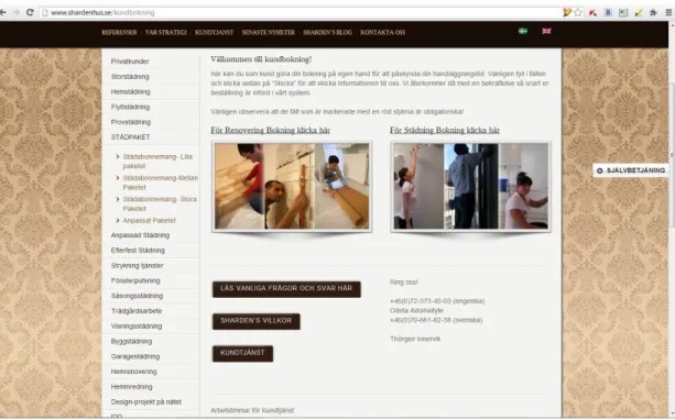
Rearrangement of the order forms on the “kundbokning” page. When viewing records of
webvisor in Yandex Metrics, I noticed that after opening the page “kundbokning” users often don't pay effort to scroll down to the second order form and fill in mainly the first, upper one. In this case, it would be optimal to place both order forms on the same level in such way that they would become equally available to users.
“kundbokning”. Button which redirects to that page is located at the bottom of the home page and is also available in drop-down menu of “självbetjäning”, the button of which is placed on the right side of each page. The fact that “kundbokning” is available in “självbetjäning” menu is not obvious to the user at a first glance. It is also possible to contact the company by going to the “contact us” page, the linke to which is placed both in “självbetjäning” menu and in the header of the home page, which greatly increases for the user its visibility and easiness to reach it. This is confirmed by statistical data. Users are almost twice as likely to click on a link “contact us” than “kundbokning”, which contains a detailed order form. In order to easen the process of ordering a company's service it's worth to place the link to a “kundbokning” page in the foreground, so that it will become visible and accessible from each of the website's pages.
Implementing changes on the website
Order pager
Based on the data gathered from the website with Google Analytics and Yandex Metrics I came to the conclusion that order forms on the “kundbokning” page are placed not very user friendly. Renovating and cleaning services forms are placed on the page one above the other and when the user opens the page “kundbokning”, he sees only one form in front of him. In order to find the other form user needs to scroll down the page. The solution in this situation could be to create two separate links to each form, which would be equally visible to the user on the page.
Like this the “kundbokning” page looked in the very beginning. This is the upper part, the first order form (See Figure 14).
The following figure (Fig. 15) - the bottom part of the page with the second order form.
(Figure 15. The bottom part of the page “kundbokning”.)
The following image is my proposal for the rearrangement of the content on the page “kundboknig”. (Fig. 16)
On the left there is the old menu, the upper part of the page looks like before. Now, instead of two order forms, we have two separate links to each of the forms. Each of the links is text that states clear what will happen if you click on it. Under the links there are images of related types of works, which also simplifies the user orientation on the page.
Figure 17 shows how the page “kundbokning” looks after the changes made.
(Figure 17. “Kundbokning” page after the changes.)
"Bokning" button
According to the statistics from Google Analytics and Yandex Metrics it was difficult for users to find a link directing them to the order page. Link became available in the drop-out menu when clicking the “självbetjäning” button, which is located on the right margin of each page. In order to simplify user interaction with the website, and to make him free from the need to look for the link on the order forms, it was decided to place the button "Booking" on every page which provides a service.
Second round
Interviews, second round
This round of interviews was conducted in order to understand how people perceive the changes implemented on the website. The questions I asked are: "Do you notice any changes on the website since our first interview? If you want to order any service from the company, how will you do?". Interviewees were welcome to give their own comments and give feedback on whatever they would like to in addition to the questions stated.
Roberto, 25, student
Most things look the same. The kundboknings page looks good. The form looks nice, gives a good overview of what you are ordening. It was different before. Well, the navigation looks quite easy now.
The "självbetjänings" button in the side of the window is annoying. Especially since news and other pages can be found in the navigation window, it gives me a little "pop up" feeling. Like those annoying commercials that pop up in the corner of ur screen on some...lets call em "questionable" websites. This button gaves a simular disturbing feeling.
Per, 45, programmer
It is partly wrong spelling + apart writing in that box that switches the cleaning deals. If I think to book a cleaning, then I make a call. Then I think, there is just too much. How many different ways can you clean up on? Home, school, hotel, office etc... Impossible to get an overview. All discounts, special offers, write how many times any why to choose them. It seems easy to get to the booking. But it's the same where it is so very much to fill in and choose in the form. There so much that it is impossible to get an overview. For example, if you are going to make a booking, and choose packages, so there are 16 (sixteen) different to choose from. Then you have to first go and see what each package entails (Det är en del felsatavningar + särskrivning i den där rutan som loopar
erbjudanden. Om jag tänker mig boka en städning, då ringer jag. Sen tycker jag, där är alldeles för mycket. Hur många olika sätt kan man städa på? Hem, skola, hotell, kontor osv. Omöjligt att få en överblick. Alla rabatter, specialerbjudanden, skriva hur många ggr som helst varför man ska välja dom. Det verkar enkelt att komma till bokningen. Men det är ju likadant där att det är så himla mycket att fylla i och välja i formuläret. Det så mycket att det inte går att få en överblick. Till exempel, om man ska boka, och välja paket, så finns det 16 (sexton) olika att välja på. Då måste man först gå och se vad varje paket innebär).
Oleg, 30, own business
That's what I pointed out last time remained unchanged as I see. Double menu on the main page, and on the references page the text still swiches from one to another too fast. But now I see there the button "bokning", which I believe should make it easier for users to process the order of services. In my opinion, it is necessary to reduce the amount of information on the site, to remove all the unnecessary and leave only the important stuff.
Francesca, 30, Italian teacher
I see more details (like nice pictures and so). It seems more cured than before. More details I couldn't quite compare as i saw the other version long ago. I can say that it seems very clear where to click to get informations. There are many buttons for every kind of information that one can need, it's good. One comment about the pictures, as they are one of the things that strike most, often unawarely (word that i have invented right now :D ). So, I see: nice women cleaning, and fine men's hands shaking or signing contracts. This means: difference in how you consider the two sexes. Which i don't like. The men decide and lead, the women are the slaves, the "Cinderellas". The person who chooses the pictures could be more careful with these messages. I noticed the “bokning” button, if I press it I see cleaning men as well as women, which I like. Then I see various options and information. If, say, I want to book a time for cleaning my place, I get this “blankett” to fill and then I send it with the “skicka” button. Seems pretty easy.
Stastical data, second round
In the first round the data was collected over a period of 34 days. In the second round the data collection period is 16 days, which is sufficient time to obtain essential metrics that can be compared with metrics of the first round. We start, as in the previous round, with the Audiences tab, section Demography / Language.
(Figure 18. The proportion of visitors having this or other language set as default.)
In the first round, the total number of users who visited the site during the 34 days was 829 (figure 18). Now, within 16 days, we have 617 visits. The number of users using Swedish as the default language is 48.6% in total (34.64% +13.96%). This amount is almost a half of all the visitors and is a biggets part of the visitors from Sweden. The number of users using the Swedish language as default rose from 45 to 48.6%.
(Figure 19. The percentage of bounces relatively to the use of language preferred by user.)
In the first round of data collection the bounce rate among visitors using English as a default language was the highest, 37.99%. The bounce rate among Swedish speaking users was 18.76% (sv) and 23.80% (sv-se). In this round, the situation has changed to the contrary. Now the greatest bounce rate is among users with Swedish language as the primary one, it is 34.53% (sv-se) and 11.87% (sv). The bounce rate among English speakers is currently 10.43%. Totaly, the following
changes can be observed: (sv) was 18.76% - became 11.87% - the percentage of bounces decreased; (sv-se) was 23.80%, became 34.53% - the percentage of bounces has increased; (en) was 37.99%, became 10.43% - the percentage of bounces decreased significantly.
(Figure 20. Audience, Demographics/Location. Visits of the website by users from different locations.)
As in the first round, the highest number of visits is performed within Sweden. In the first round, the number of visits made from Sweden during 34 days was 610. Now we have 528 visits from Sweden in 16 days.
(Figure 21. The amount of bounces in relation to the geographical locations from where the entries to the website were made.)
At the first data collection round the bounce rate for Sweden was 45.74%. Now, 16 days after the changes were implemented on the site, the percentage of bounces for Sweden fell from 45.74% to 39.43%
(Figure 22. Audience/Custom/Visitors Flow)
Out of 508 Swedish visitors the 368 have moved to the Swedish version of the company's website, and 69 to the English one. From those 69 users who switched to the English version the 37 continued staying on the website and 32 made a drop-off, which states 46.4% of the total number of visitors of the English version. In the first round the percentage of the drops-off from the English version was 64%. As in the first round, a part of the visitors who din't drop-off from the English version has returned back again to the Swedish version of the site.
(Figure 23. The top ten of the most visited pages, number of visitors and their amount in percent.) Since the first round visits of the English version of the website fell from the second to the eighth place. Visits of the ”kundbokning” page fell from 4.30% to 2.57%. Though, the number of visits of the ”kunbokning” page can be considered to increase. In the first round during the 34 days there was 114 visits, now, in the second round, during 16 days there is 81 visit. Page ”contact us” disappeared from the top ten pages leading in attendance.
(Figure 24. Amount of visits in relation to visitors location.)
From the total number of visitors the biggerst part constitute visits performed from Sweden, 79.7% percent of the total amount. In the first round the amount of visits from Sweden was 73%. The total percentage of bounces on the site fell from 32.6% to 23.6%. In particular, the bounce rate of the visits from Sweden fell from 29.5% to 20%.
(Figure 25. The most popular pages of entrance to the site in their percentage rate, Content/Entry pages.)
According to Yandex counter data, the three of the most popular entry pages on the site are Swedish home page — 46,55%, the English home page — 23,07%, page “kundbokning” - 2,31%, and page “privatkunder”.
English home page entries have fallen from 46,55% to 31%, the Swedish home page entries have risen from 22% to 23,07%, the entries of the page “kundbokning” have fallen from 9% till 2,31%.
(Figure 26. Amount of clicks. Behavior / Click map / shardenhus.se)
Figure 26 illustrates amount of clicks on particular links. If we pay attention to the menu on the right of the page, here we see that “Kontakta oss” has 2.0% (first round 9.7%) of all clicks, “kundbokning” has more, 2,9% (first round 5%).
Comparison of user interviews and statistical data
After the second round of user interviews and the second round of statistics data collection, I can again compare the qualitative and quantitative data that I have received.
Based on the statistical data obtained in the first round I placed a button ”Boka” on each of the pages of the website offering some kind of service leading to the order page. The intention was to place a link on the page "kundbokning" in the most visible places. The button has been placed in order to facilitate visitors' navigation. Let me remind you that earlier the link to the order page (page «kundbokninkg”) was a bit hidden from the user. User interviews show that the appearance of the «bokning” button was immediately noticed by all the interviewees. Statistics show that the bounce rate among visitors who entered the site from the territory of Sweden has decreased from 45.74% to 39.43%. Which means that users entering the site remain to stay there for longer time. Counters' data shows that number of visits of page "kundbokning" has risen.
On the "kundbokning" page I rearranged the order forms location. Earlier the forms were placed one under the other one. In order to see the lower order form the user had to scroll down till the buttom of the page. Now, when you open the "kundbokning" page, both forms are equally accessible and visible for the user. According to the user interviews there were no problems in navigating the web site. One of the interviewees said that to order a service is quite simple done by using the order form. One more said that he would choose to call instead to order a cleaning. According to the Webvisor in Yandex Metrics, users no longer have to scroll down the page and both order forms are in the field of users' view when they open the ”kundbokning” page.
The user interviews data, which does not appear in the counters' data is the spelling of the Swedish version of the website and excessive amount of information published on the site.
Сontingencies
There are some details in the project process which couldn't be foreseen and which in my mind could slightly effect the project outcomes. For this reason I think they should be taken into account when making the final summary and conclusions.
After the first round of user interviews and statistics gatherings I shared with the company with some undocumented results. Some of them were the necessity to place the contact phone number on each of the websites pages. Such is recommended both by Tommy Sundström (2005) and is one of Yandex recommendations, but doesn't come from counter's data. As soon as the task of this project was to investigate how can Google and Yandex counters help in improving web site functionality, I was going to implement only those improvements which would be based on the data obtained from Google and Yandex tools. Though, implementing this change is good for the company. Sharden Hus placed the phone number on every page of their website. This in my mind could have affected the number of clicks on the button "bokning" which leads to the "kundbokning" page. Some users when they want to make an order could choose to call instead of filling in the forms on the ”kundbokning” page. Possibly, without the contact phone number on each page of the website the number of clicks on the «bokning” button would be higher.
One more thing I shared with the company's representative was the need to make some adjustments in the English version of the website. The English version of the website was turned off just when I started the second round of gathering the statistics. Company needed that to carry out some work on improvement of the English version. This has affected the number of transitions to the website's English version, it rapidly decreased. Though, it did not affect the important statistical data of the second round, since already from the first round I could make conclusions about what should be adjusted on the English version. The language corrections were not a part of the improvements which I planed to make on the website after the first round. That's why there was no much importance to follow how the user behaviour would change on the English version according to the statistics of the second round.
Conclusions
After all the steps of the project are completed, and there is available data on how the executed changes on the site affected its functionality, I can draw the following conclusions.
The number of visitors having Swedish language set as their main language has grown from 45 to 48%. These changes are unlikely to be significant or caused by the changes made on the website. The bounce rate among visits made from the territory of Sweden decreased from 29.5% to 20%. The bounce rate among English speakers fell even more dramatically, from 37.99% to 10.43%. I consider these changes to be significant and connect them to the fact that now the button "bokning" is available on every page of website where services are proposed. The user sees it immediately. In particular, users whose level of Swedish is low has it much easier now to order a service from the company. Here the contingencies should be taken in account. After I shared with the company my conclusions drawn after the first round, the company added their contact phone number on every page. This could affect somewhat the bounce rate fall.
The percentage of visitors coming from within Sweden grew from 73% to 79.7%. The number of visits made from outside Sweden became almost twice as many. For comparison, 1 round, 34 days, 610 visits and 2 round, 16 days, 528 visits, which is a positive change, but it's hard to say whether it was caused by the website corrections. According to the statistics provided by Yandex about search requests in Europe on “cleaning”, the peak falls on March and April. So, I may assume that the reason of the increase of the visits to the Sharden Hus website could even be the seasonal differences in the demand for cleaning services.
Page "kontakta oss" the link on which was earlier on a more noticeable place than the link to the "kundbokning" page, disappeared from the top ten of the most visited pages. Users no longer go mistakenly to the "contact us" page for booking a service, instead they go immediately to the order page (kundbokning).
Another significant change. The number of visits of one of the most important pages on the site, the "kundbokning" page, has risen. At the beginning of the experiment, we had 114 visits in 34 days. After making changes on the site, we have 81 page visits in 16 days. The purpose of placing the button "Boka" on every page of the site suggesting services was to increase the attendance of the "kundbokning" page. This is confirmed by the latest data from Yandex and Google counters. Based on the obtained results, I can conclude that the website functionality can really be improved with the means of Google Analytics and Yandex Metrics. And can provide with the data enough for it's correct interpretation by the web analytics designer leading to the improvement of the web site performance. In this case, I have:
• Increased the number of visits from the territory of Sweden to almost double.
• Reduced the overall bounce rate: among the visitors using Swedish as a default language, and even more among the visitors who use English as a default.
• Made it easier to find both of the existing order forms.
List of references
Clifton, Brian. (2008). Advanced Web Metrics with Google Analytics. Wiley.
Dominiques, Ingrid and Berndtsson, Johan. Usability in practice. Wiki
http://www.nngroup.com/articles/quantitative-studies-how-many-users/ [2013-01-29]
Hasan, L., Morris, A. & Probets, S. Using Google Analytics to Evaluate the Usability of E-commerce
Sites (n.d). https://dspace.lboro.ac.uk/dspace-jspui/bitstream/2134/5685/1/Using%20Google %20Analytics%20to%20Evaluate%20the%20Usability%20ofE-commerce%20Sites.pdf [2013-05-12] Jason Burby, Angie Brown & WAA Standards Committee. (2007) Web Analytics Definitions.
http://c.ymcdn.com/sites/www.digitalanalyticsassociation.org/resource/resmgr/PDF_standards/W ebAnalyticsDefinitionsVol1.pdf?hhSearchTerms=Web+and+Analytics+and+Definitions [2013-05-12] Jones, C., Giersch, S., Sumner, T., Wright, M., Coleman,A. & Bartolo, L. (2010). Developing a Web
Analytics Strategy for the National Science Digital Library. Conference report. http://dlib.org/dlib/october04/coleman/10coleman.html [2013-05-13] Tyler, Mari E. & Ledford, Jerry. (2010). Google Analytics Third edition, p. 87.
Molich, Rolf . (2002). Webbdesign med fokus på användbarhet. Copenhagen: Ingenioren/boger, pp 138-139
Krug, Steve. (2006). Don't Make Me Think. Secong Edition. New Riders, p. 192 Lazar, Jonathan . (2006). Web Usability. Boston: Addison-Wesley.
Nielsen, Jacob. (2001). Användbara hemsidor: analys av 50 webbplatser. Harlow: Pearson Education.
Nielsen, Jacob. (2001). Användbar Webbdesign. Stockholm: Lieber AB.
Nielsen, Jacob. (2000). Why you only need to test with 5 users. Nielsen Norman Group. http://www.nngroup.com/articles/why-you-only-need-to-test-with-5-users/ [2013-01-30]
Professional Analytics and evaluation of websites' efficiency (Профессиональная аналитика и оценка эффективности сайтов) (2012). [Video course] Russia.
Sundström, Tommy. (2005). Användbarhetsboken. http://www.anvandbart.se/ab/ange-bildskapare
[2013-01-24]
Sundström, Tommy. (2005). Användbarhetsboken. http://www.anvandbart.se/ab/bara - vansterjustering [2013-01-23]
[2013-01-27]
Sundström, Tommy. (2005). Användbarhetsboken. http://www.anvandbart.se/ab/lankkonsekvens
[2013-01-24]
Sundström, Tommy. (2005). Användbarhetsboken. http://www.anvandbart.se/ab/lattlast [2013-01-26]
Sundström, Tommy. (2005). Användbarhetsboken. http://www.anvandbart.se/ab/mal [2013-01-23] Sundström, Tommy. (2005). Användbarhetsboken. http://www.anvandbart.se/ab/markera-meny
[2013-01-26]
Wei Fang. (2007). Using Google Analytics for Improving Library Website Content and Design: A
Case Study http://www.webpages.uidaho.edu/~mbolin/fang.pdf [2013-05-13] Web Analytics Association. (2008). Web Analytics Definitions.
http://c.ymcdn.com/sites/www.webanalyticsassociation.org/resource/resmgr/PDF_standards/We bAnalyticsDefinitions.pdf [2013-05-12]