MÄLARDALEN UNIVERSITY
SCHOOL OF INNOVATION, DESIGN AND
TECHNOLOGY
MASTER THESIS
DESIGN OF touchOS
ELENA MIRČEVSKA
ACKNOWLEDGMENTS
I would like to thank MDH for providing me with excellent working environment during my thesis research, and also, thanks to my supervisor Rikard Lindell who give me this great opportunity to work on this thesis. Thank you for all your help and guidance. I would also like to thank to Darko Stipanićev from University of Split. Thanks to my friends for being a great support: MD, LM, STF, MG, PS, and to Mikael. Without you this experience would not be the same and I will never forget you. Also thanks to my family for being there for me and for supporting me in everything I do.
TABLE OF CONTENTS
SUMMARY
1. INTRODUCTION 1
2. BACKGROUND 2
3. METHODS AND TECHNIQUES 4
3.1. Brainstorming 5
3.2. Initial idea 9
3.3. The “DO” button 12
3.4. Student workshop 13
3.5. Kindergarten workshop 22
4. DESIGN PROCESS 29
4.1. Final idea 29
4.2. Problems that still need to be faced 33
5. CONCLUSION 35
LITERATURE 37
ABBREVIATIONS 39
APPENDIX A 40
SUMMARY
The first touch technology device was developed by Samuel C. Hurst in 1971, the Elograph. The device was a capacitive touch screen.
In today‟s life we use touch screens at ATM‟s, cell phones, information kiosks and in many more technologies. Tapping on the screen twice for double clicks, and dragging a figure on the screen to move the cursor. We are capable to do almost everything the mouse does. Touch screen based system allows navigation around a GUI based environment.
Nowadays, every technology is based on the UNIX, Microsoft Windows, web OS, or their subgroups. For the past 40 years, we have been using the same human-computer interaction paradigms that were designed by the Xerox PARC company in the 1960s and 1970s. We just cut, paste and save. We didn‟t invent anything breaking new. We just adapted the old software that was given to us. And now we don‟t even think about that when working on our digital devices. We've entered a new era of interaction design. The next several years will be very important for interaction designers and engineers who will create the next generation of interaction design inputs, possibly defining them for decades to come. Operating system built for the purpose of touch technology is necessary and touchOS is made exclusively for the purpose of touch technology.
1
1. INTRODUCTION
'If we always do what we've always done, we will get what we've always got.'
- Adam Urbanski
Today, touch technology is found in almost every aspect of everyday life. It is becoming more and more popular and it is evolving every day to satisfy our needs. touchOS is a research project at Mälardalen University in Sweden whose goal is to provide new operating system for touch technology. Instead of using old operating systems that have only been upgraded since they were made many years ago, new touch technology would be based on a new operating system that is made exactly for that purpose.
This thesis is a part of the touchOS project. The task was to explore Surface Interaction, which is an interaction technique in which content is the basis for interaction between user and device.[1] Surface Interaction allows synchronous collaboration between multiple users and the content is visualized on an infinitely large surface navigated with zoom, pan and search / filter. Also, it was necessary to transform the principles of Surface Interaction into new design, and develop a prototype to evaluate the user experience and in that way contribute to the development of a new operating system for touch pads and multi-touch computers - which we currently call touchOS. touchOS will be our future research platform to study the touch interface and creative multimedia application in collaborative environments.
2
2. BACKGROUND
And I found that of all the senses the eye was the most superficial, the ear the most haughty, smell the most voluptuous, taste the most superstitious and inconstant, touch the most profound and philosophical.
- Diderot, „Letter on the Blind“, 1749.
Touch represents one of the five human senses. Nerve endings in our dermis or the bottom layer of our skin, allow us to feel. People have developed sophisticated skills for sensing and manipulating their physical environments with their fingers and hands. More and more user interfaces take advantage of that and are allowing touch input to support these skills. Touch interaction has received considerable attention in the last few years and the media interest in touch interaction with large and small displays surfaces has seen a recent explosion.[2]
As sensors and microprocessors have become faster, smaller, and cheaper, reality has started to catch up with the vision, although we still have quite a long way to go.
Of course, it hasn‟t happened all at once. Samuel C. Hurst created the first touch device in 1971, the Elograph. By 1974, Hurst and his new company, Elographics, had developed five-wire resistive technology, which is still one of the most popular touch screen technologies used today. In 1977, Elographics, backed by Siemens, created Accutouch, the first true touch screen device. Accutouch was basically a curved glass sensor that became increasingly refined over the next decade.
From its beginning, touch technology has rapidly been evolving. Nowadays, almost everyone is using it. Televisions have touch controls on the side of the bezel, virtually every new Smartphone that comes out these days has to boast a touch-sensitive screen, and a lot of them are now showing off touch-enabled back cases.[3]
3
One of the fundamental goals within the existing traditions of interaction design practice is to understand users‟ needs and desires on such a detailed level that it could serve as a basic for design of (digital and interactive) solutions capable of addressing these specific needs (e.g., Mylopoulos, Chung, and Yu, 1999.; Piper, Ratti, & Ishii, 2002). Interaction design is about “designing interactive products to support people in their everyday and working lives” (Preece, Rogers, & Sharp, 2002, p.6). This sentence implies that within interaction design a big focus is on how to approach a specific problem. The problem that we are facing here is the fact that there hasn‟t been any OS built for touch technology. Everything from, for example, the size of the clickable items on Windows OS and Mac OS are currently designed to be targeted by mouse input. On a touch screen the size of these items will have to be redesigned to be targeted by fingers.
A natural place to start is with our hands, as they are simultaneously a means for complex expression and sensation: they allow for complicated movement but their skin also has the highest tactile acuity of our extremities. Significantly, the action and perception potentials of the hand are linked – most grasping actions use the hands as bidirectional modalities, exerting force and sensing pressure to adjust that force simultaneously.[4] Active touch – where one manipulates the object they are investigating to control touch stimulation – is superior to passive touch in detecting shape and identity of object. In addition, many of the complex motions that we perform are bi-manual and asymmetric.[4]
In the past 40 years barely anything has changed.[5] We are all still using UNIX, Microsoft or Web based operating systems. We are upgrading them and not building anything new. Not challenging our mind, just copy pasting. What we need is a completely new operating system that is built only for the purposes of touch technology, so the touch technology could reach its full potential. This is why we decided to build touchOS.
4
3. METHODS AND TECHNIQUES
The screen is a window through which one sees a virtual world. The challenge is to make that world look real, act real, sound real, and feel real.”
- Sutherland “The Ultimate Display”, emphasis is mine
The concept of touch technology has been published for years; usually this is equated merely with vision and sound. In the context of the human – computer interface, touch ranks third in the hierarchy of the senses (Downton and Leedham 1991:19). Whereas the keyboard is as passive mechanical channel between the computer and user, touch technology enables a more active exploration and allows the user not just to see three-dimensions shapes represented on the screen, but also to feel them and interact with them.[6]
Touch technology is becoming cheap and ubiquitous, increasingly accessible via everyday technologies such as mobile phones [6].
Contemporary interaction design approaches are empirically oriented. Most of the other approaches, such as user-centered design, participatory design, contextual design, activity theory, and ethnographically informed system design; are built on the assumption that a suitable design proposal is to be grounded or even “found” through careful analysis of an existing situation (Carroll, 2003; Kaptelinin & Nardi, 2006; Rogers, 2004). The purpose of these approaches is to explore and understand the particular situation and the users, to such degree that the design solution becomes more or less obvious.
In this chapter we will go through all the methods and techniques that were done in these past five months and that lead us to the design that we got now. We will also show taken steps that we did that lead us to the final design idea.
5 3.1 . Brainstorming
The only way to engineer the future tomorrow is to have lived in it yesterday.
- Sketching User Experiences, Bill Buxton
When we first started to brainstorm around the idea of the new operating system we asked our self “Why?”. Why do we need a new operating system? Like it was mention before in this thesis, the answer was obvious. We wanted to make something revolutionary and something that was built for the sole purpose of touch technology.
The second big question that we asked our self was “Should we have empty surface or culture surface?”. An interface is a point of contact between two systems, and in the human - computer interface, this is the link between the computer and the user. Taking this into consideration, this question was one of the most important questions we asked ourselves during the whole process of this development.
The third question that we asked our self was “How do people remember everything?”. To develop software which is easy to learn, developers must understand how learning occurs. Human thinking, in many ways, is like a computer with different memory areas. There are three main areas: the sensory register, short term storage and long-term storage.
The sensory register reacts almost immediately to stimuli to our senses. For example, we quickly move our hand away from a source of heat.
Short-term storage is where data is held temporarily. An example of this is when we ask someone for a phone number without writing it down and then remember it for the short period it takes us to dial the number.
Long-term storage is for those things we need to remember over a longer period. The more often anything committed to long-term memory is rehearsed, the longer it will usually be remembered for.
6
Humans remember first by perceiving the giving information throw visual, auditory and sensory channels. If the brain thinks that the information is important it will store it in long term memory. The best way the brain remembers is throw visual channels. Images get “stuck” in our head and are linked together to form a story.[7]
With this information we tried to keep an open mind and crate operating system that will use lots of images so users would have better navigation and so it would be easy to learn how to use it.
We wanted to create something completely new, an operating system that wasn‟t related in any way to any known operating systems. Our surface would be an infinitely large 2-D surface, on which all content of the operating system are shown. On that surface we decided to have “Cells”. Cell is a set of data of an arbitrary type (could be text, image, sound, video, etc.) along with mutators that handles data of the current type. We are trying to get “rid of” the concept of file to persistently store content. A cell that contained other cells would be called “Entity” and a number of cells that belong together, but with a looser coupling than in an entity is called “Collection”. Cells that haven‟t been used for a while would start to fade out and would decrease in size. “Mutator” and “Transformer” is a tool/modifier that affects a specific type of content.
We also decided that we would not have a Recycle Bin. Instead of a Recycle Bin, deleted cell would turn into a “Ghost”, as shown on Image 1., that would be focused in one part of the surface. Every time a user would go throw that part with a finger ghosts would flew around, reminding the user that they are still there.
7 Image 1. Deleted cells or Ghosts
These brainstorming lead us to the idea of branching. The idea was that everything, every cell, would be connected as it is shown on the Image 2.
Image 2. Branching idea
This branching would be the entity of cells and with this idea we were thinking that everything would be connected to one starting point, to a starting cell. From that point, user would be able to reach any document, image, video, or any cell on its computer. While tapping on one point (or cell) in the branch, user would
8
be able to see more detailed description about that cell, like it is shown on Image 3. If the touched cell was a video, user would be able to see it in the cells description window; and if the touched cell was an image, user would see all information about it in the window; the procedure would work the same for the other cells as well.
Image 3. Branching information
The views of cells would be done by zooming in and out. That way the surface would be an empty space and cells would be “divided” into entities on it.
The cell selection would be done by search function or by “magnet selection”. For magnet selection user would use its finger. On it the user would add a tag (for example, if the user is looking for a picture with the certain name, the user would write the name of the picture as a tag), and simply move its finger over the entities of cells that it wants to be searched.
9 3.2. Initial idea
It takes almost as much creativity to understand a good idea, as to have it in the first place.
- Sketching User Experiences, Bill Buxton
Both sketching and design emerged in the late medieval period, and this was no accident. From this period on, the trend was toward a separation of design from the process of making (Heskett 1980). With that came the need to find the means whereby the designer could explore and communicate ideas. Sketching, as a distinct form of drawing, provided such a vehicle. Generally, the last thing that you should do when beginning to design an interactive system is write code.[8]
After the brainstorming we decided that all those ideas should be transferred to the paper. Sketching is on one way we wanted to express and expand on our ideas. We wanted to give our ideas a three dimensional view rather than imagining it in our head. This way our ideas evolved.
We had two ideas that we wanted to go throw. First one is shown on the Image 4. It was based on the branching idea. On the left of the design, drawn with small squares, would be the user‟s Favorites or Recently used applications. On the bottom of the design would be a search bar. In the middle of the image there would be a branch tree. User would custom make their branch trees. Basically, these branch trees would replace files and folders. Everything would be exposed on the infinitely big surface and branching trees would be on it. When a user would tap on one node of the branching tree, information about the content of that node would appear in the pop up window. There you could read, listen or view, regarding of the information that that node contains. Connection between nodes would be colored in one color (for example, brown) and when the new
10
connection is made it would be colored with other color (for example, blue) for a certain amount of time. In that way the user would be given time to remember newly formed connections. In the right corner (next to the branching trees) would be the “meeting point” where all the ghosts would gather. If a user goes over that area with its finger, the ghosts would “jump out”, just to remind him they are still there. On the right of the picture would be an online mode. There the user would be able to find his or hers most visited or favorite sites. There would also be a chat box. The screen would have the opportunity to expand to the left so the user would have more space to view his or hers pages.
Image 4. First sketch of the OS design
The second image we worked on is shown on the Image 5. The image is somewhat based on the same idea as the Image 4. In the Image 5. the user also has on the left its Favorites or Recently used applications, and on the bottom
11
there is also a search bar. In the middle of the image the “screen” is divided into two parts. The left part would be a private window and the right part would be online window. On the left part the user would have its branching trees. When a program is opened all the applications for it would be “floating” around the programs screen. The number of the applications that a user could have for one program would be limited to prevent the countless number of them around the program and in that way we would be preventing the “suffocation” of the users screen. On the left side would be an online mode. There, user could adjust its screen.
Image 5. Second sketch of the OS design
With this sketching we visualized our ideas better and we got an overlook on how it will turn out. We later discarded these designs because they were too similar to the nowadays operating systems.
12 3.3. The “DO” button
During one of our brainstorming we got the idea of the “DO” button. The “DO” button is shown on the Image 6. We thought that the “DO” button would be consisted out of two extra buttons. When pressed the “DO” button would branch, firstly into two extra buttons, the “UNDO” and the “DID” button. The “UNDO” button would be to undo something the user didn‟t want to do. And the “DID” button would be use for multiple performance of the same actions (for example the user wants to use Bold function two times in a row for different parts of the text). Also, since the user would have to go up the branching “DO” tree with its finger we thought that there could be a possibility that the user would move its finger while almost at the top of the branching tree. That way the user would have to go up the branching “DO” tree and we thought that might be annoying for the user. Because of that we also thought that the “DID” button would be used to remember last opened branches of the “DO” button. So in that case, if the user moves its finger before pressing on the application he or she wanted, he or she could easily open the last branching with the “DID” button. The extra branching would be the applications that user have. The applications would change accordingly to the program user is currently using. For example, if a user is currently working in some text editing tool, then the branches of the “DO” button would be “Font” (to arrange the size, stile, color,… of the letters), “Paragraph” (for editing text), “Insert” (for inserting pictures, symbols,…) and so on. If the user was working with video tool, the “DO” branches would be appropriate for that tool.
13 Image 6. The “DO” button
3.4. Student workshop
“To the vast majority of mankind nothing is more agreeable than to escape the need for mental exertion ... to most people nothing is more troublesome than the effort of thinking.”
- Bryce 1888
Programmers and software designers constantly develop useful and innovative software‟s that are sometimes commercial failures because they are unusable by those who do not have much experience. Sometimes the software gets designed from the programmer's perspective and some programs require certain combinations of, lets say, keystrokes for commands and although the combinations chosen seems obvious to the programmer, they can be confusing to the new user. Software should be designed from the point of view of the new user.
With this in mind we needed a new insight into the design of toushOS. That is why we decided to organise a student workshop and ask for students help.
The workshop participants were students that needed to study anything but students of computer science. We asked them to imagine how a new design of the operating system for touch pads and multi-touch technology should look. We
14
also told them that they are not allowed to use icons, applications, start button, files or folders. The students also had to present to us how they see that operating system working online.
After the drawing, we had an interview with each student where we asked them to explain to us what they drew.
This student made an OS that had sliding windows, as shown on Image 7.
Image 7. First design of operating system done by student
The windows would rotate, and pressing on one would make it pop up and the “menu” or the initial page would move and shrink in the corner of the screen. There is the possibility of adding more windows.
The second student design shows a wheel of customized applications in the middle (Image 8). With the help of a camera the user would be able to turn on the system by swinging its hand. There is also an option that the system would keep track of user eyes so it would be possible to select the applications from the center wheel. Squares on the right side of the image represent the screens. You move throw the screens by sliding and tapping the screens to open or close. In
15
the bottom right corner he left en empty space for user to add his customized applications.
Image 8. Second design of operating system done by student
In the next design student said it there is a possibility to highlight the text with fingers and then modify it, as shown on the Image 9.
16
The user can rotate throw windows and programs with its fingers and there would be a bar (third small image) that would have the possibility to be dragged out to allow icons to be changed on the desktop. The lowest image with the circles that could be customized to different colors, sizes and locations, represents the user‟s tasks such as internet or pictures.
In the fourth design student drew lots of buttons in different color, as shown on the Image 10. While turning on the computer the user will see a picture (as a desktop background) with the buttons popping up. With the tap on one of those colored buttons, the task that the pushed button needed to do would be executed. Student added the option of having gadgets where the user can add or personalize buttons.
Image 10. The fourth design of operating system done by student
Next student design has a sphere looking OS, like it is shown on Image 11. In the center of sphere the user would have a start button, and when pressed, everything that user put on its OS, would pop out. For example, student drew
17
Music button, Movies, Internet, My documents and My computer. Around every one of those buttons there would be three little circles that would orbit around that button. To open the button the user would have to grab those three circles and do a movement of pulling with its three fingers.
Image 11. The fifth design of operating system done by student
In next design student decided to describe his design instead of drawing it, as shown on the Image 12. There are three modes of work. Offline, Online and Login. In the Offline mode there is a "shortcut list". "Shortcut list" is personal and is created by user. In the Online mode the student said that it will be able to add "favorite sites" that the user can go to while using a certain number of fingers on the screen. The user can also use fingerprints as shortcuts to come to the predetermined program or a game. Fingerprints would be used as a shortcut in Offline and Online mode. In the Login mode the user could login to its "personal user account" via sensing of one's fingerprint pressed on the screen.
18 Image 12. The sixth design of operating system done by student
For this next design student also had “shortcut lists”. By pushing the one category on the list, as it is shown on the Image 13., the user would activate it and with that open its subcategory. There was also an Online mode. The user would be able to log in by using his or hers fingerprints (one finger or more) directly on the screen. This design would also have voice recognition software. There is also the possibility of "zoom out/in".
19
Designs shown on the next two images were done by one student. On the first design (Image 14.) student drew operating system that would have the possibility to change its appearance when it would be turned on. User can choose just one layout for some period of time. At Image 14. student drew clouds with rain drops. Each rain drop represents one application. If the user wants to use it, he or she pulls it down into the floor. To gain more space on the screen the user has the possibility to move the cloud up on the screen.
This was just one of the layouts; this student also said that instead of the cloud there could also be a sun with sun rays, flower with flower petals or flowers and bees.
Image 14. The eight design of operating system done by student
On the second design (Image 15) this student drew one big circle. In the centre of the circle there would be a button. If the user wants to press anything he or she would have to hold their thumb on main button and with another finger the slide fields that would rotate around the button. These fields would be colored in
20
different colors and every color would represent one option (for example, games would be red). The user would choose what color would represent what option.
When a user pushes outside the circle, the circle becomes smaller and moves to the corner of the screen. This student also said that instead of a circle it would be possible to have a triangle or a square or any other geometrical shape.
Image 15. The ninth design of operating system done by student
After analyzing all the work that we got from this workshop we took these results into consideration and decided to make an image of how an operating system would look. We specifically liked the last design from Image 14. and decided to illustrate it.
On the Image 16. you can see example of the design of operating system based on student workshop idea. We decided to implement the cloud and rain drops idea, but we also incorporated our own idea of the “DO” button. Here we decided to represent the “DO” button as a tree, so it would fit into this design. Every circle on the branches would represent an action that the user likes or
21
bookmarks. The cloud would have the drops in it, and they would represent files, applications, programs, games, etc.
Image 16. example of the design based on student workshop idea
We later discarded this design because we thought it wouldn‟t be accepted by everybody. We thought that we haven‟t done anything innovative, we felt that the only thing we did was to have the same operating system like we do now, just “wrapped up” in a nice design.
We thought that only a certain group of users would find this design appealing. We found this design to be “too girly” and that it wouldn‟t be accepted by the male population.
What happens if we ask boys and girls to use male based or girl based of software? Do these differences in program design actually result in different outcomes for students using the programs? In order to test this, we chose
22
female- and male-oriented programs according to criteria corroborated by the Huff and Cooper (1987) research (Cooper, Hall, & Huff, 1990). The male oriented program involved competition and shooting whereas the female oriented program used music, verbal feedback, and tasks that required completion. Middle school students then used these mathematical programs in both a private setting (an isolated individual carrel) and a public setting (a computer lab with others present). We found that students using software designed for the other gender reported more situational stress than when using gender specific software. However, this cross-gender software-induced stress occurred only when the software was used in the public setting. When the software was used in private there were no differences in situational stress levels. Thus we found the cross gender-stress effect we had anticipated, but discovered that it was linked to public performance.[9]
It is here, in subjective task value, that computer science may have the most difficult time in achieving gender equity. Changing girls‟ stereotypes of the field is a straightforward approach, and likely to yield some promise. But changing the subtle and strong gender role expectations for boys and girls in the population is a larger task.[9]
3.5. Kindergarten workshop
"Every child is an artist. The problem is how to remain an artist once we grow up."
- Pablo Picasso
After the student workshop we realized that we needed to test somebody who had more plenty of imagination and “free” mind. Who wouldn‟t be afraid to make something completely new. So we decided that it would be best to do our design testing in the kindergarten.
23
With parents consent, “Montessori“ kindergarten allowed us to do our workshop with a small group of children that were going there. They provided us with the space and materials. And since we needed to work with children, we asked the schools pedagogue, Ulrika Larsdotter Bodin, to join us in our workshop. We brought different items that could inspire ideas to the children on how a computer might look like in the future.
After the introduction, Ulrika introduced the problem to the children and asked them to draw, paint, sculpt and talk about the future of computers and how computers should be used.
When they were done, Ulrika directly made interviews with every child individually while taking notes of what they were saying. Ulrika said that it is in the follow-up stories that children have about their creations we can find the most valuable information. Therefore, we directly connected the drawing-painting-sculpting-design work to the follow up of children's creations with interviews.
The computer science students were participating as passive observers. They were instructed to dress neutral gray and not to draw too much attention to themself.
The first result that we got was from 5 year old boy. He decided to make a game. And during his interview we found out that he made the game „Angry birds“, as shown on Image 17. The boy was really keen on working on this, but when he was asked what are those buttons supposed to do, he could not answer the question, because he didn't know.
24 Image 17. The game “Angry birds”
The next one was a five year old girl. The little girl was very communicative and she wanted to talk to the observers. Since one of the observers could not speak Swedish she made a cell phone that has two mouths, as shown on Image 18.
25
The mouths are painted in green and are on the left top and right top of the image. The cell phone is in the centre of the picture surrounded with red square. Every time a person would talk on Swedish into the right mouth, the other mouth would say it on English and other way around. Also, her cell phone had a locking mechanism (the little red dot above the golden buttons), so she was the only one able to use it. The cell phone also had a start button (the down, right golden button).
Next image was also made by a five year old girl. She made two cell phones, red one and green one as it is shown on Image 19.
Image 19. Two cell phones
The red phone has applications. Every one of the silver buttons presents one of the applications, such as maps, music, and so on.
The green phone is an “older” version of cell phones. It has buttons (the little black dots on yellow surface) and the screen is silver.
26
The next drawing was made by four year old girl. This girl drew a pod as shown in the Image 20.
Image 20. The pod
The pink square on the left is a pod. She also drew a window (colored in purple, in the centre of the picture) but when she was asked why she needs a window, she didn‟t know the reason. There is a possibility that she overheard adults talking about “windows” on the screen of the computer, so she made one too. When asked what were the other purple and blue drawings on the right of the picture she couldn‟t tell because she didn‟t know.
The last drawing was made by five year old boy. He made a pod, like shown on Image 21. The pod is colored in green color.
27 Image 21. The pizza pod
The pod has two buttons (on the picture they are white). The left white button is used to turn on the pod, and the right white button is used to get a pizza. The purple circle on the right of the pod presents the pizza.
This boy also made a stilus (the little stick above the pod), but he didn‟t know why he needed one or for what use is it. There is a probability that he saw his parents use one.
We only tested children at age of 4 or 5 years old, and in this stage, children enjoy fantasy. They are fairly self-centred, doing a lot of parallel play. Simplicity is important when representing something for children this age. They cannot apprehend anything too abstract and are tuned to the not yet fully developed reasoning skills. They have difficulties understanding past or future.[10] Knowing this now we can see that we missed with our age group. We picked this age group because we didn‟t want children that were “tainted” with nowadays operating systems. We wanted children that had plenty of imagination so that they could imagine something completely new and innovative.
28
But we asked the children to draw us something that required them to think about the future, and children this age group cannot apprehend that.
Everyone is not a designer.[10] This clearly goes for this workshop. We expected the children to give us great futuristic designs, but from the results we got we saw that we couldn‟t use any of these ideas.
Even thou we didn‟t get anything completely useable from the student workshop and from the kindergarten workshop, we decided to do them as a source of inspiration that they did turn out to be. At the end of workshops we realised that what Steve Jobs said was correct; “It‟s really hard to design products by focus groups. A lot of times, people don‟t know what they want until you show it to them.”
29
4. DESIGN PROCESS
“Hands are underrated. Eyes are in charge, mind gets all the study, and heads do all the talking. Hands type letters, push mice around, and grip steering wheels, so they are not idle, just underemployed.”
- Malcolm McCullough, Abstracting Craft
Designing new operating system for touch technology is the hardest part of developing these systems. The interface is a paradigm shift and it can‟t just be bolted into the existing hardware. Operating systems for touch technology that we had so far needed to be changed, but the new interface is very difficult to impose to people.
4.1. Final idea
Successful product designs result from a series of „conversations with materials“. Here, the „conversations“ are interactions between the designer and the design medium – sketching on paper, shaping clay, building with foam core.[4] The epistemic production of concrete prototypes provides the crucial element of surprise, unexpected realizations that the designer could not have arrived at without producing a concrete manifestation of her ideas.
The backtalk that artifacts provide helps uncover problems or generate suggestions for new designs. Prototypes thus become the “essential medium for information, interaction, integration, and collaboration”.[4]
After all our work and research, we came up to the final design idea. We were inspired by the spiral shape so we decided to use it.
30
We made a flash movie that shows how the touchOS should look and approximately work. With this movie, only the basics of the touchOS were covered and the movie only shows how touchOS would work in some situations.
On the Image 22. we can see the spiral shape of the design of touchOS. The spiral would be time based. The last thing that user made (an image, document, video, and so on) would be on the top of the spiral. The spiral would be on the infinite surface.
Image 22. the design of touchOS
The user would go up or down the spiral icons with moving its finger left or right the spiral.
When tapping on one of the icons that user made, as showed on Image 22., the icon would expand and it would zoom in to the center of the screen as it is shown on the Image 23.
31 Image 23. pressed icon
The user then would have the opportunity to work in any kind of programs he or she opens. Under the program that the user opened there would be a “DO” button. The “DO” button would have the same function as described in chapter 3.3 The “DO” button.
When pressed, the “DO” button would expand, as showed on Image 24. When expanded, the “DO” button would have options for the program that the user opened.
32 Image 24. expansion of the “DO” button
To return on the spiral mode the user would only need to tap with its finger on the side. Then the spiral mode would appear instantly.
In the final idea, we also wanted to use zoom in and zoom out for better navigation. The user would zoom in and zoom out by moving its finger in circle motion on the screen.
When the user does a search, he or she will get the results in the spiral. Everything will be connected, by its relevance, with small lines as show on the Image 25. Some lines will be more emphasized, depending on their relevance to the search term.
33 Image 25. the search in the spiral
We were inspired with this idea from the images of the universe and the brain cells, where everything was connected with small lines.
4.2. Problems that still need to be faced
A thoughtful designer knows that almost nothing is given or true when it comes to what and how to design. It is also obvious that the complexity of the process demands conceptual clarity from the designer. The thoughtful position is to view the whole situation as a design task: to design the design process.[11]
We did the beginning step on making the new design of the touchOS, but there are lots of problems that still require our attention.
34
We are worried that our operating system might be having troubles with performance. If our operating system seems slow, users may be less inclined to use it. We should take time to see what the factors that influence performance are. Understanding them, can help us make a better choices in our design and implementation.
Also, we will need to make this operating system easy to use for the users. Users reluctantly switch their operating systems because they are used to the ones they have been using until now. We will have to offer a compelling, intuitive experience for the user. Find a way to offer elegant solutions to complex problems. Our operating system should be also easy to install and configure because it should make intelligent choices for the user, but it should also give the user an option to override those choices when it‟s needed. It should also warn the user against performing dangerous actions and there should be a way to provide a way to undo those actions if they are taken.
An operating system needs to be reliable. Such operating system presents information to the user in an expected and desired way. Reliable program would maintain the integrity of the user‟s data and would do everything possible to prevent data loss or corruption. That kind of OS would be able to handle complex situations without crashing.
It should also be adaptable. An adaptable operating system would be one that doesn‟t stop working when some conditions change.
Our operating system should also support mobility. When we say mobility, we mean that it wouldn‟t waste battery power, nor would it brake when the user moves it from place to place, changes monitor configurations, and so on.
These are not small problems we need to face. We know we still have a lot to do and a lot to research to complete the touchOS. If we want touchOS to be one of the good operating systems that will be equally good to others we will have to work for it.
35
5. CONCLUSION
Design is a process of finding problems, solving them, balancing contradictory, including interaction design. Discovering problems and needs is the key to innovation. In the whole design process, this is more important and difficult than solving problems. In modern society which is filled with abundant products, latent needs are the key to market. Latent need is a need that users even don‟t realize that they are missing.
With this thesis, the new touchOS system was introduced. One of the first things realized while working was that this will be a very complex system. It will involve different technologies, and making them all work together at the same time is not an easy task.
Creating something completely new and innovative requires a lot of imagination and the biggest fear we have is that the people will not accept it. Nowadays, everybody has a habit of using either Microsoft, Unix or web based operating systems. People have got accustomed to them and making them learn something new and switching to something new will be a hard task.
Switching from one version of certain operating system is easily accepted by the users. But switching from one operating system to another is like switching from, for example, a car to a motorbike. They may both be operating systems and even use the same hardware; they even may both provide an environment for the user to run applications, but both operating systems will use fundamentally different approaches to do so.
We have two different approaches to fulfill the same goal but the difference is in the fundamental ways. touchOS will have different strengths and weaknesses then other operating systems. But people like the familiar feeling that the operating systems they are used to gives them. They are not keen on learning something completely new. But just because they are used to something that
36
doesn‟t mean that it is the best option. We cannot tell people what to do or what operating system to use; we can just hope that they will see that what we are making is in the goal of improving the touch technology.
Some say “Why fix something when it isn‟t broken?” and we say “Because we can make it better and because it‟s fun and exciting!”.
37
LITERATURE
[1] Rikard Lindell; “Jag älskar att allt ligger överst; “Jag älskar att allt ligger överst” - en designstudie i ytinteraktion för kollaborativa multimedia-framträdanden, Mälardalen University Press Dissertations No. 72, ISSN 1651-4238, ISBN 978-91-86135-24-9 2009-06-08
[2] Johanne Schöning; Do we need further multi-touch affordances?; Touch Affordances: Workshop on Touch Affordances, Uppsala, Sweden, o.A., 2009.
[3] Darrell Etherington; Touch-Enabled iMac: Do We Need One?; http://gigaom.com/apple/touch-enabled-imac-do-we-need-one/, 19. 01. 2010
[4] How Bodies Matter: Five Themes for Interaction Design; Scott R. Klemmer, Björn Hartmann, Leila Takayama, Published in: Proceeding DIS 2006 Proceedings of the 6th conference on Designing Interactive systems
[5] Wikipedia;
http://en.wikipedia.org/wiki/History_of_the_graphical_user_interface#The_80s: _Early_commercial_developments, 11. 06. 2011.
[6] Senses of Touch:Haptics, Affects and Technologies; Paterson, Mark; Berg Publishers; 2007
[7] Wikipedia, http://en.wikipedia.org/wiki/Memory, 03. 06. 2011.
[8] Bill Buxton, Sketching User Experiences - getting the design right and the right design, Morgan Kaufmann, ISBN 978-0-12-374037-3, 2007
[9] Chuck Huff; Gender, Software Design, and Occupational Equity; RUNNING HEAD: Gender and Software Design; St. Olaf College; Published as: Huff, C. W. (2002). Gender, Software Design, and Occupational Equity. SIGCSE Bulletin: Inroads, 34, 112-115.
38
[10] Interaction design and children, Editorial paper, Panos Markopoulos and Mathilde Bekker, 2003 Elsevier Science B. V.
[11] Thoughtful interaction design; a design perspective on information technology; Jonas Löwgren and Erik Stolterman; The MIT Press, Cambridge, Massachusetts, London, England
39
ABBREVIATIONS
GUI – Graphic User Interface OS – Operating system
40
APPENDIX A
Design Description
touchOS
Project leader: Rikard Lindell
41 1 Introduction
1.1 Background 1.2 Definitions
1.3 Related Documents
1.4 Licensing and External Resources 2 Functional Description
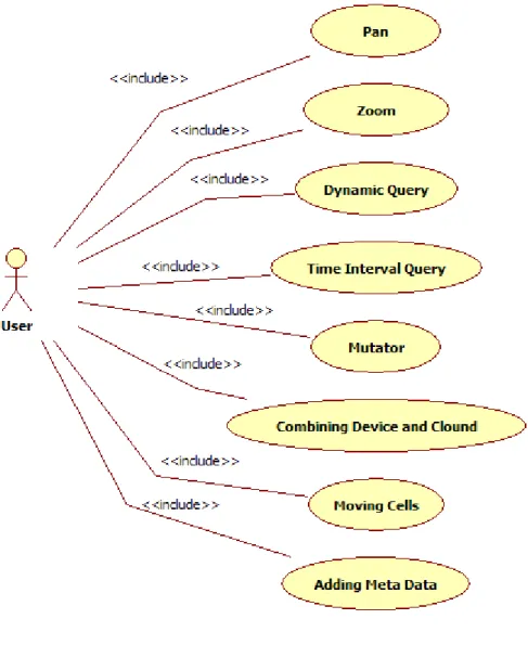
2.1 Use Case Model 2.2 About the Use cases 2.3 Pan
2.4 Zoom
2.5 Dynamic Queries
2.6 Querying Time Intervals
2.7 Mutator 2.8 Combining Device and the Cloud 2.9 Move Cell
2.10 Adding Meta Data
2.11 Parse File System Contents 2.12 Add Contents to Content Manager 2.13Display Contents
3 External Interfaces 3.1 User Interface 4 Software Architecture
4.1 Overview and Rationale 4.2 System Decomposition 4.3 Hardware/Software Mapping 4.4 Persistent Data
4.5 Access Control
4.6 Synchronisation and Timing 4.7 Start-up and Shutdown 4.8 4.8 Error Handling 5 Detailed Software Design
5.1 File System Content Parser 5.2 Content Manager
5.3 Cloud Based Storage 5.4 Cloud Based Collaboration
42 1 Introduction
1.1 Background
In today‟s operating systems we are spending a lot of our focus on using specific applications and switching between those. This is a model that has been in use since the creation of the Graphical User Interface (GUI), some 20 years ago. We believe that the model is inefficient, and that a new design could move the focus from the applications and windows to the content itself. We can avoid the problem of windows on top of each other by presenting all the content on a flat surface, navigated by panning and zooming. Additionally we can add tools that affect a specific type of content to the content itself, removing the need of windowed applications in order to modify the content. Content of one type can also contain other types of content, which gives the operating system a great flexibility, while maintaining an easy-to-use interface with uniform functionality.
1.2 Definitions
Surface An infinitely large 2-D surface, on which all content of the operating system are shown.
Cell A set of data of an arbitrary type (could be text, image, sound, video, etc.) along with mutators that handles data of the current type.
Entity A cell containing other cells. Collection A number of cells that belong
together, but with a looser coupling than in an entity. Mutator, Transformer A tool/modifier that affects a
specific type of content.
43 1.3 Related Documents
Jag älskar att allt ligger överst Rikard Lindell, 2009, ISSN: 1651-4238
Requirements Definition touchOS - Requirements Definition.docx (APPENDIX B)
1.4 Licensing and External Resources
touchOS will be an open source project, which means that external resources also must be open source. Some open source licence models do however limit the use of the licensed content(s) in a way that would create future problems for the touchOS project. We have therefore decided that the only valid licences for external resource being used in touchOS are the BSD- and MIT-licences. Of course licences similar to those might be used too, but only after careful examination and acceptance from the project owner.
2 Functional Description
44
Fig 1.Use Cases with the User as a central actor.
45 2.2 About the Use cases
The use cases presented in this document should be considered as conceptual designs. In some cases other solutions might be more effective and therefore more suitable for the project. This means that use cases are flexible and open for discussion with the project owner – however, changes to the use cases must be approved by the project owner before any revisions of this document are made.
2.2.1 Actors
User – A user is a person operating a device running touchOS as its main operating system. System – The touchOS operating system, which has its own set of actions, which might be triggered by input from the user or other events.
2.2.2 Use Cases
Each use case is described in a separate section in the remainder of this chapter. 2.3 Pan
2.3.1 Requirements Reference MR-IN-01
2.3.2 Participating Actors User
2.3.3 Related Use Cases Move Cell
2.3.4 Precondition
2.3.5 Main Flow of Events
1. The user touches the screen with three fingers and drags them across the surface. 2. The viewable area of the surface is changed so that it follows the movement of the user‟s hand.
3. Note: Consider the difference between a slow moving gesture and a swipe.
46 2.4.1 Requirements Reference
MR-IN-02
2.4.2 Participating Actors User
2.4.3 Related Use Cases None
2.4.4 Precondition
2.4.5 Main Flow of Events
1. The user touches the screen with one finger.
2. The user can zoom in by moving the finger in a clockwise circle and zoom out by moving the finger in a counter-clockwise circle, while not releasing the screen. 2.5 Dynamic Queries
2.5.1 Requirements Reference MR-CO-01
2.5.2 Participating Actors User
2.5.3 Related Use Cases Querying Time Intervals 2.5.4 Precondition
result.
2.5.5 Main Flow of Events
1. The user starts typing one or more keywords/tags that are of interest.
2. Content that matches the query will remain visible and be temporarily moved together, for better overview.
3. Content that does not match the query will be temporarily hidden from view. 2.5.6 Alternative
47 a. The keyword is erased.
b. Continue from 1.
2.6 Querying Time Intervals 2.6.1 Requirements Reference MR-CO-02
2.6.2 Participating Actors User
2.6.3 Related Use Cases Dynamic Queries
2.6.4 Precondition
result.
2.6.5 Main Flow of Events
1. The user performs a search as defined in the use case “Dynamic Queries”.
2. The user selects an interval on a timeline located in the vicinity of the on-screen keyboard in order to filter out content that is too old or too new.
2.7 Mutator
2.7.1 Requirements Reference MR-MU-01
2.7.2 Participating Actors User
2.7.3 Related Use Cases None
2.7.4 Precondition
2.7.5 Main Flow of Events
48 2. Available mutators that match the tapped content are displayed in accordance to the content manager‟s rules.
a. Mutators are displayed as small “images”, without any descriptive text.
b. The image is generated from the effect on the content, i.e. what the result would look like if the mutator were to be applied to the content. Example: A mutator that makes text bold would display a few words from the tapped text in bold.
3. If the user finds a mutator that suits the wanted result, the user taps that mutator with one finger.
2.7.6 Alternative
a) The user accidentally taps the screen without wanting to display the mutators. a. The user taps the content with two fingers again to close the list of mutators. 2.8 Combining Device and the Cloud
2.8.1 Requirements Reference MR-CL-01
2.8.2 Participating Actors User
2.8.3 Related Use Cases None
2.8.4 Precondition
working Internet connection. 2.8.5 Main Flow of Events
1. The user press-and-holds the cell with two fingers until it becomes semi-transparent.
2. The user taps the edge of the cell with one finger, which makes the cell “turn around” (show the back of the cell).
3. The user taps a cloud symbol (the system silently saves a copy of the cell to the cloud).
49 5. The cell is displayed with a cloud-like border.
2.8.6 Alternative
a) The user is out of cloud storage space.
a. The cloud symbol is made semi-transparent and inactive. 2.9 Move Cell
2.9.1 Requirements Reference MR-IN-03
2.9.2 Participating Actors User
2.9.3 Related Use Cases Pan, Zoom
2.9.4 Precondition
2.9.5 Main Flow of Events
1. The user press-and-holds the cell with two fingers until it becomes semi-transparent.
2. The user can now move the cell to a new location, by dragging it with two fingers. 3. When the user releases the screen, the cell will stay at the location where it was released.
2.9.6 Alternative
a) The user releases the screen by mistake. a. Proceed from 1.
2.10 Adding Meta Data
2.10.1 Requirements Reference
MR-CE-01 touchOS – Design Description 2.10.2 Participating Actors
User
50 Move Cell
2.10.4 Precondition
2.10.5 Main Flow of Events
1. The user press-and-holds the cell with two fingers until it becomes semi-transparent.
2. The user taps the edge of the cell with one finger, which makes the cell “turn around” (show the back of the cell).
3. The user can now add keywords and see cell meta data.
4. When finished, the user taps outside the cell in order to “turn it back”.
2.10.6 Alternative
a. The user accidentally moves the cell. a. The user must release the cell. b. Continue from 1.
2.11 Parse File System Contents 2.11.1 Requirements Reference MR-DC-01
2.11.2 Participating Actors System
2.11.3 Related Use Cases None
2.11.4 Precondition
51 1. The parser is given a valid path to a location in the file system where it has read permissions.
2. The parser recursive extracts content as well as Meta data from all the different files found in the location specified.
2.11.6 Alternative
a. File data is not recognised as a supported format.
a. A cell marked as “Unsupported Content” is added instead of the content itself. The cell should contain the file name, so that the user knows that the data still exists on the hard drive.
2.12 Add Contents to Content Manager 2.12.1 Requirements Reference MR-CM-01
2.12.2 Participating Actors System
2.12.3 Related Use Cases None
2.12.4 Precondition
2.12.5 Main Flow of Events
1. The parser sends parsed data along with Meta data to the content manager. 2. The content manager performs additional analysis of the content.
a. Mutators are added to their type of content.
b. A suitable information structure is selected by the content manager. 3. The result is cached.
2.13 Display Contents
2.13.1 Requirements Reference MR-CM-02
52 System
2.13.3 Related Use Cases
None touchOS – Design Description 2.13.4 Precondition
2.13.5 Main Flow of Events
1. The content manager performs a quick analysis of what area the user can see. 2. The content manager checks for changes of any content and marks the cells for being re-rendered.
3. All cells that have been marked are rendered and the result is cached (along with any mutators that should be visible).
4. All the cells that are positioned inside the visible area are displayed on the screen, while cells outside the visible area are ignored.
5. If any mutators should be visible, those are updated (if needed)
3 External Interfaces
3.1 User Interface3.1.1 The ZUI
The Zoomable User Interface (ZUI) will contain everything the user interacts with. All the cells and their content will be presented on an infinite 2D-surface, being visible all the time (except when the user zooms in on other parts of the surface, or they are filtered out by a search).
Upon system start, the user will be presented with the “middle” of the surface where the most recently used content is presented in a spiral form. As content is created or used, it pushes less recently used content outwards on the spiral.
The spiral can be “reorganised” in different ways, for example it could be set to display the contents that have been used the last week, month or year.
53 3.1.2 Cells
A Cell is a visual representation of an arbitrary data object. There will be a cell type for each type of content there is, e.g. text, image, etc. But cells can also contain other cells. By combining several cells, the user can create text documents containing, for example, images and videos.
A cell also contains all the available mutators for the cell‟s content type. A text cell might for example contain mutators for weight, size, colour, font, etc.
3.1.3 Entities
A cell that contains other cells is an entity. An entity is displayed with all its contents, like a web page is displayed with text and images.
3.1.4 Collections
A collection is a number of cells that belong together, but are not stored inside other cells. Music collections consisting of 4000 songs and photo albums are good examples.
3.1.5 Mutators
A mutator is a behaviour or an effect that applies to a specific type of content. The mutator affects how the content is displayed, but does not alter the original content itself. The mutator can be applied to all the content of its matching type in a cell, or to parts of the content.
3.1.6 Look and Feel
During the initial design phase we established that a black background is favourable in most cases. We were also inspired by C3LOOPS and the film Tron: Legacy.
4 Software Architecture
4.1 Overview and Rationale
The following section will describe how the first prototype could be developed. It will also present some of the key areas where possible problems could arise if not taken into consideration.
4.2 System Decomposition
Only a brief presentation of the different components will be presented here, for more information about the sub-systems, see section 5 of this document.
54
Fig 3. The static structure of the first prototype.
4.2.1 Operating System
The prototype will run on any operating system able to run the web browser Google Chromium.
4.2.2 Google Chromium
A modified version of Google‟s web browser Chromium, extended with added functionality that enables prototyping of cells and features specific to touchOS. 4.2.3 touchOS
The core of the touchOS operating system, could be built as an extension to Chromium.
4.2.4 File System Content Parser See section 5.1.
55
4.2.5 Content Manager
See section 5.2.
4.2.6 Cloud Based Storage
See section 5.3.
4.2.7 Cloud Based Collaboration
See section 5.4.
4.2.8 HTML 5
HTML 5 could be used during the prototyping process in order to quickly create components that work like cells and collections. By extending the capabilities of Chromium, custom tags could be created in order to simplify the creation of complex cells.
4.2.9 Javascript
Javascript could be used to prototype and test functionality of HTML 5 based cells, as well as handle collaborative tasks through AJAX or similar techniques.
4.3 Hardware/Software Mapping
In the first prototype of the operating system we will use a modified version of Google‟s Chromium web browser as a platform for displaying data and testing design concepts. In this stage a lot of the basic functionality can be prototyped in Javascript.
In later versions an operating system will be adapted to running Chromium as its shell and extended to better handle computations that require more processing, such as audio filters, by adding libraries with such functionality to the operating system, and then importing their functionality into the browser.
4.4 Persistent Data
All the cells on the surface will be available all the time, which means that all data must be available at all time. Since this will require a lot of memory, cells that are outside of the current view can be cached in order to quickly be displayed when the user zooms out again.
The operating system will always store the current state of everything, which basically means that everything should be treated as persistent data.
4.5 Access Control
User input should be possible by the use of on-screen keyboard(s) and touch input. Input should also be possible by connecting a hardware keyboard to the computer running touchOS.
On-screen keyboards should be replaceable, and therefore seen as standalone input modules. It does not matter how the keyboard looks, or touchOS – Design Descriptionwhere the keys are located – when the user presses the „a‟ key – the character „a‟ should be sent to the systems input handler.
Note: This is how it works on Android.
56
One very important aspect of touchOS is responsivity. It is therefore vital that the system maintains a high enough frame rate even if processing of data requires a lot of system resources. This in turn will probably require that some cells are cached instead of actually rendering all their contents each time the screen is redrawn.
One of the key features of the touchOS operating system is that everything should be available directly, so anything that might create bottle necks must be avoided, if possible.
4.7 Start-up and Shutdown
When the system is turned on the first time, it will display a set of video tutorials. When the system is shut down, it will save the current state of all components and the current view, in order to restore them in the exact same way when the system is powered on again.
4.8 Error Handling
If something crashes, the system must be able to recover and save the data of all currently unsaved cells. It is also important that components that freeze are restarted, so that they do not degrade the performance and responsivity of the operating system as a whole.
5 Detailed Software Design
5.1 File System Content ParserThe content parser subsystem will be responsible for understanding the user‟s existing data, as well as how it is organised. The parser should be able to examine all the contents recursively from at given path and prepare the gathered information for the touchOS Content Manager. When large collections of data are found in a folder structure, the parser should note that and mark the data with appropriate tags/keywords/information, so that the Content Manager knows how to display the data in a way that feels familiar to the user.
Parsing of file system contents will be performed on hard drives, flash drives as well as different types of network storage. It is therefore important that the parser‟s performance is good, even though it might not be used frequently; otherwise the user must wait for the touchOS operating
system to parse the contents of a flash drive, etc. before being able to use it (See section 4.6). 5.1.1 Static Structure TODO 5.1.2 Dynamic Behaviour TODO 5.2 Content Manager
The Content Manager subsystem will be a central part of the touchOS operating system. It will, in a way, play the part of a game engine, handling responsibilities such as: