Brand Image and Self Image:
A study on the semiotics behind Victoria’s Secret’s visual
communication and its impact on its target audience
Dania Salih
Kandidatarbete i grafisk design, 30 hp VT 2016 Handledare design: Anders Ljungmark Handledare uppsats: Åsa Harvard
ABSTRACT
This essay explores how a brand’s image affects consumers’ self-image through a case study of the lingerie brand Victoria’s Secret in order to reflect over the role of graphic designers as visual communicators in society. The study conducts a semiotic analysis of the brand and a qualitative research consisting of interviews and a focus group of a selection of women within the brand’s target audience. The conclusion is that Victoria’s Secret, through its models, contributes to an unrealistic feminine ideal that the study participants’ self-image was perceptibly affected by. While perception is personal and signs are context reliant, semiotics is not only useful for analyzing visual communication but also as a tool that graphic designers can use for creating ads with the consumer’s needs in mind.
KEY WORDS
Brand Image, Brand Identity, Graphic Design, Self-image, Semiotics, Visual Communication, AdvertisingTABLE OF CONTENTS
INTRODUCTION ... 5
BACKGROUND ... 6
GRAPHIC DESIGN AND BRAND IDENTITY ... 6
WHAT IS A BRAND? ... 7
BRAND IMAGE ... 7 SELF-IMAGE ... 8 VICTORIA’S SECRET ... 9 PROBLEM ... 10 PURPOSE ... 11 RESEARCH QUESTION ... 11 HYPOTHESIS ... 11 EXISTING RESEARCH ... 11
THE IMPACT OF ADVERTISING ... 11
BRAND IMAGE AND SELF-IMAGE ... 13
GRAPHIC DESIGN AND SEMIOTICS ... 13
GRAPHIC DESIGN AND SOCIAL RESPONSIBILITY ... 14
THEORY ... 15
1. BRANDING ... 15
Brand Image and Brand Identity ... 15
Designing for the Target Audience (the Consumer) ... 16
Brand Image and Consumer Self-image ... 16
2. SEMIOTICS AND VISUAL COMMUNICATION (ADVERTISING) ... 18
What is Semiotics? ... 18 Representation ... 20 Semiotic Analysis of Brand Visual Communication (Advertising) ... 20 Myth and Ad Analysis (Connotation & Denotation) ... 22 METHOD, MATERIAL, AND RESULTS ... 25 1. VICTORIA’S SECRET ... 25 1.1. Elements of the Brand’s Identity and Visual Communication ... 25 1.2. Visual Communication Analysis ... 30
2. QUALITATIVE RESEARCH ON VICTORIA’S SECRET ... 33
2.1. Interviews ... 33 2.2. Focus Group ... 38 ANALYSIS AND CONCLUSION ... 44 INTERVIEWS ... 44 FOCUS GROUP ... 45 OVERALL CONCLUSION ... 46 SUMMARY & REFLECTION ... 47 REFERENCES ... 49 BOOKS ... 49
JOURNALS, ARTICLES & PAPERS ... 50
WEBSITES ... 50
FIGURE 1: KAPFERER’S BRAND IDENTITY PRISM ... 51
FIGURE 2: PIERCE’S SEMIOTIC TRIAD ... 51
FIGURE 3: VICTORIA'S SECRET STORES - EXTERIOR ... 51
FIGURE 4: VICTORIA’S SECRET STORES- INTERIOR ... 51
FIGURE 5: VICTORIA'S SECRET OFFICIAL WORD MARK LOGO ... 51
FIGURE 6: VICTORIA'S SECRET LETTERFORM MARK, WITH KEY COLORS AND SHAPES ... 51
FIGURE 7: VICTORIA'S SECRET LOGO WITH SYMBOL, KEY COLORS AND SHAPES ... 51
FIGURE 8: VICTORIA'S SECRET SHOPPING BAGS SHOWCASING APPLICATION OF KEY COLORS AND SHAPES 51 FIGURE 9: VICTORIA'S SECRET IPHONE COVER SHOWCASING APPLICATION OF KEY COLORS, SHAPES, AND SCRIPT FONT ... 51
FIGURE 10: GIFT CARDS WITH VS VISUAL IDENTITY ... 51
FIGURE 11: VICTORIA’S SECRET PINK ... 51
FIGURE 12: VICTORIA’S SECRET SWIM ... 51
FIGURE 13: VICTORIA BY VICTORIA'S SECRET PERFUME - WINNER OF 2014 FRAGRANCE AWARD 51 FIGURE 14: OFFICIAL AD FOR VICTORIA WITH MODEL AND "ANGEL" BEHATI PRINSLOO ... 51
FIGURE 15: VS ANGEL BEHATI PRINSLOO, THE FACE OF THE FRAGRANCE VICTORIA, ACCEPTS THREE 2014 FRAGRANCE AWARDS ... 51
FIGURE 16: VICTORIA’S SECRET CATALOGS, WITH AN “ANGEL” AS THE COVER MODEL ... 51
FIGURE 17: VS ANGELS MAKE THE HOLLYWOOD WALK OF FAME ... 51
FIGURE 18: TAYLOR SWIFT AND A VS ANGEL AT THE 2013 FASHION SHOW ... 51
FIGURE 19: VICTORIA BY VICTORIA’S SECRET OFFICIAL AD ... 51
APPENDIX ... 52
1. VICTORIA’S SECRET VISUAL IDENTITY WITHOUT MODELS ... 52
2. VICTORIA’S SECRET VISUAL IDENTITY WITH MODELS ... 53
3. INTERVIEWS ... 54
4. FOCUS GROUP DISCUSSION QUESTIONS ... 55
5. THE PERFECT BODY CAMPAIGN & A BODY FOR EVERY BODY ... 56
INTRODUCTION
Brands communicate their identity to their target audience and attempt to influence them primarily in order to sell and distinguish themselves from competitors. For my graduation design project, I created a fashion brand for which I designed a graphic and brand identity; the brand’s image intended to encourage self-empowerment, and self-expression. The aspect that I found most interesting in branding, which inspired this essay, is that the largest focus in terms of visual communication lies on benefiting the brand without much regard to the implications it might have on the target audience. Through a proper brand strategy, products can obtain meaning to consumers that goes beyond function. This is why advertising has been critiqued as one of the social institutions which perform a function of naturalizing dominant ideologies in our culture—for example, that it naturalizes ideologies based on consumption, or ideologies that oppress women. This impact that the visual communication (advertising) of a brand has on society is what this essay intends to investigate. This is relevant to graphic designers who work within branding and design of visual communication, to brands who care about their image, to consumers who are bombarded by brands’ visual communication on a daily basis, and consequently, to society who relies on the well-being of its members to function positively. In this essay, a case study will be done on Victoria’s Secret—an international women’s lingerie brand which is famous for its portrayal of sexiness and luxury—to explore what values and ideals that its brand image creates and the signals it sends through its visual communication to its target audience and what impact those signals have on their self-image. The brand has a consistent identity that is widely recognizable, and it often communicates images of “the perfect body” to sell lingerie. A group of women in Sweden who fit into the brand’s target audience were interviewed in order to get an insight into the influence the Victoria’s Secret brand image might have on them.
BACKGROUND
The scope of this essay, and the area of graphic design on which it focuses, is branding and brand identity—specifically, the production of visual communication for a brand which is delivered through advertising, and the influence it has on consumers.
Graphic Design and Brand Identity
Graphic design is a cultural phenomenon that is embedded in culturally and historically shaped institutions, such as the design studios, advertising agencies, publishing houses, and media companies (Drucker and McVarish, 2009). With the development and proliferation of printed text, the development of print technology and industrialization, and the creation of the public sphere and then mass mediation, the role of graphic design became more visible as well as necessary and influential. In the early twentieth century, it “became the source of stylish fantasies that were crucial to the growth of consumer culture” (p.213). Soon, the idea of simply promoting products and services was replaced by one of constructing a consumable “image” (p.213). And so, graphic design “earned new clout by its ability to push consumption beyond the satisfaction of needs” by presenting “a polished image of modernity as a desirable, ever-changing way of life whose attributes were embodied by the newest product and the latest style” (p.214).
By the 1950s, the changes in the business culture required the field of graphic design to adapt: companies turned into corporations with subsidiaries and offices worldwide which cater to different markets, creating the need for a unified “corporate identity” to achieve “brand recognition across wider ranges of products and contexts” (Drucker and McVarish, 2009, p.260). Moving from layout and style choices for print, the role of graphic designers expanded to large-scale campaigns that “not only maintained the identity of a corporation but also added value to its products through symbolic investments in this identity,” making the corporation “seem like an individual entity with a voice and personality” (p.261). In other words, the graphic designer’s role was “to convey the essence of an organization’s identity” (p.262). By the 1990s, this role became more prominent as big manufacturers shifted more of their spending towards brand promotion: “creating brand awareness came first,” even at the expense of production (p.311). One prime example of this inversion of marketing and manufacturing is the Nike versus Reebok brand war: “Graphic designers were among those responsible for the campaigns that invested these brands not only with general associations of goodness, but also with specific cultural meanings via visuals and stylistic references to recognizable contexts” (p.312).
With the boom of television in the 1950s and 60s, new markets opened for graphic design in film and commercials. “Graphics entered time-based media,” and graphic designers were no longer limited to static images (p.270). There was also a growth in the mass-circulation magazines market, and so these publications relied more on the graphic design of their covers to draw more attentions to them (p.274). Towards the end of the twentieth century, graphic design went from static composition of advertising, packaging, and editorial design and moved into special effects, animation, film, television, and music video graphics, and eventually disappeared into global corporate identity systems, branding, and so on, producing a significant share of mass visual culture (p.317).
What Is a Brand?
In The New Strategic Brand Management, Kapferer (2008) attempts a comprehensive definition of the term brand—one that is financial-, legal- and customer-based: “A brand is a name that influences buyers” (p.11); it is “a shared desirable and exclusive idea embodied in products, services, places and/or experiences. The more this idea is shared by a larger number of people, the more power the brand has” (p.13). Wheeler (2013) takes a similar approach in her definition, highlighting the significance of customers/people in the making of a brand:
As competition creates infinite choices, companies look for ways to connect emotionally with customers, become irreplaceable, and create lifelong relationships. A strong brand stands out in a densely crowded marketplace. People fall in love with brands, trust them, and believe in their superiority. How a brand is perceived affects its success, regardless of whether it’s a start-up, a nonprofit, or a product (Wheeler, 2013, p.2).
A brand gives meaning and purpose to a product that is otherwise mute. It is the way a company invites its customers to perceive its products. As brands help guide customers’ perception of a company’s products, the products themselves send signals that guide the company in building their brand identity (Kapferer, 2008, p.42-43).
Brand Image
A brand image is a set of associations that are created in the mind of the consumer regarding what the brand stands for and what it promises: how it is communicating its brand identity and how it is perceived by its target audience as a result of the
messages the brand is sending out.
Brand image is on the receiver’s side. Image research focuses on the way in which certain groups perceived a product or a brand. The image refers to the way in which these groups decode all of the signals emanating from the products, services and communication covered by the brand. (Kapferer, 2008, p.174)
Brand image is formed through communication. By communicating with their target audience, a brand gradually builds up character and obtains a personality, “the kind of person it would be if it were human,” thus making brand personality the main focus of brand advertising since 1970 (Kapferer, 2008, p.183). But advertising has another function besides selling products, and that is creating structure and meaning: “ads ask us to participate in ideological ways of seeing ourselves and the world” by decoding their linguistic and visual signs (Bignell, 1997, p.33).
In ads, and in the ideology which ads reproduce, we are distinguished from others by means of the kinds of products which we consume. Social status, membership of particular social groups, and our sense of our special individuality, are all signified by the products which we choose to consume (Bignell, 1997, p.38).
The brands’ consumers become indexical signs of their social identity. Brands become “signs with a certain social value,” a value that is passed on to their consumers, impacting their self-image (Bignell, 1997, p.38).
Self-Image
Self-image, as defined by Dr. Maxwell Maltz (2010) is “your own conception of the sort of person you are. It is a product of past experiences, successes and failures, humiliations, and triumphs, and the way other people react to you, especially in early childhood.” These factors lead to you building up “a picture of yourself which you believe is true.” Smith, Baish, Willett and Watson (2012) define self-image as follows:
Self-image is how you see yourself from the inside. This includes how you see yourself physically and how you think others see you, what kind of person you think you are, what kind of personality you think you have, if you think others like you and if you like yourself. Self-image affects your self-confidence. Your self-confidence is what you project to the outside world and how other people see you (p.7).
According to Schiffman, O’cass, Paladina and Carlson (2014), there are four kinds of self-image. The first two have been mentioned above and they are actual self-image (how you see yourself), and social self-image (how you think others see you). The two remaining kinds of self-image are ideal self-image (how you would like to see yourself) and ideal social self-image (how you would like others to see you) (p.133).
Self-image has an impact on the actual projected image of oneself in the outside world. Having a negative self-image can have a negative effect on one’s life. A big part of self-image, according to Smith, Baish, Willett and Watson (2013), is body image (p.5). They state that a negative body image is not something you are born with but something that is developed over time and is generated through the experiences you go through as you grow older, as earlier mentioned by Maltz, as well as the messages that society often sends out—messages that connect “personal success and happiness with being thin and beautiful” (Smith, Baish, Willett and Watson, 2013, p.5).
Victoria’s Secret
According to L Brands (2015), Victoria’s Secret is the largest American retailer of women’s intimate apparel as well as other apparel with fashion-inspired collections, fragrances, and cosmetics. The company was founded in 1977 and had men as its target audience. By 1982, the company was nearing bankruptcy, which resulted in a change in ownership and consequently a change in target audience: the customers the products are designed for—women (Barr, 2013). The new owner of Victoria’s Secret studied European lingerie boutiques and brought the same approach to America (Barr, 2013). To describe the brand, the words most used by the brand itself are sexy, feminine, luxury, beauty, elegance, and fantasy.
Despite its success and massive media profile, the brand nevertheless encounters some unfavorable reactions and criticism over its visual communication. A few examples from online media responses include (1) the “#ImNoAngel” Campaign, which features famous plus-size models sharing their own definitions of sexy by wearing lingerie and showing off their curves, implying that being an Angel is not the ideal and inviting women to join them in breaking the ideals created by brands like Victoria’s Secret (Harrison, 2015); (2) the “Truly.Madly.Cheeky” ad that featured a model facing a wall wearing only underwear and showing an obvious photo editing mistake of the model’s butt, where they edited one butt cheek and missed the other; and most importantly, (3) the reaction to the Victoria’s secret “Perfect Body” campaign (see Appendix 5), which featured a series of “similarly built supermodels” and generated a lot of criticism and resulted in a petition requesting that Victoria’s Secret apologize and change the campaign. The petition came with a message that women are constantly “bombarded with advertisements aimed at
making them feel insecure about their bodies in the hope that they will spend money on products that will supposedly make them happier and more beautiful.” The petition remarked,
“all this does is perpetuate low self-esteem among women who are made to feel that their bodies are inadequate and unattractive because they do not fit into a narrow standard of beauty. It contributes to a culture that encourages serious health problems such as a negative body image and eating disorders.”
The petition received over 27,000 signatures and led to the brand changing the tagline to “A Body for Every Body,” but with absolutely no change in models (Bahadur, 2014)—showing that the brand either does not understand or just has no real intention to actually make a change.
PROBLEM
A brand like Victoria’s Secret, through the communication of its brand identity, contributes to creating and naturalizing ideals and values about femininity, which might affect the way its target audience (women) view themselves as women and as individuals. Feeling that you do not measure up to the ideals set by society can make you disregard your real accomplishments in life, creating a negative self-image and, consequently, making you project yourself in a negative way to the outside world (Smith, Baish, Willett and Watson, 2013). In other words, brands, being a part of a person’s daily experiences, are a factor in the shaping of the person’s self-image. By being exposed to the messages sent out by brands in order to encourage consumerism, consumers’ self-image and, consequently, their self-confidence and self-esteem are affected.
Smith et al. (2013) state that self-image is changeable and that a negative body image, and in turn overall self-image, is something that you can, and ought to, unlearn. Maltz (2010) agrees with the idea that self-image is changeable and stresses on the importance of having a positive self-image in order to live a happy and successful life (Maltz, 2010). Graphic designers, being the creators of a brand’s visual communication, have a responsibility not only towards the brands they work for but also towards consumers—whose best interest should be one of the brand’s main priorities along with profit. This leads to the purpose and question of this essay.
Purpose
The purpose of this essay is to explore the influence of brand image on the consumer through the use of the theory of semiotics as a tool in constructing as well as analyzing visual communication and to reflect over the responsibility graphic designers have towards consumers.Research Question
How does Victoria’s Secret’s brand image influence its target audience’s self-image?Hypothesis
I hypothesize that Victoria’s Secret, by portraying images of “the perfect body” consistently throughout its visual communication, is creating an unrealistic standard of beauty for women who come in constant contact with these images, which might make them feel that the way they are is less than ideal/perfect.
EXISTING RESEARCH
This section will present a selection of existing research and studies that are relevant to this essay and the research question; they are looking at the same topic, using different methods for different purposes. Similarly to this research, these studies should not be used to generalize.
The Impact of Advertising
In Richins’ article Social Comparison and the Idealized Images of Advertising, he reviews theories explaining the role of advertising in causing consumers’ dissatisfaction with the self in order to test the hypothesis that consumers compare themselves with idealized images in advertisements, that being exposed to these images causes consumers to be less satisfied with themselves. Richins (1991) mentions how advertising has had social consequences for which it has received complaints, and one of those complains is that “advertising presents an unrealistic or idealized picture of people and their lives.” These images cause consumers to compare themselves and their lives with what they see, whether they do so consciously or unconsciously. He argues that although the ads promise that the consumption of the product or brand would help bring the consumers closer to the ideal, this promise is not fulfilled. The exploratory and experimental research done in this article focused on idealized images of physical attractiveness in ads targeted at young women, and found evidence to back up the hypothesis, that these images did in fact raise comparison standards for attractiveness and cause lower
satisfaction with the women’s own attractiveness.
Bell and Dittmar (2011) conducted a study that examined girls’ media consumption and identification with media models and investigated whether the different media formats, be it TV or magazines, in which “body perfect” ideals are presented affects their impact on body image. The participants of this study involved 199 adolescent girls in the UK, aged between 14 and 16. The study showed that the type of media and the amount of exposure to it had no relation to body dissatisfaction, but that the models in the media did. The study demonstrated that being exposed to the perfect body in the media caused higher body and appearance dissatisfaction in those girls. To conclude their research, Bell and Dittmar (2011) express that this issue needs to be addressed universally, in order to reduce the impact of the thin ideal in all forms of mass media.
Rutledge (2002) conducted research on the content of advertisements depicting idealized images of women. Her research was shaped by influences of the analytical tools of psychoanalysis, semiotics, and post-structuralism. She was interested in the audience of advertisements as well as the advertisements themselves, and the relationship between the two. In her book, she “examines how women in particular are mandated to measure up to the perfect bodies in the media on a daily basis” and offers an in-depth look at how these messages are encoded with cultural ways of seeing the perfect female form.
Rutledge (2002) was specifically interested in what kinds of influence, if any, that the images of the ideal female in advertising have on both women and men. She states that there is evidence suggesting that girls and young women in this culture are particularly vulnerable to the kinds of mass media messages concerning body image, size, and appearance due to the cultural overemphasis on female body perfection. She talks about semiotics, how advertising operates in the realm of symbols, using already familiar signs and inventing new ones. She talks about codes, how they, in advertising, are the store of experiences upon which both the advertiser and the audience draw in their participation in the construction of meaning.
Her study included interviews with 73 participants, men and women, about the portrayal of the ideal female body in magazine ads. She explores a way of understanding gender and advertising through semiotics: Ads or images are signs that convey meaning that is culturally and ideologically agreed on. People experience advertising as a code. The female body in ads and the idealized female image is a naturalized way of seeing in this culture, which the subjects of her study agreed on. Rutledge (2002) talks about how advertising affects self-image—that it causes women to exploit themselves, allowing men to exploit them too, and that people connect their feelings about their self-image with feelings about security and
instigators keeping not only girls and women but also the entire culture “body obsessed,” and that advertising images are therefore the primary media images to be interrogated.
Brand Image and Self-Image
A study by Mocanu (2013) was conducted investigating the relation between brand image and self-image and how the consumption of brands contributes to consumer’s construction of self. It tests the relevance of self-image to brand image and brand-self-connection. By referring to a collection of existing studies on this subject, Mocanu (2013) states that products have psychological and social value that consumers are aware of and that affects their purchase decisions, and that products have symbolic meanings; ownership of a certain product works as a symbolic communication between the consumer and society. Mocanu discusses mainly adolescents as consumers, how they use brands to project a self-image that is idealized by their peers in order to “gain social acceptance and avoid bullying,” and how they use brands during this phase of “identity crisis” in order to form the self, to reinforce their self-identity.Referring to symbolic interactionist theory, Mocanu (2013) states that consumers who suffer from insecurities buy brands or products that are consistent with the image of themselves they wish to project or the social role they wish to master. He finds that brand exposure is influential on consumer behavior. This study had a total of 119 participants, both male and female, ages between 20 and 25; it used descriptive test instruments to capture the range of cognitive and emotional reactions of consumers in response to advertisements. Mocanu found that the possession or non-possession of specific brands within fashion directly impacts self-esteem among the young participants, that fashion brands specifically are a psychologically central aspect in self-evaluation. Participants showed that they evaluated their self-worth with material possessions rather than more traditional indicators of self-worth, like academic performance, for example (Mocanu, 2013).
Graphic Design and Semiotics
The value of semiotics in the education of graphic design is discussed by Ockerse and Dijk (1979), who maintain that semiotics is not only a significant, but also an essential tool for a graphic designer. They state that graphic design is “visual communication design wherein the designer purposefully marks, signs, and names thoughts, events or facts, and conveys information with a definite meaning and significance.” They further define the role of graphic designers in the development of visual communication stating that they “coordinate structural and functional relations to produce concise and clear communication for both sender and receiver.”
In semiotic terms, the graphic designer aids his fellow man in the process of generating and digesting “signs”. Semiotics is the theory of signs in which one studies problems of sign production and interpretation. (Ockerse and Dijk, 1979)
Graphic Design and Social Responsibility
In an article by Frascara (1988), which is relatively old yet still relevant and accurate today—and very relevant to the purpose of this essay—he discusses the social responsibility of graphic design, and how the quality of a design should be measured. Frascara (1988) writes that graphic design has developed lacking of theoretical reflection, focusing more on esthetics and less on ethics, with less consideration of communication and social significance. He proposes that the esthetic quality of a design does not determine its overall quality—graphic design is more than just an art form. Frascara defines quality in graphic design, stating, “It is measured by the changes it produces in the audience.”
Frascara (1988) names a few of the flaws present in the discussion of visual style as one of the aspects of graphic design, stating that it leaves out important areas of graphic design such as signage, that it does not distinguish between visual creation and visual manipulation that occurs in the communication process, that it does not look into problems of performance related to visual perception, and that it “omits problems related to the impact that graphic communication has on the public’s attitudes and ideas.” He talks about communication and how designers need to be aware that it requires a sharing of codes that they need to communicate with regards to the codes of the public (Frascara, 1988).
Frascara defines graphic design as “the activity that organizes visual communication in society”; it is therefore concerned with social responsibility. He adds that the main reason to the existence of any piece of graphic design is that “someone has something to communicate to someone else,” which involves a perceptual and behavioral concern—the perceptual concern involving problems of visual detection and communication such as visibility, legibility, and esthetics, and the behavioral concern regarding the effect the communications have on the target audience.
Frascara’s (1988) thesis contends that the designer’s job is not over when the design is produced and delivered, that the evaluation of the design and its effects must be a part of the design process, as the final purpose of visual communication is a certain behavioral change in a target audience which occurs after the occurrence of the communication: “The designer produces a piece that only comes into full existence when the communication with the audience takes place.”
THEORY
The theoretical basis of this essay is the study of signs: semiotics. This will guide the essay into understanding how a consumer’s self-image is affected. Through relevant literature overview and existing studies related to the scope of this essay, this chapter presents the theoretical grounds that will aid in analyzing the case study and guide the qualitative research used in answering the question of this essay. First, it will discuss branding as a form of visual communication and consumer perception of branding that impacts self-image. Second, it will explain semiotics, how it is (and how it can be) used by graphic designers when communicating with consumers on behalf of brands.
While there are many theories that study visual communication, this essay chooses to focus on the study of semiotics as it falls within the theory of visual perception, and the main focus of this essay is the consumer—the target for whom the message is intended.
1. Branding
Brand Image and Brand Identity As mentioned earlier, brand image is on the receiver’s side, but in order to discuss brand image and how it affects consumers, we need to discuss brand identity, which brand image is a product of. Brand image is the result of how a brand communicates its identity. Kapferer (2008) explains brand identity as follows: Identity is on the sender’s side. The purpose, in this case, is to specify the brand’s meaning, aim and self-image. Image is both the result and interpretation thereof. Before projecting an image to the public, we must know exactly what we want to project. Before it is received, we must know what to send and how to send it. (p.174) Kapferer (2008) maintains that a brand is not simply the name of a product; rather, it is “the vision that drives the creation of products and services under that name,” and it is this vision, “the key belief of the brands and its core values,” that is called identity. This vision is also what drives successful brands that are able to create devoted consumers or advocates, “a real cult and loyalty” (p.171). Wheeler (2013) takes it a step further and explains brand identity as something more concrete:Brand identity is tangible and appeals to the senses. You can see it, touch it, hold it, hear it, watch it move. Brand identity fuels
recognition, amplifies differentiation, and makes big ideas and meaning accessible. Brand identity takes disparate elements and unifies them into whole systems (p.4).
The main focus in this essay is the target audience. Kapferer (2008) explains the target audience: “The target specifies the nature and psychological or sociological profile of the individuals to be influenced, that is, buyers or potential customers” (p.178).
Designing for the Target Audience (the Consumer)
Insight into the characteristics, needs, and perceptions of the target customer is critical for defining a brand’s strategy and, ultimately, designing an effective identity. Through understanding the needs of the customers, designers develop solutions that are appropriate and compelling (Wheeler, 2013, p.64).
Identity designers must create a visual identity with a look and feel that resonates with customers and becomes synonymous with the brand: “Look and feel is the visual language that makes a system proprietary and immediately recognizable… This support system of color, imagery, typography, and composition is what makes an entire program cohesive and differentiated” (Kapferer, 2008, p.173). In other words, it is important for a brand to know who it is (identity), whom it is for (target audience), and finally create a graphic/visual identity that helps it to be perceived accordingly by the chosen target (brand image). A brand’s graphic design defines the norms for its visual recognition, which needs to reflect the brand’s deepest values at first glance: “You should be able to cover up the logo and still identify the company because the look and feel is so distinctive” (Wheeler, 2013, p.148).
Brand Image and Consumer Self-image
Brand image is how the consumers see the brand as a result of the constructed brand identity, and self-image is how consumers see themselves. The purpose of the essay is to look at branding from the consumer’s point of view—how they perceive a brand and ultimately the effect this perception has on their self-image—and, ultimately, discuss graphic designers’ role and responsibility for the consumer. Therefore, it is important to find a clear link between brand image and consumers’ self-image, which can be done by looking into the brand identity prism.
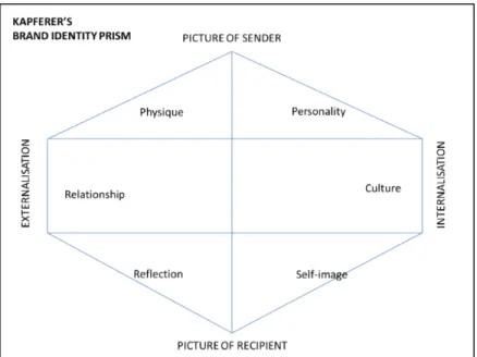
Figure 1: Kapferer’s Brand Identity Prism
Brand identity is represented by a hexagonal prism (see Figure 1) which includes the following facets: personality (the kind of person it would be if it were human), physique (physical qualities and aspects that represent the brand. Example: the famous Coca-Cola bottle), culture (the set of values inspiring the brand and its products and communication. Example: Coca-Cola stands for America), relationship (how the brand functions. Example: Nike suggests a relationship based on provocation, delivered through the tagline ‘just do it’ which encourages people to let loose), customer reflection (who the consumers perceive the brand is meant for, what kind of customer they think it is for. Example: dairy products that are positioned on lightless or fitness projects a sporty young female customer reflecting, although they are mainly purchased by older people), and finally self-image (whether the brand speaks to the target’s reflection of themselves. Example: buying a Porsche in order to prove financial capability) (Kapferer, 2008, p.182-187).
The last two are especially relevant to the focus of this essay as they are directly connected to the mind of the consumer. Kapferer (2008) clarifies the difference and relationship between the two facets, describing customer reflection as “the target’s outer mirror (they are…)” and self-image as “the target’s own internal mirror (I feel, I am…).” Kapferer adds, “reflecting the customer is not describing the target; rather, the customer should be reflected as he/she wants to be seen as a result of using a brand. It provides a model with which to identify” (p.186). A brand speaks to consumers’ self-image, a brand is perceived however the brand communicates, and consumers who choose to use that brand feel their self-image being enhanced through the brand or their ideal self-image being created by the brand. An example is the brand Lacoste: it is perceived as a sporty brand, and a
study showed that its customers see themselves as a member of an elegant sports club despite the fact that they may or may not practice any sports (p.186). Kapferer (2008) calls for us to remember, “it is advertising which writes the history of a brand” (p.196). For Wheeler, “Advertising is influence, information, persuasion, communication, and dramatization. It is also an art and a science” (p.182). It is one of the main ways of informing consumers about products, and despite an increasingly resistant audience, it still makes the desired impact. The following section on semiotics will provide the tool with which this study analyses the brand Victoria’s Secret through its advertising to discern its brand image and understand its impact on the consumer and its effect on their self-image.
2. Semiotics and Visual Communication (Advertising)
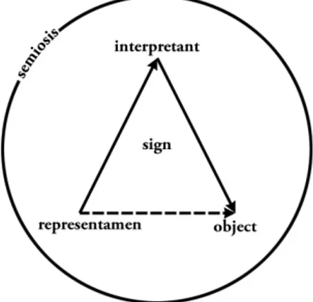
What is Semiotics? One way of finding meaning in visual communication is through semiotics. According to Zakia (2007), “Semiotics can be described as the study and application of signs, signs being anything and everything that conveys meaning,” and meaning is conveyed in many ways such as words, symbols, and colors, for example. Semiotic means “sign” in Greek, and images are signs that convey meaning and emotion (p.302).The two major theories in the field of semiotics were developed by Swiss linguist Ferdinand de Saussure and American philosopher Charles Pierce. This essay will mention Saussure’s but will focus more on Pierce’s study of semiotics as it is based and built upon Saussure’s study. Pierce’s semiotics studies signs in images and includes the viewer (the interpretant) as part of the study of signs.
All of our thought and experience, our very sense of our own identity, depends on the systems of signs already existing in society which give form and meaning to consciousness and reality. Semiotics shows us that the impression that we are individuals and unique subjects of our own life experience, is created by the language. (Bignell, 1997, p.6) “Saussure referred to signs as signifiers and the information or emotion conveyed as that which is signified” (Zakia, 2007, p.302). The sign is classically portrayed in a dyadic relationship—something which stands for something; a correlation between the signifier and the signified—but in Pierce’s definition, it has a triadic structure: object-sign-interpretant (Colapietro, 1989, p.4). Charles Pierce took Saussure’s definition a step further, describing a sign as “a relationship between an object or an
idea, how it is represented, and how the object or idea is communicated” (Zakia, 2007, p.302). In other words, Pierce’s definition of a sign is “something which stands for another to a mind,” meaning that a sign does not only stand for something but stands for something to someone; someone’s mind. (Colapietro, 1989, p.4) Pierce’s triad (Figure 2) includes what Pierce calls the representamen (the signifier), the object or idea (what is signified), and the interpretant (the process of interpreting the representamen). As Zakia (2007) explains, “The process of interpretation includes the person looking at the photo/ad along with how and where the photo/ad was exhibited–in an expensive magazine, in a slick brochure, on the Internet, or whatever” (p.303).
If brand image, which is generated through communication and can be studied through semiotics, does affect consumer’s self-image, then semiotics is also connected to self-image. Pierce attempts to explain mind and selfhood through semiosis (sign activity), and in his book Pierce’s Approach to the Self, Colapietro (1989) studies the distinctive character of Pierce’s semiotic approach to mental phenomena and particularly human subjectivity. Colapietro (1989) refers to a paper by Beth Singer criticizing Pierce’s definition of a sign and arguing that it is not general enough and concludes that Pierce’s definition of it appears to be limited to representational signs, and therefore, it cannot be general and applied to everything (p.2-3). Justus Buchler and Douglas Greenlee have also criticized Pierce in their study of Pierce’s Semiotic. But in the case of this essay, this only shows that Pierce’s study of semiotics can indeed be applied in the field of graphic design and branding, as any form of visual communication is indeed “representational.”
According to Pierce and his view of the self, communication is the essence of our being and our identity (in Colapietro, 1989, p.56). Further, Pierce makes a connection between psychology and semiotics stating that one could benefit from
the other. Pierce’s view on the matter can be summarized as follows: if consciousness means thought, it means that we are in it rather than it in us, and the nature of thought according to Pierce involves “the attempt to interpret all manifestations of thought as instances of sign,” thus making his semiotic account of thought helpful in the experimental study of the mind (p.54). This aspect further supports the use of semiotics for the purpose of this study.
Representation
According to Pierce, an image has an iconic, indexic, and symbolic representation (representation is when one thing stands for another). An iconic representation is when the representation looks like the actual thing it is representing (e.g., a photograph of a car represents a car). An indexical representation is an indirect representation of the object being represented (e.g., a shadow of a car represents a car). And finally, a symbolic representation, where something culturally agreed on represents something else (e.g., a logo of a car).
The semiotic triad mentioned earlier can be used to analyze an advertisement by looking at it and associating it freely with a number of descriptive words (this is called clustering: a method of critiquing photographs, based on the free-association techniques by Freud and Jung), which then are analyzed by identifying their iconic, indexic, and symbolic elements which has led to that perception—the words which have been associated with the ad (Zakia, 2007, p.303-304).
Semiotic Analysis of Brand Visual Communication (Advertising)
The identity prism mentioned earlier shows that brands speak, a speechless brand is a nonexistent brand, and “brands only exist if they communicate.” Kapferer (2008) concludes that a brand is a speech in itself and can thus be analyzed like any other speech or form of communication” (p.187). This is where semiotics can be useful in this essay, to analyze how a brand’s visual communication is perceived by its target audience, how it is affecting their self-image, and ultimately, how the brand’s communication could be adjusted to send out positive images and perceptions.
Semiologists have taught us that behind any type of communication there is a sender, either real or made up. Even when dealing with products or retailers, communication builds on image of its speaker or sender and conveys it to us... Both the physique and personality help define the sender thus built for that purpose (Kapferer, 2008, p.187).
In other words, a brand is a sender, a communicator; it has an identity which functions as a guide to any form of communication sent out to the public. Designers create messages that are in line with the brand’s identity by using different signifiers and representamens, and ultimately, an image of the brand is formed in the mind of the consumer through what is signified. Meaning is carried through signs, the repeated exposure of which (through advertisements, for instance) creates recognition. This is where graphic design is integral in creating brand identity.
Visual identity triggers perceptions and unlocks associations of the brand” (Wheeler, 2013, p.50). According to Zakia (2007), “we remember things through association”, and association is something that advertisements are based on (p.84-86). However, perception is a personal matter; therefore not everyone interprets an ad in the same way. Zakia (2001) defines perception as “a psychological process that includes sensation, memory, and thought and results in meaning such as recognition, identification, and understanding” (p.371). By integrating meaning and visual form, identity designers are able to manage perception of the brand.
Bignell (1997) explains, “while semiotic analysis has been used in the past for a critique of advertising, it can also be used in the industry to help ads become more effective” (p.32); in the same way the semiotic procedure can be used to interpret and analyze visual communication, such as an ad, a designer can plan visual communication to deliver the wanted message (what is signified); by giving some thought to the kind of iconic, indexic, and symbolic elements (props, colors, etc.) that would work well together for that purpose (Zakia, 2007, p.306).
When it comes to color for instance, “it can trigger an emotion and evoke a brand association” (Wheeler, 2013, p.50). Colors are signifiers, and what they signify is reliant not only on context but culture as well. “Color is symbolic” according to Zakia (2007): “in its millions of hues, chromas, and lightnesses feeds our emotions with various connotations that are culturally agreed on (p. 88). Color expresses brand personality as well as triggers emotions in consumers. It also evokes association with a particular brand and differentiates it from another based on familiarity (Wheeler, 2013, p.50).
“Graphic designers are well aware of the importance of a logo or a logotype as a symbolic way of identifying corporations and products. Through extensive exposure, they become fixed in a person’s mind so that the logo becomes a memorable representation” (Zakia, 2007, p.145). This includes the colors of a logo. The attention to color becomes an additional way to achieve an identity; one thinks of a successful brand and associates it with a color (example: Coca-Cola and the color red).
As mentioned above, for Zakia (2007), “Advertisements are based on associations, and the associations made are personal. Advertising operates on the
basis of visual suggestion (p. 86). Ads are made up of props which act as signifiers, and what they signify or connote is context dependent. The purpose of these props is to deliver associative value (p.87). Zakia (2007) offers women’s products as an example: women’s products suggest “beauty, slimness, playfulness…”; thus, they are always in the context of signifiers that support these suggestions, such as beautiful attractive females, flowers, and diamonds, for example (p.86). This can help in planning an ad, by thinking of what is to be suggested or signified and in what context, what association you want the viewer to have, and choosing the appropriate props/signifiers accordingly (p. 87).
It will be helpful to know that Syntax is “the visual grammar, the design or composition of a photograph–how the various elements are arranged to convey a particular message,” semantics is “the meaning that the reader/viewer gives the photograph–what is signified”, and pragmatics is “the context in which the photograph is viewed, which includes not only the space or environment in which it is displayed but also the time in history” (Zakia, 2007, p.306). These three terms are borrowed from linguistics and can be used in visual mode: “If one changes the syntax of a photographs or the pragmatics, the meaning (semantics) will change. In this way, photographs can be altered or displayed differently to clarify, amplify, or alter their statement” (p.306). According to Zakia, this can be done either by adding something to the message, subtracting something from it, substituting something for another, or exchanging an element for another (p.306). Myth and Ad Analysis (Connotation & Denotation)
In semiotics, denotation and connotation are “terms describing the relationship between the signifier and the signified” (Chandler, 2007, p.137). Denotation can be defined as the literal or obvious meaning of a sign (what it is depicting), whereas connotation is the underlying meaning of the sign, what the sign symbolizes/represents and what is really being said by it. The distinction between denotation and connotation operates at the level of the signified.
According to Chandler (2007), “connotation and denotation are often described in terms of levels of representation or levels of meaning” (p.139). The denotation of a representational visual image can be recognized and agreed on by all viewers from any culture in the world at any time. Whereas connotation is used “to refer to the socio-cultural and personal associations (ideological, emotional, etc.) of the sign” depending on the viewer’s/the interpretant’s class, age, gender, ethnicity, etc., as well as the context of the image (p.138).
The form of the signifier can be changed in a way that maintains the denotation but generates different connotations, like using a different typography
Both denotations and connotations can change over time as they are subject to socio-cultural variability and historical factors. An example of that is the fact that signs that refer to disempowering women have had more negative denotations and connotations in the past than they do now (Chandler, 2007, p.142).
In the case of advertising as visual communication, linguistic, visual, and other kinds of signs are used to both denote and generate a range of connotations attached to the sign. Barthes calls this the making of “myth”. Myth can be defined as “the bringing together of signs and their connotations to shape a particular message” (Bignell, 1997, p.16). The study of myth is a part of semiotics.
The way that myth works is by taking hold of an existing sign and what it connotes and using it to transfer meaning onto another sign for it to take a social role for a specific purpose, “to communicate a social and political message about the world” (17). By distorting and covering up alternative messages, myth appears to be the only truth rather than one of the possible truths (p.22).
According to Bignell (1997), “the semiotic analysis of the signs and codes of advertisements has often been used to critique the mythic structures of meaning which ads work to communicate.” Meanings of ads are designed by their creators, the brand itself, and ultimately the creative directors and designers behind its communication in order to shape and lend significance to consumers’ experience of reality, or so assumed by the semiotic analysis of advertising:
We are encouraged to see ourselves, the products or services which are advertised, and aspects of our social world, in terms of the mythic meanings which ads draw on and help to promote (p.33).
In order to study and analyze an ad in semiotic terms, it needs to be separated from its environment/context in which it exists, its pragmatics as mentioned earlier. After that is done, what needs to be identified is the visual and linguistic signs are featured in the ad, which are anything that carries a meaning, while noting how these signs relate to each other through coding systems, and the social myth the ad draws on and whether the ad is reinforcing or challenging that myth. An important fact to keep in mind is that not all viewers or readers will read an ad in the same way (Bignell, 1997, p.34), referring back to perception and how it is personal.
Signs in ads do not just have denotations; they also have connotations— cultural meanings, some of which are easily and consciously recognized and others which are unconsciously recognized and unclear unless we look for them. Bignell (1997) presents a perfume ad as an example to describe Barthes’ “mythic meaning”: a photograph of a beautiful female model in a perfume ad is not just a sign that denotes a person who has been photographed; it has connotations like youth, slimness, etc., which are positive connotations created by society regarding the
attributes of a sexually desirable woman, resulting in the sign becoming a signifier for the myth ‘feminine beauty’ (p.34-35).
By analyzing the signs in advertisements, “we pass from the sign’s denotative meaning to its connotative meanings.” These meanings are the “ingredients of myth,” meaning that all the signs in the photograph and everything they connote are transferred onto the advertised product or brand name. So a model, having become a sign for feminine beauty, transfers that meaning onto the advertised product and/or brand, consequently granting that specific product or brand a “mythic meaning,” a linguistic sign that also connotes feminine beauty (Bignell, 1997, p.35). Buying the product seems to offer the person obtaining it a share in its meaning, whatever meaning the product obtained through the connotations of the signifiers in its ad, in this case “feminine beauty.” Bignell (1997) explains, advertising works by correlating feeling, mood, or attributes to tangible objects, “linking possible unattainable things with those that are attainable, and thus reassuring us that the former are within reach”; in other words, advertisements make the consumer feel that “buying and using the product (an attainable thing) gives access to feminine beauty (a social meaning).” Consumers believe or ‘buy into’ the myth, making them desire the product if they desire its social value (p.36). This is due to the fact that ads give products social significance, which provides the consumers of the brand with their own connotation, their good taste or trendiness for example (p.38).
“The mythic meaning of ‘feminine beauty’ is much more likely to be perceived by the reader of the ad if the photographic sign calls on social prejudices in favor of images of young, slim, and tall women as signifiers of beauty. The iconic sign of the model can signify beauty because she is not elderly, overweight or below average height.” (Bignell, 1997, p.37) The positive connotations of a certain sign in our culture that favors that sign over its opposite is what creates the positive connotation of a women that is used as a sign in an ad (slim – overweight, young – elderly, tall – short, for example).
Myth makes particular social meanings acceptable as the common-sense truth about the world. The function of the criticism and analysis of myth must then be to remove the impression of naturalness by showing how the myth is constructed, to show how it promotes one way of thinking while seeking to eliminate all the alternatives. Using the semiotic methods enables you see through the myth. “The mythologist is able to separate the photograph from the myth, the sign from the signification, to undo the effect which the myth aims to produce.” (Bignell, 1997, p.24-25)
METHOD, MATERIAL, and RESULTS
In order to explore the impact a brand image can have on a target audience, the multi-billion dollar retailer Victoria’s Secret has been chosen as a case study. The case study helps give the essay real-life context to apply the theory into practice, and help test the hypothesis. Victoria’s Secret has been selected for this essay because it is a well-known, high-profile brand and because there has been a lot of criticism regarding how this brand chooses to advertise itself (specifically, that they use sex to sell) and the impact that their choice of models may have in defining the ideal female body and influencing women’s self and body image today, which is what this essay aims to explore.
The method of this exploratory research consists mainly of two parts: the first is an analysis of the brand, which will help describe its identity and image and the semiotics behind them; the second is an analysis of the brand through its target audience by conducting interviews and a focus group with a selection of women in an attempt to find out the impact the brand image has on their self-image.
This essay is targeted towards the brand Victoria’s Secret specifically, and the participants of the study as a part of the brand’s target audience. On the one hand, choosing only one brand and a small group of women to conduct the study means that the findings of the research cannot be generalized and applied to all brands and all consumers; on the other hand, it allows the essay to be more focused and get into more detail about the selected brand to attempt an understanding of how the selected women specifically react to the brand.
1. Victoria’s Secret
1.1. Elements of the Brand’s Identity and Visual Communication The StoreAccording to the CEO, Leslie Wexner, the main idea of the design of the Victoria’s Secret store was to create a British-inspired world for the American consumers: “a glamorous and luxurious shopping environment for women to fulfill their fantasies” (Barr, 2013). The stores are scented, the lighting is warm and soft, and music is played in the background (Barr, 2013). The stores are consistent with the use of the color pink. Both the interior and exterior design of every store, malls included, is consistent and coherent. (see Figures 3 & 4).
Logo The main Victoria’s Secret logo is a word mark (see Figure 5). The brand also uses a letterform mark of the initials as a logo; it is an interlaced V and S in the same typeface as the main logo (see Figure 6), and it is used along with the main logotype consistently on all VS products, websites, marketing material, etc. Key Colors & Shapes
Victoria’s Secret’s signature color is pink, which is culturally known as the color of femininity. They also use the colors black and white along with the pink. Gold and silver are also used on their products. The brand also uses striped shapes on its products, in stores, on shopping bags, on gift cards, etc. (see Figures 6-10)
Typography
A brand identity system utilizes specially designed typeface families (Wheeler, 2013, p.36), and in the case of Victoria’s Secret, Bell is the font used in the logo, and it is the font mostly used for product names on packages, titles on posters, websites, and correspondence (see Figure 9-10). A sans serif font is used for body text on the website, information on packaging, and marketing material. A script font (cursive/handwritten) is used for product names or signatures on products and gift cards (see Figure 9-10).
Packaging/ Shopping Bags
Victoria’s Secret offers customers scented pink shopping bags that are coherent with the brand’s visual identity, through the application of colors and shapes (see Figure 8).
Products and Product Lines
Victoria’s Secret has sub brands such as Victoria’s Secret PINK, for the younger female audience.
Figure 5: Victoria's Secret official word mark logo Figure 4: Victoria's Secret stores - Interior Figure 4: Victoria's Secret stores - Exterior
products, several perfume lines (see Figure 11-13), and more recently, sportswear.
Catalog
The catalog cover layout was designed to resemble fashion and lifestyle magazine covers (Barr, 2013). In 1990, super models replaced regular models and the Victoria’s Secret Angels were introduced, becoming the faces of the company (see Figure 16).
The Models
The Victoria’s Secret models are referred to as “Angels” by the brand. It started in the 1990s with renowned models; with the debut of a line of bras named “Angel” in 1997 in a commercial featuring Tom Jones, and so the Victoria’s Secret Angels were created, and the term was used to refer to the models contracted by the company to represent the brand—be it in catalogs, posters, commercials, fashion shows, or as the faces of new fragrances and product lines. The original Supermodel angels were replaced by young models whose careers are launched by Victoria’s Secret. Chosen by the brand’s Chief Marketing Officer, Edward Razek, for their looks and personalities that embody the brand, these models are trained and supported and propelled into success. Victoria’s Secret Angels are most of the highest ranked and paid models according to Forbes (2010) (see Figure 17).
The models are walking advertisements of the brand no matter where they are, even when they move on from the brand. Models play a big role and take up a large space in the visual identity of Victoria’s Secret. Victoria’s Secret scouts and hires their own models, trains, develops, and launches them into celebrity status. These models become part of the brand, a visual product in a way. Their fame is tied to being “Angels,” so even when Alessandra Ambrosio, for example, walks the runway for Chanel, makes an ad for Ralph Lauren,
Figure 8: Victoria's Secret shopping bags showcasing application of key colors and shapes Figure 6: Victoria's Secret letterform mark, with key colors and shapes Figure 7: Victoria's Secret logo with symbol, key colors and shapes
or launches her own brand (Ále by Alessandra), she is still known first and foremost as an “Angel.”
TV Commercials and the Annual Fashion Show Wexner’s experimentation with the brand’s marketing strategies led to the launch of a low-key lingerie fashion show in 1995. The result was one of the greatest coups in marketing history.
As a part of their marketing strategy, the brand produces an annual fashion show where their models walk the runway in jeweled bras and feathered wings. The show features a “multi-million dollar bra” as a centerpiece each year (from The Fantasy Bra line) and special performances by top artists from the music industry (2014 featured performances by Taylor Swift, for example, see figure 18). Victoria’s Secret does not even pay for television time “CBS reportedly pays Victoria’s Secret over $1 million a year for the rights to air what is essentially an hour-long infomercial” (Alexander, 2014). Figure 12: Victoria's Secret Swim Figure 11: Victoria's Secret PINK Figure 9: Victoria's Secret iPhone cover showcasing application of key colors, shapes, and script font Figure 10: Gift Cards with VS visual identity
Figure 13: Victoria by Victoria's Secret perfume - Winner of 2014 Fragrance Award Figure 14: Official ad for Victoria with model and "Angel" Behati Prinsloo Figure 15: VS Angel Behati Prinsloo, the face of the fragrance Victoria, accepts three 2014 Fragrance Awards Figure 18: Taylor Swift and a VS Angel at the 2013 Fashion Show Figure 17: VS Angels make the Hollywood Walk of Fame Figure 16: Victoria's Secret Catalogs, with an "Angel" as the cover model
1.2. Visual Communication Analysis
As mentioned earlier, a set brand identity means that all forms and channels of communication sent out by the brand are coherent and consistent, giving the same brand experience to the consumers and producing one brand image. In order to make the research more focused, photographic advertisements have been chosen to be analyzed as a representative for Victoria’s Secret’s visual communication. One ad will be analyzed. Using one ad to represent a brand may seem a generalization, but if Victoria’s Secret does indeed have a consistent brand identity then their every ad should send the same message about the brand.
The chosen ad is for the perfume “Victoria by Victoria’s Secret” (see Figure 19), for the reason that this perfume won the 2014 Fragrance Foundation Awards Fragrance of the Year Consumer Choice Award, indicating popularity among consumers and, possibly, quality. The brand describes the fragrance: “It’s a fresh, floral, fruity blend that captures the timeless appeal of Victoria’s Secret. Fresh. Sexy. Totally irresistible. Victoria” (vspressroom.com, 2014). The following analysis will look into how the brand advertised the product. The study of semiotics introduced in the theory section will be the guide and basis of this analysis:
The sender of this ad is Victoria’s Secret. Despite the absence of a brand logo, as well as the brand’s signature colors, but the sender is identified through context and the recognition of the model. The model, Behati Prinsloo, is one of the brand’s famous “Angels,” who as previously mentioned have become a known symbol for the brand over the years. The receiver (or interpretant) of the ad are Women, the brand’s target audience.
Denotation
The ad is a photograph of a young woman, with no visible aging wrinkles on her face, possibly in her mid twenties. We can see she is slim, as her bones are showing through her revealing outfit. Her hair is a mix of light brown and blond, slightly messy, braided, and lying on her right shoulder. There is a silver-colored crown on her head with what appears to be small crystals. Her eyes are lined with black eyeliner, with light and soft makeup on the rest of her face. She is wearing a studded black leather jacket; the jacket is slightly falling off and revealing her left shoulder. She is wearing a light rose pink lace bra underneath. Her collarbones, neckline, and some cleavage are visible. She is holding light pink roses in her hands, the same color as the bra, and the roses slightly cover her left side breast.
The model’s body is pointed slightly towards the right corner of the photograph; her face is looking forward but with a very slight turn to the right. The background is blurry, and there is a golden object that is difficult to identify. The background is a light beige color. The model is making direct eye contact with the camera. Her lips are slightly open, showing some teeth. Connotation The model in the photograph, Behati Prinsloo, is a Victoria’s Secret Angel. Her light makeup suggests natural beauty. The eyeliner emphasizes her eyes; she is drawing the viewer in with her gaze by looking into the camera, giving a sultry seductive look with her eyes and lips, presenting the brand’s sexy identity. She is very lightly dressed and showing a lot of skin which again emphasizes the sexiness. The crown connotes royalty and luxury. The leather jacket gives her an edgy and dangerous quality. As for the flowers in her hand, the light pink roses connote sweetness and innocence; they also connote elegance and grace, according to The Flower Expert (2016), one of many online sources. Her placement and torso positioning in the photo show that she is not walking towards the viewer: she is going her own way, and as she passes by, she gives the viewer a seductive look, suggesting that she is not yours, but she could be.