STS10 009
Examensarbete 30 hp
Mars 2010
Creating a Graphical User Interface
Template for Izolde
The complete design process, focusing on
usability and design
Teknisk- naturvetenskaplig fakultet UTH-enheten Besöksadress: Ångströmlaboratoriet Lägerhyddsvägen 1 Hus 4, Plan 0 Postadress: Box 536 751 21 Uppsala Telefon: 018 – 471 30 03 Telefax: 018 – 471 30 00 Hemsida: http://www.teknat.uu.se/student
Abstract
Creating a Graphical User Interface Template for
Izolde
Michel Adamek
The image analysis company Izolde was in need of a user friendly graphical user interface (GUI) to use as a modifiable template to be able to meet a variety of requests and demands from their clientele. This paper describes the process of designing such a GUI with respect to theories within human computer interaction and available usability principles and theories.
To familiarise and learn about other software on the market a background research was conducted. Wireframes as well as prototypes were created. With the help of recognised usability inspection tools tests were conducted on users with varied degree of computer experience. Test results were the basis for what would be altered and improved in terms of usability on the prototypes.
The final result is a flexible user friendly GUI in regards to the criteria outlined by Izolde.
Tryckt av: Uppsala Universitet ISSN: 1650-8319, STS10 009 Examinator: Elísabet Andrésdóttir Ämnesgranskare: Anders Jansson Handledare: Amin Allalou
Populärvetenskaplig sammanfattning
Detta examensarbete beskriver tillvägagångssättet i skapandet av en mall till ett
användargränssnitt. Ett användargränssnitt är utseendet på ett program som användaren ser och interagerar med på en datorskärm, skärmen på en telefon eller annan typ av skärm. Användargränssnittet är utseendet av en programvara och det användaren visuellt kan tolka. I klartext tillåter ett användargränssnitt en användare att interagera med hårdvara genom inmatning (användarens påverkan på systemet) och utdata (resultat av användarens påverkan).
Grafiska användargränssnitt skiljer sig från de textbaserade avändargränssnitten som tidigare var dominerande. Textbaserade lösningar känns ofta igen i äldre DOS-program och typiskt hos dessa är textinmatning av diverse kommandon och parametrar som leder till påverkan av systemet. Numer är det de grafiska användargränssnitten som
dominerar. Fördelen med dessa är att de bygger på igenkänningsmekanismen hos människans tänkande och att de därför tillåter ett mer intuitivt användande av systemet i och med att de är just grafiska.
Målet med examensarbetet var att designa en gränssnittsmall åt bildanalysföretaget Izolde. Gränssnittsmallen ska kunna modifieras för att kunna möta Izoldes kunders efterfrågan utifrån den typ av analys de vill kunna genomföra. För att kunna genomföra designprocessen krävdes djupare kunskap i vad användarvänlighet innebär och hur denna skall tillämpas i skapandet av ett grafiskt användargränssnitt. Med hjälp av vedertagna principer och teorier inom användarvänlighet var det möjligt att anta rollen som interaktionsdesigner. Interaktiondesign är en disciplin som definieras som
beteendet och interaktionen mellan ett föremål, i detta fall ett grafiskt användargränssnitt, och dess användare.
För att säkerställa att designprocessen skulle resultera i ett attraktivt och användarvänligt grafiskt användargränssnitt krävdes även att tester utfördes på användare med olika grad av datorkunskap på de wireframes och prototyper som skapades. En wireframe är en tidig skiss av designen på det slutgiltiga grafiska gränssnittet och kan beskrivas som en enkel ritning på ett papper eller en grov skiss skapat med lämplig programvara av vad designers vision av det slutgiltiga resultatet är. Genom att rita skisser skapar designern sig en god uppfattning om hur det grafiska gränssnittet kommer att presenteras i dess slutgiltiga skick. Dessutom är det mycket enklare och snabbare att göra ändringar på en skiss än i ett avancerat program som kräver mer exakt precision. Prototyper är mer sofistikerade versioner av wireframes och skapas i ett senare skede av designprocessen. Prototyper bär också större likheter med den slutliga produkten än wireframes.
Designprocessen resulterade i ett flexibelt användarvänligt grafiskt användargränssnitt vars karaktär är anpassat i avseende på de kriterier som angetts av Izolde.
Förhoppningen är att det skapade gränssnittet kommer kunna användas som en
förändringsbar mall till ett gränssnitt som kan anpassas efter de kriterier och önskemål som ges av Izoldes kunder.
Acknowledgements
I would like to thank the people involved in this process. First and foremost Amin Allalou, for his patience and will to help however busy with other projects. Hamid Sarve and Dino Muhic, for your ability to give quick help, in real life and over Skype. It has been a joyful process and I can only wish that my future work associates will have only a few of your skills.
Anders Jansson, thank you for believing in my project and encouraging me when in doubt.
Table of content
1. Introduction 51.1 Section summary 5 1.2 Izolde 5
1.3 Background to GUI and Interaction design 5 1.4 Purpose 6
1.5 Tools 6
1.6 Delimitations 6 1.7 Report Structure 7
2. Usability principles and theories 8
2.1 Usability and why it is vital 8 2.2 Interaction design 8
2.3 Graphical User Interface - GUI 8
2.3.1 Usability– and Design principles 9 2.3.2 Affordance 9
2.3.3 Grids, proximity and flow 10 2.3.4 Font and colour 11
2.3.5 Feedback 12 2.3.6 Metaphors 12
2.4 Nielsen’s definition of usability 12 2.5 Nielsen’s ten heuristics 13
3. GUI evaluation 15
3.1 Usability inspection 15 3.2 Heuristic walkthrough 15 3.3 Talk to me 15
3.4 Choosing appropriate test participants 16
4. Other Image analysis software 17
4.1 Familiarising with other software 17 4.2 General vs. Specific software 17 4.3 Background research 18
4.3.1 Cellprofiler 18 4.3.2 ImageJ 19
4.3.3 BioPix iQ 2.0 and Visiomorph 20
5. Design process 21
5.1 Designing the GUI 21 5.2 Design approach 21
5.2.1 GUI essentials 21 5.3 Wireframes and Prototypes 21 5.4 Designing Wireframe I 22 5.5 Designing Wireframe II 24
6. Prototype design process 26
6.1 From Wireframes to Prototypes 26 6.2 Designing Prototype I 26
6.2.1 Results Prototype I 27 6.3 Conducting the tests 28
6.3.1 Feedback Prototype I 29 6.4 Results Prototype II 30
7. Conclusion 34
7.1 Results and future work 34 7.2 Results 34 7.3 Future work 34 8. Discussion 35 9. Authors reflections 36 10. References 38 10.1 Software 39 11. Appendix 41 11.1 Appendix 1 41 11.2 Appendix 2 42 11.3 Appendix 3 43 11.4 Appendix 4 44
1. Introduction
1.1 Section summary
A background description of this project relevant to the reader is given in this
introducing section. A brief presentation of the company Izolde is introduced continuing with an introduction of what a graphical user interface is and the history of interaction design is summarised. The purpose of this project and the tools used to fulfil the purpose is later presented. Delimitations and the report structure are found in the last part of this section.
1.2 Izolde
Izolde is a spin-off company sprung from the academics. They develop and implement algorithms in the area of image analysis with the ambition to provide a meticulous image analysis solution to their customers. One of their current projects involves cell analysis, giving the user the ability to detect intracellular molecules. The aim of another ongoing project is to offer the ability to measure the amount of bone tissue generated in the proximity of titanium screw shaped implants.
1.3 Background to GUI and Interaction design
Graphical User Interface (GUI) is the definition of the appearance of a software seen on a computer screen, it is what the user sees when interacting with it. It is the looks of a software and what the user visually can interpret of how a software works. In plain language, what the GUI does is it allows the users to interact with the hardware of a computer in a more user friendly way via a graphical software, rather than letting the user type in commands and parameters into a text based user interface. (Myers, 1996) Even though humans have been using interaction design since before recorded history it has only recently become a studied and widely accepted field of study. Interaction design is a new discipline defined as the behaviour and interaction between an artefact, in this case a GUI, and its users. (Saffer, 2007)
Within the study of interaction between people and computer, also known as Human-Computer Interaction (HCI), GUI development has been an ever growing market. A new era of computer interaction design innovations was pioneered when the first GUI was developed by Xerox Palo Alto Research Center (PARC) in the early 1970s. In 1973 the first personal computer which used a GUI was called Xerox Alto. During the years to come various GUIs developed with more direct focus on layout and design rather than command prompts such as MS DOS. With the purpose of making computers more usable they also became more available to a broader target audience. Over the years a range of GUIs were introduced for operating systems such as Mac OS X, Windows, Linux, Symbian OS among others. (Myers, 1996)
By presenting a quote from the book Digital Ground written by renowned lecturer of interaction design Malcom McCullough one might grasp how current and wide spreading this field of study is:
As a consequence of pervasive computing, interaction design is poised to become one of the main liberal arts of the twenty-first century.
(McCullough, 2005)
1.4 Purpose
The goal of this project was to create a user friendly, aesthetically pleasing GUI template which works together with the C++ code provided by Izolde. The reason for creating a modifiable template in contrast of a fully finalised GUI is because Izolde’s aim is to be able to be flexible enough to meet the needs of different demands from customers, regardless what they might be. A person without any extensive former experience of computing, programming or image analysis is to be able to use the software and understand how various parameters affect the results of the analysed image.
This project was primarily concentrated on the usability and design of the GUI and the elements within the GUI, with a goal aimed at a GUI that is not only easy on the eyes but first and foremost intuitive and easy to learn and use.
1.5 Tools
The tools used for creating the GUI consisted of a variety of software. Balsamiq Mockups (Balsamiq Mockups 2009) was used for creating computer sketches of GUIs, Keynote (Keynote 2009) for creating static prototypes and various elements and Photoshop (Photoshop CS4 Extended 2008) for creating icons, buttons and other elements within the GUI. For the final implementation and GUI production Qt 4.5 (Qt 4.5 2009) was used, which is a cross-platform application and user interface framework using C++.
Qt 4.5 provides a framework for developing GUIs for cross-platform applications with a single code base. Rather than forcing the users to write the entire piece of code, Qt 4.5 provides an integrated development environment (IDE)!for generating codes for GUIs based and drag and drop, it generates code based the designers actions within the GUI. It supports the operating systems Windows, Mac OS X and Linux.
1.6 Delimitations
For this particular project to be successful, it was required to apply several different guidelines and rules. There are extensive user experience guidelines for operating systems, web design, software development etc., provided by Microsoft and Apple among other developers. The guidelines are to describe the behaviour of a system and the elements within that system. An easy way to put it is that guidelines help the developer set up a good user experience based on looks, feel, behaviour, font, colour, placement and so forth. However, the guidelines provided are often too numerous and rather extensive to be able to apply to the full extent. Also, by using only one set of guidelines the developer is limited since guidelines to one operating system may not be applicable to another operating system. Therefor it was necessary to make use of rules and guidelines from different providers.
Because of limitations of the extent of this project concerns such as documentation (‘How-to’ and Tips), error messages, a user handbook, a list of short commands or the minimum requirements of a computer were not taken into account. Ergo, matters not relating explicitly to the GUI and its design is not included in this project.
1.7 Report Structure
This first section is an introduction to the project. Section two deals with principles and theories; descriptions on how to achieve a high level of usability within software design. These principles and theories are the fundamental basis for carrying out the usability tests outlined in section three. In section four a background research has been made on other software on the market. Others' successes and drawbacks can be used as sources of inspiration when creating a GUI.
Section five and six do not follow a conventional approach. Traditionally a model is presented on how to pursue a process, later the results of that process are presented. In this paper sections five and six describe the methods used to complete the design process together with the results, in other words the model and results are interwoven. Section seven presents the conclusion, which also includes future work. Section eight discusses the used approach, the results and what could have been done differently to achieve better results. Ultimately, in section nine, the author gives his own reflections on the project.
2. Usability principles and theories
2.1 Usability and why it is vital
The ISO 9241-11 defines usability as:
The extent to which a product can be used by specified users to achieve specified goals with effectiveness, efficiency and satisfaction in a specified context of use. (ISO, 1998)
In other words usability means making products and systems that are not only intuitive but also easily learned and matches the user needs and requirements. The primary requirement for an exemplary user experience is to meet the exact needs of a customer without any disturbance or annoyance. The goal is to create a simple and elegant GUI which is a joy to use, an interface that the users love.
(Nielsen, 1994)
This section covers usability theories according to a variety of renowned interactions designers, software experts and graphical designers. It also explains the marriage between interaction design and GUI development.
2.2 Interaction design
Any time behaviour is involved – how a product works together with its user –
interactions designers could be involved, and for the best result, they should be. Every time a user sends an e-mail, has a conversation on a cell phone, writes a text message or listens to an iPod are all actions made possible by good engineering, but it is the
interaction designer that makes it all usable, useful and a joy to use. Good interaction design is when one is able to withdraw money from an ATM without previous
knowledge of its system, when easily updating a Facebook (a social network website) status from a cell phone or when buying something online without any difficulty. Poor interaction design also becomes evident on occasions such as when one is standing at the bus stop waiting for the bus but not being able to find out when the next is due to arrive. Other examples are when it is frustratingly difficult to set the microwave’s timer, or when having to write down important notes on a Post-it because the office worker can not copy from one program to the other. (Saffer, 2007)
In order to be a successful interaction designer one needs to adapt usability– and design principles, otherwise the designer risks creating a GUI which is not user friendly.
2.3 Graphical User Interface - GUI
The GUI is the experienced representation of the interaction design, it is what the users see and/or hear when interacting with the system. The GUI is in other words where the invisible functionality of a system is made visible and usable, it provides the structure and hierarchy of the features, controls and elements and how they are positioned. Though the GUI is immensely important it is merely a part of the entire system, the tip of the iceberg that is the technical pillar that makes the system a reality. Should a system
however lack a high-quality GUI it is plausible the functionality of the system will not be used at its full potential. (Saffer 2007)
2.3.1 Usability– and Design principles
There are certain principles that lead to a simpler, more usable system. In his literary work The Laws of Simplicity written by John Maeda, an established graphics designer, he gathers his thoughts regarding the importance of simplicity. The term Thoughtful
reduction introduced in his book describes that the easiest way to simplify a system is
by removing superfluous functionality that adds complexity. However, one must consider just how simple a system can be without compromising the functionality. When in doubt, remove, preferably without compromising the complexity of the system. All the same, simplicity and complexity need each other because people are more inclined to appreciate something when it can be compared to something else. The more complexity there is, the more simplicity stands out. (Maeda, 2005)
Another term Maeda introduces is Hide. By exposing only the tools needed while the others remain concealed the complexity is hidden. Clamshell cell phones and program menu bars are examples of hidden complexity. By hiding the complexity the users feel the sense of control, they get to choose when to reveal (or ”unhide”) the more complex aspects of the system whenever it is needed. (Maeda, 2005)
Organising, yet another term introduced by Maeda, is also vital, for organising makes a
system of many appear fewer. Concealing the magnitude of clutter by organising into sub categories adds greater manageability and taming complexity. One can also make more appear like less by moving the actual work to a far away location. Much like Google search engine, an input box in the web browser lets one access Google’s
immense network of computers and databases. The experience is therefor made simpler by keeping the results local. (Maeda, 2005)
2.3.2 Affordance
The idea of Affordance was coined by psychologist James Jerome Gibson in his literary work The Ecological Approach to Visual Perception, but it was only until years later (1988) that the concept was introduced to the HCI (Human Computer Interaction) community by Donald Norman from The Nielsen Norman Group. (Gibson, 1979) Norman defines affordance as the design of an object that suggest how that particular object can and should be used. Put differently, the object must contain visual cues to its function and use. (Soegaard, 2003)
Affordance (or technically, perceived affordance) is both contextual and cultural, one
knows how to push a button because he or she has had interactions with buttons before. On the contrary, a person who has never seen chopsticks may have difficulties
understanding the use of them. (Saffer, 2007)
Objects that are considered well-designed are easy to use in a proper manner just by looking at them, simply because they are logical. If a door has a flat metal plate at arms-height it makes one want to push it, it affords pushing. If the same door has a rounded convex handle on the opposite side of the metal plate it appears logical that the rounded handle affords pulling, the rounded handle makes one want to pull it. The flat metal plate and the rounded handle simply imply how they are to be used.
Affordance is however not only addressable in physically touchable objects, good
computer GUIs use affordance as well. Buttons can look a certain way to gain affordance, by adding a bevel they appear as if they are pushable, or by inserting a shadow they appear to pop out of the screen. This is not only so that they add to the aesthetics of the GUI but because affordance makes the user understand that it is pushable and therefor adds to the usability of the GUI. (Gaver, 1991)
2.3.3 Grids, proximity and flow
Dividing the screen into separate areas help designers organise information in a logical and consistent pattern. Grids help structure GUIs so that there is a visual hierarchy and flow through the objects on the screen giving indications to the users which elements are important and which are less."
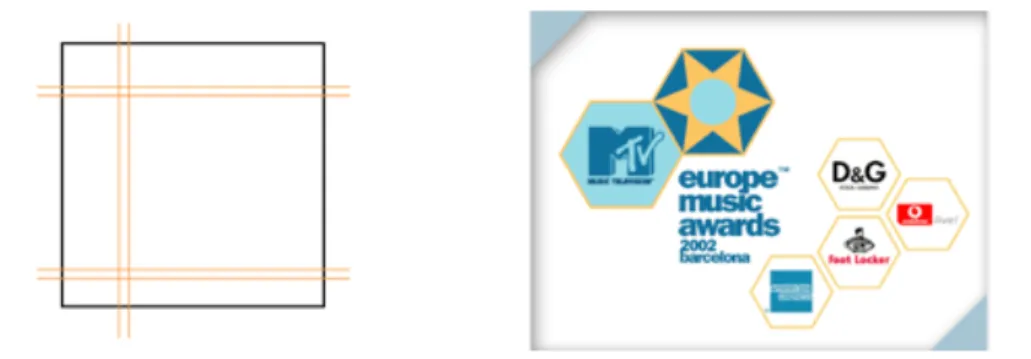
Figure 1 (left) - Grids.
Figure 2 (right) - Law of proxitity (Soegaard, 2002)
The grid system in figure 1 is seen in applications such as PowerPoint (PowerPoint 2004) (appendix 1) and iTunes (iTunes 2009). Top and left panels are used for controls or navigation, while a large central panel is the work area. The grids create space
between the features on the screen which makes for a cleaner, clearer design, rather than a cluttered, visually noisy one. A common mistake is to cram an exaggerated amount of features onto a screen which leads to the users’ eyes bouncing from one element to another which makes an application difficult to use. Another reason why not to cram a screen is because of the Law of proximity; items that are spatially located near each other seem as if they belong together, while items that are apart are perceived as separate from each other. (Graham, 2008)
Figure 2 shows that items located close together tend to be part of a group, the MTV logo and the logo for the Europe Music Awards are forming a group in the upper left corner and the sponsors logos are perceived as forming a group in the bottom right corner. (Soegaard, 2002) The proximity of objects makes one assume that they are related. This is desirable when objects are to seem related, e.g. when a Submit button is placed adjacent a text box, but not good when objects are drifting into each other that are unrelated. (Saffer, 2007)
In the Western world people read from top to bottom, left to right, therefor it is only natural to let design for this already accepted flow. Forcing the users’ eyes to roam about in an unnatural order is unwanted. Alignment and positioning of objects are important
aspects to keep in mind whilst designing the layout of the GUI, objects are to be aligned horizontally and vertically to help create an uncluttered look. By indenting objects beneath other objects they will appear to be subordinated to those above them and the further up the screen the objects are they will be perceived as more important than those farther down. (Saffer, 2007)
2.3.4 Font and colour
Designers can provide cues and hints regarding where the user should look. Colour can be used to attract the eye, as can contrasting fonts. Fonts are categorised into two groups, they are either serif fonts or sans serif fonts. Sans is French and means ”without”, hence the term sans serif. (Williams, 2008) Serifs are the small lines at the edges of the letters (figure 3) that increase the legibility and is therefore well suited for more extensive reading such as books or this very thesis. However on computer screen serif fonts have a tendency to appear fuzzy because of the relatively low resolution. That is why sans serif fonts are preferable on computer screen, they are excellent for button labels, menus, instructions and can be scanned quickly. (Saffer, 2007)
! ! ! !
Figure 3 - Left: Times New Roman (serif) Right: Calibri (sans serif)
The human brain responds to colour both consciously and unconsciously, therefor colour is a very powerful tool in visual interface design. Colour is not only to be used for aesthetic reasons, to add personality and tone, colour can also provide cues and help one navigate by establishing relationships between objects. The colour red is often identified with the conduct of stopping or that something is ending, whilst the colour green signals go or proceed. By, for instance, making all buttons the same colour it will not matter where they are located, the user will know which objects are button are which are not. Colour can also be used to emphasise importance, such as a highly saturated orange box will attract the eye more quickly than a pale yellow box. (Saffer, 2007)
Another important aspect is the contrast between colours. If the background is bright, dark colours should be used on the objects and text so that they stand out from the background. Should the background be dark, use brighter colours on the objects and text. (Sheppard, 1996) Care should be taken to avoid chromostereopsis, a phenomenon that occurs when two colours next to each other seem to vibrate. Type blue text on a red background and the user experiences this phenomenon (figure 4). The effect can be avoided by creating an object with black and white boundaries, and by increasing the contrast between the two colours. (Foraker Design, 2009)
2.3.5 Feedback
A user who clicks a button should get some sort if indication that the button has been pushed, there should be some sort of feedback that tells the user that an action has taken place. Every action, no matter how subtle, should be accompanied by a notice of the action. By physically moving the mouse the cursor moves on the screen, by pressing a digit on a cell phone a number appears on its screen: the feedback is apparent. If there is no immediate feedback users might end up pressing the icon twice or purchasing the same item as many times as button has been pressed the button. (Saffer, 2007) Keep users informed of actions and changes of states or condition that are relevant and of interest to the user through clear, concise, and straightforward language familiar to users. (Constantine, Lockwood, 1998)
2.3.6 Metaphors
People easily create new metaphors in language and everyday life. Instantly a user can intuit how to work a wastebasket icon (recycle bin icon) because he or she once learned how to work a real wastebasket, preparing their minds to make the connection years later. By rendering a GUI in images of familiar objects from real everyday life can provide a pipeline to automatic learning. Icons such as folders, telephones, address books, piles of paper and so forth are common metaphors which have all been designed in the hope of creating an intuitive GUI easily learned. The desktop is to represent ones writing desk and a computer virus deprives functionality from a computer as a virus in real life makes a person sick. (Cooper, 1995)
Much has been said about the potential of metaphors as means for people to understand things quickly. Metaphors can be helpful, but it is a false crutch to hold on to.
(Jacobson, 2000) Searching for that magic metaphor will be one of the biggest mistakes in GUI design. Metaphors are often outdated, such as the Save icon which is often a floppy disk although they have not been used in years. It is easy to come up with metaphors for physical objects such as printers and documents, but difficult or
impossible to find metaphors for processes, services, buying tickets, purchasing items and other operations that are precisely the type found in software frequently. (Cooper, 1995)
Metaphors are like that: use 'em if you find 'em, but don't bend your interface to fit some arbitrary metaphoric standard. (Cooper, 1995)
However, metaphors can provide a mental model of the system and can also serve as a creative tool when searching for new solutions. There is nothing bad with using a metaphor if it happens to fit perfectly with the situation. (Cooper, 1995) They can also help a user who uses the system for the first time, but the experienced user can regard the metaphor as an obstacle. If the metaphor is not true, it can give the user the wrong signal. Metaphors may also reduce the designer's ability to create powerful GUIs because of being forced into not thinking outside the box. (Nielsen, 1993)
2.4 Nielsen’s definition of usability
Jakob Nielsen is a renowned and acclaimed usability expert who holds a Ph.D. in human computer interaction from the Technical University of Denmark. (Nielsen, 2009) His definition of usability includes underlying key elements such as system
acceptability, which is the question of whether the system meets the needs and
requirements of a user at a satisfactory level or not. The overall acceptability of a system is a combination of its social acceptability, if the system is considered socially desirable rather than offensive, and its practical acceptability including categories such as cost, support, reliability, compatibility as well as the category usefulness. The
category usefulness is used to adjudicate if the system can be used to achieve the desired goal, it determines whether or not the system functionality does what is desired and how well the user can use that functionality. The five attributes that according to Nielsen define the term usability are:
• Learnability; The system should be designed so that it is easily learned and so that users rapidly can get started and getting work done.
• Efficiency; Once the user has learned the system it should be efficient to use, the goal is a high level of productivity.
• Memorability; The system should be easy to remember so that the casual user is able to return to the system without having to relearn the system once again.
• Errors; The error rate should be as low as possible. If the user makes an error they should be able to easily recover from them. Catastrophic errors must not occur. • Satisfaction; The system should be a joy to use, a pleasant experience while using it. (Nielsen, 1994)
2.5 Nielsen’s ten heuristics
Nielsen’s ten general principles (heuristics) to put under consideration while creating the GUI are as follows:
• Visibility of system status; The system should always keep users informed about what is going on, through appropriate feedback within reasonable time.
• Match between system and the real world; The system should speak the users' language, with words, phrases and concepts familiar to the user, rather than system-oriented terms. Follow real-world conventions, making information appear in a natural and logical order.
• User control and freedom; Users often choose system functions by mistake and will need a clearly marked "emergency exit" to leave the unwanted state without having to go through an extended dialogue. Support undo and redo.
• Consistency and standards; Users should not have to wonder whether different words, situations, or actions mean the same thing. Follow platform conventions. Strive for consistency. However, consistency in itself does not ensure usability, it is a mistake to think that consistency in the surface is equivalent with good design (MSDN, 2000). • Error prevention; Even better than good error messages is a careful design which
prevents a problem from occurring in the first place. Either eliminate error-prone conditions or check for them and present users with a confirmation option before they commit to the action.
• Recognition rather than recall; Minimise the users memory load by making objects, actions, and options visible. The user should not have to remember information from one part of the dialogue to another. Instructions for use of the system should be visible or easily retrievable whenever appropriate.
• Flexibility and efficiency of use; Accelerators – unseen by the novice user – may often speed up the interaction for the expert user such that the system can cater to both inexperienced and experienced users. Allow users to tailor frequent actions.
• Aesthetic and minimalist design; Dialogues should not contain information which is irrelevant or rarely needed. Every extra unit of information in a dialogue competes with the relevant units of information and diminishes their relative visibility.
• Help users recognise, diagnose, and recover from errors; Error messages should be expressed in plain language (no codes), precisely indicate the problem, and
constructively suggest a solution.
• Help and documentation; Even though it is better if the system can be used without documentation, it may be necessary to provide help and documentation. Any such information should be easy to search, focused on the user's task, list concrete steps to be carried out, and not be too large. (Nielsen, 1994)
3. GUI evaluation
3.1 Usability inspection
Usability inspection is the name for a set of methods that are based on having evaluators (usability experts and normal users) scrutinise the GUI. The methods are aimed at raising the question if the system is interpreted as expected and at pointing out possible usability issues in a design. (Nielsen, 1994) The process is to be conducted with users performing real tasks on prototypes. Reactions and attitudes are to be observed and analysed. (Gulliksen, Göransson, Boivie, Blomkvist, Persson & Cajander, 2003)
3.2 Heuristic walkthrough
Nielsen is the inventor of several usability methods, such as the heuristic evaluation, a type of inspection which determines whether or not each element of a GUI follows established usability principles. (Nielsen, 2005) The experts go through the GUI looking at each element of the interface (each menu item, button, control, affordance, etc.) evaluating and grading its design, positioning, implementation and so forth in regards to the list of the ten general principles (heuristics) provided by Nielsen (mentioned in section two). The heuristic walkthrough is both thorough and effective in measuring as to what extent the heuristics are being followed. A minor disadvantage of this method of inspection is that it is not designed to be tested on real users but usability experts.
However a large proportion of the questions asked during the inspection is applicable on normal users as well and not only experts. (Nielsen, 1992)
The system checklist composed by Deniese Pierotti at Xerox Corporation is suitable to use while performing the heuristic walkthrough. (Pierotti, 1999) By using a checklist well known within the HCI community adds to the validity of the tests. To maximise the productivity the system checklist was narrowed down to better suit the project.
Heuristic evaluation can be used at almost any time during the development cycle,
although it is best suited to earlier stages. The experts can be provided with paper sketches of the GUI, or even just design specifications, and still get a good amount of usability problems discovered before actual production work begins. (Nielsen, 1994)
3.3 Talk to me
This method is also known as Think aloud testing, and the focus here is on the actual users, rather than solely usability experts. (Rubin, Chisnell, 2008) The users are encouraged to think out loud while performing certain tasks with a prototype. The purpose of this is to gain access to what users are thinking about and what their intentions are as they try using the system. This method is a powerful tool and gives feedback that differ from results given by walkthroughs with usability experts. The drawback of this approach is that many users tend to ”work” differently when asked to think out loud. Therefor, however the usability inspection may be conducted, it is important for the designer not to influence the subject in any way. They must try not to help users with conscious or unconscious hints, such as glancing at the mouse or nodding. (Constantine, Lockwood, 1998)
The deferred-reflection strategy is another approach, where the participant is recorded with one or more cameras during the usability inspection. Afterwards the GUI designer looks at the recorded material for signs of puzzlement, hesitation and so on. Selected segments are then shown to the tester who then answers questions such as ”What were you thinking when performing this task?” or ”You seemed unaware of how to continue here, is that a fair assumption?” etc. This technique is excellent to recall the subjects ”inner dialogue”. (Constantine, Lockwood, 1998) However, not only is this approach time consuming, it also requires quite costly special equipment. In other words, the approach requires time and money, two luxury attributes which are not rarely of limited quantity. Another drawback is that participants are presumably going to approach the test in a slightly unnatural manner because of the cameras pointed and them.
There are certain software which gives for a more convenient and cheaper alternative to the deferred-reflection strategy. These software has the ability to record screenshots and cursor movements while also recording audio. Recording is a very powerful tool, it lets the conductor of the test return and analyse each test as they are saved on a computer. Since the participants do not have cameras pointed at them it is likely they will work in a more natural manner than if they would have been exposed to the deferred-reflection strategy.
3.4 Choosing appropriate test participants
It is important to choose the appropriate subjects for the testing. For obvious reasons the users performing the test are to be representative of the actual group of users for whom the system is produced. The participants should include the same abilities and
experiences as the targeted final users. (Rubin, Chisnell, 2008) It can also be useful to carry out tests on people who do not have the same skills as the target group, their perceptions may generate ideas that otherwise would not have been detected.
4. Other Image analysis software
4.1 Familiarising with other software
Analysing other image analysis software enables one to gain knowledge from their mishaps as well as their virtues. Learning about other software gives the advantage of the ability to differ in contrast from what is available and also gives useful information in order to complete the GUI. What does other image analysis software look like? What is already out there and what is requested? How does other software behave? This section covers aspects considering other image analysis software.
4.2 General vs. Specific software
A range of available methods within the field of image analysis allows one to carry out an analysis. These methods are however rarely neatly packaged within a GUI, instead the focus has been on developing new methods, which for obvious reasons are of interest from a research point of view. Image analysis software on the market offer the possibility to analyse images but often lack a very important aspect, usability.
Generally there are two types of software available to users. There are software that offers a variety of general analysis solutions, and then there are software developed especially for one particular type of analysis. The advantage of more general software is having all the desirables expected for general analysis but with the drawback of only being accessible to experienced people within the image analysis industry. This is because they require a steep learning curve due to the many different types of analysis available within the same software, obliging the user to spend time attempting to learn and understand the software. Yet another drawback is that they often have an interface exceedingly cluttered in comparison to software developed solely for one specific type of analysis.
Software developed for one specific type of analysis on the other hand have the advantage of not requiring the same steep learning curve to be able to use as the more general analysis software does. It is also in most cases easier to develop a specific solution rather than a variety of solutions. Also the GUI does not have to become as cluttered and visually noisy because of fewer features, therefor making it easier to master. A user should be able to start working with the GUI right away rather than familiarise oneself with a broader solution. There is however a drawback with these types of software, they lack the ability to be available for a wider range of users because of the isolated type of analysis.
Unlike GUIs developed with specific solutions to a unique problem or for more general analysis, the idea of this project was to have a GUI template that is modifiable in order to meet a variety of requests and demands. By being able to alter the template to suit the needs of a user not only does that give the ability to be available to a broader market (as the more general types of software) but at the same time having the advantage of being able to create a specific solution (as software developed for one particular type of analysis), regardless of what the demands might be.
4.3 Background research
The availability of image analysis software is vast. Developing as good a GUI template as possible researching and evaluating other GUIs is a good approach. To be able to do a background research the list of software was narrowed down to the feasible amount of four. The reason for choosing the four following software was because they have a focus directed towards the same goal as Izolde, and because some of them deliver a more general image analysis solutions while the other ones have more specific, isolated solutions.
The candidates are CellProfiler (CellProfiler 2008), ImageJ (ImageJ 2008), Biopix iQ 2.0 (BioPix 2008) and Visiomorph (Visiomorph 2008). By familiarising oneself with these software while having usability principles and theories in mind (such as
Organising, Affordance, Simplicity, Grids, Proximity, Font, Colour, Metaphors etc.)
influences the GUI designer and it gives for a good start as to how to design a GUI with high usability.
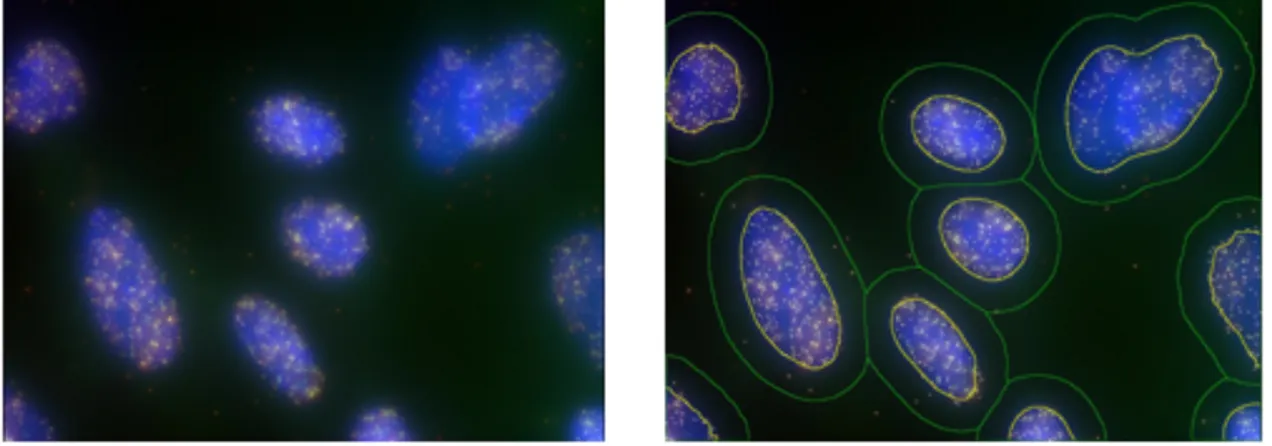
4.3.1 Cellprofiler
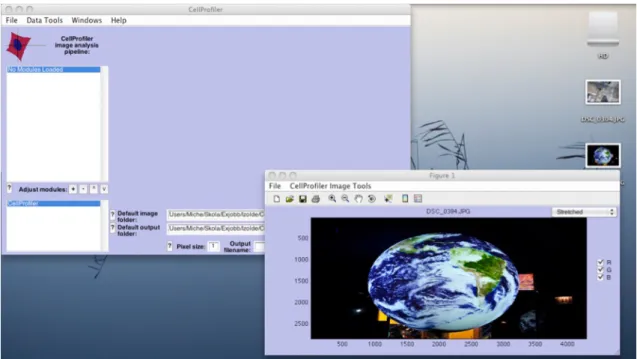
CellProfiler (figure 5) is widely known and established within the field of image analysis. It is targeted at cellular image analysis but can also be used for general image analysis as well. An issue with CellProfiler is that it is almost entirely accessible to experienced people within the field of image analysis because it requires a long familiarisation process. It demands quite high computer literacy to perform analysis, due to the more general analysis solutions.
After having imported an image with CellProfiler it opens up another window with the image and a few controls such as Save, Print, Zoom, Grab etc., within the same window. The downside of opening up another window is that the screen gets cluttered and the user needs to switch between the windows, rather than just having one window open with the appropriate controls and elements visible.
When wanting to performing an analysis of the imported image, an Error popup windows warns the user that there is no analysis modules loaded and therefor no
analysis is carried out. Things like these add to unnecessary familiarisation time needed to understand the GUI. Fundamental tasks such as performing an analysis should be simple, regardless of former knowledge of the software, for analysing is however the purpose and the software.
All buttons inherit some type of metaphor in the shape of a symbol which are most likely only understood once having pushed them. The major consistency is the look of the buttons, though they are hardly organised and grouped. The GUI also lacks
organisation when it comes to where text input boxes are positioned. In general, the GUI does not hold many of the usability principles and theories presented in section two.
Figure 5 - CellProfiler.
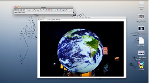
4.3.2 ImageJ
ImageJ (figure 6) has a more general solution and can be used for solving a large number of image analysis tasks. It uses a task bar with 21 buttons using metaphors to describe their functionality. The task bar is quite minimalistic and hardly takes up any space. This feature is desired as it saves valuable screen space, allowing more room for the images. By placing the mouse over the buttons the users get a brief description of what its functionality is. By importing an image another window opens up and can be placed anywhere on the screen. To analyse an image the user needs to go through a few menus instead of simply pressing an Analyse button or another button of that nature. Results of an analysis are saved as a separate file and they are not always displayed, instead they can be displayed in another window at the users’ request. The user gets to choose what is showing on the computer screen and where that info is positioned. The GUI lacks a way to have all desired information showing at once without cluttering the screen due to all the separate windows opened up above each other. This is not a huge drawback, but by having predetermined placement of displayed info gives the
advantage of letting the user know where to look for a certain result or data at all times. One can drag (also known as panning) the image by either choosing the Scrolling tool in the task bar or by conveniently pressing down the space button on the keyboard while using the mouse to pan the image. This is a good solution since panning is something the user probably will do quite often.
Figure 6 - ImageJ. !
4.3.3 BioPix iQ 2.0 and Visiomorph
BioPix iQ 2.0 (figure 7) holds features appealing to an interaction designer such as buttons that are highlighted with bevels, elements which are positioning according to guidelines, the grid layout is common, metaphors as well as written descriptions are used and the analysed image is in the centre of the GUI, straight in front of the user. Visiomorph (figure 7) also has the analysed image straight opposite of the user and has many resemblances with BioPix iQ 2.0 when it comes to usability principles. The structure and organisation of Visiomorph as well as Biopix iQ 2.0 is intuitive as it is divided into separate work flows, separate menus for each work task. This is a good way of making a system of many appear as fewer. However both of these GUIs are quite visually noisy and being able to master them would most likely take a long time.
5. Design process
5.1 Designing the GUI
Designing a GUI requires a lot of planning. The designer needs to have a clear vision of what is to be designed and also needs to be aware of the fact that there may, and most certainly will be changes along the way. The ability to embrace those changes rather than avoiding them in an attempt to stick to the original plan is key to a good design. To be able to complete the iterative, complex process of designing a GUI different types of expertise is needed, such as the expertise of ordinary users, usability experts,
programmers and designers.
This and the following section covers the methods used during the design process, from early sketches to the final prototype. Test results are introduced and also how they influenced to a more usable GUI.
5.2 Design approach
A flow chart (figure 8) was defined as to how to go about the design process and all necessary basics of the GUI were determined. The first step of the design process was to create the primary wireframe, which is an early sketch of the GUI design. After having completed the first wireframe, using the feedback from discussions with Izolde, an improved wireframe was created. After further dialogue with Izolde about the second wireframe the first prototype was introduced, which was subjected to testing with users with diverse computer literacy. Results from the tests formed the basis for creating the final prototype.
Figure 8 - Flow chart.
5.2.1 GUI essentials
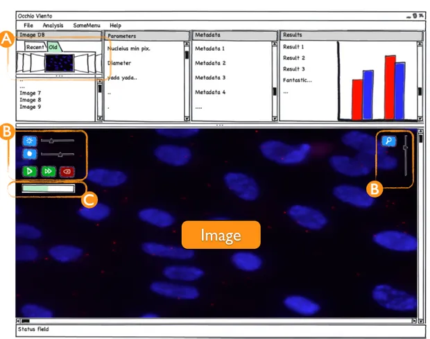
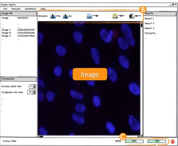
The essential basics of the GUI consist of the panels and the elements, including icons, buttons, sliders and so forth. The essential panels were Image DB (Database) which shows the imported images into the database, the Parameter panel where the user is able to define various variables, the Metadata panel displays information such as dimensions and colour space of the image and the Results panel which shows the written results of the image analysis. The basic set up of elements were the adjustment buttons Zoom, Brightness, Contrast, Analyse, Analyse all and a Stop button.
5.3 Wireframes and Prototypes
A wireframe can be as simple as a drawing on a piece of paper, a rough sketch of what the designers’ vision of the final GUI is. This is a good way of starting off the design process rather than going straight to the software used to build the GUI. Drawing sketches gives the designer a good idea of how the GUI will be presented in its final state and it is a lot easier and faster to make changes on a sketch than within an advanced software which demands exact precision when positioning and selecting the size of the elements. Once using the more advanced programs prototypes are created.
Prototypes are a more sophisticated type of wireframe and are created in the latter stages of the design process. They bear greater resemblance with the final product than early wireframes.
After having discussed ideas with Izolde and many hand drawn sketches later Balsamiq Mockup was used to create sketch-like wireframes on the computer.
5.4 Designing Wireframe I
Figure 9 - Wireframe 1.
The first wireframe (figure 9) went through many iterative alternations. Decisions about what features were to be included took place and it was established that some features were more important than others. The chosen standard size of the window was
1280x768 pixels, simply because most of today’s screens have it as a minimum resolution (W3 School, 2009). Should a screen have lower or higher resolution, the software window is adjustable to whichever size is preferred without affecting the organisation of the layout.
The idea of the first wireframe was to have all necessary data showing at once, without overwhelming the user with information. Organising the elements into categories is very important, it gives for better manageability and it tames complexity. Therefor all essential panels (Image DB, Parameters, Metadata, Results) were placed above the imported image and the adjustment buttons (figure 9:B) were only showing while placing the mouse pointer over the upper left or right corner of the image. By allowing the adjustment buttons to be visible only when in use saves valuable space on the GUI,
also they were designed in regards to the match between the system and the real world, meaning the GUI uses terminology and conventions familiar to the user, making information appear in a natural order.
The Image DB panel has two tabs, one Recent and one Old, making it more convenient for the user to faster find the desired image. Also, with the intention of making it as easy as possible to find the image, a Cover flow function was added (figure 9:A), allowing the user to flip through the images visually rather than searching for the images by name. This isan intuitive way of browsing through vast quantities of images.
The adjustment buttons Zoom, Brightness and Contrast all have slider placed next to them. The Analyse button (white Play-arrow with green background) analyses the chosen image whilst the Analyse all button (white Fast forward-arrow with green background) analyses the complete batch of imported images shown in the Image DB panel. There is also a Progress bar (figure 9:C) showing the elapsed time for the analysis at hand placed beneath the adjustment buttons. The Progress bar visually displays the system status, thus keeping the user informed about what is going on. An additional aspect was that the elements within the GUI would follow the
conventions of proximity and flow, for items which are spatially located close to each other give the impression of belonging together, making them related. For example,
Contrast and Brightness belong together more than Contrast and Magnify, for this
reason it is appropriate to organise the elements in a logical order, making it easier for the user to navigate over the GUI.
5.5 Designing Wireframe II
Figure 10 - Wireframe 2
After having evaluated the design of the first wireframe numerous aspects had to be taken into consideration. The layout of the panels and elements had to be rearranged, some information needed to be more significant while other data was proven not to be as significant. The Results panel needed to be vertically taller so that more information could be presented at once, reducing the need to scroll up and down. By making enough room for most (or in some cases all) of the results available with minimal usage of the scroll bar adds to savings in time. The idea was to minimise the amount of scrolling so that the user knows exactly where to look for a certain result, regardless of type of analysis. Furthermore, there is no need for the two tabs within Image DB since users only work with one project at a time.
All adjustment buttons were in need of a facelift, therefor a whole range of new icons were created (figure 10:B). First and foremost they did no longer appear while resting the mouse pointer over the upper left or right corner of the image. It was decided that this way of presenting the adjustment buttons was not a good idea, they would probably keep appearing at inappropriate times, thus leading to annoyance. Also, the Analyse button (for analysis of a single image) was renamed to One and the Analyse all button (for analysis of the entire batch in the database) was renamed to All, in addition their icons were replaced with icons of a microscope as the metaphor for an analysis. The
Magnify button was also replaced with a new icon and by adjusting the slider a Tool tip
appears showing information associated with a specific function by resting the mouse cursor above an element (figure 11). The current magnification level (800%) can also be found in the Status field (at the bottom below the image).
Figure 11 - Image of how a Tool tip is displayed.
The second wireframe also has a slightly different approach when it comes to layout. The image is in the centre of the GUI surrounded by Image DB, Parameters and
Results. The same grid system found in applications such as PowerPoint, Word (Word
2004) and iTunes was used, where top and left panels are used for controls
(adjustments) and navigation, a large central panel is the work area where the imported images are and the bottom works as a Status field. This creates for a common, intuitive work flow which in many cases is familiar to the users.
Metadata has been narrowed down and is now interwoven with Image DB since most of
the information in Metadata is not necessary at all times, the dimensions of the images are in most cases sufficient information. The full list of Metadata is however retrievable at the users command, but for the sake of hiding complexity, through thoughtful
reduction this information is hidden.
In the Status field there are two Progress bars (figure 10:C) which have multiple functions. While importing images to the Image DB the left Progress bar shows the percentage elapsed on a current image being imported and the right Progress bar shows percentage elapsed of the total amount of images being imported. Since import of a single image can take up to as long as 20 seconds (depending on the size of the image and computer performance) it is sensible to have two Progress bars. Would there be only one bar which displayed the full import of the entire batch (which in turn could take up to 20 second * number of images in Image DB) the user might question if the computer stopped processing because immediate feedback had not been received. While performing an analysis the Progress bars work the same way but the measurements are for the analysis and not the import. The Stop button to the right of the Progress bars stops the import process or the analysis process depending on which action is being performed. Adding a Stop button gives the user control and freedom to leave an unwanted state without the need of having to go through an extended dialogue.
6. Prototype design process
6.1 From Wireframes to Prototypes
After having reached decisions about layout and element positioning with the help of wireframes the process of creating the prototypes was conducted. This sections covers the prototype design process and also summarises results from the heuristic
walkthrough and think aloud tests.
6.2 Designing Prototype I
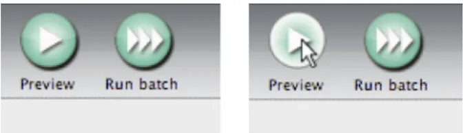
The second wireframe went through some minor, final modifications before designing the first prototype, namely changing the names and icons of the One and All buttons to
Preview and Run Batch. Once the wireframes had been approved it was time to start
developing the real GUI. For this final implementation the software Qt 4.5 was used, which provides a framework for developing software.
It was early decided that all buttons and other elements within the template needed common denominators (colour and size) so that the GUI would have a clean feel. Therefor, it was necessary to create a full set of new icons using a suitable software (Photoshop CS4 Extended 2008). Buttons also needed to afford being pushed. A good way to accomplish this was by adding a drop shadow to the buttons which makes them pop out of the screen. However, one problem still remained, even though the user pushes the button the drop shadow still remains, unless adjusting certain parameters within Qt to make it show another icon while the button is being pushed in, this one without a drop shadow. Also, the gradient is inverted, this adds to the feel of a button being depressed into the screen, thus adding to the feedback (Figure 12). Much like the wireframes, these icons also went through several iterations before it was decide which ones to use.
Figure 12 -The drop shadow on the Preview button on the left figure affords it to be pushed. The Preview button to the
right has been pushed and loses its drop shadow and the gradient is inverted.
The font chosen was Lucida Grande [Lucida Grande], a sans serif font suitable for GUIs. It has the colour black throughout the entire GUI as this also is an important attribute when striving for consistency. The colour black also stands out from the background making it easy to read, minimising the risk of !"#$%$&'(#($)&*&+
Another obstacle was finding the correct metaphors for the icons. Some of the icons have obvious metaphors, such as the Brightness– or Contrast icons, but finding the right
metaphor for Preview and Run Batch was a struggle (figure 12). These are processes that are difficult to interpret in a small figure that is the icon. The ideas for the Preview button were an icon with an eye in it (as in an eye views), an icon with a microscope in it (because a preview is actually also an analysis), a silhouette of a person running (as in
run preview), but the final decision was the Play metaphor, mostly because it is a
common symbol for starting a process, it went well together with the Run batch button (which has three arrows instead of one), and other renowned analysis softwares use the
Play metaphor as well.
An important aspect to always have in mind whilst creating a GUI is that it is made for people who are going to use it for a longer period of time and not for one time users. GUIs should also be easy to get started with. Therefor explanatory texts and over explicit hints easily become annoying objects for experienced users. So, even if some elements within the GUI are not understandable at once, they will most probably be the second time and onwards that the user uses the interface.
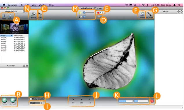
6.2.1 Results Prototype I
Figure 13 - Prototype 1 (A screenshot of Prototype 1 without descriptions can be found in appendix 2).
After numerous modifications of the prototype, which included slight editing of certain elements to total restructuring of the GUI, the results of the first prototype are as shown in figure 13. The overall layout of prototype one has inherited a lot from the second wireframe but with the additional improvements on layout, looks and usability.
All buttons have been re-designed. An Import and an Export button (figure 13:A) was added within Image Database panel so that the user would not have to go through menus when importing images. The Preview and Run Batch buttons (figure 13:B) were added below the Parameters panel so that the line of actions – from import to analysis –
became more apparent to the user. This line of actions is also recognised by the Western world where people read from top to bottom.
A few new elements were also added to the Adjustment field above the image, such as the Grab button (figure 13:C) which lets the user pan the image, the Reset button (figure 13:D) which resets the brightness and contrast to their primary values and a Colour
space drop down menu (figure 13:E) which lets the user choose between the colour
spaces R, G and B. An Undock button (figure 13:F) which detaches the current images so that one can run an analysis on a new database of images while still having the previous analysis handy in the detached (undocked) window was also added. This type of function can for example be found in the numerical computing environment Matlab (Matlab 2001), which is where the idea rose from. The Full screen button (figure 13:G) lets the user view the image in full screen mode. The Magnify button (figure 13:N) is also available within the Adjustment field.
In the Status field a Show results check box (figure 13:H) was added along with a
Magnification spin box1 below it (figure 13:I). What the Magnification spin box does is that it regulates its value as the user uses the Magnify button, displaying the current magnification level. Coordinate axes (figure 13:J) were also added to the Status field which lets the user know where the mouse cursor is positioned. The two Progress bars (figure 13:K) found in the second wireframe together with the Stop button (figure 13:L) are also found in the Status field of the first prototype.
The prototype is static, meaning there is no real feedback after (for example) pushing a button, except that the button visually appears to be pushed in. Only after having implemented a button with certain functionality does it work properly, which for obvious reasons constrained the usability testing of the prototype. One would assume that by pressing the Import button a dialogue would open, enabling the user to choose which files to import, but in this case, as the prototype is static, a dialogue box does not appear. The same goes for all other elements within the GUI. Put differently, it is not a fully functional GUI yet, it does not allow for a pervasive top-to-bottom interaction between the user and the system, but one can still get good feedback from tests with a static prototype. The implementation of functions for each element within the GUI is added only when the final prototype has been approved.
6.3 Conducting the tests
A combination of the heuristic walkthrough and think aloud tests were conducted on all participants regardless of their computer literacy. Although some task are more
appropriate for experts to conduct and some questions are more in line with what the experts might be able to point out, useful information could be generated from the non-experts as well. Therefor, the same tests were carried out by both main parties.
All participants had to fill out a form describing their age, profession, computer literacy and if they had ever used other image analysis software (appendix 4). During the first part of the test the participants performed certain tasks which tested if the GUI had an intuitive layout and if it was easily understood. The participants were asked to talk out
!"#"$%&'()*"&$"+",&-./0"-&$%1+2&'."+"3+14/5"&0"+11),$"&'%40")6"3+14/"+'-"&0"7+$"+'"4%"+'-"-),'"+88),",7&97"
loud while performing the tasks and their actions were recorded with a screenshot recording software (Quicktime 2009). The last part of the test contained various
questions highly influenced by the system checklist (Pierotti, 1999) and all participants were asked to give written answers to these questions, rather than performing certain tasks as in the previous part of the threefold test.
The test was first conducted on two usability experts, one former HCI teacher at Uppsala University, the other a former HCI student at the same institution who nowadays works within the field of software development. Before starting the actual testing the participants were told certain attributes and qualities about the GUI (e.g. that it is static) without influencing them in ways which could lead to incorrect test results. The tests were performed separately, the two experts could therefor not influence one another in any way, adding to the reliability of the test results.
Two tests were conducted on participants in their mid 20’s, both with high computer literacy. One of them is a computer technician, the other one is an academic and runs his own web design bureau. They performed the same test as the two usability experts and these tests were also performed separately.
Two tests were also performed with participants with quite low computer literacy. One is a fashion designer with no extensive experience with computers and the other one lacks interest in electronics generally. They performed the same test as the first four computer savvy participants.
6.3.1 Feedback Prototype I
Almost every participant, despite their varied computer literacy, all pointed out the same usability issues. Albeit all arguments were taken into consideration it would be a waste of time to give way for immaterial assertions such as ones dislike of a certain colour or the look of the cursor. For an interaction designer to take every claim or proposition into account scrupulously would only lead to a never ending re-modification of the current design. However, the motive of the tests is to learn how real users interpret the GUI and have them point of issues that have been overlooked by the designer. Some might argue that the designer should be the one able to notice usability issues, which is true, but it is also true that if someone puts a lot of effort and time into a matter, such as designing an GUI, could end up focusing on the little details and eventually being blinded to flaws rather than seeing the big picture and thinking outside the box.
6.4 Results Prototype II
Figure 14 - Prototype 2 (A screenshot of Prototype 2 without descriptions can be found in appendix 3)
One of the main issues that became apparent during the tests were the Progress bars (figure 13:K) in the lower right corner of the first prototype. All participants had difficulties understanding if they displayed the elapsed import progress or the elapsed progress of an analysis. They also did not understand why there were two Progress bars instead of just one.
The purpose of having two Progress bars was that the left one shows the elapsed progress of one image, be it an import or an analysis, and the right one the progress of the whole batch. For example, say you analyse (or import) ten images, once the first image has been analysed the left Progress bar is fully filled and the right bar is filled to ten percent (because 1/10th is ten percent). When the second image has been fully analysed, the right bar goes up another ten percent and so forth. In retrospect, this is not a suitable solution, at all. Even though a Tool tip appears if resting the mouse over each
Progress bar, explaining what it does (figure 11), it is apparent that this solution needed
a work over. However, there were no difficulties understanding the bright red Stop button (figure 13:L) in the lower right corner right next to the Progress bars.
Because of the inconsistency of the Progress bars the GUI had to be slightly modified. To more easily understand which bar displayed what progress, one bar was moved into the Image Database panel (figure 14:A). A description of its import functionality was also added. This way it is easier to understand that the Progress bar indicates an import progress and not an analysis. Also, instead of having two Progress bars it was now decided to use only one which would indicate the elapsed time of the import of the entire batch, or if the user chooses only to import one image the Progress bar indicates the elapsed progress of the import of that single image. This bar also has its own Stop