School of Innovation, Design and Engineering
Västerås, Sweden
Bachelor Thesis in Computer Science - 15 credits
Interface Design for Decision Support
Systems: A Case Study of a Sales
Performance Management Tool
Marcus Henricsson
mhn11010@student.mdh.se
Examiner: Rikard Lindell
Mälardalen University, Västerås, Sweden
Supervisor: Peter Funk
Mälardalen University, Västerås, Sweden
Company Supervisor: Peter Stefansson,
sales performance management tool’s user interface that generated most recurrent problems for novice users. The purpose of the case study was to investigate if identified problems related to structural and visual aspects could help improve the current user interface of the sales performance management tool. In order to investigate these objectives was evaluation research conducted, this in the form of five direct user observations, which adopted the think aloud protocol. Qualitative data obtained from the observational study were analyzed using thematic analysis, which helped identify recurring themes within the data. The results from the case study indicate that it is possible to reveal structural and visual problems within a user interface with novice users, this through using the direct observation technique with the think aloud protocol. Problems identified in the observational study showed to be rather superficial, which indicate that evaluating a user interface with novice users has its limitations. Evident from the case study was that all novice users either found or encountered some problems related to structural and visual aspects. Moreover, the results from the case study indicates that evaluating a user interface with novice users can help improve a system’s user interface. However, the improvements are likely to be incremental and not radical.
List of Figures I
List of Tables II
1 Introduction 1
1.1 Purpose and Research Questions . . . 1
1.2 Delimitations . . . 2
2 Background 2 2.1 Business Intelligence . . . 2
2.1.1 Data Support Layer . . . 3
2.1.2 Information Generation, Storage and Distribution Layer . . . 3
2.1.3 Information Access Layer . . . 3
2.2 Data Warehousing, OLAP and Data Mining . . . 4
2.3 Performance Management . . . 4
3 Design Theory 5 3.1 Information Visualization Process . . . 6
3.2 Representation of Data . . . 6 3.2.1 Scatter Plot . . . 7 3.2.2 Line Graph . . . 7 3.2.3 Bar Chart . . . 8 3.2.4 Pie Chart . . . 8 3.3 Color . . . 9 3.3.1 Showing Details . . . 9 3.3.2 Color Coding . . . 9 3.3.3 Highlighting Information . . . 10 3.3.4 Meaning of Colors . . . 11 3.4 Gestalt Principles . . . 11 3.4.1 Proximity . . . 11 3.4.2 Similarity . . . 12 3.4.3 Continuity . . . 12 3.4.4 Closure . . . 13 3.4.5 Symmetry . . . 14
3.4.6 Figure and Ground . . . 14
3.5 Text and Typography . . . 15
3.6 Conclusion . . . 15
4 Methods and Materials 15 4.1 The Interaction Design Research Triangle . . . 15
4.2 Semi-structured Interviews . . . 16
4.3 Observational Study . . . 17
4.3.1 Field of Research . . . 17
4.3.2 Think Aloud . . . 17
4.3.6 Computing Environment . . . 19 4.3.7 Data Collected . . . 19 4.3.8 Thematic Analysis . . . 20 5 Results 22 5.1 Information Scent . . . 22 5.2 Color Deficiencies . . . 24
5.3 Unexpected Behavior and Information . . . 26
5.4 Redundant and Hidden Information . . . 30
5.5 Interpretation Problem . . . 33
6 Discussion and Analysis 36 6.1 Related Theories and Previous Research . . . 36
6.2 Recommendations . . . 37
6.2.1 Information Scent . . . 37
6.2.2 Color Deficiencies . . . 37
6.2.3 Unexpected Behavior and Information . . . 38
6.2.4 Redundant and Hidden Information . . . 38
6.2.5 Interpretation Problem . . . 39
7 Conclusion 40
8 Future Work 40
Bibliography 41
Appendix A Interview Table 42
Appendix B Tasks in Swedish 42
List of Figures
1 Business intelligence architecture . . . 3
2 Performance management, closed-loop approach . . . 5
3 Information visualization process . . . 6
4 Scatter plot graph . . . 7
5 Line graph . . . 7 6 Bar graph . . . 8 7 Pie chart . . . 8 8 Luminance contrast . . . 9 9 Color codes . . . 10 10 Color saturation . . . 11 11 Color quantity . . . 11 12 Proximity . . . 12 13 Similarity . . . 12 14 Continuity . . . 13 15 Closure . . . 13 16 Symmetry . . . 14
17 Figure and ground . . . 14
18 Design research triangle . . . 16
19 Thematic analysis . . . 20
20 Picture of TWOSELL’s navigator . . . 20
21 Picture of TWOSELL’s test purchase module. . . 21
22 Picture of TWOSELL’s help module. . . 21
23 Problem with visual and textual cues . . . 23
24 Luminance contrast problem . . . 24
25 Inconsistency problem . . . 25
26 Color coding problem . . . 25
27 Problem with unexpected behavior . . . 26
28 Problem with unexpected behavior . . . 27
29 Problem with misleading mapping of instructions . . . 28
30 Inconsistency problem . . . 29
31 Hidden information . . . 30
32 Redundant information . . . 31
33 Unnecessary information . . . 32
34 Interpretation problem . . . 33
35 Problem with legibility . . . 33
36 Interpretation problem . . . 34
37 Missing error message . . . 35
List of Tables
1 Tasks used in the observational study. . . 18
2 Demographic information of participants in the observational study. . . 19
3 An overview of the computing environment used in the observational study. . . 19
4 Identified themes from the observational study. . . 22
5 Information scent: quotes from participants C, D, E, F and G . . . 23
6 Color deficiencies: quotes from participants E and G . . . 25
7 Redundant and hidden information: quotes from participants C, D, E and G . . . 31
1
Introduction
A decision support system (DSS) is an information technology system that supports decision-making activities. For example, DSSs can help enterprises accomplish both routine and specialized tasks, such as recording sales, processing historical data and provide decision makers with alternatives for various business operations [1].
In the enterprise-computing environment, DSSs are one of the most common types of information technology system used [1]. However, as more businesses continue to use information technology systems, such as DSSs, and the competition on the market increase, new challenges arise for enterprises. One challenge enterprises face today is processing and analyzing the large amount of information that is available, and turn it into something useful that is possible to act upon [1].
To process and distribute information for decision-making purposes there is Business Intelligence (BI), which consist of several tools, techniques, and technologies that enable users to extract business information from a large set of data [1]. A typical BI architecture consists of three layers, including the data support layer, information generation layer and information access layer [2]. In this thesis, the focus will be on the information access layer, which is responsible for displaying BI functions and information for users. Usually, the information access layer is shown in a software portal that provides users with a graphical interface.
Designing a graphical user interface for the information access layer can be a challenging task for designers. Information that is processed and analyzed in a DSS can originate from a variety of sources, such as raw data, business models, and documents, and this information needs to be structured and visualized in the information access layer in a way that helps decision makers. There exist various tools and techniques for evaluating and improving interfaces, and numerous of factors affect the usage and adoption rate of the information access layers [3].
1.1
Purpose and Research Questions
In this thesis, a case study is presented, which was carried out on an existing sales performance management tool, named TWOSELL. The study includes a qualitative user interface evaluation of TWOSELL’s navigator. Furthermore, based on the evaluation results are recommendations given and elaborated upon, this to present potential improvements to the user interface of TWOSELL’s navigator.
The purpose of this case study is to explore if problems related to structural and visual aspects, identified through an observational study with novice users, can help improve the current user interface design of TWOSELL’s navigator. Additionally, this thesis aims to contribute with lessons learned for this specific case study and provide principles to designers that construct similar user interfaces. The research questions that will be answered in this thesis work are the following:
• What structural and visual aspects of TWOSELL’s user interface generate most recurrent problems for novice users?
• How can structural and visual problems identified in TWOSELL’s user interface be solved?
Direct user observations that adopted the think aloud protocol were carried out on 5 participants to answer the research questions stated above. To compile qualitative data obtained from the observational study was thematic analysis adopted, which helped to identify and report recurring themes within the data. In chapter 4 are all methods and material used in this thesis presented.
1.2
Delimitations
This thesis work concerns the topic of human-computer interaction, which is an interdisciplinary research field. It is, therefore, necessary to explicitly clarify what the focus is on in the evaluation of the system TWOSELL. The focus is on observing how new users manage to complete foundational tasks within TWOSELL’s navigator. However, the focus is not on how fast users complete tasks, instead, the focus is on how users perceive and think about the system when they first use it. The observational study conducted recorded both video (on screen) and audio, which made it possible to analyze users behavior when they encounter structural and visual problems within TWOSELL’s navigator.
2
Background
In this chapter, state of the art and state of practice for decision support systems (DSS) are presented. This chapter establishes the thesis topic in a wider context; it provides information about motivations for using DSS, and with technologies it is built on.
2.1
Business Intelligence
Business intelligence (BI) is made up from a set of technologies, techniques, and tools that are designed to enable users to extract business information from large amounts of data. In this thesis, BI is defined as the process of transforming raw data into information that help businesses achieve more effective strategic and operational insight [1]. The raw data is obtained from a variety of sources, such as customer needs, industry competition and conditions, general economic, technological and cultural trends [2].
In the early 90’s, BI was introduced within the industrial world to satisfy managers’ request for efficiently and effectively analyzing enterprise data. Through the usage of BI could managers better understand their business and get assistance in decision-making processes [2]. However, in the early days the term BI was used solely to describe isolated tools that supported various tasks of managers, and it took years to establish a shared understanding of it. Finally, various approaches of BI merged into a shared understanding that focused on aspects of integration and consistency. Typically, BI architecture consists of three different layers, including the data support layer, information generation layer and information access layer [4]. Figure 1 illustrates a typical BI architecture.
Figure 1: Business intelligence architecture [4].
2.1.1 Data Support Layer
The data support layer is responsible for storing data for decision support in various forms; it can consist of transformed and harmonized, structured and unstructured data. Data storing systems for unstructured data can, for example, include document and content management systems. Moreover, structured data can for example be stored in operational data stores and data warehouses (DWH) [4] , more information about DWH can be found under section 2.2.
2.1.2 Information Generation, Storage and Distribution Layer
This layer is responsible for providing functionality to analyze both structured and unstructured data, and it supports distribution of relevant information. Moreover, this layer is capable of generating for example business reports, ad-hoc analysis or performance management concepts. The analytical functionality of this layer mainly includes online analytical processing (OLAP) and data mining [4], under section 2.2 is more information about data mining and OLAP presented.
2.1.3 Information Access Layer
In this layer are relevant BI functions and information displayed for users. The information access layer usually is shown in some software portal, which provides users with a graphical interface [4].
2.2
Data Warehousing, OLAP and Data Mining
The technology categories of BI mainly encompass data warehousing (DWH), online analytical processing (OLAP) and data mining [5]. DWH is a collection of decision support technologies, which are aimed to enable knowledge workers, such as executives, managers, and analysts to make decisions better and faster [6]. More specifically, DWH is data management systems for integrated, non-volatile, time-variant and subject-oriented data that is likely to be used for organiza-tional decision-making [4]. DWH technologies have been successful in many industries, such as manufacturing, retail, financial services, transportation, and healthcare [6].
Usually, data warehouses are maintained separately from the organization’s operational databases, and there are several reasons for this, one being that data warehouses support OLAP, which is a front-end analyzing tool [5] . DWH is mainly targeted at decision support; therefore interest is more on historical, summarized and consolidated data than individual records. To facilitate analysis and visualization of data in a data warehouse it is typically modeled in a multidimensional way, for example, in a sales data warehouse factors such as a salesperson, product, and time of sale might be of interest to show together. With OLAP, the front-end analyzing tool, can different operations be performed to either increase or decrease aggregation on the selected data in the data warehouse, or possibility add or remove dimension hierarchies, which affects the presentation of data. [6] DSS usually need data from a variety of sources and with DWH and OLAP it helps with consolidating data. Thus, DWH is the infrastructure of data, and OLAP the front-end tool that is used to analyze it. Data mining is the technique responsible for detecting trends, identify patterns and analyze data [5]. DWH, OLAP and data mining are the primary components that work together to provide desired data for DSS.
2.3
Performance Management
Several of definitions for Performance Management (PM) exists, in this thesis, the definition of Geishecker and Rayner will be adopted. Geishecker and Rayner define PM as methodologies, processes, metrics and systems that are used to manage and monitor business performance [7]. PM partially overlap with BI, and it helps bridge the gap between operational and strategic levels, it can be illustrated as a closed-looped, see figure 2.
Figure 2: Performance management, closed-loop approach [4].
The operational level is responsible for aspects such as monitoring, controlling and optimization of work processes. The strategic level focus on defining objectives and strategic Key Performance Indicators (KPIs) for businesses. Firstly, an analysis of the business is performed and then are business objectives determined. Based on the business objectives are strategic KPIs derived [4].
On the operational level is the process performance planned. The processes and data can either be automated or manually handled. Performance tools process the collected data, which makes it possible to perform different analysis of the process performance based on the defined business objectives [4]. The results obtained from the operational level affects the strategic level, which is because of data used to analyze the business strategy can indicate alignment problems on the operational layer. The operational and strategic level is thus linked [4].
PM is different from BI in the way that it focuses on systematic monitoring and the control of certain business objectives on different management levels.
3
Design Theory
In this chapter, theories related to interface design of decision support systems (DSS) are presented. This chapter covers both structural and visual aspects that are important to consider when designing interfaces for DSS.
3.1
Information Visualization Process
In this thesis, information visualization is defined as visual representations of semantics or the meaning of information [8]. Information visualization involves the design and development, and application of computer-generated graphical representations of information [9]. There exist various visualization techniques for displaying information, for example, graphs, maps and tables can be used to visualize information.
The process of information visualization involves the collection, transformation, and presentation of both qualitative and quantitative data [10]. Figure 3 illustrates the different steps taken in the information visualization process.
Figure 3: Information visualization process [10].
Raw data can originate from a variety of sources, and it can represent a set of quantitative and or qualitative data. To visually communicate the raw data to the user it needs to go through some transformation steps. Data transformation is the first step in the process, which includes the filtering, computation, and normalization of data. The transformed data obtained is then stored in a data warehouse. The next step in the process is to map the transformed data into a visual structure. From the visual structures can different views be generated, which contain information in various forms such as tables, maps and graphs. [10]
Information visualization can thus be used to make sense of reality, this by constructing graphical representations of raw data, which is a more intuitive way for users to decipher information.
3.2
Representation of Data
In a decision support system, information used for decision-making activities has been conceptual-ized. For example, the conceptualization of the information may be in a form of a chart, map, icon or a text document. The conceptualization is thus a physical representation of data, which helps a decision maker more efficiently interpret and communicate about the decision situation [11].
Several techniques exist for representing data, for example, data such as spatial, geospatial, mul-tivariate all have different methods and techniques applied to visualize and structure information.
Raw data may be in a form of numbers, text or documents, which is an unsuitable form that makes it hard for users to gain an overview and insight of information. Therefore, representation of data is needed; it helps users more effectively interpret information [12].
Many different data representation techniques exist and because of the scope of this thesis, only a few will be mentioned. The following representation techniques are presented to establish concepts, which can aid in the process of discovering and understanding particular techniques that are appropriate for certain applications.
3.2.1 Scatter Plot
Usually, the scatter plot graph is used for bivariate data (i.e. data including two variables). In figure 4 is an illustration of a scatter plot graph, which records the price and numbers of bedrooms for each collection of houses [12].
Figure 4: An illustration of a scatter plot graph [12].
3.2.2 Line Graph
A line graph shows the relationship of one variable to another, and it can be used to track changes or trends over different time periods. Figure 5 is an illustration of a line graph that shows how the temperature (in Celsius) changes over a period.
3.2.3 Bar Chart
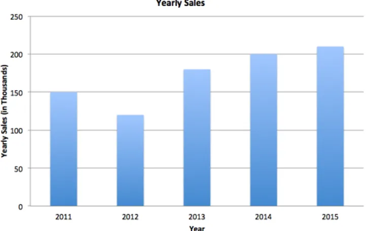
Bar charts can be used to compare quantities of different categories. A bar chart can be arranged either with horizontal or vertical bars where the height of each bar represents the value, which makes it more appropriate for comparing individual data values. In figure 6 is an illustration of a bar graph that uses vertical bars to display the yearly sales for a made up store.
Figure 6: An illustration of a bar graph.
3.2.4 Pie Chart
Pie charts are another technique that can be used to compare quantities of a whole set. A pie chart is made up from different slices that usually contain additional information, such as percentage and descriptive text. In figure 7 is an illustration of a pie chart displaying a set of product categories.
3.3
Color
Graphic elements, such as graphs, icons, maps and tables reinforce the representation of information; it helps users understand the meaning of data and allows them to visualize relationships. Color can be used to enhance a user interface design. Using appropriate colors in an interface can be helpful, for example, it can call attention to extreme or deviating values, help users differentiate among charts and items and convey information more quickly [11]. In the following subsections, important design principles concerning color will be presented.
3.3.1 Showing Details
Luminance contrast is important to consider whenever displaying detailed information. Using black and white colors ensures the most extreme possible contrast, however, it is also possible to use other colors such as yellow on black to ensure a sufficient luminance contrast. As graphical features, such as graphs, icons and maps get larger the need for an extreme luminance contrast declines [13]. Thus the luminance contrast is more important for smaller elements and text. However, it is still important to use colors that ensure a sufficient luminance contrast to make it easier for users efficiently assimilate visualized information. Figure 8 illustrates the importance of luminance contrast.
Figure 8: An illustration showing the importance of luminance contrast.
3.3.2 Color Coding
Possibly one of the most important uses of color is to indicate categories of information [13]. Figure 9 illustrates how color codes can be used. In the picture, it is possible to see the percent change and population density through the usage of color codes.
Figure 9: An illustration showing how color codes can be used [14].
When designing color codes, it is important to consider two primary components. Firstly, the color codes should have visual distinctness, which is necessary to support visual search operations. Secondly, the color codes must consider the learnability aspect, which is important because particular colors represent particular entities. To facilitate learnability, it is important to use the unique hues first, which is the following colors: red, green, yellow and blue. However, if the unique hues are not enough, it is possible to follow up by using other colors with consistent names, such as pink, brown and orange. There is, however, a strict limit in how many colors that can be used to create efficient color codes, the problem with using many different colors is that the background can distort the appearance, which leads to confusion and ultimately misinterpretation of information. [13]
3.3.3 Highlighting Information
To attract attention to a visual object, it is important that there is enough contrast between the object and its background. If objects have reduced contrast with their background, they are less salient and can be hard to spot [13]. Figure 10 illustrates how using high saturated (i.e. strong colors) colors in symbols can make them stand out if used in combination with a background area that is light and have colors with low saturation.
Figure 10: An illustration showing how saturated colors can be used to make elements salient.
3.3.4 Meaning of Colors
Colors are often used symbolically, and their meaning can vary depending on culture. For example, in western cultures, the color red can represent danger or stop; green can represents safety and blue is often associated with cold. In other countries, colors can have a different meaning, for example, in China red is used for good fortune and renewal [13]. Therefore is it important to take colors symbolism into account when designing interfaces.
With colors, it is also possible to map quantities. Colors that are more distinct (i.e. strong colors) represent a greater quantity, which implies that more saturated colors, should be used to represent greater quantity [13]. In figure 11, one way of displaying quantity with colors is shown.
Figure 11: An illustration showing how colors can be used to represent quantity.
3.4
Gestalt Principles
As mentioned in previous sections, data representation techniques used with thoughtful colors can help users to interpret and act upon information faster. Gestalt principles describe how our mind organizes information [15], therefore, can these theories be applied to improve visualizations of information and other visual and structural elements used within in a decision support system. In the following subsections, Gestalt principles relevant to information visualization and other structural aspects of interface design are presented.
3.4.1 Proximity
The Gestalt principle of proximity refers to the observation that objects that are close to each other also tend to be perceived together [15]. Figure 12 illustrates this relationship and how symbols (in this case) can be organized in rows respectively columns.
Figure 12: An illustration showing how symbols can be organized in rows respectively columns using proximity.
3.4.2 Similarity
The Gestalt principle concerning similarity refers to the observation that objects that look similar also appear to belong together [16]. In figure 13, the similarity principle is illustrated. The figure shows that items appear grouped if they look similar to each other.
Figure 13: An illustration showing how items appear to be grouped if they look similar to each other.
3.4.3 Continuity
Continuity is the Gestalt principle that refers to the observation that our visual system has a tendency to fill in missing data or resolve an ambiguity. The Gestalt principle of continuity states that our visual perception is programmed to perceive continuous forms instead of disconnected parts [16]. Figure 14 illustrates the continuity principle.
Figure 14: An illustration of the continuity Gestalt principle in action, in this case our visual system perceive the blue line as one coherent line, not two separate lines.
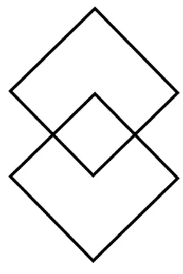
3.4.4 Closure
The closure Gestalt principle states that our visual system tries to close open figures; instead of showing separate pieces of an object it is perceived as one coherent unit [16]. Figure 15 illustrates the closure principle in action.
Figure 15: An illustration of the closure Gestalt principle in action, in this case our visual system is biased to see the whole object.
3.4.5 Symmetry
The Gestalt principle concerning symmetry states that our visual perception tends to parse complex structures in a way that reduces its complexity. For example, data can be interpreted in more than one way; the vision however organizes and interprets the data to simplify it and give it symmetry [16]. Figure 16 illustrates the symmetry principle.
Figure 16: An illustration of the Gestalt symmetry principle.
3.4.6 Figure and Ground
The figure and ground Gestalt principle state that our mind distinguishes the visual field into two different parts, namely, the figure (the foreground) and the ground (the background). The visual systems are determined by two characteristics when parsing a scene, namely the scene and what objects that is currently in focus [16]. In figure 17, the figure and ground principle is illustrated.
3.5
Text and Typography
Several of techniques and theories related to designing interfaces for DSS have been brought up in previous sections. In this section, theories related to text and typography will be covered; this section suggests theories and techniques from text and typography that can help improve the interpretation of visualized information in text format.
It is possible to describe typography as a visual equation that helps readers both understand the form and the content of a text [17]. Hence, typography is a term that covers a lot of ground, and can be thought of as a tool that can be used to change the layout of text.
In many software programs and websites text is the primary content, it is therefore also responsi-ble for a large part of the communicated information. With typography, it is possiresponsi-ble to affect how users perceive text, and with a thoughtful and suitable typography, it can be easier to communicate the desired message [18]. Therefore, typography can be seen as a tool that can be used to structure and emphasize information consisting of text.
One important aspect to consider when using text to communicate messages is to think about the visual contrast between different typefaces; it is the contrast between headings, a block of text and the use of surrounding space that all affect how users perceive text. It is the contrast and the distinct patterns created by text and typography that makes content easier to scan and read [17]. Therefore, it is possible with text and typography to influence where users direct their attention.
Text legibility is another aspect that must be considered to make information accessible. Factors such as size, row length, the distance between characters and words are all features that affect the legibility of a text. Moreover, if displaying text on a digital screen the typeface must be suitable, and it is important to find a balance in luminance contrast [18]. The chapter about color illustrates this, see figure 8.
3.6
Conclusion
In this chapter, theories related to interface design have been presented. This chapter covered the following visual and structural aspects: representation of data, color theory, Gestalt principles, text, and typography. With established design theory in place, it facilitates the discussion and ideation phase about improvements that could potentially improve the user interface of TWOSELL’s navigator.
4
Methods and Materials
In this thesis work, qualitative research has been conducted, this through an observational study and a set of semi-structured interviews. Moreover, the interaction design research triangle has been used [19], this to classify where in the area of interaction design this case study contribute with knowledge. Each method and its corresponding process will be covered in subsequent sections.
4.1
The Interaction Design Research Triangle
The interaction design research triangle is a model that presents a two-dimensional space for plotting out the position of a design research activity [19]. As can be seen in figure 18 are there three different extremes: design studies, design practice and design exploration.
Figure 18: The interaction design research triangle [19].
The concept of the model is that methods, tools, and techniques used in research activities can be quite similar, however, they are different in purpose, perspective and tradition [19]. In this thesis, the research activities that take place is mainly located in the design studies angle of the triangle, which main goal is to build an intellectual tradition and contribute with knowledge within the discipline. In order to be able to contribute to the main goal of the design studies angle, design researcher gets involved in both discussion and analysis of different design areas such as design theory and design methodology. Moreover, researchers also get influenced by other research areas such as social science and adopt other disciplines’ techniques, theories, and practices [19]. As presented in this thesis have several techniques, theories and practices of other disciplines been used to conduct the case study.
4.2
Semi-structured Interviews
Interviews performed during the project were semi-structured. Semi-structured interviews are conducted to gather qualitative data, and the method is not structured around a set of rigorous set of questions; instead it is more of an open framework that allows informants to express their views and ideas more freely [20]. For the interview to not deviate from the topic, interviewers develop an interview guide that consists of a list of questions and topics that need to be covered. The interviewer follows the guide, but it is possible to stray from the guide when appropriate.
In this project, two semi-structured interviews were conducted. The informants both worked at the enterprise POCADA AB and in the report they are referred to as person A or B, see appendix A for an interview table.
The semi-structured interviews followed the process described above (i.e. constructing and following an interview guide). Interviews conducted with the personnel at POCADA AB were mainly performed to learn more about the organization, customers, and the system TWOSELL. Additionally, it helped to formulate the field of research presented in section 4.3.1.
4.3
Observational Study
In the observational study were several controlled user observations conducted. User observations directly observe users perform specially devised tasks, where the observer records their performance; the recording of the performance depends on the focus of the investigation and therefore can take various forms [21].
In this thesis, five direct user observations were conducted to find potential usability problems within the user interface of TWOSELL’s navigator. The informants were either working or studying at university level, and in the report they are referred to as C, D, E, F and G, see table 2, in section 4.3.4 for demographic information of the participants.
Users were observed in the observational study when they performed tasks within TWOSELL’s navigator; the tasks users were tested on are shown in section 4.3.3. During the test, users were told to think aloud and externalize their thoughts, see section 4.3.2 for more information about the think aloud protocol and how it was used. From the user observations were qualitative data derived, which was analyzed using a method named thematic analysis that is presented in section 4.3.7.
Using the direct observation technique, with users thinking aloud, helped to understand partici-pants’ thoughts as they worked through their tasks. This method is suitable for this evaluation since it helped to elicit real-time feedback about problems users faced in TWOSELL’s navigator.
4.3.1 Field of Research
Information presented in the following section originates from interviews A and B, these interviews were conducted at the enterprise POCADA AB, see Appendix A for interview table.
POCADA AB was founded in 2009 with the objective to create a new kind of sales tool, which help customers (i.e. other enterprises) increase both their revenue and customer care. The main product of POCADA AB is TWOSELL, which is a software product that enables sales and revenue increase for their customers, this through using a unique and smart, personalized up-selling technique.
TWOSELL is the main product of POCADA AB and in order for it to work it must be installed on a cashier system; with TWOSELL installed can a system recommend based on an item at least three other suitable products, which is mapped out through a self-learning system. Moreover, TWOSELL can be divided into two parts, the cashier side of the system and the navigator.
The navigator is a tool that in real time can monitor how sales are going, which includes statistics such as revenue and up-selling purchases made from using the cashier side of TWOSELL. It is also possible from TWOSELL’s navigator to get an overview of statistics for different retail chains, and it is possible to follow different teams and individuals (if desired) within an organization. The navigator was the part of TWOSELL’s system that the observational study evaluated. Figure 20 shows a part of TWOSELL’s navigator.
4.3.2 Think Aloud
In the observational study was the think aloud protocol adopted to elicit real-time responses from users of TWOSELL’s navigator. The think aloud protocol involves having users continuously thinking out loud while using a system, in other words, the users verbalize their thoughts when performing certain tasks within a system [22].
Adopting the think aloud protocol in this project helped to identify users’ misconceptions with TWOSELL’s navigator. Moreover, by observing how users understand features within the user interface of TWOSELL’s navigator verbally, it was more evident what parts of the system that caused
most problems. The think aloud protocol was suitable for collecting qualitative data relevant to answering the research questions stated in this report. Therefore, was it adopted as a protocol used to conduct the observational study.
4.3.3 Tasks
To conduct the observational study were user tasks needed. In order to construct user tasks were first three overarching goals identified, these goals should be achievable by all users of TWOSELL’s navigator. The following overarching goals were identified:
1. Acquire sales statistics in real time; figure 20 shows a picture of one statistic module. 2. Complete a test purchase; figure 21 shows a picture of the test purchase module. 3. Use the available help module; figure 22 shows a picture of the help module.
After deciding upon the three overarching goals were user tasks derived, which made it possible to investigate the overarching goals. All participants in the observational study were from Sweden, and therefore were all tasks originally written in Swedish, see appendix B. In table 1, the tasks used in the observational study are translated into English.
# Task
1 Find Flygapoteket’s sales statistics for today.
2 How many TWOSELL-receipts have been printed out today at Flygplatsapoteket? 3 What is the average value of receipts today at Flygplatsapoteket?
4 How many TWOSELL-receipts have been printed out in the last 15 days?
5 What is the average value of receipts today for the pharmacy Orfeus and Flygplatsapoteket? 6 Choose a pharmacy and identify the amount of active sales persons the last 7 days.
7 Which sales person has the highest average sum and number of items per receipt? 8 Who sold most TWOSELL-receipts for your chosen pharmacy?
9 Find contact information for the enterprise POCADA AB. 10 Conduct a test purchases in TWOSELL’s navigator.
Table 1: Tasks used in the observational study.
4.3.4 Participants
In table 2, a demographic overview is shown of the participants that participated in the observational study. All the participants were recruited through email, and no one had any prior experience with TWOSELL’s navigator, which was a requirement in order to answer the research questions for this thesis.
Observation Profession Age Gender Date
C System administrator 26 Female 2016-05-12 D Student 24 Female 2016-05-13
E Student 23 Male 2016-05-13
F Student 27 Male 2016-05-17
G Student 23 Male 2016-05-13
Table 2: Demographic information of participants in the observational study.
4.3.5 Ethical Considerations
Anonymity of research participants and an adequate level of confidentiality of research data were ensured in the observational study. In order to ensure anonymity of the research participants were they assigned alphabetical codes such as C, D and G, which are used in the result section of the report to refer to a certain participant; see table 2 for demographic overview of the participants in the observational study.
Full consent were obtained from the participants prior to the study, this was done through letting participants read and sign a consent form before the observational session started, see appendix C for the consent form used in the study. Participation in the observational study was voluntary, and all participants were adequately informed about the purpose and their role in the study.
4.3.6 Computing Environment
In table 3 is a summary of the computing environment that was used in the observational study.
Browser: [Google Chrome - Version 50.0.2661.94 (64-bit)]
Screen resolution: [1920 x 1080]
Screen size: [23,5 inch]
Operating system: [OS X - El Capitan]
Tested tool in: [Full screen]
Screen and audio recording software: [Camtasia 2]
Table 3: An overview of the computing environment used in the observational study.
4.3.7 Data Collected
In the observational study were qualitative data collected, this in a form of video (on screen) and audio recordings of participants. Video and audio recordings were recorded with permission from the participants, see the consent form used in appendix C. The focus in the observational study was on observing how new users of TWOSELL’s navigator perceive and think when they performed specially devised tasks. Data collected from the observational study were then analyzed using thematic analysis, which is described in section 4.3.8.
4.3.8 Thematic Analysis
In order to analyze qualitative data obtained from the observational study was thematic analysis adopted. The thematic analysis process that was used to analyze the data is shown in figure 19. Thematic analysis is a method for analyzing, identifying and reporting themes within a data set; it helps organize data and highlights relevant information, which is suitable for answering qualitative research questions [23].
Figure 19: The thematic analysis process that was used to analyzing the qualitative data obtained from the observational study [23].
Figure 21: Picture of TWOSELL’s test purchase module.
5
Results
The thematic analysis process, as described in figure 18, was applied to transcripts and recordings collected from the observational study. Using the thematic analysis process made it possible to find commonly faced problems by new users of TWOSELL’s navigator. In table 4, identified themes are shown, which were derived from the data obtained in the observational study; the table shows the theme together with the number of participants that faced a certain problem or verbally (i.e. through adopting the think aloud protocol) helped reveal it. After the summary table (i.e. table 4) will each identified theme be explained in more depth, this through illustrative images, explanatory text, and quotes from participants. The results presented in this chapter are elaborated upon in chapter 6.
Themes Participants
Information Scent C, D, E, F and G Color Deficiencies C, D and E Unexpected Behavior and Information C, D, E and F Redundant and Hidden Information C, D, E, F and G Interpretation Problem D, E, F and G
Table 4: Identified themes from the observational study.
5.1
Information Scent
All of the participants in the observational study faced some problem when trying to complete tasks related to statistical information. Moreover, all of the participants faced similar problems and therefore was the information scent theme defined. The information scent theme indicates that the visual and textual cues were not clear enough for participants, which made the tasks related to finding statistical information longer to complete. As observed from the observational study, the main contributor to this problem was redundant and misleading textual and visual cues, see figure 23. The problem is mainly a structural one, however, it also relates to section 3.5 in the report about the usage of text and typography. In table 5, quotes regarding the information scent problem are presented; the quotes are from participants C, D, E, F, and G and have been translated into English from Swedish.
Figure 23: The similarity between the links in the navigation menu of TWOSELL’s navigator caused confusion for all of the participants in the observational study. This problem is mainly a structural one, however, it is also a problem that relates to the usage of text and typography as presented in section 3.5 in the design theory chapter.
C : "Maybe it is possible to find under TWOSELL statistic then" D : "I don’t understand why there are two different tabs for statistics" E : "When I leave one of the pages everything resets"
F : "It should be more clear what the difference is between the two pages" G : "Why are not all statistics in the same place?"
5.2
Color Deficiencies
Some of the participants either mentioned or were exposed to problems related to color. The theme color deficiency indicates that there are problems with the use of color in TWOSELL’s navigator.
In figure 24, a problem concerning luminance contrast is shown. The problem was observed when a participant hovered with the cursor over the displayed options in the drop-down menu. As can be seen in figure 24 the luminance contrast is not sufficient; in order to show detailed information such as text, it is important as presented in section 3.3.1 to ensure a sufficient luminance contrast to make content distinguishable from the background.
Figure 24: This picture illustrates a problem with luminance contrast that occurs when hovering with the cursor over the displayed options. In this case the luminance contrast is not sufficient. To make the text in this case easier to read, there is a need for a sufficient luminance contrast between the content and background.
Another problem identified related to color is shown in figure 25, in this case there was a problem with inconsistent use of colors. As can be seen in figure 25, the button label “Gå” uses different colors, in this case blue and green. The problem with using different colors to represent the same thing is that it affects the learnability of the system and visual search operations made by users; this is described in more detail in section 3.3.2 in this thesis.
Figure 25: This picture shows an inconsistency problem with colors that TWOSELL’s navigator have; this problem affects the learnability of the system and slows down visual search operations for users. For more information about the use of colors codes, see section 3.2.2.
In figure 26 another problem related to color codes is shown. The problem is that the diagrams use colors that are not clearly defined, which caused interpretation problems for several of the participants. This problem also affects the learnability and visual search operations for users of the system, see section 3.2.2 for more information about color codes. In table 6, two quotes regarding the color code problem are presented; the quotes are from participants E and G and have been translated into English from Swedish.
Figure 26: This picture illustrates a problem with the use of color codes. In this case the colors used are not clearly defined, which caused interpretation problems for some participants.
E : "Why are there no indicator of what the colors represents?" G : "It is hard to fast grasp what the colors represent"
5.3
Unexpected Behavior and Information
Most of the participants in the observational study faced problems with unexpected behavior or information in TWOSELL’s navigator. This theme was defined because participants faced problems related to either broken or missing functionality. In figure 27, an illustration of two broken links are shown; participants expected in this case to be able to click on either the logo or the highlighted link to go back to the main page of TWOSELL’s navigator, however, this was not possible. This problem relates to users expectation of the system, and in this case the visual and textual cues were misleading. For example, participants expected that the blue link in figure 27 should be clickable, however, this was not the case. Therefore is this problem related to several of design theory principles, such as the meaning of colors, color coding, text and typography and the Gestalt principle of similarity, this since other links work as expected in TWOSELL’s navigator.
Figure 27: Users expects that the link "Hem" and the logo should bring them back to the main page of TWOSELL’s navigator, however, this was not the case. This problem relates to several of design theory principles such as the meaning of colors, color coding, text and typography and the Gestalt principle of similarity.
In figure 28, the button labeled “Återställ” is not working as expected because no options are restored when clicking on the button. The button in figure 28 is not doing anything at the moment and should therefore either be removed or functionality needs to be implemented. The problem is that the button gave participants the impression to reset selected options made on the same page by clicking the button, which was not possible. This problem relates to the Gestalt principle of proximity, which refers to the observation that objects that are close to each other also tend to be perceived together; in this case should the button labeled “Återställ” reset the nearby settings as can be seen in figure 28.
Figure 28: The button labeled "Återställ" in the picture above is not working as expected. This problem relates to unexpected behavior in TWOSELL’s navigator and the Gestalt principle of proximity.
A problem with unexpected information is shown in figure 29. Figure 29 shows a part of TWOSELL’s help module where there is a problem with the mapping of instructions. The instructions in figure 29 are in Swedish because of TWOSELL’s navigator had these settings while conducting the observational study. However, the problem and focus is on the mapping of the instructions in figure 29. The problem is that the numbers are not correctly mapped with the describing text and it is therefore a problem with the usage of text and typography.
Figure 29: In the picture above is an illustration from the help module of TWOSELL’s navigator. The problem is that the numbers are not correctly mapped with the describing text. The language in the figure above is in Swedish because of the settings made when conducting the observational study.
In figure 30 there is an inconsistency problem, the symbol used for representing statistics is used to both represent report and the tab statistic. The problem with using the same symbol for representing different properties is that it can cause interpretation problems for users of TWOSELL’s navigator. This problem can be related to the Gestalt principle of similarity, which is because of the two highlighted parts in figure 30 seem to belong to each other.
Figure 30: In the picture above is an inconsistency problem shown. The symbols in the picture are used to both represent statistics and report, and the Gestalt principle of similarity indicates that they belong to each other.
5.4
Redundant and Hidden Information
All of the participants in the observational study faced problems concerning redundant and hid-den information. Problems related to this theme were mainly illogical placement of content and information. In figure 31 a problem with illogical placement of information is shown; the placement of contact information in the help module is not salient and should be found in other parts of the software according to some participants. This is both an accessibility and structural problem in TWOSELL’s navigator, and it is related to the usage of text and typography since textual cues are missing. In table 7, several quotes about this problem are stated, and they have been translated into English from Swedish.
Figure 31: The picture above shows a problem with illogical placement of information. Contact information to the enterprise is only available in the help module. This is a problem related to the usage of text and typography since textual cues are missing in other parts of the software.
In figure 32 a problem related to redundancy and priority of content is shown; see figure 20 for an overview of the statistical module and how this table is used. As can be seen in figure 20,
C : "It feels like it should not only be available under help" D : "It’s not intuitive to find it here "
E : "Usually, I find contact information at the bottom of the page" G : "It feels like an exaggerated way to find contact information"
Table 7: Redundant and hidden information: quotes from participants C, D, E and G
view. Moreover, the table in figure 32 is used in two different places in TWOSELL’s navigator; it is placed under both the tabs labeled “TWOSELL Statistik” and “Apotek statistic”, as can be seen in figure 23. Some of the participants in the observational study wonder why this table has been given the primary focus and why it is shown on both the statistical pages. This problem is related to redundancy and priority of information.
Figure 32: The table shown in the figure above is used in both the different statistical views in TWOSELL’s navigator. As can bee seen in figure 20 the table has also been given the primary focus. This problem is thus related to redundancy and the priority of information.
In figure 33, a problem concerning redundant information is shown. According to some partici-pants in the observational study the highlighted information displayed in figure 33 is not relevant to show all users of TWOSELL’s navigator. As can bee seen in figure 33, transactions details are displayed and this information is according to participant E and G not necessary to display, at least not as default.
Figure 33: In the picture above is a problem with redundant information shown. According to participant E and G in the observational study are the transaction details displayed not necessary to show all users of TWOSELL’s navigator.
5.5
Interpretation Problem
Most of the participants in the observational study had interpretation problems when performing tasks in TWOSELL’s navigator. Problems observed were mainly related to usage of text and typography. In figure 34, information that is displayed is too dense according to participant D and G; displaying dates this way can cause more interpretation problems when data grow. Another problem observed related to text and typography is displayed in figure 35; textual and visual cues are hard to notice according to some participants.
Figure 34: The information displayed in the picture above is too dense according to some participants, which can cause interpretation problems.
Figure 35: In the picture above is a problem shown related to the usage of text and typography. The problem is that the text is hard to scan due to the visual hierarchy, therefore the textual and visual cues are hard to notice, which slows down users visual search operations.
In figure 36, an unexpected radio button is displayed without any alternatives, which confused several participants in the observational study. The problem with only displaying one options as a radio button is that users expect to be able to select from other alternatives, thus it slows down and affects the learnability of the system.
Figure 36: The figure above shows a problem related to expectancy. In this case a radio button is displayed without any alternatives. The problem with this is that users expects to be able to choose from alternatives, which is not possible in this case; this slows down the users of TWOSELL’s navigator and affects its learnability.
In figure 37 a problem is observed related to the responsiveness of TWOSELL’s navigator. When an item is selected that contains no text, and the test purchases are made in the navigator, the system does not respond with an error message or inform the user on how to proceed. Instead, the system displays a text that says “No suggestions”, as can be seen at the bottom of figure 37. Another problem in figure 37 is that the fields for selecting articles are missing visual and textual cues, which informs users that it is possible to choose from predefined items. These problems are related to text and typography and the usage of visual cues, which affects the usage and learnability of TWOSELL’s navigator.
Figure 37: This is a figure of the test purchases module in TWOSELL’s navigator. The problem in this module is that it lacks both visual and textual cues. Explanatory text for users regarding the usage of the module is missing and there are no visual cues for the textboxes, which indicates that it is possible to select from predefined items.
6
Discussion and Analysis
The results obtained from the case study revealed that there were several structural and visual aspects of TWOSELL’s user interface that generate problems for novice users. The most recurrent problems for novice users of TWOSELL’s navigator were compiled and presented as the following themes:
• Information Scent • Color Deficiencies
• Unexpected Behavior and Information • Redundant and Hidden Information • Interpretation Problem
These identified themes demonstrate that novice users of TWOSELL’s navigator experienced a variety of problems related to structural of visual aspects. However, as the results indicate there are mainly problems identified that are rather superficial, and not many that caused major difficulties for users of TWOSELL’s navigator; contributing factors for this could be the chosen method and materials for conducting the observational study. For example, the tasks performed by participants during the observational study clearly affects what parts of the system they are most likely to test and thus encounter a problem in; this affects what findings that might have been observed. Moreover, the adopted think aloud protocol could have had an effect on the participants behavior when performing tasks, this because of the unnatural behavior and maybe for some uncomfortable way of performing tasks when externalizing their thoughts. However, the method and materials used for conducting this case study also had several benefits, this because all of the participants performed the test under the same conditions. Everyone that performed the study was novice users, and they all got the same instructions and facilities. How the identified structural and visual problems within the user interface of TWOSELL’s navigator can be solved is presented in section 6.2.
The case study described in this report shows that it is possible to identify problems within the user interface of TWOSELL’s navigator, which can contribute to incremental improvements in its user interface. However, the results obtained are not suggesting any radical changes, this to both the way information is obtained and to the user interface of TWOSELL’s navigator, as can be seen in section 6.2. Why only incremental improvements could be identified and suggested are most likely because of the limited resources for this thesis work. In order to be able to suggest more radical changes a more profound analysis of professionals workplace and environment would be needed, which requires more time and resources that were not available for this thesis work. Conducting an observational study on novice users can thus be useful to help improve a system’s further development with incremental improvements, however, it might be hard to suggest any radical changes with novice users and this approach because of the lack of comprehensive knowledge.
6.1
Related Theories and Previous Research
The outcome of this case study partly resulted in the identification of potential problems within the user interface of TWOSELL’s navigator. Despite the diversity of problems identified can still most of the findings be related to previous design research, this within the area of interface design as presented in chapter 3. Some of the results that were evident problems for participants in the
As presented in section 3.3, about color theory, studies and research have been conducted and proven the importance of using colors properly. For example, areas such as color coding, showing details, highlighting information and the meaning of colors have all proven to be of importance when structuring and visualizing information [11], [13].
In section 3.5 was the importance of text and typography presented, which was another evident factor that affected participants in the observational study. Studies and research, as presented in section 3.5, states that text and typography have several roles within an interface, such as it helps the reader to understand the form and content of a text, it structures and emphasizes information and influences where users direct their attention [17], [18].
It is evident from the case study that the use of colors, text, and typography in the interface of TWOSELL’s navigator affected how users perceived the system and managed to complete tasks within it.
6.2
Recommendations
In this section are recommendations given that potentially can solve the problem themes presented in chapter 5. Each identified problem theme is presented and given at least one potential solu-tion. Moreover, the recommendations are elaborated upon to present their potential benefits and drawbacks.
6.2.1 Information Scent
The information scent theme was defined because participants in the observational study struggled with finding specific statistical information, the visual and textual cues were not clear enough. In order to solve this problem are the following three recommendations given:
• Rename the labels of the statistical pages. • Move all statistics to the same place.
• Do not reset the settings made when switching between the statistical pages.
Renaming the labels of the statistical pages to be more suitable can help users of TWOSELL’s navigator to find their desired information faster. However, the problem of the content structure will remain. One way to solve this could be to have all statistics displayed together. Potential drawbacks with adopting this approach could be that a function for aggregating desired information is needed. However, it would solve the problem that users face when switching between the statistical pages to find information. Lastly, the settings that reset when users switch between the statistical pages is according to some participants in the observational study tedious, therefore, should it be considered if it is necessary to perform this action.
6.2.2 Color Deficiencies
Problems with color within TWOSELL’s navigator formed the theme named color deficiencies. In order to solve the problems related to color the following recommendations are given:
• Ensure that the luminance contrast is enough; see section 3.3.1. • Be consistent and define the use of colors; see section 3.3.2.
Ensuring a luminance contrast that is suitable makes information easier to process for users. The problem that is illustrated in figure 24 shows how hard it can be to read a text (in this case) that have an insufficient luminance contrast. Another recommendation concerning color is to be consistent with the use and definition of colors; it facilitates learning and the visual search operations for users, see section 3.3.2. Figure 25 and 26 illustrates problems with the consistency and omitted definition of colors used in TWOSELL’s navigator.
6.2.3 Unexpected Behavior and Information
The theme concerning unexpected behavior and information was defined because of the participants faced problems concerning either broken or missing functionality. In order to solve the problems identified in this theme are the following recommendations given:
• Implement the expected functionality that is described in figure 27.
• Fix the broken button named "Återställ" in the statistical page named "TWOSELL Statistik". • Change how instructions are mapped in the help module; the problem is shown in figure 28. • Ensure that symbols are used consistently.
Through implementing and fixing these recommendations given above it can help users to navigate more easily and learn TWOSELL’s navigator faster. The suggested recommendations are expected functionality of some users and should therefore at least be implemented and tested.
6.2.4 Redundant and Hidden Information
Problems in TWOSELL’s navigator that consisted of content and information that were illogical formed the theme named redundant and hidden information. In order to solve the problems related to the redundant and hidden information theme are the following recommendations given:
• Make contact information more salient and accessible.
• Evaluate the level of priority that should be given to the table shown in figure 32. • Remove or make the transaction details optional; see figure 33.
Making the contact information more salient and accessible for users can be done in several ways. For example, contact information can be placed at the bottom of each page. Another alternative could be to add an extra tab called contact. However, as all of the participants could at least complete the task related to finding contact information, it should not be removed from the help documents. Having contact information accessible should be a priority, and having it in several places in the tool should not cause any problem or concern for users.
The statistical table that is displayed in both the different statistic pages should be evaluated if it should be given the priority level it has now. From the observational study could it be observed that this table captured most of the attention of users when searching for statistical information, this even tough it would be faster for users to interpret the information using the statistical graphs that are located below the table.
The transaction details that are shown in figure 33 is not crucial to show ordinary users of TWOSELL’s navigator. However, it is not necessary to remove the functionality; it could be made
Figure 38: An alternative approach for displaying the transaction details.
The transaction details could be made optional through adopting the approach illustrated in figure 38; clicking on the arrow would expand the box and show the user all transaction details.
6.2.5 Interpretation Problem
The interpretation problem theme was defined because most of the participants in the observational study faced problems related to interpretation when performing tasks within TWOSELL’s navigator. In order to solve or at least mitigate these problems the following recommendations are given:
• Make use of text and typography to create a better visual hierarchy, see figure 35. • Avoid pushing out too much information at once to users, see figure 34.
• Remove the unnecessary radio button; see figure 36.
• Add more visual and textual cues for guiding users that are inexperienced, see figure 37.
Using different font-sizes and suitable typography can help to improve the visual search opera-tions for users of TWOSELL’s navigator. As can be seen in figure 35, all the text blocks use similar font-size and typography, which made it hard for participants in the observational study to scan through the content. By creating a visual contrast between headings and other blocks of text makes the content easier for users to scan. Another problem related to text and typography can be seen in figure 34, highlighted information in this figure are hard for users to process since it is too dense. One solution to the problem illustrated in figure 34 could be only to show detailed information when hovering over or selecting a specific bar within the graph. The benefit of this approach would be that the users are not confronted with too much unnecessary information. However, this approach could also contribute to another problem, which is that it makes it hard to get an overview of the statistical information displayed in the graph. Moreover, it could also be possible to add more colors to the graphs, which could make it even faster to interpret if colors are used properly.
The radio button displayed in figure 36 should be removed, or more alternatives should be added. In figure 37, a problem concerning the lack of visual and textual cues are demonstrated. One problem is that an error message is missing when users fail to perform test purchases. A solution to this problem is to implement an error message, which informs the users on what happened and how he or she should proceed. Another problem illustrated in figure 37 is the lack of visual and textual cues for the text boxes, which is used by users to select items in order to perform the test purchases. What can be done to solve this problem is to add either some describing text of how it is possible to search for items or the text boxes could use a similar approach as is shown in figure 38; this makes it more evident for users that it is possible to search or select predefined items.
7
Conclusion
In this thesis, a case study has been presented, which was performed on an existing sales performance management tool. The case study consisted of an evaluation research, which applied direct users observations with the think aloud protocol as a method; the evaluations were conducted with novice users on the sales performance management tool, which was done to gather information about what potential structural and visual problems new users most commonly face. Based on existing design theory of user interface design and foundational theoretical knowledge about decision support system were results analyzed and recommendations on improvements to the evaluated system given.
The results obtained from the case study indicate that it is possible to reveal structural and visual problems within a user interface with novice users, this through conducting direct users observations. However, the problems identified in this case study showed to be rather superficial, which also indicate that evaluating a user interface with novice users has its limitations. From this case study, it was evident that all novice users either found or encountered some problem related to structural and visual aspects, these aspects affected both how users perceived the system and managed to complete foundational tasks within it. Moreover, the case study indicates that conducting evaluations on novice users can help to improve a system’s user interface incrementally, however, it can be hard to suggest any radical changes.
8
Future Work
It was not possible to implement the recommendations made in section 6.2 in TWOSELL’s navigator, this because of the limited timeframe for this thesis work. Therefore, would a suitable next step be to implement and test out the suggested recommendations with new participants, this to see if the findings solved or at least mitigated the problems observed in this case study. Another future topic could be to investigate and learn more about the differences between experienced and novice users, for example, comparing and analyzing different metrics such as completion rate of tasks, satisfaction results, and participant comments could be interesting.
![Figure 2: Performance management, closed-loop approach [4].](https://thumb-eu.123doks.com/thumbv2/5dokorg/4748775.126097/11.892.235.671.155.556/figure-performance-management-closed-loop-approach.webp)
![Figure 3: Information visualization process [10].](https://thumb-eu.123doks.com/thumbv2/5dokorg/4748775.126097/12.892.157.733.364.416/figure-information-visualization-process.webp)
![Figure 4: An illustration of a scatter plot graph [12].](https://thumb-eu.123doks.com/thumbv2/5dokorg/4748775.126097/13.892.273.598.266.574/figure-illustration-scatter-plot-graph.webp)
![Figure 9: An illustration showing how color codes can be used [14].](https://thumb-eu.123doks.com/thumbv2/5dokorg/4748775.126097/16.892.211.684.161.525/figure-illustration-showing-color-codes-used.webp)


![Figure 18: The interaction design research triangle [19].](https://thumb-eu.123doks.com/thumbv2/5dokorg/4748775.126097/22.892.178.720.165.453/figure-the-interaction-design-research-triangle.webp)
