Touch gestures for process graphics
Mälardalen University
School of Innovation, Design and Engineering Victoria Andersson
Thesis for the Degree of Bachelor in Computer Science 2016-06-13
Examiner: Dag Nyström Supervisor: Rikard Lindell
Abstract
The goal of this thesis was to explore and find ways to implement touch gestures in the context of process automation, with the limitation to one specific use case found suitable for touch interaction for ABB’s distributed control system called System 800xA. The typical way to handle the data in System 800xA today is to show and control it through the so called process graphics. It is possible to do this on a touch device today, but the current graphical user interface focus on mouse and keyboard interaction. Because of this some of the common design elements and interaction cues that are in use right now are less suitable when running the system on a touch device. Important characteristics for the process graphics to have for an efficient and delightful user experience when interacting with the system on a touch device were therefore also investigated.
To understand if, and if so when and how, an industrial process control system could benefit from touch interaction a PACT analysis was done as a first step. This PACT analysis was then used as a basis for how 15 use cases and their suitability for touch were evaluated. A combination of two out of these 15 use cases were found to be a suitable aim for a prototype that was created. These two use cases involved navigation and controlling of the system and were found suitable for several reasons, including the fact that they are common use cases for when touch interaction with the system is used today. Therefor these two use cases in combination was chosen as the target use case.
To find which gestures that were suitable for this use case, an exploratory test was performed where the participants were allowed to show what gestures they perceived as suitable for different tasks that the use case could involve. The findings from these user tests were that the gestures should be kept simple, often only require one hand and one finger usage. Based on these findings, a high-fidelity prototype was implemented on a tablet called Surface Pro. As a way to evaluate the implementation of the high-fidelity prototype an assessment test was conducted. The results from the assessment test indicates that while it is important to adjust the system for touch interaction, by for example use elements in suitable sizes and provide functions adapted for touch interaction, it is also important to replicate the current system where it is possible.
Contents
Abstract ... 2 1. Introduction ... 4 1.1 Problem definition ... 4 1.2 Limitations ... 4 1.3 System 800xA ... 4 2. Background ... 52.1 System 800xA process graphics functionality ... 9
3. Method ... 9 3.1 PACT ... 9 3.2 Sketching ... 10 3.3 Low-fidelity prototype ... 10 3.4 Exploratory Test ... 11 3.5 High-fidelity prototype ... 11 3.6 Assessment test ... 11 4. Design process ... 12 4.1 PACT analysis ... 12
4.1.2 Resulting PACT analysis ... 13
4.2 Use cases for touch interaction ... 15
4.2.1 Pre-study Operator Effectiveness resulting use cases evaluation ... 15
4.2.2 Use case chosen for prototype implementation ... 18
4.2.3 Pseudo code for the chosen use case ... 18
4.2.3 Storyboard for the chosen use case ... 19
4.3 Low fidelity prototype ... 21
4.3.1 Low fidelity prototype functions ... 21
4.3.2 Exploratory test setup ... 25
4.3.2 Exploratory test results ... 26
4.3.3 Analysis exploratory test results ... 29
4.5 High-fidelity prototype ... 30
4.5.1 Windows Universal App as high-fidelity prototype ... 30
4.5.2 Assessment test setup ... 32
4.5.3 Assessment test results ... 34
4.5.4 Analysis assessment test results ... 35
5. Conclusion ... 36
5.1 Future work ... 37
1. Introduction
The development of industrial process control systems and the corresponding techniques are under constant development [1]. One of the areas that is currently being researched are alternative ways to interact with these industrial process control systems [2], [3]. The work involving interaction with an industrial process control system is today typically executed by operators of the system in a so called operator room, where desktop computers are used to interact with the process [1], [3]. Running the industrial process control systems on desktop computers often mean that the operators are limited to interact with the system by using a keyboard and mouse.
One possible alternative to keyboard and mouse interaction could be to use a touch screen where the users would interact with the system through touch gestures. There might even exist use cases when a touch screen could be a better solution than how it is used today. Since the current graphical user interface focus on mouse and keyboard interaction, some of the common design elements and interaction cues that are in use right now are less suitable when running the system on a touch screen. Therefore, if such use cases exists, the graphical user interface of the industrial process control system need to be redesigned and corresponding touch gestures explored to withhold and improve an efficient and delightful interaction for the operator.
1.1 Problem definition
The goal of the thesis was to explore and find ways to implement touch gestures in the context of process automation for a specific use case found suitable for touch interaction. To do so, the following two questions were investigated:
1. What are the use cases and needs for operators interacting with touch screens? 2. How can the process graphics be designed to fulfil these needs and ensure a system
that is easy to learn and efficient to use for a chosen use case?
a. How can different touch gestures be applied to fit the current mouse-focused-design elements in process graphics for touch screens?
b. How can existing design elements be replaced with new design elements and cues specifically designed for touch gestures?
1.2 Limitations
The goal of this thesis was to investigate if there is one or several specific use cases where a touch screen could improve the operators experience when working with ABB’s industrial process control system called System 800xA. Due to the time limit, a prototype of the system was implemented and suitable touch gestures investigated for one specific use case. The thesis was also partly limited to how the graphical user interface for System 800xA is designed since it was supposed to correlate to how the current system looks. Because of this, this thesis aimed to answer the above question with the limitations to System 800xA and its use cases. Other systems with different design elements and different use cases might therefore work better with a different solution.
1.3 System 800xA
System 800xA is a so called distributed control system (DCS). A DCS monitors and controls a part of or an entire industrial process, or even multiple industrial processes. By connecting actual signals from the industrial process to System 800xA, like for example the temperature of a liquid in a tank, it is possible to read and write to those signals. The
depending on predefined conditions and be represented as raw data. The typical way to handle the data in System 800xA is to show and control it through the so called process graphics. The process graphics is unique for each process since the graphical user interface is created by engineers for that specific industry.
The process graphics is typically displayed on one or several screens in a control room where operators interact with the system through these screens, a keyboard and a mouse. It is possible to run System 800xA on a touch screen, either a mounted screen displaying the process graphics or on a tablet or mobile phone through remote desktop. Neither of these provide a graphical user interface designed for touch. It is also possible to use so called panels. They can either be used to control one or several control system separately, or be integrated with system 800xA. These panels are today typically used on site and are designed to endure tough conditions and supports input through touch even if the operator has gloves on. They display current values and makes it possible for the operators to set specific values. They do, however, not provide the same functions and graphics as System 800xA.
2. Background
Studies have shown that alternative ways of interaction in control rooms could be of advantage. In a study by Müller et al. [3] it was investigated if today’s digital industrial process control systems could benefit from the usage of interaction methods similar to the ones used historically in analog control rooms. Historically manual controls, like for example physical buttons and sliders, were used to adjust process variables. In the modern, digital industrial process control system virtual control elements displayed on the screen are used instead. The manipulation of the control values are adjusted either by a metaphor representation of a manual control using a mouse or by being typed in using a keyboard. Müller et al. investigated this by performing user studies where the time it took to change process values via mouse, keyboard, touch and tangible-object manipulation was measured as well as the recall accuracy. Their findings were that the usage of a keyboard provide for the fastest interaction, while the usage of tangible-object manipulation resulted in the best recall accuracy. The usage of mouse and touch resulted in second and third best in
both cases.
Müller et al. therefore suggest that tangible-object manipulation similar to the historically manual controls could be used to increase the operators’ performances in the control room. Koskinen et al. [2] also argues that the usage of graphical interface elements that are used in today’s systems, instead of physical controls like before, is a disadvantage. They investigated what type of touch gestures that where preferred to control a process on a big, mounted multi-touch screen placed in a control room through user tests. Koskinen et al. just as Müller et al. found that touch interaction might not result in better speed and accuracy compared to mouse input. They however argue that there could be other benefits when using touch, like increased motor memory and awareness of others’ actions.
There has also been previously done work where alternative ways to interact with System 800xA were researched. In 2014 a thesis work was conducted by Radisavljevic and Kujan [4], where alternative ways to control an 800xA system in a mobile way were researched.
They found that a smartphone was the most suitable device to use when a fast interaction with the control system on the field is needed. This could for example be the case when an operator leaves his or her workstation to check an alarm for a specific object.
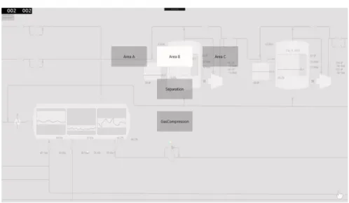
Radisavljevic and Kujan [4] also found that the usage of process graphics not is suitable nor needed when interacting with an 800xA system through a smartphone. Figure 1 was used in their thesis to represent how the navigation works in the desktop interface for System 800xA. The first display shows the process graphics for an object called “Section 1”. If an element in the display to the left in the figure, like for example the one representing the object Boiler 1 or Boiler 3, is clicked the user is navigated to the display for that specific object. They did not find this suitable for a mobile phone, since they believed that a small screen would require a lot of zooming and positioning. To solve this problem, they suggested a solution where fast navigation was obtained through a list focused design, represented in figure 2. Instead of clicking on graphical representations of objects to preform navigation, a list with all objects within a display for an object was used. Using process graphics was instead suggested to be more suitable for tasks that take longer time and that is performed on bigger screens.
Figure 1. Figure representing how the navigation works in the desktop interface for System 800xA [4].
A DCS like System 800xA can be controlling systems where an error could cause severe effect on surrounding people and environment. It is therefore important that the interactions between the process and the operator is working efficiently and are correct. Implementing ways to communicate with the industrial process control system through touch therefore require well thought through gestures and design of the user interface. Alcantara et al. [5] mentions two key challenges when designing systems that have touch gestures as interaction method. The first one is the cost required for the designer to create the gestures, where the cost includes both the effort it takes to implement it and finding suitable techniques for it. Kin et al. [6] also mention the challenge that the increasing amount of gestures generate from the aspect of how the code should be implemented. Since the gestures typically is handled by callback functions it is important that the gestures not are too similar, otherwise they could be interpreted as each other. Another important aspect to keep in mind is to make sure that the entire gesture is recognized, and not just a part of it.
The second challenges is to find the gestures suitable for the users, activity and context for which the design is aimed [5]. Several studies have shown that the basic gestures perceived suitable for different tasks differ between different groups of people [7], [8]. When observing differences between ages, StöBel and Blessing [8] found that younger user preferred the “zoom” motion where two fingers is spread over the screen, while elderly user preferred to zoom the screen by double tapping it with one finger. In a study by Mauney et al. [7] it was found that there also is differences among different cultures, where people from China in particular used more symbolic gestures, such as letters, then people from other countries. They also found that users prior experience of using touch screens affected their choice of gesture to perform a certain task, like for example how to scroll a page.
Tests performed together with the end-users during the design process to find the most suitable gestures to use for a specific activity and context has shown to have several benefits [9]-[12]. On tests made with two sets of gestures, one made by human computer interaction (HCI) researchers and one by potential end users, some of the HCI researchers’ gestures were perceived as over complicated [9]. Similar findings was obtained when users were allowed to try three different sets of gestures, one made by the authors, one consistent of randomly chosen gestures and one user-defined [10]. The preferred set in this study was also the one made by the end-user. This since the gestures in that set was perceived to be easier to remember, both over short and long time, and that they were the easiest once to learn.
In another study by Wobbrock et al. [12] where non-experts were allowed to come up with their own gestures for different tasks, it was also found that the gestures made by the non-experts were simpler than the experts. Expert gestures are believed to be sufficient to use during the early stage of the development by Wobbrock et al., but their findings were that they can become overcomplicated. For the non-expert gestures, the amount of fingers used did not matter as a contrast to how the expert gestures were designed. This was also confirmed in a study by Bunchanan et al. [13]. One hand was also preferred over the usage of two hands. Koskinen et al. [2] also had similar findings in their case study that aimed to investigate suitable gestures to for industrial process control systems. The result from their user tests indicated that the users prefer one finger and one hand usage as well.
Several studies also found that some gestures already are well known, and therefore also perceived to be suitable for specific tasks, by the user [7], [11], [12]. One such example is by Norman [14] believed to be the horizontal swiping motion to go to a new page. These gestures, when properly determined, has the potential to create a set of standardized gestures. Norman also mentions that caution should be taken around so called natural gestures, since the gesture that is used in real life to perform a task not always is the most suitable as a gesture. As an example could to widely gestures inflict harm to surrounding environment. It is not only the physical environment that should be taken in to consideration, but also how and if there will situations where the content on screen will be discussed between people showed results from a study by Gerken et al. [15]. In a user test for the study where students had to explain artifacts on the surface of a touchscreen, some experienced difficulty not to touch the surface and thereby changing what picture the screen was showing. It is therefore important to also take in to consideration what activity and in what context the designed application will be used in.
It is not only prior experience with touch that can have an impact on how an application is implemented. Ünlüer and Özcan [16] observed that students’ prior experience of graphical user interfaces effected their design for gestural interaction. This often results in a design that is not optimal for gestural interactions, where the design is limited to the student’s prior experience with mouse and keyboard. To avoid this problem, they suggest a method called ‘gestural shadow mapping’ for students to use when working on a gestural interaction design problem. This method aim to help the designer to gain knowledge about and identify the nature of gestural interaction. The basics of this method was to project the shadow of a human body and its movement and capturing the movement that is made.
Another important issue to take into consideration when designing for an application with interactions through touch is the so called the “fat-finger” problem [17]. This problem refers to the difficulty of selecting small targets on the screen with a finger. Several suggestions on potential solutions to the problem has been researched. Albinsson and Zhai [18] for example presented two interaction tools called Cross-Key and Precision-Handle. With Cross-Key virtual keys at the end of a cross gets adjusted to the small target by discrete taps, and when in position a virtual key in the center of the cross should be tapped. The Precision-Handle uses a leverage metaphor, making it possible to move the tip of the leverage to a precise location.
Another possible solution could be a Hover Cursor proposed by Ostberg and Matic [17]. When a finger hover the screen a small dot appears above the finger, the Hover Cursor. If the user then taps the surface the target under the Hover Cursor is selected, and not the one potentially being tapped by the finger. Both of these studies used Fitts’ law as a tool for evaluation. Fitts’ law is a mathematical formula that describes how the distance to a target and the size of it decides the time it will take to move to its position [19, pp. 31]. The law is therefore useful when calculating how long it takes to hit small target such as the once mentioned in the studies. Other than that, it can also be used to for example calculate risk of hitting another button than intended when buttons are positioned close to each other.
2.1 System 800xA process graphics functionality
The processes that a DCS like System 800xA controls are often larger than what can be graphically represented on one display in a way so that the users can work with it efficiently. The process graphics are therefore often divided into several displays, where a display typically represents a physical area, process or object. When so, navigation between the different displays is performed to monitor and control different parts of the process. One way to do this is by interacting with graphical elements represented in the process graphics, which generates navigation in a hierarchy like structure. Then, if a graphical element is clicked and this is programmed to generate navigation, the user is navigated to a graphical representation of that part of the system like figure 1 represents. This means that for each graphical element that is interacted with in a way so that navigation is generated, the user is navigated deeper into the hierarchy. Each hierarchy level can consist of one or several displays, so it is also possible to navigate between different displays at the same hierarchy level.
Each graphical element in the process graphics represents a so called aspect object. An aspect object represents a real object. These can be different kinds of real objects. It might be an actual physical object, like a motor or an immaterial object, like a blueprint or something else. All aspect objects have in common that they can be represented from different perspectives. These perspectives are called aspects. Each aspect defines a part of information involving the real object, and has a set of functions that makes it possible to create, access and manipulate this object.
Different kind of aspect objects can have different kind of aspect sets. These sets can include aspects such as process graphics, alarm list, trend display, faceplate, etc. A faceplate is a functionality used to set states and values to an object in System 800xA. It is displayed as a window and contains graphical elements that make it possible for the user to interact with the data that the DCS is involved with for the specific object the faceplate belongs to. The faceplate allows the user to set different settings and values through different input handlers represented in the faceplate. It could for example be an element that allows the user to set a specific temperature to a part of a process or icons that when interacted with starts or stops a motor.
3. Method
To be able to create an interactive system that is perceived as useful and at the same enjoyable, people who are going to use it should be the key aspect to keep in mind during the design process [19, pp. 3-4]. Since this thesis work aimed to create such a system, the users of the system were considered through every step of the design process. The design process consisted of three parts:
Understanding of the system through a people, activities, context and technologies (PACT) analysis.
Concept evaluation and analysis of sketches based on the PACT analysis. Implementation and evaluation of a prototype based on the concept analysis. 3.1 PACT
The first step was performing a PACT analysis. A PACT analysis is a design method used to understand the key components in interaction design; People, Activities, Context and Technologies [19, pp. 28-44 ]. The analysis aimed to find the different variations within
the different components that could have potential use of the final product. This method was used to gain knowledge of the potential for the final product which was an important part of this thesis, appose to just designing towards a predetermined use case. When the PACT analysis had been done, it was used as the basis when evaluating the suitability of potential use cases for the system.
3.2 Sketching
The part of the design process that involved the conceptual design was performed by at first creating sketches on plain white paper, and after that creating a low-fidelity prototype. The goal with this part was to gain understanding about what information and functions the system should have to work as intended [19, p. 52]. The reason that sketches were made initially is that they are cheaper in cost. Sketches only include what is necessary, since extra features only tend to distract rather than adding any extra value to it [20, p. 111].
Because of this sketches are quick to make, inexpensive and disposable, and at the same time a useful tool to use when evaluating and analyzing the concept of the design. The sketching phase was therefore an important part of the design process were it was possible to come up with and evaluate a lot of ideas. This was done as Greenberg et al. argues is the way to get the right design, where three steps are iterated: elaborate, reduce, and repeat, in a presentation based on chapter 1.2 in the book Sketching User Experiences: The Workbook [21]. The elaboration part is where possible solutions are generate. In this part there were no limitations, like for example possible technical issues. The possible limitations was handled in the reduce-part, where the ideas was evaluated and either kept or discarded. The evaluation was based on how well it would work for the aimed use case. When this was done, the ideas chosen to pursue with was elaborated again, in a way to try and find other possible solutions based on those ideas, and then reduced again until a final idea was chosen to pursue with.
3.3 Low-fidelity prototype
The sketches that were made was not designed to represent a so called low-fidelity prototype, since the design of the system still was in such an early stage that the concept still had to be determined [20, p. 139]. The creation of the low-fidelity prototype was done after evaluation of the sketches had been made, since it is better suited for when the concept is clearer and it is possible to create fewer and more precise suggestions of the design. During this thesis work the final ideas was evaluated together with the supervisor so that possible usability faults could be detected before the low-fidelity prototype was created.
A low-fidelity prototype does not offer any real interaction with the system [19, p. 118]. It is kept simple and is used to test the concept. During this design process, a low-fidelity prototype was created on paper based on the ideas chosen to pursue with from the sketches. Different states that could occur during the usage of the system at the chosen use case was represented through drawn picture on papers. To test the prototype and to investigate how users would interact with it, user tests were made. Having this step as a part of the design process was important since user feedback is an important part of creating interactive system that are human-centered as previously mentioned.
3.4 Exploratory Test
An exploratory tests was used to evaluate the low-fidelity prototype. These kind of user tests are often conducted early in the design process as a tool to evaluate the users’ mental model of the product [22, pp. 31-35]. This since an exploratory test focus on finding out why the user interacts with the prototype the way they do rather than how well they can use it. The tests are often less strict than user tests conducted later in the design process and there is several ways to do them. It can for example be done by asking the participants to perform different tasks or just letting the participant explore the product together with the test monitor. In both cases it is common that there are much interaction between the participant and the test monitor, as a way to gather as much input of the users experience as possible. This way of testing was considered suitable when evaluating the low-fidelity prototype, since it only represented the high-level aspects of the system that it aimed to represent. Some functionality had already been predetermined during the test, but others still had to be evaluated.
3.5 High-fidelity prototype
When a clear concept had been found a high-fidelity prototype was created. A high-fidelity prototype are used to test the implementation on a device that actually acts the way the system would in reality [19, p. 123]. This was done as a final step to see how the system was perceived when interactions could be made with the system without having another person preforming the action it causes. The prototype was designed to look and behave as similar as possible to how the real system would so that the feedback received during the user tests performed, was as accurate as possible.
3.6 Assessment test
An assessment test was performed as a way to evaluate the high-fidelity prototype. Unlike the exploratory test, the objective for assessment tests is to test how well the users can interact with the product [22, p. 38]. To do this, an assessment test is conducted by letting the users preform predetermined tasks. Since it is the user’s behavior rather than thoughts that are investigated the interaction between the participant and the test monitor is less than during an exploratory test. The assessment test was used to evaluate the high-fidelity prototype since it at this state of the design process was of interest to evaluate how effectively the concept of the product had been implemented.
The evaluation of the assessment test was based on two kinds of data. The first data consisted of so called performance measurements [22, p. 105]. These measurements are data in actual numbers, like the time it takes for a user to complete a predefined task or the number of attempts it took before the task was completed correctly. The performance measurements therefore represents the participants’ behavior with the system. The other type of measurements that usually are measured during an assessment test, and that also was measured during the once conducted during this thesis, are called preference measurements. These measurements represents participants’ opinion and can for example be collected by letting the participants answer to questions and allowing them to rank how they feel regarding different statements.
4. Design process
The design process consisted of a PACT analysis, concept evaluation and analysis of the intended system and lastly the implementation of a high-fidelity prototype.
4.1 PACT analysis
To better understand when, where, how and by who System 800xA is used today information regarding this was obtained from two previously done projects involving System 800xA and its PACT elements. The first project was the thesis work Migrating process automation application to mobile devices by Radisavljevic and Kujan [4]. Since touch gestures in the context of process graphics was the focus for this thesis report rather than it being possible to monitor it with a mobile device, Radisavljevic and Kujan focus had a different aim. The following of their findings were, however, valuable and therefore taken into consideration when doing the PACT analysis and during the design process:
Interaction with the system while using process graphics displays is more suitable for bigger screens than the once mobile phones have.
The most common reason for an operator to leave the control room was found to be either to solve a specific problem or for onsite monitoring.
That operators thought that faceplates and alarm lists were the most valuable features for the system to have if it was to be used out on the field.
The other project that was used as a basis for the PACT analysis was data from a pre-study carried out by ABB in 2011 called Operator Effectiveness. This pre-study included three personas and four scenarios for System 800xA as it is used today. Based on these it was found that:
The main users of System 800xA is the operators positioned in the operator room. Experience with the process graphics is key for understanding what it represents. It confirmed what Radjsavljevis and Kujan [4] found to be the most common reason for operators to leave the room mentioned above. However, since the pre-study was carried out in 2011, it did not involve any possibility to run the system on mobile devices. This is possible today through remote desktop.
As a last step a field study was conducted where one company was visited. The field study was evaluated as important since none of the previously done projects that the PACT analysis was based on focused on touch interaction with process graphics. The company visit made it possible to increase the understanding about how the system can be used in reality and to ask specific questions for this thesis to end users. A preliminary use case to focus the prototype on had already been determined when the field study was made, due to the time limit of the thesis. The suitability of the use case was however not the focus of the visit, but rather to gain knowledge about how System 800xA and its process graphics could look for a real system, and to investigate what potential operators of the system see for touch interaction. The field study resulted in a few key findings:
The usage of a touch screen displaying process graphics was considered most suitable out on the field.
The primary usage for those devices would be monitoring the system and secondly controlling the system.
The process graphics displayed on those devices would preferably be the same as the once already in use, because of the cost it would be to make new once just for touch interaction.
During an interview with an operator several touch gestures was mentioned such as tap, zoom and swipe. For swipe in particular it was mentioned that it was not perceived suitable to implement it for navigation between process graphics displays at the same hierarchy level. Some levels consisted of too many displays, so swiping would not function well. Instead the swipe gesture was suggested for navigation between current and previous display.
4.1.2 Resulting PACT analysis
The following PACT analysis was used as the basis during the design process: People
The main group of users are the operators of the system. Their role is to monitor and control the process. and are used to the process graphics of their system. The following differences in characteristics and skills among the users were however important to take in to consideration:
All type of operators need to be considered, both novice and experienced users of the system. This leads to the fact that some operators have a deeper understanding than others due to previous studies and/or field work involving parts of the actual process that the system is representing.
Depending on the placement of the touch device field operators might also interact with the system. They have less experience with process graphics, but better understanding of the physical objects involved in the process.
There will be both cultural and language differences among the users. They will be in any age from young adults and above.
There might be users with color blindness.
This means that different gestures could be perceived as suitable between the users, and one that seems natural to some may seem unnatural and strange to others. Due to this fact, the final gesture set could benefit from being kept simple since it aim to appeal as many of the users as possible. This is also motivated by the fact that the experience with the process graphics will vary among the users. The easier the gestures are to remember and perform, the wider range of potential users could have use of it.
Activities
The purpose of the activity is to monitor and control a process through touch gestures. Important aspects to keep in mind regarding these activities are:
It could potentially be a very complex task that involves a lot of interaction. It can be a very safety-critical activity that could be involving processes that if an
error occurs, can have severe negative impacts on both the company using it, and surrounding people and environment.
The usage can both be frequent and occasional. The main group of users are the operators that frequently use a system with the process graphics, but the touch interaction can vary in regularity.
Depending on the placement of the device the time and surrounding will differ. It might happen in cooperation with others and it can also be a single user activity.
Because of this, it is important that the system feels and is safe to interact with through the touch gestures. This means that it is important that the gesture set chosen for the final product is easy to use and to remember for the users. All of the other above aspects also motivate for implementation of a system that have gestures that are easy to use and remember. The process graphics should also be implemented in a way so that user understands when he or she is involved with safety critical activities.
Context
Due to the nature of the activity for the system, the context have the following characteristics:
Physically, the activity can take place in several environments. Depending on the location and type of the device it can take place in optimal environments, such as the control room, or in hard environments such as out on the field.
Socially, it can happen with a lot of coworkers nearby or when no one else is around.
Organizationally, access may be limited to a certain number of all who work in the company. This since security and control is a very important aspect concerning the use of the system. The access to the system should be restricted to only the persons authorized to use it.
It can be happen at any time of the day.
Since touch gestures are to be used as interaction method it should be possible for the user to do the activity without gloves and not suffer from it. This means that the activity can’t take place in to extreme environments. The social aspects motivate for gestures that do not require gestures that take a long time to perform, so that the screen is visible for as much time as possible when several people need to see the system at the same time. Technologies
For the final product, it is important that the technologies and their functionalities are chosen and implemented with the following aspects in mind:
Since a touch device should be used, the amount of data as an input should be restricted.
The process graphics has to be designed in a way that makes it easy and intuitive for the user to interact with it through touch.
The output, which is the current and logged data about the process the system is representing, also has to be clear.
The screen has to be big enough for the user to see the process graphics.
There has to be communication between the touch device and the industrial process control system, which can be done through the local network. The local network could be both wireless and wired.
As mentioned safety is a big concern for the system, so it has to clear what object is being target and with what input. This means that the process graphic adapted for touch interaction should be implemented in a way that makes it easy for to user to interact with the target object, without accidental interactions with the elements surrounding it. It is also important the graphical elements used to change values are easy to interact with.
4.2 Use cases for touch interaction
The next step after the PACT analysis had been done, was to find one specific use case that was suitable for touch interaction to aim the created prototype towards. Choosing one use case instead of aiming the research at the entire system was due to the time limit for the thesis. This made it possible to limit the functions needed and still test and evaluate possible touch interaction solution for those with user test setups similar to how the system could be used in reality.
4.2.1 Pre-study Operator Effectiveness resulting use cases evaluation
The pre-study done by ABB in 2011 called Operator Effectiveness that was used as a basis for the resulting PACT analysis also included 15 use cases. These 15 use cases are the once represented below. Each of these 15 use cases were evaluated based on if they were suitable or not for touch based interaction with System 800xA, as a way to try and find a suitable use case to aim the prototype at. The resulting PACT analysis and the following key aspects was taken into consideration during the evaluation:
- Keyboard and mouse interaction allow for faster and better accuracy than touch interaction [3].
- Using touch can increase the spatial memory [2].
- Touch is better suited for use cases when less text based data is needed as input since a keyboard is needed at such occasion. A virtual keyboard displayed on the touch screen can be used, but this will cover part of the screen.
- The screen should not be too big, so that it is possible to touch the whole area. This in turn means that the amount of data that can be visible for the operator at any given moment are considerably less than what is possible in a common control room where several screens are dedicated for one operator station.
There might also exists other use cases that could benefit from touch interaction that was not included in the 15 use cases that the project Operator Effectiveness found. Operator Effectiveness did not have touch as a specific focus and therefore generated in several use cases that were not found suitable for touch interaction at all. The 15 use cases were, however, valued as good enough since they covered such a large area and since a use cases suitable for touch was found. Having done the same amount of work only for touch interaction would have required a bigger cost in terms of time, which would have meant that other parts of this thesis would have suffered.
Control the process
When an operator change values or settings manually he or she control the process. This could for example be due to maintenance or due to an alarm. Control of the process can be done via the process graphics. Controlling the process while using a touch screen could be suitable when running the system both on smaller, portable devices such as tablets and on bigger, mounted screens. These screens could be used both in the control room and out on the field. This since the amount of data as input often don’t require a keyboard. Verify process status
Verification of the process status is needed when the operator wants to see if the process is running as intended. This could for example be after a stop due to maintenance. The process graphics helps with this by showing current values for the system. This could also
be a suitable use case for touch interaction, depending on the amount of data that has to be displayed for the operator to be able to verify the process status.
Be focused
Sometimes the operators get bored while working in the operator room, which could lead to loss of focus. In this use case it was in particular a young, novice operator that lacked focus after working for a while. One important factor to this was that he did not fully understand what the process graphics was showing. Seeing both the process graphics and the actual, real process it represents at the same time, could potentially increase how well the process graphics is understood by some operators. A touch screen sometimes is more suitable out in the field than a desktop computer that requires a monitor, keyboard and mouse for interaction. Having alternative ways other than mouse and keyboard as interaction tools might also increase the fun for some operators, which in turn would increase their focus.
Analyze trends
Trends are analyzed at two occasions. Either to troubleshoot some problem or to evaluate what settings that could be changed to optimize the process. Using touch screens could provide intuitive ways to perform common actions such as zooming in at specific values. Using smaller screens could however decrease the experience if several trends need to be shown at the same time.
Analyze alarms
When the system detects a problem an alarm is generated. In order to understand the cause of the problem, different kinds of data could be needed. Examples of these data are the process display representing the part of the process that experience the problems, relevant trends and faceplates. Analyzing alarms could be done by using a touch screen. It would however require an easy way to obtain the relevant data and provide intuitive ways to display and navigate between them.
Create work order
A work order is written by an operator in case a problem has to be fixed by one or several workers out on the field. As long as the amount of input data needed to describe the work is restricted, a touch screen could be used just as well as a keyboard a mouse. When detection of a problem is made out on the field a touch screen could be used to create the work order straight away, eliminating the extra effort to first write it down on paper and then be written down again when getting to the operator room.
Mobility support
This use case has changed in some aspects since the project Operator Effectiveness was conducted. In the original version, there was no possibility for the operators to see or interact with System 800xA out on the field. Therefore communication through for example a mobile phone was needed between the operator out on the field and another operator positioned in the control room when values was changed and a view of the actual “real” behavior of the system was needed at the same time. Today, this can be done through remote desktop. The thesis work by Radisavljevic and Kujan [4] also focused on investigating this further. They found, as mentioned, that process graphics is most suitable for use cases when longer interaction with the system is needed.
Navigation
An effective way to navigate between different process graphics displays is important since a system often contains more than one display. Without effective navigation all other interaction with the system would suffer. Navigation between different pages already has some “standard” gestures connected to them, like for example the swipe motion to go back and forward between current and recently visited pages. This is something the interaction with the system on a touch screen could benefit from.
Get effective system layout
This use case focused on the importance to support an effective layout to the user, independent on the number of monitors used. Realizing this would make the usage of the touch screen easier. What is perceived effective on a touch screen and a regular desktop computer might however differ. An effective layout for touch screen include needs such as suitable sizes of elements, sizes that differ to the mouse interaction due to the fat finger-problem.
Retrieve information
In order to make it possible for the operators to interpret the values displayed in the process graphics, the information presented need to be intuitive. This is important on a touch screen as well as on the monitor on a non-touch device.
Communicate information
Information and experience need to be exchanged among the operators. This can be done in several ways, for example through communication or written text. A touch screen could be useful when interaction through conversation is made, providing possibility for several people to interact with it. However, as the results from the study by Gerken et al. [15] indicated, unintended touch of the screen could cause irritation. Communicate a lot of information through text is better suited when a keyboard is available.
Change shift
When a new shift start the previous shift inform the new operators what has happened during their shift. The suitability for touch in this use case is the same as the “communicate information”-use case.
Plan shift
The planning of a shift can be done by an operator who, by analyzing different input data that has occurred during the previous shift, verify the system status. Based on the system status actions to take are communicated to the people responsible for that specific area. This use case requires a broad overview of the system and a lot of data to handle as input to different people, which is less suitable when using touch interaction.
Modify process graphics
The operators can make simple modifications to the process graphics through a tool when needed. This is not a suitable use case for a touch screen, since a lot of precise input is needed.
Personalize workplace
Making the process graphics personal for each user would for example include preferred color settings and other additions that could be added or removed. Depending on the
placement of the touch screen this could either be valuable or not needed. If it is to be used out on site by several different people throughout the day, it would be unnecessary for example. Touch could be used to set the values, but it could be done at on a desktop computer just as well.
4.2.2 Use case chosen for prototype implementation
The use case that the created prototypes was created for was the “controlling the process”-use case in combination with the “navigation”-use case. This decision was made due to the following reasons:
The fact that controlling the process is one of the things panels typically are used for today. This means that there are users how find it suitable to use touch interaction to control the process and that there is a need for it.
That there are customers who have made process graphics for this specific use case, where a touch screen is used to control parts of its system, but who experience some difficulties with it since the functions are designed for mouse and keyboard interaction. This also shows that there are users how find this to be a suitable use case. It also indicates that the current implementation of the process graphics are not optimal for touch interaction.
That during the field study both of these use cases were communicated as something they could see as valuable when using a touch screen. As mentioned, they were interested in using a touch screen to access the system outside the operator room where mouse and keyboard are not suitable, and still be able to see the same process graphics as in the control room. They were specifically interested in touch interaction involving both the “controlling the process”-use case and the “navigation”-use case.
The fact that navigation is needed for the user to be able to perform control of different parts of the process, appose to just having one process graphics display where one part of the process can be controlled, was also one of the reasons for including the “navigation”-use case.
4.2.3 Pseudo code for the chosen use case
The goal for the final prototype was to be able to navigate between different hieratical levels in the process graphics and to control the process. How the hierarchy of the system works and other functions mentioned in the pseudo code is explained further in section 4.3.1 Low fidelity prototype functions in this report. A prototype was
implemented based on the following pseudo code:
Navigate to the process graphics display where the target object is located If location in hierarchy is known
tap area representing the target process graphics display in hierarchy overview else if element in display that generate navigation to target process graphics display is known
tap element in process graphics display that generate navigation to target display else
gesture to see object names then tap element in display that generate navigation to target display based on the name
tap object else
open its context menu tap the box named faceplate else
gesture to see object names If faceplate is default aspect tap object based on the name else
open context menu for the object based on its name tap the box named faceplate
Change value
If automatic mode is on Change to manual mode Enter desired value
Press enter Close faceplate
4.2.3 Storyboard for the chosen use case
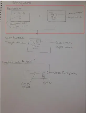
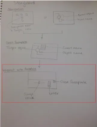
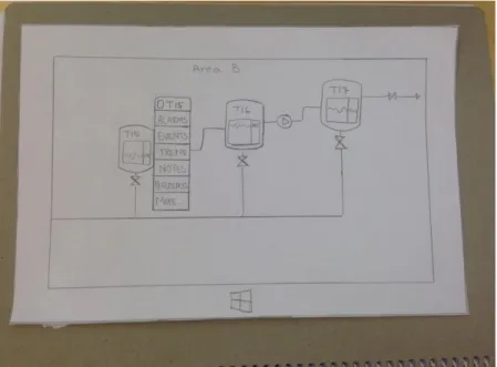
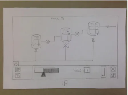
The figures below are pictures of the storyboard for the chosen use case. Figure 3 represents the storyboard for the use case, with the “navigation-task” inside the red frame. It represents how the user can use the navigation overview to navigate to the display where the target objects process graphics display is represented, by tapping the area with the same name as the process graphics display that contains the target object. Another alternative would be to tap the parent object to the target display, where the tag showing the parent name is possible to activate. Figure 4 represents the storyboard for the use case, with the “open faceplate-task” inside the red frame. Here, the faceplate could be open either by tapping the object which faceplate should be open or through its context menu, depending on the implementation. Figure 5 represents the storyboard for the use case, with the “interact with faceplate-task” inside the red frame. In it, the user could set values and close the faceplate by interacting with elements inside the faceplate.
Figure 3. The storyboard with the “navigation-task” inside the red frame.
Figure 5. The storyboard with the “interact with faceplate-task” inside the red frame. 4.3 Low fidelity prototype
A low fidelity prototype involving all the functions needed for the chosen use case was created to test and evaluate the intended implementation of the system. To be able to create a prototype that took usage of the current systems advantages and also to find its current limitation it was necessary to gain understanding of how 800xA works today. It was also important to gain knowledge in how the current process graphics was
designed. The approach going in to the sketching-phase was to “start with a blank page” and not just implement touch gestures for the current process graphics. However, the user needs to feel safe when using the system because of the often big security issues the system is involved with, and thus need to feel familiar to it when using it on a touch screen also. So the design created was focused on similar functions and symbols to the current system, so that users would feel familiar with it and therefore also safe when using it [19, p. 90].
4.3.1 Low fidelity prototype functions
In order to implement a prototype for the chosen use case that both was suitable for touch and had similar functions to the current system, the functions needed for the selected use cases was evaluated.
4.3.1.1 Navigation
In the current system each “click” on a graphical elements is navigating the user deeper into a specific part of the process if a “click” is programmed to generate navigation. To navigate “upwards” in the hierarchy the user can click an arrow pointing to the left, which represents the action of going up one step in the hierarchy. The navigation can for example also be done through menus available in the graphical user interface where each element in the menu represent a specific process graphics display of the system.
The elements in the list can be sorted by their name, on their place in the hierarchy or something else.
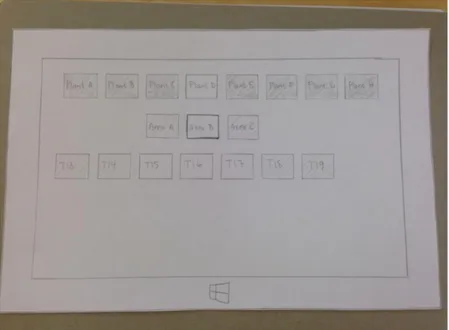
For the touch based prototype these ways to perform navigation were modified, but the base concept was kept. Interacting with an object would navigate the user to its graphical representation if it had one and the possibility to navigate between current and previous process graphics display was kept. To obtain fast navigation within the hierarchy, a hierarchy like list view was implemented, represented in figure 6. This was done due to the use case the prototype was created for. If maintenance is needed, like the operator gave as an example as use case for touch based system during the field study, it is the processes close to and connected to each other that has to be navigated too quickly. Therefore an overview was used where the process graphics displays was ordered by their position in the hierarchy. Elements in the same row had the same hierarchal level. Elements above an element represented displays at a higher level, and elements below displays at a lower level.
Figure 6. How the hierarchy navigation overview was represented in the paper prototype created. 4.3.1.2 Hover
When the cursor hover an object in today’s system it is common for three things to happen. The first thing that can appear during hovering of an object is a textbox shown directly under the cursor, either containing the name of the object or any other information that has predetermined. This is called a “tag”. The second thing that can be trigged by hovering is that the object and some of its surrounding “pop out” in the graphics. This indicates that the object is clickable. The third thing that may happen when an object is hovered in the process graphics is that the mouse cursor change shape into a “pointing hand”. This also indicates that an event is going to happen if it is clicked. There are several events that may happen, it may navigate the user deeper into the hierarchy or trig its default aspect for example.
All these functions are something the users of the systems are used to. Hover is, however, a mouse specific function. Dragging the finger over the display, making it act as the cursor,
goal to obtain with the hovering. Hovering while using touch is therefore not best practice when considering the user experience [23]. So instead of coming up with a hover solution for touch, possible touch based solutions for the functions that hover generates in the current system was evaluated individually.
Having the function that changes the cursors look from an arrow to a pointing hand was eliminated from the touch based user interface, since there was no indicator used to show where the touch was made on the screen. Having the possibility to see the name or other added information shown in the tag appearing when hovering could however be valuable for the user during touch interaction too. Showing the name could for example be useful when navigation is needed. Three basic approaches was found that had the potential to be implemented: always showing all the tags, having a button to turn on and of the visibility of the tags or having a gesture to turn on and of the visibility of the tags. Due to the already large amount of output being represented on the screen, and the fact that the system may be used on smaller screen like a tablet, the first suggestion was discarded. Instead the two other options was evaluated during the user tests, by using the part of the paper prototype shown in figure 7. During these test it was also evaluated if it was suitable or not to show the areas which are clickable at the same time.
Figure 7. How a process graphics display in the paper prototype created looked when the tags for each object had been activated.
4.3.1.3 Context menu
Clicking a graphical object can, as mentioned, generate navigation. It can also cause the objects default aspect to be opened. This is the aspect that is predefined to be shown for that specific object, for example its faceplate. To open other aspect, the user needs to open the context menu of the object. This is done by right clicking it in the current system. The context menu then appears next to the object that it belongs to, and is represented by a list of items. This context menu was kept in the touch based prototype as shown in figure 8, since accessing different aspects of an object is an important part of the system. It was however modified to be better suited for touch by making the target area of each item bigger, keeping the fat finger-problem in mind.
Figure 8. How the context menu was represented in the paper prototype created.
4.3.1.4 Faceplates
Faceplates are often the default aspect of an object. If it is, it is programmed to appear when the specific object is clicked. The faceplate appears as a window that the user can drag and drop on the screens. Faceplates was considered an important function in the prototype created since it is used to control values involved with the process, but instead of having it as a window that could be dragged and dropped, it always appeared on a fix area. This was done since the use case was for one screen only, so dragging and dropping it between different screens would not be possible. Having a menu at the bottom of the screen showing all opened windows was also not implemented, since it would take up unnecessary space.
The area that it appeared in was chosen to the bottom of the screen, as shown in figure 9. The reason for this was that the graphical representation of the process most commonly has a flow starting at the left and ending to the right, so having it appear on either side of the screen would often mean that part of the process would be hidden. Having it placed in the bottom instead of the top was due to two reasons. The first reason was that if a large screen would be used, the user would be able to better reach the faceplate when positioned at the bottom. Secondly, having it at the bottom would make it possible for the user to see the graphics displayed while changing values. If it had been placed at the top, the hand and arm would have obstruct part of the screen. The amount of input handlers, i.e. input control elements that can be used to set values and settings for objects in today’s system, was in the paper prototype limited to one slider due to the time limit.
Figure 9. How the state when the faceplate had been opened was represented in the paper prototype, with everything inside the bottom area as the faceplate.
4.3.2 Exploratory test setup
The suitable gestures to use when interacting with the system was evaluated based on an exploratory test, appose to predetermine a gesture set. Six persons participated in the test, who all worked at ABB at the time and who all had knowledge about the how the current desktop computer system of System 800xA works to some extent. The tests was done one person at the time. Before the test began the purpose of the test was informed and it was explained that there were no right or wrong gestures. Description of precise gestures was avoided so that gestures that seemed natural to the participants, according to their mental model, was performed in an as large extent as possible.
The low-fidelity prototype was created with a pencil and paper. First, the user was shown a paper representing a surface with the process graphics of a system displayed on the screen. Then a new paper was shown, representing what would be displayed on the screen if a specific action had been taken, for example if a faceplate had been open. The specific action was also explained to the participant when the new state was shown. After this the paper representing the new state was removed so that the participant had the previous state in front of them again. The participant was then asked to perform the gesture they thought would generate the state that just had been removed to be displayed on the screen.
During the test the gestures made by the participants was written down, along with any additional comments that were made. If something was unclear, like for example if the participant did not understand what the paper was representing, it was explained. Suggestions to possible solutions was also discussed if the participant got stuck. The following activities and there corresponding gestures where preformed during the test:
1. Navigate to the process graphics display for a specific object 2. Activate tags
3. Open faceplate for a specific object 4. Change value in faceplate
6. Navigate back to first process graphics display 7. Navigate to second process graphics display again 8. Open context menu for a specific object
9. Close context menu
10. Open the navigation overview
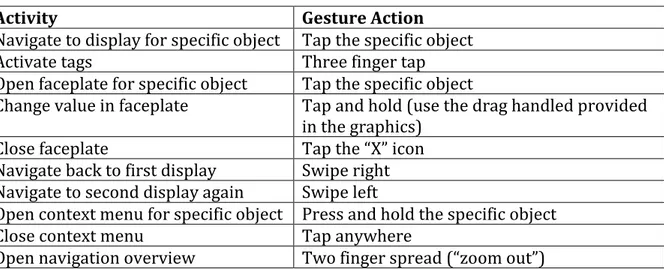
The activity “Navigate to the process graphics display for a specific object” more specifically meant that the process graphics display for a specific object represented as an element in the current display was to be opened. Before the test was made, the gestures set in table 1 was created by the author of the report, as a hypothesis of what gestures that was going to be perceived as suitable by the participants of the test.
Table 1. Hypothesized resulting gesture set for the exploratory test.
Activity Gesture Action
Navigate to display for specific object Tap the specific object
Activate tags Three finger tap
Open faceplate for specific object Tap the specific object
Change value in faceplate Tap and hold (use the drag handled provided in the graphics)
Close faceplate Tap the “X” icon
Navigate back to first display Swipe right Navigate to second display again Swipe left
Open context menu for specific object Press and hold the specific object
Close context menu Tap anywhere
Open navigation overview Two finger spread (“zoom out”) 4.3.2 Exploratory test results
All the gestures, the frequency of that gesture and additional facts registered during the exploratory test conducted for each task is presented below.
Navigate to the process graphics display for specific object Gestures made:
6 out of 6 users tapped the specific object. Comment:
The gesture seemed intuitive to all users. Activate tags
Gestures made:
3 out of 6 users suggested to add an icon to tap. 2 out of 6 users had no suggestion.
1 out of 6 users did a finger spread using all fingers. Comment:
No one of the users did any gestures straight away. The location of the icon that was asked for was both suggested to be in a hidden menu and to always be visible. How the icon was to be used also differed, both to tap to activate/tap to inactivate was suggested as well as a tap and hold icon to view
Open faceplate for specific object Gestures made:
4 out of 6 users tapped the specific object.
2 out of 6 users tapped the specific object twice, like a “double tap”. Comment:
Not as intuitive as for the first task. Double tap was mentioned as a possible suggestion by some of the participants who did the single tap at first.
Change value in faceplate Gestures made:
4 out of 6 users used the drag handle through hold and drag
1 out of 6 users tapped the number and wanted to write the number through a numbered keyboard.
1 out of 6 suggested both of the above depending on how specific the number had to be
Comment:
The numbered keyboard was expected to appear somewhere to the right on the screen.
Close faceplate Gestures made:
4 out of 6 users tapped the ‘X’.
2 out of 6 users did a “swipe down” motion starting at the faceplates top. Comment:
It took some time for some of the users to find the ‘X’ located in the upper right corner of the faceplate. One of the users how suggested the “swipe down” motion later suggested tapping the “X” as an alternative.
Navigate back to first process graphics display Gestures made:
3 out of 6 users swiped right.
2 out of 6 users suggested to add an icon to tap. 1 out of 6 users swiped from top to bottom. Comment:
The icon suggested to add was an arrow pointing to the left located in the above left corner.
Navigate to second process graphics display again Gestures made:
6 out of 6 users tapped the specific object. Comment:
2 out of 6 users said that swipe left could be an alternative, but everyone initially tapped the specific object that they wanted to open the process graphics display for.
Open context menu for specific object Gestures made:
1 out of 6 users suggested to add an icon that could be tapped Comment:
The behavior of the context menu that was expected differed among the users. 2 out of 6 expected that the context menu would go away when the finger was lifted, the other 3 did not expect this behavior. Everyone however thought it would be better if it did not disappear after the finger was lifted. Close context menu
Gestures made:
4 out of 6 users tapped the background. 2 out of 6 users lifted their finger from object. Comment:
When lifting the finger from the object was suggested, it was expected that the context menu had the behavior that not was perceived as the best one in the previous task.
Open navigation overview Gestures made:
3 out of 6 users suggested to add an icon to tap 1 out of 6 did a finger spread using all fingers 1 out of 6 users swiped from top to bottom 1 out of 6 users swiped from bottom to top Comment:
The added icon was suggested both to always be shown and to be in a hidden menu. When the swipe motions where made they all started from “outside” the screen.
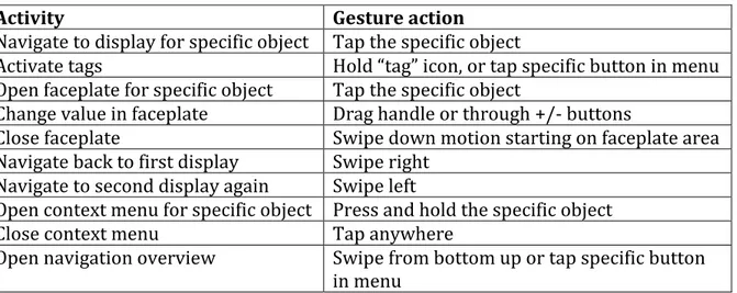
4.3.2.1 Gesture set chosen
The tablet used during the assessment tests did not provide the option to turn Windows 10 specific gestures off. Those gestures include gestures starting at every edge of the screen. Those kind of gestures was therefore not included in the final gesture set, which is represented in table 2.
Table 2. The resulting gesture set.
Activity Gesture action
Navigate to display for specific object Tap the specific object
Activate tags Hold “tag” icon, or tap specific button in menu Open faceplate for specific object Tap the specific object
Change value in faceplate Drag handle or through +/- buttons
Close faceplate Swipe down motion starting on faceplate area Navigate back to first display Swipe right
Navigate to second display again Swipe left
Open context menu for specific object Press and hold the specific object
Close context menu Tap anywhere
Open navigation overview Swipe from bottom up or tap specific button in menu
![Figure 1. Figure representing how the navigation works in the desktop interface for System 800xA [4]](https://thumb-eu.123doks.com/thumbv2/5dokorg/4538343.115256/6.892.285.606.472.710/figure-figure-representing-navigation-works-desktop-interface-xa.webp)