Designing for Memory in UX
Practice
From transaction to relatedness in Sign up-forms
Martin Lindeborg
martinlindeborg@gmail.com Interaktionsdesign Bachelor 22.5HP Spring/2019Abstract
This thesis explores how you can design for a positive memorable experience; more specifically, a sign-up and subscription process for the newspaper Sydsvenskan is investigated. To design for memory matters as memory affects the experience, future decisions and behaviour.
The thesis relates to theory on designing for memory and relatedness, as well as insights from influential designers, on how to design memorable sign-up experiences. The main theoretical point of departure is the theory of the peak end rule. The scientific method used is research through design, and three different interactive prototypes are used as explorative material in order to conduct usability and user experience research.
Exploring peak and peak end theory findings show that design in combination with trigger elements can create positive memorable experiences. The trigger elements examined are; tonality of language, imagery, user experience and user interface. Also, unexpected elements were explored, in this study e.g. a historical newspaper frontpage from the user’s own date of birth was used.
The result shows that it is possible to design an experience that travels from the main purpose of a sign-up transaction to user experiencing friendliness and relatedness with a product or service.
Keywords: Memory Design, Interaction Design, User experience Design,
User interface Design, Peak end-rule, Sign up-processes, Payment-processes, Subscription-processes
Acknowledgements
First of all, I want to say a big thank you to my supervisors Maliheh Ghajargar, Malmö University, and David de Léon, inUse. I also want to thank David Nyman from Sydsvenskan, Joakim Berglund from Bilder i Syd, Emelie Björk, Ed Damron and most importantly the participants in my study that helped and contributed to this thesis project. Thanks to my friends at Visma for moral support and inspiration. Writing a thesis can sometimes be emotionally and practically hard; thank you Terese Anving for always being there for me and thank you Elise and Alina for keeping me focused and distracted with what is most important.
1 Introduction ... 7 1.1 Purpose ... 8 1.2 Contribution ... 8 1.3 Delimitations ... 8 1.4 Ethical conduct ... 8 1.5 Research question ... 9
2 Background and related work ... 10
2.1 Designing for memory ... 10
2.2 Sign up processes relevant for memory design ... 11
2.3 Peak end, user context and relatedness ... 11
2.4 Experience design ... 12
2.5 Insights and design principles from influential designers ... 13
2.6 Summarize on usage of theory and background knowledge ... 15
3 Collaborations and related design ... 16
3.1 Collaborations with Sydsvenskan and Bilder i Syd ... 16
3.2 Current solution for sign-up and subscribing at newspaper Sydsvenskan ... 16
3.3 An example of an innovative subscription process: New York Times 18 3.4 Summarizing and moving forward ... 21
4 Methodology ... 22 4.1 Interviews ... 22 4.2 Prototyping ... 23 4.3 Usability tests ... 23 4.4 Numerical scale ... 24 4.5 Affinity diagrams ... 24 5 Design process ... 25
5.1 Initial interviews with contributors and collaborators ... 25
5.1.1 Interview with David Nyman at Sydsvenskan ... 25
5.1.2 Interview with Joakim Berglund head of Bilder i Syd ... 25
5.2 Usability tests of newspaper Sydsvenskan current solution ... 26
5.3 Sketching and prototyping on paper ... 27
5.4.1 Newspaper frontpage from date of birth ... 30
5.4.2 Conversational sign-up prototype ... 32
5.4.3 Short Mobile sign-up prototype ... 35
5.4.4 Calculator sign-up prototype ... 36
5.5 Pilot usability tests of the prototypes ... 39
5.6 Main usability test study ... 39
5.6.1 Participants in the main study ... 39
5.6.2 The main usability tests ... 40
5.6.3 Interviews after usability testing ... 40
5.6.4 Numerical scale after usability testing ... 41
5.7 Second iteration of the prototypes ... 41
5.7.1 Second iteration of Conversational sign-up ... 42
5.7.2 Second iteration of Calculator sign-up prototype ... 42
5.8 Follow up interviews after Usability tests based on memory ... 43
5.8.1 Numerical scales after passing of time ... 44
5.9 Analyzing insights from Usability tests and interviews using creating and affinity diagram. ... 44
6 Results ... 46
6.1 Usability tests and following interviews ... 46
6.1.1 Newspaper frontpage from date of birth ... 46
6.1.2 Short Mobile sign-up prototype ... 48
6.1.3 Conversational sign-up prototype ... 48
The second iteration of the prototype ... 50
6.1.4 Calculator-prototype ... 50
The second iteration of the prototype ... 51
6.2 Numerical scales ... 51
6.2.1 The Conversational sign-up prototype pie charts ... 52
6.2.2 Short Mobile sign-up prototype pie charts ... 53
6.2.3 Calculator sign-up pie chart ... 54
6.3 Follow up interviews on memory ... 55
6.3.1 Relatedness and personal relevance as a carrier for memory .. 55
6.3.2 Memories from newspaper frontpage from date of birth. ... 56
6.3.3 Tonality of language ... 56
6.3.5 Narrative imagery ... 57
7 Discussion ... 59
7.1 Value ... 59
7.2 Critique of own work ... 59
7.3 Future direction ... 60
8 Conclusion ... 61
1 Introduction
This thesis is going to explore how different design elements could form experience and memory of a sign-up process for the newspaper Sydsvenskan. Research through design methodology (Arvola, 2014) will be applied using the design artefact as a means for research. The thesis is written in collaboration with the company inUse. InUse is a consulting firm working with user experience, in the forefront of innovation.
In the field of interaction- and user experience design, there is an important correlation between experience and memory. The aspect of a positive impression or memory design is becoming increasingly important in a world in which interactive solutions are competing to keep users’ attention, and to persuade users to maintain their interest in a specific product. Signing up for services is something we do almost on a daily basis, something that we do not particularly reflect upon as memorable, but is in fact our first initial contact with a service or product. To design for a positive memory or relatedness in a sign-up process could be the first crucial step for the user to become a loyal and returning customer. To create relatedness and a positive memory of your solution or product could be the difference between users continuing to use it or moving to the next one, resulting in success or failure for your service or product. The word positive in this context doesn’t necessarily mean an interaction with no friction or difficulties involved. It is a solution or experience that gives the user a positive memory of the interaction.
One of the founding theories for designing for memory is the peak end-rule. This theory was initiated by Daniel Kahneman, Barbara Fredrickson, Charles Schreiber and Donald Redelmeier (Kahneman et al. 1993). In Redelmeier and Kahneman's paper “Patients’ memories of painful medical treatments: real-time and retrospective evaluations of two minimally invasive procedures” (1996) they focus on the idea that peoples’ memories of an experience are based on a rough average of the most intense moment (the peak) and the final moment (the end). Kahneman and Redelmeier argues that we have an experience self and a remembering self, and the remembering self is the main decider that determines future decisions and actions. The way we remember is not rational. The actual experience in the now is a stream of impressions and experiences, but the memory of the same experience is a collection of snapshots or key moments.
There are potentials to explore and be inspired by the peak end-rule theory when designing for better and to a larger extent more memorable user experience design. One can inspire design thinking in creating satisfying ends with correlating peaks to interactive solutions or experiences.
In this thesis the aspects of this theory are going to be explored and inspired by implementing them in a concrete user context. This context is the user scenarios of signing up for a subscription for a newspaper, Sydsvenskan. The disposition of this thesis is going to be as follows: first I will present a theoretical background on the peak end-rule, memory design and best practices for designing sign-up processes. Thereafter I will present and discuss my design process including; interviews with relevant partners; sketched solutions and paper prototypes; hi-fi prototypes; usability tests; interviews and numerical scales; repeated memory-interviews and numerical scales. Finally, I will analyse the material through using affinity diagrams.
1.1 Purpose
The purpose of this thesis is to explore how different design elements could form experience and memory of a sign-up process for the newspaper Sydsvenskan.
1.2 Contribution
The thesis has both a theoretical contribution and a design contribution in the form of interactive prototypes. Memory theories such as the peak-end rule have been explored to a great extent within in the field of psychology, but not within the field of user experience and interaction design, particularly not in the user context of a sign-up subscription process for a newspaper. This thesis will bring methods and design forward within the field of interaction and user experience when looking into aspects of how to design an experience that will give the user a lasting positive memory of it. These aspects could in turn form key insights that many designers and companies could gain from in order to create successful solutions that last.
1.3 Delimitations
The usability tests have been conducted in different contexts and environments with participants having limitations such as time, mood and state of being. There is also a time limitation in this thesis project that have to be taken in consideration. If I would have had even more time, I would have considered including more participants, making more interviews and usability tests in order to further refine my prototypes and insights.
1.4 Ethical conduct
For this thesis I have applied the general rules about ethics in research and ethical norms that The Swedish Research Council list in their document Good
research practice (2017).
Since I have been cooperating with the company inUse, these ethics have also been clarified and discussed and agreed upon with them. Before meeting with the participants, I also explicitly told them that my study was done in
cooperation with inUse and that the results could be used by them in the future. I also informed them that they would be anonymous in the thesis, meaning that all names have been changed. People have subjective experiences and memories of an experience; there is an ethical problem in what design can make people do, as in relation to different kinds of decision making.
1.5 Research question
How can the experience of design elements form and influence memory in an interactive sign-up form process?
2 Background and related work
This thesis has a number of different theoretical points of departure when designing for memory and sign-up processes both from an academic standpoint and from influential designers within the field of user experience design.
2.1 Designing for memory
It has been argued that design for memory in combination with experience is the way to move forward when designing with the peak end-rule in mind (Arledge, 2016). Miron-Shatz et al. argues that there are challenges when designing for a positive memory of an experience. Through experiments they found that negative memories and unfavourable feedback have stronger impact than positive ones and therefore create a larger memory-experience gap. This has different effects on cognition, memory and motivation. One explanation could be evolutionary, that negative memories have served as a kind of warning function in the evolution of humanity and human behaviour (Miron-Shatz et al., 2009). Altogether this means that forming a positive lasting impression comes with a number of challenges that needs to be kept in mind.
Daniel L. Schacter, the author of Seven sins of memory (2002) writes about of the failure of the human mind and memory. Schacter refers to some main issues, or as he put it, sins. His framework is most relevant for memory design.
This framework includes; transience, the cause of many memory issues, the fading and loss of memory over time. It is not hard to remember what you were doing a couple of hours ago, but soon you remember less. This is an interesting design opportunity for interaction designers. Absent-mindedness is another issue, that the relationship between attention and memory is failing, that we are preoccupied with other issues and concerns and not focusing on things we need to remember. There are number of issues that have to do with memory being distorted, such as misattribution aligning a memory to the wrong source. Another challenge when later doing interviews about what participants remember is suggestibility, the issue of memories being implanted through comments, leading questions or suggestions: asking leading questions or comments will help participants remember correctly or incorrectly a previous situation or sequence of events or visuals. The last sin, or issue relevant for this thesis that Schacter brings up is bias, one of the most evident and most powerful influences: we are biased by our current knowledge and beliefs on how we remember events from the past; our mind unconsciously edits and rewrites parts of previous experiences. Schacter don’t see these issues or sins as human weaknesses but as a ways of
understanding the adaptive strengths of human memory (Schacter, 2002, p. 13-15).
2.2 Sign up processes relevant for memory design
Cockburn et al (2017) suggests that one way go forward exploring design for memory is the scenario of sign up-flow as a sequence. Sign up processes are not intended to be exceptionally memorable, since they are a path or a sequence the user needs to get through in order to reach the goal. However, if you can design a sign-up process that lets the user have a positive experience, that somehow reflects upon what is to come when you reach the end of a sign-up process the this could be an initial step of creating relatedness and loyalty with customers.
Don Norman (2005) argues that loyalty building grows from reflective emotions when the users engage themselves and gets personally connected with an experience. If you manage to create emotional value for the user signing up, the likelihood of a long-lasting relationship to the product will increase. However, it is not likely that every user will recognize or experience the same satisfaction or engagement. Norman further argues: “With the large range of individual, cultural, and physical differences among the people of the world, it is impossible for a single product to satisfy everyone.” (Norman 2005, p. 40-41) and this could be one expected outcome of my research. A sign-up process could also have transformative qualities. Cooper et al. argues that there are four levels of user involvement when buying a product. The user starts with being Curious, to seeing oneself as a Beginner starting to use the product, and then evolves further to Perceptual Intermediate were the user feels in control and has an understanding how the product works and how you can use it continuously. Finally, the user becomes an Expert, and is in full control of the product.
In the context of a newspaper sign up the challenge is the fact that the subscriber needs to travel from being Curious to Perceptual Intermediate, in order to establish loyalty behaviour because, as Cooper argues, no one likes to be a Beginner for a longer period of time (Cooper 2014, p. 237-239).
2.3 Peak end, user context and relatedness
Within the peak end-rule theory it is argued that peoples’ memories of an experience are based on a rough average of the most intense moment (the peak) and the final moment (the end) (Kahneman, 2016). Previous studies using this theory have been done within the field of psychology. These studies used physical elements like pain or positive experiences related to receiving gifts. When it comes to the area of interaction design you don’t have the same elements of pain and pleasure, instead one could work with feelings connected to a particular task. These feelings could be frustration or satisfaction, experienced ”in the moment”. Another important aspect related
to user experience and memory is when and where those feelings occur. Cockburn et al. (2017) writes about this as sequencing effects which can impact the user experience and the aspect of positive experience wanting to return to a specific solution or interaction.
There have been relatively few studies made, with mixed results, when exploring and experimenting with peak end-rule, sequencing effects and experiences and this therefore needs to be researched more extensively within interaction design. Researchers (Hassenzahl and Sandweg, 2004; Gutwin et al., 2016; Cockburn et al., 2017) have done a series of experiments on evaluating sequencing effects to explore the peaks end-rule.
An example is a controlled testing environment with different screen interactions with for example two sequences of interactive pages with a series of sliders that people doing their user-tests should set to target values, and choosing which one of them they preferred. The result from experiments was that peak-end effects can significantly influence user’s preference for interfaces. Design implications of these findings suggest that simply altering the presentation order of interface components can impact remembered subjective experience (Cockburn et al., 2015).
Gutwin et al. (2016) found that peak-end manipulations are not always translating to positive memorable experience. Cockburn et al. (2015) found that they need to structure the design for both peaks and end-peaks in order to get a result, and that the result had substantial subtleties in their impact. Therefore, they point out that this phenomenon needs further research. In this thesis the peak end-rule theory is used as an overall framework guiding design decision and evaluation. This means that the theory is explored and not fully implemented. The focus is on user context or a scenario for the users to draw upon could be important for self and goal-relevance for the participants doing the usability tests (Miron-Shatz et al., 2009). User context and a particular scenario warrant further exploration. In a reflection over future research, Cockburn et al. (2017) briefly mentions sign-up and check-out scenarios as a way to move forward but does not go further in this direction. That is what this thesis is partly going to explore using aspects of the peak end-rule when designing.
2.4 Experience design
Experience design means the practice of designing with focus on the user experience to make relevant solutions or artefacts. Important aspects are the moments of engagement between users and interactive artefacts or solutions and the ideas, emotions, and memories that these moments create. Agarwal & Karahanna (2000) writes about cognitive absorption and flow with interactive technology as important aspects of forming a positive experience of perceived usefulness. They also list five dimensions that can pinpoint a positive experience from the user’s perspective: 1. Temporal dissociation, the
inability to notice passage of time. 2. Focused immersion, the experience of total engagement. 3. Heightened enjoyment, capturing pleasurable aspects of interaction. 4. Control, the user’s perception of being in control when interacting with an artefact or solution. 5. Curiosity, that the interaction stimulates cognitive curiosity (Agarwal & Karahanna, 2000). Kahneman et al. uses a similar term, duration neglect (1993), that seems to describe the same dimension as Temporal dissociation, a theory which suggest that how long something takes is not as important for the experience as one could expect.
2.5 Insights and design principles from influential
designers
In this section related design principles will be presented. Luke Wroblewski (2018) writes that if you want to build long term, loyal and returning customers unclear flows and UI that captures users, which will enhance company growth but fail to deliver a likable service, is not a good strategy. Common design patterns like a splash screen in a sign-up form with terms and conditions and tutorials seems right in wireframes but fails to solve the customer’s needs if you haven’t designed with customer needs and goals in mind.
With this in mind you should quickly as possible move through the steps that meet these needs and set expectations of the user. For example, clarifying price and possible limitations early on. With this approach you minimize the possibility that the users don’t finish the onboarding process in frustration and disappointment with their memory of using the service coloured by this experience.
Wroblewski also pinpoints that you should make sure that the users feel like they're making progress towards their goals, not the company or service goals. He also stresses timing as an important aspect. It's not just about what we ask users to do, it's also important when we ask them to do a certain task. When demanding input sensitive personal data, it’s also important to explain why you need this data (Wroblewski, 2018).
Samuel Hulick(2014) argues about many companies have the wrong frame of mind or headspace when they are trying to sell features of a product, instead of focusing on how the features actually improves the user’s life. His model (Figure 1) refers to the Super Mario Bros game environment, that visualizing through game mechanics ,what a good onboarding process experience should feel like. The standard Super Mario character gets to represent the potential customer who meets your product and that result is an upgraded Super Mario who is bigger and can throw fireballs. In the context of onboarding, it’s not only a model of game mechanics but a fundamental thinking model focusing on how the customers should feel and experience when signing up for a service (Hulick, 2014).
Figure 1. Image from Samuel Hulick book The Elements of User Onboarding - The Official Primer from UserOnboard. Used by permission by the author.
Kathy Sierra (2015), author of Badass, making users awesome, also stresses that an experience should have what she calls “transformative qualities” (Sierra, 2016), a flow that takes you through transformative experience, that somehow takes the user from its normal state to an extraordinary world. Aspects of that state will transform to a new normal state were the user feels more alive, more human. This, Sierra describes has lot to do with UI elements, that it’s not just about animation and things moving, but also about the user experiences and how users step away and remember the experience. Sierra refers to it as “post ux, ux”, or what happens after what happens: how are the users changed and what do they say about their experience (Sierra, 2016).
Sierra also points out that language and tonality are important for the experience of an artefact or experience being human. You want to interact with something that is human. Conversational language makes people to pay more attention than dry academic language; the brain kicks into conversation mode even with a ”nonhuman” UI. If the UI or interaction also acknowledges that the user is in fact human, acknowledging at the right moment that humans struggle (or potentially struggle) with interactive artefacts is a key to the user experience.
Compelling context that is easy to understand is also relevant, in keeping user’s attention, insuring that what the user wants to achieve is stimulating for memory purposes. Sierra also brings up how imagery can evoke feeling
and reaction and relatedness and could be important for the brain’s attention and memory. Sierra argues further about using unexpected narrative elements when designing, that for example pictures of puppies as imagery only works once to get the brains attention(Sierra 2015, p 255-261).
2.6 Summarize on usage of theory and background
knowledge
Here I will summarize how I will use theory and background knowledge in my design process.
• The peak end-rule theory will be used as an overall framework for exploring and guiding design decisions and evaluation, but, as discussed above, it will however not be fully implemented. Related work on the peak-end rule theory will further be discussed throughout the thesis.
• In the design process insights on user goals, relevance and loyalty building from Norman (2005), Wroblewski (2018), Hulick (2014) and Sierra (2015, 2016) will be incorporated as well as challenged. When designing for memory insights from Sierra (2015, 2016) will be used. • For observing and analysing participants reactions when doing usability tests I will take my point of departure in the five dimensions defined by Agarwal & Karahanna (2000).
• Schacter’s (2002) framework on memory will be referred to and reflected upon in the section on conducting follow up interviews and in the result section.
3 Collaborations and related design
3.1 Collaborations with Sydsvenskan and Bilder i Syd
In the process of this thesis I wanted to create partnerships that also came as close as possible to a real design partner. Through a previous working relationship with the local newspaper Sydsvenskan, I knew that their design and innovation department were not happy with their current solution. One of the problems was that the current solution was old and not meeting today’s needs and demands for a pay and sign-up process. Several parts of the solution worked poorly from a usability perspective and had mechanical and unfriendly feel-to approach to the subscriber, demanding personal information sometimes without explanation. A general situation was people subscribing and within a short period unsubscribing not continuing using their news service. This gave relevance for this thesis having a partner with real needs, thoughts and wishes for what the subscribers should experience and remember.
In a first meeting I introduced some of the initial theory on user memory and why that could be an important factor for a future design. One idea that I had about creating relatedness was to work historic elements that could have personal relevance for subscriber. Bilder i Syd is the company that has the rights to the archive of newspapers and images. They have a service where you can search for the newspaper frontpage of your date of birth and then order a printed and framed version of that frontpage to hang on your wall or give as a gift to someone on their birthday. We decided that this could be an interesting way of exploring relatedness and memory of the subscriber of Sydsvenskan by incorporating this in the sign-up process. So, it was agreed to involve them as a partner and they later accepted to be a part of this thesis project.
3.2 Current solution for sign-up and subscribing at
newspaper Sydsvenskan
To get a deeper understanding of the current solution of newspaper Sydsvenskan subscribing solution, I went through and analysed the current experience of signing up for a subscription.
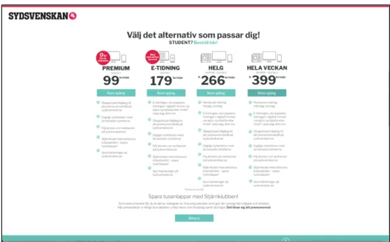
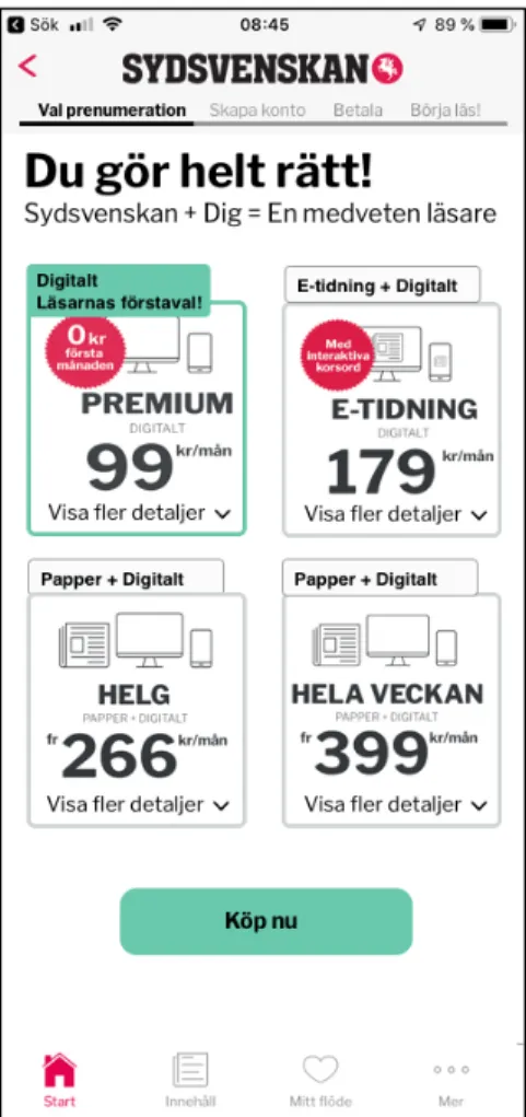
The large screen solution starts with a green subscribe button on the main news landing page, that takes you to the subscription option page where you are presented with four main subscription packages (Figure 2), with range bullet point facts features about the different packages, and a fifth student alternative separated from the four others with just a green clickable link. Although details about the different options are there, it’s still hard to get a quick overview for your decision. It’s also presented in a way that serves the company in presenting what they offer, that the information is there but not
really helping the user or subscriber to make the best decision based on their needs.
Figure 2. Subscription options with details for newspaper Sydsvenskan
After you have chosen your package you will be redirected to the third feature which is the actual sign-up form statically designed to fit a mobile screen but too small and minimal for a larger screen (Figure 3). The sign-up inherits a lot of the features and feel as from an analogue paper form, with input boxes to fill in in a six-step process with a red button to proceed in each step.
Figure 3. Sign up flow for newspaper Sydsvenskan.
The only feedback you receive is that the field you completed turns discreetly green with and edit button next to it. There is no explanation for why they need certain information, it is just requested. This could be a potential
problem for the user and could easily result in the user feeling lost or questioning why the newspaper needs certain information. That could result in the user aborting the sign-up process. To the right there is a static image that doesn’t change as the sign-up process proceeds.
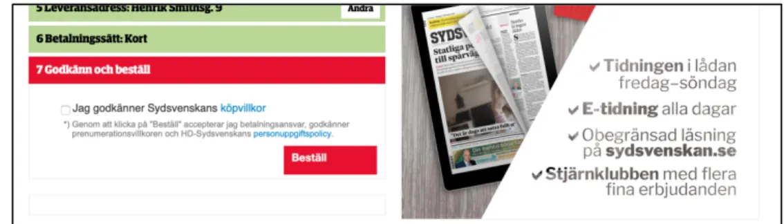
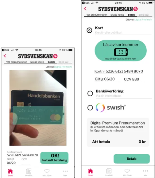
Later in the process I see two serious cognitive problems for the user signing up. The first one is that after the user has been asked to put in their personal identity number and then press the red proceed-button for collecting unknown for the user personal information. After you have done this it is confirmed that the intention for collecting your personal identity number is for the newspaper Sydsvenskan to have the correct address when delivering the newspaper. It is explained that the newspaper will be sent to your official, registered address but not showing the actual address. This could be for GDPR registering and data privacy reasons, but this is very unclear. If the user wants to check if they have the correct address, they must push an edit button leading not to confirmation but to ten input fields for manual completion. After having put in your information you will be directed to a final field that lets the user acknowledge and confirm terms and conditions (Figure 4) and your order without registering a card or other payment options.
Figure 4. Newspaper Sydsvenskan terms and conditions and order-page.
The green field above says “Payment option: Card”, indicating that payment details have been registered, but the option lacks an edit button leaving the user with only the option to confirm their terms and conditions and order without knowing what is coming next and what kind of payment information that has been registered previously.
This leaves the user with a high risk of feeling confused and not feeling in control over the interaction and proceedings in this signup and payment situation and there is a high risk that the user will discontinue to the sign-up process.
3.3 An example of an innovative subscription process:
New York Times
From reading Suhr Hansen (2019) and then interviewing David Nyman from Sydsvenskan about subscription and sign-up processes it became clear that New York Times is in several ways in the forefront when it comes to
subscription processes. Their sign-up flow cannot be directly comparable with a local newspaper like Sydsvenskan whose product aim is to deliver news on paper and digitally to a limited regional customer group, while New York Times has digital subscribers all over the world. However, the New York Times solution is relevant because of their remarkable success in increasing the number of subscribers. They managed to increase the number of subscribers from 1, 5 million digital subscribers in 2016 to 3 million digital subscribers in 2019. The most common reason mentioned for their success is their ’intelligent’ paywall. Suhr Hansen argues that this is a simplification and suggests instead that it has to do with the company’s dedication to digital subscriptions and focus on two key areas. First, the price, their one dollar a week subscription marked as “Reader favourite”, that in reality is a four dollars a month subscription. Second, packaging makes it clear what the subscriber will gain when signing up and also makes it more appealing for the one on the journey to subscription. Third, they design for customer engagement and onboarding of new subscribers.
Their sign-up and onboarding team working with their solution consists of eight people (Suhr Hansen, 2019), so it is clear that they put recourses in this, focusing not only on content but also on a great sign up process, that inhibits qualities and design principles brought in section 2.4 Insights and design principles from influential designers. The main ones set expectations for
example price and possible limitations early on (Figure 5), letting the users feel they're making progress towards their goals, also having a very short sign-up process. They also design for timing, when things happen connecting to Cockburn et al. findings (2017) and explaining how and why, not really demanding sensitive personal data.
Figure 5. New York Times order and payment information
They also design the information flow throughout the process explaining how subscribing to the New York Times will improve the customers or user’s life. It’s also possible to access information about price options and explaining what they will get for their money when it is needed in the process acknowledging struggles or certain thoughts at the right moment in the process. While analysing this sign-up process it became clear that sign up process also can adapt with interactions not visible for the user up to a certain point, one example based on which kind of wi-fi you are connected to when signing up (Figure 6).
For example, going through the sign-up process connected to the IP-address of the University of Malmö can result in a pop-up sign asking if you are a student or teacher and offer discounts. This may feel intrusive for the user that the service tries to find out who you are, but could also be the user in a way being “seen” by the product, that the system or product knows you and wants to help you make the decision of becoming a subscriber.
After having gone through the sign-up process and discontinuing at the last moment before the paying, I quite soon got emails asking if they could assist me with my signing-up process. My social media account got filled with offers and adverts for New York Times trying every way to get me onboard as a subscriber.
3.4 Summarizing and moving forward
Insights on problems with the newspaper Sydsvenskan’s current solution will be the standpoint from where to start the design process. These insights will also shape in questions and qualities focused on when going forward with the methodology. New York Times current subscription solution will have a direct influence in how for me to go forward in the design process, working as a reference and source of inspiration in trying to reach certain qualities of user experience and user interface design.
4 Methodology
The overall approach of this thesis is Research through design. This is a methodology that explores new and alternative design solutions, to develop design proposals and evaluate effects of that design through research (Arvola, 2014). Gjoko Muratovski writes about this method as a “tool for innovation,
productivity and economic growth” (2016, p. p11-12) when studying
humanity rather than things.Zimmerman et al. (2007) presents a set of four criteria when evaluating Research through design: the first one is the Process, that the designer has to document the design process with enough detail that it can be reproduced by others. The second one is Invention: you have to demonstrate how your contribution advances the current state of the art of your design area. The third one is Relevance, a shift from what is true to what is real, that your design is relevant in the real world that achieves and provides support in why your solution is the preferred one. The last one is
Extensibility, that of being able to build on the resulting outcomes of your
research.
In my research I started out by doing interviews with collaborators and contributors in this project, thereafter I conducted usability tests on the newspaper Sydsvenskan`s current solution for subscription. I then started to sketch ideas and prototyped on paper. From these sketches I designed three different hi-fi prototypes upon which I did a pilot usability test on. During this time, I gathered nine participants, preparing and personalized the prototypes for each participant and then conducted test rounds with usability tests, interviews and numerical scales. After five test rounds, I made iterations on two of the prototypes and continued testing and interviewing. After one to two weeks I conducted follow up interviews and numerical scales based on memory of the previous usability tests with eight of the nine participants. To analyse the data, I used an affinity diagram as a way of clustering my insights. In the following section I will go through the different steps in more detail.
4.1 Interviews
I used interviews as a method to find out about people attitudes, opinions and ideas. For research purposes an interview is often between researcher and participant or participants. Interviewing could be seen as a balancing act between asking very specific questions and on the other hand open-ended questions depending on your purpose and situation. It relies upon a foundation of norms and patterns in order to be an effective method. For this thesis I have done semi-structured interviews as way of gaining new insights and deepening my knowledge. This method is both the primary research method when gathering background information and the secondary after
conducting usability tests to get more insights and reflections after the participants have done them (Muratovski., 2016 p. 60-62).
4.2 Prototyping
As you go through your design process, prototypes will undertake a variety of different complexities, from sketches on paper to a low-fidelity prototype visually looking like a user interface or parts of a user interface that you want to prototype. As testing and sketching your solutions progresses and feedback from the prototypes starts to inform you about your design, you can iterate and advance in your prototyping, making high-fidelity prototypes. High-fi prototypes can look like a finished or nearly finished product but may not have all the functionality that a finished product has, but enough to inform about and test certain aspects of the prototyped solution (Muratovski, 2016 p. 149). For exploration purposes I went into a prototyping and sketch part of the project. The aim was not to create one optimal solution, but to design and redesign with insights from Sydsvenskan as well as theoretical background on memory and sign-up process design. The prototypes were to be different and possibly imperfect experiences, experimenting with design that could trigger reactions, emotions, thoughts and memories to further explore my research question while challenging or confirming previously gained insights.
4.3 Usability tests
When planning and conducting usability tests it is important that you plan what aspects of your solution you want to test, and plan tasks for the participant to perform in a test that can give relevant information about your design. It should be clear were the task starts and ends in your user scenario. It is also imperative that you test several functions and aspects of your prototypes to see how the solution you want to test works as a whole. It is also a good idea to conduct pilot testing with colleagues or friends and family to make sure that the prototypes and the test in itself runs accordingly. While doing the usability tests, the participants is asked to think out loud when going through the given task. The participants should represent the target group you are designing for with a variation and range of different backgrounds relevant for your design. Before doing usability tests the participants need to be informed about the study and its purpose and give an informed consent when attending usability tests (Arvola 2014, p. 133-137). I conducted usability tests as a method of gaining in-depth knowledge and insights on how users react and interact in this particular design space as a way of informing you about your design. The tests help you to discover and identify problems that participants face when conducting the usability tests trying to reach the goal of the test.
4.4 Numerical scale
To identify responses from the participants doing the usability tests I used Numerical scales with bipolar words in relation to certain qualities. This is a method to measure the participants’ attitudes that is structured around a ranked scale from 1-5. These scales could later be visualized and differentiated as a part of communicating measurable insights (Muratovski, 2016, p. 127-128).
4.5 Affinity diagrams
Affinity diagrams are a way to categorize and thematise and analyse qualitative data. The method is about collecting facts and data, then grouping and clustering them in different categories. By doing this you can structure unstructured data and let it be the foundation upon which your insights are based. For this to be a successful method it is important to have qualitative and openly interpretative approach to your material (Arvola 2014, p. 52-53).
5 Design process
5.1 Initial interviews with contributors and collaborators
5.1.1 Interview with David Nyman at Sydsvenskan
To explore what Sydsvenskan would want the actual subscriber to experience and remember, I asked the design team at Sydsvenskan to reflect and discuss this matter. I then conducted an interview with David Nyman, Digital Art Director at Sydsvenskan about what their conclusions were. David talked about the following qualities and issues:
• The importance of the feeling of trust associated with them as publishers when you are signing up, that the sign up-process should initiate the same feeling, tone and experience as the product Sydsvenskan.
• It should give positive, friendly and a credible feel.
• The credible feel is important in relation to the so-called “alternative media” to state the place of journalism as important for democracy. • Tonality in language, a personal language is preferable, but it’s a fine
line to work with so that you still keep the tone of trust.
• According to statistics from Sydsvenskan about 70 % of subscribers sign up on a mobile device, so this needs to be acknowledged in the design.
• One problem Sydsvenskan has is that people subscribe and after a short time unsubscribe, therefore it’s important to create a positive experience and relatedness from the start for the news service and the company at large.
5.1.2 Interview with Joakim Berglund head of Bilder i Syd
To get an understanding how people perceive and react to these historical newspaper frontpages I interviewed Joakim Berglund, head of Bilder i Syd. The current setting is that you can order a framed printed version of a newspaper frontpage from their webpage, often given as a birthday present. In this setting his observations were:
• When given as a gift it often gets to be centre of attention in a social setting. People often gather around the newspaper to comment and react on its content and the time of its origins, working as a kind of narrative historic document to the person to whom it has been given. • Often this gift will generate a chain of events, the main one being a
kind of social reaction in which the recipient of this newspaper frontpage often will contact and order this gift for other friends’ birthdays.
When it comes to the actual news content, the news is not always good news, and that could possibly spur negative reaction and memories. As Joakim recalls, there has only been one occasion when he has been contacted by someone complaining about the actual content being negative, with bad news.
His answer to this particular idea about negative or bad news is that the person receiving it was actually born on that particular day, and that alone is a positive reference or experience. This will be something to consider and be aware of in the design process and when usability testing, if that is something upon which participants will react or reflect upon.
5.2 Usability tests of newspaper Sydsvenskan current
solution
To get more insights in the newspaper Sydsvenskan’s current solution for subscription I conducted four usability tests1 to get insights into what the main issues where with the current solution.
The participants experienced the current solution as mechanical and impersonal, more like a digital form that you need to go through rather than something that felt welcoming and friendly. The majority of the participants reacted negatively to the choice of colour of red as the main colour for sign-up flow. The red button for proceeding in the sign-sign-up process felt backwards as red is often associated with warnings or errors. Explanations as to why the subscriber needs to share their personal identity number were lacking. “I have no problem with sharing my personal identity number […] but my
mother for instance would not want to share her last four numbers of her personal identity number, she would have backed out of this” /Ella
Ella also experience difficulties and uncertainties which address the sign-up process actually uses based on the personal identity number, when she tries to find out by clicking the edit button, she ends up filling out ten input fields (Figure 7). She has trouble with filling out a legit apartment number and gets stuck until she realises that she can skip the field since it misses the small red obligatory red dot.
1These usablitity tests were done with three people not participating in the main study and one person who did. The reason for this was twofold: first, I wanted to keep the two tests as separate as possible and thereby minimizing the participants’ bias when participating in the main study. Second, the participants were not able to meet me more than twice and this thus turned out to be the most practical solution.
Figure 7. Newspaper Sydsvenskan 10 manual input fields.
Two of four participants got confused about the payment options, not knowing if it had been filled in or not, or if they only had chosen a certain payment plan without not the actual payment details when they were prompted to acknowledge “Terms and Conditions” to place their order.
5.3 Sketching and prototyping on paper
Based on insights and learnings I experimented and sketched out several different ideas as to how to make memorable sign-up experiences. One early idea was to redesign and reinvent what a progress bar could be and look like in order to make it memorable. After trying out several designs, for instance using the initial character S as in Sydsvenskan and different placements of progress bars (Figure 8) I realised that these sketches went against the qualities that David Nyman from Sydsvenskan expressed for a future solution like trust and credibility and they also took up too much space from the actual content. They were playful, different and too messy, especially considering that progress bars main function is to assist the user to get a structured orientation and navigation, to feel confident about making progress as argued earlier by Luke Wroblewski (2018), and that was not the main quality in these sketches.
Figure 8. Progress bar paper sketches
From the idea that conversational language could be a factor that creates relatedness and a memorable experience I sketched out an idea that was conversation-like (Figure 9), in that it is one question and a response or input to that question, and after that a new question. This means that you could sort if perceive the previous and next question in the conversation graphically present but with lower opacity to enhance the experience of control.
In contrast to the Conversational-concept that could possibly take some time to interact but had a friendly tone, one idea was to sketch a solution that was as fast to go through as possible (Figure 10) that ended up becoming the Short
Mobile signup – prototype. This prototype was shorter and more precise in
language could also include some part that could assist the user going through the process as fast as possible.
Figure 10. Short Mobile signup – prototype sketch
The last idea that came out of the sketching session was the concept of the assisting calculator (Figure 11) that could help you add and calculate options for subscription. The other two had already made prescription packages like in the current solution for newspaper Sydsvenskan, but in this solution I broke the options in different parts.
5.4 The three hi-fi prototypes
From the paper sketches three different Hi-fi prototypes were designed from the same fundamental parts as Sydsvenskan’s current solution, adapting the same fonts, colours but re-designed to explore different qualities, insights and hypotheses from my previous research. I added a newspaper frontpage from the user’s date of birth as a trigger placed either as a possible peak in the sign-up flow or as a possible peak end stimuli. I also elaborated on other aspects as new to the user payment solutions or other ways of choosing prescription. Tonality of language was also something that overall had an important overall role in the prototypes. The prototypes where all done in Swedish and the messages and text inputs are translated to English for the thesis. One issue with this is that in some cases the tonality of language doesn’t correlate between the English and Swedish, so sometimes something in Swedish could seem awkward tonality-wise in English, and vice versa. The hi-fi prototypes were designed and made interactive using the prototyping tool Sketch. All inputs were prepared with each participant individual input information such as name address; feedback messages also included personalised information. Due to constraints in the prototypes the participant had to click instead of typing their input information where they normally would type an input.
5.4.1 Newspaper frontpage from date of birth
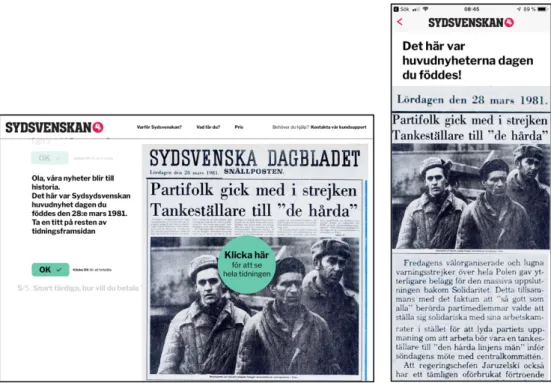
To explore if and how to create an emotional response and relatedness that has connection to news reading, the subscriber or usability tester will be presented with the newspaper frontpage of their birthdate (Figure 12, 13, 15, 25) upon entering date or personal identity number. This was done either in an implicit manner when entering your personal identity number when importing your address information for delivering the newspaper to your address or as a question after you signed up for the subscription if you have chosen a digital news service subscription.
To get a genuine response or reaction from each participant doing the usability tests of the prototypes they were presented with the real newspaper frontpage from their actual date of birth, made interactive so that they could zoom and interact with the content (Figure 15), adapted for mobile or laptop, combining the analogue nature of a newspaper and bringing it into the digital screen design space (Figure 13).
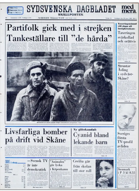
-Figure 12. Newspaper frontpage from of the participant Ola’s date of birth. Used by permission of Bilder i Syd.
Figure 13. Newspaper frontpage from one of the participants Ola date of birth adapted in the prototypes for large screen and mobile screen. Used by permission of Bilder i Syd.
5.4.2 Conversational sign-up prototype
Based on the idea of simulating a conversation-like sign up process as a way to create relatedness and friendliness I used a five-step process. This relates to what Kathy Sierra (2015, 2016) says about how conversational language makes people pay more attention and causes the brain to react as in a human conversation though it is in fact a nonhuman user interface. After hitting the subscription button, the first step in the prototype asks about the user’s name (Figure 14), and then and at certain moments throughout the process referring to your name. It is also designed in a flow that gives you a peripheral view of previous step and next step of the steps in the signup process that could have a glanceable quality that could give the user a sense of what has been before and what is to come. The progress indication is based on a 1/5 steps scale.
Figure 14. First step in the sign-up process
A prototype is not fast and effective but has friendlier qualities could evoke duration neglect (Kahneman et al., 2010). In the first iteration of the prototype I wanted to explore how sequencing the newspaper frontpage from the date of birth in the middle sign-up process after personal identity number before payment could work or evoke a reaction (Figure 14, 15). My hypothesis was that this could either work as a form peak-element inspired by the peak end-rule (Cockburn, 2017) giving the users an unexpected, but positive stimulus that could enhance or make this sign-up process an emotional a memorable experience, or it could interrupt and evoke confusion, irritation, and for the user a lost sense of where in the sign-up process, issues that Wroblewski (2018) argues as has been discussed earlier in this thesis.
Figure 15. Parts of the Newspaper frontpage from the date of birth sequence.
It will also be explored if humour or stimulation of a humourous image could stimulate the experience, memory and relatedness of it that Kathy Sierra (2015) argues for. For the first pilot usability tests I had two endings to the sign-up sequence, one with picture of the dog in a pool with message stating
“Great job and congratulations! You have now become a premium reader” (Figure 16) and the other one ending up on the actual main news page-ending with the same message as a popup (Figure 17).
Figure 16. Dog in pool narrative version
5.4.3 Short Mobile sign-up prototype
Drawing from the statistics from Sydsvenskan, about 70 % of subscribers sign up on a mobile device, thus I designed a solution that is more efficient but less conversational compared to the Conversational sign-up prototype. It has a progress bar that indicates how many steps you will have to go through and also indicates where you are in the process. To bring some kind of friction or stimuli in this sign-up process I introduced a function that could scan your credit card information and thereby hasten the process (Figure 19. Scanning of credit card option and result afterwards.). My hypothesis is that this feature could work as a kind of peak-element in the sign-up sequence, being a convenient feature that is helpful in fulfilling user goals, but could also result in trust issues around data privacy and security creating uncertainty and negative biases for the sign-up process and the product that you are signing up for.
When arriving to the subscription option page an encouraging message saying “You are doing the right thing! Sydsvenskan + You = A well-aware reader”. One of the options Premium Digital is marked with green and sign saying “Readers first choice” inspired from the New York Times sign-up flow.
Figure 18. Subscription options with readers’ choice in green
Figure 19. Scanning of credit card option and result afterwards.
When the subscriber has made their choice of subscription the second encouraging message states “Good choice! Let’s create an account” and you have the option to create an account or sign up with Google. After this step the user is presented with three payment options with one of them being the scan your card option. When completing your payment either manually or by scanning your card the next thing that happens is welcoming message saying “Congratulations! You have become PREMIUM” and then a green option button saying, “What happened on the day you were born?” with premium news flow underneath that you can scroll. If you click the green button next message is “Our news becomes history - travel to the day you were born” and an input field for your date of birth. When inputting your date of birth, you will be presented with the main story or stories adapted for mobile, interacting further you can view the full news page and zoom to news stories.
5.4.4 Calculator sign-up prototype
This mobile platform prototype acknowledges ideas from Luke Wroblewski (2018) in that it enhances user needs and control by letting the user have an
experience of choosing the features they would want in their subscription. In reality it is the same kind of packages as the previous prototypes that all have the Digital Premium feature plus additions. My hypothesis is that shaping the interaction as a calculator could create an effect that the system is actually helping you and that you van actively choose, instead of subscription packages being presented to you. This gives the user a sense of control and ownership over her/his own user needs.
As with the previous solution, after pushing the subscribe button the interaction sequence begins with a headline roughly stating in Swedish translated to English “You are doing the right thing! Sydsvenskan + You = You will have the situation under control” and a round green button that states “Start our subscription calculator for the best reader experience”. After pushing the button, you will land in calculation part of the sequence.
Figure 21. Calculator interface and one example of adding a feature to the subscription.
5.5 Pilot usability tests of the prototypes
To get insights into how the first iteration of prototypes and user tests would run and preceded conducted a smaller pilot study with 3 students at Malmö University and one family member. In this study the participants had to imagine that they were Sixten Svensson, a man born on the 2nd of March 1956. The result of these pilot usability tests was that there were some cognitive problems with these prototypes. The input fields were not clear enough and there were information hierarchy issues like the save and share buttons connected to the newspaper frontpage seen too early in the flow of the interaction. It also pinpointed that the prototypes, both information-wise and interaction-wise, had limitations that were critical for the experience of the prototypes. In the Conversational sign-up prototype half of the participants reacted negatively to the placement of the Newspaper frontpage from date of birth before payment, the other half got somewhat submerged in the experience of viewing the imagined Newspaper frontpage from the date of birth, showing some kind of duration neglect behaviour (Kahneman et al., 2010), but eventually still managed to go through the rest of the sign-up sequence. This proved that this was valid for further research. The testing result of the two different endings was that three of four of participants preferred the “dog”-ending to the sequence. One aspect of the pilot tests that was difficult to evaluate what was a genuine reaction to Newspaper frontpage from the date of birth from the student participants as they had to imagine being someone else, so this had to be researched in the main study, but indications were that this could be a stimulus that could be relevant.
5.6 Main usability test study
5.6.1 Participants in the main study
To get a relevant group of users for the usability test I searched for people that had an interest in news, newspapers and history, and who could imagine themselves subscribing for a news service. It was also important that the were not journalists or designers themselves, as that would have tainted their perception of experiencing the prototypes from them being producers of journalism and design. I searched for these users through my own social media channels, through contacts at Sydsvenskan, and students at Malmö University. I ended up with a group of five women and four men from the age of 19 to 46 years old. In order to de-identify them for this thesis but still being able to quote them I have given them other names but kept their year of birth as a reference: Ella (b.1999), Cecilia (b.1993), Jenny (b.1991), Mårten (b.1984), Josefin (b.1981), Ola (b.1981), Anna (b.1978), Johan (b.1976), Robert (b.1973).
The participants agreed to do user tests, fill in numerical scale documents twice and to be interviewed twice, first directly after testing the prototype to capture short-term memory aspects and second after 1-2 weeks for find out
what they actually remember having a time fractured-memory of experiencing the prototypes.
5.6.2 The main usability tests
For the main usability study, the three prototypes were adapted and personalized for each participant with their name, address and newspaper frontpage from date of birth and confirmation messages. The participants were asked to think out loud and go through three separate flows in the prototypes, in a certain step they were given instructions about which subscription package or additional content they should choose in order to go through the flows as they were limited to those options which were functional in the prototypes.
Figure 23. Usability test of the Conversational sign-up prototype.
5.6.3 Interviews after usability testing
Directly after conducting the usability tests I did short interviews with the nine participants. The interviews were centred on the prototype tested, their initial impression of it, and what they thought they would remember from that particular prototype. Altogether this was done in order to bring the element of the short-term memory of experience as an element for discussion.
After conducting the three usability tests, inspired by the peak end rule experiments done by Kahneman et al. (1993), the person doing the test was asked to choose which one of the prototypes they would prefer to perform again. This would indicate some kind of preference for further research when doing the follow up interview.
5.6.4 Numerical scale after usability testing
Based on qualities from previous theory research, usability tests of newspaper Sydsvenskan’s current solution, including qualities, dimensions and experiences that were important to Sydsvenskan when they were interviewed about envisioning a future solution, I created 1-5-point Numerical scales for the participants to reflect upon and fill in after each usability test (Figure 24). When filling in the Numerical scales they were asked to talk out loud about their choices. The qualities they were to reflect upon were: No control versus
Control, Untrustworthy versus Trustworthy, Short time versus Long time, Frustrating versus Smooth, Mechanical versus Friendly, Impersonal versus Personal, Distasteful versus Appealing.
Figure 24. Numerical scales filled in after the usability tests.
On the basis of the peak end-theory that argues for the importance how the end of an interactions sequence is experienced for shaping the memory it, I also created separate Numerical scales to see if the participants could separate the end of the interaction from the overall experience and reflect on the end experience. The qualities for the end experience were a shorter three scales form: No control versus Control, Impersonal versus Personal, and
Distasteful versus Appealing.
5.7 Second iteration of the prototypes
After the first five usability tests, interviews I made iterations on two of the prototypes.
5.7.1 Second iteration of Conversational sign-up
After conducting these usability tests and some of the memory from usability test interviews it became, as expected, evident that sequencing the Newspaper frontpage from date of birth before the payment was not really functioning as a peak-element (Cockburn, 2017), but more as distraction or an element that brought confusion. The subscription landing page with the dog in pool image worked really well as carrier of emotion and memory, but the tonality of the confirmation message was not working as intended. A re-design session of this section of the prototype in collaboration with David Nyman from Sydsvenskan was done, resulting in a new landing page that combined the newspaper frontpage from date of birth with what a section that featured what Sydsvenskan premium subscribers was reading at the moment (Figure 25). In this design, the tonality and features were more effectively designed, but it lacked the emotional reaction qualities of the dog in pool image, hoping to still get emotional value with the Newspaper frontpage from date of birth feature instead.
Figure 25. Iteration two of the subscription landing page
5.7.2 Second iteration of Calculator sign-up prototype
After the five first usability tests I made two changes of the calculator-sign up prototype. I modified the tonality in language (Figure 26) and the feature where you can add different options was mirrored so that the cheapest feature was the first option (Figure 27).
Figure 26. Iteration two of subscription landing page.
Figure 27. Iteration two of calculator now with mirrored options, cheapest first
5.8 Follow up interviews after Usability tests based on
memory
To get insights into what the participants actually remembered from these prototypes and usability tests I conducted follow up interviews one to two weeks after their first experience conducting the usability tests. By this time,
I expected their memory to have been fractured and possibly distorted (Kahneman et al., 1993; Schacter, 2002; Arledge, 2016).
5.8.1 Numerical scales after passing of time
As a way of exploring if time and memory had an impact on how the participants rated the experiences of the usability tests, I asked each participant of the follow-up interviews if it was possible for them to remember the experience well enough to fill in the same numerical scales as the previous ones, but now from the basis on memory of the experience opposed to reflecting on them directly after.
5.9 Analyzing insights from Usability tests and interviews
using creating and affinity diagram.
I analysed the data from my usability tests and interviews done after each usability test, and the follow up interviews by creating an affinity diagram (Figure 28). I categorized them in the following sections: Tone of language,
UX-elements, Cognitive and Memory of interaction.
Figure 28. The Affinity diagram created for this thesis.
I also made a separate cluster of insights connected to the newspaper frontpage-feature of the prototypes sorted on a scale based on the emotional reaction when doing the usability tests and experiencing this feature for the first time. The parameters for this scale went from Negative (being provoked or expressing no relation or reaction), to Intellectually positive (Understanding the value of this feature, but no emotional reaction), to
Positive relatedness (Having an emotional reaction and reflecting positively) and the last one Strong positive relatedness (Expressing strong emotions and loosing track of time and place).