Visiting Address: Drottninggatan 16 A Postal Address: P.O. Box 325, SE-631 05 Eskilstuna, Sweden
Phone: +46 16 153 600
Visiting Address: Högskoleplan 2 Postal Address: P.O. Box 883, SE-721 23 Västerås, Sweden
Phone: +46 21 101 300
Web: www.mdh.se/hvv E-mail: hvv@mdh.se
Usability versus Persuasion in an
Application Interface Design
A study of the relationship between Usability & Persuasion in a smart-phone application designed to help optimise domestic energy use and reduce CO² emission.
Donal Freeney
Master’s Thesis in Innovation & Design, 30 hp June 9 2014
Supervisor: Doctor Carina Söderlund PHD Examiner: Professor Yvonne Eriksson PHD
Visiting Address: Drottninggatan 16 A Postal Address: P.O. Box 325, SE-631 05 Eskilstuna, Sweden
Phone: +46 16 153 600
Visiting Address: Högskoleplan 2 Postal Address: P.O. Box 883, SE-721 23 Västerås, Sweden
Phone: +46 21 101 300
Web: www.mdh.se/hvv E-mail: hvv@mdh.se This thesis explores the relationship between usability and persuasion in the
design of the interface for a smart-phone application. Using a usability study of an I-phone app combined with interviews with users and the designers, the roles of usability and persuasion in the design of the app and their influence on each other as design goals is discussed from both the users’ and designers’ perspectives. The application’s purpose is to support behavior change in users by giving them feedback on their electricity use in order to encourage them to switch their pattern of usage to reduce CO² emissions. This thesis should be of interest to interaction designers faced with the challenge of designing interfaces that are simultaneously both user-friendly and persuasive. While it is generally accepted that usability has a positive effect on the potential of a design to be persuasive little is known about the effects, if any, of persuasion on usability. This thesis proposes that the relationship between these two design principles is more complex than is generally assumed and that in certain situations they may even be traded off against one another. This trade-off could be useful for designers framing design challenges involving usability and persuasion.
Key Words
Usability, Persuasion, Persuasive Design, Persuasive Technology, Interaction Design,
Page 1 of 77
Foreword
This thesis is being submitted as part of the master’s programme in Innovation & Design at the Mälardalen University, Eskilstuna, Sweden. Although the research focus is primarily design it also concerns innovation. The object of the research, the Active House project, is part of a wider research study into Sustainable &
Attractive Cities conducted by the Interactive Institute of Sweden in association
with the Royal Institute of Technology in Stockholm and with sponsorship from
Vinova under their Challenge Driven Innovation initiative. Innovation is an
important theme throughout the entire Active House project. From the application of computerized monitoring of the electricity supply network, and collecting information from appliances in an individual user’s home, to coordinating information from these sources and sending it to users on their mobile phones, the whole project is an exciting example of innovation on many levels.
The title of this thesis is taken from a comment made by one of the respondents in this study. While discussing the potential for trade-off between usability and persuasion the respondent remarked “I hadn’t thought about that before … it’s like usability versus persuasion.” I felt this comment was appropriate to use as the title of the thesis because it describes the potential conflict that the study explored between these two design principles.
There were many people who helped me to complete this master’s study and thesis; thanks to you all for your encouragement and help. I would like to give special mention to the Interactive Institute of Sweden’s energy division in Eskilstuna for their help and cooperation, without whom I could not have conducted this research project in the first place. Thanks also to my tutor at Mälardalen University, Carina Söderlund, for patience, encouragement and guidance. Thanks also to all the test participants and evaluators who gave their time and interest voluntarily, and to my Program Coordinator Bengt Köping Olsson and my teachers at Mälardalen University, Eskilstuna, Sweden.
Thank you all very much for making this possible, Donal Freeney
Page 2 of 77 Contents Abstract ... 0 Foreword ... 1 Introduction ... 3 Theory ... 7
Research Approach & Methods ... 13
Results ... 29
Results - Usability Study ... 29
Results - Persuasion Study ... 40
Results - Usability & Persuasion... 49
Analysis ... 53
Analysis - Usability Study ... 53
Analysis - Persuasion Study ... 57
Analysis - Usability & Persuasion ... 61
Conclusions & Discussion ... 63
References ... 65
Page 3 of 77
Introduction
This thesis explores the relationship between two design principles, namely usability and persuasion, when applied to the design of an interface that must be both usable and persuasive. Usability and persuasion are broad terms and for the purpose of this study the term usability refers to how effective, efficient, and satisfying an interface is to use, or is perceived to be by its users. Persuasion in this study is considered as explicit and voluntary, with the user aware of and consenting to support for behaviour change in relation to agreed goals, and without the use of deception or coercion. Although much has been written about the influence of usability on persuasion in interface design, research into the influence of persuasion on usability is far less common. The generally accepted view of usability and persuasion in interaction design is that higher levels of usability increase the persuasive potential of a design; more usability equals more persuasion (Fogg et al., 2001; Kim & Fesenmaier, 2008; Leung & Underwood, 2007; Norman, 2004, p.138). This thesis aims to contribute to a broader and more accurate picture of the relationship between usability and persuasion in interaction design by encouraging discussion about this relationship, in particular within the context of a persuasive smart-phone application.
Smart-phones are becoming more and more common; in the USA alone nearly half of all adults now own a smart-phone (Smith, 2012). These smart-phones are being used today for much more than making phone calls, with the average user spending 2 hours a day using the device, of which only approximately 11 minutes are spent on making calls (Richmond, 2012). According to Apple Computer’s own report more than 50 billion apps have been downloaded from their online app store since it opened in 2008 (Apple, 2013) and the number of different apps available has topped one million (Ingraham, 2013). Smart-phone apps are available for a wide range of purposes, including entertainment media, games, social media and news. Apps are also available that encourage or support behaviour change in users, for example encouraging users to quit smoking (e.g. LivestrongApp - fig.1), or to lose weight (e.g. WeightwatchersApp – fig.1).
Page 4 of 77 These apps themselves are relatively new and more research may be needed to establish their success at changing behaviour and whether resulting changes are long or short term. However research does already exist concerning the successful use of related technologies such as mobile phones, internet sites, and portable digital devices to support behaviour change in users. For example, a study in England of a support programme to help users stop smoking claims: “Smoking cessation support delivered via mobile phone text messaging doubles quit rates at 6 months” (Free et al., 2011, p. 53). Web based social media have been shown to be an effective medium for encouraging health promotion (Korda & Itani, 2011). Mobile devices are being used to encourage and support weight loss, increasing physical activity, and diabetes self-management (Fjeldsjoe et al., 2009). Using computer based intervention techniques has been shown to be successful in reducing drinking among college students (Carey, 2009), and a medical report claims to have “strong evidence” that targeted mobile phone messages helped improve glycaemia control for diabetes patients (Liang, 2010).
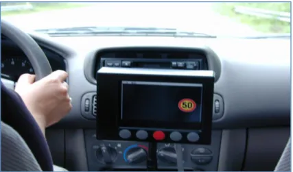
Mobile phones are particularly well suited to deliver support for behaviour change because of their ability to access users at all times and because they are so well integrated into the user’s natural environment (Heron & Smyth, 2010). Content can be tailored to the specific users and their needs, and the devices can even return feedback from users themselves. They can therefore deliver customised support to users in the contexts of their real lives, and at times and places when it may be most effective (Heron & Smyth, 2010). An example of this is a pair of Finish studies that successfully used a modified GPS system, the “Intelligent Speed Adaptation System” to persuade drivers to keep to speed limits (Päätalo et al. 2001, and Peltola et al., 2011).
Figure 2: The Intelligent Speed Adaption System
Internet and mobile phone based interventions or targeted messages have been applied in the growing area of sustainable interaction design. Sustainable Interaction Design is a field that uses design to reduce waste of the earth’s resources and reduce negative human impact on the environment and climate (Blevis, 2007).
Page 5 of 77 An extensive review of 38 peer-reviewed intervention studies aimed at household energy conservation, recommends a multidisciplinary approach to behaviour change employing techniques that permit and support the desired new behaviour while also addressing the various psycho-social factors that encourage or inhibit the new behaviour (Abrahamse et al. 2005). Graml et. al. describe a persuasive web application that used this combination of technology and psycho-social theories of behaviour change to successfully reduce users electricity consumption (Graml et al., 2011). The results of these studies suggest that internet linked devices and in particular mobile devices such as smartphones are not only capable of, but are particularly well suited to, encouraging behaviour change in users. Mobility, Usability & Persuasion: Challenges for Interaction Designers The very fact that mobile devices are mobile and constantly available to the user presents particular challenges to the designers of mobile application interfaces. An almost unlimited variety of locations and environments, lighting conditions, noise, body positions, movement, and distractions must be considered, making ease of use an absolute priority (Gorlenko & Merick, 2003). After extensive usability studies on a wide variety of mobile applications researcher and designer Jakob Nielsen proclaimed that the current mobile user experience is “horrible” (Nielsen & Budiu, 2013, p. ix). Usability in mobile devices is a challenge for designers that must be given high priority. However, when behaviour change is the goal of an application then persuasion must also be given high priority, as any effort to influence or change behaviour is persuasive in nature (Fogg, 2003, p.16). In a user interface that must be both usable and persuasive what influence do these two design principles have on each other? Literature exists describing one side of this relationship; how usability can influence persuasion. Usability is said to increase the persuasive power of an interface by enhancing trustworthiness and credibility (Fogg et al., 2001) and enhancing ease of navigation (Leung & Underwood, 2007). But what about the effect of persuasion on usability, are these principles complimentary or can they be conflicting? What are the pay-offs and trade-offs in the relationship between usability and persuasion and how do they affect interface design and can this affect the user’s experience?
While it may be argued that all information technology is in some way persuasive it appears that even systems that have an explicit intention to influence users’ behaviour are designed without specifically applying principles of Persuasive Design (Hasle, 2011). However this approach would not necessarily be problematic as long as applied usability principles increase the persuasive potential of the design, if it is true that more usability always equals more persuasion. Simplifying tasks for the user is even itself a principle of Persuasive Design (Fogg, 2003, p.33). But if the relationship between usability and persuasion is more complex, if it may not always necessarily be linear and one-directional, then simply focussing on usability may not be enough to guarantee a high level of persuasive potential in a design.
Page 6 of 77 The Research Purpose & Research Questions
The purpose of this study is to explore the relationship between usability and persuasion in the interface design of a smart-phone application created to support behaviour change in users, and to provide designers with a new way of framing the challenges of being both usable and persuasive.
The questions this research study aims to answer are:
When an interface in a mobile device must be both usable and persuasive a) how do these two design principles relate to each other? and b) how is this relationship experienced by the designers and by the users?
In the design of a persuasive interface what trade-offs are made between usability and persuasion?
The intended audience for this thesis is primarily interaction designers engaged in designing app interfaces that encourage or support behaviour change in users, and interaction and user interface designers generally. The report may also be of interest to researchers interested in using mobile technology for behaviour change, and even designers or researchers interested in improving sustainability of human habitation through the application of new technology.
Limitations
This study is an explorative study of the relationship between the design principles of usability and persuasion. The study was not intended as a basis for redesign of an interface, and specific directions for redesign of the application are not suggested here. While human factors are relevant to the study and psycho-social context of the app and its goals of encouraging and supporting behavioural change are discussed, they are not fields to which this research is expected to contribute.
Technological details of the app are not within the scope of this study, such as for example: the mobile phone device itself; how the content is collected and transmitted to the app; or the programming code used. The app is part of a larger technological system; this system itself is not the focus of the usability analysis in this study. However, the persuasive elements of the app will be analysed in the context of the larger system, both in relation to the midterm goals of behaviour change in users and to the longer term goal of reduction in the amount of CO² released by production of electricity for domestic use.
The results of this study are not expected to have statistical relevance. The study is not longitudinal therefore no measurements of actual behaviour change were possible as indications of the success or failure of persuasion in the application.
Page 7 of 77
Theory
Because it explores the relationship between two design principles applied to the creation of a user interface this study finds itself within an overlapping area of the fields of Interaction Design (IxD), User Experience Design (UxD), and Human Computer Interaction (HCI). These multidisciplinary fields may all be considered generally to fall under the much broader field of Design. However the study also focuses specifically on an interface created to encourage and support behaviour change in users; this places it within the field of Persuasive Technology or Persuasive Design (PD) and therefore even touches on the Social Sciences and study of human behaviour. More specifically, the object of study is part of a system that has as its goal influencing users’ behaviour to reduce CO² emissions, which places the study within the field of Sustainable Interaction Design.
While studying a topic that touches upon such a broad and diverse range of overlapping multidisciplinary fields can at times be intimidating and even confusing, the breadth and scope of such a subject is also an advantage because of the variety of interesting and exciting theoretical sources available. For example, this thesis uses as a source of theoretical support Schön’s theory of Reflective
Practice (1991), originally from the field of Social Science, and Norman’s theory
of design as a process of Trade-offs (1983), Norman being a psychologist and researcher who has however published many works about Design.
Schön’s theory of Reflective Practice has previously been applied successfully to design research, for example Valkenburg & Dorst (1998). In this theory Schön proposes that designers, among other professional practitioners, engage in a “conversation with the materials of a situation.” (Schön, 1991, p.78). This conversation involves setting the problem, comparing the situation to a known schema or model of a similar previously experienced situation; a model that is a simplification, governed by known laws and mechanisms, whereby specific actions ought to have specific outcomes. He describes this as a procedure of “naming” and “framing” the situation:
When we set the problem, we select what we will treat as the “things” of the situation, we set the boundaries of our attention to it, and we impose upon it a coherence which allows us to say what is wrong and in what directions the situation needs to be changed. Problem setting is a process in which, interactively, we name the things to which we will attend and frame the context in which we will attend to them. (Schön, 1991, p.40)
However, because reality is naturally more complex than any given model there may be unexpected outcomes when the designer “moves” or makes an adjustment to the design. These unexpected developments are part of the creative process, inspiring new ways of approaching the situation. They are the manner in which
Page 8 of 77 Schön describes the situation as “talking back” to the designer, and the process may be repeated over and again until a satisfactory workable definition of the problem is reached:
When this happens, the designer may take account of the unintended changes he has made in the situation by forming new appreciations and understandings and by making new moves. He shapes the situation, in accordance with his initial appreciation of it, the situation “talks back”, and he responds to the situation’s back-talk.
(Schön, 1991, p.79).
According to Schön therefore this process of applying frames to a situation in order to help define the problem is central to the creative work of designers. One way of framing a problem is to view it as a set of opposing goals that must be balanced. Donald Norman call’s this balancing of goals a trade-off. For Norman being explicitly aware of these trade-offs is useful for designers:
A central theme of our work is that, in design, there are no correct answers, only tradeoffs. Each application of a design principle has its strengths and weaknesses; each principle must be interpreted in a context. One of our goals is to make the tradeoffs explicit. (Norman,
1983)
Making a trade-off explicit would involve identifying what goals or principles present in the design may be balanced or considered to be in opposition to one another, and what the implications would be of increasing or reducing any of these elements or allowing one of them to dominate entirely. Norman illustrates this idea by looking at the potential trade-offs between aesthetics, usability and cost or ease of manufacture:
If everyday design were ruled by aesthetics, life might be more pleasing to the eye but less comfortable; if ruled by usability, it might be more comfortable but uglier. If cost or ease of manufacture dominated, products might not be attractive, functional, or durable. Clearly, each consideration has its place. (Norman, 2002, p.151).
But could the design principles of usability and persuasion be seen as opposing goals in a trade-off in certain design situations? The accepted view of the relationship between usability and persuasion in the literature is generally simple and one-directional; more usability equates with more persuasion. By this definition no trade-off would be possible since the goals are considered complimentary. Usability, and in particular ease of use, are crucial factors in successfully persuading users; contributing to a positive attitude towards the product, resulting in increased trustworthiness and therefore increased persuasion (Fogg et al., 2001). As Nahai states: “when it comes to influencing your customers online, part of the equation is making their lives easier” (Nahai, 2012).
Page 9 of 77 A study of travel websites claimed that many of them appeared to have been designed without consideration of persuasive design and focused instead on aesthetics and usability in the belief that this would be enough to guarantee their persuasive goals (Kim & Fesenmaier, 2008). However a study into how usability and interactivity affected positive attitudes to online advertising found that increased interactivity only occasionally resulted in increased persuasion and sometimes even affected it negatively (Liu & Schrum, 2009). The relationship between usability, interactivity and persuasion may be more complex than is generally assumed.
Online advertising has been shown to measurably reduce usability in websites: “Negative effects of advertising include a wide range of consequences for the quality of the user experience of the website”; including increasing cognitive load on the user, scanning and browsing difficulties, and causing negative attitudes towards the site (Brajnik & Gabrielli, 2010, p.972). Although advertising and persuasion are not the same things, it is worth considering the idea that carrying a persuasive message may come at some cost to the user’s experience of an interface. Using inbuilt restrictions in a design to influence users’ behaviour, for example, can be problematic. Norman warns against overuse of such “forcing functions” that attempt to coerce users by forbidding, combining or bundling certain activities together, without giving the user a choice. These attempts to control user behaviour come “at some cost to normal behaviour. It is important to think through the implications of that cost.” (Norman, 1983, p.134). Understanding the relationships between design principles and goals is important and useful for designers; in particular where there is potential for opposition or conflict between those goals.
In order to explore the relationship between usability and persuasion we must assess both of these design principles as applied to the design by the designers and as experienced in the design by users. Looking first at usability this study adopts the definition provided by the ISO where usability is defined as “The extent to which a product can be used by specified users to achieve specified goals with effectiveness, efficiency and satisfaction in a specified context of use.” (ISO 9241: from Benyon et al. 2005, p269). This focus on three factors, efficiency, effectiveness and satisfaction is reflected in Sander’s definition of good design; that products need to be useful, usable, and desirable (Sanders, 1992). In both cases the first two factors focus on the practicalities of getting a specific job done while the third allows for the emotional element of engaging with a product. While the practical nature of the first two factors of the definition, effectiveness and efficiency, allow for direct testing and diagnoses of faults, the emotional element of design is more difficult to evaluate, but is also highly important, especially as a differentiating factor between products (Norman, 2004, s.64).
Page 10 of 77 Usability, as defined above, is also contextual, and in the case of a mobile application varying contexts of use such as location, environmental distractions, and lighting, must also be considered. Evaluating usability, attractiveness and user satisfaction can be complicated, in particular due to the lack of generalised theory of the sort available in other academic fields such as engineering, for example. According to Sutcliffe “interaction designers give advice in the form of examples and scenarios, leaving the practitioner to abstract generalisable laws and interpret them in a design context.” (Sutcliffe, 2002, p.1). What general advice there is available tends to be in the form of guidelines and heuristics rather than theory. Examples of such heuristic guidelines are Nielsen’s 10 Heuristics for Interaction
Design (Nielsen, 1995) and Schneiderman’s Eight Golden Rules of Interface Design (Schneiderman & Plaisant, 2005, p.74). These heuristic guidelines are
usually based on a combination of psychological theory and practical experience (Benyon et al. 2005, p.272) and typically refer to sets of indicators and properties a design should posses in order to make it usable. These include, for example: giving the users appropriate and useful feedback; ease of navigation; flexibility and choice for users; and indicators such as: simplicity of design and structure; legibility of text; and how consistently language and graphic elements are used across the interface. Heuristic evaluations are highly effective for discovering usability problems and using a heuristic list can bring “conciseness, memorability, meaningfulness and insight” to an evaluation (Ji et al. 2006, p.210). A heuristic list can be successfully assembled by combining usability guidelines from leading experts tailored to fit the specific type of product being assessed and its unique contexts of use (Suárez Torrente et al. 2012). As designer and researcher Kim Goodwin states: “Not all principles are created equal. Principles appropriate in one context may not apply to another.” (Goodwin, 2009, p.8).
While there are many examples in research literature of usability studies and usability testing it is less common to find examples of assessments of persuasion in interface design. While the study of persuasion has origins as far back as ancient Greek texts on the art of rhetoric (Simons, 2001, p.14) the spread of computer technology through the 1990’s and early 2000’s has lead to the study of persuasion being increasingly applied to technology. This eventually evolved into a sub-discipline within the field of Human Computer Interaction that is often referred to as either Persuasive Technology (PT) or Persuasive Design (PD) (Mintz & Aagaard, 2012). One of the leading researchers in this growing discipline is B J Fogg. In his work Fogg outlines and defines several principles to help researchers and designers understand and use persuasion in technology. These principles are not entirely new, in many cases being adaptations of proven concepts from the far older field of rhetoric, yet there is significant evidence that they can be applied effectively to new technologies (Mintz & Aagaard, 2012). A persuasive technology is defined by Fogg as “any interactive computing system designed to change people’s attitudes or behaviors”. For Fogg the focus of
Page 11 of 77 Persuasive Design lies on the planned persuasive effects of technology, rather than on any unintended side effects. Ethical considerations are of high priority and persuasion should not be confused with coercion or deception. Fogg defines persuasion in the context of Persuasive Technology as “an attempt to change
attitudes or behaviors or both (without using coercion or deception)” [emphasis in
italics is from the original text] (Fogg, 2003, p.15). Therefore knowledge of the designer’s intentions is important to determine if a system qualifies as persuasive. Fogg presents a model of behaviour for Persuasive Design where persuasive potential is dependent on three factors; motivation, ability, and triggers. The term ‘trigger’ here refers to an event that encourages or reminds the user to act. All three factors must be accounted for to successfully change a user’s behaviour; the user must have “sufficient motivation, sufficient ability, and an effective trigger” (Fogg, 2009, p.1). Fogg suggests seven tools for developing persuasive designs:
Reduction; Tunnelling; Tailoring; Suggestion; Self Monitoring; Surveillance; and Conditioning (Fogg, 2003, p.32 - 51). These tools may be regarded as guiding
principles and can form the core of a heuristic list to assess persuasive potential of a design. A principle adapted by Fogg from the study of rhetoric is Credibility; referring to the credibility of the source of the system. Credibility is described as having two principal dimensions: Trustworthiness: that a source is fair and unbiased; and Expertise: the perceived knowledge, skill and experience of the source (Fogg et al., 2001). In this sense humans interact with computers as if they were people. Further elements associated with credibility are Surface: relating to appearance; and Reliability & Usability relating to how reliable and easy to use the system is (Fogg, 2003, p.122 - 141).
The relationship between usability, persuasion and the surface appearance or aesthetic of an interface appears to be a complex one (aesthetics is a complex and broad area of research, in this paper the word’s use is limited to the visual
appearance of an interface and what aspects of it users consider to be appealing or beautiful). Tractinsky argues that the beauty of an interface makes it more usable (Tractinsky et al., 2000 & Tractinsky, 2013), while it has also been counter-argued that it can be usability that has an effect on perceived aesthetic (Tuch et al. 2012). It is apparent that aesthetics or visual appeal is important to both usability and persuasion.
Several factors make mobile phones particularly well suited to persuasive purposes. They have become more affordable and are popular across cultures making it possible to reach almost any target audience without needing an extra device, also they are versatile and pervasive - users generally have them with them at all times (Arteaga et al., 2012). The pervasiveness and availability of mobile phones makes them especially well positioned to influence user’s at the most appropriate moment for the information to be most persuasive, usually at the point when decisions are being made. Timing, giving the right information at the right time, is one of the most important principles of Persuasion (Hasle, 2011).
Page 12 of 77 The fact that mobile phones can be connected to an information source that is constantly updated can also make them more persuasive because the information provided is considered to be current and relevant (Fogg, 2003, p.195). Another feature of mobile phones is that they are personal items that users experience closeness to, and can even be aware of context, time and location, thus the information provided can seem more relevant and personal, making users more open to influence and persuasion (Katz & Byrne, 2013).
“Persuasion always involves communication” (Bettinghaus & Cody, 1994, p.5). Viewing persuasion as a form of communication Bettinghaus & Cody apply communications theory to help analyse and assess persuasive potential; they emphasize the importance of the intentions of the sender and the communication’s effect upon the behaviour of the receiver, and suggest that comparing the correspondence between these two is an effective way of assessing persuasive communication. This type of linear or ‘transmission’ model of communication can be criticized for being unidirectional and oversimplified (Gozzi, 1999). However it can be argued that in the case of software interfaces a two sided exchange does not generally take place, as one side of the interaction is governed by choices already made by the designer before the interaction began (Prates et al., 2000). The difficulty level of the requested task and the opposition that can be expected to it should also be considered (Bettinghaus & Cody, 1994, p.17). Bettinghaus & Cody suggest persuasive communication can be broken down into four phases: attention: the receiver must notice or see the message;
comprehension: they must understand the message sufficiently well; yielding;
they accept the messages intended meaning and intend to act on it; and retention: remembering the accepted message long enough to act on it (p.64). From earlier studies it is apparent that the effects of persuasion can be measured by examining user’s behaviour after exposure to the persuasive technology to see to what extent their behaviour changed in the direction intended by the designers. For example: if a persuasive system designed to encourage users to save energy resulted in users actually saving energy (Abrahamse et al. 2005; Graml et al., 2011). Research into human behaviour indicates that people’s intention to engage in behaviour can be a reliable predictor of them actually carrying out the behaviour, and that attitude and beliefs are important factors in creating these intentions (Ajzen, 1991 & 2011). In a study using a mobile application to encourage users to engage in a healthier lifestyle it was found that changes in user’s behaviour could be successfully predicted based on their intentions and attitudes to the suggested behaviour change (Khalil & Abdallah, 2013). More specifically, attitudes and beliefs have even been found to be good predictors of energy saving behaviour (Seligman et al., 1983). This would suggest that data collected about test participant’s attitudes, beliefs and intentions may be reliable indicators of their engaging in a particular behaviour in the future and are therefore relevant for assessing the persuasive potential of a design.
Page 13 of 77
Research Approach & Methods
The purpose of this research project is to explore the relationship between usability and persuasion. The results of the study are expressed in terms of similarities and contrasts, influences and effects; predominantly verbal descriptions of qualities of the subject of the research, rather than numbers or statistics. This would suggest that a qualitative approach seems most appropriate for this study (Holme & Solvang, 1997, p.78). The use of qualitative data collection methods, and an analysis method that investigates and explores a subject rather than tests a theory, are usually associated with an inductive approach and interpretive stance to scientific inquiry; however this does not necessarily have to be the case (Knox, 2004). Knox argues that seeing interpretive and positivist stances as mutually exclusive polar opposites - always aligned to either inductive or deductive reasoning respectively - is limiting and misleading. Research methodologies, and in particular those that derive theory from data, are often combinations of iterations of induction and deduction, and differing methodologies can even be complimentary (Knox, 2004). This iterative combination of induction and deduction is often called abduction (Alvesson & Sköldberg, 2009, p.4).
Applying complimentary methodologies is recommended by Alvesson and Sköldberg who call it a ‘Reflexive Methodology’; where, for example, a traditionally positivist perspective may be counterbalanced by acknowledgement of postmodern criticism of this perspective applied consciously and reflectively by the researcher (Alvesson & Sköldberg, 2009, p.271). This methodological stance accepts the positivist view that there is an external reality that can be observed and described, but is also sceptical of the ability of language to accurately describe it and of the objectivity of the observer (Alvesson & Sköldberg, 2009, p.318). A reflexive methodology would allow the use of hermeneutic theories in the analysis of the data, in particular the concept of the hermeneutic circle of understanding; describing how parts and whole are interrelated, and also the importance of empathy with the source. This is counterbalanced by an acknowledgement of more modern semiotic theories concerning language and meaning, allowing for the co-existence of differing interpretations of the same text (Alvesson & Sköldberg, 2009, p.268). This combination of approaches was applied in this study and was particularly useful in coding and analysis of the data.
To examine the relationship between usability and persuasion in the design of a mobile application it seems logical that an understanding of both sides of the relationship is required. This introduces a natural conceptual split in the research with usability on one side and persuasion on the other; investigating the two halves under their own sets of criteria and then bringing the results together for comparison. Usability testing primarily focuses on the interaction between the user and the interface and there are many examples in the literature of usability testing that was conducted successfully without involving the designers (Nielsen
Page 14 of 77 & Budiu, 2013; Sharp Rogers & Preece, 2007, p.591). Persuasion however is a form of communication which can be viewed as a message with a sender and an intended receiver, and is best evaluated when both of these perspectives are considered and compared (Bettinghaus & Cody, 1994, p.17).
In the case of a smartphone application this would mean examining persuasion from both the designer’s and the users’ perspectives, introducing another natural conceptual split in this research project. With the Designer-User division established for the Persuasion side of the study it seems logical to apply the same division to the Usability side. Therefore the relationship between Usability and Persuasion is examined from both the designers’ and users’ perspective. This allows for the expression of the research’s conceptual model as a simple 2x2 matrix with four clear areas of investigation: Usability from the Designer’s perspective; Persuasion from the Designer’s perspective; Usability from the User’s perspective; and Persuasion from the User’s perspective (as illustrated in table 1 below).
Usability Persuasion
Designers Usability in App from
Designer’s perspective
Persuasion in App from Designer’s perspective
Users Usability in App from
User’s perspective
Persuasion in App from User’s perspective
Table 1: Conceptual Model of the research as a 2x2 matrix
The Object of Study
The object of this case study is the Active House smart-phone application (also abbreviated in this paper as the App). The App was designed with usability as a high priority, and its purpose is persuasive in nature; to encourage users to change their behaviour, altering their patterns of electricity use to reduce emissions of CO². The combination of these two goals: usability and persuasion, makes the App interface a suitable object of study for exploring the relationship between these two design principles. Also, the creators of the App allowed access to the design team for interviews and permitted the use of their prototype for a usability study. This was an excellent opportunity to study usability and persuasion in the App from both the designers’ and users’ perspectives.
Page 15 of 77
Figure 3: The Active House Apartment is located in a newly built block of apartments in the Stockholm Royal Seaport area, centre to left in the picture above.
The Active House project is part of an ongoing wider study into “Sustainable & Attractive Cities” conducted by the Interactive Institute of Sweden in association with the city of Stockholm, Vinnova, the Energy Agency, the Energy Inspection Agency, Fortum, ABB, Electrolux, JM, NCC, ByggVesta, HSB, and The Royal Institute of Technology. The ultimate aim of the project is to reduce negative climate impact of urban settlements through changing patterns of energy use to a more sustainable model. The Active House uses an innovative integrated electronic system connecting all the appliances in the home to a computer. The computer sends live information to a mobile phone which presents the user with constant feedback on the home’s electricity consumption combined with live data on the variations in electricity prices and in CO² production (CO² production varies dependent on the different modes of electricity production available: gas, hydro, solar, wind, etc.). This feedback is used to schedule usage ‘events’ – such as washing or drying clothes or charging an electric car, with the intention that the user will plan their electricity usage according to the availability of cleaner sources of energy. This is made possible by availing of ‘Smart Grid’ technology, which differentiates between electrical power produced by different sources and measures usage in hourly periods. The initial Active House project involves a pre-study with one family in a specially equipped apartment in Stockholm (pictured in fig.3). It is intended as a model for a further 200 homes, also in the Stockholm area. (The Interactive Institute of Sweden, 2013).
Presented here are some of the main features of the App that were the focus of the usability tests.
Page 16 of 77
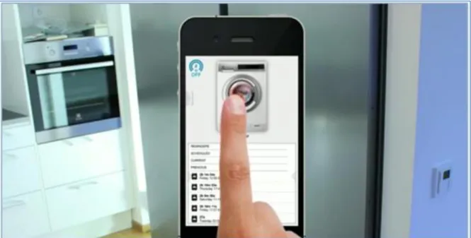
Figure 4: The Active House App, a promotional image from the Interactive Institute of Sweden
The App is designed for use on an Apple I-phone or I-pad tablet. It is accessed by clicking on an icon which opens the start-page. Figure 5: The Active House icon >
The Start Page/Home Screen
The program opens on the Home Screen, or Start Page (see fig. 6). This page features a 3D model based on the actual floor-plan of the Active House apartment. When an appliance is active it shows up as an icon over its approximate location in the apartment. Rooms on the model appear white when there is activity in the house, or grey when there is no activity.
In the upper right corner of the screen is the
Meter, which displays live data on energy
use, CO ² emissions, and price (see ‘The Meter’ below).
Just below the Meter is a grey button that opens the Quick Menu (See Quick Menu below).
Below the 3D model of the apartment are four figures that represent the house occupants and show who is currently at home.
The lower half of the screen is taken up with the Log. The Log displays Reminders: messages about price and CO ² emissions;
Scheduled: usage events that are planned to
start soon; Current: active appliances and signal information; and Previous: recently completed events.
Page 17 of 77 The Meter
One of the most important features of the interface is the Meter. Its purpose is to inform users on the current amount of energy being used in the apartment, the level of CO² emissions, and the current price of electricity in kronor per kilowatt-hour. It has the form of a circular or horseshoe shaped scale, almost like a traditional dial but without a needle. In the centre of the dial is a lightning-bolt shape, and under this is a number. The lightning-bolt pulses in a tempo that changes according to the rate of electricity use. The Meter has three display modes (see fig.7), accessed in turn by clicking on the Meter graphic; the default mode is the blue energy display.
Figure 7: The 3 modes of the Meter: Energy, CO² & Price
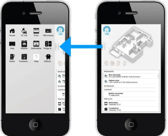
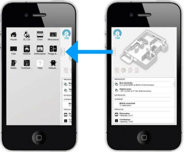
Navigation - The Quick Menu
The Quick Menu contains icons that can be clicked to navigate directly to every appliance, to the Home Screen, and to the Help page. It is accessed by clicking or dragging on the small grey button on the left side of the Home Screen/Start page, as indicated below by the blue arrow (see Fig. 8.).
Figure 8: The quick Menu is accessed by clicking on the small grey button on the left side of the Home screen.
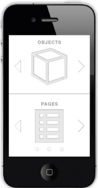
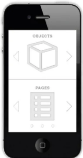
Page 18 of 77 Navigation - Swiping
The interface is divided into two fields or windows; the upper or ‘Objects’ window, and the lower ‘Pages’ window. Both windows can be scrolled horizontally or ‘swiped’, while only the lower window contains menus that can be scrolled vertically.
The Objects window contains images of all the appliances connected to the system; washing machine, cooker and microwave for example, plus the Home Screen and the Help page. Swiping in the Objects window changes the appliance displayed, and the user can browse through the sequence of images of each appliance. As each new appliance is displayed in the upper window it brings with it its own page of log details displayed in the lower Pages window. This log displays a record of use specific to the selected appliance. These logs can be scrolled vertically to access more information.
While on the Home screen the lower Pages window can be swiped horizontally to access some extra setting and control menus and the
Statistics page (see Statistics below). Figure 9: Navigation Guide
The Appliances
All of the appliances connected to the system are displayed in the Objects window. When an appliance is in use or is active the image animates to indicate this. Some examples of appliances that can be displayed and selected in the upper Objects window are presented here below (see fig.10): A charger for an electric car; a dishwasher (shown here in active mode which has animating water drops); a cooker hob; and an oven.
Figure 10: Four examples of appliances that can be displayed and selected in the Object window: an electric car (charging); a dishwasher; a stovetop (hob); and Oven.
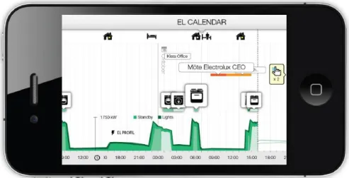
The Timeline/Calendar
The Timeline or Calendar is accessed by tilting the phone to the horizontal position (see fig.11). It opens automatically and is by default set on the Electricity Calendar displaying information on electricity use on the current day. The graph can be swiped horizontally to the left from the opening position to look back at usage over time. It also displays icons for the appliances used and reminder messages.
Page 19 of 77
Figure 11: The Timeline/Calendar in Electricity mode displaying electricity use over time
The Timeline/Calendar has 2 other modes displaying information on CO2 and Price (fig. 12 & fig.13):
Figure 12: The Timeline/Calendar in CO2 mode
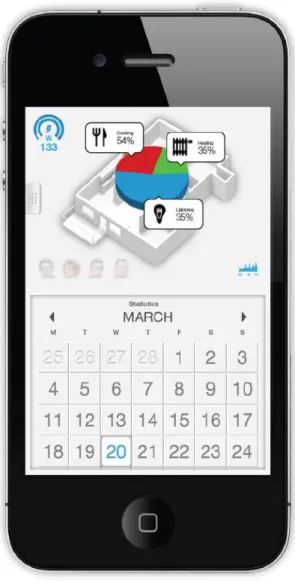
Page 20 of 77 The Statistics Page
The Statistics page displays information on electricity use and what proportion of the total used was accounted for by different activities, such as cooking, heating, and lighting, as shown here in fig.14. This page is opened by swiping horizontally in the lower Pages window of the Home Screen.
Figure 14: The Statistics page
Although not every feature of the App is displayed here this is a representation of the most important features and those that received the most attention in the usability studies. The prototype did also contain a temporary Help page; this was a place-holder page with no content, but which allowed for testing of how users experienced navigating to it.
Page 21 of 77 Guidelines for the Usability & Persuasion Assessments
From principles of Usability, Persuasion and Persuasive Design available in the literature discussed in the Theory section of this thesis and here below, two lists of guidelines were created, one for assessing usability, and one for assessing persuasion in the App. The lists served as guides to both designing the interviews and tests and analysing the collected data.
Three of the most commonly used lists of usability guidelines were used for creating the assessment list for usability in the study: Jakob Nielsen’s 10
Heuristics for Interaction Design (Nielsen, 1995); Schneiderman’s Eight Golden Rules of Interface Design (Schneiderman & Plaisant, 2005, p.74); and Donald
Norman’s list of rules of thumb for designers from The Design of Everyday
Things (Norman, 2002, p.188). These lists are reproduced in full in the appendix
(Appendix nr. 1-3). There is some overlapping and repetition in these expert guidelines as they cover similar ideas and concepts from different angles. For the purpose of this study they were re-arranged, summarised, and edited together to create a set of guidelines that would be appropriate for a usability assessment of a mobile application and they are presented here below:
Feedback: The App interface should respond to the user’s actions in a manner that is clear to the user and keep them informed with appropriate feedback on the systems status.
Consistency: The App interface should be consistent in its labelling and behaviour. Use the same words, symbols and colours for the same menu items, locations, situations and actions consistently across the system. Plan for Errors: This has two aspects, prevention and handling: Error
Prevention: The App interface should be designed so that users can
complete actions with the least possible potential for error. Error
Handling: When users do commit errors they should be as easy as possible
to recognise; error messages easy to understand; and easy to correct or undo.
Support Freedom to Explore: Users often explore an interface by clicking their way forward and this can lead to choosing functions or navigation links by mistake. The App should support this poplar way of learning by providing simple and obvious means to exit a function or page, terminate an action, return to the start, or return to the previous location or state.
Understanding, Relevance & Mapping to Real World: The App interface should use language that is recognisable and understandable to the user rather than system oriented terms or references to programming code. Conventions, structures and mappings used should reflect the real world rather than being based purely on the logic of the systems structure.
Page 22 of 77 Simple Minimalist Design: The App interface should have a simple and minimalist design showing the user only what is necessary and relevant; any extra information is distracting as it competes with the essential information reducing its relative visibility to the user.
Reducing Cognitive Load - Recognition rather than Recall: The human short-term memory is limited, to keep the burden on it low displays should be kept simple. Controls and options should be visible to the user; it is easier to recognize a control or an option than to recall one. The App should give users clues to follow rather than requiring them to use their memory.
Simplify Structure of Tasks: The structure of tasks and sequences of actions should be simple, logical and transparent with a definite beginning, middle and end.
Flexibility & User Control: The App should be easy enough for beginners but also provide short-cuts for more experienced users and allow expert users to customise frequent actions. While beginners may need more help, experts generally want more control.
Provide Help & Documentation: The ideal App interface should be intuitive and easy to learn but help, explanations and instructions should always be readily available if needed.
From the field of Persuasive Technology seven principles or tools for developing persuasive designs (Fogg, 2003, p.32 - 51) were applied in the guidelines for assessing persuasion, these are:
1. Reduction: reducing complex behaviour to simpler tasks
2. Tunnelling: guiding users through a set of tasks in a specific order to make it easier to achieve a goal
3. Tailoring: using information that is personally relevant to the user and suited to their needs and context
4. Suggestion: suggesting a behaviour at the most opportune moment, giving users the right information at the right time
5. Self-monitoring: helping users monitor their own behaviour and modify it while tracking progress toward a goal
6. Surveillance: allowing one party to observe the behaviour of another 7. Conditioning: reinforcing desired behaviour with rewards
Using these seven tools and also the principles of Persuasive Design and Persuasive Communication presented above in the Theory section of this thesis, a set of guidelines was created for the study which is presented here below:
Page 23 of 77 How, if any, do Fogg’s 7 ‘Tools of Persuasion’ appear to be used in the App?
Examine Credibility and Trustworthiness in the App including the areas of: Source Credibility; Surface Credibility; Usability & Reliability.
What are the mobile technology aspects involved, how are they appropriate and effective for persuasive design? This includes:
o Giving users the right info at the right time o Constant Availability in time and place
o Connected media – regularly updated, information is current o Ease of inputting data
o Personal/Closeness of a mobile phone as a trusted personal possession
What are the designer’s goals with the project? What are the designer’s intentions with the App? What do users perceive as the purpose of the App? Do the designers feel there is a message/what is it? Do the users feel there is a message/what is it?
Using Fogg’s 3 factors and ‘Behavior Model’ for PD consider designers’ & users’ perspectives on: Motivation; Ability; and Trigger.
What did the Users notice? (Attention)
What do Users say they like/dislike? (Attention)
o Appearance; Functionality; and Language -Textual & Visual What do Users understand from the App?
o Meaning, (Comprehension)
What are Designers and Users attitudes to the difficulty of changing to the desired behavior?
o Opposition; Motivation; Self efficacy (Yielding)
What are Users beliefs/attitudes/intentions regarding the App and its message? (Yielding)
What is the nature and degree of correspondence between Designer’s and User’s beliefs/attitudes/intentions regarding the App?
The Usability Tests and User Interviews
There are many well established techniques of Usability Testing and they usually involve studying users interacting with the product, interviewing users or having them fill out questionnaires, with the goal of building an understanding of how users experience interaction with the product (Cooper, 2007, p.70). Observing users interacting with the interface has been used successfully to assess and evaluate interfaces since the 1980’s and is still the dominant method today (Sharp et al. 2007, p591).
Page 24 of 77 One of the most popular usability testing techniques is known as the think-aloud test. In a think-aloud test several participants or evaluators, usually people representative of target users, are given a series of tasks to perform while saying out loud what they are thinking at each step in the interaction. This is usually conducted one-on-one with an interviewer who may even prompt the participant to speak or comment on specific aspects of how they are experiencing the interaction. The tests are recorded on video or audio and analysed for similarities and patterns where errors or difficulties were encountered (Sharp et al. 2007, p.335). This type of usability test is particularly effective and cost efficient because it can quickly gather an enormous amount of data about how people experience a new system using even primitive prototypes (Kuniavsky, 2003, p.259) and can identify the majority of usability problems with as few as 5 participants (Nielsen, 1994).
It is important when assessing the usability of a system to understand how the users perceive the system; how they believe it works, rather than how the designers envisioned it or how the system is actually structured. This can be visualised in the form of a model, literally building a picture of how users understand and relate to the system. This helpful assessment tool is often referred to as the ‘Users’ Mental Model’ (Norman, 2002, p.189).
While most of the collected data in this study is qualitative in nature one test was conducted on the App which yields quantitative data. The System Usability Scale, or SUS. The SUS is a questionnaire based on 10 usability statements that gives a rating of usability in percent, and is useful for a quick rough estimation of where the system stands relative to average usability values (Stanton et al. 2005). The SUS statements used are presented in the appendix (Appendix nr. 4).
The study consisted of a series of usability ‘think-aloud’ tests, user interviews, and interviews with the designers of the App. These were conducted in two locations: Stockholm and Eskilstuna in Sweden in April and May 2013. Assisting me on the usability study was Elinor Ramström, a project assistant at the Interactive Institute of Sweden. The objectives of the tests were to assess usability in the App interface and to document users’ experiences of interacting with it. The objectives of the interviews were to find out what the designers intended to achieve with the App, and to get an impression of what the app was communicating to users, in order to compare the designers’ and users’ perspectives on persuasion in the App.
The first set of 3 usability tests was conducted at the Active House apartment in Stockholm Royal Seaport with 3 members of the family that live in the apartment as part of the project; the father and mother and son. Their ages ranged from teenager to middle age, and they had varying levels of experience of using smartphone applications. These usability tests were ‘think-aloud’ tests, using a predetermined list of tasks performed on a prototype version of the App on an
Page 25 of 77 Apple I-phone. The tests were recorded using a digital voice recorder and written notes. An SUS (system usability scale) survey was completed by each of the 3 participants after they had completed the usability test.
The second set of usability tests was conducted at the Munktell Science Park in Eskilstuna. There were 8 test participants of mixed gender, age, and computer proficiency. Recruitment was by convenience and included students from Mälardalen University, workers at the Interactive Institute not associated with the project, family members of workers at the Institute, and some random workers from other companies at the Science Park.
Figures 15, 16 & 17: Users interacting with the App during the usability tests
Each test participant was interviewed directly after their usability test. The interviews were structured and the questions focused on how they experienced the App and what they perceived it was communicating, and were aimed at building an understanding of usability and persuasion in the App from the users’ perspective. The 10 interview questions are listed here:
1. Is there something about the App you particularly like? 2. Is there anything about the App you particularly dislike? 3. In your opinion what is the purpose of the App?
4. How engaged are you in environmental issues?
5. Have you learned anything new about electricity use from the app, from using the app?
6. Do you feel that this app could help you reduce the amount of CO2 created by your electricity usage?
7. Do you believe that using the app over a longer period could help change the way you use electricity?
8. If this app were sending a message, what would you think that message was?
9. If you could add some function to the app, what would you suggest? 10. Is there anything you would like to add yourself?
The interviews ranged between approximately 10 to 30 minutes in length. An SUS (system usability scale) survey was completed by each participant after their interview. All of the interviews were recorded on a digital voice recorder and written notes were taken.
Page 26 of 77 Interviews with the Designers
Four of the team responsible for developing the Active House app agreed to be interviewed for this project. Two of the interviews took place at the offices of the Interactive Institute in Eskilstuna. One designer was interviewed at the Royal Institute of Technology (KTH) in Stockholm, and the fourth interview was conducted via live internet audio-visual link (Skype). The interviews were semi-structured using an interview guide and were approximately 30 to 40 minutes long. The interview guides contained questions and points to be discussed such as:
Describe the Active House Project & their role in it
Is it a usable design in their opinion? Discuss relevant design principles/application
Is it a persuasive design in their opinion? Discuss relevant design principles /application
If you could add any function to the App what would it be? What do you consider to be the purpose of the App?
If the App was sending a message to users, what would that message be? All four interviews were recorded on a digital voice recorder and notes were taken manually during the interviews. Some photographs and screen-shots of the App interface were taken during the interviews.
Ethical Considerations
All of those who took part in the tests and interviews used in this paper did so voluntarily and without coercion or monetary payment. The 8 participants in the usability tests did receive a ‘Triss’ lottery scratch-card as a token of appreciation for their participation. Any and all participants were free to withdraw from the study at any time, and they were informed of this right. In order to protect all participants’ integrity I have attempted to make them as anonymous as possible, using abbreviated letters and numbers in place of their names in this paper. Where data was collected in Swedish I have translated it to English myself and attempted to keep my translations as true as possible in letter, meaning and spirit to the original Swedish recordings.
Transcription, Coding & Analysis
The recorded tests and interviews were transcribed to written digital documents in Word. They were then printed out on paper and coded manually; first as open coding where all events or statements are summarized, and then as axial coding where the first set of codes are cross referenced within each text and across the collected data to see if similarities and categories emerge and what themes recur. This is an iterative and systematic process, where the data is revisited over and again in the light of new categories emerging. The themes and categories are updated and refined to the point where it appears that the most significant themes and categories in the material have been discovered, and no new themes are
Page 27 of 77 emerging. These themes and categories are then used to extract insights and understanding of the material in the context of the research questions. During the coding process a notebook was kept to record spontaneous insights, questions or reflections that were inspired by the material, this notebook functioned as a manner of collecting thoughts that were helpful in the analyses stage but that did not belong in the more objective stages of coding and categorizing the material. The usability tests and interviews were conducted in both English and Swedish. Some reference material was also collected in Swedish. All translations to English are the authors own, unless otherwise stated.
A number of abbreviations are used throughout this paper and these are explained here:
The App: throughout most of this paper the Active House smart-phone application is referred to by the abbreviation ‘the App’ with a capital ‘A’. FM - The Family Members: The 3 evaluators who took part in the first
set of usability tests were all members of the family that live in the Active House apartment in Stockholm Royal Seaport. They are referred to in this paper as ‘Family Member’ in order to preserve their anonymity. The abbreviation ‘FM’ is used with an appointed code number: FM1 to FM3. TP - The Test Participants: The 8 evaluators who took part in the second
set of usability tests are referred to in this paper as the ‘Test Participants’ in order to preserve their anonymity. The abbreviation ‘TP’ is used with their appointed code number: TP1 to TP8.
D - The Designers: Four members of the design team at the Interactive Institute of Sweden agreed to be interviewed for this study. This group included designers with responsibility for the graphical interface, designers with responsibility for the technical development of the App, and the project leader and research leader. As all four had major influence on the design of the App and to preserve a certain level of anonymity for them they are all referred to as Designers, with the abbreviation ‘D’ and their appointed number: D1 –D4.
Critique of Method
The Interactive Institute allowed the use of their functioning prototype in the usability study. However as only one design was prototyped it was not possible to test different versions of the application. An ‘A – B’ test with more emphasis on persuasion in one design and on usability in the other may have been a useful way to observe differences in how users experienced the influence of these principals on the design of the application. This was not possible in this study but is included in suggestions for further research. The study was not longitudinal therefore no measurements of actual behaviour change were possible as indications of the success or failure of persuasion in the application. While users’ comments and
Page 28 of 77 answers to questions about attitudes and behaviour were considered as indicators of intentions and willingness to engage in that behaviour, a longer study over time would possibly have yielded more concrete evidence of behaviour changes due to exposure to the application and its persuasive message.
Reliability & Validity
Although absolute objectivity may never be achieved, it was a goal of this research to be as impartial as possible; data gathering, analyses and reporting of results and conclusions were carried out with conscious attention to truthfulness and scientific rigour, and every attempt was made to make to data collection and analyses methods and sources consistent and transparent. The short time frame of the study did not allow for observation of actual behaviour change in users after exposure to the application. This makes validity an issue, in particular internal validity, and whether the study could be said to actually measure persuasion in the application interface. However, there is research that suggests that intentions to engage in behaviour and attitudes to that behaviour can be taken as reliable indicators of a person’s future engagement in that behaviour, and this is referred to in the Theory section of this thesis. The small sample size of the study and the fact that recruiting was mostly by convenience means the results are not of statistical significance, and no claim is made for them to be so. However, even such a small sample is considered appropriate for a qualitative study where the purpose of the study is predominantly explorative or descriptive. It has been the aim of this study to explore and describe the relationship between usability and persuasion as design principles in the Active House App, not to exhaustively define this relationship but to hopefully add to the sum of knowledge about it and encourage further research and discussion on this subject.