Visualization of Quantified Self data
from Spotify using avatars
Author Stefan Aleksikj
Supervisor Aris Alissandrakis Exam date 30 August 2018
Contents
1 Introduction 1 1.1 Background . . . 1 1.2 Motivation . . . 3 1.3 Research questions . . . 6 2 Related work 8 2.1 Visual perception of facial expressions . . . 82.2 Use of avatars in data visualization . . . 10
2.3 Quantified Self Spotify projects . . . 11
3 Methodology 13 3.1 Prototyping . . . 13
3.1.1 Exploration of various avatar implementations. . . 13
3.1.2 Development of the avatar mockup . . . 14
3.1.3 Concept design questionnaire . . . 14
3.2 Data exploration . . . 14 3.3 User study . . . 15 3.3.1 Data collection . . . 15 3.3.2 Post-study interviews . . . 20 3.4 Limitations . . . 20 3.4.1 Finding participants . . . 20
3.4.2 Spotify data limitations . . . 20
4 Prototype development 22 4.1 Design of the prototype . . . 22
4.1.1 Design principles . . . 22
4.1.2 Graphic design of the avatar . . . 23
4.1.3 Final avatar design . . . 24
4.2 Mapping data on the avatar . . . 26
4.2.1 First prototype . . . 27
4.2.2 Second prototype . . . 28
4.3 Data calculation . . . 30
4.4 Developing the avatar . . . 32
4.5.1 Front-end . . . 34
4.5.2 Back-end . . . 39
5 Results and Analysis 44 5.1 Questionnaire for the proposed concept . . . 44
5.2 User study . . . 46
5.2.1 First prototype . . . 46
5.2.2 Second prototype . . . 52
5.3 Discussion and Future work . . . 54
5.4 Reflection on the Research Questions . . . 56
5.4.1 How to create an avatar based on the Chernoff faces technique for data visualization? . . . 56
5.4.2 How to visualize multivariate Quantified Self data us-ing an avatar? . . . 56
5.4.3 How to visualize passively collected personal data in an avatar? . . . 57
5.4.4 How to provide meaningful insights for the users through visualization of their personal data in an avatar? . . . 57
5.5 Conclusion . . . 57
Bibliography 59
A Mockups 62
B Visual Perception Questionnaire 71
C Privacy pages 97
List of Figures
4.1 musicAvatar inspiration . . . 23
4.2 Refined mockups . . . 25
4.3 Final prototype design . . . 25
4.4 First prototype examples . . . 28
4.5 Second prototype examples . . . 29
4.6 Avatar pixel grid. . . 33
4.7 Login steps . . . 35
4.8 First implementation UI . . . 36
4.9 First implementation UI examples. . . 37
4.10 myDay musicAvatar example . . . 38
4.11 Second implementation UI. . . 38
4.12 Second prototype tooltip . . . 39
4.13 Basic MongoDB Schema . . . 40
4.14 System schema . . . 41
5.1 Question samples from the initial survey . . . 45
5.2 Survey results chart . . . 46
5.3 Number of visit chart, first implementation . . . 47
5.4 Fetch data chart, first implementation . . . 48
5.5 Avarage music features value per user, first implementation . 49 5.6 Avrage values for danceability, first implementation . . . 49
5.7 Users opinion, first implementation . . . 51
5.8 Number of visit chart, second implementation . . . 52
5.9 Avarage music features value per user, second implementation 53 C.1 Privacy page, first implementation. . . 98
C.2 Privacy page, second implementation. . . 99
D.1 Instruction page, first implementation. . . 101
List of Tables
3.1 User logs . . . 16
3.2 User record logs . . . 18
3.3 User activity logs . . . 18
3.4 Users seen data . . . 19
3.5 Users comment log. . . 19
3.6 Users opinion log . . . 19
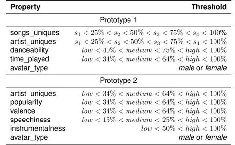
4.1 Data mapping of the avatars. . . 26
4.2 Music feature thresholds . . . 31
Abstract
The increased interest for self-tracking through the use of technology has given birth to the Quantified Self movement. The movement empowers users to gain self-knowledge from their own data. The overall idea is fairly recent and as such it provides a vast space for exploration and research. This project contributes to the Quantified self movement by proposing a concept for visualization of personal data using an avatar. The overall work finds inspiration in Chernoff faces visualization and it uses parts of the pre-sentation method within the project design.
This thesis presents a visualization approach for Quantified Self data using avatars. It tests the proposed concept through a user study with two iterations. The manuscript holds a detailed overview of the designing process, questionnaire for the data mapping, implementation of the avatars, two user studies and the analysis of the results. The avatars are evaluated using Spotify data. The implementation offers a visualization library that can be reused outside of the scope of this thesis.
The project managed to deliver an avatar that presents personal data through the use of facial expressions. The results show that the users can understand the proposed mapping of data. Some of the users were not able to gain meaningful insights from the overall use of the avatar, but the study gives directions for further improvements of the concept.
Keywords: Quantified Self, Chernoff faces, avatars, data visualiza-tion, Spotify
1
|
Introduction
1.1
Background
In a ubiquitous computing world, almost every aspect of our daily online and offline activities are logged somewhere over the Internet. This informa-tion is collected through various sensors placed in the surrounding infras-tructure, smartphones, online accounts etc. The collected data potentially holds meaningful understandings about us.
Possibly, the user can master new skills and grasp personal insights by reflecting on its own data. This can lead to self-improvement in various
aspects of our personal development [Mols et al., 2016]. For example,
tracking exercise performance by using a wearable can provide us with a deeper understanding of our current physical condition. This can be done by examining the information which is collected from the device. With this knowledge the user gains meaningful insight that can lead to improvement of its exercise habits, food diet, general health etc. Because of this benefit and overall increased access of technology, self-tracking is becoming very popular among people who exercise regularly.
This phenomenon of using technology for self-tracking in order to gain self-knowledge is called Quantified Self (QS). The term was first introduced
by Wired Magazine editors Gary Wolf and Kevin Kelly in 2007 [Quantified
Self Labs,2012]. Furthermore the authors created a movement that ex-plores the potential of QS data through user groups, conferences, articles, online discussion etc. They focus on self-improvement, for self-discovery, self-awareness, self-knowledge through self-tracking. Wolf in one of his talks gave the following statement:
We know that new tools are changing our sense of self in the world – these tiny sensors that gather data in nature, the ubiq-uitous computing that allows that data to be understood and used, and of course the social networks that allow people to collaborate and contribute. But we think of these tools as point-ing outward, as windows and I’d just like to invite you to think of
them as also turning inward and becoming mirrors. [Wolf et al.,
1.1. Background
The QS movement brings empowerment for the user. It allows us to take ownership of our data and gain added value from their analysis. The ben-efits mentioned by the founders of the movement are realistic and achiev-able. Still this concept is quite new and as such it raises a lot of questions. This thesis aims to contribute to the general discussion of the QS move-ment. Hopefully some of my findings can lead to better understanding of how users perceive QS visualization. This potential knowledge can ulti-mately improve the way we design interaction for QS apps.
This thesis aims to contribute to the movement by analyzing new ways of visualizing quantified-self data with the use of data-generated avatars. It
is part of an ongoing project1 that explores creative ways to visualize QS
data, aggregated from social media and Internet of Things services.The
initial work has produced a thesis [Nake,2015] and two conference papers
[Nake et al.,2016; Alissandrakis and Nake, 2016]. Through its research the project aims to provide meaningful insight for the user.
The project compliments the ongoing trend for self-tracking. In recent years self-tracking apps have gained massive popularity. According to a
study [Rocket Fuel,2014] conducted by Rocket Fuel, a provider of artificial
intelligence (AI) marketing and advertising solutions, 31% of consumers in U.S are currently using a QS tool to track their life habits. Furthermore, 20% of consumers know someone close who uses a this kind of tool, and 25% of consumers are interested in obtaining a QS tool for health and fitness. Nearly one in five planned to give a QS tool to someone as a gift, which further shows determination for these type of interest to track health and
fitness behavior digitally. Apps such as: Habbit Tracker2, Instant -
Quanti-fied Self, Track Digital Wellbeing3, Sleep as Android: Sleep cycle tracker,
smart alarm4, Fabulous: Motivate Me! Meditate, Relax, Sleep5etc., have
millions of downloads all over the Internet stores. The QS movement holds
more than 500 examples of apps6. They cover a broad spectrum of topics
such as: personal wellbeing, exercise habits and performance, productiv-ity, socialization etc. Most of these applications tend to provide meaningful insights for the user.
In an article [Waltz,2012] through self reporting in period of two months,
Waltz provides observations of how the consumers of today can quantify
1
Project details: https://lnu.se/en/research/searchresearch/forskningsprojek t/projekt-visualizing-quantified-self-data-using-avatars
2Habbit Tracker: https://play.google.com/store/apps/details?id=com.oristats
.habitbull
3
Instant - Quantified Self, Track Digital Wellbeing:https://play.google.com/store/ap ps/details?id=com.emberify.instant
4Sleep as Android: Sleep cycle tracker, smart alarm: https://play.google.com/stor
e/apps/details?id=com.urbandroid.sleep
5Fabulous: Motivate Me! Meditate, Relax, Sleep:
https://play.google.com/store/ap ps/details?id=co.thefabulous.app
6
1.2. Motivation
themselves. The report provides an analysis of how she recorded and
analyzed biometric data on daily basis with the use of the five most popular7
devices on the market. The article claims that with a proactive use of the tools the outputted data offers a numeric picture for the users health, fitness and sleeping condition. Besides consciously collecting data with various devices and wearables, everyday users are generating vast data traces through their smarthpones and social media accounts. The QS movement provides tools for analysis of this type of data logs, but it is worth to note that they are not as popular as the health and fitness tracking tools.
As the trend grows so is the need of providing interactive presentation of data. A current familiar problem of the QS movement is that users often
lose interest in the usage of the self tracking tools [Gouveia et al.,2015;van
Berkel et al.,2015]. A consumer report [Ledger and McCaffrey,2014] that confirms this claim, presents a study in which one third of 6223 users have dropped using self-tracking apps within a span of six months. This issue can be addressed with rethinking the design approach for QS tools. This
is where the thesis finds inspiration in applying Chernoff [Chernoff,1973]
type of visualization in QS applications. Potentially this approach could add value for the user experience and maintain his/her interest. More on this idea will be elaborated in the upcoming sections.
1.2
Motivation
As it was noted in the previous subsection of this thesis self-tracking fitness and health apps are on the spotlight of the QS movement. They mostly fo-cus on measuring and displaying the user performance. This data provides guidance and motivation for future improvement. These QS apps offer a direct benefit for the user which makes them popular. People have interest in tracking these aspects of their lives long before the digital revolution. Still there is much more data about ourselves that we unconsciously create on a daily basis. Everything that we undertake over the Internet with our per-sonal computers or smartphones leaves a data trace. This thesis considers that there is potential in exploring how this data can be visualized.
One of the challenges for the QS movement is found in the presenta-tion and visualizapresenta-tion of the QS data. There are potentially many hidden meanings in each QS dataset. Through proper data visualization we can contribute in discovering these insights. It is important to note that the choice of how we visualize QS data directly affects the quality of the self-reflecting process. Effective visualization will give to the user an added
value [Marcengo and Rapp, 2014]. We need to address the methods of
how we display this information in a meaningful manner.
7
Zeo Sleep Manager Pro: Mobile, Fitbit, BodyMedia FIT Core Armband, iHealth Blood Pressure Monitoring System, and iHealth Digital Scale.
1.2. Motivation
Plain charts are not enough to display multivariate QS data [Marcengo
and Rapp,2014]. This claim is based on a study that shows that the viewer attention focuses only on partial segments from the displayed data visual-ization. Furthermore the article argues that the visualization should gov-ern the points of focus especially in cases of large datasets such as QS data. This creates the need of exploring new ways of representing our data
trace. As a solutionMarcengo and Rappsuggest a model of storytelling.
As the saying goes, data presented in a picture can hold thousand words. The pre-attentive visual processing of an image can provide the users with meaningful insight without applying complex analysis. This can make the understanding of the personal data very straightforward. Following up on this, the thesis raises the question “How to generate the visualization of a story?”. The use of avatars in presentation of QS data can contribute to the idea of storytelling through an image. Complex aspects of our every-day digital records can be simplified and presented within an avatar. This method of data representation could provide clear insight of our life habits and increase of accessibility of our own data.
In [Nake,2015;Nake et al., 2016] as well as [Bogdanov et al.,2013], the authors use items to represent the information. The position and the size of the item should also signify some sort of meaning. This approach seems visually appealing and playful for the users. It is also worth to notice that this type of visualization is limiting because it can only be used for the project it was created for. Reusing those visualizations for a different purpose demands adjustments and rethinking some visual aspects. This project avoids using items and visualize the values from the data as part of the face and body features. This takes the project to the core concept of Chernoff faces. The Chernoff method uses facial expressions to present multivariate data. This concept can be used as an avatar face. Additionally it will allow the prototype to be reused for different type of QS datasets.
In the Merriam Webster dictionary, “avatar” is defined as an electronic image that represents and is manipulated by a computer user in a virtual space (as in a computer game or an online shopping site) and that
inter-acts with other objects in the space8. Data generated avatars can create a
bound between the users and their data. They can represent embodiment of our data records. There is a potential for creating a prototype that can provide interactive data visualization with the use of an avatar.
Recent events such as the Cambridge Analytica scandal [Cadwalladr
and Graham-Harrison,2018] have raised the public awareness about In-ternet privacy and safety of personal data. Events like these have shaken
the trust between companies that collect data and their users [Greenfield,
2018]. A possible solution to overcome this mistrust can be in increasing
8Link of the definition: https://www.merriam-webster.com/dictionary/avatar, last
1.2. Motivation
the transparency from the company’s side. Providing the collected data back to the user offers an added value for both sides. The company can show in details what kind of information it collects, while the user can dive into the world of QS. There is a potential to use the avatar visualization for this form of data. Very often the collected data can be seen as irrelevant or boring. The avatar is meant to deal with multivariate complex data. It can provide meaningful insights about the user activity in an engaging and in-teractive manner. This type of visualization can be used to raise awareness among users about their online presence. Having frequent updates for the user activity which are easy to consume will improve the understanding and perception of how the services actually work. It can show in detail aspects of their usage for which the users are not completely aware of or they do not directly correspond with their personal impression.
Furthermore, early QS apps show that users give up on Quantified Self
and fitness-tracking applications in a short timespan [Ledger and
McCaf-frey, 2014]. This creates the need for exploring new interactive ways of
data visualization in order to maintain the user attention in a longer times-pan. A potential solution is found in visualizing passive collected data from the user. This data is mostly generated for commercial purpose. Although the structure of the information is complex, through the use of the avatar it can be refined for mass usage. This visualization does not require any ac-tive participation from the user in the process of data collecting. Taking an advantage of something that already exist could be one of the core concept for maintaining the user attention.
As mentioned, the QS movement has found most of its popularity among users who are interested in tracking their health and workout performance. It is important to note that this type of tracking is done intentionally with the aim to gain useful insight about our wellbeing and physical condition. Still we have to consider the fact that there is much more in the movement be-sides health and fitness tracking. On an average, a user generates between
0.33 - 0.79GB of data per day.9 This data is neglected by their creators. The
avatar visualization can provide context for this vast sea of data. It is envi-sioned to simplify the way we present data which can ease the information consumption for the user. The avatar can serve as a gateway for the user in the QS movement.
This section offers potential in researching the idea of generating avatars from QS data. For me as an author this field holds uncharted knowledge
9
These numbers are provided from the IBM’s article 2.5 quintillion bytes of data created every day. How does CPG & Retail manage it? (https: //www.ibm.com/blogs/insights-on-business/consumer-products/2-5-quintillion-bytes-of-data-created-every-day-how-does-cpg-retail-manage-it, last opened 19/08/2018); and CISCO’s report - The Zettabyte Era: Trends and Analysis ( https://www.cisco.com/c/en/us/solutions/collateral/service-provider/visual-networking-index-vni/vni-hyperconnectivity-wp.html, last opened 19/08/2018).
1.3. Research questions
which is challenging to explore. Additionally I firmly believe that the main focus of technology should be improvement of human lives and the values of the Quantified Self movement goes along with this cause.
1.3
Research questions
Complementing on the motivation which was brought up in the previous section, the following research questions were composed:
RQ1 How to create an avatar based on the Chernoff faces technique for
data visualization?
RQ2 How to visualize multivariate Quantified Self data using an avatar?
RQ3 How to visualize passively collected personal data in an avatar?
RQ4 How to provide meaningful insights for the users through visualization
of their personal data in an avatar?
With an attempt to answer the first three questions the thesis will de-velop an online application that visualizes QS data in an avatar. The avatar will use facial expression to present data. This exploratory project will use data from Spotify. Through every user activity on the platform a log is cre-ated in the background of the service. Using users consent, the platform offers access of their activity. Additionally it provides advanced meta data for the streamed music. The logs combined with the meta data could pro-vide intriguing avatar for the users. This extensive API represents a pas-sively collected multivariate QS data which makes it ideal for the research project. Although the implementation will be conducted on data from one social network, the overall work will provide a know-how and a technical solution for reusing the proposed concept in a different project.
For the fourth question a study will be conducted to observe the user behavior. The study will provide answers of how the users perceive and understand the proposed concept. The results of the study will be used for creating a second prototype. Through reflecting on the user behavior into the design process, the second prototype should provide deeper insight than the first iteration. This reiterative method will provide a model of how to generate a meaningful data visualization using an avatar. More on the
approach and methodology is elaborated in the Chapter3.
It is worth to notice that the thesis finds a potential in researching ap-proaches that can extend the usage of QS applications through a longer time span. As elaborated in the previous section, dropping out (due to loss of interest in self tracking) is one of the current problems of the QS movement. The author of the thesis considers that the time frame in which the thesis project needed to be implemented, analyzed and documented
1.3. Research questions
did not allow for exploration of this problem. This type of issue requires a longer study through several iterations. As it is not intended to provide an incomplete answer, this additional question will be postponed to future work – through the fourth research question of this thesis contributes in partially addressing this problem. Providing meaningful insight could spark interest for longer usage of the avatar. This finding could be reused in other QS apps.
2
|
Related work
2.1
Visual perception of facial expressions
People grow up studying and reacting to faces all of the time. Small and barely measurable differences are easily detected and evoke emotional reactions from a long catalog buried in the
memory. [Chernoff,1973]
Chernoff face visualization tends to exploit this human capability for the purpose of presenting multivariate data. The core concept of the visualiza-tion is to show different aspects of a dataset on 18 different face elements.
According toChernoffthe visualization holds mnemonic advantages when
it is used for comparative analysis of large numeric data. In an analysis [Bruckner,1978]Brucknerargues that one of the advantages for using the Chernoff visualisation method is that faces are easily recognized and de-scribed. He provides an analogy which states that a common user could face obstacles in the differentiation between sine curves. An untrained user could struggle to recognize and describe different curves. On the other side for the user it would be easy to pinpoint each element of the human face without any training. Additionally the user could easily communicate and notice changes in the facial expression.
There is an ongoing debate among the scientific community about the effectiveness of the Chernoff face visualization. Although this visualization concept has shown its practical implementations, research has also given
results that the faces do not offer pre-attentive visual processing [Morris
et al.,1999] as claimed by their author. In general Chernoff faces do not of-fer any particular advantage over other iconic type of visualization. Another
study [Sivagnanasundaram et al., 2013] which aimed to explore Chernoff
claims search showed that there is no advantages in the method for sup-porting efficient spatial search of data. The study tested the claims by mea-suring perception on various set of faces on 65 participants.
When it comes to recognizing facial expression, the human mind
per-ceives the face as a whole [Robert Kosara,2007]. In the context of Chernoff
faces, this means that the user needs to be trained to break down differ-ent aspects of the face visualization in order to read and understand the
2.1. Visual perception of facial expressions
presented dataset. Additionally the facial expression recognition follows a
strong hierarchy [Robert Kosara,2007]. This set of cognitive rules
deter-minants in which facial features we focus at, and how we identify people. For example pupils and eyebrows have much more attention then all the
other features [Morris et al.,1999]. This leads to the conclusion that some
different segments of the data can be neglected.
Despite the argument that Chernoff faces can present vast spectrum of multivariate data, not every case is appropriate for applying this type of visualization. This is due the fact that the facial expressions can represent a particular emotion. In situations where the dataset holds sensitive infor-mation which can temper with human emotions, applying Chernoff face can lead to confusion or even insult. In order to avoid this type of situations the designing process must be done with percussion and reiterative analysis.
As mentioned, Chernoff faces is the main inspiration for the overall project. With the anticipation that the previous arguments can also ap-ply to the avatar, the thesis added supportive features in the application UI to overpass the possible limitations. The features included detailed
in-structions of how the avatar works, tooltip1and email support. During the
designing process of the avatar, additional attention was made for the seg-ment of linking the data with the body features.
Chernoff also argues that if the faces are presented individually they provide a small value as a communication tool. Presenting the data as a personal avatar while using the human capabilities for noticing changes in facial expression could hold the key of using this type of visualization as a communication tool. Active use of the avatar can communicate different states of the user’s recent activities. Additionally displaying multiple avatars to represent a longer time span could help the user to conduct a compara-tive analysis of its data trace.
In their work Ekman et al. propose a Facial Action Coding System
(FACS) for analysis of facial expressions [Ekman and Rosenberg, 1997].
They recognize various muscles which when contracting they display dif-ferent facial expressions. Those combinations of facial muscle contractions are defined by Ekman as Action Units (AU). Different AU can display various emotions, something that the human mind is programmed to understand. Chernoff claims that the visualization of the facial expressions can be car-toonish instead of realistic. The human mind is capable of recognizing
facial appearance even in illustrations [Chernoff,1973]. Different positions
of FACS can be used for selecting various features from the avatar face as placeholders for data. Still the concept of AU is merely an inspiration and loose guidance for the creation of the avatar. This project does not aim to present QS data as emotions of an avatar.
1
2.2. Use of avatars in data visualization
2.2
Use of avatars in data visualization
As part of the “Visualizing quantified self data using avatars” project2,
Alis-sandrakis and Nake proposed a design for avatars using data from
Insta-gram, Twitter, LastFm and Human API. In Nake’s work [Nake,2015] she
conducted a user study with the goal to explore the possibilities of using an avatar in visualization of QS data. Based on the findings from the user
study she created a prototype [Nake,2015;Nake et al.,2016]. The project
showed that most of the participants were able to recognize their avatar generated from their activity within a set of avatars. This finding provided a solid foundation for further research.
An interesting study [Farshid et al.,2012] suggests the use of Chernoff
faces as a tool for visualization of consumer data from social media. They see the use of Chernoff faces as a powerful tool for comparison. In the study they analyze data from six Sauternes wine brands based on social conversation measurement. Although this is not QS data it still is a good example of using the faces for visualization of data. This paper provides a good insight of the thinking process for data visualization by using Chernoff faces. The result of the study shows that Chernoff faces could become invaluable tool for comparison of data for brand managers particularly in cases where there is a need of simplified data. For this case Chernoff faces showed that it could be a useful visualization of clustered data.
A visionary project [The Discipulus Project, 2013] funded by the
Eu-ropean Commission aims to implement a medical avatar for each patient in the European Union. The project aims to generate the avatar based on health data for the patient from different health institutions. With this
project,The Discipulus Projectaims to solve the problem of dispersed data
from the European health care system. Furthermore the aim of the avatar is to provide for the patients more detailed information about their condition, treatment options and possible means to improve their lifestyle. An opinion
article [Brown,2016] based on the project sees a mnemonic potential of the
future avatar by directly pinpointing for the user their health issue. Project like this show the overall research and commercial potential for using an avatar for presenting personal data.
The QS movement holds a significant number of visualization projects. One particular from Jana Beck uses Chernoff faces for visualization of her
diabetes (insulin) tracking system [Beck,2014]. The project uses the faces
in order to establish an emotional connection with the data. This work is also interesting from a technical perspective since it is using D3js library, which is the same technology that was planned to be used for implementa-tion segment of the thesis.
2Project details: https://lnu.se/en/research/searchresearch/forskningsprojek
2.3. Quantified Self Spotify projects
An interesting visualization bySkiptune LLC3, demonstrates how to link
musical metrics to facial features of Chernoff Faces. The faces are con-structed using melody data from different types of music genres. The re-sults provides interesting oversight in the variation of different music fea-tures according to their genre. The overall project shows how music can be visualized using Chernoff faces. This approach inspired me to reflect on music data extracted from user profiles. Music holds a great importance in our everyday lives. Reflecting on our daily music listening activity can pro-vide deeper understandings of our habits. This type of data seems suitable for the first iteration of the project.
A study that aims to visualize music metadata into avatar was conducted byBogdanov et al., collecting music data from LastFM user profiles [ Bog-danov et al.,2013]. They tracked the most popular songs for a user in order to determine his/her music style through an algorithm analysis of the songs. In the first part of the study they analysed different features from a song. Afterwards they interpreted the results in a music avatar. The avatars vary depending on the most dominant type of music which was discovered by the algorithm. This research is very similar to my thesis prototype since it includes music analysis and visualization of the results into an avatar.
2.3
Quantified Self Spotify projects
The Internet holds many different “homebrew” projects of Spotify users an-alyzing their own data. In the blog post, Is my Spotify music boring? An
analysis involving music, data, and machine learning4, the author shows
how the music features for a song provided by the Spotify API can provide deeper insight of the music listening habits. In a similar project, Visualizing
Hundreds of My Favorite Songs on Spotify5, by using the song features,
the author demonstrates how visualization can improve the understanding of our music preferences. As a follow up on this article a visualization tool
called SpotRecs6was developed. The tool utilizes Spotify’s API in order to
process and analyze songs, allowing users to know more about what mu-sic they enjoy. Popular visualization tools such as Tableau can also directly access Spotify personal data. This feature allows the users to explore their
3Skiptune LLC is a self-funded corporation established in the Commonwealth of Virginia
in 2014. The Skiptune project seeks to understand how melodies are structured and have evolved across cultures, genres, and years, and is as much of a process as a project. [Skiptune LLC,2014]
4
Detailed link for the blog post: https://towardsdatascience.com/is-my- spotify-music-boring-an-analysis-involving-music-data-and-machine-learning-47550ae931de, last open on 28/07/2018
5Detailed link for the blog post:
https://medium.com/cuepoint/visualizing-hundre ds-of-my-favorite-songs-on-spotify-fe50c94b8af3, last open on 28/07/2018
6
Detailed link for the application: https://jyu.github.io/spotrecs/, last open on 28/07/2018
2.3. Quantified Self Spotify projects
music preferences. Projects like these are providing interesting overview of how Spotify data can be utilized for discovering personal insights. They also offer solid guidance how to collect and analyze Spotify data.
As a part of Spotify DevX 2017 alongside with other team members, the
thesis author had the opportunity to develop a web application7that
gener-ates art based on a user’s last fifty Spotify songs. musicScapes genergener-ates a landscape based on the Spotify music features for every extracted song. The landscape changes depending if the user has listened to happy or sad songs, energetic or calm, major or minor mode and other track features. The purpose of the project is to provide the users with a bigger insight of their Spotify activity and establish a healthier relationship with their data. We saw this app as a daily reflection tool for the music lovers. The thesis work at the time inspired the creation of musicScape. Although the app never got any official user testing, the design and the implementation pro-cesses provided a valuable knowledge for the ongoing work on this thesis.
7
Detailed link for the musicScapes application:https://musicscapes.herokuapp.com, last open on 28/07/2018
3
|
Methodology
The methodology for this thesis is divided in three segments. The first segment offers methodology for developing a visual system for the avatar. The second segment aims to explores the data collected from the user Spotify accounts. The third part of the methodology is focused on user testing of the proposed concept.
3.1
Prototyping
3.1.1 Exploration of various avatar implementations
With the goal to get inspiration for the prototype design an online research was conducted to explore various online avatars and Chernoff visualiza-tions. The research took in consideration examples of avatars that can potentially hold user data in their elements. Those examples were mostly consisted of avatars with detailed illustrated faces and bodies. Some of the
most influential examples are presented on Figure4.1.
In the next step an analysis of the collected examples was made by the author of the thesis. The analysis was focused on two segments. The first explored various implementation of avatars which provided guidance for the prototype aesthetics. The second analysis aimed to envision possibilities of binding data in the avatar elements. They were individually observed by analyzing their design elements (space, shape, color, texture and position). For each example various comments were provided. The comments didn’t follow any specific structure. They aimed to serve as a mental note for the
author opinion. For example for Figure4.1.C some of the comments were
that it is visually appealing approach which can be implemented in a short
period of time. More on this is elaborated in subsection4.1.2.
Based on the comments four basic requirements were generated. They served as guidance in the designing process as well as in the implementa-tion of the web applicaimplementa-tion. The requirements were as follows:
• The design should offer features that can represent different states of the user data.
Development of the avatar mockup
• The avatar should be understandable. • The avatar should be simple to implement.
The requirements are explained in more detail in subsection4.1.1.
3.1.2 Development of the avatar mockup
For conceptualizing the avatar visual appearance and data presenting meth-ods, several static graphic mockups were made. The mockups were illus-trated using Adobe Illustrator. In addition of the graphical elements for the mockups, notes were added to explain the possibilities for the data present-ing features of the proposed avatars.
After the designing of the mockups a discussion was made to choose the final concept for the avatar between the author and the mentor of the thesis. During the discussion the previously mentioned requirements were taken as standard for grading the mockups. At the end one of the mockup was chosen as the avatar appearance for the prototype.
3.1.3 Concept design questionnaire
With the aim to evaluate the data mapping for the chosen mockup a user study was conducted through a dissemination of an online questionnaire. This questionnaire was meant to test and validate some proposed visual-ization concepts. The users were tasked to answer the questions with the option(s) that they consider to be the most appropriate. The questionnaire challenged them to match examples of various state of the avatars with their equivalent data chart and vice versa. In the final stage of the questionnaire the users were asked to recognize a potential state of the avatar based on some music listening example. They were also told that there is no such thing as a correct answer. Throughout the questionnaire the participants had the opportunity to provide opinion for each feature individually and for all the features as a whole. The questions were repeated in different forms as a method to measure the participant consistency.
Behind the scenes for the purpose of the evaluation of the received results, there were answers which were considered to be close to the pre-dicted mapping and answers which were considered to be extremely off from the envisioned visualization. This insight offered solid evaluation and guidance for improvement of the proposed concepts.
3.2
Data exploration
For this project it is important to understand the data retrieved from Spotify. Spotify offers rich data for the songs that can be streamed from the service. The data which was collected for this project is consisted of all the streamed
3.3. User study
songs for a given user profile during the user study. For each of the songs there was also a collection of audio features which are provided by Spotify. For that purpose an exploration of Spotify API documentation was made. The research was focused on the endpoints that provide audio features and audio analysis of a song, since these parts of the data seemed abstract and hard to interpret in a practical case. This part of data is one of the core features for the visualization. This research also provided understanding about how Spotify tracks user activity and how to utilize that in the project implementation.
For that purpose a set of song was used to see the spectrum results for various music genres. The findings from the research gave direction how to parse, calculate and map the retrieved data.
3.3
User study
For the user study a small online campaign was made to recruit partici-pants. The recruitment campaign was consisted of disseminating adds for participants over Facebook and Twitter. Additionally word to mouth was used to promote the app among the students and teaching staff at the Lin-naeus University. The implemented application was named musicAvatar. This was done with the intention to simplify the communication with the participants and to make the overall project more appealing for the public.
After their first login the users received an email with instructions how to use the avatar as well as details for privacy of the app. The email instructed the users to read carefully the instruction page in the application in order to learn how the avatar works and the privacy page which was consisted of details of what kind of data is extracted from the user profile and how it is used. The email asked the users to use the app as regular web application with no emphasis for the amount of usage. It also informed them that at the end of the testing phase, some of them would be contacted for an additional interview.
The study for the first iteration of the prototype lasted for a month while for the second iteration the user study period was two weeks. The users were able to use the musicAvatar application by logging in (providing ac-cess) with their Spotify records. Only Spotify users were invited to partici-pate in the testing.
3.3.1 Data collection
The prototype was programmed to log the users activity. Additionally Likert scale and a comment box were added as optional inputs for the user opin-ion. The collected information was used for the analysis of the prototypes. The following list describes the data documents used for the logs during the two iterations:
Data collection
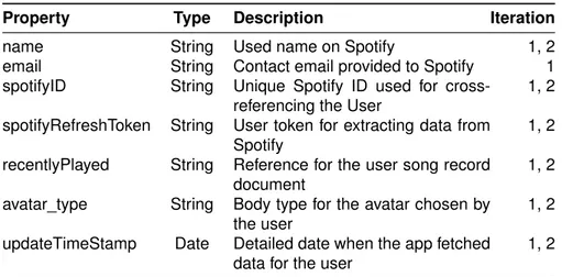
Property Type Description Iteration
name String Used name on Spotify 1, 2
email String Contact email provided to Spotify 1 spotifyID String Unique Spotify ID used for
cross-referencing the User
1, 2 spotifyRefreshToken String User token for extracting data from
Spotify
1, 2 recentlyPlayed String Reference for the user song record
document
1, 2 avatar_type String Body type for the avatar chosen by
the user
1, 2 updateTimeStamp Date Detailed date when the app fetched
data for the user
1, 2
Table 3.1: User logs. The table presents JSON object that contains the basic information for the user.
• Users
The data document (see Table3.1) kept the user contact info. It was
used to reference the user data in the other log documents. The personal contact info was only used for communicating with the users.
Some of the data was extracted from the GET /v1/me/1 endpoint at
Spotify. Additionally this data document kept record of the user last activity, Spotify credentials, and app preferences.
• User record
The User record (see Table3.2) holds all songs which were listened
on Spotify by the users during the User testing phase. For each user there is a document that holds array of Song objects. The song ob-jects contains all the essential information about the song. This data is used to analyze the users Spotify music activity and to generate their avatars.
The information is generated by merging data from two endpoints:
GET v1/me/player/recently-played2and GET /v1/audio-features3
• User activity.
The app kept a log record of all the attempts to fetch data from Spotify. The initiation of fetching the new data was done on four hour intervals
1
https://developer.spotify.com/console/get-current-user/, last open on 29/07/2018
2
https://developer.spotify.com/console/get-recently-played/, last open on 29/07/2018
3
https://developer.spotify.com/console/get-audio-features-several-tracks/, last open on 29/07/2018
Data collection
by the server side or on opening the app by the user. The User Activity
document log (see Table3.3) holds an Array of Objects. Every Object
represent an individual activity. • User seen data
Every time the app displayed an avatar a record log was created. This was used to explore the user experience. In the analysis this logs offered a detailed insight of what type of avatar state the user experi-enced. This log only kept track when data was displayed. Whenever there was no data to be seen the activity was logged only with the
User Activity log. See Table3.4.
For the First and Second prototype as well as the MyDay feature the app kept a separated log document.
• User comment
All comments provided by the user on the MyDay feature and the sec-ond prototype were tracked by the User comment log. This log kept a simple record of the comments provided by the user. Analysis of these logs provided direct insight of the user opinion. The comments were also used in the process of selecting the participants for the
interview. See Table3.5.
• User opinion
In the first prototype the users were able to provide an opinion through a Likert scale with a comment box. They were asked if they think that the avatar accurately represent their last two hours of Spotify music
listening. The option 1 represented Strongly Disagree and option 5
Strongly Agree. The comment section was optional. This logs pro-vided material for analysis of the user opinion. The document
struc-ture is presented on Table3.6.
• User download img and User change body
The final two type of logs recorded when the user used the change avatar and download image feature. The documents included a time stamp of the record and user Spotyfy ID. For the change of avatar a record of the new chosen type of avatar was also kept.
The data was stored and analyzed in JSON format. All the data were anonymised with the intention to preserve the user privacy. The recorded logs provided a detailed overview for each user. Through the User study the project tested the core concept for the avatar. This study offered detailed feedback for the user experience and gave directions for further improve-ment.
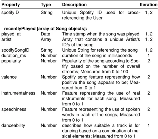
Data collection
Property Type Description Iteration
spotifyID String Unique Spotify ID used for cross-referencing the User
1, 2
recentlyPlayed [array of Song objects]:
played_at Date Time stamp when the song was played 1, 2 artist Array Array that contains a unique Artist/s
ID/s of the song
1, 2 spotifySongID String Unique String for referencing the song 1, 2 duration_ms Number duration of the song in milliseconds 1 popularity Number Popularity of the song according to
Spo-tify based on the number of overall streams; Measured from 0 to 100
2
valence Number Spotify song feature representing how positive the song appears to be; Mea-sured from 0 to 1
2
instrumentalness Number Feature representing the use of real instruments for each song; Measured from 0 to 1
2
speechiness Number Feature representing the use of spoken words in each of the songs; Measured from 0 to 1
2
danceability Number describes how suitable a track is for dancing based on a combination of mu-sical elements; Measured from 0 to 1
1
Table 3.2: User record logs. The table presents a JSON object that holds data for all the recent played songs for each user user. The recentPlayed property present an array of Song Objects.
Property Type Description Iteration
spotifyID String Unique Spotify ID used for cross-referencing the User
1, 2 time_stamp Date Time stamp when the activity was
logged
1, 2 didFetchData Boolean Boolean that shows if data was
re-trieved from Spotify
1, 2 auto Boolean Boolean that shows if the data was
fetched automatically by the server
1, 2
Table 3.3: User activity logs. The table presents a JSON object that holds information for an event when the app tried to fetch data from Spotify.
Data collection
Property Type Description Iteration
spotifyID String Unique Spotify ID used for cross-referencing the User
1, 2 time_stamp Date Time stamp when the activity was
logged
1, 2 obj JSON Object Object that contains all the data
param-eters for the displayed avatar
1, 2 body_type String String value of the displayed avatar
body
1, 2
Table 3.4: Users seen data. The table presents a JSON object that holds the information of all the time the app displayed an avatar.
Property Type Description Iteration
spotifyID String Unique Spotify ID used for cross-referencing the User
1, 2 time_stamp Date Time stamp when the activity was
logged
1, 2 comment String String value of the provided comment
by the user
1, 2
Table 3.5: Users comment log. The table holds a JSON object for a com-ment provided by the user for the displayed avatar.
Property Type Description Iteration
spotifyID String Unique Spotify ID used for cross-referencing the User
1 time_stamp Date Time stamp when the activity was
logged
1 comment String String value of the provided comment
by the user
1 value Number Value between 0 - 5 representing the
opinion provided by the user
1
Table 3.6: Users opinion log. The table holds a JSON object for a comment and opinion provided by the user for the displayed avatar.
Post-study interviews
3.3.2 Post-study interviews
At the end for both of the user studies the methodology included interviews with some of the users. For the first iteration few participants were cho-sen for an oral interview. The interview questions were composed after a brief analysis of the collected records. Three users participated in the user testing. The most active participant who was also provided constructive criticism towards the prototype in the comments was chosen for the inter-view. The other two participants represented “average” active users on the application. In their initial feedback before the interview they provided both high and low values for the avatar. The interviews lasted between 30 and 40 minutes.
For the second iteration a list of written question was send to all the testers. Same as before, the questions were composed after a brief analy-sis of the collected records. All testers received questions. The questions were identical for every user.
The goal of this phase to get a detailed insight from an user perspec-tive. The answers helped to improve the prototype design for the second iteration and they provided inspiration for future work.
3.4
Limitations
3.4.1 Finding participants
The study struggled to find appropriate testers. Although there was a signif-icant number of users only few of them were actually interested in tracking their music behavior. The project depended on a specific profile of users. The ideal candidate was considered to be a proactive Spotify user who is interested in tracking his/her daily music habits. A person with this profile could provide a meaningful feedback for the avatar.
The early results, retrieved after the first week of the user study of the first prototype, showed that the initial users are not as active on Spotify as the project wanted them to be. This issue was tackled by promoting the app in various Facebook groups for music and data visualization. The assump-tion was that in these groups there is a higher chance of finding the proper candidates for testing. Still considering that this project is conducted by one person the overall outreach didn’t manage to acquire a larger number of proactive Spotify users interested in tracking their activity.
3.4.2 Spotify data limitations
Spotify offers comprehensive support for developers using their API. Still during the user study there were cases in which the project was limited due to the rules set by the provider of the data, malfunction of the company
Spotify data limitations
system and bugs in the prototype deployment. Spotify limits the number of songs which can be retrieved from the recent_played endpoint to 50 per user. This meant that musicAvatar was able to see only the last 50 songs streamed by the user. This policy presented a limitation because the prototype was designed to present time periods. For the avatar to be accurate it needed a stream of linear data, while Spotify provided desecrate data. This issue was resolved with an implementation of an interval of http reqests towards Spotify for each user individually. The server side on every four hours made a call to Spotify to see if there are any new songs for the users. Cases in which the user has listened to more than 50 songs in a time span of four hours the web application was not able to see all of the data. Although it was considered that cases like these are not very likely to happen, there was no mechanism to spot or record them.
As an additional limitation was considered the server side of the proto-type. There were times were due to unhandled error or malfunction by the server host provider the intervals did not fully complete their iterations. The reasons for the unhandled errors were mostly because of inconsistency in the received data. This cases were not anticipated during the development of the application back-end. They were fixed “on the go” during the user testing period. Although these type of bugs were reported and handled in a short period, there is a potential of missing some records for the users.
The data testing mentioned in the subsection 3.2 showed that some
music features can appear to be incoherent. For example the API docu-mentation from Spotify claimed that the speechiness for rap music should be above 0.33. In many cases for particular rap songs the value was bellow 0.05. This was considered confusing. Similar cases were spotted with the instrumentalness feature. This inconsistency of the data presented chal-lenging burden for providing proper thresholds.
Finally there were reported cases in which some of the Spotify API servers were reported to be down. This proved limited access to the API which made the application significantly slow. During this period there might be cases were the app missed data for the users. Additionally these prob-lems affected the quality of the user experience due to increased waiting time.
4
|
Prototype development
4.1
Design of the prototype
4.1.1 Design principlesThe following design requirements were used as a guidance for creating the mockup of the avatar. They were generated based on an analysis of various avatars and Chernoff visualizations.
• The design should offer features that can represent different states of the user data.
Since the avatar is meant to represent data the design should envi-sion features that can display different states. This can be achieved by changing the position of some of the avatar elements according to the data input. For example similar to the concept of Chernoff face, the mouth of the avatar can hold data. Open type mouth can hold one state of data, while closed mouth can hold the opposite state. Follow-ing this logic different body and face elements can be used for data visualization.
• The changes of the avatar should be noticeable.
It is important for the user to notice the changes on the avatar. On the opposite the visualization can appear as a static image. For that purpose the dynamic features should be emphasized while the rest of the body should appear neutral. This can be achieved through the use of various design elements such as color, size, shape, form, space and position. For example a strong color for the mouth which is placed on a neutral skin color can get the attention of the user. • The avatar should be understandable.
The user should be able to easily understand the proposed concept for visualization. For that reason the avatar should apply clear dif-ferentiation between the extremes in the dataset. The viewer should be able to recognize and separate the presented minimum and maxi-mum. The in-between states should follow a logical progression. This
Graphic design of the avatar
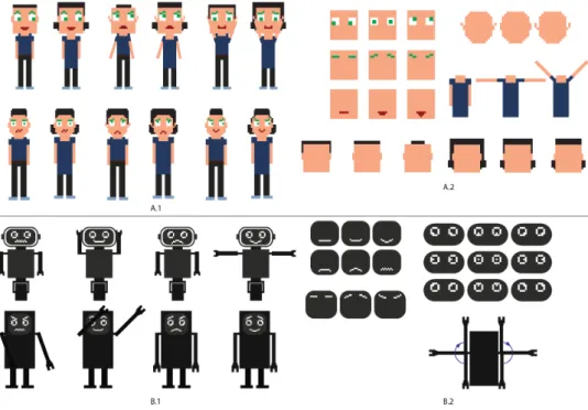
Figure 4.1: The image presents the main inspiration for the musicAvatar, A) Facebook Space, B) Bit emoji, C) Unknown project which implemented pixel like Chernoff faces.
could allow for the user to start consuming the avatar without the need of any complex instructions. This approach excludes the possibility of using symbolic presentation of data.
• The avatar should be simple to implement.
Considering the fact that the time for research is limited and that the focus of the thesis is a user study, the design should be simple to implement as a web application. This limits the space for applying details during the designing process. Additionally the used technol-ogy for implementation should take into consideration all limits. This includes my scope of developer skills. The final design should be simple to implement using the chosen technology without any need for learning additional skills.
4.1.2 Graphic design of the avatar
Before starting the avatar design I browsed over the Internet to find inspira-tion. I mostly focused on different types of avatars and Chernoff faces type of visualizations. Through the survey of existing projects I mostly found
inspiration in the implementations of avatars by Facebook Spaces1 (see
1
Facebook Spaces main page https://www.facebook.com/spaces, last open 28/07/2018
Final avatar design
Figure4.1.A) and Bitemoji2(see Figure4.1.B). Both of the projects use
car-toonish design. Besides finding this styles visually appealing, they provide a vast scope of facial expressions. This gave solid direction how various face elements can be displayed in different “emotional” states.
The second inspiration that defined the technical aspect of the project
came from a Chernoff face implementation3(see Figure4.1.C). which used
“pixel” art design. This project contained shapes which are simple to code and changing features which are easy to spot. The overall cartoonish char-acters which I found appealing can be designed using square forms. This seemed interesting and straight-forward.
For the development of the mockups I initially used pencil and paper. The more promising concepts were afterwards designed in Addobe Illus-trator. For each potential visualization I created multiple states of the facial expressions and body positions. This provided a solid basis for analysis of the proposed avatars. The end goal was to extract the most suitable features from each mockup and to apply them in a final avatar.
In the final phase of designing the mockups the process mostly went
with a human and a robot representation. Figure4.2displays the most
re-fined versions of the proposed avatars with their face and body features. In an analysis with the mentor of the thesis the robot representation was dropped. The arguments for this decisions claimed that coding three types of body representation can be time consuming. Furthermore the features of the robot were not completely synced with the features of the human. Finally we thought that having a robot alongside with humans can be con-fusing and misleading for the user.
4.1.3 Final avatar design
The final appearance (see Figure 4.3) of the avatar was created by
se-lecting the most suitable features from the refined mockups. The big head approach seemed most applicable because this element is the focal point of the data presentation. The face features were designed to have multiple different positions. Still, with the intention to have clarity in the visualization of data only the positions who follow linear progression were chosen for the final version. Since the body didn’t presented any data it was implemented with neutral appearance in order not to distract the user attention. Both of the implementation had the same visual appearance although they have some variations in the functionality of the features.
In the first implementation (see Figure 4.3.A) of the avatar, data was
2
Bitmoji main pagehttps://www.bitmoji.com, last open 28/07/2018
3
This project was found through browsing over the Internet. I didn’t manage to find more details about the actual implementation. Still the style of the design provided valuable inspiration for the technical implementation. https://www.slideshare.net/kalleheinon en/superanalytics-cfe, last open 28/07/2018
Final avatar design
Figure 4.2: This image shows the most refined versions of the mockups. A.1) Human mockup versions, A.2) possible states of the body and face feature for the human version, B.1) Robot mockup versions, B.2) possible states of the body and face features for the robot version.
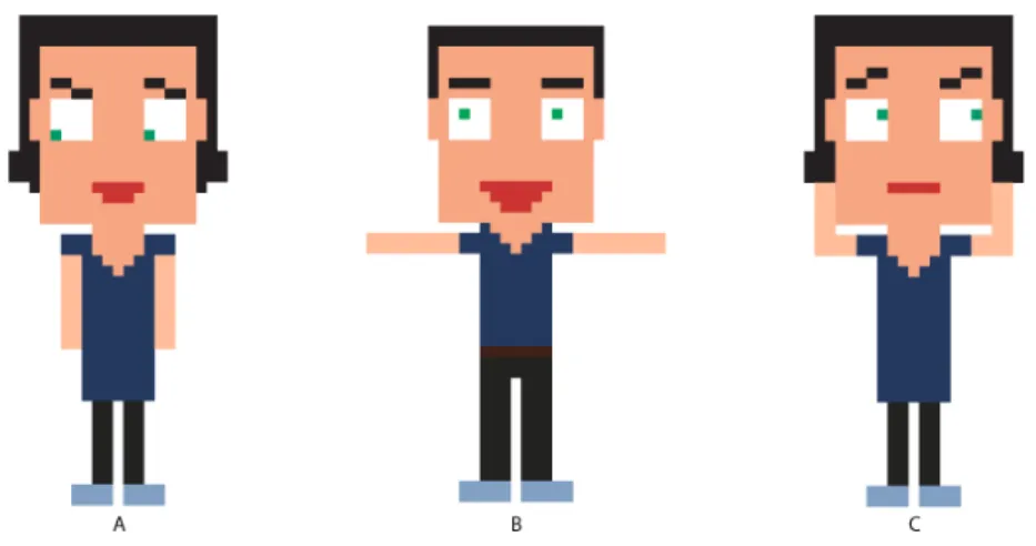
Figure 4.3: A) First prototype iteration; A.1) eyes, A.2) arms, A.3) mouth; B) Second prototype; B.1) eyebrows, B.2) ears, B.3) arms, B.4) eyes, B.5)
4.2. Mapping data on the avatar
Avatar feature First Iteration Second iteration Eyes Variation of artists and songs Variation of artists Eyebrows (emphasizing the eyes) Spotify popularity of songs
Ears Not used Instrumentalness
Mouth Amount of music Speechiness
Arms Danceability Valence
Table 4.1: The table contains all used avatar features for data presentation in both of the prototypes.
presented in the eyes, mouth and arms (see Table 4.1). The eyebrows
in this version were used to reinforce the eyes. They tilted based on the
position of the eye pupils. For the mouth (see Figure 4.3.A.3) feature the
selected displays were opened, semi-opened and closed, thus presenting
three different states of one information. The arms (see Figure4.3.A.2) also
had three different positions, lowered, horizontally spread and up in the air. The arms and the mouth presented one dimensional data. The eye pupils
(see Figure4.3.A.1) were used as dot in a scatter plot with a possibility of
four step movement, horizontally and vertically. This allowed for the eyes to have sixteen different states.
The second prototype presented data (see Figure 4.3.B) in the
eye-brows, eyes, mouth, ears and arms (see Table 4.1). The eyebrows (see
Figure 4.3.B.1) had three possible positions by moving vertically on the
avatar forehead. In this iteration the size of the eye pupils was used to
present data (see Figure4.3.B.4). The avatar was consisted of three
pos-sible sizes for the pupils, small, medium and big. The ears (see Figure
4.3.B.2) presented binary data with two possible displays, pointy and
nor-mal looking ears. The mouth (see Figure4.3.B.5) and the arms (see Figure
4.3.B.3) had the same design as the first iteration. In this avatar all features
presented one dimensional data.
The avatar features are quite flexible. As it can be seen the features can adjust according to the project needs. Future implementations can also explore presentation of data in other body parts. The avatar provides mostly space for experimenting with colors and shapes. For example as it can be seen from the mockups the project suggested use of the hair as a placeholder for data.
4.2
Mapping data on the avatar
On Table4.1is presented the mapping of data through the avatar features
in both of the prototypes. The process of choosing which music feature should be linked with the first implementation of avatar elements was done through a discussion. Since music perception is a complex topic and there
First prototype
is no straightforward answer of how we perceive melody, the decisions for the mapping were mostly made from a personal experience using intuition. This was done to get a starting point for the user testing. The insight pro-vided from the first testing gave guidance for improvement of the mapping and complexity of the avatar for the second user study.
4.2.1 First prototype [Figure4.3.A]
• Eye pupils [Figure4.3.A.1]
The position of the eye pupils represents the “diversity” of music that the user has listened to by measuring the variety of artists and songs. The variation of songs moves the pupils horizontally; more to the right means that mostly unique songs have been played. The variety of artist moves the pupils vertically; upwards indicates big diversity of artists.
• Mouth [Figure4.3.A.3]
The size of the mouth represents the amount of music the user has been listening to in the past two hours. A small mouth indicates that the amount of music was low for the given period. A more open mouth means more time has been spent listening to music.
• Arms [Figure4.3.A.2]
The position of the arms represents the danceability of the music be-ing analyzed. A low danceability is indicated by arms next to the avatar body; raised arms indicate higher danceability.
According to Spotify, danceability describes how suitable a track is for dancing based on a combination of musical elements including tempo, rhythm stability, beat strength, and overall regularity.
The avatar displayed data for the user Spotify music listening activity in the last two hours. The moment of opening the application was used as a referent point. For example, if the application was opened at 15:07 (Today), the avatar would use the songs which played_at time stamps are between
13:07 and 15:07 (Today). On Figure4.4are presented three avatars from
the first prototype as an example:
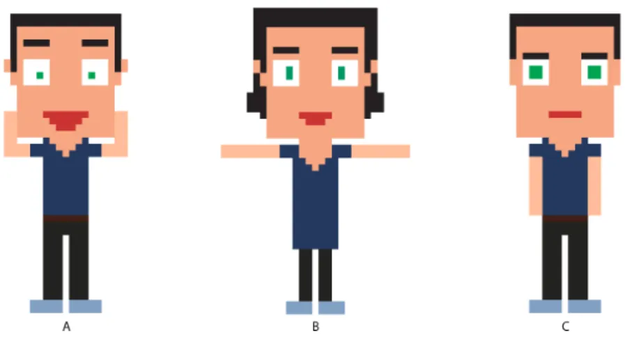
1. Avatar A [Figure4.4.A] has the lowest state of the arms, which repre-sents music with little danceability. The mouth shows medium amount of played music in the presented period. The eye pupils displays high amount of repetitive songs and artists.
2. Avatar B [Figure 4.4.B] has the medium state of the arms, which represents music with intermediate danceability. The mouth shows
Second prototype
Figure 4.4: The image contains some example states for the first prototype.
high amount of played music in the presented period. The eye pupils displays significant number of unique artists with small repetition and mostly repetitive songs.
3. Avatar C [Figure4.4.C] has up pointing arms, which represents music with high danceability. The mouth shows low amount of played music in the presented period. The eye pupils displays significant number of unique artists with small repetition and mostly unique songs.
4.2.2 Second prototype [Figure4.3.B]
• Eyebrows [Figure4.3.B.1]
The position of the eyebrows represents the popularity of the music listened in a period of one day. The higher are the eyebrows posi-tioned the more popular the music is according to Spotify.
The popularity is calculated by a Spotify algorithm and is based, in the most part, on the total number of plays the track has had and how recent those plays are.
• Eye pupils [Figure4.3.B.4]
The size of the eye pupils represents the “diversity” of the songs by measuring the variety of their artists. Small eye pupils represent small variety of artists and bigger eye pupils represent larger variety.
• Ears [Figure4.3.B.2]
The “spikiness” in the ears represents the use of instruments in the songs. Spike ears means the songs were mostly instrumental. Flat looking ears presents that the songs contained vocals.
Second prototype
Figure 4.5: The image contains some example states for the second proto-type.
The Spotify music feature instrumentalness, predicts whether a track contains no vocals. “Ooh” and “aah” sounds are treated as instru-mental in this context. Rap or spoken word tracks are clearly “vocal”.
• Mouth [Figure4.3.B.5]
The size of the mouth represents the amount of speech in the mu-sic. Smaller mouth represents music that is mostly instrumental and bigger mouth music that contains significant amount of lyrics.
The Spotify music feature Speechiness detects the presence of spo-ken words in a track.
• Arms [Figure4.3.B.3]
The position of the arms represents the positiveness of the music which is being analysed. A low positiveness is indicated by arms next to the avatar body; raised arms indicate higher positiveness (cheerful, happy).
Valence is a measure by Spotify for describing the musical positive-ness conveyed by a track. Tracks with high valence sound more pos-itive (e.g. happy, cheerful, euphoric), while tracks with low valence sound more negative (e.g. sad, depressed, angry).
In this prototype the avatar displays data for a whole day of Spotify ac-tivity. The twenty four hours are calculated starting from midnight. The application showed seven avatars, thus presenting data for a whole week. When opened, the first presented avatar in the row was from the previous day. For example if the application is opened on Saturday, the first dis-played avatar would be from Friday, the second would be from Thursday,