Thoughtmarks:
Re-thinking Bookmarks & the Personal Information Space
by Marcus Ghaly
Master of Interaction Design, Malmö Högskola Advisor - Jonas Löwgren
Abstract!
7
1 Introduction!
8
2 Related Research!
9
2.1 Information Archiving with Bookmarks! 9
2.2 Keeping Found Things Found on the Web ! 10 2.3 Characterizing Browsing Strategies in the World Wide Web! 11
2.4 What Do Web Users Do?! 11
2.5 Löwgren & Pliability ! 12
2.6 Victor - Magic Ink & Information Software! 14
2.7 Internet Scrapbook! 16
2.8 Integrated Back, Bookmarks, and History! 17 2.9 Visual History Mechanism on Mobile Internet Browsing! 18
2.10 Visual Snippets! 19
2.11 A Comparison of Visual and Textual Page Previews! 20 2.12 From Text to Imagery and the Implications on Memory! 21
2.13 External Memory Aids! 22
2.14 Delicious! 23
2.15 Trunkly! 23
2.16 Pinterest! 24
2.17 Archiving & Data Management! 25
2.18 Summary! 26
3 Methodology!
27
3.1 Design principles! 27
3.1.2 Research Through Design! 28 3.2 Synthesis, Selection, Detailing of Chosen Concept! 28
4 Design Process!
31
4.1 Phase 1 - Understanding Users & Their Bookmarks! 31
4.1.1 Introduction & Methods! 31
4.1.2 Bookmarking Overall! 33
4.1.3 Organization Habits! 34
4.1.4 Tagging! 35
4.1.5 The Retrieval Test! 36
4.1.6 What Could Be Improved! 36
4.1.7 Reactions to the Mockups! 36
4.1.8 Conclusions & Looking Forward! 37
4.2 Phase 2 - The Conflicts In Expectations & Habits! 38
4.2.1 Introduction & Methods! 38
4.2.2 Ease of Use & Expectations! 38
4.2.3 Not Changing the Title! 39
4.2.4 Organizing & Deleting Bookmarks! 39 4.2.5 Curating, Forgetting, & Too Many Bookmarks! 40
4.2.6 How Specific Should it Be?! 40
4.2.7 Conclusions & Moving Forward! 41
4.3 Phase 3 - Re-Imagining Collections - Prototypes 1, 2, & 3! 41
4.3.1 Introduction & Methods! 41
4.3.2 Prototype 1 - Scrolling Bookmarks! 42
4.3.3 Prototype 2 - Scrolling Bookmarks & Relevance! 44
4.3.5 Timeline & Other Views! 46
4.3.6 Assessment! 46
4.3.7 Conclusions & Moving Forward! 47
4.4 Phase 4 - A New Method for Bookmark Creation! 49
4.4.1 Introduction & Methods! 49
4.4.2 How to Make a Visual Bookmark! 50
4.4.3 Touch Screens & Direct Manipulation! 51
4.4.4 Ease of Use! 52
4.4.5 Supporting Additional Options! 54
4.4.6 Assessment! 55
4.4.7 Conclusions & Moving Forward! 56
4.5 Phase 5 - Evaluating & Refining Design Choices! 56
4.5.1 Introduction & Methodologies! 56
4.5.2 Transitions and Animations! 57
4.5.3 Icons and Layout! 58
4.5.4 Overall Functionality ! 59
4.5.5 Conclusions & Moving Forward! 61
4.6 Phase 6 - Hi-Fi Prototyping - Programming as Sketching! 62
4.6.1 Introduction & Methods! 62
4.6.2 A Userʼs Real Bookmarks! 62
4.6.3 Tools for Creating Prototypes! 63
4.6.4 How Much of the Experience to Prototype! 64
4.6.5 Conclusions & Moving Forward! 64
5 Final Concept!
64
6.1 Phase 7 - Final Interviews & Evaluation! 66
6.1.1 Introduction & Methodologies! 66
6.1.2 Visualized Bookmarks! 66
6.1.3 Timeline! 67
6.1.4 Text & Images! 67
6.1.5 User Habits! 68
6.1.6 Folders & Hierarchy! 68
6.2 Future Work! 69
6.3 Reflection On My Process & State of My Result! 70
7 References!
72
Appendix A!
77
Appendix B!
78
Abstract
Bookmarking is one of the main methods by which users store the online information they find valuable. However, bookmarks in their current incarnation suffer from a number of drawbacks which do not support users in their daily routines. Bookmarks are very easy to make, but over time this causes bookmark collections to grow,
requiring systems of organization to keep track of everything. Eventually though these systems of organization require organizing themselves. And as time passes the titles of both bookmarks and folders begin to loose their meaning and users find it harder and harder to determine a bookmark’s value or a folder’s contents based on title alone. This leads to the bookmarks themselves becoming stale and unused, making
collections that much harder to search through when trying to re-find one’s found, online information.
This thesis proposes to re-imagine bookmarks as visualized information that is easily recognizable, and can help users to predict the information a bookmark links to. In this way it is hoped that bookmarks can become a more meaningful link between users and their found, online information. Furthermore, automated tagging is proposed to assist users when searching for their content, as well as chronological sorting to help users visually scan through their collections and re-find their bookmarks. Finally,
non-hierarchical, folder-less bookmarking was also proposed, though in the end this did not map to users’ habits. That being said, visualizing bookmarks would appear to be worth pursuing as it resonated with users, and could be one direction to follow in assisting users with their information collections.
1 Introduction
Given the amount of information on the internet and the central role this information plays in our everyday lives, it comes as no surprise that in order to keep track of the things we find valuable online many people turn to browser based bookmarks or online bookmarking services. Bookmarks remove the mental load of needing to remember everything we have found to be useful online and their associated url’s. While Google claims to “organize the world’s information,” (Google, N.D.) it could be said that
bookmarks organize one’s personal information. But the current structure of this “personal information space” (Abrams, Baecker, and Chignell, 1998) has a number of barriers that reduce its effectiveness. Because the act of making a bookmark is very simple, over time bookmark collections grow, but with that growth our toolset’s ability to aid us in sifting through our collections and retrieving specific pieces of information offers ever diminishing returns (Cockburn and McKenzie, 2001). The methods for organizing bookmarks, whether through folders or tagging, over time can become barriers as these systems for organization require that they themselves be organized. Furthermore, titles of bookmarks become less and less helpful in assisting us to recall what what information they link back to, and folder names further obscure this process making it difficult for users to predict a folder’s contents (Jones, Bruce, and Dumais, 2001). It would appear that the ease with which users can create bookmarks is at odds with the difficulties of managing, organizing, and retrieving our found online information. Indeed the findings from user interviews conducted for this work mirror almost exactly the findings from these decades old sources. Further, there is an abundance of academic literature on bookmarking from the late 90‘s to early 2000‘s, yet a subsequent absence in more recent times. And so one must therefore ask where has the emphasis been placed over the past decade in the domain of bookmarking? I would propose that it has in fact been in sharing via online and social media.
The introduction of Delicious in 2003 (2003), Facebook in 2004 (2004), Reddit in 2005 (2005), and Twitter in 2006 (2006), among others, began a new trend in
bookmarking which saw them become part of a social dynamic instead of a solitary activity. Sharing bookmarks (links in this context), commenting on links, and posting new links in response, etc. has since become commonplace. There is also the myriad of blogs and other forums that act like miniature online repositories for links and found information.
Posting links (bookmarks) on Facebook is an excellent way to both share, and be exposed to, new information online. In the case of Facebook this information can perhaps be considered pre-filtered for quality given that your exposure to links is by way of your friends and colleagues. Twitter works in much the same way because if you value the tweets of the people you follow then it is safe to assume you may also value the links they post. Somewhat similarly, Reddit relies on the power of the crowd to identify valuable information and by voting either promote or demote a links “value.” But these services don’t provide a personal information space (Abrams, Baecker, and Chignell, 1998) for bookmarks, or create a coherent, structured way for users to save the things they have found online for later retrieval. They are instead platforms
designed for sharing all types information, a subset of which happen to be links (bookmarks). Sharing is obviously an important component of information, but the problem sets and solutions around sharing are quite different from those surrounding information organization.
And this brings us to a very important point which is that as a result of all of these online services, and the subsequent movement of users into the social space, making bookmarks in the browser has been left behind both in terms of design, research, and innovation. I would argue that this shift away from the browser does not signal its demise as a tool for information organization, as many users report actively using bookmarks, but instead affords us the opportunity to consider the browser as
something worth returning to, and leaves open the possibility to re-imagine it in a new light. Furthermore the recent emergence of tablet computing in the mainstream could serve as a new architectural program on which we make our break with tradition and begin to re-imagine. In this way the use of tablets as a new vantage point positions us between looking towards potential futures with touch-centric and mobile scenarios while still maintaining our ties to the heritage of information organization research and design.
Let us pause for a moment and consider a quote in relation to the these statements. “By interaction design we mean designing interactive products to support people in their everyday and working lives. In particular, it is about creating user experiences that enhance and extend the way people work, communicate, and interact.” (Preece, Rogers, and Sharp, 2002, p 6) Is it not valid then to reconsider bookmarking as a whole? Surely there must be at least some room in which to reevaluate this topic. Therefore one must ask, how can we readdress the making, organization, and retrieval of bookmarks that support users and enhance their interactions?
2 Related Research
2.1 Information Archiving with Bookmarks
I initially chose a number of pre-year-2000 papers on bookmarking in an attempt to understand the design space historically and reflect on how it has changed over the
years. However there are a number of striking similarities between user perceptions of, and difficulties with, bookmarks taken from research data in the mid to late 90’s and the experiments I conducted for this thesis in 2012. The work of Abrams, Baecker, and Chignell (1998) was of particular interest because it provided both quantitative and qualitative research. Their work studied why people made bookmarks, and how bookmarks are created, organized, and used, and finally they concluded with recommendations for filtering bookmarks including “time-based visualizations with automated filters, the use of contextual information in representing bookmarks, and [...] hierarchy formation.” Their study touched on a number of areas where bookmarking appears to have much more in common with meaning making than just listing links. First, and perhaps most relevant to this paper, was their claim that “users create their own personal information space for the web by making bookmarks, structuring the resulting collection, and managing its growth.” They noticed that users would organize clusters of information with bookmarks, and then use those bookmarks as a way to jump between clusters. With regards to organization their user research found that, “bookmarks are unstable if they are not kept in meaningful categories, which takes a lot of time.” They also identify problems with organization in that bookmarks are by default ordered chronologically, but if users manually rearrange their bookmarks into different categorizations they lost the ability to sort by date.
2.2 Keeping Found Things Found on the Web
A study conducted by Jones, Bruce, and Dumais (2001) explored the use of folder based hierarchies and identified a number of text-related downsides to this method of information organization. They noted that, “folders can obscure as well as organize [...] In efforts to locate a bookmark after creation, users reported difficulty in
determining which folder a bookmark was in.” Furthermore, bookmark recognition was found to be difficult as their titles were often not descriptive enough for users to recall what they linked to. But users did not only have difficulty finding their information. Folder creation was also viewed as difficult because folders had to actually be organized, named, and created in the first place. This led to another problem in that the time required for organization was identified as troublesome because users sometimes found that their previously titled and arranged hierarchies became stumbling blocks for future data retrieval. Temporal problems further extended into folder naming as well because, “subjects also reported difficulties determining a folder’s contents and purpose from its name after some time had elapsed.”
Interestingly many of the people I interviewed gave responses almost identical to this decade old research.
That said, while files and folders in their desktop incarnation require names, have locations, and are organized into strict hierarchies, there are no rules mandating that bookmarks follow this same model. Therefore we might consider that in the
bookmarking context folders themselves could be changed or modified, or they could even be done away with and a different paradigm used in their place. It is at least worth considering given that this work is reevaluating bookmarking on the whole.
2.3 Characterizing Browsing Strategies in the World Wide Web
The work of Catledge and Pitkow (1995) is also worth considering when comparing much older research to modern day findings. They attempted to study behavior
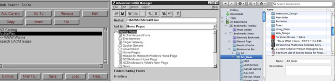
patterns as users browsed the web by capturing and logging user events for students, staff, and faculty at Georgia Institute of Technology’s College of Computing. They logged the patters of 107 participants and divided up their users’ actions into eight categories with a percentage of use for each category. They found that clicking hyper-links and pressing the back button consumed 92.5% of all user activity within their browsers (51.9% and 40.6% respectively). Hotlists, Mosaic’s term for bookmarks, consisted of only 2% of browser activity.
Now, one cannot assume that behaviors and statistics taken from users in Mosaic from 1995 would map perfectly to behaviors and statistics taken from users today. And in fact the above mentioned test would need to be recreated today to draw any such conclusions. It is instead worth noting the similarities between the interface for, and interaction with, bookmarks when this test was conducted and the modern day
equivalent. The image below shows a progression from Mosaic’s Hotlist (left) (National Center for Supercomputing Applications, N.D.), to the Advanced Hotlist Manager (middle) (Niall Kenedy, 2006), and to the Bookmark Manger from Firefox 12 (right) (Mozilla, 2004). Note that the “->” in the Hotlist denotes a “sub-list,” or a “folder” by todays nomenclature.
Figure 2: Evolution of Bookmarks - Hotlist (left), Advanced Hotlist Manager (middle), Firefox Bookmark Manager (right)
Given the similarities in the above three examples, it is perhaps worth considering that we reevaluate at least some parts of our current toolset and the thinking around making, organizing, and retrieving bookmarks.
2.4 What Do Web Users Do?
Given that bookmarks and history are the two main ways by which users revisit websites, it is worth asking how often users actually go back to websites so as to understand the value of these tools. The work of Cockburn and McKenzie (2001) attempted to address this. They conducted a 119 day study which used browser log data to track 17 users who visited “a total of 84841 [web] pages.” They found that,
“previous studies have shown that revisitation (navigating to a previously visited page) accounts for 58% and 61% of all page visits. Our study shows that page revisitation is now even more prevalent, accounting for 81% of page visits when calculated across all users.” This rather large figure requires some context because they also found that the top three pages most viewed by their participants accounted for an average 24% of all page views. Still though, this would appear to strongly suggest that revisitation is an important element of user habits. They also identified bookmarking, history, website design, and navigational controls like forward and back as suggested areas for improvement noting that, “it is clear that any minor interface inefficiency in supporting revisitation will result in massive productivity losses when multiplied across millions of users.” Finally, with regards to bookmarks they concluded that “our study reveals that users build very large bookmark collections, and that the current interface schemes tend to become unwieldy.”
Comparing these last two quotes together, and in light of such statistical data, perhaps the case for reconsidering bookmarking has more weight to it. They also identified “visual histories,” where website image previews are incorporated into browser history, as one possible approach that could aid with website revisitation, though no mention of “visual bookmarks” is made. If adding visual elements to history is worth consideration, so to could visual elements for bookmarks. But before we go too far down this path, let us first consider visualization in general and return back to bookmarks afterward.
2.5 Löwgren & Pliability
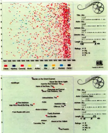
Löwgren (2007) introduces the concept of pliability, and defines a pliable interaction as, “one where the user is drawn into a sense of shaping the digital information with his/her fingertips, even though the actual artifact might employ standard, non-tactile interaction techniques such as mouse, keyboard, and display monitor. Pliability is a sensuous quality, having to do with how it feels to use the artifact in the here-and-now of the use situation, and as such it plays a role in understanding the aesthetics of interaction.” He elaborates on this notion with several examples and comparisons between pliable and non-pliable interactions. His first example compares a traditional database with that of a movie database called the The FilmFinder (Ahlberg &
Shneiderman, 1994). With the traditional database, all the information it contains is essentially hidden from the user, and only when a search is performed does “relevant” data appear. This type of interaction is perhaps lacking in functionality in that if the data the user wants lies just outside of the current search criteria there is no way for the user to know this and venture outside their current search accordingly. Therefore either they see what they want in the returned list of items, or they don't, with nothing more to go on. But this leads one to view the interaction as lacking pliability because there is no real way to manipulate the result, refine the criteria skillfully, and compare these various outcomes other than simply start the search over again with at most a few added key words. FilmFinder takes the opposite approach. Instead, the full contents of the database are presented to the user at the beginning of a search, and as the search criteria are changed the data-points outside the adjusted criteria are removed
from view. Furthermore, the data is presented in a graph with the movie’s release date along the x-axis and its popularity along the y-axis. So the combination of seeing the data as well as seeing how adjusting criteria affects the data makes for both powerful and informative interactions. The ease with which the data can be manipulated, as compared with traditional database searches, creates an elegant sense of pliability, and the correlations and insights gained from this create what Löwgren calls
“serendipitous discoveries.” As an example, if the lower end of the movie-length slider is increased, shorter length movies are removed from the graph. As such one can see that movies on the left side of the graph are removed first, leading to the realization that movies were shorter in the earlier days of film. This type of insight would simply not be possible in traditional database interactions.
Figure 3: The FilmFinder
The second example that influenced my design process was the notion of direct manipulation as considered in a comparison between two mapping programs, Eniro (2000) and Google Maps (2005). Eniro was similar to many mapping programs of the day where if one wanted to move the map view left they would click the left arrow, wait for the next map section to load, and then compare what they remembered from the previous frame with the new frame of map and extrapolate the difference to regain their bearings. If however one wanted to move the map view left with Google Maps, they would simply click and drag the map horizontally and watch as new portions of the map came into view. This direct manipulation model in Google Maps maintained one’s orientation and, as Löwgren put it, “facilitates view reconciliation.” Finally map data
could be mixed with satellite photography, furthering one’s comprehension of the data presented. This example concludes by pointing out that the model of direct
manipulation in Google Maps was subsequently adopted by the other map engines soon after its introduction. This connection between action and result, cause and effect, greatly increases the quality of the user experience and moves the user that much closer to the information they wish to interact with. To this end, let us consider for just a moment the case of the bookmark as it stands currently in the image below.
Figure 4: Screenshots of Terminal (left), OSX (middle), Safari on iPad (right)
Moving from left to right is the terminal window, a folder and its contents from the desktop, and a set of bookmarks from the iPad. If we reflect for even the briefest of moments on the concept of pliability while considering the command line which has not significantly changed since the teletype machines of the 1950’s, the file browser GUI which also has changed little since the Alto of the 1970’s, and the bookmarking menu of the iPad from 2012, there is perhaps cause for concern. Why should the iPad’s bookmarks of today look so much like the command lines from decades ago? Yes, one can tap on a bookmark to open it instead of typing its name on the command line. Yes, one can directly manipulate the list of bookmarks by dragging their finger up and down on the screen to scroll instead of the wheel mouse on the desktop. And yes, thanks to Steve Jobs the font is nicer on the iPad than the command line. But does this really represent the best that design has to offer? The answer must surly be no.
Organizing, representing, and interacting with bookmarked data is lacking here, and it is from the standpoint of current non-pliability in interaction and a lack of visualization in its presentation to the user, that I wish to readdress bookmarking.
2.6 Victor - Magic Ink & Information Software
Victor’s Magic Ink (2006) aligns well with pliability in that similar types of software comparisons are made, though Victor’s approach breaks software down into three categories: Information Software, Manipulation Software, and Communication Software.
For the purposes here we will focus only on information software which is defined by Victor as, “[serving] the human urge to learn. A person uses information software to construct and manipulate a model that is internal to the mind - a mental representation of information. Good information software encourages the user to ask and answer questions, make comparisons, and draw conclusions.” Victor then goes on by taking current examples of information based software and interactions and reinvents them with a greater emphasis on exploration, comparison, and thus ultimately decision making on the part of the user.
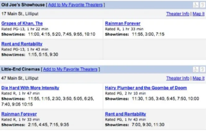
Victor also uses movies for comparison, but the context is when a user wants to see a movie in the theater and is looking at a website for listings and times. The first image shows how movie listings are currently arranged, where by the movies are organized by theater. Because of this layout the user must look through the offerings of each theater to find the movie they want, and then their eye must jump from listing to listing to compare the times at which the movie is showing at the different theaters.
Interestingly, Victor explains that when movie listings were printed in news papers they were organized by theater because the theaters paid to be listed. Today however this financial arrangement, and thus the graphic layout, between a theater and webpage listing does not exist. So one would assume that the only reason for the information to be treated the same way in its digital form is if someone merely copied a solution from the previous era and only thought of implementation and not how to design the
information for its given context.
Figure 5: Online Movie Listings
Victor re-imagines this layout starting from a very simple observation. “The primary question is, ‘What movies are showing today, at which times?’ Given the two spatial dimensions available to us, this should suggest a graphic with movies along one axis and times along the other.” In his redesign Victor lists the movies vertically, color codes the theaters, puts time along the x-axis, and puts a light gray shade on the past so that the barrier between shaded and non-shaded time listings represents “now.” His information graphic skillfully includes brief movie descriptions and ratings, all of which serve to better inform the user about the choice they wish to make.
Figure 6: Online Movie Listings Redesigned
It is these transformative elements, from simply putting text on a page without consideration for its context of use, to understanding that data can be arranged as information graphics, that I wish to bring to bookmarking. Thinking back to the former example of the terminal, finder, and bookmark list. The idea that a solution from a previous era was copied into a new context and only implementation, and not design, was considered at least in theory would appear to have similarities to the movie listing example above. So perhaps a simple distilling of interaction and layout, similar to the narrowing down of just graphing movies vs time on a chart, can be done for
bookmarks. Such an approach might help to alleviate the difficulties of folders, and the complexities of categorizing one’s data into rigid hierarchies. The idea of bookmarks as a tool to create a “personal information space” (Abrams, Baecker, and Chignell, 1998) would seem to dovetail nicely with Victor’s definition of information software as
something we use to “construct and manipulate a model that is internal to the mind.” Because, as Victor says of his own example, “this is not a list of search results - it is an information graphic. It’s for learning.”
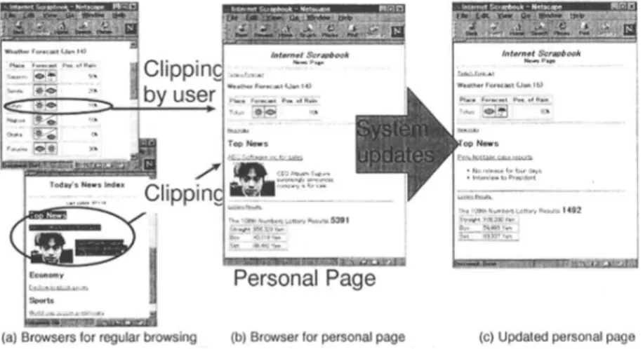
2.7 Internet Scrapbook
Upon reflecting on the ideas of pliability and data as information graphic, one might wonder in which direction bookmarking can be taken. And it is perhaps in the
prescient work of Sugiura and Koseki (1997) that some initial influences can be drawn. The Internet Scrapbook was conceived by its authors to be an “information
personalization system,” which, as the name suggests, transforms our idea of information on the internet from a series of pages we must remember the location of and constantly navigate to, and reframes it as a single personal page on which we can arrange the snippets of information we find into a collage.
Figure 7: Internet Scrapbook
There is something really important going on here. The makers of the Internet
Scrapbook identified that the act of remembering where information is online and
searching or navigating back to it as being quite cumbersome. Their conclusion was to let the user snip valuable information from the web and arrange it visually in the hopes that this would solve the difficulties they had identified. Internet Scrapbook attempted to rethink how to represent found, valuable information online. However, if one considers that many users reported having somewhere between 100 to 300 or more bookmarks (Abrams, Raecker, and Chignell, 1998), then one might need to consider what scrolling through 300 or more scrap book entries might look like. Without the ability to search or sort by criteria, perhaps Internet Scrapbook in its current form might suffer from similar issues as regular bookmarks in regards to
information organization and retrieval. That said, this approach of making found online information visual is very interesting to consider.
2.8 Integrated Back, Bookmarks, and History
The work of Kaasten and Greenberg (2001) takes a similar approach to Internet
Scrapbook (Sagiura dn Koseki, 1997) but they propose a slightly different approach.
They suggest that a browser’s back and forward buttons, bookmarks, and history be integrated into a single tool. They suggest that the browser’s back and forward buttons should go through a user’s entire viewing history instead of being limited to a single web browsing session. Also, a user’s history would be ordered in terms of frequency of page view instead of a chronological list. In this proposed new tool, a green bar is added next to each bookmark which increases in height based on that bookmark’s frequency of use, and users can optionally dog-ear a bookmark to help it stand out. Their proposed system takes a snapshot of viewed webpages and displays a small icon view of this snapshot in a vertical list of the user’s web history. The back and forward buttons would then move up and down this displayed vertical list. By hovering the mouse over a small web icon a larger snapshot is displayed, allowing the user to make out some of the details from that webpage in order to better identify it. Finally, clicking on this web icon takes the browser to the actual webpage. With regards to
bookmark retrieval a search function has been included, though it should be noted that this only searches a bookmark’s title for keywords.
Figure 8: Integrated Back, Bookmarks, and History
While the thread of visualization is also present here, a number of considerations could be made. First, one must weigh the difference in approach of frequency of use for listing bookmarks vs Abrams, Baecker, and Chignell’s (1998) suggested chronology sorting. Additionally, tablets lack mouse hovering, so the idea of displaying nested website snapshots via mouse hover would need to be redesigned. Also, evaluating just how small these preview icons can be before they loose their value would require user feedback, especially for sites that are mainly text. That being said, the proposed solutions of Kaasten and Greenberg (2001) suggest a number of very interesting avenues worth pursuing in understanding how bookmarks might be visualized and retrieved. While their research is primarily aimed at web history instead of creating bookmark collections, there is quite some overlap in these two adjacent domains. 2.9 Visual History Mechanism on Mobile Internet Browsing
The Visual History Mechanism (Yoong-en, Su, and Seong, 2007) explored visualizing browser history on mobile phones. Here, fullscreen snapshots of recently viewed webpages are taken by the phone automatically, placed in a vertical list and sorted by frequency or date last viewed, but not alphabetically. The design concept attempted to reduce the user effort of re-finding previously visited websites through visualization, but because non-touchscreen cellphones were the target platform, with relatively small screens and weak cpu’s, a number of design decisions followed as a result. Tree node graphs and other information visualizations were avoided, the website thumbnails were
kept very small, and because the solution targeted web history and not bookmark collection, the number of visualized bookmarks was kept to 20 in total. A simple system of marking (favorite-ing) and displaying the number of page views numerically was added. But despite the hardware imposed limitations, their user testing found that “19 out of 22 test subjects agreed that the proposed Visual History mechanism was easy to use” as compared with a text only view. But perhaps more interesting was a “total of 7 (31.82%) test subjects found the system unnecessarily complex yet easy to use. Hence, it was believed that the complexity of the Visual History mechanism did not affect the ease of use of the mechanism by chance.”
Figure 9: Visual History Mechanism
While it is unclear from the text what impact the introduction of touch screens would have, it is interesting to note the positive feedback from the users when comparing their visualized history to the equivalent text version, and that ease of use outweighed additional complexities introduced by the visualization. Though the authors were addressing browser history, limiting the number of visualized webpages to 20, and the size of the icons were very small due to screen size, based on their conclusions one could surmise that bookmarks may also benefit from a similar visual treatment. 2.10 Visual Snippets
The work of Teevan et al. (2009) attempted to see what role different forms of website representation played in finding and re-finding information online through search. The research they referenced examined the role of text-based website summaries and thumbnail icons to assist users when searching for content. However, what Teevan et al. introduced was a new method of representation called visual snippets, which were icon sized images composed from a mixture of webpage thumbnail, “salient image” or company logo derived from the same site, and the website title or url. These were originally hand-generated but later were computer-generated. They wanted to see what role a multi-faceted, visual representation of websites could play, as compared with text-summaries and thumbnails for search. 197 users were asked to find, by way of a modified search engine for testing purposes, different pieces of information about products, services, and medical knowledge in an attempt to successfully answer a number of questions posed by the researchers. Accompanying the users’ search
results were either text based descriptions of websites, thumbnails, or visual snippets. The following day these same users were asked to re-find the same information, again through the same search engine. The researchers concluded that when considering finding and re-finding tasks together visual snippets performed the best and text summaries performed the poorest, however when only considering re-finding tasks thumbnails were the best. They commented that, “the trend suggests visual
representation of previously viewed pages may support faster revisitation.”
Figure 10: Visual Snippets - Text (top), Visual Snipped left), Thumbnail (bottom-right)
It is interesting to consider this research in light of the Visual History Mechanism (Yoong-en, Su, and Seong, 2007) and the findings of Jones, Bruce, and Dumais (2001). If visualizing history was seen as helpful to users, while the text based nature of bookmarks became a stumbling block over time, then perhaps the visual
representations that helped with re-find websites in the above study could be applied to bookmarks, given that the nature of bookmarks is indeed to help us re-find
information. Also, because a user actually makes their own collections it is safe to assume that they will have seen their visualized content previously, thus aiding in retrieval.
2.11 A Comparison of Visual and Textual Page Previews
In a roughly similar vein, the work of Aula et al. (2010) compared different webpage preview strategies in an attempt to understand users’ perceptions of helpfulness when searching online. Specifically, they wanted to see how helpful users predicted a webpage would be in providing them with desired information, as compared with its actual helpfulness, based on the the type of preview presented to the user by a search engine. Users were given text-summary previews, small to large thumbnail previews with no url or title, and thumbnails with a url or title placed either at the top or bottom of the thumbnail. With regards to the url or title being at the top or bottom of an image, they used eye tracking and heat maps to determine where the user looked and for how long. They found that with text-summaries alone users over-estimated the usefulness of a website, while with a thumbnail only users tended to under-estimate a website’s usefulness. But, interestingly enough, “by adding the titles and URLs below the
thumbnails and making sure that the thumbnails are large enough (200x200 or larger), the underestimation bias could be largely alleviated.”
Figure 11: Different Page Preview Styles
A users’ ability to judge the helpfulness of a webpage in providing them with the information they want, based solely on a preview of that webpage, touches on their ability to predict. This is because a user is essentially making an assumption or prediction about the website they will be taken to and the kind of information it will contain. A user’s level of satisfaction will be determined by how closely the predicted result and the actual result match. Methods for correctly informing this type of
prediction could have implications for bookmarking because, as mentioned by Jones, Bruce, and Dumais (2001), users often have a hard time remembering what information their bookmarks link to or a bookmark’s relevance based on the title alone. Therefore, assisting the users’ ability to predict what information they will be lead to when
selecting a bookmark could potentially improve their relationship with their information, and the bookmarking toolset on which they rely to reach that information.
2.12 From Text to Imagery and the Implications on Memory
If an emphasis is to be placed on visualization over text based lists for bookmark organization, then it is perhaps worth considering whether imagery can assist in the recollection of information more so than text or language. The work of Hart and Graham (1975) sheds at least some light on the topic. They conducted three experiments where participants were asked to remember and recall the contents of several 4 x 4 matrices who’s cells contained a single letter each. In the first experiment participants were given the contents of the matrices verbally, but asked to construct a mental image of what the matrices and their contents looked like. In the second test the participants were shown images of the matrices and their contents. In the third test the participants were given the contents of the matrices verbally only, with no
instructions to imagine the matrix contents. The participants were later asked to recall the matrices’ contents and were graded based on time and accuracy. The assumption being tested was that if the results were the same, then perhaps a similar mental
“abstract representation” was being used in memory, but if the results differed then the representations perhaps were also different. It was found that “recall was best when students saw the matrices, intermediate in the imagery situation, and poorest in the verbal situation.” However, equally interesting was the finding that “recall was best for the corner cells of seen and imagined matrices, indicating the spatial nature of these processes; no such effect was found for verbal processing.” While it is beyond the scope of this paper to delve the inner workings of human psychology and neurology, the above test at least suggests that it is worth evaluating the qualities of imagery and comparing those qualities to their text based bookmarking counterparts.
2.13 External Memory Aids
Regarding memory, the work of Intons-Peterson and Fournier (1986) focused on understanding memory aids and their use in different situations. They break down aids into two groups; internal aids such as "mental rehearsing, alphabetic searching, mental retracing, the method of loci, and other mnemonic systems," and external aids like "making lists, writing on a calendar, and putting an item in a special place." They suggest that external aids can be helpful when there are long periods of time between learning and recalling information, when memory alone might not be accurate enough, when there is not enough time for memory strategies like mnemonics, or when a
person is focused on another activity. They further suggest that internal aids can be beneficial when external aids are not convenient like when acting on a stage, when one is without pen and paper, when physically carrying aids is inconvenient, and when recalling information happens soon after its learned.
Intons-Peterson and Fournier conducted three experiments testing various conditions, situations, internal and external aids, and imposed different limiting factors on roughly 200 participants. Their study used "(a) memory aids to sample internal and external types; and (b) situations that were past and future, verbal and spatial." They found that external aids were helpful in assisting spatial and future memory situations where users knew that information would need to be recalled later. These aids were perceived as more accurate and reliable by participants than internal aids, and that creating external aids like lists were helpful in recalling information later even when the list was not
available.
From this perspective, bookmarks could be considered as an external aid for memory, where memory strategies are offloaded as digital artifacts for later recall. There can be a long time between bookmark making and later bookmark finding, a user's attention is on browsing and not using mnemonic memory activities for url's, and one's browser bookmarks are always adjacent to their web viewing activities. Finally, when making bookmarks one can assume they might need to be recalled later.
However, when comparing these insights with the research findings of the British Audio Visual Society (UK Center for Materials Education, N.D.) the disconnects with
bookmarking found by Jones, Bruce, and Dumais can be clearly seen - "We remember 10% of what we read, 20% of what we hear, 30% of what we see, 50% of what we see and hear, 80% of what we say and 90% of what we say and do at the same time.” If only 10% of read material is remembered, and bookmarks are a text-based external aid, then perhaps we can understand how easily users forget their bookmarks and folders based on title alone. If instead the research of Teevan et al. and Aula et al. can be shifted to bookmarks, then we might also shift this external aid into the 50%
category of seen (visualization) and heard (read) information. Further, if the user can become engaged with their bookmarks spatially through a touch screen, then perhaps we might inch closer to the 90% category by including "doing" as the direct
manipulation of bookmark making. This overlapping of visualization, bookmark
interaction, and engagement could be interwoven into this external aid in an attempt to remove some of the difficulties users currently report with their bookmarks.
And so now, with a number of touch stones for orientation, and after examining several possible future tools, exploring just a few online bookmarking services is important to help understand the current trends and developments in this design space and how they influenced my design process.
2.14 Delicious
Delicious (2003) was one of the first services where users could keep their bookmarks online, but their real innovation was in tagging. Instead of organizing bookmarks in folders, users could instead tag their content with keywords that could be searched for again later. Users could even browse by tag keywords. Multiple tag words could be associated with a single bookmark, aiding in the categorizing and searching of one’s collection.
However while Delicious and tagging have become popular (several people I
interviewed reported using Delicious) there are a number of problems with tagging in general. Firstly, spelling mistakes and slight variations on tag words cause
organizational difficulties; a user can tag one bookmark with “gallery,” another with “galleries,” and another with “galeries.” But also there is the problem that one must remember under which tag cloud they categorized a given bookmark when looking for it again later, which is identical to the problem of remembering which folder a
bookmark is in with browser bookmarks. Seen this way, the difficulty of identifying a bookmark based solely on text can be seen as quite similar with bookmark folders and tagging.
2.15 Trunkly
Trunkly (N.D.) is an online tag based bookmarking service which manages to
overcome some of the problems with tagging. Instead of users tagging their content manually and having to remember those tags when searching for their content later, Trunkly treats the text in webpages themselves as tags. When a user bookmarks with Trunkly it saves a copy of the website’s entire text as meta-data that it attaches to the
bookmark. This removes the need to manually tag and makes search more flexible. By turning a websites entire text into tags Trunkly leverages readily available data instead of placing the burden of manually managing tags and tag collections on the user. However, Trunkly still represents bookmarks as text only elements, but visualization is not the problem it attempts to solve.
Trunkly represents true folder-less, non-hierarchical, bookmarking. While users can add tags if they so choose, there is no requirement to categorize, sort, or organize one’s bookmarks. This improves the creation and retrieval of bookmarks, and does so not by adding new interactions or structural paradigms but by removing the current hierarchical paradigms of files and folders. It essentially abstracts away the idea of a bookmark into an informational object, as opposed to a bookmark being an object who’s information one must know about in order to interact with it.
2.16 Pinterest
Pinterest (2010) can be thought of as a service for content gathering in a social network context. Like other social networks, users have followers, can follow others, and users can pin (post) and re-pin the content they find online. Users also have a dashboard for curating their found content, and users can comment on each others pinned content, add “likes,” etc. But Pinterest is a noteworthy here because it’s an application for collecting information found online and representing it visually. When a user saves a link (bookmark) in Pinterest, they are prompted with a list of all the images available from the associated webpage. The user selects an image to be their visual bookmark, selects a folder for storage, and optionally adds a description. In some ways Pinterest offers the best of all worlds because a user’s content is visual, users can share and find content, and users can comment on or “like” content, essentially ranking it. Visualizing found content is the major distinguishing feature of Pinterest, but this service is not without its downsides.
To begin with, users have no options other than to be social as there is no private content. Furthermore users can look at and search through one another’s content without the prerequisite of being “friends.” So all of one’s content is available to the entire social network at all times. This has lead to a number of privacy concerns regarding online bookmarking services. An article from Fearless Web (2012) had this to say about Pinterest’s lack of privacy, “Don’t post any pictures that you wouldn’t feel comfortable showing to anyone including your parents, kids or co-workers (that includes your boss) in person.” This is a remarkably strong stance, though perhaps warranted, and so one must ask does this really reflect how users should use their personal information spaces? Should a user second guess each bookmark they make for fear of social repercussions? The issue of privacy then further strengthens the argument to return to the browser as it is not a social service, but a solitary piece of software on a personal device.
But more importantly is that while this service does visually represent content, its organization is still folder based, links (bookmarks) are still displayed in static vertical
lists, and search-ability only comes by way of manually added descriptions. As such, the burden of organization, curation, and retrieval still rests on the user. However, the takeaway I drew from Pinterest was that visualizing information resonates with users. Given Pinterest’s extreme popularity online, I would argue that this is no accident. 2.17 Archiving & Data Management
In light of the above research and examples, if we accept that bookmarks are how we create a personal information space, then one must ask what are the qualities of these types of spaces? What are the attributes of these personal archives of our found online information, and what are the implications if we do not reevaluate them? Abrams
(1997) states that complex information spaces have five qualities: 1. they contain a large enough volume of information to cause information overload 2. they carry a large amount of low-value information making it hard to find high-value information 3. unless consistent effort is spent on organization they become extremely disordered 4. while they may have structured areas, there is too much complexity for the entire space to be evenly and equally structured 5. and they are so large that there is no way to view the space in its entirety. Abrams claims the web is one such system, but that bookmarks run counter to this because they are a personal information space. All of the literature reviewed here, and the many interviews conducted for this work suggest otherwise. With the possible exception of the second quality, the data suggests bookmarks are in fact a complex information space.
Collections do contain large amounts of information as users constantly add bookmarks. When looking for a specific bookmark, the other bookmarks in one’s collection can be considered “low-value” as the user must sift through them to find the desired bookmark. From the literature and interviews conducted here, users spend very little time organizing their bookmarks and so their collections move towards disorder. Tag clouds and folders do allow for localized regions of structure, but large collections sizes mean this structure is not evenly distributed. Finally it is not possible to see one’s entire collection and all the information it contains from a single vantage point. And so what follows is that we must consider what these five qualities suggest if we do not reevaluate our bookmark collections and the management of the data they hold.
A clear example of this comes form Abrams, “Humans have physiological tolerance levels to information. If the volume of information exceeds the capacity of our sense, then our comprehension declines.” Because collections grow in size, if we do not consider ways to curtail the amount of information presented to users, as in the FilmFinder, users will not be in a position to make informed decisions and draw
conclusions based on their vast archive of information. If there are in fact high and low value elements in our collections, we do the user no favors by not considering
approaches like visualization which allow them to estimate a bookmarks value and usefulness when sifting through their collections. Entropy is simply unavoidable, and so we must actively pursue alternate means of dealing with this issue, like
constantly and meticulously organize their data by hand if they want to find their bookmarks again later and derive value from their collection. New methods of evenly structuring this data space, whether through alphabetical, chronological, or other means of classification, must be evaluated in this asymmetric space or users will not be able to easily sift through their extensive information collection. And finally, while users’ collections may be too large to map out in a traditional one-to-one scale, systems of arrangement that afford “serendipitous discovery” can offer at-a-glance insights that can currently only come from unrealistically exhaustive dives into, and critical analysis of, our data. These considerations suggest that instead of accepting the status quo, we should try to understand the implications that complex information spaces pose and attempt to address them with conscientious decisions through design.
2.18 Summary
Given the shear vastness of the internet, bookmarking, or at least categorizing information in some fashion, is essential for users to organize their found information. However, many notable researchers have identified a number of problems with the currently available tools. Jones, Bruce, and Dumais (2001) found that users had a hard time identifying and determining the usefulness of bookmarks by their title, and had similar problems with folder titles. In light of this, as bookmark collections grew in size they became unmanageable because of the gap between the ease with which a user could make a bookmark and the difficulty they encountered later with identifying and managing their bookmarks. Yet, the work of Cockburn and McKenzie (2001) found that 81% of user’s browsing habits involved returning to previously seen
websites. Putting these two studies side by side suggests that there is at least some room for improvement in assisting users in their daily web routines. Löwgren’s (2007) pliability and Victor’s (2006) thought to view information in terms of “graphics for learning” could perhaps be the framework used to consider in which direction bookmarking could be taken. The current lack of pliability and assistance with decision making in browser based tools constitutes a hole in current usability and design. In fact, the lack of evolution in these tools means that reasonably old research is still quite relevant for this discussion. That being said, there have indeed been a number of studies that attempt to address the problems of bookmarking.
Internet Scrapbook (Sugiura and Koseki, 1997), Visual Snippets (Teevan et al., 2009),
Integrating Back, Bookmarks, and History (Kaasten and Greenberg, 2001), and indeed
many others have attempted to apply visual imagery in one form or another in an attempt to improve already existing patterns of interaction. These proposed future tools assist with decision making in that they better inform users about the information they interact with and find valuable. And in fact we see some components of
visualization in existing products and services, as well as the introduction of text based tools like tagging and search in an effort to assist with re-finding activities.
And so this is the landscape in which I have done my research. This is the
maybe a better way to think about bookmarks is to stop thinking about them as
bookmarks. Perhaps instead we should think of them as ideas, as being connected to information. Perhaps they are indicators of the types of information and experiences we have found and can re-experience online. Perhaps it is through this lens that we can offer some possibilities to answer the question of how we might better support users in the creation, organization, and retrieval of their found online information.
3 Methodology
3.1 Design principles
There were two main design principles that informed my process. To begin with, user centered design influenced my choice to involve users throughout my research. This began with initial interviews to understand the design space and user habits, then email surveys to find gaps in tools and habits and desires for future tools, critiques of the many mockups and medium-fi prototypes, and finally an evaluation of a hi-fi prototype.
The second influence was research through design, with its notion of a design artifact as outcome. Here, my desire was to build a designed thing which, to some users, would hopefully portray a preferred future state. Therefore, a number of mockups and medium-fi, video, and hi-fi prototypes were constructed, portraying a myriad of futures that were narrowed down to just one over the design process.
These two methodologies overlapped and influenced each other in each phase of the design process. On the one hand, user feedback at times sparked ideas for future designed states, while on the other hand explorations in the design space and elements of designed artifacts were kept, modified, or removed based on user
feedback and opinion. In this way users are included in the process while the designer is still free to explore.
3.1.1 User Centered Design
Users were actively involved in every phase throughout the design process in keeping with the ideas of user centered design (Saffer, 2007, pp. 31-32). From concepts to mockups, users and professional designers were consulted and their comments and reactions helped guide the design process. Feedback on mockups led to reflection and the creation of new mockups, and those mockups to new rounds of feedback and reflection, and so on. Numerous in-person interviews were conducted, email surveys were sent out, and even users in other parts of the world took part in skype interviews. Later, user feedback was considered in regards to medium-fi and hi-fi prototypes in an attempt to determine whether user needs were adequately being addressed.
However, I did not engage users in workshops, develop personas, or attempt to identify gatekeepers. Bookmarking is not a specialized field where the user customs and traditions are unknown, but rather it is a reasonably universal practice for internet users. And so users who had tablets as well as those who did not were interviewed, users with large and small bookmark collections were engaged with, and users who used traditional browser bookmarking, those who tagged, and those who used
alternative means for saving found information were also considered. I did not attempt to design for everyone, but the intention was to design for a wide audience. And so understanding user needs and wants across a large segment helped to keep me from thinking I was the intended audience, and helped to form designs around current user behaviors.
3.1.2 Research Through Design
However, the work presented here also employed the ideas of research through design because of the framing this approach offers to the produced design artifact. Zimmerman, Forlizzi, and Evenson (2007) argued that these artifacts, “describe a vision of a preferred state,” which when compared to the current state reveals a gap about which discussions can happen. Furthermore, they state that “use of this model results in a holistic research contribution that reveals the framing of the problem and the balance the researchers have made between the intersecting and conflicting perspectives.” Indeed, as will be discussed later, the chosen framing of visualization that came early in my work greatly affected the outcome as did the discovery and evaluation of conflicting users practices. User habits and tools, as it turned out, were at times poorly aligned with their ability to manage their bookmark collections.
That being said, this was an explorative process. Re-imaging something as broad as bookmarking required more than just a list of user needs. Exploration was done
through divergent sketching using paper, pixels, coding, mockups, and medium to hi-fi prototypes. These sketches posed new forms of organization, different modes of representation, and new methods for interacting with information. These sketches explored the design space and materials without always needing the prerequisite of going to the users. While user centered design was employed to understand users, research through design enabled me to sketch out ideas first and then consult users.
3.2 Synthesis, Selection, Detailing of Chosen Concept
The intended goal of this research was to create a working hi-fi prototype that portrayed some of the themes and ideas touched upon during the many interviews conducted. This was done in an attempt to understand experientially at least a few directions we might point towards when trying to answer the question of how we could improve the creation, organization, and retrieval of our found information online through bookmarks? To reach this goal, not only did interviews need to be conducted, but prototypes ranging from low-fi, to medium-fi, to high-fi needed to be built, video prototypes had to be developed, code written, and validation (and invalidation) of design choices had to be weighed and considered. Undertaking this endeavor
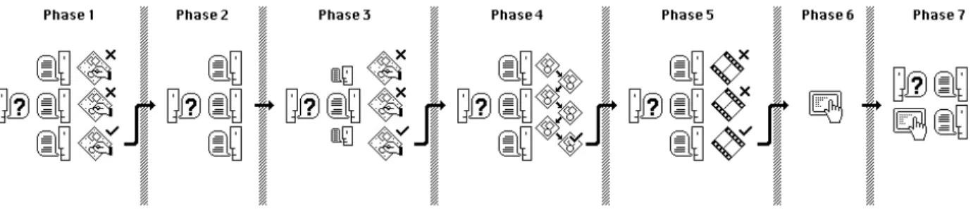
required that the design process be broken up into manageable stages of inquiry. Each stage consisted of its own goals, had its own synthesis and selection of designs, and its own detailing of the chosen portion of the design concept. Specifically, this project was divided into the following seven stages:
Figure 12: Design Process
Phase 1 Understanding Users & Their Bookmarks
This was the first step because if there has been a move towards bookmarking via social and online services in addition to standard browser based tools, then one must understand users’ current relationships with their bookmarks and the tools they employ. Therefore, in-person, closed form questions were carried out to determine if users rely on just one tool or multiple tools, where the weak points and gaps in their practices and toolset(s) are, and what new framings could we consider that might offer new
possibilities for organizing found information. Regarding reframing, three different mockups representing three different modes of visualization were presented to the interviewees and open form questions were asked so as to gage their general reactions and perceptions.
Phase 2 The Conflicts in Expectations & Habits
It was important to understand friction points as well because user habits and toolsets at times conflicted with a user’s ability to build, maintain, and use their bookmark collections. An attempt was made here to identify poorly or unsupported elements of information organization for which potential solutions were then incorporated into future mockups and tested in the next phase of research. An online email survey was
employed, using closed form short answer questions and quantitative (rating from 0 - 10) based questions discussing current habits and asking users to comment on potential future toolsets in light of those habits.
Phase 3 Re-Imagining Collections - Prototypes 1, 2, & 3
Re-imagining collections came from pursuing the thread of visualization which had emerged from the first phase and attempted to address some of the inconsistencies identified in the second phase. Here, the bookmarks of a design professional were turned into three medium-fi prototypes and presented back to the designer in an
attempt to gain real user feedback for a potential future tool. Open form questioning was used and the designer commented on aesthetic choices, interface elements, and the different modes of interaction and organization presented by the three prototypes. Other design professionals were consulted as well, though they only saw mockups constructed from the first professional’s bookmarks and not their own.
Phase 4 A New Method for Bookmark Creation
Several design iterations followed in an attempt to re-imagine bookmark making in much the same way that re-imagining bookmark collections had done in the previous phase. Several design professionals were consulted because of their depth of
knowledge in usability, interface design, and interaction with touch screens. A number of medium-fi prototypes were developed and open and close form questions were asked so as to consider broader topics of user interaction as well as specific elements like button placement, labeling, and GUI elements.
Phase 5 Evaluating & Refining Design Choices
Up until this point many designs and interactions had been considered and debated for both bookmark making and bookmark collections, and so video prototypes were used in this phase to demonstrate the summation of the design choices, interface elements, and modes of interaction developed in all previous phases. Both design professionals and non-professionals were interviewed and both open and closed form questions were used. The closed form questions were designed to consider graphical elements, order of operations, and methods of interaction, while more open form
questions were used to help identify potential assumptions and biases I had formed during the process thus far.
Phase 6 Hi-Fi Prototyping - Programming as Sketching
Based on the interactions presented in, and feedback received from, the video
prototypes and mockups from the preceding phases a final prototype was constructed. Here, the tools selected to build the prototype are briefly discussed as well as a
discussion about how much of a final experience needed to be created. Phase 7 Final Interviews & Evaluation
As stated previously, the final hi-fi working prototype was developed so that a number of potential themes could be reflected upon in action to try and better understand how we might consider improving our relationship with our found online information. Closed form questions were asked to see if specific design choices could have potentially positive outcomes regarding supporting user habits and expectations, while open formed questions were used to try and understand how users felt about the prototype as a whole and what potential new avenues could be explored for future work.
4 Design Process
4.1 Phase 1 - Understanding Users & Their Bookmarks
4.1.1 Introduction & MethodsI began by trying to understand how users think about their bookmarks; their mental model of linked information and its organization. I conducted in-person interviews with five people. The participants were asked to describe their bookmarking practices and tools as well as rate their tools and comment on strengths and weaknesses. They were asked whether their habits changed when working on a project where finding and organizing information plays a role. A small test was done to see if the participants could re-find a website they had previously bookmarked and explain their actions and thoughts aloud. Once the test was done and both I and the participant considered their workflow, they were asked what they thought could be changed or improved about their current systems of working. Finally, they were shown three mockups (listed below) of potential future tools and asked to consider these mockups in comparison to their current workflows and tools and give open ended feedback on the mockups. In light of the findings of Jones, Bruce, and Dumais (2001) that users found bookmark recognition difficult based on folder and bookmark titles, these mockups attempted to find ways of replacing titles as the main stepping stone or gateway to a users’ online information.
The first mockup represented information as more of a collage of related or similar elements. Because many people either use folder structures or tags as a way of grouping similar bookmarks, I was curious about how strongly bookmarks in these groups were interrelated. Users were presented with two example scenarios of both putting together a new outfit made of clothing from different websites and remodeling a kitchen. Those interviewed were asked to imagine they had a digital scissor tool that would allow them to clip things out of webpages, somewhat similar to Internet
Scrapbook (Sugiura and Koseki, 1997), but be able to arrange their clippings like a
collage. Czerwinski et al. (1999) used Implicit Queries as a way of computationally finding similar bookmarks and highlighting them for the user in an attempt to influence their grouping strategies. However, in the mockup below users were instead told that they could draw lines between different clippings so that they could decide how their information was interrelated. Finally each clipping had a title or URL from the
originating website visualized as a speech bubble. In this format users could see a number of linked pieces of information, how they were related, and reevaluate the relevance of these items and relations. This could all be done at a glance and without needing to sift through folders, remember tags, or read lists of website titles.
Figure 13: Mockup 1
The second mockup considered bookmarks as a tool for information gathering. Currently, if a user wanted to relate several different article sections or images together they would either have to bookmark the different webpages and later visually scan those pages to find the relevant information again(MacKay, Keller, Watters, 2005), or copy and paste the URL and relevant information out of the webpage into a separate document (Abrams, Baecker, and Chignell, 1998 and Jones, Bruce, and Dumais, 2001) and thus loose the original context the information was in.
MacKay and Keller (2005) introduced the concept of Landmarks to assist in
information retrieval. Here, bookmarks not only link to webpages but to highlighted, “landmarked,” sections within webpages. In the second mockup those interviewed were asked to consider a tool that allowed them to not only highlight different images and text on different pages, but then also be able to link the highlighted text and pages together visually to create a single idea, grouping, or narrative from disparate pieces of information. Here, the history of the cellphone was shown where an article about the Newton (left) was linked to an article about the Palm Treo (center) which was then linked to a review of the newest iPhone (right). In this way the three different texts from three different sources made up one total idea. Therefore they weren’t just
Figure 14: Mockup 2
The final mockup was not based on linking information in clusters or groupings, but instead touched on data-visualization and search using visual bookmarks and
collections. The example given was searching for a set of previously bookmarked tutorials showing how to sculpt a female head in 3d, and the images below were snapshots taken from websites by the user as visual bookmarks. These images were themselves the hyperlinks back to the original site. The sites’ URLs were included at the top of each image. This treatment touches upon the work of Teevan et al. (2009) in that a website thumbnail previously seen by the user improved information re-finding.
Figure 15: Mockup 3
The responses given to the above states questions and feedback on the three
mockups have been grouped into the following six sections: 1. Bookmarking Overall, 2. Organization Habits, 3. Tagging, 4. The Retrieval Test, 5. What Could Be Improved, 6. Reactions to the Mockups.