Thesis
An Analysis of Noise in the NOvA Near Detector
Submitted by Matthew Judah Department of Physics
In partial fulfillment of the requirements For the Degree of Master of Science
Colorado State University Fort Collins, Colorado
Spring 2016
Master’s Committee:
Advisor: Norm Buchanan Kate Ross
Copyright by Matthew Judah 2016 All Rights Reserved
Abstract
An Analysis of Noise in the NOvA Near Detector
The NOvA (NuMI Off-axis νe Appearance) long-baseline neutrino experiment utilizes
neutrino oscillations to gain insight into the unanswered questions in neutrino physics and further our knowledge of particle physics. The answers can only be arrived at through precise and accurate measurements of neutrino properties. To obtain these high precision results using the NOvA experiment background signals and noise must be understood and characterized. The work described is a study of noise characteristics from the electronics and photosensors used in the near detector of the NOvA experiment. A number of methods for the identification and elimination of noise in the electronics are discussed.
Table of Contents
Abstract . . . ii
List of Tables . . . v
List of Figures . . . vi
Chapter 1. Introduction . . . 1
Chapter 2. Neutrino Physics . . . 2
Chapter 3. The NOvA Experiment . . . 7
3.1. Long-Baseline Neutrino Experiments . . . 7
3.2. NOvA Measurements . . . 8
3.3. Off-Axis Experiment . . . 11
3.4. The NOvA Detectors . . . 12
Chapter 4. Data Quality . . . 16
4.1. Importance of Data Quality . . . 16
4.2. Current Techniques for Data Quality . . . 20
Chapter 5. DSO Studies . . . 26
5.1. Motivation . . . 26
5.2. Preliminary Detector Work . . . 31
5.3. DSO Noise Analysis Study . . . 35
5.4. Analysis of DSO Scans . . . 41
5.5. Noisy Channel Comparison . . . 45
Bibliography . . . 50
Appendix A. DSO Plots . . . 51
List of Tables
5.1 DSO Noise Patterns . . . 36 5.2 List of APDs containing noisy channels identified using hardware watchlist . . . 46 5.3 List of APDs with noisy channels identified using QNA . . . 46 5.4 List of APDs with noisy channels identified by QNA that were on the hardware
watchlist. . . 46 5.5 Sample of channels identified using DSO analysis and the pattern of noise they
List of Figures
2.1 Feynman diagram of neutrino charged current interaction . . . 2
2.2 Rotation of neutrino basis . . . 4
2.3 Neutrino mass hierarchy . . . 4
3.1 The NOvA baseline . . . 8
3.2 Probability of electron neutrino appearance . . . 10
3.3 Comparison of NOvA first results to T2K and MINOS . . . 10
3.4 Schematic diagram of the NuMI off-axis beam. . . 11
3.5 Neutrino energy spectrum at different off-axis angles . . . 12
3.6 Schematic diagram of NOvA detectors . . . 13
3.7 Electronic Channels on a Detector . . . 14
3.8 Photograph of an APD unit installed on the NOvA Near Detector . . . 15
3.9 Illustration of a NOvA detector cell . . . 15
4.1 A plot showing the FEB hit rates for the near detector over a 24 hour period. . . 21
4.2 Plot showing FEB hit rates with overlayed particle track . . . 22
4.3 Average ADC reported by each channel . . . 22
4.4 Total number of reporting FEBs . . . 24
4.5 Hardware watchlist sample . . . 25
5.1 NOvA event display showing electron neutrino event . . . 27
5.2 NOvA FEB hit rate map with sample mask . . . 29
5.4 Periodic noise in NOvA DSO analysis plots . . . 31
5.5 A sample of the DSO automated analysis website. . . 35
5.6 DSO plots of a noisy APD pixel . . . 37
5.7 DCS plot with added baseline. . . 38
5.8 DSO plots of a noisy APD pixel . . . 39
5.9 DCS plots with added baselines . . . 40
5.10 DCS Histogram plots of four APDs . . . 40
5.11 DCS histogram data for the near detector . . . 43
5.12 Channels Removed By Varying Cuts . . . 44
5.13 DCS histogram plot with sample cuts . . . 44
5.14 Distribution of channel means after noise cuts. . . 45
A.1 DSO plots of a noisy APD pixel . . . 51
A.2 DSO plots of a noisy APD pixel . . . 52
A.3 DSO plots of a noisy APD pixel . . . 52
A.4 DSO plots of a noisy APD pixel . . . 53
CHAPTER 1
Introduction
The Standard Model of particle physics explains a vast array of experimental results pertaining to fundamental particles and their interactions through the electromagnetic, weak and strong forces. Arguably, the most mysterious of these fundamental particles is the neutrino. Several questions still remain unanswered about the neutrino, such as its absolute mass, whether it violates charge parity symmetry, and whether the neutrino is its own anti-particle. Knowledge gained from experiments can help answer these questions and can lead to knowledge beyond the Standard Model.
The NOvA (NuMI Off-axis νe Appearance) long-baseline neutrino experiment, utilizes
neutrino oscillations to gain insights into these questions and to further our knowledge of particle physics. These answers can only be arrived at through precise and accurate mea-surements of neutrino properties. To obtain these high precision results, background signals and noise must be understood and characterized to ensure that NOvA is capable of reaching these goals.
The goal of the work described in this thesis is s study of noise characteristics from electronics and photosensors used in the NOvA experiment and how this information can be further utilized to obtain higher quality data, resulting in better experimental results pertaining to these unanswered questions.
CHAPTER 2
Neutrino Physics
The Standard Model of particle physics (SM) stands as one of the most thoroughly tested scientific models developed in the 20th century. It has been able to describe the existence of particles, their interactions, and makes many predictions that have been verified through experiment. This testament to scientific understanding has pushed the limits of scientific thought and discovery. The SM contains fundamental particles that include quarks, leptons (electrons, muons and tauons) and neutrinos. Experimentally, three generations of neutrinos have been found. The three generations (or flavors) are the νe, νµ, and ντ. They are named
after and correspond to the lepton counterparts that are involved in their specific charged current weak interactions, as shown in Figure 2.1.
P
Figure 2.1. Feynman diagram of a neutrino charged current interaction, where N is a neutron, p is a proton, νl is one of the three types of neutrino
and l is the corresponding lepton. The W is the vector boson mediating the exchange.
The study of neutrinos has provided many insights into SM weak interactions. Since the discovery of the neutrino, experiments have discovered that neutrinos have mass [12].
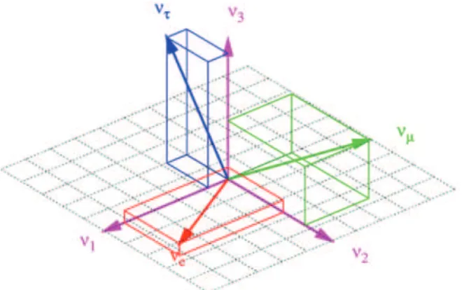
Because neutrinos have mass, they oscillate flavor states as they propagate [5]. Neutrino oscillation theory describes the rotation of the neutrino flavor state basis to the neutrino mass basis through a unitary matrix:
νi =
X Uijνj
Where i = e, µ, τ are the flavor states and j = 1, 2, 3 are the mass states. The unitary matrix is commonly referred to as UP M N S, where the subscript stands for Pontecorvo, Maki,
Nakagawa, and Sakata who provided major aspects to the neutrino oscillation theory. The matrix is commonly written in terms of four parameters that need to be determined experi-mentally. These parameters are θ13, θ23, θ12 and δcp. The θ parameters describe the rotation
angles between the neutrino mass and flavor states. The rotation of the two bases is shown in Figure 2.2 . The final parameter, δCP, describes a charge-parity (CP) violating phase that
may be present for neutrino oscillations and could explain the matter/anti-matter imbalance in the universe. The standard form of the oscillation mixing matrix is:
UP M N S = c13c12 c13s12 s13e −ıδ −s12c23− c12s23s13eıδ c12c13− s12s23s13eıδ s23c13 s12s23− c12c23s13eıδ −c12s23− s12c23s13eıδ c23c13 ,
where c and s represent cosine and sine and the subscripts which represent theta param-eter is the argument of the function. For example c13represents cos(θ13). The CP subscripts
Figure 2.2. Graphical representation for the rotation of the leptonic basis from the mass basis for the three neutrino types. [8]
If one were to start with a pure lepton neutrino state να the probability of that state
oscillating into another neutrino with lepton flavor νβ, is written as:
Pνα→νβ( L E) = X j,k U∗ αjUβjUαkU ∗ βke −ı∆m2jk 4E L
The probability of neutrino oscillation depends on the rotation parameters, ∆m2
jk, L and
E. L is the distance traveled by the neutrino, E is the energy of the neutrino and ∆m2
jkrefers
to the mass squared difference between two of the mass states. Mass enters this equation
Figure 2.3. Pictorial representation of the possible neutrino mass hierar-chies. The left side represents the ”normal” hierarchy and the right side rep-resents the ”inverted” hierarchy. [9]
through the use of the equation below. The final approxiamtion makes use of the fact if p >> mj,k then p ≈ E. Ek− Ej ≈ (m2 k− m 2 j) 2p ≈ ∆m2 kj 2E
Experiments measure the oscillation probability to determine the values of the different parameters used in the neutrino oscillation theory. However, because the oscillation prob-abilities depend on ∆m2
experiments are not able to determine the absolute values of the neutrino mass. This leads to an interesting problem in neutrino physics. The well-accepted picture of neutrino oscillation involves three mass states with three mixing angles defining the superposition of the leptonic on these mass states. Since neutrino oscillation experi-ments are only sensitive to the mass squared difference, there has been no way to decide if the sign of this term should be positive or negative because of the sensitivity of our cur-rent experiments. So the correct ordering of neutrino mass states has not been able to be determined. New experiments (including NOvA) have better sensitivities and have the po-tential to determine the mass ordering. In neutrino physics, this is described as by mass hierarchies. Depending on the choice of sign for the two mass splittings, the hierarchy is described as normal or inverted depending on the whether ν3 is the heaviest or the lightest
particle, respectively. This is shown graphically in Figure 2.3. This figure also includes the amount of superposition of the leptonic states on each of the mass states. Determining the amount of superposition is one of the main goals of neutrino experiments. Experiments are designed to make precise measurements of the neutrino oscillation parameters thus further characterizing the neutrino.
NOvA, the experiment that is the focus of this thesis, was designed to make precise measurements of θ13, θ23 ,and ∆m223. NOvA also has the capability to provide constraints
on δCP as well as on the ordering of the mass hierarchy. Outside of these main oscillation
related goals, NOvA can provide more information on neutrino-nucleus interaction cross sections, neutrinos from supernova, probe for sterile (non-interacting) neutrinos, and other exotic topics.
CHAPTER 3
The NOvA Experiment
The NuMI Off-Axis νe Appearance (NOvA) experiment has been designed to study the
oscillation of muon neutrinos into electron neutrinos using the world’s most powerful neutrino beam and two finely segmented detectors. The Neutrinos at the Main Injector (or NuMI) beam based at Fermilab is the source of muon neutrinos for the experiment.
The near detector is primarily used to characterize the neutrino flux from the beam, prior to propagation to the far detector 810 kilometers away and to minimize systematics. This flux is then used as the basis for an extrapolation to the flux that should impinge on the far detector located in Ash River, Minnesota. Because it is much closer to the beam source (only about 1 kilometer from the NuMI target) it also is used to study systematics of the experiment through higher interaction rates with the beam. The far detector is used to measure the neutrino oscillations of interest. Both detectors are based on the same liquid scintillator design this allows for the best constraint of uncertainties related to the neutrino flux, and hence the neutrino cross-section measurements.
3.1. Long-Baseline Neutrino Experiments
The NOvA far detector is situated at the Ash River facility in northern Minnesota near the Canadian border. The neutrinos travel this distance beneath the Earth’s surface and are subjected to the effects of matter. These matter effects slightly alter the neutrino oscillation probabilities based on whether the experiment is using a neutrino or anti-neutrino beam. These probabilities are also affected by whether the mass hierarchy is normal or inverted, thus long baseline experiments are sensitive to determining the mass hierarchy of neutrinos.
Fermilab Ash River
Figure 3.1. The NOvA baseline. [1]
Long-baseline experiments take advantage of the L/E ratio (a parameter from the prob-ability expression) to choose which neutrino oscillation will be measured by the experiment. Since the oscillation probabilities are determined by L/E, the proper baseline is determined and then the energy of the beam is tuned to whichever neutrino oscillation the experiment is to study. The NOvA experiment was designed in the opposite fashion, where the beam’s energy was predetermined and the baseline was chosen to fit the neutrino oscillation of interest.
3.2. NOvA Measurements
As stated above, the NOvA experiment is designed to measure the probability of the transition of muon neutrinos to electron neutrinos and the probability of the transition of muon anti-neutrinos to electron anti-neutrinos.
3.2.1. Electron Neutrino Appearance. The electron appearance measurement deter-mines the probability of a muon neutrino oscillating into an electron neutrino. Since this probability is dependent on the CP violating phase and the mass hierarchy, the NOvA exper-iment is capable of placing limits on these two factors through the measurement of electron neutrino appearance.
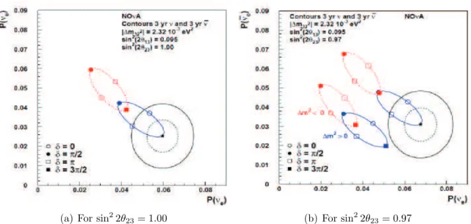
Figure 3.2 shows the probability of the appearance of electron neutrinos and anti-neutrinos. The graph includes two three sigma confidence contours. One of the contours is what NOvA expects to reach after three years of data collection using a neutrino beam. The smaller of the contours includes three years of data collection using neutrinos and three years of data collection using anti-neutrinos. Confidence level refers to the significance of limits set on the measured parameters. In this case, the confidence levels exclude certain limits on the appearance probabilities of the electron neutrino type. For example, a 2σ result indicates that there is 97.7 % chance that the real result does not lie outside of the contour shown on the graph. These plots show the physics reach of NOvA. Figure 3.2(a) gives estimates based on having a maximal mixing parameter for θ23, but as recent experiments obtain more
precision on this parameter it is possible for non-maximal mixing to be an accurate picture for neutrino oscillations. Figure 3.2(b) shows how these measurements could influence the NOvA results. The right-most pair of ellipses occur if θ23 is greater than 45
◦
and the left occur if θ23 is less than 45
◦
.
Closely related to the measurement of these probabilities is the determination of ∆m2 23
and sin2
θ23. After taking less than 10 % of the expected amount of data, NOvA results have
been published showing the current findings of these two parameters [13]. These current results can also be compared to the results of two major neutrino experiments T2K and MINOs as shown in Figure 3.4. As these graphs show, the capabilities of NOvA with only 10 % of the total expected data is beginning to be comparable to the results of other established experiments.
3.2.2. Muon Neutrino Disappearance. The NOvA detectors are sensitive enough to be able to measure muon neutrino charged current events. This allows NOvA to make measurements of muon neutrino oscillation factors through the study of their disappearance.
(a) For sin2
2θ23= 1.00 (b) For sin
2
2θ23= 0.97
Figure 3.2. Plot of the probabilities of electron neutrino and anti-neutrino appearance. The plots illustrate how well NOvA is able to determine the mass hierarchy and measure the CP phase. The ellipses show the δCP values
and choice of hierarchy that could be obtained from the oscillation probability measurements. The two black contours show the expected 3 − σ confidence level of measurements for three years of operation for both neutrinos and antineutrinos if the starred point were to be measured. The blue curve is for the normal hierarchy and the red curve is for the inverted hierarchy (a): Shows the expected results using sin2
(2θ13) = 0.095 and for sin 2
(2θ23) = 1.00
(b): Shows the expected results for sin2
(2θ13) = 0.07 in the lower curves and
sin2
(2θ13) = 0.095 in the higher curves with sin 2
(2θ23) = 0.97. [1] [3]
Figure 3.3. Comparison of NOvA results to those of T2K and MINOS show-ing the allowed regions in ∆m2
23 , sin 2
OFF AX IS BEAM
ON AXIS BEAM ND
FD
Figure 3.4. Schematic diagram of the NuMI off-axis beam.
Since NOvA uses a narrow-band energy beam (see Section 3.3) and an 810 km baseline, the L/E parameter for muon oscillation is tuned so that the muon neutrino flux has largely oscillated to electron neutrinos when they arrive at the far detector. This gives the detector excellent precision from measuring sin2
(2θ23) and |∆m223|.
3.3. Off-Axis Experiment
The NOvA experiment utilizes detectors that are off-axis from the main beam line. This design is shown in Figure 3.5. The benefit of off an off-axis design is that neutrino events are much more narrowly distributed in energy than when the experiment is on-axis. This reduces backgrounds coming from high energy neutrinos. The energy of the neutrino beam is related to the energy of the pions (the particle whose decay creates the neutrinos, see Chapter 4 for more information) through the following expression:
Eν =
1 − (mµ/mπ)2
1 + γ2tan2
θ Eπ
This equation shows that if the beam was pointed directly at the detectors, the neutrino energy would be directly proportional to the pion energy. However, if an off-axis beam is considered the neutrino energy depends more on the angle by which it is off-axis than it does on the pion energy. This is plotted in Figure 3.5.
Figure 3.5. Neutrino energy spectrum at different off-axis angles. [1]
The NOvA detectors are 14 mrad off-axis from the neutrino beam. Figure 3.6 shows the energy spectrum of the neutrino beam based on the angle off-axis from the beam. Notice that at 14 mrad off-axis almost all pion decays produce neutrinos in the 1 - 2 GeV range. This range is of particular interest to oscillation experiments, because the narrow-band energy beam of neutrinos gives reduced variation of νeenergies and also reduces backgrounds coming
from high energy neutral current π0
neutrino interactions.
3.4. The NOvA Detectors
NOvA uses two liquid scintillator detectors to observe particle interactions (Figure 3.6). The near detector is 2.9 m by 4.2 m and 14.3 m long and weighs a total of 222 tons. The far detector is considerably larger being 15.6 m by 15.6 m and 78 m long, weighing 15 kilotons. The size difference makes up for the fact that the near detector has a much higher incident flux, being only a kilometer from the neutrino source.
Each of the NOvA detectors are made of PVC cells filled with liquid scintillator, with a wavelength-shifting fiber running through the cell (Figure 3.9). The liquid scintillator is the interacting, or active, medium for event detection and generates the scintillation light that
is collected by wavelength-shifting fibers. The fibers are then attached to Avalanche Photo-Diodes (APDs) which are read out by the front-end electronics (FEBs). This arrangement is illustrated in Figure 3.7.
The detector consists of about 64% active medium. The PVC extrusions form a series of planes that house the liquid scintillator. The planes are used to mark the position, or coordinates, of the events as they pass through the detector. This is done using alternating vertical and horizontal planes to read out x and y coordinates to mark the position as particles move through the detector (see Figure 3.6).
When an interaction takes place, the resulting charged particle that may be created passes through the detector ionizing the liquid scintillator. The ionization causes the liquid scintillator to emit 425 nm photons. These photons can be reflected by the specially treated PVC walls where they may be absorbed by the wavelength-shifting fibers located in the PVC extrusions. The fiber in the PVC cell is twice the length of the cell, so it is looped at the bottom such that the fiber has twice the chance of catching a photon. The wavelength
Cells are 3.8 cm by 5.8 cm
Figure 3.6. Schematic diagram the NOvA far and near detectors, the ex-ploded view shows the alternating horizontal and vertical cells that give the detectors x-y tracking capabilities. [6]
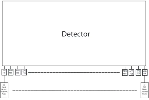
APD FEB APD FEB APD FEB APD FEB
Detector
APD FEB APD FEB APD FEB APD FEB 32 WLS Fibers, Channels, Pixels 32 WLS Fibers, Channels, PixelsFigure 3.7. Illustration of how APDs, FEBs, fibers, and channels are related on a detector. The near detector has 631 APDs and FEBs installed. The far detector has 10,745 APDs and FEBs installed. Each APD has 32 fibers attached to it. Each fiber corresponds to to an APD pixel and these are referred to as readout channels.
shifting fiber shifts the photons to between 450 nm – 650 nm. Each end of the fiber is attached to one pixel of the APD. The corresponding APD is then read out by the FEB and the data is sent to be processed offline. These electronic units contribute most of the noise (outside of background cosmic particles) that affects the quality of data in the experiment.
Figure 3.8. Photograph of an APD unit installed on the NOvA near detec-tor. The front-end board is the blue circuit board, the red board controls the thermoelectric cooler. The APD pixels are mounted in the white PVC block at the top of the unit.
CHAPTER 4
Data Quality
Data quality affects every aspect of an experiment’s results. It appears in every analysis through the uncertainties that are introduced due to poor data quality. In the NOvA ex-periment, data refers to the analog to digital (ADC) counts generated by the APD due to a charged particle creating photons inside of the detector and the times stamps generated by the NOvA timing system for when the events occurred. Therefore, data quality is a measure of how well the data obtained is representative of what actually took place inside the detector.
4.1. Importance of Data Quality
Neutrino interactions are generally not difficult to detect but are somewhat rare because of the low rate of interaction due to the weak coupling strength between neutrinos and matter. Therefore, large detectors are used to increase the probability of an interaction within the detector. Based on this fact, many detectors are typically built to maximize the fiducial (or useable) volume of the detector. The size of the detector determines how many electronics or readout channels are needed to give an accurate detection system within the detector. The detection system is then required to operate in such a way as to maximize the signals that the experiment is seeking while trying to minimize the noise coming from the detection system itself or picked up from other sources.
In NOvA, the algorithms used to identify neutrino charged current events (Figure 1.1) are one of the most crucial processes of the experiment [13]. One of the algorithms uses a library of many simulated events and tries to match the event structure detected in the detector to one or more of the simulated event topologies in the library. This is used as an
efficient way to accurately identify which particles interacted in a particular event within the detector. If too much noise is introduced as the data is collected and saved, the correct event topologies in the library may no longer match the data collected by the detector. This could result in loss of actual events and would negatively impact experimental results. Therefore, data quality plays an important role in the overall success of the experiment in reaching the physics goals.
The creation and maintenance of the neutrino beamline is a crucial component of the NOvA experiment. However, beam quality goes beyond the scope of this thesis and will not be discussed in detail. Just note that the majority muon neutrinos that make up the beam come from the following decay:
π+
→ µ+
+ νµ
The pion is created through the interaction of protons in the beam with a beryllium target causing the production of various mesons including the pion.
4.1.1. Data Quality Related to Readout Electronics. The readout electronics system is what collects the data from the detector. It is one of the major areas of concern regarding data quality. There are many methods used to ensure that the electronics are in proper working condition before they are placed on the detector. Each of these methods check for some of the most common problems that can be encountered during the construction and testing of the electronic systems.
There are a number of problems that can cause noise from the APDs. These problems can range from manufacturing errors, improper installation of the units, or even problems that develop in the units over time. Examples of such issues are application of the wrong coatings,
electronic connections that degrade over time, scratched pixels on the photomultiplier of APD or even malfunctioning cooling systems. Each of the potential problems can lead to different levels of noise being produced by the electronics on the detector. Identifying these issues can take a substantial amount of work and may only be determined after the unit is removed from the detector and inspected.
It has been shown that noise issues can develop over time. Minor problems with circuitry and improper coatings on the APD pixels are commonly associated with increased noise levels when the units have been placed on the detector for longer periods of time. Over time as the coatings degrade from use, the noise levels begin to rise on certain channels of the detector. Eventually this can lead to a loss of data when the unit becomes too noisy to collect data properly. These units then need to be either repaired or replaced with properly working units to ensure that data is of good quality.
The APDs work in such a way that their circuits provide amplification to the signals that are obtained from the detector. So if there are problems with this circuitry before the amplification process the noise present is amplified to levels that will almost certainly affect the data. This can either falsely show up as interactions, or if the problem is bad enough, the APD unit may be skipped over completely and will not contribute data to corresponding events. Once a per-determined hit rate threshold is reached by APD units they are switched off.
There are other low level noise issues that can develop over time for the APD units. These issues can lead to the APDs either reading too much signal or not reading enough signal compared to the optimal dark noise levels of the APD units. Dark noise refers to a relatively small electrical current that is present in photosensitive devices when there are no photons entering the device due to the random generation of electrons. These issues are
addressed through the use of pedestal scans. A pedestal scan is a baseline scan performed on the electronics that determines the normal electrical noise produced by a unit when there is no signal from the detector. The level of dark noise is recorded for each channel on a detector to determine if a component is noisy. These levels are used to raise or lower the threshold necessary to identify when an APD indicates an event occurring in the detector.
These factors can limit the quality of data collected by the experiment. They lower the ability of the readout systems to track the energy produced in these problematic cells as particles pass through them because the signal of the noise could overwhelm the signal produced by the particles resulting in the loss of event information. Therefore, finding a way to identify and correctly diagnosis these problems is an important requirement for the experiment.
4.1.2. Environmental Factors. Other factors that can affect data quality center around the surroundings of the detector. These ambient factors can affect the electronics of the detectors in ways that affect the data further down the line. One such factor that has been determined through the analysis of data signals is the effect that the 60 cycle electrical circuits have on the detector. Whenever lighting was on or if APD units were located near electrical wires it was shown that there were low levels of 60 cycle noise present in the data collected. This noise can show up as more energy being deposited in the detector than that coming from particle interactions. If this noise reaches a level that is greater than some of the particle interaction energy levels, events can be misidentified.
Other ambient sources of noise can also be detected in the far detector. Because the far detector is located on the surface of the Earth it is subject to many cosmic particles interacting inside of the detector. Using time restrictions based on when the neutrinos from the beam reach the detector and other criteria which reject cosmic interactions from
influencing the beam-based data can help address the cosmic particle background signal. Another factor that has been shown to effect data quality at the far detector is lightning storms present in the area. Lightning strikes can also show up as noise in the data and need to be addressed using proper grounding of both the APD units and the far detector building itself. Each of these ambient factors can affect the data quality. Therefore, it is important to be able to both quantify these effects and be able to address the issues when they arise.
4.2. Current Techniques for Data Quality
The current techniques used to determine data quality for the NOvA experiment center around the use of the FEB hit rate data. The FEB acts as an interface for the data from the APDs to be collected by the offline data acquisition system. These hit rates correspond to the rate at which signal is produced by an APD unit. If this rate is less than it should be an APD is considered quiet and if the rate is higher than it should be the FEB is considered noisy.
The hit rates are used in a series of plots produced to identify which hardware needs to be repaired or replaced. This data is collected on a weekly basis to create a list of malfunctioning APD units. This list can then be analyzed to determine what is wrong with malfunctioning channels and an appropriate course of action can be taken. There are also a series of plots that are updated on an hourly basis. The plots provide a current and accurate view of how the electronics are operating on the detector [4].
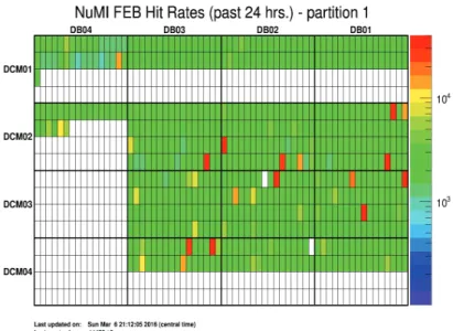
Figure 4.1 shows a typical view of the FEB hit rates in the near detector for a 24 hour period. The warmer colors show the parts of the detector that are receiving higher hit rates compared to other parts of the detector. Cooler colors in the plot show the portions of the detector that have lower FEB hit rates. These APD units are more likely to be considered
Figure 4.1. A plot showing the FEB hit rates for the near detector over a 24 hour period. This is a map in electronic channel space not in detector coordinates.
quiet. Quiet units are problematic because certain levels of noise are expected to be present in working APD units. Devices showing less than this level could indicate problems such as a channel not properly outputting signal, or the the unit is not synchronized with the rest of the detector. White portions of the plot show APD units that are not reporting. Most of the white portions are just areas of the detector that do not actually exist. However, the middle portion of the plot shows at least two units that are not responding on the detector. Figure 4.2 corresponds to 24 hours of FEB hit rate data with an added sample track. The sample track crosses near or through a few cells with noisy APD units. As the particle passes through the detector it deposits energy and generates scintillation photons along its path. Since it passed near these noisy cells, it may be difficult to determine the actual energy deposited by the particle inside the detector. Due to the noisy APDs it may be difficult to tell if the path is actually a single continuous track. This could make it difficult to determine either the particle’s identity, the event’s energy, or even if it was a track created by one or
more particles. This example shows the difficulties introduced by noise in the detector and how these plots can influence the maintenance of units on the detector.
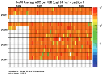
Closely related to the typical 24 hour FEB hit rate plot, Figure 4.3 shows the average ADC values reported by each FEB during a 24 hour period. ADC counts are the raw unit
Figure 4.2. A plot showing the FEB hit rates for the near detector over a 24 hour period with a sample particle track. The track does not correspond to a particle interaction.
Figure 4.3. The plot shows the average ADC reported by each channel for each FEB. This is computed by finding the total ADC reported by each FEB divided by the total number of hits reported by each FEB during the 24 hour period.
of deposited charge and relate to the amount of energy deposited inside the detector. In a noise-free scenario this would show precisely where most particles interacted with detector. However, when taking noise into account the average ADC values reported by FEBs can also show which APD units are reporting signals most often, thus signaling the most likely units with noise related issues. The noise is artificially increasing this number and making it seem like some units are reporting more data from particle interactions than others. This graph was produced over the same 24 hour period as Figure 4.1, so comparing these two graphs gives an accurate view of which FEBs are reporting more data from particles passing through the detector.
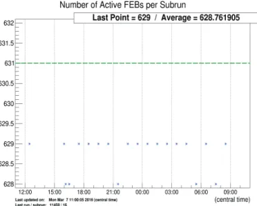
Figure 4.4 shows the plot of the number of active FEBs per subrun on the near detector. This shows if any of the APD units is not reporting for an entire subrun. A subrun is a minimum collection of data used by the experiment to separate events and data into similarly sized data packages. The plot marks the optimal number of active FEBs with a dashed green line. There are 631 FEB units on the near detector and 10,745 on the far detector. This plot indicates if any channels have become inactive over the course of an entire run. Channels that continually drop in and out indicate a problem that is localized to a particular channel on the detector. If many channels begin simultaneously dropping data, it may indicate a major problem with the detector that is not due to a particular APD unit. These problems could range from a power failure to the channels on the detector being out of sync with the rest of the detector.
Figure 4.5 shows the hardware watchlist produced by the experiment based off of FEB hit rates over a one week period. This list indicates the APD units that are malfunctioning based on the statistics of the past week of data collection. The list is used as way to indicate
Figure 4.4. Display of the total number of FEBs that reported at least a single hit for the time period between 12:00 and 9:00.
which channels need more attention, to be worked on, replaced, or just watched over the coming weeks to see if they become noisier.
The list gives the physical location of the unit and identification (name of the electronics channel) of the malfunctioning channels on the detector. This can help identify if there are some environmental factors that are affecting the unit or if there is some other influence on the unit, such as the wrong APD coating. The chart continues with a series of measurements that determine if the unit is signaling a hit too often or if it is not outputting enough signal. These metrics are used to identify the proper course of action for dealing with the problem. There are many more plots and devices that give more information on what is happening in the NOvA detectors. This robust system is able to help identify problems in the detector and give clues as how to diagnosis and fix the problems with the malfunctioning APD units. However, there are some sources of information that are being underutilized in regards to the identification of problems that effect data quality.
Figure 4.5. A sample of the hardware watchlist. The list gives the location of the malfunctioning unit on the detector and a series of metrics used to diagnosis the issue with specific channels.
CHAPTER 5
DSO Studies
5.1. Motivation
NOvA data consists of the ADC counts generated in the APD system by photons pro-duced in the detector via particle interactions. These counts are related to the voltage produced in the APD by photons which is dependent on the energy deposited during the event. Figure 5.1(a), shows an electron neutrino event in the NOvA far detector. This event has been subjected to a series of cuts, or data removal by a set of criteria, that have eliminated the noise and other interactions that occurred in the detector when this neutrino event took place. These cuts remove energy in the detector that is not associated with the neutrino interaction. One example is when cosmic data is removed from the actual data that is related to the neutrino beam. Cosmic data comes from muons that are produced via the interaction with cosmic rays in the atmosphere. These particles typically interact with the edges of the detector and would not be going in the same direction as the beam. Further cuts such as where the particle track began or what direction it was traveling in can also be used to further reduce background from the dataset.
Figure 5.1(b) shows the addition of a small amount of noise back into the event. It is easy to see that the event is still present in the plot, however with the addition of this small amount of noise it becomes difficult to judge whether this event is neutrino-related or just something else interacting in the detector. This noise could have a large impact on the experiment if the neutrino event was missed because of the presence of the noise in the detector. The same could be said if the noise pattern introduced a ”fake” neutrino event by giving a signal that looked like a real event but only came from noise in the detector.
(a) Without Noise
(b) With Noise
Figure 5.1. NOvA event display showing electron neutrino event. Top pane shows event and bottom pane shows the event with noise added.
This example shows how noise could lower the efficiency of the detector enough that an entire event could be missed. To limit this uncertainty it is important to use every piece of information available to properly identify issues with the electronics in the detector.
Currently NOvA researchers use Digital Scanning Oscilloscope (DSO) readings to identify the operating conditions present in the APDs of the detector. DSO scans are waveform samples produced by the data acquisition system. The DSO scans are performed during
down time for the detector and look at the baseline ADC counts in the readout channels. These scans result in a ”noise profile” for each APD channel. Noise profiles are distributions of the average noise that is produced in a readout channel. The noise profiles are then used to create a mask for the detector. The mask is later used to normalize the data of the detector when looking for the events. So, if an APD channel is running noisy (or showing too much output compared to the rest of the detector when there is no signal present), the mask acts to subtract that extra noise out of the data when it is analyzed thus trying to show what the event created without the noise present in a particular channel. This also works if the APD channel is quiet (shows to little signal compared to the actual running values of properly functioning APD units), by lowering the ADC count threshold required to indicate good data.
This step is an important part of the NOvA data quality and data taking procedure. It aids in excluding any noise issues due to dark rate in the APDs, damaged APDs, noise from the wires used to transmit the data, or if the APD is picking up noise from other sources near the detector. This makes it possible to partially remove noise that is present in the detector without actually having to fix each noisy APD. It also ensures that there is a way to cancel out any ambient environmental noise that is not caused by a malfunction in an APD. This helps achieve the overall goal of the experiment by calibrating the apparent detection rates of the detector.
The DSO scans are currently only used to create these masks and are sometimes ana-lyzed individually to identify what is wrong with the APD in question. This is only done occasionaly because of the time required for an individual to look at all of the DSO scans for every APD channel. This process could take anywhere from a couple to several hours depending on how many channels need to be checked. The analysis of these scans involves
(a) Without Mask
(b) With Mask
Figure 5.2. NOvA FEB hit rate map. (a): Shows the hit rate map. (b): Shows the hit rate map with sample mask applied.
the use of four different plots to identify problems in an APD unit. A sample of these plots for a non-problematic APD is shown in Figure 5.3.
Figure 5.3(a) shows the raw output of a DSO scan. The y-axis represents the ADC count for the DSO scan. DSO scans are comprised of 1000 different samples (ADC counts
(a) Raw DSO Scan (b) DCS Plot
(c) Fast Fourier Transform of DSO Scan (d) Histogram of the DCS data
Figure 5.3. NOvA DSO analysis plots. (a) Shows the raw DSO waveform. (b) Dual Correlated Sampling of the DSO waveform. (c) The fast fourier transform of the DSO waveform. (d) Histogram of the DCS data.
obtained in a given time period) for a specific channel. The normal noise level for this APD unit fluctuates around 575 ADC counts for this channel. This signal comes from the electronics and the APD and is a measure of the low level of electrical fluctionations inside the unit. This type of noise is typical for an operational APD.
Figure 5.3(b) shows what is referred to as a Dual Correlated Sampling (DCS) plot. This refers to a sampling technique that uses the difference between consecutive samples to eliminate a slow moving baseline from the raw data. This centers each DSO reading on zero. This plot has been the most useful in analyzing noise patterns in the DSO data (See Section 5.4 for a brief look at this technique).
(a) Fast Fourier Transform of DSO scan (b) Fast Fourier Transform of DSO Scan
Figure 5.4. NOvA DSO analysis plots with periodic noise. (a): Plot of a noisy channel showing periodic noise. (b) Plot of a channel showing a different periodic noise pattern.
Figure 5.3(c) shows the Fast Fourier Transform (FFT) of the raw DSO data. This plot shows if any harmonic noise is present in the DSO scan. This can be used to identify channels that have loose grounding or conduction wires or if channels are located to closely to other electronic devices. It has been used to identify noise from the normal 60 cycle electrical circuits used to power the lighting in the near detector’s location. This type of plot has shown frequencies that related to issues with APD circuitry and other related hardware problems. Figure 5.4 shows some plots with this type of periodic noise.
Figure 5.3(d) shows the histogram distribution of the DCS data. The use of this plot in the analysis of problematic APD diagnostics has been underutilized in the past.
5.2. Preliminary Detector Work
In order to achieve the high-precision goals of the NovA experiment all of the experimental uncertainties must be known and characterized. These uncertainties are mostly identified during the planning stages of an experiment and are largely characterized during the testing
phases. Many studies are performed during this period of the experiment and continue throughout the course of the experiment’s operation.
Many studies have been conducted in order to quantify and characterize the sources of uncertainty for NOvA. A description of the studies that have been performed as a part of this thesis follow in the next three sections. These studies were performed over the course of the summer of 2015 during my stay at Fermilab.
5.2.1. APD Quality Assurance Testing. In order to ensure that all of the electronics that are placed in the detector are in the required working condition, the NOvA collabo-ration implements a quality assurance procedure to identify APDs that are malfunctioning so that they are not installed in the detector. This procedure was developed by the APD manufacturers and is performed at Fermilab (for the near detector) and at Ash River (for the far detector) before any APDs can be installed on the detector. My involvement was with the near detector.
There is a series of three tests that must be passed in order for an APD to be installed on a detector. The first test is a visual inspection of the APD. This checks for any components that are loose, missing, or have been damaged during the handling process. This inspection has identified APDs that have had frayed cooling wires, loose grounding connections, and has even identified APDs that have incorrect connectors installed.
The second test invloves studying the current induced by a voltage bias on the APD. This test simulates the dark current noise that will be produced by a unit when it is attached to the detector. A bias voltage ranging from 0 to -375 V is applied to the APD in incremental steps. The induced current is then monitored. If the current is too far above (or too far below) a pre-set threshold value the unit is flagged and shipped back to the manufacturing facility to be corrected. The APDs that show too much current during this process are likely
to generate more noise while on the detector and could negatively impact the quality of data collected. If an APD does not show sufficient current during this test, it is likely that there is a poor connection within the device, or that there is some other defect in the unit.
The third test involves checking that the cooling system for the APD is working properly. This system, called the thermoelectric cooler (TEC), adjusts the flow of the water across a specific APD to maintain its proper working temperature. This tests the resistance of the thermistor to ensure that it is in the optimal range for proper operation.
Each test is performed on each APD as they are obtained at either detector’s installation site. This quality assurance is an important part of detector maintenance and has identified many problems before the data collection process could be affected by malfunctioning APD units. These tests are also performed to identify failure modes for the APDs that have been replaced because of malfunctions. Over 72 APD units were shipped to Fermilab for installation in the near detector during the summer of 2015. I took part in the quality assurance testing for each of these units.
5.2.2. Routine Detector Maintenance. During the summer of 2015, the NuMI beam was turned off for two months of routine annual maintenance and upgrades. This was done to perform the preliminary upgrades for running the beam at higher energies and for investigations into the performance and proper maintenance of the beamline. The downtime provided access to working on the detector for extended periods of time without losing any neutrino data.
The detector work included the replacement of APD units that had been previously identified as performing out of specification. This period of time also allowed for a check of every APD on the detector to make sure that all were performing properly. Part of this work included the checking of every ground wire to ensure that all were properly connected.
The installation of additional electromagnetic screening materials was also performed. These upgrades were done to further improve the detector grounding and to have better screening against ambient electromagnetic noise in the near detector hall.
Further detector work was done to complete a survey of every channel on the near detector. This survey resulted in a catalogue of each piece of electronic equipment that was installed on the detector. This included the precise location of each piece of electronics on the detector. This was done to provide information about which channels become noisy over time. This can now be correlated with the unit’s manufacturing date and location on the detector to find patterns that indicate where noise issues originate. This will help to identify the manufacturing procedures that led to specific noise issues or if certain manufacturing procedures led to the degradation.
5.2.3. Automation of DSO Plots. The process of using DSO plots for the identification of noisy channels has been used for the duration of the experiment. One issue with this process is the inefficiency of creating the plots on a week by week basis and analyzing all of the plots manually.
During my stay at Fermilab, I was able to address this issue by automating the DSO plot generation process. The automated procedure can be run over the entire near detector or just over the channels on the hardware watchlist. The program then creates the four DSO analysis plots for every APD. These plots are placed onto the hardware watch website as an additional tool to determine which channels are malfunctioning and what the possible causes could be. Figure 5.5 shows the outcome of this automation process after it has been posted online.
This automated process provides complete access to the DSO analysis results to all NOvA researchers in a format that is easily used and more efficient than the past uses of these plots.
Figure 5.5. A sample of the DSO automated analysis website.
This will also be attached to the hardware watchlist website and will be an integral part of the analysis of malfunctioning APDs for the NOvA experiment.
5.3. DSO Noise Analysis Study
This section describes past work using DSO scans for noise analysis. The patterns de-scribed are then used as a basis for the automation of analyzing DSO scans to identify malfunctioning APD channels on the detector.
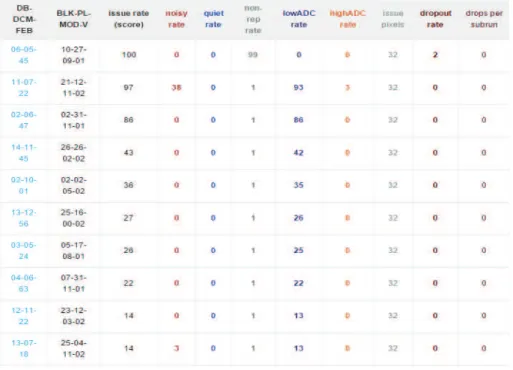
5.3.1. DSO Noise Analysis Patterns. In the early studies of DSO noise, fifteen unique patterns were identified using the DSO plots [2]. These patterns are summarized in Table 5.1. In the table spikes refer to DCS readings that are greater than the baseline threshold. The patterns have been used as a way to classify and group how malfunctioning APDs behave before and after maintenance.
To understand these patterns and how issues were identified refer to Figure 5.6. As can be seen in Figure 5.6(c), there are no periodic patterns present in the DSO scan. Referring to Figure 5.6(b), it can be seen that the DCS data is more spread out than what one would
Table 5.1. DSO Noise Patterns
Pattern DCS Features Other Features
1 Baseline of 20, with no large spikes
No periodicity, sometimes happens with very quiet pixels
2 Baseline of 20, but only on even samples. Has few spikes greater than 50
No periodicity, half the pix-els show this pattern
3 Baseline of 0, no spikes DSO is non-zero and no pe-riodicity
4 Baseline of 5, no spikes No periodicity, but all pixels show low fluctuation in FFT 5 Baseline of 50, with no
not-icable spikes
Odd spikes in the FFT 6 Baseline of 20, with about
half of all readings over 20 with spikes greater than 50
No periodicity
7 Has two baseline: one part with 0, one part with 5. Has few spikes over 500
No periodicity
8 Three baselines: one at 5, one at 0, one at 20. No spikes
No periodicity
9 Three baselines: one at 5, one at 0, one at 50. No spikes
No periodicity
10 Baseline of 20 No periodicity, odd patterns in the DSO
11 Baseline of 20, pairs of spikes greater than 35 in the DCS
No periodicity
12 Baseline of 0 , pairs of spikes greater than 35 in the DCS
Only the first two pixels have this pattern.
13 Baseline of 20, pairs of spikes greater than 35 in the DCS
Periodic, occurs in pixels on the edge of the APD
14 Baseline of 20, pairs of spikes greater than 35 in the DCS
Periodic
15 Baseline of 0, some spikes greater than 50
Periodic. All pixels show this
(a) Raw DSO Scan (b) DCS Plot
(c) Fast Fourier Transform of DSO Scan (d) Histogram of the DCS data
Figure 5.6. DSO plots of a noisy APD pixel. (a): The raw DSO waveform for the pixel. (b) The dual correlated sampling of the DSO waveform. (c): The FFT of the DSO waveform. (d): The histogram of the DCS plot. This plot includes a red line which was a fit for the data.
expect for a properly operating channel (see Figure 5.3(b)). This is emphasized in Figure 5.7, where the ”baseline” is drawn in over the DCS plot. The baseline refers to the average spread of the DCS data. In this scan most of the DCS peaks extend 20 units above and below the zero line. Also note that there is one large spike present in the DCS plot. If we take all of these features into consideration, table 5.1 indicates that this pixel is noisy and that it is consistent with that of pattern 2.
One more example is featured in Figure 5.8. The first thing to note is that Figure 5.8(a) shows a widely varying DSO scan. This variation can also be seen in the DCS plot in Figure 5.8(b). Figure 5.9(a) shows the baselines for this DCS plot. One is located at 0 (blue line),
Figure 5.7. DCS plot from Figure 5.6(b) with added baseline.
the next is located around 5 (black lines) and the final one extends out to 50 (orange lines). These features, and the fact that there are no periodic signals present in the FFT plot, indicate that the APD is noisy. The noise pattern is consistent with that of that of pattern 9.
The common theme to this type of analysis is the apparent arbitrariness of determining the baselines and the lack of quantifiable descriptions of these noise patterns. The patterns and subsequent analysis are classified by eye. The baselines are determined by judging where most of the spikes appear to be reaching out to in the DCS plot. In fact, it seems perfectly acceptable to have drawn the baselines in Figure 5.9(a) as those shown in Figure 5.9(b). We now have identified what seem to be four valid baselines and we could base a new pattern around this feature of the DSO plots.
These examples demonstrate the qualitative approach that has been used to identify DSO patterns for noisy APDs. The process is time consuming because each APD produces data from 32 pixels. The DSO plots are made for each of the 32 pixels, so four plots must be analyzed for each pixel to identify which noise pattern the APD is experiencing. This time consuming process introduces the need for a more quantitative approach to analyzing DSO plots to identify noisy APDs.
(a) Raw DSO Scan (b) DCS Plot
(c) Fast Fourier Transform of DSO Scan (d) Histogram of the DCS data
Figure 5.8. DSO analysis plots of a noisy APD pixel. (a): The raw DSO waveform for the pixel. (b) The dual correlated sampling of the DSO waveform. (c): The FFT of the DSO waveform. (d): The histogram of the DCS plot. This plot includes a red line which was a fit for the data.
5.3.2. DSO Analysis Method. In developing a more quantitative method to identify problematic channels from the DSO data, it was important to look for distinct patterns that can be easily recognized. These distinct patterns would stand out as flags for the identification of channels that are not operating properly. These patterns were identified in different ways than from the previous discussion; however they are still based on the same concepts. Since the DCS plots have been most useful in the past for the identification of these patterns, these plots are the focus of the current problem-channel identification. However, instead of using the standard plot of the DCS the histogram of the DCS will be used for easier channel identification.
(a) DCS plot with added baseline (b) DCS plot with added baseline
Figure 5.9. The same DCS plot with choices for baselines added. (a) Shows 3 baselines: 0 (blue line), 5 (black lines), 50 (orange lines). (b) A different set of baselines for the same DCS plot: 0 (blue line), 5 (black lines), 25 (green lines), 30 (orange lines).
(a) Good Channel (b) Good Channel
(c) Bad Channel (d) Bad Channel
Consider the plots in Figure 5.10. There are plots corresponding to two properly oper-ating APDs and two plots corresponding to problematic APDs. These are typical examples for both the normal channels and the malfunctioning channels. The two good channels have mean DCS values that are much closer to 0 than the bad channels. Also, the two good channels have standard deviations that are smaller than the standard deviations of the bad channels. This is easily determined from the RMS values listed on the plots using the equation: x2 RM S = ¯x 2 + σ2 x
Because electronic noise is a random phenomenon that can be described by a normal distribution, the histograms can be fit with a Gaussian distribution function. The mean and the standard deviation are parameters used to characterize the curves. Since the DSO samples a waveform for a channel operating without signal resulting from the beam induced interactions, the mean value of the DCS should be centered around zero. Small fluctuations in this number are due to normal levels of noise coming from the APD unit, and larger fluctuations are due to the noise that needs to be identified. These fluctuations will contribute to the standard deviation of the DCS data. The mean and standard deviation can be used to identify the patterns that are necessary to identify the problematic channels using the DSO data.
5.4. Analysis of DSO Scans
The analysis of DSO scans to identify noisy channels relies on finding a way to differentiate good channels from bad channels. This is done by plotting the mean DCS value for every channel of the near detector in Figure 5.11(a). Figure 5.11(b) shows a log plot of the
distribution with bad channels indicated by red lines. Note that most good channels have a mean DCS value that is near zero, while most of the bad channels have mean DCS values that lie outside of the primary distribution.
To evaluate the accuracy of using the mean DCS value as a means to identify noisy channels a series of tests must be conducted. Figure 5.13 shows the histogram of mean DCS values of both good and bad channels shown in Figure 5.11(b). The vertical lines represent where a cut will be placed which identifies channels with mean DCS values in between the two lines as ”good” and channels with mean DCS values outside of the lines as ”bad”. The lines are then moved such that all noisy channels identified by the hardware watchlist lie outside of the lines thereby identifying these channels as bad using DCS data as the determining factor. The number of good channels outside of the lines needs to be minimized to limit the number of good channels being improperly flagged as ”bad”.
Figure 5.12 shows the results of the movement of the vertical lines in Figure 5.13. As the cut width increased the number of good channels flagged as ”bad” decreased and the number of bad channels being flagged increased. To maximize the number of bad channels flagged (while minimizing the number of good channels improperly flagged) a cut width of 0.5 should be used. Thus, any channel with a mean DCS value greater than 0.5 will be flagged as noisy.
A similar process can be used to determine when the width of the DCS plot is considered abnormal. The histogram in Figure 5.11(b) shows the distribution of the DCS width of every channel on the detector. Very few good channels have a DCS width greater than 3 − σ from the average shown in the histogram. Bad channels will be identified if their DCS widths are greater than 3 − σ from the average DCS width of good channels.
(a) DCS mean distribution
(b) DCS mean distribution log plot
(c) DCS standard deviation distribution
Figure 5.11. DCS histogram data for the near detector. (a): Shows the distribution of mean DCS values for every channel on the detector. (b) Shows the distribution of mean DCS values for every channel on the detector in a log plot. The noisy channels are marked in red. (c): Shows the distribution of DCS width values for every channel on the detector.
1 10 100 1000 10000 100000 0 10 20 30 40 50 60 0 0.1 0.2 0.3 0.4 0.5 0.6 0.7 0.8 0.9 1 N u m b e r o f G o o d Ch an n e ls (l o g s c al e ) N u m b e r o f B ad Ch an n e ls Mean DCS value
Bad Channels Remaining Good Channels Removed
Figure 5.12. This plot shows the results of a series of consecutive cuts based on varying the DCS mean value. The blue line is the number of bad channels remaining in the list as the cut becomes wider. The red line shows the number of good channels removed from the list as the cut becomes wider.
Figure 5.13. Mean DCS values for every channel on the near detector. The two vertical lines were moved in small steps to determine the number of good channels and noisy channels at each DCS mean value. This illustrates how good and bad channels were identified in Figure 5.12.
The results of these two cuts are shown in Figure 5.14. Figure 5.14(a) shows the distri-bution of every channel’s mean DCS value with known bad channels plotted in red. Fig-ure 5.14(b) shows the distribution of these mean DCS values for every channel not removed by the cut on the mean DCS value. Figure 5.14(c) shows the same distribution after every channel with a DCS width greater than 3 − σ from the detector average was removed. As
(a) Distribution of channel means before any cuts. (b) Distribution of channel means after first cut
(c) Distribution of channel means after the second cut
(d) Distribution of channel means after second cut
Figure 5.14. Plots showing the effects of cuts on the distribution of channel means for the detector. (a) Shows the distribution without any cuts. Red in-dicates noisy channels from the hardware watchlist (b) Shows the distribution after a cut is made based on the mean DCS value of noisy channels. (c) Shows the distribution after a cut is made based on the width of the DCS data. (d) Shows a close up view of the same distribution in (c).
can be seen there are almost no bad channels indicated after the second cut was applied. Therefore, almost all of the known noisy channels have been flagged as bad by the two cuts.
5.5. Noisy Channel Comparison
The technique described in Section 5.4 will be referred to as the quantitative DSO noise analysis (QNA) technique. The evaluation of the validity of the results of QNA is based on two factors. The first is the comparison of the list created by the QNA to the hardware watchlist produced during the same period of time. The second evaluation looks at all of the channels that were identified by the QNA that were not indicated by the watchlist. These channels were processed using the original DSO analysis techniques (discussed in
Table 5.2. List of APDs containing noisy channels identified using hardware watchlist 1-2-31 1-3-15 1-4-28 2-1-2 2-3-20 2-3-41 2-3-42 2-4-15 2-4-21 2-4-22 3-2-31 3-3-59 3-4-25 4-1-2 4-1-20 4-1-30
Section 5.3.1) to determine the noise patterns that were present (if any) for these identified channels.
5.5.1. Noisy Channel - Hardware Watchlist Comparison. This analysis was based on the DSO scan preformed on the near detector on December 14th 2015. The results of this were then compared against the December 20th 2015 hardware watchlist. This was the hardware watchlist produced nearest to when the DSO scan was performed. The channels listed in the hardware watchlist are summarized in Table 5.2.
The hardware watchlist contained 18 problematic APDs (see Table 5.2). On these APDs 46 channels were identified as noisy. The QNA technique identified 133 problematic channels
Table 5.3. List of APDs with noisy channels identified using QNA 1-2-25 1-2-31 1-4-28 2-4-15 3-2-4 3-2-61 1-2-48 1-3-1 1-4-22 2-1-20 2-2-24 3-4-2 2-2-34 2-3-7 2-3-9 2-3-32 3-1-26 1-3-15 2-1-2 2-2-14 2-2-31 2-2-60 2-3-15 2-3-26 2-4-31 3-2-31 3-3-22 4-1-0 4-1-2 4-1-3 4-1-20 4-1-21 4-1-27 4-2-0 4-2-11 2-3-41
Table 5.4. List of APDs with noisy channels identified by QNA that were on the hardware watchlist
1-2-31 1-3-15 1-4-28 2-1-2 2-3-41 2-4-15 3-2-31 4-1-2 4-1-20
Table 5.5. Sample of channels identified using DSO analysis and the pattern of noise they exhibit.
Channels Identified Pattern Identified
1-2-25 8
2-2-24 10
2-2-31 Baseline 20 and Periodicity
2-2-60 5 2-3-15 6 2-3-21 13 2-3-26 13 2-3-32 5 2-4-31 6
across 36 APDs (listed in Table 5.3). Of the 46 channels identified on the hardware watchlist, QNA was able to identify 42 of these correctly. See Appendix B for the DSO plots of the hardware watchlist channels that were not identified using QNA. The overlap of these two different techniques is quite substantial given that they identify noise channels using different criteria.
5.5.2. Pattern Identification Comparison. The final evaluation of the QNA was to use the earlier qualitative DSO pattern recognition to verify that all channels not listed on the hardware watchlist were actually exhibiting noise patterns. The summary of this comparison is found in Table 5.5. Only one channel identified using QNA did not exhibit a perviously identified noise pattern. This channel did show signs of noise though. There was slight periodicity shown in the FFT of the DSO data and the baseline of the DCS plot showed a baseline of 20.
The conclusion of this analysis is that QNA does identify problematic APD channels correctly. Every channel identified using QNA did show characteristic signs of noise in the DSO plots. These may be low level noise patterns that are not capable of being picked up
via the FEB hit rate method that the hardware watchlist uses. The DSO analysis technique shows great promise in its application to identifying problematic APD channels.
CHAPTER 6
Conclusion
This thesis presented a study of how data quality and quality assurance procedures are performed for the NOvA long baseline neutrino experiment. This included the APD quality assurance testing, detector maintenance, and the use of DSO waveforms to identify issue channels on the detector. Each of these procedures has a wide impact on the quality of data collected and in turn on the final product produced by through the NOvA experiment.
As a result of the work performed for this thesis, DSO waveforms are now a part of the hardware watchlist maintenance website and can be used by the experiment to identify problems with the electronic channels in the detectors. It has also been shown that DSO scans can and should be used to further identify and characterize issues in the electronics channels. These scans identify similar issues to those identified using FEB hit rates, but also show different characteristics that are not easily identified using that criteria. The use of these scans to further enhance the data quality studies of the experiment is invaluable to achieving the best possible understanding of noise related issues in the electronic channels of the detector.
Bibliography
[1] R. Patterson, ”The NOvA experiment: status and outlook”, Nuclear Physics B: Proceedings Supplements. 235, pp 151 – 157 (2013)
[2] T. Xin, ”DSO plots of non-reporting APDs”, NOvA doc-db (2015)
[3] NOvA Official Plots and Figures, www-nova.fnal.gov/plots and figures.html
[4] NOvA Nearline Monitoring, nusoft.fnal.gov/nova/datacheck/nearline/nearline.html [5] Barger and Marfatia, ”The physics of neutrinos”, Princeton University Press. (2012) [6] ”The NOvA detectors”, www-nova.fnal.gov/nova detectors.html
[7] J. Sepulveda Quiroz, ”APD QA Electronics Setup for Station 2”, NOvA doc-db (2014) [8] Fleurot, ”Neutrino Oscillation”, nu-physics.laurentian.ca/˜fleurot/oscillations/ (2010) [9] Yang, Guang, ”Neutrino mass hierarchy determination at reactor antineutrino
experiments”, arXiv:1509.08747 [physics.ins-det]
[10] NOvA Collaboration, ”NOvA technical design report”, http://www-nova.fnal.gov/ nova cd2 review/tdr oct 23/tdr.html (2007)
[11] Olive, et al. (Particle Data Group), Chin. Phys. C, 38, 090001 (2014)
[12] Fukuda, et al (Super K Collaboration), ”Measurements of the solar neutrino flux from Super Kamiokande’s first 300 days”, Physical Review Letters 81 (6): 1158-1162 (1998). [13] Adamson, et al (NOvA Collaboration), ”First measurement of muon-neutrino disappearance in NOvA”,Phys. Rev. D 93, 051104(R) (2016)
APPENDIX A
DSO Plots
This appendix contains DSO plots that were on the hardware watchlist but were unable to be identified using QNA.
(a) Raw DSO Scan (b) DCS Plot
(c) Fast Fourier Transform of DSO Scan (d) Histogram of the DCS data
(a) Raw DSO Scan (b) DCS Plot
(c) Fast Fourier Transform of DSO Scan (d) Histogram of the DCS data
Figure A.2. DSO analysis plots of a noisy APD pixel.
(a) Raw DSO Scan (b) DCS Plot
(c) Fast Fourier Transform of DSO Scan (d) Histogram of the DCS data
(a) Raw DSO Scan (b) DCS Plot
(c) Fast Fourier Transform of DSO Scan (d) Histogram of the DCS data
Figure A.4. DSO analysis plots of a noisy APD pixel.
(a) Raw DSO Scan (b) DCS Plot
(c) Fast Fourier Transform of DSO Scan (d) Histogram of the DCS data
List of Abbreviations
ADC Analog to Digital APD Avalanche Photodiode
CP Charge-Parity
DCS Dual Correlated Sampling DSO Digital Scanning Oscilliscope FEB Front End Board
FFT Fast Fourier Transform
NOvA NuMI Off-Axis νe Appearance
NuMI Neutrinos at the Main Injector POT Protons on Target
SM Standard Model of particle physics TEC Thermoelectric Cooler
![Figure 3.5. Neutrino energy spectrum at different off-axis angles. [1]](https://thumb-eu.123doks.com/thumbv2/5dokorg/5527509.144214/20.918.263.657.101.397/figure-neutrino-energy-spectrum-different-axis-angles.webp)