Expressing Temporality
In
Graphical User Interface
Taner Olcay
info@hybriddesigner.se Interactions Design Bachelor 22.5HP Spring 2020Abstract
Temporality has been given attention in HCI research, with scholars arguing that temporal aspects in function-oriented graphical user interface are overlooked. However, these works have not adequately addressed practical approaches to manifest time in the design of such. This paper presents an approach for implementing temporal metaphors in the design of graphical user interface. In this design research, I materialize temporal metaphors into material qualities, in order to manifest time into the design of graphical user interface and shape the experiences of such designs. I argue that the design of temporal metaphors may express traces of time in graphical user interface differently from contemporary designs. I discuss implications and significance of unfolding experience over time. In conclusion, this design research, by articulating the experiences of its design works, sheds new light on the meanings of expressing temporal metaphors in the design of graphical user interface.
Table of contents
Abstract ... 2 Table of contents ... 3 1 Introduction ... 5 1.1 Context ... 5 1.2 Purpose ... 5 1.3 Delimitations ...61.4 Structure of the thesis ...6
1.5 Research questions ...6
2 Theoretical Research ... 7
2.1 Temporalism ... 7
2.2 Reductionism ...9
2.3 Temporality ... 10
3 Advancing: Exploring temporal metaphors ... 14
3.1 Temporal processes ... 15 3.2 Organic ... 15 3.3 Inorganic ... 15 3.4 Human ... 15 4 Material Exploration... 16 4.1 Anatomical features ... 16 4.2 Living essence ... 18 4.3 Material qualities... 18 4.4 Moving forward ... 20 5 Experimentation ... 21
5.1 Research approach and methods ... 21
5.1.1 Research in and through design ... 21
5.1.2 Auto-critique ...22
5.1.3 Material thinking ...23
5.1.4 Sketching and prototyping artefacts ...23
5.2 Experimental setup ... 24
5.2.1 Ethical considerations ... 24
5.3 Artefacts ... 25
5.3.1 Frosting ... 25
5.3.2 Blooming ... 30
6 Discussion ... 40
6.1 Inorganic phenomenon ... 40
6.2 Organic phenomenon ... 41
6.3 Human phenomenon ... 41
6.4 Representing temporal metaphors in design ...43
6.5 Reflection and self-critique ... 44
6.6 Future work ... 45
7 Conclusion ... 45
7.1 Contribution ... 46
8 References ... 47
1 Introduction
1.1 Context
When interacting with contemporary graphical user interface (GUI), we experience a sense of realism (Harrison, Hsieh, Willis, Forlizzi, & Hudson, 2011). As of now, certain aspects of realism (e.g. animation), create the appearance that user interface graphics behave in accordance with the physical laws of the living world. When applying these animations is to mirror the realistic feature of motion of objects from natural and physical effects. It is a mere reference, an anchor in the experiences that objects in the living world convey. When experiencing aspects of realism in GUI, we experience one thing in terms of another. This is what is known as metaphor (Serig, 2008). Interaction design has long drawn on the familiar logic of the living world. Here, GUI often uses metaphors that allow for experiences to feel real and familiar.
However, these are only some aspects of realism in contemporary GUI. We may consider it as a genre of realism. When one considers the existing metaphors to not convey realism in its entirety, an opportunity to probe a different genre emerges. What other realistic features of the living world are there? And how can these realistic features be implemented in GUI to express other realisms?
1.2 Purpose
This paper examines other realistic features such as temporal processes of the living world and how they may be used metaphorically to shape experiences over time in GUI.
The aim of this paper is to contribute to the interaction design practice of designing temporal metaphors in GUI. I argue that the design of temporal metaphors, derived from temporal processes of the living world, may express traces of time in GUI. Likewise, that temporal metaphors may open new spaces for design in interaction design by how experiences unfold over time. I propose an approach of research in and through design, interaction criticism, and material thinking anchored in interaction design practices. This paper shows how traces of time are expressed in GUI by drawing upon the expressive nature of temporal metaphors. Here, to cast new light on temporality in interaction design.
This paper approaches the topic from a practical inquiry due to the somewhat unexplored nature of its scope. The purpose of the thesis is to explore how time may be expressed differently from that of contemporary GUI.
1.3 Delimitations
The context in this design research is only GUI in mobile devices and interactions thereof. This delimits hardware and other kinds of non-touch devices. Likewise, I do not discuss the different priorities, limitations, and abilities of graphical user interfaces in this paper. It is not my primary goal to study all temporal processes of the living world. Therefore, I do not discuss metaphors (e.g., spatial metaphors, auditory metaphors, and haptic metaphors). Emotions bound to the experiences are neither further elaborated on. To unpack the scope of this design research, the paper draws upon a four-week design experimentation consisting of me only.
1.4 Structure of the thesis
The structure of this paper is as follows. The body of the work is divided into four main chapters. The first chapter uncovers different realistic features from the premise of theoretical research. The second chapter materializes the temporal processes into temporal metaphors. The third chapter presents the design works, research approaches and methods, set-up, and ethical considerations. The final chapter presents the discussion in which the findings are interpreted and explained in the context of the theoretical research. A reflection, self-critique, and future work follow that. Last, the conclusion which the contributions are explicitly framed.
1.5 Research questions
The main research question is as follows.
- How are traces of time manifested in the design of temporal
metaphors in GUI?
In addition, the following sub-questions leading up to the main research question are unpacked throughout the design research.
- What other realistic features are there?
- How can other realistic features be implemented to GUI?
- How may the material qualities of a temporal metaphor shape the
2 Theoretical Research
In this chapter, I review the contemporary state of time in GUI.
2.1 Temporalism
In the last decade, temporality has been given attention in HCI research. Several researchers within the interaction design field have in various ways approached the design of time. Yet, it is strikingly overlooked, remaining somewhat unexplored. Not until recently have they focused attention on novel temporal interactions. In an attempt, I have outlined this varied landscape below.
The work by Harrison, Hsieh, Willis, Forlizzi, and Hudson (2011) enlightens a new set of user interface graphics highly intertwined with time. They distinguish this set from traditional ‘animated elements’. Harrison et al. distinguish it as “a sequence of geometric manipulations (e.g., scale, rotation, deformation, translation) applied to pre-defined regions of a graphical element over time.” (p. 1). Importantly, Harrison et al. recognize the absence of other natural motions from the living world. They emphasise that contemporary GUI has often been merely mimicking ‘mechanical motions’ (e.g., sliders and buttons). They list different sources of motions that they propose may be leveraged in the design of GUI. These motions are as following: biological motion (human motion and posture), gestures (deliberate human motion), organic motion (motion inspired by organisms and organic processes), mechanical motion (sliders, buttons, etc), physical and natural effects (e.g., ripples in water, paper folding, etc), and cartoon conventions (exaggerated real-world motions).
Harrison et al.’s work enlighten different realistic features in designing GUI. The takeaway of Harrison et al.’s work suggests that more research is needed in exploring user interface graphics that are “emblematic of real-world motions” (p. 3).
Similarly to the work of Harrison et al., Sturdee and Alexander’s (2015) paper take the notions of real-world motions further into temporal design. Sturdee and Alexander examine time in shape-changing interfaces, emphasizing that we derive with the concept of shape-change from nature in the living world. Nature as temporal reference exposes continual changing in textures and colours, and how organic materials shape-change. As Sturdee and Alexander note, “Many current research prototypes look to the natural world for inspiration, making this a valuable starting point to create a methodology of temporal design for shape-change.” (p. 1).
Sturdee and Alexander’s work is a step towards investigating the concern raised by Huang and Stolterman (2011) in the design of temporality. The paper by Huang and Stolterman emphasises the overlooked aspects of
temporality in interaction, suggesting attention to be shifted towards interaction design research. Huang and Stolterman approach the matter from a research lens, reasoning how interactions often are based on the ‘ideal’ scenario whereas people are “fully focused on a specific task” (p. 1). Since, interaction unfolding over time is more complex than presently recognized. The neglected nature of events leading up to a session, or between time, wait time, etc. The paper by Huang and Stolterman proposes awareness on the matter of studying temporality in the field by how interaction over time is experienced. To quote:
Our perspective is based on the everyday user experience where many products are involved and the use experience is naturally fragmented? Users are involved with multiple products usage, multitasking, and information sharing across various artefacts, and there is no simple or given story or trajectory that can be easily determined. (p. 2)
What Huang and Stolterman mean is that one is highly likely to derail from this ‘ideal’ scenario, which becomes the experience. And, this experience needs to be considered in designing interaction over time.
In a like manner, Kujala, Vogel, Pohlmeyer and Obrist (2013) enlightens the lack of understanding of time and the meaning of temporal aspects in interaction design. Here, emphasizing that the meaning of temporality is not widely discussed even though interaction often concerns “subjective context-dependent, and dynamic events” (p. 2). Likewise, arguing that “time is radically changing the context and meaning of UX” (p. 5). Kujala et al. imply that the person is not the only one changing over time, but the interaction along with it. The work by Kujala et al. serves to argue for the notions of Huang and Stolterman (2011).
The notions of Kujala et al. (2013) and Huang and Stolterman (2011) are discussed further as Karapanos, Zimmerman, Forlizzi, and Martens (2009) argue that to fundamentally understand how interaction in context may be meaningful in a person’s life, more research is needed to expand beyond such momentary interactions towards ‘prolonged experiences’.
Lundgren (2013)’s paper adds on to Karapanos et al.’s (2009) notions, arguing that value may derive from exploring temporality in how interactive artefacts may behave in relation to time. Also, how function may derive from altering temporality in interaction. Lundgren (2013) acknowledges that although attempts have been made within the scope of temporality, an articulated discussion, and practical approaches on how to design for temporality is lacking.
In the paper published 2009, Lundgren and Hultberg (2009) discern different temporal themes, three in relevance to the work of this paper: ‘live time’ (now, normal pace, events in natural order), ‘real time’ (normal pace, events in natural order), and ‘unbroken time’ (any pace, events in natural order). Lundgren and Hultberg leave us with a puzzling insight of what if a newly "written text is blue, however slowly fading to black after a few hours of active time. Or combine this effect with live time, letting the colour of the text depend on the time of the day, so that we easily can find that paragraph we were working on before lunch, and so on." (p. 37).
The work by Vallgårda, Winther, Mørch, and Vizer (2015) is another step towards designing for temporality. They present findings from a design experiment that explore the experiential nature of a set of temporal expressions. Thus, arguing that richer experiences rise from motionless and functional mediums. Before presenting their work, Vallgårda et al. raise concerns on temporality in areas as such Interaction and GUI. Their work attempts to better understand the relationship between the experiences and expressions of their material. It leaves us with the notion that further studies in temporality may reveal meaningful and novel approaches to the current functional interaction design.
It is evident that temporality is overlooked in Interaction design. The next section attempts to unravel the question of why that is?
2.2 Reductionism
Approaches made in HCI research are often of user-centric nature, starting from people’s needs and requirements. These approaches, as recognized by Jung and Stolterman (2012), tend to focus on the functionality of interactive mediums at the expense of their aesthetic and sensuous expressions. Jung and Stolterman problematize the nature of how an artefact may express more than just a given task for functional purposes. The paragraphs below attempt to understand why temporality is neglected in user-centred approaches. The work by Lenz, Diefenbach, and Hassenzahl (2014) serves as a collection of nineteen reviewed and published approaches to interaction aesthetics. Whereas many of them are used in current models of user-centred design approaches.
The paper by Lenz et al. centres around interaction aesthetics to articulate interaction. Thus, beyond visual aesthetics, advocating a shift to a more mature understanding of aesthetic expressions. The paper reviews nineteen published approaches, all to some degree emphasising aesthetics articulated as descriptions of feels, overlooking meaning and depth behind such articulations. Likewise, how these aesthetics are to be approached by designers in the field of interaction design and HCI. The paper problematizes the nature of making interaction feel ‘magical’ or ‘fast’ by emphasizing the absence of prescriptive stance describing how such interaction would be made. What we end up with is the struggle to contend with the subjective
experiences of people. Even so, how it may shift due to the individual appraisal and his/her expectations and experience of the interaction.
The framework proposed holds a certain value for an understanding of how we tend to experience the aesthetics differently and not the meaning in these experiences over time.
The paper is a summary of repertories that fail to praise the nature of time. Here, emphasis on how interaction aesthetics naturally change over time. As circumstances and/or contexts may change in the living world, so do our experience of interaction. In this sense, the interaction does not adapt to what was and is about to. The interaction conveyed in the paper by Lenz et al. concerns that of the present. In reality, changes are made under continual conditions, whereas our interaction with a medium influences it as it influences us.
The underlying concern is interactions in a single or ‘ideal’ scenario. Whereas in the living world, interaction produce far more complex scenarios. This becomes clear when the aesthetics derived from their collection are categorized, one being ‘temporal’. The category of ‘temporal’ is described as ‘duration of interaction, sequence of interaction steps’ only adding further to the argument that attention is needed in unravelling the intriguing nature of interactions unfolding over time. This, however, is not a critique towards the work by Lenz et al. as it only serves as a point of departure for this design research. Lenz et al. recognize the user-centred- and product-oriented view, that distinguishes the reviewed papers from notions of experience-centred design. Naturally, from such views, time is simply overlooked.
What temporality may yield that has been reasoned to be neglected in user-centred design approaches is how function does not necessarily have to change for a new relationship to be experienced with an artefact. Thus, temporality may nurture a different kind of relationship where one might feel differently towards an artefact. What it would mean to have an artefact in which we partially have a history with? With reductionism, interaction is reduced in value to merely its functions. This becomes problematic as such artefact with so reduced value inevitably end up cast away once used no more. An act like this consequently allows for neither memories nor history to be nurtured.
2.3 Temporality
In this section, I attempt to unpack what temporality is and what it means. Temporality—the state of existing within time—shapes
virtually all aspects of how we experience and construct the world around us. Time touches on many core aspects of research and practice in the design and HCI communities.
Interaction and GUIs are fundamentally temporal; time is the medium through which an interactive dialogue between a human and computer begins, unfolds, and resolves. (Odom et al., 2018, p. 384)
This paper’s use of the term temporality, drawing on Odom et al. (2018), is ‘the experience of and over time’. How we experience time unfolding of a design is confined in my attempt of defining temporality. To unpack what temporality means in GUI, we need to look at existing expressions of traces of time in said context.
Figure 1. A screenshot of Apple’s Screen Time in iOS 13 (https://bit.ly/applescreentime). Apple’s Screen Time conveys the time one spends on an Apple iOS device. As seen in Figure 1, time is expressed in numbers. In this sense, time is expressed
implicitly. What the numbers unsuccessfully express is what this time means
and is. Consequently, the numbers only serve as mere symbolisations for time. For simplification, we could compare this to how a timepiece tell time and how a pair of old jeans tell time.
Figure 2. A screenshot of Apple’s Device storage on iOS 13 (https://bit.ly/appledevicestorage).
In another case (see Figure 2), the storage gradually fills up over time as media are stored on the device. Again, time is expressed implicitly. As reasoned by Jung and Stolterman (2012), these contexts are reduced to merely their functions. What if time was expressed explicitly to become
meaningful in a person’s use of GUI? A ‘prolonged experience’? as emphasised by Karapanos et al. (2009).
Figure 3. A screenshot of Apple’s Recent Items interface in OSX (https://bit.ly/applerecentfiles).
Even in a different case where time is of concern, it is no different. The mere point here is how these cases concern themselves with functionality than aesthetic and sensuous expressions of time, as explained in section 2.2. This implicit nature of expressing time juxtaposed with these function-oriented environments opens up new design space for exploring other possibilities. Temporality in GUI may serve to not only represent time but also explore different meanings. What would it mean to have a history with GUI? This is just one of a handful in the puzzling nature of temporality. In the living world, time is woven into every piece of an experience.
Your own traces on the ground fade, the footmarks washed away or overlaid with others, the only remains the slight deepening of a rutted path or the gloss on well-trodden stones. Often the trace that persists is on paper in diaries and
journals, or digitally on the web: lines of text and photographs. (Dix, 2018, p. 4)
Meaning derives from our experience of time, whether its artefacts surrounding us (e.g., clocks or calendars) or natural phenomenon (e.g., withering of a tree, moulding). Just as how time is fundamental in our lived experience, digital mediums that are so as well should naturally co-exist with time too.
What if temporality was immersive and naturalistic? In this notion, temporality may speak of a dialogue with the person, context, and time. It is to provide an overarching narrative than puzzled pieces of events. It unfolds naturally over time. While much literature established the importance of time in interaction design, how we may implement time in the design is neglected. More specifically, in the design a temporal lived experience.
3 Advancing: Exploring temporal
metaphors
In the previous section, I discussed diverse theoretical propositions to inform the contemporary state of GUI with a focus on the absence of temporality in the experience of interaction. The approaches of interaction aesthetics highlight practical attributes for describing interaction but disregard how to design those attributes in light of temporality to inform experiences unfolding over time. Related work grounded in interaction design and HCI provide grounds for investigating temporality and what such meaning may be to people and their use of GUI.
The related work in chapter 2 scrutinizes that interaction design has somewhat overlooked the potential of meanings that may derive from the design of temporality, too many accounts only denote what things look, feel, and function. Thus, to explicitly pinpoint how the experience of GUI may unfold over time in people’s life.
I propose that the inquiry into temporality in GUI start from the premise of analysing and articulating the experience of temporal processes of the living world. Here, that may lead to the more meaningful and nuanced unfolding of the interaction of people’s everyday use of GUI. Likewise, grounding the design research in problem-oriented and experience-oriented approaches, and in the critique of design activities by supporting my engagement in the design process. In this chapter, I unravel the question of what temporal processes are there?
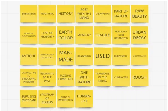
To unfold the value residing in the expressions of a temporal process of the living world as an inquiry to this design research, I began by asking what temporal processes are there? By means of mind-mapping, I unpacked different temporal processes that arose from my everyday encounters in nature. Through thematization, these different temporal processes were grouped into themes/categories based on their similarities in nature:
organic, inorganic, and human.
Each of these groups is imbued with characteristics which are further elaborated in the next sections.
3.1 Temporal processes
I identified nine types of temporal processes derived from the mind-mapping session: bloom, wither, growth, mould, rust, frost, form, wear and tear, and
fragility. Besides, organized these temporal processes into categories of
three. While the strictness of this categorization can be debated it is an attempt to articulate the experience of different temporal processes. These categories, which are further elaborated below, arose from the similar characteristics shared between the temporal processes.
3.2 Organic
The organic category is characterized as possessing ‘uncertainty’ as it depicts ‘unpredictability’ in its temporal processes because of how they evolve ‘uniquely’. In this sense, an organic phenomenon denotes ‘life’ as its parted from people and the industrial world. The organic phenomenon evolves from ‘nature’. These temporal processes embody the connotations of life such as ‘rise’ and ‘fall’. They are independent of people’s interaction but may co-exist with them. These temporal processes are inflicted of ‘rising’, ‘vigour’, or ‘decay’. The temporal processes of the organic category are bloom, wither, and growth.
3.3 Inorganic
The inorganic category is characterized as the ‘bane of nature’, enforcing ‘disequilibrium’ by their characteristics of ‘encroaching’. They are not governed by the living but by natural forces. Thus, encompassing resistance to the living with traits of ‘ferality’. They appear with their agenda, beyond people’s control, only in favour of themselves. The temporal processes of the inorganic category are mould, rust, and frost.
3.4 Human
The human category is characterized as ‘man-made’, by people’s acting in the world. These temporal processes are ‘morphed’ by people’s engagement, interaction, over time. They are ‘shaped’ by people’s presence in the living
world, affected not by nature but by ‘influence’. These temporal processes appear ‘submissive’ to the influence of the living, to the forces exercised. The temporal processes of the human category are form, wear and tear, and
fragility.
To conclude this chapter, I have enlightened the expressive nature of three different categories of temporal processes. By means of mind-mapping, I have uncovered a handful of such. As we move on to the next chapter, I unfold each temporal process and analyse their expressions. As I interpret them, I begin to refer to them as temporal metaphors, ‘materials’ of this design research.
4 Material Exploration
In this chapter, we shift our focus towards materializing our temporal processes. By drawing on Serig’s (2008) notion of experiencing one thing in terms of another, we concern ourselves with material qualities in their abstracted representations anchored in the living world. Thus, temporal processes become temporal metaphors in the process. In materializing the temporal processes, I sought to unveil the meaning of each of them. Thus, their aesthetic and sensuous qualities, and temporal evolvements. Thereby, attempting to accentuate their expressive potentials. At this point, functionality was toned down and not addressed as the purpose here was to explore how temporal metaphors may be implemented to GUI.
I grounded the material exploration in how I approached the temporal processes and their relations to the world. In this sense, I used mood boards and time-lapse videos as inspirational sources for my articulations of uncovering the essence of each of these. Here, by analytically assessing such abstractions into concrete expressions. In this chapter, I present an approach for implementing temporal metaphors in the design of GUI. And, I emphasize the expressions in the temporal processes to provide a basis for exploring how material qualities of a temporal metaphor may shape the experience over time in GUI.
4.1 Anatomical features
In an attempt to unpack each temporal process, they were approached from an artistic and a scientific point of view. The latter are elaborated in this section. A scientific point of view is to approach a temporal process by unveiling its anatomical features. Through such means, the temporal processes were to be dissected to get a sense of what they were made of. From this, I found myself with measurable and quantifiable qualities. These
qualities would allow the phenomenon of each temporal process to be reproduced digitally. However, I found this approach restricting to unpack the meaning, interpretation, and to metaphorically form the temporal process. The reason is elaborated below.
Figure 4. The material qualities of Rusting charted, to depict the change in each quality throughout its evolvement. The evolvement is divided into phases of four.
The attempt of dissecting a temporal process to its anatomical features was as accordingly, making mood boards and observing time-lapse videos. Here, the evolvement conveyed by the videos was divided into four phases, collectively forming the evolvement of a temporal process. Through observation, qualities were mapped, valuing differently for each phase. Once these qualities were charted, the change in each quality was observable. As seen in Figure 4, a set of qualities structure the anatomy of Rusting. The spacing between each phase determines the amount of change over time. As pointed out at the beginning of this section, this approach dissected a temporal process. Emphasis on dissecting, as I found it to diminish its living essence. Although this approach articulated a set of qualities, it did so from one perspective. To dissect a temporal process meant to examine it as lifeless. For the purpose of this design research, it was meaningless as measuring them separately only served to detach the essence of a temporal process from itself. The other perspective, which had been absent in this approach, was to analyse a temporal process as living.
4.2 Living essence
In this section, the design research continues from the premise of the living
essence of a temporal metaphor. Here, we are not concerned with measurable
qualities such as ‘expansion’ nor ‘saturation’. The notion of living essence derives from the nature of illuminating each temporal metaphor as living and not lifeless, transcending the anatomical features. I approached each temporal process from the same premise as earlier, by articulating the expressiveness into wordings or phrases (see Figure 5). I refer to this as the material qualities. This was done so by considering the significance of each of the temporal metaphors in light of temporal lived experience. Each temporal metaphor was descriptively assessed and mapped out through analysis, expressing the aesthetic and sensuous qualities.
Figure 5. A mind-map of the themes from observing Rusting.
4.3 Material qualities
The material qualities signify the experience of a temporal metaphor. I had an understanding and acknowledged a temporal metaphor in such a way that I could articulate the experience of expressing it as a “verb”. This meant that a temporal metaphor was articulated as a phenomenon over time through its significance (see Figure 6). The subsections below contextualize the material qualities. Although the nature of the description may be debated, it is only meant as an inspiration than truth.
Figure 6. A mindmap illustrating the significance of Mould in a word cloud.
Blooming
The enactment of blooming is imbued with ‘life and beauty’ in how blooming ‘blossoms’ over time. Moreover, how blooming reveals ‘vibrant colours’. It denotes ‘purity’ in how it evolves from ‘delicate’ to ‘powerful’ in ‘striking
emotions’. Yet, blooming depicts ‘complexity’ and ‘entanglement’ in how
each of its ‘layers emerges coherently’.
Growing
Growing signifies ‘strength’ and ‘rising’ in how it evolves in ‘vigour’ and ‘vitality’. It evolves from ‘virginity’, ‘youth’ to ‘wisdom’. The evolvements denote ‘patience’ and ‘absorbing of life’ to ‘strengthen’.
Withering
Withering symbolises the sense of ‘darkness’ as it causes ‘decay’. It ‘crinkles
towards death’. Its evolvement denotes the ‘draining of life’ as it serves as a
‘reminder of what was’. It embodies ‘sadness’ and ‘delicacy’. Withering brings about a certain ‘end to time’.
Rusting
Rusting symbolises ‘ageing with the living’. It is imbued with ‘history’ and ‘memory’, a ‘reminder of what was’. ‘Ancient’, expressing the remnants of the living. There is also a certain ‘beauty’ to it. Rusting is a ‘spectrum of
colours’ and a ‘blend of imperfection’. It brings about the feel of ‘danger’,
‘roughness’ and ‘untameable’. Rusting ‘submits to time’ as the ‘industrial
world submits to rust’. From a different perspective, it wreaks of ‘urban decay’ and ‘industrial’ feel, bringing about the feel of ‘worry’. Rusting might
be thought as depraving ‘purpose’. It ‘deteriorates’ its surrounding, bringing about ‘unease’ and ‘vulnerability’.
Frosting
Frosting denotes ‘silence’ similar to the presence of a winter night. It ‘diminishes’ time as it frosts its surrounding ‘unaffected by time passing’. Similarly, the sensation of ‘stillness’. From a different perspective, it ‘shines’ and ‘glances’. It has the look of ‘dusted crystals’. Frosting denotes ‘delicacy’ to touch. It may feel ‘slippery’ and ‘cold’ to people’s interaction. In contrast, in other cases it may appear ‘decorative’ and ‘pristine’.
Moulding
Moulding has a ‘vicious’ presence to it. The feel of ‘illness’ and ‘darkness’. It evolves, often in hidden sight, ‘encroaching’ on our world. Its evolvement may present itself as ‘monstrous’, a ‘plague’, dreadful to people’s senses. It appears as ‘soft’ with vibrant colours. As moulding evolves, it ‘overstays its
welcome’. It ‘spreads, living off things one holds dear’.
Forming
Forming denotes ‘endurance’ in its resistance to other forces. Over time, forming may ‘deprive function’. Yet, as it evolves, it ‘applies new form and
personality’.
Fragilizing
Fragilizing means to ‘sensitize’, to be ‘delicate to our approach to it’. In this sense, it ‘endures stress’. The feel of ‘Disappointment’ and ‘frustration’ emerges from fragilizing that of ‘purpose’ and ‘function’. To fragilize means to ‘expose’ and ‘provoke emotions’.
Wearing and tearing
Wearing and tearing is imbued with ‘history’, a bearer of ‘memories’. It is ‘unique’, voicing ‘personality’ and at times ‘stylish’. There is an ‘emotional
bond’ to it, degrees of ‘wisdom and knowledge’ throughout its evolvement. It
is ‘adventurous’ and may become ‘full of life’ or ‘emptied of life’. Wearing and tearing means that it is ‘pushing the limits’. It causes ‘fragility’ and ‘sensitivity to our adventurous’. It always ‘serves or served a purpose’.
4.4 Moving forward
In the previous section, the significance of each of the temporal metaphors has been highlighted. On moving forward, I use the temporal metaphors of
The reason for selecting these three as ‘materials’ was based on the criteria of opportunities, contrast, and potentials as a design intention of expressing time. In the next chapter, I specifically aim to use the material qualities of a temporal metaphor to shape the experience over time in GUI.
5 Experimentation
The intent of the experimentation was to explore how the material qualities of a temporal metaphor may shape the experience over time in GUI by conceptualizing the selected temporal metaphors. Here, through my critical judgement. The experience of the aesthetic and sensuous meanings was central to the findings of this design research. Likewise, my reflective practices as both a designer and a researcher were an essential component in the design research.
Throughout the design process, my role was an interplay of designer and researcher. Here, designer as my subjective experience was to be expressed. And, as a researcher to objectively analyse the said experience. The material qualities guided my designing of each temporal metaphor.
Methods were chosen, in regard to the nature of this design research as well as to support the design process to answer the research questions. These research approaches and methods are argued in the following sections below.
5.1 Research approach and methods
I approached the experimentation analytically, which meant that my intentions had been to, based on the analysis, develop concepts for iterative purposes. The research approaches and methods were meant to produce insights for the topic of this paper. Likewise, selected to unfold the research questions. In the following subsections, I elaborate on why each research approach and/or method was suited to answer the research questions.
5.1.1 Research in and through design
The central approach to this design research was rooted in the approach of
research through design, using conceptualized temporal metaphors to
investigate time in its manifestation in GUI. For this design research, I explicitly relied on the exploratory and generative nature of design to explore temporality and to contribute within the interaction design field. Artefacts stemmed from this type of research became design exemplars rather than propositions, allowing me to address some of the design questions and challenges of how time is manifested in the design of temporal metaphors in GUI. Here, I emphasize the means of producing a contribution of knowledge by engaging in designing to demonstrate a research contribution. Also,
contributing a design approach which may in the future encourage further research within the domain of this topic. Artefacts produced in this type of research are catalytic for discourse in the community, in hopes to continue upon the conversation. For this design research, this allowed for certain freedom in the research stemming from the strength of the researcher and designer (Taner Olcay) rather than aping the processes of others, drawing on Zimmerman, Forlizzi, and Evenson (2007). Likewise, Dalsgaard (2010) supports such freedom allowing the blend of many approaches. Whilst underlying the focus on the creative process, Dalsgaard reasons that research
in design explores the design process and what unfolds in it. This, in contrast
to, how research through design addresses a theme in which design catalyses how to explore the subject matter. The latter is particularly characterized as iterative and explorative, that sparks designerly reflection and practice as a valid research strategy.
Dalsgaard (2010) emphasize how research in and through design are not mutually exclusive and may be intentionally combined to research within interaction design. His notion of the mixture is defined as improving understandings and practices of the community. Likewise, use the involvement of the researcher as a mean for knowledge generation. It grounds this in interaction design as the intent is likely to pursue novel and distinct cases rather than general findings. For this reason, such insights are of value for the community.
Through means of research in and through design, this design research not only attained a better understanding into how the design process may be developed to address the research question but also my involvement throughout the series of activities. Using research in and through design as a generative approach allowed for diverse experiments, addressing design questions and challenges.
5.1.2 Auto-critique
Auto-critique means to criticize ones’ work, to use ones’ involvement as a mean to generate knowledge. Bardzell (2011) reasons that not only may a designers’ first-person critique improve ones’ design practices but improve ones’ abilities to understand meaning and significance in such. Bardzell offers three-pointers that characterize the practice generally. I list these pointers in consideration of this design research.
- Offer a description. I purposefully rendered my designs as objects of analysis. Here, uncovering questions such as: How does it present itself? How does it affect me? What sensory experience do I get? What do I feel? What does it mean to me?
- Pinpoint problem(s). Why was that design artefact significant when similar designs in that phase were not? In what ways can it be reassessed?
- Back and forth. I purposefully got intimate with the ‘material’ by working back-and-forth between details and relating them to the experience in whole.
5.1.3 Material thinking
In the experimentation, the approach of thinking materially was used for exploratory practices with the temporal metaphors as well as critical judgement on their material qualities.
I proceeded from the notion that intimacy with the temporal metaphors meant to gain a deeper understanding of how they talk back to me as a designer and articulating their expressions (Bardzell, 2011). By intimacy, I entailed working back and forth between wholeness and details. In this sense, I assessed the temporal metaphors in their practical manifestation in the design.
As I went from wholeness to details, I did so by leaving the level of ‘temporal metaphor’ analysis and enter the level of ‘material’ analysis. Such involvement in an exploratory phase of a research project aligns with the methodology by Wiberg (2013). Likewise, Jung and Stolterman (2012) convey how a material lens may provide in-depth knowledge to aesthetic and sensuous qualities of digital artefacts. This implies the experience derived from the ‘materials’. Similar approaches can be seen by Jung and Stolterman (2012) and Wiberg (2013), underlining sense-making as an act of interpretation, understanding, and conceptualization. The designing of temporal metaphors underwent such an act.
I purposefully worked with the temporal metaphors closely to understand them at play and as resources for design. In this sense, the process of experiencing the temporal metaphors supported the catalysing theme of research in and through design.
5.1.4 Sketching and prototyping artefacts
For me to experience a temporal metaphor in GUI, I first had to explore how it might look and feel. Sketching was an approach to establish such grounding. It was an establishment of moving forward from description to experience. This attempt, as supported by Houde and Hill (1997), was to purposefully sketch (draw) to make better design decisions for the latter artefacts.
According to Houde and Hill, a prototype is a representation of a design idea, regardless of medium. Houde and Hill’s notion of look and feel denotes questions about the sensory experience of experiencing a prototype. This resonates with this design research and aim of the experimentation.
The design research in this paper demonstrates these features in look and feel where aesthetics and sensualism play a factoring role in uncovering the significance of each temporal metaphor.
For clarification, artefact and sketch are meant here as the ‘thing of design’ (Houde and Hill’s prototype) whilst prototyping is the act of designing such. The distinction between artefact and sketch are elaborated below.
For the sketching, the fidelity was not of concern, but attention was rather shifted to the resolution. Here, Houde and Hill refer the resolution to the amount of detail. The initial sketches were made in lower resolution. The reason to start at a lower resolution was to establish the wholeness, to later increase the resolution and get a closer more intimate relationship with the latter artefacts—by working in details. The means of sketching allowed for converging of various design ideas, to later diverge. Such a method allows for flexibility and inexpensively generate representations.
Once I had established a basis, I moved forward in designing artefacts of higher fidelity with Houde and Hill’s definition of role in mind. Here, to consider the role meant to ask questions of what meanings may unfold over time? This divided the design work into three directions whereas each temporal metaphor explored meaning in each direction based on the findings of the sketches.
5.2 Experimental setup
I selected sketching, prototyping artefacts, and auto-critiquing as primary means for inquiry. Besides, I purposefully planned to use inexpensive means for the initial iterations and later move on to more time-demanding tools as problematizations developed. Inexpensive means meant sketching digitally. Time-demanding means concerned tools such as JavaScript programming language that is commonly used as a part of a web page that allows for interactions between the web page and the person. For the sketching and prototyping, a time frame of most of a couple of hours was decided for each sketch or artefact.
The experimentation started from the premise of sketching the material qualities (aesthetic and sensuous) of each temporal metaphor, to later move towards the three design spaces of function, experience, and context, to answer the aim of this design research. The material qualities were used as a inspirational source throughout the experimentation.
5.2.1 Ethical considerations
As this design research was to be conducted by one ‘designer’, it was utmost important to properly consider ethical approaches, in accordance with the Swedish Research Council (Swedish Research Council, 2017). The various roles, such as an academic researcher and interaction designer, meant that I was responsible for structuring the design research by clarity and order. Likewise, systematically, and critically analyse the findings. To discuss faults. And, to keep the research organised through documentation and filing.
The risk of grounding the design research entirely on oneself was known. The implications of solely relying on oneself meant responsibility in avoiding academic bias. This was done, in accordance with the Swedish Research Council, by treating ones’ experiences objectively and be true to its descriptions. Moreover, to be honest, and truthful in and to the design research.
5.3 Artefacts
In this section, I present three temporal metaphors (frosting, blooming, and
wearing and tearing) and the design works of each. These are mainly used
to discuss the main research question. The structure for each design work is as follows. First, the idea, construction, and purpose for each sketch or artefact are presented, followed by the outcome of auto-critique. Second, the problematization from said critique and the next heading. Finally, the key findings are presented at the end of each subsection.
5.3.1
Frosting
5.3.1.1 Aesthetic and sensuous
To explore the experience of frosting, I needed to unfold the question of how frosting might look and feel in GUI. I believed it was necessary as I had to shift from descriptive material qualities to illustrative material qualities, to inform the significance of frosting from experience. The descriptive material qualities in section 4.2 provided the basis for the looks and feel of frosting but lacked to inspire the designing of the experience of frosting. In correlation with Houde and Hill (1997), I proceeded with sketching frosting to manifest it in design.
I started with five sketches and reiterated four of them based on their potential and problematized nature from the auto-critique. I used a variety of digital brushes and textures that allowed me to depict frosting creatively with freedom only bound by the descriptive material qualities. I attained a better understanding of the temporal metaphor as a ‘material’ by working back and forth between the iterations, as encouraged by Wiberg (2013) and Jung and Stolterman (2012). I problematized the findings of each iteration through auto-critique (Bardzell, 2011) which guided the design process forward. Here, to purposefully fuel the iterative process by overcoming problems of the design works.
All sketches leading up to the two that are presented below expressed partial fragments of the descriptive material qualities of frosting. By the end of the sketching phase, it was clear how each of the material qualities together forms a holistic experience of frosting. That is, to be experienced together than distinctively. While only sketching one or two qualities of frosting I found it to be a futile effort. The frustration led to reassess the latter sketches, in an attempt to, convey a wholesome experience. The sketches were either
combined or reiterated on to arrive at the latter two. These two purposefully attempted to convey a wholesome experience. I introduce two of the sketches and the findings below.
By fusing auto-critique, I approached the experimentation through problem-oriented and experience-problem-oriented approaches. This meant that auto-critique fuelled the design research by problematizing the experience. What follows is the first auto-critique which also served as a lasting format throughout the experimentation. The critique is followed by why. From the premise of uncovering how frosting in a given context might look and feel I asked What do I experience? And what does it mean?
Figure 7. Illustrates two sketches of Frosting.
(i) in Figure 7 expressed the looks of “a thin layer of ice, to melt upon touching” because of ‘the translucent layer on the graphical element and the small concaved dots’A and how ‘the small concaved dots look fragile to
touch’A. Similarly, the look of “melting” because of ‘how some areas are
missing the small concaved dots appearing on the surface’B. The feels were of
“submitting to the frost” and “crystalizing the surface” because of ‘the white noise on the outer edges of the graphical element, and the intensified white colour on the inner edges’C.
In (ii), frosting expressed the look of “shielding” the graphical element because of the coverage of the somewhat opaque layer of textureA. In this
sense, fossilizing if not preserving it. Also, looked “enduring”, “resisting”, and “protective” because of ‘the scratch marks on the frosting’B.
I purposefully assessed the experience by dividing the expressions into ‘verbs’, which attempts to refer to the experience over time. I did so to spark design intentions and frame a reference for the next iteration.
The conclusion was as follows. Frosting expressed to fade away on ones’ influence but emerge by the absence of ones’ presence. The frosting was not experienced as a layer protecting the graphical element, to which it submitted to the influence of frost. Moreover, frosting not only affected the graphical element but seemed to impart in ones’ relation to it. Here, freezing the graphical element for ones’ return. Last, a proposition for how frosting may evolve emerged by the way frosting felt to crystalize the graphical element inwards from the edges.
These sketches had been iterated towards a promising direction of frosting. However, the unfulfillment of experiencing frosting over time remained unexplored. As we move on to the next subsection, we do so with the curiosity of how the experience might look and feel over time. And in what ways may frost evolve?
5.3.1.2 Experience over time
Four artefacts are presented that focused on what ways frosting may evolve and what those experiences may mean and be. The artefacts were themed around ‘time-lapse’. The structure for this and remaining subsections is that of describing how the artefact was made, why, and where I intended to move based on a formulated problem from auto-critique.
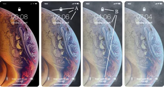
The idea of Frostbite I was that of overlapping one static image over the other by fading one of them over a set amount of time. The artefact was built using JavaScript programming language. This artefact served as a starting point of exploring how frosting may evolve.
Figure 8. Illustrates the evolvement of Frostbite I. See Appendix 1 for live version.
The experience of Frostbite I was felt as of “artificial” nature. This meant that it did not convey the experience of frosting intruding on the graphical element on its terms, as pointed out in section 3.3. To elaborate, the evolvement of frosting looked “uniform”, as the frosting ‘grows on the GUI evenly’ as seen
throughout Figure 8. It was experienced so in correlation to the feel of “linear”because of ‘how it evolves in a straight manner’. These feel inevitably conveyed a ‘mechanical’ impression. On these points, the experience of this artefact also depicted the feelings of “chilling and cold” as frosting evolved toward the end because of ‘how the textures and brushes are more prominent’. On a summary note, the GUI “looks flat─like how a piece of paper might frost all together”. To problematize what was not, the opportunity arose as too what other ways may frosting evolve to allure an, perhaps feral sensation?
Frostbite II intended to explore the evolvement of a ‘spread out’ and ‘different’ growth from Frostbite I. This artefact utilized six images instead of the previous two. This approach not only increased the complexity of the artefact by introducing additional images but was rewarding in the way that it allowed for more control over the details and growth. Frostbite II explored the growth from the centre outwards.
Figure 9. Illustrates the evolvement of Frostbite II. See Appendix 2 for live version.
From critiquing, the experience of Frostbite II (see Figure 9) was a promising direction toward the significance of frosting. That is the qualities of ‘encroaching’ the GUI. To elaborate, the experience felt “spread out and unpredictable” because of ‘how the textures and brushes are unevenly distributed’A. Likewise, the feel of a “cold presence” because of ‘how each
graphical element frosts differently’B. Both points reasoned that the GUI
reacted to time, and ones’ relation to the GUI was affected. From problematizing the findings, I did not continue from what was missing but from what was found and decided to do so in a different direction. A curiosity arose to how an experience of exaggerated ‘encroaching’ evolving might be?
Frostbite III intended to focus on an encroaching tone to the experience. Thus, making use of different transitions between the images and introducing the images in a different tempo and using different durations for each image. This artefact intentionally reversed previous evolvements of frosting by evolving from the outer edges inwards.
Figure 10. Illustrates the evolvement of Frostbite III. See Appendix 3 for live version. The feel of “cold” was more prominent in the experience of Frostbite III (see Figure 10) than previous artefacts, as it looked as if the GUI “submitting to the cold, not being able to resist it” because of ‘the looks of how the frosting starts from the edges’A and ‘growing inwards’B. These looks led to the feel of
the GUI being “captivated by the frost”. On these points, the experience of the equivalent of ‘being cold on the outside, warm on the inside’. Moreover, the frosting “pausing” the time between one and the GUI because of the points of
A and B.
To conclude, I summarize this subsection by stating the main takeaways that are used in the discussion. On a general note, I found it to be a futile effort to express frosting by considering the material qualities separately. To form a holistic experience, the latter sketches and artefacts considered the material qualities as a wholeness. More specifically, the findings of the sketches were that of frosting fading away on ones’ influence but emerging by the absence of ones’ presence. Similarly, affecting ones’ relation to the GUI. This was also an underlying theme of the artefacts: as the GUI was experienced to be reacting to time in the presence of frost, so was ones’ relation to the GUI. Moreover, how a different pace imposes an encroaching-like nature to frosting, referring to a feral and natural growth rather than artificial, was explicitly found from the artefacts. The GUI was experienced as being ‘paused’ by the frost, unavoidably affected by it. And finally, preserving time between one and the GUI.
5.3.2 Blooming
5.3.2.1 Aesthetic and sensuous
Similarly to the approach made in the previous subsection, I used sketching to close the gap between the descriptive nature of the material qualities and the experience of blooming over time. In this subsection, blooming is explored in different contexts to unfold meanings in those experiences. I started with seven sketches and reiterated six of them based on their potential and problematized nature from the auto-critique. I introduce one of those sketches as a departure for this subsection.
Figure 11. Illustrates one sketch of Blooming.
The experience of blooming as seen in Figure 11, looked as if it was “expanding or exploding” because of ‘how the brushes are painted outside of the contexts edges’A. In this sense, escaping the boundaries of the graphical
element. In contrary, it also looked as if it was “intruding” because of ‘how the brushes also are painted inside the context’B. Moreover, “colourizing”
as if blooming was “romanticising” and “masquerading” the graphical element because of ‘how the layers blend and are added on top of each other’D
and BCD. On the points concerning looks, it felt as it was “energizing” and
“dramatizing”.
These findings were used to narrow down potential contexts in which blooming may express meanings. We continue in uncovering how blooming might unfold. And how that experience might be?
5.3.2.2 Other contexts
Aurora Borealis expressed blooming in the context of a loading spinner. Moreover, to purposefully explore a context which had a dramatizing theme to it due to how loading spinners are used to convey that something is and is
about to happen.
Figure 12. Illustrates the evolvement of Aurora Borealis. See Appendix 4 for live version. The experience of Aurora Borealis (see Figure 12) gave the sensation of “mystery, a build-up” because of ‘how the brushes and the glow of colours gradually grow throughout the evolvement’. There was an intriguing factor in how the colours blended as blooming gradually grewA. It was felt as “fantasy,
clouds, candy, space, and imaginary flower” because of ‘the petal-like brush and use of colours’A. However, something was missing which I later
concluded to be was the feel of ‘crescendo’. Meaning, a dramatic build-up, or the feel of ‘a romanticized flow’ or ‘uprising’. Further, the feeling of something spectacular is about to happen. That missing element led to the question of how I might visually refer to ‘crescendo’?
Crescendo intended to conceptualize the sensation of a build-up using size, opacity, and intensity of colours, to visually intensify the context of a progress indicator.
Figure 13. Illustrates the evolvement of Crescendo. See Appendix 5 for live version.
From critiquing, the experience of an ‘uprising’ was more prominent in Crescendo (see Figure 13) than Aurora Borealis because of the use of the size and intensity of coloursA. Likewise, the sensation of “chilling to warmth”
because of the shift in coloursB. The feel of “expansion” was noticeable
because of ‘how the progress bar grows in size together with brush strokes and glow of colours’, reminding of “clouds and vast sky”. On the points described, this artefact was a promising direction towards unfolding meaning in GUI by blooming. I left this artefact not with a specific problem, but with a curiosity of how I might express blooming in the same context but in other ways? To purposefully expand my design space.
Kaleidoscope was based on Crescendo. Kaleidoscope intended to explore
fractal illustrations and introduce rhythm to the evolvement of blooming.
Figure 14. Illustrates the evolvement of Kaleidoscope. See Appendix 6 for live version. One of the concerns from the experience of Kaleidoscope (see Figure 14) was that it felt incomplete because of how it did not achieve was it was intended to do, which left the frustration on whether this was a promising direction or not. I firmly believed that the incitement of a kaleidoscope approach might be inspiring. However, I reiterated further from the premise of not what was missing but what was promising. The sensation of “rhythm” sparked interests in how ‘the glow of colours emits a different tempo: pulsating throughout the evolvement’A. At this point, I had exhausted the context of ‘progress’ of any
kind and left this artefact by returning to the question of in what other contexts may blooming express meaning with learnings till this point.
Snooze comprised the findings of the previous artefacts, to explore blooming in the context of an alarm interface. I sought to unveil whether crescendo and rhythm in blooming might add meaning in this context, and what that experience might be. This artefact proved challenging as it moved from static graphical elements to a dynamic graphical element. This being the digital numbers continuously changing.
Figure 15. Illustrates the evolvement of Snooze. See Appendix 7 for live version.
The experience (see Figure 15) felt “superficial”, particularly in the early evolvement, because of ‘how the texture is displaced, not part of the context’A.
In contrary, the late evolvement sparked positive feels because of ‘the texture, both inside and outside of the digital numbers, is layered on top of each other’B. Interests sparked to further explore the looks of blooming from the
inside outwards of the digital numbers. However, it was found that the missing piece was the sensation of ‘dramatic build-up’ once the alarm went off. What is the experience of blooming expressed as a ‘finale explosion’? I decided to continue the idea of rhythm and conclude the prototyping of blooming by exploring the evolvement of expressing rhythm together with the findings of Snooze.
Heartbeat concluded the prototyping of blooming by exploring the expression of a ‘pulsating uprising’. Here, a pulsating glow and the emerging of colours inside a dynamically changing graphical element was gradually increased in intensity and size as the time reached its end.
Figure 16. Illustrates the evolvement of Heartbeat. See Appendix 8 for live version.
The experience (see Figure 16) felt as if it was “breathing whilst bits escaped” because of ‘how gradients of colours are animating inside the digital numbers whilst a glow of colours outside of the numbers appears and disappears throughout the evolvement’A. The looks of “intensifying” and “expanding”
was there as ‘the colours intensify whilst the glow grow in size’B, but in
contrast, to the point of A, felt “abstract”. However, the feel of “breathing”
towards the end had a dramaturgical sensation because of ‘the combination of intensity and size deliberately changing in closer intervals towards the end’B. On the point of B, the feel of “something closing, towards a finale”.
To conclude, I summarize this subsection by stating the main takeaways. The findings from the artefacts show blooming adding meaning in finite contexts in the GUI. Moreover, how dramaturgical build-up and rhythm is a promising direction in depicting the evolvement of blooming. More specifically, how the use of colours and sizing in intensity is one way in approaching the evolvement of blooming. Likewise, how the experience of blooming is more prominent when blooming is not restricted by the boundaries of graphical elements.
5.3.3 Wearing and tearing
5.3.3.1 Aesthetic and sensuous
In this subsection, wearing and tearing is explored to uncover where and how wearing and tearing might be meaningful.
I started with five sketches and reiterated four of them into three to later reiterate two of them. Two of the sketches are presented as a starting point for this subsections design works.
Figure 17. Illustrates two sketches of wearing and tearing.
In critiquing, (i) in Figure 17 expressed ‘decolouring and smudging’A that left
the impression of “immense usage”. The wearing from ‘the edges towards the centre’A gave the feel of the graphical element “losing function”. In this sense,
it felt as “I am responsible, causing it”. In (ii), the looks were of a “rougher narrative”, “deteriorating and falling apart” because of ‘how fragments of the graphical element no longer are there’A. It looked as if the wearing and tearing
had “caused material damage to the element to the point that it had been deprived of functionality” and “holding on to life” because of ‘how larger fragments are completed removed’B. These points gave the feel of “stressful”.
These findings were used to narrow down the scope of which contexts wearing, and tearing may express meaning over time. The underlying theme of these findings was that of interaction expressing time. For this reason, I purposefully selected contexts which were to be interacted with.
5.3.3.2 Meaning over time
Typewriter intended to explore wearing and tearing in the context of a keyboard/keypad. Upon interacting, each touch left a dirt patch on the graphical element. I asked what meanings may be unfolded of expressing wearing and tearing.
Figure 18. Illustrates Typewriter after it has been interacted with. See Appendix 9 for live version.
The experience of Typewriter (see Figure 18) expressed feels of “tangible and real” because of ‘the smudge texture overlaying the context’A. In the sense of
real, how the embellishments of ones’ fingers were conveyed digitally. This feel sparked interest in what one might do to the context. The experience was also expressed as “direct” because of how the context behaved physical, leaving an “intriguing” feel. I decided to move in the direction of a more ‘extreme context’ to invite different experiences.
From the premise of Typewriter, the purpose of Codex was to experience how wearing tearing might be in a contrasting case. This artefact was a variation of Typewriter, shifting the context to the unlocking of a lock screen.
Figure 19. Illustrates Codec after it has been interacted with. See Appendix 10 for live version.
From the critique, the experience (see Figure 19) felt not as inviting as the previous artefact. To elaborate, it felt “exposing” because of how ‘the smudge texture overlays’ A the numbers concerning ones’ privacy. In this sense, a feel
of “awareness” arose. From a different note, the experience felt “uniquely bound to me” because of ‘how ones’ actions smudge the context by ones’ terms’A. The way the wearing looked “concentrated and dense”, made one
aware of the areas affected by the interactionA. To extend with an analogy, as
to ‘how a pair of shoes wear and tear all-round’, this artefact expressed the sensation of how ‘a shoe is impaired by a hole’. From both Typewriter and Codex, I decided to move on to explore how the relation to GUI might be affected by the physical sensation of wearing and tearing.
Slider explored a context in which the graphical element was to deteriorate through friction. Here, the emphasis was not how ones’ fingers smudge the context but rather how ones’ action is embedded with consequence. The context was the thumb/handle of a graphical slider element.
Figure 20. Illustrates Slider after it has been interacted with. See Appendix 11 for live version. The experience (see Figure 20) left one dwelling on questions than sensations. The ‘loss of colour on the surface of the slider’A prompted the
question of “what type of material is it?”. Likewise, raised the awareness of ones’ interaction. In particular, how hard one dragged, how far, and for how long.
Pulldown concluded the exploration of wearing and tearing by exploring rather the findings of physicality unfolding over time, and how ones’ action is embedded with consequence. This artefact was constructed in the way that the direct interaction with a graphical element consequently affected other graphical elements.