Varied amount of
information for two
different user profiles
Main Subject area: Informatics Author: Britta Lago & Cajsa Liedberg Supervisor: Domina Kiunsi
JÖNKÖPING 2021 June
Establishing the relationship between novice and
expert users’ knowledge level and their preferred
amount of information displayed
This final thesis has been carried out at the School of Engineering at Jönköping University within informatics. The authors are responsible for the presented opinions, conclusions, and results.
Examiner: Bruce Ferwerda Supervisor: Domina Kiunsi
Scope: 15 hp (first-cycle education) Date: 2021-06-13
Abstract
The purpose of this thesis was to investigate the relationship between a user’s prior knowledge and their preference regarding information amount. Previous studies investigating information overload have not focused on the user’s prior knowledge in relationship to information overload, and results regarding preferred amount of information have been inconsistent.
The study was conducted through a qualitative survey where the participant first tried a mock-up website and afterwards answered the survey questions. To decide the mock-up’s context, a case company within investments was used. The mock-up was based on the thesis’ case company and consisted of three made-up company set ups regarding an investment. Each company had two alternatives, one with more and one with less information displayed. The amount of information was measured by volume of text and number of attributes presented for the user. The participants were then divided in two user profiles, novice or expert, and the result from the study was analyzed divided between the user profiles.
The findings of the study were that novice users generally preferred less information displayed, while the expert users were inconsistent in their general preferences but tended to prefer a higher number of attributes while a lower information volume. There were signs of information overload in both the user profiles, while others in the same user group preferred more information. This shows that information overload depends on more than the knowledge level of the user.
Keywords: thesis, user profile, novice versus expert, user preferences, information overload, amount of information, prior knowledge
Table of content
Abstract ... ii
Table of content ... iii
Introduction ... 5
BACKGROUND ... 5
PROBLEM STATEMENT ... 5
PURPOSE AND RESEARCH QUESTIONS ... 6
SCOPE AND LIMITATIONS ... 6
DISPOSITION ... 7
Theoretical background ... 8
INFORMATION OVERLOAD AND DECISION MAKING ... 8
USER-PROFILES:EXPERTS AND NOVICES ... 9
PERSONALIZATION AND USER GOALS ...10
INFORMATION ARCHITECTURE FRAMEWORK ...10
Information architecture: Content ...11
Information architecture: Context ...12
Information architecture: User ...12
Method and implementation ... 13
CHOICE OF METHOD ...13
How to answer the research questions ...13
CASE STUDY -ANTRO ...14
MOCK-UP AND IMPLEMENTATION OF THE FRAMEWORK ...14
Implemented framework: Content ...16
Implemented framework: Context ...16
Implemented framework: User ...16
Mock-up structure ...17
PARTICIPANTS AND DEFINING THE USER PROFILE ...18
DATA COLLECTION ...19
Literature study ...19
Software ...20
DATA ANALYSIS...22
VALIDITY AND RELIABILITY ...22
ETHICAL CONSIDERATIONS ...23
Results ... 24
PRESENTATION OF COLLECTED DATA ...24
General answers ...25 Novice answers ...26 Expert answers ...28 DATA ANALYSIS...31 General analysis ...31 Novice analysis ...32 Expert analysis ...33
Discussion ... 35
RESULT DISCUSSION ...35RQ - What is the relationship between a user’s knowledge level (novice, expert) and how much information they prefer to be displayed? ...35
A. Does the novice user prefer less or more information displayed? ..35
B. Does the expert user prefer less or more information displayed? ...36
METHOD DISCUSSION ...36
Conclusions and further research ... 38
CONCLUSIONS...38 Practical implications ...38 Scientific implications ...38 FURTHER RESEARCH ...38
References ... 40
Appendixes ... 43
Introduction
In this chapter, the background of this thesis is presented followed by the problem statement, which leads into the study’s purpose and research questions. After that, the scope and limitations of the study are discussed ending with the disposition outlined.
Background
When working with a website’s personalization, a key part is to define and meet the user’s goal (Sili et al., 2016). Different types of platforms have different types of goals and different user groups, each with possibly different goals as well. It is important to identify and analyze these user groups for the website to be as user-friendly as possible, for as many users as possible (Kous et al., 2020). It is easier to reach an acceptable level of usability if the website only targets user groups with similar characteristics (Kous et al., 2020), though there are always some characteristics that differentiate between user groups, with variating importance for the development of the website. When it comes to websites and software, these characteristics can for instance be familiarity with the type of service/product the website offers, knowledge about the service/product domain, or computer/device skills (based on the amount of time and types of usage/activities) (Barnum, 2020). Apart from these types of characteristics, user groups can also differentiate by different user goals or user demographics, depending on what is important for the study conducted.
The type of information and how it is presented can as mentioned determine the understandability for the user but the amount of information is also key to avoid information overload (Barber & Odean, 2001; Y. C. Chen et al., 2009). In a user’s first deliberate impression of a website, the site’s content is one of the most important factors (Martínez-González & Álvarez-Albelo, 2021). Regardless of the type of information a user can still end up not reaching their goal if they are overwhelmed with information (Y. C. Chen et al., 2009). The combination of relevant information and volume is therefore important to obtain as many satisfied users as possible. If knowing how your users utilize the information it can be easier to create a website where your users are satisfied and meet their goals but it is also beneficial for the companies' further marketing strategies (Y. C. Chen et al., 2009).
When trying to satisfy the users and their goals it is important to keep the usability in mind. The factors that define a website’s usability are that the user needs to be able to navigate and operate the page without trouble, as well as understand the site and find information on it (Hasan & Abuelrub, 2011). Though the factors that have the greatest influence on a website’s ease of use are interactivity, site information quality, and personalization features (Aljukhadar & Senecal, 2015). Studies have been done on a website’s ease of use and user experience of different types of sites, and research has shown that personalization and design both have a great impact on the user’s perception of the ease of use of a website (Aljukhadar & Senecal, 2015; Douglas & Liu, 2011). In conclusion, when making a website easy to use, the information on a site is important, both the quality of it, as well as the quantity.
Problem statement
After conducting a study regarding how a heavy information load affects consumers, Y. C. Chen et al., (2009) propose that future research should take the individual characteristics into account as well, such as prior product knowledge and personal involvement. The novices and experts in the study of Y. C. Chen et al., (2009) were categorized based on their knowledge regarding online shopping in general, and not the products they were shopping for. Therefore, studies regarding the effects of different levels of information in relation to users’ prior knowledge and personal involvement are missing and create for future studies.
Tabatabai & Shore (2005) suggest future research to explore different kinds of expertise and its effect on seeking information on the web, for example domain-specific knowledge, which shows that there is an interest for continuous studies in this field regarding information’s effect on novices and experts.
It is established that too much information displayed to the user may lead to information overload (Barber & Odean, 2001; Y. C. Chen et al., 2009), but a high amount of information can also improve the user’s experience (Aljukhadar et al., 2012; Calitz & Barlow, 2012). The result can often depend on the user’s prior knowledge level about the subject domain, but the research results have been inconsistent, as it has variated how much information the users have wanted, both novices and experts (Barber & Odean, 2001; Calitz & Barlow, 2012; Y. C. Chen et al., 2009). This makes it difficult to know how much information to display when designing websites aimed at either novice users or expert users, in order to avoid information overload but still give enough information to satisfy the user.
This thesis, therefore, wanted to examine the relationship between the user’s prior knowledge and preferred level of information.
Purpose and research questions
The purpose of this study was to investigate what amount of information different user types prefer displayed on a platform. The user types were divided based on their prior knowledge and experience regarding the field of the platform, which varied from low to high.
To be able to fulfill the purpose, it was broken down into a research question with two sub-questions:
- What is the relationship between a user’s knowledge level (novice, expert) and how much information they prefer to be displayed?
a. Does the novice user prefer less or more information displayed? b. Does the expert user prefer less or more information displayed?
A qualitative study, including a survey, was conducted in order to answer the question and sub-questions.
Scope and limitations
For a website, the largest number of features, pages, and content in relation to the budget can be what limits the possibilities. Calculations regarding working hours and development time could also limit what kind of features a website could have included. As this project did not have a specified budge it was not a factor when making the mock-up and survey, but instead the limited time was the major factor. This report was executed in the authors' bachelor thesis course at Jönköping University at the School of Engineering and therefore the time was limited to the weeks the course ran.
Today websites always need to work on both desktop and mobile, but due to limited time, the mock-ups were only made for desktop. The respondents had been asked to take the test on a desktop, and not making two mock-up versions saved time which instead was used to focus on analyzing the data at a greater depth. Though a mobile version is preferred from a development and programming point of view (Hamm, 2014), the focus was on the design and user process which was why only a desktop version was considered to be the best approach for this study.
Because of the ongoing pandemic of Covid-19, no physical meetings with the respondents were possible, and instead, they tested the mock-up online and directly afterward answered the survey.
Disposition
First the theoretical background related to the problem statement is presented, covering the areas of information load, user profiles, personalization, and information architecture. After that the chosen method, which includes a user test and survey, is explained and motivated. To answer the thesis’ research questions the start-up company ANTRO was used as a case. With their graphic manual as a guide, a mock-up was created for their business idea and digital platform. The mock-up was then used when conducting the user test. Survey questions related to the test of the mock-up were created to gain information of the participants' preference. The data gained from the survey is presented in the result section, and then the combination of the results and literature study is discussed, ending with suggestions of further research.
Theoretical background
This chapter presents the theoretical foundation for the study, which includes information overload and decision making, experts and novice users, and personalization. This is followed by the presentation of the framework used when creating the mock-up.
Information overload and decision making
When one purpose of the website is for the user to make a decision about something on for example an e-commerce platform, it is appealing to believe that more information leads to better decision-making and therefore argue for giving users as much information as possible. There are, however, two factors that play an important part in making this statement true or not: firstly the relevance of the information to the decision, and secondly, whether the decision-maker is equipped to use the information (Barber & Odean, 2001). It does not matter how much information is given to a user if they do not know how to process or utilize it (Y. C. Chen et al., 2009). Too much information can also seem overwhelming and lead to information overload, while the right amount of information can give the user exactly what they need to make an informed decision (Barber & Odean, 2001).
Information overload is a condition when a user finds themselves overloaded with information, which can make them feel confused and overwhelmed (Castañeda et al., 2020). Information overload can also lower the user’s ability to make effective decisions, as well as lead to the user passing their limit of attention and for example leaving the page, not completing their purchase of not fulfilling a form (Castañeda et al., 2020; Y. C. Chen et al., 2009). This would mean a drop-off of response rates.
A larger amount of information is not necessarily a bad thing, but it could demand a higher effort from the user, and it could lead to less good decisions (Y. C. Chen et al., 2009). By knowing your user and how they use the presented information it is easier to know how to present the information to keep their attention. If a user has limited knowledge regarding the product or service, their attention could also be limited leading to lower satisfaction and fewer user goals met (Aljukhadar et al., 2012; Y. C. Chen et al., 2009; Laker et al., 2018). The user's previous knowledge is claimed to be the most important factor when reading information (Lu et al., 2018). Knowing the users’ knowledge and taking it into consideration is important since it affects the perception of information overload (Y. C. Chen et al., 2009).
Aljukhadar et al., (2012) talk about choice quality meaning the confidence and satisfaction of the choice. With a higher amount of information, a higher satisfaction is implied, and the user feels more confident in a stressful situation if they have more information available when making the decision (Aljukhadar et al., 2012). Therefore, it is crucial to make sure that the user gets the right information in order to increase the knowledge which leads to a higher choice quality, resulting in higher user satisfaction. Too much unnecessary information can affect the choice quality but if the user is not disturbed by a higher amount of information the satisfaction of the choice can still be high (Aljukhadar et al., 2012).
The concept of information overload can be difficult to assess as there is no common approach of measuring even though different methods exists (Y. C. Chen et al., 2009). A common way is to only measure the presented number of alternatives and attributes (Aljukhadar et al., 2012; Castañeda et al., 2020; Y. C. Chen et al., 2009; Lee & Lee, 2004; Sue & Ritter, 2015; Winzar & Savik, 2002). Having a higher number of attributes is advantageous since a user prefers many attributes for more complex products (Aljukhadar et al., 2012). Although it is also important to
not only count the number of alternatives or attributes but also how they are distributed and on what level (Y. C. Chen et al., 2009; Lee & Lee, 2004). Lee and Lee (2004) mentions that not only the number of attributes but the structure with factors such as context and quantity can affect the result when investigating information overload. A context factor can for example be the meaning of the attribute and information overload can be measured with the volume of information both including the number of attributes as well as the structure.
User-profiles: Experts and novices
Many websites are focused on specific user groups, such as young adults or people with a deep understanding of the subject (Morville et al., 2015). With a niched user group it makes designing a website a simpler task since a website is created with its user groups’ characteristics and goals in mind (Kous et al., 2020). Trying to cater to multiple user groups takes more effort as it needs to reach an acceptable level of usability when the user groups have characteristics that differentiate (Kous et al., 2020). Different user groups also use websites differently, which needs to be taken into consideration when designing a site (Morville et al., 2015). This means that for example, users with high experience and knowledge about the website domain/product/service and users with low or no experience and knowledge, uses websites differently. These different users could also be called experts and novices.
Tabatabai and Shore (2005) conducted a study that showed that when navigating a website, novices were less patient than the experts. In the study the user groups were divided based on their computer and information-seeking knowledge, into novices and experts. The novices relied more on trial-and-error, navigated and clicked more while the experts were more strategic in their navigation. The experts were also more aware of their feelings, as the novices felt more lost and disoriented. This feeling of disorientation had a negative effect on the users reaching their goals in the study, which is an important reason for preventing it. In this particular case of website navigation, this can be done with guidelines or maps to show the users where they are (Tabatabai & Shore, 2005).
As mentioned in chapter 2.1, a high level of information can lead to information overload, but one example where the display of more information was preferred by the novice user can be found in research made by Calitz & Barlow (2012). The research from Calitz & Barlow (2012) was conducted with an e-commerce website and the presented result indicated that the novice user tended to prefer the website with a lot of information displayed. Even though all participants had quite similar opinions, there were some cases where the intermediate and expert users tended to prefer the website where less information was displayed because of their prior knowledge of the product. This could suggest that novice users would require more information than expert users, which does not go in line with some of the previously stated arguments about the risk of information overload in chapter 2.1. However, as this study by Calitz & Barlow (2012) was about e-commerce websites, and the particular arguments in chapter 2.1 were stated by Barber & Odean (2001) in a general discussion about information, it can be assumed that users might need different amounts of information on different types of websites.
Experts are also more confident when shopping online, as their product knowledge may reduce the search for product alternatives and lead to them making much better decisions than novices in a high information load environment (Y. C. Chen et al., 2009). Novice users are more likely to perceive information overload in these environments than expert users are, even though previous mentioned research showed that novice users sometimes preferred more information displayed (Calitz & Barlow, 2012; Y. C. Chen et al., 2009).
Personalization and user goals
In order to make a platform personalized for a user profile the design and functions need to meet different users’ individual needs (Sili et al., 2016). An important part of the personalization is to find out the user's goal (Barnum, 2020) since that makes it easier to make choices when creating the mock-up. Personas are therefore useful in order to investigate possible user goals leading to a more personalized website.
Personalization in this report does not mean that the user can choose a different design on the website themselves. Though it is a term used to make sure that the website is made in a user-centric way with the user and its need in focus when developing the website. A unique personalized website would mean that the website would look different depending on the specific user, and this personalization could be done through the user’s profile created on the website. These changes could be beneficial for the website because the presentation of the page is a key factor in the user's decision-taking on the website (Calitz & Barlow, 2012). Though it could also create problems such as the user needs to keep their user profile up to date with their information and preferences, it could also be a matter of integrity whether how much information the company can collect and store from the user (Calitz & Barlow, 2012). A user can also be aware and wanting to avoid generated content and the collected user data can therefore be useless for that user and that unique personalization (DeAndrea et al., 2018). Since different users can have different goals it is, according to Morville et al., (2015), important to focus on the findability and understandability reflected in the information architecture. They describe that as a key factor for successful usability because if the users cannot find what they are looking for their user journey gets incomplete, and their goal is not met. Morville et al., (2015), however, point out that the findability for users’ needs to be compromised with the business’ goal in order to have a balanced information architecture.
Information architecture framework
To create efficient information architecture design, the framework of Morville et al., (2015) (shown in Figure 1) can be used. This includes three main entities: user, context and content, and together these three categories can answer most questions concerning the information architecture of a website (Morville et al., 2015). The categories are visualized in a Venn diagram to show how all three entities make the base for information architecture. Each entity has focus points presented as a description next to them.
Figure 1 The three circles of information architecture by Morville et al., (2015)
Information architecture: Content
Content is a quite broad term, but in the context of Morville et al. (2015) framework, it is defined as the technical components that make the website. Content can regard web development elements such as headers and buttons, but also images and text. The volume of the content is a key factor to evaluate in order to meet the user's goal. Not having too much content but also not too little is a part of customization (Morville et al., 2015). Some studies even say that the quality of the content and information is considered a basic dimension of their evaluating model (Hasan & Abuelrub, 2011; Kim & Stoel, 2004; Saunders, 2011), but in order to make the content understandable for different users, there is a need to analyze the choices of text regarding relevancy. The content is a part of the website’s quality and a website with high quality is not only aesthetically pleasing for the user, but it can also give the user a higher trust in the company and its’ service or product leading to higher credibility, this is also a part of the website's usability (Król & Zdonek, 2020).
People can be confused with new features and unfamiliar functions even though you could assume that the web would be something understandable since it has existed for over two decades (Barnum, 2020). Thought that could be a risky assumption and therefore it is important to use more standardized methods and not try to invent new and completely unknown features. According to Barnum, (2020), web users have expectations regarding where specific objects are placed on a website such as the search bar that is assumed to be placed in the upper right corner.
One way to make it easier for the user is repeating patterns and being consistent, as to not confuse the user unnecessarily (Coleman, 2018; Malamed, 2015). Repetition is one of the seven design principles when creating designs and together they create a visual hierarchy (Hughes, 2019). Being repetitive does not mean that everything looks the same but having for example contrast, asymmetry and intentional chaos can still create a good design with visually related elements (Malamed, 2015).
The visual hierarchy is even more important for novice users because it helps the learning and understanding, and with a lower knowledge it needs to be clear which information is the most important, second-most, and so on. Grouping the content is a key part of that by guiding the user through the design when organizing the information. Grouping is created from design principles such as the principles of proximity, similarity, enclosure, and uniform connectedness.
It is important to make sure that the grouping is intended otherwise misunderstandings can appear and confuse the user. (Malamed, 2015)
All humans are different, but some generalizations can be drawn from the society learnings that can be applied in the design. That could for example be to assume that the user connects the color green with go and the color red as stop (Lidwell et al., 2010), and to go against this in the design could create big and unnecessary confusion and mistakes for the users.
Information architecture: Context
In order to establish a good information architecture, the context needs to be established. The context regards a business or organization and its mission, goal, strategy, culture, and more. This mix is unique in every situation, therefore the information architecture must be uniquely matched to each context. Having a narrow business context makes the goals for the website and architecture clearer. (Morville et al., 2015)
Information architecture: User
When making websites and apps, it is important to know who is using your website (Morville et al., 2015). A user’s different preferences and prior knowledge impact their informational need and information-seeking behavior when using the website (Morville et al., 2015). It is crucial to know these needs and behaviors, as well as the users’ goals to create a product/service that the user prefers (L. Chen & Pu, 2010).
A part of a website is its usability, which is described by the International Organization for Standardization, ISO (9241–11:2018) as: “The extent to which a system, product or service can be used by specified users to achieve specified goals with effectiveness, efficiency and satisfaction” (Bevan et al., 2016, p. 269). A core in describing usability is that it is “...easy to use, understand, operate, find information, or navigate” (Hasan & Abuelrub, 2011, p. 22). Among users with low prior knowledge, the focus on learnability could be a key factor when increasing the usability (Alshamsi & Andras, 2019). Another part of a website’s user-friendliness is about how forgiving the design is: if the design cannot handle user mistakes, even simple errors can give large consequences and the design can be perceived as bad and not usable (Lidwell et al., 2010).
Method and implementation
In this chapter, the chosen method for the study is explained and motivated. The different processes and components of the qualitative study are explained, starting with the data collection before going through the used mock-ups. After that the validity and reliability of the study are examined, ending with the considerations.
Choice of method
The goal of this study was to gain knowledge about which amount of information different users prefer by using an investment platform as a case. This was done through qualitative research with an online survey in order to easily collect the experience from the participant. The survey consisted mostly of qualitative questions, focusing on open-ended questions, instead of a quantitative survey with only close-ended questions. The part about the user’s experience of the platform is measured with open-ended questions to gain a deeper understanding, while the demographic part of the survey is measured with close-ended questions to make both answering and analyzing easier and less time-consuming. This makes the survey mostly qualitative, but with some quantitative questions. (Creswell & Creswell, 2018)
Both methods would have given an insight into the user’s experience, a qualitative method would give fewer results with a deeper insight of each respondent’s experience, instead of a quantitative method which would give more results but less information about each respondent. (Creswell & Creswell, 2018)
Since physical meetings could not be conducted online meetings could have been used as a method. Then the participant would have tested the mock-up and then answered interview questions via a video call. Though that could put pressure on the participant and instead with the survey they could answer the questions at their own pace and not feel stressed about being watched when testing the website. This also added up the feeling of anonymity for the respondent, as it was not possible to see from which participant the answer came. If they would have tested it on their own and then had an interview via an online meeting there could have been too much time in between the test and the meeting, which could be a risk of them forgetting valuable input.
A usability test, where data regarding where the user clicks, watches, and makes choices can be gained, could also have been used when collecting the user's experience. This could have given a deeper insight into the user journey, the data collection would, however, be large and require a high amount of time analyzing and therefore a usability test was not possible to conduct for this study.
To conduct this study and apply it, the start-up company ANTRO was used as a case company. The personas used – see Appendix 1 – are made by ANTRO from data about their future users and these are described in chapter 3.3.3, and using personas made from real data gained this study. The mock-up created – see Appendix 2 – was created from ANTRO’s design ideas, and the mock-up is described in 3.3. It saved time to use ANTRO’s already existing graphic design and business goal when creating the mock-up, and therefore gained this study.
How to answer the research questions
The relationship between the research questions and the chosen methods can be seen in Figure
2. The question was answered by a user test: where the respondents tried a mock-up where
why. After collecting the data, it was analyzed in search of relationships between information amount preferred and user knowledge, which is a part of answering the sub-questions.
Figure 2 Visual showing of method in relation to the research question
Case study - ANTRO
In order to investigate the user’s preference regarding the amount of information, a case study was used with the start-up company ANTRO. Their business idea was – as well as the purpose of their website – to make a platform where individuals could invest to assist small to medium-sized companies in their purchase of robotics. They were aiming their platform towards both people with high knowledge in the field of investments but also towards people with low to no knowledge in these fields.
As ANTRO’s platform needed to be understandable and attractive to new users in the field of investments regarding robotics, but at the same time attract experienced users, the user experience was the most important aspect when developing the platform. This fact made them a good case study for this research.
Mock-up and implementation of the framework
After defining the users’ goals, a plan of the user task flow was done in order to make decisions regarding the mock-up. It was important to know their goals and the suggested user flow to be able to meet their needs in the mock-up (Hamm, 2014). Mock-ups are beneficial to use in the designing aspect since it does not require programming which a fully developed website would. A mock-up acts as a prototype with partial functionality that a real website would but it is also easy to test and change throughout the design process.
Another framework that could have suited this study was the framework of Hasan & Abuelrub (2011) (shown in Figure 3) which acts as an evaluation model with general criteria in order to assess the quality of a website. The framework was created as a general model rather than for a specific product/service, as it combined the findings from different specified models into this more generic model. The framework of Hasan and Abuelrub (2011) could have aided this study in the process of creating the mock-ups, though investigating all the of entities would have been too time consuming which was why it did not suit this study.
Instead Figure 1 The three circles of information architecture by Morville et al., (2015) was used as a structure and inspiration for this study’s framework and research. The framework of Morville et al., (2015) as a whole suited the goal of this study, but the focus points of each entity needed some alteration to keep them relevant for this research. The altered framework can be seen in Figure 4 Altered framework based on the three circles of information architecture. All three entities with their altered focus points are described further down.
Figure 4 Altered framework based on the three circles of information architecture.
The structure of this framework benefitted the study because it visualized the different aspects and made it easier to keep the user goals and needs in focus when the mock-up was created. Using a framework with more levels could have given a deeper insight and identified more problems (Xu, 2007), though that could also have been more time-consuming and therefore the number of levels and entities was limited.
Implemented framework: Content
When developing the mock-up, the hierarchy of the page was important, making sure that the order of the elements was suitable and understandable. That included both larger elements, such as text fields and images, but also smaller ones, such as buttons, symbols, and forms. Since a user can have certain expectations regarding basic elements (Barnum, 2020), it was important to consider this when creating the mock-ups to avoid unnecessary confusion.
Because ANTRO’s graphic manual was followed when creating the mock-ups, no decisions regarding colors and fonts were made, though choices were made regarding variation and position. The guidelines from the graphic manual were used when creating the design according to the design principles such as contrast and proximity (Lidwell et al., 2010; Malamed, 2015). The contrast is a good way to create attention and interest since it can be diverse with color, font size, or emphasize the text (making it bold, italic, or underlined) (Lidwell et al., 2010). By following ANTRO’s graphic manual and being consistent with their colors, fonts, and logo variations a perception was created of the company for the user.
Implemented framework: Context
In the framework used in this thesis, context was about the business context and the channel used for the website. As previously mentioned in chapter 1.4, this study was only conducted via desktop. Because of the case company ANTRO, the business context was investment platforms.
Y. C. Chen et al., (2009) discuss the information utilization regarding e-commerce platforms, but that and decision making are also very important for investment platforms. This type of platform, as well as the domain of investment-based crowdfunding, is increasingly growing (Rossi & Vismara, 2018). In the investment process, there are three main actors: the potential investor, the entrepreneurs seeking capital, and the platform acting as intermediaries between the first two (Rossi & Vismara, 2018). When it comes to crowdfunding, there exists multiple models, where the differences are mostly regarding what is promised in return to the investor by the entrepreneur. The investor could get nothing in return (donations), they could get their investment back (loans), they could get non-financial benefits from the company, or they could get a share in the profits of the business. The last one mentioned is the model that produces the largest amount of funds per project (Kang et al., 2016).
When choosing between different companies to invest in, the different types of information such as content and facts about the company can be a factor for the investor, such as the company’s market share or how long the company has been in operation (Jiang et al., 2018). Laker et al., (2018) suggest further research to be done regarding how the information is presented and framed to benefit the users’ decision-making and its quality.
Implemented framework: User
When getting to know the potential user, it can be beneficial to use personas. Personas made by ANTRO, (see Appendix 1) were therefore used when creating the mock-up. Though personas are fictional characters, they are based on data about potential users (Coleman, 2018). Working with personas’ needs and desires helped with defining problems in the mock-up, and by using multiple personas it was easier to spot different features that needed further focus (Barnum, 2020). The amount of investigation regarding the personas influences the level of success with the website and therefore it is important to research the users’ goals and needs to make sure that the foundation is good (Hamm, 2014).
The site needed to be user-friendly to both the target users: novices and experts. As these user types have different knowledge levels, they have different needs regarding the amounts of information. More information can gain the novice’s experience (Aljukhadar et al., 2012; Calitz & Barlow, 2012), but it can also lead to information overload (Barber & Odean, 2001; Y. C. Chen et al., 2009).
Mock-up structure
In the test the user was given three sets of mock-ups with two alternatives presented at a time, and the user had to choose the one alternative they preferred. Each set up had one made-up company looking to invest in robotics to improve their business and each set up had two alternatives with attributes containing the same numbers and data. However, the information load connected to the attributes differentiated, and some alternatives had more attributes than the other and differed in information load.
To decide the bare minimum amount of attributes and information about the investment, for the shorter alternatives, ANTRO provided the information that was considered necessary to decide on making an investment. This minimum information consisted of ten attributes with the related data about the company and the investment. This was within the range of 4-15 attributes, which is seen as the optimal number of attributes (Jacoby et al., 1974; Sicilia & Ruiz, 2010; Winzar & Savik, 2002). To develop the alternatives with a higher information load, the authors of this thesis used and added to these attributes in different ways in the three setups, which are described further down. After the alternatives with higher information load were finished, these were reviewed and approved of by ANTRO, as the company was considered more competent in the area of investments than the authors. If attributes or information with no connection to the investment had been added, ANTRO could have brought this to the authors’ attention. The two alternatives in each setup were named with a letter that the user used to differentiate the alternatives in the survey. The letters were randomly chosen so no valuation was connected to the alternatives. If for example, only A and B had been used, the user could have related these with for example school grades, where A is better than B (Sue & Ritter, 2015). The mock-ups are, as previously mentioned, enclosed as Appendix 2. The intended user flow and flowchart is attached in Appendix 3 respectively Appendix 4.
The first set of investment objects, the company called Therax, had the same number of attributes for both alternatives but differed in the amount of text explaining the attributes. The first alternative (K) had a short presentation of the investment and company data for each attribute while the second one (T) had a somewhat longer explanation of the attribute when presenting the data. This change of volume of information can be a factor when investigating information overload since the amount of information can influence the user’s preference (Lee & Lee, 2004; Winzar & Savik, 2002). The type of information added was no more attributes but instead an explanation of the attributes term that could enhance the perception for the novice user with lower knowledge within the field (Calitz & Barlow, 2012). For the shorter alternative K each attribute explanation ranged between 6-11 words, except for the attribute describing the type of robot the company would invest in, as this added up to 20 words by two sentences consisting of 11 respective 9 words. The range for the longer alternative T was 11-20 words, except for the robot attribute, which was 43 words long, made up by three sentences of 23, 11 and 9 words respectively.
The second set (Argusson) altered in the number of attributes where the first alternative (G) had more attributes about the investment object than the second alternative (W). Alternative W only contained the ten attributes given from ANTRO, meaning that the participants should have enough information regarding the investment to make a decision. The four added attributes for alternative G were for example which year the company was founded and in what way the robotics would help improve the company. Altering the numbers of attributes is a common method when investigating information overload and therefore the second set up had added attributes. Altering the numbers of attributes is as previous mentioned a common method when investigating information overload, which was why the second set up had added attributes (Aljukhadar et al., 2012). The total of fourteen attributes for alternative G still was in the range for optimal number of attributes (Jacoby et al., 1974; Sicilia & Ruiz, 2010; Winzar & Savik, 2002).
The third and last set (Bentin) only had running text for both alternatives, with the same number of attributes in both alternatives. The first alternative (S) had the information of the attributes directly presented in text while the other alternative (P) had deeper descriptions of the attributes incorporated in the text. This gave alternative P a longer text for the user to read, although it presented an explanation for all the attributes and their data. Both alternatives consisted of three paragraphs containing the same attributes, which were only presented in alternative S and both presented and explained in alternative P. This led to the robot investments only being mentioned by name in alternative S, while each robot was explained both by design and purpose in alternative P. This made the second paragraph, which only was about the robots, more than six times as long in alternative P in comparison to alternative S (19 rows of text versus 3 rows). The second set up was based on the theory of different numbers of attributes commonly used as a measurement for information overload (Y. C. Chen et al., 2009). The third set up was similar to the first as they both contained one alternative more descriptive than the other, though for the third set up all the attributes were incorporated in a running text made into three paragraphs, instead of being stated like a list as in the first set up. The first and third set up focused on the structure and volume of the information, as they had the same number of attributes but differentiated in context and quantity (Lee & Lee, 2004).
Participants and defining the user profile
The participants in this study were members of Swedish investment groups on Facebook and this would imply that they have an interest in investments, but it does not have to mean that they have prior experience. The groups the survey was posted in targeted different audiences and varied in number of members. Three groups targeted a wider audience and a fourth was targeting beginners, but all of the groups had a general focus within investments. The answers could not be tracked from which group they came from to keep the participant anonymous. Asking users to categorize themselves as “novice” versus “expert” is not recommended as those terms are hard to define, and if researchers want to categorize the users according to these terms, the terms should be clearly and objectively defined (Barnum, 2020). In order to determine the participant's user profile, whether they were a novice user or an expert user, the participant answered questions regarding their knowledge, habit and experience within investments. Getting grouped as an expert did not mean that they knew everything about investments, rather than being an experienced investor that had invested multiple times and felt comfortable with the investment business and taking high-risk actions regarding investments. After collecting the results, the participants were grouped, without their knowing, either as a novice user or an
to investigate the differences between the two user profiles, experts and novices, therefore no other groups was included in this study and all of the participants were defined as one of them. The parameters which data was studied when dividing the participants into novice users and expert users, were all self-perceived by the participants. The parameters which data was analyzed were:
- Whether or not the participants had any experience of investments, where they could answer yes or no.
- Their knowledge within the area of investments, which they were asked to rate 1-5. - How comfortable they felt in making investments, which they also were asked to rate
1-5.
- How often they invested, which meant for example buying or selling investments, changing or keeping up with the progress of a current one. Here the alternatives were once a day, once a week, once a month, once every other month, or less often.
- Why they were a member of a Facebook group about investments, where they could choose multiple answers or write their own ones. Some of the alternatives were to learn more and gain tips by reading other members’ posts, to discuss investments, to ask questions and get answers and tips, or to help others and answer their questions.
The most important factors were whether the participant had invested before, and their knowledge. If they had not invested before, they were grouped as a novice. If they had invested before then the other four parameters were studied to see if they met at least three out of the four criteria in order to be grouped as an expert user. The criteria were a knowledge level of four or higher, a comfort level of four or higher, investing once a week or more often, and being a member in a Facebook group about investments to help other members or spread knowledge in some way.
All participants’ data were studied and analyzed by both the authors before being assigned a user profile.
Limitations regarding the participants:
- A measure or assessment of the knowledge of the user’s computer habit was not taken into consideration so when the user’s knowledge level is mentioned, this was based on the user’s own perception of their knowledge within investments.
- The types of investments the user preferred were not investigated rather than on how the display of content and if different types of content determine their choices.
- The participants had divided prior knowledge, and as that was not known in beforehand, the division between the user types could not be guaranteed to be equal.
Data collection
This section contains information about all the sources used for collecting this study’s data and research.
Literature study
For the literature study, the library platform PRIMO from Jönköping University was used. PRIMO gave access to books, articles, and other publications in printed or electronic form. Search keywords were for example: information overload, novices and experts, and user
profile. The searches were filtered to only show peer-reviewed articles or published literature
(for example ePub and eBooks) to maintain the quality of the study. Books loaned from Jönköping Library and course literature from the authors' previous courses at the School of
Engineering at Jönköping University was also used for the research. The literature study contributed to the base of this thesis regarding the theoretical framework as well as an understanding for the chosen method.
Software
The software used for creating the mock-up was Adobe XD and it was chosen because this was a familiar program for the authors so unnecessary time was not spent on finding and learning a new program. In Adobe XD you can export the mock-up and based on the functions implemented the user can click around on the pages as if it would be an actual website, but without having to code it and host it on a server.
Google Forms was used to host the survey, this was a familiar program for the authors which meant no time had to be put into learning the program. After the creation of the survey, a link was shared with the participants and their answers were then collected by Google Forms and combined into a spreadsheet.
Survey and user test
This study was conducted through a survey and a user test, where the participant visited a mock-up of ANTRO’s website, with the survey attached in Appendix 5 and the mock-mock-up included as Appendix 2. The mock-up contained three sets of investment objects placed next to each other, which the participants afterward, in the survey, chose between and answered questions about. In each set of investment objects, one contained more information and the other one less. An important thing to have in mind when making the survey is to not have leading questions as this can influence the answers from the users and negatively and falsely affect the result (Barnum, 2020; Saunders, 2011; Sue & Ritter, 2015). To prevent this, the questions had to be read through thoroughly and make sure that the questions are non-biased, so no incorrect interpretations of the participant's experience and feelings were done in the testing. It is also important to write out the full question such as “What is your age?” rather than just having
“Age?” and only ask one question at a time to avoid confusion (Saunders, 2011; Sue & Ritter,
2015). The survey questions included instructions such as “click all that apply” with multiple checkboxes and an explanation of a scale’s options. This lets the user know what they are supposed to do leading to fewer misconceptions (Sue & Ritter, 2015). An important part of the data analysis, in order to answer the research question, was to have relevant questions in the survey as well as not too many, because otherwise the participant can tend to leave before completing the survey (Sue & Ritter, 2015).
Forms are important but can be a difficult element to create since a lot of information could be necessary to collect, but it is also a place where a lot of users tend to leave the page or at least not fulfill the form (Ash et al., 2018). That means that only the required data was asked about from the user to make sure that they completed the survey. One way to make it easier was to make as many questions as possible into multiple-choice questions, rather than open-ended questions (Sue & Ritter, 2015). It is also needed to have a balance between getting precise data or getting a response at all, when for example asking about their age. If the user is asked to enter it by themselves it can both be an ethical issue if the participant does not want to give away specific data about themselves, but it is also more time-consuming to enter rather than checking a suitable box (Sue & Ritter, 2015).
The survey was completely written and executed in Swedish because by having the survey in Swedish the participant could feel more comfortable to answer in its native language which
gave a deeper data collection. By having the survey in another language than the report misunderstandings in the translation could appear, but by having a structure on how to translate them to avoid errors the advantages of a Swedish survey benefitted this report the most. In order to avoid issues such as misconceptions when translating the answers, both the authors (who are native Swedish) did a translation of every answer and afterward compared the translations. This is a part of eliminating misconceptions by double-checking the answers (Creswell & Creswell, 2018) and the translations.
The questions in the first part were about the respondents’ experience with the presented mock-up and what they thought and felt during the navigation. This part required more user-specific opinions, and they were, therefore, able to write their answer after the open-ended questions to get more qualitative answers. The questions in the first part were the main part to gather data for the research question where the two last parts were used to compare the data from the first part. This part was put as first to make sure that the user had done the test most recently otherwise, they could forget valuable input and thoughts about the test if they needed to answer the demographic and prior experience questions before the questions about the mock-up. The second and third parts of the test contained demographic questions and information about their prior experience and knowledge within the fields of investments. The demographic answers were used for comparison of the answers in the first part about the mock-up, and when analyzing this data the demographics and the comparison is also a big part of the report’s validity (Gibbs, 2018; Sue & Ritter, 2015). When asking about where the participant lives, cities and municipalities can be classified in different ways regarding with where the limit goes such as a small, medium, or large city. To avoid confusion and determine the alternatives regarding cities and their population the Swedish Association of Local Authorities and Regions (Sveriges Kommuner och Regioner) document of the “Classification of Swedish municipalities 2017” was used (SKR, 2017). This was also a part of the data analysis when presenting the participants answers combined with the demographics.
The two last parts were answered exclusively with multiple choices, checkboxes, or linear scales, though the participant often had the alternative to add their own answer if they did not feel that any answer suited them. The scales were consistent regarding numbers (1-5) where one was the lowest or worst and five the highest or best, otherwise it could be confusing for the participant and would demand more instructions and information in the survey, which would also have led to a longer time of completion (Sue & Ritter, 2015). The highest and lowest points on the scale were labeled with words (“Does not agree at all” and “Agree fully”), which prevented the participants from having to form opinions about the differences among word labels for each scale point, while they still understood the meaning of the scale and its points (Sue & Ritter, 2015).
When asking close-ended questions, it is important to make sure that the user finds an answer which reflects their opinion (Saunders, 2011), and to make sure that was the case, all obligatory questions had the option to write their own answer.
In the third part, the participants got divided based on their answer on the question “Do you have prior experience?”. This was because the following questions were not as relevant to all participants, depending on their answer. For example, if the user answered that they did not have any prior experience, a following question with “What types of investments have you done?” would not have been not relevant. Since ANTRO was a start-up company it would be difficult to measure the user’s perception and previous knowledge of the company and therefore
the survey only included questions of their previous knowledge regarding investments rather than the company itself.
In order to find signs of any information overload in this thesis’ test, the comments from the participants were used. Comments that could be used as indicators could for example be regarding the user wanting more information in order to make a choice leading to information underload, or instead the user thinking there was too much information that signaled information overload (Aljukhadar et al., 2012; Castañeda et al., 2020). If another method would have been used, where the user’s motion could have been tracked, time spent and clicks on the website could have been a part of measuring information overload. Though since that was not possible for this thesis, limited by the time and resources available, only the comments were used to determine information overload.
Data analysis
Through Google Forms a complete spreadsheet with all the responses was created where the raw data could be accessed. The first part, containing the answers about the user test, contained almost all freely written answers which required translation, leading to a higher possibility for errors and therefore both authors translated all the answers. The second and third part, regarding the demographic and knowledge questions, were easier to sort since the multiple-choice, checkboxes, and linear scales gave fewer freely written answers, reducing the translation time. The answers from the two last part were sorted to see the distribution over the different types of users and their data. After sorting and translation, the authors went through all the translations together and compared them in order to make sure the translations were correct. Combined with the literature study, the survey answers were analyzed in order to draw conclusions regarding the research question.
The authors' interpretation, usage, and presentation of the collected data was a big part of the credibility of the report (Peräkylä, 2021) and therefore the translations and answers were as previously mentioned double-checked to avoid mistakes.
Validity and reliability
The literature study is a part of the report's reliability and therefore this report has only been using printed material or peer-reviewed articles as references. This was to ensure that the stated fact was controlled to enhance the validity of the report, increasing the reliability.
Throughout the whole process, the authors have had a supervisor from Jönköping University that has critically reviewed the writing and making sure that it is valid and reliable. This has included the choice of method in relation to the research question, choice of prior theories and literature as well as choice of survey questions. The authors have also been using external auditors reviewing the report to both avoid smaller errors such as spelling mistakes but also making sure that a person that is not familiar with the subject on a deeper level can understand the report. By having both a peer debriefer, as a supervisor, and an external auditor the overall validity of this qualitative study has increased (Creswell & Creswell, 2018).
How the data is interpreted is a big part of the validity (Patel & Davidson, 2019) and the findings need to be displayed credibly and demonstrably in order to make the authors’ observations valid (Peräkylä, 2021). The data and findings have been controlled multiple times by the authors together with the supervisor to make sure that the report was consistent, this increases the reliability for this thesis (Creswell & Creswell, 2018; Gibbs, 2018). The bias of the report has
been declared and all data collected was presented whether or not it was in line with specific findings or not, to maintain the thesis’ validity (Creswell & Creswell, 2018).
To make sure that the presented content regarding the different investment objects was valid the data was given from ANTRO. After the data was implemented into the up, the mock-up was reviewed by ANTRO again to make sure no mistakes or misinterpretations were made. This process gave a higher content validity to the study, rather than the authors making up facts and categories which could have been irrelevant for the purpose.
Ethical considerations
At the beginning of the form, the user was informed about their rights and their anonymity throughout the whole process. The authors' contact information via mail was presented if the participant had any questions to create a good relationship with the participant and to increase the trust. The main parts of the questions were mandatory in order to collect necessary data, though the participants had the opportunity to leave the survey at any time.
Some demographic questions, such as gender or age, can be a sensitive topic to ask (Sue & Ritter, 2015) but it is still relevant since the answers is necessary for the research and the data analysis. This was why some questions, even as they could be seen as sensitive, were kept in the survey because they were deemed relevant.
Results
At first an objective presentation of the collected data is given with summaries of the survey’s data collection. Afterwards an analysis of the data with the theoretical background findings is presented. Both the presentation of the collected data and the analysis is divided in a general section but also divided between the two user profiles: experts and novices.
Presentation of collected data
The test was conducted by 15 persons of which two persons chose not to test the website and therefore ended the survey before finishing it. After this, when mentioning the answers and division, the participants will only mean the 13 people that fully completed the survey and user test. Those who did not complete the survey will not be a part of the analysis. Out of the thirteen participants, seven of them were categorized as novices while the six left was labeled as experts (see Figure 5). The result presented will start with a general result from all the participants as one group, followed by the results from the novice user group as well as the expert user group.
Figure 5 Participant division regarding user profile
Out of the seven novice users there were two women and five men, while in the expert group all six participants were men. All participants except two had a university degree, although these two were currently studying for a degree. Both were 20-30 years old, and both categorized as novice users.
The participants’ ages were categorized within three groups, ranging from 20-64 years old, and the division can be seen in Figure 6 below. No participant was younger than 20 years or older than 64 years, although these options were presented in the survey.
7 54%
6 46%
Ratio novices experts
Figure 6 Age division amongst participants
General answers
Even though the purpose of this study was to examine the relationship between the amount of information preferred and the different user types, the general collected data is also presented, as there can be knowledge to gain in these results. Therefore, the result regarding the general division can be seen in Figure 7, and the general analysis is explained further down in chapter 4.1.1. 2 33% 1 17% 3 50%
Experts' age
20-30 years 31-45 years 46-64 years
5 38% 4 31% 4 31%
General age
20-30 years 31-45 years 46-64 years
3 43% 3 43% 1 14%
Novices' age
Figure 7 General division between less and more information
Novice answers
In Figure 8 the division amongst the novices’ preferences can be seen. First comes the ratio for the three sets and then a general division regarding the preferences of the novices. This is followed by three tables with summaries of the comments from the novice participants (Table
1, Table 2 and Table 3), one for each set up. In each table the comments for and against the
alternatives are summarized and finally, a table with a summary of general comments about the test is stated in Table 4. All the exact comments from the participants can be seen in Appendix 6.
5 38%
8 62%
Second set Argusson
Alternativ W; less Alternative G; more
10 77%
3 23%
First set Therax
Alternative K; less Alternativ T; more
8 62%
5 38%
Third set Bentin
Alternativ S; less Alternativ P; more
23 59%
16 41%
Less versus more
Figure 8 Division amongst novice users’ preferences.
Table 1 Summary of novice participants’ comments regarding the first set up
First set,
Therax Comments for Comments against
K, less
information •• Short and concise Straightforward and clear even though some things could have been more detailed.
• Less unnecessary words
• The other alternative was more descriptive about the robot's function
T, more
information • More detailed information about the robot's function • Not as professional text and paragraphs felt filled out • To thorough text leading to longer time to
read it trough. • Redundant information 6 86% 1 14%
First set Therax
Alternative K; less Alternativ T; more
4 57%
3 43%
Second set Argusson
Alternativ W; less Alternative G; more
4 57%
3 43%
Third set Bentin
Alternativ S; less Alternativ P; more
14 67% 7 33%
All sets
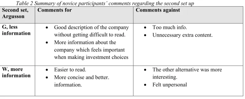
Less (K, W, S) More (T, G, P)Table 2 Summary of novice participants’ comments regarding the second set up
Second set,
Argusson Comments for Comments against
G, less
information • Good description of the company without getting difficult to read. • More information about the
company which feels important when making investment choices
• Too much info.
• Unnecessary extra content.
W, more
information •• Easier to read. More concise and better. information.
• The other alternative was more interesting.
• Felt unpersonal
Table 3 Summary of novice participants’ comments regarding the third set up
Third set,
Bentin Comments for Comments against
S, less
information • The paragraphs were more straight forward. • Good and concise
• Uninspiring pitch
• Too little info about the product
P, more
information • More information to make the assessment easier • Made me understand what it
meant
• Verbosity • Difficult to read
• Too much text and redundant information about the robots
Table 4 Summary of novice participants’ comments regarding the whole text
Other comments regarding the whole test
• To obvious examples aimed to make you choose the shorter versions. • Learned about personal preferences
Expert answers
In Figure 9 the division amongst the expert participants is shown, first the three different set ups and lastly the experts’ general preferences regarding less or more information. After this, three tables are shown containing summaries of the comments from the expert participants regarding the three set ups (Table 5, Table 6, and Table 7). Finally, a table with a summary of the expert users’ general comments about the test is stated in Table 8. As these tables contains summaries of the expert participants’ comments for and against the alternatives, the participants exact comments are enclosed in Appendix 6.
Figure 9 Division amongst expert users’ preferences
Table 5 Summary of expert participants’ comments regarding the first set up
First set,
Therax Comments for Comments against
K, less
information •• Short and concrete information Gave a better overview
• Less amount of unnecessary
information
• Inadequate information
• Not so explanatory
T, more
information • More detailed information. Although relatively small difference content wise.
• Perceives the information as biased • A lot of unnecessary text
• Took a long time to read
• Only repeating text in paragraph 9 50% 50%9
All sets
Less (K, W, S) More (T, G, P) 1 17% 5 83%Second set Argusson
Alternativ W; less Alternative G; more
4 67%
2 33%
First set Therax
Alternative K; less Alternativ T; more
4 67%
2 33%
Third set Bentin
Table 6 Summary of expert participants’ comments regarding the second set up
Second set,
Argusson Comments for Comments against
G, more
information • More facts • A lot of unnecessary information W, less
information • Short and concise information •• Too little information The other alternative had more facts Other comments regarding the second set up
• Both alternatives are very scarce, and if they try to list the most important facts then some are missing while others should not be on the list.
• When the company was founded and where it is based can be of value, but it should not be written among the key numbers.
Table 7 Summary of expert participants’ comments regarding the third set up
Third set,
Bentin Comments for Comments against
S, less
information •• Less amount of information It was explanatory and clear • All information needed was in an
easily accessible format.
• Difficult to percept the investment object
• Lacked info. P, more
information • Easy to understand what the investment consists of • Gave better information despite
more information
• Too biased text.
• Contains a lot of information that is irrelevant for me as an investor. • Would rather prefer an overview Other comments regarding the third set up
• The information displayed felt unnecessary, wanted to know other facts
• Information about the investments does not suit in a running text. A combination with running text and numbers would suit better.
• Numbers in text format is more difficult to interpret
Table 8 Summary of expert participants’ comments regarding the whole test
Other comments regarding the whole test
• Terms should be defined/explained in a separate section so the one who is familiar with them will not have to read them.