Exploring the Web Accessibility for
people with Dyslexia
En undersökning av tillgänglighet på webben för
personer med dyslexi
Emma Indal
Ellinor Mavéus
Computer and Information Science Bachelor
15 credits Spring/2019
Supervisor: Nancy Russo Examinator: Fredrik Rutz
Abstract
Five to eight percent of Sweden's population is diagnosed with dyslexia and almost twenty-five percent experience reading and writing difficulties. Ninety-four percent of Sweden's population uses the internet in all areas of life, from education and work to reading newspapers and gathering information from encyclopedias.
From previous research, it is known that web accessibility is a problem for people with dyslexia, but not enough people take action. The world goes from analog to digital in today's digitalization, therefore it is important to make the digital content available and accessible for all kinds of people, regardless of disability or not.
This study aims to get a deeper understanding, through a questionnaire, of how people with dyslexia and/or reading and writing disabilities experience the accessibility on websites today. The study identifies what obstacles these people face when they try to access information on websites and how the identified and analyzed obstacles could be used to create an easy-to-use-and-implement toolbar to help people overcome these obstacles. To validate if the toolbar could be used on websites to customize how the information is displayed and thereby access the information easier, a usability test was conducted. When the user is included early in the process, it is possible to improve the prototype before it is released live and available for developers to implement on their websites. The usability test was conducted through a Think Aloud protocol and aimed to connect the end-users thoughts with their behavior while using the component.
The result of the study shows that the majority of the participants do not think that many websites today are adapted for people with dyslexia and think websites should offer the ability to customize how the content is displayed on web pages without having to use browser extensions. The result also shows that the easy-to-use-and-implement toolbar includes functionality that will decrease these obstacles for people with dyslexia. You can also see that the previous research on colors, font style, font size, and line spacing is four of six categories the participants in this study see, as the biggest obstacles when they try to access information on websites today. What they also experienced was that the toolbar should include more choices within these categories to customize the toolbar for the individual person instead of a large group of people, which also is one of the suggestions for future research.
Sammanfattning
Fem till åtta procent av Sveriges befolkning är diagnostiserade med dyslexi och nästan tjugofem procent har läs- och skrivsvårigheter. Nittiofyra procent av Sveriges befolkning använder internet inom alla områden i vardagen, allt från utbildning och arbete till att läsa nyhetstidningar och söka information i uppslagsverk.
Från tidigare forskning är det känt att kunskap om att tillgänglighet på webben är ett problem för personer med dyslexi, men inte tillräckligt många människor tar ansvar för att det ska förändras. Vår värld går från analog till digital i dagens digitalisering, därför är det viktigt att göra digitalt innehåll tillgängligt för alla typer av människor, oavsett
funktionsnedsättning eller inte.
Denna studie syftar till att få en djupare förståelse, genom ett frågeformulär, angående hur människor med dyslexi och/eller läs och skrivsvårigheter upplever tillgängligheten på webben idag. Studien identifierar vilka hinder dessa människor står inför när de försöker få ta del av information på webben och analyserar hur de identifierade och analyserade hindren kan användas för att skapa en ”easy-to-use-and-implement” verktygslåda. För att validera om verktygslådan hade kunnat användas på webbplatser för att anpassa hur informationen visas och därmed öka tillgängligheten, genomfördes ett användbarhetstest. När användaren inkluderas tidigt i processen är det möjligt att förbättra prototypen innan den släpps live och görs tillgänglig för utvecklare. Användbarhetstestet genomfördes i form av ett Think Aloud protocol och syftade till att koppla samman både slutanvändarens tankar med beteendet under tiden verktygslådan användes.
Resultatet av studien visar att majoriteten av deltagarna inte tycker att speciellt många webbplatser idag är anpassade för personer med dyslexi. De tycker också att webbplatser borde erbjuda möjlighet att anpassa hur innehållet visas på webbsidor utan att behöva använda webbläsartillägg. Resultatet visar på att prototypen innehåller funktionalitet som minskar dessa hinder för personer med dyslexi. Man kan också se att den tidigare
forskning av färger, teckensnitt, textstorlek och radavstånd är fyra av sex kategorier som deltagarna i denna studien anger som de största hindren när man försöker ta del av information på webbplatser idag. Vad deltagarna också upplevde, var att verktygsfältet hade kunnat innehålla fler val inom de utvalda kategorierna för att anpassa verktygsfältet för den enskilda personen istället för en stor grupp människor. Det är också ett av förslagen för framtida forskning.
Sökord: Tillgänglighet, Dyslexi, Läsbarhet, Digitalisering
Abbreviations
WCAG - Web Content Accessibility Guidelines UX - User Experience
UI - User Interface
HTML - Hypertext Markup Language CSS - Cascading Style Sheets
Definitions
W3C (World Wide Web Consortium) - An international community that works together to develop Web Standards.
World Wide Web - A set of resources and web pages that can be found on the internet.
Browser extension - A small software application that can be added to a specific web browser and provides a set of functionalities.
Adobe XD - A UX/UI design and collaboration tool.
Table of Contents
1. Introduction 1 1.1 Dyslexia 1 1.1.1 Diagnosed or not 2 1.2 Coping strategies 21.2.1 Coping strategies for people with dyslexia 2
1.3 Human Computer Interaction 3
1.4 Web Accessibility 4
1.4.1 Web Accessibility Guidelines 4
1.4.2 Web Accessibility for people with Dyslexia 6
1.5 Research Questions 6
1.6 Previous Research 7
1.6.1 Web Accessibility Guidelines for people with Dyslexia 7 1.6.2 Adaptation of websites for people with Dyslexia 7 1.6.3 Adaptation of websites through browser extensions 8
1.6.4 What is missing? 9
2. Method 11
2.1 Decision of Research Strategy 11
2.2 Decisions of data collection methods 12
2.2.1 Survey 13
2.2.2 Prototyping 14
2.2.3 Think Aloud Protocol 15
2.3 Participant selection 16
2.3.1 Participant selection for the Survey 16
2.3.2 Participant selection for the Think Aloud protocol 17
2.4 Research Ethics 17
3. Result 20
3.1.1 Pilot test 20
3.1.2 Survey 23
3.2 Result of Prototyping - first iteration 29
3.3 Result of Think Aloud protocol 33
3.4 Result of Prototyping - second iteration 35
4. Discussion 38
4.1 Method discussion 39
4.2 Result discussion 40
4.3 Component Deployment 43
4.4 Constraints 44
5. Conclusion and Future Research 45
6. References 46
Appendix 51
Appendix A - Questionnaire 51
Appendix B – Think Aloud Protocol Participant 1 53
Appendix C – Think Aloud Protocol Participant 2 55
Appendix D – Think Aloud Protocol Participant 3 57
1
1. Introduction
According to the study "Svenskarna och internet", 94% of Sweden's population use the internet today. This 94% uses the internet in all areas of life: education, work, newspaper, encyclopedias, and social interaction. Taking part in information digitally is becoming more common among Sweden's population. This also means that all people in Sweden, with or without disabilities, should be able to take part in digital information. Digital information should be accessible for everyone [1].
1.1 Dyslexia
Dyslexia is a disability in reading and writing and is a biological language disability. According to the U.S. Center for Disease Control and Prevention [2], a disability is defined as:
“A disability is any condition of the body or mind (impairment) that makes it more difficult for the person with the condition to do certain
activities and interact with the world around them.”
What dyslexia is caused by is still not clear. The researchers think it depends on the brain’s ability to process language. The obstacles that a person with dyslexia face are individual and different for each person. A person with dyslexia does not have to suffer from all the symptoms [3]. The obstacles that are found are reading, spelling, and understanding a text but also when it comes to the separation of letters [4]. These obstacles can affect a person negatively in other areas in life, and it can be everything from social to emotional [5]. Dyslexia is often hereditary but has nothing to do with a person's intelligence. Dyslexia can never fully be treated, but the earlier it is discovered, the better chance you have of improving the obstacles [6]. Although only 5-8% are diagnosed with dyslexia in Sweden, there are many others who do not yet know that they are affected by the disability [4].
Something that is very important is to distinguish dyslexia and visual processing issues. Dyslexia is not a problem with vision. Just because you have Dyslexia, it does not mean that you have Visual processing issues. These two factors go hand in hand but are still two completely different things. Visual processing issues problems involve problems with processing information that the eyes see, unlike dyslexia where you have more problems with mixing up the order of letters. If a person with visual processing problems reads a text, the person will probably have trouble with processing the words he or she sees on a
2
page, but does not have to have dyslexia for that. If a person with dyslexia reads a text, he or she will have problems with the language processing and not the vision. The differences are not always very clear and it can probably be a reason to why some people confuse visual processing and dyslexia [7].
1.1.1 Diagnosed or not
Everyone who has dyslexia has reading and writing difficulties, but everyone who has reading and writing difficulties does not have dyslexia [8]. About 25% in Sweden suffer from reading difficulties, but only 5-8% have dyslexia [9]. About 80% of the children in the first and second grade in elementary school suffer from reading difficulties and the majority of these 80% overcome it. But looking at the fifth grade, there are only 15% who manage to overcome it. This hidden statistic is because of many people diagnoses themselves instead of seeking help. A person with dyslexia cannot get rid of the disability, but the sooner the person seeks help, the faster he/she can start work on it [8].
The investigation of dyslexia is short and smooth. The investigator tests different work areas such as reading, writing, and mathematical abilities, language skills, visual and auditory ability, attention and concentration ability, and the memories such as working memory, long-term memory, and short-term memory. When the test is done, the results get analyzed and after 1-2 weeks the investigation is completed and the diagnosis is made [6]. Today, it is an obligation in Swedish schools to help students who have dyslexia and thereby adapt the teaching to their needs [8].
1.2 Coping strategies
When a human faces a stressful situation, it may become a threat. When thoughts and actions are used to deal with that situation it is called coping. All people use different coping strategies to avoid a situation becoming a threat. A coping strategy can be everything from making a to-do list to communicate about what you feel stressed about.
Coping strategies can be divided into two different categories, problem-focused strategy, and emotion-focused strategy. The problem-focused strategy works as it sounds, you concentrate on the problem while emotion-focused strategy is more about a focus on your emotions to tackle the situation [10].
1.2.1 Coping strategies for people with dyslexia
People with dyslexia or people with writing and reading disabilities may also use coping strategies to avoid stressful situations when it comes to access information on the world wide web. These coping strategies will -- as well as general ones -- differ from person to
3
person, but to use technology to your advantage is one example of a coping strategy for people with dyslexia. For example, a tool called Scanmarker which is a pen that a person with dyslexia can use to scan text in a book and transform it into text in a document on their computer. Another coping strategy can be to use existing browser extensions to improve the readability on a website [11].
1.3 Human Computer Interaction
Today, user interfaces are an even more important part of computers in the daily life than they used to be. When computers were only used by a small part of Sweden’s population and could mostly just perform very specific tasks, it was not particularly strange to require a higher degree of learning and expertise from the users. Since it were used for specialized and work-related tasks, it was acceptable to have more difficult interfaces. Today, when 94% of Sweden’s population uses the internet in all areas of life, usability becomes even more important [1, 12]. Usability is defined by ISO 9241-11 as [13]:
“The extent to which a product can be used by specified users to achieve specified goals effectively, efficiently and with satisfaction in a
specified context of use”.
When the vendors of computers started to see users as something else than only an inconvenience, the term that was used was “user-friendly” systems. The problem with using that term is that users are not interested in computers being friendly, they are only interested in having computers that are not in the way of them when they want to get their tasks done. Different users have different needs, which means that a system that seems to be “friendly” to one user can be unfriendly to another one [12]. Because of this problem, user interface professionals have tended to use other terms. One of the terms is Human-computer Interaction (HCI) [12].
HCI is a multidisciplinary field within the area of design and computer technology. HCI overlaps user-centered design, user interface design and user experience design and focus on the interaction between a human and a computer [14].
To put HCI in context, it can be explained as there is a person that would like to perform a simple task like reading a text, but inserting a mediating computer for the activity, makes it a human-computer interaction [14]. The most complex part about HCI is to make the three different parts, interaction engineering (the implementation), interaction design (design of the workflow) and interaction science (e.g. use the science for design choices), work together [15].
4
Something that improves Usability is accessibility requirements. The primary focus of accessibility is people with disabilities [16].
1.4 Web Accessibility
Many websites that exist on the World Wide Web today are created with accessibility barriers which makes them inaccessible for a large group of people. To make these barriers smaller, a set of guidelines has been developed as a standard to make web content more accessible on the web [17].
1.4.1 Web Accessibility Guidelines
Web Content Accessibility Guidelines (WCAG) is a set of recommendations with the purpose to make the Web more accessible for all kind of people. The 12 different guidelines include recommendations to make the web content more accessible for people with disabilities, everything from cognitive limitations to speech disabilities or blindness. The recommendations also cover different devices such as desktop, mobile and tablet. The guidelines are not only a set of recommendations for people with disabilities,
following them will make the content more accessible for all kind of general users as well [18].
The guidelines in WCAG 2.0 are the following [18]:
1. Guideline 1.1 Text Alternatives: Provide text alternatives for any non-text content so that it can be changed into other forms people need, such as large print, braille, speech, symbols or simpler language.
2. Guideline 1.2 Time-based Media: Provide alternatives for time-based media. 3. Guideline 1.3 Adaptable: Create content that can be presented in different ways
(for example simpler layout) without losing information or structure.
4. Guideline 1.3 Distinguishable: Make it easier for users to see and hear content including separating foreground from background.
5. Guideline 2.1 Keyboard Accessible: Make all functionality available from a keyboard.
6. Guideline 2.2 Enough Time: Provide users enough time to read and use content. 7. Guideline 2.3 Seizures: Do not design content in a way that is known to cause
seizures.
8. Guideline 2.4 Navigable: Provide ways to help users navigate, find content, and determine where they are.
5
10. Guideline 3.2 Predictable: Make Web pages appear and operate in predictable ways.
11. Guideline 3.3 Input Assistance: Help users avoid and correct mistakes.
12. Guideline 4.1 Compatible: Maximize compatibility with current and future user agents, including assistive technologies.
WCAG is divided into three different levels, A, AA and AAA. Every criteria within a guideline has a level specified which symbolizes a degree of priority. A is the lowest level and the level that should be focused on first, the criteria that have level A specified are the ones with the highest priority. Criteria that have AAA specified are the criteria that should be focused on when all the other levels, A and AA are fulfilled. Even if level AAA is the highest level, one should, of course, consider following these criteria as well and not only focus on the lowest level, which is level A [19].
WCAG 2.1 is the latest published version and was published 5 June 2018 [14]. It is, according to W3C, the version that is recommended to use. WCAG 2.0 is not changed, which has been the first and central web accessibility since 2011, but WCAG 2.1 has expanded with 17 new criteria which are focused more on mobile accessibility, people with low vision and people with cognitive and learning disabilities [20].
The 17 new criteria for WCAG 2.1 are the following [20]: Guideline 1.3 Adaptable
● 1.3.4 Orientation (AA)
● 1.3.5 Identify Input Purpose (AA) ● 1.3.6 Identify Purpose (AAA) Guideline 1.4 Distinguishable
● 1.4.10 Reflow (AA)
● 1.4.11 Non-Text Contrast (AA) ● 1.4.12 Text Spacing (AA)
● 1.4.13 Content on Hover or Focus (AA) Guideline 2.1 Keyboard Accessible
● 2.1.4 Character Key Shortcuts (A) Guideline 2.2 Enough Time
● 2.2.6 Timeouts (AAA)
Guideline 2.3 Seizures and Physical Reactions ● 2.3.3 Animation from Interactions (AAA) Guideline 2.5 Input Modalities
● 2.5.1 Pointer Gestures (A) ● 2.5.2 Pointer Cancellation (A)
6 ● 2.5.3 Label in Name (A)
● 2.5.4 Motion Actuation (A) ● 2.5.5 Target Size (AAA)
● 2.5.6 Concurrent Input Mechanisms (AAA) Guideline 2.5 Input Modalities
● 4.1.3 Status Messages (AA)
1.4.2 Web Accessibility for people with Dyslexia
Although it is 5-8% people in Sweden that are diagnosed with dyslexia and about 25% who suffer from reading difficulties, the WCAG does not include specific guidelines to make the content on the web more accessible for this large group of people [4, 9, 21].
As mentioned, the WCAG does not specifically include guidelines that focus on improving the content for people with dyslexia yet. But many of the disabilities that the guidelines are based on can be connected to what a person with dyslexia experiences as a problem. For example, in Guideline 1.4 “Distinguishable: Make it easier for users to see and hear content including separating foreground from background”, Visual presentation (1.4.8), Text spacing (1.4.12) and Resize text (1.4.4) [22].
1.5 Research Questions
The purpose of this study is to identify how people with dyslexia experience the readability and accessibility on websites today and what obstacle(s) they face when they try to access information on websites. The study will also explore how a component can be created with these identified obstacles as background to make the information on websites more accessible for people with dyslexia.
Based on the previous research, to identify the problems and to be able to create the component, the questions below will be answered through this study.
1. How do people with dyslexia experience the readability and/or the accessibility on websites?
2. What obstacles do people with dyslexia face when they try to access information on websites?
3. How can an easy-to-use-and-implement toolbar be created to make content on websites more accessible for people with dyslexia?
7
1.6 Previous Research
Adaption of websites for people with dyslexia, adaption of websites through browser extensions and existing web accessibility guidelines for people with dyslexia are three interesting fields for this study. To get a picture of previous research within these fields, a literature review was conducted. The purpose of the literature review was to get a deeper understanding of the research that already has been done, what results have been achieved and what is missing within the field.
1.6.1 Web Accessibility Guidelines for people with Dyslexia
Researchers within the area of web accessibility guidelines for people with dyslexia point out that a person with dyslexia can without problem understand oral text but struggles to understand written words and sentences [21, 23].
A recurrent result in other studies is that the presentation of text matters and larger fonts increase the readability compared to smaller fonts [21, 24].
One previous study claimed that text customization is not the solution, since many of the people with dyslexia are not able to decide what parameters leads them to a better reading experience. But they also pointed out that they believe in letting the user customize the text, you should just make sure first of all to make the text accessible for the majority without any customization [21].
WCAG, discussed in section 1.4.1, is a set of guidelines for web accessibility. The previous research that has addressed these guidelines says that it is hard to know which guidelines in WCAG that would fit for people with dyslexia since it is not obvious if dyslexia is a cognitive disability or not. Which also is a reason why dyslexia is not a part of the WCAG [21].
The previous research says that the only guideline that dyslexia is mentioned in, is
“Success Creation: 3.1.5 Reading level” [24]. They also point out two important guidelines
from WCAG that is not especially for people with dyslexia but for accessibility overall. It is font size and font type where font size should be around 18 points for a 17 inches screen and font type should be sans-serif and non-italic font types [21].
1.6.2 Adaptation of websites for people with Dyslexia
The previous research of how websites can be adapted through customization of font type, color, font size, and line spacing to make a website more accessible for people with dyslexia points out that changing the parameters matters. A collection of papers about
8
these four different areas agrees with the importance of that at least three of four parameters affects readability for people with dyslexia [24, 25, 26, 27, 28].
Previous research within the area of font type for people with dyslexia includes an
experiment has been conducted using eye-tracking technique to measure whether the time for reading a text differs depending on the font. What the researchers could see was that the font types affect the readability of people with dyslexia and thereby could come up with a set of different fonts that would increase readability. The set of fonts were Helvetica, Courier, Arial, Verdana, and CMU. What they also could see was that italic font type reduced readability and is therefore not preferable for accessibility adaptation on web sites. Fonts that are specially designed for people with dyslexia do not contribute to better or worse readability [25].
Previous research also says that adapting fonts for people with dyslexia will improve the accessibility of a web site for a large part of the population. It will not reduce the readability for people without dyslexia, rather it will be beneficial for people without dyslexia [26].
Research has also been conducted within the field of background colors. The research has mainly touched how background colors behind text can decrease/increase the readability for people with dyslexia. The studies have been conducted on both people with dyslexia and people without dyslexia to be able to check the differences. In these studies, you can observe that readability increases with warm background colors compared to cool
background colors for both people with dyslexia and without, but it is more beneficial for people with dyslexia because of the readability issues [27]. Warm colors are exemplified as Peach, Orange, or Yellow and cool colors are exemplified as Blue Grey, Blue, and Green in the study [27].
Two areas where research also has been conducted is if font size and line spacing will increase or decrease the readability for people with dyslexia. Through results from studies within this area, the researchers could observe that text size is an important factor while line spacing neither increases nor decreases readability and thus is not an important
parameter to consider when it comes to web accessibility for people with dyslexia [24, 28].
1.6.3 Adaptation of websites through browser extensions
To get a deeper understanding of how browser extensions for people with dyslexia work, two papers of previous research has been studied. The two different papers conduct studies of two browser extensions (Firefixia and DysHelper).
9
As mentioned earlier, it has emerged that people with dyslexia often find it difficult to understand written words and sentences as well as to use the web [23]. In previous research, a browser extension named Firefixia has been evaluated. Firefixia is specially designed to support people that are diagnosed with dyslexia, with the goal to facilitate their use of the web [29]. Firefixia includes functionality to let the user modify font size, font type, text alignment, space between lines, space between characters, background color, text color, link color, visited link color, line width, border of block elements, and eliminate italics. The tool only use images to describe the different functions and no text [29].
Firefixia was tested by four participants who were diagnosed with dyslexia. The participants gave feedback on the most and least useful functions in the toolbar. The result was that functions such as changing the text size, text alignment and text color were the functions that facilitated the most for a person with dyslexia [29]. Functions that was mentioned during the test as least useful was font type and background color [29].
Another browser extension, called DysHelper, is a tool which adjusts and modifies the text to help people with dyslexia customize how information is displayed on the web. The goal with the extension is according to the authors to “visually fragment a given text so that the problematic graphemes in letter patterns are pulled from each other, whilst keeping the text visually consistent”. The solution that Dyshelper provides is to add a fragmenting sign, “-”, between words [30].
To test the tool DysHelper, the researchers conducted a test in which five people participated. All five people who participated in the study was diagnosed with dyslexia. The task they had to carry out was comparing a plain text with a modified text, where those fragmenting signs were added. The result of the test was that all participants experienced the user experience as positive but an improvement suggestion from the users was to have the possibility to change the number of fragmenting signs [30].
1.6.4 What is missing?
Based on the previous research it is implied that the knowledge about dyslexia and web accessibility guidelines exists, but without action from people who work within the technology industry and creates websites with content that 25% of the Sweden’s population experience is hard to access, the problem will not be solved.
There is a lot of research that concerns areas such as what web accessibility guidelines that exist and how important they are as well as what problem areas on websites (for
10
example font type, colors, font size) that exists. The knowledge is there, but not enough people take action.
What one also can agree about is that previous research has focused on measuring the behavior of the users on the web through techniques like eye tracking, but what if the behavior does not reflect what the user actually wants?
It’s clear that a set of web browser extensions exists that can be used as assistance for people with dyslexia and the included functionality meets the user’s needs as well as give positive results. These are tools for those who know that they are diagnosed with dyslexia and actively seek coping strategies as help. But the reason why browser extensions are not optimal is since it is a large group of people, 25% of the Sweden’s population, that are not diagnosed with dyslexia but experience reading and writing difficulties. For this large group of people, it is maybe not a priority to actively seek coping strategies as help. It might therefore be useful to provide the opportunity to customize how information are displayed on all websites without having to use browser extensions.
This study will, therefore, go into the depth of the obstacles that people with dyslexia face when they try to access information the web. The study will also explore how a prototype of an easy-to-use-and implement toolbar can be created that can be
implemented on websites to make content more accessible on websites for people with dyslexia. The study will also test this toolbar to be sure that it meets the user's criteria. By evaluating the toolbar, it is possible to validate that it not only provides assistance for the person with dyslexia or other reading difficulties but is also easy to use, to make sure that the interaction between the human and the computer works as expected.
11
2. Method
This section includes decisions of which research strategy the study was based on and why, the data collection methods that were used to collect data for the study and how they will answer the research questions. It also includes a participant selection part that explains how the participant was selected and why and ends with ethical considerations.
2.1 Decision of Research Strategy
A common research strategy when it comes to developing new IT products (also called artifacts) is a research strategy called "Design and Creation". The IT product in the research strategy Design and Creation can have one of three different roles [31]:
● The main focus of the research. ● A vehicle for something else.
● A tangible end-product of a project where the focus is on the development process.
In this research, the component that was created acted the role "a vehicle for something else" since a prototype was developed but contributes to knowledge first when it is validated and used in a real-world context such as implemented on an existing website or similar [31].
According to Oates, design and creation can be the only research strategy the research is based on, but it can also be one of several and work alongside another, for example, a case study or experiments [31]. In this study, the design and creation research strategy was the only one but included several different data collection methods both to collect knowledge within the field and to evaluate the artifact that was created.
No matter how you choose to use the design and creation research strategy the most important thing is that the activities are based on the five established principles. The five established principles are awareness, suggestion, development, evaluation, and conclusion [31].
Awareness
To get deeper knowledge within the field, a literature review was conducted followed by a survey to include potential users in an early stage.
Suggestion
12
extensions could be gathered. With this knowledge in mind, a decision of a very important question in the survey could be taken. If this large group of people thinks websites today should offer customization of how the content is displayed without having to use browser extensions. That the majority of the participants said that this should be offered, paved the way for how the problem could be addressed.
Development
Either a system is developed with a waterfall model of development. For the waterfall model, tasks occur sequentially after each other, one by one, and the output from a task is dropping in to the next one [31, 32]. Another way to set up the development process is an iterative model of development. The iterative approach is the one that fits how the component will be created in this study since this study is going to use prototyping which gives the opportunity to create the component in different versions and test it between the iteration phases to make sure it meets the user's needs [31].
Evaluation
After the prototype was created a usability test was conducted with the purpose to evaluate the IT artifact in a real-world context, which is a common way of using the design and creation research strategy in Information Systems research [31].
Conclusion
Due to time constraints, only one usability test could be conducted and improvement suggestions from the participant that was received could not be confirmed that they worked. Suggestions of additional functionality were also received and could, therefore, pave the way for future research.
With the research strategy set, a decision of what data collection methods that would fit the research strategy could be taken.
2.2 Decisions of data collection methods
In order to answer the research questions, this study is based on, data collection methods were selected and adapted to these. The data collection methods used for this study were divided into two different parts and aimed to collect both quantitative data and qualitative data.
The first and second research questions aimed to identify how people with dyslexia or reading disabilities experience the readability and/or the accessibility on websites and what obstacle(s) they face. To answer these questions a survey was conducted. The reason why, for example, interviews were not selected as a data collection method to answer
13
research question 1 “How do people with dyslexia experience the readability and/or the
accessibility on websites?” and 2 “What obstacles do people with dyslexia face when they try to access information on websites?” was because, with a survey, a large amount of
data can be collected in a short amount of time, in a standardized and systematic way [29].
When in-depth knowledge was gathered about how people with dyslexia experience accessibility on the web and what obstacles they face, a prototype with included functionality to reduce these obstacles could be created and thereby answer research question 3 “How can an easy-to-use-and-implement toolbar be created to make content
on websites more accessible for people with dyslexia?”.
The third research question aimed to examine how a component can be created with the identified parts from the first and second research questions, to make information more accessible for people with dyslexia on websites.
The reason to use prototyping was to be able to use an iterative approach in the “Design and create” research strategy and be able to use the prototype in the third and last data collection method which was a usability test, Think Aloud protocol. The Think Aloud protocol aimed to collect more quantitative data and evaluate that the prototype met the user’s (which in this case are people with dyslexia) criteria and if it will help them access information more easily on websites in their daily life [31].
2.2.1 Survey
The first data collection method was a questionnaire for people with dyslexia and was sent out with the purpose to define the obstacles that people with dyslexia face on the web. The questionnaire was a mix of open questions, closed questions and statements that were answered with the Likert scale. The open questions in the questionnaire gave the participant the chance to decide what to answer, but the open questions in this study had at least one answer pre-defined, followed with a free text field. The closed questions in the questionnaire gave the participant a range of answers to choose from [31]. The Likert scale that was used for some statements in the questionnaire is the most common
attitude measurement where the unit of measure is determined by negative as well as positive statements to get an index of several single questions [33].
The questionnaire consisted of nine questions where the first question aimed to get rid of participants that are not diagnosed with dyslexia since the important participants were people that are diagnosed with dyslexia or people who experiencing reading disabilities.
14
The questions and statements in the questionnaire were the following, the full questionnaire can be found in Appendix A.
1. Are you diagnosed with dyslexia? 2. Age
3. Experience that it is difficult to read and access information on web pages 4. In which categories do you find it difficult to access information on web pages? 5. Experience that many websites today are adapted for people with dyslexia
6. Being able to adapt how the content is displayed on web pages would have made it easier to access the information
7. Think that web pages should offer the ability to customize how the content is
displayed on web pages without having to use browser extensions (browser extensions, such as Helperbird)
8. What coping strategies do you use to more easily access information on web pages? 9. What do you see as your biggest obstacle(s) when you try to access information on
web pages today?
10. Please fill in your email address below to participate in a future usability test.
Before the questionnaire was sent out, a pilot test was conducted. The pilot test aimed to confirm that the questions in the questionnaire were understandable or if something could be changed to improve the understanding of the questions. The pilot test was conducted on 10 randomly selected participants. In the test, the participants were analyzing the original questions and answer the following three questions. The result of the pilot test can be found in section 3.1.1.
1. Was it any question you experienced was difficult to understand?
2. Please explain why the question was difficult to understand - please start with the number of the question.
3. Is there anything else you think we should ask about?
2.2.2 Prototyping
Based on the collected quantitative data from the questionnaire, the data was analyzed. When the data from the questionnaire was analyzed, a prototype was created with functionality based on the identified obstacles in the questionnaire. The main goal with the prototype was to examine if a component in the shape of an "easy-to-use-and-implement" toolbar could be developed to increase the accessibility on websites. The prototype was created with an iterative approach and used in a usability test in between
15
the iterations to evaluate the interaction between the participant and the prototype. The result of the first iteration can be found in section 3.2 and result from the second
iteration can be found in section 3.4.
The developing process of the prototyping was divided into two different phases. The first phase was focusing on creating a sketch of how the component was going to look like and included design choices and a list of functionalities, based on the result from the
questionnaire, which was going to be included in the prototype. The design sketch was created in Adobe XD which is a program for creating UX/UI sketches [34].
The second phase was the implementation phase where the component was created including all interactive functionality. The component was created in HTML, CSS, and JavaScript. The component aimed to be a prototype of a toolbar that will be available for developers to implement on web pages with the purpose to give their users the
opportunity to customize how the content is displayed without having to use browser extensions.
2.2.3 Think Aloud Protocol
To be able to test the usability of the prototype, a Think Aloud protocol was conducted. A Think Aloud protocol is a usability test where the participant is asked to use a system and in the meanwhile thinking out loud. The Think Aloud protocol provides the
opportunity to verbalize the user's thoughts while he or she moves through a system [35]. Having the opportunity to verbalize the user’s thoughts while using a system enable us to understand how the human interact with the system [12]. This makes it possible to get a deeper understanding of every single misconception and improve the system on the parts that cause problem [12]. An important part when using the Think Aloud protocol is to not put too much focus on the user’s own “theories” why a problem was caused, instead look at what the user actually was doing during that part of the test [35]. The result of the Think Aloud protocol can be found in section 3.3.
The steps before performing the Think Aloud protocol was the following:
1. Was sending out invitation and instructions through email.
2. Selected a number of participants who would conduct the usability test. 3. Scheduled a time when the participants were going to participate. 4. Conducted the Think Aloud protocol through Google Hangouts. 5. The participant shared their screen through Google Hangouts.
16
The purpose of recording the participant's screen and voice was to be able to connect what the user was doing during specific parts of the test with the verbalization of the user’s thoughts. The reason to this was to avoid focus too much on the users own “theories” about what caused the problem [35]. The test was performed on one participant at a time and all the participants received two different tasks to perform during the test.
The following tasks that the participant was going to perform were:
1. Open the link you have received to open the webpage.
2. Use the toolbar that is implemented at the website and think aloud during the test.
They did not receive any more instructions during the test about how to use the
implemented toolbar. The reason to this was because an interesting part in the test was if the participant could found the toolbar and if was placed on a good position on the website, or if that part could be improved.
After the test was finished, the participant got to answer the following three questions:
1. Did you experience that it was difficult using the toolbar? If yes, explain? 2. Did you find something was missing in the toolbar?
3. Do you think the component would have made it easier for you in your everyday life?
2.3 Participant selection
An important part of the planning and designing phase of the data collection is the selection of which participants and how many that should participate [31]. This study includes two different data collection methods and the selection of participants is described down below.
2.3.1 Participant selection for the Survey
The first data collection method of the study consisted of a questionnaire and according to Oates a good rule-of-thumb when it comes to participant selection for surveys is to have a minimum final sample of 30 participants for small-scale research. The reason to have a minimum of 30 participants as the final sample is that the calculating of average or mean should be reliable [31].
17
In this study, a sample frame of 4013 persons was selected. The sample frame is a list of the total number of the whole population of people that have the ability to participate in the study [31]. The reason why the sample frame for this study was 4013, was because the sample frame consisted of a group of people with reading and writing disabilities from a community on Facebook called "dyslexia.org" [36].
To be able to get as many answers as possible in a short amount of time, no exact selection of participants from the sample frame was made. Instead, a non-probabilistic sample technique called "self-selection sampling" was used. Self-selection sampling is described as "researchers advertise their interest in a particular topic and their need for respondents, and collect data from anyone who responds" [31].
However, the minimum of participants before the questionnaire could be closed down had to be 30 people that are either diagnosed with dyslexia or not diagnosed but experiencing reading and/or writing difficulties. The questionnaire was not closed before the
predetermined limit was reached, to get a final minimum sample size of at least 30 people [31].
2.3.2 Participant selection for the Think Aloud protocol
For the second phase of the study, a Think Aloud protocol was conducted to get more qualitative data from a smaller group of people. This method was used to test the prototype and aimed to understand the user behavior when the participant was using the component and if the included functionality met the user's needs.
The last question in the questionnaire aimed to invite participants that were interested in participating in a usability test. The sample size of the Think Aloud protocol was
therefore created based on the interest of the participants that participated in the questionnaire. The total amount of accepted participants, which means that they are diagnosed with dyslexia or experience reading and writing difficulties, that participated in the questionnaire was 33. This means that 33 participants were invited to conduct the usability test in shape of a Think Aloud protocol.
2.4 Research Ethics
Research is important for today's society, therefore, it is important that the research has responsibility towards the person who is involved in the research. One should be objective and neutral through the research and no manipulation may be used to influence the answer. The participants should also have protection against unauthorized transparency in their live conditions. In order to avoid this kind of unauthorized transparency,
18
Vetenskapsrådet, has produced four different main rules based on the individual protection
claim to be followed during a research [37]:
Rule 1 - The information requirement
The researcher must inform the respondents and the study participants about their task in the project and what conditions apply to their participation. They must be informed that participation is voluntary and that they have the right to interrupt their participation. The information shall include all the elements of the current investigation that may reasonably affect their willingness to participate.
Rule 2 - The consent requirement
The researcher must obtain the consent of the respondents and the survey participants. In some cases, consent should also be obtained from the parent / guardian (eg if they are under 15 and the investigation is ethically sensitive).
Rule 3 - The confidentiality requirement
Those who participate in an investigation must have the right to independently decide whether, for how long and on what conditions they should participate. They should be able to interrupt their participation without this having any negative consequences for them.
Rule 4 - The use requirement
In their decision to participate or discontinue their participation, the survey participants must not be subjected to undue pressure or influence. Dependency conditions should also not exist between the researcher and prospective study participants or respondents.
The first research method, a survey was sent out to collect quantitative data. The questionnaire included a short information text about the research to inform all participants the purpose and the invitation message included a little more detailed information about the researchers of this study. All participants who participated in the survey was anonymous except those who provide their email at the end of the survey if their email were connected to more personal details.
The purpose of collecting the emails was to be able to send out invitations to the participants to give them the opportunity to participate in a usability test, the Think Aloud protocol. The participants that participated in the study were clearly informed that enter their email was optional and the question was not marked as a mandatory question in the questionnaire.
19
The participants that participated in the Think Aloud protocol were also anonymous and were informed about it both in the invitation email and before the test was started. The participant that participated in the Think Aloud protocol were referred to "Participant 1", "Participant 2", "Participant 3", in the result of the Think Aloud protocol.
All information that can identify a person, in this case, email, was removed when the study was finished. According to GDPR, the General Data Protection Regulation, two principles was applied for this study “may only collect personal data for specific, specific and legitimate purposes” and “should delete the personal data when they are no longer needed” [38].
20
3. Result
This section includes the result of the collected data from the research methods that have been used throughout the study. There were three main goals of the study. The first goal was to identify the obstacles that people with dyslexia face when they try to access information on websites. The second goal was to determine how a component could be created based on the answers from the survey to make content more accessible for all kind of people. The third goal was addressed with the result of a usability test of the component to make sure it meets the user's criteria and to be able to involve the end-user in the prototyping process.
3.1 Result of Survey
This section is divided in to two different parts, first part includes the result of the pilot test that was conducted before the questionnaire was sent out. The second section includes the result of the original questionnaire.
3.1.1 Pilot test
The primary goal with the pilot test was to confirm that the participants understood the questions in a correct way and the secondary goal was to explore if there was anything else we could ask about that was interesting within the field. Ten randomly selected participants participated in the pilot test and no personal information were conducted. The participants got access to the 9 different questions in the original questionnaire to analyze and answer 3 different questions in the pilot test.
Q1: Was there any question that you experienced was difficult to understand?
21
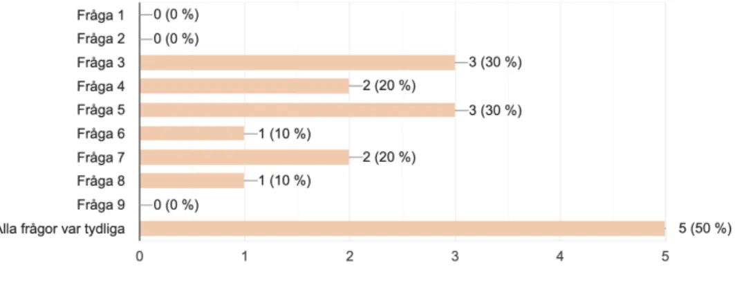
The first question aimed to get feedback from the participants if there was any question they experienced was difficult to understand. The result in Figure 3.1 shows that 5 out of 10 said that all the questions was clear and the other 5 persons said that one or more questions was hard to understand. Question 1, 2 and 9 were the most clear questions and the questions that were more or less unclear was questions 3-8.
Q2: Please explain why the question was difficult to understand - start with the number of the question.
Figure 3.2: The result of Q2 in the pilot test.
The result in Figure 3.2 shows that question number 3 received feedback regarding that it was hard to understand what kind of information that was meant. This question was not changed for the original questionnaire and the reason was that it regarded all kind of information on websites. The only thing that was changed was “information on the web” to “information on websites” to be specific about that it was information on websites. General feedback about the questions 4-7 was that it was unclear in the pilot test if it was only people with dyslexia that were going to answered the questionnaire, and therefore we got improvement suggestions like adding a text which explains how it is to be a person
22
with dyslexia. But since the target group in the original questionnaire was limited to only people with dyslexia, a description of what dyslexia is was not added.
Q3: Is there anything else you think we should ask about?
Figure 3.3: The result of Q3 in the pilot test.
The result of Figure 3.3 shows suggestions of what we could ask about more within the field. The first suggestions was that an interesting part could be to ask about what type or severity the person with dyslexia have. A decision to not add a question about this was made. The severity of a person with dyslexia would not benefit this research.
The other suggestion was to ask people what they work with and how much knowledge they have within the field. Since the questions includes terms like coping strategies and browser extensions the participant that gave the suggestion were a little confused about that probably not everyone that will participate in the original survey will understand these terms. To improve this, an example of an existing browser extension was added in
question 7 and for the question about coping strategies, a coping strategy we could get knowledge from in the literature review, (browser extensions), was added as an already existing answer. A question asking about the participants work and how much knowledge they have within the field was not added, it would not benefit this research.
23
3.1.2 Survey
To identify how people with dyslexia experience readability and/or the accessibility on websites and if they face any obstacles when they try to access information on websites, a survey was conducted. The survey was sent out to a group of people that are diagnosed with dyslexia and people that are not diagnosed but have reading/writing disabilities. 45 people participated in the survey where 33 of them (73,3 %) conducted the entire survey since they answered "Yes" or "Not diagnosed, but reading/writing disabilities" on the first question that was about their condition and 12 persons answered "No" which did not let them answer the survey.
Figure 3.4 shows that 53,33% of the participants that participated in the questionnaire is diagnosed with dyslexia while 20% of the participants are not diagnosed but experience
reading/writing disabilities. The participants that are not diagnosed with dyslexia was 26,67% and were not redirected to answer the entire questionnaire
24
Figure 3.5 shows that 6.06% of the participants that participated in the questionnaire are under than 15 years old, 48.48% are between 15-24 years old, 6.05% are between 25-33 years old, 15.15% are between 34-42 years old, 18.18% are between 43-51 years old and 6.06% are over 51 years old. This means that the majority of the participants that have participated in the survey is between 15 and 51 years old.
Figure 3.6 shows that the majority of the participants, a total of 24, that participated in the questionnaire gives a 3 or higher on the question about if the participant finding difficulties with reading and take part of the information on the internet while 9 participants give a 2 or lower on the question.
25
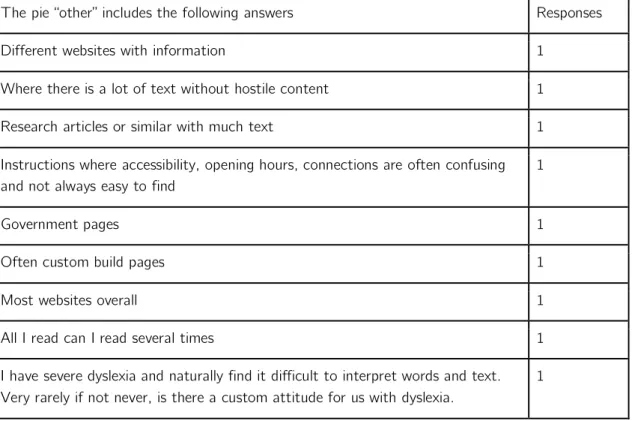
Figure 3.7 shows that 22.22% of the participants find it most difficult to gather information on newspaper websites like Aftonbladet.se or Sydsvenskan.se, 18.52% of the participants indicates that E-commerce websites are the most difficult ones and 40.74% says that Encyclopedias like Wikipedia.org or NE.se are the most difficult ones. This was an open question which means that the participants were able to give their own suggestions as answers in a free text field. Answers with one response or lower are therefore categorized in the category "other" and placed in a table below.
Table 3.1: Answers that are placed within the "other" category for question 4.
The pie “other” includes the following answers Responses Different websites with information 1
Where there is a lot of text without hostile content 1 Research articles or similar with much text 1 Instructions where accessibility, opening hours, connections are often confusing and not always easy to find
1
Government pages 1
Often custom build pages 1
Most websites overall 1
All I read can I read several times 1 I have severe dyslexia and naturally find it difficult to interpret words and text. Very rarely if not never, is there a custom attitude for us with dyslexia.
26
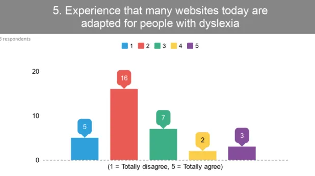
Figure 3.8 shows that the majority of the participants, a total of 21, that participated in the questionnaire gives a 2 or lower on the question about if the participant experience that many websites today are adapted for people with dyslexia while 12 participants give a 3 or higher on the question.
Figure 3.9 shows that the majority of the participants, a total of 31, that participated in the questionnaire gives a 3 or higher on the question about if the participant being able to adapt how the content is displayed on web pages would have made it easier to access the information while 2 participants give a 2 or lower on the question.
27
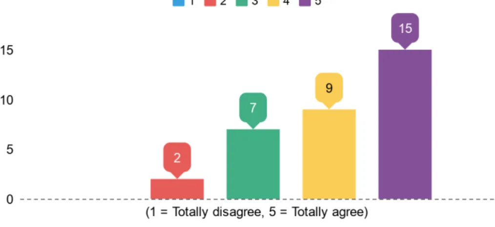
Figure 3.10 shows that the majority of the participants, a total of 31, that participated in the questionnaire gives a 3 or higher on the question about if the participant think that web pages should offer the ability to customize how the content is displayed on web pages without having to use browser extensions while 2 participants give a 2 or lower on the question.
Figure 3.11 shows that 60.61% of the participants do not use any coping strategies to easily access information on web pages, it also shows that 21.21% of the participants use browser extensions to easily access information on web pages. This was an open question which means that
28
the participants were able to give their own suggestions as answers in a free text field. Answers with one response or lower are therefore categorized in the category "other" and placed in a table below.
Table 3.2: Answers that are placed within the “other” category for question 8.
The pie “other” includes the following answers Responses Do not know that help exists 1
Search function in the web browser 1 Breathe and try to get through it in a calm way, Can use speech synthesis if it is available.
1 Do not know. I mostly look at pictures and headlines or call the customer service at the company in question.
1 Ask someone to read it for me. Read slowly and several times. 1
What, what is this? 1
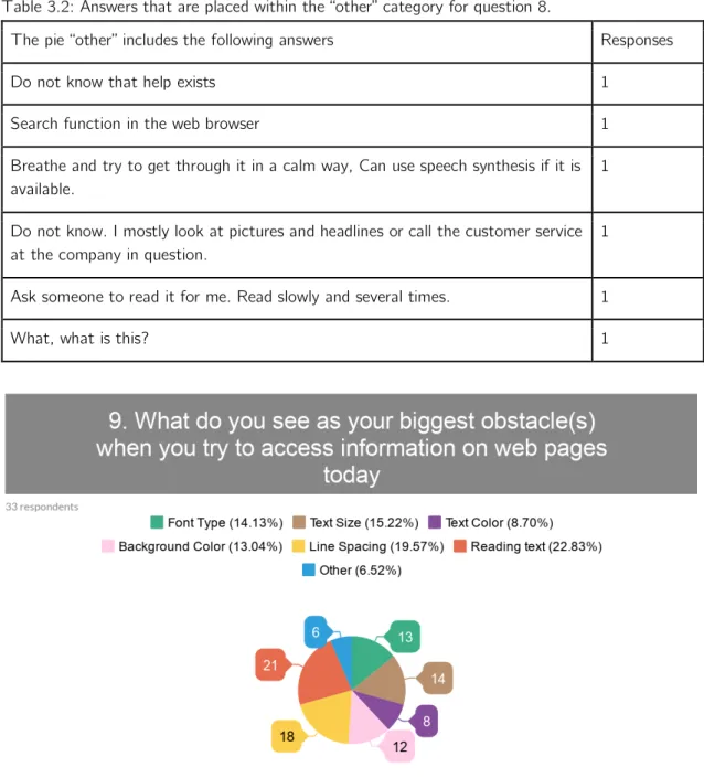
Figure 3.12 shows that 14.13% of the participants that participated in the questionnaire says that font type is the biggest obstacle, 15.22% says text size, 8.70% says text color, 13.04% says background color, 19.57% indicates that line spacing is the biggest obstacle and 22.83% of the participants experience that reading text without access to voice reading is the biggest obstacle. This was a multiple-choice question and the participants may, therefore, have specified several answers. It was also an open question which means that the participants were able to give their
29
own suggestions as answers in a free text field. Answers with one response or lower are therefore categorized in the category "other" and placed in a table below.
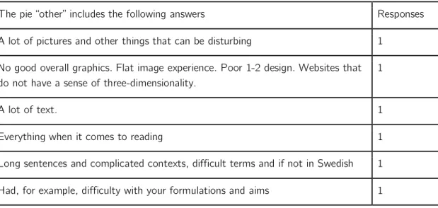
Table 3.3: Answers that are placed within the "other" category for question 9.
The pie “other” includes the following answers Responses A lot of pictures and other things that can be disturbing 1
No good overall graphics. Flat image experience. Poor 1-2 design. Websites that do not have a sense of three-dimensionality.
1
A lot of text. 1
Everything when it comes to reading 1 Long sentences and complicated contexts, difficult terms and if not in Swedish 1 Had, for example, difficulty with your formulations and aims 1
3.2 Result of Prototyping - first iteration
Based on the analyzed answers collected from the questionnaire, a component was created with the purpose of making content on the web more accessible on the web for people with dyslexia. The reason why the component is based on the answers of the questionnaire is because the purpose with the questionnaire was to identify the obstacle(s) people with dyslexia face on websites. The most reported obstacles was "Background Color", "Font Type", "Text Size", "Text Color", "Letter Spacing" and "Reading text (no access to voice reader)". These identified obstacles was used as functions in the component to be able to customize how the information is displayed at the website. The prototyping process was divided into two different phases.
In the first phase, a sketch in Adobe XD was created with the purpose to make a minimalistic and easy-to-understand design before the second phase where all interactive functionality was implemented.
30
Figure 3.13: Sketch of how the toolbar looks when it is closed.
Figure 3.14: Sketch of how the toolbar looks when it is open.
In the second phase of creating the prototype, the component was created in JavaScript, HTML, and CSS for full implementation of the prototype including all interactive
functionality. After the result of the questionnaire was analyzed, a decision on what functionality would be included in the toolbar could be taken. The decision of functionality
31
resulted in 6 different functions that are implemented in the toolbar that can help the user customize how information displays on a website.
The 6 different functions included in the component are: ● Background Color ● Text Color ● Font Type ● Font Size ● Line Spacing ● Voice Reading
For the Voice Reading functionality, where the user can activate Voice Reading in the toolbar and then mark a sequence of text and get it as voice instead of text, an external module from “Responsive Voice” is used in the component [39].
The decision on which background colors would be included is based on previous research from the literature review where you could observe that readability increases with warm background colors compared to cold for both people with dyslexia and without. Therefore the component includes a set of warm background colors.
32
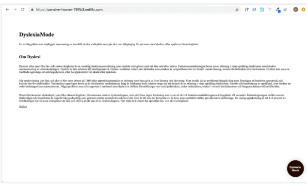
To be able to use the component in the Think Aloud protocol, the component was implemented on an example website with some example text from Wikipedia about dyslexia and deployed through a service called "Netlify" which is a platform for automating modern web pages [40].
Figure 3.16: The toolbar developed with all interactive functionality - open.
33
3.3 Result of Think Aloud protocol
To be able to include the end-users in the development process in an early stage, a usability test was conducted. The usability test consisted of a Think Aloud protocol with the purpose to connect the participant's behavior and thoughts while using the toolbar implemented on a website. The section below present the result of the Think Aloud protocol for the 3 different participants. The protocols with raw data from the test can be found in Appendix B-D.
According to Oates, the first part of the data analysis is data preparation where you focus on getting the data in a proper format [31]. During the test, notes were taken of the participant's thoughts and behavior. The notes acted the base of the protocol for a participant, where more information could be added while looking at the recorded video afterward. When the data preparation was done and the data was in a proper format, the protocols of the Think Aloud were read through and grouped into categories. The
categories are based on what is relevant to the studies research questions, which is one of three themes that can be used for the qualitative data analysis [31]. With the data in a proper format and in separate protocols for each participant, thoughts and expressions from the participants could be inserted as segments in a table connected to a specific category.
To easier be able to see a pattern of positive versus negative parts of the result, the segments are color coded in three different colors.
Green segments - Satisfied
Blue segments - Neither satisfied nor dissatisfied Red segments – Dissatisfied
Table 3.4: Grouped and categorized result of Think Aloud Protocol
Categories Participant 1 Participant 2 Participant 3
Web Browser Google Chrome Google Chrome Google Chrome Location of Toolbar Found it, but a
suggestion for a better location is at the top of the page with another name.
Difficult to find. A link distracted the participant from finding the toolbar. Got directions to go back and keep looking for
34 the toolbar. Understanding of Icons for functionality
Understood it. Hard to understand
some of the icons. The participant mixed together with the
background color function and text color function.
Hard to understand the majority of the icons. All of them except row spacing and text size.
Background Colors Good background colors for people with dyslexia. It is better for the eye to read when it is warmer and relaxed colors.
The participant did not missed any colors.
The participant was missing black and white color as background colors.
Font Colors Good combinations and color choices. Dark colors work better on the text.
The darker the better! Light colors are not preferred.
Was satisfied with the color choices that existed.
Font Styles Liked Comic Sans and thought the choices were good. The participant mention that more opportunities to choose between would have been good.
Satisfied with the font styles that exist.
No comments about the font styles that exist.
Font Size The participant says it is good to be able to make the text bigger and smaller
Had difficulty finding the font size. Mixed together with the font style and font size functions.
The participant had no problem finding or understanding the font style and quickly moved on to the next tasks.
35
Line Spacing The participant wanted to see which row spacing is used at the moment
Found the function quickly and easily.
The participant clicked on the icon itself and not the "+" or "-" and therefore could not change the line spacing in the beginning.
Voice Reader Voice reader did not worked as expected.P1 mentioned that it is important that functionality works when you are dependent on tools.
Had some
problems with the marking of the text itself, the
participant did it a few times before it worked.
Hard to understand that a sequence of text was going to be marked to get it read by voice.
Would use the toolbar in their everyday life
Yes. Yes, the
participant thinks it is useful for people without dyslexia as well.
Yes, the participant thinks it is a good tool for people with reading disabilities.
36
3.4 Result of Prototyping - second iteration
Figure 3.18: The toolbar when it is closed. The name and location are improved based on the result from the Think Aloud protocol.
Figure 3.19: The toolbar when it is open. Current font size and line spacing are added as well as the “+” and “-” are separated from the middle element, based on the result from Think Aloud protocol. A close icon is added to the orange button instead of the name of the toolbar.
37
Figure 3.20: The toolbar when it is open. Labels with a text for all functions are added based on the result from the Think Aloud protocol to complement the icons.
Figure 3.21: The background colors white and black were added based on the result from the Think Aloud protocol to complement the icons.
Figure 3.22: One more font style was added based on the result from the Think Aloud protocol to complement the icons.