Visual instructions
for toddlers
Designing instructions in a medical
iPad app
Antonia Hulha | Bachelor thesis in informative illustration
Mälardalens högskola January 13th 2015
Examiner: Yvonne Eriksson Course: ITE317
2
Abstract
Together with a research group from Mälardalen University’s department of Health, Care and Social Welfare, a prototype for an iPad app was created that aims to solves some of the current issues in healthcare for toddlers. The prototype would then be used by the research group to test with toddlers and examine whether the toddlers’ knowledge of basic medical treatments was increased. Due to varying linguistic backgrounds and abilities, the iPad had to be completely free of words, communicating only through sounds, images and animation.
In this study, a research question was developed: What design aspects of
illustrations and animations make them identifiable and ensure basic usability in an interactive iPad app that does not contain any written or spoken words for children between the ages 3 and 5?
In order to find the answers to this question, an expert review was conducted, relevant design principles were studied to learn more about usability guidelines and animation for children, a prototype was created and iterative participatory
tests were conducted with children of the same age as the target audience. These
methods showed that there is a lack of usability guidelines when it comes to designing usability for a young audience. However, the usage of an expert review method prior to creating an app proved to be an effective way to see different design strategies in action and evaluate them. The participatory tests indicated that the usage of two different gestures is challenging for young children, and that instructions for these two gestures have to be different from one another.
3
Acknowledgements
This thesis has benefited greatly from the support and experience of the “IACTA” research group from MDH. Without their help, I would never have been able to get this amount of valuable data from the iterative participatory tests.
I would also like to thank my mother, who read and re-read my thesis so many times, and who helped me make difficult decisions throughout the entire process.
4
Table of Contents
Abstract ... 2
Acknowledgements ... 3
1 Introduction ... 5
2 Purpose and research questions ... 6
2.1 Delimitations ... 7
3 Method ... 8
4 Previous research ... 9
4.1 Young children's use of mobile touch devices ... 10
4.2 Stills Vs. animation in visual communication with young children ... 11
5 Design principles and concepts ... 12
5.1 Designing usability for a young audience ... 12
5.2 Animation as an educational tool ... 13
5.3 Visual effects that attract attention and guide the user’s eye ... 13
6 Expert review ... 15
6.1 Result and analysis of the expert review ... 17
7 Initial prototype ... 24
7.1 Perspective ... 24
7.2 The design of objects, rooms, characters and situations ... 25
7.3 Gender roles and stereotypes ... 27
7.4 Interactive elements ... 28
7.5 The design of the back-button ... 29
7.6 Visualizing the examinations ... 29
7.7 Timing ... 31
8 Iterative participatory tests ... 32
8.1 Iteration 1 ... 33 8.2 Iteration 2 ... 39 8.3 Iteration 3 ... 41 9 Conclusions ... 43 9.1 Engagement ... 43 9.2 Recognizability ... 44 9.3 Visual instructions ... 44 9.4 Source criticism ... 44 9.5 Future ... 46 10 References ... 47 Attachments ... 48 Attachment 1: Storyboard ... 48
Attachment 2: Screenshots of the final app ... 54
5
1 Introduction
Interactive software has been used for many years to teach children of all ages about many different subjects. For most of this time, computers with mouse and keyboard were used for this purpose. In recent years, however, touch-screen devices have surfaced in this industry, and in comparison with mouse and keyboard are much more intuitive (Geist, 2012, p. 32). Even though this new technology is used more and more, there are no readily available design guidelines for creating informative apps for young children.
This work was done in conjunction with a research study conducted by
researchers from Mälardalen University Sweden in the department of Health, Care and Social Welfare. Their research deals with the current state of communication between children and nurses/doctors in Swedish hospitals and children’s
perception of care situations (Stålberg, 2014). Children between the ages three and five are often not comfortable in care situations: they are scared or nervous and they often don’t understand what is happening to them (ibid). A research group from MDH proposes that children in that age will become less frightened and nervous if they receive more information about the different treatments beforehand (ibid).
iPad apps have only since recently been used as teaching tools (DeCurtis & Ferrer, 2011), which is why this design problem has not yet been researched to a wide extend. An app that realistically and interactively depicts medical treatments in a way that is child-appropriate is something that, to the knowledge of the members of the research group at MDH, does not yet exist (Stålberg, 2014). Through their research, they found that an iPad app would be most suitable to (1) better inform children upfront about medical treatments and to (2) improve communication between children and hospital personal (ibid). The medium is suitable for the communication of complex information about medical treatments and the creation of lasting knowledge (Stålberg, 2014). This decision was done due to the fact that picture, animation and sound can be combined, that the
medium is interactive, that the touch-based technology is easy to use compared to using a mouse and keyboard, freeing more of the users attention for the content (Geist, 2012, p. 32), that the touch-based technology furthermore requires less initial learning, it is even argued that it is intuitive (DeCurtis & Ferrer, 2011) and that the touch-based technology and portability of the device is suitable for a hospital environment.
With this target audience, there are certain facts that need to be kept in mind: the target audience is comprised of young children between the ages three and five, the target audience might have differing cultural backgrounds and the nature of the content needs to child-friendly (Stålberg, 2014).
6
2 Purpose and research questions
The purpose of this study is to create an interactive prototype of an iPad app that can be used by researchers to test on toddlers between the ages three and five. The app should show how different medical treatments are performed. The app should be child-friendly and age-adjusted, meaning the app should be usable without any written or spoken instructions to guide him/her. The illustrations in the app should be designed in such a way, that the user is able to identify and understand them. Based on this purpose, the following design problem arises: What design aspects of illustrations and animations make them identifiable and ensure basic usability in an interactive iPad app that does not contain any written or spoken words for children between the ages 3 and 5?
The above design problem can be subcategorized into several scientific questions. Visual instructions: If the iPad app does not include any written or spoken words, what design aspects of illustrations and animations ensure basic usability for young users?
Recognizability: In what way can illustrations of objects, rooms and characters be designed, so that they are identifiable for young children?
Engagement: Will visual effects, animations, down-times and timings influence the users engagement while using the app? If that is the case, in what way do these attributes need to be changed to improve the engagement?
Throughout the entire process certain design challenges had to be kept in mind, which are unique for this study.
Challenge one: Animation vs. illustration
Based on the content of each scene, animation or static illustration was better suited to communicate different types of information. While animation can certainly help with deeper understanding of the situational information (events that happen over a period of time), illustration is non-fleeting, so a child may look at it as long as it wishes (Höffner & Leutner, 2007).
Challenge two: Age appropriateness
The informational content of the app needed to be complete and understandable, but it also needed to be age appropriate. Especially when it came to blood, syringes, and organs, a balance needed to be established between realism and age appropriateness.
Challenge three: Usability
The usability of the app had to be well thought-out in order for the users not to get hung up on overcomplicated mechanics (especially seeing as the target audience are toddlers). For this, usability guidelines were researched and implemented where possible.
7
2.1 Delimitations
Not all tasks that the research group had in mind could be completed in the timeframe of this study. The research group initially wanted more features added to the prototype, such as an internal rating system for the users (with happy and sad faces appearing on the screen) and illustrations for different moods that the user might have. However, due to time constraints, the above was not included in the prototype, which was communicated early on in the study. The above feature may in fact be so complex, that it could fill an entire thesis by itself. The reason for this is that it deals with illustrations that portray feelings that the child is supposed to interpret correctly and then choose the picture that most reflects their own feeling - without any instruction. There is no evidence for it, but it is
presumably very challenging to achieve and evaluate whether or not the child understood the “vote” correctly.
Furthermore, this study does not answer questions of pedagogic or sociologic nature, nor does it aim to uncover how memorization can be increased so that users remember the treatments after they have used the app. That would go very deep into fields like cognition and pedagogics, which is outside the scope of this thesis.
8
3 Method
In order to answer the research questions posed in this study, a design process was created, which included the following steps:
Figure 3.1 – The design process used in this study
In this section, all the above steps (See Figure 3.1) will be described briefly. Further details for these methods can be found in their respective chapters. The process started with a presentation from the research group and a subsequent one-on-one interview with Anna Stålberg, the project leader. Due to spatial constraints, details for this step will not be included in this report. Instead,
relevant information will be presented punctually to answer questions and supply information along the way. See attachment 1: Storyboard for the results of this method.
Later, previous research was examined and compared to the research questions posed in this study. Articles were searched with relevant keywords and included based on the relevance of the content, i.e. if they dealt with young children’s use
of mobile touch devices or stills vs. animation in visual communication with young children. For details, see chapter 4.
Furthermore, design principles in the field of usability and GUI-design for young children were studied. The subjects included in this method were designing
usability for a young audience, animation as an educational tool and visual effects that attract attention and guide the user’s eye. For each of these subjects, design
principles were aggregated from different studies and articles and then presented and analyzed in this report. For details, see chapter 5.
The design principles aggregated in the above method were then used to evaluate existing apps in an expert review method. Five existing apps were selected based on relevant criteria and evaluated with a custom analysis pattern. For details, see chapter 6.
Then, the initial prototype was created with the help of the findings from the previous methods. Included in this report are only those steps in the creation process, which had an observable impact on subsequent participatory tests. The steps include the design of the perspective, the design of objects, rooms,
characters and situations, gender roles and stereotypes, the design of interactive elements, the design of the back button, the visualization of the examinations and the use of timing in the app. For details, see chapter 7.
Lastly, iterative participatory tests were conducted with nine participants in the same age group as the target audience. These tests were split into three iterations. After each iteration, observations were gathered and analyzed and relevant changes were implemented into the prototype. For details, see chapter 8.
Brielf &
interview ResearchPrevious
Study of design principles Expert Reviews Creation of initial prototype Iterative participator y tests
9
4 Previous research
To design an app requires many different skills. If young children with different cultural and linguistic backgrounds are the target audience, the task becomes even more challenging and complex. Previous research was used as building blocks to deepen understanding of the different stages of the study.
In order to find previous research, a database-search was conducted with keywords such as toddler, learn, smartphone, communication. However, when almost no usable results were found, that search expanded into other areas with the anticipation that that some of the results would overlap with this study. Below is an overview over the conducted searches.
Table 1: Search words and results from the University’s Database “Discovery”
Search words Limits Result
app AND toddler Between 2012 and 2014
Peer Reviewed
5
app AND toddler AND learn* 12
app AND toddler AND learn* Peer Reviewed 1
smartphone AND toddler 16
smartphone AND toddler AND learn* 2
"mobile device" AND toddler 13
interactiv* AND toddler Between 2008* and 2014
Peer Reviewed 120
interactiv* AND toddler AND visual 32
interactiv* AND child* AND communicat* AND visual* NOT autism
Between 2008* and 2014
Peer Reviewed 75
animat* AND toddler 97
animat* AND toddler Between 2008* and 2014 44
animat* AND children AND communicat* NOT disability NOT autism
Between 2008* and 2014 Peer Reviewed
231 child* AND "touch screen" Between 2008* and 2014
Peer Reviewed 170
* 2008 was chosen as a limit because it was then that the first smartphone with the android OS came to market.
In order for a result to be considered relevant, two criteria were applied. Either the article had deal with how children use interactive technologies or the article had to deal with children’s understanding of animated and non-animated storytelling (see table 2).
The articles that were excluded from this study focused on subjects like
technology’s negative effects on children’s development or subjects like children with special needs, where the apps were designed to fit their exact situation. Other articles merely described multiple existing apps without any deeper design- or usability-analysis.
10
Table 2: Overview over the included articles
Author Title Keywords
Geist, E. (2012) A Qualitative Examination of Two Year-Olds Interaction with Tablet Based Interactive Technology
interactiv* AND toddler interactiv* AND toddler AND visual
Hoffman, J., Paciga, K. (2013)
Click, swipe, and read: Sharing e-books with toddlers and preschoolers.
animat* AND toddler Schlosser, R. et
al. (2011)
Animation of Graphic Symbols Representing Verbs and Prepositions: Effects on Transparency, Name Agreement, and Identification
animat* AND children AND communicat* NOT disability NOT autism
Moody, K. (2012)
Using Electronic Books in the Classroom to Enhance Emergent Literacy Skills
interactiv* AND child* AND communicat* AND visual* NOT autism
Ibharim, L., Borhan, N., Maizatul H. (2013)
A Field Study of Understanding Child's Knowledge, Skills and Interaction towards Capacitive Touch Technology (iPad).
child* AND "touch screen"
Mcknight, L.,
Fitton, D. (2010) Touch-screen Technology for Children: Giving the Right Instructions and Getting
the Right Responses
child* AND "touch screen"
The included articles dealt with one of two subjects:
• Analysis of young children's use of mobile touch devices (gestures, navigation, etc.)
• Analysis of still-image vs. animation in visual communication to young children
4.1 Young children's use of mobile touch devices
Geist (2012) examined whether children between the ages two and three could use touch-screen devices independently. The study showed that especially in
comparison with mouse and keyboard interactivity, using a touch-screen device seemed much more intuitive for young children (Geist, 2012, p. 32). Geist (2012) did however not mention in what way usability is affected by interface design, only by gestures. Poor interface design can impair the usage of an app
tremendously, no matter how intuitive the medium is (Hanna, L. et al., 1999). This article is of interest for the choice of medium.
Ibharim, Borhan and Maizatul (2013) analyzed the touch gestures used on iPads by 7-year-old children. Their article showed that there are different levels of difficulty regarding touch gestures, some of which were too challenging for the participants (Ibharim, Borhan, Maizatul, 2013). Mcknight and Fitton (2010) conducted similar studies with children between the ages 6 and 7, and came to the same conclusion. Based on those studies it can be concluded that some touch-gestures are difficult to correctly perform for 6 to 7 year-old children.
Moody (2012) examined how well children understand different e-storybooks. He concluded that distracting elements that are not related to the main content can
11 lead to concentration problems in children and reduce the potential for correct understanding of the content (Moody, 2012, p. 39). The fact that Moody (2012) mentions this in his study suggests that it is relevant for the users of an
informative app to stay focused. If they don’t, the app may not achieve its purpose. Consequently, elements used in the interface should not be distracting and instead have a purpose (Moody, 2012).
4.2 Stills Vs. animation in visual communication
with young children
In their article, Schlosser et al. (2011) examined moving and animated symbols that were identified by children between the ages three and five. These symbols represented both verbs (e.g. jump) and prepositions (e.g. under). Schlosser et al. (2011) chose verbs and prepositions specifically because they are difficult to visualize with still pictures (p. 343). The results of the study showed that animations are more effective than static images in the communication of symbolized verbs and prepositions (ibid, p.356). However, the study does not show how nouns, adjectives and even entire stories can be successfully visualized. To get a fundamental understanding for symbolic representation of words, more elements of language should have been included in the study.
Hoffman and Paciga (2013) studied e-books for children compared to traditional children's books. They claim that animation is better at communicating stories than illustration (Hoffman, Paciga, 2013). However, they also claim that animation can be very distracting if used too frequently of things that are irrelevant (ibid).
To summarize, eventhough the articles answered questions about the usage of gestures and the advantages of animation of still, there were still several aspects of the current design problem that could be answered through previous research:
• How does the interface have to be designed in order for young children to be able to use the app?
• What visual attributes make illustrations understandable for young children?
• What are common challenges regarding animation for young children, for instance regarding speed, timing and length?
12
5 Design principles and concepts
This section deals with some of the basic design principles that are relevant for this study, i.e. playability. This is important because poor usability has a negative impact on the teaching effects of an app (Bruckman & Bandlow 2002 cited by Gilutz, S., Black, J. 2010). A study revealed how important usability is in teaching applications: “If children can not use educational technology effectively, They certainly will not learn through the process of using it” (Bruckman & Bandlow 2002 cited by Gilutz, S., Black, J. 2010).
5.1 Designing usability for a young audience
Unfortunately, it was not easy to find guidelines and principles for the design of apps for young children, which may be due to the novelty of the medium and the age of the target audience. However, an older study from 1999 by a Research group from Microsoft was found, who called themselves the “Kids Usability Staff” (Hanna, L. et al., 1999). The age of this article might make certain guidelines irrelevant but it was included in this study because it gave valuable insight on the definition of “usability” for a young audience and it offered some relevant guidance on the subject. A more recent study by Korhonen et al. (2009) was included as a complement. The study does not specifically target young children, but which also deals with design principles for software.
The Kids Usability Staff start out by explaining why this field of research is mainly unexplored (Hanna, L. et al., 1999, p. 1). They claim that the reason behind that is that children are difficult to research and that many believe that it is not necessary, since young children are easily satisfied - “with gratuitous
animations and funny noises” (ibid). Also, since “fun” is hard to define and to evaluate for this type of audience, a lot of work on usability had been previously abandoned (ibid). With usability design, the age and level of familiarity of the user needs to be taken into account (ibid). For example, something might be a lot more challenging for a three-year-old than a five-year-old (ibid, p.3).
Furthermore, the game should allow for creative exploration, with familiar and intuitive procedures: “Each step should make sense to children so that they can easily remember what to do.” (ibid, p.10).
According to Korhonen et al. (2009) playability has not been studied often due to the fact that there is no commonly agreed upon definition of the term. Egenfield-Nielsen et al. (2008, cited by Korhonen et al., 2009) as easy to use, fun and challenging. Järvinen et al. (2002, cited by Korhonen et al., 2009) define the term as functional, structural, audiovisual and social. Fabricatore et al. (2002, cited by Korhonen et al., 2009) claim that playability means that the gameplay is
controllable and understandable. Korhonen et al. (2009) may be correct in
claiming that there is no common definition, but all the above definitions suggest that usability is a factor when it comes to playability.
For good usability, clear instructions are essential (ibid, p. 9), especially in this case where children use an app without parental assistance. The user needs to know how to navigate inside the app and how to interact with it. According to the
13 Kids Usability Staff, instructions need to be age appropriate and easy to
comprehend (Hanna, L. et al., 1999, p. 9). In order to find out what makes
instructions easy to comprehend for three-to-five year-olds, the different stages of children’s development have to be examined briefly. According to the child psychologist Jean Piaget (1998 cited by DeCurtis and Ferrer, 2011), children older than the age of two start to understand symbols and can “think about things and events that aren’t immediately present”. This suggests that children of that age are well equipped for an informative app such as the one created in this study. If children comprehend symbols it could be presumed, that the symbol of an arrow may be usable for navigation in an app and that the users will understand it. If they are able think of events that are not immediately present, they may
understand the connection between an object on one side, and a target on the other side, and that one should be paired up with the other.
5.2 Animation as an educational tool
A Study from 2007, done by two researchers Höffner and Leutner from Essen, Germany, showed that animation is at a definite advantage compared to static images when it comes to education and instruction (Höffner & Leutner, 2007). However, the results also showed that static picture can be preferable as it
provides permanent information, whereas an animation informs the viewer briefly and transiently (Höffner & Leutner, 2007, p. 724). Although this may be true for video-based animation, this does not have to apply to an interactive app: there the animations can be started whenever the user desires (triggered by a gesture), allowing for a replay of animations where needed.
Furthermore, according to Höffner and Leutner (2007, p. 727) the type of content displayed as animation plays an important role in determining the benefit of animation versus static pictures. The researchers state that if the animation depicts the subject matter directly and explicitly, it is well suited as an educational tool (compared to animation with a purely decorative purpose). Decorative animation can actually have negative results, because it can be a distraction from other content that has educational value. This is a kind of extraneous cognitive load and should be avoided (Höffner, Leutner, 2007, p. 734).
Studies done by a Neuropediatric Research Unit in Stockholm, Sweden, showed that the above is especially true for children under the age of 13 (Olesen et al., 2006). In younger children distracting visual elements often lead to less retention of information (ibid, p. 1050).
5.3 Visual effects that attract attention and guide
the user’s eye
Visual effects that attract attention are also called “Pop-out effects” and it more explicitly describes visual attributes that make certain objects stand out compared to other objects in a scene (Ware, 2008, p. 28). Based on the works of Ware (2008), there are different kinds of pop-out effects that are based on different attributes like color, shape, motion and spatial grouping (p. 41). Based on the work of the Microsoft research team (Hanna, L. et al., 1999), highlighting for
14 individual elements should be triggered when the user does something with the scene, like hover over an object with the mouse cursor. An effective pop-out effect for such an interaction could be increasing the color contrast of the object (Ware, 2008, p. 41).
15
6 Expert review
This method was chosen based on the Microsoft research Study (Hanna, L. et al., 1999) as well as the study done by Korhonen et al. (2008). Hanna et al. (1999) claim that expert reviews could help with catching obvious design problems and usability violations (p. 4). According to Korhonen et al. (2009), expert reviews are very valuable and should be conducted in the early stages of the study to identify usability problems before development has started. Expert reviews are also known as heuristic evaluations and with them an interface is evaluated while it is being used (ibid).
The apps to be studied were selected with the following criteria:
• The target audience should be approximately three-to-five year-olds • The app should be illustrative
• The app should be without any written or spoken words
• The app should be relatively complex (i.e. not just a puzzle game)
• The app should have high rating and be popular at the time of writing this thesis
Based on the above criteria, five apps were chosen for evaluation.
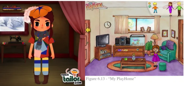
Fairy Tales by Toca Boca
This app is a dress-up game where the user chooses either a boy or a girl and then gives them different outfits. The shirts and pants can be changed in length and color and pattern with just a few drags.
16 Toca Doctor is a simple doctor-game, which aims to make doctor’s examinations fun and playful. In order to fix a broken leg, for instance, the user takes the two parts of the broken bone and slowly slides them together with their fingers.
Ocean Swimmer by Sago Sago
Ocean Swimmer is an exploratory game where the user gets to play a fish that lives in a little house in the ocean. By dragging their finger over the screen, the user is able to move the fish around in the ocean and visit different places and even other animals.
Weather by MarcoPolo
Weather is an educational game that teaches young children about the seasons and about different weathers. The user can switch between summer and winter,
between strong and soft winds, between sunny and rainy. Throughout all of this the user then gets to see the main character react to the weather.
17 Bamse is a game that is essentially a stage for multiple smaller games. It starts in a little village where each building leads to a small game, such as reading a book, drawing a picture, playing memory or watching a short video.
6.1 Result and analysis of the expert review
The above apps were analyzed based on a custom analysis pattern, which was based on the design patterns found in the studies from Microsoft (Hanna, L. et al., 1999) and from Korhonen et al. (2009).
• What are the visual cues used to highlight interactivity? • Are icons and symbols used in the interface?
• What kind of visual style is used to portray objects, people, rooms, etc.? • Are illustrations and animations used to make the game more engaging? If
so, how?
• What kind of visual perspective is used in the apps?
When written or spoken words can’t be used to instruct the user on what to do, designing instructions may become challenging. That is probably why there are many different solutions implemented in the apps that were analyzed. Looking at all of the five apps, there seem to be three different approaches to this challenge. In the apps “Weather” and “Fairy Tales” an instructional animation is shown in the beginning of each scene to show how the app is used. In the animation a floating hand clicks on several interactive elements to show what is possible in each scene (see Figure 6.1 and 6.2).
Figure 6.1 - “Fairy Tales” – a small hand is shown in the beginning of the scene that drags down the pants, visualizing that type of interactivity for the user.
Figure 6.2 - “Weather” - a hand is shown, clicking on different buttons and showing what they do in the beginning of the game. This shows the user how the game works right from the start.
In the apps “Ocean Swimmer” and “Bamse” free-play is used. For instance, in “Ocean Swimmer” the user can move their character anywhere on the screen without it being wrong or leading to a dead-end. By letting the character swim to
18 different places and tapping on different elements the user experiences a sort of trial-and-error type of gameplay. The same is true for “Bamse” (see Figure 6.3), where there is nothing that visually indicates interactivity, not even higher contrast or different levels of saturation (see Figure 6.4).
Figure 6.3 “Bamse” – The castle, the house and the characters on the right are all interactive, even though they blend in with everything else.
Figure 6.4 “Ocean Swimmer” – a tap on the sand-castle makes the fish destroy it and then makes a crab appear that rebuilds it.
In “Toca Doctor” a mixture of animation and visual highlighting is used to show which elements can be interacted with. There is an initial animation once the scene is loaded. For instance, when loading the scene of a broken leg bone, the two bone-halves slowly move apart from one another when the scene is first loaded. Additionally, the leg bones also have a strong shadow (see Figure 6.5), which is something that is used on all interactive elements throughout the game.
Figure 6.5 - “Toca Doctor” – An animation and a shadow together visualize interactivity.
Figure 6.6 - “Bamse” – A semi-transparent bubble is shown behind the outfit to indicate interactivity.
Something that is used in all of the tested apps, but not consistently so, is a round indicator that overlays interactive elements. These indicators are semi-transparent, and are used to show interactivity (See Figures 6.6, 6.7 and 6.8).
19
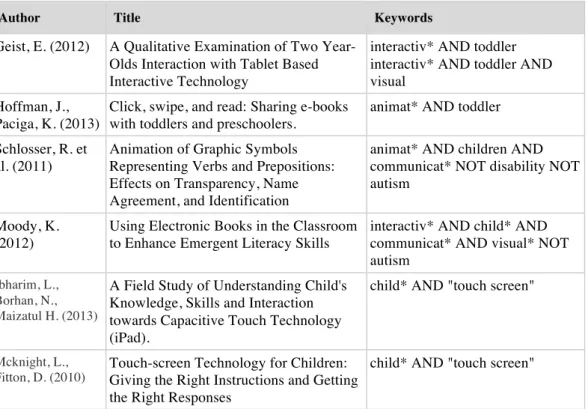
Figure 6.7 “Ocean Swimmer” – a round, sun-like, pulsating shape indicates that this is somehow an important spot. When moving the fish over the shape the other fish blows up its little body and swooshes through the water.
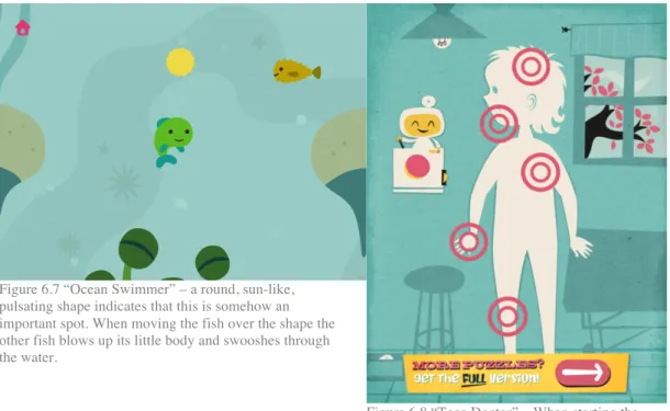
Figure 6.8 “Toca Doctor” – When starting the game the little guy on the left places five round indicators all over the this shape of a child’s body. Tapping on these indicators leads to the sub-scenes.
In all of the games, icons and symbols were used in some way. For instance, “Weather” and “Ocean Swimmer” use a little house icon on the top left as a way to navigate back to the beginning of the game. While inside of a sub-scene, “Bamse”, “Fairy Tales” and “Toca Doctor” use an arrow to indicate the navigation to the previous scene. And especially in “Weather”, symbols for all types of weather and winds are used.
Regarding visual style, the apps “Ocean Swimmer” and “Toca Doctor” have a very flat and simplistic style. There are only very few elements on the screen, which forces the focus on those elements that are present in the scene (See Figure 6.9 and 6.10).
20
Figure 6.9 - “Ocean Swimmer” – a simplistic style with flat colors is used in this app. The amount of elements and details are very limited to focus the attention of the user on key elements.
Figure 6.10 - “Toca Doctor” – flat surfaces and objects without a lot of detail (and a certain level of abstraction) create a visual focus on the hand and the thorns.
The apps “Weather” and “Bamse” have a visual design with a lot of detail (See Figures 6.11 and 6.12). In “Bamse” strong black borders are drawn around each element in the scene and small details are added to each object. The background is a high-contrast repeated pattern that may create a visual conflict with the rest of the elements in the scene. In “Weather” a painterly style is used, with gradients and semi-realistic color shifts in the trees and the grass. However, none of the objects in the scene cast a shadow.
Figure 6.11 - “Bamse” – A lot of details and a lot of elements fill the screen at any given time.
Figure 6.11 - “Weather” – There are a lot of GURESEARCH GROUPelements (both in the top and bottom) as well as a lot of elements in the scene.
21 Sound and animation is used in all of the examined apps. In the apps “weather”, “Fairy Tales” and “Ocean Swimmer” a lot of animations and sounds are used to keep the users engaged and focused. For instance, in “Weather” different animals fly by regularly that the user can drag around with their finger. The main character also moves around and looks at all the different interactive elements, while
sometimes making sounds like humming. In “Ocean Swimmer” the little fish blows bubbles every once in a while, which makes a sound. Also, he waves at the user to keep him/her engaged. There is always some sort of movement, like air bubbles rising in the background or other fish moving around and swimming by. In “Fairy Tales” the main character looks at different interactive elements in the scene and every once in a while makes a funny grimace at the user.
The visual perspective in most of the game was a flat 2D perspective. According to a study done by Ruland, Starren and Vatne (2007), children perceive their world differently than adults (p. 2). This means, that visual representation of the world (objects, rooms, characters) need to be adjusted to that view of the world and the child’s developmental stage. The expert review suggests that a flat 2D perspective is the most common way of visualizing the world for a young
audience. When the games show the inside of a room they usually show the room straight from the front, as though to mirror the way a room is perceived when standing inside of it.
In all of the below figures, the following perspective attributes were observed: • There are at least two sides of the room visible, the floor and the back
wall. Sometimes even the ceiling and the corner walls on the left and right are visible.
• The back wall is usually perpendicular to the viewing angle, meaning the users look straight at the back wall.
• Characters in the game have their face positioned in such a way that the complete face is visible to the user.
• In order to create the illusion of closeness or distance to the camera, certain objects and characters are moved down or up.
Figure 6.12 - “Fairy Tales”
22
Figure 6.14 - “Toca Boca”
Figure 6.15 - “Kai-lan’s Great Trip to China”
Figure 6.16 - “Dora’s Pony Adventure Game”
Figure 6.17 - “Dora the Explorer”
To summarize, when it comes to visual cues for interactivity, the games using the short introduction-animation (showing all the different types of interactivity) may have found the best solution. However, creating this animation is most likely very time-consuming and, in the case of this thesis, not possible to create within the timeframe. The games using a “trial-and-error” strategy, where there is no highlighting and the user needs to find interactive elements with interactivity, is presumably not suited for informational apps that aim to lead the user through multiple interactive scenarios. When it comes to visually highlighting specific elements, both the shadow effect in Toca doctor and the circular highlight used in
23 many other games was deemed good enough to ensure basic usability. The above assumptions will be tested in subsequent participatory tests.
Regarding visual style, a less cluttered and more focused approach is most appropriate for an app for three to five-year-olds (Olesen et al., 2006). Apps like “Weather” or “Bamse” have a more detailed style that could be regarded as more cluttered, which is not necessarily wrong. Still, according to Olesen et al. (2006) the clarity of the content is improved if there are less distracting elements on screen.
Lastly, sounds and animations might be a useful tool when creating an app for a young audience. In the apps above, a lot of sounds and animations are used in many different situations, which could be presumed (but not proven) to keep the users active and engaged and focused on the app. Some of these animations may even help the users figure out where to click next (for example in “Fairy Tales”, where the character looks at interactive elements every once in a while).
24
7 Initial prototype
The research described up until this point led to the creation of an initial prototype. How it was created will be described in this section. Due to spatial limitations, only those topics were included that later had an observable impact on the participatory tests.
The app was supposed to contain the following scenes according to the research group (Stålberg, 2014):
1. Waiting Room – where characters are placed together with a parent figure. The selection of a character leads to the next scene.
2. Seat-Selection – where the user chooses a seat for his/her character (either on parents lap, own chair or exam table). The selection of the seat leads to the examination room.
3. Examination Room – where the character undergoes multiple medical examinations. After all medical examinations are completed, the user returns to the waiting room.
Furthermore, the study included the creation of illustrations and animations that show different medical treatments, namely an examination of the heartbeat, an examination of the lungs (by breath sounds), a visual examination of the ear, retrieval of blood from the arm and retrieval of blood from the fingertip.
However, it is important to note that the app was not feature complete for the first test iteration of the participatory test. The reason for that was that the first
iteration was supposed to be conducted as soon as possible to find potential flaws early. Still, all the basic scenes and two out of five medical examinations were included in this prototype and ready for testing.
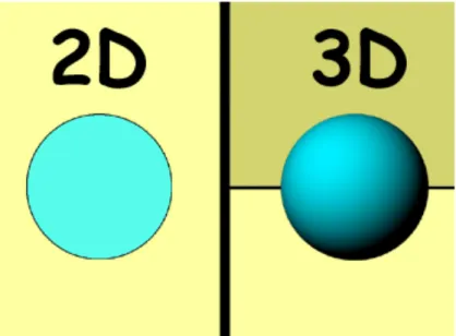
7.1 Perspective
Rooms, objects and characters can either be illustrated in 2D or in 3D. Illustrations that could be described with having a 3D style are those where shadows, color-gradients, realistic perspective, object shading and less vibrant colors are used (see Figure 7.1). The previously conducted expert review
suggested that many games for young children avoid these visual characteristics, making them more describable as having a 2D style with objects and people mostly shown from a straight-on viewpoint.
25
Figure 7.1 – 2D versus 3D: both images show a ball, but the ball on the left is one-colored and flat, and the ball on the right has a more 3D-like appearance due to the object shading.
7.2 The design of objects, rooms, characters and
situations
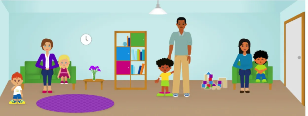
Based on the analysis of the expert review, the waiting room was designed with a front-facing perspective with few 3D elements (see Figure 7.1). The contents of the waiting room scene (and all the other scenes) where created based on an interview with the research group, where Stålberg (2004) gave instructions or provided reference photographs for the object included in the scene, the style of furniture, the wall and floor color and the placement of child-characters and their parents (Stålberg, 2014). Based on the scribble and the interview, the full
illustration for the app was created (see Figure 7.2).
26
Figure 7.3 - “Waiting Room” Illustration
Characters
Characters were illustrated with a flat, borderless style, and with few visual details (see Figure 7.4). Details were only added in order to make the characters less generic and more personable. There is no evidence or it, but it can be presumed that a character with single-colored clothing and flat hair is less interesting to a four-year-old child than a character with a print on their shirt, ruffled hair and two-colored shoelaces (see Figure 7.4). Also, simple shadows were added under the chin of each character and at the edges of their clothing to create a visual separation between the head and the upper body and to create the effect that the clothing is hanging loosely.
Figure 7.4 – the character of a boy in three different states: coughing, idle (but not entirely happy, because he is sick) and with a naked upper body, ready for a chest examination.
27
Using photo references
In order to create illustrations that are easily identifiable, they were illustrated closely to their real-world counterpart. In order to achieve this, the research group at MDH provided photographic material for reference (see an example with Figures 7.5 and 7.6).
Figure 7.5 – The reference image for all the tools used to take blood.
Figure 7.6 – The completed and interactive illustration for taking blood.
However, photographs are often very complex, for instance Figure 7.5 contains details such as a light glare on the vacutainer, strong shadows under the arm and under the blue sleeve, wrinkles on the glove and potentially distracting elements in the background. All of these details are non-essential for the process of taking blood, and thus are solely visual distractions, which according to Olesen at al. (2006) should be kept to a minimum when working with a young audience. In order to improve on that, these details were left out in the illustrations.
Furthermore, the blood in the above photograph is very dark, almost black, which may impair recognizability. In Figure 7.6 the color of the blood was adjusted to be a lighter wine-red, a more stereotypical depiction of blood.
Photographs were used as reference to increase recognizability, but the resulting illustrations were simplified and partially adjusted to reduce distraction and enhance recognizability.
7.3 Gender roles and stereotypes
Several of the illustrations used in this app can be considered stereotypes.
For instance, both neutral and stereotypical clothing was used in the app. One boy has on a pair of shorts, a wide t-shirt with a print on it and wide shoes with two-colored shoelaces. Another boy has a plain blue pair of pants and green shoes and a green shirt. One character of a little girl wears a pink dress with pink shoes, while another girl wears a simple yellow shirt, a green skirt and green shoes. Furthermore, racial stereotypes were used in the app, such as for a character of a little girl who has a curly afro, dark skin and dark eyes, a character of a little girl
28 who has blond hair and blue eyes, and a boy with black hair and light-brown skin, suggesting Arabic decent.
Moreover, two mothers and one father who accompany the young characters in the app. This is in line with a stereotype, where mothers take their children to the doctors more often than fathers (fathers being the bread-winners and mothers being the care-takers).
Lastly, the character of the doctor is depicted as a tall, broad-shouldered male with a long white coat and a stethoscope around his neck.
When creating illustrations that depict stereotypes, these stereotypes are
reinforced and even condoned. Wherever possible, boundaries should be pushed in order to reduce stereotypes and recognize individuality. However, these stereotypes were included, because the app needs to be as close to the user’s real situation as possible and relatable to the users according to the research group at MDH (Stålberg, 2014). In order to appeal to more children with different ethnic backgrounds, three different racial stereotypes were included, where Caucasian was included twice, once as male and once as female, because the app will primarily be used in Sweden. According to the researchers previous research, when it comes to the style of clothing, many girls and boys preferred characters with a colorful bow in their long hair or clothing with print on it over plain clothing (ibid). Furthermore, as this app aims to create a relation between the information on the screen and their real-life situation, Stålberg (2014) decided that there should be more mothers than fathers present in the waiting room, as this created a higher chance that the app would fit their personal situation (ibid). And lastly, the doctor was chosen to be male because, the research group claimed, that the majority of doctors that the children will meet in these situations would be male (ibid).
7.4 Interactive elements
For the initial prototype, an animated glow-effect (growing and shrinking over time) was placed around interactive objects to make them stand out. This was done to create contrast to other objects, which don’t have the same effect (see figure 7.7), based on the pop-out effects described by Ware (2008, p. 30).
Figure 7.7 – the building blocks in the middle are interactive, which is why they have a glow-effect around them. The figures left and right of it are not, which is why they do not have the effect. However, this effect did not work as expected and had to be abandoned.
29
7.5 The design of the back-button
A simple arrow-symbol was used to visualize the function to go backward, i.e. to return to the previous scene. This button was placed in two different scenes: the seat-selection scene and the medical examination scene (see Figures 7.9 and 7.10).
Figure 7.9 – Seat-Selection Scene: an arrow is placed in the bottom left corner, to return to the previous scene.
Figure 7.10 – Medical Examination Scene: an arrow is placed in the bottom left corner, to return to the previous scene.
7.6 Visualizing the examinations
Every Group of examinations contained four visual steps:
1. In the beginning of all the examinations on one character a list of all examinations is shown in the top right corner. This is called the
examination review throughout this study. As long as those examinations
have not been finished, the image representing each examination is greyed out.
2. In the start of an individual examination an image appears in the top left corner, which is a visual representation of the examination. This is referred to as the start button in this study. If the user taps on it with their finger, the examination begins.
3. Once the examination is started an interactive medical instrument appears that the user is supposed to drag to a specific location in order to complete the examination (for example: a stethoscope needs to be dragged onto the heart to be able to listen to it). Once the examination is complete, the
examination review on the top right is adjusted to show the newly
completed examination with a checkmark.
4. At any point the user may press on the back button to return to the waiting room.
30
Figure 7.11 – Medical Examination Scene: here you can see the “start-button” in the top left for the stethoscope examination, the examination review with an indicator for completed examinations in the top right, and the back button.
Figure 7.12 – Medical Examination Scene: In the bottom of the screen a hand appears, holding a stethoscope. The user needs to drag it onto the chest, where the lungs are represented with a blue glow that grows and shrinks over time.
Figure 7.13 – Once the examination is done, it is shown in the top right with a checkmark over it, indicating completion.
31
7.7 Timing
In the beginning of all the scenes the user gets to watch the scene unfold for a few seconds. For example, the waiting room scene does not fit on the entire screen on the iPad, so when the scene is initially displayed, only the left half of it can be seen.
Figure 7.14 – The left side of the waiting room. Figure 7.14 – The right side of the waiting room.
This was identified as a potential problem: maybe the end-user will think that there is nothing more on the right. So in order to show the user that the room expands to the right, and that there is more to do there, a visual effect was used in the beginning of the scene that moves the camera from the far left of the room to the far right of the room and back to the left again. The same applied for the second scene. In order not overwhelm the user with immediate motion, a still frame for one second was added before the animation started.
Figure 7.15 – The left side of the examination room. Figure 7.16 – The right side of the examination room.
32
8 Iterative participatory tests
The Iterative Participatory Test was included in this study based on the finding of the Microsoft Research Group (Hanna, L. et al., 1999), a study by Ruland, Starren and Vatne (2007) and the guidance of the research group at MDH (Stålberg, 2014). According to Ruland, Starren and Vatne (2007) participatory design is “an essential aspect of good design practice” (p. 2).
In the Microsoft Research Group it was established, that an iterative research process is done to ensure that the target audience truly understand the elements in the game, because they offer a way to determine the level of product appeal and because they help with gathering information about potential negative reactions (ibid, s. 7). These types of tests are done by testing certain features, revising them, and testing them again. The method is especially important when working with children as a target audience: any sign of distraction, disengagement or boredom should be taken into consideration when evaluating the test results (ibid).
Ruland, Starren and Vatne (2007) found, that participatory design as a research method is very well suited when creating software for children, because that method allows for a deeper understanding of the “children’s cognitive and emotional developmental stage” (Ruland, Starren and Vatne, 2007, p. 1). Moreover, they found that the children’s role in the design process is limited when it comes to usability (ibid). This means, that decisions regarding usability cannot be solely based on this method, and instead needs to be supplemented by further research.
Nine children between ages three and five participated in the study and were observed individually. Depending on the child’s level of extroversion, they were briefly interviewed afterwards in a non-structured interview. Due to ethical restrictions, the exact amount of girls and boys may not be disclosed (Stålberg, 2014). Three observations were conducted in each iteration of this method, taking 15-20 minutes each.
It was very important that the participants felt safe while performing the tests and that none of them felt that they have to participate. In order to be able to speak with the children and use them in the test, the parents had to be asked for
permission first. My research partner created a contract, which described in detail what the tests would include, how information will be gathered (using an audio recorder) and that the participants will stay anonymous in any study or article published based on the tests. Throughout these tests it was the responsibility of the researchers to keep an eye on the participants while performing the tests and interpret their reactions to see if they are comfortable or not. If a participant had indicated discomfort or that they do not want to continue, the test would have been stopped immediately. Furthermore, care had to be taken regarding the way that the participants were spoken to. It was important not to scare them or say things that confuse them or make them sad. Moreover, all the participants remained anonymous and any information gathered in the tests was treated securely and with a lot of caution.
33 In each session one participant was invited into an empty room in their
kindergarten, where the interview could be conducted mostly without external disturbance. The participant was then presented with the iPad and the open start screen of the prototype. Then, the participant was allowed to start playing and the observation started. From this moment onward, the child’s gestures, hesitations, and moments of distraction were observed, whether it was swiping instead of tapping on the screen, thinking and staring at the screen for a longer period of time, or going through the app without a problem. Throughout the session questions were asked such as “Do you know which room this is?” or “Do you know what it was that just happened here?” (when the participant had just done a medical procedure in the game). If a participant was stuck at any point in the app, a grown-up stepped in and helped out. After the participant had successfully performed all medical procedures for all the characters in the app, they were asked if they wanted to continue playing and redo some of them. If they said yes, further observations were conducted, but this time the information was less critical, as it was mainly the first-time usage that was interesting for this study. After the participant was done playing and he/she made the impression that they would be willing to answer to a few questions, he/she was asked some follow-up questions, such as asking about medical treatments that they might have had in the past, questions about blood and how they feel about it and being scared at the doctor. The session was then concluded.
The findings from this method were written down while the participant used the app and the entire session was recorded on audio tape. Since the participants mostly used the app quietly, an audio recording was not the most effective way of collecting data; for instance, a video recording would have been of more value. However, due to ethical restrictions other recording methods such as film were not allowed. As mentioned above, the participants were asked several questions throughout the testing session and afterwards. These questions aimed to reveal many things, such as how much of the information in the app was actually remembered by the participants, how images in the app were interpreted, what they liked and disliked about the app, etc. Sometimes a grown-up needed to help the participant proceed in the app if they were stuck. These moments were particularly valuable, as they showed which parts of the app need immediate improvement.
Based on the qualitative nature of this study, data processing was done
descriptively. First the data needed to be aggregated. Valuable observations such as difficulties, lack of interest and lack of recognition were grouped together and categorized. This revealed, which problems were common among the participants. Furthermore, attention was paid to situations, where only one participant was stuck and others proceeded without a problem. There were times when the participants repeatedly tried to interact with elements in a way that was not recognized correctly by the system. If possible within the time constraints, these types of problems were also collected and resolved.
8.1 Iteration 1
34 8.1.1 Observations of iteration 1
In this testing iteration a lack of engagement could be observed frequently, whether it was due to an error or due to perceived boredom. Since no prior research had been conducted regarding the appropriate timing and speed for an app for children, the prototype has been built under the assumption, that children look at each scene as it unfolds, similar to looking at a TV screen, and only if asked or after careful inspection put their finger on the screen to interact with the app. This assumption was wrong. Two out of three participants started tapping on the screen right a way - even before certain animations were finished in the app - interacting with a lot of things without knowing what those interactions would result in. One participant looked away and did other things as though she was bored. Furthermore, one participant did not once drag the camera in the waiting room or the examination room, even though the app had presented the entire room in the beginning of the game. This participant would’ve missed a lot of
interactivity had it not been for a grown-up stepping in and showing the participant what to do.
When it comes to the visual properties of interactive elements, two things could be observed. For one, the glow effect mentioned in an earlier chapter did not work as expected for two out of three participants. The expected behavior was that the participants’ focus would be immediately be drawn to the glowing elements and that they then would choose to interact with them. However, two out of three participants ignored these elements completely and instead pressed on things that had no interactivity at all (like the clock on the wall or the books in the bookcase). It was as though they had no visual focus, which could mean that the glow-effect was not an effective pop-out effect. Furthermore, two out of three participants did not use the back-button (a backward-pointing arrow to symbolize “return to previous scene”); they did not use it to return to the waiting room. Because this was necessary to proceed inside the app, this behavior created a full stop in the tests, so a grown-up had to step in and help out. One participant proclaimed that it didn’t want to go *back*, it wanted to go *forward*.
When it came time to test the different examination-scenes, additional difficulties could be observed. The “start button” in the top left corner was not used by any of the participants, creating a full stop where a grown-up had to step in every time. This may have been due to size or due to a lack of visual pop-out. Also, one participant continuously pressed on the elements in the top right instead of using the interactive elements in the scene, even though the elements in the top right are just supposed to give visual feedback on completeness of the examinations. Furthermore, two out of three participants did not use the interactive examination tool in the way that was intended. Instead of grabbing it with one finger and dragging it to the target location, one participant tried pressing on it instead and waited for a reaction from the app (which did not happen) and another participant pressed on the target location instead. Fortunately, all three eventually tried dragging the tool toward the target without any outside help and succeeded. Overall, no problem could be observed when it came to recognizing rooms and objects in the app. This was observed with the help of questions that were asked during the test and at the end of it:
35 • Do you know what this room is? (Pointing at the waiting room)
• Do you know what this room is? (Pointing at the examination room) • Do you know who this person is? (Pointing at the doctor)
One participant could answer all of these questions and another participant answered everything, except he said “doktorrum” (translates to “Doctor’s room”) for examination room. Unfortunately, one participant was very shy, and did not answer the questions, so that participant’s level of recognition could not be evaluated.
8.1.2 Analysis of Iteration 1
The first test iteration showed, that the participants did not seem to have the patience to sit through the several educational camera and character animations, but would instead tap and drag on the screen right away. Two participants would even look away from the screen and do something else. However, these
animations were added for a reason. The participants have to be educated about the length of the waiting room; otherwise they might not see all examinations for all the characters in the app. At the same time, the animations are not created in such a way, that the participants’ focus stayed on the app, waiting for the
animation to finish. In order to reduce the risk of failure and errors, a solution was implemented, that prevents all interactivity in the app until the entire animation is finished. That way the users can tap on the screen as much as they wish, this behavior will not have any results until the animation is finished. However, this does not change the level of engagement of the user while animations are player. In order to find a solution for that, all the down-times in the app (i.e. when the app is completely still, for instance the one-second-freeze before the waiting room camera animation and the freeze before the seat selection animation) were reduced by 40% for the next iteration.
Since the first version of the pop-out effect – an animated glow effect – did not work as expected, another pop-out effect for interactive elements had to be designed. To find a way to improve the effect, “Visual thinking for design” by Colin Ware (2008) was consulted again and the different pop-out effects were reevaluated. Ware (2008) claims that the most successful visual pop-out effects are those that use some form of motion (p. 36). Looking back at the expert review, a circular overlay was used in many of the reviewed apps. Inspired by this
approach, the new choice was a circular highlight (animated over time to grow and shrink) that was placed on top of or behind interactive elements (see figures 8.1 and 8.2) which was included in iteration two for further testing.
36
Figure 8.1 - circular highlight in the waiting room scene.
Figure 8.2 - circular highlight in the seat selection scene.
In order to eliminate the “back button” as a single point of failure, but still keep it around for those users who would like to use it, additional options were added to go “backward” in the game. For instance, once an examination is finished, the entire screen listens for touch events and sends the user back to the waiting room when any part of the screen gets tapped. Additionally, the back button was adjusted in such a way that it will be hidden until all of the examinations are finished to improve the participant’s focus on those examinations.
In order to improve the usability for the examinations three things were adjusted: the start button in the top left (see Figure 8.3), the examination review area in the top right (see Figure 8.4) and the examination tool. In order to give the start
button more of the participant’s focus, an animated highlight-circle was placed
behind it. Moreover, the button is animated over time to grow and shrink as well as rotate, because motion is an effective pop-out effect according to Ware (2008, p. 36). In order for the examination review to be less distracting it was adjusted so that it is hidden it until the first examination is finished. Then, an indicator for only the completed examination appears in the top right and the next examination can begin (see Figure 8.4). Finally, for increased usability for the examination
tool, a circular highlight was placed on top of it just like for all the other
interactive items.
Figure 8.3 - circular highlight behind the start button for each individual examination.
Figure 8.4 – as the next examination starts, an icon appears in the top right, indicating which
examinations are completed for this character.
37 For the next Iteration three new examinations were added. Information about these examinations was gathered through a workshop with the research group, who has many years of experience working as a nurse in a children’s hospital in Stockholm.
Otoscope examination
In this medical examination, an otoscope is used to look inside the ear of a patient, to check for infection or other problems. Since the examination focuses on the ear of the patient, the scene begins with a close-up, which only shows the patient’s right side of the upper body (see figure 8.5). The interactive element in this
examination is a hand holding an otoscope, which appears to the left of the screen. Meanwhile, the ear of the patient is highlighted with a circle, to indicate the target for the otoscope. Once the user drags the otoscope to the ear, interactivity stops and the otoscope animates to the final target position. Then the doctor’s face appears, moving closer to the otoscope and finally looking through it (see figure 8.6).
Figure 8.5 - Otoscope examination – an interactive hand holding an otoscope appears on the left.
Figure 8.6 - Otoscope examination – once the user moves the otoscope in the right place a doctor appears on the left, looking through the otoscope.
Blood retrieval from the tip of the finger
Blood retrieval from the tip of the finger is the first multi-step examination, meaning it has multiple subsequent elements that are interactive. In the beginning a hand appears holding a tool called lancet and the screen zooms in close on the patient’s hand. A highlight circle is placed on one of the patient’s fingers (see figure 8.7). Once the lancet is successfully dragged onto the target finger, it moves into place and the doctor’s finger presses the button, which in turn makes a small cut into the patient’s finger. This visualization is accompanied by a “click” sound, similar to how it sounds in the real world. Then the lancet disappears and a little drop of blood appears on the fingertip of the patient (see figure 8.8). After that a small vial appears (non-interactive), which collects the blood sample (see figure 8.9). The last step is that an interactive bandage appears, which can be dragged on the finger (see figure 8.10). Once it is in the right place, it folds around the finger and the examination is complete.
38
Figure 8.7 - Lancet examination – an interactive hand holding a lancet appears on the left.
Figure 8.8 - Lancet examination – once the user moves the lancet in the right place, it disappears and a drop of blood appears on the finger.
Figure 8.9 - Lancet examination – an animation shows a vial that appears at the finger and disappears together with the drop of blood, indicating that the drop of blood is now collected.
Figure 8.10 - Lancet examination – the last step is that a bandage appears, which needs to be dragged on the finger.
Blood retrieval with a vacutainer
Blood retrieval with a vacutainer is the second multi-step examination. In the beginning, the patient needs an anesthetic patch (EMLA-patch) placed on the area that the blood gets drawn from (Stålberg, 2014). After one hour the patch gets removed and the blood can be collected. First, an interactive needle appears, that needs to be dragged into the target area. Second, the vacutainer appears, and needs to be placed inside of the plastic cover attached to the needle. Once it is attached, blood appears in the vacutainer. After a few seconds, everything disappears and an interactive bandage appears, which can be dragged onto the target area. Once all of these steps are done, the examination is complete.
39
Figure 8.11 - Vacutainer examination – before the examination can begin the start button appears in the top left. Also, the patient has several EMLA-patches, which is how it often is in real life situations, because the doctors don’t know which area is best for retrieving blood.
Figure 8.12 - Vacutainer examination – The needle is placed onto the target area and the vacutainer appears to be dragged inside of the plastic shell.
Figure 8.13 - Vacutainer examination – Once the vacutainer is attached, the vacuum inside sucks in the blood.
Figure 8.14 - Vacutainer examination – The examination is completed with an interactive bandage.
8.2 Iteration 2
In this iteration three participants (ages four and five) participated. Of those participants, all had not been interviewed previously, meaning they had no previous experience with the app.
8.2.1 Observations of iteration 2
The reduction of downtime and the lack of interactivity in animations made things happened on the screen right away without being destroyed or interrupted through direct interactivity. In this iteration, two out of three participants seemed to stay better focused and seemed to understand what the app tried to show them, which may have had to do with the changes to the downtime. However, since these participants were new, they might have stayed more engaged even with the old timings.