Graphical system visualization
and flow display
A visual representation of an
authentication, authorization, and
accounting backend
JOAKIM AF SANDEBERG
DEGREE PROJECT IN INFORMATION TECHNOLOGY, SECOND LEVEL STOCKHOLM, SWEDEN 2016
K T H R O Y A L I N S T I T U T E O F T E C H N O L O G Y
Graphical system visualization and flow display
A visual representation of an authentication, authorization, and accounting backend
Joakim af Sandeberg
Master of Science Thesis
Communication Systems
School of Information and Communication Technology KTH Royal Institute of Technology
Stockholm, Sweden 28 July 2016
c
Abstract
Displaying the architecture of a software system is not a simple task. Showing all of the available information will unnecessarily complicate the view, while showing too little might render the view unhelpful. Furthermore, showing the dynamics of the operation of such a system is even more challenging.
This thesis project describes the development of a graphical tool that can both display the configuration of an advanced authentication, authorization, and accounting (AAA) system and the messages passed between nodes in the system. The solution described uses force-based graph layouts coupled with adaptive filters as well as vector-based rendering to deliver a view of the status of the system. Force-based layout spreads out the nodes in an adaptive fashion. The adaptive filters starts by showing what is most often the most relevant information, but can be configured by the user. Finally, the vector based rendering offers unlimited zoom into the individual nodes in the graph in order to display additional detailed information.
Unified Modeling Language (UML) sequence charts are used to display the message flow inside the system (both between nodes and inside individual nodes). To validate the results of this thesis project each iteration of the design was evaluated through meetings with the staff at Aptilo Networks. These meetings provided feedback on the direction the project was taking as well as provided input (such as ideas for features to implement).
The result of this thesis project shows a way to display the status of an AAA system with multiple properties displayed at the same time. It combines this with a view of the flow of messages and application of policies in the network via a dynamically generated UML sequence diagram. As a result human operators are able to see both the system’s architecture and the dynamics of its operation using the same user interface. This integrated view should enable more effective management of the AAA system and facilitate responding to problems and attacks.
Sammanfattning
Att visualisera arkitekturen av ett mjukvarusystem ¨ar inte l¨att. Visas all tillg¨anglig information s˚a blir vyn f¨or komplicerad medan ifall f¨or lite visas s˚a blir vyn on¨odig. Att samtidigt visa dynamiken som uppst˚ar n¨ar systemet arbetar ¨ar ytterligare en utmaning.
Detta examensprojektet beskriver hur utvecklingen av ett grafiskt verktyg, som b˚ade kan visa konfigurationen av ett avancerat autentisering-, till˚atelse- och bokf¨orings-system (AAA) och meddelanden som skickas mellan noder i systemet. L¨osningen anv¨ander en kraftriktad graflayout tillsammans med adaptiva filter och vektorbaserad rendering f¨or att visa en vy av systemets status. De adaptiva filtren b¨orjar med att visa den information som oftast ¨ar mest relevant men kan st¨allas in av anv¨andaren. Nyttjandet av vektorbaserad grafik tillhandah˚aller obegr¨ansade m¨ojligheter f¨or anv¨andaren att zooma in p˚a delar av grafen f¨or att visa mer detaljerad information.
UML sekvensdiagram anv¨ands f¨or att visa medelandefl¨odet inuti systemet (b˚ade mellan noder och inuti noder).
F¨or att utv¨ardera resultatet av examensprojektet blev varje iteration av designen utv¨arderad vid m¨oten med personalen p˚a Aptilo Networks. Dessa m¨oten gav ˚aterkoppling p˚a vilken rikting projektet tog samt input med t. ex. id´eer p˚a nya egenskaper att l¨agga till.
Resultatet av detta examensarbete visar ett s¨att att visa statusen f¨or ett AAA system med m˚anga av systemets egenskaper visade samtidigt. Det kombinerar detta med en vy av fl¨odet av meddelanden och applikationpolicies i n¨atverket via ett dynamiskt genererat UML sekvensdiagram. Resultatet av detta ¨ar att m¨anskliga operat¨orer kan se b˚ade systemets arkitektur och dynamiken i hur det fungerar i samma gr¨anssnitt. Detta gr¨anssnitt b¨or m¨ojligg¨ora mer effektiv hantering av AAA systemet och underl¨atta l¨osningar p˚a b˚ade problem i systemet och attacker mot systemet.
Acknowledgements
I would like to thank Aptilo Networks for providing the project opportunity for this thesis project and in particular Chris Steinbach for providing valuable insight into the ALE configuration system. I would also like to thank my examiner Gerald Q. Maguire Jr. for examining me and providing feedback on my work.
Contents
1 Introduction 1
1.1 Background . . . 1
1.1.1 About Aptilo . . . 1
1.1.2 Large scale networks . . . 2
1.2 Problem . . . 3 1.3 Purpose . . . 3 1.4 Goal . . . 4 1.5 Sustainability . . . 4 1.5.1 Ethics . . . 5 1.6 Method . . . 5 1.7 Delimitations . . . 5 1.8 Outline . . . 6 2 Theoretical background 7 2.1 Large scale Wi-Fi systems and networks . . . 7
2.2 Aptilo Long term Evaluation (ALE) system . . . 8
2.2.1 Different types of protocols . . . 8
2.2.2 Application groups . . . 10
2.2.3 Adapters . . . 11
2.2.4 Tracing in the ALE system . . . 11
2.3 Important properties for graph visualization . . . 11
2.4 Force based graphical layout . . . 12
2.4.1 Slowdown when nodes are nearing their equilibrium . . . 12
2.4.2 Coarse pre-positioning of nodes . . . 13
2.5 Other possible techniques to enhance readability. . . 13
2.5.1 Edge clustering . . . 14
2.5.2 Filtering . . . 14
2.5.3 Different types of shared property representation . . . 14
2.5.4 Other approaches to represent shared properties . . . 16
2.6 Detect if a graph is easily readable . . . 16
2.7 UML Sequence Chart . . . 19
viii CONTENTS 2.8 Ruby on Rails . . . 20 2.8.1 View layer . . . 20 2.8.2 Controller layer . . . 21 2.8.3 Model layer . . . 21 2.9 Javascript . . . 22 2.9.1 Sigma.js. . . 22 2.9.2 cardinal-spline-js . . . 24 2.9.3 D3.js . . . 25
2.10 Interface to ALE system’s data . . . 25
2.11 Development at Aptilo and Bugzilla . . . 26
2.12 Working model . . . 27 2.12.1 Kanban . . . 27 2.12.2 Extreme programming . . . 28 3 Method 31 3.1 Literature study . . . 31 3.2 Related work . . . 31
3.3 Presenting mockups and prototypes . . . 33
3.4 Retrieving information . . . 34
3.4.1 Parsing the retrieved elements . . . 34
3.5 Creating abstractions . . . 34
3.6 Displaying the information . . . 35
3.6.1 Node properties displayed within nodes . . . 35
3.6.2 Common properties as areas instead of links. . . 36
3.6.3 Link status as dots upon the links . . . 38
3.6.4 Active legend . . . 39
3.6.5 Layout engine. . . 40
3.7 Generating flow information . . . 41
3.7.1 UUID-tracking . . . 41
3.7.2 Tracking counter . . . 42
3.7.3 Parsing the log . . . 43
3.8 Displaying flow as a sequence chart . . . 44
4 Result evaluation 47 5 Presentation of results 49 5.1 Images of the graphs shown inside the web GUI . . . 49
5.1.1 Examples of the sequence diagrams . . . 55
CONTENTS ix
6 Analysis 59
6.1 Analysis of the graphs inside the web GUI . . . 59
6.2 Analysis of the sequence diagrams . . . 60
6.3 Analysis of the artificial neural network’s result . . . 60
7 Conclusion 63 7.1 Discussion. . . 64
7.2 Future work . . . 64
Bibliography 67 A Task description from Aptilo 71 A.1 Introduction . . . 71
A.2 Requirements . . . 71
A.2.1 ALE System Visualization . . . 72
A.2.2 Overlays . . . 72
A.2.3 Flow Visualization . . . 72
A.2.4 Message Flow Diagram . . . 73
A.2.5 Policy Flow Diagram . . . 73
Appendix B
List of Figures
2.1 An overview of Aptilo SMP’s interaction with the internet. The
core of Aptilo SMP is the ALE system[1]. . . 9
2.2 An animation sequence for an edge-clustering process. Color is used to encode edge directions[11].. . . 14
2.3 Two kinds of system property representations. The two graphs present the same information but in two different ways. . . 15
2.4 Displaying properties both as links and as grouping. The nodes are grouped by their respective site into site 1 and site 2. It is now clearly visible that the blue and green properties are each only present at one site each (site 1 and site 2, respectively) while the red feature is shared between the two sites.. . . 16
2.5 Graph showing the error of the neural network during learning. The graph is generated by default by Neuroph when training a network. A full iteration is considered when all images in the learning set has been passed once. This means that 1/30th of an iteration is the same as the network analyzing one image, when 30 images are used in the training set. The setup used when generating this graph is presented in Section 5.2 on page 58. . . . 18
2.6 Example of ordering of a waffle as UML sequence chart. . . 20
2.7 An example of a node’s structure overlaid onto a node to create a graph within a node. . . 23
2.8 A line drawn through a set of points. The image (to the left) shows the straight lines between points before cardinal-spline-js is used and the resulting curve (to the right) after cardinal-spline-js has been used. . . 25
2.9 Picture of the priority board during this project . . . 28
2.10 Flowchart for a typical XP approach . . . 29
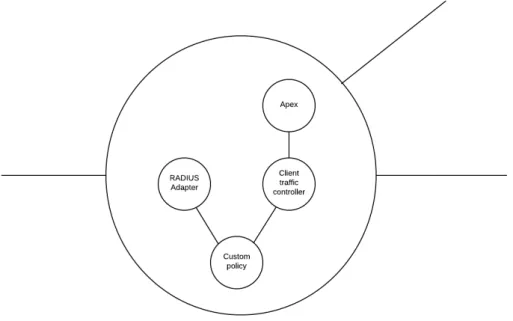
3.1 A node within the graph with its properties displayed. . . 36
3.2 An example of a graph with colored dots at the end of the edges. . 38
3.3 A layout created with the modified version of forceAtlas2 algorithm. 40
xii LIST OFFIGURES
3.4 An example of the sequence diagram for a group of log entries. The log is displayed to the left and the corresponding sequence diagram to the right. The log only shows the relevant messages, and their relative timestamp. . . 43
4.1 A graphical representation of the neural network. The values and color of the neurons show how much they each influence the final result. . . 48
4.2 A graph representing the error when training the neural network. The error decreases as the network adjusts itself to the input. An error tolerance of 1% is used. The exponential trend line to the data has the equation y = 0, 2164e−0,393xand R2= 0, 997 . . . 48
5.1 A view of how the webpage might look inside the Aptilo web GUI. 50
5.2 A view of the graph grouped by application group and site. The external nodes in the system are visible as green dots. The system nodes are the squares with each application group forming a complete graph. . . 51
5.3 The settings menu below the system graph . . . 52
5.4 Images of the settings menu which is displayed below the graph and the active legend which is displayed to the right of the graph. . 53
5.5 Images displaying the different node types as well as the different edge representations. If the user zooms in on a node, they can see all of the properties of that particular node. This information is also available in the active legend if the user clicks on the node. . 54
5.6 A view of the webpage when displaying a message or policy sequence diagram. The currently shown view shows a message sequence. The settings box above the diagram shows the last four characters of the UUID, trace number, timestamp, and the first message in the sequence for each sequence found. There are three different events visible in this figure. Events are shown further down the webpage if the user scrolls. . . 56
5.7 Example of a sequence of function calls inside the policy engine. The labels above are either of the function being called or the function it returns from depending on if the line is solid or not. . . 57
5.8 Graph showing the results from the neural network measurement done before each demo meeting. The value represent how similar the graphs generated were to the graphs the neural network had trained on. The error bars shows a 95% confidence interval. . . 58
List of Source code listings
3.1 Code to display an area behind a set of nodes in Sigma.js . . . 36
3.2 Code to display colored dots on the links between nodes in Sigma.js 38
List of Acronyms and Abbreviations
This document requires readers to be familiar with some technical terms relevant to the thesis. Below is a list of these terms.
AAA Tripel-A system. A networking system that handles Authentication, Authorization, and Accounting. This system keeps track and controls the users access to network resources.
Adapter An interface to the ALE system which can receive and send information, either inside the system or to external networks via protocols such as RADIUS. One adapter can be linked to more than one node for redundancy. ALE Aptilo Longterm Evolution. A network backend and
AAA system developed by Aptilo Networks.
Application Group One or more nodes in the ALE system which together provides an application such as a database or history storage.
JSON Javascript Object Notation. Data structure used to store virtual objects.
Node This term refers either a vertex inside a graph or a machine in the ALE system, depending on context. Protocol Either a networking protocol or a way to evaluate
information flowing to an adapter in the ALE system, depending on context.
Regular Expression Regex. A search pattern used to match specific text inside a string of text. Support special characters such as [0-9] for numbers between 0 and 9, [a-zA-Z] for any lower or uppercase letter between a and z and + (plus
xvi LIST OFACRONYMS ANDABBREVIATIONS
sign) for one or more characters of a given match. As an example, the regex ([a-zA-Z][0-9]+) will search for all strings containing a sequence with one or more letters followed by a number of any length, e.g. test0312 but not monkey or 13214test.
Ruleset One or more rules associated with an Application Group. The rules in the ruleset determine how to process information inside the Application Group. SVG Scalable Vector Graphics. An image format which
stores images as vectors instead of pixels.
Web GUI Web Graphical User Interface. The Web GUI referenced in this report is the web interface through which the ALE system is monitored and configured.
Chapter 1
Introduction
This thesis is the result of a thesis project carried out at Aptilo Networks A graphical system overview has been added to their Wi-Fi and cellular backend service to make it easier to administer. The graphical system overview is designed to display relations in the network as well as information flows inside this network. Each flow displays which components of the system are communicating and what data is being sent between them. The system also displays in detail what happens to specific ”traced messages” inside the system. These details can be shown both for individual servers and between servers.
1.1
Background
This section will describe Aptilo Networks as a company, why large scale networks are needed and the characteristics of these large scale networks, in particular Aptilo Networks’ technologies.
1.1.1
About Aptilo
Aptilo Networks[1] is a company headquartered in Stockholm, Sweden, that produces and markets software systems to manage mobile data and Wi-Fi services for 3G, LTE, WiMAX, Wi-Fi, and fixed broadband networks, including solutions for mobile data offloading using Wi-Fi. Aptilo’s service management platform controls billing, along with user services and access to the network. The company offers service management and policy-based control solutions for both telephony network operators and Internet service providers(ISPs). In addition to its headquarters, Aptilo has regional offices in Kuala Lumpur, Malaysia; Dallas, Texas; and Dubai, United Arab Emirates[2].
2 CHAPTER 1. INTRODUCTION
1.1.2
Large scale networks
Large scale network systems are becoming more and more prevalent in today’s society. For example, in the UK there is one Wi-Fi hotspot for every 11 people and worldwide there is one for every 150 people[3]. Many of these hotspots are connected to larger networks administered by ISPs and wide area cellar network operators. To administer these systems a backend is used to verify users, keep track of sessions, and connect the various types of hotspots to the network operator’s network. These hotspots may support various protocols, differ in their behavior, and be spread over large geographical areas.
In order to manage large scale Wi-Fi systems, Aptilo Networks has created a platform called the Aptilo Service Management PlatformTM (SMP)[4] which consists of user portals, billing system, and an authentication, authorization, and accounting (AAA) service. This service management platform is realized using the Aptilo Long term Evolution (ALE) architecture. This architecture has three layers: management, control, and execution. The management layer is used for configuration and monitoring. The control layer interacts with external systems to control these systems using protocols such as RADIUS, DIAMETER, BGP, SNMP, SOAP/XML, etc. The execution layer provides application logic processing.
According to Chris Steinbach of Aptilo[5] SMP system handles all the routing and control of the network. A typical SMP deployment consists of between one and several dozen SMP nodes as well as connections to external nodes (such as Wi-Fi access points or cellular basestations). Each of the SMP nodes handles one or more services, such as policy and service control, session storage, client traffic control, or database storage.
In addition, Chris Steinbach said that each of the SMP nodes may also have one or more adapters to handle communication between SMP nodes or with external nodes. Such adapters include an HTTP adapter, RADIUS adapter, and DHCP adapter. Each node also has several additional properties, such as which site it is at, what different protocols it can handle, and its current load. To get a full grasp of of the system with all the different connections and protocols interacting, a graphical representation is needed. This graphical representation can present different views depending on whether the user wants to see the structure of the system or to follow a sequence of messages due to a given interaction with a user.
1.2. PROBLEM 3
1.2
Problem
The number of SMP nodes and external nodes (typically ranging between 5-50 SMP nodes, 10-200 external nodes) makes it infeasible to present all of the available information at once, thus some abstractions need to be made. The problem with such abstractions is that important information may be lost and some abstractions might make the status of the system harder to understand instead of easier.
The location of the nodes in the graph must be considered. The graph might have multiple desired properties that have to be weighed against each other and a balance between these properties has to be found. For example, it might be desired that nodes sharing a property (for instance their geographical location) should be positioned close to each other, but this might lead to more edges crossing inside the graph making the edges harder to follow. This means that a balance has to be found in which these nodes might be positioned close together but without voiding some other condition for instance minimizing the number of edges that cross. Due to the large number of users and high amounts of traffic it might be hard to identify specific traffic and to monitor the flow of information between nodes inside the system. However, a desirable feature is that a network administrator can turn on a trace flag to identify the traffic of a specific user or protocol, e.g. RADIUS authenticates. This traffic can then be displayed to show how this traffic flows through the system, while highlighting where any errors occur along the way.
From this problem a problem statement arises in the form of:
How can a program best present a schematic high-level overview of the SMP system, combined with a (possibly dynamic) traffic overlay?
1.3
Purpose
The purpose of this thesis is to describe the development and functions of a tool which represents a high-level overview of a distributed system with many different properties and protocols for each node. Additionally, the tool can present dynamic data about traffic propagating through the network.
4 CHAPTER 1. INTRODUCTION
1.4
Goal
Aptilo has clearly stated a set of requirements about how the graphical overview system should function and look. These requirements can be seen in appendix
A. Note that in this appendix an SMP instance implemented using the ALE architecture is referred to as an ALE system (this same convention will be followed in the rest of this thesis). As stated by Aptilo, the key requirements are:
• “The ALE management interface MUST provide a consolidated, schematic high-level overview system configuration including ALE nodes, and external nodes, node groups and networks.”
• “Given that some ALE installations will be complex, involving many nodes, it MUST be possible to control the level of detail[...]”
• “It SHOULD be possible to generate diagrams exposing system behaviour from user trace [...]”
These requirements constitute the goal of this project.
The finished tool will be integrated as an addition to their ALE management web Graphical User Interface (GUI) where two new pages will be added. One with the flow view and one with the network overview. These two pages will be combined to one if it is deemed feasible.
1.5
Sustainability
The environmental impact of the work described in this thesis can be considered benign. A better system overview will lead to a system with a more even load over the system and easier identification of bottlenecks. With this increased information the administrator will be able to expand the system only at the points where it is actually needed. This leads to fewer servers that needs to be kept running and this means less power consumed. The economic impact of the tool should be positive for the company as this tool should help make their system more attractive to their customers. Moreover, the societal impact should be positive as the administrators will be able to better analyze problems with the system, hence more quickly resolve problems; therefore, providing better service to the end users. The increased use of mobile data offloading using Wi-Fi has a very positive benefit for the end users in terms of longer operating times for their devices and in some networks lower cost for the service. Moreover, mobile data offloading means that there is less emitted radio energy over a large area, benefiting society.
1.6. METHOD 5
1.5.1
Ethics
Special caution has to be taken when choosing how to do the evaluation of the thesis project as well as how information about the ALE system is described. No trade secrets about the ALE system will be mentioned, but enough detail has to be described to ensure that the reader understands the solution to the problem and how it enhances the existing ALE product. Additionally, the evaluation has to be done in a general and objective manner and critically analyzed. In this way aspects of the tool that are relevant to others and to other problems can be presented in fair and balanced way, potentially leading to the adoption of these elements in other tools and systems.
1.6
Method
The method adopted in this thesis project is the design science method using iterative design, implementation, and evaluation of a prototype. Each prototype will be demonstrated to the product development team at Aptilo and their comments will be combined with an artificial neural network to form an opinion of the current design. The process is iterated to improve the prototype until it has fulfilled the project’s goal. The information from the series of evaluations will be analyzed using an inductive approach to form a conclusion. A qualitative approach will be used during meetings with Aptilo before reaching the final result, and finally a quantitative assessment will be done through the use of an artificial neural network to evaluate the final result.
1.7
Delimitations
This thesis will be limited to only looking at a representation of the system in a graph form with nodes and edges. No other type of system representation will be analyzed. The graphical representation will only be for rather small systems with approximately 50 nodes instead of large systems containing thousands of nodes. This means that some available graph abstractions will not be applicable to the project since some abstractions are only usable for larger systems.
The thesis will only focus on systems where each node has many shared properties and to be displayed at the same time. In a traditional graph each pair of nodes only might be connected or not.
The flow view will be specific for the ALE system and will only show traces of packets starting with a specific trigger event within the system. No traces between
6 CHAPTER 1. INTRODUCTION
external nodes will be done since the external nodes’ program code can not be modified by Aptilo to ensure correct logging of the trace.
1.8
Outline
Chapter 2 will give a theoretical background to this thesis project. The key technologies used will be described and the current state of the art will be presented. The beginning of the chapter describes AAA networks and the ALE system. In the middle of the chapter graph visualization techniques are described along with how to analyze if a graph is easily readable and a description of the UML sequence diagram. The end of the chapter goes on to describe the different programming libraries and frameworks used to implement the solution.
In Chapter 3 the method for the work conducted is described. The beginning of the chapter describes how the literature study was done and what related work were found. The working methods used, Kanban and Extreme Programming (XP), are then described. The chapter describe how the rest of the work was conducted, starting with the presentation of mockups, how the graph was generated and displayed, and finally how the messages flows in the system were identified and displayed.
Chapter 4 explains how the evaluation of the result was done. The first part of the chapter describes the program Neuroph [6] which was used to create an artificial neural network to evaluate screen images with. The second part describes how the meetings with the staff at Aptilo were used to evaluate the work.
Chapter 5 the presents the results. Images of the different views that have been generated are displayed together with descriptions of how the user may interact with them. First images of the system overview is displayed, which shows a graph of the system together with a legend. Second images of the UML sequence diagram is shown.
In Chapter 6 an analysis is done of the data gathered from the artificial neural network. A graph of the results generated from the network is presented and its values are discussed.
Chapter 7 gives a conclusion to the thesis project. First a summary is given and then which goals were completed are mentioned. Next a final statement from Chris Steinbach is displayed. Lastly a discussion of the thesis project is given and future work for the tool developed is suggested.
Chapter 2
Theoretical background
This chapter will describe all of the theory underlying this thesis. The chapter begins with a summary of large-scale Wi-Fi systems and networks. This will be followed by short summary of some of the protocols relevant to this thesis project. Next the ALE system is described. Section 2.4 summarizes some important properties of graphs, while Section 2.5 presents the concept of force based graphical layout. Section 2.6 describes some techniques to enhance graphical layouts, while Section 2.7 discusses how we can evaluate whether a graph is readable. Section 2.8 describes a UML sequence chart. Section 2.9 describes the Ruby on Rails programming environment and Section 2.10 describes Javascript – as these formed the basis for the implementation. The last Sections 2.11 and 2.12 describe the how software development at Aptilo is structured and the working models that were chosen for this thesis project.
Appendix B was used to provide good and bad examples of graphs for training of the artificial neural network. Details of artificial neural networks can be found in standard textbooks on the subject, such as Christopher M. Bishop’s ”Neural networks for pattern recognition”[7] and ”Pattern Recognition and Machine Learning”[8] by the same author.
2.1
Large scale Wi-Fi systems and networks
Creating a large scale Wi-Fi system is a non-trivial task. The systems delivered by Aptilo may have tens of thousands of Wi-Fi access points or basestations. Additionally, the network administrator needs to manage the traffic between these nodes and the various services, as well as managing the individual services and the servers on which these services run. Furthermore, many different protocols need to be understood. Access control is provided by an authentication, authorization,
8 CHAPTER 2. THEORETICAL BACKGROUND
and accounting (AAA) system. A traditional AAA system can control access to resources in the network, enforce policies for user groups or individual users, log usage, and provide usage information necessary for billing for use of services. Aptilo’s access control system does all of this and more as it must also be able to interact with the network operator’s AAA system. In the context of this thesis, AAA is described as:
Authentication Authentication in AAA means keeping track of which user is which so that no one can impersonate another user. This is most often done based upon a user name and a password, but might also be done by other methods, such as subscriber identification module (SIM) cards or certificates.
Authorization Authorization means that when a user is accessing the network he or she only gets access to those network resources for which they have subscribed. This might be used to assign the user a specific amount of bandwidth and grant access to certain internet services, such as web pages, but not to other services (such as video streaming).
Accounting Accounting is used to measure and record the amount of network (including service) resources a user uses. This accounting might keep track of the amount of data a user transfers, the amount of time the user is connected to the network, and what kind of data the user transfers. The accounting records can subsequently be used to either bill users or limit their usage after a certain amount of usage. Additionally, accounting data is also analyzed to extract network trends and to display aggregated resource utilization, both of which are important for network and service capacity planning.
2.2
Aptilo Long term Evaluation (ALE) system
The ALE system provides a complete AAA solution with a focus on flexibility. The system will be described by dividing the system into protocols, application groups, and adapters.
2.2.1
Different types of protocols
As previously mentioned there are many different protocols used to realize the AAA system. Some of the protocols used in the ALE system are:
2.2. APTILO LONG TERMEVALUATION(ALE) SYSTEM 9
Figure 2.1: An overview of Aptilo SMP’s interaction with the internet. The core of Aptilo SMP is the ALE system[1].
RADIUS and DIAMETER Both RADIUS and DIAMETER can be used to handle transactions for AAA. The Wi-Fi access points might make RADIUS or DIAMETER requests to the RADIUS/DIAMETER servers to determine whether to allow a device to access the network. These responses can specify the maximum bandwidth that this device can utilize. RADIUS is often used as an example throughout this thesis project but all these examples might be changed for another protocol for instance DIAMETER.
MAP/HLR The MAP protocol is used to communicate with the home location registrar (HLR) within GSM and UMTS mobile networks. This can be used to access the user’s credentials when a mobile carrier is providing Wi-Fi access.
10 CHAPTER 2. THEORETICAL BACKGROUND
modify files on an external server. LDAP is frequently used to store data, such as logs for accounting purposes. LDAP can also be used to retrieve information about users in a distributed system.
2.2.2
Application groups
An application group in the ALE system is a group of nodes that together provide a service to the ALE system. Inside the application group both load balancing and redundancy are maintained by using the nodes within the group. The six types of application groups in the ALE system are:
Policy and service control Policy and service control is an application group dedicated to enforcing different kinds of rules depending on the traffic. Service control may for instance have a rule enabling users who have already signed in not to have to enter their password again.
Usage data The usage data application group keeps track of the usage of the system by users. It does this by keeping logs of the usage of each node and logging the events sent between nodes.
Storage cluster The storage cluster group stores long term information within the network. Such long term information includes user names and passwords.
History storage cluster The history storage cluster group has a similar function to the storage cluster group, but this group stores the user logs. These logs record which user is logged in, where, and for how long.
Client traffic controller The client traffic controller group maintains all the direct communication with nodes outside of the system and routes data from the user terminals (i.e., clients) to the internet and back. This group uses one or more adapters. When a user connects to an adapter the adapter applies policy and service control based upon the specific rules to be applied for this specific client. Portal cluster A portal cluster provides a captive portal for users connecting to the network. This application group provides network specific web pages to the users.
2.3. IMPORTANT PROPERTIES FOR GRAPH VISUALIZATION 11
Such a web page might display ”Welcome to network XXXX, please buy a voucher to surf”.
2.2.3
Adapters
Adapters within the ALE system are routines for handling different types of connections and network protocols. Currently there are seventeen adapters available, both the most common AAA protocols listed in Section2.2.1, but also adapters for DNS, DHCP, SQL, and a custom API adapter. Most of these adapters can be customized; for example, to optimize the RADIUS adapter depending on whether it is communication with Aruba equipment or Cisco equipment. Another example of customization is to log usage data to an external database.
2.2.4
Tracing in the ALE system
An extra feature of the of the ALE system relevant to this report is the option to enable tracing. Tracing inside the system can be done by enabling a trace rule for a specific condition. The condition is a regular expression which is matched to either a standard field (such as username) or to any custom field setup in the policy for an adapter.
If the regular expression is true, then a message is placed in the log contain trace messages for all the following debug log messages that are generated. These trace messages give information about which trace was triggered and information about what is happening in the system, such as ”Evaluating policy rule-set [...]”.
2.3
Important properties for graph visualization
Important properties when visualizing a graph are hard to define and measure, since what makes a graph easily readable is to some extent subjective. However, general design aspects such as colors, fonts, line widths, and aspects specific for graph design, such as node clustering, line shapes, and node positioning may greatly affect whether a graph is easily to read or not. Unfortunately, what is a good property for a small graph might not be a good property for a large graph. For example when you have a large graph node edges might be better visualized if they are clustered together and then shown as wider links. However, for a small graph this clustering is unnecessary and makes the graph harder to read.
There exist some graphical layout solutions. For example, one widely used method to position nodes is to use force based layout. This method is described in the next section.
12 CHAPTER 2. THEORETICAL BACKGROUND
2.4
Force based graphical layout
Force based graphical layout is a way to determine positions for nodes in a graph using a physics based approach. The solution produces a graph where the number of edge crossings is minimized and nodes are positioned close to its neighbors. Force based layouts positions the nodes by creating a n-body system where each node has a set of forces (gravity) pulling it towards other nodes. How strong the force is between two nodes depends on the number of links between these nodes. To ensure that all nodes are not pulled together spring like attraction/repulsion is used. This can be contrasted to the inverse square law applicable for a traditional gravitational system.
To describe the spring attraction and repulsion Hooke’s law is used. Hooke’s law describes how the force of a spring is proportional to the distance it is extended. This means that the springs in a force based layout will pull the nodes together. When they are closer than a certain threshold they instead will push away to ensure that the nodes in the system do not overlap. Different weights can be used for both the nodes and the edges in the system in order to arrange the nodes into a specific layout. A node with a higher weight will be harder to move by the forces acting upon it and an edge with higher weight will pull harder on the nodes it is connected to.
Certain steps can be taken to enhance the algorithm. Two highly useful things to add to the algorithm are slowing down when nodes are nearing their equilibrium and doing coarse prepositioning of the nodes. These are each described in the following subsections.
2.4.1
Slowdown when nodes are nearing their equilibrium
When nodes are nearing their optimal position they might reach an unstable state, such that the algorithm moves the node past its optimal position to a location on the other side of its optimal position. Then in the next iteration it moves it past the optimal position once again, This continues with the node never reaching its optimal position. To circumvent this problem the iterations can be made more fine grained at a heavy cost in performance, or the nodes can be slowed down when they are detected to be moving back and forth. Slowing down ensures that the nodes can move rapidly to the area near their optimal position, but when they are moving past this position they are slowed down by a factor, i.e. their effective weight is increased to make them stop moving.
2.5. OTHER POSSIBLE TECHNIQUES TO ENHANCE READABILITY 13
2.4.2
Coarse pre-positioning of nodes
A pre-positioning algorithm can be applied to ensure that nodes start off close to their optimal positions. The pre-positioning algorithm used in this thesis was first presented by Hua, et al. in ”Force-Directed Graph Visualization with Pre-Positioning”[9]. Their paper describes how pre-positioning can be used to decrease the time to reach equilibrium by approximately 20%. This has the added benefit of making the result more consistent compared to a random initial positioning of the nodes.
The pre-positioning proposed can be described as:
1. Vall is all nodes in the graph. Sort Vall by node degree.
2. Select node Vkthat is the node with highest degree in Vall. Position Vkin the
middle of the frame of reference.
3. Find all nodes Vkc that are connected to Vk. Position all Vkc in an evenly
spread out circle around Vk.
4. Find all nodes Vkcc that is connected to Vkc. Position all Vkcc in an evenly
spread out circle around Vkc.
5. Repeat step 4 recursively for all children to Vkcc.
In each step only nodes that have not yet been positioned should be moved. Sorting by highest degree ensures that these nodes have the most effect on the layout.
Some enhancements to this algorithm can be made. The algorithm presented by Dong, et al. in ”An advanced pre-positioning method for the force-directed graph visualization based on pagerank algorithm”[10] takes a novel approach by using pagerank to determine the importance of nodes instead of using degree as Hua, et al. did. According to Dong, et al. this leads to a better layout than just using each node’s degree.
2.5
Other possible techniques to enhance readability
There exists many techniques to make a graph easier to read. This can be done by changing shape of the lines, filtering out unnecessary information, and changing how the information contained in the graph is presented. The following subsections describe several of these techniques, specifically edge clustering, filtering, and ways of showing shared properties.
14 CHAPTER 2. THEORETICAL BACKGROUND
2.5.1
Edge clustering
By grouping edges together the connections in the graph can be viewed in a more general setting[11]. This could be applicable to a graph where each edge represents one unit of traffic being sent between two nodes. When many edges exists between clusters within the graph, then these edges might be grouped together and displayed as one larger edge (as shown in Figure2.2). The resulting graph would then be simpler to read and the edges represent the amount of traffic between regions instead of the amount of traffic between individual nodes.
Figure 2.2: An animation sequence for an edge-clustering process. Color is used to encode edge directions[11].
2.5.2
Filtering
Filtering of the graph is a simple way to reduce the amount of information displayed to the user. Filters can be applied in many ways, such as filtering on domain specific properties or graph specific properties. Examples of domain specific properties are “only nodes with an RADIUS adapter” or “Hide nodes that are part of the storage cluster application group” while a graph specific property can be “Show nodes with a degree larger than 10”.
2.5.3
Different types of shared property representation
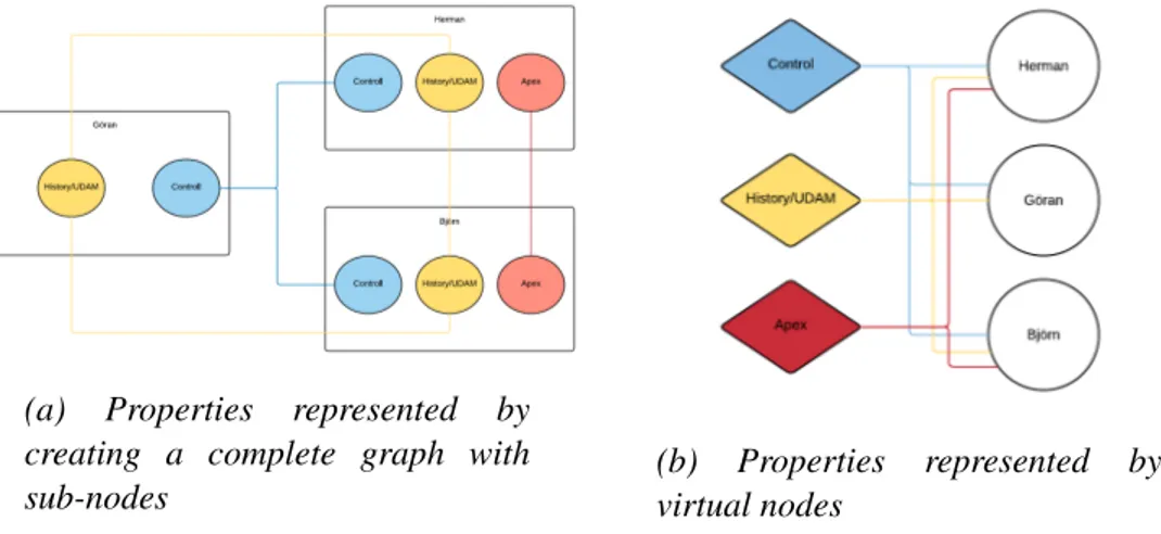
The edges in the graph might represent different properties shared by one or more nodes. For instance, edges might represent nodes that are part of the same subnet, part of the same application group, or simply nodes that have sent traffic between each other. This means that different ways to represent these edges might be used and combined to make the graph as easy to read as possible[12].
Complete graph
One way to show that a group of nodes share a property is to make the nodes a complete graph. This means adding an edge from every node in the group to every other node. This has the advantage of easily showing that the nodes are
2.5. OTHER POSSIBLE TECHNIQUES TO ENHANCE READABILITY 15
connected and if the edges represent for instance a subnet it is intuitive to see that the connected nodes share a physical connection. The disadvantage of this approach is the large number of edges needed. The number of edges grows with O(n2) where n is the number of nodes. An example of such a complete graph is shown in Figure2.3a.
(a) Properties represented by creating a complete graph with sub-nodes
(b) Properties represented by virtual nodes
Figure 2.3: Two kinds of system property representations. The two graphs present the same information but in two different ways.
Link to virtual nodes
To decrease the number of edges needed for a group, one approach is to add a virtual node to the group. This can for instance be done for a subnet by creating a node whose name is the name of the subnet and connecting all nodes that are part of this subnet to the new virtual node. This has the advantage of decreasing the number of edges needed from O(n2) to O(n), but the result is a little less intuitive since there is an extra hop between connected nodes. An example of using virtual nodes is shown in Figure2.3b.
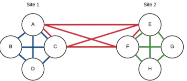
Grouping
Instead of using links to display a shared property the nodes might instead be physically grouped together. This can be done by adding hidden edges between the nodes and letting the force based layout act upon these hidden edges to position the nodes closer together. For example, when combined with an edge filter, this can be used to group the nodes by physical location and display (color) edges depending on type of service. The resulting graph would then display which
16 CHAPTER 2. THEORETICAL BACKGROUND
services are distributed among multiple physical locations and which are not. An example of such an graph is shown in Figure2.4.
Figure 2.4: Displaying properties both as links and as grouping. The nodes are grouped by their respective site into site 1 and site 2. It is now clearly visible that the blue and green properties are each only present at one site each (site 1 and site 2, respectively) while the red feature is shared between the two sites.
2.5.4
Other approaches to represent shared properties
There are more approaches available than these, but most other approaches are either suited for much larger networks, or networks with rather different structure such as social networks. A few of these approaches are described in ”Motif Simplification: Improving Network Visualization Readability with Fan, Connector, and Clique Glyphs” by C. Dunne and B.Schneiderman. The three shapes Fan, Connector, and Clique Glyphs were considered, but ultimately were not used in this thesis.
2.6
Detect if a graph is easily readable
Relevant to this study is to evaluate if the resulting graph is good result in the sense that both the staff at Aptilo finds it useful and that it is good with regards to some objective measurement.
As described in Cody Dunne’s presentation [13], as mentioned on page 27, there exists more than 24 rules to take into account when measuring the readability of a graph. In Katherine Ognyanova’s presentation ”Static and dynamic network visualization with R” [14] four of the most basic measurements are:
2.6. DETECT IF A GRAPH IS EASILY READABLE 17
• Uniform edge length,
• Minimal amount of nodes overlapping, and • Symmetrical.
However, many other measurements are listed by various sources [15, 16, 12]. Some of these measurements are (in addition to the previous four):
• Minimize edge bends,
• Central placement of high degree nodes, • Minimize difference in node size,
• Hierarchical layout (i.e. directed edges facing the same way as much as possible), and
• Avoid crossing among outlines (i.e. avoid having different clusters of nodes cross their outlines).
Unfortunately, no general tool to measure these qualities were found. The closest tool that was found is described in Cody Dunne and Ben Shneiderman’s paper ”Improving Graph Drawing Readability by Incorporating Readability Metrics: A Software Tool for Network Analysts” [17], but the program SocialAction described in the paper could not be downloaded. This is due to the fact that the SourceForge page [18] for the project had been abandoned. The page had not been updated since 2013 and contained no files. My examiner did find the code as part of the ManyNets project via the linkhttp://www.cs.umd.edu/hcil/ manynets/manynets-source-code-final.zip. I tried to build and run it both via IntelliJ, Netbeans, and CMD but kept encountering errors. As a result I did not use this software.
Instead a simple image recognition neural network was constructed to objectively determine if the graphs generated in the thesis are most similar to the graphs with many of these good aesthetics or similar to graphs with many bad aesthetics. The neural network is very general.
Neuroph [6] was used to construct and run this neural network. The image recognition network in Neuroph is constructed from the description available in the Neuroph image recognition guide. Two sets of images are given as input to the neural network. One with images the network should recognize, in this thesis these are graphs with good aesthetics. The other set is a set of images considered poor and should not be recognized, in this thesis these are graphs with bad aesthetics.
18 CHAPTER 2. THEORETICAL BACKGROUND
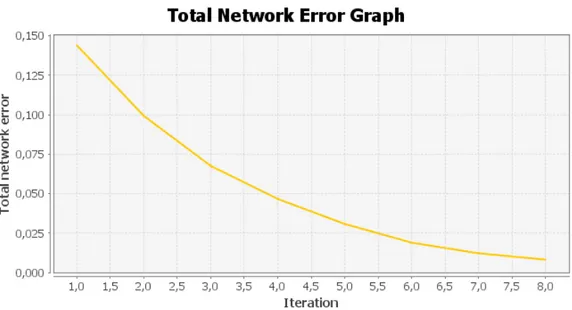
Figure 2.5: Graph showing the error of the neural network during learning. The graph is generated by default by Neuroph when training a network. A full iteration is considered when all images in the learning set has been passed once. This means that 1/30th of an iteration is the same as the network analyzing one image, when 30 images are used in the training set. The setup used when generating this graph is presented in Section5.2on page58.
Before the neural network learns from the input images some parameters have to be set. The most important parameters for this neural network are
Image sampling size The images are split before passed into the neural network, into subimages of a given height and width. The number of neurons in the first layer is then H*W where H and W are height and width of the grid. Hidden layers size Inside the neural network there are multiple hidden
layers. More hidden layers and more neurons per layer will generally produce a more accurate result for the network, but adding more neurons give diminishing returns and takes more processing power on the computer system running the network.
Max error How large an error the neural network can have on the training set. This is the value to be reached by the error rate after multiple iterations in the graph (see for example the graph shown in Figure2.5). Typically around 1%(0,01) maximum error is acceptable (in this
2.7. UML SEQUENCE CHART 19
graph corresponding to 8 iterations), but this depend on the application. This is the value represented on vertical axis on the graph in Figure2.5. A lower value means better accuracy for the network, but requires a longer training period and very low values are not guarantied to ever be reached when learning.
After training the neural network with the two input sets new images can be passed to the neural network. The neural network outputs a value between 0% and 100% indicating how well the images match those among the training images. This value will be used as a metric to objectively determine if the layout done by the program constructed in this thesis project can be considered good and to ensure that the work done during the thesis is progressing in the correct direction.
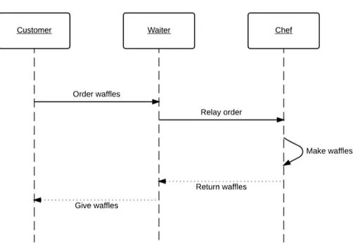
2.7
UML Sequence Chart
Since the project’s goal is to both visualize the system as a whole and to visualize flows in the system, a UML sequence chart is used to visualize the flow independently of the structure of the system. The UML sequence chart is a well known way of displaying how a series of messages or actions are sent between multiple entities or actors within a system. In such a chart each actor is displayed with a timeline going vertically through the chart. Each event is then annotated by an arrow going between two actors or in a loop back to the same actor. Each arrow initiating or requesting something is solid, while arrows returning or ending something are dashed. An example of a sequence chart for ordering a waffle in a cafeteria is shown in Figure2.6.
20 CHAPTER 2. THEORETICAL BACKGROUND
Figure 2.6: Example of ordering of a waffle as UML sequence chart.
2.8
Ruby on Rails
Ruby is a programming language created in 1995. Ruby is considered a functional programming language balanced with imperative programming. The main concept of Ruby is that everything can be considered an object and unlike languages such as Java where primitive types (classless types) exists, in Ruby even basic things such as integers (int) extends the class Numeric. A common application for Ruby is to host webpages via the Rails framework.
Ruby on Rails (or simpy Rails) is a web-application framework specially designed to include special tools and APIs to enable database-backed web applications in Ruby. Rails consists of three layers which each have a specific responsibility. Each of these layers is explained in the following subsections.
2.8.1
View layer
The view layer determines the layout and design of the webpage. Each view that should be presented to the user of the webpage has a layout specified in the view layer. The view files are often HTML files with embedded ruby calls. The embedded calls may execute calls to the model layer and thus get unique content for the current user.
2.8. RUBY ONRAILS 21
2.8.2
Controller layer
The controller layer handles requests arriving to the Rails application. It decides which view should be returned combined with which model. The controller ensures that when a user requests a certain domain the correct view and correct model are paired and returned. This means that multiple views may share the same model and multiple models may be combined into a single view. For example, the controller layer may keep track of whether a user is logged in or not and either display a login prompt or the actual view that should be displayed if the user is logged in. The controller may keep track of the type of user and thus either display an administration panel or a regular user panel.
2.8.3
Model layer
The model contains the logic specific for the application. The model layer contains all the logic and functions related to the data associated with the site. The model layer retrieves/saves data from/to a database, and gives the view layer content to show. The model layer may also summarize and modify the data and execute different functions depending on what interactions the user has with view layer.
Active Record
Active Record is the persistent data management used in a Rails application as part of the model layer. Active Record provides an interface with Ruby functions to a relational database and provides storage of Ruby objects directly mapped to the database. To enable Active Record for an object the object is created as a subclass of ActiveRecord::Base. This creates a table in the database with the same name as the class and the object will have a number of Active Record API functions attributed to it. To fill the table with associations to other models tags, functions such as belongs to, has one, and has many can be used.
Active Record provides several functions to retrieve objects from the database. If the object User is stored in the database, then User.all will return all users stored in the database. User.find_by(name: David) will find the first user with the name ”David”. A more complex call to retrieve users can be users = User.where(name: ’David’, occupation:
’Painter’).order(created at: :desc). This will return all users with the name David and occupation Painter and sort them by the date they were created in the system.
22 CHAPTER 2. THEORETICAL BACKGROUND
query would be SELECT * FROM Users WHERE name = David AND occupation=Painter ORDER By created at DESC; The similarity to SQL in the function names are intentional, as Active Record does an SQL query to the database when it is used. The advantage of Active Record is that it provides Ruby functions and it creates Ruby objects from the return of the SQL query. Active Record also sets up the objects within the database and automatically adds their properties, just by sub classing an active record when creating an object. When Active Record is used all changes made to an object after it is retrieved are kept in a buffer and not added to the database until the save function is used on the object. In the case of ALE, this means that when a user is making changes to the system no changes are actually saved until a specific save button is used to commit these changes to the database.
2.9
Javascript
Javascript is a loosely typed, lightweight programming language initially created by Oracle. Javascript is best known as a scripting language for web pages, but it can also be run outside of a web browser through frameworks such as Node.js. Javascript is typically run at the client side of the web page and enables the developer of the website options to manipulate and create live interactions with the website. Such interactions can be simple things (such as changing the page layout, detecting mouse movement, and enabling buttons) to more complex things (such as browser games, advanced graphical demonstrations and physics simulations). Some of the Javascript libraries that will be used in this thesis project are described in the following subsections.
2.9.1
Sigma.js
Sigma.js is a graph drawing library constructed in Javascript to display graphs on web pages. It can display graphs using one of three different renders: HTML5 Canvas, WebGL or SVG. This library also supports a variety of plugins.
Sigma.js’s core functionality only displays nodes and edges given positions. Sigma.js can be extended to do many things through the use of plugins, e. g. show custom images for each node, display multiple edges between the same two nodes, create a layout using a basic force based layout, and parse graphs from external Javascript Object Notation (JSON) files.
The basic graph object in Sigma.js only has 10 methods that can be used to retrieve one or all edges/nodes, add edges/nodes, and remove edges/nodes. Most
2.9. JAVASCRIPT 23
of sigma’s functionality comes from its easily extendable core as well as its high rendering performance.
The following paragraphs describe the main plugins used in this thesis
sigma.renderers.customShapes
This plugin enables custom node shapes as well as overlaying images on top of nodes in the sigma graph. This means that system nodes and external nodes can have different shapes. It also means that images with node properties can be overlaid in order to display the value of a node’s attributes.
sigma.exporters.svg
The sigma.exporters.svg plugin enables export of a Sigma.js graph to a Scalable Vector Graphics (SVG) file. This SVG file can then be combined with custom shapes to enable drawing graphs within nodes, where the internal node structure can be displayed with a graph. This graph can then be overlaid onto the node and displayed as a part of a larger graph. An example of this concept is shown in Figure2.7
Figure 2.7: An example of a node’s structure overlaid onto a node to create a graph within a node.
24 CHAPTER 2. THEORETICAL BACKGROUND
sigma.layout.forceAtlas2
The sigma.layout.forceAtlas2 plugin gives sigma the functionality to do force based layout of the sigma graph. The plugin takes several options as input, such as node and edge weight factor, starting iterations, and how much to slow down the nodes should be subject to. How the force based layout works was further described in the Section2.4starting on page12.
sigma.plugins.filter
The sigma.plugins.fliter plugin enables the use of custom functions to specify filters for the graph. The filter function is called once for each edge and node in the graph and returns either true or false. If true, then the currently called node or edge is displayed, otherwise it is hidden. The filter function can consider properties such as node type, node degree, edge, length, or a custom property to decide if the element should be shown or not.
sigma.renderers.parallelEdges
By default Sigma.js does not support multiple edges between two nodes, but the sigma.renderers.parallelEdges plugin adds this support. Each edge in the graph has a count property and to have multiple edges between the two nodes different counts are set for the different edges. All edges between two nodes can then be displayed at the same time without overlapping.
2.9.2
cardinal-spline-js
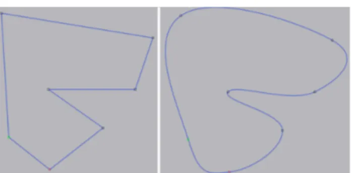
Cardinal-spline-js[19] is a project available on GitHub which adds a new function to the HTML5 Canvas. The new function receives an array of points as input and outputs a shaped containing a curved line through the points. The curve is interpolated via the formula for a cardinal spline. An exapmle of the shape before and after the cardinal-spline-js function is used can be seen in Figure2.8.
2.10. INTERFACE TOALESYSTEM’S DATA 25
Figure 2.8: A line drawn through a set of points. The image (to the left) shows the straight lines between points before cardinal-spline-js is used and the resulting curve (to the right) after cardinal-spline-js has been used.
2.9.3
D3.js
D3.js[20] is a Javascript library made for processing and representing data on web pages. D3 stands for Data Driven Documents. Like Sigma.js D3.js supports plugins. In this thesis project D3.js is combined with a plugin to present UML sequence diagrams. The plugin is d3-message-sequence.
The GitHub project d3-message-sequence enables the drawing of sequence diagrams with D3.js. This plugin has functions for adding messages between actors as well as parameters for setting animation properties when adding data. During this thesis project this plugin was used without any animations but the plugin was modified to support different kinds of arrows, extra labels for the arrows, and different arrow colors. These modifications are further described in Section3.8starting on page44.
2.10
Interface to ALE system’s data
The ALE system configuration is accessed through a web page served via Ruby on Rails. This means that a developer might access the data either from the SQL database where Active Record stores its values or via the built-in Rails functions that Active Record provides. The various configuration objects such as adapters, system nodes, protocols, rulesets, external nodes, etc. are represented and made accessible via these two interfaces.
Active Record can be used to retrieve the configuration of the system, but to retrieve data recorded by the system the log file is accessed. The ALE system stores data in a log file aggregated from all nodes in the system locally on the master node. The master node also runs the web server from which the system
26 CHAPTER 2. THEORETICAL BACKGROUND
is configurated. This logfile can be accessed directly from Ruby code running on Rails, but has to be parsed into usable objects. This parsing is described in Subsection3.7.3starting on page43.
2.11
Development at Aptilo and Bugzilla
The development at Aptilo uses Bugzilla[21] as its main form of organization. Bugzilla is used by many software projects (i.e. the Linux Kernel, Open Office, Red Hat and by Mozilla). While Bugzilla was originally only intended to track bugs in the system, Aptilo has extended its usage to include new features to implement and other changes to be made to the system. Each new feature to implement is added as a new ”bug” and all relevant fields, such as name, who it is assigned to, priority, severity, and target release are filled out.
Bugzilla is well integrated with Git and together with each bug the relevant Git repositories gets listed. When a developer has made changes to a file, the developer may send the changes for code inspection. The code inspection part of Bugzilla has been modified at Aptilo to work through Bash Unix Shell via the command codeinspect. The command accepts multiple arguments but the main arguments are
Bugnumber The tracking number in Bugzilla, so the reviewer knows which bug the changes are made for,
Reviewer email The mail to which the codeinspect is sent,
Git branch The branch in which the new commits to be inspected are located, and
Commit hash If the developer does not wish to send the full git history since the last accepted commit, the hash of a commit may be specified.
The commits sent in the codeinspect may only add one feature at a time, and should contain two commits with each codeinspect; one with the modified files, and one which increases the version number.
After a codeinspect has been sent, the reviewer receives an email containing a git patch with the suggested commits. The reviewer might then forward the message if need be, to people in the staff with more expertise in the changed code. The reviewer then responds back to the sender, either with changes needed or with a confirmation that the developer can push the changes to the remote server.
2.12. WORKING MODEL 27
2.12
Working model
Kanban[22] is an agile method to use for software development and extreme programming(XP)[23] is a programming philosophy used when writing program code. Both of these working models were originally designed to be used in a team of developers, but many parts are applicable for a sole developer.
2.12.1
Kanban
Kanban[22] was first developed at Toyota in the 1940s. The motivation was to implement just in time development in a similar fashion to how a convenience store manages its stock. This means that each step in the development process tries to start new work only when it deems all previous work is finished, and to have as few jobs running in parallel at a time. This is supposed to lead to more flexible planning and faster output.
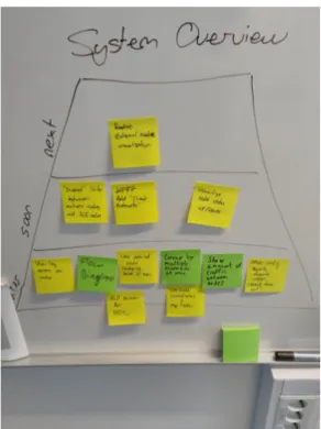
In Kanban a priority board lists of all the tasks in the backlog. The board at Aptilo is grouped by Later, Soon, and Next. An example of the planning board can be seen in Figure 2.9. The most important task or tasks are positioned in Next, while in Soon a small group of slightly less important tasks are placed. Finally, in Later are all tasks which are currently not deemed important. When a task is finished, then a new task is plucked from the Next group. When the Next group is empty, then the most important tasks in the Soon group are moved up to the Next group. This means that only the most important tasks are being worked on and no lengthy planning sessions are needed. This approach can be compared to Scrum where each sprint is planned beforehand.
28 CHAPTER 2. THEORETICAL BACKGROUND
Figure 2.9: Picture of the priority board during this project
2.12.2
Extreme programming
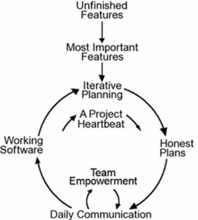
Extreme programming (XP)[23] is a philosophy with an emphasis on simplicity. This simplicity is meant to be used as the simplest approach most often is the best approach when programming. XP also emphasize the importance of integrating code with the excising solutions to avoid compatibility issues. XP also suggests a structure of the work that goes very well with Kanban in that the most important piece work is selected and finished before starting on any new work. A flowchart of how XP might work is illustrated in Figure2.10.
2.12. WORKING MODEL 29
Figure 2.10: Flowchart for a typical XP approach
These two working models(Kanban and XP) were chosen since Kanban was used as a standard at Aptilo, I had previous experience with XP, and I believed they would go nicely together.
Scrum was considered as another option but were not chosen since Kanban was a better option to use, due to Kanban being standard at Aptilo.
Chapter 3
Method
The overall goal of this thesis project is to demonstrate a practical solution which is capable of displaying the state of an ALE system with many different properties visualized along with how the traffic is flowing within the system. This chapter will describe the method used to achieve this overall goal
3.1
Literature study
The first part of the project was a literature study. The study’s goal was to get a general understanding of different types of graph representations and to find existing solutions to similar problems.
The literature study is based upon sources found by querying Google Scholar, IEEEXplore, and Scopus. The search queries were formed with a basic understanding from previous courses at KTH, specifically: ID2220: Advanced Topics in Distributed Systems, and IK1550: Internetworking. These searches were done in several iterations based on the previous search results in order to get more and more specific results. At the end of the literature study a reading list of approximately 15 documents were used as a base. From this knowledge the first prototype was created to demonstrate to the staff at Aptilo. Their feedback was the main input for my subsequent design decisions.
3.2
Related work
Six previous works were deemed to be the most relevant to this thesis project and highly related to the work to be conducted. A description of each of these works as well as which parts of the work were relevant and why is given in this section.
32 CHAPTER3. METHOD
Force-Directed Graph Visualization with Pre-Positioning
Hua, et al. presented a model for prepositioning the nodes in the graph before applying a force-based layout in ”Force-Directed Graph Visualization with Pre-Positioning: Improving Convergence Time and Quality of Layout”[9]. This was highly useful for the thesis project since it described a rather simple algorithm for pre-positioning the nodes which decreases the time to reach equilibrium by approximately 20%. Another benefit of pre-positioning (instead of spreading the nodes randomly) is that the result will always be the same after a certain number of iterations with the force-based algorithm. This means that a user of the system will always end up with the same graph for the same input parameters, compared to having the nodes in a random pattern when starting the algorithm. This is especially useful for the user when sharing the generated graph’s settings with a colleague, since they both will see the same result.
There exists more advanced pre-positioning algorithm such as one based on pagerank described by Dong, et al. in ”An advanced pre-positioning method for the force-directed graph visualization based on pagerank algorithm” [10], but since the graph constructed by the tool in this thesis project was rather small, the performance benefit of such advanced pre-positioning was not needed. Using this advanced pre-positioning would only increase the complexity.
Improving Graph Readability by Incorporating Readability Metrics
In [17] by C. Dunne and B. Shneiderman several readability metrics are defined for how to determine if a graph is easily readable. These readability metrics include properties such as node occlusion, edge crossing, edge crossing angle, and edge tunneling. All these readability metrics are always kept in consideration during this thesis project to ensure that the graphs presented and generated by the tool always follow these guidelines in the best possible way. A tool called SocialAction[18] was created, but as described in Section 2.6 on page 16 the source code for the tool could not be found early in this project.
Measuring and Improving the Readability of Network Visualizations
In the Ph.D. thesis ”Measuring and Improving the Readability of Network Visualizations”[16] by Dunne there are further descriptions of how a graph can be determined to be easily readable or not. The contents of this thesis overlap with the work presented by Dunne and Shneiderman in ”Improving Graph Drawing Readability by Incorporating Readability Metrics: A Software Tool for Network Analysts” (described in the previous paragraph). Since Dunne’s thesis describes many other useful things to be considered in this thesis project such as ”Group-in-a-Box” layouts, and describe the readability metrics with other words, this was considered a key source.
![Figure 2.1: An overview of Aptilo SMP’s interaction with the internet. The core of Aptilo SMP is the ALE system[1].](https://thumb-eu.123doks.com/thumbv2/5dokorg/4626411.119499/28.892.135.711.201.603/figure-overview-aptilo-smp-interaction-internet-core-aptilo.webp)
![Figure 2.2: An animation sequence for an edge-clustering process. Color is used to encode edge directions[11].](https://thumb-eu.123doks.com/thumbv2/5dokorg/4626411.119499/33.892.194.762.416.525/figure-animation-sequence-clustering-process-color-encode-directions.webp)