Linköping University | Department of Computer Science Bachelor thesis, 18 ECTS | Industrial Engineering and Management Spring 2021 | LIU-IDA/LITH-EX-G–21/003–SE
TopQ - a web-based queuing
application
A case study in developing a queuing application for
students and tutors with focus on navigability and design
TopQ - en webbaserad köapplikation
En fallstudie i utvecklingen av en köapplikation för studenter och handledare med fokus på navigering och design
Albin Jaldevik, Erik Jareman, Frida Andersson, Frans Nyrfors, Martin Tjern, Oscar Kröger, Sara Abrahamsson
Supervisor: Martin Sjölund Examiner: Aseel Berglund
Linköping University SE–581 83 Linköping +46 13 28 10 00, www.liu.se
Upphovsrätt
Detta dokument hålls tillgängligt på Internet – eller dess framtida ersättare – under 25 år från publiceringsdatum under förutsättning att inga extraordinära omständigheter uppstår. Tillgång till dokumentet innebär tillstånd för var och en att läsa, ladda ner, skriva ut enstaka kopior för enskilt bruk och att använda det oförändrat för ickekommersiell forskning och för undervisning. Överföring av upphovsrätten vid en senare tidpunkt kan inte upphäva detta tillstånd. All annan användning av dokumentet kräver upphovsmannens medgivande. För att garantera äktheten, säkerheten och tillgängligheten finns lösningar av teknisk och admin-istrativ art. Upphovsmannens ideella rätt innefattar rätt att bli nämnd som upphovsman i den omfattning som god sed kräver vid användning av dokumentet på ovan beskrivna sätt samt skydd mot att dokumentet ändras eller presenteras i sådan form eller i sådant sam-manhang som är kränkande för upphovsmannens litterära eller konstnärliga anseende eller egenart. För ytterligare information om Linköping University Electronic Press se förlagets hemsida http://www.ep.liu.se/.
Copyright
The publishers will keep this document online on the Internet – or its possible replacement – for a period of 25 years starting from the date of publication barring exceptional circum-stances. The online availability of the document implies permanent permission for anyone to read, to download, or to print out single copies for his/hers own use and to use it unchanged for non-commercial research and educational purpose. Subsequent transfers of copyright cannot revoke this permission. All other uses of the document are conditional upon the con-sent of the copyright owner. The publisher has taken technical and administrative measures to assure authenticity, security and accessibility. According to intellectual property law the author has the right to be mentioned when his/her work is accessed as described above and to be protected against infringement. For additional information about the Linköping Uni-versity Electronic Press and its procedures for publication and for assurance of document integrity, please refer to its www home page: http://www.ep.liu.se/.
© Albin Jaldevik, Erik Jareman, Frida Andersson, Frans Nyrfors, Martin Tjern, Oscar Kröger, Sara Abrahamsson
Abstract
Students’ learning processes can be affected negatively by long waiting times to get assistance on lesson- and lab-sessions. Studies show that digital queuing systems decrease the waiting time. Thus, the purpose of this report is to investigate how to design a web-based queuing application to achieve a high perceived usability for students and tutors. Especially based on navigability and design which in accordance with research in the area has a direct impact on the usability. To achieve a high perceived usability the application was developed itera-tively. In the first version the implemented functionality was built upon the result from the feasibility study combined with research in the area. After a set of user evaluations, changes from the first version were implemented to further improve the perceived usability. Lastly, another set of evaluations were performed to confirm the improvement in the final version. The results showed that the first version of the system was perceived as 84 out of 100 on the System Usability Scale (SUS) and the final version as 88 out of 100, an improvement by four units. Uniform design, no irrelevant functionality, placing buttons in conspicuous positions and having double checks to “dangerous actions” all seem to be factors contributing to the navigability, desirability and thus the usability on a queuing-application.
Sammanfattning
Studenters lärandeprocess kan påverkas negativt av långa väntetider för att få hjälp under lektions- och laborationspass. Studier visar att digitala kösystem reducerar väntetiden. Föl-jaktligen är syftet med arbetet att undersöka hur en webb-baserad köapplikation kan designas för att uppnå en hög upplevd användbarhet hos studenter och handledare. Speciellt med avseende på navigerbarhet och design vilket enligt tidigare forskning har en direkt påverkan på användbarheten. För att uppnå en hög upplevd användbarhet utvecklades applikationen iterativt. I den första versionen implementerades funktionalitet som byggde på resultatet från förstudien i kombination med tidigare forskning. Efter användartester implementerades ändringar från den första versionen för att ytterlige förbättra användbarheten. Slutligen genomfördes ytterligare användartester för att bekräfta förbättringen i den slutgiltiga ver-sionen. Resultatet visade att den första versionen av systemet uppfattades som 84 av 100 på systemanvändbarhetsskalan SUS och den slutgiltiga som 88 av 100, en förbättring med fyra enheter. Enhetlig design, ingen irrelevant funktionalitet, placering av knappar i iögonfal-lande positioner och att ha kontroller vid “farliga klick” verkar alla vara faktorer som bidrar till navigerbarheten, åtråvärdheten och där med användbarheten för en kö-applikation.
Part I
Table of Contents
1 Introduction 1 1.1 Motivation . . . 1 1.2 Aim . . . 2 1.3 Research Question . . . 2 1.4 Delimitations . . . 2 2 Theory 3 2.1 Usability . . . 3 2.1.1 Definition . . . 3 2.1.2 Website Usability . . . 3 2.2 Navigation . . . 5 2.2.1 Definition . . . 52.2.2 Why is Navigation Important? . . . 5
2.2.3 The Impact of Navigability on Usability . . . 5
2.2.4 What Makes a Website Navigable? . . . 6
2.3 Desirability . . . 7
2.3.1 Definition . . . 7
2.3.2 The Impact of Aesthetic Design on Usability . . . 8
2.3.3 Compositional Elements . . . 8
2.3.4 Color Usage . . . 9
2.4 Digital Tools in Education . . . 11
2.4.1 Effects of Digital Queuing Applications . . . 11
2.4.2 General Issues Regarding Digital Tools in Education . . . 11
2.5 Theory Related to Methodology . . . 12
2.5.1 User-Oriented Development . . . 12
2.5.2 Concurrent Thinking Aloud Procedure . . . 12
2.5.3 Retrospective Probing . . . 13
2.5.4 System Usability Scale . . . 13
2.5.5 Optimal Sample Size of Usability Evaluation Methods . . . 14
3 Method 17 3.1 Pre-Study . . . 17
3.1.2 Marketing Plan . . . 17 3.1.3 Prototype . . . 18 3.2 Implementation . . . 18 3.2.1 Back-End . . . 18 3.2.2 Front-End . . . 19 3.2.3 Deployment . . . 19 3.3 Usability Evaluations . . . 19
3.3.1 Usability Evaluation After Iteration 1 . . . 20
3.3.2 Usability Evaluation After Iteration 2 . . . 22
4 Results 25 4.1 Pre-Study . . . 25 4.1.1 Survey . . . 25 4.1.2 Prototype . . . 25 4.2 Implementation . . . 27 4.2.1 General Design . . . 27
4.2.2 Landing Page, Navbar and Footer . . . 27
4.2.3 Login and Registration . . . 30
4.2.4 Room Page . . . 31
4.2.5 Checkout . . . 32
4.2.6 Functionality . . . 32
4.2.7 Technical Environment and Tools . . . 33
4.3 Usability Evaluations . . . 35
4.3.1 Usability Evaluation After Iteration 1 . . . 35
4.3.2 Changes After Iteration 1 . . . 38
4.3.3 Usability Evaluation After Iteration 2 . . . 40
5 Discussion 45 5.1 Results . . . 45
5.1.1 Pre-Study . . . 45
5.1.2 Usability Evaluations After Iteration 1 . . . 46
5.1.3 Changes After Iteration 1 . . . 48
5.1.4 Usability Evaluations After Iteration 2 . . . 49
5.1.5 Desirability . . . 50
5.1.6 Navigation . . . 51
5.2 Method-criticism . . . 53
5.2.2 Prototype . . . 53
5.2.3 Usability Evaluations . . . 54
5.2.4 Source Criticism . . . 55
5.3 The Work in a Wider Context . . . 55
5.3.1 Ethics of Accessibility . . . 56
5.3.2 Ethics of Lucrative Design . . . 56
6 Conclusion 57
List of Figures
1 Illustration of Quesenbery’s five dimensions with different balances . . . 4
2 Examples of chromatic and achromatic colors, respectively. . . 9
3 Three saturation levels for a red color. . . 10
4 Example of a three-color scheme. . . 10
5 Illustration of the method. . . 17
6 Result from the question: What features would you request in a queuing application? . . . 26
7 The start page of the prototype done in the feasibility study . . . 26
8 The room page of the prototype done in the feasibility study . . . 27
9 TopQ’s color scheme . . . 28
10 Three different examples of the hovering effect . . . 28
11 TopQ’s landing page with navbar and footer . . . 29
12 TopQ’s navbar from a non-logged in perspective . . . 30
13 TopQ’s navbar from a logged in perspective . . . 30
14 The login- and register forms on TopQ. . . 30
15 The student-view on the room-page. . . 31
16 The admin-view on the room-page. . . 31
17 TopQ’s checkout-section. . . 32
18 TopQ’s payment-page. . . 33
19 Example of form-validation on TopQ. . . 34
20 Alert when the password confirmation fails. . . 34
21 TopQ’s queuing-page after iteration 1. . . 35
22 The queue-up modal after iteration 1. . . 36
24 The result of the design rate after iteration 1. . . 38
25 The result of the SUS after iteration 1. . . 38
26 Information-modal to clarify the admin functionality after iteration 2 . . . . 40
27 New design on queue tickets and buttons on top of page after iteration 2 . . 41
28 Added about-us page after iteration 2 . . . 41
29 Example of double-checks when deleting a ticket after iteration 2 . . . 41
30 The result of the navigability rate after iteration 2. . . 43
31 The result of the design rate after iteration 2. . . 43
32 The result of the SUS after iteration 2. . . 44
33 Illustration of the SWOT-analysis . . . 75
34 Positioning map of TopQ compared to competitors . . . 78
35 Prototype of TopQ’s landing page. . . 79
36 Prototype of TopQ’s room page. . . 80
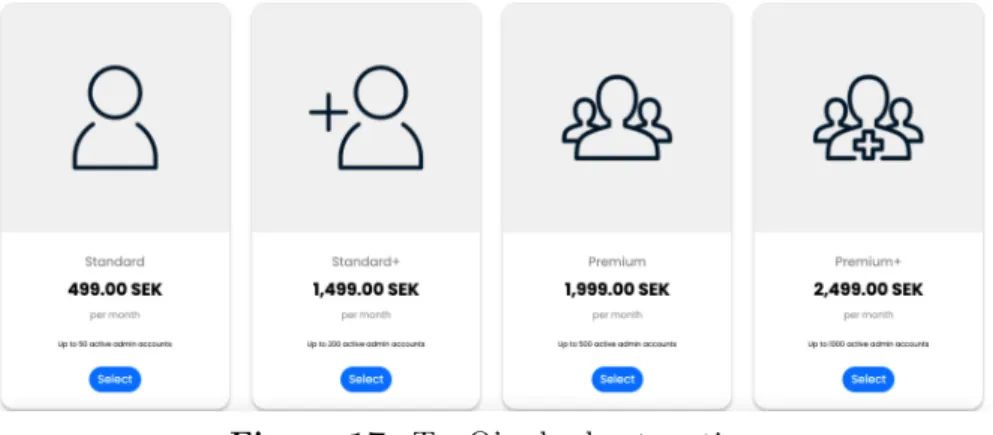
37 TopQ premium account bundles with pricing. . . 80
List of Tables
1
|
Introduction
The use of technology and digital tools for educational purposes is increasing, in particular, due to the spread of the coronavirus and the closure of schools. As a result, it has become clear that there is a lack of adequate, technical solutions for many educational purposes, such as a well-functioning way to receive help from teachers and tutors. This study aims to investigate how to design a web-based application to be used for that purpose.
1.1
Motivation
The ability and willingness to adapt to the rapid development and use of technology in education is a key for schools to deliver high-quality education in the 21st century. In particular, this has become clear during the outbreak of the coronavirus. The United Nations Educational, Scientific and Cultural Organization (UNESCO) reports that more than a hundred countries worldwide have closed all schools as part of the attempt to prevent the spread of the virus, affecting more than half of the world’s student population [1]. Due to limitations in digital skills, the need to educate online increases the pressure on both students and teachers [1], [2]. This indicates a need for digital tools used for educational purposes that are easy and straightforward to use and navigate.
When the classrooms are online, the teachers and tutors need a simple and efficient way to keep track of everyone who needs help and interaction, and which of them to deal with first, some kind of queuing system. A marketing plan was developed during the feasibility study (Appendix A). The analyses indicate a great need for a straightforward and easy-to-use queuing application to reduce the waste of valuable time that should be spent on learning instead. Sajadee’s study at Linköpings University shows that the use of a digital queuing system reduces the waiting time for assistance in physical classrooms as well [3]. This indicates that there will be a need for this system even after the reopening of schools. In a survey made among students and tutors during the pre-study for this project, 90.5% of the respondents stated that they were interested in a better queuing application for lessons and lab sessions (Appendix B). On average, the respondents answered that their overall experience of the current systems used for the same purpose, on a scale from 1 to 5, was 3.4. A study done at the Eszterhazy Karoly University in Hungary showed that technical issues due to the wide variety of platforms and tools that are used in different courses could be a factor affecting students learning experience negatively [4]. This is also confirmed in our survey, where 87.2% of the respondents stated that having one single application for this purpose in all their courses would facilitate their learning experience.
Based on the reasoning above, it is therefore investigated how to design a web-based queuing application, designed for use in both lab- and tutor sessions, to be navigable and desirable to deliver good usability.
1.2
Aim
The project’s purpose is to investigate how a web-based queuing application can be de-signed to deliver good usability, primarily based on the factors design and navigability. The web-based queuing applications aim to be used for lab and tutor sessions in schools and universities to meet the increasing need.
1.3
Research Question
How can a web-based queuing application for lab and tutor sessions be designed to be both navigable and desirable in order to deliver good usability for students and tutors?
1.4
Delimitations
Since the primary focus group for the research question is students and tutors in Sweden, especially those enrolled at universities, the limitations have been done to these specific groups. Consequently, all surveys reported in this project have been conducted and limited to the focus group. In addition, the web-based queuing application will not be available to the public during the development, only to the developers and selected test subjects. Regarding the term “user” the report mainly refers to the focus group with students and tutors. Note, however, that the literature used in the project often refers to the word user and, in these cases, the term’s primary meaning.
2
|
Theory
In the section below, the underlying theory will be introduced, which is the basis for the development of the web-based queuing application. Initially, the theory of usability is pre-sented with a focus on website usability, and the impact design and navigability have on usability. Furthermore, the theory of navigability is presented with factors that make a web-site navigable. The section continues with the theory of desirability, where relevant factors such as logo design, color usage, and graphics to text ratio are further described. Finally, the theory related to methodology is discussed where the focus is on user-oriented development and Usability Evaluation Methods (UEM).
2.1
Usability
This chapter introduces the theory related to usability and explains the concepts of Web site usability and user experience.
2.1.1 Definition
According to the International Organization for Standardization, usability has been defined by the standard ISO 9241-210:2010 as the “extent to which a system, product or service can be used by specified users to achieve specified goals with effectiveness, efficiency, and satisfaction in a specified context of use” [5]. Thus, the term assesses how easy a user interface is to use in terms of performance and satisfaction. In addition, ISO states that usability is relevant when designing or evaluating interactions with, for example, services for development [5].
2.1.2 Website Usability
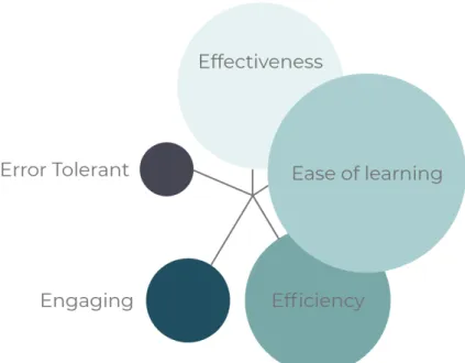
Nowadays, a huge number of websites are available where the interface and usability play a significant role in the user’s acceptance of the site [6]. According to Palmer, websites need to consider usability in order to be successful and satisfy the users [7]. Furthermore, studies have shown that a usable website increases revisit rates while creating a positive attitude towards the site among the users [8]. If a delay occurs when a user clicks on a hyperlink, the home page lacks sufficient information, or if the website is challenging to use in general, the user will likely leave the page [8]. The attention currently paid to usability indicates the importance of using usability methods during the development process. Moreover, these methods have been shown to reduce costs as they reduce the need for changes after the web application has been delivered [9]. Thus, the importance of website usability is apparent. To provide a better understanding of usability and its effect on websites, Quesenbery divides usability into five specific dimensions presented in Figure 1 [8], [10].
Figure 1: Illustration of Quesenbery’s five dimensions with different balances
• Effective - the completeness and accuracy with which users achieve their goals • Efficient - the speed (with accuracy) with which this work can be done
• Engaging - how pleasant, satisfying or interesting an interface is to use
• Error Tolerant - how well the product prevents errors and helps the user recover from any that occur
• Easy to Learn - how well the product supports both initial orientation and deeper learning
Quesenbery believes that identifying and understanding these dimensions is a good step to understand usability and its impact on websites. As the balance (Figure 1) between the dimensions differs, it is essential to identify and analyze them individually in each specific project [8].
In addition to Quesenbery’s five dimensions, a website today should be easy to use and accessible to all users, including older adults and people with special needs. Accessibility is the ease to access anything; thus, security also becomes an important parameter to consider when investigating usability [11]. Braz and Robert explain that the authentication process is essential for controlling accessibility and that the design of these becomes a crucial problem to solve the conflict between security and usability [12]. Furthermore, security usability concerns how the security information should be handled in the user interface and how authentication systems should be easy to use [12]. Therefore, both security and usability are considered necessary in the authentication process, which creates problems as complex security methods are not considered easy to use [12]. According to Braz and Robert, the
conflicts might be minimized by using general heuristics principles such as minimizing the user input, making decisions in the name of the user, and notifying the user of actions taken on their behalf [12].
2.2
Navigation
This chapter will introduce theory regarding navigation and how it impacts the perceived usability of a website.
2.2.1 Definition
There are several different definitions and views on what navigation is within website design-ing. One definition that focuses on the efficiency in navigation is “[...] the extent to which a visitor can follow a website’s hyperlink structure to locate target contents successfully in an easy and efficient manner” [13]. In a more general definition, navigation can be described as the path a user travels through the website [14].
2.2.2 Why is Navigation Important?
With the increased use of websites, the importance of developing sites in order to satisfy customers has grown [14]. Navigation is one key aspect since it enables the user to find its way through the site. A website that does not have efficient and user-friendly navigation risks making the user feel lost, frustrated, or disorientated, which in turn can lead to users having a bad experience or even leaving the site [15].
Smith, P.A [16] says that one significant disadvantage of websites that have been mentioned in literature is the sense of being ’lost. Even small websites can create difficulties in navigating and lead to a user feeling disorientated. The ’lostness’ factor is further explained by Otter, M et al. [17] where it is stated that it should be looked at as the degradation of performance instead of the users’ subjective feelings. In order to counteract this ’lostness’ and deliver good usability, it is necessary to implement satisfactory navigation.
2.2.3 The Impact of Navigability on Usability
A website’s primary purpose is to facilitate knowledge acquisition, and in order to do so, navigability plays a significant role [18]. Thus, when discussing usability, navigability is often brought up [18]–[21]. For instance, Quesenbery discusses navigability in connection with the dimension labeled efficient emphasizing the need for ideal workflows to ensure usability [10]. Furthermore, several studies have been conducted in the hope of finding connections between
various navigation structures and usability [18], [22]. For instance, in 2007, Fang explicitly investigated the correlation between specific well-adapted navigation structures and usability, discovering significant correlations between certain types of navigation structures and high usability [18].
2.2.4 What Makes a Website Navigable?
There are several aspects that influence a website’s navigability, according to the literature. Regarding some of the aspects, there are divided opinions while others are generally accepted. One problem with the structuring and designing of a website is that different users have different preferences and expectations [23]. According to Zhang et al. [14] there are three fundamental questions that should be answered in order to deliver good navigability for the user: Where am I? Where have I been? Where can I go?
Links
One of the most important aspects when constructing a website’s navigation is links. Links can be seen as the tool for traveling between the nodes in a website and plays a vital point in the navigation [24]. How these links are implemented and designed can therefore affect the efficiency and usability of a website. There are several key points to consider when implementing links [24]:
• It should be clear on pages that links are links.
• Links should be placed so that it ensures users will notice them. • The destination of each link should be clear.
The most common indicator for a link is underlining, where the link and the underlining are blue. Another usually seen indicator is a raised “button”. In addition to this, there are other methods to show what is a link. According to Farkas and Farkas [24] consideration should also be taken when naming and placing links. Users will, by habit, interpret some words such as “About Us” and “Home”, as links. With placement, the reasoning is similar. Since the most common placement of links is at the top and to the left of a website, users will tend to look for links at these positions. Farkas and Farkas [24] further explain that it is essential that methods such as underlining and raised “buttons” should be avoided when it is not links. This to not fool users into clicking things on a website that is not intended to take them anywhere, which could cause misunderstandings and loss of efficiency [24]. When addressing the destination of links, there are also factors to contemplate. Rollovers, supplementary texts, and labels are typical techniques to clarify where the user will be taken if clicking a link [24]. Insufficient information about the destination can lead to increased
time spent navigating to a preferred goal. This can, in turn, impact the experience negatively and leave a user with the feeling of a poorly designed website [24].
Placement
The nature of a user’s reading is to scan a website for the most important and not look through all of the content. Important information and the options for navigation should therefore be placed where the user naturally looks for them. This is supported by Chen et al. [23] that mentions placement of navigational elements in inconspicuous locations as a common factor that reduces navigability. Further, Farkas and Farkas [24] highlights that the positioning of common navigational elements should be placed at the same place on each web page since the user will, by habit, look for them at the same place.
Users can often be found scanning pages in similar patterns. A study done in 2007 [25] found that the users often scan pages in an F-pattern. This can be described in a three-step process:
1. Horizontally across the top of the page.
2. Further down the page in another horizontal line. 3. Vertically across the left side of the page.
Although a common pattern, the study found that the pattern does not always appear and is somewhat dependent on what type of page it is [25]. In-text pages, the pattern occurs but not in image-based pages.
2.3
Desirability
This chapter introduces some theoretical concepts in the realms of design that can make a web page desirable from a user perspective. Additionally, it is addressed how desirability can impact the perceived usability of a web page.
2.3.1 Definition
Desirability is a subjective factor used to assess how aesthetically pleasing a product or brand is [26]. Design is generally what makes for a desirable product. A desirable product engages users in an early stage, making them more likely to interact with the product [26]. Desirability is one of the multiple levels that form a user experience. Some of the most critical aspects of desirability when it comes to designing a web page are logo design, graphics to
text ratio, and color usage [27]–[29] . Colors are usually one of the first design elements that a user notices, and therefore it is important to consider the choice of colors carefully when designing a web application [29].
2.3.2 The Impact of Aesthetic Design on Usability
Quesenbery highlights Engaging as one of the five primary dimensions of usability and de-fines it as “how pleasant, satisfying or interesting an interface is to use” [10]. How pleasant, satisfying, or interesting an interface is to use can vary between different users but one key aspect that greatly affects the user’s perception is the visual attractiveness of the website [30]. Visual attractiveness is affected by a range of certain aspects such as site templates, animated images, colors, and associated themes, which improve usability by impacting the users’ aesthetic perception and ease-of-use [30]. In 2009, Aljukhadar and Senecal [30] per-formed a large-scale study of 59 different websites spanning multiple industries to examine how various usability elements drive user’s attitudes and intentions towards different web-sites. The study showed that while site information and trust were stronger for tangibles sites (such as fact-oriented sites like Wikipedia), visual attractiveness and site interactivity were more influential for service-oriented sites [30].
2.3.3 Compositional Elements
A user’s first impression of a web page is strongly affected by its appearance. Usually, users look at the graphics before getting information in the form of text [28]. This means that the graphical design of a web page matters more than the actual information when it comes to delivering a good first impression [28]. The number of compositional elements and their complexity can impact the perceived aesthetic appeal of a web page [31]. A web page with too many or too complex elements is likely to be perceived as cluttered, and a web page with an insufficient number of compositional elements is likely to have a low aesthetic appeal. The aesthetic appeal of a web page is generally improved if the compositional elements share symmetry – both through its placements but also through its contents [31].
One way to determine a web page’s complexity is by analyzing the ratio of graphics to text on the web page. Generally, a graphics-to-text ratio between 1:1 and 3:1 creates the impression of an easy-to-use web page [28]. In this span, a ratio of 1:1 indicates a more realistic and simple-looking web page that is easy to use, and a ratio of 3:1 indicates a fancier web page that is clearer to follow. Web pages that are in the span between 1:1 and 3:1 have generally adapted a good combination of the easy-to-use and clear-to-follow aspects [28].
Figure 2: Examples of chromatic and achromatic colors, respectively.
2.3.4 Color Usage
Colors can be either chromatic or achromatic. Chromatic colors are generally seen as more pleasant and credible than achromatic colors [32]. Therefore, chromatic colors should be considered when designing a web page to make it more desirable. Chromatic colors draw attention, and for this reason, they should be used for navigational elements. However, it is important not to use too many chromatic colors as this makes it harder to use colors as guidance for the user [32]. Achromatic colors can be used for elements that do not need to draw the users’ initial attention. Figure 2 presents examples of chromatic and achromatic colors.
Colors can also be either saturated or desaturated. Saturated chromatic colors draw attention and slow users down [32]. It is important to use these colors conservatively. Otherwise, a web page can be perceived as cluttered and unprofessional. Saturated chromatic colors are most effectively used for buttons and other actionable elements [32]. This makes for an efficient way to show the user what is important on the web page, and thus a great way to guide the user on how to navigate the site in an efficient way [32]. Desaturated chromatic colors are generally perceived as more minimalistic and professional than saturated chromatic colors. These colors do not draw loads of attention and are easy to overview [32]. Desaturated chromatic colors can be used for menus, headings, backgrounds, and other large areas that do not need a lot of a user’s initial attention[32]. For these elements, an achromatic color can also be used [32]. The saturation level for achromatic colors does not matter as much as for chromatic colors since these colors are more subtle to begin with. Figure 3 presents an example of different saturation levels of a red color.
For a web page to be perceived as navigable, it is also important to use colors in a way that creates a path for the user to follow [29]. This means that there should be a general theme in all color usage on a web page. Using a certain color for similar elements on the web page makes for a web page that is easy to navigate [32]. Using colors without association results in a poor visual hierarchy, making it more difficult to navigate the page [32].
Figure 3: Three saturation levels for a red color.
Figure 4: Example of a three-color scheme.
to keep a user interested in the page longer [32]. One simple way to keep a page navigable whilst using multiple colors is to introduce a monochromatic color scheme [32]. Doing so makes it possible to use more tones, shades, and tints within the same hue. A two-color scheme with one dominant and one highlighting color (and their respective monochromatic colors) is an effective way to make a web page more interesting without making it nonuniform [32]. In this approach, a powerful chromatic color is used as highlight, and an analogous or complementary color that is more neutral is used as a dominant color. It is also possible to use a third color, making it a three-color scheme [32]. A three-color scheme balances appealing design and simplicity in an effective way. A general rule when using a three-color scheme is to use the three-colors in a 60-30-10 manner. This means that the primary, secondary, and accent (highlight) color should be used on 60, 30, 10 percent of the web page, respectively [32]. Multiple primary, secondary, or accent colors can be used to make the design more interesting. However, using too many colors in a three-color scheme introduces more complexity to a web page and thus risks making it harder to navigate. An example of a three-color scheme can be seen in Figure 4.
Colors can be used to subconsciously fabricate certain attitudes towards a web page or a product. For this reason, the general evaluative appeal of color should be considered when choosing colors for a web page [29]. Research on color preference shows that warm colors (red, orange, yellow) can cause psychological arousal – and with that increased user activation [29]. Whilst user activation is certainly a good thing; warm colors come with other problems: they are often viewed as negative from a credibility perspective [29]. Cold colors (blue, green, violet) are generally preferred over warm colors when it comes to credibility. The reason for this is that cold colors are often perceived as relaxing, pleasant, and professional [29], [32]. The use of a color scheme based on cold colors is likely to give the user a credible and
professional impression [29].
2.4
Digital Tools in Education
This chapter introduces relevant theory regarding the use of digital tools in the educational environment. Digital transformation in education has traditionally been quite a slow-moving topic, but COVID-19 has affected the field and increased its importance [4].
2.4.1 Effects of Digital Queuing Applications
A study done at Linköping University [3] showed that the use of an online queuing application significantly reduces the waiting time. Further, the involvement of the application resulted in fewer complaints regarding lack of assistance. Both students and teachers benefit from an online queuing application, even in physical education. There is less traffic and movement in a physical classroom compared to traditional queuing methods, and there is no longer a need for visual observation by teachers to assists students [3]. The introduction of an online queuing application also posed some challenges, such as the initial time needed for changing the existing habits.
2.4.2 General Issues Regarding Digital Tools in Education
There are several platforms and programs that can be used in online education. Depending on the platform, some require that documents must be stored locally or on the user’s cloud repository. This can raise issues of local accessibility, copyright, and digital continuity [33]. Some educational platforms are CPU-intensive and require hardware that can handle the program. Based on the operating system used by students or tutors, integration with external applications can cause problems, which slow down students’ progress and affect the learning process [33].
According to Vladoiu and Constantinescu, the vast majority of people are encountering a problem regarding internet issues and lack the knowledge to use and solve problems regard-ing technology in their academic life [34]. Furthermore, they explain that in the world of digitization, there is a concern regarding the privacy of the internet, as more people are connected to the internet [34].
There are some other challenges with the use of it-systems in online education as well. The use of several different systems increases the risk that technical problems arise, which may affect the education [4]. According to Bogdandy et al. [4] this can be solved with the help of support materials. Another challenge is the dependence on the user’s own hardware compared to the school’s resources. At this, online education and teaching at the school differ as the latter enables the use of school equipment and resources, while online education
places the responsibility on students to provide sufficient equipment. This could be a big problem, but according to the study, the results show that the majority of students prefer to use their own equipment [4].
2.5
Theory Related to Methodology
This chapter introduces the methods and procedures used to evaluate the queuing system from a usability perspective.
2.5.1 User-Oriented Development
It is not always easy for software developers to fully understand how users of a system or software truly perceive it. Therefore it is often beneficial for developers to involve users during the development phase [35]. There are several different methods to involve potential users during the development phase, but one of the most common and effective ones is to allow potential users to participate in usability tests [35], [36]. Methods for performing usability tests such as Concurrent Thinking Aloud Procedure (CTAP) and retrospective probing are collectively referred to as Usability Evaluation Methods (UEM).
2.5.2 Concurrent Thinking Aloud Procedure
CTAP is a method widely used in cognitive psychology to learn how individuals process information while performing complex tasks and assignments [37]. The basic structure of the method is quite simple. During the usability test, the user is assigned a range of dif-ferent tasks and is simply asked to “think aloud” while performing them[37]. As the user is performing the tasks, the observer will be able to note the user’s thoughts and impressions regarding the application’s functionality and design in real-time [37].
There are both strengths and weaknesses associated with the method. For instance, a study from 2010 showed that users who participated in a CTAP-oriented usability test performed the assigned tasks slower than users who were simply performing the tasks in silence [38]. However, the same study also concluded that the data gathered from users after they had performed the assigned tasks in silence was inferior and less accurate than the data obtained during the CTAP-oriented test [38].
Although the method is robust and easy to use, it has to be used correctly in order for the result to be valuable. Ericsson and Simon recommend allowing the test user to practice the procedure prior to getting the assignment [39]. This allows the user to get used to thinking out loud while performing tasks and thus enables the user to clearly focus on the task when completing the actual test. Moreover, the authors also recommend that the test user is not disturbed during the actual test to avoid interrupting the user experience [39]. Boren and
Ramey propose an alternative to the total silence approach [40] that allows the observer to communicate with the test user in a strictly controlled manner to elicit desired information [40]. However, in this approach, there is always the risk of disturbing the user experience to the degree that might impact the results [39].
2.5.3 Retrospective Probing
Similar to CTAP, retrospective probing is a UEM that is centered around allowing users to complete a range of assignments [37]. However, in contrast to CTAP, where results are collected by recording the user’s thoughts during the assignment, retrospective probing evaluates by asking the users a range of questions after the completion of the assignments [37].
The nature of the questions can either be open-ended or specific. Open-ended questions allow the user to express their thoughts more freely and thus enable the interviewer to collect more qualitative data [37]. However, closed questions resulting in yes/no or a number on a set scale are superior when collecting quantitative data for empiric analysis [37].
An advantage the method has over CTAP is that all test users receive the same questions, which simplifies the comparison between different users [37]. Although, a disadvantage is that the users might have forgotten certain parts of their experience when the test concludes. This will potentially lower the reliability of the collected data and thus skew the results [37].
2.5.4 System Usability Scale
The System Usability Scale (SUS) is a questionnaire developed in 1996 by Brooke [41] to meet the demand for a subjective usability measure that could be quickly and easily administrated while at the same time reliable enough to be used to make comparisons of changes in user-experience from version to version of a software product [41]. Since its development, the scale has been evaluated multiple times, and the results still indicate that the scale is a robust and versatile method of measuring usability [42], [43].
SUS is a Likert scale ranging from one to five (strongly disagree to strongly agree) containing ten specific statements[41]. The SUS questionnaire should generally be presented to the users after they have had a chance to use the software being evaluated[41]. It is also best practice to ask the users to record their immediate response to each statement in order to access their initial expression[41]. If a respondent is unable to record a response to a specific statement, the middle of the scale ought to be filled in [41].
SUS yields a single number that can range between 0 and 100. A high score indicates that the usability is perceived as good, while a low score indicates that it is perceived as poor [41]. To calculate the SUS score, a score for individual statements is calculated, summed together, and then multiplied by a constant value of 2.5. The individual score for statement
1, 3, 5, 7 and 9 is calculated by subtracting 1 from the scale position while statement 2, 4, 6, 8 and 10 is calculated by subtracting the scale position from 5 [41].
The 10 original statements which make up the SUS questionnaire can be viewed below
1. I think that I would like to use this system frequently 2. I found the system unnecessarily complex
3. I thought the system was easy to use
4. I think that I would need the support of a technical person to be able to use this system 5. I found the various functions in this system were well integrated
6. I thought there was too much inconsistency in this system
7. I would imagine that most people would learn this system very quickly 8. I found the system very cumbersome to use
9. I felt very confident using the system
10. I needed to learn a lot of things before I could get going with this system
2.5.5 Optimal Sample Size of Usability Evaluation Methods
Regarding the optimal sample size of usability evaluation methods, there is currently no clear consensus. The simple answer is, of course, that more test users equal a better overall discovery rate [36]. However, this is not a linear relationship but a relationship where the increase in discovery rate exponentially decreases for every additional test user. Moreover, there is also the element of cost that needs to be considered. Usability evaluations tend to be both time-consuming and expensive. In order to combat these issues, a general rule that identifying 80% of the total number of usability issues is simply good enough has been established [36].
When discussing user-centered usability evaluation methods (such as CTAP and retrospective probing) the number of participants needed to discover 80% of the usability issues varies between different studies [36], [44], [45]. In 1992, Virzi indicated that only 4-5 test users are needed to detect 80% of the usability issues, while Law and Hvannberg (2004) reported that 11 subjects were needed to reach a discovery rate of 80% [44], [45]. However, in 2010, Hwang and Gavriel put the different theories to the test by examining 27 different usability experiments using various evaluation methods [36]. The authors then used logarithmic, linear regression to predict the optimal number of test users based on the overall discovery rates recorded in the examined experiments. The result showed that nine test users ought to be sufficient to achieve a discovery rate of 80% [36].
For the System Usability Scale, it has been shown that 8-12 respondents is enough to gain a good assessment of how people view your product [46].
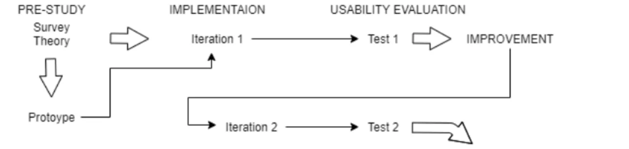
Figure 5: Illustration of the method.
3
|
Method
This chapter describes the work carried out to answer the research question and ensures replicability. The workflow of the project can be seen in Figure 5 where the work consisted of three stages: pre-study, implementation, and testing. In this chapter, the pre-study is first presented, where the survey and the prototype are described. Furthermore, the implementation section describes how the web-based queuing application was realized from a technical perspective. Finally, the usability evaluations used for testing are described. In this section, the questions used for both students and tutors are presented.
3.1
Pre-Study
The purpose of the pre-study was to produce the theoretical and functional framework for the web application.
3.1.1 Survey
To examine the market’s needs, market research was conducted in the form of an anonymous survey. The survey was conducted to create a better understanding of the customer segment and collect relevant information about students and their preferences regarding a queue application. The survey was conducted online using Google forms. The questionnaire was shared on social media and by email to students and tutors at Linköpings University. The survey (Appendix B) contained ten questions referring to current situation analysis and identifying preferences desired in a web-based queuing application.
3.1.2 Marketing Plan
During the feasibility study, a marketing plan was made to investigate the need for the service, identify competitors and determine how the application was to differ from the existing
alternatives. The marketing plan initially includes an NABC-analysis as a basis for the environmental analysis. The environmental analysis consists of a PEST analysis followed by Porter’s five-force model, a competition analysis, and finally, a SWOT analysis. Furthermore, the market goals were developed, the customer segments were identified, and the market was analyzed with a positioning map. The analyzes then formed the basis for a marketing mix.
3.1.3 Prototype
A prototype was made during the feasibility study, which forms the basis for the development of the website. The prototype created the structure of the web-based queuing application and quickly showed navigability and design issues. The prototype was created with Figma, which is explicitly used for web application prototypes and includes increased functionality with buttons and bootstrap elements.
3.2
Implementation
The queuing application is implemented with multiple different techniques and packages. The implementation was performed iterative where the first iteration was performed before the first usability evaluation. Based on the outcome of this evaluation, measures were im-plemented in iteration two before the last usability evaluation, see Figure 5. This approach was chosen as an iterative workflow with usability evaluations between the iterations enables implementation based on the test subjects’ opinions.
3.2.1 Back-End
The back-end is composed of a Python web-server powered by the Flask framework. The primary purpose of the back-end is to provide a REST API for the client to interact with. It will also manage a SQL database that will store the data needed for the application to function correctly. The server will also be responsible for serving the client files.
Versions: 1. Python 3.8.2 2. Flask 1.1.2 3. SQLAlchemy 1.3.23 4. stripe 2.56.0 5. bcrypt 3.2.0 6. Flask-JWT-Extended 4.1.0
3.2.2 Front-End
The front-end is structured as a single-page application, i.e., loading new pages will be handled by the client. In development, TypeScript and SCSS will replace regular JavaScript and CSS primarily to increase developer efficiency and project maintainability. The code will then be transpiled and packaged by Snowpack to generate the files for distribution. With the purpose of simplifying the development, the libraries JQuery, Bootstrap, copy-to-clipboard, and jwt-decode will be used. These libraries come with pre-built functionality for many standardized tasks. Versions: 1. JQuery 3.5.1 2. Bootstrap 4.6.0 3. Snowpack 3.0.11 4. TypeScript 4.1.5 5. copy-to-clipboard 3.3.1 6. jwt-decode 3.1.2 3.2.3 Deployment
For deploying the web application to the internet, the service ngrok is used. Ngrok makes it easy to expose our local development server to the internet via a public URL which will be used during the usability evaluations.
3.3
Usability Evaluations
During the project, two separate usability evaluations took place – one after each iteration of web development. Both usability evaluations had the same structure where the test subjects first had to solve a number of tasks while thinking out load in accordance with CTAP. The test subject then had to answer a number of questions in accordance with the retrospective probing methodology. Finally, the subjects filled in a SUS questionnaire. These usability evaluations were performed with an implementation iteration between, see Figure 5. Each test group contained nine subjects in accordance with Hwang and Gavriel’s study on the optimal sample size for usability evaluations [36]. The participants chosen had to be students or tutors with experience from using another online queuing application. The usability evaluations were conducted using both CTAP, retrospective probing, and the System Usability Scale (see sections 2.4.2, 2.4.3, and 2.4.4).
First, the user was given a set of tasks to perform while thinking out loud in accordance with CTAP. The purpose was to capture the user’s initial impressions of the queuing system. Students and tutors will use different functionality in the application; a student wants to, for example, queue up while a tutor wants to be able to create a room and manage the queue. Thus the research team constructed two different sets of tasks for the evaluation, one for students and one for tutors. The tasks were constructed to simulate potential activities undertaken by students and tutors in a lab/tutor environment and contained descriptions such as “Create an account on TopQ”. For the complete list of tasks, view the lists presented below. Prior to the actual tasks, the subjects were allowed to practice CTAP by solving a simple logical puzzle in obedience to Ericsson and Simon’s recommendation [39].
After the completion of the tasks, the subjects were asked a range of questions regarding their experience in accordance with the retrospective probing methodology. The aim of this part of the evaluation was to elicit thoughts and impressions specifically connected to the design and navigation aspects of the website. In line with Birns [37], closed questions such as “How would you rate the website’s design from one to five where one is very bad and five is very good?” were asked in order to gather quantitative data for comparisons. Meanwhile, open-ended questions such as “What is your overall expression of the queuing system?” were used to gather qualitative and reflective data, which could be used to improve the usability further during the second iteration. For the complete list of questions, view the list presented below.
Lastly, to discover if the overall usability of the web-based queuing system had improved after the second iteration, each test subject filled out a SUS questionnaire in compliance with the instructions given in section 2.5.4.
Following each evaluation, the results were compiled and analyzed. The results are presented in section 4.3. In order to decide which perceived issues needed to be resolved, each issue was thoroughly examined from three perspectives: number of mentions, implementation difficulty, and connection to navigation, design, or usability. Each issue was then categorized into three different categories: Implement, Implement if time is left, and Do not implement. The result can be seen in section 4.3 where the measures were implemented in iteration 2, before the second usability evaluation.
3.3.1 Usability Evaluation After Iteration 1
The first usability evaluation took place after iteration 1 and contained nine subjects, three of whom were tutors and six students at Linköping University. The usability evaluation was performed online via a video link where the user used screen sharing features when performing the tasks. As previously mentioned, ngrok was used to create secure tunnels to our localhost.
1. Create an account on TopQ 2. Log in with your new account
3. Access the lab session with room id: 1 through a code/link 4. Queue up
5. Remove your queue ticket
6. Join another pre-existing room by entering room id: 2 7. Leave the room
8. Log out from TopQ
Tasks for tutors:
1. Log in using email: admin@topq.se and password: admin 2. Queue up
3. Remove your queue ticket
4. Click the zoom-link on another ticket and “help” the student 5. Remove the “helped” student’s ticket from the queue
6. Demote another admin to member 7. Promote a premium member to admin 8. Create a room
9. Copy the link used to invite students to your room 10. Join another pre-existing room by entering room id: 2 11. Leave the room
12. Log out from TopQ
Questions:
1. What is your overall impression of the queuing system? 2. What do you like the most about the queuing system? 3. What do you dislike the most about the queuing system?
4. Did it feel natural to navigate the queuing system?
5. How would you rate the website’s navigability from one to five where one is not at all navigable and five is very navigable?
6. Did anything feel difficult to find?
7. If you could change anything to make the site more navigable, what would you change? 8. What is your overall impression of the website’s graphical design?
9. Was the design in line with your expectations?
10. How would you rate the website’s design from one to five where one is very bad, and five is very good?
11. Did anything feel unappealing to you?
3.3.2 Usability Evaluation After Iteration 2
The second usability evaluation then took place after iteration 2 with nine subjects, the same three tutors as before, and six different students ad Linköping University. The usability evaluation was performed the same way as the first but with some added tasks for students and tutors, which can be seen below.
Tasks for students:
1. Create an account on TopQ 2. Log in with your new account
3. Access the lab session with room id: [individual room id] 4. Queue up
5. Change what you need help with 6. Remove your queue ticket
7. Join another pre-existing room by entering room id: [individual room id] 8. Leave the room
9. Log out from TopQ
Tasks for tutors:
2. Click the zoom-link on another ticket and “help” the student 3. Remove the “helped” student’s ticket from the queue
4. Demote another admin to member 5. Promote a premium member to admin 6. Create a room
7. Copy the link used to invite students to your room
8. Join another pre-existing room by entering room id: [individual room id] 9. Queue up
10. Change what you need help with 11. Remove your queue ticket
12. Leave the room 13. Log out from TopQ
4
|
Results
This section presents the results obtained from this research. The purpose of this report is to examine the design and navigability aspects of a web page. The results presented will be based on these aspects.
4.1
Pre-Study
The following section will present the results obtained in the pre-study.
4.1.1 Survey
An anonymous survey conducted in the pre-study was used to investigate market needs and collect relevant information about students’ and tutors’ preferences in a web-based queuing application. The most important results are presented in the sections below, but the total outcome of the survey can be seen in Appendix B.
Forty-two people responded to the survey (30 students and 12 tutors). The survey showed that 81% used some kind of queuing system and the most common queuing systems were:
• Microsoft Teams - 23 people • Zoom - 13 people
• Camedin - 4 people
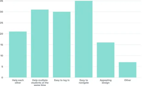
The average value of students’ and tutors’ broad experience of their respective queuing system was 3.32 on a scale from 1 to 5. The survey showed that 90.5% were interested in a better queuing application for lessons and lab sessions. The results from the questions regarding what features they would request in a queuing application are presented in Figure 6.
4.1.2 Prototype
The final prototype can be seen in Figure 7 and aims to provide an overview of how TopQ could be implemented. The colors and logo were not used in the development, but the prototype was used as a basis for how the website would be structured. The prototype contained, among other things, a landing page and a room page which can be seen in Figure 8.
Figure 6: Result from the question: What features would you request in a queuing application?
Figure 8: The room page of the prototype done in the feasibility study
4.2
Implementation
This chapter presents the result of the implemented web-based queuing application developed in accordance with the pre-study, the theory, and the user evaluations. At the end of the chapter, an account is given of which technical tools were used during the implementation and why.
4.2.1 General Design
When designing TopQ, the focus has been an appealing and easy-to-navigate interface with a consistent design and color chart according to Figure 9. This has been done by implementing an uncluttered website that consists of three elements - navbar, main container, and footer. As the user navigates around the website, new content is loaded into the main container. A hovering effect has also been implemented over all clickable objects (Figure 10).
4.2.2 Landing Page, Navbar and Footer
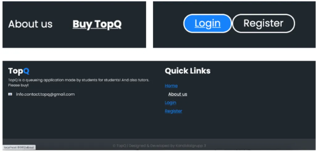
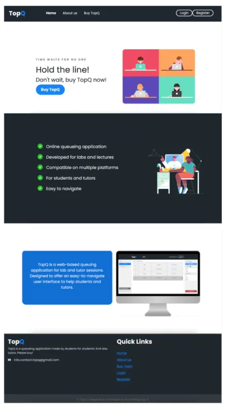
As shown in Figure 11, TopQ’s landing page consists of three different sections in addition to the navbar and footer. These sections are used to clarify the purpose and benefits of TopQ. The page was also created with the aim to be minimalistic and uncluttered.
The first section of the landing page contains an animation as well as the “Buy TopQ” button, which is intended for schools. Through this button, schools can be referred to TopQ’s school
Figure 9: TopQ’s color scheme
Figure 12: TopQ’s navbar from a non-logged in perspective
Figure 13: TopQ’s navbar from a logged in perspective
page. The following section also contains an image and six check-marks explaining TopQ’s purpose. The last section contains a small information box about TopQ and a picture with a preview of the queue room for students and tutors. The footer at the bottom of the landing page contains TopQ’s contact information and five quick links.
The navigation menu, containing the links “Home”, “About us” and “Buy TopQ”, was placed in the navbar at the top of the landing page. The login and register buttons for students and tutors were placed at the top right of the navbar. The navbar shows different links whether the user is logged in or not. Figure 12 shows the navbar from the perspective of a non-logged-in user, and no matter where they are on the website, they can always log in and register through the links in the navbar. Figure 13 on the other hand, shows logged-in users’ perspectives where they are unable to reach the page for schools (Buy TopQ), and the login and registration buttons have been changed to the user’s e-mail and a logout button.
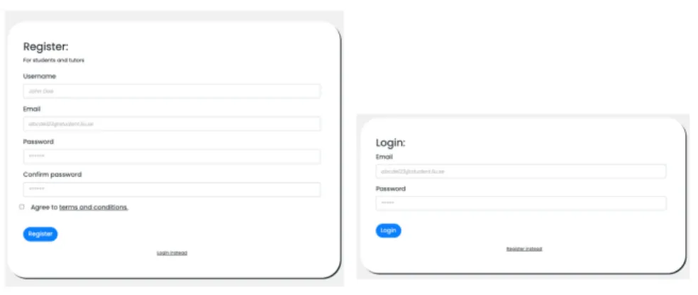
4.2.3 Login and Registration
To enable the authentication of users, the research team used registration- and login func-tions. Figure 12 shows that the buttons for these functionalities are placed in the upper right corner in the navbar, making them available at the same place on all pages on the website. The user can quickly jump between the login- and registration page through the link at the bottom of each form, as shown in Figure 14.
Figure 15: The student-view on the room-page.
Figure 16: The admin-view on the room-page.
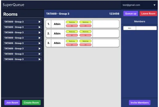
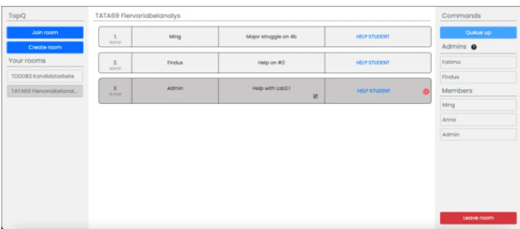
4.2.4 Room Page
After signing in, the user is redirected to the room page. This page is what constitutes the entire queuing system. The queue system is designed as a three-column system, and the functionality varies depending on whether the logged-in user is admin for the current room or not (see Figure 15 and 16). The left column holds general functions for rooms, like joining a new room, seeing and jumping between the rooms in which you are a member, and, if you have an admin account, create new rooms. The middle panel represents the queue and contains queue tickets from students currently waiting for assistance. The middle panel also holds functionality for the queue tickets, such as editing your description or leaving the queue and, if you are an admin, remove handled tickets. Lastly, the right panel holds functions for the room you are currently seeing, such as queue-up or leave the room and, if you are an admin, delete the room. Also, the right panel contains information on other members of the room, both admins and students, and a pop-up modal for more information and guidelines on the admin-administration.
The buttons have been placed in accordance with previous research and the result of the user evaluations. The color choices are in line with the color chart in Figure 9 and the rest of the application. The buttons have the accent color and match all other buttons except
Figure 17: TopQ’s checkout-section.
for buttons representing “dangerous” actions which have been giving a red, complementary color.
4.2.5 Checkout
The checkout and payment pages are only available from a signed-in school account. This means that as a student or tutor, and thereby user of the actual queuing system, you do not have access to these pages. The schools register on the TopQ school page and then sign in on the login page, just like other members.
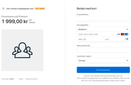
After signing in to a school account, the school user gets redirected to the checkout page (see Figure 17) from where you can select a collaboration plan and then get redirected to the payment page and continue the purchase (see Figure 18). The school users can also, through the customer portal, see their current collaboration plan and their billing history.
4.2.6 Functionality
All functionality on the web application has been implemented with a clear focus on clarity for the user and making the website as appealing and easy-to-use as possible. All buttons are big enough to hold a descriptive word showing where they lead or what they do. Additionally, all buttons have the same color. Furthermore, all input fields needing information from the user have an instructive label telling the user what they need to do. To help the user, even more, all fields also have a placeholder to exemplify the needed input.
Another example of clear guidance for the user is the feedback that is given when a required field is empty in a form (see Figure 19). The feedback points out where the problem is, making it easy for the user to do the right thing before it is possible to send the form. Another example is the need for password confirmation when creating an account. If the
Figure 18: TopQ’s payment-page.
passwords do not match, the user receives an alert and has to try again, as shown in Figure 20. Furthermore, for all “dangerous” actions that cannot be undone, there are double-checks asking the user if they want to proceed or go back, aiming to help the user avoid making mistakes. Lastly, a hovering effect has been added to all clickable objects as described and illustrated in section 4.2.1.
4.2.7 Technical Environment and Tools
The web-based queuing application was developed in accordance with and with the use of the techniques and packages presented in the method chapter (section 3.2). The back-end is composed of a Python web-server powered by the Flask framework as well as SQLAlchemy for the development of the database. To develop the front-end, HTML was used together with TypeScript and SCSS to increase developer efficiency. However, the files were then transpiled and packaged by Snowpack for distribution. Before the user evaluations, ngrok was used to create secure tunnels to localhost.
In this section the tools and modules which affecting the research question and, or are visible to the user are further presented, motivated and described.
• Flask modules
– Flask-JWT-Extended was used to implement password-protected functionality on the website only visible to logged-in users. The module makes it possible to condition the access to some functionality using a JWT Web Token which is obtained on the client-side after a successful login. This is much more efficient than to use, for example, if-statements for the same purposes.
Figure 19: Example of form-validation on TopQ.
Figure 21: TopQ’s queuing-page after iteration 1.
– Flask-CORS was used for handling Cross-Origin Resource Sharing (CORS), which makes cross-origin AJAX possible and allows communication via HTTP methods. • Stripe was used to enable payments in the application. Implementing the prebuilt checkout from Stripe is a much easier way to implement secure payments than to develop a similar solution from scratch.
• Bootstrap 4.6.0 was used to implement templates in HTML and CSS. This enabled the implementation of many important design-aspects described in section 2.3.
4.3
Usability Evaluations
This section presents the results from the two user evaluations that took place during and after the development of the queuing system.
4.3.1 Usability Evaluation After Iteration 1
The first usability evaluation took place after iteration 1, on the first version of the web application and with nine test users. The purpose of this evaluation was to improve the application by finding out the test users’ thoughts and ideas on navigation and design. Furthermore, the research team wanted to ensure that the functionally of the website was in line with the users’ expectations. The result from the evaluation was then taken into consideration during the development in the next iteration, iteration 2.
The following figures show parts of the web-application’s design after iteration 1. Figure 21 shows the queuing page and Figure 22 the queue-up modal. The landing-page was very similar to the one after iteration 2 and is presented in Figure 11 (4.2.2).
Figure 22: The queue-up modal after iteration 1.
CTAP
To begin with, the test users were to perform a set of given tasks presented in section 3.3.1 and at the same time think aloud in accordance with the CTAP-method. The most important thoughts that arose during this part of the test are summarized below.
• Stylish, clean and simple design. The color choices are nice, and the pictures on the landing page were appreciated.
• The Login-, Log out-, and Register-buttons are in the upper-right corner, as expected. • A confirmation on the written password is missing when you register a new account. • Confusing that the Rooms-button in the navbar is showing when I am already on that
page. Where does it lead?
• Most tasks were very intuitive, however, some of the buttons are not where I first thought they would be, even if I found them quickly.
• The functionality of admins is not obvious. More information is requested. • The labels in the queue-up form should be more instructive.
• It is too easy to make a mistake. It would feel more secure with double-checks on certain “dangerous” actions.
Retrospective Probing Methodology
After the completion of the tasks, the subjects were asked a range of questions regarding their experience in accordance with the retrospective probing methodology (see section 3.3.1).
Figure 23: The result of the navigability rate after iteration 1.
That way, thoughts and impressions connected explicitly to the design and navigation aspects of the website could be elicited. The most important ideas are summarized in this section, and to see the whole outcome, see Appendix C.
The users’ overall experience of the application, question 1 (section 3.3.1) was mostly positive. Commonly used words were easy to navigate, simple, clean, and smooth. Also, it was appreciated that no unnecessary functionality was implemented, which made the application easy and straightforward to use. However, the subjects had some inputs on things that could have been better, such as words that could be exchanged and buttons that could be moved to another place on the page.
When answering question 6 (3.3.1), regarding if anything was hard to find, the most common answers were the “join room”-button and the “queue up”-button. Additionally, the rooms button in the navbar was mentioned several times and described as confusing. The same buttons were brought up in question 7 as well (3.3.1) regarding what to change to make the application more navigable. Also, many of the test users here requested more instructive labels on the queue-up modal. The subjects were requested to rate the navigability on a scale from 1 to 5. The result is given in Figure 23.
Regarding the graphical design, the users’ overall experience, question 8 (3.3.1), was positive as well. On question 9 (3.3.1) all of the users responded that the design was in line with or even better than their expectations. Many of the subjects liked the landing page, the choice of colors, the pictures, and that it felt modern. However, the design of the queue tickets was not that appreciated, as many users thought it was not in line with the rest of the system. The subjects were requested to rate the website’s on a scale from 1 to 5. The result is given in Figure 24.
Figure 24: The result of the design rate after iteration 1.
Test user
Questions 1 2 3 4 5 6 7 8 9 Average
I think that I would like to use this system frequently 4 4 5 4 4 5 4 3 3 4,00
I found the system unnecessarily complex 2 1 2 1 4 1 1 2 1 1,67
I thought the system was easy to use 4 4 5 5 4 4 5 3 5 4,33
I think that I would need the support of a technical person to be able to use this system 1 2 1 2 1 1 1 1 1 1,22
I found the various functions in this system were well-integrated 3 4 4 4 3 5 5 3 4 3,89
I thought there was too much inconsistency in this system 2 2 1 2 1 1 1 2 1 1,44
I would imagine that most people would learn this system very quickly 5 5 5 5 5 5 4 5 5 4,89
I found the system very cumbersome to use 2 2 1 1 2 1 1 1 1 1,33
I felt very confident using the system 3 3 5 5 2 5 5 4 3 3,89
I needed to learn a lot of things before I could get going with this system 2 2 2 1 1 1 1 4 2 1,78 84
Figure 25: The result of the SUS after iteration 1.
SUS
Lastly, the test users answered an anonymous survey, a SUS-questionnaire including the questions presented in section 2.5.4. The result of the survey was then used to see if the web-based queuing system had improved after the second iteration by comparing the results from this SUS questionnaire with the one done after the next iteration. The SUS result was 84 on a scale from 0 to 100, and the full result is presented in Figure 25.
4.3.2 Changes After Iteration 1
After the usability evaluations made after iteration 1, the results were compiled and cate-gorized as described in section 3.3. Thereafter, a decision was made on which measures to take and which not to take as presented in this section.