Institutionen för datavetenskap
Department of Computer and Information Science
Final thesis
Developing a responsive mobile-first design
guide for e-commerce with the users in focus
by
Mathias Aktan & Ulf Wirén-Hallqvist
LIU-IDA/ LITH-EX-A--14/046--SE
Final Thesis
D
EVELOPING A RESPONSIVE MOBILE
-
FIRST
DESIGN GUIDE FOR E
-
COMMERCE WITH THE
USERS IN FOCUS
by
Mathias Aktan & Ulf Wirén-Hallqvist
LIU-IDA/LITH-EX-A--14/046--SE
2014-06-18
Supervisor: Johan Åberg , IDA, Linköpings universitet
Examiner: Magnus Bång , IDA, Linköpings universitet
På svenska
Detta dokument hålls tillgängligt på Internet – eller dess framtida ersättare – under
en längre tid från publiceringsdatum under förutsättning att inga extra-ordinära
omständigheter uppstår.
Tillgång till dokumentet innebär tillstånd för var och en att läsa, ladda ner,
skriva ut enstaka kopior för enskilt bruk och att använda det oförändrat för
ickekommersiell forskning och för undervisning. Överföring av upphovsrätten vid
en senare tidpunkt kan inte upphäva detta tillstånd. All annan användning av
dokumentet kräver upphovsmannens medgivande. För att garantera äktheten,
säkerheten och tillgängligheten finns det lösningar av teknisk och administrativ art.
Upphovsmannens ideella rätt innefattar rätt att bli nämnd som upphovsman i
den omfattning som god sed kräver vid användning av dokumentet på ovan
beskrivna sätt samt skydd mot att dokumentet ändras eller presenteras i sådan form
eller i sådant sammanhang som är kränkande för upphovsmannens litterära eller
konstnärliga anseende eller egenart.
För ytterligare information om Linköping University Electronic Press se
förlagets hemsida http://www.ep.liu.se/
In English
The publishers will keep this document online on the Internet - or its possible
replacement - for a considerable time from the date of publication barring
exceptional circumstances.
The online availability of the document implies a permanent permission for
anyone to read, to download, to print out single copies for your own use and to use
it unchanged for any non-commercial research and educational purpose.
Subsequent transfers of copyright cannot revoke this permission. All other uses of
the document are conditional on the consent of the copyright owner. The publisher
has taken technical and administrative measures to assure authenticity, security and
accessibility.
According to intellectual property law the author has the right to be mentioned
when his/her work is accessed as described above and to be protected against
infringement.
For additional information about the Linköping University Electronic Press and
its procedures for publication and for assurance of document integrity, please refer
to its WWW home page: http://www.ep.liu.se/
Abstract
Mobile e-commerce is an increasing trend. Still, many sales sites are not adapted to mobile interfaces. Important factors in the design of successful e-commerce applications are trust, high quality graphics, and easy navigation. However, a typical design approach is to strip down functionality and this can have a negative impact on the user experience.
The goal of this thesis was to create a style guide that can be used to develop responsive e-commerce sites through a mobile first implementation strategy. A style guide was created by applying modern design theory and by investigating existing commerce solutions. Moreover, a prototype of an e-commerce solution was developed using the style guide. This prototype was evaluated by an expert group of usability professionals. The study indicates that the style guide is a useful and effective tool in the design and development of e-commerce systems. We conclude that a mobile first strategy needs to be combined with subsequent traditional desktop design.
Acknowledgments
We would like to thank Thim Otskov, our contact person at Infor and his team for the help and support they have provided us during our work.
Magnus Bång & Johan Åberg our supervisors at Linköping’s University for the help and expertise they provided us with. Espen Jørgensen & Solveig Prestvik at TINE Norway and the customers they provided us with for our field study. Thanks to Brad Frost for letting us use his work and illustrations in our report. A special thanks is given to our families and friends who have stood by us during our education.
Linköping, June 2014
T
ABLE OF CONTENTS
1 Introduction ... 8
1.1 The problem ... 8
1.2 The task ... 8
1.3 Thesis purpose ... 9
1.4 Scope & Limitations ... 9
1.5 Definitions ... 9
1.6 Disposition ... 10
1.7 Infor ... 11
1.8 TINE ... 11
2 Background ... 12
2.1 Mobile market change ... 12
2.2 A changed strategy for web development is needed ... 14
3 Method ... 15
3.1 Theory ... 15
3.2 E-Commerce Design Guidelines ... 16
3.3 Interviews & observations ... 16
3.4 Statistics Survey ... 17
3.5 Requirements ... 17
3.6 Prototype ... 18
3.7 Prototype Evaluation ... 19
4 Phase One - Theory ... 20
4.1 Creating user value & user experience ... 20
4.2 Content & functionalities ... 24
4.3 Adaptive experience & responsive design ... 30
5 Phase One – E-Commerce Design Guidelines ... 43
5.1 Creating user value & user experience ... 43
5.2 Content & functionality ... 43
5.3 Adaptive experience & responsive design ... 45
6 Phase Two – Data Collection ... 47
6.1 Interviews & Observations ... 47
6.2 Statistics survey ... 49
7 Phase Two – Requirements... 51
7.1 Tine e-commerce requirements ... 51
7.2 How to increase trust for TINEs system ... 51
7.3 Interaction problems ... 51
7.4 User value chart – Prioritizing requirements and interaction problems ... 52
8 Phase Three – Prototype ... 53
8.1 Mobile first ... 53
8.2 Content ... 55
8.3 Login & Registration ... 56
8.4 Design Choices ... 57
9 Phase Three – Prototype Evaluation ... 64
9.1 Mobile first ... 64
9.2 Content ... 65
9.3 Login & Registration ... 65
9.4 Design choices ... 65
10 Discussion ... 68
10.1 Method ... 68
10.2 The design guide ... 69
10.3 Prototype ... 70
10.4 The need for a m-commerce ... 75
10.5 The purpose of the visit to an e-commerce ... 75
10.6 The work in the wider context ... 75
11 Conclusion ... 77
Reference list ... 78
1 I
NTRODUCTION
In just a few years the web browsing experience has changed drastically. About a fifth of the population in Sweden state that they have bought a product at a webpage or application with their smartphone, this does not include services such as movie tickets or application purchases. (Posten, 2013 Q2)
The main focus of companies planning to change their webpages is that they want to improve design and usability, closely followed by improvements on mobile purchasing and getting the site mobile ready. (Posten, 2013 Q2)
Studies also show that about 68% of the Swedish population has used their smartphone to search for product information. While only 6% state that they have bought a physical product with their phone, many users state that they use their phone in some part of online purchases. (Posten, 2013 Q2) Shopping with mobile interfaces increase rapidly by around 15% each quarter and businesses need to adapt in order to capture the growing market. (Posten, 2013 Q3) Bad design, lacking usability, unsupportive interfaces and the lack of trust to companies and smartphone usage demands a change in how e-commerce sites are built today.
Sites look different depending on screen resolutions, by implementing a responsive design a more uniformly interface can be created. Responsive design allows content to be rearranged in order to address issues with pages looking bad on different devices.
Traditionally mobile sites are stripped down versions of full sites offering less content and functionality. (Florins & Vanderdonckt, 2004) Removing the wrong content from a site often gives a bad user experience, which affect customers and business partners’ views on the company affecting sales and relationships negatively. With a mobile-first strategy, the full mobile site is designed first and extra functionality is added to bigger screen sizes. By doing this core functionality and content will still be available to the users creating a greater user experience.
1.1 T
HE PROBLEMThe major problem developers are faced with is developing a user-friendly e-commerce solution that has great intuitive design and works on multiple platforms. It is difficult to capture what the users’ requirements are mainly because what they need and what they want aren’t always the same. E-commerce sites often struggle with meeting user expectations and good usability is hard to achieve on multiple devices. A good overview of what products are available is a common problem on many e-commerce sites. And getting users to fulfill a started order and leaving them wanting to comeback and use the site again. What users’ value as important can be different from user to user, aproblem for one user can be a nonexistent one for another.
1.2 T
HE TASKA design guide is going to be created for a responsive e-commerce system that is designed through mobile first. A front-end environment of an e-commerce is going to be created as a business-to-business design solution on behalf of Infor, a leading company offering business solutions. The environment is created so that we can test the design guide.
TINE is the largest distributor of dairy products in Norway and is one of Infors customers that have asked us to gather user feedback on their existing e-commerce to find out what users want to see in a redeveloped system.
Our findings are going to be used to create a site developed with a mobile first perspective in order to better prioritize content. By designing with mobile first, we hope to focus on getting a great design on the mobile and scale it up to the bigger screened devices in a responsive environment.
We use a development method that captures what the users feel is important in an e-commerce, by doing this a more user centered system should be created.
To capture the user expectations together with good usability in an e-commerce, focus is going to be put on core user behavioral aspects on an e-commerce e.g. “finding”, “choosing”, “acquiring more detailed information” and “the product checkout”. Good usability is going to be created with the help of suitable tested design alternatives chosen by users and usability experts. Design alternatives are going to be customized and chosen to fit an e-commerce site that will be tailored to fit the users’ needs.
1.3 T
HESIS PURPOSEThe purpose of this thesis was to develop a responsive mobile-first design guide for an e-commerce with the user in focus. Create a prototype with the help of the design guide in order to validate that the design guide works.
1.4 S
COPE&
L
IMITATIONSWe focus on front-end development leaving the backend open for another thesis. A separation of website and mobile application is done where we won’t focus on mobile apps. Our focus is put on web development through HTML5, jQuery and CSS3/Sass. We will support IE9 or newer, latest Chrome, Firefox and Safari. Our chosen framework Foundation will give us predefined breakpoints that let us change the layout for different screen sizes. An interface will be created for mobile phones, tablets and desktops while we won’t cover large TV screens and smart watches in our study.
1.5 D
EFINITIONSAccordion – Display collapsible content by pushing/inserting information under the clicked header.
B2B – Business to Business. B2C – Business to Consumer.
Block – A part of the design that can be moved, resized, reoriented, regrouped, substituted or split into several blocks.
CSS – Cascading Style Sheet, used to format the layout for webpages.
E-commerce – Electronic Commerce, buying, selling and exchanging goods and services through an electronic system.
Grid-system – Uses rows and columns for building up the layout of webpage. HTML – HyperText Markup Language
Handlebars – JavaScript library for building templates based on the mustache template language.
JavaScript – Scripting language for Internet pages, mainly used to create dynamic and interactive webpages.
jQuery – A JavaScript library with additional enhancements and a lot of third party plugins. M-commerce – Mobile Commerce, buying, selling and exchanging goods and services through
wireless handheld devices.
Media queries – CSS3 component that allows the layout of webpages to be adapted to certain conditions like the screen resolution.
Mobile first – A design strategy where the first step is to make the design for smaller screens and later enhance it for larger ones.
Responsive design – Is when a webpage is tailored and adapt itself for different screen sizes. Sass – A CSS precompiler who lets the developer extend the functionality of traditional CSS and
later compile it into traditional CSS code.
TINE – The largest supplier of dairy products in Norway.
Trust – The users confidence with the site, e.g. if the users are able to reach everything they want on the site, if the site works as intended, and if the users are able trust the information on the site.
User interface (UI) – The visual part of a program or system.
User value – Is what the user regards as important on the site e.g. what the user has a need for. Usability – Refers to how easy something is to use. (Nielsen, 2012)
Utility – Refers to a designs functionality, if it can accomplish what the user wants it to do, i.e. if it can be utilized the way the user intendeds it to. (Nielsen, 2012)
Useful – Is both usability and utility together, i.e. if it is well designed and does what it is intended to.
User Experience (UX) – A term used to cover all aspects of user interactions with a company, product, system or environment. (Nielsen, 2012)
Whitespace – Empty space around objects, used to better separate content, making it easier to overview information.
1.6 D
ISPOSITIONInfor the company we did our thesis for and their customer TINE will be described in this chapter. The next chapter contains a background on the e-commerce market and an introduction to mobile first. A method chapter describes how our study is conducted, along with what tools and methods used. The thesis is divided by three phases containing a respective result chapter.
Phase one contains the theory chapter with our theoretical framework with information on e.g. usability, user experience, adaptive and responsive design, and recommendations on how to design an e-commerce. An empirical data collection chapter that covers user feedback from interviews, observations and surveys follows in phase two. In phase three the prototype chapter will show how we combine the theoretical and empirical study, realizing the chosen design alternatives in the prototype environment which is followed by the evaluation chapter that validates the prototype.
The discussion and results chapters are where we incorporate our own conclusions and present the findings to our research question. We end the report with reference guide and appendix containing interview data.
1.7 I
NFORInfor is one of the leading developers of enterprise software. User experience and usability are key factors used to differentiate themselves from the competition. Located at 38 countries with around 12000 employees and with over 70000 customers making them a large player in the development of business solutions. (Infor, 2014)
Different customers at Infor want and need different things when it comes to usability. That’s why the needs to explore what their preferences are and get their opinions on what they really want and need. Infor has sent us to one of their customers to study their existing e-commerce usage and apply a mobile first approach to research a good design alternative to the existing system.
1.8 TINE
The largest dairy product company in Norway, TINE has been asked by Infor to be our test company for our study. TINEs large product base will be used to populate the user interface created from a mobile first standpoint. They in turn have been promised our research findings, which will include what their customers want, how they really work and in what context TINEs e-commerce is being used. We also explore in what way there is a need of a mobile interface for TINEs customers.
2 B
ACKGROUND
In this chapter we explain how traditional development of mobile sites is done and how a mobile first approach can be an alternative way of developing. This is explained together with a brief background on the e-commerce market.
E-commerce users in the Nordic countries were asked in 2012 if they could see themselves using a mobile phone to buy products where 11% said that they would and that 5% had already used the phone to order online. These numbers however include services such as in app purchases. The typical user is between 18 and 49 years old. In this group of people 14% stated they could see themselves using the smartphone to order sometime in the remainder of the year. (Posten, 2012)
Earlier studies of the postal e-barometer, a quarterly report on e-commerce depicted what businesses thought were the major obstacles leading to low m-commerce. In the study from 2008 it showed that 55% stated that the display was too small, 50% didn’t know it was possible, 44% stated bad reception and 22% said that the reason was bad security. However when users where asked the same question it showed that 35% thought the screen was too small, 29% of the questioned stated that the internet connection was too bad, 23% that they didn’t feel it was secure and 11% didn’t know what it was possible. (Posten, 2008 Q2)
A big problem is the lack of a good strategy on mobile usage when companies market products. The most usual products bought with a smartphone (not including services) are books, entertainment media, clothes and home appliances. (Posten, 2013 Q2)
2.1 M
OBILE MARKET CHANGELately there has been a trend that the average person is using mobile phones more frequently than desktops. One important reason for this is that our mobile phones usually are closer at hand to us, opening the web browser and enter the address is easy, fast and convenient on the mobile. Researchers believe that the number of people visiting a website through their mobile phone will surpass the ones using their desktop. (Danger & Grigsby, 2012) Mobile commerce stands for about 16% (2013) of all e-commerce sales and has an increase of 68% from the previous year according to eMarketer. (Jones, 2013)
Figure 1: Increased M-commerce sales. (Jones, 2013)
The e-commerce market is growing and an increasing base of customers utilizes tablets and smartphones to order or look for information on products. However, today only 3 out of 10 companies have optimized their sites for mobile usage. (Yu, 2013)
Figure 2: What the smartphone is used for in a M-commerce. (Posten, 2013)
13,57 24,78 41,68 0 5 10 15 20 25 30 35 40 45 2011 2012 2013
M-commerce sales in $ billion
68% 24% 20% 18% 6% 0% 10% 20% 30% 40% 50% 60% 70% 80% Use a search engine to find information about a physical product Use a price comparision site before visiting a website or physical shop Use a price comparision site while visiting a website or physical shop Scan QR-codes to quicker get to information I'm looking for
Pay for a physical product
What do you use your smartphone for?
2.2 A
CHANGED STRATEGY FOR WEB DEVELOPMENT IS NEEDEDTraditional sites are developed for large screens by guessing a width that works for the majority of users. However, with the introduction of smaller screened devices such as smartphones, tablets or even tiny smart-watches sites may look ugly, as they were not originally developed for them. (Gremillion, 2013) Many developers are forced to remove content in order to compensate for the smaller screen areas creating a less than ideal user experience.
2.2.1 Mobile First
Mobile first is a development strategy where a website or application is developed first for the smaller screened device and scaled to larger screen devices. The idea is to create a site with the absolute necessities that a mobile device needs and add to design when developing for larger devices. This makes the developers focus on core functionality and content.
2.2.2 Responsive design
A new trend since 2010 is to design HTML pages responsively by adapting content to the actual window size or screen resolution. Moving information around to create a more intuitive flow of information for the users.
A responsive web design is when the same HTML code is used for all devices and styling code such as e.g. “CSS/less” or “Sass” is used to alter the page with the help of media queries. (Goggle developers, 2014)
Responsive design makes it easier to maintain HTML pages as it don’t require separate pages for the same content. By recognizing the different screen widths of visiting devices, or if a device is in portrait/ landscape mode content is adapted and moved to what has been predetermined by the developers. (Goggle developers, 2014)
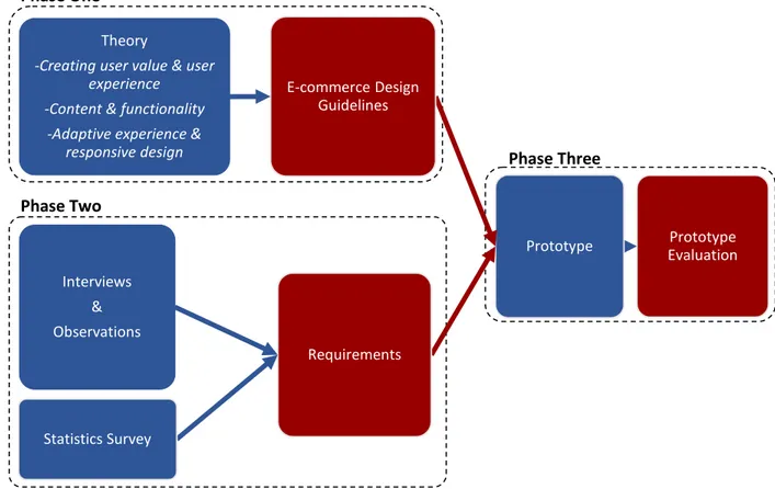
Phase Three Phase Two
Phase One
3 M
ETHOD
Here we describe the methods used to research how a mobile-first strategy can be used to capture the essence of what’s important for the user. How we aim to create a design pattern and test it in a B2B environment.
Figure 4: Our approach to create & test a mobile-first design for TINEs e-commerce.
P
HASEO
NE3.1 T
HEORYThe theories on e-commerce help us understand what usability experts’ state as important for successful e-commerce and development methodology such as mobile-first helps us prioritize content according to user requirements.
General design patterns on how solutions to common problems in e-commerce can be handled guide us to capture good ways of designing systems that meet user requirements. We have divided the theory chapter by looking at the most important design patterns for a successful e-commerce. The chapters are “Creating user value & user experience”, “Content & functionality” and “Adaptive experience & responsive design”. Prototype Evaluation Prototype E-commerce Design Guidelines Theory
-Creating user value & user experience
-Content & functionality -Adaptive experience &
responsive design Requirements Interviews & Observations Statistics Survey
The literature included in the present study is mostly consistent of online sources that are no more than 5 years old. The literature used consists of conference papers, journals, articles & books, where the most updated and creditable sources where used.
3.2 E-C
OMMERCED
ESIGNG
UIDELINESA general design guideline is put together that shows the most important factors B2B e-commences need to have in order to be successful. The design guidelines are divided into three categories “Creating user value & user experience”, “Content & functionalities” and “Adaptive & responsive design” which are important in order to handle requirements and problems users have.
Design patterns from the theory are summarized and structured to help form a guide with the most important factors. This allowed us to have a good overview on most important aspects of the design choices.
P
HASET
WO3.3 I
NTERVIEWS&
OBSERVATIONSQualitative research methods are used to gather empirical data. A snowball sampling method was used to collect participants in our qualitative research, which were referred to us by TINE. This allowed us include users who we otherwise wouldn’t have access to. We analyzed the users handed to us by TINE that represent a large portion of their customer group. (Mack, et al., 2005)
The location of the interviews and observations took place at the users’ work environment located throughout Oslo, often very simple offices with moderate technology.
In-depth interviews & participant observation was the chosen qualitative methods that helped us to collect natural occurring behaviors, personal experiences and perspectives. (Boyce & Neale, 2006) With the help of a PACT-analysis we broke down the typical e-commerce user and summarize the interviews and observations. (Trulock, n.d.)
3.3.1 Interviews
Five e-commerce users were selected and then asked a series of qualitative questions to find out in what context the system is used and what they regard important or obsolete in their e-commerce.
Semi-structured interviews with pre-prepared questions were used in in-depth interviews with a sub selection of TINES e-commerce users. Where the in-depth interviews were conducted to capture individual experiences and feelings towards the system. (Boyce & Neale, 2006)
The questions asked at the start of the interviews were relatively easy and then progressed to more challenging levels as the interview continued. The questions used are exploratory and open-ended so that we can capture what they truly wanted to say. Each interview lasted for approximately one hour and the data was recorded on paper throughout the interviews. According to the recommendations of (Benyon, et al., 2005).
3.3.2 Observations
An observation study was also conducted straight after the interviews were they performed predefined tasks defined by us. By observing the users when they performed tasks we were able to identify common problems that the users encountered and what necessities they had. (Benyon, et al., 2005) We asked them e.g. to find a specific product on the site, add the item to the checkout cart and change the quantity. We used predefined scenarios during our interview sessions to capture how the users do certain tasks, which allowed us to observe how they interacted with the system. With the help of the observations we could then identify the problems most of the users’ encounter and their user interaction patterns. (Benyon, et al., 2005)
During the observation study both of us recorded their actions on paper. (Benyon, et al., 2005) The observation study was conducted in parallel with the interview and took approximately one hour. (Observation data can be found in the appendix)
3.4 S
TATISTICSS
URVEYWe complemented our empirical research with data gathered from online statistics on typical e-commerce user behaviors. What the users and companies regard as the most important factors for a successful e-commerce. The statistics also show the largest contributing factors for aborted purchases. The statistics used are mostly gathered from the Swedish postal institute and are from the years 2008 to 2013. With the help of the statistics we can better create the requirements that e-commerce users have in order to create an e-commerce that fits the users’ needs.
3.5 R
EQUIREMENTSThe user context is very beneficial as it explains what the user does, why he does it and how he does it gives a general understanding of how they system should be designed. By understanding the context one can better draw conclusions of what is important and benefits the user. This in turn gives the developer a better understanding of how things need to be done to catch what the user requirements are. (Wäljas, et al., 2010)
The gathered information is analyzed and formed to fit a narrower e-commerce tailored for TINEs customers.
From our interviews, observations and online statistics we created a requirements list that shows what part of the e-commerce is the most important for the users. The requirements list created from our studies are also ranked according to severity for the e-commerce with the help of a user value analysis. (Tullis & Albert, 2008)
P
HASET
HREE3.6
P
ROTOTYPEA prototype was created with the help of our requirements list and the design guide address how the user problems can be solved while meeting their requirements. (Nielsen, 2012)
We iterate over a series of low fidelity prototypes that will transition into a high fidelity prototype. The initial low fidelity prototypes are created using wireframes to give quick and easy to evaluate design options. Our high fidelity models are created using HTML5 code together with jQuery, SASS & MySQL. Foundation is used to create responsive dynamics for the prototype. The reason we choose foundation is because it’s highly adaptive, easy to use and is well documented any other framework that meets these criteria would also be sufficient.
3.6.1 Iterative design process
In order to create a user centered design we had to incorporate information of the users in an early stage. It is important to understand the user, how he works and what activities can occur so that the design can orient around the user.
Products need to be designed with user-centered methods to ensure that the user’s feedback gets taken into account when designing systems. Implementing changes late in development are costly and often hard to measure. The earlier the user is included in the design phase the better the users tend to accept a new system. Design solutions shouldn’t be forced on a user. User-feedback needs to be implemented through a human-centered design to capture how the users want to use the system, its capabilities and in what context. (Bevan, 2005) This is mainly why we choose to gather user feedback at an early stage.
3.6.2 Design process
A variant of Nielsen’s design process is used to create our design proposal with the help of a prototype: (Nielsen, 2012)
1. The existing e-commerce is tested to identify what parts we should focus on.
2. Study of existing e-commerce designs to get ideas on alternative solutions. Looking for what kind of features they are using and what’s similar to the ones that TINE is using.
3. Perform a field study to show us how the users behave in their environment. 4. Use paper prototypes to test design ideas.
5. Iterate moving from low- fidelity prototypes to high- fidelity interface on the devices and evaluate each cycle.
6. Inspect design so that it follows usability guidelines and base the design on the theoretical framework together with the empirical study.
7. Test and evaluate the final design.
3.7 P
ROTOTYPEE
VALUATIONBy testing the prototype, the validation and legitimacy of the design guide for TINEs e-commerce was made possible. Feedback from users and other designers help us identify possible future improvements that researchers can use to further create a better style guide. Our evaluation on the system is focused on a B2B environment where the user group is TINEs customers.
The evaluation of the new design was tested by Infors usability experts by evaluating the prototype it shows whether the design pattern and requirements list used to create it are suitable or not. (Wäljas & Väänänen-Vainio-Mattila, 2009)
The evaluation study took place at Infors Linköping office where five usability experts tested the same user scenarios that the original TINE customers tested. They were also given the opportunity to explore the system freely and give feedback and pointers. During the test they were asked to think aloud. (Nielsen, 2012) The method was used because it is very good for usability testing, easy to use and gives us information on why the user performs a task wrong. What he is thinking of during the test and gives us convincing feedback on potential design flaws.
A drawback of the evaluation method is that the prototype won’t be tested in the actual environment by TINEs users. We recorded the evaluation sessions by pen and paper where we both took turns. Each test took about half an hour and the results are discussed in the final chapter.
4 P
HASE
O
NE
-
T
HEORY
4.1 C
REATING USER VALUE&
USER EXPERIENCEAn e-commerce is an internet-based ordering system where customers can purchase goods online. A critical part of an e-commerce is the loyal customer, without him it will be hard to succeed. (Goldman, 2010)
A successful e-commerce needs to include factors such as safety, user value, usability, and user experience to create a design that is centered on what the users need to have. If a site does not have trust or is designed to meet the users’ goals the user experience will be weaker giving an impression that the e-commerce isn’t good.
4.1.1 Safety
When technology moves forward the users can be overwhelmed by technological innovations. It is the e-commerce sites mission to mediate trust and professionalism to the users. By mediating that the user will feel more secure in buying products with the help of new technology, the reason is that customers are in general more likely to order if they feel secure.
Studies show that 64% of the Swedish people get worried when ordering online from a site that does not show any security assurance. In turn 74% state that their assurance would increase if a site showed any assurance that can identify a secure site. (Hansson, et al., 2010) A Swedish assurance logo is “Trygg e-handel”, which can be placed on sites as a symbol of verification that the site is trustworthy. A symbol like the one from “Trygg e-handel” has proven to increase sales with 20-30%. Recommendations from friends are treated as the most important factor when a site’s trustworthiness is determined. (Posten, 2012 Q2)
There are still not that many consumers that order online with their mobile device even though 70% of all consumers have a smartphone. (Posten, 2012 Q2) However, many use it as an information gathering tool, playing an important part in the way customers purchase products both online and in physical stores.
Many users abort purchases because of poor usability on substandard developed web sites. Insufficient trust towards the sites caused by the design is still one of the major reasons for this. (Hu H-J., 2008) 4.1.2 User value
If the customer does not wish to use a website at all it becomes irrelevant, understand what the user wants. Understand how they benefit from having an e-commerce. (Sun, 2010) The information on the site needs to have value for the user, since the use of irrelevant information causes the users to lose interest. (Stenfelt & Lundberg, 2012) A way of prioritizing what value is higher for the site is to use a “value users’ chart”. With the help of charts it becomes clear on what changes to the UI that are the most severe to the project. (Tullis & Albert, 2008)
Affects few users Affects many users
Small impact on user experience Low severity Medium severity
Large impact on the user experience
Medium severity High severity
Table 1: Severity rating scale. (Tullis & Albert, 2008)
4.1.3 Usability & user experience
Usability is how intuitive and understandable instructions of a web interface are while user experience focus on the users’ feelings about a product. User experience is strongly connected to what’s expected from a platform as well as what previous expectations are. (Wäljas, et al., 2010)
User experience, (UX) is a term used to cover all aspects of user interaction with a product, system and application. Factors that can be used to measure UX are for example; (Tullis & Albert, 2008)
How long it takes to perform a task on website such as ordering an item? The amount of errors users make while e.g. changing quantity?
How many users can perform a specific task without failing?
How many users can’t find the shortest way of navigating to a destination using for example a shortcut?
How many users get frustrated registering a product because text such as serial numbers is too small?
How many users are happy with how easy it was to order a product online?
These questions can be used to study behaviors and attitudes. Measuring these can be done with the help of counting clicks, task success rate, task time, asking if they were frustrated or delighted and eye fixation. These are examples of good usability metrics. (Tullis & Albert, 2008)
Furthermore, the user needs to be able to understand the site and be able to use it to be a loyal customer. (Sun, 2010)
Usability is divided in five components; (Nielsen, 2012)
Learnability, how easy it’s to carry out a task for the first time?
Efficiency, how quick is the user able to perform a task in a well-known environment? Memorability, how fast can users relearn skills after not using them for a period of time?
Errors, how many errors do the user make, the seriousness of these and the easiness to recover from an error?
Satisfaction, how satisfying is the design to use?
Another quality attribute is utility and refers to what the user needs in form of functionality. Both usability and utility are important attributes to determine the usefulness of a function. It doesn’t matter if the function is easy to perform if it isn’t something that the user wants. The same problem reoccurs if the system has the functionality but the design is bad. (Nielsen, 2012)
Utility is whether it provides the features you need. Usability is how easy & pleasant these features are to use. Useful is usability and utility together.
Figure 6 Useful, usability, utility (Nielsen, 2012)
Usability is important because the user will leave the website if he isn’t able to easily perform his task or find the information he was looking for. “The first law of e-commerce is that if users cannot find the product, they cannot buy it either.” (Nielsen, 2012)
User generated content increases personal value to the actual user experience. If the user is able to comment on products, upload pictures to a shared gallery or a personalized profile he will feel a stronger connection to the site. Resulting in a better user experience and higher frequency of use. (Pasman, 2011)
It is important to define a clear identity for a web page so that the visitor feels familiar and comfortable with the brand. The system should be viewed as a good friend providing information, a tool that is at your disposal guiding you to fulfill tasks. Capture the users’ opinions in an early stage of the design process. Tools that can be used to accomplish early user integration in the design process are typically storyboards, scenarios, interviews and observations. (Pasman, 2011)
4.1.4 Human-Computer Interaction
Effectiveness, efficiency and satisfaction can be studied to see how users can use a product in a specified context. Effectiveness shows how accurate and complete a task can be performed by a user. Efficiency tells what effort is needed to achieve the effectiveness and satisfaction is how the users accept and evaluate an application. (Konradt, et al., 2012)
To capture usability in a user-interface design one should look at for example credibility, content and response time. (Konradt, et al., 2012)
4.1.5 Why usability is important in B2B
What separates business to consumer (B2C) from business to business (B2B) e-commerce is the brand of the company, a consumer is more driven by what it feels towards the brand while businesses are looking at what value the business vendor gives and what long term relationship they have. In B2C good usability and emotions play a large part as it determines whether the customer returns to buy products in the future. For B2B the usability becomes more important in the long run as contracts and dependencies drive the partnership. (Konradt, et al., 2012)
Bad usability however creates irritations and affects the way the users feel about the company. Since the amount of information that B2B commerce products have is more and needs to be available to a larger extent. Usability becomes more important to help the business users to find information by structuring up how information is found and presented. (Konradt, et al., 2012)
4.1.6 Delays loading times
The ideal response time for information to be sent to the server and back should be less than 0.1 seconds for the user not to notice any interruptions. While the highest acceptable delay is 1 second and
unacceptable time is 10 seconds. Website success is strongly connected to download times, which is easy to measure and strongly connected to usability and what the users want. (Konradt, et al., 2012) 40% of users who visit a website abandon it if the load time of the page is more than three seconds. A one second delay yields about 7 % loss. For an e-commerce this can result in a very high loss of revenue. (Gardner, 2011)
With the help off CSS3, visual elements can be implemented through code instead of with images. CSS3 allows a site to be designed so it has the same look, lowering server requests by using code for rounding corners, gradients and drop down shadows for supported browsers. (Gardner, 2011)
A mobile first approach allows a site to be optimized for speed on the mobile devices and with the help of media queries high resolution content and design can be added to other larger screened devices. (Gardner, 2011)
Another possible solution regarding load times is to trick the user in believing that server requests have been done, simulating faster response times. Queuing the request to the server and displaying that the action is successful before it actually has been uploaded can do this. Instagram makes the user perceive that a “like” is done straight away by popping up a heart on the screen. However in reality the request to the server is still being handled in the background of the client. (Wroblewski, 2013)
4.1.7 Trust
Trust plays a major part of successful e-commerce. A user needs to feel comfortable with the site and factors that influence the user are design, branding, etc.
Trustworthiness can be communicated with four approaches: (Nielsen, 1999) Use a high design quality, clear navigation and no typos.
Show all the important information like delivery charges regarding the order from the beginning. Use good shots with high quality of all products and the show correct image for all products. Do not isolate the site, link and let the users read reviews about the site on third-party sites,
which is a sign of confidence.
A websites’ openness regarding their security and how they handle private data have a large impact on their trustworthiness. For example password fields that hide the password should be used, though the functionality can be expanded and let the users change the visibility of the field to show the typed password. It’s also important that a privacy statement is provided where it explains everything regarding the users’ private information on the site. Trust as a subject is wider than security and includes additional aspects. An example is if the users are able to reach everything they want on the site, if the site works as intended, and if the users are able trust the information on the site (good quality images, spelling, grammar, expressions etc.). (Nielsen, 1999) (Hasan, et al., 2012)
4.2 C
ONTENT&
FUNCTIONALITIESIn order to make a system well designed the developers need to have clear labels and balance the page content so that the flow of information leads the user to the next step of the page. Relevant navigation needs to be used to find content and the design must align with the behavior of the user while focusing on what’s important to the user. The context of the user, what the customers need and how they behave has to be aligned with how the site is designed in order to create a good user experience. (Wroblewski, 2011)
4.2.1 User attention
Make the interface on the mobile intuitive. Let the flow of the user interaction be smooth and help them focus on their primary tasks. Don’t build the site as traditional desktop ones where we try to show as much information as possible. Instead help the user traverse through the site by analyzing where the users attention is placed. (Wroblewski, 2013)
In an e-commerce it’s important to understand what triggers the user with the design, have good content and good usability. A site with poor usability or design but with a great content will make it difficult to sell products. The reason for this is that it might be difficult to find the great content or that the design doesn’t look professional and trustworthy. Important aspects to think about when designing the site include: (Fuller, 2013)
Top Content – Users are lazy and will judge the site before scrolling or pressing a link. Therefore the most important content should be placed at the top.
Avoid Clutter – Make the design easy to scan for the users, a great tips is using whitespaces to separate content.
Familiar Navigation – Users expect to find the navigation at certain places, if the navigation isn’t there they’ll get frustrated and leave the site.
Typography – Good typography is essential when it comes to readability, use large headers, mark important sections, use an appropriate line-height and a font that is retina ready.
Colors – Customers make their purchase decisions based on emotions. Colors create emotions and brand recognition in the color scheme creates safety. Think about what emotions the site is supposed to mediate and base the color scheme on that.
Visual Hierarchy – Visual hierarchy is all about telling the users what they are supposed to be looking at, use larger images for the most important elements, smaller for the other, the same rule applies to headers.
Images – Use images to draw attention, images of things that people like tend to increase the number of sales. The use of interesting or unexpected images are normally better than using the traditional stock images that everyone else are using.
Movements – Users wants feedback from the system as a confirmation, movements are a great way to direct attention to something that has changed.
Buttons and links – Going to the next step usually means pressing a button or link, this is why it’s important to consider the color and placement of these.
Make it simple – Make it easy for the users to fill in forms and take action, don’t ask for unnecessary information or steps.
Social Proofs – Inform the potential customers that users before them have bought the same product. This can be done with for example ratings and reviews.
Recommendations – Make it easy for the users to find similar products, additional products or information they might be interested in.
Sales – Make it clear if an item is on sale. 4.2.2 Good content
A quote by Jonas Downey states, “Say everything that needs to be said, but no more”. (Downey, 2013) Web users tend to be lazy and it has shown that users only read about 16% of all words displayed on a webpage. While 79% only gaze through text. A study by the Nielsen Norman Group showed that the following factors increased the usability and readability with 124%: (Nielsen, 1997)
Write concise texts.
Make the text easy to scan through without reading the whole paragraph. Use an objective language or neutral language.
When choosing what information to display it’s important to build the sentences so that they guide the user to what information will be displayed. Examples are the use of highlighted keywords such as hyperlinks, typeface variations and colors. Other things the eye easily gazes for are bullet lists and sub-headers. Capture the audience with the most interesting facts first and only mention one idea per paragraph. (Downey, 2013)
Fonts, icons and colors are usually well thought during the development phase, while labels get a random word or sentence. This often gives users headaches, since they don’t have a clue of the meaning and what to enter in a textbox. Well thought out sentences play a huge part when it comes to usability. (Downey, 2013)
Below are two tables that compare two dialog windows. The first text is the usual standard one often presented on todays on websites while the second has been given a lot more thought. (Downey, 2013)
You’re moving a repeating event. Which events too do you want to update? Only this event
All events in the series Never mind
Figure 7: Dialog box (Downey, 2013)
You're moving a repeating event. Do you want to move all future versions of this event too? Yes, move all future versions.
No, just move this one and keep the others where they were. Never mind, don't move anything.
Figure 8: Dialog box (Downey, 2013)
4.2.3 Quality images
Images take up around 61% of a websites space today. (Grigsby, 2013) The use of high-resolution screens requires even larger images to look good which requires an increased image size. As a web designer it’s important to provide the best possible experience for a specific user. The ones without a
high-resolution display should only have to wait for the smaller images, something that can be created with the help of media queries. An alternative to reduce the size of images is to use font or vector icons. (Grigsby, 2013)
How pictures are presented becomes more important on mobile devices. Keeping the aspect ratio on pictures becomes harder with different screen ratios. What type of advertisement is suitable change since wide leaderboard ads won’t look good on smaller screens? A way of handling this is with swapping out images depending on resolution. (Byrne, 2013)
4.2.4 Mobile-Optimized sites vs. Full Site
Basic ideas when mobile optimizing include, cutting out features, removing content and enlarging interface elements for easier touch, this is usually done by creating separate sites. (Nielsen, 2012) According to Nielsen information about and what a user can do with a product should be less on a mobile site than on a desktop. But it’s still important not to limit the amount of products on the mobile, if a user search for a product and don’t find it on the smartphone they will assume that it won’t exist on the desktop either. (Nielsen, 2012)
He also states that providing full content is sometimes the only way of satisfying all visitors to a mobile site, there is always a few who expect to have the same functionality on the phone and the desktop. But with good design or a link to the full site content can be managed to be user friendly even on smaller screen devices. (Nielsen, 2012)
Design so that for the major and more frequent tasks more users have a good user experience and that for small minor less used tasks allow the system to have extra interaction with extra clicks to reach the content. This strategy is good for pleasing the majority of the users by neglecting an often much smaller group.
For the most part complex tasks are better suited on desktop environments. An entire site can’t be optimized for mobiles from the start according to Nielsen. Desktops will get penalized if forced a mobile design since it’s not optimal for larger screens and don’t have the same input devices as a phone, never forget who’s the larger of the user groups. (Nielsen, 2012)
In and B2B environment planned complex tasks will be carried out on desktops and not on a mobile device. But when the user is on the move the best choice is to use what is available, for example a smartphone or tablet. (Nielsen, 2011)
4.2.5 Shopping procedure
Users’ purpose for visiting a site can normally be divided into three categories “urgent”, “repetitive”, “bored” or a combination of these. The environment a user is in during a visit can also differ.
With the awareness that a user can visit the site for a different purpose at different places the design of the site can better be aligned with what the users want to do at each interaction of the site. The shopping procedure of an e-commerce has been divided into the following interaction types to help understand what the user wants to do: (Wroblewski, 2011)
Find – The user wants to find information about a specific topic, order, location or product quickly by browsing or searching (urgent).
Explore – The user got some extra time and wants to explore and browse through information or products to see if something interesting shows up (bored)
Inform – The user repeatedly checks for the latest updates regarding a topic, product, delivery or in-stock statuses (repeat)
Create and Modify – The user has to perform a specific task like ordering products, change or continue with an existing order (urgent). The same task can also be carried out on a regular basis (repetitive & urgent)
Understanding what the user wants to do when visiting a site and in what context the visits are in helps create an appropriate structure for the site. (Wroblewski, 2011)
4.2.5.1 Find & browse
There are two different ways to find a product, a user can either browse or search for a product. It’s important to offer both alternatives in an e-commerce. Users who prefer to search usually know the products they are looking for since it’s the fastest way to find a product. It’s however important to handle misspelled words in a good way (fuzzy search) otherwise users will feel frustrated when they don't find what they are looking for. (Nielsen, 2011)
4.2.5.2 Keeping an eye on user activity
Revisits is an important part of every website, studies have shown that for most sites (58-81%) of all desktop traffic are revisits and that half of these occur within 3 minutes. Usually users want to check out a recently view product again when they revisit a website within 3 minutes, where they want to access the same product or information again. (Sohn, et al., 2011)
Many e-commerce sites keep track on previous user history, for example it can show recent objects viewed. If the system keeps track of user activities they can then be used at later points to help increase user experience. A user might be logged in and viewed a few products then change platform. A filtering of information presented could also help the user, if for instance it recommends certain products based on previous activities. Keeping track on how popular a product is might also be relevant through a user perspective. Showing items from a category that’s usually ordered from can help users locate what they are looking for. (Sohn, et al., 2011)
4.2.5.3 Registration placement
Most web shops offer or force the users to be registered members at different stages at the shopping process. Depending on the purpose of the site a different approach can be taken but the main goal is to reduce interference for the user. The different approaches are: (Nielsen, 2009)
Register before checkout Register after checkout
Register to be able to browse products Register a little bit at the time
One of the most common approaches is to let the user “register before checkout”. This is unfortunately not a good idea since it interferes with the customer at the most impotent part which is when he going to make the order. This interference can cause the customer to abort a purchase and go to another site. (Nielsen, 2009)
A similar approach is to let the user “register after checkout”. This approach offers a lot of benefits compared to the previous one since it won’t interfere during the shopping procedure. The membership will also be treated as a “value proposition” since the website offers the user to make his or hers next purchase easier. It is also easy to become a member since the user already has entered all the necessary information and only have to pick a password at this point. (Nielsen, 2009)
A totally different approach is to force the users “register to be able to browse products”. This method makes sense in some cases when the companies don’t want to share some information to outsiders. The privileged members can take part of the e.g. product information and price. The e-commerce can also be tailored to suit a specific customer. (Nielsen, 2009)
The last approach is “register a little bit at the time”. Users are usually more willing to the enter information if it doesn’t seem to be much, this tactic fools the users by divide the registration process into smaller pieces. This approach can make the users irritated but most are still willing to proceed since they already have enter some information in the system and it’s better than one huge register form before checkout. (Nielsen, 2009)
There are a couple of general rules for registering users independent of chosen approach: (Nielsen, 2009)
Do not force the user to register if it isn’t necessary. Only ask for a bare minimum of information.
If the goal is to make the users members then offer them a “value proposition”.
If something is missing or wrong, spare the users frustration from reentering all the information again.
Help the user to fill in his information by automatically filling in information when possible, e.g. ask for the zip code and automatically fill in the city for him or her.
4.2.6 Design characteristics of multi-platform interaction
When trying to design a good cross platform, one need to look at the composition, how devices and functionality are organized. Continuity to other platforms, how transitions between different platforms work and the consistency of system components that they are designed the same way throughout the system, that they use the same names, design and symbols. (Wäljas, et al., 2010)
It’s important to decide what the core features are, provide them in a consistent manner to create a familiarity and show that it’s the same features that are offered on different platforms. (Nielsen, 2011) 4.2.6.1 Composition
How devices and functionality are organized: (Wäljas, et al., 2010)
Component role allocation defines the users purpose of each device which in turn determines the expectations of the functionally. It’s important to understand how the different platforms are used and in what situations to prioritize functionality and tailor the best user experience for each device.
Distribution of functionality relates to what functionality is transferred to different devices and what is made distinguished based on the strengths and weaknesses of each device or the assumed situation to be used in.
Functional modularity is how well each platform adapts to different situation. The usage of the service might be limited if not all functionality is being distributed to other platforms and not the correct device is within reach.
4.2.6.2 Continuity
How transitions between platforms are handled: (Wäljas, et al., 2010) Task migration e.g. continuing or moving work to another platform.
Cross-platform transitions it should be easy to change platform without technical difficulties. Synchronization of actions and content needs to be easy between different platforms. 4.2.6.3 Consistency
Services needs to have the same look and feel over multiple platforms. Always offer the same design throughout all the platforms on a component level. (Wäljas, et al., 2010)
Perceptual consistency is when viewing how the user perceives the system meaning having the same look and feel to it.
Semantic consistency is when the same symbols and terminology is used.
Syntactic consistency is about interaction logic, error messages are placed at the same place or menu items are sorted in the same order.
If the user knows how to use a service on one unit it should be easy to transfer that knowledge to another unit. The same icons, terminology and expressions need to be used in a consistent manner so that mitigation becomes easy. (Wäljas, et al., 2010)
However it isn’t enough to only use the same logo or color scheme. This is why it’s important to divide the design into blocks so that all elements have a similar look, users must be able to easily locate stuff on different platforms and understand how to interact with them. (Nielsen, 2011) Images and text need to have the same look and feel on all platforms even if they are in different sizes. It’s important that the users are able feel that it’s the same content they are looking at on all devices. When a system is designed with composition, continuity and consistency in mind one can expect a better total user experience over multiple platforms. (Wäljas, et al., 2010)
A fluent content and task migration gives an experience of smoothness while good consistency makes the users perceive that the systems work perfectly together. (Wäljas, et al., 2010) The transition to new environments needs to go smooth or else the user won’t accept the new platform. With bad UX in the transition the main system will also suffer leaving the user lost in the transition. (Pasman, 2011)
4.3 A
DAPTIVE EXPERIENCE&
RESPONSIVE DESIGNGuide the user with adaptive components that’s tailored for the user environment and provide a responsive interface for different screen sizes with a mobile first strategy.
4.3.1 Guide the user with the design
A flexible design that adapts according to what the user is doing can increases the user experience. The system should keep track of what the user want to see on a site and the developers need to know how the user interacts with the site, where he usually has his attention. (Sohn, et al., 2011)
4.3.1.1 Compatibility of user environment
From a usability point of view it is important to inform the user that he or she is using an unsupported device or needs to activate a plugin such as JavaScript in the browser. (Danger & Grigsby, 2012) Which will help the user help find a solution to the problem and not blaming the site for problems that can occur.
Browsers have different compatibility with CSS, HTML, JavaScript, and Flash among other tools that can be used when creating websites. Many users still use old versions of browsers not making them compatible with newer development tools. Some of the browsers force updates while others are not that demanding. For mobile devices much newer versions of browsers are installed making them support new standards better. While some older standards such as Adobe Flash are no longer supported. (Deveria, 2013)
Media queries in CSS3 are commonly used to trigger a different look for different screen sizes, orientation, aspect ratio etc. (Danger & Grigsby, 2012) The browsers without support for media queries use a fallback to a previous development state and what is shown depends on the chosen design method, e.g. mobile first or desktop first. (Grigsby, 2013)
Desktop first gives a desktop fallback, only showing the desktop version even if visited from a mobile phone. Because it’s developed from a desktop first perspective.
Mobile first gives a mobile fallback, only showing the mobile version even if visited from a desktop PC. Because it’s developed from a mobile first design.
The physical devices have different properties. Some have hardware buttons while other have touch, navigate with gestures, and have different screen size and aspect ratio. Depending on operating system how the user interacts with the computer is slightly different, e.g. on Apple OSX the close, minimize, expand buttons are located to the left in a window, while in Microsoft Windows it’s oriented on the right side of a window. The save screen that different programs use in windows have the button order “yes”, “no” and “cancel” while OSX have “don’t save” “cancel” and “save”. Depending on where in the world the users live they can read a book from the left to right or right to the left. These environmental or cultural differences give us a hint of how users want their websites oriented. A good rule of thumb has always been to balance the page trying to guide the user to move forward to a location. (Benyon, et al., 2005)
4.3.1.2 Make the design adaptive
In a world filled with a wide range of different devices it’s impossible to know what device the next visitor will be using. A solution to this is to provide a responsive and adapted experience for that type of device. Most modern smartphones and tablets provide different styles on the keyboard to give the user
an adapted experience. Two common situations are showing a number pad when the user is entering numbers and a @-symbol when the user is entering an e-mail address. (Moore, 2013)
HTML5 make it easy to change input screen for a mobile device: (Moore, 2013) <input type="number" />
<input type="email" />
Media queries are sensor tools that are under constant development and the new (Media Queries Level 4) will for example support “script”, “pointer” and “hover”. All of these will make it easier to increase the usability on the site. (Cox, 2013)
Script notice whether the device supports JavaScript or not. Pointer makes it possible to check the devices input accuracy.
o Coarse refers to a touch device.
o Fine refers to a device with a mouse or styles.
o None refers to devices without a pointer, e.g. only a keyboard connected. Hover checks if a device supports hovering.
These media queries also take into consideration that users can have multiple pointer devices connected to the same device, for example a touch screen and a mouse. The benefit of using media queries and adept the design to touch or mouse is that developers are able to make buttons, links, menus etc. more touch friendly. Another benefit is that they are able to offer hovering functionality when it’s possible and replace it when it isn’t possible. These are simple extensions to the functionality that will add more control over how the design is adapted throughout different devices. (Cox, 2013) A common solution to save space on a website is to include the label inside a textbox and hide the label when the user starts typing or replace the label with an icon. Both of these methods have their own downsides. Hiding the label can make the user forget what information he was supposed to enter. Replacing the label with an icon can be confusing for less known icons. An alternative method is to use the “float label pattern” which makes the label float inside the textbox whenever the user has typed something in it. (Smith, 2013)