They only show the leader
Improving watching cross-country
skiing at home
Anton Brottare
Anton@brottare.eu Interaktionsdesign Bachelor 22.5HP VT/19Contact information
Author: Anton Brottare AG9708 Email: anton@brottare.eu Supervisor:Anne-Marie Skriver Hansen
Email: anne-marie.hansen@mau.se
Abstract
This thesis explores the setting and culture surrounding watching cross-country skiing at home and how to improve that experience. Through a combination of qualitative and quantitative research methods it’s
discovered that watching solitarily from home is the most popular way to watch. The viewers express a great deal of interest in interacting with the athletes and in seeing more statistics. The design process results in an interactive visualisation and information system that overlays the
broadcast, giving the viewer control over what to see and when. User testing proves this prototype and concept as desirable by the users, especially the conceptualisation of using their phones to control this system.
Table of contents
Abstract ... 3 Table of contents ...4 Figure list ...6 1 Introduction ... 7 1.1 Motivation ... 7 1.2 Delimitations ... 7 1.3 Research questions ... 7 2 Theory ... 82.1 Cross-country skiing as a sport ... 8
2.2 Different ways of watching sports ...9
2.3 Related fan interactions ...9
2.3.1 Goal In The Next Seconds ... 10
2.3.2 Fanboost ... 10 2.3.3 NHL All-Star ... 11 2.3.4 Fan votes ... 11 2.4 No augmented reality ... 11 2.5 Interactivity ... 12 3 Design Methods ... 13
3.1 Design methods and tools ... 13
3.1.1 Survey ... 13 3.1.2 Participatory observations ... 13 3.1.3 Interviews ... 13 3.1.4 Brainstorming ... 14 3.1.5 Prototyping ... 14 3.1.6 User testing ... 15 3.2 Double diamond ... 16 3.2.1 Discovery phase ... 16 3.2.2 Defining phase ... 16 3.2.3 Development phase ... 16 3.2.4 Delivery phase ... 17 3.3 Ethical considerations ... 17 4 Design process ... 17
4.1 Survey ... 17 4.1.1 Results ... 17 4.1.2 Conclusion ... 20 4.2 Participatory observations ... 20 4.2.1 Participants ... 20 4.2.2 Procedure ... 20 4.2.3 Results ... 20 4.3 Interviews ... 21 4.3.1 Participants ... 21 4.3.2 Interview findings ...22 4.4 Design opportunities ...22
4.4.1 Results from the brainstorming ...23
4.4.2 Choosing what to develop further ... 25
4.4.3 First prototypes ... 25
4.4.4 Explorative user testing ... 26
4.4.5 Tying the prototypes together ... 27
4.4.6 Assessment user testing ... 30
4.4.7 Different scenarios ... 31 5 Discussion ...32 5.1 Ethical complications ...32 5.2 Concepts ... 33 6 Conclusion ...34 References ... 35
Figure list
Figure 1: GINTS Interface ... 10
Figure 2: Illustration of the double Diamond Design process ... 16
Figure 3: Chart of event popularity ... 17
Figure 4: Chart of ways of watching... 18
Figure 5: Chart of outside of broadcast activities ... 19
Figure 6: Chart of interaction interests ... 19
Figure 7: First results of brainstorming ...23
Figure 8: Merging of ideas ... 25
Figure 9: Prototype 1 - Graphical incline representation ... 25
Figure 10: Prototype 2 - Detailed track overview 1 ... 26
Figure 11: Prototype 3 - Detailed track overview 2 ... 26
Figure 12: Prototype 4 – Merged prototypes ... 28
Figure 13: Illustration of living room experience ... 29
Figure 14: Close-up of phone UI ... 29
Figure 15: TV layout of visualisations ... 30
Figure 16: Endurance mode ... 31
1 Introduction
1.1 Motivation
Watching traditional sports at home today, no matter the viewing medium, is basically done the same way it was done before the internet took off. There’s usually little to no interaction from the viewers apart from staring at the screen. Bale (1998) notes that a sporting event can be watched in three main ways and categorizes them as category one to three. Category one is watching it live where it happens, in the stadium for example. Category two is the one this thesis will focus on, the viewing at home or as Buffington puts it “in private domiciles” (2017, pp 939). The third category is a bit of a mix of the first two as it mostly describes sport bars or in Buffington’s words “public spaces where spectators can view the televised event, but in the presence of large throngs of (primarily anonymous) fellow spectators” (2017, pp. 940). Buffington (2017) notes that most viewers are category two viewers and yet most interactions happen in category one and three. Category one viewers can even go so far as to provide their team with a homefield advantage against visiting opponents by chanting, reacting and otherwise boosting their team towards victory, something that’s also common in category three even if it doesn’t affect the team’s performance (Buffington, 2017). The most common interaction in category three however is viewer to viewer (Buffington, 2017) be it teasing fans of the opposing team or collectively responding together with fellow fans.
1.2 Delimitations
Today a plethora of televised sports exist and designing something that fits the needs of all category two sports viewers (Bale, 1998) is likely an impossible task. To narrow the scope of the thesis it was decided to focus on one sport and the choice fell on cross-country skiing.
1.3 Research questions
− What is the existing culture and setting around watching cross-country skiing at home?
− How can interaction be designed to improve the experience of watching cross-country skiing from home?
2 Theory
2.1 Cross-country skiing as a sport
The first record of a modern, non-military, cross-country skiing competition took place on the 19th of March 1843 in a local newspaper in the Norwegian city of Tromsø (Huntford, 2009). The published announcement invited anyone that wanted to test the speed of their ski in a race estimated to take 40 minutes, that was if the weather permitted skiing. If the race actually took place is not known but no matter which it was the beginning of a new age for the popular mode of transportation (Huntford, 2009). When the first winter Olympic games were held in Chamonix in 1924 cross-country skiing was one of the five events and has been present at the winter Olympics ever since (“Cross country skiing Equipment and History - Olympic Sport History”, n.d.). Today international cross-country skiing competitions are governed by the International Ski Federation, FIS for short. In the 1980s cross-country skiing evolved from its traditional technique with a new faster technique called ski skating, initially the FIS worked to ban the new technique out of fear that it would corrupt the classical heritage of the sport (Bengtsson, n.d.). However, in 1986 the FIS realised that they could not fight the will of the people and divided the sport in two disciplines, classical and freestyle (Bengtsson, n.d.). The dual
discipline format is what the sport follows to this date and races permit either classical or freestyle techniques except for double pursuit where half the race is classical and the other half freestyle (International Ski
Federation, 2018b).
The highest level of international competition in cross-country skiing is the FIS Cross-Country World Cup (International Ski Federation, 2018b), hereafter referred to as the FIS world cup. There’s also a less popular commercially funded long distance cup called the Ski Classics, in which all the races are 50 kilometres or longer (“Ski Classics – vill göra långloppen mera populära”, 2010). The world cup begins in the end of November and finishes in the end of March with competitions every weekend apart from when the Olympics or biannual world championships forces a hiatus (International Ski Federation, 2018a). The viewership of cross-country skiing globally is fairly small, only ranking 39th in Brown's (2012) Biggest Global
Sports index. In Scandinavia however cross-country skiing is a very popular sport, in Norway 8 of the 10 most viewed sports programs in 2017 were cross-country skiing (NRK, 2018). Even so the global interest for the sport has been steadily declining the last years (Lundholm, 2019; Petterson, 2019; Sörensen, 2019).
2.2 Different ways of watching sports
As mentioned in the introduction John Bale (1998) defined three categories of viewers dependant on the way they experience a sporting event. These categories, despite watching the same event, may experience the event differently due to a multitude of factors. One of these factors is the impact broadcasting companies have on category two and three viewers experience. When watching something live all attendees have their own unique vantage point from which they watch the event. Category two and three on the other hand are restricted to the camera angle, commentary and production techniques that the broadcast company provides. Buffington (2017) notes that the 2006 football World Cup final had a live attendance of around 69,000 people, in contrast the estimated viewership for the event globally lies between 260 and 750 million people (Buffington, 2017). There is no way of knowing for sure how the global viewership is split between category two and three viewers, what is certain however is that they have been subjected to similar filtering from the broadcast companies. Despite this, category three viewers have a greater chance of creating a unique viewing experience. For category two viewers the opportunities for sociability are reduced by the constraints of a living room. Category three viewers on the other hand are still given the opportunity to interact with their peers in a way that is characteristic for category one. The ethnographic research Buffington (2017) conducts reveals that category three viewers engage in two primary activities during a football match, watching the game and interacting with each other. Significant events in the matches sparked interactions between friends and strangers alike (Buffington, 2017). These interactions, for example the collective responses that a goal create, help create a unique viewing experience that category two viewers lack.
2.3 Related fan interactions
Four related sports fan interactions that have been found will be presented in greater detail. These fan interactions will serve as inspiration and material for discussions during the different research methods employed in the design process.
2.3.1 Goal In The Next Seconds
Viva superstars describes themselves as a company that creates second screen fan engagements to take TV Shows or live events to the next level (Viva Superstars, n.d.). One of the products that they provided up until 2015, when it was discontinued, was the Viva Ronaldo app where
fans of the football player could meet and engage in everything related to Ronaldo. Together with Centieiro, Romão, & Dias (2014) an addition to the Viva Ronaldo app was introduced, the Goal In The Next Seconds or GINTS feature. GINTS is a game that the users play while watching a live football match. The aim of the game is to predict if a goal is about to happen within the coming 20 seconds (Centieiro et al., 2014). The interaction is meant to be used without looking at the phone, solely navigating through haptic feedback. When a match is ongoing an upward swipe in the app will reveal the GINTS feature, when the user presses the middle of the screen a bet is placed and a 20 second countdown begins. If Ronaldo’s team scores a goal within the 20 seconds since betting the player is awarded points, if Ronaldo’s team doesn’t score the player loses points
(Centieiro et al., 2014). One drawback of the GINTS feature is that not all broadcasts have the same delay meaning users may not get awarded the points they believe they’re entitled to. Centieiro et al. (2014) underlines the importance of reducing the required visual attention for second screen interactions to be successful. The GINTS interactions doesn’t affect the players or game in any way and is solely a competition between like-minded category two (Bale, 1998) viewers.
2.3.2 Fanboost
Formula E features one of the fan interactions that may have the greatest impact on the drivers and race in what they call Fanboost. Fanboost is a voting system where the fans are given an opportunity to change the outcome of a coming race. Between 6 days before and 15 minutes into to the race fans are given an opportunity to vote on their favourite drivers, the top five drivers are rewarded with a 5 second long boost they can utilize in the second half of the race (Formula E, n.d.). Voting takes place on the website and on twitter with specific hashtags for each driver. Each viewer can vote once per day on each platform, to a maximum of 12 votes per person per race. Fanboost has changed the outcome of a race, for example in the Putrajaya ePrix in 2014, where Bruno Senna successfully passed Nicolas Prost thanks to Fanboost (“Senna makes most of FanBoost.,” 2014).
2.3.3 NHL All-Star
Every year the National Hockey League, NHL, plays an all-star game with the best players from each division teaming up. From 2016 and onwards the fans have been given the chance to select the captain of each all-star team (NHL Public Relations, 2018). As the all-star game is just a fun event for the fans the nomination of captain is more of a symbolic value for the player as they get confirmation that they have earned the fans loyalty (Adam Kimelman, 2018). The 2019 NHL all-star game also featured a “last men in” vote where the fans got to vote on who’d be the last player in each divisions team (“Skinner, Landeskog, Letang, Draisaitl named”, 2019). The last men in vote had actual impact on the outcome of the games as all the last men, apart from one, actually scored in the games in the mini tournament (Roarke, 2019b, 2019c, 2019a).
2.3.4 Fan votes
Another common way of allowing the fans to interact with their favourite sport is to have fan votes on things that doesn’t affect the outcome of the events. For example, the FIFA fan awards is a series of awards where the fans are given a chance to vote for their favourite male and female players and coaches (“The Best FIFA Football Awards”, n.d.). Another example of fan votes could be the Formula 1 driver of the day vote in which the fans are given the chance to vote for the driver that they believe performed the best on the track during that Grand Prix (“Driver of the Day 2019”, n.d.).
2.4 No augmented reality
Augmented reality, also known as AR, is when technology is used to integrate computer generated information into the real world (Bimber & Raskar, 2005). Augmented reality systems began as head mounted displays but have since evolved to utilizing handheld devices, like phones or tablets, as the display (Billinghurst, Clark, & Lee, 2015). Despite this minification of the technology is expected to bring back head mounted displays in the form of even smaller devices capable of being worn without obstructing the user (Billinghurst et al., 2015). But that is still to come, and the most common AR devices today remain handheld. For AR devices to function properly the device’s location in relation to what’s being displayed need to be known. Tracking AR devices today is done with an array of different sensors but many of them suffer from drifting or occasional interference from other devices which can be disorienting for the user (Billinghurst et al., 2015). To avoid working with or around these potential negative aspects this thesis will not utilize augmented reality.
2.5 Interactivity
Despite interactivity being an essential part in the design of most products and services, especially digital, it still remains a fluid and difficult to define subject (Barry & Doherty, 2017). Much of the discussion around interactivity lies in defining where it occurs, something that the multi-level structure of today’s interactions complicates (Barry & Doherty, 2017). In an effort to simplify this Lim, Lee & Lee (2009) proposes a set of interactivity attributes to make the invisible qualities of interaction more tangible. These attributes together create what Lim et al. (2009) call the shape of the interaction, similar to how attributes can be used to describe the shape of physical artefacts. These attributes are:
− Concurrency – describes how concurrent or sequential the interaction happens.
− Continuity – describes how discrete or continuous the interaction is. − Expectedness – describes how expected the outcome of the
interaction is.
− Movement range – describes how close to the interaction the outcome occurs.
− Movement speed – describes the speed of interaction induced movement.
− Proximity – describes how precise or approximate the interaction is. − Response speed – describes how delayed the response to the
interaction is.
Keeping these attributes in mind when designing can help the designer control the shape of the interaction and steer the way it’s experienced by the user (Lim et al., 2009).
3 Design Methods
3.1 Design methods and tools
For a design process to be successful a multitude of tools and methods may be utilized. In the design process leading up to this thesis a combination of quantitative and qualitative methods has been employed in order to gain a holistic view of the context and its users’.
3.1.1 Survey
Surveys provide a means of gathering quantitative data from a selected customer group (Cooper, Reimann, Cronin, & Noessel, 2014). Surveys also provide a way of comparing different demographics, for example comparing answers between ages, genders or other defining variables. For this thesis a web-based survey was utilized as it’s an efficient way to gain an overview of how a customer group experiences or utilizes a service or product (Cooper et al., 2014).
3.1.2 Participatory observations
Making a field visit for observations is a good way to become more familiar with the context and setting of what is being designed for. Participatory observations are a method for collecting qualitative data by making a field visit and participating in the event and/or group that is being studied (Yin, 2003). By taking field notes and measuring occurrences additional useful information can be gathered about the topic that is being studied (Yin, 2003). In this thesis participatory observations were conducted in order to allow the participants to go about their activity as normal as possible.
3.1.3 Interviews
In order to successfully design something new for an already existing context it’s important to understand the context fully. One of the most important sources of qualitative data is interviews (Yin, 2003). There is a multitude of different ways to conduct an interview. The most common types being structured, unstructured and semi-structured (Wilson, 2014).
Structured interviews follow a script that the interviewers are to follow with as little deviation as possible meaning all participants are asked the questions in the same order (Wilson, 2014). For close-ended questions participants are asked to answer with standardised responses, such as – poor, fair, good and very good. Structured interviews emphasise standardisation in both responses and questions to be able to group and compare the answers in a reliable manner (Wilson, 2014). Structured interviews are most fitting when the design team want to collect consistent information about a major issue that has been discovered (Wilson, 2014).
Unstructured interviews emphasise conversations with stakeholders and users. Unstructured interviews lack a format or specific questions, instead a general theme or topic is discussed. The interview is guided by project goals and the issues that the participants feel are important, the interviewer and participants drive the conversation and direction together (Wilson, 2014). Unstructured interviews are most appropriate when gathering in-depth data of users experiences, allowing them to express themselves without restrictions (Wilson, 2014). Unstructured interviews are most appropriate in the early stages of a design process (Wilson, 2014).
Semi-structured interviews offer a middle-ground between structured- and unstructured-interviews as the name suggests. Semi-structured interviews are more like a guided conversation than the structured queries of structured interviews which results in a more natural flow of the conversation (Yin, 2003). A combination of open-ended and close-ended questions are utilized to direct the discussion making it more structured than discussing topics as is the aim of unstructured interviews (Wilson, 2014). Open-ended questions encourages detailed responses whilst close-ended questions can be used to keep interviewees productive (Cooper et al., 2014).
In this design process semi-structured interviews were utilized because of the versatile middle-ground they offer.
3.1.4 Brainstorming
Brainstorming is a method for idea generation, solution finding and increasing creativity. Brainstorming is appropriate to utilize in any phase of a design process were a problem requires a new solution or idea (Wilson, 2013). The aim of brainstorming is to generate as many ideas as possible as quality when brainstorming often comes from great quantity, the more the better (Wilson, 2013). Brainstorming can be done individually or in group, when brainstorming in group it’s important not to criticise or limit the other participants as anything that limits the amount of generated ideas is contrary to the essence of brainstorming (Wilson, 2013). There are multiple different variants of brainstorming, in this thesis it was kept simple and the only constraint was a set time limit.
3.1.5 Prototyping
The main reason designers create prototypes is to test specific parts of concepts for evaluation and knowledge building (Lim, Stolterman, & Tenenberg, 2008). The reason behind making part specific prototypes is to limit the feedback the prototype provides, making it easier to identify problems or areas of opportunity for future prototypes, making prototyping iterative (Lim et al., 2008).
Prototypes are often classified depending on their fidelity, also known as resolution, or physicality. In this thesis only digital prototypes were made.
It’s possible to create prototypes of varying fidelity and most often they are classified as either high or low fidelity. A low-fidelity prototype can be made from cheap materials such as paper (Lim et al., 2008), which increases the flexibility and decreases the effort needed to create and modify them. Low-fidelity prototypes excel at exploration (Preece, Rogers, & Sharp, 2015). High-fidelity prototypes on the other hand look more like the finished product and may even use the same materials (Preece et al., 2015). A high-fidelity prototype is usually easier for the user to understand on their own (Preece et al., 2015). In this thesis both low- and high-fidelity digital prototypes were utilized. The lower fidelity prototypes were utilized in user-testing focused on exploring the concepts at an early stage whereas the higher fidelity prototype was utilized later in the design process for user-testing focused on assessment.
3.1.6 User testing
User testing, also known as usability testing, is an important step in the development of any product or service. User testing can occur in different stages of development but is best utilized in the early to middle stages of development (Goodman, Kuniavsky, & Moed, 2013). User testing is like a structured interview and is most efficient when focusing on a few aspects of a designed artefact. User testing should be an iterative process that allows for changes to be made between sessions (Goodman et al., 2013). The goal of the user testing determines what type of testing it is. Goodman et al. (2013) states four main types of testing - exploratory, assessment, comparison and validation. Exploratory user testing is conducted to evaluate the potential of early concepts. Assessment user testing is conducted to discuss and try features in development. User testing focused on comparison is done to evaluate designs against each other. The fourth type of user testing is validation were the goal is to certify standards late in the development process (Goodman et al., 2013). In this thesis multiple user tests were conducted with different goals, both exploratory and as an assessment.
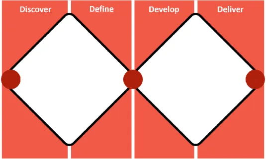
3.2 Double diamond
Throughout the thesis work the methods and tools have been utilized according to the double diamond design process to ensure utilization of the right method at the right time. The double diamond is comprised of four phases - discover, define, develop and deliver (UK Design Council, 2015).
Figure 2: Illustration of the double Diamond Design process
3.2.1 Discovery phase
The first phase, discover, is a divergent phase where the designer works to gather insights related to the problem statement (UK Design Council, 2015). During the discovery phase in this design process the previously mentioned methods that were utilized were the survey, interviews and the participatory observations.
3.2.2 Defining phase
The second phase, define, is a convergent phase where the designer defines a detailed problem that needs solving. In this design process the defining phase was comprised of interpreting the answers from the discovery phase and formulating design opportunities based on these insights. When the define phase is completed the first half of the double diamond is completed and it is once more time to diverge in the next phase.
3.2.3 Development phase
The third phase, development, is a divergent phase with the goal of coming up with solutions and concepts for prototyping, testing and iterating (UK Design Council, 2015). The methods used in the development phase in this design process were the brainstorming and the lower fidelity prototyping.
3.2.4 Delivery phase
In the fourth and final phase, delivery, it is time to finalize testing and evaluation of the concept for implementation (UK Design Council, 2015). During the delivery phase the methods that were utilized were prototyping and user testing.
3.3 Ethical considerations
The work throughout this thesis has followed the ethical standards formulated by The Swedish Research Council (2017). All participants were informed of the project and their rights as well as asked to sign a letter of consent before voluntarily participating in any and all activities related to the design process.
4 Design process
4.1 Survey
4.1.1 Results
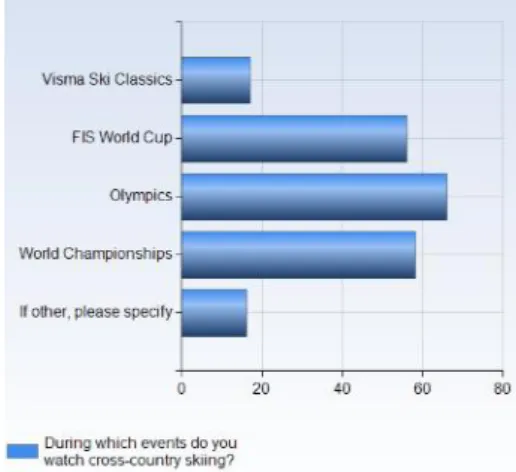
The research began by conducting a web-based survey to find out more about people that watch cross-country skiing and their watching habits. The survey was posted on two online forums that focuses on cross-country skiing and a grand total of 68 responses were recorded. 88% of respondents were male, 10% female and the rest didn’t want to reveal their gender. The average age of the respondents was 33 years old.
Since an array of different cross-country skiing events exists, it felt necessary to gauge which events people watch the most. Not surprisingly the championships, especially the Olympics, draw the most viewers with 96% of respondents saying that they watch cross-country skiing at the Olympics. Something that’s in line with reports from MMS, an institution that measures consumption of video in Sweden, that reports that the ladies’ relay at the 2018 Olympics had 1.8 million viewers in Sweden (MMS, 2018a). The other championship, the World Championships, also has a very high view rate compared to the regular season. During the 2019 World Championships in Seefeld the most viewed event, the men’s 50km, had 1.5 million viewers in Sweden (MMS, 2019). In the regular season, the FIS world cup which consists of 33 events over the course of 17 weeks, the most viewed event in Sweden in 2018 was the 10/15km ladies’/men’s pursuit in Lillehammer with 839.000 viewers (MMS, 2018b).
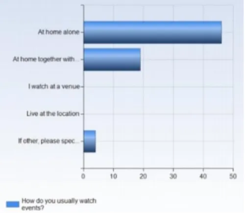
Despite this, 51% of the respondents watch cross-country skiing weekly during the season and almost 70% of the respondents watch at home alone, 26% watch at home with friends/family. No respondent usually watches live at the location or at a venue. Something that’s understandable as the world cup travels from location to location, mostly throughout Europe, each week during the season. This makes it hard to follow along and watch multiple events live. With a staggering 96% of the respondents watching at home to some degree it’s safe to say that category two (Bale, 1998) is the most common way of viewing cross-country skiing. Most respondents reported that their main motivation for watching is that they’re interested in the sport and think it’s fun and exciting, a handful of participants reported that they ski themselves and enjoy watching and learning from the best skiers there is.
Figure 5: Chart of outside of broadcast activities
As for participating in activities related to, but outside of, the broadcast a clear 80% don’t participate at all with a few respondents participating in forums, fantasy league or twitter. The people that responded other reported that they talk face-to-face to friends or colleagues about the events. 51% of the respondents reported that they don’t use their phone/tablet whilst watching. The respondents that do use their phone or tablet report that they use them during parts of lower interest to avoid getting bored. A clear majority of the respondents watch alone at home and doesn’t participate in any activities outside of the broadcast despite almost half of the them using their phone or tablet whilst watching.
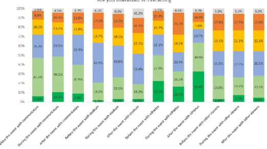
If people are to interact with something - when and with who are they most interested in interacting with?
To answer this question a Likert scale was utilized where the respondents were asked to choose who they were interested in interacting with. This revealed that most people are uninterested or neutral toward interactions with the stadium and other viewers. The most interest lies in interacting with the athletes and the commentators especially before and after the race.
4.1.2 Conclusion
Almost nobody is engaged in a related interaction outside of the broadcast which may indicate that people don’t care that much about the sport when they’re not watching. Something that is contradicted by the participants uninterest in interacting during the race where none of the categories reaches over 50% agreement/strong agreement. This contradiction is something that will be investigated further in the interviews and observations. It’s also safe to conclude that the survey participants are the most interested in interacting with the athletes in some way. It’s also worth noting that despite the survey being posted on online forums devoted to cross-country skiing almost none of the participants discuss the broadcasts on the very same forum. It’s entirely possible that the participants discuss their own skiing, equipment and other matters related to cross-country skiing as an activity rather than the broadcasts.
The heavily distorted gender balance in the answers is something that could be investigated in the future. In this design process however there ultimately wasn’t time to investigate why, besides the reasons why more men than women watch sport is still a heavily convoluted topic (Apostolou, Frantzides, & Pavlidou, 2014).
4.2 Participatory observations
4.2.1 Participants
Through the survey contact was established with three cross-country skiing viewers that would allow me to join them for watching a race in their homes. The participants were 2 males and one female between 25 and 55 years old. They all usually watched the races alone or with one or two close family members. None of them skied themselves but they all watched the FIS world cup regularly throughout the season.
4.2.2 Procedure
Each observation took place in the participants home, I’d arrive about 40-60 minutes before the race was set to start and follow along in their usual routine. While we were watching the race, field notes were taken on my phone in hopes that it would be less conspicuous and allow the participants to act as natural as possible. For the sake of consistency, it would have been ideal to watch the same type of race with all participants but due to scheduling difficulties it wasn’t possible. Therefore, the observations took place during two ladies’ 10km and one men’s 15km all in classic style.
4.2.3 Results
None of the participants watched the pre-race studio but it is likely that my presence may have affected this decision. During the races the participants sat relaxed for the first laps of the race but when the races went into the final
kilometres two of them tensed up and sat on the edges of their seats. It is worth noting that both of those races were incredibly tight all the way to the finish line, with less than 1.5 seconds between first and third position. All three of the participants looked at their phones at some point throughout the race. Two of the participants checked the current standings in the overall cup, something that’s usually covered in the pre-race studio, and the other just scrolled through Instagram in one of the slower segments of the race. A common denominator for all participants were that they, at least once, complained that the current camera view didn’t follow the skier they were the most interested in or that it for some reason changed focus to something of less interest during a part of the race they were excited about.
4.3 Interviews
With the quantitative data from the survey and the qualitative data from the observations it was time to construct questions and allow the qualitative data collection to dig even deeper with semi-structured interviews. The survey served as a great way to get in contact with potential interviewees by having an optional sign up for being contacted by me for an interview. A total of 15 respondents opted for me to contact them, out of which four expressed further interest. The interviews consisted of 14 pre-prepared questions to steer the conversation and took between 60 and 80 minutes. Three of the four interviews were conducted over video calls as the geographical distance was too great to meet.
4.3.1 Participants
The first interviewee was a 55-year-old woman residing in Sweden. She watches the FIS world cup regularly throughout the season as well as the Olympics, Vasaloppet and the world championships when they’re on. She hasn’t skied in many years but enjoys watching the events.
The second interviewee was a 27-year-old man residing in Canada. He watches the FIS world cup regularly but most often after the fact, as his time zone doesn’t align well with the airtime of the events. Whenever the Olympics or world championships is on, he makes a point of watching them live no matter the timing. He is active in an elite skiing initiative and has competed in the FIS world cup on a couple of occasions.
The third interviewee was a 19-year-old male residing in the United States of America. He watches the FIS world cup regularly, but like interviewee two after the fact due to the time zones. Whenever there’s a championship or the Olympics he tries to watch it live. He’s currently enrolled in a cross-country skiing college team and aims to someday compete on the international stage. The fourth and final interviewee was a 40-year-old male residing in Denmark. He rarely watches the FIS world cup due to limited viewing options in Denmark, however the Olympics and world championships are something he
prioritizes watching. He skis as his main form of exercise and has completed Vasaloppet.
4.3.2 Interview findings
The interviews revealed that the interviewees realize that a new interaction is likely to require at least some of their attention. Something they fear will make them miss out on what’s happening in the race, as a result of that the respondents expressed a desire for interaction that take place before and after the race. However, all the interviewees admitted to almost never watching the pre- or post-race studio that accompanies most of the race broadcasts. One of the interviewees stated that he previously had competed in a fantasy league against friends and that it had given him more investment in his chosen athletes and not just the ones competing for his country. All the interviewees expressed great interest in being able to choose who to follow during the race and not being restricted to following the current leader pack, something the cameras tend to focus on. When asked about their view of fan interactions in other sports the most interest was expressed for a skier of the day type vote. Multiple interviewees expressed concerns for interactions that may affect the outcome of the races.
One thing that all interviewees expressed strong interest in was getting more details of the track and skiers, something that’s notoriously bad in the current format. There’s a quick overview of the track in the beginning of most events but it usually lasts less than 30 seconds. Another problem with the lack of track details is that it’s hard to gauge just how steep the climbs are when the camera is also at an angle. As for information about the skiers the only information that’s provided is their timings at certain stations around the track, all interviewees would like to see more information about the skiers - for example their speed and position on the track.
4.4 Design opportunities
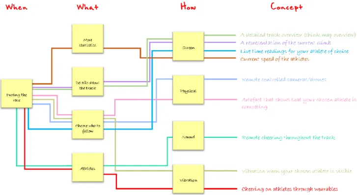
With the data collection completed it was time to sort and categorize the insights for an upcoming ideation session. I began by highlighting reoccurring words in my transcribed interviews and field notes from the observations. After this I chose the four most common categories for ideation. These categories were:
− Details about the track − More statistics
− Athlete interaction − Choose who to follow
The interviews had revealed that the uninterest for interaction during the broadcast came from a concern that it would draw attention from the race itself, something that Centieiro et al. (2014) noted the importance of avoiding. So instead of focusing on developing ideas that would take place
before and after the race I opted to try and come up with ideas that could take place during the race but not distract from the broadcast. As the world championships and Olympics take place so seldom I chose to put my efforts toward designing with the FIS World Cup in mind.
4.4.1 Results from the brainstorming
In the first round of brainstorming the following 9 concept ideas were created.
Figure 7: First results of brainstorming
1. A detailed track overview
In the current format the category two viewers (Bale, 1998) have little to no chance of determining where on the track the skiers are or where they are in relation to each other, apart from the timings from the last checkpoint. One solution to this is to provide a detailed overview of the track where the skiers current positions are visible.
2. A representation of the current climb
When watching skiing it can be very hard to determine how steep the incline that the skiers are going up or down actually is as the camera is often at a similar angle. A solution to this could be to show a representation of the incline on-screen so the viewers have something to compare with. Inclines can be displayed in a multitude of ways, one common way of displaying an incline is the way road signs does it with a slope drawn on the sign.
3. Live time readings for chosen athletes
As cross-country skiing is a sport with lots of races with individual starts the standard format for showing the skiers times is showing how they compare at certain time measuring stations around the track. The issue with this is that there can be many kilometres between the stations meaning the viewers seldom get an update on how the field performs compared to each other. A solution to this could be to display live timings as the skiers already carry transponders to ensure they take the correct route.
4. Current speed of the athletes
Another thing that can be hard to gauge is just how quick the skiers are going. For example, both the men and ladies can average around 20 kilometres per hour over a 15/10-kilometer-long race with steep inclines both up and down. Displaying this information could help get the viewers more engaged in the race.
5. Remote controlled cameras
Another idea for more control over who to follow could be to choose your own cameras or even be in control of a camera. Being in control of cameras remotely with thousands of other viewers is a technically demanding challenge so for the sake of this thesis it was decided to settle on choosing your own camera view.
6. Artefact indicating that your chosen athlete is competing
Not all skiers compete in all competitions so if you’re interested in following a specific skier this artefact could let you know that he has completed the warmup or qualifiers and is expected to start the race.
7. Remote cheering throughout the track
Category one viewers (Bale, 1998) have an opportunity to boost their favourite skiers along the track or when they’re in the stadium. A way for category two viewers to partake in this could be remote cheering along the track, for example spots that are less popular for the category one viewers to stand at. The cheering could be done through the use of speakers and/or large screens for example.
8. Vibration when your chosen athlete is visible
If you’re not following one of the top five skiers, the screen time that your chosen skier gets is often very limited or sometime even non-existent. A way of notifying you that your favourite athlete is on screen could be through haptic feedback.
9. Cheering on athletes through wearables
Another way for the category two viewers (Bale, 1998) to show their support for their favourite athlete could be that the athlete wears something that provides cheering through some medium such as audio or haptic feedback.
4.4.2 Choosing what to develop further
After the brainstorming session it was clear that many of the ideas were similar or along the same theme, providing the viewers with more information. For further development it was decided to focus on giving the viewers more access to information related to the broadcast. Information or statistics relating to the broadcast had been a key insight from all the data collection methods. From this the concept of customizable on-screen information was created.
Figure 8: Merging of ideas
4.4.3 First prototypes
In the first round of prototyping low-fidelity prototypes were created through the use of photo and video editing software. These prototypes were created for explorative user testing and as such only displayed certain aspects.
1. Prototype 1 - presenting the incline
For the first prototype a series of screenshots from a broadcast were edited to feature an approximation of the incline the skiers are climbing. Versions with a graphical representation in addition to just presenting the number were created for future testing.
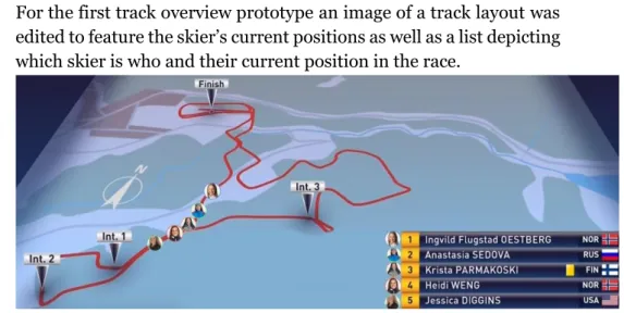
2. Prototype 2 - detailed track overview 1
For the first track overview prototype an image of a track layout was edited to feature the skier’s current positions as well as a list depicting which skier is who and their current position in the race.
Figure 10: Prototype 2 - Detailed track overview 1
3. Prototype 3 - detailed track overview 2
A second track overview was created with video editing software. It was created by animating markers over the track and height maps that are displayed before the race. The markers move according to the race leaders’ position in a shorter race. The maps were then placed in the corner of the video stream for the entirety of the race.
Figure 11: Prototype 3 - Detailed track overview 2 1
4.4.4 Explorative user testing
The goal of the first user testing was to explore the potential of the low-fidelity prototypes in order to assess whether it captured the essence of what the viewers wanted. Three of the participants from the interviews earlier in the process took part in the user testing. As with the interviews the testing sessions had to be conducted through video calls as the geographical distance
prevented a meeting in person. For these user tests the participants were asked to imagine the prototypes in the context of a race.
Prototype 1 was the first prototype to be tested. The participants liked the concept and were in agreement that knowing the incline of the current climb was a helpful tool to better understand what the skiers were experiencing. However, the visualisation of the incline wasn’t received well at all. When asked about it none of the participants had realised that it was a representation and admitted that they had only looked at the number. It is possible that it would’ve been clearer as a video prototype where the incline changed as the skier progressed around the track and not just still images. The participants expressed great interest in prototype 2, under the condition that they were able to switch to this view at will and not get forced to watch it every so often, the way split times are shown from time to time now. Apart from that, one participant expressed interest in adding the split times next to the skier’s names. The tests of this prototype highlighted the importance of choice when it comes to providing the viewers with information, as information at the wrong moment can impact the experience negatively. The final prototype, prototype 3, was well received and the participants really enjoyed seeing the end draw closer on the map as the skiers progressed around the track. They did express that the background around the map was a bit distracting and would’ve liked to see just the map overlaid on the broadcast. The importance of providing information without taking up too much space on the screen became clear from these tests.
These explorative user tests were great for reinforcing the hypothesis that the participants in the interviews and survey didn’t mind if new interactions happened during the race as long as it allowed the focus to stay on the race itself.
4.4.5 Tying the prototypes together
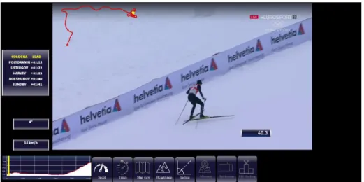
With the insights from the user tests a second round of prototyping began. The idea was to integrate all the previous prototypes into one higher fidelity interactive prototype. Keeping Lim et al.'s (2009) interactivity attributes in mind it was decided that interaction should be expected, discrete and with instant response speed in order to minimize the attention required for interacting with the prototype. For this a webpage with a large video player was created and under the video player an array of buttons was positioned. The buttons corresponded to an information box and pressing them would toggle the visibility of that box. The information boxes were designed to mimic the appearance of the existing box that display how long the race has been going on. As per the requests of the previous user testing the map view didn’t receive a background and instead was superimposed on the video player.
Figure 12: Prototype 4 – Merged prototypes2
The video that was chosen for the prototype was the 2017/2018 Tour de Ski final climb as lots of information is available online about the track. Such as the incline or average incline in many segments which was important to make the prototype believable and not have the numbers being way off having a negative impact on future user testing. Due to the limited time scope it was decided that the displayed information would follow the race leader, Dario Cologna, no matter who is currently in view in the camera. The displayable information was the following:
• Speed – Pressing the speed button displays a speedometer to the left of the broadcast which shows the current speed in kilometres per hour. • Times – Pressing the times button displays the times between the race
leader and the following 5 skiers to the left of the broadcast.
• Map view – Pressing the map view button superimposes a map of the track, a yellow dot on the track indicates where the race leader is.
• Height map – Pressing the height map button displays a height graph slightly below and to the left of the broadcast. A yellow bar on the height map indicates the current position of the race leader.
• Incline – Pressing the incline button displays the current incline to the left of the broadcast.
The displayed information updates as the race progresses in one of two ways. The speed and times proved too hard to try and match with the video track as there is nothing to compare with, so estimates were created by comparing the split times and the finish times for the skiers. The estimates then had random values added or subtracted to simulate the speed of the skier increasing and decreasing slightly. The map view, height map and incline on the other hand relies on how far along the video stream has been played. Due to the complexity of implementing them three functions had to be cut - the map view from prototype 2, the FIS ranking and the split screen. The mini map,
prototype 2 from the earlier round of prototyping, and FIS ranking weren’t possible to make believable without actual values and the split screen wasn’t possible as there only exists one stream of the race. The buttons were left in the prototype, but greyed out, to hopefully spark discussion about more information or visualisations that the viewers would like to see in a finished product.
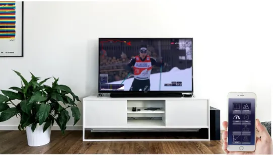
Figure 13: Illustration of living room experience
A lower-fidelity prototype was also created that illustrated how the prototype could work in a living room setting, where the broadcast was displayed on a television instead of the current format that only works in a web browser. For this the phone was imagined as a remote control for displaying the different information types. Centieiro et al. (2014) notes the difficulty in creating touch screen interfaces that require little visual attention so instead I opted for a design resembling that of a remote control, with large illustrative buttons in easy to reach positions.
As the broadcast takes up the entire tv-screen the visualisations were integrated into the broadcast in a similar way to how the already available
time since the race started is displayed.
Figure 15: TV layout of visualisations
4.4.6 Assessment user testing
For the second round of user testing contact had been established with two more participants willing to partake in user testing, meaning the number of participants was increased to 5. The participants were between 25 and 70 years old and all watched the FIS world cup regularly. These user tests were done with the goal of assessing the available features in the prototype as well as explore further visualisations the participants could be interested in. The prototype was made accessible to the participants via a website a couple of days before the scheduled video call testing session, as the higher fidelity of the prototype gave way for exploring it on their own. During the video calls the participants were asked to share their screen, start the prototype and we’d discuss what they enjoyed and what they didn’t enjoy.
All participants were positive to the new information boxes, with the most popular being the current speed. The consensus was that it was easy to use but that they hadn’t been sure what all buttons did before pressing them. A possible solution to this could be to add an introductory text explaining the functions and descriptive tooltips when hovering over the buttons. Another remark many of the participants made was that the position indicator in the height and map views didn’t move very fluently. In a finalized product the animations would need to be fluent to be less distracting. The participants that had seen the first prototypes were disappointed that the map view hadn’t made it to this prototype, which was understandable but as mentioned the timeframe and lack of real data didn’t allow for this to come to fruition. When asked about additional statistics or visualisations they would be interested in all participants had ideas such as skier’s heartrate, time deltas between skiers of choice and distance between the skiers. A concern that too much information could be overwhelming was raised. However, as it is the
viewer that decides themselves which information to display and when, it’s unlikely that this would become an issue.
Regarding the illustration of how the concept could function in a living room environment the participants liked it more than the web-based version with the main motivation being preferring to watch sport on their television over their computer screen.
4.4.7 Different scenarios
Cross-country skiing races differ greatly in length and intensity opening for customization of the added information depending on which type of race or which part of the race the user is watching. Based on the user testing and discussions with users two different scenarios have been imagined illustrating this.
Endurance mode
Endurance mode would be ideal for the longer races with individual starts, such as the 30/50km and longer. Individual starts often mean that the skiers only are shown briefly as they pass the time stations around the track. Keeping up with a chosen athlete requires you to pay close attention to the times as they pass these stations. Turning on endurance mode could make the visualisations focus on times and positions on the map.
Sprint mode
In shorter races such as sprints the time the race takes are far shorter and the skiers start in a mass start, with all skiers in the race starting at the same time. To efficiently charge for better positions skiers often attack during the toughest inclines to gain as much as ground as possible on their opponent. Because of this the time differences between the skiers are less important while the speed, height map and incline become the focus.
Figure 17: Sprint mode
Apart from pre-configuring the information before the race begins the user would have access to customising it as the race goes on. If for example there’s a certain section where the user is interested in a specific type of data they’d have access to turning it on and off at will.
5 Discussion
Throughout this thesis choices have been made which has had impacts on the design and design process. Some of these choices and how to take the design work further will be discussed in this section.
5.1 Ethical complications
If the concepts presented in this thesis were to come to fruition, it’s important to consider the ethical complications of broadcasting detailed information about skiers’ performance. Much of the information that the prototypes in this thesis showed is unlikely to be obtrusive as much of it can be extrapolated from already existing information. Calculating the average speed of a skier in
a certain part of the track can be done by comparing the distance and the time between time stations for example. But if for example the heartrate, which was a popular request after the second user testing, were to be broadcasted it could have implications. Heartrate sensors have been made available for the general public through smartwatches and other wearables and many people today have access to monitoring their own heartrate. There’s even an entire community dedicated to monitoring and logging quantifiable data about oneself, the quantified self community. That someone has the right to quantify themselves is probably not a controversial thought but broadcasting the athletes data may be too intrusive. All athletes, especially the ones prevalent in the public eye, might not be comfortable sharing this information. These public figures are already expected to share their lives on social platforms and maybe quantifiable data about their bodies is taking it too far. Further research in the area of presenting athlete data for category two viewers (Bale, 1998) would require investigating these concerns and where to draw the line for what needs to be shared publicly.
5.2 Concepts
If the prototype were to be developed further several promising aspects were left unexplored in this design process and could be grounds for future development.
The positioning of the visualisations on-screen is something that would benefit from further testing and exploration. The current positions were based on the insight that the viewers want to avoid being distracted, thus positioning it similarly to how the currently available visualisations already are positioned. Continuing this work the opportunity to allow the user to position the visualisations freely should be explored. If the user is to be given more access and control over the broadcast they’re watching allowing free placement of the added visualisations feels like a natural path to explore. Another popular aspect that was left unexplored was the ability to directly interact with the athletes. I chose to focus on the broadcast itself as there are plenty of ways to interact with athletes before and after the races through social media. However, during the race there’s no way for category two or three viewers (Bale, 1998) to interact with the athletes. As the athletes will be mid race the potential for two-way communication is very slim but exploring what athletes would think of concepts seven and nine, remote cheering around the track and through wearables, could reveal new design openings. Lastly exploring the ability to combine visualisations is something that I think could add interesting value to the broadcasts. For example, a table showing all skiers current speeds or average speeds. The possibilities could be made endless by allowing users to layer these visualisations in order to create new ones.
6 Conclusion
This thesis set out to establish what the setting and culture that exists around home cross-country skiing viewers looks like. It was discovered that people that watch cross-country skiing are engaged by the excitement of the races and most of them watch regularly throughout the season. Watching from home is by far the most common way of watching the races. Watching cross-country skiing isn’t as sociable as other sports may be as most of the viewers watch the races solitarily and engaging in broadcast related activities is very uncommon. This thesis also set out to establish how to design for improving at home cross-country skiing viewing experiences. Initially the viewers weren’t interested in additional interactions to take place during the race. However, it was discovered that interactions may take place during the race as long as they don’t interfere with the viewers ability to focus on the race itself. Instead interactions should help engage the viewer in the race. One way of achieving this is by allowing access to data or information about the race that the viewer finds appealing. A prototype was made to explore this field. The prototype allowed the user to display more information than what’s traditionally available in the broadcasts, granting the viewer control of what information to show and when to show it. In user testing the prototype was received well by the testers, especially if it were to be controlled through their phones. In conclusion, as consumers continues to gain control over the media they consume being in greater control over the information they’re fed in sporting broadcasts is a step that’s likely to come.
References
Adam Kimelman. (2018). McDavid, Ovechkin, Matthews, MacKinnon voted NHL All-Star captains | NHL.com. Retrieved May 9, 2019, from
https://www.nhl.com/news/2019-nhl-all-star-game-fan-vote-captains-announced/c-303261886
Apostolou, M., Frantzides, N., & Pavlidou, A. (2014). Men Competing , Men Watching : Exploring Watching-Pattern Contingencies in Sports, 462–
476. Retrieved from
https://search-ebscohost-com.proxy.mau.se/login.aspx?direct=true&db=s3h&AN=99765807&la ng=sv&site=eds-live
Bale, J. (1998). Virtual fandoms: futurescapes of football. In A. Brown (Ed.),
Fanatics: Power, Identity and Fandom in Football (pp. 265–277).
London: Routledge. Retrieved from
https://proxy.mau.se/login?url=https://search.ebscohost.com/login.a spx?direct=true&db=nlebk&AN=74027&lang=sv&site=eds-live
Barry, M., & Doherty, G. (2017). How We Talk About Interactivity : Modes and Meanings in HCI Research. INTERACTING WITH COMPUTERS,
29(5), 696–714. https://doi.org/10.1093/iwc/iwx004
Bengtsson, B. E. (n.d.). Cross-Country Skating: How it Started | International Skiing History Association. Retrieved May 11, 2019, from https://skiinghistory.org/history/cross-country-skating-how-it-started Billinghurst, M., Clark, A., & Lee, G. (2015). A survey of augmented reality.
Foundations and Trends® in Human–Computer Interaction, 8(2–3),
73–272. https://doi.org/10.1162/pres.1997.6.4.355
Bimber, O., & Raskar, R. (2005). Spatial augmented reality: merging real
and virtual worlds. AK Peters/CRC Press.
https://doi.org/10.1503/cmaj.070353
Brown, M. (2012). World’s biggest sports - World’s most popular sports.
Retrieved May 7, 2019, from
http://www.biggestglobalsports.com/worlds-biggest-sports/4580873435
Buffington, D. (2017). You’ll never watch alone: media and community in the sports bar. Soccer and Society, 18(7), 937–952. https://doi.org/10.1080/14660970.2015.1067787
Centieiro, P., Romão, T., & Dias, A. E. (2014). From the Lab to the World : Studying Real-time Second Screen Interaction with Live Sports. In
Proceedings of the 11th Conference on Advances in Computer Entertainment Technology (p. 14). ACM.
Cooper, A., Reimann, R., Cronin, D., & Noessel, C. (2014). About Face: The
Essentials of Interaction Design. (4th Editio). Hoboken: John Wiley &
Sons.
Cross country skiing Equipment and History - Olympic Sport History. (n.d.). Retrieved May 11, 2019, from https://www.olympic.org/cross-country-skiing-equipment-and-history?tab=history
Driver of the Day 2019 | Formula 1®. (n.d.). Retrieved May 9, 2019, from
https://www.formula1.com/en/latest/article.driver-of-the-day-2019.4Mflx1u6tsAABdwuDIvXb8.html
Formula E. (n.d.). Formula E Fanboost. Retrieved May 9, 2019, from https://fanboost.fiaformulae.com/info
Goodman, E., Kuniavsky, M., & Moed, A. (2013). Observing the User
Experience: A Practitioner’s Guide to User Research. IEEE Transactions on Professional Communication (Second, Vol. 56).
Burlington: Elsevier Science.
https://doi.org/10.1109/TPC.2013.2274110
Huntford, R. (2009). Two planks and a passion: the dramatic history of
skiing. A&C Black.
International Ski Federation. (2018a). Long Term World Cup Calendars
Cross-Country 2019/20-2022/23. Retrieved from
https://assets.fis-
ski.com/image/upload/v1547202799/fis-prod/assets/WC_Calendar_CC19-23_status-nov2018_all.pdf
International Ski Federation. (2018b). THE INTERNATIONAL SKI
COMPETITION RULES (ICR) BOOK II CROSS-COUNTRY. Retrieved
from https://assets.fis-ski.com/image/upload/v1540201631/fis-prod/ICR_Cross-Country_2018_clean.pdf
Lim, Y.-K., Stolterman, E., & Tenenberg, J. (2008). The anatomy of prototypes: Prototypes as Filters, Prototypes as Manifestations of Design Ideas. ACM Transactions on Computer-Human Interaction,
15(2), 1–27. https://doi.org/10.1145/1375761.1375762
Lim, Y., Lee, S., & Lee, K. (2009). Interactivity Attributes : A New Way of Thinking and Describing Interactivity. In Proceedings of the SIGCHI
Conference on Human Factors in Computing Systems (pp. 105–108).
ACM.
Lundholm, A. (2019). Krisen inom längdskidsporten – saknar skidskyttets
styrkor. Sveriges Radio. Retrieved from
https://sverigesradio.se/sida/artikel.aspx?programid=179&artikel=712 6518
MMS. (2018a). Rapport: OS i Pyeongchang 2018. Retrieved from
http://mms.se/wp-content/uploads/_dokument/rapporter/tv-tittande/evenemang/2018/Vinter-OS 2018.pdf
MMS. (2018b). Veckorapport. Retrieved from http://mms.se/wp-
content/uploads/_dokument/rapporter/tv-tittande/vecka/2018/VeTvTitt1848.pdf
MMS. (2019). MMS sammanställning av tittandet på TV och onlinevideo
under februari 2019 (Vol. 46). Retrieved from
http://mms.se/wp-
content/uploads/_dokument/rapporter/tv-tittande/manad/2019/Månadsrapport_2019_2.pdf
NHL Public Relations. (2018). NHL All-Star Game fan vote now open. Retrieved May 9, 2019, from https://www.nhl.com/news/2019-nhl-all-star-game-fan-vote-ballots-can-be-cast/c-302462768
NRK. (2018). Statistikk – Årsrapport 2017 – NRKs årsrapport 2017.
Retrieved May 7, 2019, from
https://www.nrk.no/aarsrapport/2017/statistikk-_-arsrapport-2017-1.14000945
Petterson, T. (2019). Siffrorna som visar skidsportens kris. Expressen.
Retrieved from
https://www.expressen.se/sport/langdskidor/siffrorna-som-visar-skidsportens-kris/
Preece, J., Rogers, Y., & Sharp, H. (2015). Interaction design: beyond
human-computer interaction. Wiley. Retrieved from
https://search.ebscohost.com/login.aspx?direct=true&db=cat05074a& AN=malmo.b2194327&lang=sv&site=eds-live
Roarke, S. P. (2019a). Central Division routs Pacific in All-Star Game opener
| NHL.com. NHL.Com. Retrieved from
https://www.nhl.com/news/central-division-pacific-division-all-star-game-recap/c-304238780
Roarke, S. P. (2019b). Crosby, Barzal have five points each, Metropolitan wins All-Star Game | NHL.com. NHL.Com. Retrieved from https://www.nhl.com/news/metropolitan-division-central-division-all-star-game-recap/c-304239164
Roarke, S. P. (2019c). Crosby scores twice, Metropolitan defeats Atlantic at
All-Star Game. NHL.Com. Retrieved from
https://www.nhl.com/news/metropolitan-division-atlantic-division-all-star-game-recap/c-304238778
Senna makes most of FanBoost. (2014). Autosport, p. 1. Retrieved from https://eds.b.ebscohost.com/eds/pdfviewer/pdfviewer?vid=0&sid=e9 5f5f36-f734-492f-b574-93e5a466be63%40sessionmgr120
Ski Classics – vill göra långloppen mera populära. (2010). Längd.Se. Retrieved from http://www.langd.se/ski-classics-vill-goumlra-laangloppen-mera-populaumlra.4855276.html
Skinner, Landeskog, Letang, Draisaitl named Last Men In winners | NHL.com. (2019). Retrieved May 9, 2019, from https://www.nhl.com/news/2019-nhl-all-star-last-men-in-winners-selected/c-303786452?tid=277549086
Sörensen, D. (2019). Svalare mediaintresse för norsk längdskidåkning.
Aftonbladet. Retrieved from
https://www.aftonbladet.se/sportbladet/a/WLpyBa/svalare-mediaintresse-for-norsk-langdskidakning
The Best FIFA Football AwardsTM - Fan Voting - FIFA.com. (n.d.). Retrieved
May 9, 2019, from https://www.fifa.com/the-best-fifa-football-awards/fan-voting/
The Swedish Research Council. (2017). GOD FORSKNINGSSED. https://doi.org/10.1063/1.4944399
UK Design Council. (2015). The Design Process: What is the Double Diamond? | Design Council. Retrieved May 2, 2019, from https://www.designcouncil.org.uk/news-opinion/design-process-what-double-diamond
Viva Superstars. (n.d.). Viva Superstars - Vision. Retrieved May 9, 2019, from https://www.vivasuperstars.com/vision/
Wilson, C. (2013). Brainstorming and beyond : A user- centered design
method . Saint Louis: Elsevier Science & Technology,. Retrieved from
Wilson, C. (2014). Interview Techniques for UX Practitioners Interview
Techniques for UX Practitioners A User-Centered Design Method.
Waltham: Elsevier Inc.
Yin, R. K. (2003). Case study research : design and methods. Sage. Retrieved
from
https://search-ebscohost-com.proxy.mau.se/login.aspx?direct=true&db=cat05074a&AN=malm o.b1774896&lang=sv&site=eds-live