“They don't look real;
they are not nice.”
Main Subject area: Informatics
Author: Eveline Ingesson, Magdaléna Kubincová Supervisor: Martin Lindh
JÖNKÖPING 2021 April
Skeuomorphic vs. Flat Design Icons – Ease of use,
Recognition and Preference of Children Aged 7-9
This final thesis has been carried out at the School of Engineering at Jönköping University within [see main field on previous page]. The authors are responsible for the presented opinions, conclusions, and results.
Examiner: Anders Rudgård Supervisor: Martin Lindh
Scope: 15 hp (first-cycle education)
Abstract
Icons are an important part of the user interface design. By representing objects and actions, they can quickly and efficiently convey information as well as make an interface more aesthetically pleasing for the user. Nowadays, the flat design is used as the industry standard while skeuomorphic icons fade away. In this study, we aimed to examine the value of both icon styles for a segment of users aged 7-9 years old. We tested the ease of use, recognition, and preference for skeuomorphic and flat design icons with twenty pupils from a Swedish primary school (N=20), using three experiments to measure these parameters. In the first experiment, participants completed simple tasks in an educational application prototype. The second experiment involved selecting icons with certain meaning from a grid. Lastly, the participants were presented with five pairs of icons and asked to choose which one they liked better. Although our results did not find a statistically significant difference in the ease of use or recognition for this age group, we found that the children had a strong preference towards the skeuomorphic design. Therefore, we suggest that skeuomorphic icons should be used in interfaces specifically designed for children, as they are more aesthetically pleasing for the users and do not affect the ease of use or recognition in a negative way.
Table of content
Abstract ... ii
Table of content ... iii
1
Introduction ... 1
1.1 PROBLEM STATEMENT ... 2
1.2 PURPOSE AND RESEARCH QUESTIONS ... 2
1.3 SCOPE AND LIMITATIONS ... 2
1.4 DISPOSITION ... 3
2
Method and implementation ... 4
2.1 MATERIALS USED IN THE STUDY ... 4
2.1.1 Pre-study: icon quality survey ... 4
2.1.2 Prototypes ... 5
2.2 PARTICIPANTS ... 5
2.3 DATA COLLECTION ... 6
2.3.1 Experiment one – measuring the ease of use ... 6
2.3.2 Experiment two – measuring recognition ... 7
2.3.3 Experiment three – measuring preference ... 7
2.4 DATA ANALYSIS ... 8
2.4.1 T-test ... 8
2.4.2 Measured parameters ... 9
2.5 VALIDITY AND RELIABILITY ... 9
2.5.1 Study design ... 9
2.5.2 Measured parameters ... 10
2.6 CONSIDERATIONS ... 10
3
Theoretical framework... 12
3.2 SKEUOMORPHISM VS. FLAT DESIGN ... 12
3.3 PREFERENCE AND USABILITY IN DIFFERENT AGE GROUPS ... 13
3.4 DESIGNING FOR CHILDREN ... 14
3.5 EXPOSURE EFFECT ... 15
4
Results ... 16
4.1 COLLECTED DATA ... 16
4.2 RESULT ANALYSIS ... 18
4.2.1 Experiment one – measuring the ease of use ... 18
4.2.2 Experiment two – measuring recognition ... 19
4.2.3 Experiment three – measuring preference ... 19
5
Discussion ... 20
5.1 RESULT DISCUSSION ... 20
5.1.1 Research question one – ease of use ... 20
5.1.2 Research question two – recognition ... 21
5.1.3 Research question three – preference... 21
5.2 METHOD DISCUSSION ... 22
6
Conclusions and further research ... 23
6.1 CONCLUSIONS ... 23 6.1.1 Practical implications ... 23 6.1.2 Scientific implication ... 23 6.2 FURTHER RESEARCH ... 24
7
References ... 25
8
Appendixes ... 28
1
Introduction
Kamarulzaman et al. (2020) defines icons as visual signs which represent objects, actions, concepts or ideas and state that they play an important role in delivering information. They are widely used in user interfaces across different devices, digital platforms, and applications in order to convey how to navigate and perform specific tasks. For users to successfully complete these tasks, icons need to be clear and easy to understand. When learning how to use a device or application, it is therefore important to understand the icons.
There are different design approaches when it comes to icon design, two of which are skeuomorphism and flat design. According to Oswald & Kolb (2014), flat design gained momentum in 2013 when Apple released a new operating system called iOS. The previous design approach, skeuomorphic design, was then abandoned.
The term for the older of the two design approaches, skeuomorphism, is a mix of two Greek words: skeuo (tool) and morph (shape). It is used to describe a design in which objects in the digital world mimic the real-world tool with matching usage (Norman, 1999). Skeuomorphic artefacts include colors, textures and shapes of the physical objects to facilitate the transition from analogue to digital. These metaphors and affordances from the real-world make the designs more familiar (Lakoff & Johnson, 2008) and its use self-explanatory (Oswald & Kolb, 2014) to the end user.
On the other end of the spectrum, flat design takes the minimalistic approach as its base principle. Instead of trying to replicate analogue objects, this design focuses solely on the digital environment (Banga & Weinhold, 2014). According to Urbano et al. (2020), the goal of flat interfaces was to be perceived as modern, and to help users focus on their tasks by eliminating unnecessary features of the designs.
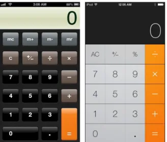
Figure 1: The calculator app, example of transition from skeuomorphism in iOS6 (left) to flat design in iOS7 (right)
Previous research has been done on usability and preference of skeuomorphic and flat design, and the results vary, especially across different age groups. Cho et al. (2015) performed a study on elderly participants ranging from 65 to 91 years and concluded that they better understood and also preferred skeuomorphic icons over flat design icons. Another study, performed by Robbins (2014), compared skeuomorphic and flat design with users in three different age groups (age 13–26, 27–45 and 45+). The results were that participants aged 27–45 years old preferred flat design, while the youngest and oldest age groups were evenly split between the two different design approaches. However, we have found a research gap when it comes to younger children and icon design. Therefore, in this study, we have chosen to focus on children aged 7–9 years old to better understand which icon style is better understood, recognized, and preferred by children – skeuomorphic or flat design icons.
1.1 Problem statement
As many children of today are using digital interfaces, we find it interesting and useful to learn how they perceive skeuomorphic and flat design icons. It is of particular interest since different parts of education in schools are becoming more digitized, using different educational platforms, and it is important that the school children understand how to use them in order to succeed with their education.
Icons are an integral part of user interfaces and understanding which types of icons provide better usability for children can be of benefit in the development of different applications and interfaces. More knowledge in this area would lead to a better understanding of whether to use skeuomorphic or flat design icons in interfaces designed for young children, to increase their understanding of how to use them and thus enhance their user experience. This knowledge can be of great use for application developers and designers across different fields and industries.
1.2 Purpose and research questions
The purpose of this study is to understand if one icon design, skeuomorphic or flat design, is preferred, better recognized, and provides better usability for children aged 7–9 years old. This will be done by performing three different types of experiments. We will then draw conclusions on which icon style – skeuomorphic or flat design – are better to employ in user interfaces designed for this age group.
Drawing on the purpose of this study, our research questions are:
• Which icon style, skeuomorphic or flat design, is easier to use for children aged 7–9 years old?
• Which icon style, skeuomorphic or flat design, do children aged 7–9 recognize more easily?
• Which icon style, skeuomorphic or flat design, is preferred by children aged 7– 9 years old?
1.3 Scope and limitations
This study is focused on young children aged 7–9 years old and the difference of usability between skeuomorphic and flat design icons. It also aims to gain knowledge on how well children recognize these different types of icons and if they aesthetically
prefer one of the styles. The study does not take into account other types of icon styles, neither does it consider any other age groups.
The interfaces used for experiments in this study do not include text underneath or next to the icons. While it is not so common for real-world applications, we chose not to include text and only test the icons on their own. Since children of this age group are just learning to read at school, there are significant differences in reading capabilities between pupils from different grades (Wiebe, Geiskkovitch, & Bunt, 2016). This could cause difficulties for the younger participants. The difference would also add an unnecessary variable (reading skills) that could skew our results.
This study was performed on a laptop and the participants used a computer mouse to perform the tasks. With this approach we managed to get additional data, such as mouse hovering and to keep distance from participants as a pandemic precaution, while still managing to observe their actions. Displaying prototypes on different devices (smartphone, tablet, smartwatch etc.) might produce different results since children are more accustomed to using touchscreens from an early age (Holloway, Green, & Livingstone, 2013).
1.4 Disposition
The next chapter of this thesis, Method and implementation, provides a detailed explanation about how we collected the data for our study. It describes the experiments we conducted, materials that we used and gives information about the participants who took part in these experiments. This chapter also includes the analysis methods that were used to evaluate the collected data and arguments justifying our decisions regarding the overall methodology, along with the considerations we took into account. This information is followed by the Theoretical framework, which presents the existing research related to this study. It includes background information about icon characteristics, expands on the skeuomorphism vs. flat design section from the Introduction and presents and analyses the available data regarding usability and preference for these styles in the available body of research. The Theoretical framework also presents information about interface design for children and the exposure effect, which are important in the context of this thesis.
The Results chapter is divided into two sections. The first one presents the raw data we collected through the experiments. In the second part, this data is analyzed and used to answer the research questions thesis posed.
The following chapter, Discussion, relates and compares our results to the findings of other researchers in the existing body of research presented in the Theoretical framework. It also includes a discussion regarding the methods used to collect the data and suggestions for improvements in possible future studies.
The Conclusions and further research chapter summarizes our findings and presents implications that they have for the industry and the scientific community. We also provide suggestions for future research to expand on this topic.
2
Method and implementation
In our study, we conducted three different experiments in order to answer our research questions, as well as a pre-study to verify the quality of our materials. The experiments were performed by 20 children aged 7–9 years old, divided into two groups of 10 participants each. All the experiments were designed as A/B tests, and our study is quantitative.
2.1 Materials used in the study
There are many factors that can affect the usability of an icon, such as border, colour or the object it depicts. An example of such difference is a study performed by Chen (2015), who found that icons with open borders have shorter recognition time than those with closed borders. Since the focus of this study is to compare flat design and skeuomorphism, we chose icons where the level of detail is the only variable. All icons used in this study have an open border, are in full colour and their understandability has been pre-validated by graphic designers to make our results as accurate as possible. Icons chosen for the pre-study were borrowed from the following icon libraries:
• Skeuomorphic icons: https://www.pngitem.com/, https://iconarchive.com/
• Flat icons: https://icons8.com/, https://fontawesome.com/,
https://www.flaticon.com/
The age of the participants was also taken into consideration when selecting icons for the study. Since 7-9-year-olds are children attending primary school, majority of the icons were displayed in the context of an educational app. Other icons represented simple objects like a clock or a camera, objects we assume are understandable to young children. As kids of this age group prefer bold colours (Naranjo-Bock, 2011), we decided to use flat and skeuomorphic icons that are colourful, rather than picking overly stylized flat icons and making the skeuomorphic icons black and white.
2.1.1 Pre-study: icon quality survey
In a study by Ghayas et al. (2018), the authors investigated the effects of different smartphone icons characteristics on various age groups. In the study, icons from different mobile phones, that the authors claimed to be popular in 2013, were selected. Before conducting the actual study, four human-computer interaction students rated the different icon’s characteristics (complexity, familiarity, and semantic distance). Chen (2015) conducted a different study investigating app icon design from various mobile operating systems (Apple iOS, Google Android and Windows Phone 8) in order to understand user recognition and preference of different icon types. In the study, icons were collected from app stores, and then experienced graphic designers selected the ones that would be used for the actual user testing.
Both of these studies conducted a pre-study on the icons used in their testing, where people with experience in the field rated or selected the icons. Based on this, we decided to include a pre-study in our study as well, to make sure that the icons that we used were of good quality. When measuring the quality of the icons, we considered two aspects. The first aspect we looked at was whether the icons were representative of their design style. This meant determining whether the icons we selected qualified as being of either flat or skeuomorphic design. The second aspect we considered was whether the meanings of the selected icons were understandable. In order to determine these
qualities, we conducted a pre-study with a total of five participants – one graphic design teacher, one user experience design teacher and three graphic design students from Jönköping University.
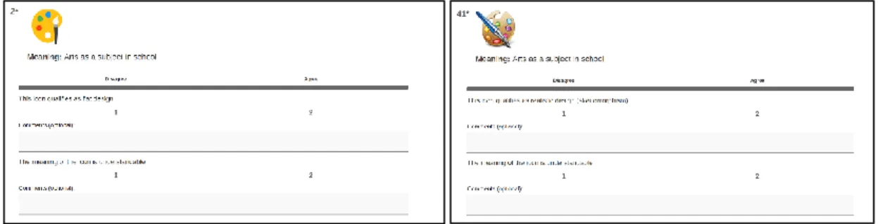
The pre-study consisted of a survey with 70 icons, where one icon at a time was displayed to the participants along with the meaning that we had assigned to it. The participants then had to choose whether they agreed or disagreed with two statements. The statements for the flat design icons were: 1) This icon qualifies as flat design, 2) The meaning of the icon is understandable. For the skeuomorphic icons, the statements were the same, except that we asked whether the icon qualified as realistic design (skeuomorphic design). We chose to include the word realistic, since skeuomorphic is a term that might be confusing if the participants are not completely familiar with it.
Figure 2: Example of pre-study survey questions
To be able to use the icons in our experiments, we decided that at least four (80%) out of the five the participants should approve the icons on both statements in the survey. We also took the participants’ comments into consideration. Based on these comments, we adjusted five icons to make them usable in the experiments. Full list of icons that were selected based on the survey and subsequently used in this study can be found in Appendix 1.
2.1.2 Prototypes
The graphical user interfaces used in this study were created using the Adobe XD tool and were displayed on a 13-inch Macbook Pro (2017). The text in these prototypes was in the native language of participants, that is Swedish. The interfaces for A/B testing and the tasks that the participants performed were completely identical to ensure valid and comparable results. During the experiments, the screen was recorded in order to get accurate measures of time and steps required for task completion. The participants used a computer mouse for the different tasks.
2.2 Participants
This study had 20 participants that were of three different ages. The youngest children were 7 years old (N=6), the second youngest were 8 years old (N=8), and the oldest children were 9 years old (N=6). During the study, they were divided into two groups with an equal number of children of each age in both groups. All of the participants came from Kålgårdsskolan in the city of Jönköping, Sweden. They took the tests during their regular school hours.
2.3 Data collection
To answer our research questions, we conducted three experiments, each focusing on a single research question. In the first experiment, the ease of use was measured by the number of steps participants took to finish their tasks. The second experiment was designed to evaluate how easily icons of different styles could be recognized by our target group. In this case, we measured their speed in seconds. Our last research question, user preference, was answered by presenting the same type of icon in flat and skeuomorphic style, and letting the participant choose which one they liked better.
2.3.1 Experiment one – measuring the ease of use
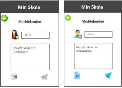
The first experiment was designed to measure how easy or difficult it is for children to use interfaces with different icon styles. We designed two versions of an educational application, one with skeuomorphic icons and one with flat design icons. Apart from the icons, the two versions were identical. Then, we let one group of participants use the application with skeuomorphic icons, while the other group used the version with flat design icons. The participants were asked to perform three short tasks using the application. The first task was to click on an icon that would show them photographs from a school trip. The next task was to find the math class in their schedule, and the last one was to send a message to the teacher. The minimal number of steps needed to complete these assignments was one, two, and four steps respectively. We chose this order to make the tasks progressively more difficult, so the children would not be intimidated by starting off with something too complicated but were still challenged as they got more comfortable with the interface. All screen views from the application can be found in Appendix 2. The result of this experiment was the number of steps each participant took to complete the tasks.
The method of dividing the participants into two groups and showing each participant only one type of icon design was used in a study by Spiliotopoulos et al. (2018). We figured that this method would give us accurate results, since there would be no “learning effect”. If we showed both versions of the application to the participants, there was a chance that they would perform better on the second version presented to them due to having learnt how the application works. As some icons from the first experiment were also present in the second one, we chose to alter the interface between experiments as well. So, the children who worked with skeuomorphic icons in the first experiment would be presented with a flat grid in the second experiment and vice versa.
Figure 3: Screenshots from the prototype used for measuring the ease of use (skeuomorphic version to the left and flat design version to the right)
2.3.2 Experiment two – measuring recognition
In the second experiment, we presented the participants with a grid of nine icons (3x3). Just as in the first experiment, each group was presented with either skeuomorphic icons, or flat design icons to eliminate the chance of any learning effect. The type of icons depended on what they worked with in the educational application. Since some icons were used in both experiments, the children were presented with the opposite icon style so that all of the icons in the grid were new to them. The participants were then asked to identify specific icons: Music Player, Calculator and Clock. We measured the ease of recognition by analysing how quickly they were able to determine the meaning of the icons in the grid and find the correct ones.
Figure 4: Grids used for measuring recognition (skeuomorphic version to the left and flat design version to the right)
2.3.3 Experiment three – measuring preference
For the third experiment, we presented the participants with two icons with the same meaning – one in skeuomorphic design and one in flat design. We then asked the participants which style they liked more, and based on the answers, we could draw conclusions on the participants’ preference of icon design. Overall, five pairs of icons
were used to collect data for this experiment: Camera, Clock, Calculator, Music Player and Geography (as a subject in school). We chose not to ask the participants further questions on, for example, why they liked different designs, since we thought they might be too young to logically reason around their preferences in a way that would provide usable results for our study.
Figure 5: Example of screen for measuring preference (skeuomorphic version to the left and flat design version to the right)
2.4 Data analysis
Microsoft Excel software was used to analyze the data from our experiments. The first step of our data analysis was to determine whether there was a statistically significant difference between values obtained for the skeuomorphic and the flat design icons. This test was followed by analyzing the values and the meaning of the collected data.
2.4.1 T-test
As explained by Hayes (2020), T-test is a statistical tool used to determine if there is a significant difference between two groups of data. It is one of the ways to test the null hypothesis (H0). The null hypothesis is a hypothesis proposing that there is no
difference between certain data sets (Hayes, 2021). The opposite of the null hypothesis is the alternative hypothesis (H1), which claims there is a difference in the data. There
are several types of T-tests that can be performed to either accept or reject the null hypothesis. The choice depends on whether the data in the two groups comes from the same participants (Paired/Two-Sample), if the two sample sets are of the same size and variance (Equal/Unequal Variances), and if we anticipate that one group will perform better or worse than the other (One-tail/Two-tail Analysis). To test the null hypothesis, we also need to set the level of significance (α). The alpha level of significance is defined as the probability of making the wrong decision when the null hypothesis is true (Glen, 2021). This number is a percentage, and the lower it is, the bigger the chance the analysis is correct. According to Glen (2021), the significance level can vary depending on many factors, but 5% (α=0.05) is the most commonly used value. The result of a T-test is a p-value (P), which is then compared to the significance level. If the p-value is lower than the significance (P< α), we can reject the null hypothesis. Since in our case there were only two groups of data (flat vs. skeuomorphic) for each task, we used t-tests to either rejects or confirm the null hypothesis (H0 = There is no
difference in usability between skeuomorphic icons and flat design icons for children aged 7-9 years old). While we had an equal number of participants in both groups, we
did not perform additional variance testing, and decided to use Unequal Variance since it produces correct result even if the variance is equal with minimal loss of statistic
power (Frost, 2019). As each child produced only one result the collected data was not paired, so we conducted Two-Sample T-tests Assuming Unequal Variances. We did not pre-specify which test group has better or worse results, so we examined the output for the two-tail analysis. This method was also used by Huang & Chen (2015) in their study comparing Metro and Aqua style icons and by Backhaus et al. (2018) who looked at age-related preference for skeuomorphic and flat icons in different age groups. Other commonly used analysis tools, such as ANOVA, were not suitable in our case as we only had two categories to compare. Each task, such as sending a message to the teacher, finding math on the schedule, or clicking on the clock icon was evaluated separately.
2.4.2 Measured parameters
The recorded data from the first experiment was the number of clicks it took for participants to complete the three tasks. During the experiment, the computer screen was recorded to get accurate data. We calculated the average value for each task in both categories and compared the results between them, since the tasks were of varying difficulty. Additionally, the total number of clicks for all tasks was calculated and compared as well.
For the second experiment, picking icons from a grid, we measured the time it took the participants to find the correct icons. The time was measured in seconds using the screen recordings. The method of analysis used was the same as in the first experiment, average values were compared for each task and total time for all three tasks was calculated and compared as well.
In the last experiment, participants picked the icon from a matching pair which they preferred from an aesthetic perspective. For each of the five icons, “S” (skeuomorphic) or “F” (flat) was marked based on the child's preference. The total number of points each style of an icon received was calculated as a percentage for each icon, and for the whole style in total.
2.5 Validity and reliability
To choose the most optimal ways of collecting and analyzing data for this thesis, we made decisions mainly based on the methods used in the existing body of research. However, since this study is very specific regarding the age of the participants, some methods had to be adjusted to better fit our circumstances.
2.5.1 Study design
All experiments in this paper are a form of an A/B testing, whether it is two interfaces, two grids or two icons. This method was applied by Oswald (2018), who performed a study to assess the strengths and weaknesses of skeuomorphic and flat design. It was done by giving the participants tasks to complete on interfaces with different styles. His study had an A/B test design where the A and B versions differed in their visual designs, but the workflow was the same in both versions. We decided that this is the most suitable approach to conducting our research, which would produce results capable of answering our research questions.
While our first experiment, completing multi-step tasks on two interfaces, was modelled based on the research of Oswald (2018), the grid in the second experiment
came from a study by Burmistrov et al. (2015). They performed a research on skeuomorphic (referred to in the study as traditional icons) and flat design icons to determine visual search effectiveness of the different design styles. In this study, the authors employed the method of using a grid with icons and letting the participants search for specific target icons. A grid of 9x9 icons was displayed to the participants. We found this to be a good way of measuring recognition, and therefore we chose to apply this method as well. However, we figured that a grid of 9x9 icons would be too many icons for young children to choose from, causing too much distraction and confusion. For this reason, we used a grid of 3x3 icons instead.
2.5.2 Measured parameters
Since the overall result of this study is the usability of skeuomorphic and flat icons, we chose tasks that would reflect that. According to Schneidermeier et al. (2014), usability is measured by three parameters – effectiveness, efficiency, and user satisfaction (ISO 9241, 1998). In their usability study, which compared Windows 7 to Windows 8, they used these parameters to evaluate the usability of said operating systems. The authors measured effectiveness based on the users’ ability to complete a task (task success rate). They measured efficiency by the number of interaction steps it took for the users to complete the task as well as time spent on the tasks. The user satisfaction was measured with a questionnaire.
In the tasks performed by our participants, we used the same way of measuring efficiency as in the study performed bySchneidermeier et al. (2014), that is, number of interaction steps and time spent on each task. These measures were divided between the first two experiments. While it would be possible to measure both parameters in both experiments, we found that majority of children were not accustomed to using a computer mouse, and their movements were slow, so measuring time in multi-step tasks where more thinking is required would not tell us much. Additionally, looking at the number of steps taken where they only needed to click once, which was done almost without an error, also brought no useful information. To make the most of our data, we chose to measure only steps for the tasks in the education application, and only time in the icon grid from experiment two. Measuring the effectiveness was not necessary in our case, since all participants successfully completed all tasks.
In their study, Schneidermeier et al. (2014) used a questionnaire to measure the third parameter of usability – user satisfaction. We found that this was not a suitable research method for children, as we consider our participants to be too young to properly make use of a questionnaire. We decided to exchange this parameter for user preference, which is more comprehensible for children aged 7 to 9 and designed an experiment that measures the participants’ preference for the two icon styles. Reppa & McDougall (2015) claim that simple icons which are visually appealing to users are located more easily. However, they did not find the same effect for complex icons. A study performed by Smythwood & Hadzikadic (2018) produced the opposite results. Based on these findings, we can conclude that there is some connection between aesthetic preference of icons and their usability. Furthermore, we consider the preference of icon style an interesting parameter to measure on its own.
2.6 Considerations
For this study, we had to take into consideration that our participants were young children and not adults. Therefore, we made sure to inform the teachers thoroughly
about the design of our experiments and the purpose of the study. We were also transparent about how we collected the data. By giving the teachers this information, they could make the decision whether the tests were appropriate for the children or not. This ensured that we did not do anything that would be unethical in our testing, or that would not be appropriate for the participants.
Moreover, due to the fact that we were in the midst of a pandemic, covid-19, we tried to do the experiments in a way that was as safe as possible. First of all, the children did the tests one by one, and only one of us was present during the experiments, in order to avoid crowding and minimise unnecessary contact. We also made sure to keep appropriate social distancing, and the computer mouse as well as the computer itself were disinfected after every test.
Another consideration we took into account was to try not to influence the children in any way regarding their usage of the computer. In order to do this, we did not give any instructions on how to use the computer or the computer mouse, to ensure and promote the children’s intuitive and natural usage of the tools.
3
Theoretical framework
This chapter provides a detailed analysis of the current body of research that was relevant for designing this study and its research questions. The following sections elaborate on the theories connected to icon design, age-related preferences for interface styles and the importance of research questions we investigated in this thesis.
3.1 Icon characteristics
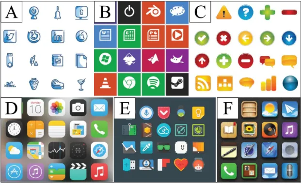
Icons can be categorized according to their design in many ways such as line, metro, aqua, flat, skeuomorphic or skeuo minimalistic. Kamarulzaman et al. (2020) conducted a review of forty scientific articles on the topic of icon design published between 2014 and 2019. They identified the ten most investigated elements of icon design, which are: recognizable, color, simple, semantic, familiarity, shape, aesthetic, consistency, uniqueness, and concreteness. This thesis focuses on two distinct styles, skeuomorphic and flat design. Their most contrasting characteristics, which are relevant for this study, are simple and abstract in flat design, and complex and concrete in skeuomorphism. Furthermore, participants’ ability to recognize these icons is also a part of this paper. Effects of other elements such as shape and color are not explored in this thesis.
Figure 6 - Examples of icon styles: Line (A), Metro (B), Aqua (C), Flat (D), Skeuo minimalistic/material design (E), Skeuomorphic (F)
3.2 Skeuomorphism vs. flat design
While skeuomorphism was the initial go-to design for the first digital interfaces, flat design took-off with the revolutionary redesign of Microsoft 8 in October 2012, and iOS 7 in September 2013. Since then, studies have been conducted to assess whether this decision of these tech giants was beneficial for their customers. Oswald & Kolb (2014) performed a study comparing Apple’s flat (iOS7) and skeuomorph (iOS6) interfaces. The attitudes towards these design approaches differed wildly in the two surveys. While initially the flat interface was perceived as “fun” and “childlike” and
skeuomorphic as “grown-up” and “serious”, this attitude switched completely as users became more familiar with the new style. Similarly, Schneidermeier et al. (2014) investigated the difference between Windows 7 and Windows 8, but included effectiveness and efficiency together with user satisfaction. Skeuomorphic design of Windows 7 performed better overall, but the authors admitted that familiarity of the interface might have played a part. This indicates that a repeated experiment may produce different results, just like in the case of Oswald & Kolb (2014). Indeed, several studies (McDougall, de Bruijn, & Curry, 2000), (S. J. Isherwood, McDougall, & Curry, 2007), (S. Isherwood, 2009) claim that familiarity is an important predictor of user performance.
Robbins (2014) describes two contradicting ideologies in the skeuomorphic vs. flat dilemma. On the one hand, the features such as gradients, depth, textures, and handwritten fonts are more than decorations, but they were made so that the user can easily identify them and hopefully use them more efficiently. This claim is supported by Cho et al. (2015), who concluded that skeuomorphic icons are more informative for less experienced users, in particular the elderly. Backhaus et al. (2018) and Zhang et al. (2016) also concluded that skeuomorphic icons are identified more easily. On the other hand, minimalists argue that depth and texture make screens unnecessary complex and provide inaccurate representation on the usage of a particular element (Robbins, 2014). Evidence that visually complex icons are more difficult to interpret can also be found in several studies (Schröder & Ziefle, 2008), (Leung, McGrenere, & Graf, 2011), (Cherng, Lin, King, & Lee, 2016). While we cannot unequivocally conclude that one style is better than the other, we believe that each style has its use case. This approach is supported by Backhaus et al. (2018), whose participants preferred skeuomorphic style for personal apps with emotional value, such as gallery, and a more minimalistic approach for purely functional apps, like calculators. The purpose of this study is to look at preferences of one population segment, children aged 7–9, and to determine what design is more usable for this particular age group.
3.3 Preference and usability in different age groups
The differences in usability and preference for different icon styles has been studied by many researchers, who have come to contradicting results. Xi & Wu (2017) compared the usability of four icon styles: line, metro, flat and skeuomorphic. Their results showed that skeuomorphic icon style has the lowest search efficiency. Participants of a study by Spiliotopoulos et al. (2018) also perceived flat design as more usable, while skeuomorphism positively correlated with increased difficulty in performing tasks. On the contrary, Burmistrov et al. (2015) concludes that the search for flat icons is performed almost twice as slowly as a realistic icons search. These studies, however, only take adult users into account.
The differences in usability between age groups had also been a matter of several studies, mainly focusing on making digital interfaces more accessible for the elderly. Cho et al. (2015) found that realistic skeuomorphic icons are more understandable for and preferred by older users (65-91). Backhaus et al. (2018) came to the same conclusion for the elderly, adding that while skeuomorphic icons were easily understood by both groups, younger participants strongly preferred flat design. Other studies comparing young and old users produced similar results (Zhang et al., 2016), (Urbano et al., 2020). However, a significant amount of research claims the opposite. In a study by Oswald (2018), older users had more problems using skeuomorphic interface than flat. Schroder & Ziefle (2008) found that both older and younger users
are more difficult to interpret for both researched age groups. Robbins (2014) investigated three groups of participants; young (13-26), middle-aged (27-45) and older (46+). His results suggest strong preference for flat icons in the middle-aged group. Younger and older participants did not show significant preference for either style. Out of all studies in our literature review, only one (Zhang et al., 2016) potentially included younger children, who preferred skeuomorphic style. However, the exact age was not specified (category was named “Under the age of 15”), so we cannot be certain that younger children were involved. Furthermore, the sample of participants in this category was fairly small (N=6) in comparison to the total number of 155 participants. We take these results into account, but do not consider them significant enough to draw definite conclusions, hence, we chose to conduct our own study researching children aged between 7 and 9.
3.4
Designing for childrenYoung children, much like the elderly, come with special needs that must be taken into consideration during the design process of products aimed at this population segment. One of such concerns in icon design are the metaphors being used. The main advantage of skeuomorphic style is that it indicates its function by simulating a real-life tool. This works well for the elderly, however, objects such as floppy disk, film strip or an old-fashioned landline will not tell much to a child who has never seen or interacted with those tools. An example of this is study by Wiebe et al. (2016), who designed icons for categories of games in an app store. They found that children had the biggest difficulty identifying the “arcade”, presumably because this category is not understood by today's kids. This argument is in favor of flat design, whose strong point is using icons derived directly from the workings of a system, instead of using real-world tools as metaphors. This approach was specifically designed to appeal to the new generation of the “digital natives”, people who have spent their whole lives using touchscreen devices (Oswald & Kolb, 2014). In their extensive user experience study aimed at children, (Nielsen & Sherwin, 2019) confirmed that even 3-year-olds recognized functions such as play, pause, and the full-screen, icons that we believe are simple and abstract.
On the other hand, Uden & Dix (2000) argue that older icons are much more distinct; and redesigning them based on objects we use nowadays would just result in an array of boxes with a screen and a button, indistinguishable from one another. Uden & Dix (2000) further add that children recognize functions of many old objects from books and cartoons. Furthermore, interfaces for young kids often use skeuomorphic graphics with a lot of colours and detail to keep attention and interest of their audience. Younger children prefer interfaces that look “cool” and “edgy”, it is only the older ones (11-14) that start to appreciate a more minimalistic look (Naranjo-Bock, 2011). It is the aim of this study to find out which approach to interface design for children that holds more credibility.
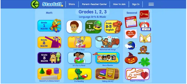
Figure 7: Starfall.com, educational website for children
3.5
Exposure effectLidwell et al. (2010) writes about a design principle known as the exposure effect. The exposure effect entails that as we are repeatedly exposed to a certain stimulus, our feelings can change from being neutral towards the stimuli to increasing our liking of the stimuli. In other words, the more we are exposed to something, the more we like it. According to the authors, the exposure effect is strongest when the exposure to the stimuli is subtle and we process the exposure subconsciously. The authors provide examples of this effect. The Cubist works of Pablo Picasso, for example, were at first not widely appreciated, but are today recognized by many as beautiful – due to having been exposed to it repeatedly.
The exposure effect might also explain the results in the previously mentioned study performed by Oswald & Kolb (2014). In the study, Apple’s new flat (iOS7) and old skeuomorph (iOS6) interfaces were compared. The attitudes of participants changed after some time, from perceiving flat design as “childlike” to being perceived as “grown up”, as the participants became familiarized with and had been more exposed to the new and flat interface.
4
Results
This chapter includes all the data we collected during our experiments and its analysis in relation to the research questions which we aimed to answer with this study.
4.1 Collected data
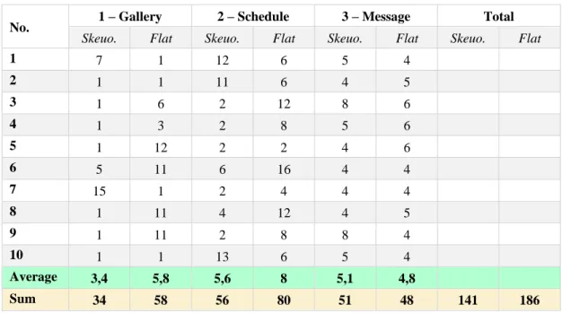
The first experiment consisted of three tasks of varying difficulty that were completed by the participants, with the number of clicks as a measured value. The first task, finding an icon that would show them photographs from a school trip, could have been completed by one click. The average number of clicks for this task was 3.4 for skeuomorphic design and 5.8 for flat design. The minimal number of clicks needed to complete the second task, finding the math class in the schedule, was two. The average score for the skeuomorphic icons was 5.6 clicks, and for the flat icons it was 8 clicks. In the last task, sending a message to the teacher, participants had to click at least four times. On average, they clicked 5.1 times in the skeuomorphic prototype and 4.8 times in the flat one. The total number of clicks for all tasks was 141 with skeuomorphic icons and 186 for flat design icons.
No. 1 – Gallery 2 – Schedule 3 – Message Total
Skeuo. Flat Skeuo. Flat Skeuo. Flat Skeuo. Flat
1 7 1 12 6 5 4 2 1 1 11 6 4 5 3 1 6 2 12 8 6 4 1 3 2 8 5 6 5 1 12 2 2 4 6 6 5 11 6 16 4 4 7 15 1 2 4 4 4 8 1 11 4 12 4 5 9 1 11 2 8 8 4 10 1 1 13 6 5 4 Average 3,4 5,8 5,6 8 5,1 4,8 Sum 34 58 56 80 51 48 141 186
Table 1: Experiment one – task clicks
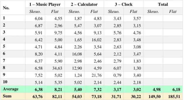
The second experiment also consisted of three tasks, but all with the same number of steps (1) needed to complete them. We measured the time it took them to find the right icon in seconds. The first icon, Music Player, had the average time of 6.376s as a skeuomorphic icon and 8.211s as a flat icon. The Calculator was found in 5.403s as a skeuomorphic icon and 7.318s as a flat icon. For the last icon, Clock, it took participants 3.171s to recognize the skeuomorphic icon and 3.022s to recognize the flat one.
No. 1 – Music Player 2 – Calculator 3 – Clock Total
Skeuo. Flat Skeuo. Flat Skeuo. Flat Skeuo. Flat
1 6,04 4,55 1,87 4,83 3,43 3,57 2 6,87 2,96 5,47 3,07 2,85 3,15 3 5,91 9,75 4,56 9,13 5,76 4,76 4 6,42 5,00 1,65 16,02 2,83 3,48 5 4,71 4,84 2,26 3,54 2,63 3,08 6 8,20 4,11 16,08 5,64 2,12 3,47 7 6,37 5,90 2,98 2,46 2,79 1,83 8 6,58 34,63 12,90 4,59 6,07 1,30 9 7,52 5,02 1,24 21,76 0,79 3,40 10 5,14 5,35 5,02 2,14 2,44 2,18 Average 6,38 8,21 5,40 7,32 3,17 3,02 4,98 6,18 Sum 63,76 82,11 54,03 73,18 31,71 30,22 149,50 185,51
Table 2: Experiment two - task time in seconds
In the third experiment, participants were presented with five pairs of icons and asked to choose which style for that particular icon they preferred. All icons in this experiment were majorly preferred as skeuomorphic. 90% of the participants liked more icons as skeuomorphic than as flat icons. Out of 100 collected answers (5 icon pairs x 20 participants), 89 were in favour of skeuomorphism and 11 were in favour of flat design.
No. Camera Clock Calculator Music
Player Geography Total
1 F F F F F 2 S S S S S 3 S S F F F 4 S S S S S 5 S S S S S 6 S S S S S 7 S S S S S 8 S S S S S 9 S S S S S 10 S S S S S 11 S S S S S 12 S S S S S 13 S S S S S 14 S S S S S 15 S S S S S 16 S S S S S 17 S S F S F 18 S S S S S 19 S S F S S 20 S S S S S Skeuo. 19 19 16 18 17 89 Flat 1 1 4 2 3 11
Table 3: Experiment three - preference for icon styles
4.2 Result analysis
To verify the significance our results, we conducted a series of T-tests prior to forming conclusions about the collected data. The T-tests were Two-Sample Assuming Unequal Variances, with the commonly used level of significance (α=0.05) which was compared to the resulting p-value (P). The null hypothesis (H0 = There is no difference in usability
between skeuomorphic icons and flat design icons for children aged 7-9 years old) was
either accepted or rejected for each usability aspect tested in our study.
4.2.1 Experiment one – measuring the ease of use
The first two tasks in the first experiment were completed with lower average number of clicks for the participants working with the skeuomorphic prototype. The total number of clicks was lower in the skeuomorphic group as well. After conducting the T-test analysis, the experiment one produced the following p-values for task one (P1 =
0.276), for task two (P2 = 0.241) and for task three (P3 = 0.614). Since the results of all
the conducted T-tests are higher than the used alpha level of significance (P1,2,3 > 0.05),
we cannot reject the null hypothesis. That is, there is no difference in the ease of use between skeuomorphic icons and flat design icons for children aged 7-9 years old. Hence, the answer to our first research question, “Which icon style, skeuomorphic or
flat design, is easier to use for children aged 7–9 years old?”, is neither one, as there is no statistically significant difference in the collected data set.
4.2.2 Experiment two – measuring recognition
The second experiment produced a similar outcome. Task one and task two required less time to complete for the participants using the skeuomorphic grid. The total time was also lower in this group. Like in the previous experiment we performed a T-test analysis and came to the following results: task one (P1 = 0.557), task two (P2 = 0.475)
and task three (P3 = 0.806). Since all values are higher than our alpha level of
significance (P1,3,3 > 0.05), we accept the null hypothesis for this experiment as well. Therefore, the answer to our second research question, “Which icon style, skeuomorphic or flat design, do children aged 7–9 recognize more easily?”, is also neither one. It is interesting to note that the children of this age group are very fast learners. During just three simple tasks they managed to lower their initial search time by more than a half in both the skeuomorphic and the flat design grid, suggesting that they can quickly adjust to using interfaces in either of these styles. This shows that the more usable design style is the one people are used to, a claim which is also supported by Backhaus et al. (2018).
4.2.3 Experiment three – measuring preference
Our last experiment was not a subject to the T-test analysis as there was only one set of data to analyze. Regardless of the styles they worked with in the previous experiments, all participants were shown the same five icon pairs in this one. The third experiment revealed a strong preference for the skeuomorphic design style. With 90% of the participants choosing skeuomorphism as the “prettier” style, and 89 out 100 answers being in favor of skeuomorphism, we can confidently claim that the answer to our third research question, “Which icon style, skeuomorphic or flat design, is preferred by children aged 7–9 years old?” is skeuomorphic design. Even though we did not include choice reasoning in our collected data set, one of the children provided an explanation for not liking the flat design icons, nevertheless. The child said: “They don't look real; they are not nice.” This quote summarized the results of our study so perfectly that we decided to use it as the title of this thesis.
5
Discussion
In this thesis, our purpose was to investigate skeuomorphic and flat design icons and to try to understand if either one of these icon styles is easier to use, simpler to recognize and preferred by children aged 7–9 years old. Based on this, we posed and set out to answer three research questions:
• Which icon style, skeuomorphic or flat design, is easier to use for children aged 7–9 years old?
• Which icon style, skeuomorphic or flat design, do children aged 7–9 recognize more easily?
• Which icon style, skeuomorphic or flat design, is preferred by children aged 7– 9 years old?
For each research question, an experiment was designed. In this section, the results of these experiments will be discussed and evaluated in relation to our purpose, research questions as well as the previous research.
5.1 Result discussion
In our theoretical framework, we discussed different studies which tested and compared the usability and the preference of skeuomorphic and flat design icons. However, it is important to take into account that the majority of these studies did not include younger children in their research, which makes it somewhat problematic to compare these studies to ours and draw conclusions. Out of all the studies we found, only one included children (Zhang et al., 2016), but the exact age was not specified, we only know that the children were under the age of 15. Furthermore, the number of participants of this age group was small in comparison to the total number of participants – only 6 out of 155. Hence, although we consider it important to discuss and compare the results of previous studies to our own, we should be careful in refuting theories or drawing specific conclusions based on these comparisons.
5.1.1 Research question one – ease of use
To investigate the first research question, aimed to answer whether skeuomorphic or flat design icons are easier to use for children aged 7–9 years old, we designed two versions of an application, one with skeuomorphic icons and one with flat design icons. After testing the application with 20 children, and analysing the collected data, we found that there was no significant difference in the ease of use between the different icon styles. Therefore, the answer to the research question is that skeuomorphic and flat design icons are equally easy to use for children of this age group, based on our findings. Based on our theoretical framework, varying and sometimes contradicting conclusions have been drawn on the usability of skeuomorphic and flat design icons. Spiliotopoulos et al. (2018) found that flat design was more usable, and that skeuomorphism was connected to more difficulty in performing tasks. Similar results can be found in several other studies (Schröder & Ziefle, 2008), (Leung et al., 2011), (Cherng et al., 2016). On the contrary, Cho et al. (2015) came to the conclusion that skeuomorphic icons are more informative for less experienced users such as elderly people. Backhaus et al. (2018) as well as Zhang et al. (2016) also concluded that skeuomorphic icons are identified more easily.
Our results, however, differ from the above-mentioned studies. Out of all the studies we analysed, none have found that the two icon styles provide an equal level of usability. This phenomenon might be specific for our age group and could be useful to know and take into account when designing applications for younger children.
5.1.2 Research question two – recognition
Our second research question, which was aimed to determine which icon style is more easily recognized by children of our specified age group, was measured by presenting the participants with a grid of nine icons (3x3). The participants were then asked to identify specific icons. Each group, consisting of 10 children, was presented with either skeuomorphic or flat design icons. Upon analysing our data from the experiment, we could conclude that there was no significant difference in recognition between the two icon styles. The answer to the research question is therefore that both icon styles are equally easy to recognize for children aged 7–9.
Based on our theoretical framework, contradicting results have been found on how easy it is to recognize skeuomorphic and flat design icons. Xi & Wu (2017) showed that skeuomorphic icons have the lowest search efficiency out of four icon styles: line, metro, flat and skeuomorphic. On the other hand, Burmistrov et al. (2015) states that the search for flat icons is performed nearly twice as slowly as a realistic icons search. Similar results were found by Backhaus et al. (2018) and Zhang et al. (2016).
It is important to remember that these studies only take adult users into account. However, as with the first experiment, none of the studies have reached the same results as we have in our study. Again, this suggests that our results are age-related.
5.1.3 Research question three – preference
Our third and final research question was aimed to determine which icon style, skeuomorphic or flat design, is more preferred by children. In order to answer this question, we presented the participants with two icons of the same meaning – one in skeuomorphic design and one in flat design. We then asked the participants which style they preferred.
Our results showed a clear preference for skeuomorphic icons. In fact, 89% of the icons presented to the children were preferred in the skeuomorphic version. Only 2 out of the 20 children liked the flat design icons better than the skeuomorphic icons. In a study by Cho et al. (2015), it was found that realistic skeuomorphic icons are more preferred by older users (65-91). This suggests that despite the age difference, older and younger application users have the same preferences in icon styles.
Schneidermeier et al. (2014) came to the conclusion that familiarity of an interface can play a role when measuring effectiveness, efficiency and user satisfaction, when comparing Windows 7 and Windows 8. Several other studies (McDougall et al., 2000), (S. J. Isherwood et al., 2007), (S. Isherwood, 2009) claim the same – that familiarity is an important factor when evaluating different interfaces. Although we cannot be completely certain of the difference in children’s level of familiarity when it comes to flat and skeuomorphic design, we can relate this to the previously explained exposure effect (which entails that the more we are exposed to a stimuli, the more we like it).
Prensky (2001) introduced a term known as “digital natives”, referring to a new generation that has grown up and spent all their lives using different digital interfaces. Although the children participating in our study would be the so-called digital natives, and have been exposed to different digital interfaces, we can assume that they have not been exposed to flat design as much as teenagers and adults. Realistic designs reassemble real-life objects, which the children are exposed to wherever they go. Therefore, the exposure effect might be a reason as to why the majority of the children preferred the skeuomorphic icons – since they have been exposed more to the realistic-looking objects rather than the flat design.
When comparing the three research questions we investigated in this study, only this last one shows a difference between the two icon styles. While the ease of use and recognition is suggested to be on the same level, the children clearly prefer the skeuomorphic icons. This is useful information for cases when we design interfaces for children. If the target audience is solely young children, we argue that it is better to use skeuomorphic icons. Even though it might not affect the usability of the website or application, the more aesthetically pleasing the interface is to children, the higher the chances that they will use it more.
5.2 Method discussion
Our choice of methods was based on the previous studies investigating the differences between the skeuomorphic and the flat design icons, which we found suitable. However, since the participants of these studies were mainly adults, we had to make some adjustments to make the methods suitable for children. For all the experiments, we used A/B testing. The first experiment was based on a study by Oswald (2018). The grid in the second experiment came from a study by Burmistrov et al. (2015), although we adjusted the grid from consisting of 9x9 icons to 3x3 in order to simplify the task for the children. The third test, regarding preference, was inspired by a study by Schneidermeier et al. (2014), who measured user satisfaction with a questionnaire. We found that using a questionnaire would be too difficult for children aged 7–9, and therefore adjusted the method accordingly, and let the children simply point out the icons they liked better. We believe that, through our experiments, we have been able to answer the research questions which we set out to. The methods used were thoroughly designed and based on current research, and at the same time adapted to suit the researched age group.
However, there are aspects of the research that could have been done differently, and if so, different results might have been produced. Firstly, the tasks in the first experiment seemed to be a bit difficult for the children of these ages. It could be that the tasks required too much thinking and were too advanced. If the tasks were made easier, the results might have been different. Moreover, the children did not seem accustomed to using a computer mouse. The movements were slow and there seemed to be a difficulty in performing moving the cursor with precision. If another device had been used, such as a tablet, we might have reached a different outcome, since according to Holloway et al. (2013), children are more accustomed to using touchscreens from an early age. Another aspect is the choice of icons. While we performed a pre-study in order to determine that the meaning of the icons used were understandable, this was a study performed with adults. An option would be to do a pre-study with children before designing the tasks. It could be that icons with a meaning that is clear to adults, might still be too abstract for younger children to understand – perhaps due to never having been seen before.
6
Conclusions and further research
In this chapter, the conclusion from our study is presented. Practical and scientific implications of the results are discussed, as well as suggestions for further research. 6.1 Conclusions
When designing this study, our aim was to investigate skeuomorphic and flat design icons, and to understand whether either of the design styles provide better usability, are more easily recognized or are more preferred by children aged 7–9. After conducting three experiments with children of said age group, we came to the following conclusions:
• There is no significant difference between skeuomorphic and flat design icons when it comes to how easily children aged 7–9 can use and recognize them. • There is a clear preference for skeuomorphic icons amongst children aged 7–9. The knowledge gained from our study can be useful when designing different applications and interfaces for children. Despite the fact that there we could not see any significant difference in usability and recognition between the two icon styles, these results can have both practical and scientific implications due to the clear preference shown by the children.
6.1.1 Practical implications
Icons are an important and fundamental part of today’s applications and interfaces. The use of flat icons is the current trend in the user interface design industry, and skeuomorphic design has become far less common than it used to be. Interestingly, however, is that our research shows that skeuomorphic icons still have a function to fill, and that there are cases where employing this design style might be better.
Skeuomorphic icons were rated as more aesthetically pleasing by the children in our study, and this is important to note when designing for this audience. Design does not only aim to be functional, but it also aims to be aesthetically pleasing to the users. Therefore, when designing games, applications or any other type of interfaces for children, the use of skeuomorphic icons could make a big difference. Based on our results, we can conclude that using this type of icons could increase the childrens’ satisfaction when using an application, which could lead to greater enjoyment and them wanting to use it more. This information can be of good use to the user interface design industry when creating new or updating existing digital interfaces for children.
6.1.2 Scientific implication
The fact that the children preferred skeuomorphic icons raises questions on taste and aesthetic preferences. Is what we deem as being aesthetically pleasing a result of what we are mostly exposed to? Our study could serve as a complement to research on aesthetic preferences and why we prefer certain design styles. It can also be used together with other, similar studies where the preferences could, for example, be compared with different age groups.
As detailed in the theoretical framework, we could barely find any studies similar to ours where younger children were included. This could imply that this is a somewhat neglected age group when it comes to research within the field of informatics. However, we believe that this is an important population to research, as children of today are born into a digitalized society. They are learning how to use digital tools and applications at an early age, and it is important that we know how to best design for this user group. We encourage future research to take this age group into consideration and aim to understand how they experience design better.
6.2 Further research
Our research is limited to children aged 7–9, and we would suggest researching children of other ages as well. Another suggestion would be to conduct experiments that are similar to or the same as ours but on different devices. The children in our study used a computer and a computer mouse, but as previously mentioned, children are more accustomed to using touchscreens from an early age (Holloway et al., 2013). By using a device that the children are more accustomed to, it would be possible to accurately measure the time it takes for children to complete tasks, instead of, as we did, measuring the number of clicks. This might produce results different from ours in terms of usability.
It might also be interesting to investigate icon preference of children in different countries, as the aesthetic preferences might vary in different parts of the world. Further on, one could investigate how other icon styles affect children in various ways. Examples could be line, metro, aqua and material design.
7
References
Backhaus, N., Trapp, A. K., & Thüring, M. (2018). Skeuomorph versus flat design:
User experience and age-related preferences. Paper presented at the
International Conference of Design, User Experience, and Usability.
Banga, C., & Weinhold, J. (2014). Essential mobile interaction design: perfecting
interface design in mobile apps: Pearson Education.
Burmistrov, I., Zlokazova, T., Izmalkova, A., & Leonova, A. (2015). Flat design vs
traditional design: Comparative experimental study. Paper presented at the IFIP
Conference on Human-Computer Interaction.
Chen, C.-C. (2015). User recognition and preference of app icon stylization design on
the smartphone. Paper presented at the International Conference on
Human-Computer Interaction.
Cherng, F.-Y., Lin, W.-C., King, J.-T., & Lee, Y.-C. (2016). An EEG-based approach
for evaluating graphic icons from the perspective of semantic distance. Paper
presented at the Proceedings of the 2016 CHI conference on human factors in computing systems.
Cho, M., Kwon, S., Na, N., Suk, H.-J., & Lee, K. (2015). The elders preference for
skeuomorphism as app icon style. Paper presented at the Proceedings of the 33rd
Annual ACM Conference Extended Abstracts on Human Factors in Computing Systems.
Frost, J. (Producer). (2019). Statistics By Jim. How to do t-Tests in Excel. Retrieved from https://statisticsbyjim.com/hypothesis-testing/t-tests-excel/
Ghayas, S., Al-Hajri, S. A., & Sulaiman, S. (2018). Experimental Study: The Effects of Mobile Phone Icons Characteristics on Users' Age Groups. J. Comput. Sci.,
14(8), 1134-1143.
Glen, S. (Producer). (2021). StatisticsHowTo.com: Elementary Statistics for the rest of us! Alpha Level (Significance Level): What is it? Retrieved from
https://www.statisticshowto.com/probability-and-statistics/statistics-definitions/what-is-an-alpha-level/
Hayes, A. (Producer). (2020, March 22). Terms: T-test. Investopedia. Retrieved from
https://www.investopedia.com/terms/t/t-test.asp
Hayes, A. (Producer). (2021, April 15). Terms: Null hypothesis. Investopedia. Retrieved from https://www.investopedia.com/terms/n/null_hypothesis.asp
Holloway, D., Green, L., & Livingstone, S. (2013). Zero to eight: Young children and their internet use.
Huang, C., & Chen, P.-T. (2015). The effect of age on perception and preference of app
icon styles. Paper presented at the International Conference on
Human-Computer Interaction.
Isherwood, S. (2009). Graphics and semantics: The relationship between what is seen
and what is meant in icon design. Paper presented at the International