Designing the Militarization 2.0 research tool
An interface for searching large-scale social media data
Thesis Project 1 2014 Supervisor Anders Emilson Malmö University anders.emilson@mah.se Nils Ehrenberg Malmö University nils@ehrenberg.cc
Abstract
Research is a time-consuming endeavor which requires appropriate tools to manage
often vast amounts of information. Militarization 2.0 is a research project aiming to
explore Militarization in social media. The aim of this project is to design a user
interface for supporting researchers in projects involving large amounts of data in
qualitative studies. The project will follow the design process of the first version of the
Militarization 2.0 research database interface. The design process involves user studies,
interviews and design and testing of paper and digital prototypes. The results include the
interface prototype as well as reflections on what tools proved useful in the design
process.
Acknowledgements
I would like to thank my thesis advisor Anders Emilson for his advice throughout the project. I would like to thank Susan Jackson for involving me in the Militarization 2.0 project as well as her fellow researchers Nicholas Robinson, Magnus Dau, Marlen Martin, Linn Ehde, Linda Åhäll and Marcus Schulzke for participating in the design process. I would also like to thank Lon Pilot and Ali Arafati for their involvement in the technical development. I would like to thank Daniel Spikol for his advice and support and lastly Lars and Jonas for their feedback to the writing of the thesis.
Table of Contents
1 Introduction... 1
1.1 What is big data?...1
1.2 Research question... 2
1.3 System description... 3
1.4 Limitations... 5
1.5 Structure of the thesis... 5
2 Methodology...6
2.1 Project phases... 6
2.2 Interview method and analysis... 7
2.3 Mapping the design space...7
2.4 Scenarios... 8
2.5 Prototyping...8
2.6 HTML prototype... 10
3 Research process...11
3.1 Databases for shopping and end users... 11
3.2 Literature review ...12
3.3 User research – Finding the design space... 14
3.4 Expected needs and desires...15
3.5 Narrowing the scope ... 17
4 Design process...18
4.1 Concept development... 18
4.2 User scenarios... 19
4.3 Paper Prototype...20
4.4 Feedback for the first prototype...23
4.5 Revised UI – HTML Prototype...26
4.6 Feedback for the interactive prototype... 31
5 Discussion...34
5.1 Designing the research process...34
5.2 Assessing the scope...34
5.3 Expectations of privacy... 35
5.4 User knowledge and experience... 36
6 Conclusions... 37
Figures
Number of likes on Facebook for some of the militarized companies...1
Primitive Architecture of the system (Arafati 2014)... 4
Gantt chart for the Militarization 2.0 project...5
Collection of interview notes before final sorting them... 7
Affinity diagram from interviews...16
Sorting comments into groups...16
Early flowboard of views and relationships between them...18
Browsing interface...20
User view... 21
Placeholder for hashtag cloud...24
Placeholder for time graph... 24
Text search... 24
Search results prototype...25
A second search results prototype... 25
Flowboard for the digital prototype...27
Browsing view for the digital prototype...28
Filters for the digital prototype...28
Profile information for the digital prototype... 29
View the posts a user has made and who they interact with...29
Conversation tree for the digital prototype...30
1 Introduction
Social media consists of massive amounts of data on every possible subject, that is constantly being published and republished on a myriad of different channels (Gillin 2010). Social media channels are populated by individuals but also by public and private organisations and
companies. Most of these entities have a clear and obvious agenda, promoting products, services or ideas to the public. Others, however, are more opaque. Why does Boeing or Saab need Facebook pages or Twitter feeds as military companies or for their their weapon systems? Why are thousands of people liking the pages of weapons systems and militarized companies(See Figure 1) and how does this affect society? While they are interested in selling their products, it's not the private citizens who are the target audience. The Militarization 2.0 project (Mil 2.0) aims to explore militarization through these questions by monitoring known actors and their social media activities (Svensson 2013). Militarization is the process of normalising the
existence of the arms and military service industry, through various media, such as social media that is intended (Svensson 2013).
In order to explore what militarization is and how it works Mil 2.0 project plans to create a database collecting social media data, focusing on Militarized companies and those that interact with these companies. Using data driven design tools in this type qualitative study is relatively unexplored within International Relations (Jackson 2014) and the database will be developed over the course of the project which will run over four years. The goal in the early stages is to create tools that can be developed further as Mil 2.0 progresses.
The focus on militarization places the project within International Relations as it relates closely to national and military security. It also relates to gender studies as it serves to support the military. A male-dominated space, as valuable and normal (Svensson 2014). The researchers within the Mil 2.0 project are currently split
between Sweden, Germany and the United Kingdom, with focus on different aspects of militarization as well as methodologies, some focusing on smaller case studies with specific imagery, while others investigate the conversation around military games.
In this project I will design tools to support qualitative research in international relations studies using big data from social media sources. The data will be collected from different sources, focusing on Facebook and Twitter but also using Instagram and Youtube. In order to do this I will design the first version of an interface to be used in the Mil 2.0 project, allowing researchers to search and explore the data collected for the project.
1.1 What is big data?
Big Data is a term that has been actively discussed in various forums in recent years as a
Company
Likes
Saab AB (2014)
8249
Boeing Company
(2014)
10311
Lockheed Martin
(2014)
121930
F35 Lightning II
(2014)
25025
Academi Training
Center (2014)
9070
Figure 1: Number of likes on
Facebook for some of the
militarized companies.
solution to many problems, for example Google has attempted to chart flu epidemics using Big Data (Krenchel and Madsbjerg 2014). But defining it is somewhat harder, Jacobs (2009) argues that the definition of big data has changed over the years and the closest definition is something that is larger than what the average software can handle. In the 90's big data would have been a dataset too large to fit into an excel document. Big data is not just large amounts of data, that can be stored on a relatively small drive. It's large amounts of data with repeated observations over time (Jacobs 2009). They further argue that the collection of data is unproblematic but that it is difficult to get the data out in a meaningful way (Jacobs 2009). The problem lies in the simple structure of data and computing power, where most organisations would simply lack the computing power to analyse all the data.
Bertot and Choi (2013) offers a similar definition of big data when exploring the use of big data for policy making in the United States. They define big data as something that requires
significant processing power, span a range of data types and can cross over multiple data platforms (social media, web logs, photographs). Although the Militarization 2.0 revolves primarily around private actors, some of their concerns in regards to big data remain valid, such as the possible privacy issues with large amounts of data about a person that is collected over time. While Bertot and Choi (2013) largely discuss consequences and recommendations based on American policy, the importance of making the data available in multiple formats,
accessability and availability serves to reiterate Jacobs earlier point about the difficulty of getting the data out of the database compared to entering it.
An example of using big data in order to gain an understanding of a subject or to visualise large amounts of data at once is the Global Database of Events, Language and Tone's (GDELT) work visualising what what other people are mentioned in articles about a world leader (Taylor 2014 and GDELT 2014). Although just the data and the visualisations of who is mentioned tells us very little without further information it can give us a hint at where to look next. Schwartz et al (2013) use Facebook data to create similar word cloud visualisation about what different age groups, genders and personalities post about. This shows similarities or common fields of interest about what different groups are talking about. Although the visualisations do not take the full picture into account (they show the actions but not the cause), such as societal norms, with men swearing more, talking about video games or youtube while the visualisation for women mention family, love and their significant other. Schwartz et al argues that the open vocabulary approach used offers new insights, for example when predicting genders in data. Schwartz et al also argue that their approach is especially useful when dealing with large samples.
1.2 Research question
This project will aim to explore how to support knowledge production, through academic research in international relations studies using big data from social media sources. In order to do this the first versions of the Mil 2.0 database will be designed and tested with researchers involved in the Mil 2.0 project. In Mil 2.0, part of the goal is to create a method for working with large-scale social media data in qualitative and quantitative projects for International
relations.
Mil 2.0 does not have a single defined research method, instead different researchers bring different methods to the project. Although the majority of the current researchers are currently focused on qualitative methodologies, they may do collaborations with quantitative researchers. It is also possible new researchers with different methodologies will join the project in the future. This means that the database and interface needs to be suitable for both current researchers and potential future researchers.
One of the goals of Mil 2.0 is to find a method, while exploring the Militarization of social media, where large amounts of data can be used for in qualitative studies, focusing on one or a few cases. At this point there is considerable research into using social media data in
quantitative approaches such as Schwartz et al (2013) and Liu et al (2012) as social media offers large amounts of data that can be generalised. However, whether working with qualitative or quantitative methods, one of the common problems of working with social media data lies in finding the relevant information within the massive amounts of available data or finding the context of the data.
One reason that large-scale research concerning social media appears to be primarily done in quantitative projects is that each post generally contains very little information and for most social media there are no quick methods for digging through the data. As social media has a number of different quantifiable data, the goal with this project can then be defined as designing the interface to allow experienced researchers to search for useful data for qualitative studies using quantitative indicators when producing knowledge. By knowledge production in this case, it is the scientific production and exploration of knowledge that is implied. This is relevent in interaction design as it means exploring how the researchers interact with research data and investigating how to simplify the process to make the relevant information more easily available.
The research question for this project can then be defined as follows:
How could database driven tools be designed in order to support researchers using large-scale social media data for knowledge production in qualitative studies?
More specifically, I will focus on supporting the researchers in finding relevant information within large amounts of data. Relevant information may differ on a case to case basis and it is therefore important to explore this together with the researchers in order to establish needs and methods.
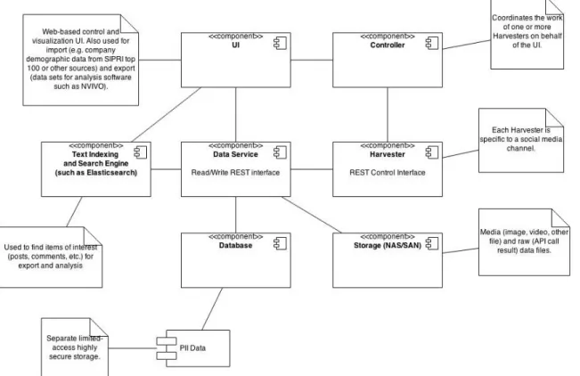
1.3 System description
This section will briefly cover the system design and development. Design in this case is the technical design of the database system, where the system is made up of several modules (See Figure 2). The system is made up of three main parts, harvesting modules, data service and UI. The harvesting modules, which collect data from various social media accounts, are divided by the various social media and controlled by an API controller. These modules are simply used to
collect information, in addition to the known actors (first level accounts) that they collect from, they also collect data from the users who interact with the first level accounts, these are second level accounts. In order to filter out spam and bots the harvesting modules also collect third level users, that is the users who interact with second level users. If a third level user reacts to a post reposted from a first level user by a second level user, they will also become second level users because a second level account is defined as someone influenced by a first level user. Doing this makes it possible to collect information on how specific actors interact on social media as well as how information is disseminated.
The UI never directly communicates with the database but rather with the API controller, which exists as a layer between the database and the user interface. As the UI serves as touchpoint for the users, it's also where the focus of this project lies, while the back-end of the system is never visible directly to the users and, because of the system design, the back-end can be developed separately from the interface.
The development plan for Mil 2.0 is to design and develop the various parts of the project simultaneously (See Figure 3), although as the research project is still in an early phase, the media and different parts are still open to change.
1.4 Limitations
The goal of this project is to explore how to design the user interface for a research tool targeted at a small group of researchers with varied methodologies. This will be done by designing a user interface prototype for the researchers in the Militarization 2.0 project. The implementation, technical consideration or communication with the system is outside the scope of the project. At the end of the project the aim is to offer some direction in how to design an interface for the target audience as well as a prototype of the interface that will be used in the Militarization 2.0 project.
1.5 Structure of the thesis
This thesis is divided into dix main chapters, Introduction where I cover the context, goals and research question of the project. Methodologies where I describe the various research methods, prototyping methods and how the design is validated in the design process. Research process where I describe the results of the research for the design process. Design process will continue where the research process leaves off and describe the prototypes and the user testing. The Discussion chapter where I discuss and reflect on the process, problems with the design process and how to approach them. Lastly there is the Conclusions chapter where the research question is answered.
2 Methodology
In this chapter I will explore the various methods I used for the research and design processes. How the project was structured through agile methods, interview methods, sketching and prototyping methods such as flowboards, paper and digital prototypes, the use of scenarios and why the various methods were used. I will also show how the designs were validated.
2.1 Project phases
The project was planned and scheduled using agile methods (Sommerville 2009), scheduling meetings both with the researchers and the other developers. The prototype was developed over four main phases, each taking roughly two weeks. In each phase I met with the researchers either to discuss the project or to test out prototypes. I also had meetings with the technical developers three times a week where we discussed the progress as well as what would or would not be possible to build or design.
As the goal of the design process is to create a prototype of the interface for the database the work can be largely be contained in what Buxton (2007) refers to as the design phase, which he compares with the pre-production of a film. Within this project the development of the front-end follows Buxton's product development process, with primarily concept development and
preparations for the engineering but with little involvement from the developers beyond an advisory position.
The first phase in the design process was the exploration, where I conducted interviews to explore current methods and perceived needs, largely what Löwgren and Stolterman (2004) refers to as a contextual inquiry, to establish knowledge of current practices and work, although it was not possible to see and follow the work of the researchers and was therefore necessary to rely on their descriptions of the work. The design:lab practice, proposed by Binders and Brandt (2008), as a method for mutual exploration and design research through participatory
techniques, where they consider the primary result of the research to be a better understanding among the involved stakeholders. Sanders Binders and Brandt (2010) proposes a framework of participatory design methods as well as recommendations of tools for workshops and
stakeholder relationships. Most of these tools fall outside the project scope as probes and workshops are time-consuming and require amounts of time with users that is not available. I have attempted to incorporate some of the ideas of Binder and Brandt (2008) and Sanders, Binder and Brandt (2010) to get the users to participate and learn from the design process starting the exploration with open discussions with the researchers in order to let the users guide the process.
In the second phase I began the conceptualisation, where I made a literature review of current research, databases as well as established the requirements for the prototype.
In the third phase the first prototypes was developed and tested, with the fourth phase building on the third with a digital prototype and further testing and analysis.
2.2 Interview method and analysis
The first set of interviews was done in order to explore the researchers current working methods. As well as their perceived needs, tools they knew they wanted in the database. In addition to the perceived needs, the interviews also sought to explore what latent needs that the researchers had, either because they were unable to express these needs at this point or because they were unaware of them. The findings could then be used in order to find design openings. There were six interviews with seven researchers which followed a semi-structured format, with a set of discussion points and questions that each participant received in advance (Appendix A). The semi-structured format was modeled after what Preece, Rogers and Sharp (2004) suggests when preparing an interview. In the first three interviews it was possible to meet, however with the last three interviews the researchers were working from the United Kingdom and Germany respectively and the interviews were instead done over VoIP. The German researchers also requested that they do a joint interview together instead, they felt more comfortable doing it this way. During the interviews the participants were encouraged to ask questions or raise issues they felt were left out. The interviews were recorded for later analysis.
In the presentation of the results from the interviews and user tests the users will be anonymous, therefore the recordings of the interviews will also be held as confidential. The decision to anonymize the user in this manner was made in order to make it easier for the researchers to express themselves without considering who else might hear the recordings, as some of the researchers were hesitant to be interviewed alone in the beginning of the project.
2.3 Mapping the design space
In order to analyse the results from the interviews all the comments from the researchers were written down on post-it notes and grouped into an affinity diagram in order to establish the design space (Preece, Rogers and Sharp, 2002). While affinity maps are often used to sort ideas from brainstorming (Spool 2004), Beyer and Holtzblatt (1999) describes it as a method to
Figure 4: Collection of interview notes before final sorting them.
consolidate workmethods from interviews during a Contextual Design process. Beyer and Holtzblatt's approach is the one used in this projec in order to consolidate the expectations and needs from the interviewed researchers. By using the affinity diagrams this way it was possible to map out the design space, the space of possible solutions (Westerlund 2009). This project largely follows a sequential structure. Although with a fuzzy explorative start that develops into ideas and requirements that are then prototyped and tested iteratively.
Some wicked problems (Westerlund 2009), that is to say ill-defined problems without any clear solution or that requires a political rather than design solution, have been identified. These concern two primary subjects, scope and privacy. The first, scope, involves how large a tool the database and searching should be. It can be expanded into a complete research tool or it can be a slimmed down search function. There is no correct answer to this, although I have reasoned towards a scope that involves some tools beyond a search (See section 5.2 Assessing the scope). The second wicked problem involves privacy, what right does the users whose data is collected have to privacy? While only public data can be collected there are both legal issues of
surveillance and ethical concerns that can be addressed. From a research point of view, not having all the data can affect the results, for this reason I have chosen to not take this problem into consideration throughout the design process but I will instead address it in the discussion (See section 5.3 Expectations of privacy).
2.4 Scenarios
Some use cases were looked at as scenarios to see what functionality that could be used together, these were created to be rough rather than detailed as Cooper (2007) would describe the use of scenarios. This was partly done to reflect that the users were uncertain on how they would want to use the interface themselves.
Using personas together with scenarios is often considered good practice (Cooper 2007 and Preece, Rogers and Sharp 2002), however Matthews, Judge and Whittaker (2012) found that personas are often most useful to communicate the design rather than to develop it. Matthews, Judge and Whittaker's findings suggests that personas often do not offer enough depth for the individual designers to be used in the design process or if used should not replace other User Centered Design methods for immersing with the users. Another critique of personas, presented by Nielsen and Hansen (2014) is that although personas can be used to communicate, it can also cause problems if not all participants are familiar with the use of personas. In this case, with as the researchers are both clients and users, I consider personas unnecessary for communicating the user needs or goals.
2.5 Prototyping
A few different methods of prototyping were used throughout the project. Flowboards, paper prototypes and digital prototypes were used in different parts of the project and with different goals.
Flowboards
Flowboards are a technique mixing storyboards and flowcharts with it's roots in game design (Adams 2004). It can be used to chart out the possible interactions in different game modes and is especially useful when there are multiple modes that needs to be implemented. Flowboards were deemed to be useful for designing the interface as while there's a start and a finish to where the interface is used, the steps between this may vary and involve moves forward and backwards in the UI.
Sketching and paper prototyping
In order to map out the functions for searching and browsing I created diagrams to show the different parts of the UI and what you should be able to do with each of these. Once I had the rough outlines of what would be needed I sketched a visual version of the UI. The main purpose of this was to first present what would be in the UI to the users and also give them an idea of what it could look like.
It might have been possible to create several, different models of interaction with the UI that could be tested but after discussing the process with the researchers they preferred that I would create one design that they could discuss and give feedback to. With that in mind I attempted to create several parts of the UI at once in order to offer a more comprehensive view for them to look at and comment on, without giving the impression that it was too late to change or go back to the drawing board. Löwgren and Stolterman (2004) argue that a design that looked too polished can make the users feel that it's too late to change or that it is closer to being ready than it really is. Buxton (2007) reinforce this, describing sketches as something that should offer minimal detail while offering several version of the same object. The goal is to suggest an idea while also allowing for suggestions and changes.
Reviewing the early models of the interface
For testing the same users that participated in interviews were invited, although focus was placed on the three researchers that it was possible to arrange physical meetings with. In total, six users participated. For the first round of testing the users, one at a time, first introduced to the general structure of the interface design. After this they were presented with the UI and asked to identify different parts, similar to a heuristic walkthrough (Sears 1997) albeit with actual users rather than experts. Each test took between 20 to 40 minutes.
For the researchers not on location, a similar process was made. Where the overall structure would be introduced and they would then be shown sketches of the interface. Each element of the UI was discussed, first asking them to explain what they thought it was.
This allowed for testing the concept and discussing it, in order to further develop the interface, while not directly testing the usability or effectiveness. Schneiderman (2005) expresses that when designing exploratory interfaces, and this should be considered such, it is difficult to test usability during the process as the usage can vary greatly from user to user. Following Buxton and Green's (2008) recommendations usability testing should be done at a later stage, once the design is set and instead focus on critique of the design.
2.6 HTML prototype
In order to validate the results from the first prototype, a second version was built using HTML. The goal of the second prototype was to follow up on the the criticism from the first version while also building something that could be tested as something closer to a final interface.
Testing the HTML prototype
The second iteration was tested with all seven researchers from the interviews. As before, those users not available in person were participating through skype. With the difference that two of the researchers on location asked to test it together, while all the researchers that participated digitally were interviewed separately. In addition, the interface was also reviewed by the developer for the database to discuss feasibility. The tests followed the same structure as the previous version, taking roughly 20 minutes per researcher. With the interactive prototype it was possible to do some lighter usability testing, although stricter usability should be tested as the next version is implemented by the development team.
3 Research process
There is a multitude of datasets for researchers exploring war, military expenditures or the causes of war. Some, such as Correlates of War1 (COW) have been around for decades. COW's is goal is to
“facilitate the collection, dissemination, and use of accurate and reliable quantitative data in international relations” (COW). It offers a large amount of datasets for researchers that can be downloaded but does not offer any interface for searching through it. In order to navigate the users must use a codebook available which explains what the different data is as well as their
abbreviations and positions in the dataset.
Stockholm International Peace Research Institute2 (SIPRI) also has a number of databases available,
while some are downloaded as documents much like the COW datasheets, others are searchable based on various indicators. Most of the databases available through SIPRI still requires the users to know at least some of the country codes in most cases. Dealing with quantitative data it is still more accessible than COW.
Dealing with qualitative and quantitative indicators The womanStats Project3 offers sets of data
where the users can select the type of data, provided they are familiar with the abbreviations and types available and the country they would like to access in order to see statistics about women around the world.
3.1 Databases for shopping and end users
As the user experience of the existing databases appeared limiting and especially complex for inexperienced users some of the common websites for end users were studied. These websites, such as Prisjakt4, a price comparison engine, Amazon5 one of the largest online stores in the
world and Hemnet6, a real estate site. These websites all offer large amounts of data that can be
sorted based on quantifiable indicators while at the same time the users make qualitative decisions on what to buy or look closer at.
On all of these websites it is possible to search in free text. It is also possible to find similar products or when some initial decisions have been made, such as choosing category or location, filter out further depending on price, brands or technical specifications. Even for experienced users this is useful in order to narrow the scope of a search. Using categories that the user decides on makes it possible to speed up the search compared to ranking the search results (Käki 2005). By using categories Käki also shows that with it, it is easier to find items the user is looking for without exact search parameters.
1 http://www.correlatesofwar.org/ 2 http://www.sipri.org/ 3 http://www.womanstats.org/ 4 http://www.prisjakt.nu/ 5 http://www.amazon.com/ 6 http://www.hemnet.se/
For Mil 2.0 the relevance of ranking and sorting through categories is to allow the users to not just go through as large amounts of data as possible, but to allow them to rapidly sort away data that is irrelevant to their research. This is similar to how a shopping database can be used, search for an item while sorting various filters in order to get rid of items that don't fulfill the right criteria.
3.2 Literature review
In the following section related research and literature to the project will be introduced, it's divided into sections of interest for project. Tools for researchers presenting some of the databases available but also some methods for analysing data. Databases for end users will present some uses of databases for users outside of research, then presenting some of the uses of big data for companies. Lastly some methods for interfaces and visualising data will be
presented.
Tools for researchers
In order to analyse data there are numerous tools and while social media is a new field, the amount of tools to analyse it is rapidly growing.
One of the ways of dealing with databases and data analysis is fs/QCA, fussy set Qualitative Comparative Analysis, a method developed by Charles Ragin (2008) in the late 90's as a way of dealing with analysing data with qualitative and quantitative components. The Fuzzy set implies that a value can have different levels of strength, unlike a crisp set where it's either true or false. This gives researchers a tool for exploring relationships in large amounts of data.
Nykänen (2013) approaches big data by attempting to create an intuitive way to interact with large datasets. He shows an example of how a search of the bible could be done to both give an overview while also allowing the reader to go into detail. Although Nykänen appears to be primarily concerned with the performance of the database, being able to both view the data at a distance and then close in on the more relevant parts is important. Nykänen suggests controlling the data through SQL queries by 'expert' users. However, in the Mil 2.0 project, the user
expertise lies in analytical skills rather than SQL, because of this it is more important to make the data approachable in order to allow for manual analysis than precise controls.
Byun et al (2012) introduces a tool to collect data from twitter as well as a simple UI for sorting and some basic ideas for visualising the results. Byun et al makes it clear that the UI is only created in order to offer some tool for the users to add or remove which users they wish to follow, and, focusing instead on the possibilities of analysing large amounts of social media data. Once the data is collected Byun et al use external software for the analysis of the data, suggesting that better tools for both gathering and analysing social media data should be explored.
Similarly to Byun et al (2012), Liu et al (2012) developed SocialCube in order to examine public reactions to social phenomena. Aiming to create models to assist with decision-making based on social media. By collecting and doing Human Culture Social Behaviour analysis, the
SocialCube was used to attempt predictions of violence during the uprising in Egypt 2011. Unlike Byun et al the SocialCube does not rely on external tools for analysis but instead analyses the data from unstructured text streams in order to find affective results that can be used to predict events.
In the Mil 2.0 database the results will be collected and analysed, but at this point primary analysis will either be qualitative or done through analytical software, predicting events such as in SocialCube (Liu et al 2012) is also unlikely to be the aim. The needs primary revolve around easily searching and browsing data, where the sql queries, like Nykänen (2013) suggests may be complex for the users. This suggests a gap for researchers outside the technical fields when approaching data-driven research tools.
Further applications of big data in research
For companies the use of big data is important as a forecasting tool, what trends are coming and what are people talking about? Kairos Future7, a consulting company specializing in foresight
and market research, has developed a piece of software called Marvin with the aim of analysing social media data (Lindgren 2013). In 4 Steps to Crowdsourced Intelligence Mats Lindgren describes their approach to, as they put it, let computers do what they do best, process huge amounts of data. Once the data is more approachable and divided into areas Lindgren suggests to crowdsource the analysis by proposing challenges on what might be the important trends in the next few years.
Similarily, Palomo et al (2011) describes this method as Self-Organising-Maps (SOM), which can be used for forensic data. And while SOM's can be used to discover patterns, the researchers would first need to know what patterns they are looking for, or at least which data to look at. In this way, the Mil 2.0 data should be available for use in software or tools such as this, although at a later stage in the research. The expected amount of data is not just large but also very varied, covering a massive amount of subjects and users.
Displaying information
When displaying quantitative information the most important part is that the information is relevant to the viewer. In order to make the information relevant it should be clear what it is and why it is showing. Tufte (2001) argues that graphical excellence consists of complex ideas communicated with clarity, precision and efficiency. While the primary goal is not graphical representations of the data, the interface which is used should therefore make clear to the users what it is and why. It should be easy for the users to understand where the information comes from in order to ensure that the visualisations are transparent.
One way to visualise text patterns is through the use of tag clouds, such as the ones Schwartz et al (2013) utilize, by giving words in a text different sizes or colours in order to differentiate commonly used words in a text (Hinkle 2009). Some researchers have created variations on tag clouds in order to create clearer visualisations or to show new concepts, Fujimura et al (2008) created a tool for making topographic maps to display near-lying fields as a way of approaching
large amounts of data, however at 5000 entries the amount of data used by Fujimura et al still remains small for projects such as Mil 2.0.
Lee et al (2010) further discusses the idea of using tag clouds, suggesting improvements to visualise changes over time, but also suggesting that tag clouds, while appealing, may be hard to read. Oosterman and Cockburn (2010) further studies tag clouds concluding that for visual analysis they are less accurate than many other diagrams. Lee et al (2010) as well as Oosterman and Cockburn's (2010) research suggests that while useful, tag clouds should not be the only way of navigating or visualising data.
3.3 User research – Finding the design space
This section will discuss the users, the findings from meeting the users and what their views, expected needs and desires from the UI are. Starting with introducing the users for the and current user practices in order to explore what is important for their research and how to support it.
Current user work process
In the explorative interviews the aim was to understand how the researchers work today, what their methods are as well as how they intend to use it and what their expectations of the database are. The interviews further aimed to explore what tools they needed, wished they'd had in previous work or were interested in exploring.
In total seven researchers were interviewed, three of which are working as assistants, two researchers are working with post-doctoral work and two senior researchers with more than twenty years of experience within the field.
All the seven interviewed researchers come from qualitative backgrounds but have varying views on the use of quantitative research. While some of the researchers had no interest in the statistics, another researcher expressed that while their work would be qualitative they would be interested in collaborating with quantitative researchers in the future.
While they are experienced researchers, working with social media and especially in the form of big data is new to most of the team. This means that they are unsure of what exactly their needs are going to be and while some of them have clear expectations of some things they would be interested in, others did not yet have a clear view of how the database would be useful in their research. When it came to social media they also aired various concerns about how research was done. One researcher mentioned using it as examples but felt that single comments did not contain enough information to be useful and also felt that using social media in this way lead to poor sampling bias, expressing hope that a database might allow him to see larger patterns in order to narrow the scope in a qualitative study. Another researcher stated that the primary use of a database would be to narrow down the scope in order to reach a small enough amount of data to be able to go through it by hand.
The views among the researchers of what militarization means or which aspects of it they were interested in researching varied widely. From exploring the normalisation of militarized
language in social media to how gamers playing military games communicate. While some researchers had clear ideas on what they would be exploring, others were still not sure how their analytical skills would be applied to the project. The Mil 2.0 project is set to run for several years more and is just starting up, this is not a concern. However, the database and it's functions shouldn't cater too heavily to one viewpoint and it is important to not lean too much on those who know what they need in the design process. Should one approach be supported over others it may limit the researchers, by not offering the tools they need but also by not showing what is possible. Since some researchers have a more limited experience of the possibilities with the technology available, the interface shouldn't restrict their work by not offering tools they need but do not know how to ask for.
3.4 Expected needs and desires
In this section the expected needs of the researchers will be discussed. When asked about tools they wish they'd had or ways in which they would like to sort it the first reaction was generally that they were not sure. However when discussing it they raised points of what they expected they would need or tools that they'd wished they had when going through data. In order to ensure that the researchers were willing to open up and discuss what they wanted, liked or what frustrated them it was important that they felt comfortable, both with the goals of the research and how the meetings were arranged.
Figure 6: Sorting comments into groups.
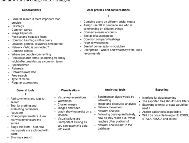
Browsing
As several of the researchers expectations of the database was to use it to narrow down scope they discussed different kinds of filters or queries they'd like to be able to use. General ones such as gender of posters, number of posts or retweets, common hashtags or common words or themes. Being able to narrow down the scope by setting a certain timespan was also raised several times. They also wished to be able to combine multiple criteria, or filter out certain social media or types of media. These comments were grouped as general filters as they primarily aim filter out noise when searching for interesting data.
Profiles and conversations
The second thing that was brought up repeatedly was the ability to see the full profiles, with common posts, subjects or hashtags of the posters once they found something interesting. Some researchers were concerned about the possible privacy issues this might raise by being able to see a full profile of where a user would post but could still see the benefits. They were also interested in being able to combine the accounts from different social media in order to see a pattern of the users activities. Related to the profiles was also the desire to see full conversations as the native tools of for example Youtube make it impossible to follow a conversation there. In the affinity diagram (See Figure 5) profiles and conversations was joined as one group, aimed to find qualitative information once the researchers have narrowed down their interests.
Visualisation
While most discussions centered around these two groups, some researchers discussed the possibility of visualisation. Some of this concerned how the data would be displayed when searching. Whether it would be drop down menus or how they would see a profile. However being able to get the results as a cluster of images, tag clouds or seeing graphs was considered interesting. One researcher expressed that this was irrelevant as he would be able to create his own visualisations.
Analytical tools
To a lesser extent a similar interest was found for analytical tools. Sentiment and network analysis was raised as interesting to see whether the general comments were positive or negative and to be able to see how or if users are connected and how. In both the case of creating
visualisations beyond structuring the search results and using analytical tools the researchers views went apart somewhat, where some simply saw this as potentially interesting tools while others felt it fell outside the scope of the database and into their analytical work.
General tools
The last two groups I divided into is being able to export the selected dataset into at the very least excel but preferably formatted for importing into various analytical tools such as STATA8,
fs/QCA9 or D3JS10. While this does not strictly fall into the user interface design, one researcher
8 http://www.stata.com/
9 http://www.u.arizona.edu/~cragin/fsQCA/ 10 http://d3js.org/
also expressed that the exported document should also have some kind of list of filters used so that another person can do the search. Some tools relating to this that were discussed was the ability to comment, rate and tag their searches and results.
3.5 Narrowing the scope
Concluding the user study, most of the researchers had similar concerns in regards to being able narrow down the data according to their fields of interest and then be able to do qualitative analysis of users, conversations or images. Because of this the primary goal of the first iteration of a user interface for exploring Militarization in social media should aim to support this first step in their research. They should also be able to export and comment their searches as this will allow them to do further analysis. Further analytical tools can be implemented at a later stage or facilitated by supporting exports into formats that can be imported into specific tools.
When exploring the practices and needs it also became clear that the researchers were not yet certain what kind of data would be captured. Although the researchers were still exploring what kind of problems they would be approaching in their research, one aspect of uncertainty was also not knowing what the data would contain, making it difficult for them to express how they would use it. A latent need or at least part of the solution for the database was, aside from designing the interface also expanding the users understanding of what it would contain.
4 Design process
In this chapter I will describe the different phases of the design process, from establishing scope, concept generation and concept development. I present my designs as well as explain my design decisions.
4.1 Concept development
In this section I will discuss what can be displayed in the different parts of the interface in order to divide what is shown where. I will also begin to map out how the different parts of the interface interacts with each other. The different parts are a browsing interface for sorting and exploring the datasets that will be available, an interface for going through a defined dataset, one interface for viewing a user profile and lastly one to see conversations.
Qualitative and quantitative indicators
Although the focus of this project as well as that of most of the researchers interviewed is on supporting qualitative studies, it should be simple to navigate and collect data for a quantitative purpose as well.
While for example womanStats offers qualitative indicators (See Chapter 3) the data in the Mil 2.0 database is very different and it's hard to draw parallels on how to display qualitative data, however the primary sources for this type of analysis will be the user profiles and conversations. In these cases the users will need to narrow down their search first. An example of this is prisjakt, where the user first selects category and then narrows down various parameters, before
Figure 7: Early flowboard of views and relationships between them.
looking at a small list of matching products. Being able to search for posts in a similar manner would simplify the process for the researchers.
As some of the researchers had expressed that they could use a single image or a conversation for their articles, it was important that there were ways of viewing images specifically. But also that the researchers would be able to get an in-depth view of each user should they want to.
4.2 User scenarios
I created two brief user scenarios of what the process might be when using the database for the researchers. The scenarios were created for internal use in order to imagine what the user process could look like when sketching an interface.
Scenario 1
A researcher is exploring the behaviour among gamers. In order to do this he tracks various users on youtube who post videos about games, especially military games. He narrows down the search to follow the conversation on specific videos. When finding an interesting comment the researcher decides to look at that user to see how the user interacts with others, on which other videos he posts and what he posts. When he finds interesting users he adds them to a list in the database and once he has found the selection of users that he is interested in, he exports the list in order to do further analysis.
At a later point he goes back into the database and opens up the list, at this point he has looked at the users with the intention of finding more users. He still wants all the users to be in the same list so he marks the old users in order to be able to separate them once he exports the updated list.
Scenario 2
A researcher wants to explore how the online discussion in regards to some recent unrest in Ukraine has changed over a week. In order to do this he first looks at companies operating and divides the case into various groups. In this part of the case he looks at security companies providing professionals, such as Blackwater. When exploring the discourse in regards to Blackwater he narrows down the scope it it won't include mentions of Game of Thrones by filtering out common mentions of the show such as #got. In this case he only wants the posts that have been retweeted or commented so he excludes any posts that doesn't appear to get any traction from the search and then exports the data in order to analyse the results.
In both of these scenarios the users need to know what they are looking for before they start searching, they know what they expect to find or at least that there is something to look for where they are searching. The analytical work takes place elsewhere, either by creating graphs or diagrams in order to visualize the data or by analysing the posts and their effect.
4.3 Paper Prototype
By using a flowboard (See Figure 7) to sort the different actions how how to move between the different views it was possible to get an overview that could be discussed with the technical team, primarily to discuss viability which was not considered a problem. As the researchers had little experience with this type of flowcharts and sketches, they felt they'd like a more concrete concept before they could offer feedback.
Designing the prototypes some parts were left unfinished in order to allow the researchers to discuss how they thought it should work. This was primarily the tools for grading and commenting as well as how the lists should be created. Another part that was left open was the view for users (See Figure 9), in order to discuss what they wanted from browsing individual users.
Friends, likes, shares and retweets
Different social media interactions mean different things. There are different methods for sharing or commenting posts. These are not just named differently, such as share and retweet but also work in different ways. On Facebook the ways to interact with a post involve:
Commenting, this is relatively straightforward. Liking it, this means generally means expressing agreement and lastly sharing the post, letting all your friends know about it. On twitter things the interactions are somewhat simpler. A user can retweet a post, essentially repost it
themselves, this follows the same function as sharing a Facebook status. And a twitter user can tweet back or comment by using the same hashtag if there's a larger conversation.
Similarly friendships or contacts do not work the same way, a Facebook friendship goes both ways, although liking a page on Facebook goes only one way, where the user follows the page. A twitter user following another user is more similar to liking a Facebook page than it is to
friending the user, with the exception that the twitter user has the option of following that user back.
Designing the UI some generalisations are made, rather than create completely different UI's for each social media, this is primarily done so that it is possible to search across several media at once. The searchable parameters in the UI is that a post or comment can have:
Comments – Other users commenting the original post, this is less viable for twitter where the
conversation is carried through a hashtag rather than as responses to a single post.
Likes – While liking is not the same as approving, this action means that a user at the very least
if following that post.
Shares – The amount of times that post has been shared or retweeted. The difference from a like
is that by sharing users are deliberately spreading that post. And users can have
Total posts – The total amount of posts that user has made.
Likes / Followers – On Facebook a user liking a page means they follow that user, which is
onesided and therefore similar to twitter, instagram or youtube where the same action would imply a follower.
Mentions – Times that user has been mentioned in other posts within the database. Browsing interface
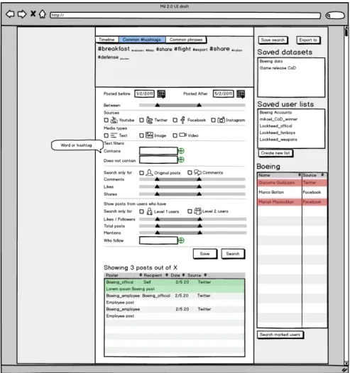
As previously stated the goal of the browsing interface is to give the researcher a way of filtering the data. For the paper prototype (See Figure 8) I opted to primarily use information about the posts, such as dates, source, media type, shares and likes. But also content of the post, allowing for free-text filters and some lighter filters based on the poster's profile. With further work it might be possible to create filters based on the popularity of the users where an average of posts, shares and likes are calculated, allowing the researchers to only view users who are able to reach out. As most of the researchers have little experience with this I choose to not explore this further, as it might be unclear how this is calculated and most researchers seemed uninterested in this kind of tool, preferring instead rough sorting tools in order to get access to a dataset they can export.
Instead of tools for analysis and visualisation I included some simpler visualisations that would make it easier to view the data. Allowing the users to view a timeline of the posts in their data set as well as create tag clouds in order to allow the users to browse and look at the data in different ways. The purpose of these visualisations would be to make it easier to find interesting datasets.
User profiles
Since there are several different sources (Twitter, Facebook, Instagram and Youtube) and types of accounts (Facebook Page, Facebook User Page), the profiles view needed show this. For the most part, different profiles look the same with smaller changes to display whether it's a
Facebook, Twitter, Instagram or Youtube profile. A user profile is still mostly the same and they contain largely the same information under different names. A Facebook friend is split into follower and following on Twitter and likes and shares are similar to retweets.
There are also some other types of profiles, this mostly concerns Facebook where there are groups and pages. While groups are largely private they are similar to pages and show slightly different information compared to a user profile. A Facebook page will not show who has liked the page, while profiles show which pages they follow or like. This means that it is only possible to display the users who like a page if their information has been collected.
Lists
The lists on the right column of the UI (See Figure 8 and Figure 9) function to save both datasets but also lists of users. The topmost one is contains saved sets of search parameters that the researchers can return to. The second list shows lists containing groups of accounts, while the third displays the above list.
General tools
Tools in this case are actions that are intended to ease the documentation or structuring of the research. The list of tools consists of:
• Grading • Saving • Exporting • Commenting
By grading an item in the search the user can select a few items that are particularly interesting. This function was designed in two ways, either as grading on a scale of 1-5 or as simply selecting or not selecting.
Saving, exporting and sharing are closely related functions. Saving would let the users save searches for later so that they can go back and modify the search. Sharing would let the users share a particular set of parameters with another user. Exporting saves the selected dataset as a file of the type of the users choosing.
Commenting would let a user add a comment to a search, in order to remember why this search was interesting or why certain parameters were relevant. This comment would follow with the exported file.
4.4 Feedback for the first prototype
The paper prototypes were tested by presenting first the flowboard of the interface to a user to discuss the general concept and limits of the design. After that the users were introduced to the UI and encouraged to think aloud about what the different parts of the UI meant. The flowboard itself was was met with disinterest and some uncertainty in what it meant, the rest of the UI was met with more interest.
When introduced to the first draft of the UI the researchers placed focus on different aspects. Although the common concern was that it was difficult to offer feedback without being able to test it with real data to see the results, especially for the researchers not on location all involved researchers felt it would match their needs.
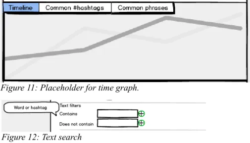
Adding a visualisation at the top (See Figure 8) was met with positive responses although some researchers felt it was unnecessary as they either had no interest in what they felt would be generalisations or because they would be able to do more advanced visualisations later. The included examples of simple visualisations were a timeline, common hashtags and common phrases from the posts within the search parameters.
The one generally deemed most relevant was the timeline, although two of the researchers assumed it was possible to compare different searches using it. While comparing searches could be useful, this was originally considered outside the scope of the work within the database. The reason for the confusion was likely an unclear stock image (See Figure 11) but it raised the point of comparing two searches. One researcher also suggested the possibility of viewing some kind of network map for the browsing to see how the posts are connected, while another asked if it might be possible to extract topics from the posts and display that.
Adding text filters that can be turned on and off was deemed too limiting by several researchers, requesting the use of something that would allow them to permit for multiple different spellings of the same words (See Figure 12). All other filters were easily understood in the search
Figure 10: Placeholder for hashtag cloud.
Figure 11: Placeholder for time graph.
parameters and there was very little complications except for the concept of Level 1 and Level 2 users, which remains somewhat opaque. One researcher also requested the possibility of simply viewing all posts that contains a URL.
As some of the search parameters appeared mutually exclusive, one researcher asked that if one of them was selected, the other should be greyed out or otherwise marked as inaccessible. This concerned for instance being able to search youtube for comments containing images.
Displaying the search results worked well, the users were presented with two ways of marking their interesting results. In one they would simply mark them (See Figure 14), in the second it would be possible to add different weighting to comments (See Figure 13), the latter was preferred by all the users.
Having a list of saved datasets was also appreciated but three of the researchers were at first uncertain about the term, however when discussing the term and offered alternative terms they felt dataset was the correct term. This could still be changed as the function is intended to save search parameters rather than the actual dataset and with continuous collection of data the data in the parameters could be subject to change.
While sharing was considered for the database, it was left out of the first version. Some
researchers commented on the lack of this and asked for the ability to send their saved sets with comments to others, or at the very least be able to export a list with their filters and comments. Both of which should be considered.
The profile view was met with some mixed responses, while useful there remains some questions on how much data about an individual user that can legally be displayed. Being able to capture the profile and cover image was interesting to some researchers while another expressed it felt almost like snooping.
There is also at this point no way of combining a users different accounts from different social
Figure 13: Search results prototype
media, this is primarily due to different social media making it hard to know if it is the same person, especially since they might be using different names on different media. However, if it is possible some revisions could be done in order to link the accounts.
Uniting accounts is less of an issue with industry actors, whom it should be possible to reach easily. One researcher suggested the the solution to this might be to add lists of users on the right hand side for all database accounts. It might also be interesting to add a ”search only for industry actors” filtering functionality.
Some additional minor notes on the formatting were also made, differentiating between gender and sex while easily fixed suggests that inaccurate terminology in the interface could be enough to hinder the users.
Paper prototype conclusions
By creating a mockup of the interface it was possible to discuss how the data was shaped, what it contained and allow the researchers a first glimpse of what the UI could look like. It also allowed the users to think about the data being collected and what it means.
One researcher described exploring the UI as - a bit like browsing Hemnet. Hemnet had previously been described as one of the examples where she had enjoyed searching and
exploring a database, suggesting that she felt that it was intuitive and clear. At the same time she also felt that it could potentially become a bit like snooping, while this allowed her to do an in-depth study of a users social media presence it was also considered a bit disturbing.
Overall the researchers were very positive and eager to explore and discuss the UI while at the same time not offering much criticism, they felt the design was a good match to their needs. At the same time, they had little previous experience of the field and were unsure of their needs and it is therefore possible that their view of the data was shaped by the design process. In addition, they were also very grateful for someone else working on building the database for them, which could make them more hesitant to offer criticism so not to offend.
Additions needed for next iteration of the UI
Some things that were left out or poorly displayed should also be amended for the next version of the prototype.
The researchers need some method for sharing a dataset without exporting it and sending over the files for it.
Since the users can create sets of accounts, it should be possible to search for these as well. The profile view should be developed further to explore what is possible to display.
As previously mentioned, conversations were not included in the UI. The next iteration should include a conversation view.
4.5 Revised UI – HTML Prototype
respond to the criticism and test out the changes and secondly to create a prototype that the users would be able to interact with in a manner closer to a final version.
Using HTML and Javascript to create an interactive version of the UI (See Appendix D), was also done in order to let the researchers walk through a search by selecting parameters and discussing how they would search.
The flowboard from the previous version was also expanded upon to meet the needs and actions that were needed (See Figure 15).
Unlike the early prototype, which had placeholder images of the graphs, the second one simply held a placeholder with the text suggesting what was going to go there (See Figure 16). This was done as some researchers had expressed some doubts in regards to the use of these and I wanted them to discuss what, if anything, they would like to see there.
The text filters were adapted to include a brief description on how to use different search tools such as ~ in front of a word to suggest similar words, this was done after discussing it with the technical team on whether it would be viable to include (See figure 17). Further additions to the text search could also be added in order to allow the researchers to create a wider or narrower search.
For viewing the profile the HTML prototype contained an example profile of Boeing (see Figure 18), as some researcher had been unsure what the use of the profile would be or what it would
Figure 16: Browsing view for the digital prototype.
contain. Below it was also possible to view both the posts made by the user or view their contact and who they had interacted with as well as frequent contacts (See Figure 19).
As well as improving the previously designed parts of the interface a first version of the conversation view was also developed. As the concern of those researchers who were primarily interested in looking at Youtube was that it is difficult to follow a conversation at youtube since
Figure 18: Profile information for the digital prototype.
it's almost impossible to see who answered whom, the conversation view was designed to follow a simple tree structure. Showing who posted, likes and replies to each post as well as the posters profile view. It was also designed to show that it would be possible to expand or contract conversations if they were replies to another comment rather than a direct comment (See Figure 20).
On the right hand side (See Figure 21) the lists are available, much like in the earlier prototype. The users can select, add and remove lists. Sharing a list or dataset can be done by exporting it to the database rather than to their computer, allowing other users to download it.
Testing
Testing the HTML prototype was done in a similar fashion to the first user tests and with the same six users as before, except for one researcher who had dropped out of the first user test also joining for the second round, he had previously participated in the early interviews.
As before most of the researchers were not on location and the test was more like an interview over Skype. Each user test over Skype took around 20-25 minutes and followed a basic script (See appendix C), where the users were asked to describe, explain and use the prototype while thinking out loud. They all tested separately. For the three researchers on location, two of them requested two test it together as they felt a bit uncertain, which was agreed to. The tests on location followed the same script but took around one hour each.
4.6 Feedback for the interactive prototype
In this section I will cover the feedback from the researchers on the interactive prototype. Covering first the different parts of the interface, some general responses and and following conclusions as well as some suggested new functionalities.
Browsing
When going through the interface, whether looking through it or walking through it in a searching scenario several researchers felt that the order of the interface was wrong in terms of which tools they should get to first, this primarily concerned the text filters. Although the first thing that they had thought of when interviewed had been narrowing down a date selection, when actually searching they would have preferred to add the text filters first and then narrow down by dates. I also anticipated that there might be some confusion about using ~ signs or “” in order to specify the search, however saw the information box, this was readily accepted. The researchers with more technical experienced focused on this and felt this sorted most of their concerns.
The sliders also caused some confusion, largely as the researchers were unsure what the span would be. This could be attributed to the lack of a numbers or markers to show how much they had selected. This could be improved by making it so that they could also write in the numbers they want. One researcher also suggested that a visualisation showing a breakdown of for example the number of posts with likes above the slider would have been very helpful. Removing the visualizations and replacing them with placeholders made several of the researchers confused, wondering if they would write there instead. Especially the two
researchers who tested together locally were apprehensive of this. While they had been unsure about the usefulness of these visualizations in the first round of testing, they appeared to have changed their view and wanted to be sure that they would be back as they felt this would be very helpful for browsing and searching through the data. While the expected plan had been to discuss what the visualizations would be like, instead the researcher who had been hesitant before were much more positive and felt it would be a good tool for gaining an overview of the data.
Profiles
When viewing the profiles the researchers felt that there should be more data, especially