Encoding and decoding
Researching the controversy of Kamala Harris’ Vogue cover
Kodning och avkodning
En undersökning av kontroversen kring Vogues omslag med
fotografier av Kamala Harris
Selma Kristjansdottir
Bachelor in Visual Communication, 15 HP VT 2021, K3, Malmö University
Supervisor: Dennis Augustsson Examinator: Tina-Marie Whitman
Abstract
The purpose of this research is to examine how visual communication can be interpreted in different ways and even in opposition to the creator’s intention, and to understand how different visual signs in images convey meaning to explain audience’s oppositional reading. Through a qualitative methodological approach, a semiotic comparative analysis of two covers of the fashion magazine Vogue featuring Kamala Harris will be carried out, a digital cover and a print cover. Theoretically, the analysis is grounded in postcolonialism,
representation, and Stuart Hall’s encoding and decoding model of communication. The results suggest that there are signs in the photograph on Vogue’s print cover that can be interpreted from a postcolonial perspective, and both oppositional and preferred readings are discussed.
Abstrakt
Syftet med denna uppsats är att undersöka hur visuell kommunikation kan tolkas på olika sätt och till och med i motsats till skaparens avsikt och att förstå hur olika visuella tecken i
bilderna förmedlar mening för att förklara denna oppositionella läsning. Genom ett kvalitativt metodiskt tillvägagångssätt kommer en semiotisk analys för att jämföra två omslag på
modetidningen Vogue med Kamala Harris, både digitalt omslag och tryckt omslag. Teoretiskt är analysen grundad i postkolonialism, representation och Stuart Halls kodnings- och
avkodningsmodell för kommunikation. Resultaten tyder på att det finns tecken på fotografiet på Vogues tryckomslag som kan tolkas från ett postkolonialt perspektiv och både
oppositionella och föredragna avläsningar diskuteras.
Keywords
Representation, Stereotypes, Vogue, Magazine cover, Postcolonial theory, Encoding, Decoding, Preferred reading, Oppositional reading, Semiotics
Nyckelord
Representation, Stereotyper, Vogue, Tidningsomslag, Postkolonial teori, kodning, avkodning, Önskad läsning, Oppositionell läsning, Semiotik
Table of contents
Abstract ...2 Abstrakt ...2 Keywords ...2 Nyckelord ...2 Introduction ...4 Background...5 Vogue... 5 Kamala Harris ... 5Vogue’s intentions for Kamala Harris’ cover... 6
Problem and Purpose ...7
Research questions ...7
Delimitations ...7
Theory...8
Representation ... 8
Preferred and oppositional reading ... 9
Postcolonial theory ... 10
Stereotypes and the Other ... 10
Semiotics ... 11
Semiotic terminology ...11
Related research ... 12
Method and material ... 13
Analysis and results ... 14
Denotation ... 14
American Vogue digital cover:...14
American Vogue print cover: ...15
Connotation ... 15
American Vogue digital cover:...15
American Vogue print cover: ...15
Myth ... 16
American Vogue digital cover:...16
American Vogue print cover: ...17
Summary and discussion ... 17
Further research ... 21
Introduction
A magazine cover is the ‘face of the magazine’ and is meant to intrigue readers to buy the magazine. The more interesting, controversial, or popular the cover model is, the more magazine issues will be sold. Being the ones who decide who is on the cover, media editors hold the power to influence people’s opinions by deciding who is heard and seen and who is not. From my perspective, this power should come with a responsibility to avoid
stereotyping, including the stereotyping of people of color as they have historically been less visible than white people in mainstream media.
On January 10th, 2021 American Vogue published the February cover picture featuring the newly elected vice president of the United States, Kamala Harris, on their Instagram. On the cover photo, we see Harris standing in front of a green and pink backdrop wearing a black blazer over a white t-shirt, black jeans, and Converse Chuck Taylor sneakers. The comment section soon flooded with people’s reactions and they were not positive, many said that they expected Vogue to do a better job with the photographing and styling of the shoot and that the photograph they chose did not do Kamala Harris justice as the second most powerful elected official in the United States of America. Vogue then published the cover picture for the magazine’s digital edition featuring Harris in front of a golden backdrop wearing a powder blue Michael Kors suit. That picture sparked a huge controversy as to why that picture was not used on the cover of the printed magazine as well as the digital one. My initial reaction was that the picture that was chosen for print was too casual and did not radiate the same power as the digital cover. Then I started to wonder why, what is the difference in these pictures and how do we come to these conclusions?
I am neither an American nor of African descent, I am a white European and thus there is a lot about the context and phenomena I am studying that I can’t fully understand. This is however a valid topic for me to study as a future visual communicator and for the scholarly field of visual communication as well to learn more about representation and stereotyping of people of color. I will be part of the coming generations of creators who create, and consequently decide how things are represented in the media and so it is an essential part of the role of a visual communicator to critically analyze pictures, especially pictures that evoke such a response as Kamala Harris’ Vogue cover did, to learn from them.
Background
Vogue
The magazine Vogue is a monthly lifestyle and fashion magazine originally published in 1892 as a weekly high-society journal for New York City’s social elite covering news of the local social scene and traditions and culture of high society. Condé Nast publications bought Vogue in 1909 and transformed it into a women‘s fashion magazine that focused on beauty and etiquette (Britannica.com, 2021). Vogue is a global brand with publications in 27 countries all over the world, for example Vogue Paris, Vogue Russia, and Vogue Japan. American Vogue is the head brand and the foundation of Vogue‘s leadership and authority, the photographs that are analyzed and discussed in this thesis appeared in American Vogue (CondéNast.com).
American Vogue has become increasingly more involved in American politics in recent years. In the 2016 presidential elections, Vogue publicly endorsed Hillary Clinton for president of the United States. The magazine published an article online where it was written that the publication had no history of political endorsements but that given the stakes of this election a decision was made that the magazine would endorse Clinton. Vogue had covered Hillary Clinton‘s career for years and she had been profiled by the magazine six times (Vogue.com, 2016). In March 2020, Anna Wintour wrote an article that was published on Vogue’s website where she voiced her negative opinions on President Trump and said that she believed that Americans should choose Joe Biden for president (Wintour, 2020a).
In May 2020, Wintour wrote another article that was published online titled „Joe
Biden Should Choose a Woman of Color to Be His Vice President – and He Should Do It Now“ where she wrote about her negative feelings towards President Trump again and the
turmoil in the country due to the Covid-19 pandemic and civil unrest following the murders of several black people. She goes on to write that Joe Biden should choose a woman of color to be his vice president (Wintour, 2020b).
Kamala Harris
Kamala Harris became the 49th vice president of the United States in January 2021. She was
the first woman and the first African American to hold this office, she had previously served in the U.S. Senate and as attorney general of California. She studied political science and economics at Howard University and earned a law degree from Hastings College. She sought
the Democratic presidential nomination in 2020 and later joined presidential candidate Joe Biden as his vice presidential running mate (Britannica.com, 2021).
Vogue’s intentions for Kamala Harris’ cover
Vogue published an article titled Kamala Harris’s Vogue Cover Is a Tribute to Her Sorority
Days where they explain the photographers’ vision and prompts for the photoshoot. When
describing their intentions they say ‘As the nation’s first madame vice president-elect,
Kamala Harris represents a new dawn in American politics. So naturally, the backdrop for her print and digital Vogue images were going to be wholly original’ (Okwodu, 2021).
Meaning that they wanted to create something completely new to represent the changes happening in American politics. The article goes on to say that Harris styled herself for the print cover shoot with Converse sneakers - her trademark on the campaign trail, and a casual blazer. The article further expands on the print cover shoot saying that the background is a nod to Harris’ sorority, Alpha Kappa Alpha at Howard University, the first historically African American sorority (ibid.). Their colors, salmon pink and apple green are iconic as they have remained the same for more than a century and are instantly recognizable to members and anyone with knowledge of the Greek system of sororities and fraternities. The photographer, Tyler Mitchell, shares that when conceptualizing the cover, he decided that he wanted to honor Harris’ college days and the powerful women who comprise the ranks of historically black sororities such as Alpha Kappa Alpha (ibid.).
Tyler Mitchell became the first and only black photographer to do a cover shoot for
American Vogue in 2018. He is a young activist, filmmaker, and photographer who looks to ‘revitalize and elevate the black body’ in his work (Nnadi, 2018).
For the topic of this study, which is the mismatch between producers’ encoding and
audience’s decoding, this is interesting information. This insight into the producers’ thoughts and plans for the cover is valuable to the research as it tells us Vogue’s intentions for the cover, it tells us how the producer encoded the material and how they intended it to be decoded by the audience.
Problem and Purpose
It appears, based on my informal analysis of people’s reactions to the Vogue covers on social media, that the audience has adopted an oppositional reading for the photograph that Vogue chose as the print cover as many people voiced their disappointment, confusion, and even anger at Vogue’s decision (Hall, 1973). Oppositional reading is a term coined by the cultural theorist Stuart Hall, and it refers to the audience's negative reactions to visual material. This term will be further expanded on in the theory section of this essay.
Visual communicators create and thus decide how things are represented in the media and with this role comes power and responsibility to consider the intended message and how different audiences could interpret it and with what effect. Expanding on this argument, visual communicators have a responsibility to avoid harmful stereotyping, which includes the stereotyping of people of color (Hall, 2013 p. 219).
The problem area for this study concerns how visual communication can be interpreted in different ways and even in opposition to the creator’s intention. The purpose is to understand how different visual signs in the images convey meaning to explain this oppositional reading. To investigate this, I will make a comparative analysis of the two magazine covers using a semiotic method through a postcolonial lens.
Research questions
This study poses two research questions:
1. What signs can be found and interpreted from a postcolonial perspective in the pictures of Kamala Harris that Vogue chose as February’s print cover and the digital cover?
2. How can a postcolonial perspective explain the oppositional reading of the image from the print cover?
Delimitations
For this research, I have decided to apply postcolonial theory as a tool to analyze and decode signs to find an underlying message in the photographs. Of the many critical theories possible I chose this one because I find that it has space for a broader spectrum of possible readings than for example gender theories that mainly focus on representation of gender, feminism,
and queerness. To support this argument, Stuart Hall wrote on the topic of difference that what is said about racial difference can equally be applied to other dimensions of difference, such as gender, sexuality, class, and disability (Hall, 2013 p. 215). Postcolonial theory covers these issues through the use of the term ‘The other’ which will be explained in greater detail in following sections. In short, the term refers to those minorities who are marginalized and excluded because of stereotyping. (Sturken and Cartwright, 2018) That being said, having chosen a critical perspective such as post-colonial theory can make it challenging for me as a researcher to remain unbiased and neutral in describing the research material as the chosen theoretical framework essentially has an agenda. Therefore, critical thinking is essential when analyzing and evaluating visual material because we can never be completely objective as our interpretation of the material will be from our own point of view. It is therefore vital to be critical of our thoughts in the research process.
In her book Visual Methodologies (2016), Gillian Rose presents a framework of methods that researchers working with visual material can use. The framework is based on thinking about visual materials in terms of four sites: The site of production (where an image is made), the site of the image itself (the images’ visual contents), the site of circulation (where and how it is distributed) and the site of audiencing (who sees it and where). For this research I will focus on the site of the image itself which includes the images’ visual
contents, focusing on the image’s composition, its visual and spatial structure, and effects. In short, I will be analyzing visual signs in the photographs and discussing possible
interpretations of them from a postcolonial perspective.
Theory
The following section will present the theoretical framework from which the research is performed and introduce terminology that will be relevant for the discussion that comes after. The main critical theory that the research is based on is postcolonial theory accompanied by theories on representation with the many concepts, ideas, and terms involved in this subject. The chapter ends with a section presenting the theoretical framework and concepts of
semiotics as an analytical tool.
Representation
Representation is the process by which people of the same culture use language, be it verbal or visual language, to make meaning. Stuart Hall (2013, p 3) writes in his book
meaning. The former is the process of constructing mental representations, both abstract and concrete in our heads. The latter is language so that we can translate and share our ideas and concepts with words, written or spoken, as well as with sounds or visuals. Hall argues that things do not have any fixed or true meaning but that it is up to us, as individuals in society to make meaning (2013). He goes on to explain that meanings will always change from one culture or time period to the next because we must share the same conceptual map of the world in our heads to be able to communicate and understand each other. To share the same conceptual map means that we share mental representations and codes and we interpret signs in the same way. Social and linguistic conventions change and evolve over time and therefore can meaning never be fixed. Hall expands on parts of this topic with his theory on preferred and oppositional reading (ibid.).
Preferred and oppositional reading
In his essay Encoding and decoding in the Television Discourse (Hall, 1973) Stuart Hall argues that media texts are encoded by the producer and then decoded by the audience. Essentially that means that the producer encodes messages into their media that are then decoded by the audience and the producer has no power as to how their text will be decoded by different audiences. Different audience members will play an active role in making meaning by decoding the media in different ways based on the individual’s cultural
background, economic standing, and personal experience. The viewers might even change the meaning of the message themselves through collective action if the majority of audiences adopt an oppositional reading. Hall states that the audience subconsciously use one of the following three positions when decoding the text.
• Preferred reading – how the media producer wants the audience to decode the text. Audience members will take this position if the message is clear and if the audience member shares the same worldview, is the same age, of the same culture as the producer intended, or if it has an easy-to-follow narrative and deals with themes that are relevant to the audience.
• Oppositional reading – when the audience rejects the preferred reading and creates their own meaning for the text. This can happen if the media contains themes that the audience member disagrees with or doesn’t relate to or understand, possibly because
of different culture and beliefs, age or different time periods than intended by the producer.
• Negotiated reading – a compromise between the dominant and oppositional readings, where the audience accepts parts of the producer’s views but has their own views on parts of it as well.
Postcolonial theory
In order to understand postcolonial theory, colonialism must first be described. Colonialism has a long history in the West as a way to control countries in different parts of the world (Kohn and Kavita, 2017). Westerners inflicted violence, exploitation, and coercion upon non-Western countries to achieve political domination over them. (ibid.)
Postcolonial theory refers to the cultural and social context of the countries, that were formerly defined in relationships of colonialism, both the colonized and colonizer, with the focus of explaining societal issues that these formerly colonized and colonizers face today as a result. Postcolonial theory is disparate and hard to explain in concrete terms but in rough terms, it is about how the image of Westerners as rational and intelligent beings is made by Westerners by depicting other countries as irrational and mystical. (Sturken and Cartwright 2018). Sturken and Cartwright write about the term “the Other”, coined by the philosopher George W.F. Hegel in relation to postcolonial theory. They argue that when it inevitably comes to power struggles between individuals or groups, in the case of colonialism these groups are Western countries and other countries. One of the groups becomes the Other which is described as the party that has lost all power and as a result, the other party becomes more powerful. This term is central in postcolonial studies where it is asserted that Western countries have all the power and non-Western countries are the Other. (Sturken and
Cartwright, 2018)
Stereotypes and the Other
Stereotyping is a way to reduce people to a few, very simplified, characteristics which are presented as ingrained and built-in. Stereotyping reduces a person to these characteristics or traits, that are then exaggerated and simplified. It is central to the representation of racial difference, carrying out a strategy of splitting as it divides the normal and acceptable from the
abnormal and unacceptable while excluding everything that is different, leaving no room for a spectrum of people and characteristics but polarizing characteristics into ‘good’ and ‘bad’. (Hall, 2013 p. 247) Stereotyping usually occurs when there are gross inequalities of power which is directed against the excluded minority group. It classifies people based on a norm and constructs the excluded and marginalized as ‘the Other’. (ibid.)
’The Other’ is a term that refers to that which is understood as the as the symbolic
opposite of the “normative category”, such as the woman to the man, the black person to a white person et cetera (Hall, 2013 p. 225). In theories that question the functions of binary oppositions in understanding society and social relations, the Other is that which defines the opposite of the dominant pole of the binary opposition, for example black being defined as not white, and which can be understood as disempowered through this opposition. (ibid.)
Semiotics
The meaning encoded and decoded in visual communication can be analyzed using semiotics. Semiotics refers to the study of signs in society and how they communicate meaning
(Bignell, 2002). Semiotic analysis can be used to analyze both language and visual material as in either case there are signs that carry meaning.
Gillian Rose presents different approaches to analyzing and making meaning of signs in her book Visual methodologies (2016). Semiotics, in her words: „confronts the question of how images make meaning head on“ (Rose, 2016 p. 106). What she means by that is that it is neither descriptive nor does it rely heavily on quantitive research but rather presents many analytical tools useful for taking an image apart and tracing how it works in relation to broader systems of meaning (ibid.). Semiotics digs deep under the surface of the visible to uncover the power struggles at play and shine a light on the deep social assumptions embedded, for example in the visual imagery that saturates our modern life (Rose, 2016 p. 106). The research presented in this essay uses semiotics as a method as I will describe the images and find signs that prove important for the theoretical application and then I will discuss and analyze these signs from a postcolonial point of view.
Semiotic terminology
There are many schools of thought within semiotics and I have chosen to use the terms denotation and connotation in this research as well as the term myth, all of which were coined
by semiotician Roland Barthes, for the postcolonial critical interpretation. These terms will be presented in the following sections.
Denotation and connotation
Denotation refers to a visual description and the literal meaning of a sign. Details, colors, and composition are represented through denotation. Connotation on the other hand refers to the culturally constructed meaning of the sign and what ideas and values are presented. To be able to decode the sign we have to have shared conceptual maps, meaning that we have to come from a similar culture with a similar background to be able to decode the message (Hall, 2013 p. 23).
Myth
Roland Barthes’ myth is defined as a system of communication (Hall, 2013 p. 24). When describing visual text Barthes discusses the signifier, the signified, and the sign; the sign is considered to be the visual text, the signifier is the form of the sign, and the signified refers to the concept or meaning that is associated with a signifier. Myth is the 3rd level of meaning,
the 1st and 2nd levels being denotation and connotation. Myth is a secondary language that
presents a socially constructed ideology as if it were a natural fact (Hall, p. 24). Barthes’ myth requires a critical perspective to illuminate systems and underlying ideologies
embedded in the signs in a visual text and I have chosen post-colonial critical theory for this research. (Rose, p. 131)
Related research
While this research doesn’t exactly examine oppositional and preferred reading or post-colonial theory, it is no less important to the discussion of my research. Looking at
researchers who have explored this topic let us explore representation of powerful women in the media, the media’s power to influence people’s perceptions and behavior, and how signs are decoded by the audience.
In her thesis ‘The Portrayal of Powerful Women in the Media’ (Milligan, 2007), Kristin Milligan investigates and discusses the portrayal of powerful women in the media to gain a perspective of different ways the media tend to elaborate and focus on gender issues to a greater extent than the public may think. She presents her hypothesis that although women
are making strides in the right direction, the often-negative portrayal of powerful women in the media can be unwarranted and lead to an unfair perception of women in powerful
positions. To demonstrate that the media do focus on gender issues when portraying powerful women, she investigated how three specific women in power have been represented by the media. She chose to examine media portrayals of women from various fields such as politics, corporate America, and journalism. She chose Carly Fiorina, former CEO of Hewlett
Packard, Katie Couric, anchor of CBS Evening News, and Nancy Pelosi, Speaker of the United States House of Representatives as subjects for her research.
Milligan concluded that the media tends to enhance and focus on gender issues of powerful and influential women (ibid. p. 38). According to her conclusion, the media has a tendency to concentrate on the women’s clothes, appearance, their time spent at the hairdresser, or their personal life which trivializes the position of power these women find themselves in. Milligan goes on to write that women who are able to achieve promotions to powerful positions are already faced with tougher critics than their male counterparts, and often find themselves having to prove a lot more to their superiors. According to Milligan, the media is not helping these women by concentrating on their clothing and appearances and trivializing the roles they play (ibid.).
Relating this research to my own, it is important to note that Milligan does not consider the aspect of race, but rather focused on powerful women in general and she did not focus on the viewer’s general decoding of messages from the media. That being said, the results from Milligan’s research do tell us that the media holds power to influence people’s perceptions, behaviors, and opinions which sheds light on the media‘s responsibility to think about their representation of different groups. This allows us to consider Milligan‘s results in relation to the research presented in this essay.
Method and material
The material was analyzed using qualitative comparative analysis. The two covers were visually analyzed with semiotic methodology and then compared from a postcolonial perspective.
The first step was to generally analyze the elements in the cover photographs at the denotative level and to select signs relevant for continuing the analysis. These signs were
then interpreted at the connotative level. The connotative interpretations were the basis for an analysis from a postcolonial perspective at the level of the myth.
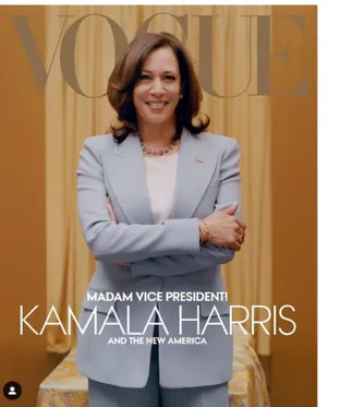
Figure 1. Vogue digital cover, February 2021 Figure 2. Vogue print cover, February 2021
Analysis and results
The result of the analysis will be presented in the following sections under the titles of the three analytical levels: Denotation, connotation, and myth.
Denotation
American Vogue digital cover:
Harris is photographed at eye-level standing in front of a yellow saffron-colored background draped with gold fabric. In front of the background behind her is a fabric-draped object, likely a table. She is photographed from just below the hips and up wearing a powder blue suit with jewellery consisting of a pearl necklace, bracelets, a ring, and the American flag pinned to her jacket. She is smiling and looking into the camera with her arms crossed across her chest. The composition is symmetric with Harris in the centre. Her head is in the
foreground of the magazine’s title, partly covering the G in Vogue. Spread across the bottom half of the cover are the words “Madam Vice President! Kamala Harris and the new
American Vogue print cover:
Harris is photographed at eye-level standing in front of a fabric draped background consisting of a green patterned fabric behind pink fabric that covers the floor irregularly, forming
creases and wrinkles. We see her whole body wearing a white shirt under a black jacket, black ankle-length pants, and black Converse Chuck Taylor sneakers with pearls grazing her neck. Her hands are tied in front of her waist and a smiling expression on her face with eyebrows slightly raised. Harris is centred in the composition, but the pink draped fabric is placed a bit to the right making the composition appear somewhat asymmetrical. Her head is in the foreground of the magazine’s title, partly covering the G in Vogue. On the upper right side of the cover placed beside her upper arm are the words “By the people, for the people The United States of fashion”. Spread across the bottom half of the cover are the words “Madam Vice President! Kamala Harris and the new America”.
Connotation
American Vogue digital cover:
Ms. Harris stands upright, looking to the camera with a smiling impression and a determined gaze with her arms crossed connoting to the viewer that she is a person of confidence, power, and authority. Her powder blue suit is well cut and looks well-crafted giving the impression that it is expensive, as does the jewellery she is wearing. White pearls are commonly worn by female politicians and first wives (Thomann, 2019) but Harris has chosen to wear blue and grey tinted pearls around her neck, a possible interpretation of which is that she will do things differently and not conform to the norm of American politics. However, she wears the
American flag pinned to her jacket commonly worn by American politicians which connotes her patriotism to the viewer in a subtle yet definite way.
The gold color in the background connotes status, wealth, and power. Gold is historically associated with these terms tracing back to medieval art and European altarpieces
commissioned by the church to show their wealth (Pooke and Newall, 2008). The color yellow, often associated with the sun and flowers, connotes light, hope, optimism, and enlightenment (Bourn, 2010b).
American Vogue print cover:
Ms. Harris’ smiling expression with brows raised may be interpreted as a surprised
happened by accident when Harris was not ready. Her body language amplifies this argument, her hands are gripped together and casually placed in front of her waist and her stance is asymmetrical with her left foot firmly standing straight while her right foot is slightly more relaxed. Her clothes and shoes are casual which connotes that she is not elitist but rather relaxed and ‘one with the people’. Her shoes play a big role in this connotation as Converse is a well-known affordable American brand and their shoes are worn by a very large group of people, including the lower and middle classes.
The green and pink background colors are vibrant and playful, the heavy materials and pattern on the green fabric is reminiscent of baroque style interiors. The color green,
associated with nature, leaves, and grass connotes growth, rebirth, and fertility. Pink is often associated with femininity and connotes affection and approachability among other things (Bourn, 2010). A preferred reading of the cover would be that the relaxed and casual nature of Harris’ stance and clothes, as well as the colors used in the background, is a way to showcase her as an approachable person instead of the rigorous and formal setting often associated with politics (Hall, 1973).
Myth
American Vogue digital cover:
The visual elements in the digital cover combined, creates a rather typical representation of American politicians which we often associate with formal clothing and powerful body language. However, in the picture we see an African American woman in this setting most often occupied by white people (Buchholz, 2021). The photograph in combination with the text “Madam Vice President! Kamala Harris and the new America” connotes that a black woman can become Vice President of the United States and be celebrated for it despite the country’s history with racism and racial discrimination (Roberts and Rizzo, 2020). This interpretation is likely the producer’s intentions, making it the preferred reading of the image. An interpretation of the image through the lens of post-colonial theory could be that it is a way to conform Harris to the role of a traditional politician that is authoritative and
inaccessible through her body language consisting of crossed arms and a determined gaze. An oppositional reading of the cover could be that visually representing Harris as a traditional politician is a way of ignoring the fact that she is a minority in politics (ibid.) and that she will most likely do things differently than her white male predecessors, being the first African American and female Vice President of the United States.
American Vogue print cover:
According to the connotational interpretations, Harris’ clothes and body language as well as the print cover’s backdrop is a way to showcase her as approachable, as the intention was described by Vogue themselves (Okwodu, 2021). This would be the preferred reading, but this can be interpreted in a different way through the lens of post-colonial theory. Harris’ clothes as well as her shoes are casual, arguably too casual for a picture to commemorate such a historical moment in African American history. The pink fabric that is draped across the background and lies on the ground beneath her feet takes the focus away from Harris, and her seemingly unprepared facial expression with raised eyebrows as well as her stance
connotes surprise and uncertainty rather than power, strength, and leadership which would be more representative of the role of a Vice President.
From a postcolonial theory point of view, the casual nature of the photograph can be
interpreted as a way to diminish her accomplishment of becoming the first African American and the first woman to be elected as Vice President of the United States, by representing her with a photograph that seemingly does not match the high editorial standard of photography that Vogue is known for or the significance of the role of a Vice President (Britannica.com, 2021). This oppositional reading could even include the idea that the visual signs combined represent a stereotypical representation of a minority in politics: African American women.
Summary and discussion
The questions posed for this study were:
1. What signs can be found and interpreted from a postcolonial perspective in the picture of Kamala Harris that Vogue chose as February’s print cover and the digital cover? 2. How can a postcolonial perspective explain the oppositional reading of the image
from the print cover?
The analysis supports the theory that there are signs in the pictures of Kamala Harris that Vogue chose as February’s digital cover and the print cover that can be interpreted from a postcolonial perspective. In the myth section of the analysis, I discussed two possible
interpretations of the Vogue covers, on the one hand a preferred reading of the text according to Vogue’s intentions (Okwodu, 2021) and on the other hand an oppositional reading from a postcolonial perspective. Both interpretations are plausible, which reflects Stuart Hall’s argument that our cultural perspective affects how we make meaning of visual material and
that the producer’s intentions and encoding is not always understood or decoded by the audience as the producer intended (Hall, 1973).
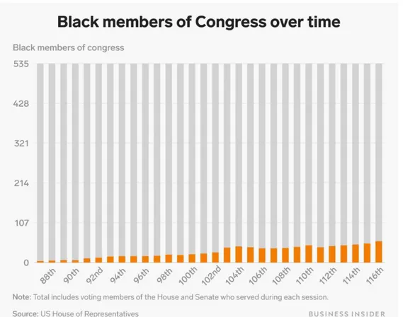
The digital cover contains visual elements that connote power, while the print cover contains visual elements which are associated with weakness and vulnerability, according to the analysis. For example, Harris’s stance and body language on the digital cover connote power and authority while her seemingly unprepared stance and body language on the print cover connote surprise and uncertainty. From a post-colonial point of view, the representation of Harris on the print cover can be interpreted as a way to diminish her power and authority by photographing her in casual clothes with a surprised expression on her face. And by doing so, the producers of the photograph would be contributing to sustaining racial discrimination within U.S. politics, where there are fewer black Americans than white Americans within the highest ranks of government (Gal et al., 2020). By representing Harris with a surprised expression and body language that can be interpreted as uncertainty can connote to the viewers that she is not reliable or equipped to take on the position of Vice President.
Figure 3: Chart retrieved from: https://www.businessinsider.com/us-systemic-racism-in-charts-graphs-data-2020-6?r=US&IR=T on May 7th, 2021.
My argument, based on my interpretation of the results is that the photograph that Vogue chose for the digital cover would have been better representative of Harris’ status and more appropriate to put on the print cover as well as the digital cover. My interpretations of the covers are based on my own cultural background and personal experience and thus other people will interpret these covers differently based on their own background and experiences, meaning that there will never be one conclusion on the matter of which photograph should have been used for the Vogue covers (Hall, 2013). These results should be taken into account by all visual communicators regardless of their specialties. Photographers, illustrators,
filmmakers, and graphic designers alike need to be aware of the fact that the audience might interpret the message in another way than the producer intended.
As visual communicators, we will be part of the media, which holds power to influence people’s perceptions, behaviors, and opinions (Milligan, 2007) and so we have a
responsibility to communicate in a non-discriminatory way, especially on complicated and sensitive topics such as race. In the book Visual Communication: Understanding Images in Media Culture, the authors write about a study of news images conducted by Messaris and Abraham which indicates that visual material can deliver subtle racist cues that evoke well-worn stereotypes of African Americans (Aiello and Parry, 2020 p. 91). Based on these arguments, it is important for us as visual communicators to avoid the use of racial stereotypes and to examine our work critically before publishing. Adding to that, visual communicators must be aware of the harmful effects of racial stereotypes and be willing to learn about the history and practise of racial discrimination against people of color and how it relates to postcolonialism (Hall, 2013 p. 251). I would say that this applies in particular to visual communicators of European descent that are born and raised in European countries where the majority of inhabitants are white and have therefore never been a part of a racial minority, known as ‘the Other’ within postcolonial theory, a term that gains its meaning as the symbolic opposite of the normative category, the “normative category” in this case being white Europeans. (Sturken and Cartwright, 2018). White Europeans might thus be somewhat oblivious to the struggles that people of color face when it comes to racism and racial
discrimination.
The terms within postcolonial theory are, in my opinion, problematic as they convey racist connotation by presenting a racial hierarchy which I find paradoxical when discussing harmful consequences of racial hegemony, hegemony refers to the dominance of one group
over another. It is for these reasons I have chosen to hyphenate the term “normative category” when referring to white Europeans in the paragraph above.
In regard to the method used for the analysis, it is important to take into account that in a qualitative visual analysis it can be difficult to convey the subjective feel of a photograph or other visual material fully. Gillian Rose discussed this in her book Visual Methodologies (2016, p 34) in relation to visual research methods, more specifically a visual analysis of the site of the image itself that “There is a subjective feel that is ineliminable in our seeing something” and that this ‘feel’ is just as much a part of analyzing and understanding images as the interpretation of their meaning but can be difficult to explain fully in words (ibid.). Another important aspect in terms of methodology is that I chose postcolonial theory as a critical theory before I began analyzing the material and my interpretations are thus influenced by my chosen theory.
The results of my analysis are nonetheless valid for the purpose of answering my research questions, which were centred around if there were signs in the photographs that could be interpreted from a postcolonial perspective and if a postcolonial perspective could explain the audience’s oppositional reading of the print cover.
Vogue meant no harm with their choice of photograph for the print cover, according to the article published on the subject by them (Okwodu, 2021). Their intentions were to embrace Harris as Vice President and to emphasize the change she would bring to American politics with her unique perspective. To do so, they hired a young black photographer, Tyler Mitchell to shoot the cover photo (ibid.). However, some audiences seem to have adopted an
oppositional reading for the cover as has been discussed in this essay.
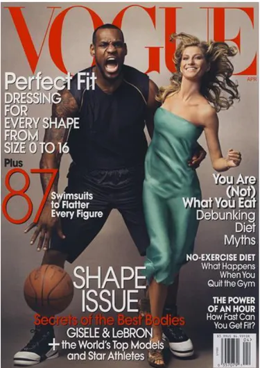
Vogue has been criticized for a lack of diversity among their staff, designers, chief editors, executives, and photographers as well as racial insensitivity in their publications (Helmore, 2020).
Figure 4: A Vogue cover from 2008 that received criticism because of racist connotations. (archive.vogue.com)
The chief editor of American Vogue, Anna Wintour, has apologized and taken full responsibility as well as promised to do better in the future (ibid.). This goes to show the importance of racial diversity in the media, not only general diversity in terms of staff but also in the highest echelons of the media, among the chief executives. With racial diversity comes diversity in perspective and that is important when it comes to the production and publication of racially inclusive material, and inclusivity is key when it comes to social sustainability and social equity.
Further research
This research has looked at the issue of encoding and decoding, preferred and oppositional readings from a somewhat subjective perspective. It would be relevant and interesting to conduct a qualitative analysis of this through interviews with a large group of the magazine’s audience to research and understand which reading might be thought of as the most common
one in the case of Vogue’s February 2021 covers featuring Kamala Harris and what we as visual communicators might learn from that information.
Bibliography
Aiello, Giorgia; Parry, Katy. 2019. Visual Communication: Understanding Images in Media
Culture. London: Sage Publications Ltd.
Barthes, R. 1957. Mythologies. New York, Noonday Press.
Bignell, Jonathan. 2002. Media semiotics. 2nd edition. Manchester: Manchester University Press.
Bourn, J. 2010a. Meaning of The Color Pink. Available at:
https://www.bourncreative.com/meaning-of-the-color-pink/ (Accessed: 16 May 2021). Bourn, J. 2010b. Meaning of The Color Yellow. Available at:
https://www.bourncreative.com/meaning-of-the-color-yellow/ (Accessed: 16 May 2021). Britannica. 2021. Vogue. Available at: https://www.britannica.com/topic/Vogue-American-magazine (Accessed: 16 May 2021).
Buchholz, K. 2021. Chart: How Diverse is U.S. Congress? Available at:
https://www.statista.com/chart/18905/us-congress-by-race-ethnicity/ (Accessed: 10 May 2021).
Condé Nast. Available at: https://www.condenast.com/brands/vogue#Global Summary (Accessed: 10 May 2021).
Fanon, Frantz. 1967. Black skin white masks. London: Pluto Press.
Gal, S. et al. 2020. 26 Charts That Show How Systemic Racism Is in the US. Available at:
https://www.businessinsider.com/us-systemic-racism-in-charts-graphs-data-2020- 6?r=US&IR=T#black-americans-have-historically-been-underrepresented-in-the-highest-echelons-of-government-as-well-4 (Accessed: 16 May 2021).
Hall, Stuart. 1973. Encoding and decoding in the television discourse. University of Birmingham. Available at:
https://www.birmingham.ac.uk/Documents/college-artslaw/history/cccs/stencilled-occasional-papers/1to8and11to24and38to48/SOP07.pdf (Accessed: 17 May 2021).
Hall, Stuart. 2013. Representation. 2nd edition. London: Sage Publications Ltd.
Helmore, E. 2020. Can Anna Wintour survive fashion’s reckoning with racism? Available at: https://www.theguardian.com/fashion/2020/jun/13/anna-wintour-vogue-diversity-racism-debate (Accessed: 16 May 2021).
Kohn, M. and Kavita, R. 2017. Colonialism. Available at:
https://plato.stanford.edu/entries/colonialism/ (Accessed: 16 May 2021).
Lacey, Nick. 2009. Image and representation. 2nd edition. London: Palgrave Macmillan. Leibovitz, Annie. 2008. Vogue cover [Photograph].
https://archive.vogue.com/issue/20080401 (Accessed: 12. May 2021).
Messaris, P., & Abraham, L.K. 2001. The Role of Images in Framing News Stories. New York: Routledge.
Milligan, K. 2007. The Portrayal of Powerful Women in the Media. Bryant University. Mitchell, Tyler. 2021. Digital cover [Photograph]. https://www.vogue.com/article/kamala-harris-cover-february-2021 (Accessed: 31. Mars 2021).
Mitchell, Tyler. 2021. Print cover [Photograph]. https://www.vogue.com/article/kamala-harris-cover-february-2021 (Accessed: 31. Mars 2021).
Nnadi, C. 2018. Meet Tyler Mitchell, the Photographer Who Shot Beyoncé For Vogue’s
September Issue. Available at:
https://www.vogue.com/article/tyler-mitchell-beyonce-photographer-vogue-september-issue (Accessed: 16 May 2021).
Okwodu, J. 2021. Kamala Harris’s Vogue Cover Is a Tribute to Her Sorority Days.
Available at: https://www.vogue.com/article/kamala-harris-vogue-cover-backdrop-meaning-alpha-kappa-alpha (Accessed: 16 May 2021).
Pooke, Grant; Newall, Diana. Art History: The Basics. 2008. New York: Routledge. Roberts, S., & Rizzo, M. 2020. The Psychology of American Racism.
https://doi.org/10.31219/osf.io/w2h73 (Accessed 7. May 2021)
Rose, Gillian. 2016. Visual Methodologies. 4th edition. London: Sage Publications Ltd. Sturken, Marita; Cartwright, Lisa. 2018. Practices of looking. Oxford: Oxford University Press.
Thomann, L. 2019. 24 of America’s First Ladies and Their Pearls. Available at:
https://www.agelessheirlooms.com/americas-first-ladies-pearls/ (Accessed: 16 May 2021). Vogue.com. 2016. Vogue Endorses Hillary Clinton for President of the United States. Available at: https://www.vogue.com/article/hillary-clinton-endorsement-president-united-states-democrat (Accessed: 10 May 2021).
Wintour, A. 2020a. Anna Wintour on COVID-19, the Met Gala, and Why She Will Be Voting
for Joe Biden. Available at:
https://www.vogue.com/article/anna-wintour-joe-biden-covid-19-the-met-gala (Accessed: 10 May 2021).
Wintour, A. 2020b. Joe Biden Should Choose a Woman of Color to Be His Vice President—
and He Should Do It Now. Available at:
Samtal på riktigt
Illustrerade samtalstips
Selma Kristjansdottir
Examensarbete i Visuell kommunikation, 15 hp
VT 2021
K3 Malmö Universitet
Handledare: Oskar Aspman
Examinator: Tina-Marie Whitman
Innehåll
Bakgrund ... 3 Problemområde och syfte ... 3 Avsändare ... 3 Målgrupp ... 4 Offentliggörande... 4 Relaterade medieproduktion ... 5 Material och tillvägagångssätt ... 7
Grafisk profil och moodboard... 7 Val av verktyg ...11
Dokumentation av slutresultat ... 24 Reflektion ... 30 Källförteckning... 32
Bakgrund
Många i samhället lider av ensamhet, särskilt nu i samband med Covid-19 pandemin (mind.se). Unga människors mående har i synnerhet påverkas negativt på grund av pandemin eftersom de har behövt kraftigt minska socialt umgänge med vänner, familj och kollegor (news.cision.com). Det sociala umgänget bidrar till en känsla av tillhörighet, så förminskning av det har en stor påverkan på personlig utveckling i ung ålder. De hårdast drabbade är i åldersgruppen 18–29 år (ibid.).
För att bekämpa lidande i dessa tider behöver alla hjälpas åt och visa medmänsklighet, genom att prata om känslor och psykiskt mående. Därför är det viktigt att sprida kunskap om det medmänskliga samtalets kraft och hjälpa människor att prata om hur de mår (mind.se). Organisationen Mind har tagit fram och publicerat på sin hemsida fem samtalstips på hur folk kan göra för att få sig och andra att prata mer om sitt psykiska mående. Det handlar inte enbart om svåra problem men om att öppna upp för samtal kring livet som det faktiskt är, samtal som känns viktiga på riktigt (mind.se).
Problemområde och syfte
Hur kan man använda visuell kommunikation för att få folk att ta del av information som finns på nätet? Hur gör man det på ett inbjudande och intresseväckande sätt?
Mind publicerade samtalstipsen på sin hemsida i form av text på bilder som folk kan bläddra mellan. De innehåller inga illustrationer utan endast text och en siffra i en cirkel. Jag valde att definiera målgrupp för detta projekt och göra intresseväckande illustrationer riktade mot målgruppen med syftet att göra de mer benägna att gå in på Minds hemsida och läsa samtalstipsen.
Avsändare
Mind är den fiktiva avsändaren. Det är en ideell organisation som arbetar mot att uppmärksamma och aktivt motverka psykisk ohälsa och jobbar mot målet att personer med psykisk ohälsa blir respekterade och får det stöd de behöver.
Jag har inte haft kontakt med Mind och kampanjen som jag har illustrerat för finns inte på riktigt utan baserade jag den på samtalstipsen som de har publicerat på sin hemsida. Jag utformade projektet och definierade målgruppen själv, med inspiration från Minds tidigare kampanjer och innehåll på deras hemsida och sociala medier.
Den fiktiva kampanjen heter ‘Samtal på riktigt - lyft ditt kallprat till varmprat’ och har för syfte att informera om vikten av att prata med andra om sina känslor och att hjälpa folk att börja dessa samtal.
Målgrupp
Målgruppen som organisationen Mind riktar sin information mot är väldigt bred, det är allt från tonåringar och upp till äldre människor över 70 år (Mind, 2018). Då det är nästan omöjligt att nå ut till en sån bred målgrupp med en kampanj behövde jag definiera en snävare målgrupp som kampanjen skulle riktas mot.
Eftersom unga människors psykiska hälsa har förvärrats under pandemin bestämde jag att målgruppen skulle vara unga människor i åldrarna 18–29 år. Folk i den åldern använder mycket sociala medier där visuellt material är i fokus och text är minimal (Tran, 2018). Målgruppen verkar därför vara mer vana att läsa kort text som kompletteras med visuellt material, på grund av detta kommer text och illustration kombineras och textstycket på varje bild blir kort.
Offentliggörande
Illustrationerna kommer publiceras på Minds hemsida under rubriken ”Fem tips på hur du kan lyfta ditt kallprat till varmprat”. Illustrationerna innehåller ett kort textstycke och de kommer presenteras som slides som användaren kan klicka mellan. Dessa fem tips finns redan på hemsidan men det finns inga illustrationer med. På grund av att målgruppen är människor som är vana vid visuellt material på sociala medier fattades det illustrationer för att engagera och få de att läsa texten. Just nu ser det ut såhär på hemsidan:
Skärmdump från Minds hemsida (https://mind.se/kampanj/varmprat-icastiftelsen/).
Illustrationerna kommer också användas i marknadsföringssyfte på social media appen Instagram för att få folk in på Minds hemsida. Detta kommer ske i form av sponsrad reklam och även inlägg i Minds Instagram flöde med länk till samtalstipsen på hemsidan.
Relaterade medieproduktion
I min research sökte jag på webbsidan Behance.net under sökorden ’mental health
illustrations’ och hittade en illustrerad manual för hur man ska prata med någon om deras
psykiska ohälsa. Projektet publicerades på social media i Filippinerna året 2020 som part av en kampanj mot stigmatisering av psykisk ohälsa.
Illustrerad manual gjord av Chloe Abrasada. Hämtat den 2. Juni från: https://www.behance.net/gallery/103568543/How-to-Talk-with-Someone-about-their-Mental-Health
Här ser vi 9 bilder som innehåller ett ostrukturerad narrativ som hänger ihop med användningen av färger, kompositionen och linjerna i form av ’doodles’ på texten och kring bilderna. Denna har varit en stor inspiration för mig när det gäller användning av form och linjer men även användningen av ett ostrukturerad narrativ.
Jag bestämde mig för att också använda ’doodles’ i mina illustrationer för att det ger känsla av lekfullhet, lägger mer vikt på vissa nyckelord samt att de gör illustrationerna mer visuellt
intressanta för att våra ögon dras till och vill följa linjerna. Vilket också gör att målgruppen blir mer benägen att läsa texten.
Material och tillvägagångssätt
Jag bestämde mig för att behålla formatet på samtalstipsen som finns redan på Minds hemsida, så de kommer presenteras som bilder eller slides som användaren kan klicka mellan. Det första jag gjorde var att korta ner texten på varje bild eftersom målgruppen är mer benägna att läsa kortare textstycke. Jag var noga med att behålla kärnan i varje textstycke så att budskapen skulle vara den samma även om texten är kortare.
Grafisk profil och moodboard
Jag tog reda på Minds visuella identitet, eftersom jag inte hade kontakt med organisationen och jag hittade ingen grafisk manual på deras hemsida. Jag kollade på deras hemsida såväl som deras Instagram flöde för att hitta färger, typsnitt och få känsla för hur de jobbar med layout och struktur. Jag hade för avsikt att använda deras färger och typsnitt så att illustrationerna och hela designen skulle passa in i deras hemsida och social media flöde.
Visuella identitet som jag tog fram efter att ha undersökt Minds hemsida samt Social media.
Efter det letade jag inspiration och gjorde moodboard. Sen började jag skissa.
När jag letade inspiration för min moodboard letade jag efter färgstarka, dynamiska och konceptuella illustrationer som även förmedlar lugn. Mina tankar för illustrationerna var att de skulle vara inbjudande genom användningen av karaktärer som målgruppen kan relatera till, dynamiska och visuellt intressanta genom att använda kontraster, organiska linjer, textur och starka färger. Jag ville även att de skulle kännas lekfulla samt att förmedla lugnhet. Känslan av lekfullhet kan uppnås genom att använda starka färger, medans lugn kan förmedlas med ljusare färger såsom beige.
Jag känner att ämnet psykisk ohälsa förmedlas ofta visuellt med mörka färger och med en seriös underton vilket jag ville undvika för att göra illustrationerna inbjudande och ge känslan av hopp.
Moodboard. Bildkällor står på varje bild.
De första skisserna jag gjorde.
Jag hade redan bestämt mig för att använda linjer som kopplar ihop illustrationerna för att göra de inbjudande genom att skapa känslan av lekfullhet med ’doodles’ och att karaktärerna skulle gestaltas som huvud istället för helkroppar för att uppnå en mer personlig effekt på illustrationerna. Jag ville inkludera botaniska former i illustrationerna för att det konnoterar bland annat tillväxt, utveckling och hopp. Samtal om känslor och psykiskt mående handlar mycket om tillväxt, utveckling och hopp eftersom man lär sig något om någon annans mående och känslor och utvecklas förhoppningsvis som person.
Skisser under skissprocessen.
Jag fortsatte experimentera med linjerna och hur jag skulle kunna använda de för att visualisera saker som inte är visuella, såsom känslor, effekter och idéer som kommuniceras.
Val av verktyg
När jag försökte komma fram till vilket verktyg skulle passa bäst för min vision provade jag vattenfärg, Adobe Illustrator och Adobe Photoshop.
Jag insåg att det skulle bli för svårt att hålla färgerna konsistenta med vattenfärg och det var ett av mina kriterier att illustrationerna skulle matcha Minds varumärkesfärger. Därefter provade jag Illustrator men kände att illustrationerna blev väldigt platta och stela vilket inte passade med min vision att göra illustrationerna dynamiska och visuellt intressanta.
Skiss gjord i Illustrator.
Till slut provade jag Photoshop där jag kunde göra allting jag ville göra, jag kunde teckna mer organiska och dynamiska former, vara säker på att jag använde rätta färger, samt att jag kunde sätta in textur genom att använda clipping masks.
Efter feedback på skisserna från min handledare bestämde jag att göra den tredje bilden likare de andra genom att lägga till karaktärer där också för att alla bilderna skulle hänga ihop. Jag experimenterade också med karaktärer och inkludering när det gäller ras och kön. I detta skedet bestämde jag också att använda cirklar som återkommande element för att skapa kontakt mellan bilderna.
Jag ville jobba vidare med inkludering så jag la till en karaktär med hijab på huvudet.
Karaktärerna som förekommer i illustrationerna.
Vid det här läget började jag känna mig ganska nöjd med illustrationerna så jag provade att skriva ut bilderna för att se om något behövdes fixas. Illustrationerna kommer publiceras digitalt men jag kände ändå att det vore lönt att skriva ut dem för att se de från ett annat perspektiv än på datorn.
Jag tyckte att det hjälpte inte så mycket att skriva ut bilderna eftersom jag använde RGB färgrymd när jag gjorde illustrationerna för att de skulle publiceras på webben. Hade tanken varit att publicera de i print också hade jag gjort den versionen i CMYK färgrymd. På grund av fel färgrymd ändrades färgerna och blev suddiga och mörka på papper. Det enda jag ändrade efter att ha sett illustrationerna utskrivna var att jag tog bort blommorna på bilden där det står ”Lyssna för att förstå, inte för att svara” eftersom jag tyckte inte de bidrog med något till budskapet på den bilden.
Jag satte in texten i typsnittet Circular bold som placeholder innan jag hade bestämt vilken typsnitt jag ville använda. I början tänkte jag använda Helvetica eftersom det är den typsnitt som Mind använder i sin kommunikation, men tyckte att det skulle se för officiellt och seriöst ut och inte bidra med något till ändamålet vilket var att göra illustrationerna och hela designen lekfull, inbjudande, dynamisk och visuellt intressant. Så min tanke var att hitta ett typsnitt som var handskriven, lite lekfull och personlig för att göra hela designen lekfull och inbjudande. Jag inkluderade dock också Circular och Helvetica när jag testade mig fram med typsnitt för att se om handskriven eller vanlig typsnitt funkade bättre för ändamålet. Jag valde ut fem olika typsnitt att välja mellan och skrev ut en illustration med olika typsnitt, och valde bort en och en.
Jag började med att ta bort Shadows and light eftersom jag tyckte inte den kändes så personlig och den passade inte så bra med illustrationen. Sen tog jag bort Circular bold eftersom Mind använder mest Helvetica. Efter det tog jag bort Indie Flower eftersom den blev för feminin tyckte jag, så eftersom målgruppen består av både kvinnor och män valde jag bort den. Efter stod då Helvetica och Reenie Beanie och till slut använde jag Reenie Beanie eftersom den förmedlar det jag ville, den ser ut för att vara handskriven, är varken maskulin eller feminin och ger ett personligt uttryck.
Efter att typsnitten var klar ville jag koppla ihop texten och illustrationerna och göra texten en del av illustrationerna för att göra målgruppen mer benägen att läsa den och för att det bidrar med lekfullhet till hela designen eftersom det handskrivna typsnittet ser ut som ett personligt meddelande. Jag tog inspiration från den relaterade mediaproduktionen och
texten och förtydligar budskapet genom att ge tittaren visuell information om hur hen ska läsa och tolka texten.
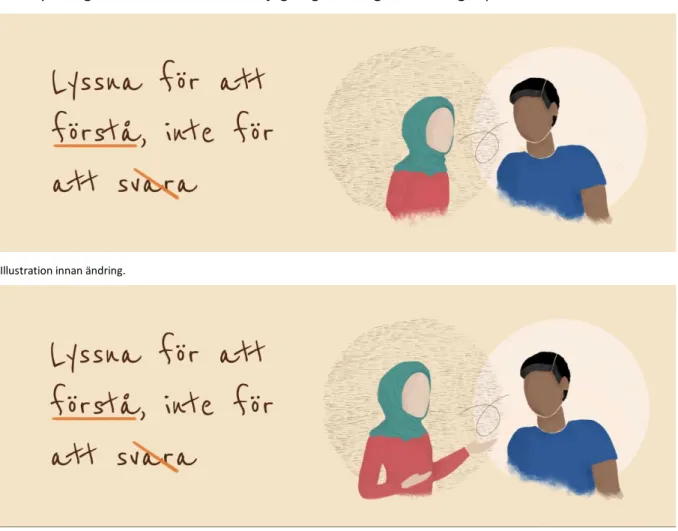
Efter ytterligare feedback bestämde jag mig för att göra ändringar på tre av illustrationerna.
Illustration innan ändring.
Illustration efter ändring.
Efter feedback om hur jag skulle kunna göra illustrationerna mer dynamiska tittade jag på bilder och visuellt material av människor att prata och tittade på människornas kroppsspråk. Jag tycker att illustrationen blir mer effektfull genom att avbilda den rödklädda karaktären med händerna ut som om hen försöker förmedla sina känslor genom kroppsspråk. I kombination med texten, formen och färgerna förstår man att det handlar om sårbarhet och känslor.
Illustration innan ändring.
Illustration efter ändring.
Det samma gäller om kroppsspråket för denna illustration som den förra. Effekten på denna blir dock annan än på den förra eftersom texten, formen, färgerna, linjerna och kroppsspråket konnoterar obekväm atmosfär och jobbiga känslor, kanske även lite ilska.
Illustration efter ändring.
Jag ändrade märken kring ordet ’förenar’ på den här illustrationerna eftersom de märken jag la först var otydliga om inte man zoomade in på bilden. Eftersom tanken med dessa märken var att förtydliga budskapet tyckte jag det var bättre att sätta ett väldigt tydligt tecken istället.
Förhållande till uppsatsen
Mediaproduktionen har inga direkta kopplingar till uppsatsen då det är två seperata arbete men min research för uppsatsen har fått mig att tänka på saker jag hade kannske inte tänkt på innan. I min uppsats analyserar jag Vogue omslag där det kombineras bild och text så jag har läst en del om förhållandet mellan dessa två saker. Stuart Hall menar att mening ligger inte bara i bilden utan i förhållandet mellan bild och text och att det påverkar varandra (Hall, 2013). Det har hjälpt mig i min mediaproduktion för att den handlar väldigt mycket om just det, förhållandet mellan illustration och text.
Min uppsats handlar om kodning och avkodning, som är termer från Stuart Halls mottagningsteori (Hall, 1973). Den handlar om att beskådarna inte alltid tolkar material på set sättet som avsändaren menade (ibid.). Det vill säga att jag som avsändaren av dessa illustrationer har kodad materialet med vissa tecken och konnotationer och jag önskar att målgruppen ska avkoda och tolka på det sättet som jag menade det men det finns ingen garanti för det, målgruppen och andra möjliga beskådare kommer avkoda och tolka materialet utifrån sin uppfattning och bakgrund. Med detta i åtanke har jag varit noga med att tänka på inkludering och mångfald i illustrationerna för att alla som ingår i målgruppen ska kunna relatera till materialet.
Reflektion
Mediaproduktionen resulterade i fem illustrationer, som planerat. Illustrationerna är ganska abstrakta, färgglada, intresseväckande och innehåller Minds färger enligt deras visuella identitet som jag tog fram. Karaktärerna är diverse när det kommer till inkludering av människor från olika kulturer och kön och signaturfärgen orange spelar stor roll. Jag menar att orange är Minds signaturfärg eftersom deras logotyp är orange. Illustrationerna
kompletterar texten bra och det är en tydlig koppling mellan dem.
Däremot är illustrationerna inte väldigt dynamiska på det sättet jag hade tänkt mig i början, jag ville göra de dynamiska och visuellt spännande men jag tycker inte jag har uppnått det eftersom karaktärerna består enbart av huvud och överkropp och illustrationerna är statiska och utan rörelse. På grund av detta är det möjligt att de inte är lika intresseväckande som jag planerade. Jag borde ha gjort mer research på hur man visualiserar osynliga saker såsom känslor, ljud och atmosfär samt att studera sätt att illustrera dynamiskt kroppsspråk, till exempel hur vi kommunicerar våra känslor genom olika gest. Då hade jag möjligen kunnat göra illustrationerna lika dynamiska som jag tänkte.
Ett av de problem jag stötte på var att Mind hade ingen grafisk profil och därför studerade jag deras hemsida för att hitta färger och typsnitt jag kunde använda för att illustrationerna skulle passa in i deras visuella identitet. Det blev faktiskt bra eftersom då lärde jag känna varumärket mycket bra och det hjälpte mig på vägen att skräddarsy illustrationerna till Mind.
Jag valde att göra karaktärer av diverse bakgrunder och kulturer för att illustrationerna skulle vara inkluderande samtidigt som jag tänkte på placeringen av karaktärerna inom varje illustration och tänkte på texten för att undvika stereotyper. Till exempel valde jag att sätta två människor med mörk hy på illustrationen vid texten ”Var inte rädd för att fråga
obekväma frågor” eftersom jag tänkte att om jag hade placerat en ljushyad människa och en mörkhyad människa hade det kunnat tolkas som en rasfråga och därmed tagit fokus från ämnet psykisk hälsa. Eller kanske hade det varit effektivare? Eftersom rasfrågor och rasism är ju tätt kopplade till psykisk hälsa.
Det är väldigt viktigt att prata om psykisk ohälsa och det kan vara avgörande för människan som lider. För många är det svårt att börja samtalet och då kan dessa illustrerade
samtalstips hjälpa. Målgruppen för denna mediaproduktion har, likt alla i världen, drabbats hårt av pandemin och det kan vara särskilt svårt för unga människor och deras utveckling att inte kunna umgås socialt (news.cision.com). Dessutom lider många unga av oro på grund av klimatångest, oro över jämställdhet, rasism och prestationsångest i dagens samhälle. Därför är det så viktigt att folk lär sig prata om psykisk hälsa och att organisationer som Mind fortsätter sitt arbete.
Källförteckning
Chloe Abrasada. 2020. How to Talk with Someone about their Mental Health.
https://www.behance.net/gallery/103568543/How-to-Talk-with-Someone-about-their-Mental-Health (hämtat: 31. Maj 2021)
Hall, Stuart. 1973. Encoding and decoding in the television discourse. University of Birmingham. Available at:
https://www.birmingham.ac.uk/Documents/college-artslaw/history/cccs/stencilled-occasional-papers/1to8and11to24and38to48/SOP07.pdf (hämtat: 17 May 2021).
Hall, Stuart. 2013. Representation. 2nd edition. London: Sage Publications Ltd.
Mind.se. https://mind.se/aktuellt/nytt-samarbete-for-att-minska-psykiskt-lidande/ (hämtat: 31. Maj 2021)
Mind.se. https://mind.se/kampanj/varmprat-icastiftelsen/ (hämtat: 31. Maj 2021)
Mind.se. 2018. Minds effektrapport 2018. Stockholm: Mind. https://mind.se/wp-content/uploads/effektrapport-mind-2018.pdf (hämtat: 1.juni 2021)
Mindsverige. 2021. Instagram. https://www.instagram.com/p/COAFAktpQOK/ (hämtat: 31. Maj 2021)
News.cision.com. 2021. Allt fler mår sämre psykiskt till följd av pandemin – varannan ung kvinna har påverkats negativt. https://news.cision.com/se/apotek-hjartat/r/allt-fler-mar-
samre-psykiskt-till-foljd-av-pandemin---varannan-ung-kvinna-har-paverkats-negativt,c3283985 (hämtat: 2. Juni 2021)
Tran, Kevin. 2018. Social platforms are most popular among 18- to 29- year olds.
https://www.businessinsider.com/social-platforms-are-most-popular-among-18-to-29-year-olds-2018-3?r=US&IR=T (hämtat: 2. Juni 2021)