Engaging map visualization through
Emotional Design
Underrubriken ska du skriva här, om du har en
Patricia Rodriguez
För avläggande av filosofie kandidatexamen i Informationsdesign med inriktningen Programinriktningen Informativ Illustration
Ett examensarbete på grundnivå, 15 hp Examinator Yvonne Eriksson
Handledare Lasse Frank
Akademin för Innovation, design och teknik Mälardalens högskola 2019-06-04
Abstract
Gustav Vasa association, among other things, works to inform the public about Strängnäs interesting background about Swedish history and cultural heritage. Their purpose is to promote Strängnäs as an interesting travel destination to visit and teach visitors about Swedish history during the 15th to 17th century specifically. Their objective is to promote and deliver this information through interactive and innovative platforms in order to attract a younger target group, but also to engage the user’s interaction. This research contains the strategies and methods needed in order to create a digitally interactive and cultural map of Strängnäs, that would achieve both visual engaging and guiding purposes. Under this research, multiple methodologies were performed in order to get a more in-depth knowledge about the Swedish domestic traveller needs,
preferences, motivations and behaviours before and while leisure traveling. In addition to that, theories from emotional design, rhetorical, storytelling and cartographic visual techniques among others, are presented to give this thesis a base to visually engage and guide the users. The data collection methods used in this research has been both as observations, interviews with Gustav Vasa association, tourist centres in Eskilstuna, Västerås and Strängnäs and with the target group, with the purpose of gather data relevant as this research´s basis. Along with these, user testing methods such as A/B testing, think aloud and usability testing were conducted as to evaluate the resulting design concepts from the data collection methods. This thesis resulted in that a combination of both emotional and rhetorical theories, and both flat and skeuomorphic design styles, created an engaging and persuading visual content. This concluding in making users want to interact with the map´s visual and textual context within the map´s digital interaction. The use of visual concepts that could be
associated by a both visceral and reflective level of design (Norman, 2005) concluded in a stronger engaging response from the users, as well as, the use of visual rhetorical theories within the map´s visual content. Finally, the use of storytelling techniques both in visual and textual context lured the user to interact with the information provided by the design.
Preface
First, I would like to dedicate this thesis to myself, who has been working so long, so hard and so far, to get where I am today, unemployed and with an enormous amount of stress. Anyway, I feel enormously proud of myself, for being who I am and where I am, surrounded by people who I am madly in love with.
Daniel, without the strength, courage, love and understanding you have shared during these long years I wouldn´t be here. I wouldn´t, or if I would it wouldn´t be as “sane” as I am today. Mom, if it wouldn’t for your constructive criticism, laugh and craziness I wouldn´t have been able to laugh at my failures and welcome the endless self-criticism a designer is always doomed to do.
My peers, companions and rivals…thank you, thank you for sharing these three years of intensely stressful but also fun times. You are my inspiration, my goal and purpose for keeping doing what I love most, to create.
And finally, but not least important, to all the teachers and mentors who have taught me the tools necessary to accomplish what I have done during these studies, for their patience, caring and support. You are awesome.
4
Content
Abstract ... 2 Preface ... 3 Content ... 4 Introduction ... 71.1 Background and Collaborative Partner ... 7
1.2 Problem statement and objectives ... 7
1.3 Aims and Research Questions ... 8
1.4 Scope and Delimitations ... 8
1.5 Thesis structure ... 9
2. Theoretical context ... 10
2.1 Emotional design ... 10
2.2 Rhetorical theories ... 11
2.3 Storytelling techniques ... 11
2.4 Cartographic design principles ... 13
2.5 Other theoretical approaches ... 14
2.5.1 Gestalt psychology theory ... 14
2.5.2 Fundamental principles of interaction ... 14
2.5.3 Interface design strategies ... 15
3. Research methods ... 16
3.1 Target group ... 16
3.2 Methods for Collecting data ... 17
3.2.1 Observations ... 17
3.2.2 Interviews ... 17
3.2.3 Prototyping ... 18
3.3 Methodology used for user testing ... 19
3.3.1 Think aloud testing ... 20
3.3.2 A/B testing ... 20
5
3.4 Methods for Analysing data ... 21
3.5 Methodological criticism ... 21
4. Empirical studies & Results ... 23
Case 1 ... 24
Results ... 24
Analysis and discussion ... 25
Case 2 ... 25
Results ... 25
Analysis and discussion ... 26
Case 3 ... 26
Results ... 26
Analysis and discussion ... 27
Case 4 ... 27
Results ... 28
Analysis and discussion ... 28
Case 5 ... 29
Results ... 31
Analysis and discussion ... 33
Case 6 ... 33
Results ... 34
Analysis and discussion ... 34
Results relation to problem statements ... 35
5. Design ... 37
5.1 Form, style and color ... 38
Places of interest ... 38
The maps guiding visualization ... 39
Other visual graphic elements ... 40
5.2 Text and narrative ... 41
5.3 Typography ... 44
5.4 Interaction and usability ... 45
5.6 Layout ... 46
6 Discussion ... 49 References ... 51 Printed sources ... 51 Electronic sources ... 52 Image reference ... 52 Appendix ... 53 Annex 1 ... 53 Annex 2 ... 55 Annex 3 ... 56 Annex 4 ... 58 Annex 5 ... 60 Annex 6 ... 64 Annex 7 ... 67
7
Introduction
Below the basis for this thesis research will be explained in order to serve as an introduction for the thesis content. Under this chapter both a background information of the collaboration partners, problem statements, objectives, goals, research question and the research scope and limitations will be explained.
1.1 Background and Collaborative Partner
Gustav Vasa association is a non-profit organization, that is both political and religiously impartial and resides in Strängnäs municipality. The association is composed by genuinely and actively people that are interested in Swedish and more specifically Strängnäs history heritage. The organization´s aims are:
1. To actively promote Strängnäs as a place of interest for tourism, where many interesting aspects within Swedish architectural history, culture and environment under the 15th to 17th centuries can be visited and first-hand experienced.
2. To promote the information through interactive and innovative platforms that represent the cultural heritage in order to attract the user through interesting knowledge.
Nowadays, tourist maps are possibly one of the most common cartographic documents that we can find when traveling to foreign or different places. According to cartographic visual theories supported by the International Cartographic association (ICSM, 2018), they are many types of maps, which are classified according to their intended functionality and content. Gustav Vasa´s association needs an interactive digital map of Strängnäs, to show in their webpage, with the objective to attract people and motivating them to visit cultural or historical points of interest within Strängnäs municipality. In
addition to it, the requested map had to not only to accomplish an aesthetic purpose, but it would have also to visually guide the user through the different places. The need for a digital map comes from the lack of an engaging digital map of Strängnäs municipality, that combines both visual information about the historical places in, their background information and how to localize them.
1.2 Problem statement and objectives
The objective with the map, according to Gustav Vasa association, was to attract and guide the user though the maps content, in order to promote
8
Strängnäs due to its interesting historical heritage. It was therefore decided to focus on how to visually engage and guide the user through a compelling aesthetic, in order to motivate the user to interact with the design and hopefully make them want to visit Strängnäs.
The problem statements stated at this point were:
• What historical or current events could motivate the users to choose Strängnäs as an interesting vacation or traveling site?
• Which preferences or motivations had the users during traveling or visiting different cities?
• How should the information be shown in order to make it more appealing to the users?
• Which combination of methods and theories would be needed to create a visually compelling and guiding map?
1.3 Aims and Research Questions
The aim of this thesis research has been on how to better visualize a maps visual content in order to make both visually appealing and guiding to the user. This with the purpose of providing a truthful and engaging information about Strängnäs many historical events and places of interest. Another aim has been to motivate the user’s interaction with the map with help of theoretical context based on perception and cognitive theories. Since the aims and objectives are inter-related, the research question is:
• How can the visual content of a digital map be designed, in order to make it both visually engaging and guiding?
• How can a cultural map of Strängnäs be illustrated in order to motivate the user’s interaction based on the map’s aesthetics?
1.4 Scope and Delimitations
Since the main objective of this thesis is to visually engage and guide the viewer through the map, it has been focused on how a maps aesthetics can be designed in order to appeal and persuade the user’s engagement. Other subjects as how to engage the user through interface interaction haven´t been addressed in this research thesis, due to the limited frame of time provided. However, since one of the purposes is to motivate the user to interact with the map´s interface due to its aesthetics, strategies in interactive design and principles of interaction have been followed as to accomplish a certain level of interaction within the interface.
9
The textual content presented in relation with the illustrations and provided by Gustav Vasa association, have whatsoever not being used as an object of this research study. The textual content provided though, has been modified in order to better complement the visualizations using rhetorical concepts.
The media decided for this project will be as a digital interactive map in the Gustav Vasa association webpage. The decision was made as a result of a lack of a physical place where it could be displayed in physical form as a traditional paper map or brochure. The lack of social media accounts from the association itself also delimited the platform to their webpage.
1.5 Thesis structure
Below follows a short describing summary of planned contents within the thesis:
Chapter 1 (Introduction) introduce a brief summary on the background and framing of this project (the project’s objective, goal, display and chosen media). A list about the main problems and questions that will be research and answered later, as the thesis follow. And finally, the objectives and specific aims and the scope and delimitations of the project.
Chapter 2 (Theoretical context) it contains relevant theories chosen during the analysis of the empiric data that will be explained, within the project context and area of relevance.
Chapter 3 (Data collection methods) explicates the methodology used in the research, the reason of the chosen method and it process. Both reflections about the methods used and a visual summary of the empirical data results. Chapter 4 (Data Analysis and Comparison) describes the execution of the methods, the empiric data and discusses and compares the results obtained. Chapter 5 (Results) describes and explain the design culminated from the results gathered through the data collection methods and user testing. Chapter 6 (Conclusions and Continuation) a summary of the project design process, conclusions of the thesis, comments on their relevance for the thesis and personal suggestions and thoughts.
10
2. Theoretical context
This chapter presents the theoretical context which have been used for the thesis research, chosen due to their relevance with regards to the goals of this project, visual engagement and guiding. First the theories used to visual engagement and persuasion will be presented and followed by cartographic theoretical techniques. Finally, a summary of other theories and principles that have been used in order to explain the decisions made towards the layout and interaction of the graphic content will be addressed.
2.1 Emotional design
According to Norman (2005) emotional design is a cognitive theory that parts from the premise that both usability and aesthetics can correlate. Norman (2005: 19-20) describes emotional design as the one who strives to elicit an emotional reaction/connection from/to the user with the intention of influence the user’s perception. To do so, Norman explains that there are three levels
through which the human form this emotional connections:
the visceral, behavioural, and reflective levels. Norman (2005: 67) describes that the visceral level appeals to our initial reaction towards a products
appearance, such as based on the products brightness, form and highly saturated primary colours. The author explains that it can be easily studied by putting people on front of a design and observing their reactions. Norman explains that this level of connection basically studies the engagement of the senses. The stronger the reaction the bigger its engagement. The second level, the
behavioural (2005: 67-70) refers to the usability of the product itself, how well it performs the intended function, understandability, usability and physical feel. According to Norman under this level we will form a better opinion about the usefulness of the item itself. The third and final level, the reflective design (2005: 83-84), cover the products message and meaning of its use. It determines how it makes us feel or remember when holding it, using it or looking at it. It is all about the personal remembrances something evokes. It is to say, the stronger the remembrance, the stronger the emotional value and engagement will be. This theory is intended to be applied onto the visual design of the map, since it defends the idea of improving the user´s visual engagement through certain perception levels. As the author refers (2005: 20) the conscious use of this theory during the design development, can help the designer achieve a stronger reaction from the user and lead to a deeper engagement through the design.
11
2.2 Rhetorical theories
Rhetorical theories have been seen also relevant during this project due to its function and how it can be used according to Janne Lindqvist (2016) to achieve the objective of attracting and persuading the user by the maps visual content. The rhetoric is quoted by Janne Lindqvist (2016: 63) as “[…] the art of
discovering what can convince and persuade, what can affect.”
Furthermore, Lindqvist (2016: 82-83) describe three persuasive means into the textual concept, called: ethos, pathos and logos. Lindqvist describes ethos as what helps a speaker appear trustworthy to the audience, such as that persons authority, experience or status. Pathos is described as to express the feeling we want to influence, by the methods or feelings we use to achieve the desired reaction from the audience. Logos is defined as the evidence or arguments we use to refute and persuade the audience with. According to Lindqvist (2016: 83) these persuasive concepts are likely to help us persuade the audience if we use them in our speech, text or visual content. This will be used accordingly due to this thesis objectives.
Another rhetorical concept used under the idea generation phase of the visual content and prototyping was, what Cooper et al. (2014: 301) quotes as a visual metaphor, “[…] signals a function: a picture used to represent the purpose or attributes of a thing”. Cooper et al. (2014: 301) explains that the problematic in the use of visual metaphors, is that as a representation of something, it can be translated by the users in many ways. The authors explain that our
comprehension depends on:
• if we are used to see or interact with them by previous experience. • if it requires a certain precognitive understanding of them by language
or culture and such. • the context they are used.
Visual metaphors have been used to represent everyday concepts within the design aesthetics, with the intention of visually engaging the user, in addition of creating emotional connections by reflective levels of design.
2.3 Storytelling techniques
In addition to Lindqvist´s rhetorical theories, Gustav Freytag´s pyramid of dramatic structure was applied in the visual content as to help structure the visual narrative. This theory was used with the purpose of: a) help convince the user about the veracity of the visual and written information the design
communicates, b) to visually engage the user through persuasive concepts supported by the rhetorical theory and, c) to create an entertaining visual narrative that attracts and lead the user through the maps visual information.
12
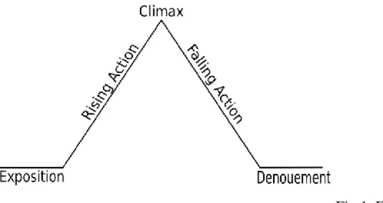
Granath (2006: 104) describes Freytag´s dramatic arc divided in five parts: exposition, rising action, climax, falling action, and dénouement.
Fig 1. Freytag´s pyramid.
The exposition is described as the introductory part where the character, places, plots and so on, are presented. Followed by, the rising action are described, as a series of events that builds the background story towards the turning point in the narrative, the climax. The climax could be described as the point of biggest interest, where a certain action or information is presented in order to create a stronger reaction. After this stage, the falling action, is explained as where the conflict is resolved, leading to the denouement, the final stage when the plot is resolved.
According to Granath (2006: 104) a dramatic narrative can help the speaker or the transmitter (in this case the designer) to tell a story with the goal of catching the audience's interest. In this case, it will be applied through the maps visual content and the maps interface interaction.
Narrative voices have been used in order to lead the user through the textual context and to engage the user through the visual narrative intended. The narrative is quoted by Abbot (2008: 223) as “The representation of a story (an event or series of events)”. The narrator voice (Abbot, 2008:1567) is described as the voice that narrates a story. The author further explains, that there are three different narrator voices, distinguished as first, second and third person. The first-person point of view is defined as a participant narrator, referring with “I” and “we” pronouns. Where the narrator is commonly seen as the protagonist of the story. The second person narrator is explained as having a point of view where the narrator participates with the audience, making them part of the story, and by using pronouns as “you” of “yours”. Finally, the third person narrator voice is identified as an uninvolved character outside the narrative world, that explains the events and characters through a third person perspective. Referring the character in third person “he”, “she”, “they” and so on, where the audience
13
is made instead the character. Abbot, (2008: 1568) further explain that an omniscient third person narrator, refers to the narrative voice that is perceived as having privileged knowledge of the characters, places, thoughts and events in the story.
2.4 Cartographic design principles
Furthermore, the maps visual design and its guiding objective, will be based on the field of cartographic theories supported by the International Cartographic association (ICS) and the Intergovernmental Committee on Surveying and Mapping (ICSM). According to National Geographic encyclopaedia (2011) and supported by the ICS and ICSM “a map is a symbolic representation of selected characteristics of a place, usually drawn on a flat surface”. ICSM (2018)
describe different kind of maps depending on their functionality. Just the general reference map and the thematic map will be explained due to their relevance to this project.
According to ICSM (2018) a general reference map is the one that show important physical features of an area with the purpose of aiding the discovery of locations. On the other hand, ICSM (2018) explains the thematic map as one that represents a theme or topic. Combinations of these two map types are, according to them, seen in tourist maps, where a general reference map is combined with a thematic one, since it aids visually the user through the area but also highlights certain places of interest that the user might like to visit. According to National Geographic encyclopedic entry about map visualizations (2011), maps are usually visualized from a 2D perspective and shown on a flat surface from above. According to both ISCM (2018) and National Geographic (2011), explains that this way of visualizing a map is usually easier to read and understand by the users since the scale that determinates the relationship
between the distance of the map and actual distance between places are easier to comprehend.
This last theoretical concept about the map visualization display will be taken in consideration in this project due to the map’s functionality: to visually guide the user through the map and show the distance between the different places of interest. Both thematical and general purpose visualizations will be use since the maps functionality will be to: a) visually guide the user through important physical features of the area with help of roads and green areas, b) aiding the user to discover Strängnäs places of interest , c) to visualize distance, and d) to visually represent a topic or theme, a cultural/historical tourist map of
14
2.5 Other theoretical approaches
Other theoretical context has been used in this thesis research as to explain some aspects about the choices made in the layout and hierarchy between elements. In addition to it, while not being an object of study under this
research, interface interaction techniques have been used in order to be able to evaluate a real-time reaction from the user while interacting with the map´s design and visual content. A brief description about the gestalt psychology principles, fundamental principles for design and interface design principles will be described below as to give the reader a better understanding of its use. 2.5.1 Gestalt psychology theory
Gestalt psychology laws (Ware, 2012: 181) are described as the rules that describe the way patterns are visually perceived by the viewer. These laws are classified in eight different design principles: proximity, similarity, connectivity, symmetry, closure, relative size and finally figure and ground. The principles of proximity, similarity and connectivity have been used in order to motivate decisions within the layout of the different graphic elements within the design as to accomplish a more comprehensive, understandable and structured visual information. A description of the design principles used under the prototyping phase are explained below:
• Proximity (Ware, 2012:181) is described as the forms we perceived as belonging together because of they are being grouped or positioned next to each other. (Ware, 2012:181)
• Similarity (Ware 2012:182), are the similar elements that tend to be perceived as being grouped together.
• Connectivity (Ware 2012:183) by connecting various thing in groups by a line.
• Symmetry, (Ware 2012:185) however is an organizing principle, where things grouped symmetrically are perceived as a visual whole.
• Closure and common region (Ware 2012:186), is described as perceiving a closed contour as a whole object, and the perception of being able to divide regions of space by inside or outside a contour. A region enclosed by a contour becomes a common region.
2.5.2 Fundamental principles of interaction
According to Norman (2013: 10) there are six fundamentals to principles of interaction, that are important in order to being able to discover what a product does, how it performs and what actions are possible with it. It is why, these principles of interactions: affordances, signifiers, constraints, mappings, feedback and conceptual model, have been used in order to create a basic interaction within the maps interface, in order to evaluate the user´s perception towards the different graphic elements when being interacted together.
15
Norman (2013: 11) defines an affordance as the actions possible with and towards a product while a signifier (Norman: 2013: 13) is described as the signs that are perceptible by the user. The mapping (Norman, 2013:20-21) concept is describe as the relationship of the elements we use and how they interact with each other. The constraints (Norman, 2013: 85) are explained as the physical, logical, semantic and cultural restrictions towards the operations that can be performed with, within and towards a product. While the feedback is quoted by Norman (2013: 23) as “[…] a reaction, response or result from an action.” Within the constraints interactions, two of them have been used and classified as a semantic and logical constraints. The semantic constrains (Norman, 2013: 129) are explained as the constraints that rely upon the knowledge we have of the situation we are in, in this case the visualization of the places of interest and the absence thereof of other elements, limiting the users action to only them. In the other hand, the logical constrains (Norman, 2013: 149) are quoted as “[…] the logical relationship between the spatial or functional layout of components and the things that they affect or are affected by”. Finally, a conceptual model (Norman, 2013: 25) is described as the ability we have assigning meaning to things, it is to say, how we understand the relationship between what the model represents, its function and outcome (Norman 2013 :99-100).
2.5.3 Interface design strategies
In addition to the already explained above, there are different strategies described by Cooper et al (2014: 251) needed in order to create effective interactions that go well with the user flow. This has been used as a basis as to support the decisions made within the maps intended usability and interaction within the map’s visual context. The list bellow summarizes the steps needed that according to Cooper et al (2014:251) are fundamental for a successful interface interaction:
• Follow users’ mental models. • Less is more.
• Let users direct rather than discuss. • Provide choices rather than ask questions. • Keep necessary tools close at hand. • Provide modeless feedback.
• Design for the probable but anticipate the possible. • Contextualize information.
• Reflect object and application status. • Avoid unnecessary reporting.
• Avoid blank slates.
• Differentiate between command and configuration. • Hide the ejector seat levers.
16
3.
Research methods
In this chapter, the methods used in this project will be discussed. The analysis of the target group, the data collection methods used, and the method used for data analysis will be described and explained. It will be followed by a
description of the methodologies used in a later stage of the design process, during the prototyping and evaluating stage of the artifact.
3.1 Target group
After identifying the information problem and the research question in this project, it was necessary to start focusing on identifying whom the target group was, it is to say whom would be affected by the information according to Larsson (2014: 181). From a first observation about the Gustav Vasa
association context, their webpage information and objectives, the target group was presumed as all webpage visitors that most probably had an interest about Gustav Vasa, Strängnäs history or Swedish history in general. Since the target group was a difficult one to approach due to the lack of information about whom exactly visited the webpage, it was decided to target a more
approachable group that could be related and relevant to research upon. The target group addressed in this research, consists on a selection of Swedish citizens with a cultural or historical interest that had culture as a motivation when traveling to recreational destinations. The identification and selection of participants took place prior to when the interviews were made, by asking the participants their most usual motivation for travel and where selected due to be the target group audience of this research.
The age of the participants on interviews and user testing has varied between 22 to 55 years old. The age has not been a priority in this project since it has not seemed relevant, though the intention of having such a wide age range in the participants, has been to see if there were any differences between interest or motivations while traveling. The intended design was not to be adapted for languages other than Swedish, since the collaborative partner have determined the Swedish language as a priority.
17
3.2 Methods for Collecting data
The data collection methods that have been used in order to get valuable
information about how to collect relevant data about the thesis objectives, goals and limitations and the target groups preferences are: Participant observation (2016: 304) and personal and group interviews (Denscombe, 2016: 293) on the target group, tourist centres and the collaboration partner.
3.2.1 Observations
Shadowing (Hanington & Martin, 2016: 158) has been used under this research, as an observational method were the researcher take notes and gather
information about the environment, situations and the natural behaviour of the people, without interfering directly with the situation.
The purpose to use this approach has been to get relevant data that could be used in order to know: a) if the places of interest were able to be visited inside, b) about their location, entrance and exit points c) to gather visual information about the building and its premises and, d) to observe and get an insight about the city´s layout.
Later in this study, during the prototype phase in case 5 and case 6, a participant observation method was used in combination with other methodologies in order to examine how the users interacted with the prototype, but also to see and document their first reactions. Denscombe (2016: 293) explains that there are several different approaches to observations, that can be more or less
participatory and with a more direct or indirect approach. Denscombe (2016: 293) points out that the participant observation is often used as a data gathering method that can be done in the early stages of a design process as to create an understanding for the users needs, behaviour and, lifestyles and culture in their natural environment. According to many methodologies described by
Hanington & Martin (2016) it can also be applied in combination with many other methods with the purpose of helping the researcher evaluate a designs usability, reaction and functionality. This by letting users interact with the created artefact while researchers make direct or indirect observations of the situation.
3.2.2 Interviews
This method was applied on the target group, the Gustav Vasa association and three different tourist centres in order to gather relevant data as a foundation for this thesis research and as to guide the decisions needed in order to continue with the next step of the research process, idea generation and prototyping. Hanington & Martin (2016: 102) explains that interviews are a fundamental data collection method to gather information about prior knowledge, opinions,
18
attitudes and perceptions from the customer. Interviews can be structured, semi- structured or unstructured according to Denscombe (2016: 266). In this research a semi-structured interview approach was used, since according to Denscombe (2016: 266) it is described as a structure where the researcher has a distinct subject that is going to be approached with a list of questions that need to be answered. In addition to it, this structure is described as a flexible one where participant may voice their thoughts and may develop their answers.
Due to having a specific subject to discuss and knowing the importance of the target group thoughts and possible meaningful insights that might appear during the interviews, a semi-structured interview approach was used with the
intention of: 1) getting a deeper knowledge about the users wants, needs, motivations and behaviour, 2) to get an understating about which visual
information would be needed in order to improve the maps functionality and 3), to evaluate the target group reactions, thoughts and interactions with the
prototype. Under a later phase in the research process, during the idea generation and prototyping, the interviews were combined with A/B testing, think aloud and usability testing methods.
While the interviews to the target group and association were made as group or individual interviews face to face, the interviews conducted with the tourist centers were made by phone due to lack of the possibility of time scheduling. The decision to interview other tourist centers rather than just Strängnäs was made to compare and discuss their different results and to see if the tourist behavior had a certain pattern. Denscombe (2016: 267-268) explains that while a personal interviews can be a good method to use since the researcher can focus on just one person at the time, group interviews have the advantage to increase the number and selection of participants involved in the research and thereby contribute to a greater variation of experiences and opinions during the survey.
3.2.3 Prototyping
Hanington & Martin (2016: 138) quotes “Prototyping is the tangible creation of artifacts at various levels of resolution, for development and testing of ideas within design teams and with clients and users.”
According to the authors, prototypes can vary between low to high fidelity prototypes. Low fidelity prototypes are mostly used throughout the early ideation phase or process in form of paper-based sketches or mock-ups in order to change and test during the design development. In the other hand, the high-fidelity prototypes are usually closer in appearance and functionality they are to the final product. This are basically more useful during the evaluation phase of the product since it is usually tested on users, who could now give a more complete feedback based on aesthetics, form, usability and form. The
19
prototypes were made in vector graphic design with a combination of both flat and skeuomorphic design, further explained and described. Spiliotopoulos et al. (2018: 1) describe flat design as a design methodology that focus on the
simplicity, bright colours and clean lines with 2D illustration techniques, whilst skeuomorphism design is described as a style that imitates familiar materials or objects to invoke a sense of familiarity in the user. Spiliotopoulos et al. (2018: 1) quotes “a skeuomorphic designs are intended to help the users understand how to use a new interface by allowing them to apply their prior knowledge about the real-world objects it contains.”
During the idea generation phase of this research, based from the results obtained from the data collection methods, it was conducted a low fidelity prototype testing, the prototype development can be seen in Annex 7. The intention with the low fidelity prototype was to identify and sort among the different design concepts that strongly engaged the interest of the users. The decision to make the low fidelity prototype testing in vector graphic design instead of sketching on paper was with the intention of directly ask the user about their thoughts and opinions with regards to how the color and style was perceived. It may seem that the prototypes in this case, were high fidelity ones due to their relative finished appearance, but neither their interaction or
usability could be tested in this phase and therefore are suggested as low fidelity ones. The low fidelity prototypes made and tested on this phase were both the concepts of the different buildings or places of interest based to their historical or cultural relevance in Strängnäs, the maps style and other graphic components forms and aesthetics.
In a later phase of the research process, a high-fidelity prototype was made with the purpose of evaluate the users first reactions towards the artifact’s aesthetics, usability and interaction. This with the intention of seeing if the created design achieved the objectives intended with the map, to engage and guide the user within the maps interface. The high-fidelity prototype was also design in vector graphic design, while its interface interaction was developed in Animate CC.
3.3 Methodology used for user testing
During the prototyping phase of the artefact in this research process, three different user testing method have been used in combination with interviews and observation, Think aloud (Hanington & Martin, 2016:180), A/B testing (Hanington & Martin, 2016: 8) and usability testing (Hanington & Martin, 2016: 194). The purpose with the user testing methods with both low and high- fidelity prototypes were to evaluate the user’s preferences and behaviour towards the prototypes.
20 3.3.1 Think aloud testing
Hanington & Martin (2016: 180) quotes that “Think-aloud protocol is a method that requires participants to verbalize what they are doing and thinking as they complete a task, revealing aspects of an interface that delight, confuse, and frustrate.” According to the authors, it is an evaluative method that affords the researcher with a try-and-true approach to see the task process being resolved by the participants, but also to be able to identify pros and cons of the prototype or product tested.
In this research, think aloud testing has been used during both low and high-fidelity prototypes. Low high-fidelity prototypes, it was used in combination with an A/B testing version as to know the first thoughts about the created designs and determine which one visually engaged the user the most. On the other hand, during the evaluation of the high-fidelity prototypes, the think aloud testing was combined with a short interview and what Hanington & Martin (2016: 194) names for a usability testing. This combination of methods seemed relevant to evaluate, compare and discuss the reactions, preferences and behaviours of the users towards the maps design and interaction.
3.3.2 A/B testing
A/B testing is described as a method were two versions of the same design or concept are tested in order to see which one performs better towards the designs goal (Hanington & Martin, 2016: 8).
In this case, this method has been modified and adapted to test the intended goal, were the users had to choose between three or more concepts, and point out which one they experience as more visually engaging or interesting due to their personal preferences. The intention of this test was to determine the most visually engaging concept designed based on theoretical contexts and empiric results.
3.3.3 Usability testing
This method has been used in addition with an interview, were the user was asked some questions in conjunction with their interaction and behavior with the maps interface. The intention of using this method has been to get an in-depth information about the user´s impressions with regards to the aesthetics, interaction and usability of the high-fidelity prototype.
Usability testing (Hanington & Martin, 2016: 194) is a method used during the evaluating phase of the artifact. With this method the researcher observes and evaluates the customer's ability to perform certain functions that are linked to the use of the artifact, in this case, the maps interface. During this time, the researcher takes notes on feedback from the users. The researcher takes notes
21
about which parts of the structure and interaction need to be changed or possible upcoming problems in line with what he/she observes. This method helps the researcher evaluate the users behavior towards the artifacts usability. In addition to it, it is helpful for the researcher since it can later improve the artifact and test it receive feedback and so on.
3.4 Methods for Analysing data
According to Denscombe (2016: 344) there is many ways of analysing data to help the researcher describe, explain and interpret data. As stated by
Denscombe there are two terms applied in data analysis, qualitative and
quantitative research. The qualitative use words or visual images to analyse and catalogue the data and its associated with the researcher’s involvement, whilst the quantitative uses statistical tests, using rather numbers to the analysis and tends to be associated with impartiality.
The data in this thesis is analysed through a qualitative research analysis method. Due to the limited timeframe for this project, the quantitative data was excluded, according to Denscombe (2016: 349), as valuable as it can be it is difficult to handle when having a limited timeframe or lack of economical or technical resources. Instead it has been focused on qualitative data collection methods, with the intention of optimizing time the best way possible but also to get a better insight aboutwhat the user needs and wants that the design needs to meet to fulfil the project’s goals.
This qualitative method has been used both to analyse the observations, interviews and prototypes made during the research process of this thesis. The interviews made during this research process have been transcribed, analysed, compared and discussed in relevance to the thesis research. In addition to it, notes taken during observations and other user testing methods, such as think aloud and A/B testing have been summarized, interpreted and discussed. The purpose with the analyse of data has been: a) to search after relevant
information that could lead to an answer to some of the problem statements made in the beginning of this thesis, b) to hopefully have an insight about the target group preferences, motivations and needs and, c) to find relevant data that could help determine which theoretical path to follow.
3.5 Methodological criticism
Denscombe (2016: 264-268) describes the advantages and disadvantages of using interviews as a data collection method. While this method can offer a way to gain a more in-depth data and valuable insights from the interviewed, it can on the other hand, be difficult due to a lack of time, budget, logistical and
22
ethical aspects. It is acknowledged that the result from these performed methods may have been different if the amount of the participants questioned had been wider, since every person have their own interest, conditions and prior
knowledge. To use a shadowing (Hanington & Martin, 2016: 158) approach, can be relatively cheap to carry out, where few resources are needed in order to perform it. However, it can be time consuming and impartial, since it is based on how the observer, in this case the researcher, experience and perceive the environment and behaviours around it. The sources referenced in this research, have been judged as genuine and credible since the authors are acclaimed as researcher notable within their field of studies and relatable to the theoretical context within this research thesis.
The interviews made were carried out with ethical aspects in mind. Research must, when it comes to people, contain an approval from everyone involved (Denscombe, 2016: 423-447).Were the participant must be informed of the purpose of the study, who is standing behind the research, that their
participation is voluntary and that they can at any time interrupt or withdraw from their participation. The approval by the participant have been done verbally before the interviews took place and was informed that they would be named in the attached papers, but that no other personal information would be referred.
23
4.
Empirical studies & Results
In this chapter a summary of the empirical studies, their research process, the methodology used for the analyse of data and the results are explained and discussed.
Below a table of the different methodologies used under the research process is presented. Their purpose and data analysis method are described as to give an overlook of the cases that are addressed later under this chapter:
Case Purpose of data
collection
Collection method Data use and analysis
Case 1 To determine and identify Gustav Vasa Association objectives, goals, target group and preferences with the design.
Discussion, interview
The association interests, needs and background information shared about the historical places of Strängnäs. Qualitative analysis and interpretation to guide the next step of the process.
Case 2 Documentation valuable logistical information about historical places interest and user behaviour.
Participatory Observation
In order to record valuable information about relation distance between places, locations and exits of the different places of interest.
Case 3 Documentation of valuable data about most visited places and questions/ information asked from travellers. Personal Interviews by phone with three different tourist centres.
Qualitative analysis and
interpretation were made in order to get a better understanding about Swedish domestic travellers’ behaviour and compare with next step of the process.
Case 4 Documentation of information about the target groups behaviours and motivation, while planning and visiting places of with historical interest. Group interviews to target group
Qualitative analysis and interpretation of the information was made in order to understand the target groups preferences and behaviours, in order to guide the next step of the process.
Case 5 Documentation of user testing on low-fidelity prototypes.
Combination of Interviews, A/B testing and Think
aloud test
Qualitative data analysis was made to research about degree of visual engagement and better
24 Case 6 Documentation of target groups impressions, interactions and behaviour towards the high-fidelity prototypes. Combination of interview, usability
testing and thing aloud methods.
Qualitative data analysis and interpretation to evaluate user’s engagement and interaction.
The cases below, will describe the processes that had led to the upcoming results. They have been classified into different groups: the results from data collection methods and the results from the prototyping and evaluation tests. Below the first four cases will be explained since they are the ones which determined the organizations objectives and goals with the design and the target groups preferences. These results were needed in order be able to
establish the basis on which the research resolves and in order to continue with the next step of the process, the idea generation and prototyping phase.
Case 1
This case is summarized in Annex 1, where an unstructured interview with three representatives of the Gustav Vasa association was made. A semi-structured interview was conducted, in order to get relevant information about the associations interests, needs and goals toward the design intended but also get information about the target group to whom the design would be addressed, and to determine the areas of interest and places which should be visualized. Questions made by their objectives, goals and need for the design were addressed, as a petition to be in contact under the research´s time period. Results
The following result is summary of the discussion with Gustav Vasa
organization was summarized in: a) their need of a map that visually engaged the user with the intention of promoting Strängnäs as an important historical place to visit, b) a map that showed interesting information about the places background/ past events or historical relevance and c) their enthusiasm for having an interactive map that could be displayed on their webpage.
No suggestions about the visual content was required or requested at this point, since it would have to be tested on the target group and based on relevant theoretical context.
25 Analysis and discussion
Due to the information documented during the group interview, it was analysed as a qualitative data and used as to guide the next step of the research process. The impressions gathered under the discussion, were that even if the
associations interest led to focus on Gustav Vasas character (former king of Sweden of the 1500 hundreds) and period of time, Strängnäs municipality has a wider range of interesting historical heritage, that was interesting as well as to achieve their objectives. The map would essentially work as a tourist map showing historical places of interest that did not specifically had to do with Gustav Vasas character or period. Instead it would gather a handpicked place by the association, based on the places that they experienced as fundamental and interesting due to their historical and cultural background. The output from the discussion was used a basis for the research of this thesis.
Case 2
For each observed place, notes were taken.
An observation of the premises of Strängnäs municipality was made with help of a list provided about by the Gustav Vasa association. This list provided names and addresses to historical and cultural places of interest within
Strängnäs. Prior to the observation was made, a planning and scheduling of the visit was made in order to visit the places while open to the public and collected and submitted in Annex 2.
Under the observation it was noted about if the places entrance were accessible or not, were they were located and opening hours if they have them. Every place was recorded by taking pictures of them and their surroundings. It was also noted the approximately amount of people located and their behaviour. Results
The conclusions from the observation done in Strängnäs municipality were: 1. Most of the places weren’t accessible for the visitor with exception of
Strängnäs church, Grassagården and finally the Windmill and Roggeborgen with needed previous booking.
2. The only place with displayed opening hours was Grassagården. 3. The maps provided and displayed around Strängnäs municipality were
lacking visual information about how the places of interest look like and how to identify them.
4. The most amount of people was concentrated around the church, Gyllenhjelmsgatan, Grassagården and the townhall (rådhuset). A personal reflection as an observer was that these last-mentioned places were in a relative short distance to the town’s main street were shops,
26
coffee shops and restaurants are located. The church in this context was where the biggest amount of people was.
5. The observed people gathered in the church was of all ages, from toddlers to elders. Some of the observed people were perceived as tourists or at least new to the surrounding since they had both maps and were accompanied with a church guide. It was noted though, that the people surrounding these places took pictures.
Analysis and discussion
The relevant information gathered from this method was: 1) documented visual information of the different places, 2) if the interior of the buildings were accessible. While significant information was gathered to get a better
understanding of the premises and area to visualize, other data was not deemed as relevant for this research. The amount of people in each place was not determined as a relevant data, due to the chance factors and lack of statistics. In the other hand, a common behaviour was documented and used as a former idea in the design. The behaviour observed in the people was the need or use to document visually the place of interest by taking pictures.
Case 3
In this case, semi-structured interviews by phone, were made to Eskilstuna´s, Västerås and Strängnäs tourist centre management. The purpose with these interviews was to gather data about visitors most frequented places within the counties and most frequented questions. The data presented below are the question made during the interviews, their answers are archived in Annex 3.
1 What is the most visited season in your cultural or historical places of interest?
2. What are the most attractive tourist places based on the amount of people?
3. What are the most common questions you get from tourists? 4. Where do most of the tourists come from? Domestic or foreign?
5. How do the tourists search for the information themselves, is it via your website, the physical tourist centre etc?
6. Do you know what motivates visitors to your tourist destinations? Results
The results presented have been taken in consideration and compared to the results collected from the next step of the process described in Case 4. A conclusion was made by the most similar answers, and summarize bellow: • Most visited seasons: Mid Maj until mid-September.
27
• People who visit the most: Mostly Swedes but also a variety of foreign travellers.
• The most visited places in order according the Interviewers order or preference:
1) Zoos or aquatic parks
2) Historical or culture Swedish places with strong historical background
3) Wildlife areas
• What the users ask more about in order of relevance: o “must to see” places
o Locations, addresses.
o about seasonal or weekend events in the area. o Opening hours
Analysis and discussion
The data collected from the tourist centres gave relevant data about what the traveller usually asked for during their stay or visit to these places and later compared to Case 4, where the target group was interviewed. Besides the already mentioned, the interview with the Strängnäs tourist centre, gave also an insight of the places that were most frequented in Strängnäs municipality. Due to the visitor’s different motivations to travel (nature, sports, cultural etc), the data gathered about the places that were not known for their historical or
cultural relevance were excluded due to their lack of relevance within the map’s functionality.
Case 4
The interview was made to eight people between 22 and 55 years old with an historical or cultural interest, and specifically with a tendency of traveling for such reason. The way in which the group was chosen, was by asking multiple people about their main motivations of traveling. The methodology used was as group and individual semi-structured interviews. This case is transcribed in Annex 4 where the full answers can be read. This step of the process was intended as to get a in depth information about the target groups motivations, preferences and behaviour while leisure traveling. Below a list of the questions made is presented and later summarized.
1. What was the last leisure trip you did in Sweden?
2. Do you plan your vacation or travel to a location, in that case what do you do?
3. What is the information you seek or are most interest to know about when you visit of place of interest during your travel?
28
4. What would you describe is your motivation to/for travel?
5. Where do you find or search the information you need to the places you want to visit?
Results
The results obtained were:
1. More than a half of participants had visited municipalities near the capital such as Uppsala, Västerås, and Stockholm due to its interesting cultural and historical background.
2. Most of the participants responded that they usually planned
beforehand, by searching for the information needed in order to get to the place of interest and its location.
3. The information most searched for according to the responses were: a. “must to see” places in the area.
b. overall information of the place they intent to visit (opening hours, address, telephone and webpage).
c. Google maps or other maps for navigation.
d. Search for pictures of the places they would like to see. e. Transport and sightseen tours.
4. The people interviewed responded that their motivation to visit historical and cultural places of interest were due to their need of experience new things and discover new places.
5. The most used tools for searching data according to the user’s responses were Google maps for navigation and mapping purposes or by
“googling” information about the place of interest in different databases.
Analysis and discussion
These interviews gave relevant data about the motivations and intentions of the target group while traveling and gave information about their behaviour before and during their stay while traveling to historical places of interest. It gave also data about what kind of information the target group usually search for and needed in order to engage them to stay in the same page instead of searching in different databases. The data gathered and used from this case was: a) their main motivation for traveling was to discover and experience new things, b) Their need for knowing the distance in relation with the hotel and other places of interest and c), opening hours, address and contact information. This method gave enough data to begin with the idea generation phase of this research and prototyping of the different elements needed in order to achieve the target group’s needs, explained in Case 5 and Case 6.
29
The cases presented below (Case 5 and 6), describe the methodologies and results obtained during the prototype development and evaluating test. These two cases were possible thanks to the data collection methods made prior and already explained above. Case 5 reflects upon the tests made after the first visual concepts were produced. These concepts are described and explained under the analysis and discussion of this case. In addition to the results
obtained under the test made in Case 5, a high-fidelity prototype was made and tested in the target group, explained In Case 6.
Case 5
A semi-structured interview was conducted in combination with think aloud and A/B testing methods to six people between 22 and 55 years old. This in order to evaluate the first concepts made with the purpose to determine the target group preferences and which concepts accomplished the desired response, to visually engage. The designed concepts were the outcome of the results obtained from cases 1, 2, 3 and 4 in combination with relevant theories that supported or lead to how produce visually engaging designs. The concepts were based on trying to achieve emotional levels of design described by Norman (2005) and with use of visual metaphors (Cooper et al. 2014: 301). The style chosen to visualize this concept where based on a combination of flat and skeuomorphic design, explained by Spiliotopoulos, Rigou & Sirmakessis (2018) as design styles trendy in User Interaction (UI) design nowadays and described as styles that visually engages and motivates the users interest in interacting with interfaces. Since the style and the feeling of the concepts were decided, concepts in vector graphic design were made since the beginning, the evolution of the concepts can be seen in Appex 7.
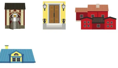
Five of eight illustrated places were tested. The places were visualized in four different concepts each and visualized by: 1) their physical representation, 2) the building´s roof, 3) the building´s entrance and finally 4), by an event or functionality made with Cooper et al. (2014: 301).
Not all the concepts could be visualized due to their function or by significant event, since many of them were interesting solely by being well preserved. In this case it was decided to follow another approach, were significant or physical characteristic aspects of the area or building would be visualized instead.
30
Fig 2. Strängnäs windmill Concepts.
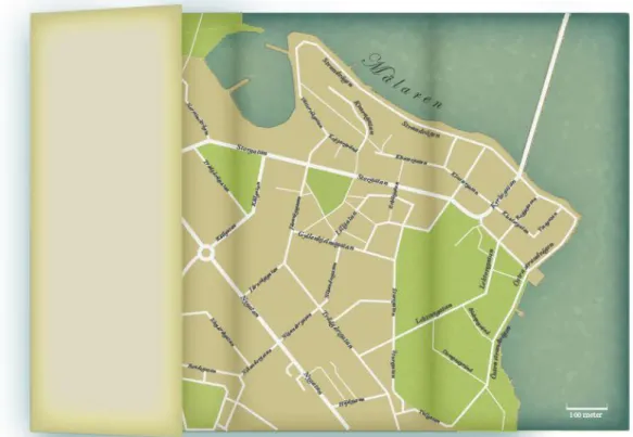
In the other hand, the visualization of the map itself, were based on
Cartographic visual theoretical techniques found and supported by ICSM and ICS organizations oriented in cartography (map visualization and
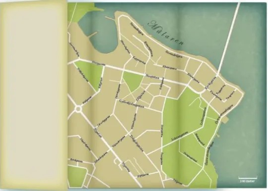
communication). The maps design (see Fig 3) was based on the results of Case 4, were the interviewers responded that Google maps was their navigation system preference and the already mentioned theoretical context. According to the target group, they liked to use Google maps in order to navigate and locate places of interest due to their experience with the system and understandable functionality. This representation of the map was supported by ICSM (2018) and ICS (2019) description about why maps where visualized from an above (bird view) perspective. According to them, this kind of visualization is easier to read and understand by users since the scale that determinates the
relationship between the distance of the map and actual distance between places are easier to comprehend. These facts seemed relevant as to accomplish the map´s objective of visually guide the user to the different places. The purpose of this test was to get information about how the users experienced the maps aesthetics instead of its representations in addition to, know if the intended overall feeling was achieved. The feeling that was tried to be transmitted through the design was one of curiosity and nostalgia. This with the purpose of achieving what Norman (2005: 83-84) describes as a reflective level of design, that consists about the personal remembrances something evokes in the user and in how it can be used in a way to strengthen user engagement.
31
Fig 3. Maps visualization.
Results
The Visceral level of design, measured by the concepts that were chosen due to what the users perceived as more aesthetical pleasing, were the ones with high colour saturation and contrast. It was also concluded, that the concepts
representing the places of interest, were chosen due to their remembrance to certain places that the target group have previously visited but also the feeling of curiosity that these visualizations provoked. The concept chosen of
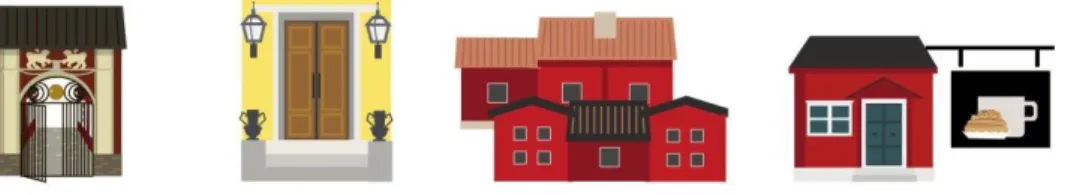
Strängnäs cathedral, Roggeborgen and Strängnäs windmill (Fig 4) were the ones below, by 4 of 5 people. The concepts are the showing the roofs (Fig 4). The most repeated comments were: “I want to know what that building hides” to “it makes me want to visit it and see for myself how it looks like”.
32
The Grassagården (Fig 5) concept were chosen due to the feeling of “cosiness” that they evoked and personal remembrance associated with excursions made in childhood or with family.
Fig 5. Grassagården.
The town hall (rådhuset), the customs house (tullhuset), Lillagatan and the Gyllenhjelmsgatan (Fig 6) were not tested until the high-fidelity prototype of the map, explained in Case 6, was made. Unlike the rest of the concepts made until now, these were based on representing the most characteristically
architectonical aspects of the places, due to their limited background story and truthfulness about significant events.
Fig 6. Gyllenhjemsgatan, Town house, Lillgatan and customs house.
The reflective level of design was measure by the personal remembrances they evoke and how it made the users feel. According to Norman (2005: 83-84), the stronger the positive feeling a design evokes, the greater the interest will be to interact with it. The feelings aroused by different concepts were experienced as positive, since the users perceived the concepts as fun and visually appealing to look at, interesting and to recalling childhood memories. The maps guiding visualization purpose was perceived as easy to understand and to follow. Its style, colour and form were perceived as interesting and associated with tourist maps and to old maps found in atlas. The overall perception of it, was as visually engaging because of its old looking style accentuated by the cursive
33
typography. At this point the typography chosen was due to accentuate an old looking feeling and later used to strengthen the visual narrative.
Analysis and discussion
The data analysed were mostly done by observing the users first reaction towards the design, asking them about their feelings, thoughts, memories or associations awaken by the most relatable concept. This with the intention to evaluate the visceral level of emotion that, Norman (2005: 67) describes as what appeals to our initial reaction towards a products appearance and can be tested through observing the user first reaction. Norman (2005:67) explains that this level of connection studies the engagement of the senses. It is to say, that the stronger the reaction, the bigger the engagement will be. In addition to it, the already explained reflective design (Norman, 2005:83-84) would also be tested in order to measure which concept achieved a stronger level of
remembrance and be used in order to visually engage the user as well. The purpose of this analyse data, would be to use the result as an input to decide upon the next step of the process, as well as to guide and determine some aspects of the decisions of the design.
The prototype concept was made by a mix of different travel agencies webpage and navigation concepts such as TripAdvisor and booking.com. The prototype was intended to be associated with modern navigation and way showing systems oriented to a general public.
Case 6
This case summarizes the high-fidelity prototypes test made and its results. The test was conducted on three people within the target group, between 27 and 45-year-old. The users were asked to interact freely with the map while explaining their thoughts aloud (think aloud test), while being observed and later
interviewed. After the interaction with the maps interface, a few questions were asked corresponding the feeling they got about the interface functionality, aesthetics and usability.
1. How do you experience the aesthetics of the design?
2. What brings you the strongest visual attention in a map? (rank them) 3. How have you experienced the behaviour of the interface? Have you experienced anything as difficult or challenging to understand to use? And in this case, what and how would you like to be changed in order to achieve the desirable response?
34
4. Is there anything that bothers you about the aesthetics, layout or interaction?
5. What is your impression of the design? Does it make you feel or remember something, and in that case what?
Results
The results from the high-prototype test conducted (Annex 6), concluded that some elements of the layout of the map needed to be changed in order to succeed.
A summary of the responses is presented below:
1. Appealing and playful due to the colour scheme, style and form. 2. The legend visualized on a piece of paper concept, followed by the
buildings and the headline.
3. The text shown when hovering on the buildings, drew most the attention since the information indicated something of interest without showing too much. The less liked was that there was no information whatsoever that indicated that they could interact with the legend.
4. One of the participants highlighted the need of strengthening the indication of which building they had clicked on, in relation with the information that appeared on the left side of the map.
5. It was an overall positive impression, that the users associated with past travel experiences and associated with treasure hunts maps and
amusement parks, where something exiting could be experienced.
Figure 7. High-fidelity prototype.
Analysis and discussion
The combination of observation, interview, think aloud and usability testing, was used in order to evaluate the user interaction and behaviour towards the map’s aesthetics and interface interaction. The results made by this test, were
35
implemented and its results concluding in the prototype further explained and described under Design.
The results obtained from how the maps aesthetics were perceived and experienced were overall positive, indicating that the colours, style and forms implemented were perceived as visually pleasing and engaging. Though, some elements would be needed to be changed in order to have a better visual
hierarchy between elements. The usability towards/with the map were perceived as positive since the participants responded as to being easy to
understand its use. Though, some changes within the interaction had to be made in order to create a stronger indication of some functions within the maps interface, in this case the use of the legend. This few inputs from the hierarchy were addressed and change in order to improve the design and to optimize the user experience.
Results relation to problem statements
At the beginning of this thesis, it is mentioned which questions are needed to answer in order to being able to achieve the needed results to accomplish the design expectations, objectives and goals. Bellow a list will describe and explain the results in relation to the problem statement. The methods used in this thesis and the results from them are showed, to explain what data had been used in order to guide the next steps of the process towards the artifact´s design.
Objectives Problem statements Methodology Results
Visually engagement and motivation
What historical or current events could motivate the users to choose Strängnäs as an interesting vacation or traveling site? Interview with Gustav Vasa association (Case 1).
Places and interesting events were chosen and provided by Gustav Vasa association. That list is summarized in Annex 1 and compared to the places mentioned from the Tourist centre in Strängnäs.
Which preferences or motivations had the users during traveling or visiting different cities?
Interview with Tourist centres and Target group (Case 3 and 4)
Their motivation was: To discover something new or different by describing or seen something different or totally specific from the place in question.