The rise of
brutalism and
antidesign
PAPER WITHIN Informatics AUTHOR: Ellen Brage TUTOR:Martin Lindh JÖNKÖPING March 2019
Engineering programme.
The authors take full responsibility for opinions, conclusions and findings presented.
Examiner: Ulf Seigerroth Supervisor: Martin Lindh Scope: 15 credits
Abstract
Abstract
The following bachelor thesis is written by a student at New Media Design within Informatics at the School of Engineering, Jönköping University.
The background of this study is based on the emergence of web design trends brutalism and antidesign, which have been argued to originate from styles used during early periods of the web’s history. Furthermore, a lack of cultural analysis within web design has been identified. The visual evolution of the world wide web is not sorted into distinct and widely acknowledged periods or categories such as is the case with most other cultural areas like music and art. The emergence and popularity of brutalism and antidesign were identified as potential cases of visual styles returning from the past. They were therefore considered opportunities to examine visual periods in web design and predict where the field is heading in the future.
The study was conducted using the qualitative method of semi-structured interviews. The empirical data was analysed using a thematic analysis and was later compared with theories derived from literature studies.
The study found three reasons behind the rise of brutalism and antidesign in web design; the world wide web’s coming of age, reactions towards the mainstream web and the interest in retro trends. The study also aimed to find the possible implications of their emergence on the aesthetic evolution of web design. It was found that brutalism and antidesign are part of a large number of experimental and retro trends that will continue to emerge. Though they are unlikely to directly affect mainstream web design in its current state, they may be seen as design movements. This may be viewed as a step in the direction of visual categories within web design.
Summary
The study aims to examine design styles and periods of the web and find the reason for the emergence of the web design trends brutalism and antidesign, which have been described as derived from the early days of the web. The study provides insight into the visual evolution of web design, and how it may proceed in the future. To be able to answer this purpose, two questions were formulated.
[1] What is the reason behind the recent rise of Brutalism and Antidesign in web design?
[2] What implications can the emergence of these trends have on the aesthetic evolution of web design?
To aid in answering these questions, a qualitative method in the form of semi-structured interviews has been used. These were conducted with experts within the field of web design. The method was chosen to ensure a qualitative set of data which would provide an understanding into the field of web design, its history and its trends. A thematic analysis was performed on the empirical data which was then compared to existing relevant theory.
The results show that brutalism and antidesign can be considered retro trends. The reason behind the recent rise of brutalism and antidesign in web design is a
combination of the following:
1. The world wide web’s coming of age
The empirical data states that the web either is mature or has begun to mature. It also indicates that the return of visual design languages has not been commonly seen before, which is because it has been too young until now. The web has recently reached an age where it is relevant to start borrowing from the past.
2. Reaction towards the mainstream web
Brutalism and antidesign are reactions towards two different, yet related, perceived qualities of the mainstream web; visual uniformity and commercialism.
3. The interest in retro trends
There is currently a large interest in retro trends in pop culture, especially from the 1990s, where brutalism and antidesign are derived from.
The implications that the emergence of these trends have on the aesthetic evolution of web design are as part of a larger number of experimental trends and retro trends that will arise. Brutalism and antidesign are unlikely to directly affect mainstream web design. They may, however, be seen as design movements, which is a potential step in the direction of acknowledged categories within visual web design.
Keywords
Brutalism, antidesign, web design trends, retro trends, visual web design, web design evolution, web design history.
Contents
Contents
1
Introduction ... 6
1.1 BACKGROUND ...6
1.2 PROBLEM DESCRIPTION ...7
1.3 PURPOSE AND RESEARCH QUESTIONS ...8
1.4 DELIMITATIONS...8
1.5 OUTLINE ...9
2
Method and implementation ... 10
2.1CONNECTION BETWEEN RESEARCH QUESTIONS AND METHOD ...10
2.2RESEARCH DESIGN ...10 2.3APPROACH ...10 2.4DATA COLLECTION ...11 2.4.1 Interview design ... 11 2.4.2 Selection of respondents ...12 2.5DATA ANALYSIS ...13 2.6RELIABILITY ...14
3
Theoretical background ... 16
3.1 CONNECTION BETWEEN RESEARCH QUESTIONS AND THEORY ...16
3.2BRUTALISM AND ANTIDESIGN ...16
3.2.1 Brutalism ... 17
3.2.2 Antidesign ... 18
3.3TECHNICAL ADVANCEMENT IN WEB DESIGN ...19
3.3.1 Browsers ...19
3.3.2 Web design tools ... 20
3.4VISUAL EVOLUTION IN WEB DESIGN ...21
3.4.1 The first web designs ...21
3.4.2 Second-generation sites ... 22
3.4.3 Table-based designs ... 22
3.4.4 The Flash era ... 23
3.4.5 Mid-2000s personal profile designs ... 24
3.4.6 Web 2.0 ... 24
3.4.7 Skeuomorphism ... 25
3.4.9 What comes next? ... 27
3.4.10 Suggested web design periods ... 27
3.5PRODUCT DESIGN HISTORY ...27
3.5.1 1750s-1850s ... 27 3.5.2 1850s-1914 ... 27 3.5.3 1900s-1945 ... 28 3.5.4 1945-1970 ... 28 3.5.5 1970s-Now ... 28 3.6DESIGN TRENDS ...29
3.6.1 When to follow a trend ... 29
3.6.2 The interest in retro trends ... 29
3.6.3 Trend cycles ... 30
3.6.4 The return of 1990s’ trends ... 31
4
Empirics ... 32
4.1TRENDS IN WEB DESIGN ...32
4.1.1 Trend-driving factors ... 32
4.1.2 Trend usage ... 33
4.1.3 Trend life-spans ... 34
4.2BRUTALISM AND ANTIDESIGN ...35
4.2.1 Origins ... 35
4.2.2 Style ... 36
4.2.3 Reasons for emergence and popularity ... 36
4.2.4 Application ... 38
4.2.5 Life-span ... 38
4.2.6 Significance to the field of web design ... 39
4.3WEB DESIGN HISTORY ...39
4.3.1 View on history ... 39
4.3.2 Web design eras ... 40
4.3.3 Trend cycles ... 40
4.3.4 Current state...41
4.3.5 Predictions... 42
5
Findings and analysis ... 44
5.1 TRENDS IN WEB DESIGN ...44
5.1.1. Trend-driving factors ... 44
5.1.2 Trend usage... 44
5.1.3 Trend life-spans ... 45
5.2 BRUTALISM AND ANTIDESIGN ...45
Contents
5.2.2 Style ... 46
5.2.3 Reasons for emergence and popularity ... 46
5.2.4 Application ... 48
5.2.5 Life-span ... 49
5.2.6 Significance to the field of web design ... 49
5.3 WEB DESIGN HISTORY ...50
5.3.1 View on history ... 50
5.3.2 Web design eras ... 50
5.3.3 Trend cycles ... 50
5.3.4 Current state ... 51
5.3.5 Predictions ... 51
6
Discussion and conclusions ... 53
6.1 DISCUSSION OF METHOD ...53
6.1.1 Sampling ... 53
6.1.2 Interview form ... 54
6.2 DISCUSSION OF FINDINGS ...54
6.2.1 What is the reason behind the recent rise of Brutalism and Antidesign in web design? 54 6.3 CONCLUSIONS ...57
6.3.1 What is the reason behind the recent rise of brutalism and antidesign in web design? 57 6.3.2 What implications can the emergence of these trends have on the aesthetic evolution of web design? ... 58
6.4 IMPLICATIONS ...58
6.5 FURTHER RESEARCH...59
7
References ... 60
8
Search terms ... 63
1
Introduction
1.1 Background
Web design is a young sub-field to the field of design. It is also evolving rapidly along with the world wide web. According to Internet World Stats, it has grown in number of users from 0.4% of the world’s population in 1995, to 55.1% in June 2018. During the 28 years of evolution of the world wide web, 330 billion websites have been noted in the digital library of The Internet Archive. Doosti, Crandall and Su (2017) argue that the world wide web — “perhaps the most important and best reflection of today’s new media” — has had little examination through the lens of cultural analytics.
Furthermore, Doosti, Crandall and Su note that studies into the evolution of web design are few, despite the web arguably being the most encountered interaction design today. Widely acknowledged categories or periods, as within the closely related field of graphic design, are absent in web design.
An art or design movement is described as “a style or prevailing inclination in art or design that upholds a specific philosophy or ideal and is followed and promoted by a group of artists for a defined period of time” (Encyclopedia Britannica). As argued by Chen, Crandall and Su (2017), time periods are powerful means to compare cultural artefacts that share aesthetics or philosophies. When periods, styles, tools and vocabulary can be identified by critics, they become portable concepts that can be adapted, built upon and rejected; a style or time period may be a reaction to another. Chen, Crandall and Su (2017) argue that art is not created in isolation but is a result of all the people cooperating in an art world’s conventions. This, they explain, means an artist must work within a social context, conventions and histories of critics, galleries, the public and others in the art community, so that their work may be regarded as art. Petrovic (2013) argues that art and design have an undeniably close relationship and these rules apply to fields in design as well. Even in human-computer interaction (HCI), Gaver and Bowers (2012) have argued for designers to be aware of design artefacts surrounding them. Domingo (2019) describes labels and categories as “time-saving building blocks” which help people understand the world and communicate with each other. Labels, she argues, provide a “readily accessible image of what designs truly are and where they belong in relation to other categories of designs”. Domingo (2019) argues that design movements can be used by user experience designers to explain decisions and provide inspiration. Therefore, mapping periods and styles of a field not only leads to knowledge and understanding of its history, it also gives designers a set of references which may be used for work within the field. Doosti, Crandall and Su (2017) argue that there is a lack of cultural analysis of the web, but that there is a growing recognition that such new media should be preserved.
In recent years, two design styles based on past web eras started gaining popularity and interest. They have been labelled brutalism and antidesign in their modern adaptation. Moran (2017) states that these two trends are derived from the early days of the
internet. She describes how brutalism references the early days of the web by aiming to look unadorned and haphazard, utilizing few design features other than the default appearance of websites. Antidesign aims to mimic what Moran (2017) calls “bad 1990s’ design on steroids”. It lacks visual hierarchy and utilizes strong colours and patterns and distracting, often animated, features. Brutalism and antidesign may be seen as instances of historical web design eras returning. Furthermore, the trends have been named and have distinct design principles which can be recognized. These traits bring brutalism and antidesign close to the definition of a design movement according to Encyclopedia Britannica. While these two design styles are different in both philosophy and visual appearance, they are often bundled together and confused for each other as described by Scacca (2018). The return of these visual styles, as trends, may be viewed
Introduction
as steps in the direction of acknowledged categories and periods. Therefore, the cause and implications of the emergence of brutalism and antidesign is deemed relevant to the aesthetic evolution of the web. A study on the subject is believed to provide further insight into web design eras and where the field of web design is heading in the future.
1.2 Problem description
Web designs have evolved for 28 years, from simple, static pages of black text on white or grey backgrounds, to visually rich, interactive and responsive designs. Styles have gone in and out of popularity. According to Chen, Crandall and Su (2017) we still lack theories to describe or explain its changes, which are driven not only by changes in aesthetic style, but also (perhaps even more) by evolution in technology. Chen, Crandall and Su (2017) advocate a need to understand patterns of change in web design, explain why certain designs stay while others fade, and give insight into past, present and future design practices. They argue that being able to compare web design periods could be valuable to website designers, marketers and even beyond HCI.
According to Doosti, Crandall and Su (2017) the web differs from more traditional cultural artefacts in that it is essentially boundless. The describe how this provides more material to find statistically-significant general patterns, but also makes study and organization of web design impractical. Another obstructing factor is that because the web is a relatively young field, much of the aesthetic evolution is directly related to its technical evolution. As a result, telling visual trend from technical advancement is at times difficult. It should be noted, though, that this is the case in the beginning of the rise of any cultural artefact. The advancement of tools used and visual preferences evolve parallel to each other, often blending together. Examples of this can be found throughout the history of product design. According to Milton and Rodgers (2011) its timeline begins with the Industrial Revolution which shifted the main production method of goods from craft production to mass-production. Milton and Rodgers (2011) describe how the industrialization affected not only production methods but the
products themselves, resulting in a great deal of new designs. Eventually reactional movements such as Arts and Crafts followed which advocated a renewal of artistic handwork.
Doosti, Crandall and Su (2017) see a need of automated techniques that can be used to characterize, compare and contrast web design styles in a meaningful way, as exists within for example art and music. Doosti, Crandall and Su (2017) view the world wide web as a significant cultural artefact. Defining and understanding its visual design styles as with other cultural artefacts is part in recognizing it as such. Graphic design is a field, related to web design, that often requires its practitioners to have a fundamental knowledge of its history, periods and styles. Bradley (2014) argues that knowing design history adds context that helps understanding design, allows observation of change over longer periods of time, and reveals patterns that are beyond a human lifespan. He believes it is an opportunity to learn from the best practitioners of the past, develop an understanding of trends and evolve personal taste. Bradley (2014) also argues that learning from history helps in creating designs that stand the test of time. While one could argue that the web is too young to have distinct periods in the same way as graphic design, the pace of evolvement and number of easily accessed examples in web design provides diverse material in an amount that would be enough to enable
definition of styles and categories. The benefits of learning about history, including its past trends, can be applied to web design just as any other design field. Hence, studies on web design trends and history are deemed valuable for the advancement of the field.
1.3 Purpose and research questions
The problem description argues that there is a lack of studies that define, categorize and analyse web design styles, and that there is a need to do this. This entails knowing and understanding the history of the web and its visual design styles. A potential categorization in web design has been suggested by Chen, Crandall and Su (2017). No studies have been found specifically on brutalism and antidesign. They are found to be examples of visual web design languages that have returned from the past and received labels and recognition, something that is typical of design movements. Therefore, they are viewed as opportunities to find indications of where web design is heading.
Whether brutalism and antidesign can be considered legitimate web design movements can contribute to the purpose of categorizing visual web design.
The study has an exploratory purpose, which according to Blomkvist and Hallin (2015) entails exploring a subject or dimension of a subject that has previously not been studied to any great degree. Brutalism and antidesign are viewed as dimensions of the subjects of web design history and visual categories within web design. The study aims to examine design styles and periods of the web and find the reason for the return of past visual styles, in its modern adaptation labelled as brutalism and antidesign. The study will provide valuable insight into the visual evolution of web design, and how it may proceed in the future.
To be able to answer this purpose, two questions have been formulated. The web has seen a return of past visual design styles in form of the trends called brutalism and antidesign, but no explanation has been found to why they return, or why they do so at this moment in time. Because of this, the first question reads:
[1] What is the reason behind the recent rise of brutalism and antidesign in web design?
Furthermore, since the two visual styles in question are derived from specific periods in time, there is reason to look at the meaning and the implications that their return could have on the field of web design. Hence, the second question reads:
[2] What implications can the emergence of these trends have on the aesthetic evolution of web design?
1.4 Delimitations
The study focuses on the visual design of websites, as viewed by users. This includes aesthetic elements such as colours, images and typography, and information
architecture elements such as layout and navigation. Functionality of websites has not been studied in depth.
Web design evolution is not only driven by the advancement and changes in visual expression, but also, perhaps even more, by technological advancement. While the research questions of the study are based on visual styles, much of the theory and reasoning used to answer them bring up technological factors. This is something that has been carefully considered and followed up upon throughout the study. However, the focus has been kept to what the technical advancement contributes to the evolution of visual styles.
The literature study involves the history of web design and product design. In the case of product design, relevant parts of its history have been studied for the purposes of
Introduction
comparison, and to provide understanding for web design history. It is a vast field and the focus has been kept to cases from where comparisons may be drawn. This means that product design history will not be studied in great depth.
When talking about a retro trend in web design, it refers to a trend that came into existence specifically on the world wide web. The expression does not include adaptations of offline retro styles derived from other environments such as print media.
Most websites come in variations depending on factors such as viewing device, screen width, browser and content updates. Websites shown as examples during the semi-structured interviews have been viewed through the same device to eliminate some of these variations. The variations that may still remain have been overlooked, since they are deemed insignificant when studying general visual expressions.
1.5 Outline
This report has been clearly structured with headings and subheadings to reflect the content of the following body text.
The next chapter is called Method and implementation and describes the choice of method and process. There is also a discussion on the reliability of the report.
The Theoretical background describes the theories that have been applied to this study. The empirical chapter is an objective description of the empirical data that has been collected.
Findings and analysis summarizes the findings from the empirical data and compares it with findings from existing theory.
The Discussion and Conclusions chapter contains a discussion of method and findings and states the conclusions and implications of the study. Further related work is also suggested.
Next is References, followed by Search terms.
The Appendices contain screenshots of example websites shown during the semi-structured interviews and the interview outline.
2
Method and implementation
2.1 Connection between research questions and method
The following chapter describes the methods used to gather and analyse the data that have been used to answer the questions posed by the study.
The two research questions are closely related, with the second being a follow-up question to the first. Furthermore, they are of the same nature, both being related to history and trends in web design. As a result, the same method has been used to answer both the first and second question: by conducting five semi-structured interviews with experts within the field of web design.
2.2 Research design
According to Blomkvist and Hallin (2015), using interviews as a research method helps in discovering new dimensions and developing a deeper understanding of a
phenomenon. One of the most common methods used in qualitative social science research is to gather empirics via qualitative interviews. Blomkvist and Hallin (2015) describe how this method makes it possible to learn more about how individuals reason in different research questions. Interviews of an open nature allows for unexpected discoveries. The study aims to find the reason behind the rise of two web design trends and their implications on web design history. Conducting interviews with practitioners who have worked in the field since the early days of the web will provide valuable insights that have been gained first-hand. The second research question “[2] What implications can the emergence of these trends have on the aesthetic evolution of web design?” has an element of prediction and is believed to be best answered by the long-time experience of web design practitioners, who have seen and partaken in the evolution of web design and its visual trends. Qualitative interviews will allow these experts to elaborate on their experiences, views and predictions.
Blomkvist and Hallin (2015) describe how a qualitative interview can be unstructured or semi-structured. In the unstructured interview there is only an overarching topic, and what is supposed to be found out is undecided in the beginning. Semi-structured interviews are organized around several themes or question areas that are determined in advance. They still allow for flexibility and many of the questions are decided upon or even created during the course of the interview. Since the research questions are formulated and a number of topics are already found as being of interest to the study, but there are yet dimensions to be explored, semi-structured interviews is deemed the most suitable choice of method.
2.3 Approach
The study has been carried out using an inductive approach. According to Blomkvist and Hallin (2015) this means conducting an empirical study based on an identified problem and using theory to develop a better understanding of the findings. With an inductive approach, the empirical material determines which theory is of interest and hence, it is possible that the empirical findings lead to a different theoretical
framework.
Nunnally and Farkas (2016) state that quantitative research produces consistent and generally agreed upon results. They describe that while it is very informative, it does not reveal why things happen, nor share information that isn’t specifically requested.
Method and implementation
Nunnally and Farkas (2016) also describe qualitative research and state that it is used for studying something that is subjective and difficult to measure in precise units. The study focuses on trends, something that is to a great extent subjective and difficult to measure. It also aims to predict shifts in web design, something that is best supported by the experience and opinions of experts. Nunnally and Farkas (2016) describe how qualitative research is suitable for finding the “why” behind a phenomenon. This research method best matches the purpose of the study, which is to find the reason behind the emergence of two trends and their potential implications. Because of this, the inductive approach has been combined with a qualitative method.
To be able to formulate relevant interview questions, literature studies were initiated first. Existing theories on the subject, together with an understanding of web design history, provided a basis from which more in-depth questions could be asked. Furthermore, as the interviews were to be of a semi-structured nature, and thereby allow for some further elaboration and discussion, a certain level of insight beforehand was deemed beneficial. While examining existing literature, questions relevant for the interviews arose. Because of this, interview questions were formulated parallel to conducting the literature study and were refined as it progressed. From the empirical data some new themes and theories surfaced that were deemed relevant to the study. In accordance with the inductive approach, the theoretical framework has been expanded after conducting the semi-structured interviews to provide a deeper
understanding into the relevant themes. This is the case with several of the topics, such as that of 1990s trends and nostalgia, which was mentioned by respondents. The same is true for mentions of reactions towards commercialism, and early social media profile customisation, which were made by respondents.
2.4 Data collection
The data in this study was gathered through semi-structured interviews. These provided empirical data that has been compared to the theories derived from the literature studies, and, in turn affected further studies.
2.4.1 Interview design
The purpose of the semi-structured interviews is to provide insight into how web design professionals view and reason around the subjects of the study. These subjects are “Trends in web design”, “brutalism and antidesign” and “Web design history” and are based on the research questions. The interview questions have been designed to generate data which will aid in answering the research questions of the study.
The first subject is “Trends in web design”. Studying the factors that contribute to the emergence, use and popularity of web design trends in general will provide insight into the specific trends brutalism and antidesign. This includes what drives trends and which ones tend to last. The questions within this subject cover the following topics: • How to view and work with web design trends
• What drives web design trends forward • What makes a trend last
The second subject is “brutalism and antidesign”. The respondents’ assessment of the origins of the trends and the reason for their emergence can potentially aid directly in answering research question “[1] What is the reason behind the recent rise of brutalism and antidesign in web design?”. Finding out how the respondents view the trends, how they have emerged and whether they would implement them will provide insight into
the impact and life-length that the trends may have. The questions within this subject cover the topics:
• The respondents’ level of familiarity with the specific trends • Where they are derived from
• The reason for their popularity
• What the specific trends may be utilized for
• If the trends will have an impact on the field of web design
The third subject is “Web design history”. Brutalism and antidesign are derived from earlier periods of the web’s history. Studying it will provide insight into the
circumstances around the origins of the trends. Since a lack of visual web design eras and categories has been argued, questions have also been formulated to find whether the respondents believe there are any, or if they could possibly exist, and what they could be based on. Furthermore, insight into the phase of web design history we are currently in will aid in finding the context in which brutalism and antidesign find themselves at the moment. Finally, the respondents’ predictions on what is next to come will aid in determining the life-length and long-term impact of the trends. The questions within this subject cover the topics:
• View on web design history
• View on acknowledged eras and categories • View on the current phase in web design history • Predictions of coming shifts and trends
The interview questions have been divided into these three categories. Some of the questions sometimes overlap and relate to other categories depending on what angle each respondent has answered from. The interview outline can be found as an appendix to the study. Since the interviews were semi-structured, questions have varied; some were excluded and some were added along its course. The presented outline has been translated to English, since the interviews were conducted in the Swedish language.
All respondents were shown the same example websites of brutalism and antidesign; three of each, six in total. These were shown to ensure that the styles discussed were perceived as the same by interviewer and respondent. This reduced any potential misunderstandings over the topic. The websites were chosen based on findings from the literature study, some as direct examples and some based on description of the design principles. Screenshots of the websites that were shown can be found as appendices.
2.4.2 Selection of respondents
The selection of interview subjects was based on profession, experience and areas of personal interest. Specifically, professionals who work with, or closely related to, web design. Other requirements specified were
• A couple of years of work experience
• A knowledge of and interest in web design trends
These qualities are considered valuable since the study relates to the coming and passing of trends, which is knowledge that comes with working experience. Web design history is short enough that many currently active practitioners have experienced its very beginning and its development ever since, and this is experience that is deemed
Method and implementation
valuable to the study. Potential interview subjects were found by word-of-mouth information and consulting the faculty of Jönköping University. These sources
provided the names of a number of design agencies, and in some cases specific contact persons, which in turn pointed to professionals that met the requirements. These were contacted via e-mail, briefly describing the subjects around which the interview would revolve. All interviews were carried out in similar environments and were recorded as audio files which were transcribed shortly after.
Five interview subjects were selected. Out of these, four are located in Jönköping and one in Gothenburg, meaning all are in proximity to Jönköping University. This was a decision made in regard to time and cost constraints.
2.5 Data analysis
Analysing the empirical data has been done in close relation to gathering it. The empirical method consists solely of semi-structured interviews, which produced qualitative data in the form of answers. These were recorded as audio files which have been carefully transcribed.
A thematic analysis has been performed on the data. Blomkvist and Hallin (2015) describe that this is done by drawing up categories into which the empirical material is sorted. The categories may be based on for example words and terms used by
participants, or themes that emerge when examining the empirical material or existing theory. Based on these categories the questions of the study are answered, according to Blomkvist and Hallin (2015).
The first categories which were used in the sorting are equal to the three main subjects that were formulated to categorize the interview questions; “Trends in web design”, “brutalism and antidesign” and “Web design history”. Firstly, the answers were summarized and compiled under each respective heading and each respondent was given a colour code. Secondly, sub-categories were added to each main category. This was done by examining patterns and themes that were found in the respondents’ answers. These sub-categories are:
• Trends in web design o Trend-driving factors o Trend usage
o Trend life-spans • Brutalism and antidesign
o Origins o Style
o Reasons for emergence and popularity o Application
o Life-span
o Significance to the field of web design • Web design history
o View on history o Web design eras o Trend cycles o Current state o Predictions
The colour-coded data was then applied to each of the sub-categories. This created an overview which allowed for comparison between answers. In the last step, answers under each sub-category which were in agreement or otherwise similar were grouped together. This also made for a clear overview of conflicting or otherwise divergent answers. Theory that supports or contradicts the empirical data has been included and referenced in the analysis.
2.6 Reliability
Several factors may affect the reliability of a study. Some of the choices made in the process of this study are accounted for in this chapter, since they are believed to be influencing factors.
Web design trends and predictions are important research areas for the literature study. As are trends in general. These topics are seldom covered by academic papers and books, but to great extent by essays and magazine articles, which are influenced by opinions and personal beliefs. Documents of this nature have been studied in cases where academic papers and referenced literature have not been sufficient. The
inclusion of such sources has been necessary to get a proper overview of attitudes and opinions regarding the studied subjects. The potential risk to the study’s reliability has been taken into consideration. The material has been treated for what it is, which in many cases is qualified opinions, assessments and predictions, written by practitioners or critics. To ensure reliability, the articles have been carefully examined and where statements are based on opinions and personal beliefs, it has been made clear through the text. Alternative views and attitudes are accounted for when necessary.
The language in which the semi-structured interviews have been conducted is Swedish. This is due to the interviewees’ nationality, and native language, being Swedish.
Conducting the interviews in English was perceived as a potential barrier to the respondents expressing themselves fully as intended, which would have had a deeper impact on reliability than a translation from Swedish to English. Therefore, the decision was made to translate the interviews for the summary presented in the Empirics chapter. The translations were done with a great level of care to ensure that no information was wrongfully interpreted.
In accordance with the nature of semi-structured interviews, respondents have sometimes elaborated upon their answers in ways that could not have been predicted. This is data that is deemed valuable to the study. It does, however, make comparison between answers less generalizable. The qualitative empirical data has been analysed with care to ensure a reliable assessment.
According to Blomkvist and Hallin (2015) everything that the interviewer does and says has an impact on how the interview evolves. To reduce possible disturbances, all
interviews have been held in secluded and silent rooms and the interviewer remained as neutral as possible to avoid introducing bias.
In the case where answers have been too vague to make an objective assessment of them, they have been left out, to avoid affecting the reliability of the study. To avoid produced answers, the interview outline was not sent in advance to the participants. Instead, only a description that was enough for potential participants to decide whether to partake or not, was provided beforehand. This way it was ensured that answers were based on experience and opinions rather than research.
Method and implementation
The example websites shown during the interviews were chosen with care to ensure they were representative for each of the styles. According to Scacca (2018) antidesign websites are often confused as brutalist websites by several widespread online articles. To avoid any misunderstandings by the interviewer of the styles in practice, these websites were chosen based on findings in theory. The principles described by Moran (2017) and the examples that she presents have been used as a basis for the selection.
3
Theoretical background
3.1 Connection between research questions and theory
Because of the second question being a follow-up question to the first, it should be noted that all the theories covered by this chapter together form the basis for both questions.
To provide a theoretical basis for the first question “What is the reason behind the recent rise of brutalism and antidesign in web design?”, the following subjects are covered.
“Brutalism and antidesign” is covered in 3.2.
“Design trends” is covered in 3.6 and in part examines theory on returning trends, also called retro trends. The web evolves parallel to and mingles with other pop culture environments, and the behaviour of trends within other fields is believed to contribute to an understanding of web design trends. According to Moran (2017) brutalism and antidesign are derived from earlier days of the web. Sasso (2011) argues that the use of retro-style design has increased dramatically, despite an ongoing technological
revolution. Studying the interest in retro trends is believed to provide insight into why brutalism and antidesign, being trends from past decades, have gained popularity. Examining the rate at which the trends of past decades return is believed to aid in determining the life-span and future of brutalism and antidesign.
To provide a theoretical basis for the second question “What implications can the emergence of these trends have on the aesthetic evolution of web design?” the following subjects are covered.
To find the context from where brutalism and antidesign emerged, web design history has been studied. It has to great extent been driven by technical advancement, which is why “Technical Advancement in Web Design” is covered in 3.3. Several visual styles and eras have been identified while studying web design history and conducting empirical studies. These are listed in “Visual Evolution in Web Design”, 3.4.
According to Milton and Rodgers (2011) product design is generally recognized as a discipline that was born out of a massive technological change in society; the Industrial Revolution of the mid-eighteenth century. The birth of the world wide web bears similarities, also being the starter of a big societal change. A comparison is deemed valuable for the sake of potential predictions in web design history. Therefore, “Product Design History” is covered in 3.5.
3.2 Brutalism and antidesign
Moran (2017) describes how brutalism and antidesign are reactions against a perceived uniformity of web design and have been gaining popularity over the past few years. She states that they were, at first, mostly seen in cultural contexts such as designer
portfolios and art museum sites, but some designers have also advocated including brutalist and antidesign principles in products. Moran (2017) makes a clear distinction between brutalism and antidesign.
Theoretical background
3.2.1 Brutalism 3.2.1.1 Origins
Moran (2017) states that brutalism in web design draws inspiration from brutalist architecture, which became popular in the 1950s. These buildings, according to Moran (2017), are described as having a heavy and ruthless appearance. Hopkins (2014) describes brutalism as a branch of Modernist architecture which originally centers around the work of architects Alison and Peter Smithson. Hopkins (2014) describes how the duo took inspiration from the post-war work of Le Corbusier — buildings with exposed, rough concrete, famously known as béton brut. The buildings they constructed from this inspiration deliberately exposed the structure and raw materials in a “crude, unfinished state”.
3.2.1.2 Philosophy
In his book Towards a New Architecture, first published in 1931, Corbusier (2013) explains mass-production as a spirit that must be created. Mass-produced houses are described as healthy, morally correct and beautiful. According to Corbusier, the new tools created by the industrial society were capable of adding to the welfare of people by providing their most basic need: shelter. He argues that the old architectural codes should no longer be of concern, and that there has been a revolution in the conception of architecture. Furthermore, he states that “the house is a machine for living in”. According to Day (2006) brutalism is more than an aesthetic style — it is equally much about a socio-political attitude. He describes how brutalist architects rose from the new-left Britain in the late 1950s and saw it as their social responsibility to design rough, grey buildings, without decoration and displaying their true function. Day (2006) describes how cables and ducts were intentionally exposed and where paint was used, it was in colours like pure blue, red and yellow.
3.2.1.3 In web design
According to Moran (2017) brutalism used in digital design aims to look raw, haphazard or unadorned, mimicking the visual appearance of early 1990s’ websites. This includes leaving elements “bare-boned”, with a default appearance. Moran (2017) claims that advocates for brutalist web design are looking to break away from the dominating style on the web today, which is perceived as stale, premade templates. Scacca (2018) describes how many brutalist websites carry a black and white colour scheme. She states that some designers may use grey, staying close in appearance to the concrete of brutalist architecture, and that many brutalist designs utilize
monospace typefaces because of their raw, unadorned quality. 3.2.1.4 Popularity reasons
Moran (2017) states that brutalism is considered a way to make the web “true to itself” and honest. Brutalist web design, according to her, serves as a valid reminder that there are more possibilities in how to design for the web than with simple, conventional interfaces and stock photos. According to Wilshere (2017), another important aspect is that in today’s political climate, there is a widespread suspicion of corporate interests — in particular, the data about users that is being collected by big tech and social media companies. The brutalist web design trend he believes may express a desire for increased online transparency, reflected in the baring of the underlying structure. Wilshere (2017) argues that his is yet a reminder of brutalist architecture, which not only exposed its raw materials but also its social vision.
3.2.1.5 Usage
Scacca (2018) believes brutalism can be used for some contexts. She sums up the good and bad qualities of brutalism as follows.
Brutalist web design may be good for “
• Brand new designers trying to get the hang of HTML.
• Anyone who wants to shock their audience or make a social statement.
• Websites suffering from slow page speeds or overly complex conversion funnels that want to experiment with a total redesign.
• Text-heavy websites that want more focus on the reading experience and less on distractions. • Small e-commerce sites that want more focus on inventory and less on flashy promotional bars and
overweight designs.
• Websites that have an audience that this type of nostalgia might appeal to (e.g. other web designers, developers, gamers, etc).”
Brutalist web design is not good for “
• Corporations and other entities that want to appear professional and modern. • Anyone that wants to make their website a warm and welcoming environment.
• Websites that are complex in nature and require conversion features like mega menus, pop-ups and live chat to support their goals.
• Anyone nervous that anything but a modern design would confuse their audience and prevent them from converting in the end.“
Scacca (2018) believes that in many cases, the safer choice is to incorporate brutalist elements with an otherwise modern website.
Moran (2017) argues that a brutalist style works for some websites. She recommends limiting the brutalist style to the visual design and avoiding breaking visual hierarchy, navigation or interaction design.
3.2.2 Antidesign 3.2.2.1 Origins
According to Milton and Rodgers (2011) antidesign as a movement came into being during the 1960s in Italy, where designers formed a reaction against established design norms and obsession with consumption.
3.2.2.2 Philosophy
Woodham (2016) describes how the antidesign that was formed during the 1960s “sought to harness the social and cultural potential of design rather than embrace style as a means of increasing sales”. Antidesign is attributed as a reaction to “the
impoverished language of Modernism”, which was considered good form by leading manufacturers and influential designers at the time. Woodham (2016) emphasizes how the differences between the movements are reflected in their respective design
language. Modernist objects generally utilize a muted colour palette, often blacks, whites and greys, while antidesign embraces all colours. An antidesign value is to embrace the temporary nature of Pop, consumerism and mass media language. This means including decorative elements, kitsch, irony and distortion in scale. Woodham
Theoretical background
(2016) states that these characteristics would also, later on, become important to Postmodernism and Memphis design.
Greenhalgh (1993) quotes Ettore Sottsass, key advocate of the antidesign way: “The only design that does not endure is the one that in such a society looks for metaphysics, looks for the absolute, for eternity. And then I don’t understand why enduring design is better than disappearing design.”.
3.2.2.3 In web design
According to Moran (2017) some designers use the term brutalism when they are actually utilizing the principles of antidesign. She describes how instead of stripping down an interface and keep the styling at a minimum, which is key to a brutalist design, they intentionally create unattractive, disorienting or complex interfaces. These sites, according to Moran (2017), often lack visual hierarchy, use harsh colours, disorienting patterns and distracting features such as animations and customized cursors. The overall effect she describes as “bad 1990s’ designs on steroids”. This does not fit the original sense of brutalism, and hence, Moran (2017) calls it antidesign instead. According to her, these designs are often created as an inside joke for designers, who perceive them as ironic. Antidesign, she states, has met some resistance in the UX community since the design principles contradict those of UX design.
3.2.2.4 Popularity reasons
According to Moran (2017), some designers are becoming bored with simple and polished designs, and antidesign brings them some “freshness”. Some advocates have even argued that users need to be challenged, and complex experiences would be more memorable and enjoyable, something that Moran (2017) rejects, unless for specific contexts. She argues that users are not looking to solve a challenge when they use a product, and web designers should not make things harder for them just for the reason to stand out or keep their interest. The main reasons designers use antidesign are, according to her, for humour and to get attention for being edgy and provocative. 3.2.2.5 Usage
Antidesign, according to Scacca (2018), should be completely avoided since “the only statement it’s making is that you want to anger everyone and adhere to no smart design principles”.
The only contexts where Moran (2017) advocates the use of antidesign, are:
• if the audience is designers, illustrators or artists. They are generally skilled at using digital products, which is why they can manage it. They also have the potential to understand the intended joke.
• if the product is meant for entertainment, which means interaction doesn’t have to be smooth and the user doesn’t have to perform a task.
3.3 Technical advancement in web design
3.3.1 BrowsersAccording to the World Wide Web Consortium, Tim Berners-Lee wrote the first web client and server in 1990.
Robbins (2006) describes 1991–1993 as the birth of the World Wide Web. During this period, all pages were displayed as black text on a grey background. In 1993 the Mosaic Browser was created. According to Robbins (2006), though this browser was not the first to allow graphics on pages, it was available cross-platform and thus became the most popular. It also supported sound, video, bookmarks and forms. Allowing images in documents she describes as a key to the Web’s fast rise in popularity.
In 1994, the Netscape 0.9 browser was released. According to Robbins (2006), the early browsers were sold and aimed to offer a better experience than free browsers such as Mosaic. She describes how Netscape had its own HTML tags, for example for
background colour and table text formatting, disregarding the traditional standards. 1996–1999 Robbins (2006) labels “The Browser Wars” years. Netscape and Microsoft both aimed to dominate the market with their respective web browsers, Communicator and Explorer. She explains how this led to a rapid advancement of browsers, including the creation of JavaScript, CSS and dynamic HTML.
In 2000 Internet Explorer 5 was released for the Mac, something that Robbins (2006) appoints as a significant change in browser history. This browser fully supported the HTML4.01 and CSS1 Recommendations, which she describes as a high standard at the time. Moreover, it supported the PNG image format with transparency.
Robbins (2006) states that Netscape suffered what was regarded as its official loss in the Browser Wars when being sold to AOL (America Online).
In 2005, Mozilla Firefox 1.0 was released. Robbins (2006) explains how it had a strong support of web standards, and its security was higher than Explorer’s. Firefox, she states, was the first browser to take a significant share of the browser market from Microsoft.
3.3.2 Web design tools
Hong (2018) describes how in the early days of the web, there were no ways to properly structure web layouts into columns and rows. Instead, designers did this using the table markup, which allowed for a separation of content, however in an unintended and cumbersome way. Hong (2018) describes how designers used spacer GIFs: small, transparent GIF images placed in between content, to create white space. Graphic elements such as visit counters and animated GIF images were used experimentally. Hong (2018) describes that with the introduction of Adobe Flash, previously
Macromedia Flash, in 1996, the field of web design saw great changes. Flash became the primary tool for creating interactive and graphics websites, allowing animation, custom fonts and shapes, 3D effects and splash pages. The whole site was compiled into one file to be read by the user’s browser, making it heavy and unoptimized for search engines. Hong (2018) states that in 2010 Apple stopped supporting Flash in their iOS software, which was one of the reasons for a decline in usage.
During the 2000s, CSS (Cascading Style Sheets) was increasingly supported in web browsers and gained popularity, according to Hong (2018). Since CSS defines how the HTML is displayed, it allows designers to keep content and design separate. Websites became easier to maintain, quicker to load and more search engine-friendly when the use of CSS increased. Another change during the early 2000s that Hong (2018) emphasizes is the rise of JavaScript, which enabled designs with interaction, complex navigation and multimedia applications.
Theoretical background
The early web was mainly centred around aesthetics according to Hong (2018). As the web matured, the focus shifted towards usability for the end user. Hong (2018) describes how designers became more aware of colour distribution, placements, typography and the usage of icons. Eventually, SEO (Search Engine Optimization) gained awareness as well, and the web industry started putting more effort into it. Sites and applications that could be interacted with started appearing. This shift in the history of the web is labelled Web 2.0.
According to Marcotte (2015), the first iPhone was launched in 2007. This led to a rapid increase in mobile browsing according to Hong (2018), something that was unforeseen by the web industry — browsing a website on such a small screen was not perceived as user-friendly. Designing for smaller screens was a new challenge. Hong (2018) describes how in the beginning, web designers tackled it by creating two versions of the same website, which meant more, and more complicated, maintenance work. The increased usage of smartphones, and thereby mobile browsers, brought along a need for a more efficient way of designing for the web. According to Hong (2018), Ethan Marcotte suggested a new method for web design in 2011 that meant using the same content and changing the layout for smaller screens — responsive web design. Media queries were introduced for CSS3, making responsive design easier to achieve. Hong (2018) states that in 2016 mobile and tablet internet usage surpassed desktop usage for the first time.
3.4 Visual evolution in web design
In his book Creating Killer Web Sites from 1996, that Hong (2018) also sees as the introduction of spacer GIFs, Siegel (1996) describes first-, second- and third-generation websites.
3.4.1 The first web designs
Hong (2018) describes how the first ever website was created by Sir Tim Berners-Lee in 1990 and simply existed to tell visitors what the world wide web was. A copy of the original page from 1992 is still online (figure 1), and it consists of black text and embedded, blue links on a white background. Most of the websites at the time looked similar, according to Hong (2018): entirely text-based and with a simple HTML structure.
Siegel (1996) describes first-generation sites as “designed to look good on ASCII (text-only) terminals, black-and-white monitors and low-resolution colour displays”. These sites, he writes, are linear and typically adapted to slow modems. Text and images are top-to-bottom, left-to-right and with separators such as bullets and horizontal rules. Siegel (1996) describes how some had banners and were organized, while most had edge-to-edge text that ran on for pages; “at best, they looked like slide presentations shown on a cement wall”.
Figure 1. The first website, screenshot. CERN, http://info.cern.ch/ (Acc. 12 March 2019)
3.4.2 Second-generation sites
In 1995, Netscape released extensions to HTML which initiated what Siegel (1996) calls second-generation sites. These, he writes, were similar to first-generation sites but with graphic changes such as icons replacing words, tiled images, image borders and an increase in banners. They followed the “home page model”, something that according to Siegel (1996) means that the landing page was decorated with icons, 3D buttons, windows and pictures. Sometimes sound files were loaded into these as well. 3.4.3 Table-based designs
Along with an HTML version supporting tables, new possibilities were introduced. Because of the lack of tools to create structure on web pages, Hong (2018) describes how designers turned to the table element during the early days of the web. To create white space, designers used spacer GIFs: small, transparent GIF images placed in between content. Graphic elements such as visit counters and animated GIF images were used frequently and experimentally, according to Hong (2018). An example of a table-based design can be seen in figure 2.
In his book, Siegel (1996) describes his model of building websites, calling it third-generation site architecture. He advocates and teaches the method of building page layouts with the table element, and the use of spacer GIFs.
Theoretical background
Figure 2. Table-based web design, 3DRealms. Practical Web Design. Hong (2018)
3.4.4 The Flash era
Early HTML sites were very limited when it came to design options, and Craig (2009) explains how the intricate table structures and spacer GIFs needed for complex designs made Flash a welcome alternative. He states that it was introduced to the scene of web design in the late 90s, early 2000s.
Figure 3. Flash-built web design. Ishkur's Guide to Electronic Music, http://techno.org/electronic-music-guide/ (Acc. 12 March 2019)
Flash became the primary tool for creating interactive and graphics websites according to Hong (2018), allowing animation, custom fonts and shapes, 3D effects and splash pages. A splash page serves as an introduction to the website. According to Craig (2014), it is often aiming to make a “strong first impression” by displaying a
“cacophony of visual excess” in the form of sliding photography, videos and status bars. An example can be seen in figure 3.
3.4.5 Mid-2000s personal profile designs
Safir (2012) states that for a long time, and with its prime during the mid-2000s, MySpace was widely regarded as the best online platform for social networking. It started as a social website where mostly young people connected, but soon started to attract many types of professionals looking to network and promote themselves. Safir (2012) describes how before MySpace, creating an individual website was a demanding and difficult process for those not educated in programming. He states that the platform opened the opportunity for everyone to have a “page” of their own, which led to massive popularity. According to Craig (2014), users with an average level of skill tended to over-design when personalizing their MySpace profiles. Figure 4 shows an example. Some designers, he states, also picked up on the trend and adapted it for websites.
Figure 4. “A typical MySpace profile page”. Metaphors and Analogies in Product Design. Babich (2017). UX Planet. (Acc. 12 March 2019)
3.4.6 Web 2.0
Craig (2014) argues that along with Web 2.0 came an excessive use of rounded corners, reflections, drop shadows and gradients. He views the style as typical for designs from 2005. An example can be seen in figure 5, which is a design that Craig (2009) created in a tutorial on how to design for Web 2.0.
Theoretical background
Figure 5. Web 2.0 Design. How to Create a Clean Web 2.0 Style Web Design in Photoshop. Craig (2009). Web FX. (Acc. 12 March 2019)
3.4.7 Skeuomorphism
Banga and Weinhold (2014) argue that creating a sense of familiarity is important when designing for the web, since most users tend to prefer things that they are accustomed to. Skeuomorphism is, according to Schwartz (2017), a purely visual style of design that is used to preserve the meaning and experience of earlier, real world objects. Hong (2018) describes how this is done by using gradients, drop shadows, textures and other elements that create a real and three-dimensional impression.
Figure 6. Skeuomorphic design, Apple Contacts.Flat 2.0: Why Fully Flat Design is Outdated. Ho (2016).
Skeuomorphism advocates argue that it makes interfaces easier to understand and more intuitive for users. In the case of some products, when moving from analog to digital, it allows for a faster and more efficient transition because interface elements are more recognizable, according to Schwartz (2017). He states that in other cases,
designers use skeuomorphism to enhance enjoyment, often aiming for a “retro” look. Shotts (2014) states that while transitioning to visually flat platforms, many interfaces were described as overly skeuomorphic — Apple being a big promoter of the design approach. An example of Apple’s skeuomorphic designs is seen in figure 6. While most modern platforms have abandoned what Shotts (2014) describes as the exaggerated textures of skeuomorphism, other of its features are still an integral part of many interfaces. Knobs, switches and buttons tell users how to interact with interfaces, and many app designs — such as calendars and calculators — still feature skeuomorphs, according to Shotts (2014).
3.4.8 Flat design
The increase of smartphone usage, and thereby responsive design, is the main reason for the rise of flat design according to Hong (2018). He describes how skeuomorphic designs became challenging for designers to implement when screen sizes and browser constraints became increasingly varied. Simplified designs solved many of the
problems with tedious design processes and slow loading websites. What further popularized this trend Hong (2018) attributes to the launch of Microsoft Metro and Apple’s iOS 7, which soon made rich design (skeuomorphism) seem outdated. This caused many to suddenly see a need to redesign their website or app.
Hong (2018) argues that Flat design also borrows influences from Swiss Style (also known as International Typographic Style), which was dominant in the 1940s and 50s. Swiss style is characterized by asymmetric layouts, strong grid systems, sans-serif typefaces and a clear hierarchy of content. Figure 7 displays a Flat design example.
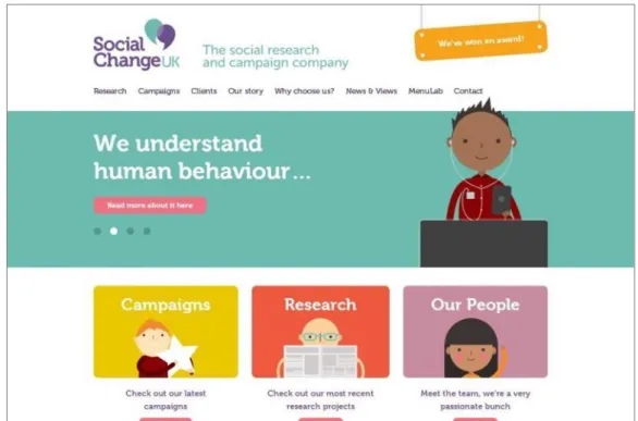
Figure 7. Flat design, Social Change UK.Flat 2.0: Why Fully Flat Design is Outdated, Ho (2016). Medium.
Theoretical background
3.4.9 What comes next?
Hong (2018) emphasizes the fact that web design trends do not spring from one source, be it person or company, but is a mix of visual design (which takes influence from print design) and web technology. Designs are becoming more complex than the original flat design, and thanks to new technology there is more flexibility. Hong does not predict the evolution of web design trends, but states that it moves very fast.
3.4.10 Suggested web design periods
A study performed by Chen, Crandall and Su (2017) resulted in a suggestion of four rough web design categories using names suggested by experts. These are:
• Rudimentary, Simplicity or Informational period.
Experts described web designs of the late 1990s and early 2000s using words like “naive”. Pages are deemed to be functional, informational and lacking a balanced design. One expert describes 1990s websites as similar to the front of a newspaper.
• Chaos, Gradient or Rise of the Image period.
Many of the experts in the study described websites from 2000 to 2005 as “terrible” and with “overused, garish, colorful backgrounds”. The amount of content increased, making some websites look crowded. Images were styled with shadows to give a 3D look.
• Formative or Cinematic period.
Beginning around 2007, this period saw large visual changes in web design according to several of the experts. Web 2.0 became popular and basic, well-organized layouts for different genres of websites were established. The term “cinematic” comes from the popularization of the website banner.
• Condensation, Sci-Fi or Flat period.
Around 2011 flat designs became popular and websites were refined and responsive with clear information architecture models. Websites utilize many various media types.
Chen, Crandall and Su (2017) view their study as a first step towards understanding how and why web designs have changed over time.
3.5 Product design history
3.5.1 1750s-1850sAccording to Milton and Rodgers (2011), product design is generally considered to have emerged as a discipline during the Industrial Revolution which occurred around the 1750s to 1850s. What we today describe as craft production was before this the only means of producing objects. Milton and Rodgers (2011) describe how with the
Industrial Revolution, goods could suddenly be produced in large numbers, by workers with lower skill and to lower costs. The profession “product designer” emerged and entailed giving the mass-produced items form.
3.5.2 1850s-1914
The 1850s to 1914 are called “The Great Reform movements” by Milton and Rodgers (2011). Workers’ unions and parties were formed as reactions to awful working conditions in factories. Inventions listed by Milton and Rodgers (2011) that came into being during this time include the first electric streetcar, the incandescent light bulb, the microphone, the household sewing machine and the telephone. They state that
towards the end of the 1800s, Europe saw a second wave of industrialization which resulted in new methods of production and equipment.
Between 1854 and 1914, the Arts and Crafts movement was active. Milton and Rodgers (2011) describe it as a reaction to industrial and city development and the growing mass production, and that it advocated a return to nature and handcraft.
Art Nouveau was another response to mass-produced wares during this time, according to Milton and Rodgers (2011), which developed into a big international movement that lasted between 1880 and 1910. They describe it as a strive “for a comprehensive artistic reformation of all areas of life” and that practitioners were expected to design not just art but also products such as jewellery and furniture. 3.5.3 1900s-1945
The 1900s to 1945 Milton and Rodgers (2011) call “Modernism to pre-war luxury and power”. During the first half of the 1900s Europe and China alike were ravaged by political and economic turmoil.
Between 1907 and 1935, the Deutscher Werkbund were active in Germany, according to Milton and Rodgers (2011). They describe the goal of the founders as to prove that applied arts and industry could cooperate to develop a national style fit for the modern age. The Werkbund were against revivalism, believing that architecture should
represent the age when it was created.
Modernism, or The International Style, Milton and Rodgers (2011) appoint as the dominant design style between 1914 and 1939, and state that it differed greatly from design movements in the past. It emphasized experimentation, formalism and
objectivism. Products, according to Modernism, were supposed to express the spirit of a new age and surpass what can be seen in earlier work.
Art Deco lasted between 1920 and 1939 and is described by Milton and Rodgers (2011) as an eclectic, decorative arts style that reached a wide range of fields and materials. 3.5.4 1945-1970
1945 to the 1970s is called “The post-war period” by Milton and Rodgers (2011). They explain that while European countries and Japan were recovering from the war, the United States could quickly establish itself as a leader in economy and design. American culture spread into Europe and its products became symbols of a new, international lifestyle. The early 1950s saw a wave of consumption and advertising increased.
The “Good Form” principle lasted between the mid-1950s to 1968 and was
characterized by functionality, durability, clarity, suitable materials and environmental responsibility, according to Milton and Rodgers (2011). They state that in the late 1960s, a counterculture to mass consumption was formed by consumer taste and the ideologies of designers. Antidesign arose as a protest against established design norms. 3.5.5 1970s-Now
The 1970s to present day are labelled “Post-modernism” by Milton and Rodgers (2011). They describe how the rebellious decade of the 1960s gave birth to radical design
Theoretical background
movements that produced objects which made ironic comments on modern designs, such as applying heavy decorations that referenced historical styles.
The Memphis Style, which aimed for liberation from the “soulless, good taste” had its time between 1976 and 1988 according to Milton and Rodgers (2011). They describe how it became a catalyst for many designers to join a range of anti-functionalist
movements all under the umbrella term “New Design”. These, according to Milton and Rodgers (2011), are often influenced by subcultures and anti-authoritarianism. New Design movements focus on experimental works, use their own production and distribution networks, mix styles and utilize irony and provocations.
3.6 Design trends
Schwartz (2017) describes how design trends come in waves and sweep the market of a field, dominate it during a time period, fade out in favour of new trends and later on return as retro fashion. At this last point, he states, the trend joins “the spectrum of general design patterns and vocabulary available to designers”.
3.6.1 When to follow a trend
According to Sherwin (2018), there are 3 Bs to keep in mind to know when to follow a web design trend or not. These are
• Budget
If the team does not have the budget to redesign in the following few years, Sherwin advises caution around utilizing trends since they may go out of style.
• Brand
Sherwin describes how some brands benefit from keeping up with trends since it displays a level of awareness. There are also brands that do not benefit from using trends, such as banking or security brands which users may expect to convey reliability and stability.
• Behaviour
A trend can be adopted if it supports human behaviour. Sherwin gives the example of larger buttons as a potential trend that actually supports usability and therefore would be safe to adopt. Trends that make it more difficult for users will lower user satisfaction, according to Sherwin. 3.6.2 The interest in retro trends
Reilly (2014) attributes the reason for why fashion history returns in part to the nostalgic factor — objects from the past may recall happy memories of people’s adolescence or give a romanticized image of an era that fascinates them, but they are too young to remember. Another reason, according to Reilly (2014), is that there is a limited number of ways to make or style a garment and returning to the past is a way to make something appear new, especially if the customer is unfamiliar with the era. Reynolds (2011) argues that there is an obsession with retro styles in pop culture. He states that pop’s metabolism used to have its own dynamic energy through periods like the psychedelic sixties, the post-punk seventies, the hip-hop eighties and the rave nineties. The 2000s, he argues, is different — the pulse of “now” feeling weaker because it is crowded out by the past. Reynolds (2011) states that the 2000s “has been about every other previous decade happening again all at once: a simultaneity of pop time that abolishes history while nibbling away at the present’s own sense of itself as an era with a distinct identity and feel”. Further, he notes that earlier eras have had their own admiration for antiquity, but never has there been a society in history so obsessed with