Streamlining Data Journalism
Interactive Analysis in a Graph Visualization
Environment
Sebastian Wictorin
Interaction Design Bachelor 22.5HP [Spring 2018]Contact Information
Author: Sebastian Wictorin E-mail: bassewic@outlook.com Supervisor: Elisabet Nilsson E-mail: Elisabet.nilsson@mau.seMalmö University, Faculty of Culture and Society (K3).
Examiner:
Jens Pedersen
E-mail: jens.pedersen@mau.se
Abstract
This thesis explores the topic of how one can streamline a data journalists analytical workflow in a graph visualization environment. Interactive graph visualizations have been used recently by data journalists to investigate the biggest leaks of data in history. Graph visualizations empower users to find patterns in their connected data, and as the world continuously produces more data, the more important it becomes to make sense of it. The exploration was done by conducting semi-structured interviews with users, which illuminated three categories of insights called Graph Readability, Charts in Graphs and Temporality. Graph Readability was the category that were conceptualized and designed by integrating user research and data visualization best practises. The design process was concluded with a usability test with graph visualization developers, followed by a final iteration of the concept. The outcome resulted in a module that lets users simplify their graph and preserve information by aggregating nodes with similar attributes.
Key-words: Graph Visualization; Data Journalism; Interaction Design;
Acknowledgements
Thank you to all the interview and usability test participants. I also would like to thank Neo4j staff that helped me to get in contact with users. The help from my supervisor, Elisabet, has also been useful throughout the making of this thesis.
Contents
Table of Figures ... 7 1 Introduction ... 8 1.1 Research Question ...9 1.2 Aims ...9 1.3 Delimitations ...9 2 Background ...9 2.1 Data Visualization ...9 2.2 What is a graph? ... 102.3 Graph Interaction Techniques ... 11
2.4 Cypher ... 11
2.5 Visual Graph Semantics ... 12
2.5.1 Scale ... 12
2.5.2 Clusters ... 13
2.5.3 Expansion... 14
2.6 Data Journalism ... 14
2.6.1 Trends in (The State of) Data Journalism ... 15
2.6.2 Graphs in Data Journalism ... 16
2.7 Related Works ... 17
2.7.1 Linkurious ... 17
2.7.2 Gephi ... 17
2.7.3 Tom Sawyer Perspectives ... 18
2.7.4 Neo4j Bloom (Early Access Program - 1.0) ... 19
3 Methods ... 20
3.1 Double Diamond ... 20
3.2 Semi-structured Interviews ... 21
3.3 Prototyping ...22
3.3.1 Look and Feel Prototype ...22
3.4 Usability Testing ...22
3.5 Ethical Considerations ...23
4 Design Process ...23
4.1.1 Data Journalist from a Norwegian News Agency ... 24
4.1.2 Research Scholar from Columbia University ... 25
4.2 Insights ... 26 4.2.1 Graph Readability ... 26 4.2.2 Charts in Graphs ... 26 4.2.3 Temporality ... 27 4.2.4 Conclusion ... 27 4.3 Concept ... 27
4.3.1 Concept goals – “Aggregation” ... 28
4.4 Designing - “Aggregation” ... 29
4.4.1 Expert Usability Test ... 33
4.4.2 Test Results ... 33
4.5 Final Design ...34
4.5.1 Result & Value ...36
5 Evaluation & Discussion ... 37
5.1 Perspective ...39
6 Conclusion ...39
7 References ... 41
8 Appendix ...43
Table of Figures
Figure 1. A diagram of a property graph. ... 10
Figure 2. Different scales in a graph. ... 12
Figure 3. Examples of clusters in a graph. ... 13
Figure 4. Before and after a node is expanded. ... 14
Figure 5. A visualisation of different kinds of data. ... 15
Figure 6. A screen capture of Linkurious. ... 17
Figure 7. A screen capture of Gephi. ... 18
Figure 8. A screen capture of Tom Sawyer Perspectives. ... 19
Figure 9. A screen capture of Neo4j Bloom. ... 20
Figure 10. The Double Diamond model. ... 21
Figure 11. Design Iteration #1. Initializing the module. ... 29
Figure 12. Design Iteration #1. Overview of the module. ... 30
Figure 13. Design Iteration #1. Configuring inputs. ... 30
Figure 14. Design Iteration #1. Before adding aggregation. ... 31
Figure 15. Design Iteration #1. After an aggregation has been added. ... 31
Figure 16. Design Iteration #1. Viewing node details on double-click. ...32
Figure 17. Design Iteration #1. Toggling an aggregation - Hide/Show. ... 33
Figure 18. Design Iteration #2. New configuration interaction. ... 35
Figure 19. Design Iteration #2. Selected attributes in a box. ... 35
Figure 20. Design Iteration #2. When an aggregation is added - new toggle icon. ...36
Figure 21. Design Iteration #2. Node quantities in aggregation. ...36
Introduction
In everyday life we encounter numerous types of data and information
visualizations. Some examples included might be
charts of stock market activities that might indicate the direction of the economy,
a weather chart showing the movement of rain clouds that might affect your weekend plans,
advertising and marketing posters,
an instruction manual for putting together a couch from IKEA, with views specific to each part as it is added.
The phenomena “Visualization” could be defined as the communication of information using graphical representations. (Ward, Grinstein, & Keim, 2010). Visualizations of data can in the right hands, affect the world as we know it. Recently one of the biggest leaks of data got in the hands of data journalists and made it possible for an investigation to win the 2017 Pulitzer prize in Explanatory Reporting. The investigation is called Panama Papers and it revealed how wealthy people from different categories of life, hide their money using tax havens. The technologies that enabled this opportunity of investigation was the Neo4j graph database with Linkurious as the graphical front end to explore and visualize the data (ICIJ, n.d.). Making sense of data is an increasingly significant topic as the world continuously produces more data. As much as 90% of the data in the world today was created in the last two years, and as the world becomes increasingly connected – the amount of data is likely to grow (Hale, 2017).
Neo4j, Inc., is a graph company that is behind the platform for connected data - Neo4j. The graph platform helps companies, organizations and individuals to make sense of their data by revealing how e.g. people, processes or digital systems are interrelated. It is this connections-first approach that powers intelligent applications in contemporary technological challenges such as artificial intelligence, fraud detection, real-time recommendations and master data (Neo4j, 2017).
It is evident that interactive data visualizations can be of great impact and researching it from an interaction design perspective is arguably always going to be unsaturated. Research for making sense of data should arguably increase in parallel to the amount of data that is generated in our world. On a mission from Neo4j, this thesis explores how interaction design can streamline data journalists analytical workflow in a graph visualization environment.
1.1 Research Question
How can interaction be designed to streamline a data journalists analytical workflow in a graph visualization environment?
1.2 Aims
The primary aim of this thesis is to research how a data journalist works with graphs, and how interaction can be designed in a graph data visualization context. The secondary aim is to enlighten interaction designers to the emerging fields of interactive graph visualization and data journalism, and how they can be designed for.
1.3 Delimitations
This thesis investigates interaction design within graph visualization software for the analytical workflow of a data journalist. The research is limited to graph visualization environments and will not consider other aspects of the workflow such as the gathering of data or the pre-processing of data. Therefore, the research only considers the workflow for when the data is cleaned and gathered, ready to be used in a graph visualization environment.
Background
2.1 Data Visualization
Data Visualization sometimes called Data graphics, is the use of non-representational, abstract pictures to make sense of quantitative information. It is in many cases the most effective way to describe, explore and summarize any given set of data. Edward R. Tufte (2001) provides best practises for when statistical graphics consists of complex ideas but is communicated with precision, clarity and efficiency. According to Tufte, a graphical display should:
• Show the data.
• Induce the viewer to think about the substance rather than about methodology, graphic design, the technology of graphic production, or something else.
• Avoid distorting what the data have to say. • Present many numbers in a small space. • Make large data sets coherent.
• Reveal the data at several levels of detail, from a broad overview to the fine structure.
• Serve a reasonably clear purpose: description, exploration, tabulation, or decoration.
• Be closely integrated with statistical or the verbal description of a data set.
Ward et al. (2010) argues that any given visualization can never guarantee effectiveness. This is because different users can have varying perceptual abilities, backgrounds and preferences which will create different opinions on each visualization. Even the user’s task will affect the usefulness of a visualization. It is therefore important to allow users to freely modify, customize and interactively refine visualizations until they feel like they have achieved their goal.
2.2 What is a Graph?
A graph is when visualized an illustration of circles and arrows. The circles are called nodes and the arrows are called relationships. When visualized it provides users an understanding of how their data is related with each other. Each node represents an entity of various sorts (a person, thing, category, place or any piece of data), and each relationship, represents how two nodes are associated with each other. Both the relationships and the nodes may also have properties of any quantity which describes the entity further. The nodes may also have labels in any quantity which is a special type of property used to group nodes into sets.
Figure 1. A diagram of a property graph.
The property-graph model is illustrated above to bring visual clarity to the concepts (Fig 1). The figure displays a fictional slice of a social media graph, where the nodes have the label “User” and the same property-key (name) but with different property-values (Billy, Harry and Ruth). The relationships are
of the type “Follows” which explains how the nodes relate to each other. Graphs are best stored in a special type of database, called a graph database (Eifrem, Webber, & Robinson, 2013).
2.3 Graph Interaction Techniques
The goal of data visualizations is to increase comprehension of any given set of data. Although a static snapshot of a graph might provide insights to data, it is often a requirement for graphs to be interactive to reach this goal. There are some interaction techniques that has become popular in many graph visualization software. A summary of techniques that are commonly adopted is:
• Selecting: allows users the ability to highlight and process specific object.
• Abstracting/Elaborating: giving the user abilities to change the level of detail of the representation scheme.
• Reconfiguring: an interactive process that can be used to change the layout of the same representational scheme. Such as sorting nodes based on some specific criteria.
• Encoding: this interactive technique can allow the users to change the layout method for a graph. Imagine a web of nodes rearranged into a hierarchal tree layout.
• Exploring: allows users to navigate a graph, often by zooming and panning.
• Connecting: a technique that can allow the user to highlight the path between a focused node and some other node.
• Filtering: the interactive process of removing unnecessary detail and displaying the remaining objects. The concept here is to filter nodes based on their attributes to make the querying (2.4) process faster and easier (Tarawneh, Keller, & Ebert, 2011).
2.4 Cypher
When using a database there is a need for mechanisms for manipulating, creating and requesting information. A request of information from a database is called a query and there are three general methods for posing queries;
• configuring parameters from a menu,
• specifying fields and values to define the query, • by writing in a specialized query language.
The latter is the most powerful method for making information requests, but also the most complex because it forces one to learn a specialized language (Beal, n.d.).
Cypher is an expressive graph database query language built specifically to
Neo4j and is designed to be easily read and understood. Its ease of use derives from the fact that it is constructed at its core to intuitively resemble the way diagrams of graphs are drawn on a whiteboard. The Cypher equivalent of the diagram shown in Figure 1 could be represented as:
MATCH (:User)-[:FOLLOWS]-(:User) RETURN *
This pattern describes what is called a path, which in this case queries nodes with the label “User” that are connected with the relationship “Follows” (Eifrem, Webber, & Robinson, 2013).
2.5 Visual Graph Semantics
This paper will sometimes refer to a language guide for graph visualisations that has been formalized within Neo4j. The visual concepts are created to have provide common ground for when visual aspects of graphs are mentioned or interpreted.
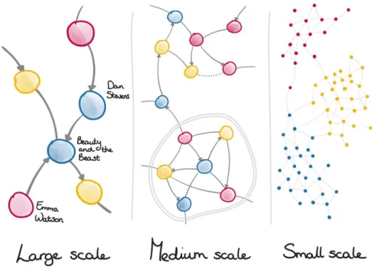
2.5.1 Scale
The naming conventions for scale is in a similar manner as used for geographical maps - large, medium and small scale. The different semantic rules depend on how many nodes are visible and how big these nodes are.
Figure 2. Different scales in a graph.
Large scale means that the graph is up close, the nodes are big and only a
handful or dozen will fit on your screen,
Medium scale is the intermediary scale where it is possible to distinguish
details on the nodes. This scale happens somewhere along the lines of several dozen nodes up till about a hundred nodes. Graph structures like clusters (2.5.2) is also something that could be available on your typical screen.
Small scale happens when hundreds, thousands or even more is visually
available on your screen. It is hard to extinguish details on the nodes because they will be very small, but this view gives you a great structural overview of the graph.
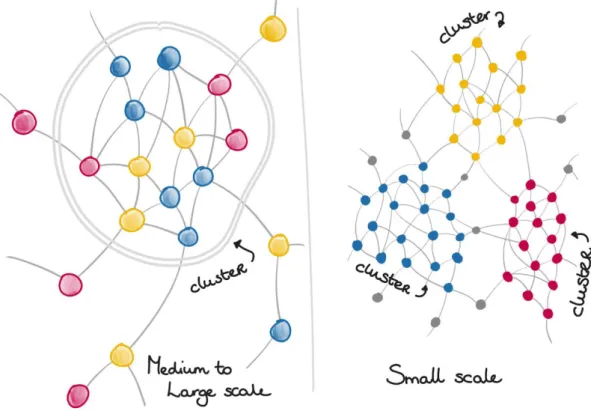
2.5.2 Clusters
When nodes are highly interconnected with relationships and less connected to other nodes, they could be formed into structural neighbourhoods called clusters. An example could be if we look at the cast of the Harry Potter movies, who together have worked on eight movies, but most have not worked together on other movies. This results in the cast being highly interconnected with the Harry Potter movies and could be combined into a cluster. The figure below represents how a cluster might look visually without any real data applied (Neo4j, Sigil Lang, 2018).
2.5.3 Expansion
A graph will always contain relationships between nodes, although they might not always be visible in the graph view. The graph view is the canvas of where the visualised graph data resides. To bring more nodes and relationships into the graph view in another way than running a query, it is common to do so by expanding a node. By doing an expansion on a node it will bring the closest neighbours that relate to the node onto the graph view.
Figure 4. Before and after a node is expanded.
2.6 Data Journalism
“In computing, data is information that has been translated into a form that is efficient for movement or processing. Relative to today's computers and transmission media, data is information converted into binary digital form”
(Rouse, 2017)
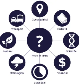
Data journalism is journalism with data. This is arguably the most trivial way how one could describe “Data Journalism”, sometimes called “Computer Assisted Reporting”. Traditionally speaking, data could be a collection of numbers, usually collected in a spreadsheet. Some 20 years ago, this was likely to be the case in the field of data journalism. However, we now live in a digital era where almost everything can be or is described with two numbers - zeros and ones (binary). Everything from political votes, disease and confidential documents to photos, audio or video are grounded in just two numbers: zeros and ones (Gray, Chambers, & Bounegru, 2012) (Fig 5). This means data journalism is the ability of interrogation and questioning of numbers. Data journalism is instigated when one starts to ask questions about numbers or with numbers - proving that something is happening and is widespread (Egawhary & O'Murchu, 2012).
Figure 5. A visualisation of different kinds of data.
2.6.1 Trends in (The State of) Data Journalism
Looking back about 10 years, using large sets of data has been difficult and have required technical abilities that exceeds what has been common among journalists. It has been verified through various studies that data journalists usually rely on data provided by the government, research companies, city officials, etc. There have historically only been a few cases in investigative journalism where journalists have been able to find resources to gather and analyse their own data and in turn publishing the results. However, the situation is changing at a quick pace. Today, there is substantially more accessibility to free data online and tools that enhances the process of analysing, visualizing and publishing large quantities of data (Aitamurto, Sirkkunen, & Lehtonen, 2011).
According to the European Journalism Centre (EJC) report on data-driven journalism published in 2010, it is finding the know-how in how to work with available data that could energize the role of the journalist - making her the “sense-maker” by digging deep into data and making journalism more socially relevant (Aitamurto et al., 2011).
A study conducted by EJC in 2011 with about 200 journalists that participated and about 134 surveys that were fully completed showed some interesting insights. For example, when asked “What are you most interested in learning?”, a majority of 83% answered that they would like to learn how to give more depth into a story by providing context through statistical data and data visualization. The next top two skills they would like to acquire were how to analyse data (72%), and how to visualize data (66%). The results from the study conducted by EJC could therefore suggest that it seems like finding and pre-processing the data is not the biggest problem in data journalism, rather it is having the knowledge in how to work with it that is the biggest barrier (Lorenz, 2011).
2.6.2 Graphs in Data Journalism
There is a reason for why graphs are increasingly being used within the field of Data Journalism. Graph databases specializes in analysing relationships and any interconnections between data in large volumes. By incorporating this technology with a visualization tool, the expression “follow the money” has become closer to reality for journalists than ever before (Merkl Sasaki, 2017).
2.6.2.1 Panama Papers
This project was organized by the International Consortium of Investigative Journalists (ICIJ), and is one of the largest data-driven investigations ever conducted and won the 2017 Pulitzer Prize for Explanatory Reporting. A collaboration of nearly 400 reporters around the world investigated what was then the largest leak of data in journalism history (ICIJ, n.d.). The data was about 2.6. TB and concerned shell companies used as offshore tax havens. The data was loaded in to a Neo4j graph database and Linkurious was used as a graphical front end for querying the database. Some of what was uncovered was how billionaires, politicians and even sports stars, all hide their money with the use of tax havens(Cabra, 2016).
2.6.2.2 Paradise Papers
Like the Panama Papers, the investigation was powered with the Neo4j graph database and Linkurious as the analytical visualization software to unveil key findings in some 11.5M documents. Some of the exposed key findings listed on the ICIJ were how
• big multinational corporations like Apple, Nike and 100 others were tax engineering,
• royalty and sports stars where using Isle of Man tax-avoidance structures,
• more than 120 politicians and world leaders, including Queen Elizabeth II, and 13 advisors, major donors and members of the Donald J. Trump administration had offshore activities and interests (ICIJ, 2017).
2.7 Related Works
This chapter describes four graph visualization solutions and some highlighted features that they currently have.
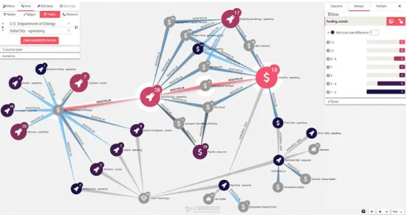
2.7.1 Linkurious
This graph visualisation software is arguably the most recognized visualiser because of it being significant to the Paradise Papers and the Panama papers investigations. It allows the users to search your database with a built-in search engine and editing its graph data properties in-app. There are also various built-in features to streamline data analysis such as
• allowing you to see your data in a geospatial context,
• increasing graph readability by untangling webs of interconnected data into graphical layouts,
• node and relationship styling,
• bar charts based on node property values (see Figure X below), • graph filtering.
This software also allows for multi-user collaboration and reporting between teams (Linkurious, 2013).
Figure 6. A screen capture of Linkurious.
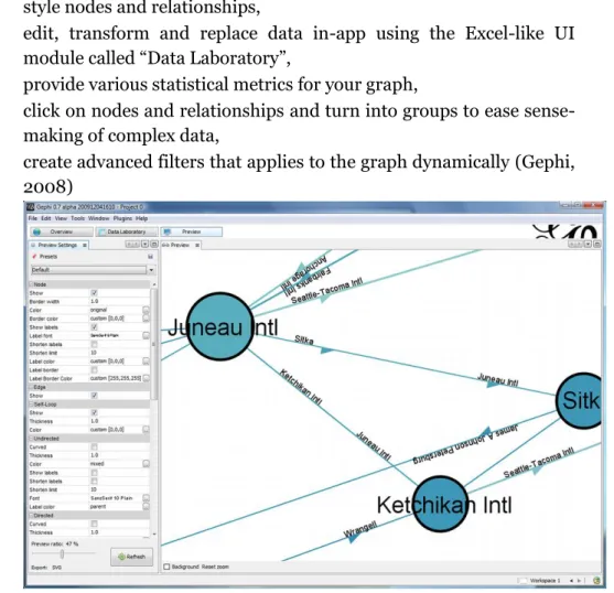
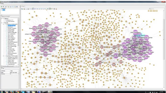
2.7.2 Gephi
This open-source graph visualisation software has a lot of capabilities and is highly customizable. Virtually every capability it has can be altered to suit your needs. Some of the features allows the user to
• style nodes and relationships,
• edit, transform and replace data in-app using the Excel-like UI module called “Data Laboratory”,
• provide various statistical metrics for your graph,
• click on nodes and relationships and turn into groups to ease sense-making of complex data,
• create advanced filters that applies to the graph dynamically (Gephi, 2008)
Figure 7. A screen capture of Gephi.
2.7.3 Tom Sawyer Perspectives
Tom Sawyer Perspectives is a platform for building graphs, data visualization and analysis applications. It is a Software Development Kit (SDK) with a graphics-based design and preview environment. It is used by e.g. enterprises, government agencies and technology companies to build applications that solves big data problems. Some features it has is
• timelines to see graphs evolve through time, • charts,
• different layout options for graphs, • tables and rows,
• filtering and searching,
Figure 8. A screen capture of Tom Sawyer Perspectives.
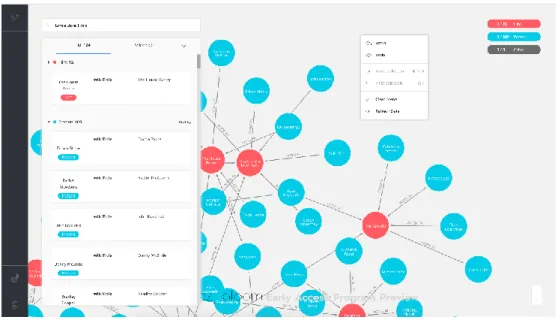
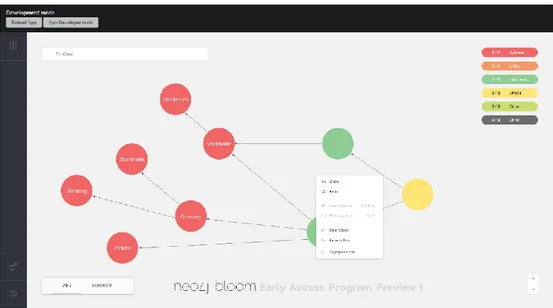
2.7.4 Neo4j Bloom (Early Access Program - 1.0)
This software is currently being developed by Neo4j and its goal is to be the first-hand choice for business users to easily make sense of their connected data in a graph visualization context. It has an easy to use search with the intention to enable user without experience in Cypher to apply queries onto their graph data - this is the outcome of parsing natural language into Cypher queries.
Bloom is configured at its core to work with a specific graph structure and looking at that structure in a coherent way. The configuration is called a Perspective, because it provides a scope onto the underlying graph data. In the perspective you can configure two main parts onto your data: categories and search phrases. The search phrases enable users to setup Cypher queries that replies to a user chosen search phrase template, to streamline the initialization of queries for somebody without Cypher experience. The categories classify nodes by labels and then displays each node according to its category. The options that can be configured for categorized nodes are the node’s colour, caption, icon and what properties to include. The biggest differentiator for this product is that the database solution is also built by Neo4j, ultimately making Neo4j a single vendor for all things related to graphs for businesses and other endeavours. Some highlighted features that are currently implemented is
• inspecting nodes and relationships to provide its details, • an easy to use search bar,
• node categories, • search phrases.
Figure 9. A screen capture of Neo4j Bloom.
Methods
The outcome of this thesis has built insights using four different methods that are described below.
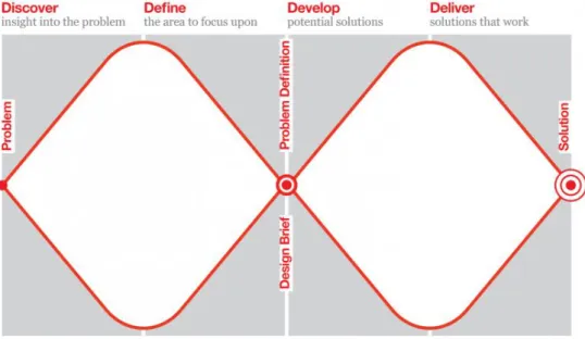
3.1 Double Diamond
A design process can have various flows which can be illustrated in models, one of these models is called Double Diamond. This model is an iterative one and it therefore cycles through four different phases of a design process; Discover, Define, Develop and Deliver. This visual map challenges all creative processes by divergent and convergent thinking, which can be represented by a diamond shape. Essentially the different approaches of thinking are to first quantitatively collect ideas (divergent) and secondly to synthesize and narrow down to get the best idea (convergent). Looking at the figure (10) below, one can see that the Double Diamond does this twice - once to confirm the problem definition (Discover and Define) and once to create the solution (Develop and Deliver). The Discover phase is with fresh eyes, noticing new things and gathering insights. All this can be done abundantly as the divergent shape suggests (Design Council, n.d.).
The Define phase however seeks to make sense of all the possibilities identified in the Discover phase. It is now time to Define answers to questions like; what matters the most? What is feasible? What should be acted upon first? Ultimately the goal here is to define a creative brief that can be used in the next two phases - Develop and Deliver (Design Council, n.d.).
The third phase, Develop, is about creating concepts and solutions which are prototyped, tested and iterated. The fourth and last phase, Deliver, concludes the design process by refining the idea that worked best as a solution for the design brief that had been defined in phase two. It is arguably hard for a design process to be this linear so going back to any of the phases during a design process could happen (Design Council, n.d.).
Figure 10. The Double Diamond model.
3.2 Semi-structured Interviews
Semi-structured interviews are a method for the gathering of qualitative research and is optimal for when there is little information upon the topic that is of interest. Qualitative research can be used if one wants to understand the nature of processes, certain situations, systems, settings, relationships or people. How semi-structured interviews differ from structured interviews is how the responses from the participants can vary in scope. Semi-structured interviews provide opportunities for extended responses by asking open-ended questions, which requests clarification as the interview proceeds (Muratovski, 2016).
Portigal (2013) details key steps in the process of interviewing which are to • study people deeply, ideally in their context,
• explore the meaning behind user behaviours,
• synthesise, analyse, interpret and using inference for making sense of gathered data,
• use insights to point toward a service, product, design or other solution.
3.3 Prototyping
Prototypes are useful tools for communicating and discussing ideas with stakeholders, users or team members. They are an effective way for designers to explore design ideas and the activity of prototyping encourages reflection in design. Prototypes are set out to answer questions and help designers in making decisions between alternatives. This means that they serve a variety of purposes, which is
• to test the technical feasibility of a concept, • to do user testing and evaluation,
• to clarify requirements that might be vague,
• or to confirm if the design direction is compatible with the rest of the product development. (Sharp, Rogers, & Preece, 2011)
3.3.1 Look and Feel Prototype
The look and feel prototypes are built with the primary goal of exploring and demonstrating options for the concrete experience. They are a simulation of what it would be like to interact and look at, without necessarily considering implementation implications or how it would play in the user’s life. They are made by designers to visualize different look and feel possibilities, which later are tested by users to find out what can be improved. They also serve as the sense maker of how the future artefact might look like (Houde & Hill, 1997).
3.4 Usability Testing
Usability testing often refers to any technique used to evaluate a system or a product. Rubin and Chisnell (2008) describes usability testing as a process that employs people as test participants who are representative of the target audience to evaluate the degree of how a product meets specific usability criteria. The usability criteria’s that Rubin et al. (2008) defines are usefulness, efficiency, effectiveness, learnability, satisfaction and accessibility.
Usefulness refers to the user’s ability to achieve their goals and their
willingness to use the product. This criterion is key and if a product does not meet this criterion, any other measures should not be tested.
Efficiency is at which haste a user can complete their goals accurately. One
test efficiency by having an assumption regarding how fast a user should be able to finish certain tasks or goals.
Effectiveness refers to which degree the product behaves in the way users
expect it to and at which ease users can use it to their intention.
Learnability is related to effectiveness and refers to the user’s ability to
operate the system to some defined level of competence after a predetermined amount of training.
Satisfaction is tested based on the user’s perception, emotions and opinions
about the product.
Accessibility is closely knit with usefulness as it refers to if a user has access
to the products that reaches the goal. An example for this could be if a product has some prerequisite to work properly (Rubin & Chisnell, 2008).
3.5 Ethical Considerations
The thesis follows the ethical standards as formulated in Codex rules and guidelines for research in Humanities and Social sciences (The Swedish Research Council, 2017). Both the usability test and the semi-structured interviews were conducted upon the guidelines and therefore informed the participants about the aim of the project and that their participation is voluntary. The participants were orally informed about their rights, that the gathered material would be used for research purposes only, and that all contributions will be treated anonymously.
Design Process
This chapter is about how the user research defined a concept that has been designed in two iterations. The first design iteration was concluded with an expert usability test where two graph visualization experts were involved. The chapter finishes of with a final design iteration that was based on insights received from the user research and the expert usability test.
4.1 Semi-Structured User Interviews
The design process was informed by interviewing two potential users remotely on separate occasions, namely a Data Journalist from a Norwegian news agency and a research scholar from Columbia University - Graduate School of Journalism. Both the interviews were about 45-60 minutes long, with a questionnaire to dictate the direction of the interviews. The introduction at the beginning of each interview described the scope of this project and its goal. By describing the scope, it helped to understand how a data journalist primarily spends their time. This was because both the interviewees described the processes of getting the right data and getting the data right, as the most time consuming and difficult processes. However, these processes were not in the scope of this project, but the understanding of the scope allowed the interviews to be correctly emphasized on information that was of relevance.
The questionnaire was led by open questions like: “How does an analytical process usually look for you?”, “How do you imagine a best-case scenario for analyzing graphs?” and “Why is this not always the case?”. This was to allow
for extended responses and to get an in-depth grasp of how an analytical process can differ when comparing the results from the interviews.
Below are the summarizations of the two interviews followed by categories of insights that emerged when synthesising and analysing the interview results.
4.1.1 Data Journalist from a Norwegian News Agency
The interviewee was introduced to the line of questioning regarding the analytical process. When asked how the analytical process usually looks it became apparent that there seems to be no linear workflow. The interviewee uses different tools dependant on what the story is about, and the tools themselves are spread between different software and custom-built toolkits. There was often a need to see their quantitative data in a statistical presentation (i.e. different types of charts). This was important not only because the possibilities to gain insights from the data, but also because the same insights from the charts are commonly understood by news readers. The interviewee wished more graph visualization software had the capability to base charts depending on values in relation to what graph is currently visible in the graph view. Charts are for this interviewee usually displayed using functionalities within software like Microsoft Excel. It is already possible to convert their data into charts, but this required the user to change tool and reconfigure the inputs for chart initialisation for every new interesting graph excerpt.
The interview progressed into talking about node quantities, and how scale defines the analytical process. A large node count and looking at the graph at a small scale were according to the interviewee, usually not time well spent, rather it is preferred to find smaller graph subsets by querying or deducting nodes that are irrelevant. It was stated that the smaller the graph is that you are looking at, the easier it is too find patterns in the data. Although the full visualised graph could be important by making sense of the datasets structure and find irregularities - it is more common to use a query to find a small to medium scale pattern that could be analysed. According to the interviewee this was also closely coupled with presentational process because graph readability would probably increase if a story contained several small graphs rather than one big graph. Although the combination of all small graphs might be provided as the last piece of the story, to see the full picture of how the separated stories are connected.
During the interview, the subject of graph readability was revisited and how readability enhances both the analytical process and the presentational process. It was said that untangling clusters of nodes, one can more easily comprehend a graph’s fine-grained patterns. This was followed by discussion about concepts like abstracting data, essentially functionality that would reduce node count to see the bigger picture of a graph and which helps identifying patterns more easily. The outcomes of abstracting nodes could be
beneficial for analysing and presenting graphs because it would reduce clutter or noise that does not help analysing or explaining the narrative a pattern or story. Functionality for abstracting called “grouping” nodes exists within Gephi and Tom Sawyer Perspectives, but it has not been used for this interviewee because it lacks the ability to see the nodes that are contained easily. It was also stated that grouping nodes possibly removes too much information because the relationships would be directed at the grouped node and not the individual nodes within the group. When grouping nodes, it was said that it is hard to keep track over the groups and differentiate between groups visually.
This interviewee delivers data-driven stories to an audience that consumes their news mostly on mobile and the agency had not yet published a story that involves graphs. Graph readability on mobile devices are particularly challenging because the inherent fact that the screen size of a smartphone is relatively small.
4.1.2 Research Scholar from Columbia University
There had been several cases of where this interviewee had been directly and indirectly used graphs as a tool for creating data-driven stories. Like the previous interview, it was clear that the tools used for analysing graphs was dependant on the story, which means the different required functionalities are spread amongst several software.
A sought out for interaction for this interviewee was to enable a timeline that correlated with the graph data. This would, according to the interviewee, be interesting because it would ease delimiting data to a specific timeframe without having to make changes to their database. The interviewee argued that this would be beneficial to a large array of data journalists because timestamping the data is something that almost everyone does. It was said that as a journalist, there is an outspoken need for a narrative when delivering a story, and the temporal aspect is key for creating this narrative.
The interviewee said that charts used in relation to graphs varies from case to case. In some cases, the process of turning excerpts of data into charts is a time-consuming effort, where the result of the chart may not provide anything to the story. The interviewee has been using Microsoft Excel or Google Sheets for making charts because it has been developed for a long time which have enabled the tool to have a variety of rich capabilities.
The interview progressed into talking about how graphs are perceived depending on node count. It was explained that analysing a graph in small scale is at times a wasted effort because there are too many nodes to look at or too many nodes that means the same thing. To combat this problem the interviewee would remove the nodes that does not serve an immediate purpose of the story to ultimately - view a graph with a smaller node count but with higher a collective relevance. The interviewee stated however that
the goal of a good graph is to preserve as much information as possible, which makes removing nodes a paradox. The interviewee wished that there existed ways to more easily abstract and/or merge nodes with similar properties as to preserve rather than removing nodes or adjusting the database. It was summarized that simplifying a graph is helpful for analysing a graph visually, which could be in certain cases to reduce node count.
4.2 Insights
These interviews resulted in three different categories of insights that seemed particularly relevant and interesting. The categories of insights were formed by synthesizing and analysing common denominators between the two interviews.
4.2.1 Graph Readability
A recurring subject that emerged in both interviews was how simplifying a graph is key for making it easier to read and therefore easier to find interesting patterns more quickly. There were different approaches to simplify a graph, one was to remove nodes that does not provide any interest to the story or pattern by making a more specific query or dismissing those nodes as you go. Another one was to merge nodes in the database, which results in a smaller and more easily read graph. When discussing grouping of nodes, which is an interaction available in Gephi and Tom Sawyer, the answer from one interviewee was that grouping nodes could remove too much information – because individual relationships are not easily distinguished and that grouped nodes are hard to differentiate from each other. Graph readability could be particularly relevant to data journalists because the fact that their readers will ultimately consume the information provided in the graph format and simplifying the graph would in turn make a graph-based story easier to comprehend.
This category also emerged when gaining the insight of which node counts the users usually work with when analysing graphs. In most cases the nodes are visualized and analysed in the large to medium scale, which limits the node count to about a 5-100 range. By analysing nodes at this preferred limitation there was an outspoken need of preserving as much information as possible in the graph, because nodes can indirectly or directly mean the same thing when analysing a pattern.
4.2.2 Charts in Graphs
There seemed to be a need for having charts in a graph visualisation environment. This was because charts are not only helpful for providing insights to the analytical process but also that news readers are generally familiar with how charts are understood. For these interviewees, there seemed to not be enough of a tight coupling between existing charting tools and the graph visualization software. Having to reinitialise a chart for every
interesting graph excerpt was usually a timely process which in some cases does not provide any useful insights. This was mainly because both interviewees were using charting tools that were not inside their graph visualisation software such as Google Sheets or Microsoft Excel. These tools were used in their workflows because of how flexible, dynamic and rich in capabilities these tools are. Reflecting on how Excel does charting and incorporating that into a graph context could therefore be a powerful insight to design for.
4.2.3 Temporality
Narrative was an important factor, and the possibility to view, how or if, the data changes through time could be beneficial to a data journalists story. According to the one of the interviewees, it is a best practise to time-stamp their gathered data – which would make a concept revolving temporality beneficial to a large array of data journalists.
4.2.4 Conclusion
Graph readability was the insight category chosen to conceptualize. This was primarily because of how frequently this topic emerged in various ways during the interviews, which gave the insight category more depth.
The primary reason for not exploring charts was that the interviewees use tools for charting in Microsoft Excel and Google Sheets because of their richness in capability. Why this reason for not conceptualizing charts in a graph context regarded its assumed complexity, which the timeframe of this thesis might have not allowed for.
Graph readability related more to the secondary aim (1.2) by it being more graph-centric in the way that the focus is to understand the nodes and their relationships based on how they are visualised, which affects the possibility of more easily finding patterns that they might reveal.
4.3 Concept
The interviews informed a design approach that pointed towards creating a concept that reduces node count based on similar node attributes in the graph view, without removing too much information. The data journalist also described that news are mostly consumed on a smart-phone, and because of the smaller screen size there are less nodes that can be displayed at once. Increasing readability of a graph was therefore an interesting direction to design for.
The question that were informed by user research and challenged the design process was:
“How can one reduce node count in a graph and meanwhile preserve as much information as possible?”.
The conceptualization started with brainstorming about how one can group or bundle nodes without removing the relationships between nodes and making groups easily differentiated amongst themselves. This in accordance to the user interviews, would alleviate the need for increased graph readability. By collecting nodes into groups in software like Gephi and Tom Sawyer, makes a collection of nodes into one big node. This made the functionality often impractical for the users as it could remove too much information when abstracting the nodes.
The idea was directed to how one can collect nodes with similar properties into an aggregation that does not conceal any information from the nodes. This would essentially create clusters, but rather being based on their interconnectivity, they would be based on their similarity in attributes. Before designing, goals based on user research were created for the interactive flow and another choice was couple the goals with the theoretical practices made by Edward R. Tufte when he created the guidelines for graphical excellence in data visualization (2.1). The goals created for the upcoming design iterations were also based on assumptions that needed confirmation by testing.
4.3.1 Concept goals – “Aggregation”
The first and primary goal of the concept, was that the user should be able to reduce node count whilst preserving as much information as possible. This was significant since the user research informs the need for simplifying graphs, which in turn enhances the analytical process.
The second goal was that a user should be able to remove, as well as add aggregations with ease. This assumption was based on aggregations should not be a permanent merge of data entities, merely a front-end visual abstraction.
The third goal was that the user has the need to see what an aggregation contains. It was troublesome to use grouping interactions from different software because they do not illuminate the relationships or the nodes - they abstract too much information. Visual data should according to Tufte (2.1), avoid distorting what the data has to say, which pointed towards an interaction that enables the user to always see the nodes and their relationships.
The fourth goal was that the user should be able to easily differentiate aggregations from regular nodes. Not allowing user to see the difference between an aggregation from a regular node would deviate guidelines from Tufte (2.2). This would also mean distorting the data and not allow the user to find aggregations from a visual standpoint.
4.4 Designing - “Aggregation”
Initially the first design was sketched on paper, but it became apparent that this method was inefficient for this case. The interactive flow would require multiple screens which subjectively would be more time-consuming drawing on paper. Using a software can arguably allow for some time reducing measures like: reusing elements, copy pasting screens and testing different styles almost at the speed of thought.
The upcoming designs are all made in Adobe Experience Design, a design software that specializes in designing UI/UX solutions at a rapid pace with the ability make prototypes out of separate screens (Adobe, 2017). By using this software, it was possible to create a look and feel prototype with ease, which allowed the usability test to be appropriately tested on not only usefulness but also efficiency and effectiveness.
The design flow for aggregating nodes were made on a static Neo4j Bloom (Bloom for short) background with fictive data, as to see how the flow could look and feel in the context of a graph visualization environment. The figure (11) shows six different red nodes called “Address”, two green nodes “Intermediate” and one yellow node “Officer”, the naming conventions are related to which fictive category the label were classified by (2.7.4).
The first step of the flow was to have an interaction that initializes the aggregation module. This was done by right-clicking on the graph view, which in Bloom returns a context menu that signifies functionality that apply to the software or the nodes currently in view. A list item was placed at the bottom of the context-menu that when clicked, loads the aggregation module (Fig 11).
Figure 12. Design Iteration #1. Overview of the module.
The module contained three inputs that specifies which node attributes should be aggregated. The greyed-out placeholder text was designed to detail what the input field can specify, which was from top to bottom; label, property key and property value (Fig 12). The input fields also intended to work as a search bar where the current input text, filters results based on closest match. The results were then designed to appear in a drop-down menu (Fig 13) where the wished result may be selected by click or navigation using keyboard arrows + enter.
Figure 13. Design Iteration #1. Configuring inputs.
This was followed by a blue toned text that when clicked confirms the selected inputs and creates the aggregation (Fig 14 + 15).
Figure 14. Design Iteration #1. Before adding aggregation.
Figure 15. Design Iteration #1. After an aggregation has been added.
When “+ Add Aggregation” has been clicked the aggregation has been constructed based on the configured inputs, and an aggregation card is shown under the “Aggregations” header. Clicking the X icon on the right side of the card removes the aggregation and the card. Furthermore, when “+ Add Aggregation” has been clicked the aggregation has been created which collects all the nodes in the graph view that applies to the configured inputs and aggregates them together around a circle, this is now an aggregation. The aggregation was signified visually by it being a collection of smaller nodes around a circle. The aggregation contained a caption in the middle of the circle, in this case it says “Title”, which can be edited on the aggregation card to any caption of choice (Fig 15). This would allow the users to easily differentiate aggregations from each other as the fourth goal expects, and to preserve information by revealing both the nodes and the relationships – which the first goal expects.
Another design choice was that the relationships should point to the nodes around the aggregation to not conceal any information from the connections. The choice of having the aggregation having a visually unique style, was done consciously by relating back to the fourth goal (see 4.3.1). This would also affect the third goal because the user should be able to find aggregations easily.
Figure 16. Design Iteration #1. Viewing node details on double-click.
Another design choice that was made, were that when a node around the aggregation is double clicked, the node will conceptually “open up” and provide details as to what properties or labels the node has (see Fig 16). This related to the first concept goal that was assessed before designing, where node reduction should not remove too much information.
Another detail of this interactive flow was based on assumptions regarding what could be a useful feature, which was toggling an aggregation on and off, without removing the aggregation or the aggregation card. The round dotted icon on the left of the aggregation card was designed to be a toggle, and by clicking on it the aggregation would switch from being activated or deactivated (see Fig 17). This would reduce the opacity of the card, which signifies its de-activated state.
Figure 17. Design Iteration #1. Toggling an aggregation - Hide/Show.
4.4.1 Expert Usability Test
This test was conducted in the Neo4j office environment with two graph visualization developers working on the Bloom product. Why the design concept was tested with graph visualization developers were because of their experience in how functionality in graph visualization environments are usually constructed, and how elements within functionalities are used. They got to try the prototyped simulation collectively, with the objective to improve the efficiency and effectiveness of the preliminary design concept. Before the test was conducted, the goals of why and what the interactive flow attempts to solve was described. When the test was ongoing it was monitored to evaluate the concepts efficiency. The session was concluded with asking questions that indirectly regarded the usability test measures mentioned in 3.4; usefulness, and effectiveness. This resulted in having an open discussion regarding the initialisation of an aggregation and the direct interaction with the aggregation when it is on the graph view.
4.4.2 Test Results
The outcome of the test proved to be helpful for providing adjustment details to the existing elements in the concept, and suggestions to add new details which could improve the flow. The concept got its usefulness validated, which directed the test to emphasise its effectiveness and efficiency. The details are described below, chronologically to how the interactions in the flow were used.
The first insight was directed to the configuration of the aggregation, which seemed too much like sequenced steps. The reason for why this was not optimal was because the flow could suggest that you start of by configuring the label in the first input field and then go on configuring the rest in sequence. This could suggest that a label must always be configured first, or
that an aggregation cannot be instantiated without a label. For the end user this does not have to be the case.
What was illuminated next by the testers was that the flow did not allow a user to configure multiple node attributes as one aggregation. It was said that there is no reason for any kind of user to not have the capability to aggregate nodes based on multiple inputs.
Another debatable aspect of the interactions that the test induced was how the aggregation could get styled depending on how many nodes is within the aggregation. This had not been thought about and it was suggested that an aggregation can reduce the size of the surrounding nodes depending on node quantity. The suggestion was that the more nodes that surround the aggregation, the smaller the nodes themselves become – up to a threshold for a maximum number of nodes.
When confronted about the hide/show toggle interaction, the interaction itself seemed useful, but they felt like the choice of icon looks too much like a radio button. This has implications to how the interaction is supposed to work because the intended solution for the toggle is that you may toggle multiple aggregations at once. The radio button defeats that purpose as a radio button should only be toggled once in a list, not being activated several times as a checkbox.
4.5 Final Design
The last design iteration was a direct action upon the usability test, and that resulted in the interactions being adjusted to be in accordance to what was said. The final flow can be accessed using the link that is available in the appendix (8.1) of this thesis.
What was changed is that the three input fields for configuring an aggregation has been removed, and instead replaced with one input field that works as a search module for node attributes. When a user wants to find a label or property, it is now accessible by clicking or navigating to the matching result in the drop-down result list (see Fig 18).
Figure 18. Design Iteration #2. New configuration interaction.
This was changed because the usability test informed that configuring three inputs that were previously vertically aligned felt like taking three necessary steps to make an aggregation. When an attribute is selected for aggregation, the property or label will reside in a box that collects every chosen attribute. When the user deems that the aggregation is ready to be created, it is now possible to do so by clicking the “+” icon (see Fig 19 + 20).
Figure 20. Design Iteration #2. When an aggregation is added - new toggle icon.
The usability test also created some helpful confusion regarding the toggle icon looking too much like a radio button. It was changed to instead be an eye icon, that signifies the hide/show interaction (see Fig 20) . Another insight from the expert usability test was related to how the aggregation scales with node count. The choice made whether how much the aggregation can scale was to enable a user to aggregate up to 20 nodes in one aggregation. Some designs for these node count variations are depicted in the figure below (see Fig 21). The choice of letting an aggregation scale up to 20 nodes was informed by the user research, where analytics of graphs usually happen when a graph contains around 5-100 nodes in total. This influenced the scaling of aggregations by assuming that aggregating more than 20 nodes with similar attributes might be rare in a graph that contains 100 nodes in total.
Figure 21. Design Iteration #2. Node quantities in aggregation.
4.5.1 Result & Value
This design process has informed one way of how interaction can be designed to streamline an analytical workflow for data journalists in a graph visualization environment. The concept is called “Aggregation” which lets the users use a UI module to condense their graph by collecting nodes with
similar attributes into an aggregation. The way this design flow alluded on user research were primarily that a simplified graph, with a reduced note count, streamlines graph analytics. Furthermore, the users refrained from using grouping interactions in other software because it could remove too much information from the grouped nodes. This was solved by exposing the nodes on a circle which makes them accessible to be interacted with directly. The aggregation allows the user to caption an aggregation which can allow for easier differentiation between aggregations. By having the nodes exposed on the outer circle the user may see exactly how surrounding nodes relate to the aggregation and which nodes are in the aggregation, which preserves the relationships between nodes but also condenses the graph.
The result of increased graph readability not only relate to the possibility of streamlined analytics, but also that when a news reader consumes a graph on mobile – it can simplify the data and not distort information because all the parts of an aggregation are exposed visually.
The module can be used for data journalists to condense graphs by collecting similar nodes into aggregations, which can provide possibilities for revealing patterns.
Evaluation & Discussion
Data visualizations are generally hard to evaluate because of how different people are, and ultimately – users are. Every human being has different backgrounds, perceptive abilities and preferences, which results in data visualizations often being opinionated differently. The effectiveness of a data visualization is also dependant on the user’s task or case, which concludes that a data visualization concept can never guarantee immediate success (Ward et al., 2010). This could potentially mean that by enabling interactions that allows for customization of the aggregations appearance, might have worked better for the outcome. In its current state, a user can only customize visual aspects like caption and content but lacks more intricate customization options like e.g. sizing or shape.
Hypothetically, the outcome of this design process could alleviate the needs that the user research suggests, which makes the concept hypothetically valuable. Seeing as data visualization concepts could be opinionated differently depending on which individual user is utilizing the concept – there could have been other approaches to the design process. Due to practical reasons, it was not possible to get the real users represented in the usability test which could have informed whether elements in the concept could have had customization affordances. The representative users that participated in the usability test were graph visualization developers. This implication can be
discussed whether it was optimal, as Rubin et al. (2008) suggest that the participants should be representative of the target audience. However, it is suggestive of what a representation of a target audience means, as graph visualization developers work with data, and data journalists work with data. The design process opted to follow the double diamond design model (3.1), which it did not do to its full extent. The user research was arguably divergent followed by convergence when compartmentalizing the insights into different insight categories. However, the design conceptualization did not opt for a divergent phase because the process explored merely one concept into a look and feel prototype, without exploring more possibilities. This was due to the delaying of the design process because of scheduling issues with the users. The structure of this design process worked well for distinguishing user needs and problems to make design solutions that opts to resolve them. On a conceptual level, the aggregation module solves the user needs based on the goals assessed in 4.3.1. But to see if it achieves these goals in its intended context, one can arguably not confirm that by testing, as it may require the concept to be implemented with its intended functionality. This is mainly because different tasks, stories or datasets requires different tools, as the user research informs. The implications of this consequential use of tools could mean that certain interactive concepts might be less useful for certain tasks, stories or datasets. However, one can probably device a concept that hypothetically solves problems and later validate its interaction design by testing it with real users. This implies that users could relate the concept to how it can be used in their projects.
The user collaboration had some implications regarding their awareness of the projects affiliation with Neo4j. This awareness caused the interviewing process to delve into technical terms, which often needed clarification. By assessing this implication earlier in the interview process, the research data could have been easier to digest by informing each interviewee about my lack of technical understanding of back-end processes. Perhaps an outspoken awareness of technical prerequisites could have allowed the extraction of data to achieve a more holistic view of the user’s actions in their analytical process. Another aspect that might have improved the collaboration with users was the fact that the interviews were not conducted in their context. They were remotely conducted because the participants worked from different countries.
How the aggregation module could be used in its hypothetically implemented state should probably consider the implications of knowing what to aggregate to increase a graph-driven story’s readability. If a very important node in a story would be included in an aggregation rather than being standalone, it could affect the readability of the story. As graph-driven stories are presented to the public, one should then probably be mindful of the implications that could arise when the news readers are consuming a story that contains aggregations. However, the aggregation module’s primary purpose is to make
graphs simpler to analyze – to find stories more efficiently. How stories are presented to the public is up to the data journalists judgement to determine whether the presented data is ethically sound, i.e. not being distorted.
5.1 Perspective
The design process has illuminated directions for the interaction design community that could be of interest when approaching the topic of interactive graph data analysis for data journalists. The figure (22) depicts the design process for this project and what path ultimately was explored in detail. Even though temporality and charts were not explored through conceptualization, does not mean that they should not – even graph readability is an unsaturated area. The importance of exploring interactive data analysis as an interaction designer from the perspective of data journalism is important, as well-designed concepts can allow users to find patterns in the data which could impact the world. Relating back to emerging trends in data journalism (2.6.1) it could suggest that increased access to data will bring new significance to data analytical research.
Figure 22. A graph of the design process and future directions.
The projects current state should not be considered finished until it has been tested with users in its implemented form. Further elaboration on this project could suggest more user involvement, which in a usability test could highlight features in the aggregation flow that can have affordances for interactive customization.
Conclusion
When concluding the outcome of this project, it is important to note the aggregation module is merely a single way interaction can be designed to streamline a data journalists analytical workflow in a graph visualization environment. This means that the research question
“How can interaction be designed to streamline a data journalists analytical workflow in a graph visualization environment?”,
has an unlimited number of possible answers, and this thesis provide one of them. The design process materialized the aggregation module by conducting semi-structured interviews which gave an in-depth look into the analytical workflows of the data journalist. The need for simplifying graphs and keeping information intact was the primary insights that allowed a design opening to be found and iterated on through a look and feel prototype. The first design was iterated on by considering the synthesized interview data and concluded the process with an expert usability test to validate its usefulness and to streamline its efficiency and effectiveness.
The state of the project could be considered unfinished, as there is room for improvements. To increase reliability to the concept, one should probably conduct usability tests but with data journalists to get a grasp of which elements in the concept can have customization affordances.
Streamlining the analytical workflow for data journalists through interactive concepts is a topic that if successful, can influence society greatly by allowing users to find patterns that they might have not seen otherwise. The patterns can hypothetically be untold stories, which can if published – directly impact processes in societies all over our connected and data-driven world.
References
Adobe. (2017). 6.0.12. Retrieved 2018, from
https://www.adobe.com/se/products/xd.html
Aitamurto, T., Sirkkunen, E., & Lehtonen, P. (2011). Trends In Data Journalism.
Beal, V. (n.d.). Retrieved May 2018, from Webopedia: https://www.webopedia.com/TERM/Q/query.html
Cabra, M. (2016, May). Neo4j. Retrieved from https://neo4j.com/blog/icij-neo4j-unravel-panama-papers
Design Council. (n.d.). Retrieved May 2018, from https://www.designcouncil.org.uk/news-opinion/design-process-what-double-diamond
Egawhary, E., & O'Murchu, C. (2012, April). Retrieved from ICIJ: https://tcij.org/sites/default/files/u4/Data%20Journalism%20Boo k.pdf
Eifrem, E., Webber, J., & Robinson, I. (2013). Graph databases. O'Reilly Media, Inc.
Gephi. (2008). Retrieved 2018, from https://gephi.org/features/
Gray, J., Chambers, L., & Bounegru, L. (2012). The Data Journalism
Handbook. O'Reilly Media, Inc. Retrieved April 2018
Hale, T. (2017, July 26). Retrieved from
http://www.iflscience.com/technology/how-much-data-does-the-world-generate-every-minute/
Houde, S., & Hill, C. (1997). What do Prototypes Prototype? In Handbook of
Human-Computer Interaction (Second Edition ed., pp. 367-381).
Apple Computer, Inc.
ICIJ. (n.d.). Retrieved May 2018, from ICIJ:
https://www.icij.org/investigations/panama-papers/
ICIJ. (2017). Retrieved April 2018, from ICIJ: https://www.icij.org/investigations/paradise-papers/
Kasdjasl, A. (2018). WE.
Linkurious. (2013). Retrieved March 2018, from . https://linkurio.us/product/
Lorenz, M. (2011, September). Training data driven journalism: Mind the
gaps. Retrieved March 2018, from
http://datadrivenjournalism.net/news_and_analysis/training_data _driven_journalism_mind_the_gaps